
Filed In: Neon
Neons (2014) by OPI

Released for the first time in full-sized bottles, OPI brings us as new eye-searing collection: Neons by OPI (CAN $10.95/each), six über-bright hues along with Put A Coat On! Natural Nail Base Coat, to help these babies really “pop” (sold separately). I confess that up until now, I never really understood neons’ appeal, but try wearing just one of these shades and NOT feeling happy – impossible, I tell you.
A good way to bring out the most of these neon shades, is with a reliable white base coat (which effectively replaces your usual base coat). The new Put A Coat On! from OPI applies beautifully: fairly opaque and relatively non-streaky, even at just 1 coat. The trick to achieving the most flawless finish with this collection, is to first apply the white base, and then let it thoroughly dry before going in with your chosen hue. The reason for this, is to ensure the white base does not bleed into the polish, which may then cause grooves in the finish or require multiple coats for an even surface.
The formula is a unique animal as well; medium thick and with the smoothness of a crème, but the springy feel of a jelly. As these Neons by OPI all wind down to a natural satiny finish, I suggest capping them off with a nice glossy top coat to really help them stand out. The following swatches were done with: 1 layer of Put A Coat On! Natural Nail Base Coat, 2 layers of each individual shade, and top coat.

Neons (2014) by OPI

Neons (2014) by OPI
Life Gave me Lemons – A true highlighter yellow with hints of chartreuse to keep it interesting. My biggest surprise, was in how much I absolutely LOVE this shade and am already planning on giving it some serious pedi time this Summer.

Neons by OPI – Life Gave Me Lemons
You Are So Outta Lime! – A super vivid lime colour, but with touches of mint to sweeten it up. I love how it’s green, but not – very wearable and will not give the dreaded “lobster” hue to skin (many green shades can give a ruddy tint to surrounding skin).

Neons by OPI – You Are So Outta Lime!
Juice Bar Hopping – A true citrus explosion, no? Makes me think of candied orange slices, or orange-flavoured Popsicles. This shade is such a great alternative to wearing red – and probably even more eye-catching (and totally non-staining, as an added bonus).

Neons by OPI – Juice Bar Hopping
Hotter Thank You Pink – A hot fuchsia pink with a blue pearly gleam. Rather like mixing textures, the addition of that inner shimmer (which is very visible, by the way) gives a 3-D feel to this shade and elevates it to something more than just another pink neon.

Neons by OPI – Hotter Than You Pink
Down To The Core-al – A scorching coral that definitely leans pink, filled with an ultra-fine pearly pink shimmer for added depth. Very hard to accurately photograph the true nature of this colour, this shade seems to merge the best of orange, red, coral and pink – creating a stunning Summer must-have. LOVE!

Neons by OPI – Down The The Core-al
Push & Pur-pull – An intense purple hue (think: Crayola bright) that somehow manages to be both vivid and dark. It’s that eye-popping purple kind of colour that lands it amongst the other neons here, but this can easily be worn year-round as well.

Neons by OPI – Push & Pur-pull
While my personal preferences tend to run to more conventional colours and finishes, I confess to having fallen hard for these Neons by OPI. Surprisingly easy to work with, each shade bears a rich, vibrant, and lush intensity, managing to infuse your mani/pedi with a much needed injection of colour, while still somehow staying far from appearing juvenile. Now that the warmer weather is finally (FINALLY) here, what better way to usher in the season than with some sizzle?
You can find this collection now through select retailers, professional salons & spas – the Neons by OPI collection is also available in GelColor through select salons (professional service only). For more information, visit:

*Disclosure: Product samples provided by the company/PR for my unbiased consideration


Essie – Bouncer, It’s Me (Neon 2013 Collection)

In my earlier review of the Essie 2013 Neon Collection (here), there was one shade missing, and in my opinion, this elusive beauty is the true star of this grouping. ‘Bouncer, It’s Me’ is an explosive cobalt blue shade, powerful & concentrated and literally had me in thrall from the very first brush stroke.
As with all the previous Essie neons, a base of ‘Blanc’ was used as “underwear”, in order to make the colour really stand out.
The jelly-like formula is a touch sheer leaning with the first coat, although that is quickly taken care of upon application of the 2nd. This shade is both deep and intense and while not day-glo neon, nonetheless bears a rich vividness – applying in a self levelling way and coming to a satin finish. Bonus: no staining upon removal. Coats applied: 3 (thin), plus top coat.
In the last two swatches, I decided to switch things up a bit by attempting my very first dotted mani using all the shades of the Essie 2013 Neon Collection, and I have to say that I’m pretty happy with the results.

Essie – Bouncer, It’s Me

Essie – Bouncer, It’s Me

Essie – Bouncer, It’s Me

Essie – Neon 2013 Collection dotted mani

Essie – Neon 2013 Collection dotted mani
Last word: I can sum things up with one word: adore. yes, I adore this blue and I intend to wear it to death – my only dilemma is whether I want to wear it more as a mani or a pedi? If you get nothing else from this collection, do yourself a favour and snag this beauty as soon as you can, because I have a feeling it will fly off the shelves.

Kindly provided by Essie for my unbiased consideration
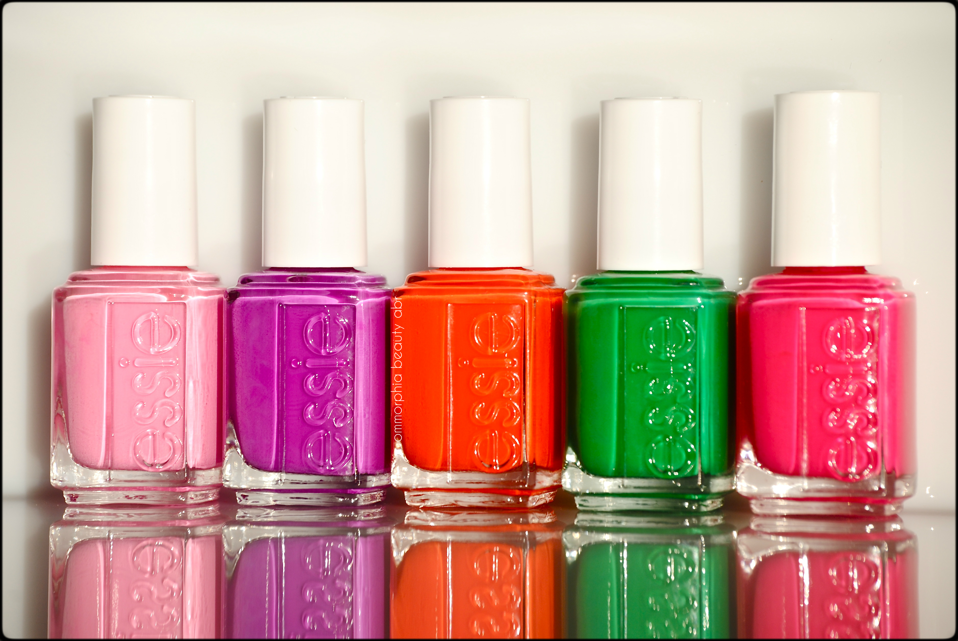
Essie – Neon 2013 Collection

When I think of neon, the term “retina- searing” usually comes to mind, which is so NOT the case with Essie’s new Neon 2013 Collection. Inspired by the partying/clubbing scene but displaying a mellower side to neon, these hues have something most fluorescent shades lack: wearability & a hint of sophistication – not just lacquers for the teeny- bopper set any more.
Note that there is a 6th shade not shown (a blue called ‘Bouncer It’s Me’) – which I’ll be hopefully reviewing soon. As with most neon varnishes, all of these have a satiny finish, so adding top coat is a must in order to have them really stand out.
TIP: Essie suggests layering these shades over a white such as ‘Blanc’ (as I have done here), in order to make the colours really pop. All swatches are with base and top coats.

Essie – Neon 2013 Collection
Boom Boom Room – like a pastel on steroids, this hot bubblegum pink is not a colour I would expect to find in a collection of neons, but it definitely isn’t your average dainty pink hue – think more sassy girl. The formula was the thickest of them all, but still applied easily enough and in a non-patchy manner. Coats applied: 2

Essie – Boom Boom Room

Essie – Boom Boom Room
Bottle Service – An electric pink hue with hints of violet undertones, I found this oddly compelling and just so incredibly flattering. The formula was of medium-thick density, although applied easily and smoothly along the nails. Coats applied: 2

Essie – Bottle Service

Essie – Bottle Service
Saturday Disco Fever – a sizzling traffic-cone orange hue with some slight hot pink undertones, in a quasi-sheer jelly-esque formula (that was a mouthful) with an easier flow than the first 2 shades. Without the layer of Blanc underneath, I would imagine that this might need a 3rd coat for full opacity – something to bear in mind. Coats applied: 2

Essie – Saturday Disco Fever

Essie – Saturday Disco Fever
DJ Play That Song – An intensely “throbbing” violet-purple hue with the most amazing formula of the group, flowing smoothly and in a totally self-levelling way. Even though this shade is warm leaning, I still feel that it will suit basically all skin tones across the board. Coats applied: 2
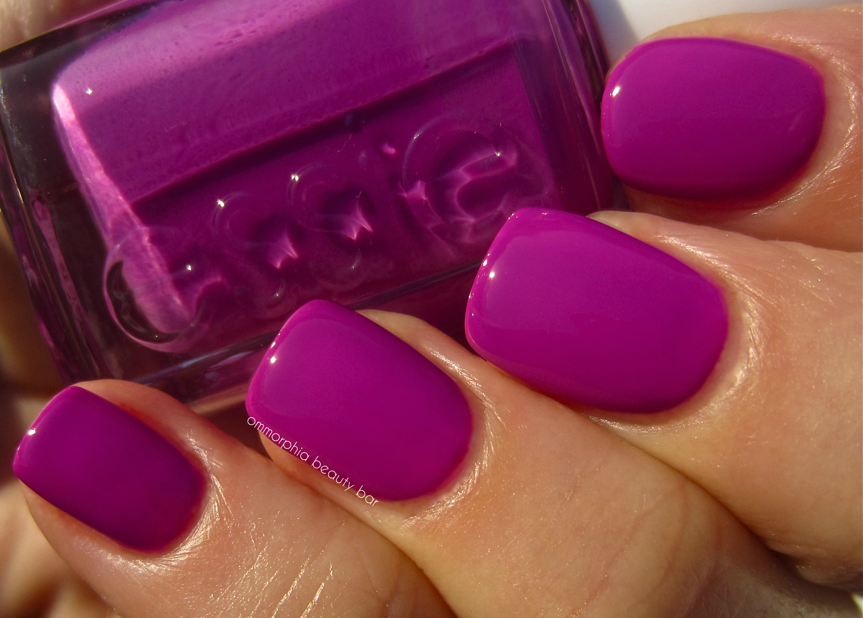
Essie – DJ Play That Song

Essie – DJ Play That Song
Shake Your $$ Maker – a vibrant Crayola-ish grass green hue, in the sheerest formula of them all. Even though I detect hints of yellow in the base, I found this colour to be an exceptionally well-balanced green and one that does not give off the dreaded “lobster hands” effect. Coats applied: 3 (thin)
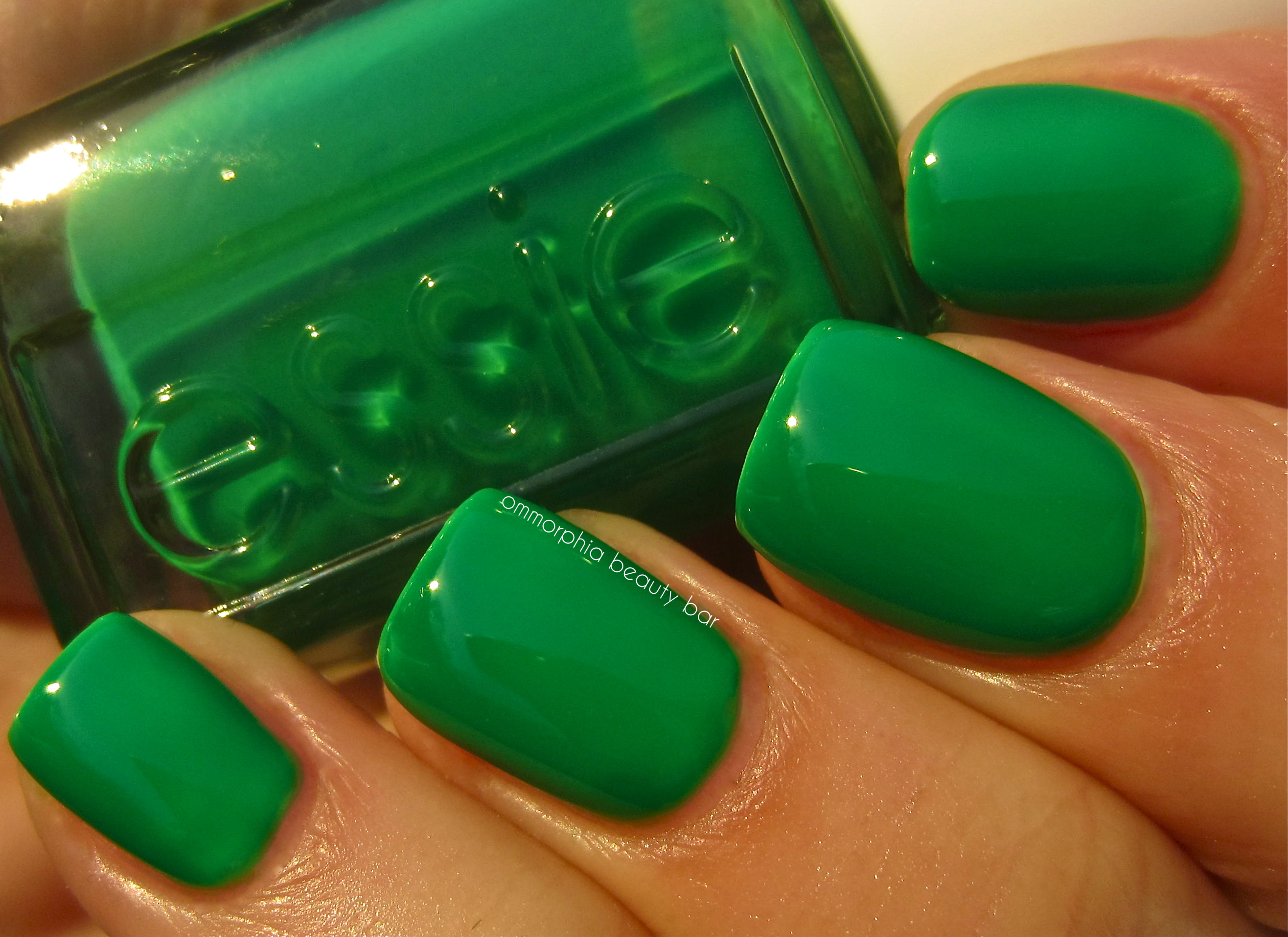
Essie – Shake Your $$ Maker
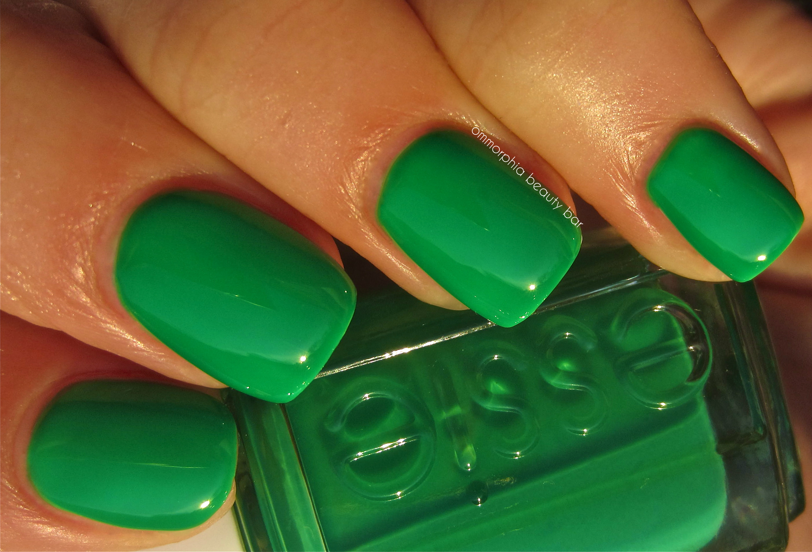
Essie – Shake Your $$ Maker
Last word: I confess that I’m not usually a fan of neons – I’m guessing it’s an age thing – however I can definitely see myself getting behind a few of these. ‘Bottle Service’ and ‘DJ Play That Song’ are my absolute favourites and I can just picture them as summertime “notice me” pedi shades. I’m looking forward to seeing how Essie interprets neon blue, because something tells me I’ll be falling for that one too … it’s the aquatic lover in me, wouldn’t you know!
Kindly provided by Essie for my unbiased consideration
China Glaze ‘Summer Neons’ Collection – part 2 (swatches & review)
")
Something about the seasons seems to dictate the colours we wear, and let’s face it; nothing says caliente like the vibrant hues of China Glaze’s new ‘Summer Neons’ Collection! In my review of part 1 (previously seen here), I should have specified that the pinks of that first grouping were the warm hues of the bunch, while the shades shown in this batch, all definitely lean more towards the cooler side. Any way you look at it, there’s something here for everyone – from the most reserved, to the obvious divas!
")
Part 2 of China Glaze’s new ‘Summer Neons’ Collection is made up of the last 6 shades – all bearing a mixed bag of finishes this time around. All these colours tend to run rather cool with definitive blue undertones, although there are a few that can almost swing either way as they will suit a wide variety of skin tones. The two crèmes of this grouping have a very fluid consistency and bear no shimmer at all, although their mirror-like shine certainly makes up for that. I also found that the amount of coats I needed to apply for each varied as well, as the individual formula consistency fluctuated more widely here than with the previous 6 – although the fabulous end results didn’t hurt! All swatches are with Poshé’s Fast Drying Base Coat and Super-Fast Drying Top Coat.
")
‘Love’s A Beach’ is a super fluorescent true pink shade with a unique crème/jelly-like formula that’s full of surprises; self-levelling with no visible brush strokes, it bears a beautiful pearly essence and dries to a satiny, semi-matte finish … an absolutely stellar formula! Coats applied: 2
")
in sunlight
")
backlit
")
indoors
")
with flash

‘Hang-Ten Toes’ is another cool-hued pink similar to ‘Love’s a Beach’, but several degrees lighter in tone and with more obviously visible blue undertones. The pearly shimmer seems a little finer here and definitely recedes more when viewed indoors, while the formula itself also applied more sheer; 2 coats gives decent but not fully opaque coverage with the finish once more ending satiny/semi-matte. Coats applied: 3
")
in sunlight
")
backlit
")
indoors
")
with flash

‘Beach Cruise-R’ is absolutely fabulous! An über-vibrant fuchsia with an intense violet side, the formula was unexpected as well, being slightly thicker than the others and in that odd crème/jelly consistency. Once more, the shimmer really only comes to life when seen in full sun or with flash, but the finish appeared to be somewhat more glossy than the others with the same pearly gleam – really brought out the blue/purple highlights in the base. Coats applied: 2
")
in sunlight
")
backlit
")
indoors
")
indoors/alternate
")
with flash
")
‘Under the Boardwalk’ is the first of the non-shimmers in this grouping, being a slightly deeper, more raspberry-hued version of ‘Beach Cruise-R’, and definitely a touch more toned down. With a truer crème/jelly consistency, the self-levelling formula was a cinch to apply, and the highly reflective glossy finish barely needed any top coat, although I wouldn’t skip it just the same. As this shade seems to have some reddish undercurrents, it tends to lean slightly warmer and more magenta-inclined. Coats applied: 2
")
in sunlight
")
backlit
")
indoors
")
with flash

‘Splish Splash’ is that perfect sky shade you see when summer is full-on … stunning! A bright azure blue shade filled with ultra-marine finely ground pearlized shimmer, this hue appears to emit a slightly metallic finish with even some hints of violet flashing back at you in certain lights, winding down to a satiny/semi-opaque finish. Bonus: no staining! Coats applied: 2
buy valacyclovir online yourcialisrx.com/valacyclovir.html no prescription
")
in sunlight
")
backlit
")
indoors
")
indoors/alternate
")
with flash

‘Ride the Waves’ is the second non-shimmer of the bunch AND the sheerest of all 12 in this collection. Interestingly enough, the formula applies in a rather medium-thick format, but the jelly-like consistency is the most prevalent here. A truly vivid ultra-blue shade, this is not only 100% self-levelling, but the glassy shine at the finish is spectacular. When 2 coats are applied, you achieve a stunning translucency, and while 3 coats gives a deeper opacity, it does take slightly longer to dry (but so worth it!). I absolutely adore the “stained glass” effect of this ink blue shade — LOVE! Coats applied: 3
buy viagra black online yourcialisrx.com/viagra-black.html no prescription
")
in sunlight
")
backlit
")
indoors
")
with flash
Final thoughts: As I wrap up China Glaze’s ‘Summer Neons’ Collection, I have to confess that my initial assumptions were so completely WRONG; I have never considered myself a fan of super-bright hues, let alone neons, but with every lacquer of this collection, I found myself not only shifting to the bright side, but totally loving it as well! Does it hurt that China Glaze products are at such an excellent price point & quality? I don’t think so! My favourites of this bunch are hands down ‘Beach Cruise-R’ and ‘Ride the Waves’, with ‘Love’s a Beach’ not far behind – but the truth is that I found something to love about every single one. Available now and absolutely perfect for showing off your summer style, get ’em while they’re hot!
buy vibramycin online yourcialisrx.com/vibramycin.html no prescription
Feel free to check out China Glaze’s website for their full lineup, or follow them on facebook/twitter to receive the latest updates.
")
*Disclaimer: Product samples provided by the company/PR for my unbiased consideration
China Glaze ‘Summer Neons’ Collection – part 1 (swatches & review)

For a self-professed “neon-avoider”, it may seem a little odd that not only is this my second collection of these über-bright hues, but that I’m actually really enjoying the jolt of colour that they provide. What sets China Glaze’s new ‘Summer Neons’ Collection apart from everything else out there, is that these attention-grabbing colours come with a nice surprise: shimmer! It’s like a 2-for-1!
")
Part 1 of this 12-piece collection of lacquers, focuses primarily on the more obvious “neon” shades of the group along with the pinks, and some of the characteristics they all have in common, namely:
- a medium-thick formula
- a brushstroke-free and self-levelling application
- ultra-fine shimmer
- a semi-matte/satin finish
- 2 coats for each shade for opaque coverage
The following swatches are all with Poshé Fast Drying Basecoat and Super-Fast Drying Topcoat – as stated, the final look is rather satiny/semi-matte; unless you prefer that finish, I recommend ending with a nice glossy top coat, as that really brings out every ounce of visual interest of each shade.

‘Sun-Kissed’ is a retina-searing “highlighter” yellow hue, infused with an ultra-fine pearly shimmer that’s a nice way of modernizing such a vivid neon shade. The formula was the thickest of the 6 here, although it still applied easily enough.
")
in sunlight
")
backlit
")
indoors
")
with flash

‘I’m with the Lifeguard’ is almost radio-active; a neon green so vibrant that you’d swear it glows in the dark, there’s almost a cartoonish “toxic-waste” eerie look to this hue, but it’s surprisingly flattering to wear. Bearing a slightly similar formula to ‘Sun-Kissed’, this shade nonetheless applied very well just the same and I absolutely loved the ribbons of pearly shimmer visible in both the bottle and on the nail.
")
in sunlight
")
backlit
")
indoors
")
with flash

‘Surfin’ for Boys’ is a high-octane pink filled with that same crushed pearly luminosity, and bears an excellently-flowing formula. While the shimmer is not as clearly visible with this shade as with the previous two, the coral flash you see along the nail edges more than makes up for that. There also seems to be an inner blue flame that becomes apparent in certain lights, adding a beautiful depth and overall tone to this unique colour. LOVE!
")
in sunlight
")
backlit
")
indoors
")
with flash

buy hytrin online buynoprescriptiononlinerxx.com/hytrin.html no prescription
‘Orange You Hot?’, is a high-voltage orange which still manages to somehow appear rather dusty-looking. Like a sophisticated take on that well-known colour of our childhood, “school-bus orange”, the shimmery pearly strands in the base give this citrusy hue a nice depth and dimension. An interesting and lighter version of the colour of the year, ‘Tangerine Tango’.
")
in sunlight
")
backlit
")
indoors
")
with flash

buy imodium online buynoprescriptiononlinerxx.com/imodium.html no prescription
‘Flirty Tankini’ has a secret; a more toned-down version of ‘Surfin’ for Boys’, the formula on this hot pink shade seemed to be more of a hybrid as it felt almost jelly-like. With an excellent flow, the pearl shimmer appears much less apparent to the naked eye, although the pale violet flash that shows up at certain angles and which compliments the light peachy/coral undertones, makes for a nice touch.
")
in sunlight
")
backlit
")
indoors
")
with flash

‘Pink Plumeria’ (love that name!) is a highly vibrant & saturated doll-pink hue, filled with an ultra-fine golden shimmer. The formula was unexpected as well; flowing with the consistency of raw egg white (sorry – I call ’em as I see ’em!), I did not expect the ease with which it applied. While it can appear as a less intense version of ‘Flirty Tankini’, the gold shimmer takes this hue in a completely new direction and can make it look at times rather warm leaning (think: flamingo pink), or cooler-toned (as in pink lemonade). A grown-up, beautiful & unique summery pink hue!
")
in sunlight
")
backlit
")
indoors
")
with flash
Final thoughts: I’ve documented in my numerous China Glaze posts, what a total fan I am of this brand; the permanent colour range is vast, the seasonal collections that are released offer totally wearable shades, with colours that generally meet everyone’s tastes, the formula is for the most part absolutely stellar and the best part? The price point is almost ridiculously low in comparison to all that you’re getting. This first half of the ‘Summer Neons’ Collection took me by surprise; I may have groaned upon viewing the lacquers, but that quickly faded when I actually began swatching – then couldn’t stop staring and taking photos! Even if you don’t manage to squeeze in any beach time, something tells me that a quick swipe of one of these happy hues can almost transport you there … I said “almost” !
buy imuran online buynoprescriptiononlinerxx.com/imuran.html no prescription
Available now at all locations where China Glaze products are sold, feel free to visit the company’s website for further information and/or to view their entire lineup, and you could also follow them on twitter or their facebook page.
")
*Disclaimer: Product samples provided by the company/PR for my unbiased consideration


