
Filed In: Ozotic
Ozotic by piCture pOlish – 601
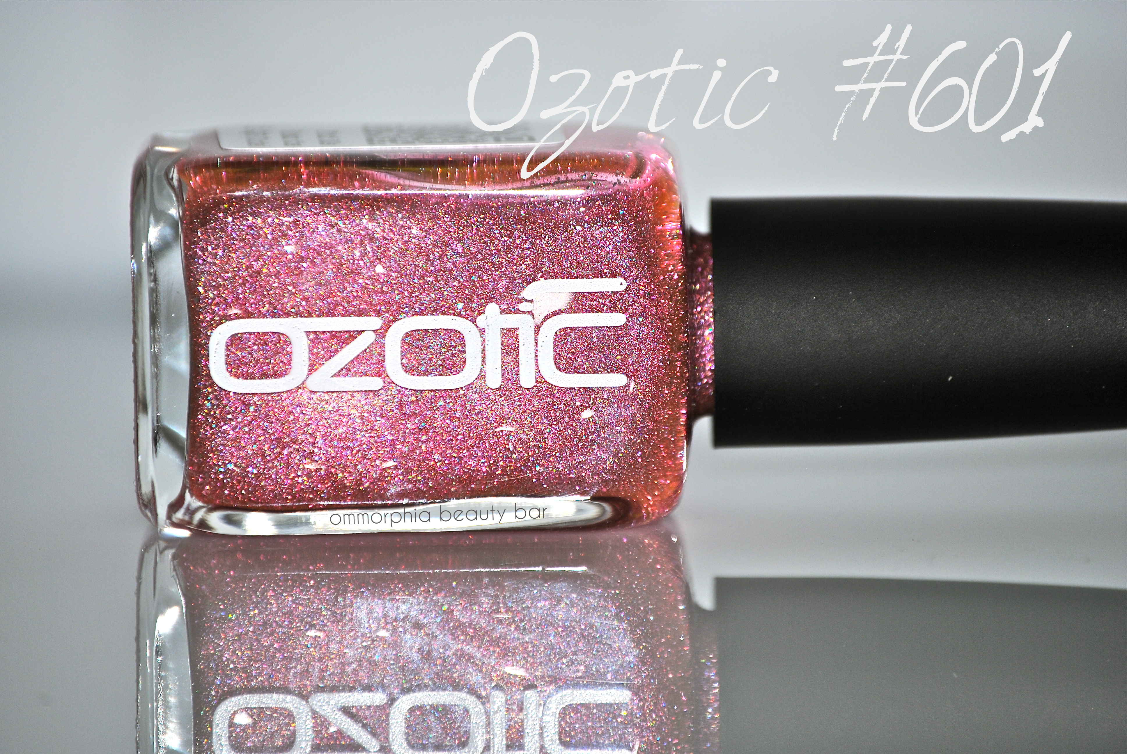
From all of the Ozotic by piCture pOlish shades I was sent to review, #601 has to definitely be the one that surprised me the most. Why? For starters, I am definitely not a “pink” person and so this shade didn’t really rock my world … until I applied it. Sometimes, it really does pay to step out of your colour comfort zone, and what better way to do that than with nail polish, right?
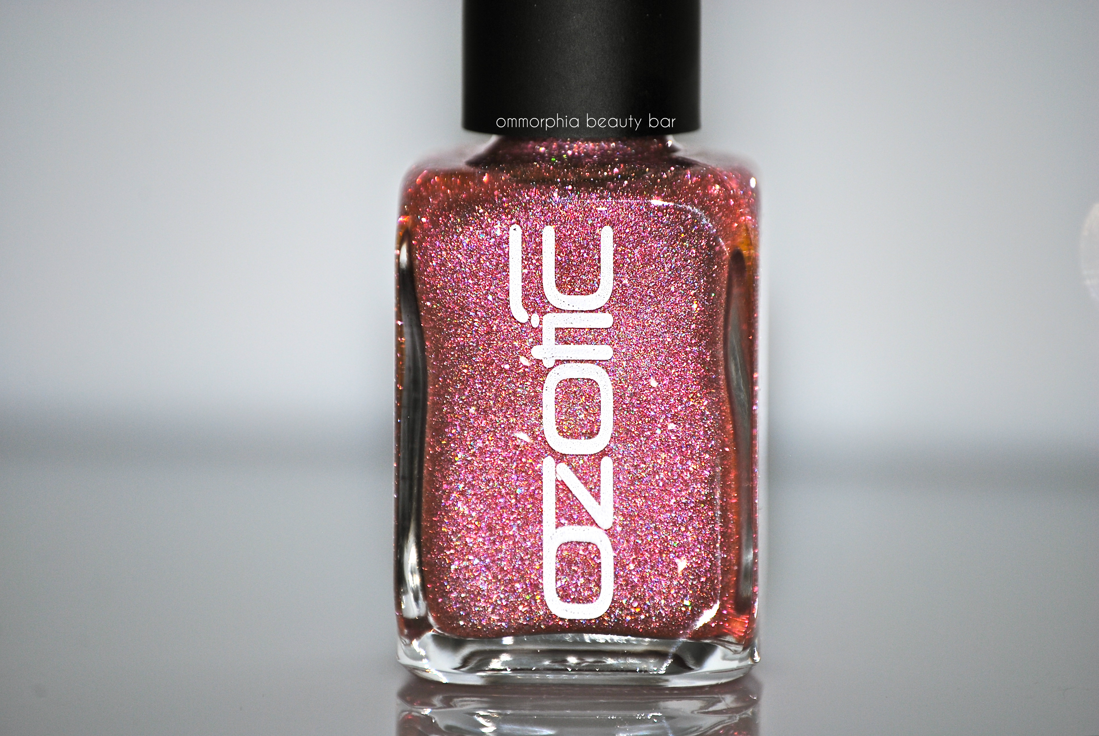
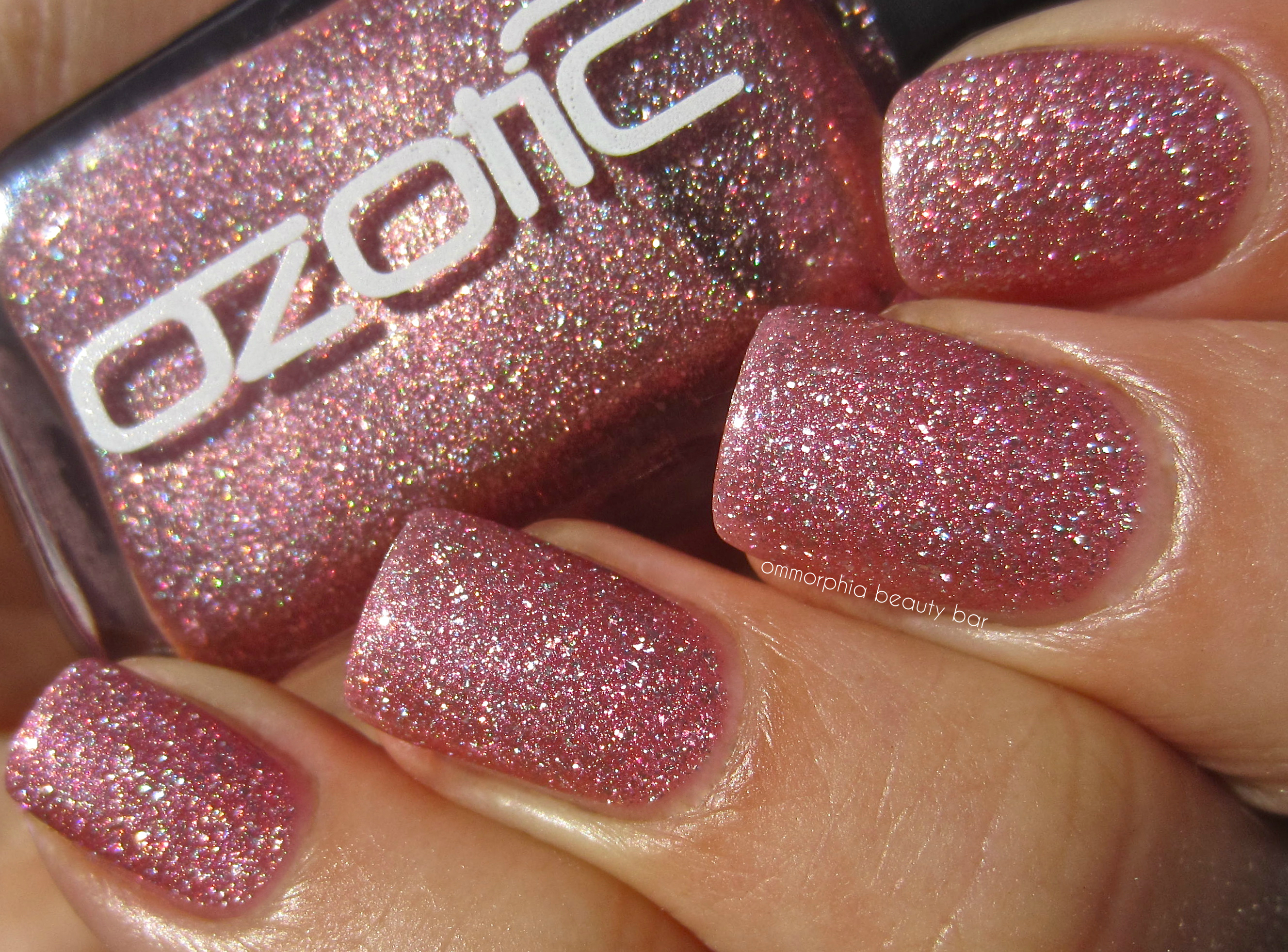
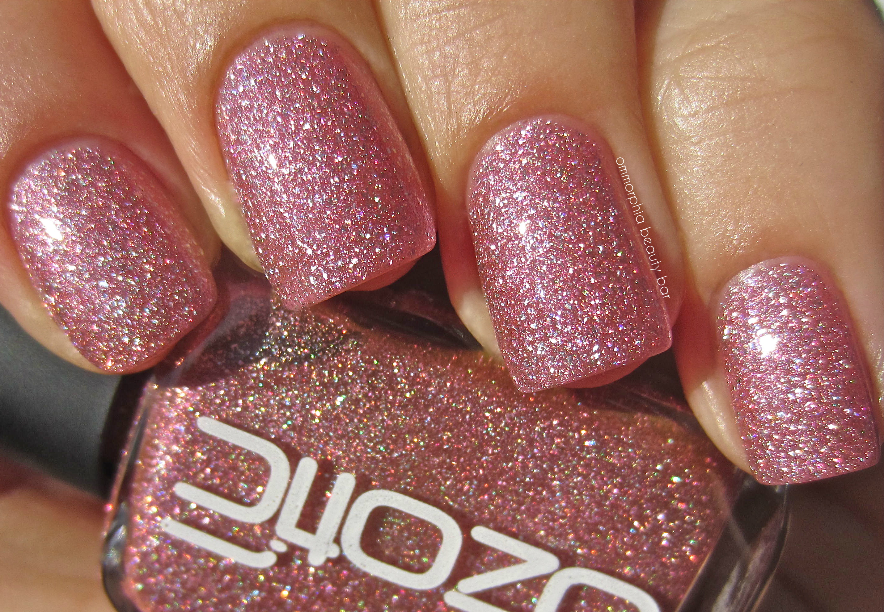
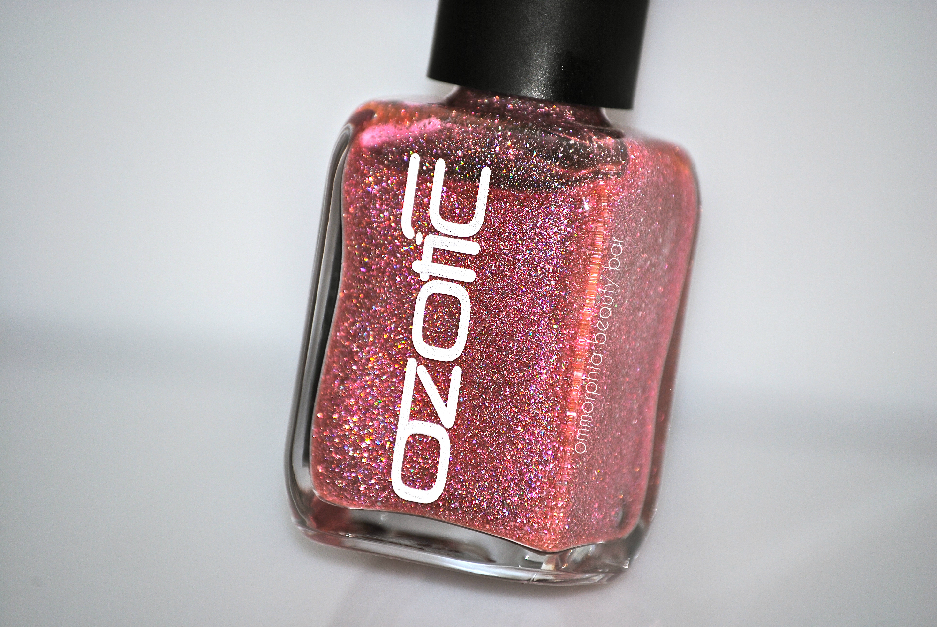
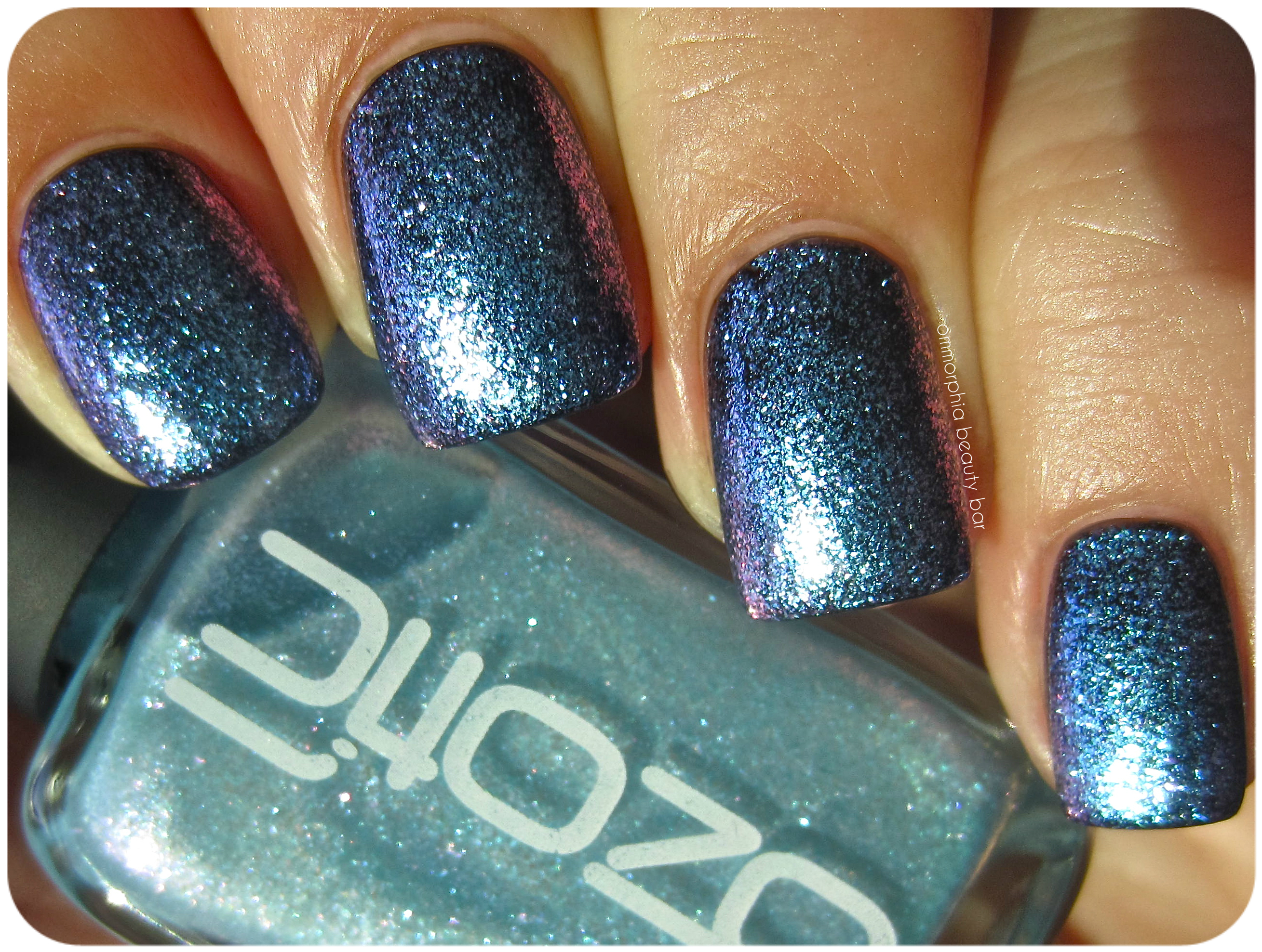
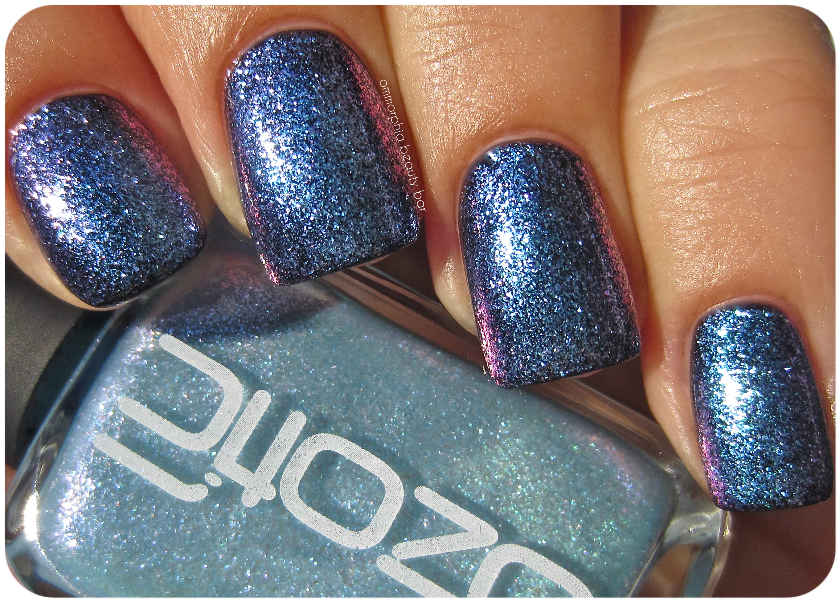
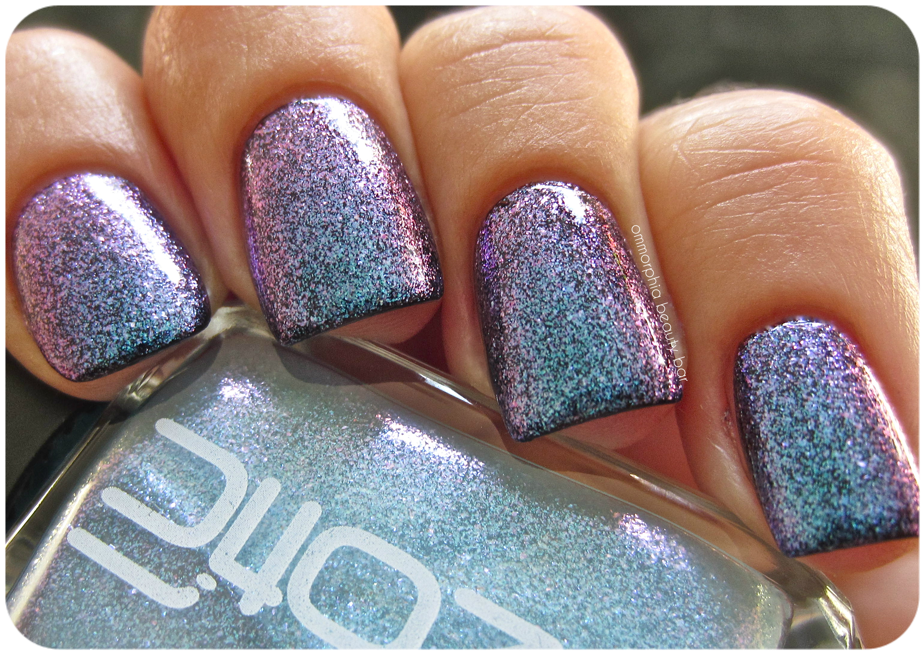
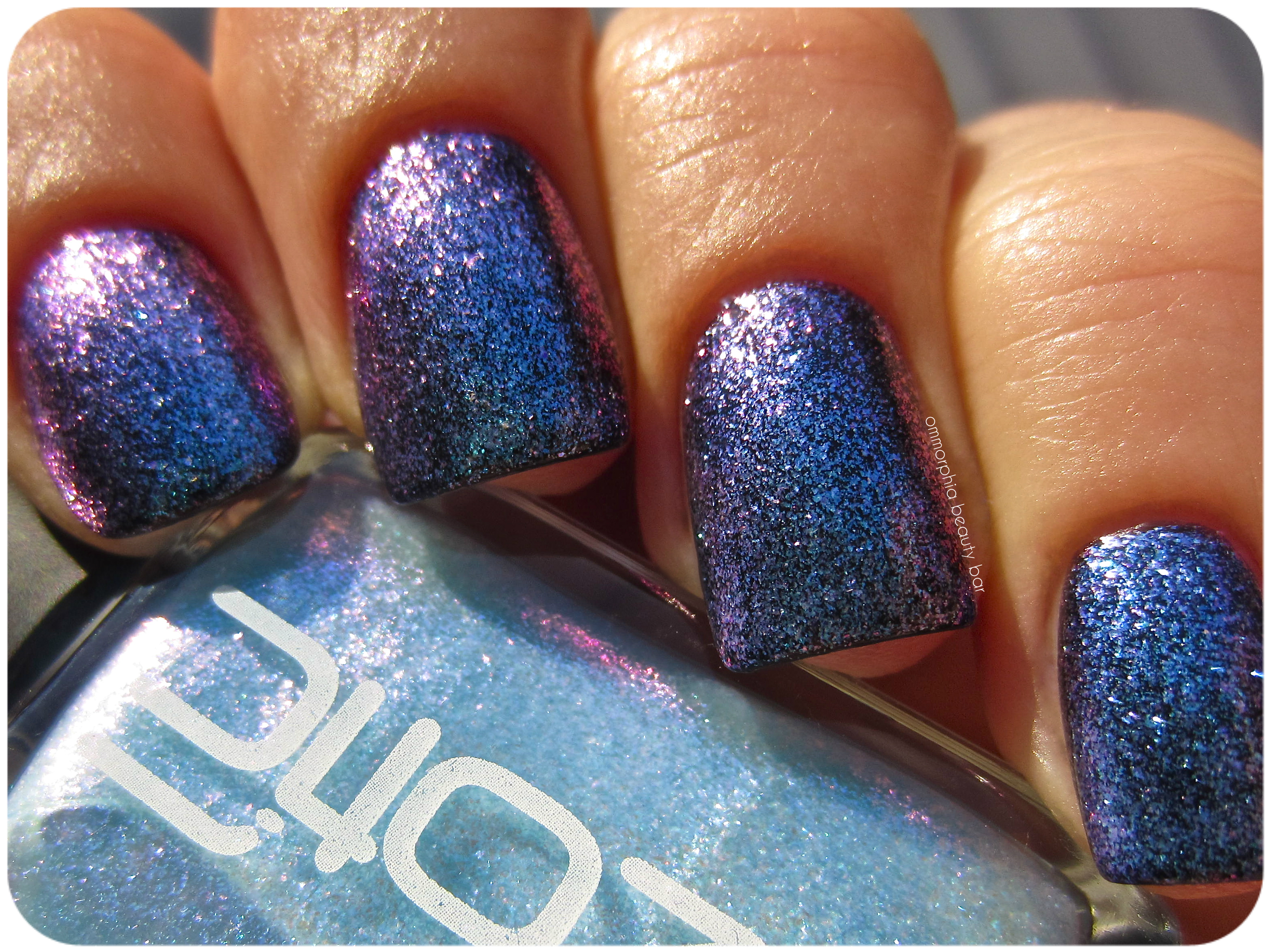
Ozotic by piCture pOlish #601 (CAD $14.50) – densely packed with finely ground pink and prismatic glitter, you’d be forgiven in not realizing that the base of this shade is actually clear. Worn alone, the look is one of dainty femininity, albeit the scattered holographic effect gives it a modern edge — layered over a dark solid hue, however, is the best way to bring out its multi-tonal refractions. Bearing an excellent formula that falls in a self-levelling and brush stroke-free manner, the finish is on the satin side and so benefits from the addition of top coat. Coats applied: 2, plus top coat (applied alone) and 1, plus top coat (layered over a black crème)
Ozotic by piCture pOlish – 601
Ozotic by piCture pOlish – 601
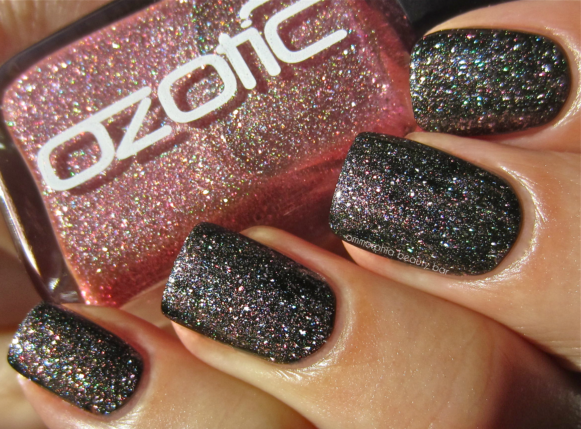
Ozotic by piCture pOlish – 601 (layered over a black crème)
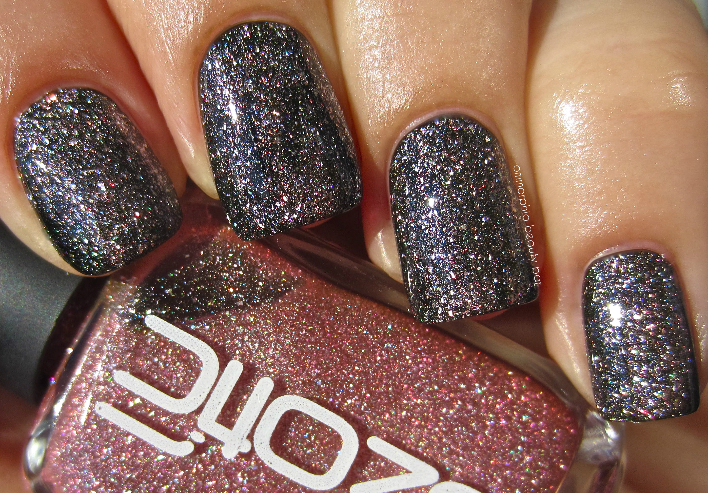
Ozotic by piCture pOlish – 601 (layered over a black crème)
cheap Cipro
cheap Clomid
cheap Cozaar
cheap Flagyl
Last word: If you’re a fan of pink as well as prismatic lacquers, then you need look no further than Ozotic by piCture pOlish #601 – it’s got all that and more, in one bottle. With a superb formula and all the layering possibilities available – or not, depending on your personal preferences, this is a shade that I never expected to like as much as I did and I can’t wait to try it over other colours as well. Bottom line: a total win.
More information can be found on the piCture pOlish/Ozotic website, or via twitter, facebook, Pinterest and Instagram
*Disclosure: Product sample provided by the company/PR for my unbiased consideration


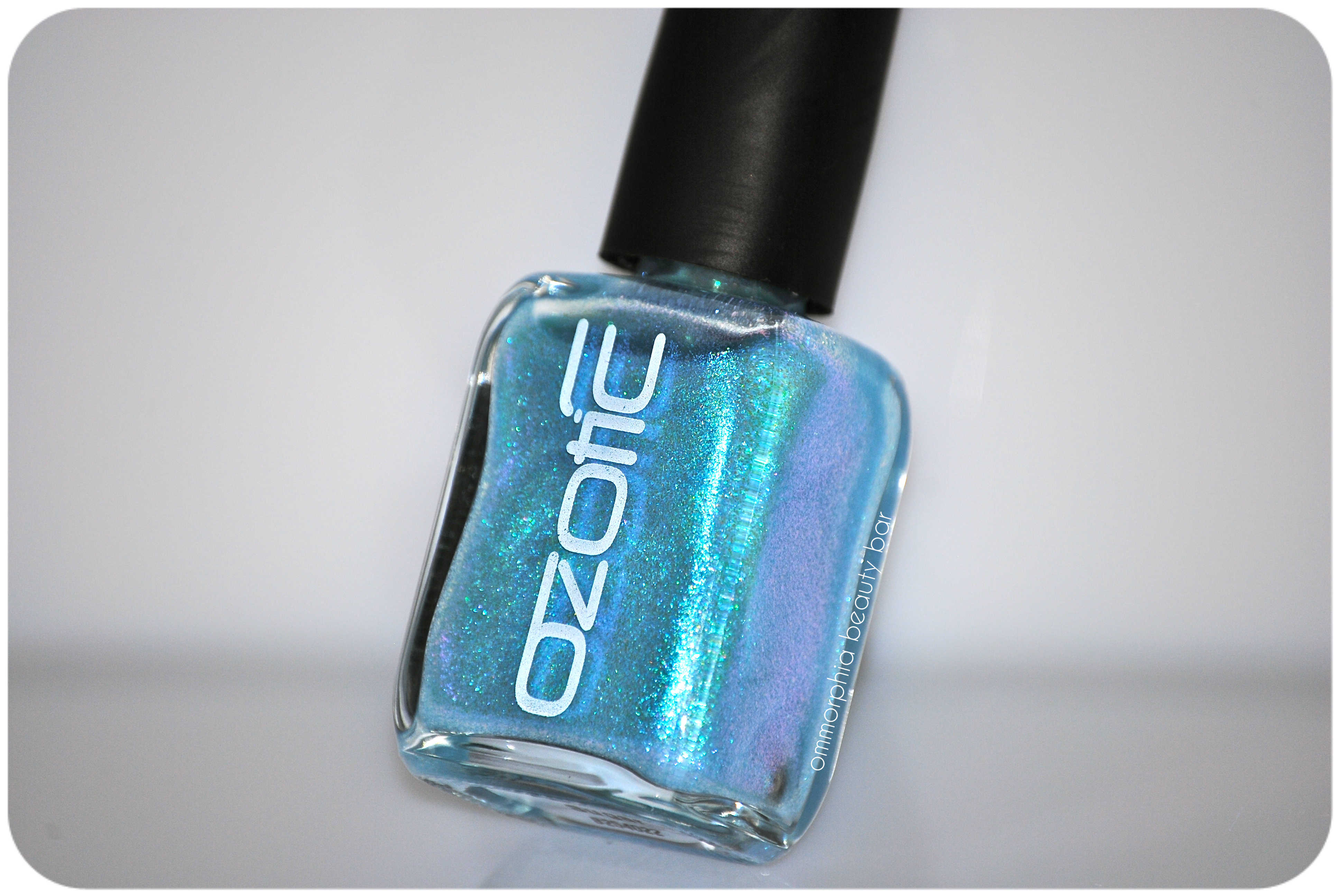
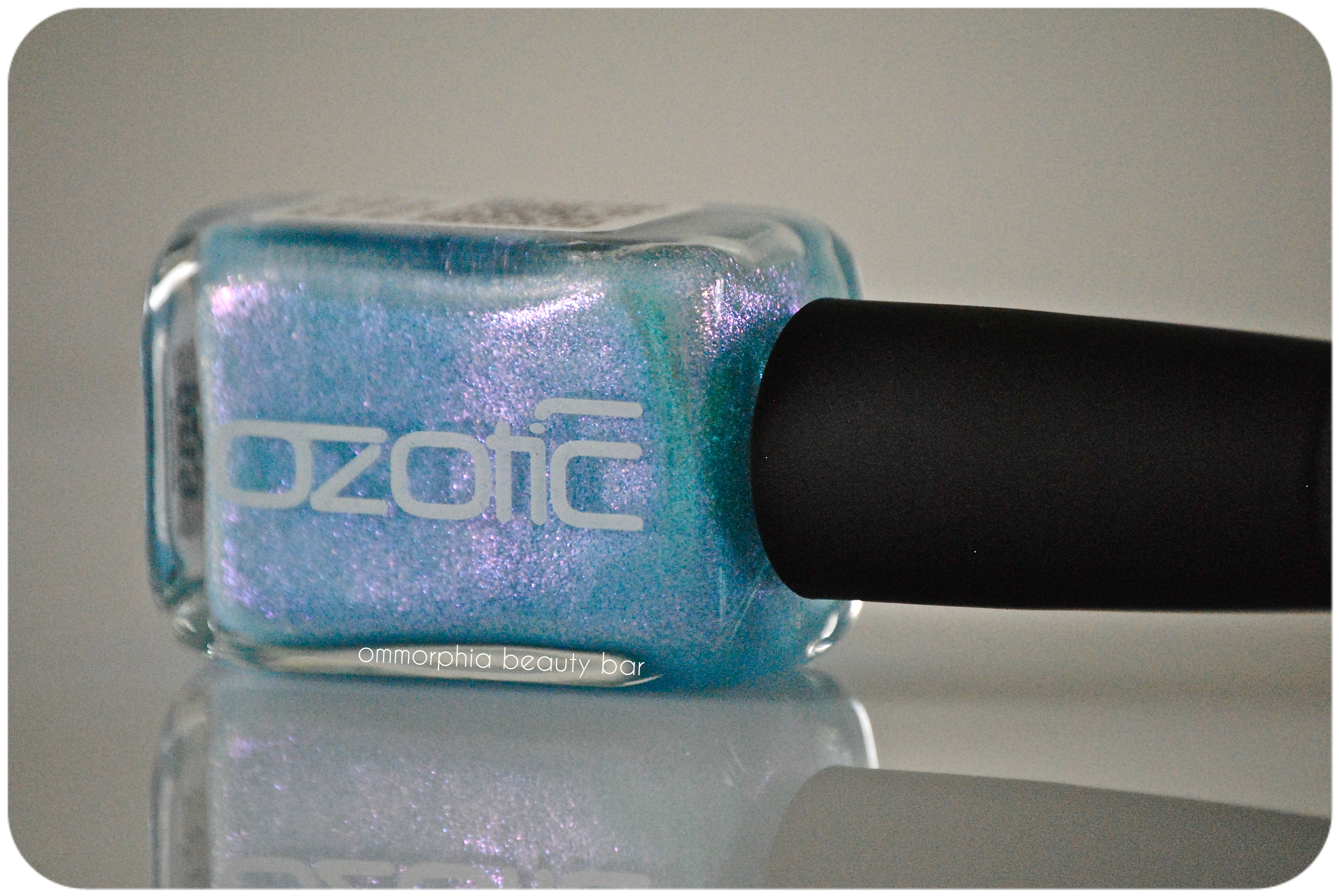
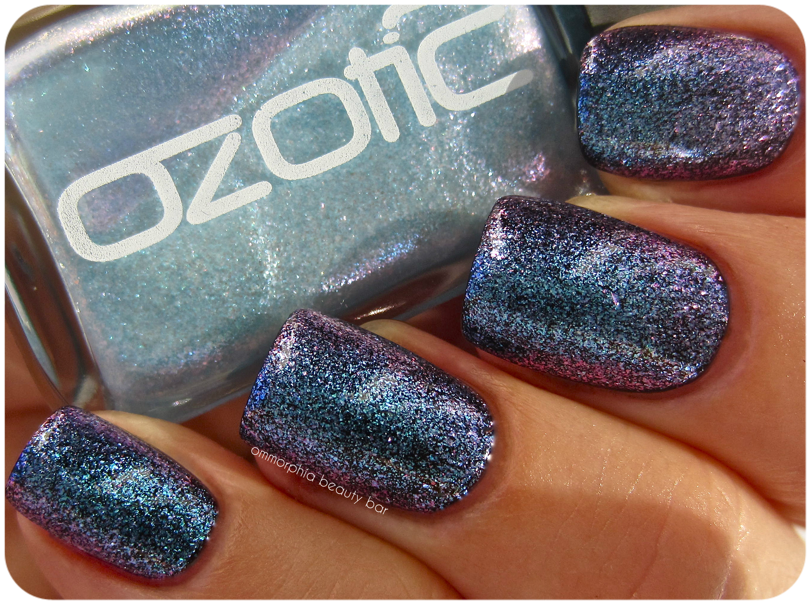
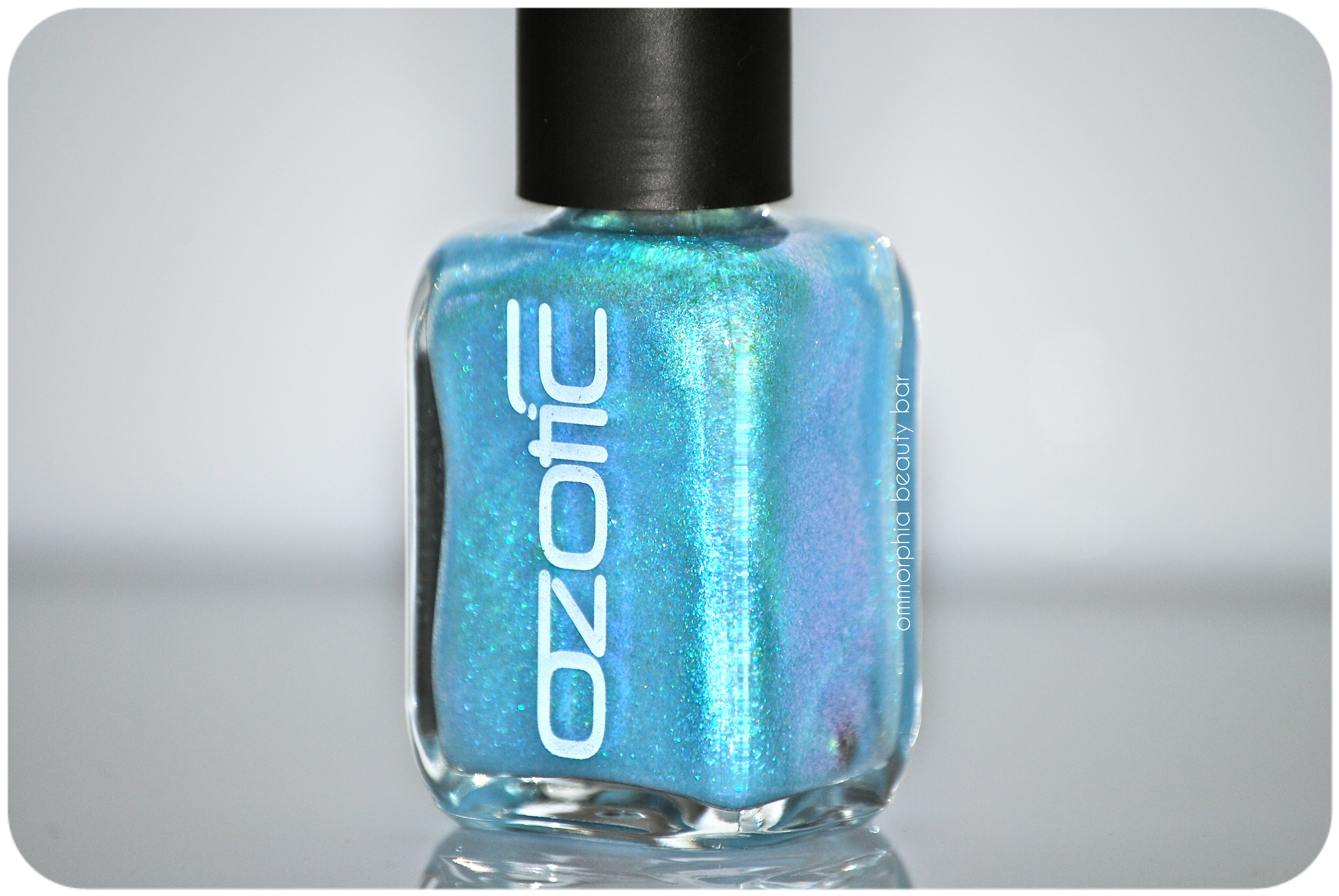
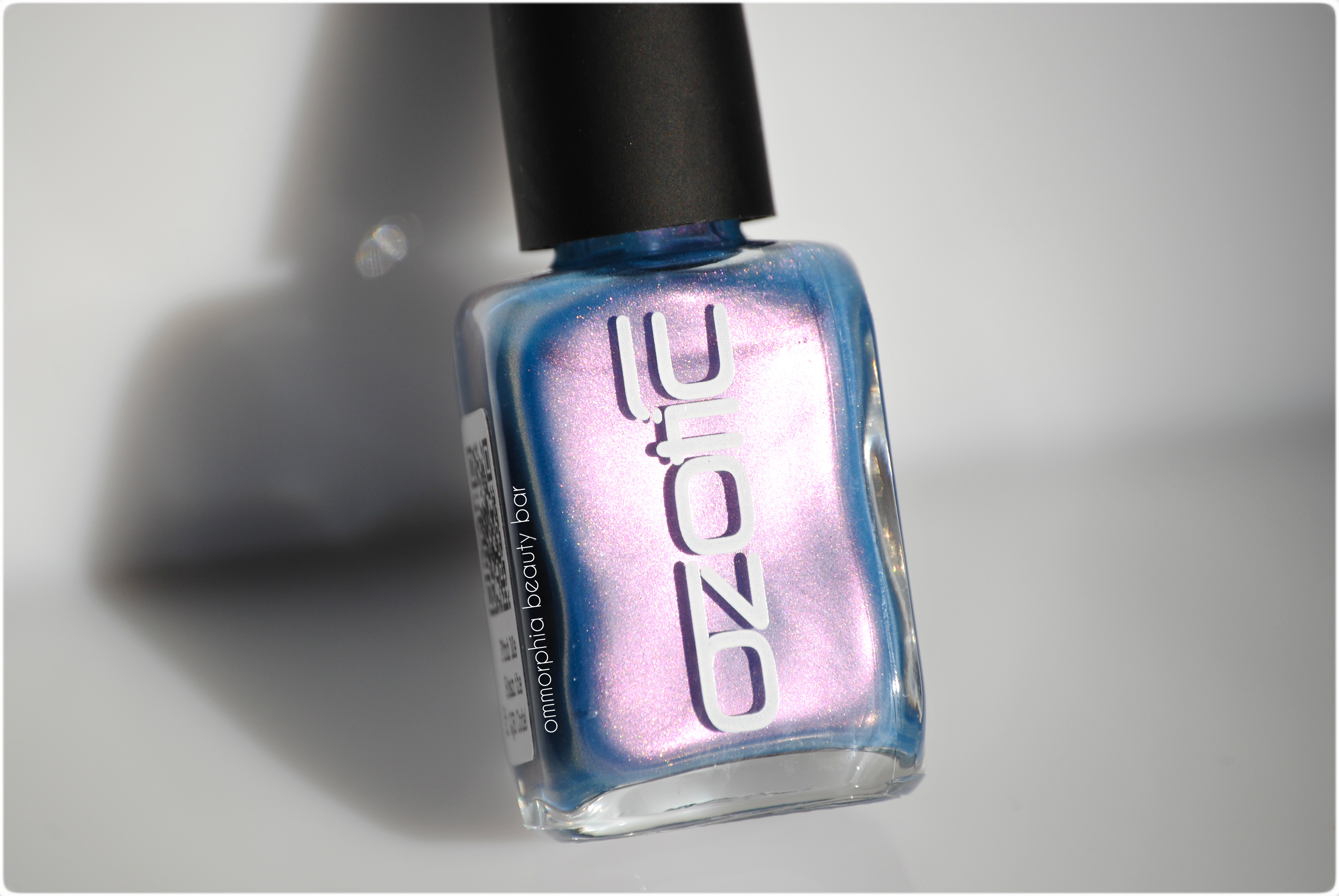
Ozotic by piCture pOlish – Sugar #903
Looking at Ozotic by piCture pOlish Sugar #903, you’d be forgiven in thinking that it’s just a shimmery sky blue shade, because that’s exactly what it looks like.
In the bottle.
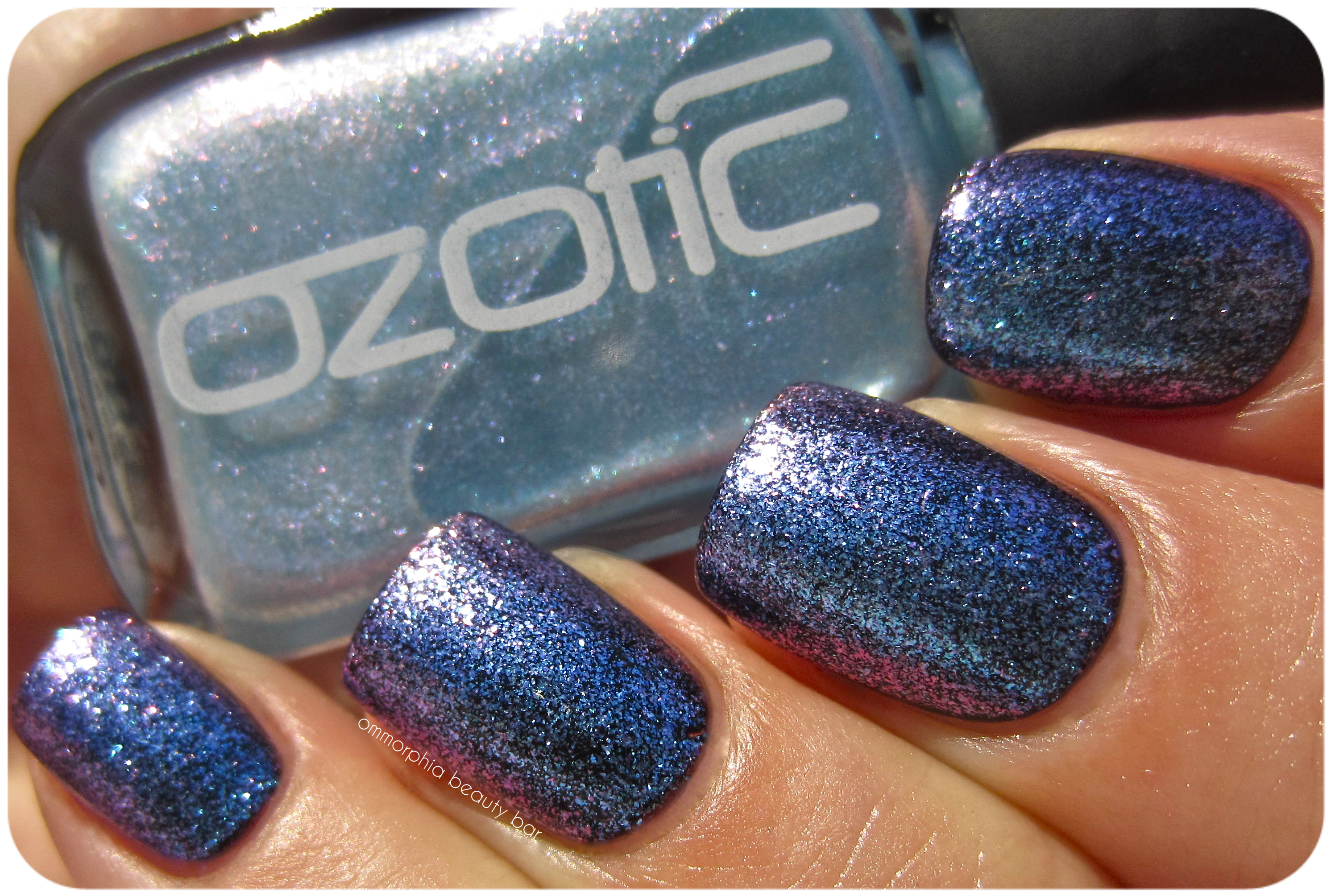
Applied, however, it morphs into something completely magical, displaying colours you had no idea were even there. On its own, this shade is delicate & ethereal – one might even say ‘fairy-like’ (so cheesy, but I swear that’s what it made me think of), but layer this baby over a deeper shade and … sit back and enjoy the light show.
Ozotic by piCture pOlish – Sugar #903
Ozotic by piCture pOlish – Sugar #903
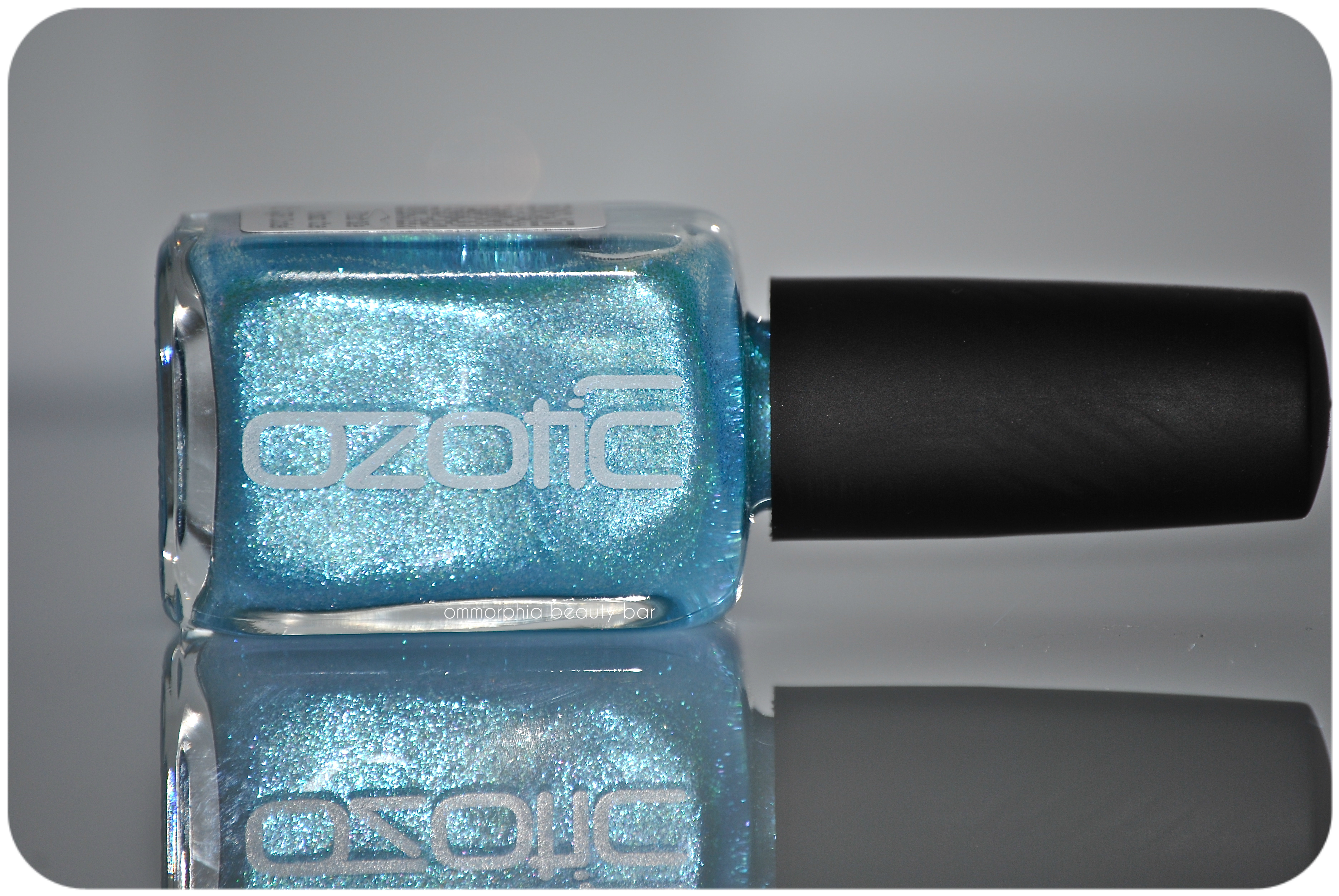
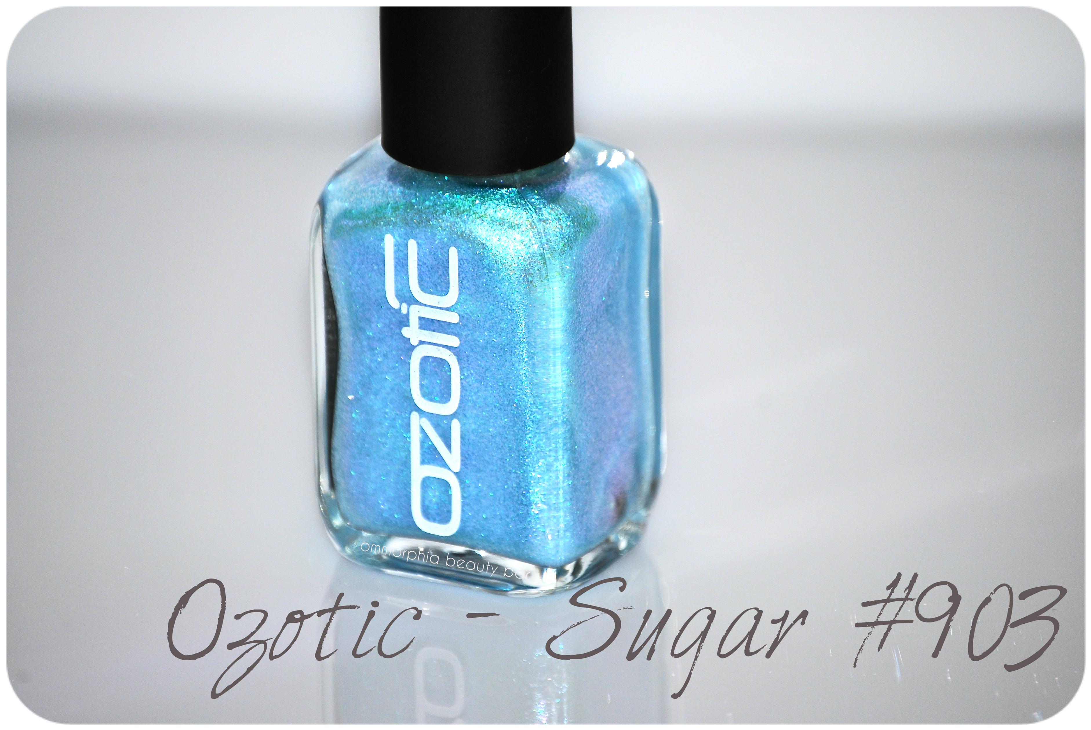
Sugar #903 (CAD $14.50) – a sky blue to violet duo chrome pearly shimmer, in a mid-thick viscosity formula that is paradoxically ridiculously easy to work with, as it lays down exactly where you want it to go – no sliding around or pooling at the cuticles. Quick drying and smooth to the touch, there’s a brilliant natural shine at the finish. The following swatches are all 1 coat of Sugar #903 over a black crème, plus top coat.
*Note: appearing more as a “multi” than “duo” chrome, the effect is visible no matter the lighting or angle, ranging from the iciest blue shade, to petal pink, and all the way to vibrant purple — truly spectacular!
Ozotic by piCture pOlish – Sugar #903
Ozotic by piCture pOlish – Sugar #903
Ozotic by piCture pOlish – Sugar #903
Ozotic by piCture pOlish – Sugar #903
Ozotic by piCture pOlish – Sugar #903
Ozotic by piCture pOlish – Sugar #903
Last word: It’s not often that a lacquer surprises me, so I was totally unprepared for everything this beauty had to show. Admittedly, worn alone, this shade doesn’t draw as much attention – unless you happen to like an understated shimmery look. In my opinion, worn over a black hue (or any dark colour) is the way to go if you want impact – serious, mega impact, at that.
cheap Soma
cheap Strattera
cheap Trazodone
cheap Ventolin
More information on piCture pOlish/Ozotic products can be found on the website, or via twitter/facebook, Pinterest or Instagram
*Disclosure: Product sample provided by the company/PR for my unbiased consideration
Ozotic by piCture pOlish #910 Scattered Chrome

Ozotic by piCture pOlish #910 of the Scattered Chrome Series is pure & unadulterated luxury. I mean, just LOOK AT IT. Simply viewing the bottle contents, you know that you’ll be in for something absolutely extraordinary, and even if you’re not a fan of brilliant lacquers, I dare you to look away from the incredible brilliance and beauty of this shade.
Told you so …

Ozotic by piCture pOlish – #910 Scattered Chrome

Ozotic by piCture pOlish – #910 Scattered Chrome

Ozotic by piCture pOlish – #910 Scattered Chrome

#910 Scattered Chrome – a rich oxidized bronze multi-chrome base hue punctuated by scattered holographic particles. Starting from the absolutely STELLAR formula, the first coat lays down slightly sheer, but becomes completely opaque by the second layer. Brush stroke-free and with a brilliant natural finish at the end, this complex shade bears an initial deep golden look which displays an eerie green hue along the edges, as well as blue tints at certain angles. Then there are the prismatic flashes that give off a unique iridescence all their own … spectacular, I tell you! Similar to CHANEL’s cult favourite ‘Peridot’ (reviewed here), OPI’s ‘Just Spotted The Lizard’ (reviewed here), and China Glaze’s ‘Rare And Radiant’ (reviewed here), #910 stands apart due to its holographic additions. Note that this lacquer can also be layered over a dark base, but I definitely prefer the look on its own. Coats applied: 2, no top coat

Ozotic by piCture pOlish – #910 Scattered Chrome

Ozotic by piCture pOlish – #910 Scattered Chrome

Ozotic by piCture pOlish – #910 Scattered Chrome
cheap Fluoxetine
cheap Levitra Professional
cheap Topamax
cheap Wellbutrin

Ozotic by piCture pOlish – #910 Scattered Chrome

Ozotic by piCture pOlish – #910 Scattered Chrome
Last word: From the Ozotic by piCture pOlish lacquers I’ve tried so far, this shade is hands down my absolutely favourite. In turn blinged-out, sophisticated, complex, and fun, #910 Scattered Chrome offers something for every taste and every skin hue – equally flattering to light as well as darker tones. Perfect for the warmer weather finally upon us, you’ll be sure to catch me sporting this shade throughout the Summer!
piCture pOlish and Ozotic products can be found through their website, twitter, facebook, Pinterest and Instagram

*Disclosure: Product samples provided by the company/PR for my unbiased consideration
Ozotic by piCture pOlish – #744

Ozotic by piCture pOlish may be a brand that is new to me, but I have long admired the line’s many unique shades & finishes – as initially seen from reviews by my fellow bloggers. If multi-tonal and/or duo chrome hues are your Achilles Heel, then you’re in luck, for something you will NOT find among the Ozotic range of lacquers, are your average mono-coloured or crème finishes.
All swatches are with base and top coats.
Ozotic #744 (in sunlight)

Ozotic #744 (CAD $14.50 11 ml) – a lavender base hue with an obvious pink/lilac duo chrome colour shift and random prismatic specks throughout. The medium-density formula is quite easy to work with, as the polish goes exactly where applied without any dragging or pooling – any would-be visible brush strokes are kept to a minimum. Its natural finish is quite shiny, although dry time seemed to take a little longer than average – be careful to not rush your coats. One thing that needs to mentioned, is that I found the brush wand to be a bit on the long side, which by itself wouldn’t necessarily be a bad thing, but the accompanying brush head is rather long and floppy as well, making for a tricky application. I suggest you load up your brush with polish, then try to apply as little pressure as possible when painting, for optimum effectiveness.
The versatility of this lacquer is something I appreciate as well; the first two swatches (figs. 1 & 2) are 2 coats of #744 over a ridge-filling base coat, whereas the last two swatches (figs. 3 & 4)are 1 coat of Ozotic #744 over the inky blue base of nails inc. ‘Belgrave Place’. In my opinion, when #744 is left on its own or layered over a light/white base, the colour shift is at its strongest and gives of an almost ethereal effect. Layered over a deep blue/dark base may take away from the duo chrome flash a bit, but the resulting colour is almost glowingly intense. Either way, it’s becomes something totally unique.
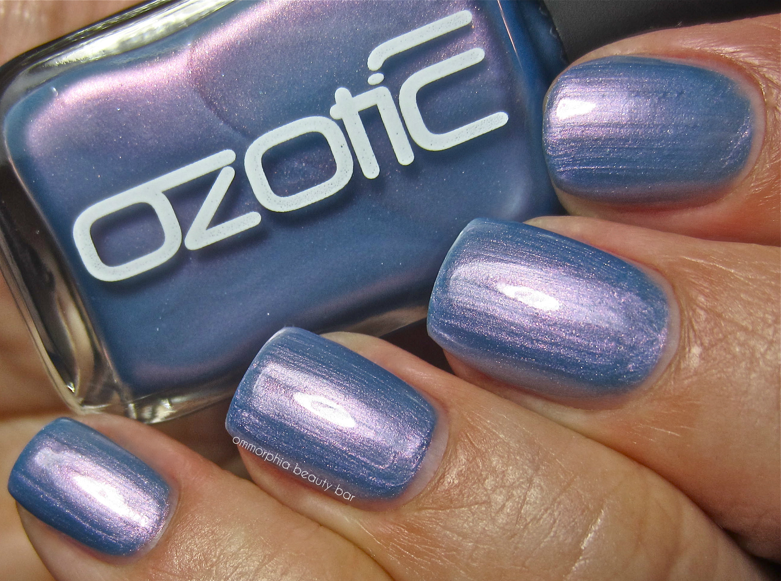
fig. 1 – Ozotic #744
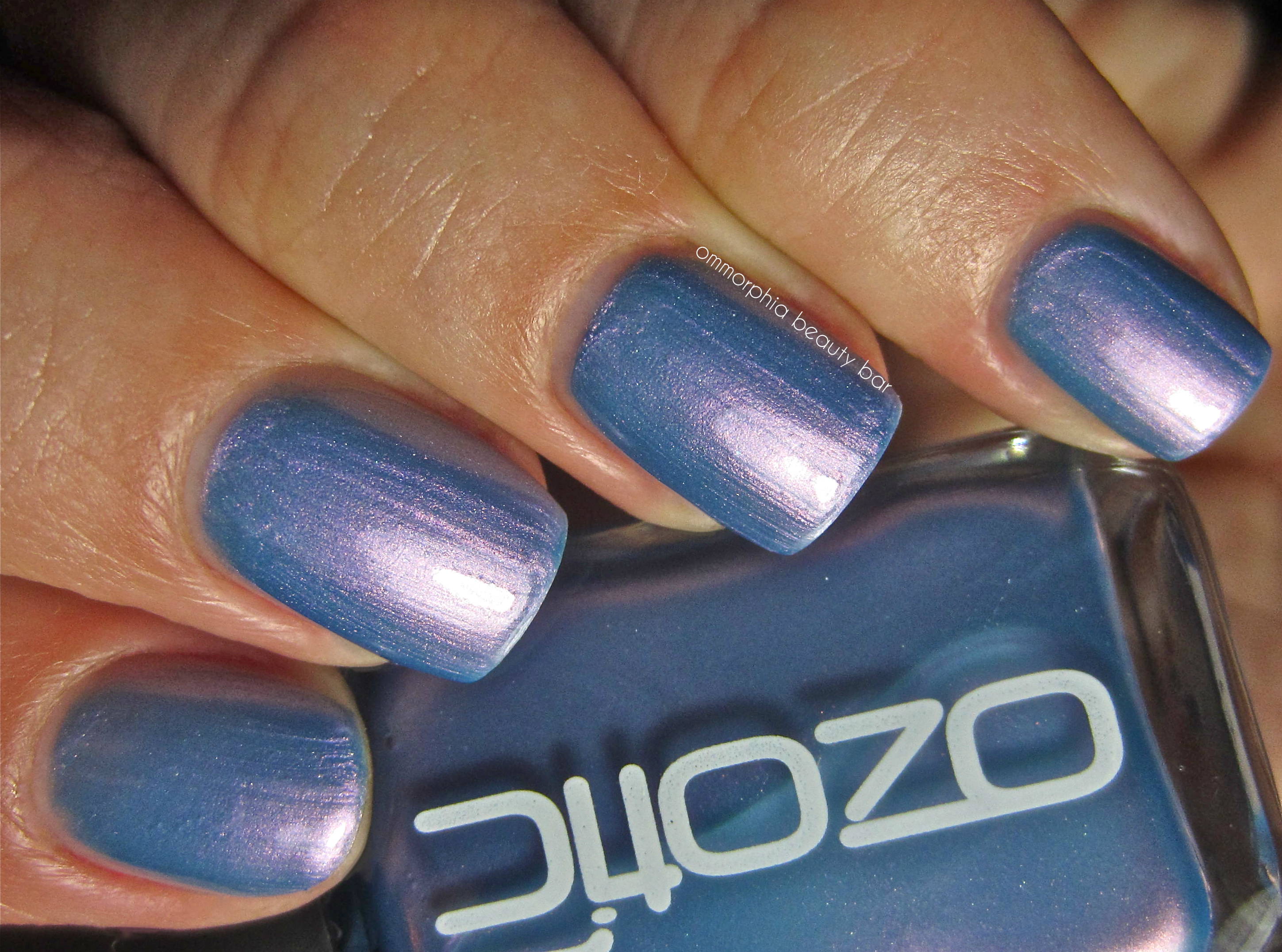
fig. 2 – Ozotic #744

fig. 3 – Ozotic #744 – layered over nails inc. Belgrave Place
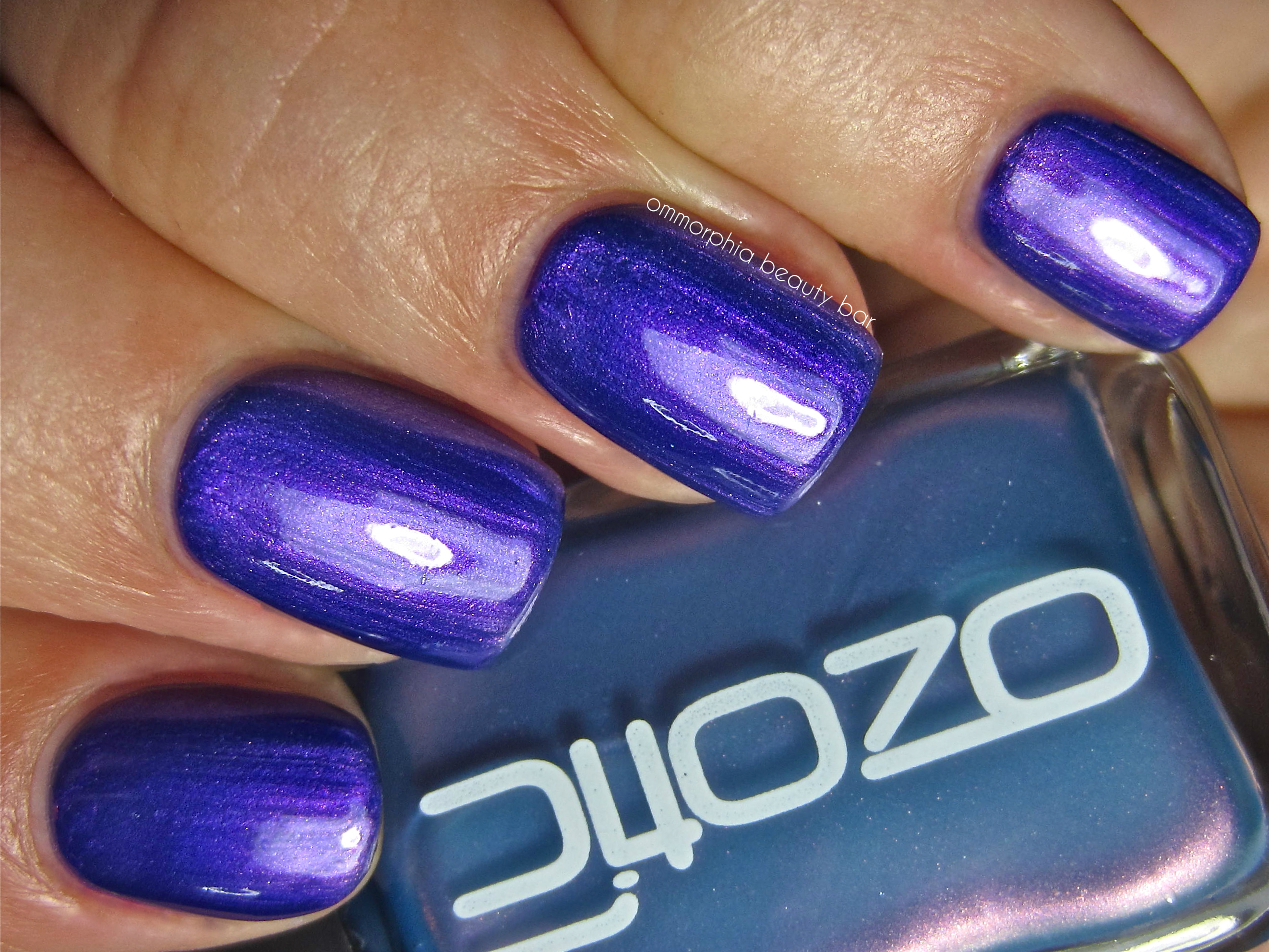
fig. 4 – Ozotic #744 – layered over nails inc. Belgrave Place
Last word: The last thing I expected to see, was the violet explosion of colour when #744 was applied over a darker base; even when worn on its own, I loved the melding of cornflower blue and flashes of dusky pink, while the fact that this pastel-looking shade proved completely opaque at 2 coats, was another nice and unexpected surprise. My only issue lies with the brush, something that definitely needs to be addressed and tweaked, as the present version can prove to be a little daunting in less experienced hands – not enough to be a deal-breaker, but definitely something to know in advance.
You can find the full range of piCture pOlish products through their website, or feel free to follow via twitter,facebook, Pinterest or Instagram
*Disclosure: Product sample provided by the company/PR for my unbiased consideration


