
Monthly Archives: January 2013
Korres – a special event!
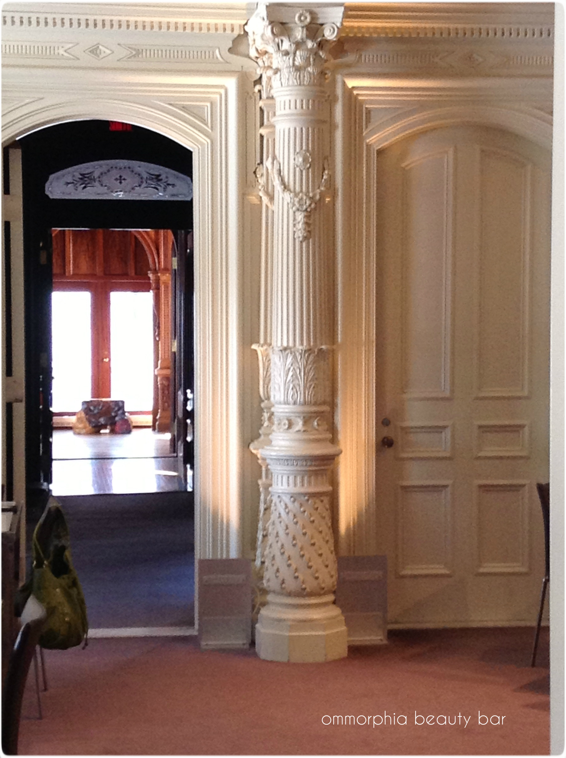
On Wednesday, January 23, 2013, I was invited to attend an extraordinary press event hosted by the Zoï Agency in honour of Greek Cosmetics brand Korres who celebrates their 15th anniversary this year, and where it was my extreme privilege to meet co-founder Lena Korres. This event was held at Montréal’s Canadian Centre for Architecture, a museum of architecture and research housed in the Shaughnessy Mansion originally built in 1874, with many of its impressive architectural details now restored to their original state by the Centre.
EDIT: I wanted to add that Korres will actually be celebrating their 17th anniversary this year, and not their 15th as originally stated.
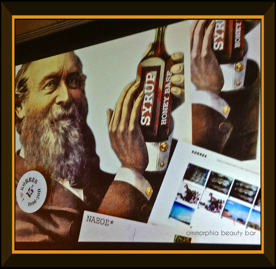
We were greeted by Lena Korres herself, who subsequently took the podium and entertained us with interesting details of the Korres brand’s history, beginning with the dream of “making creams” that founder George Korres originally wished for at 8 years of age. Fast forward 15 years later, and not only has that dream been realized, but this brand is quickly becoming a worldwide force to be reckoned with, as their reputation for providing organic & effective products, spreads. They’ve certainly come a long way from the production of their first product, a naturopathic cough syrup (see opening image).
Following the presentation, we then served a buffet-style luncheon consisting of traditional Greek fare with modern touches: moussaka, kebab skewers, salad with feta cheese, and several more dishes besides. The tables of the beautiful dining area, located in rooms of the original mansion with all details lovingly restored, were decorated with simple & elegant vases of vibrant red amaryllis blossoms. Finally, we were treated to desserts in the same traditional Greek style, with an assortment of mini baklava, loukoumia – powdered & jellied Greek delicacies, and cups of fresh Greek yogurt sprinkled with Greek honey, pomegranate seeds & walnuts.
I was fortunate enough to be able to spend some quality time with Lena Korres, and it was an absolute pleasure to be able to converse with her in our native Greek – it somehow made the entire event so much more personal for me, and it felt like ‘home’. As the brand’s spokesperson, they could not have chosen a better representative: eloquent, gracious and brimming with positive energy are just some of her attributes, but it is her flawless complexion that literally keeps you riveted: I want my skin to look like that! A few quick questions revealed that the only products she does use are Korres, naturally, with an emphasis on the Wild Rose daytime moisturizer, the Yoghurt range, and the Quercetin & Oak anti-aging regimen.
All too soon, the event wrapped up and saying goodbye with hugs & kisses (we are Greek – that’s what we do!), I gave Ms. Korres my word that I would definitely look her up on my next visit to Greece for that personal tour of the plant we spoke of. As a final token of appreciation, we were presented with fabulous gift bags containing an assortment of Korres products as well as a lovely glass container with a porcelain cover, which I have already put to good use on my vanity. It’s a given that I’ve already made inroads on the products we were gifted with, which happen to be some of my personal favourites.
buy celexa online infobuyblo.com/celexa.html no prescription
I hope you enjoy the following photos showing some of the highlights of the day!
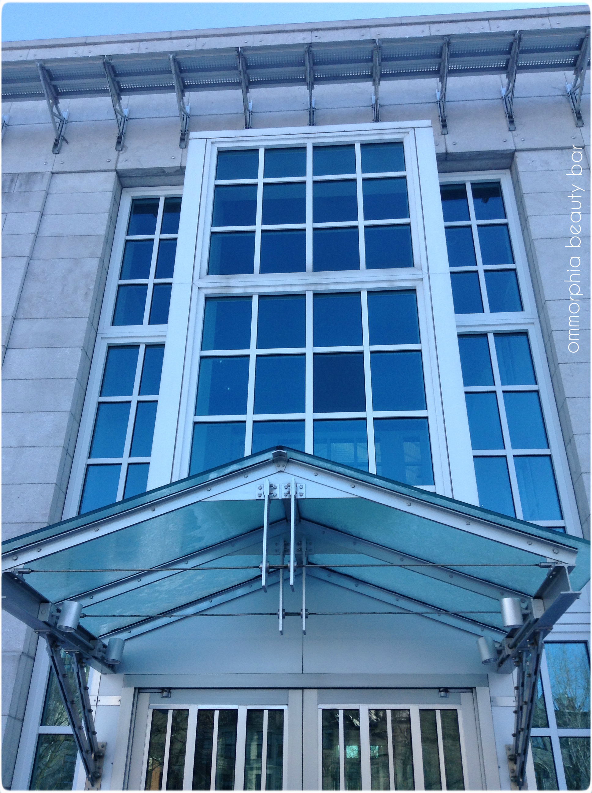
Canadian Centre for Architecture
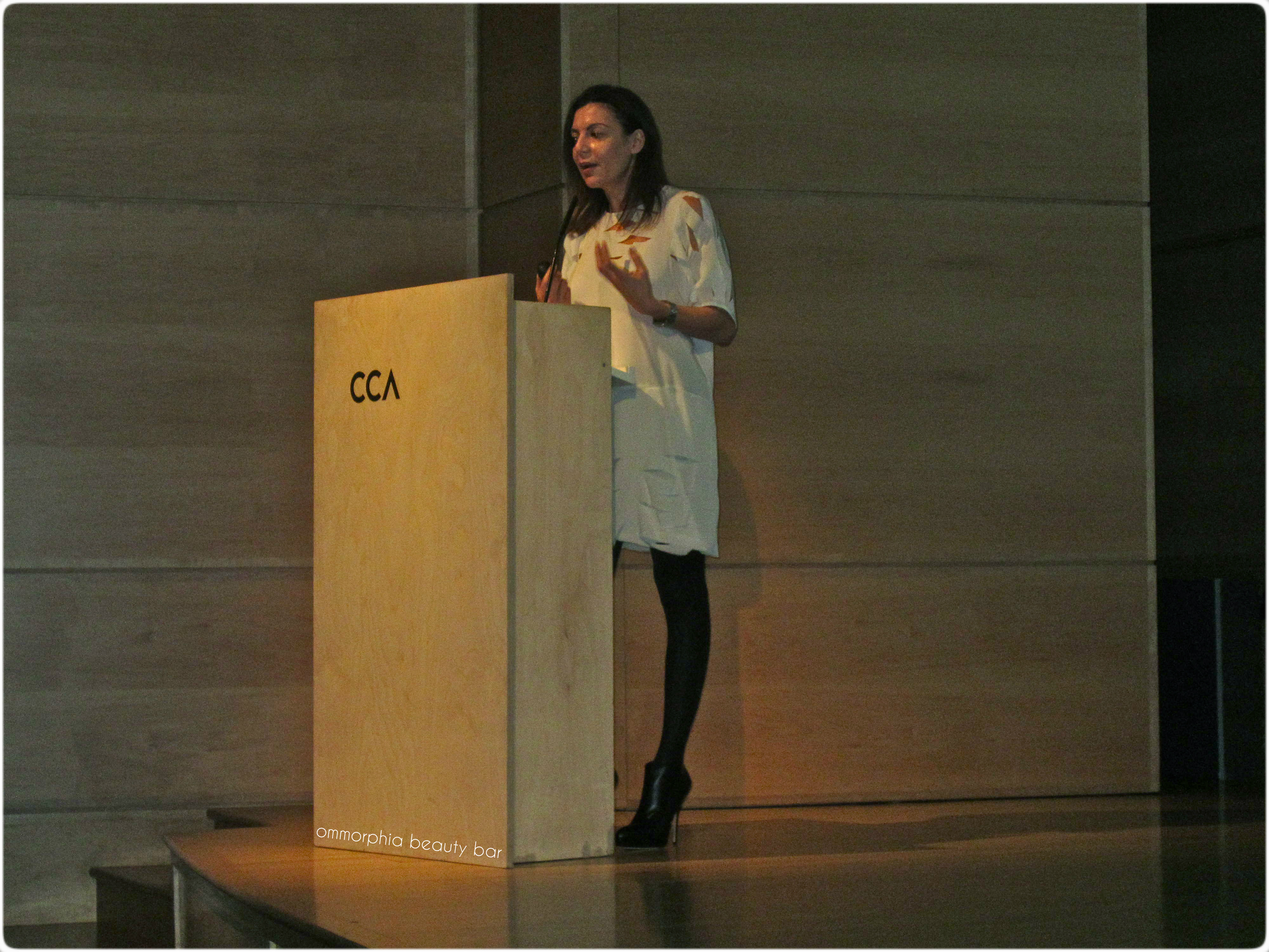
Guest of honour: Lena Korres at the podium

founder George Korres at eight years old
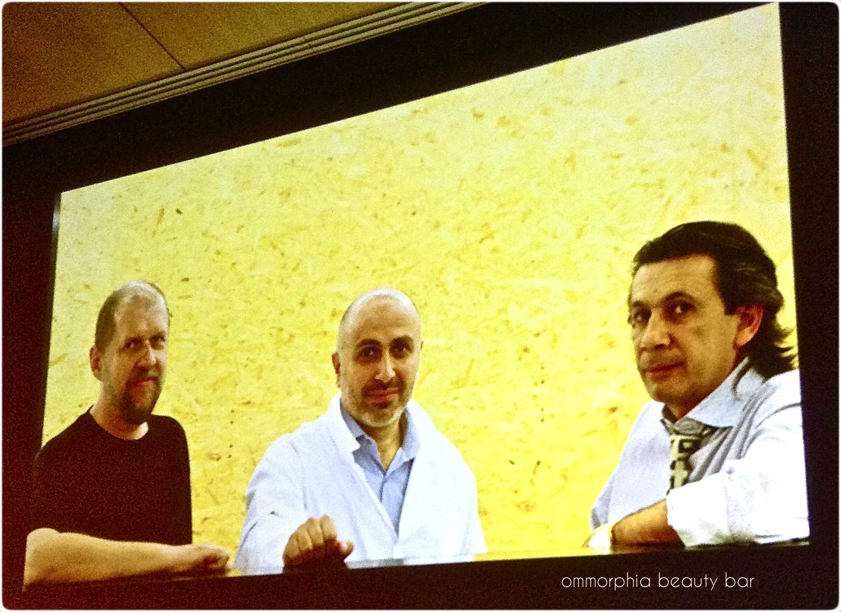
George Korres (center) and members of his creative/development team
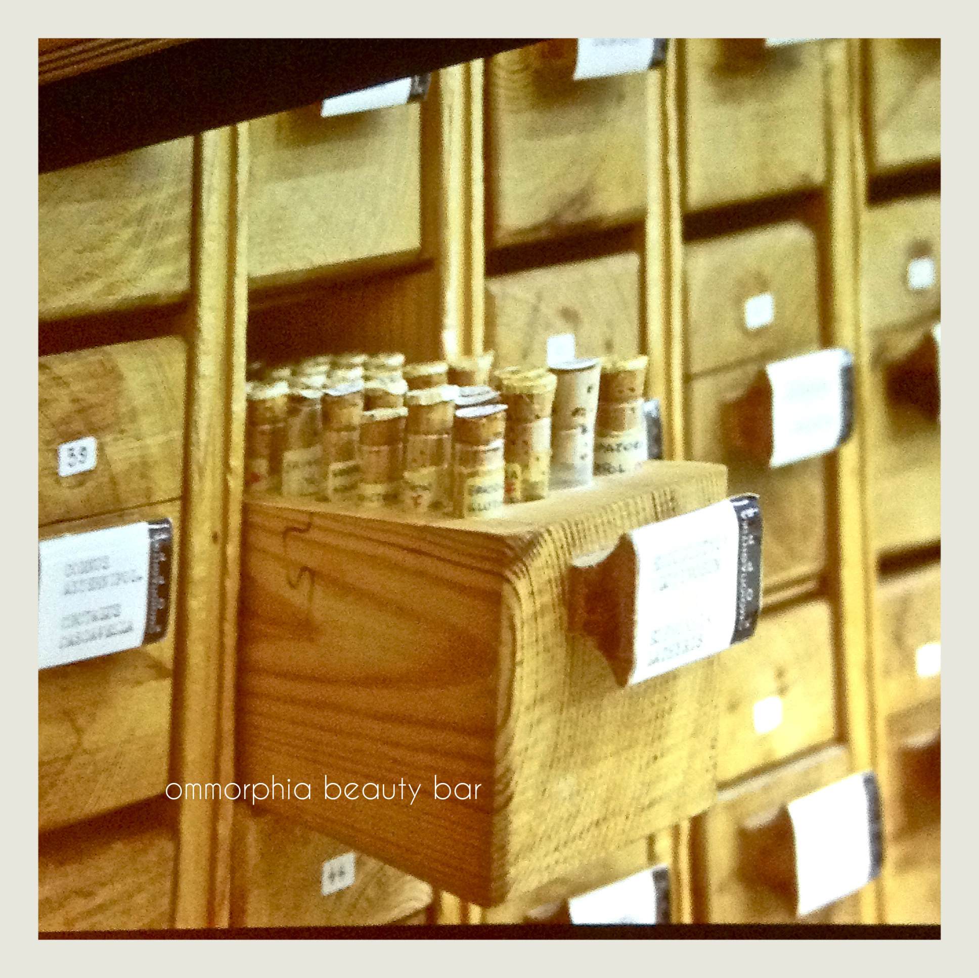
original pharmaceuticals/botanicals at the Korres archives
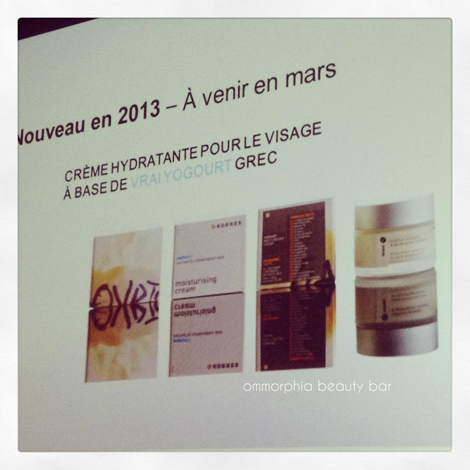
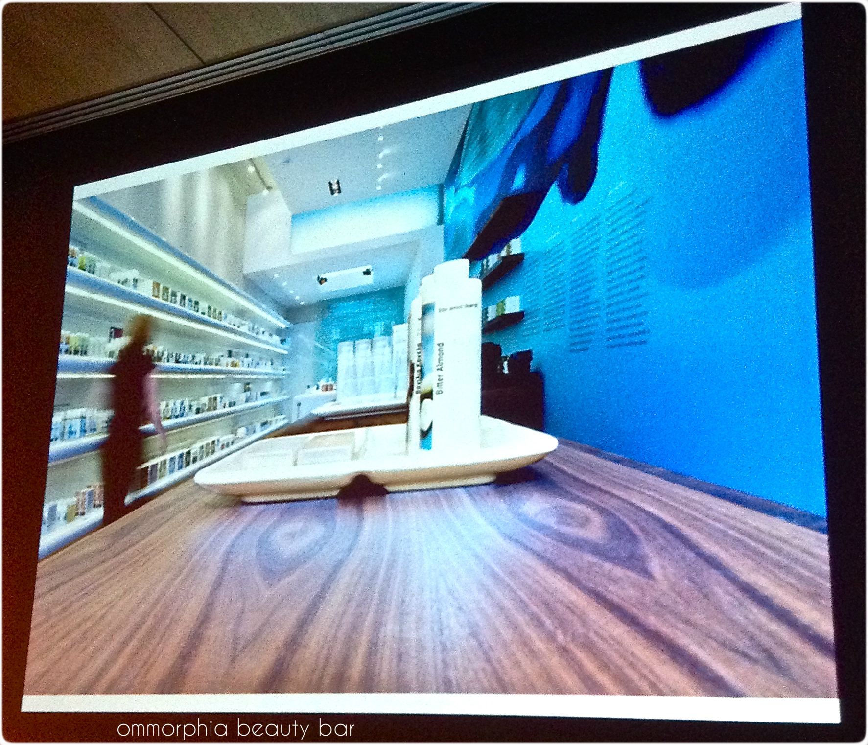
still image of upcoming 2013 product launches
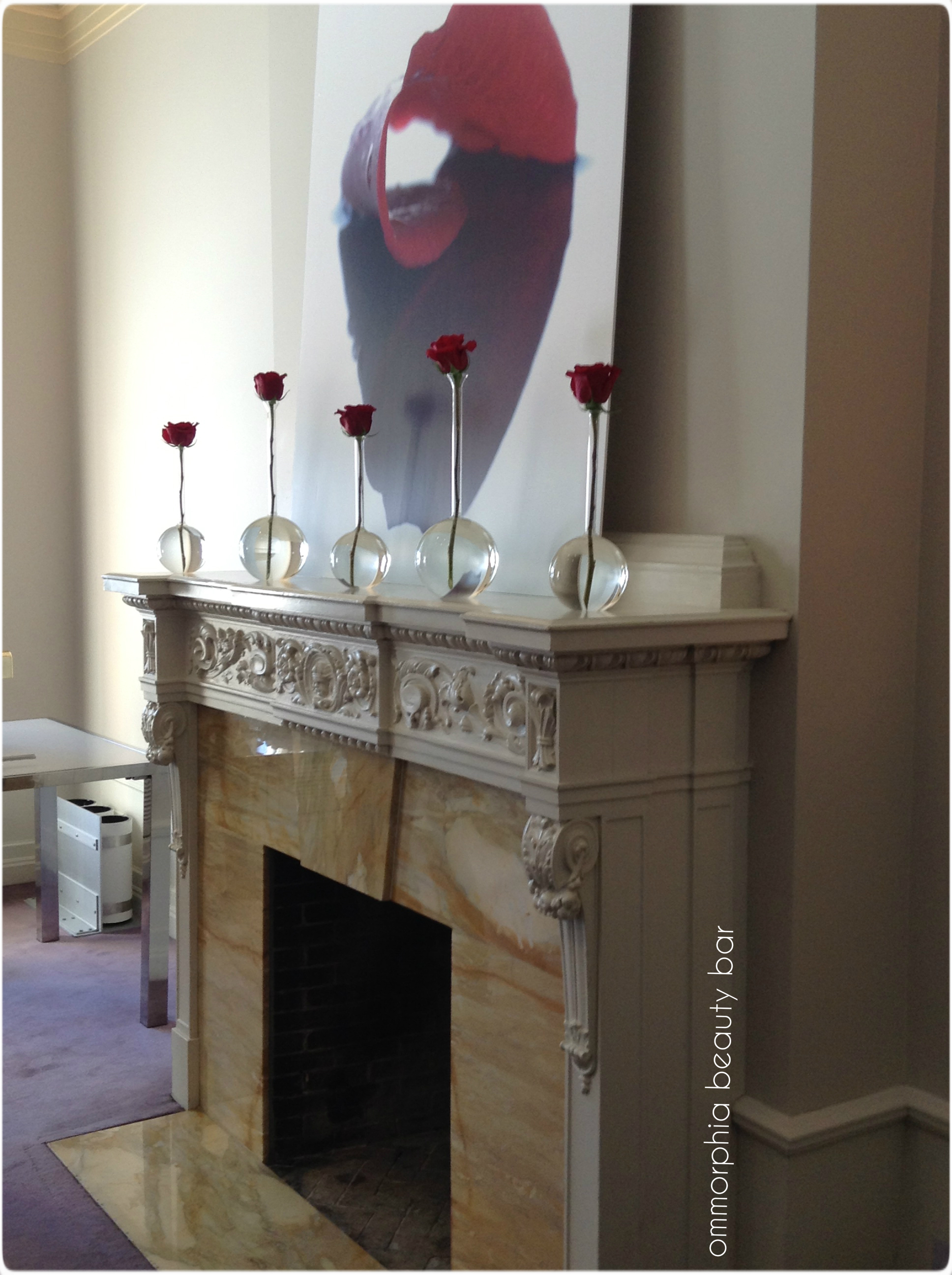
fireplace with original scrolled detail mantle, luncheon anti-chamber
a view of the spectacular architecture in the dining area
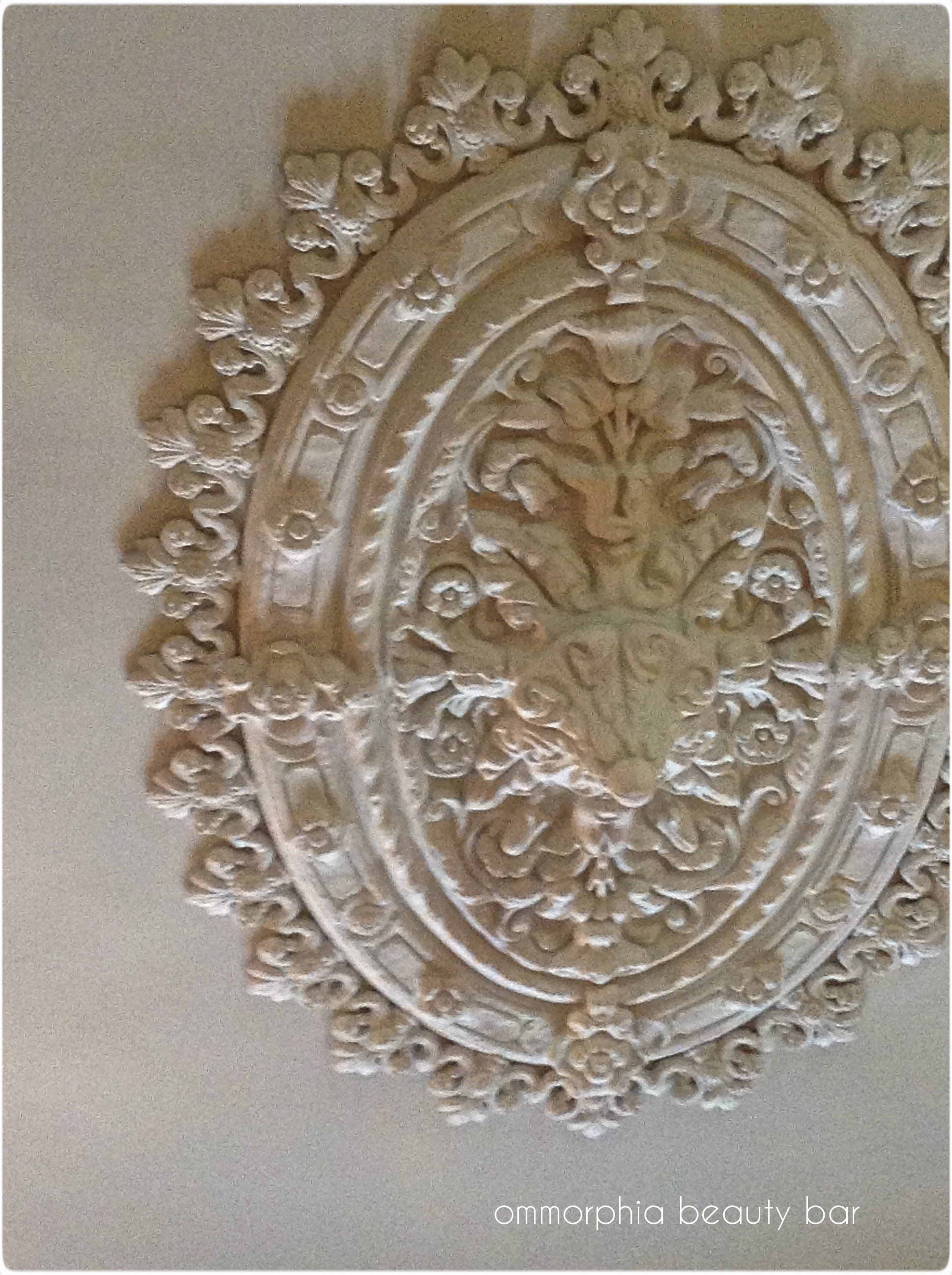
original sculpted ceiling medallion in the dining area
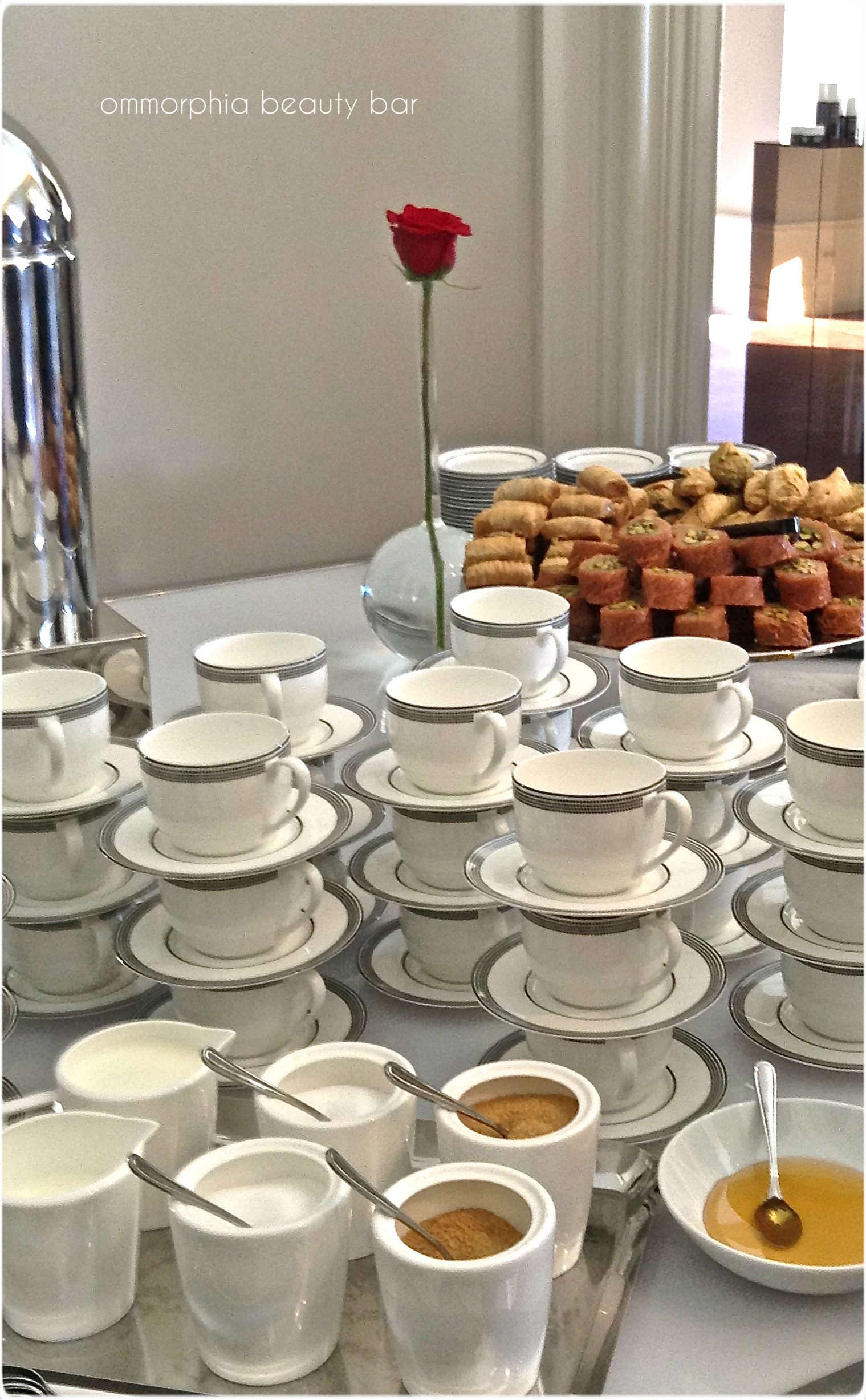
stacks of coffee/tea cups!
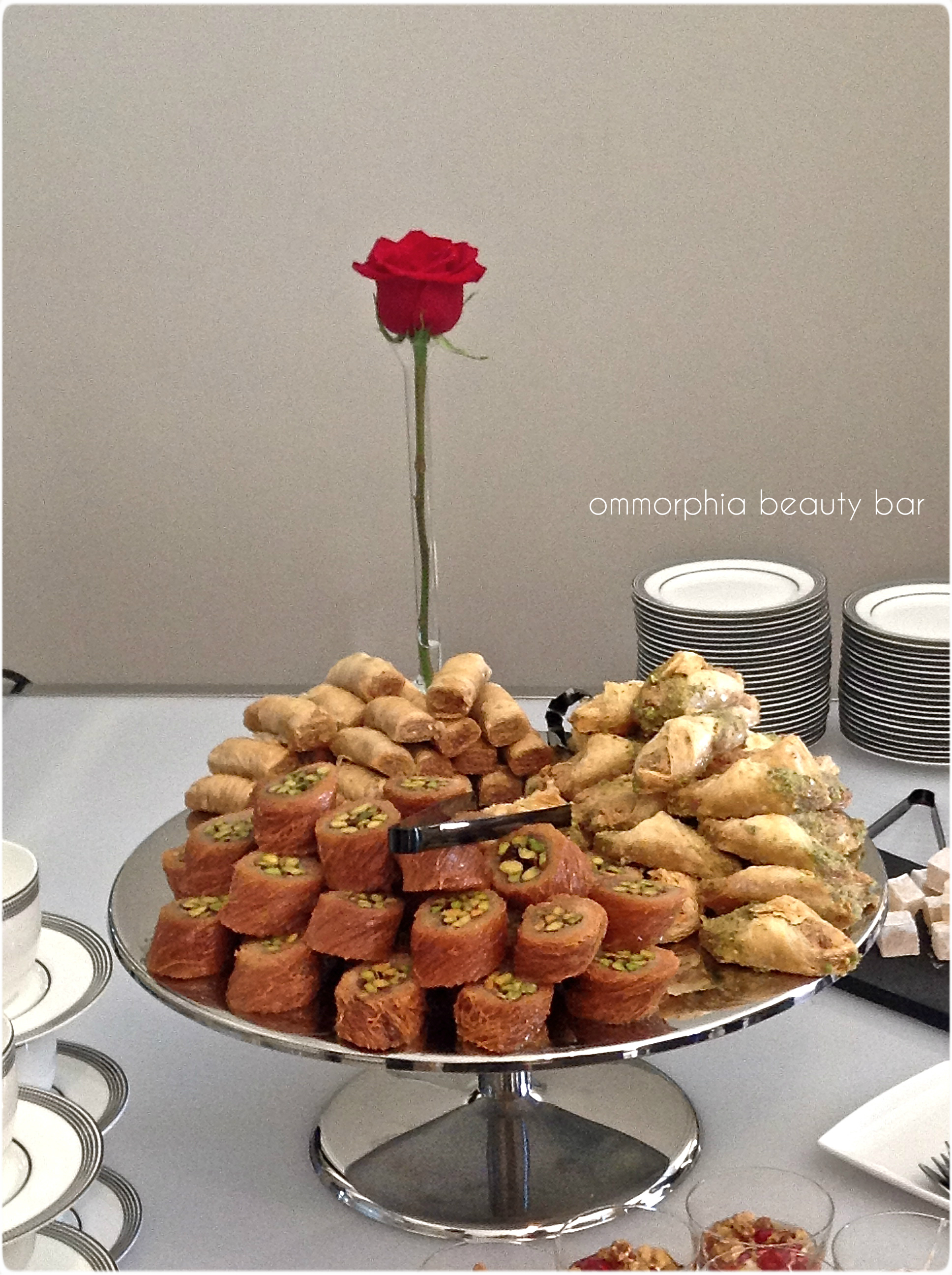
artful display of mini baklava treats
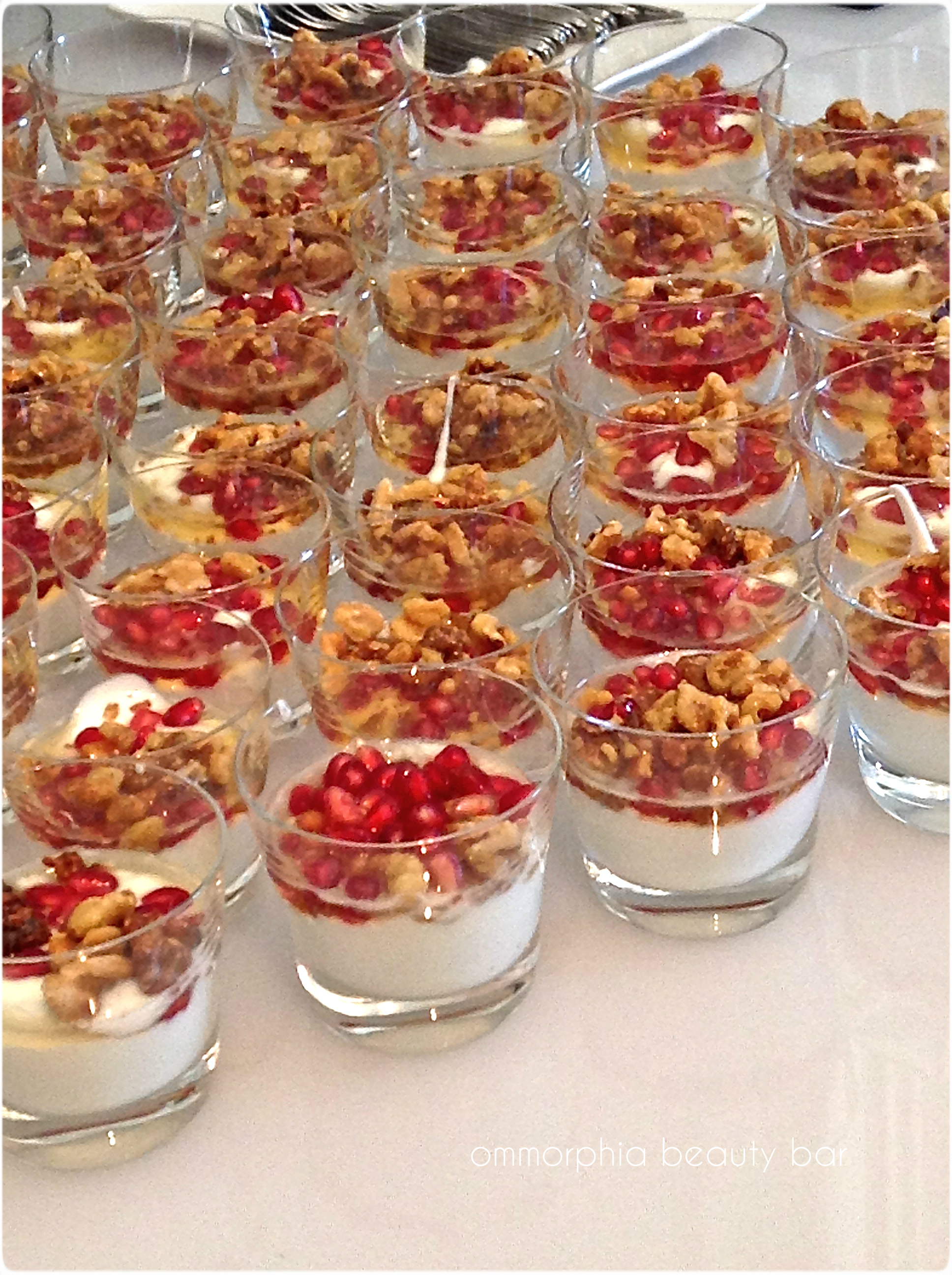
Greek yogurt cups sprinkled with Greek honey, pomegranate seeds, and walnuts

A Greek delicacy: Loukoumia – jellied dessert cubes

Korres products vignette – Wild Rose
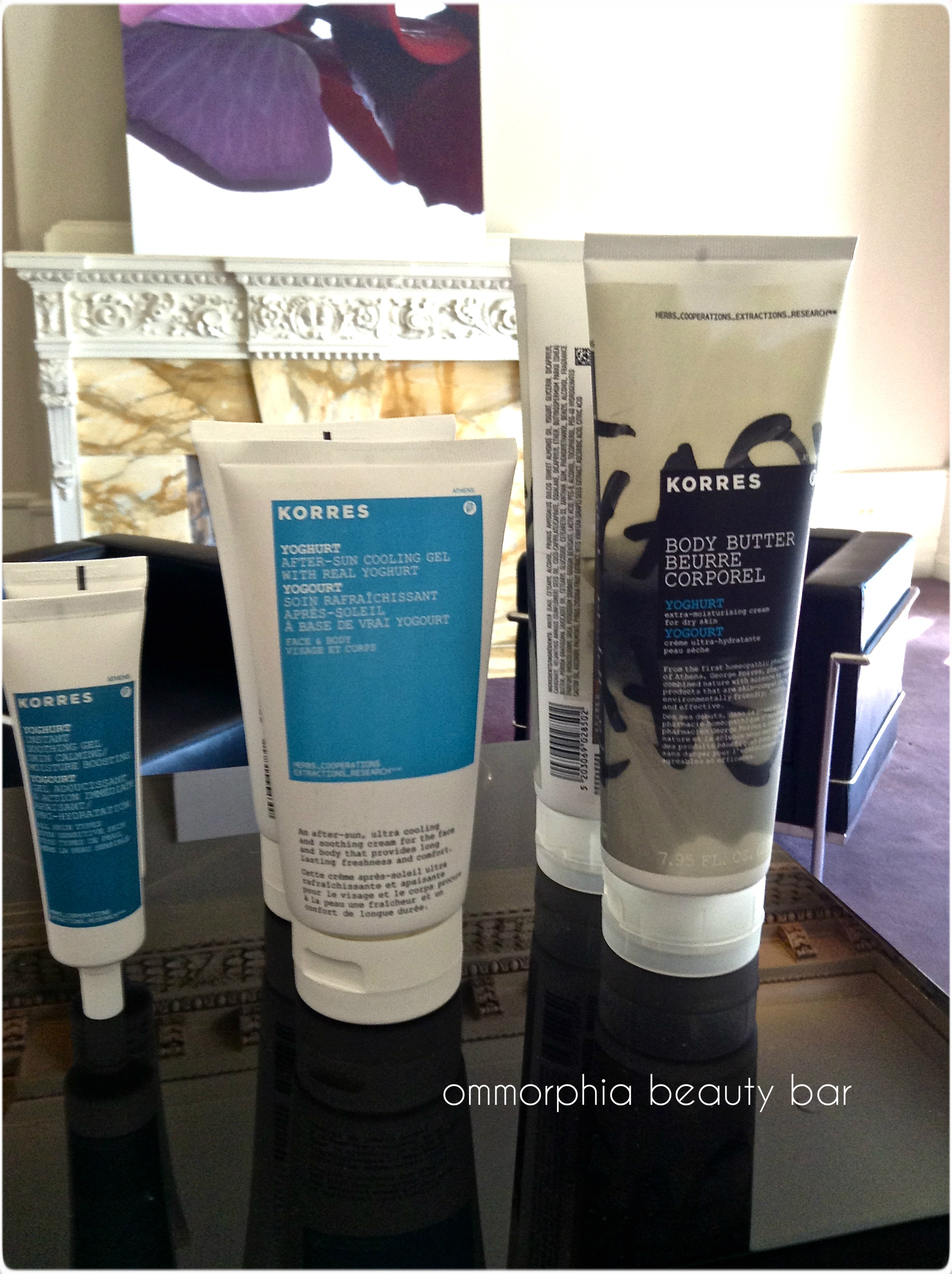
Korres products vignette – Yoghurt
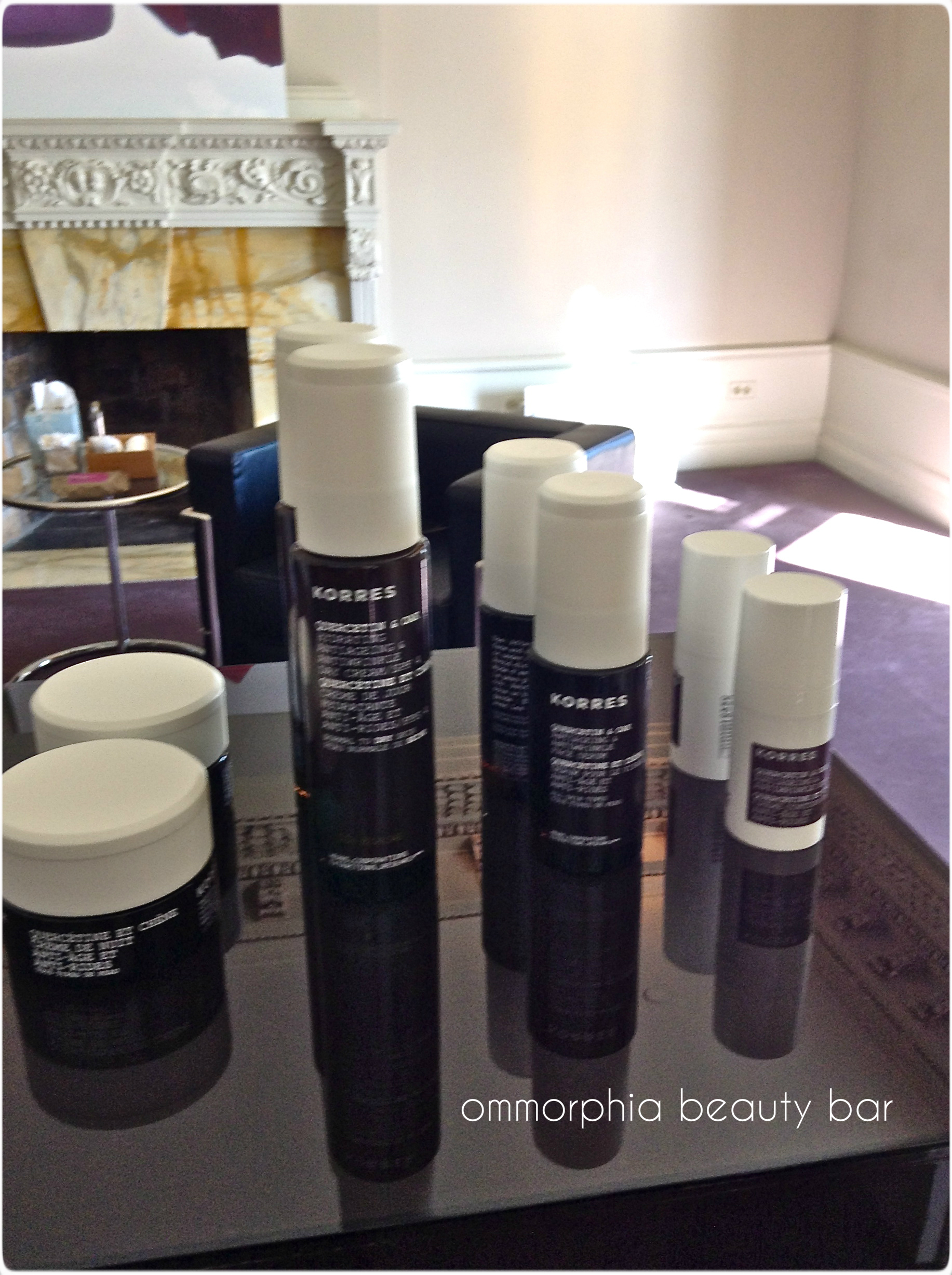
Korres products vignette – Quercetin & Oak

Korres Products vignette – assorted best sellers
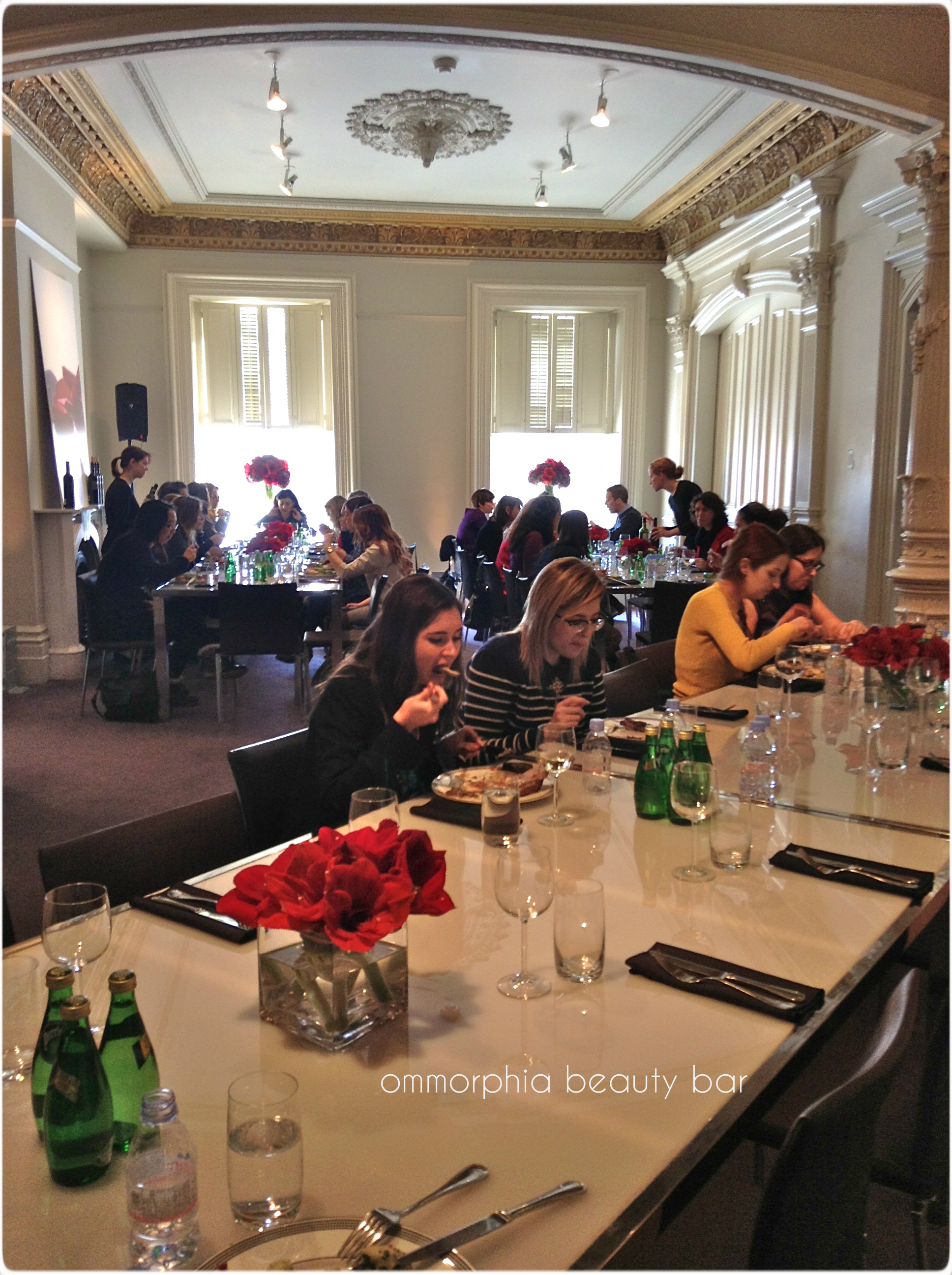
invited guests enjoying the atmosphere & delicious lunch
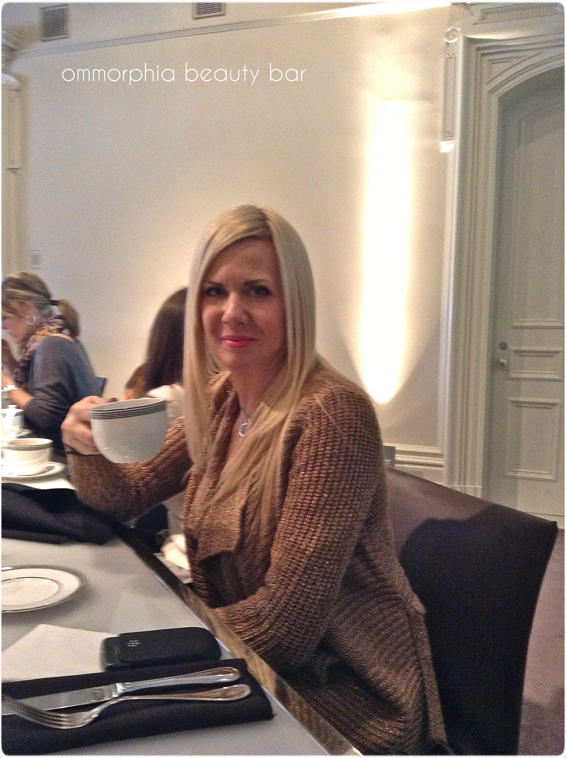
… with my after-lunch coffee!

the simple & elegant amaryllis blossoms decorating the tables
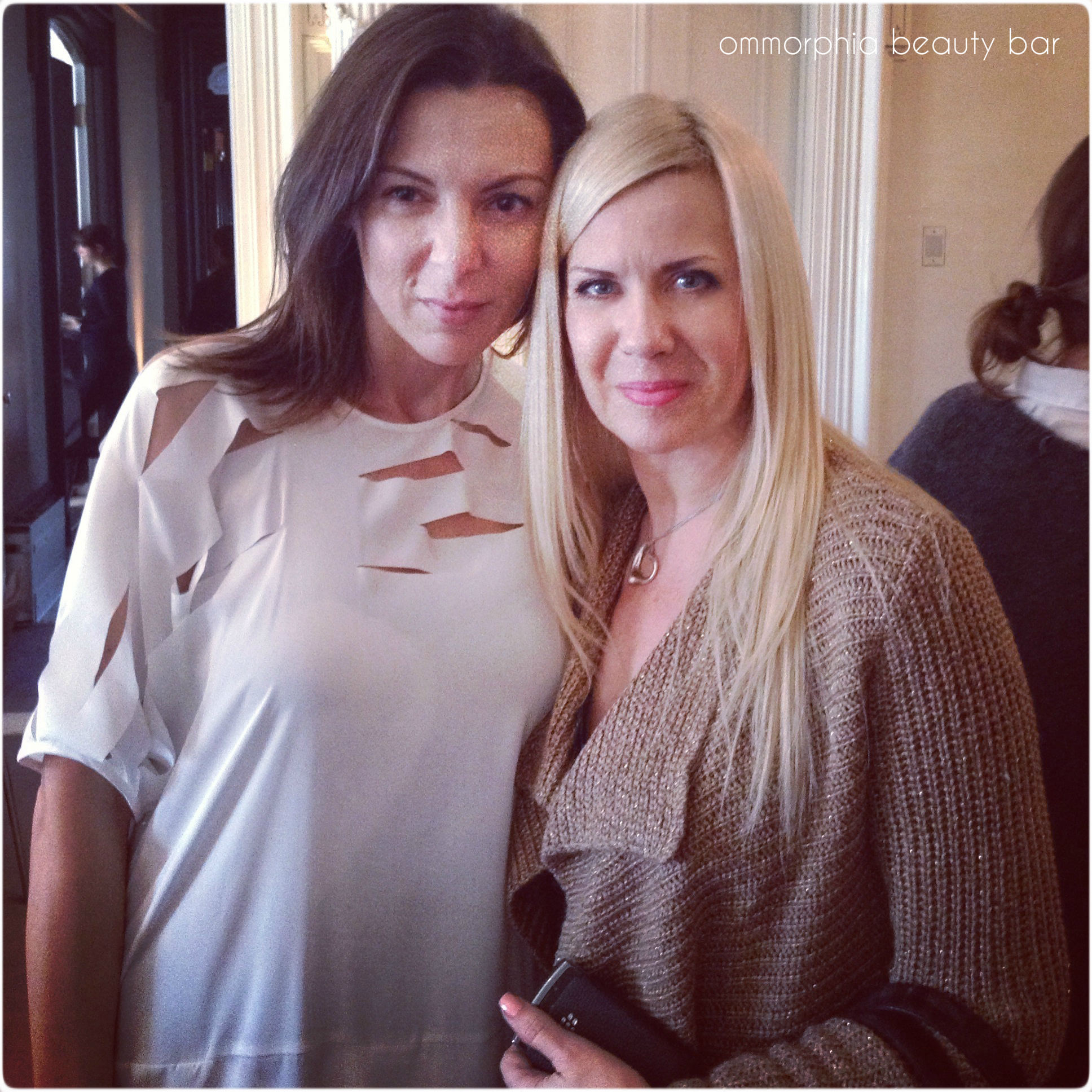
with the charming Lena Korres – a woman of substance AND beauty

the contents of the generous gift bag – already putting everything to use!
buy bystolic online infoblobuy.com/bystolic.html no prescription
Final thoughts: I want to say a heartfelt thank you to Maria and Denis at Zoï Agency for including me in this event, as well as extend my delight in meeting an admirable woman such as Lena Korres. It was also wonderful getting to meet a few other bloggers from my home town and spending some time getting to know each other. This was a truly special & memorable occasion that I will cherish forever!
buy celebrex online infobuyblo.com/celebrex.html no prescription
Korres boutique in London, England


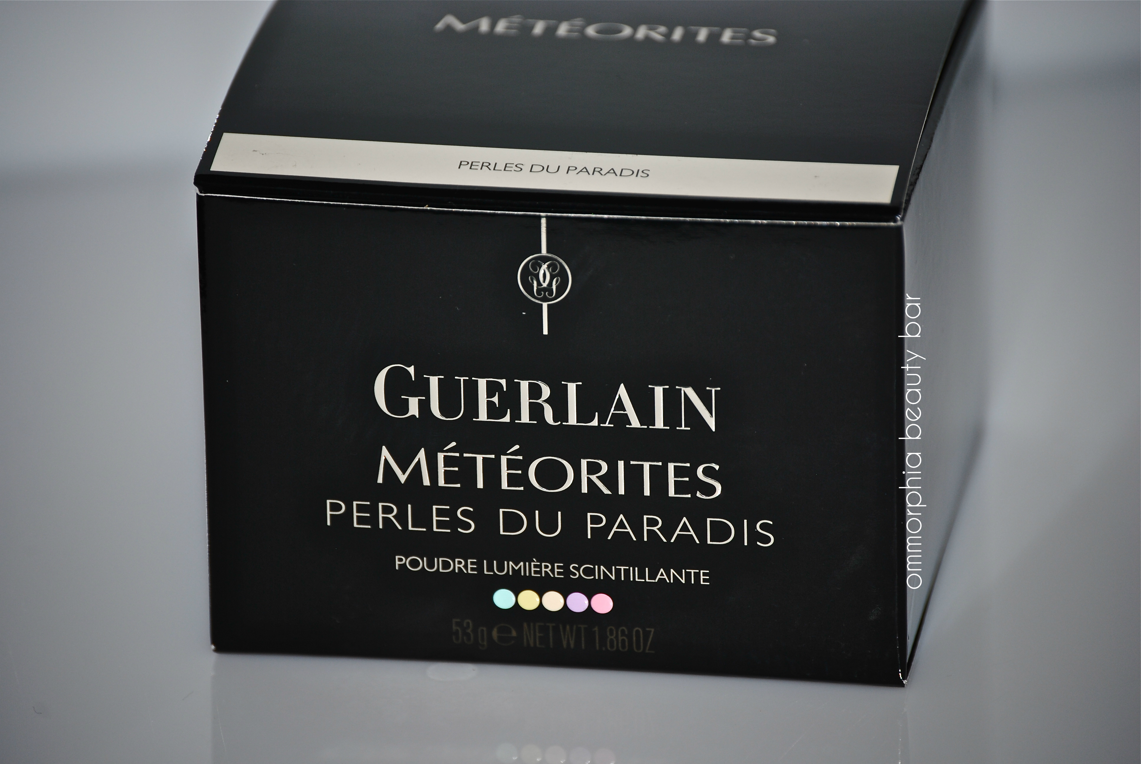
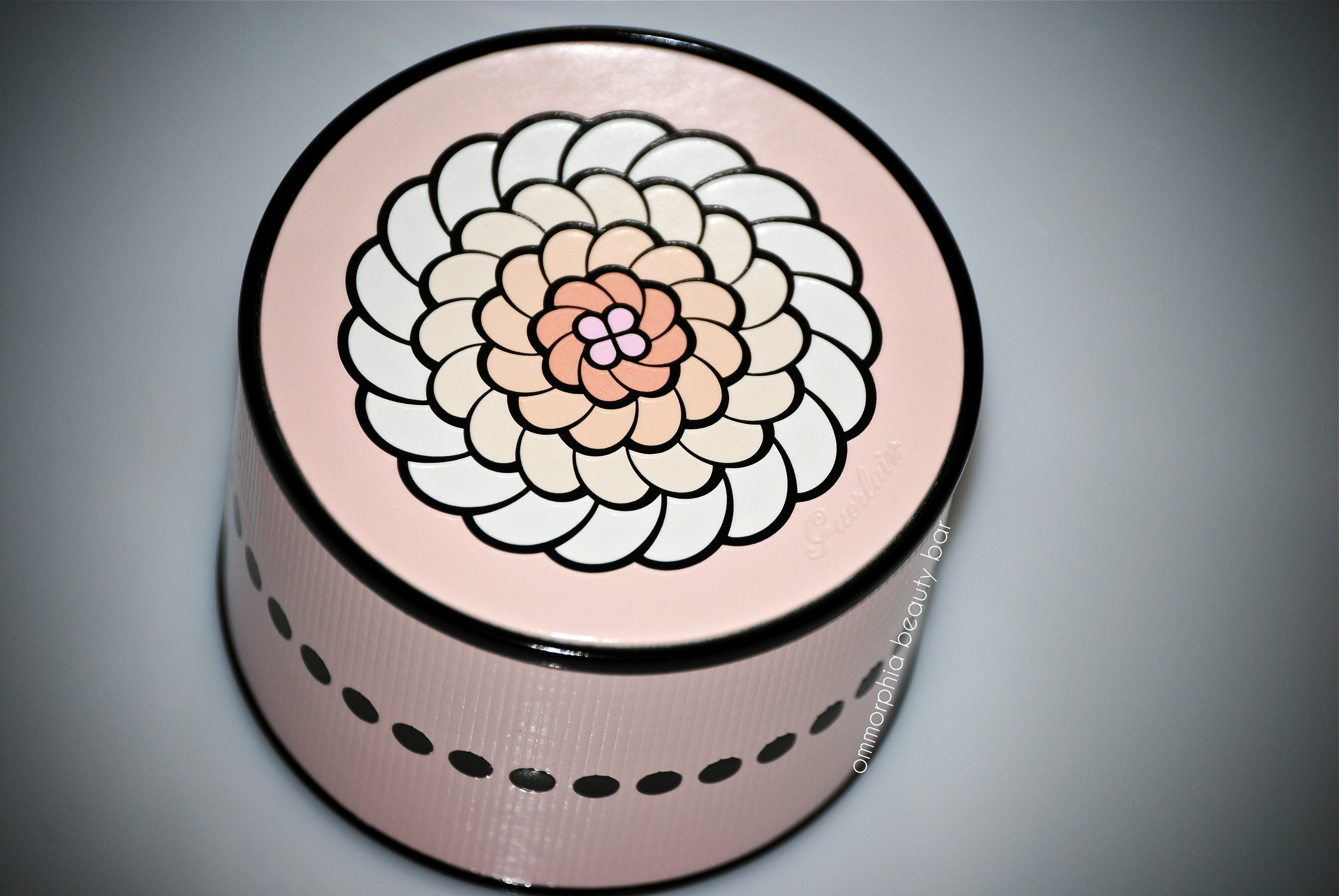
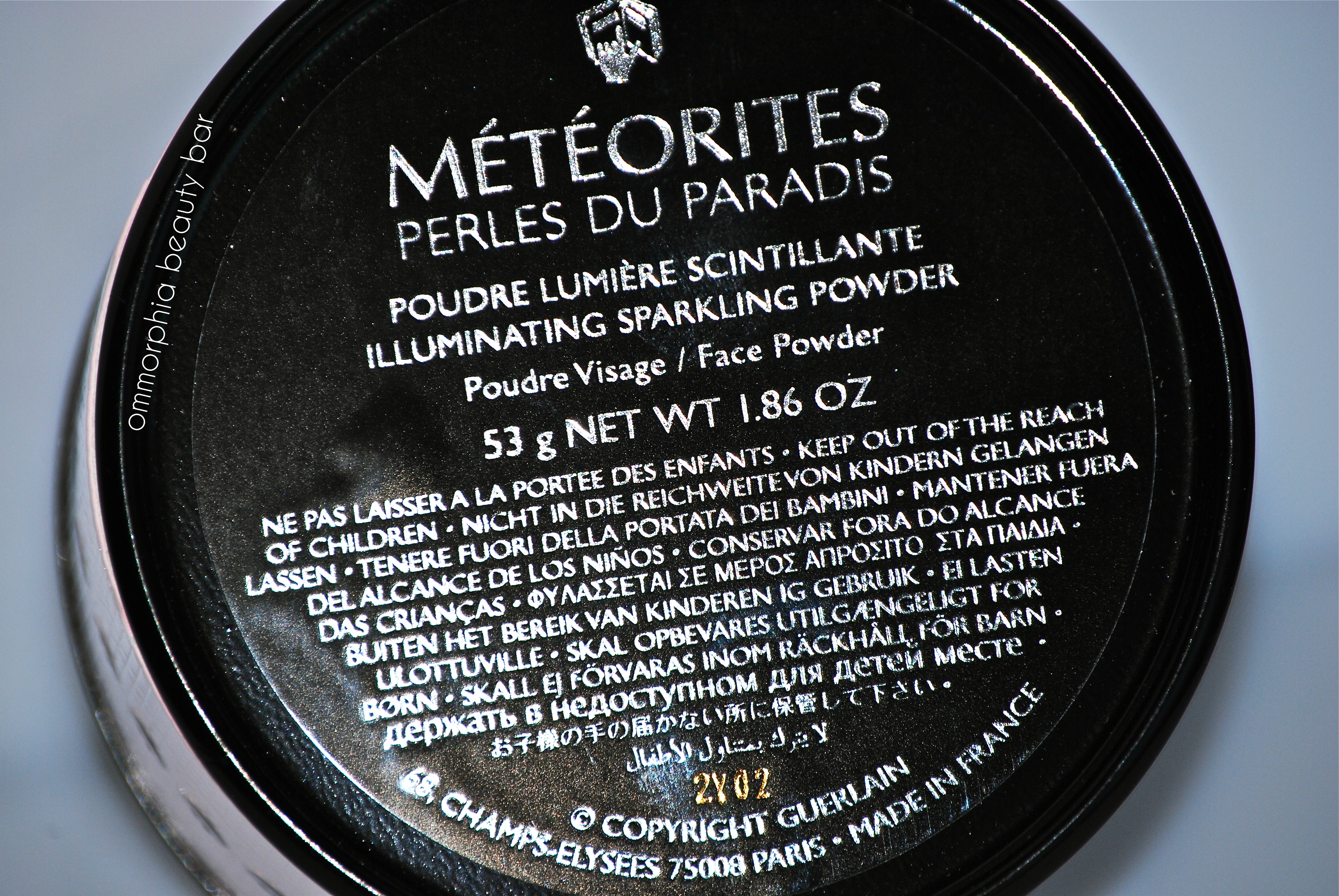
Guerlain Météorites ‘Perles du Paradis’ Spring 2013

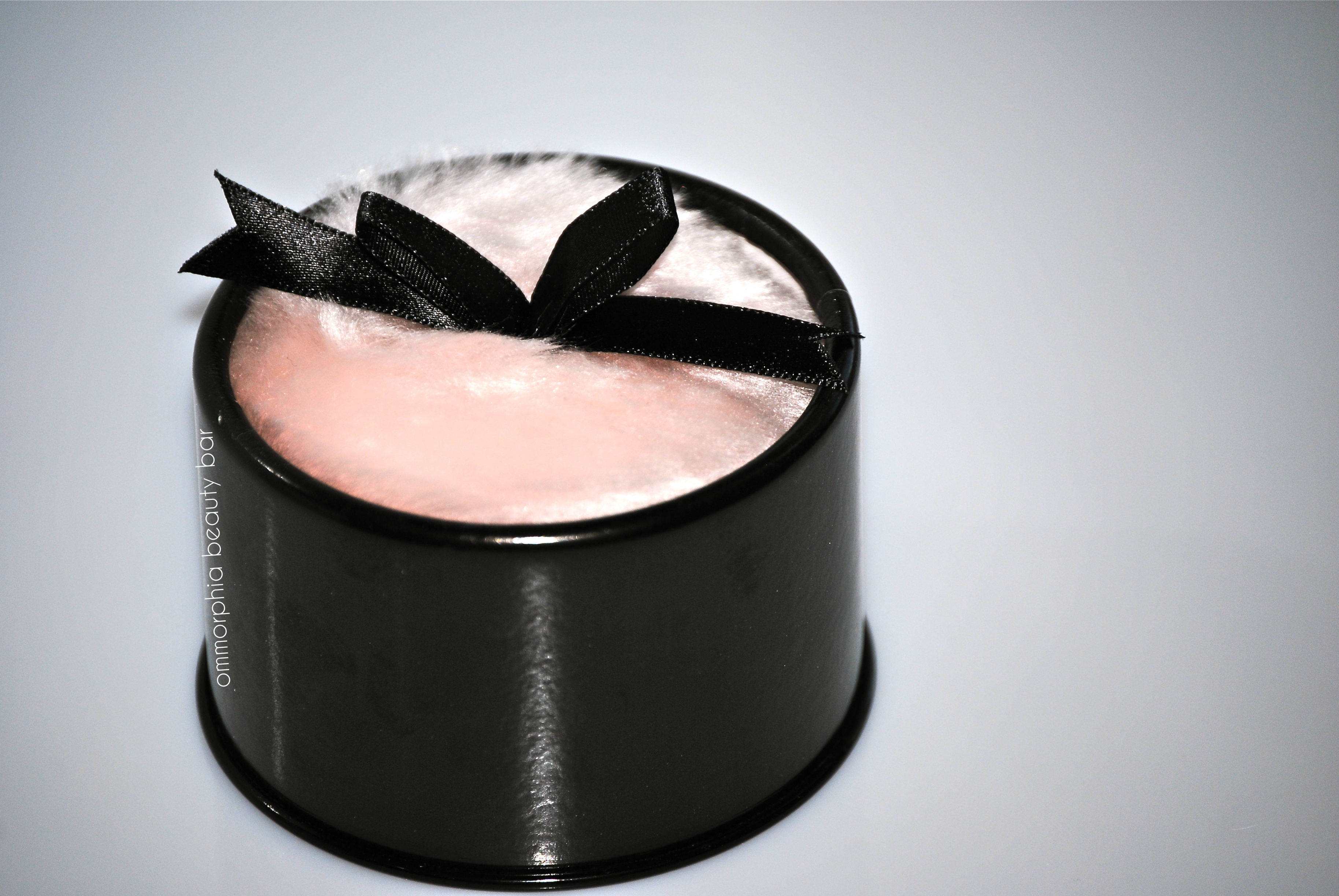
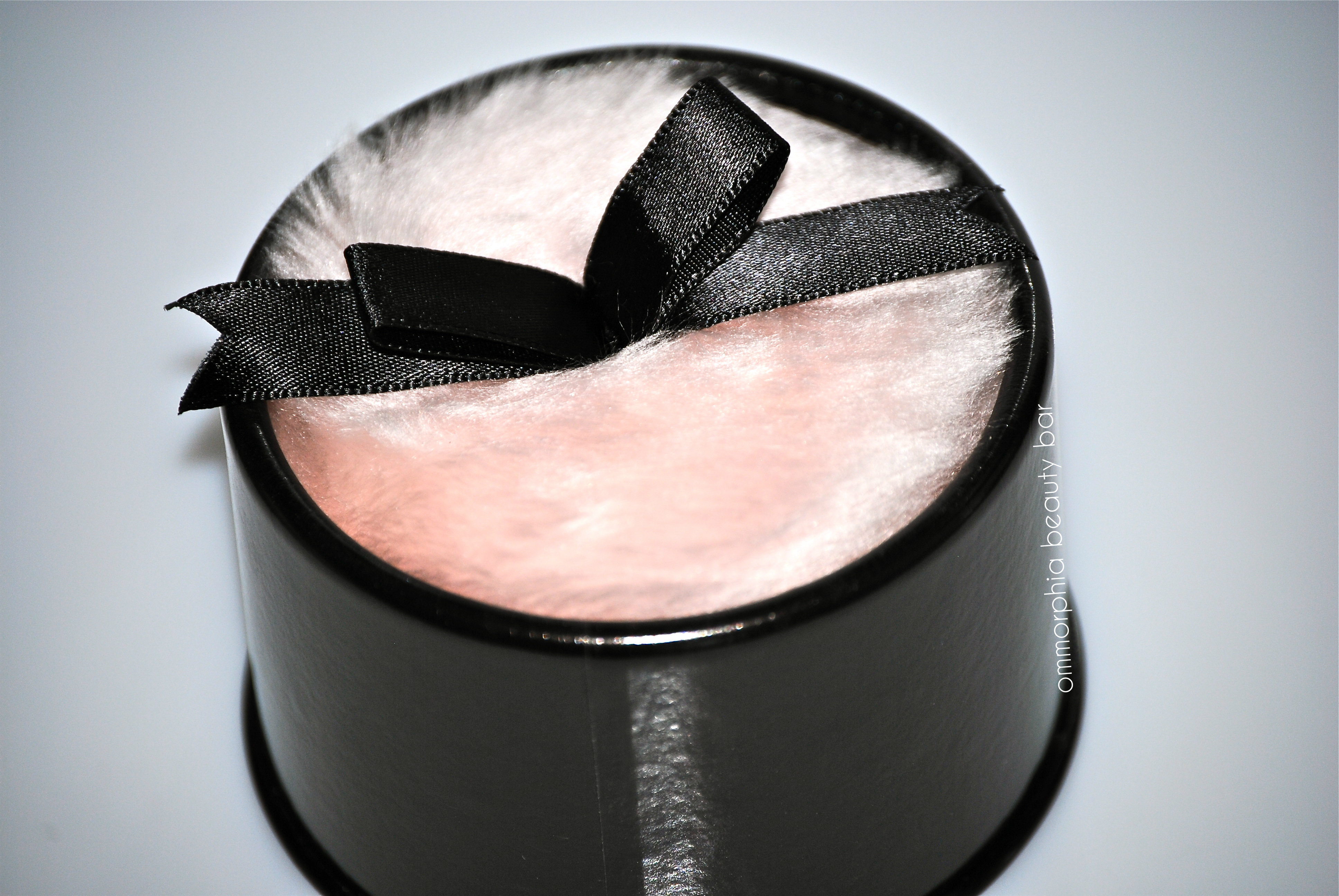
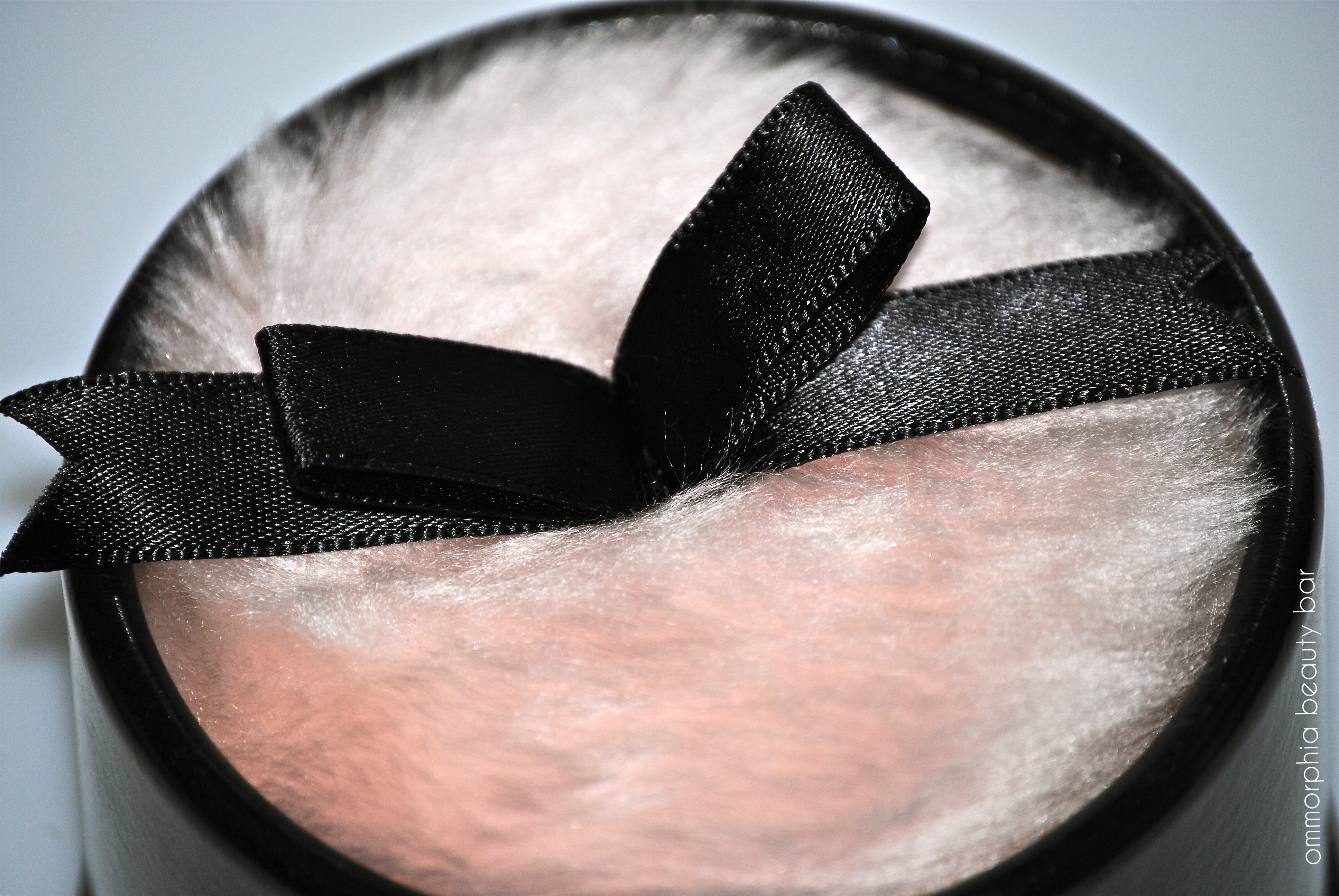
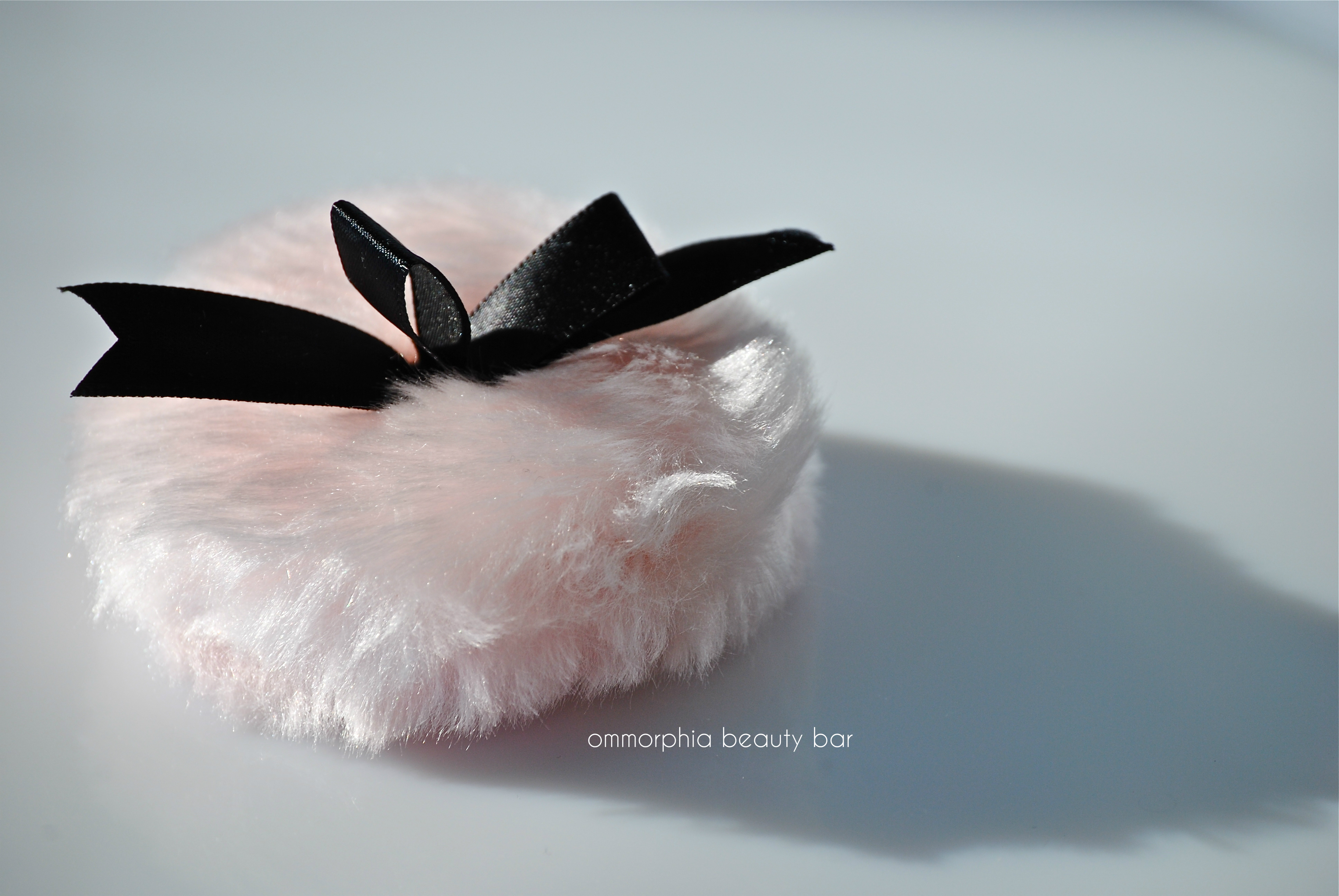
It’s no secret that I have a “thing” for high-end cosmetics (I’m guessing quality & pretty packaging may have something to do with it), but Guerlain is one brand that I only began exploring last year (see earlier reviews here, here, here, and here). For years, I’ve heard raves about their Terracotta bronzing powders and Météorites illuminators, but always resisted the call – until I saw the Spring 2013 release, and just like that, I fell hard. Then there’s the pink powder puff … everything about this beauty needs to be proudly displayed on a vanity table, calling to mind the days when women lavishly indulged their subtly powerful feminity!
Guerlain – Météorites Perles du Paradis

Guerlain – Météorites Perles du Paradis

Guerlain – Météorites Perles du Paradis
Guerlain – Météorites Perles du Paradis
Guerlain – Météorites Perles du Paradis

Guerlain – Météorites Perles du Paradis (ingredients list)
Guerlain – Météorites Perles du Paradis
Guerlain – Météorites Perles du Paradis
Guerlain – Météorites Perles du Paradis
Guerlain – Météorites Perles du Paradis
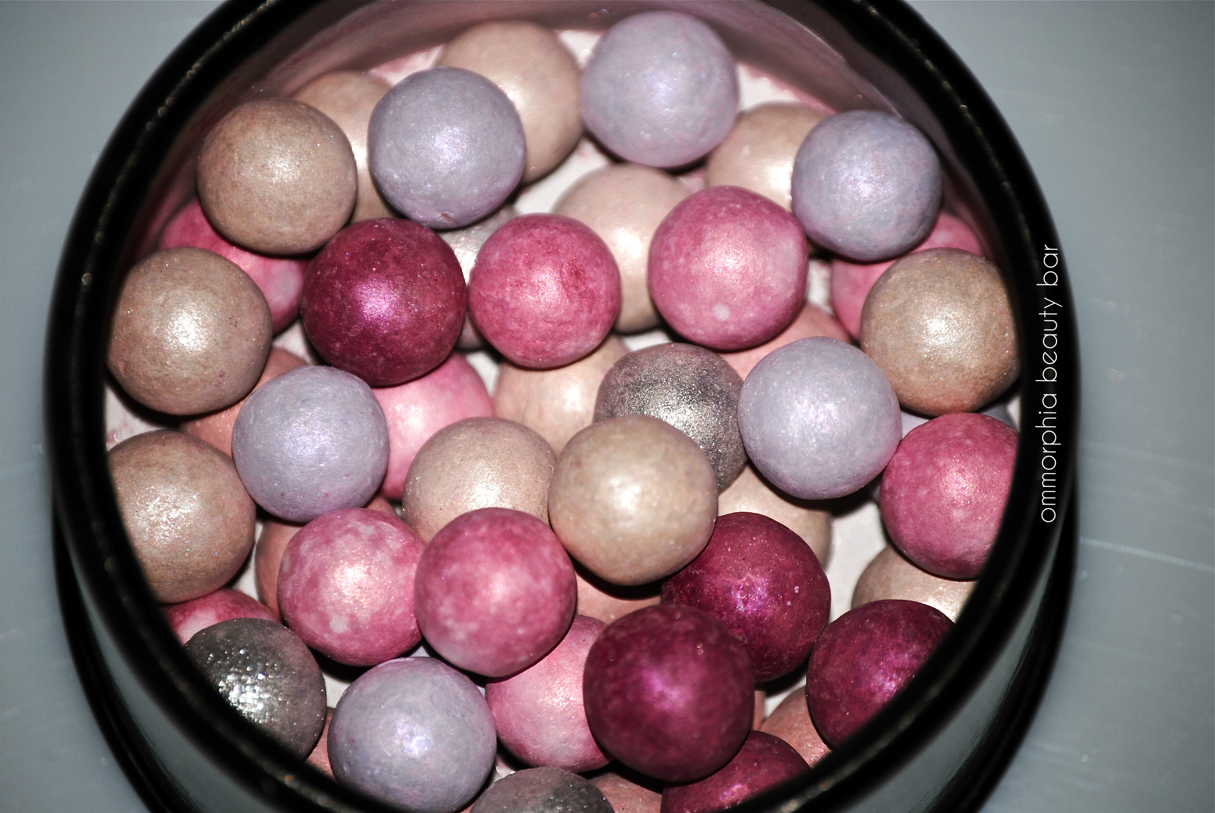
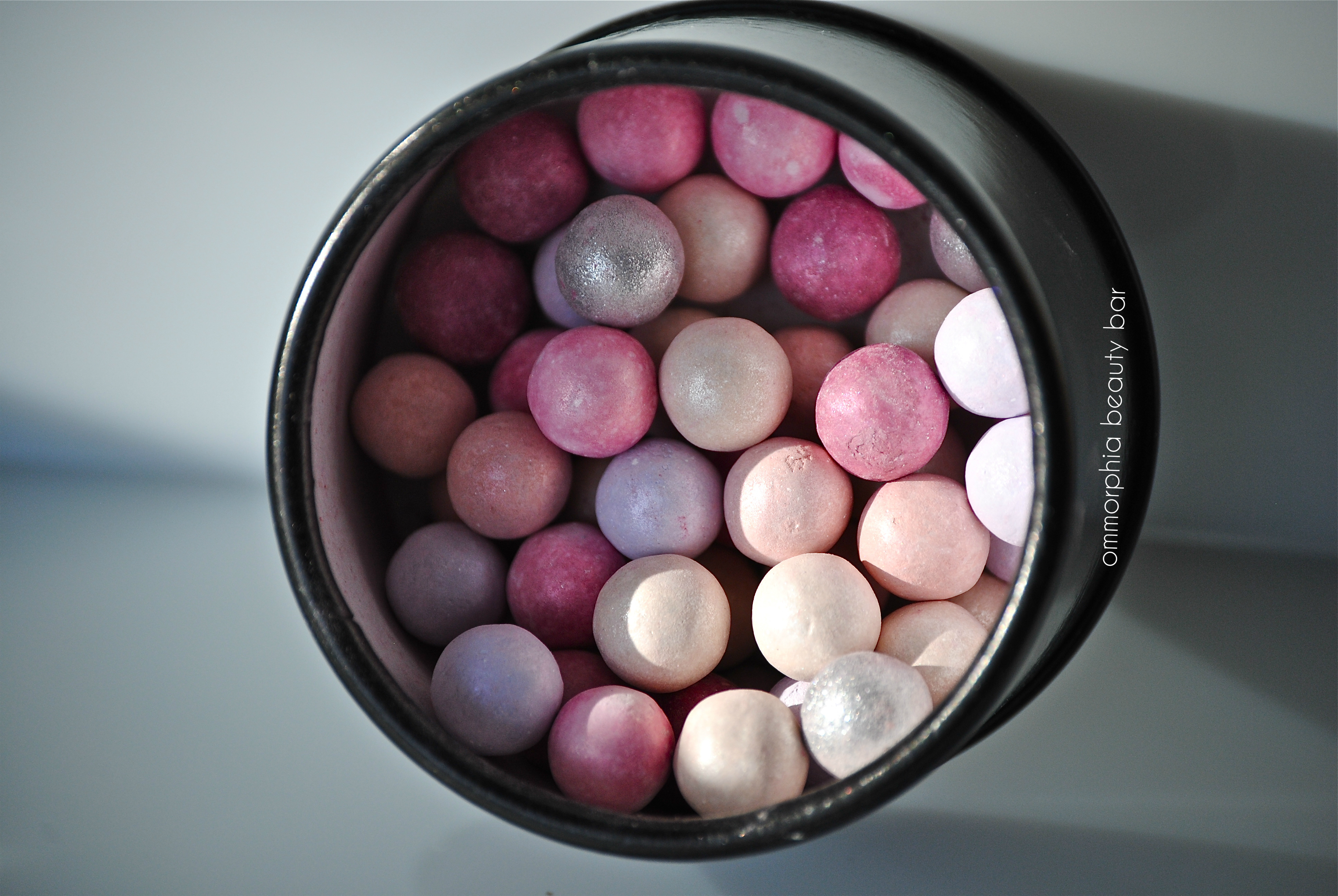
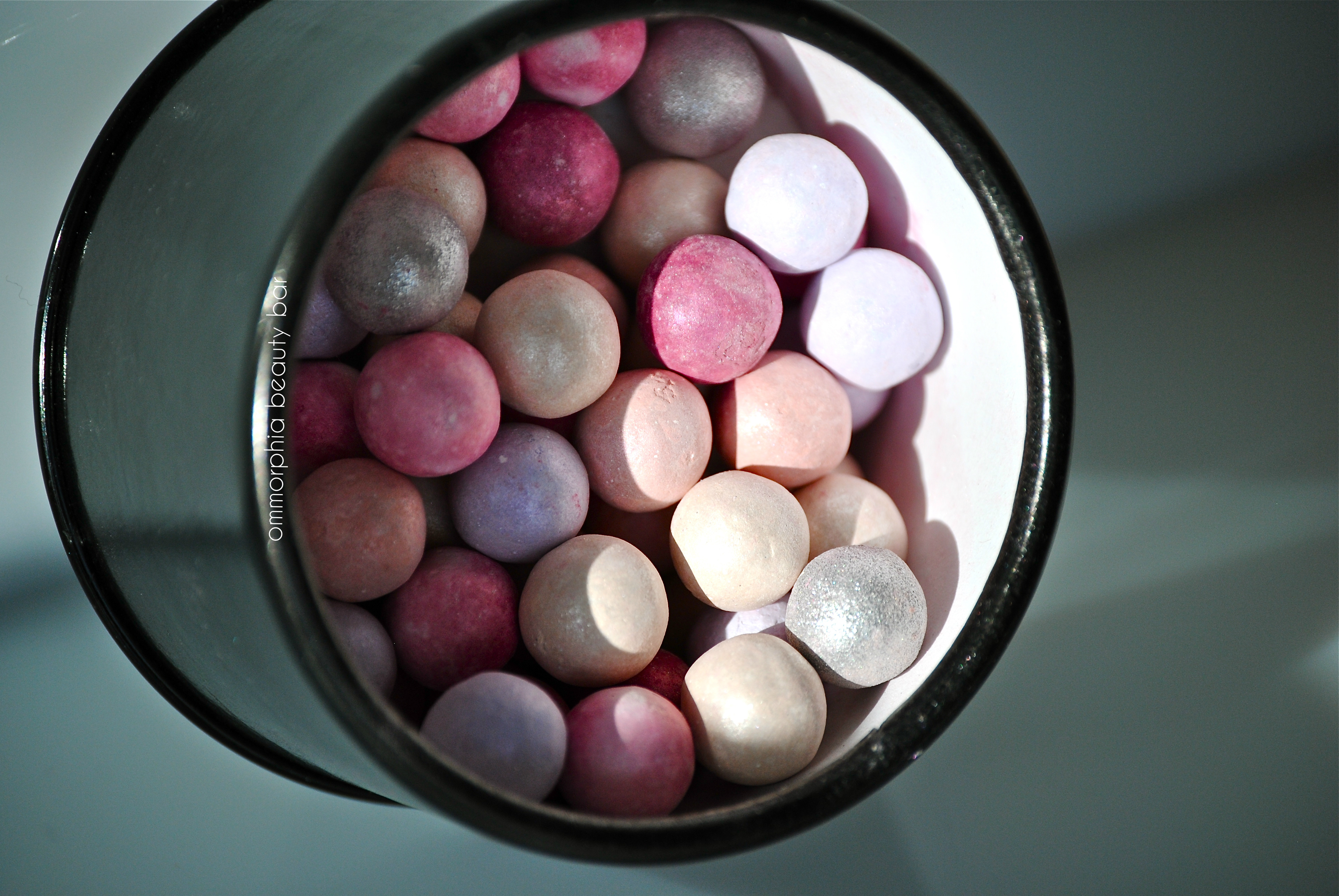
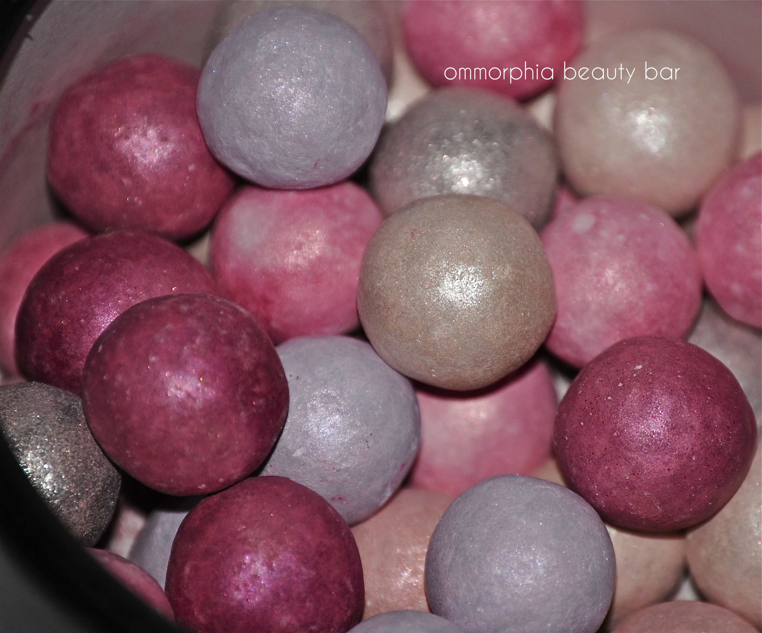
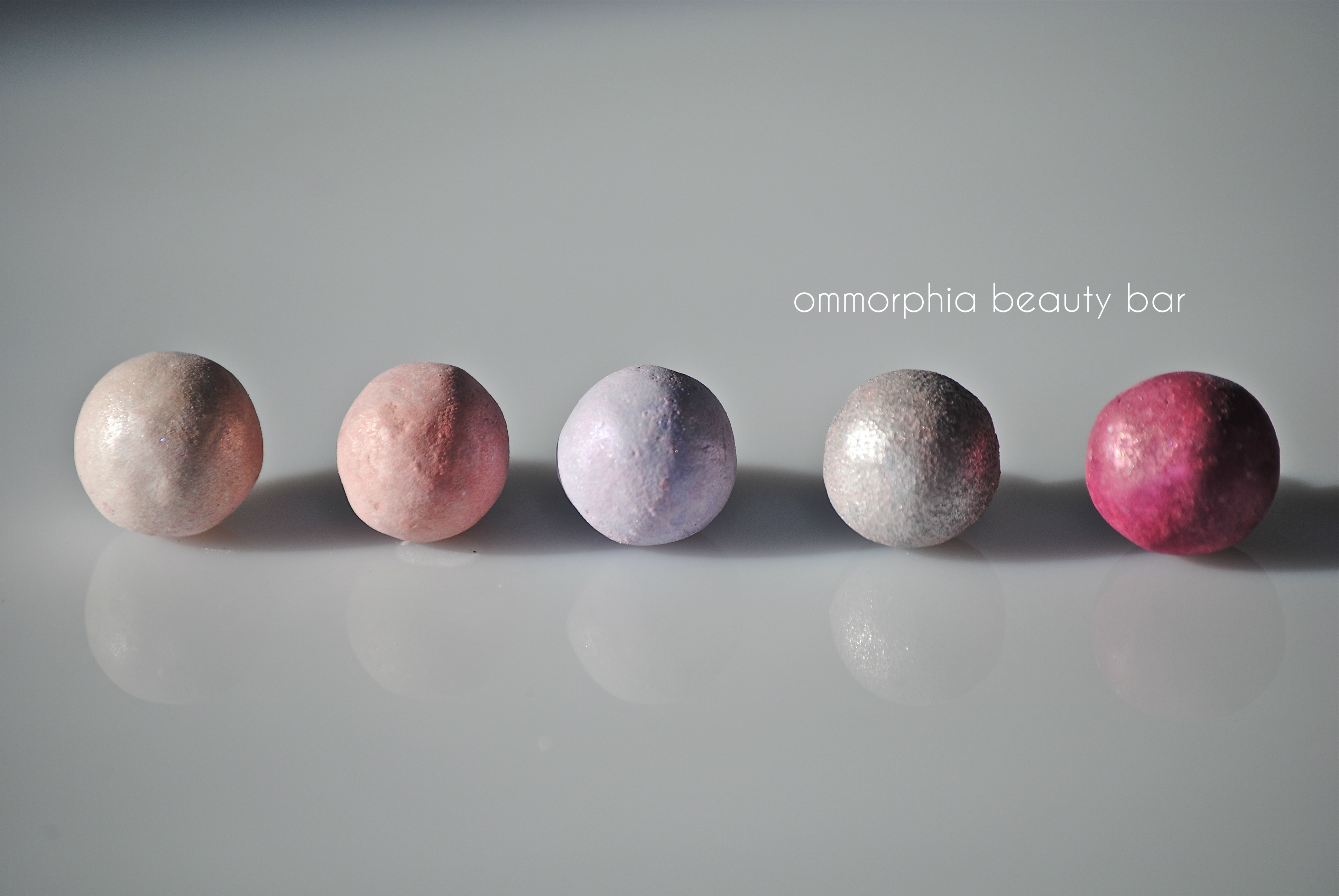
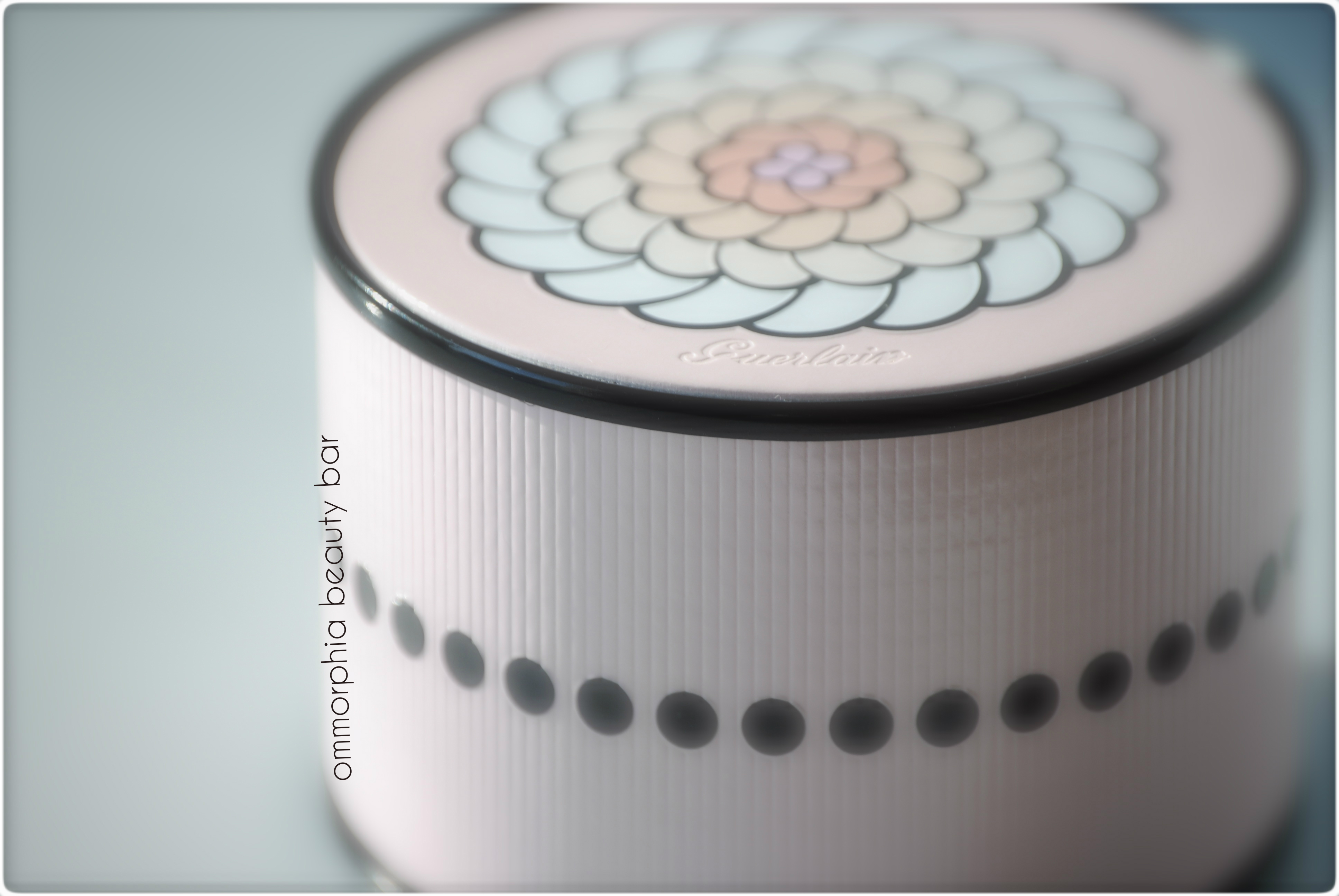
Météorites Perles du Paradis Illuminating Sparkling Powder (CAD $67.00) – beads of illuminating powder for the face, in 6 varying tones – pearl white, baby pink, lavender, pink, dark rose, and silver – all in Guerlain’s signature violet scent. The pearls come housed in a black cardboard container with a pale pink ribbed outer cover, printed with the brand’s floral emblem on top, and includes a black beribboned pink powder puff as well. The beads are apparently oversized, although I personally don’t have others from Guerlain for a complete comparison (but I can attest to the claim, having seen them at the counter). In one of my photos (below), note that I’m showing only 5 of the 6 coloured beads; mainly because I mistakenly thought the pale pink ones were the darker ones, with the outer coating rubbed off – so wrong!
Breakdown:
- pearl white – 13
- baby pink – 9
- lavender – 8
- pink – 10
- dark rose – 5
- silver – 4
- Total: 49 beads
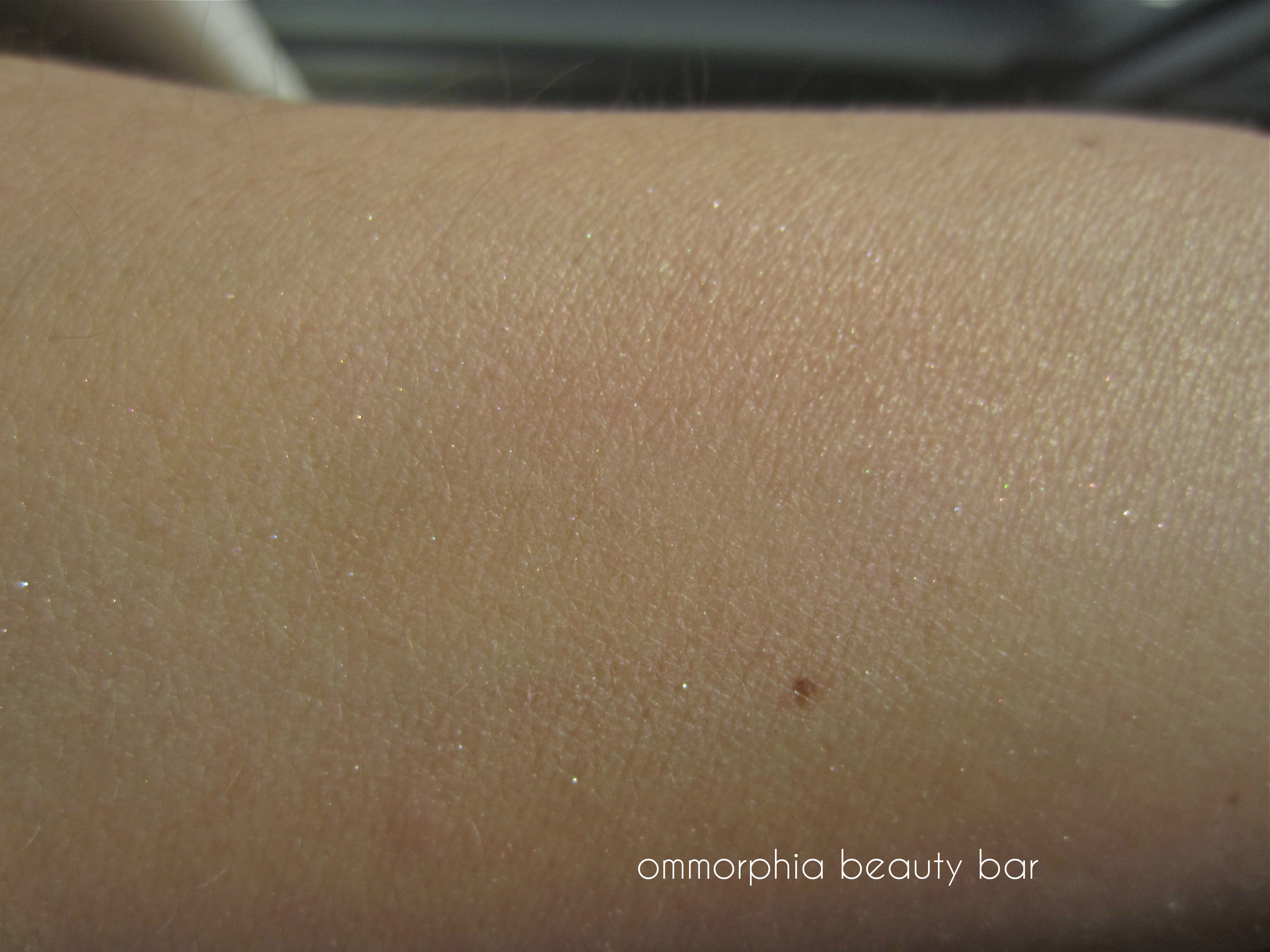
I have a confession to make: up until now, I could not understand the hype & fuss over these little balls (sorry – “little balls” cracks me up!). Even swatching this product at the counter, I still hesitated – because I couldn’t see anything happening. For anyone else who has resisted getting on the Météorites bandwagon, here’s an important lesson: department store lighting does NOT sell this product; you need to see yourself first in natural light, to truly understand the effect.
As the container has a nice wide opening, it’s very easy to swirl your brush through the beads; sometimes I even gently toss them (before opening) to get a uniquely different distribution of colours. The powder is exceptionally fine-milled – almost invisible to detect, while the silver balls are the only ones to give off a slightly more discernible shimmer. From the “ball breakdown” (keep your laughter to a minimum, please) the white & lighter pinks dominate, while the lavender acts as a colour-corrector, the dark rose gives depth, and the sparser silver flecks impart an extra little kick.
Once applied to the face, however, is when the magic truly begins; the first thing you notice is a gently diffused overall look, then it’s almost as though imperfections are somewhat softened, and you’re left with this beautiful luminosity. Not an obvious glow, this is more a product that imparts a certain vitality to your skin – I would never have believed it, had I not experienced it first hand. Eight hours later, I could still see traces of this effect, and I even felt like my skin’s natural oils were well absorbed as well – kept the shine at bay longer than I expected from a face powder.
Guerlain – Météorites Perles du Paradis
Guerlain – Météorites Perles du Paradis
Guerlain – Météorites Perles du Paradis (closeup detail)
Guerlain – Météorites Perles du Paradis

Guerlain – Météorites Perles du Paradis swatch (natural light)
Guerlain – Météorites Perles du Paradis swatch (blended, natural light)
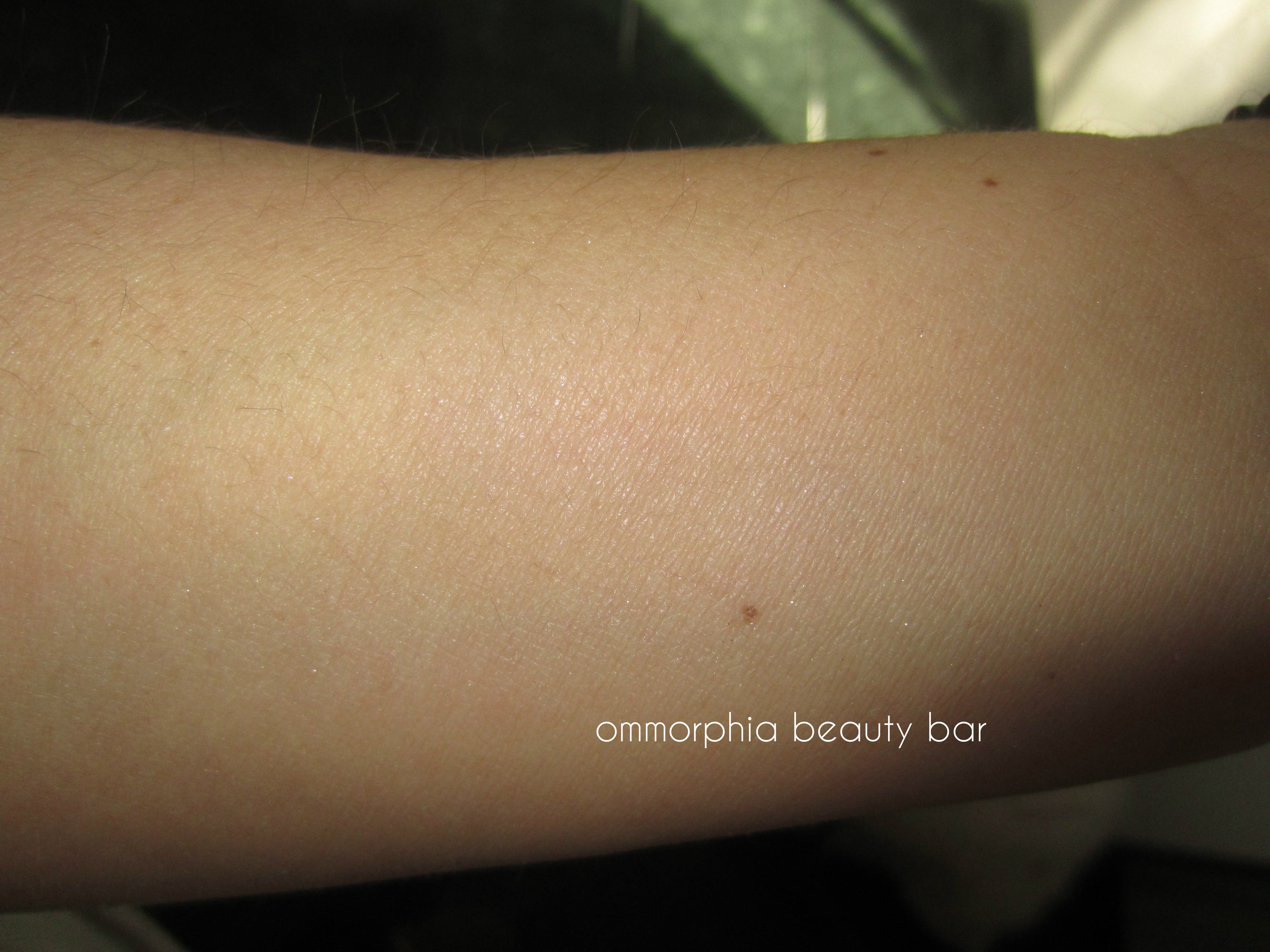
Guerlain – Météorites Perles du Paradis swatch (blended, with flash)
Final thoughts: For those who tend to shy away from anything labelled “illuminating” for fear of the dreaded disco-ball effect, then this is the product for you. If you want a face that looks lit from within (looks better than that sounds, actually), then you NEED this. I was worried that the predominantly pink hues of this grouping would totally clash with my skin tone (light medium with yellowish undertones), but instead it served to balance everything out – colour me impressed!
The star of Guerlain’s Spring 2013 Collection, the Météorites Perles du Paradis Face Powder is also limited edition – just a friendly reminder. I’d love to hear who else has fallen in love with this beauty!
OPI Euro Centrale Collection for Spring/Summer 2013 – part 2 “Moody Blues”

When I first beheld this collection (see part 1 here), I confess that I was immediately drawn to the deeper hues, or what I like to call the “Moody Blues”. Something about blue is just so compelling, and the assortment provided by this grouping, is nothing short of spectacular. With such diverse finishes, ranging from barely-there shimmer, luscious crèmes, and a final touch of whimsy with the glitter, I dare you to not fall as hard for these beauties, as I did!
Once again, each and every shade bears a stellar formula, flowing effortlessly along the nail in a completely self-levelling manner, drying relative fast, beautiful glossy shines at the finish, and leaving behind no staining upon removal. All swatches are with base and top coats.

OPI Euro Centrale Collection SS 2013 – the “Moody Blues” group!
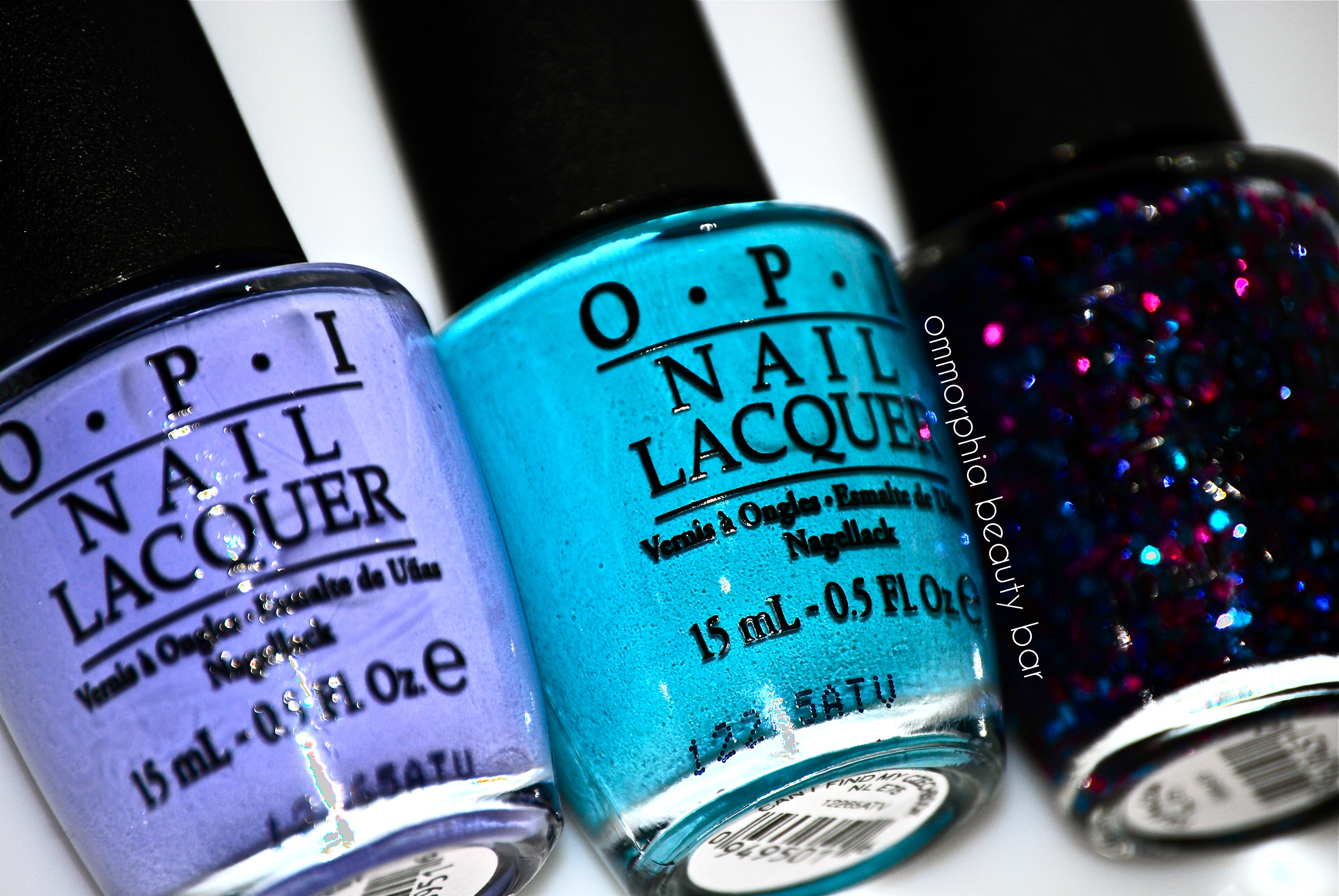
You’re Such A Budapest, Can’t Find My Czechbook, Polka.com

Vant To Bite My Neck?, OPI…Eurso Euro, I Saw…U Saw…We Saw…Warsaw
You’re Such A Budapest – a muted and cool leaning cornflower/lavender hue with grey-lilac undertones and filled with a surprise: ultra ultra fine blue & silver shimmer. A simply stunning pastel shade in a streak-free formula, the shimmer is not that apparent to the naked eye, but adds a nice dimension to keep this colour from appearing flat – 100% LOVE! Coats applied: 3 (thin)
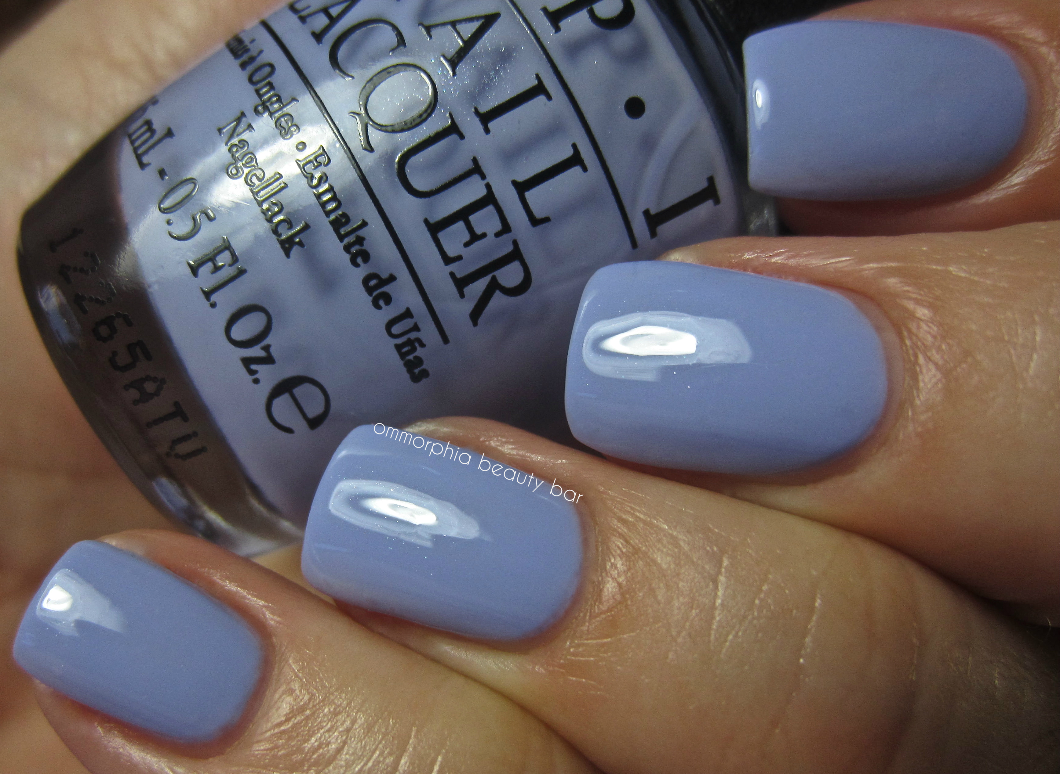
OPI – You’re Such A Budapest
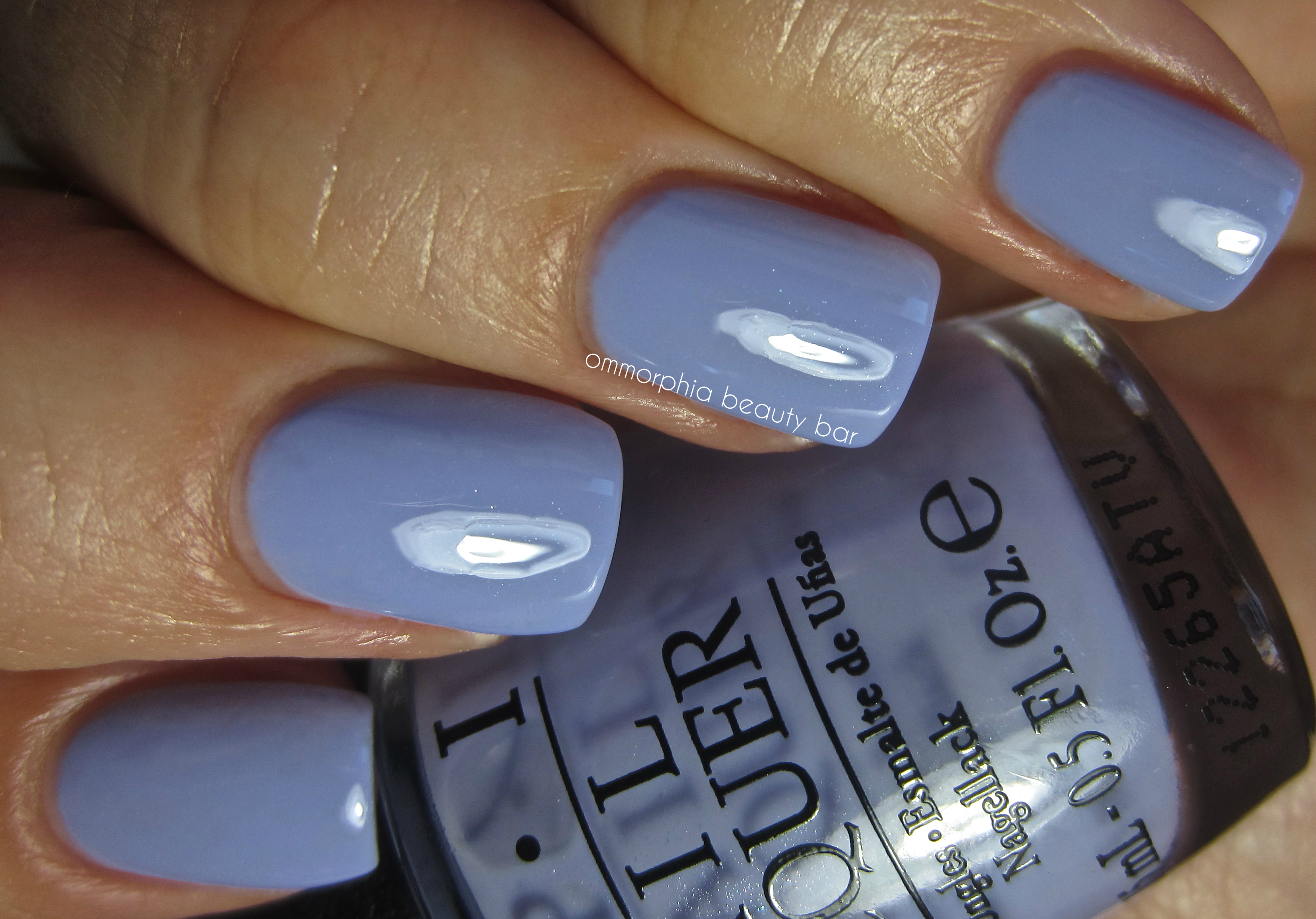
OPI – You’re Such A Budapest
buy cymbalta online infobuyblo.com/cymbalta.html no prescription
Can’t Find My Czechbook – a rich Robin’s Egg Blue with some aqua tints in the base, there’s a slight dusty quality to this colour that gives it such visual appeal and makes it suitable for a broad range of skin tones. Superb formula with a mirror-like shine at the finish. Coats applied: 2

OPI – Can’t Find My Czechbook

OPI – Can’t Find My Czechbook
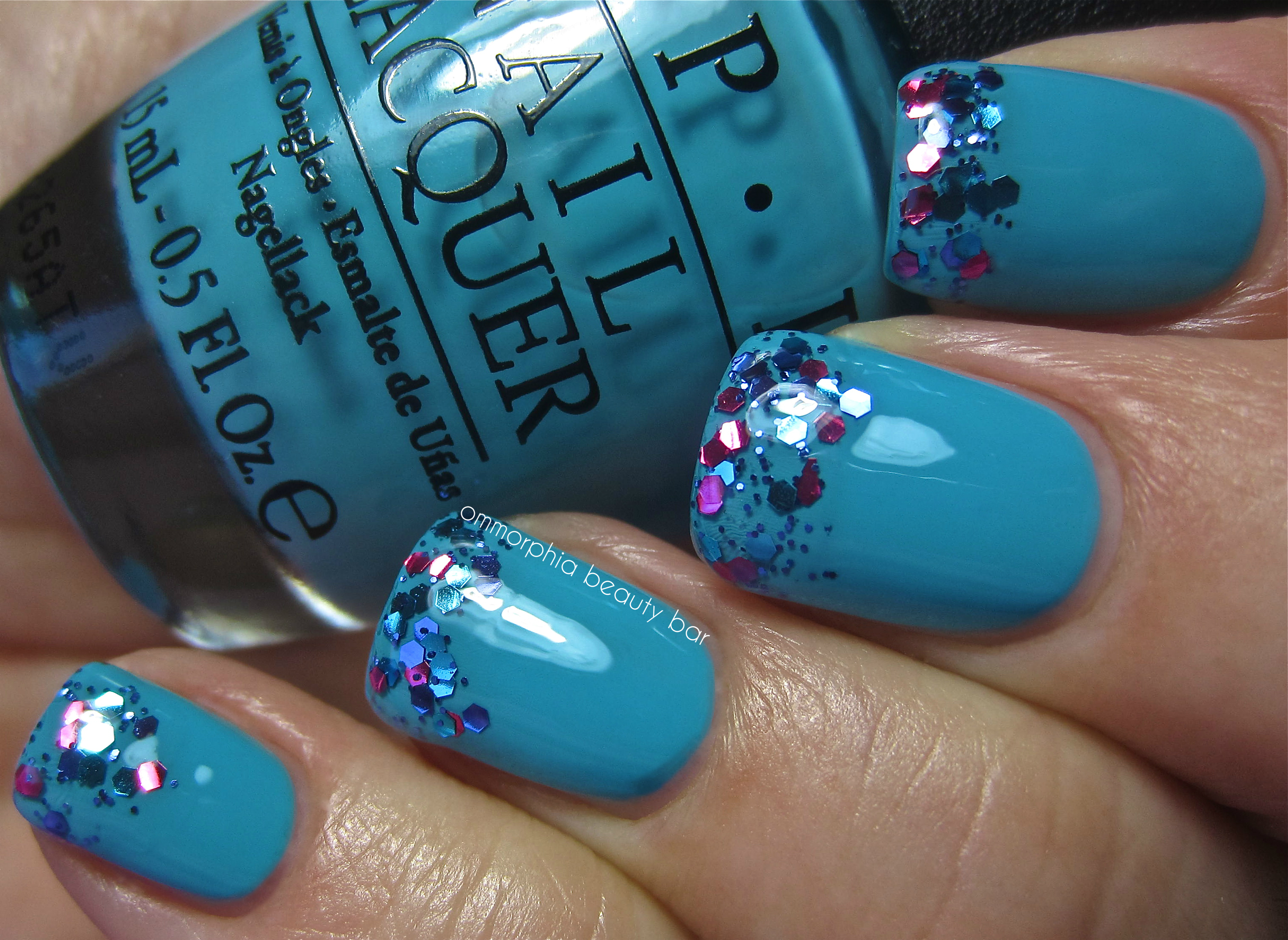
OPI – Can’t Find My Czechbook with Polka.com glitter tips
OPI…Eurso Euro – a true show-stopper, this is a vivid royal blue/cobalt hue in a crème-jelly hybrid formula with intense colour saturation and an impossibly glossy shine at the finish that makes the addition of a top coat almost superfluous. Its bright ink-blue tones give it a sophisticated yet modern appeal and does not come off as blackened, no matter the lighting conditions. Coats applied: 2

OPI – OPI…Eurso Euro

OPI _ OPI…Eurso Euro
Polka.com – (applied over OPI…Eurso Euro) blue, purple, and magenta mid-sized hexagonal glitter along with blue round micro glitter in a clear base. Best used as a layering polish, there’s a pretty decent amount of glitter dispersal per brush stroke. Some effort will be needed for removal, as with all lacquers of this type. Coats applied: 2
buy depakote online infobuyblo.com/depakote.html no prescription

OPI – Polka.com (layered over OPI…Eurso Euro)

OPI – Polka.com (layered over OPI…Eurso Euro)
Vant To Bite My Neck? – with an unbelievable saturation of colour to this intense purple/grape hue, it can almost apply as a 1-coater, although a second coat adds an overall luxurious depth of tone. With some reddish undertones in the base to lend it warmth, along with its ultra high-gloss finish, this shade is somewhat of a paradox, appearing both vivid & brooding at once. Don’t skip base coat to avoid any mild staining. Coats applied: 2

OPI – Vant To Bite My Neck?

OPI – Vant To Bite My Neck?
I Saw…U Saw..We Saw…Warsaw – (the name … seriously?) the most perfect navy blue shade I’ve come across, in an absolutely phenomenal formula – ultra glossy & richly pigmented. A nice twist on a vampy hue, I love how it keeps its deep blue tones visible at all times. Once again, top coat seems almost unnecessary here – nice if you’re in a rush! Coats applied: 2

OPI – I Saw…U Saw…We Saw…Warsaw

OPI – I Saw…U Saw…We Saw…Warsaw

OPI – I Saw…U Saw…We Saw…Warsaw with Polka.com accents
buy desyrel online infobuyblo.com/desyrel.html no prescription
Final thoughts: Even though each new OPI release is eagerly anticipated, something about the 12 shades of this collection seems to have flown under everyone’s radar; flamboyant lacquers are all fine and dandy, but extravagant shades can only take you so far, and I for one, have been looking forward to getting back to basics: rich, jewelled hues that are eminently wearable, and in formulas that are a pleasure to apply. The Euro Centrale Collection, is ALL that … and more!
The OPI Euro Centrale Collection will be available as of early February. Feel free to follow the brand on facebook/twitter for all updates.

*Disclosure: Product samples provided by the company/PR for my unbiased consideration
OPI Euro Centrale Collection for Spring/Summer 2013 – part 1 “Hot & Spicy”

I really enjoy travelling with OPI and look forward to seeing how they interpret the countries they feature, into polish. The 2013 Spring/Summer Collection takes us into the heart of central Europe, with all its diversity and lushly vibrant colour – perfectly captured into nail lacquer. I’ve decided to separate the 12 shades into two parts, beginning with part 1, or what I call the “Hot & Spicy” group, shown here.
The formula on every single one of these hues was absolutely amazing, flowing easily, self-levelling, drying relatively quickly, and leaving behind a gorgeous shine – with a few looking almost mirror-like. All swatches are with base & top coats.

OPI Euro Centrale SS 2013 the “Hot & Spicy” group!

My Paprika Is Hotter Than Yours!, My Vampire Is Buff, Suzi’s Hungary Again!

Hands Off My Kielbasa!, Oy – Another Polish Joke!, A Woman’s Prague-ative
My Vampire Is Buff – an ultra creamy and warm leaning blush white hue, which gives decent coverage even at 2 coats. Never stark looking, I found this shade the easiest white to wear that I’ve ever come across – pure LOVE! Coats applied 3 (thin)

OPI – My Vampire Is Buff

OPI – My Vampire Is Buff
Suzi’s Hungary Again! – a vivid rose/coral/pink hue in a hybrid crème-jelly formula, and with incredibly fine pearly shimmer throughout – although it’s very subtle on the nail. Beautiful high gloss at the finish. Coats applied: 2

OPI – Suzi’s Hungary Again!

OPI – Suzi’s Hungary Again!
Hands Off My Kielbasa! – a dusty/antique nude-rose hue with finely ground gold, silver & pink shimmer in the base, as well as brush stroke-free in application. I’m not sure how I feel about this shade; on the one hand, it can come across as somewhat dated, but it’s also strangely appealing – it looks very much like NARS’ cult Orgasm blush. Coats applied: 2

OPI – Hands Off My Kielbasa!

OPI – Hands Off My Kielbasa!
My Paprika Is Hotter Than Yours! – a searingly hot coral red crème hue that applies with all the qualities of a jelly: squishy-looking and ultra glossy. Very colour saturated, this can almost be a 1-coater but don’t skip base coat, to avoid any mild staining. Coats applied: 2

OPI – My Paprika Is Hotter Than Yours!

OPI – My Paprika Is Hotter Than Yours!
Oy – Another Polish Joke! – (oy – the name…) a clear base filled with pale yellow gold and some scattered pink finely ground shimmer. There’s almost an oxidized look to this finish, sporting a brilliant canary gold veneer with some slight greenish flashes, although the formula itself is on the sheer side – also excellent as a layering polish. Bonus: easy removal. Coats applied: 3

OPI – Oy – Another Polish Joke!

OPI – Oy – Another Polish Joke!
A Woman’s Prague-ative – a semi-sheer pink/orange base filled with gold, bronze, and copper ultra-fine shimmer that gives an overall honey/amber look and bearing a subtle duo chrome effect – definitely more visible in the bottle than on the nail. A complex shade that will also translate well for fall, you can also layer this beauty over a complimentary base colour for even more depth. Bonus: easy removal. Coats applied: 2

OPI – A Woman’s Prague-ative

OPI – A Woman’s Prague-ative
Final thoughts: I cannot stress enough how impressed I was with the formula on every single one of these shades; flowing like silk across the nail for an effortless application. ‘My Vampire Is Buff’ took me completely by surprise with its lush & simple beauty and if I’d have to pick a favourite here, that one would be it. ‘Hands Off My Kielbasa!’ is an odd duck and will definitely appeal to the nudie-lovers out there, while ‘My Paprika Is Hotter Than Yours!’ will make an epic pedi shade come the summer. All in all, this first group gets a thumbs up from me – stay tuned for part 2, where the shades take on a darker vibe.
The OPI Euro Centrale Collection will be available early February. Feel free to follow the brand on facebook/twitter for all updates.

*Disclosure: Product samples provided by the company/PR for my unbiased consideration
The ommorphia Beauty Vault: Highlighters – creams, powders & hybrids

When I began the process of inventorying & sorting my cosmetics collection, I assumed the highlighter category would be a relatively short write-up, but a quick scroll through the photos in this post, clearly shows how wrong that thinking was. Indulging and using highlighters is a rather new fascination for me, and I’ve come to rely on a well-placed dab of this product to add that little extra something to my finished look. Like emphasizing the killer cheekbones I wish I was born with. If only.
While many of the products shown in this post are no longer available, you can use the information provided as a general guide for your future highlighter purchases.

The Creams (and one liquid) – all by MAC, only Shell (far right) is part of the permanent range, as well as the most neutral of this group. The 3 shown here impart the most colour, as far as highlighters go, as well as the highest level of shimmer/sparkle. Easiest format for blending, the warmth of your fingers helps these creams glide seamlessly along the skin – with the liquid applying in an even more effortless manner.

Bearing less pigmentation than the above cream highlighters, the 2 shown here share a similar nude base, although their application and final look is completely unique.

The breakdown:
- NARS Copacabana Multiple – the only one in stick format, coolest leaning and more silvery with apparent ultra-fine shimmer
- Illamasqua Gleam in Aurora (reviewed here) – the creamiest & sheerest of them all, champagne toned, most subtle gleam
- MAC Shell Cream Colour Base – drier texture, pale silvery-pink iridescence
- MAC Playmate Pink Glitter Cream (2003 MAC for Playboy Collection) – driest texture, deeper pink hue with visible large golden sparkle
- MAC Sun Rush Lustre Drops (2010 To the Beach Collection) – highest gleam but easiest to blend, a deep golden/copper tone

The Powders (pink hued) – what binds the three of this group together, is that they all share varying levels of pink in their base, which serves to bring a fresh & youthful flush to the skin.

The breakdown:
- Laura Mercier Rose Rendezvous (reviewed here) – the deepest pigmentation and shine factor, ultra-finely milled powder, most coppery
- Guerlain Cruel Gardenia (reviewed here) – the softest powder with more of a rose-gold tone, sophisticated gleam
- Guerlain Perles du Paradis (full review forthcoming) – palest, sheerest and slightly pink-tinged, superior blending capacity

The Powders (neutral/gold hued) – with some light tan hints in this grouping, along with a few gilded touches, these all share a more easily wearable gleam.

The breakdown:
- CHANEL Poudre Lumière Sculptée (2011 Holiday Collection, reviewed here) – the palest toned, most subtle glow, slightly powdery
- CHANEL Lumière d’Artifices Beiges (2012 Fall Collection, reviewed here) – most flesh toned, finely milled, subtle shimmery glow
- MAC By Candelight Mineralize Skinfinish (2009 Warm & Cozy Collection) – most visible shimmer, drier texture, hints of rose
- Giorgio Armani Madreperla Face Palette (2011 Holiday Collection, reviewed here) – most golden, dry but ultra-fine texture

Poudre Signée de Chanel Illuminating Powder (Spring 2013 Collection) has just recently joined my collection, so it hasn’t been fully reviewed yet, but from initial wearing, it imparts an absolutely amazing glow to the skin, exceptionally fine-milled and with subtle golden hints – no visible sparkle. Full review to follow.

The Highlighter/Blush Hybrids – some products seem to straddle the line between purposes; looking like blush but with definitive highlighter overtones, these impart both colour and a gleam – you just need to use a lighter hand in application.
Note that the two decorative MAC products shown were not swatched; I still haven’t been able to bring myself to use them (apart from a tiny touch on one of the palettes) – sounds crazy, but there you have it.

The breakdown:
- NARS Orgasm Multiple – creamy finish, most easily blended, peach toned
- MAC Stereo Rose Mineralize Skinfinish – subtle shimmer, fine-milled, rose-gold overall tone
- MAC Marine Life High-Light Powder (2010 To The Beach Collection) – most intense pigmentation, gold only an overspray
- MAC My Paradise Cheek Powder (2011 Surf, Baby! Collection) – most coral hued with a light golden layer (mainly overspray)

The Face Powders – I’ve included these 4 powders in this category, primarily because they each bear too much colour to be used as true face powders of the type meant to invisibly set your look – but rather impart a lightly diffused tone to the skin when applied, more sheen than shimmer.

The breakdown:
- CHANEL Rose Merveille Poudre Universelle (2011 Spring Collection) – most visible shimmer of the group, but still quite subdued
- Shu Uemura Luring Powder in Rose (2008 Fall Collection) – deepest tone, some powdery kickback, softest texture of all reviewed
- MAC Tahitian Sand Beauty Powder (2009 Hello Kitty Collection) – most neutral toned, drier texture
- MAC Alpha Girl Beauty Powder (2008 Heatherette Collection) – pink tinged and cool leaning, drier texture
Final thoughts: When I purchased MAC’s Playmate Pink Glitter Cream (from the Playboy Collection) back in 2003, I had absolutely no idea how to use it properly, and so it’s lain languishing in an obscure corner, almost forgotten until I began preparing for this post. My next “real” highlighter was the Copacabana Multiple from NARS, mainly because I had heard/read so many makeup artists raving about it and therefore I added that to my makeup collection as well.
Fast forward a few years later, and while I’m amazed at how many highlighters I presently own, I’ve also realized how much I have come to rely on them, from layering under foundation to provide a luminous “lit-from-within” kind of glow – a great way to wear this product during the day, to adding drama to my upper cheekbones for deeper impact on an evening look, or an overall lightly diffused sheen to provide radiance. And thus, the addiction to highlighters is born …

*Disclosure: Some products provided by the company/PR for my unbiased consideration


