Filed In: Chanel nail polish
CHANEL – Le Vernis ‘Sky Line’ (swatches & review)

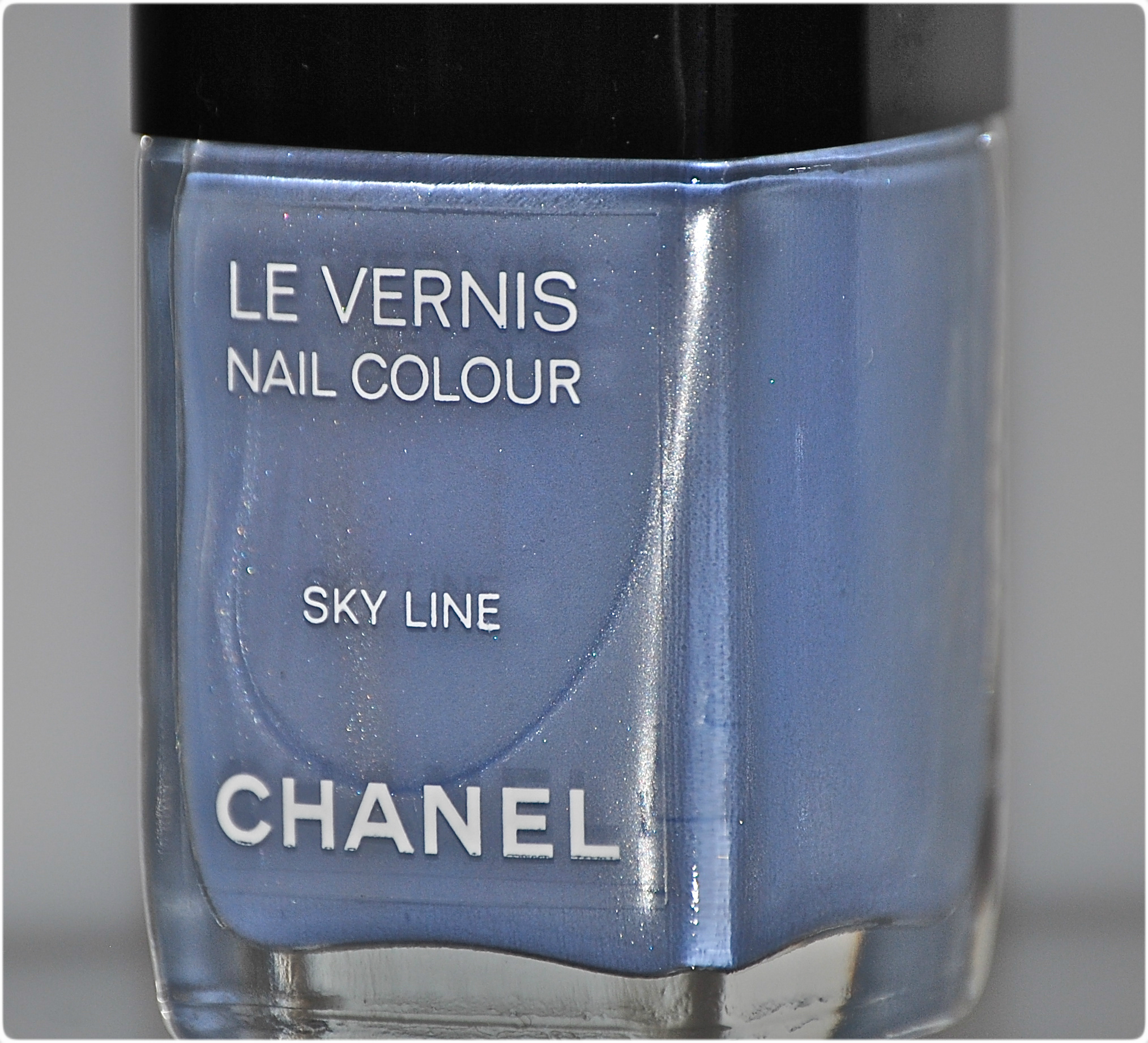
Early glimpses of CHANEL’s spring 2012 couture show, revealed the models wearing a light blue nail varnish; those quick peeks were all it took, and everyone began buzzing about ‘Sky Line’ – but it would prove to be almost unicorn-like in its elusiveness (especially for us Canadians). Then, when the first swatches started circulating, there was much said about its finicky formula. Did that stop me from wanting to add this beauty to my CHANEL collection of lacquers? Uh … not so much, obviously. How could I possibly pass up a shade as unique as this, and from a brand I adore?

Sky Line
buy generic cozaar online buynoprescriptionrxonline.com/generic-cozaar.html no prescription
Sky Line – is full of surprises. An ethereal silvered cornflower-blue shade, there are pearly flashes that underly the entire look. The medium thick formula has an excellent flow, although the slightly frosty finish means you do need a steady hand in application to keep any visible brush strokes to a minimum. Dry time was unexpectedly quick, and while there is a lovely natural shine at the end, top coat not only enhances the colour, but helps to camouflage any imperfections. It should be stated that the camera really does emphasize the brush strokes in the following photos — all significantly less visible when seen with the naked eye. All swatches are with base and top coats. Coats applied: 2 – perfect coverage & opacity.
buy doxycycline online buynoprescriptionrxonline.net/doxycycline.html no prescription

in sunlight

in sunlight

with indirect lighting
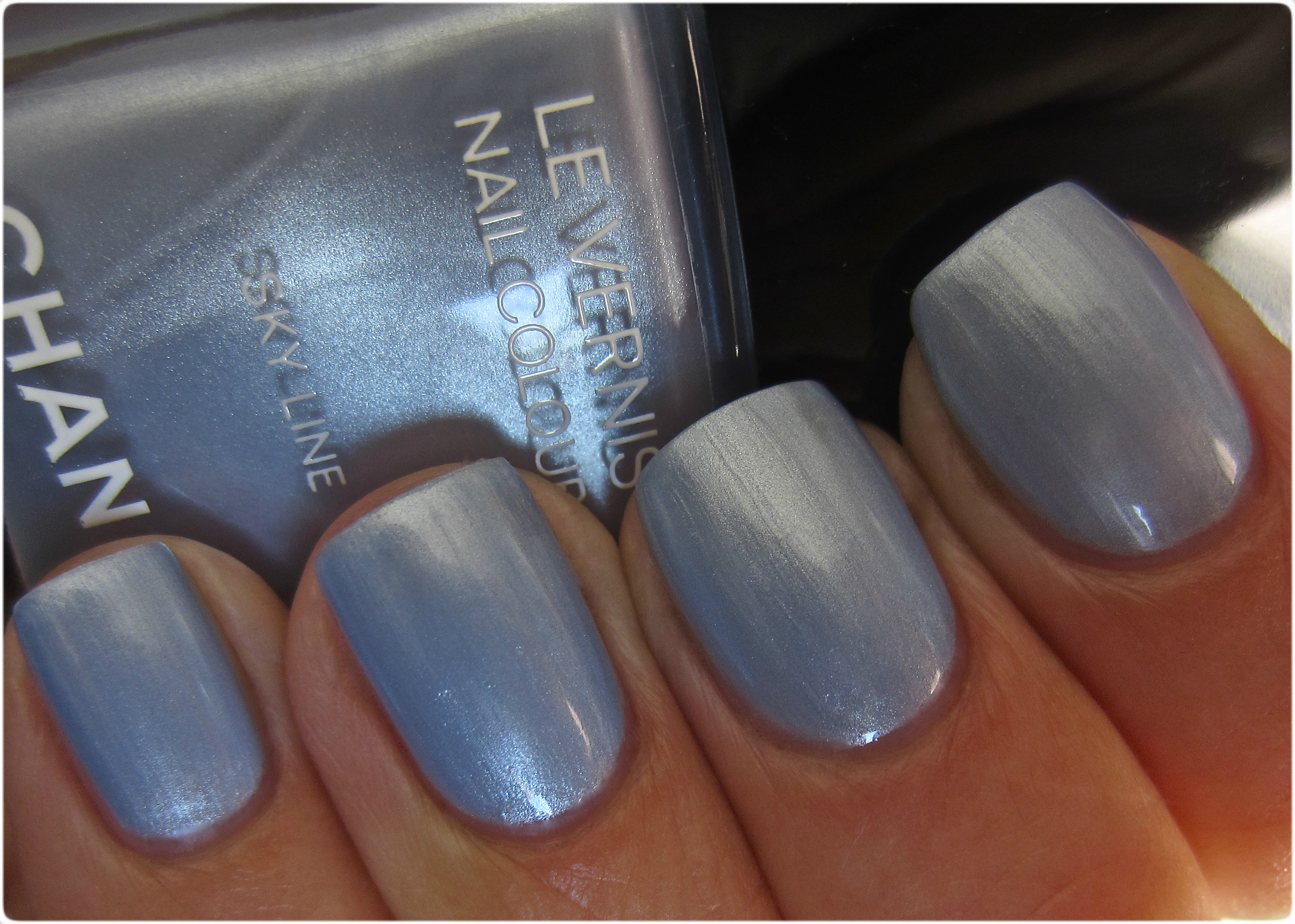
in shaded light

in indirect shaded light
Final thoughts: Here’s the thing; I’ve talked often enough of my love for deep hues, especially crème shades, so I wondered if the only reasons I was drawn to this varnish was because a) it’s CHANEL and b) it’s a limited edition item. Well, I’d be lying if I said that those 2 reasons weren’t factors, but I surprised myself by how much I loved this shade — and the longer I wore it, the more I couldn’t stop looking at it. Something about this totally unique shade of blue, made me think “snow queen” with its icy overtones, and rummaging through my collection of varnishes yielded absolutely no look-a-likes, making me realize that I was right in not passing this up. Still, while neither a shade or a finish for everyone, there is no denying how original this colour is. Almost makes me look forward to winter. I said “almost”.
buy estrace online buynoprescriptionrxonline.net/estrace.html no prescription

*


CHANEL – Les Essentiels de CHANEL Fall 2012 Le Vernis #559 Frenzy, #561 Suspicious and #563 Vertigo & Comparisons

Before I even began swatching the new trio of nail varnishes from CHANEL’s fall 2012 ‘Les Essentiels de CHANEL’ collection (reviewed in my previous post here), I had already started thinking of possible look-a-like contenders; naturally, I wanted the duplicates to be as identical as I could find them and since these particular shades aren’t too outrageous, I figured it would be relatively easy to find a few döppelgangers. Uh, not so much. But some interestingly close relatives were found just the same.


Finding a #561 Frenzy clone wasn’t as hard as I originally thought, but even so, most of the bottles I culled from my stash were either too pale, too grey, or too pink. I finally opted for Essie’s ‘Miss Fancy Pants’ from the brand’s fall 2012 collection (previously reviewed here). The following swatches are all with Seche Clear Base Coat and Seche Vite Top Coat. Coats applied – 2 (for each) and how it compared:
- middle & ring fingers: CHANEL #559 Frenzy
- index & pinkie fingers: Essie ‘Miss Fancy Pants’ – a definitely thicker formula, more grey tinged and a few degrees deeper in tone, bearing similarities in opacity, self-levelling application and high gloss shine at the finish

in sunlight

in shade

with flash

I immediately knew which shade I wished to compare #561 Suspicious to, and that was none other than CHANEL’s #541 ‘Tentation’ from one of the brand’s spring 2012 releases (previously reviewed here), although I was concerned about the differing finishes but I felt that the base colour was identical enough to warrant a comparison. Once more, all swatches were done using Seche Clear Base Coat and Seche Vite Top Coat, using 2 coats of lacquer for both. Here’s how it compared:
- middle & ring fingers: CHANEL #561 Suspicious
- index & pinkie fingers: CHANEL #541 Tentation – a hybrid jelly/crème formula, which seems to give this shade more elasticity on application, several degrees more vibrant and pink-leaning when viewed live – most probably due to the multitude of fuchsia and blue tinged ultra-fine shimmer it’s filled with, same opacity and ease of application but not as glossy at the finish.

in sunlight

in shade

with flash

The final shade, #563 Vertigo proved to be more of a challenge and I was pretty sure that I had absolutely nothing like it in my collection. On the one hand I was right, but still found myself surprised to pull out at least 2 possibilities – both found amongst my Diors – ‘Ebony’ from the Mitzah Collection (previously reviewed here) and ‘Underground’ from the ‘Rock Your Nails Collection’ (previously reviewed here), and then decided to add CHANEL’s #509 ‘Paradoxal’ (previously reviewed here) to the equation, primarily because it offers the same mysterious shimmer as that of ‘Vertigo’, although the intensity of ‘Paradoxal’s’ hue is visibly way off. All swatches are with Seche Clear Base Coat and Seche Vite Top Coat. Coats applied – 2 for each. Here’s how they compared:
- index finger: Dior ‘Ebony’ – the thinnest formula of them all, more brown based and bearing sparse silvery flecks that are almost invisible to the naked eye
- middle finger: CHANEL #563 Vertigo
- ring finger: Dior ‘Underground’ – the thickest formula of the group, although with a similar flow to that of ‘Vertigo’, more prune based and bearing scant silvery flecks that add depth, but are not visible unless seen in direct sunlight/flash
- pinkie finger: CHANEL ‘#509 Paradoxal’ – identical formula to that of ‘Vertigo’ and similar concept of a “muddied tone filled with complex shimmer”, obviously more deep mauve/purple leaning but with that same enigmatic look to it

in sunlight

in shade

with flash
Final thoughts: From the three lacquers of the ‘Les Essentiels de CHANEL’ Collection, the 2 that I would have to say are the most easily duplicated, are without a doubt #559 Frenzy and #561 Suspicious, although even at that, you would be hard pressed to find an exact match or come close to CHANEL’s stellar formula and application. Looking at the comparisons to #563 Vertigo, it is clear that there really is NOTHING like it out there, although if you theoretically combined Dior’s ‘Ebony’ and ‘Underground’, you’d probably come very, very close. Theoretically. My final verdict? I’m pleased to say that all three CHANELs can definitely hold their own in anyone’s collection, but if it’s something unique, off-the-wall, and one-of-a-kind that grabs your fancy, then you should definitely snag #563 Vertigo — while you still can!

*Disclaimer: Some products provided by the company/PR for my unbiased consideration
CHANEL – Les Essentiels de CHANEL Fall 2012 Le Vernis #559 Frenzy, #561 Suspicious and #563 Vertigo (swatches & review)

If there’s one vice I unashamedly cling to, it’s my love of all things CHANEL … and have been indulging in said vice for over 25 years now. Every new collection makes my blood rush – sometimes scary fast, at others not so much – but while not every cosmetic item will grab my eye (and my wallet), the nail lacquers are something I absolutely cannot resist. My first thoughts on viewing the newest trio, part of ‘Les Essentiels de CHANEL’ collection, was a mixed bag of emotions; but even that wasn’t enough to keep me from snagging all three. Told you: total addiction!

The three nail varnishes of ‘Les Essentiels de CHANEL’ collection are comprised of #559 Frenzy – a lavender tinged pale taupe crème, #561 Suspicious – a vibrant fuchsia crème, and #563 Vertigo – a mind-boggling mix of grey and eggplant, filled with an inner fiery shimmer. Application of all three hues was effortless, as they each flowed with ease along the nails, requiring only the lightest of pressure of the mid-sized flexible brush to achieve a beautiful finish. All swatches are with Seche Clear Base Coat and Seche Vite Top Coat.
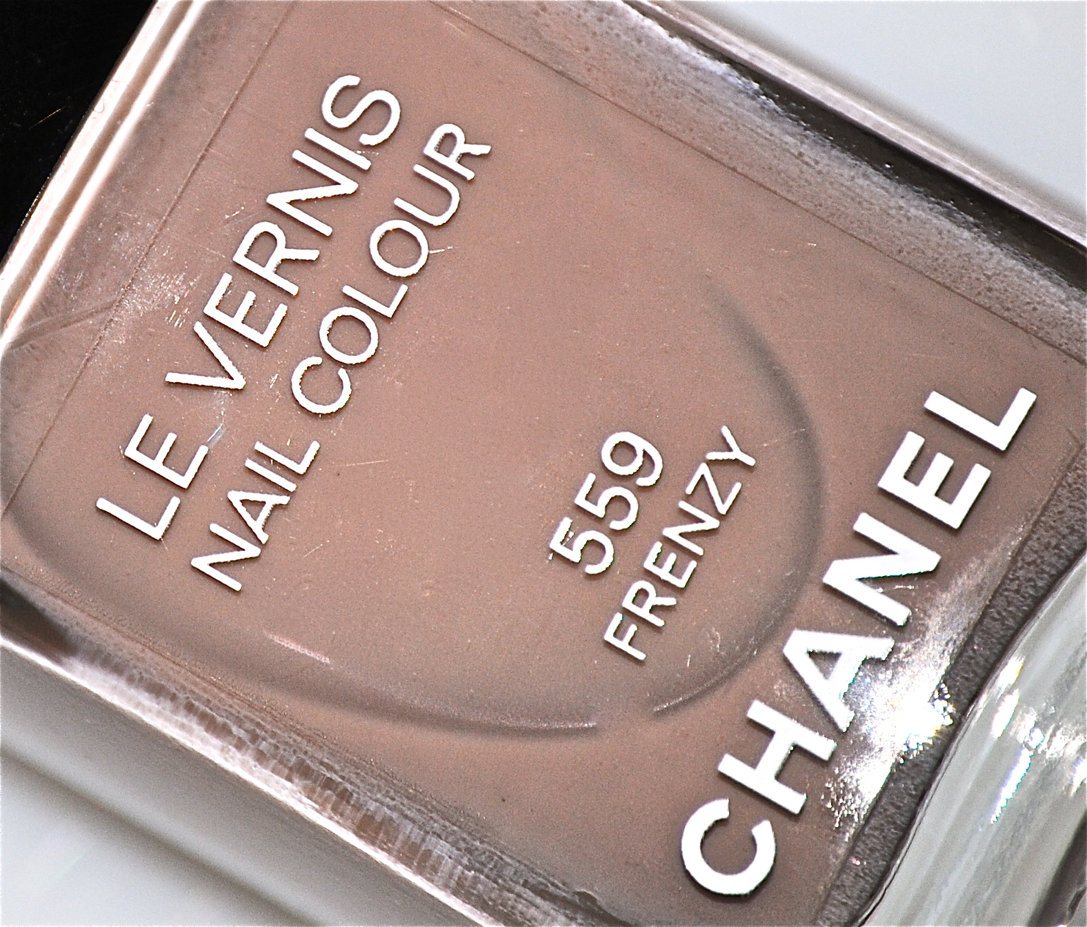
#559 Frenzy – is what is meant by a true “palate-cleansing” colour; a diffused putty crème hue that is dusted with hints of lavender, the first coat provided surprisingly good opacity for such a light colour. The thin-leaning yet easy flowing formula bears an excellent viscosity, laying down in a self-levelling way and leaving behind an ultra high-gloss shine at the finish. Coats applied: 2

in sunlight

in shade

with flash
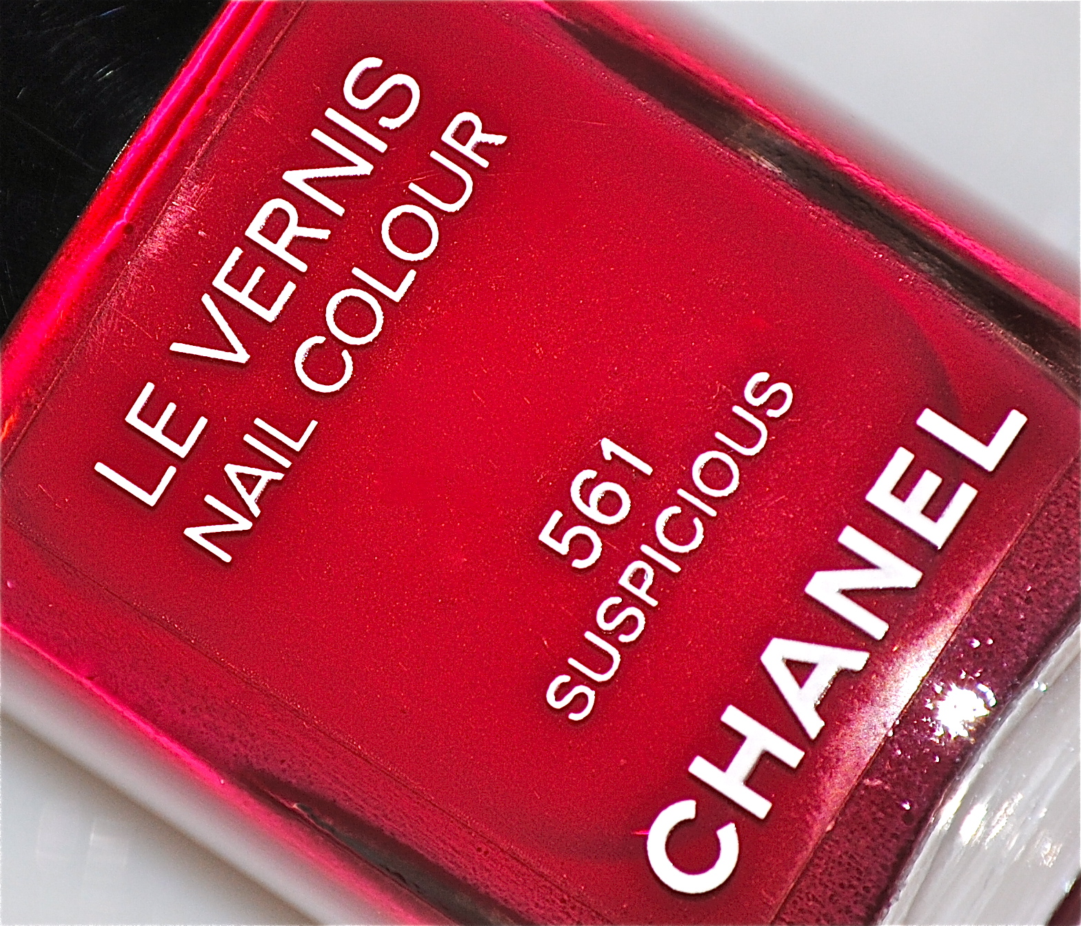
#561 Suspicious – is about as perfect as a nail lacquer can get; beginning with a formula that flows like silk across the nails, to its incredibly high pigmentation of colour that make this a true 1-coater if so desired, this luxurious deeply brilliant cerise hue bears magenta undertones in its base that make it paradoxically warm and cool toned, depending on the angle and lighting. Exceptionally self-levelling and with a mirror-glass shine at the finish, the one word to describe this is: INSANE! Coats applied: 2
buy fosamax online noprescriptionrxbuyonline.com/fosamax.html no prescription

in sunlight

in shade

with flash
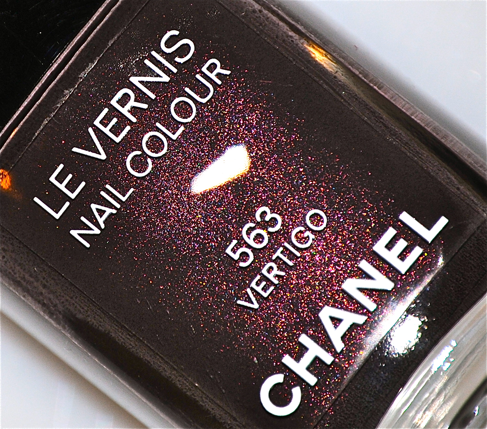
#563 Vertigo – bears the thickest formula of the three, although that does not detract from its stellar application just the same. With a wonderful flow and viscosity, not to mention the high saturation of colour, this is another shade that can easily pass as a 1-coater (although I recommend 2 coats to enhance its unique depths). A highly complex mix of slate grey, mink brown and the deepest plum, its ultra-fine bronze and reddish shimmer only really becomes apparent when viewed in direct sunlight or under flash, although I suspect it goes a long way in adding to its allure. A truly unique shade worthy of “vamp” status. Coats applied: 2

in sunlight

macro

in shade

with flash
buy glucophage online noprescriptionrxbuyonline.com/glucophage.html no prescription
Final thoughts: When I came across the ‘Les Essentiels de CHANEL’ collection, I was initially hesitant – a rare occurrence for me; last year’s fall offering found me in awe of the entire collection, but this year I limited myself to the 3 varnishes, and just a few more items (to be reviewed soon). That doesn’t mean I still don’t have time to be convinced about the rest, however. Having amassed a rather large collection of CHANEL lacquers over the years, I never fail to be amazed at how the brand continues to produce colours that are fresh & spot-on trend, but then again, it is CHANEL, after all! I absolutely love all 3 shown here, as they each offer something different and I refuse to pick a favourite … sorry! Stay tuned for my comparison post coming up in my next review!
buy grifulvin online noprescriptionrxbuyonline.com/grifulvin.html no prescription

CHANEL – Les Roses Ultimes de Chanel Collection 2012 (swatches, comparisons & review)

There’s an undeniable Frisson (shiver) of excitement I feel when I come across a new CHANEL collection, and the while the Attraction may be obvious, the Distraction of all that beauty makes me catch my breath – in the end, I cannot help but give in to the utter Tentation (temptation): CHANEL, I’m yours!
I know, cheesy but … I couldn’t resist trying to use the names of all four lacquers in one sentence! Right before CHANEL’s summer offering came out, the brand had released a smaller capsule collection consisting of 6 limited edition Glossimers (I caved and bought one, but that’s for another post) and 4 limited edition lacquers, all inspired by the sublime beauty of roses. I am a self-professed CHANEL addict collector, although I must confess that initially I wasn’t wowed by these shades – but it didn’t take long for me to have a change of heart, as the following all proves!

‘Garden Queens’ by Robert Joyner (source)

There’s a convoluted story behind how I ended up with this collection; I was sure that I had duplicates for at least 2 out of the 4, so I initially walked away with only two of them: ‘Attraction’ and ‘Distraction’. Bringing them home, however, not only showed me that they actually were unique in my collection, but also made me question my decision to leave the other 2 behind. Sooooo….
‘Frisson’ I pretty much wrote off as soon as I saw it, primarily because I was sure it was identical to last year’s ‘Morning Rose’, but once again, I was wrong. Therefore (and several days later), I picked it up as well. Now though, the foursome was only a trio (unfair? awkward? unbalanced?) – but still not reason enough to convince me to add the missing shade.
‘Tentation’ finally joined its brethren — for free! (which I picked up using my Pharmaprix Optimum Points – so sweet!) I should state that even had I not received it gratis, one quick counter swatch was enough to convince me how totally stunning it truly is and that I was insane to not already own it!
buy zantac online buynoprescriptionrxxonline.net/zantac.html no prescription

white rose (source)

‘Attraction’ is a highly gleaming and somewhat metallic frosted white hue … and a bit of a contradiction. It should be stated that this shade certainly looks significantly better on; in pictures, what stands out more than anything are any visible brush strokes, an unfortunate by-product of this type of finish. The medium-thick formula spreads well, although you do need a steady hand with your application to keep it smooth looking. Surprisingly, 2 coats were enough for good opacity, although I did 3 for the swatches. With a pearly shimmer softening the wintry cast of this lacquer, this is a fresh & crisply modern way to wear white.
NOTE: This was the shade the models sported at the CHANEL spring 2012 runway show.

in sunlight

backlit

shade

indoors

with flash

Rummaging through my CHANEL lacquer collection for anything similar, the only shade that came remotely close was ‘Pearl Drop’ (previously reviewed here); below is a list of how it compared. Index & pinkie fingers – ‘Pearl Drop’ (3 coats as well), middle & ring fingers – ‘Attraction’. buy zestril online buynoprescriptionrxxonline.net/zestril.html no prescription
- more sheer with a thinner formula
- golden shimmer (adds a warm cast)
- smoother finish and less prone to visible brush strokes
- looks dingy beside the icier white of ‘Attraction’

in sunlight

backlit

shade

indoors

with flash

pale pink rose (source)

‘Frisson’ is a ballet tutu pink hue, made even more interesting by the addition of finely ground gold and slightly iridescent pink glitter. The excellently flowing formula made application a breeze and while I absolutely loved the translucent look of 2 coats, I opted for 3 coats here to achieve a deeper opacity. Another plus: how self-levelling and wonderfully glossy the finish is. Personally, this shade reminds of one thing: powerful femininity. Love that!

in sunlight

backlit

shade

indoors

with flash

buy zetia online buynoprescriptionrxxonline.net/zetia.html no prescription
Until I went looking, I hadn’t realized exactly how many pale pinks I am fortunate enough to own in my rather extensive CHANEL lacquer collection, and yet ‘Frisson’ still manages to stand out among them. Here’s how they compared:
- index finger: ‘Flamingo’ – base hue almost identical to ‘Frisson’, no glitter but more of a pearly shimmer, a denser formula making it more opaque and overall a degree warmer by a slight peachy tint.
- middle finger: ‘Frisson’
- ring finger: ‘Morning Rose’ – similar sheerness to ‘Frisson’, several degrees deeper in tone making it the darkest here, with a higher concentration of gold glitter
- pinkie finger: ‘Bikini Rose’ – medium formula, not quite as sheer as ‘Frisson’, a few degrees lighter in tone, no glitter but with a subtle and ultra-fine hot pink/fuchsia duochrome flash (quite gorgeous, actually!)

in sunlight

backlit

shade

indoors

with flash

coral rose (source)

‘Distraction’ is perfection. Really. A simmering salmon pink/warm coral hue, the formula was nothing short of amazing, flowing easily and with an excellent viscosity. The first coat lays down a touch on the sheer side, which becomes opaque by the second, although I did 3 coats for the swatches here. Bearing an almost jelly-ish look to it, the finish is not only completely self-levelling, but ultra-glossy as well – but the best part is the internal fuchsia fire of this beauty, which adds such a stunning luscious depth. LOVE!

in sunlight

backlit

shade

indoors

with flash

The only shade that bears even the slightest resemblance to ‘Distraction’ in my CHANEL collection, is ‘Orange Fizz’ (on index and pinkie fingers) – here’s how it compared:
- slightly more opaque
- definitive peach/orange undertones
- no inner flash or shimmer

in sunlight

backlit

shade

indoors

with flash

fuchsia rose (source)

‘Tentation’ is the other shade of this collection that has totally stolen my heart. This is a most luxurious and deeply intense fuchsia hue, filled with a vivid magenta shimmer that gives off an almost luminous blue-ish flash in certain lights. An exceptional formula (the best of the four, actually), 2 coats are more than enough for perfect coverage, although I applied 3 here for consistency with the rest. Self-levelling and with an ultra glassy finish, do not skip base coat as this shade has the potential to slightly stain.

in sunlight

backlit

shade

indoors

with flash

Before picking up ‘Tentation’, I was sure that it was basically a summer version of ‘Rouge Carat’ (previously reviewed here), but as you’ll see in the swatches, I was way off. Here’s how it compared: (3 coats shown on index and pinkie fingers)
- same amazing formula, viscosity and opacity/coverage, self-levelling properties and glossy finish
- more red-toned
- ruby inner shimmer, giving a more “fiery” look
- looks red besides ‘Tentation’

in sunlight

backlit

shade

indoors

with flash
Final thoughts: With the exception of ‘Attraction’ and its rather fussier nature, this is another stellar collection of varnishes from the house of CHANEL. I love how a theme as obviously romantic as roses, is interpreted in such a modern and fresh way, with a small but interesting assortment of colours. As I stated earlier, I can understand why Peter Philips (CHANEL’s Creative Director) chose ‘Attraction’ for the runway show, as it definitely looks amazing when seen “live”. I believe that each shade shown offers something unique, although the show-stoppers here have got to be ‘Distraction’ and ‘Tentation’, not only for their vivid hues, but for bearing such superior formulas. Still available at CHANEL counters now, I encourage you to take the time and stop to smell, er…swatch these “roses”!

Vintage CHANEL: #247 Haute Chocolat (swatches & review)

How thrilled would you be if you could help create a unique CHANEL nail lacquer shade? That’s exactly what happened in 2008 to then-19 -year old Amy Gonzo from Port Washington, WI, when she entered the “Color of the Year” contest sponsored by Seventeen Magazine in conjunction with CHANEL. Her winning entry was inspired by her favourite holiday & cold weather drink: a steaming cup of hot chocolate. Choosing a unique twist on the name, she very aptly named her colour ‘Haute Chocolat’, in honour of the French cosmetics brand – how perfectly fitting for this decadently rich, deep brown lacquer.
How I came to have this beauty: Being the CHANEL cosmetics addict collector that I am, I literally moved heaven & earth to get this shade … no, seriously: I bought it sight unseen back in 2008, had it shipped to my mother-in-law’s condo in Florida where my sister-in-law (who was visiting there at the time) was supposed to bring it back to Montréal for me – she forgot to pack it – I had to then wait a few more months before my mother-in-law came back with my treasured bottle, until I could finally get my hands (or nails) on it … crazy stuff, but 100% true!
buy prevacid online rxbuyonlinewithoutprescriptionrx.net/prevacid.html no prescription

how absolutely yummy does this look? (source)

CHANEL’s #247 ‘Haute Chocolat’ is a simply stunning hue, like that of simmering melted chocolate. Interestingly enough, the formula is thin – almost watery, yet still manages to flow exceptionally well. This rich mink brown colour is shot through with silver, gold, pink, blue, and green ultra-fine glitter, some of it so minute that it only appears as quick little flashes of light. In order to achieve the opacity you see here, I applied 3 very thin coats, although you could probably get a similar look with 2 thicker layers. For a shimmery lacquer, I was pleased by how naturally glossy it was and the fact that there was no staining upon its very easy removal, was a nice bonus.
buy prelone online rxbuyonlinewithoutprescriptionrx.net/prelone.html no prescription

in sunlight/deep tone

in sunlight/medium tone

in sunlight/lighter tone

closeup

indoors/lighter tone

indoors/deeper tone

backlit

with flash
Final thoughts: ‘Haute Chocolat’ not only proudly takes its place in my collection of vintage CHANEL lacquers, but also has the distinction of being a totally unique colour amongst its fellow varnishes. This luxurious hue has some chameleon-like properties as well, going from a deep seal brown, to a mid-range chestnut, as well as taking on a lighter sepia tone at times. Never being one to follow trends all that closely, I absolutely love the glimmering look of ‘Haute Chocolat’ against lightly tanned skin … so totally compliments that summer glow! After its long journey to get to me, wearing this delicious hue was so worth it! (plus, I make a mean cup of cocoa – how could I not own this gem?)
buy prednisone online rxbuyonlinewithoutprescriptionrx.net/prednisone.html no prescription