- Beauty Journalist & proud Montrealer with a passion for beauty in all its fabulous diversity. "Beauty begins the moment you choose to be yourself" - Coco Chanel
To suscribe, please enter your email:
Archives
Categories
Categories
beauty Beauty Tools Blush Bronzers Brushes Chanel CHANEL Beauty CHANEL Makeup Chanel nail polish Cosmetics Dior Essie Eye Liner Eye Shadow eyeshadow eyeshadow palette Face Powders Foundation fragrance Guerlain Highlighter Highlight Powders limited edition limited edition beauty limited edition makeup Lip balm Lip Gloss Lip products lipstick luxury beauty luxury makeup MAC Makeup makeup Makeup Artist Makeup Brushes Mascara nail polish Nail Polish Comparisons NARS New OPI palette Perfume Skincare- @ommorphia on Instagram
-
Filed In: China Glaze
China Glaze ‘Let It Snow’ Collection Holiday 2011 – part 1 (swatches & review)
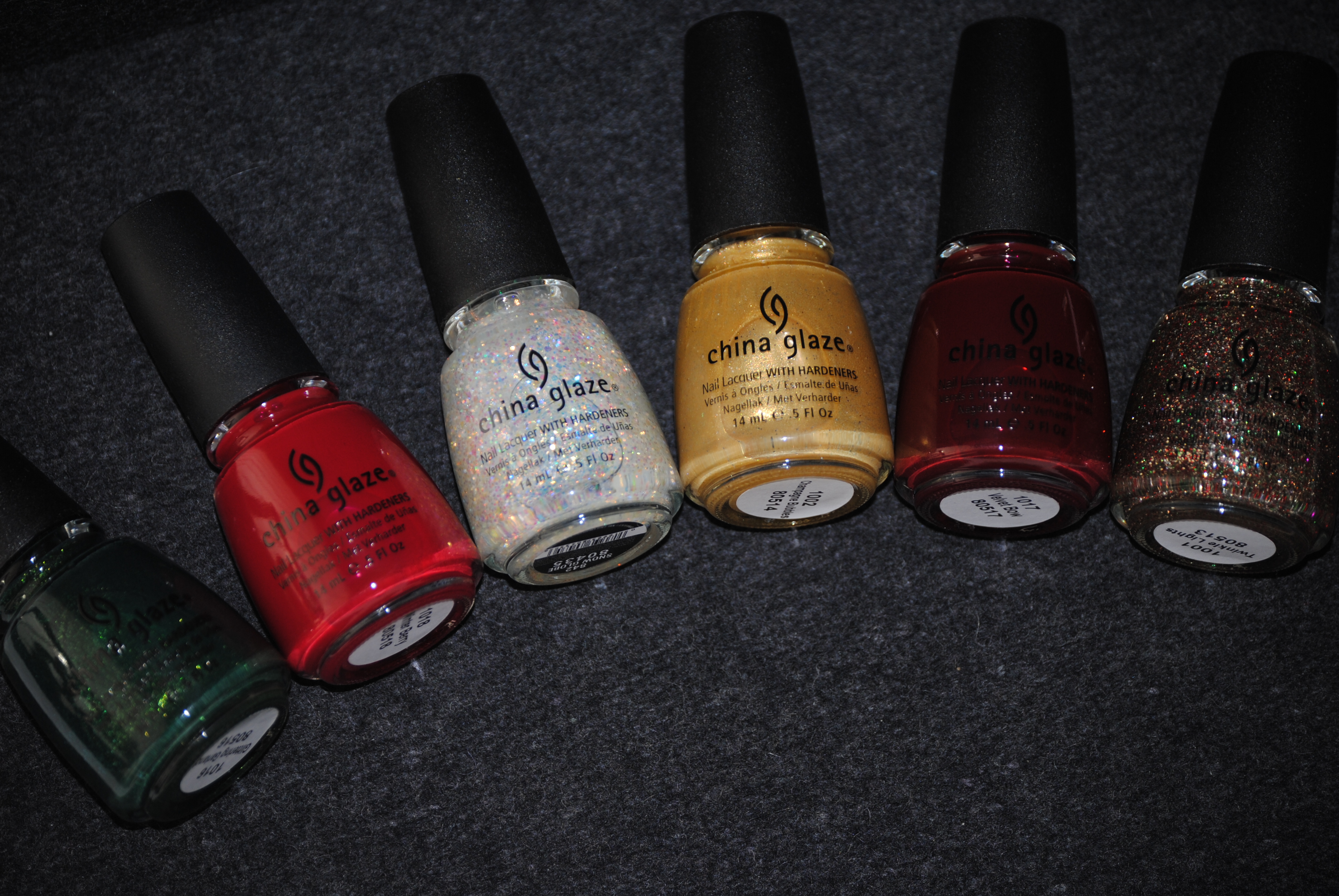
For Holiday 2011, China Glaze brings a winter wonderland to life with their new collection, aptly titled ‘Let It Snow’. Comprised of twelve gorgeously festive shades, including ultra fine shimmers, jewel-rich crèmes, as well as twinkling glitters, there is something in this collection to suit every taste and to have your tips ready to meet every holiday event. To make things easier, I have broken this collection down into two segments, so that you can fully enjoy each varnish’s stunning glow! All swatches are with Deborah Lippmann’s 2-Second Nail Primer as well as On A Clear Day Top Coat, and Seche Clear Base Coat.
‘Snow Globe’ is nothing short of magical! Bringing me back to my childhood and my endless fascination watching the glittering particles swirling throughout these shaken orbs, this replicates that look so completely! A clear base filled with iridescent and prismatic mid-sized glitter, the formula was a touch on the thick/suspension side, but still very workable. While I love the “fairy lights” look of this on its own, it would make a truly unique layering polish as well. The following swatches are with three coats of lacquer, and I was pleasantly surprised by how smooth to the touch it felt with simply one layer of top coat. Bonus: very easy removal.
Sunlight lends ‘Snow Globe’ a delicate rainbow-like spotted effect, with each sequin giving off its own delicate glow.
Indirect light casts a cooler look overall, and seems to not only spotlight each particle of glitter, but adds a subtle blueish tinge.
I love how shaded light makes ‘Snow Globe’s’ glitter almost dance in the light, while adding a much warmer tone throughout.
A final view taken with flash sends the light bouncing off each colourful sequin, yet still manages to look subtle and never gaudy.
‘Champagne Bubbles’ is a gentle lemon-gold hue, filled with ultra fine golden shimmer and small sparse gilded glitter. The formula itself was amazing with very good gloss at the finish, but as this is a touch on the frosty side, you need to apply your coats carefully to avoid any visible brush strokes being left behind. Interestingly enough, I noticed green and pink flashes simmering in the base colour, however the pictures failed to capture these nuances. While I personally prefer the more delicate look of this shade at two coats, I applied three here for fuller opacity.
Sunlight serves to emphasize the more yellow tones found in this shade, and pushes the gold glitter particles deeper into the background.
Indirect light lends ‘Champagne Bubbles’ an icier semblance and turns the glitter into silvery shards of light interspersed throughout the base hue.
Shaded light not only gives this shade a sunnier disposition, but clearly emphasizes its delicate golden glitter.
A final view taken with flash reflects brilliantly off the golden finish of this hue, and displays how elegant it shines, despite its intensity.
‘Twinkle Lights’ is like Christmas in a bottle of lacquer! A medium thick, rather suspension-like formula, it is simply filled to the brim with gold, green and red micro-glitter, all in a clear base. Perfectly enchanting with two coats, as I applied here, I don’t know if you’d even want to add a third layer, as the coverage seemed more than enough like this. Gleaming jewel-like, it can almost take on the look of foil in some lights, and I would advise waiting at least 2 minutes between coats, in order to avoid any potential clumping.
When seen in sunlight, the more foil-like nature of this lacquer comes forth, and merges all the colours into one glimmering tapestry.
Indirect light gives makes it seem as though multi-hued icicles were scattered across the nails.
Shaded light definitely brings out the more golden side of this lacquer, yet the green and red glitter serve as perfect companions.
A final view taken with flash is almost diamond-like in its brilliance! How pretty (and festive!) is this?!
‘Velvet Bow’ is in a word: SPECTACULAR. Seriously, the formula was beyond amazing and practically applied itself. Intensely glossy, completely self-levelling and gliding on like silk, two coats were all that were needed to reach complete opacity, and while you certainly don’t need to add a top coat for any shine, I wouldn’t advise skipping that step – if only to protect and prolong this awesome shade. Bonus: absolutely no staining left behind upon removal.
Sunlight reflects almost blindingly off this shade, emphasizing its deep maroon leanings.
Indirect light deepens the overall tone of ‘Velvet Bow’ and calls forth hints of brown lurking in its base.
Shaded light gives this shade a hint of berry, however the tone remains urban and very sophisticated.
A final view taken with flash emphasizes the luscious nature of this shade and shows how creamy it truly appears.
‘Glittering Garland’ is that perfect Christmas tree green, but is made so much more unique by all that it has going on. A fabulous formula, this is a deep almost pine green shade, loaded with brighter, viridian green shimmery flecks that lend it that “lit-from-within” glow (which I totally adore!). A wonderfully self-levelling application, the glass-flecked finish had a decent shine at the end, but greatly benefits from the addition of top coat to really make it stand out. A total STUNNER!!
Sunlight, and it looks like the light shining off the sparkling dew tipped leaves of a pine forest, a classical colour yet given an urban edge.
Indirect light appears to add some drama and mystery to ‘Glittering Garland’, while deepening the base hue to a more hunter green shade.
Shaded light does amazing things to the glass-flecked intensity of this shade, giving it the look of a green fire simmering under the surface.
A final view taken with flash makes this look, well….like a glittering garland! I love how the intensity of the shimmery flecks just seem to pop!
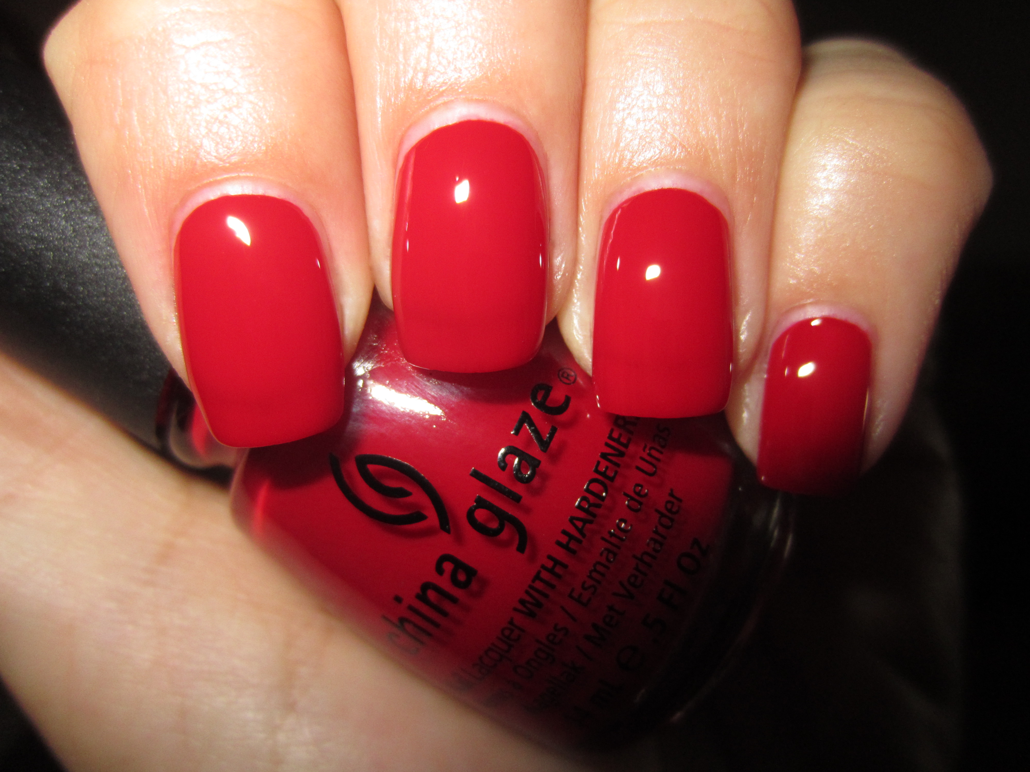
‘Winter Berry’ reminds me of those little red berries that the holly bush produces…and just as juicy looking! A stellar self-levelling application, this is a blue based brilliant scarlet hue, yet its more jelly-like formula gives it a wonderfully cushiony appearance. An insanely ultra-glossy finish, two coats were all that were needed for this pigment-saturated hue to provide full coverage. A true berry shade, it was simply perfection in every way and the best part? NO staining left behind!
Sunlight brings out a more cerise side to this shade, giving it the look of glossy maraschino cherries…and just as luscious!
Indirect light takes ‘Winter Berry’s’ vividness down a few notches, yet note how its brilliance still lingers.
Shaded light brings out any deep pink undertones found in this shade’s base hue, giving it a fresh and fun vibe.
A final view taken with flash, adds a dripping wet element to the finish, ending ultra glossy and pillowy soft in appearance.
Final thoughts: I have yet to be disappointed with anything China Glaze produces, and these first six lacquers of the ‘Let It Snow’ Collection are no exception. While these shades lend themselves so perfectly to the holiday season, they are nonetheless colours that will transcend the festivities and work well in the upcoming months as well. The formula on all was a joy to apply, and China Glaze’s modest price point makes it sweeter still. The collection has already begun trickling into stores now, but I encourage you to visit the company’s website for more information. The weather outside may be frightful (not yet!), so “let it snow, let it snow, let it snow” (I couldn’t resist) – as long as it melts on command! Stay tuned for my upcoming review on the second half of this collection.
*Disclaimer: Product samples provided by the company/PR for my unbiased consideration
Reader Request: Dark Grey Comparisons (swatches & review)
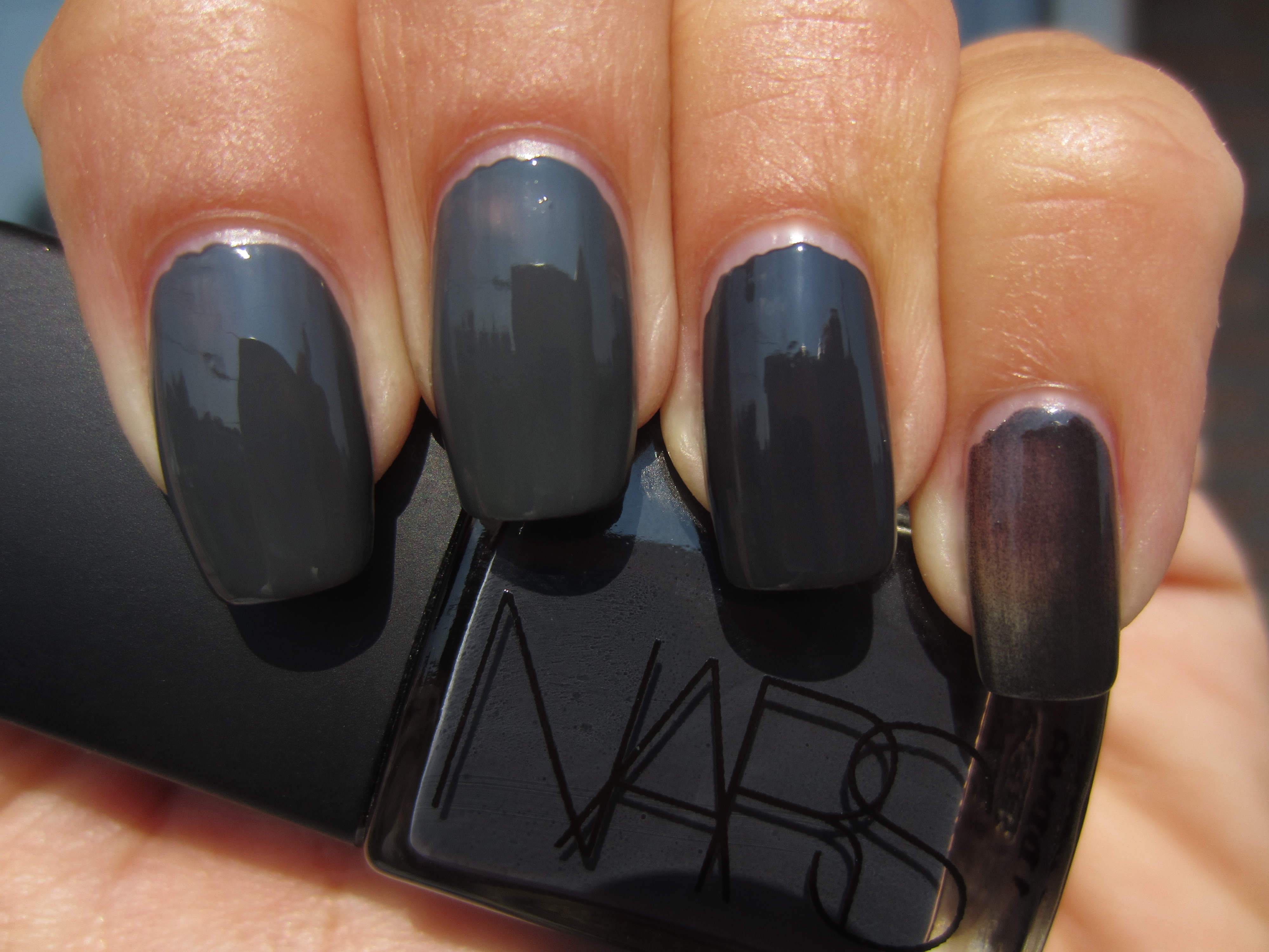
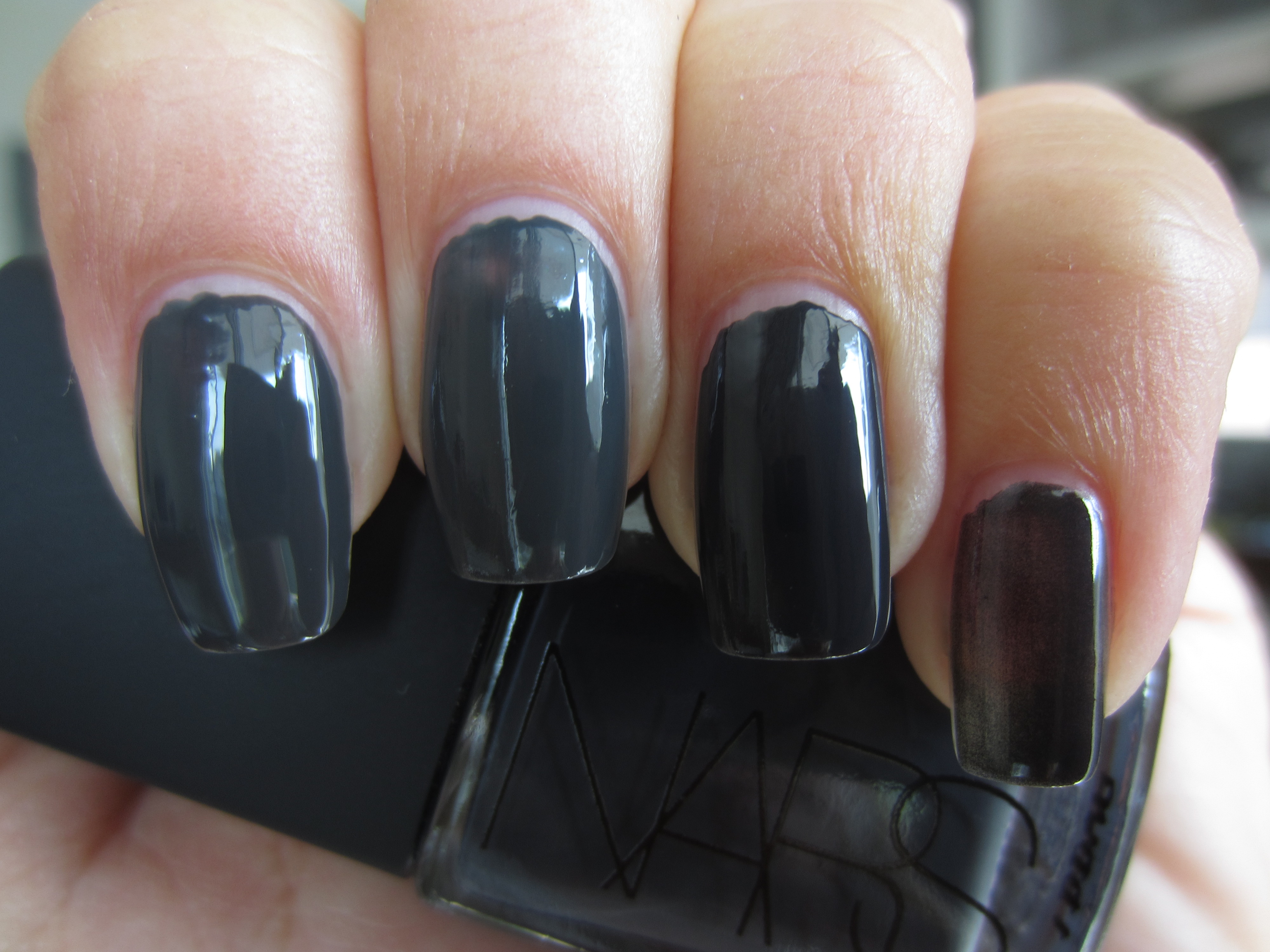
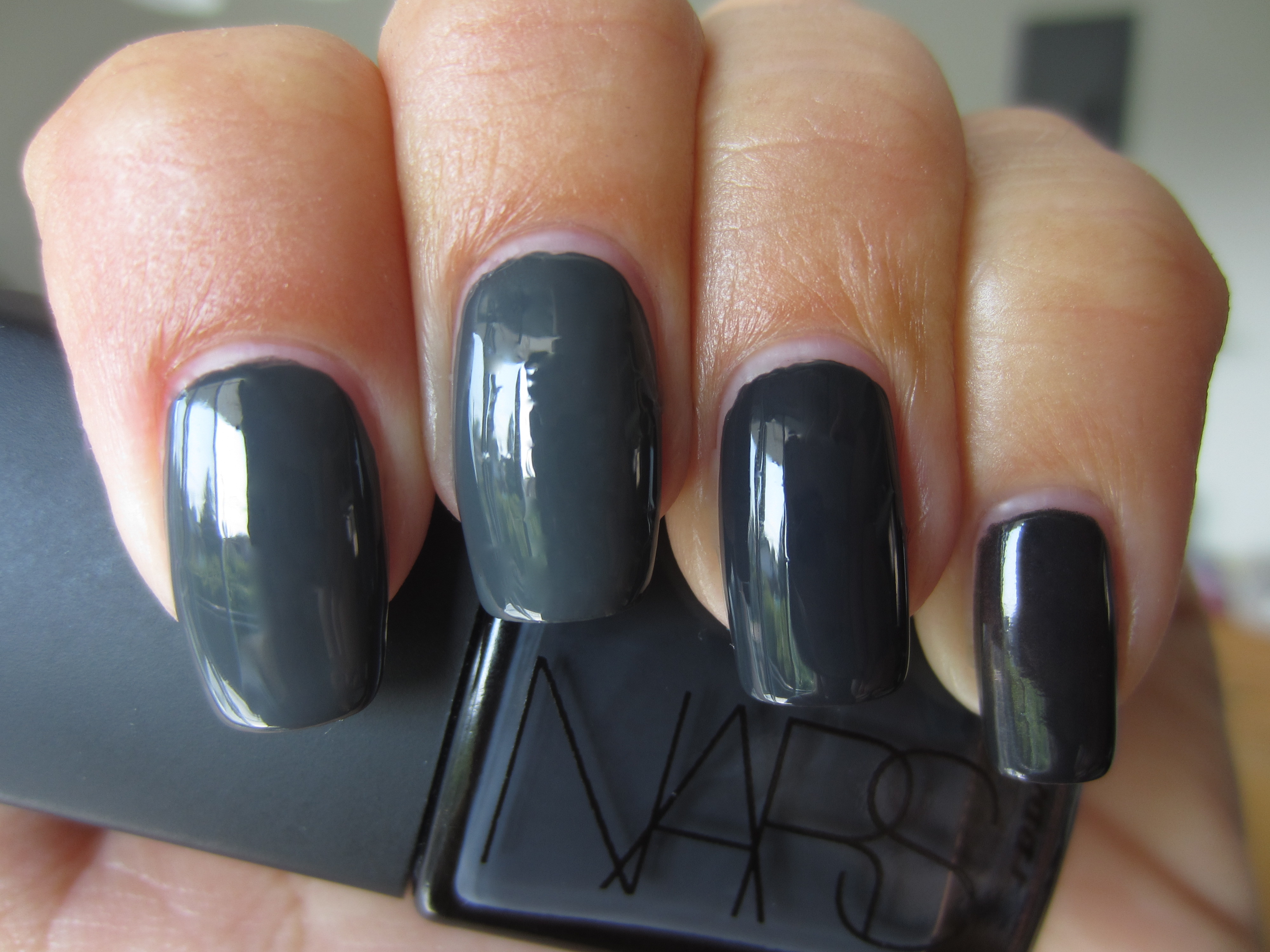
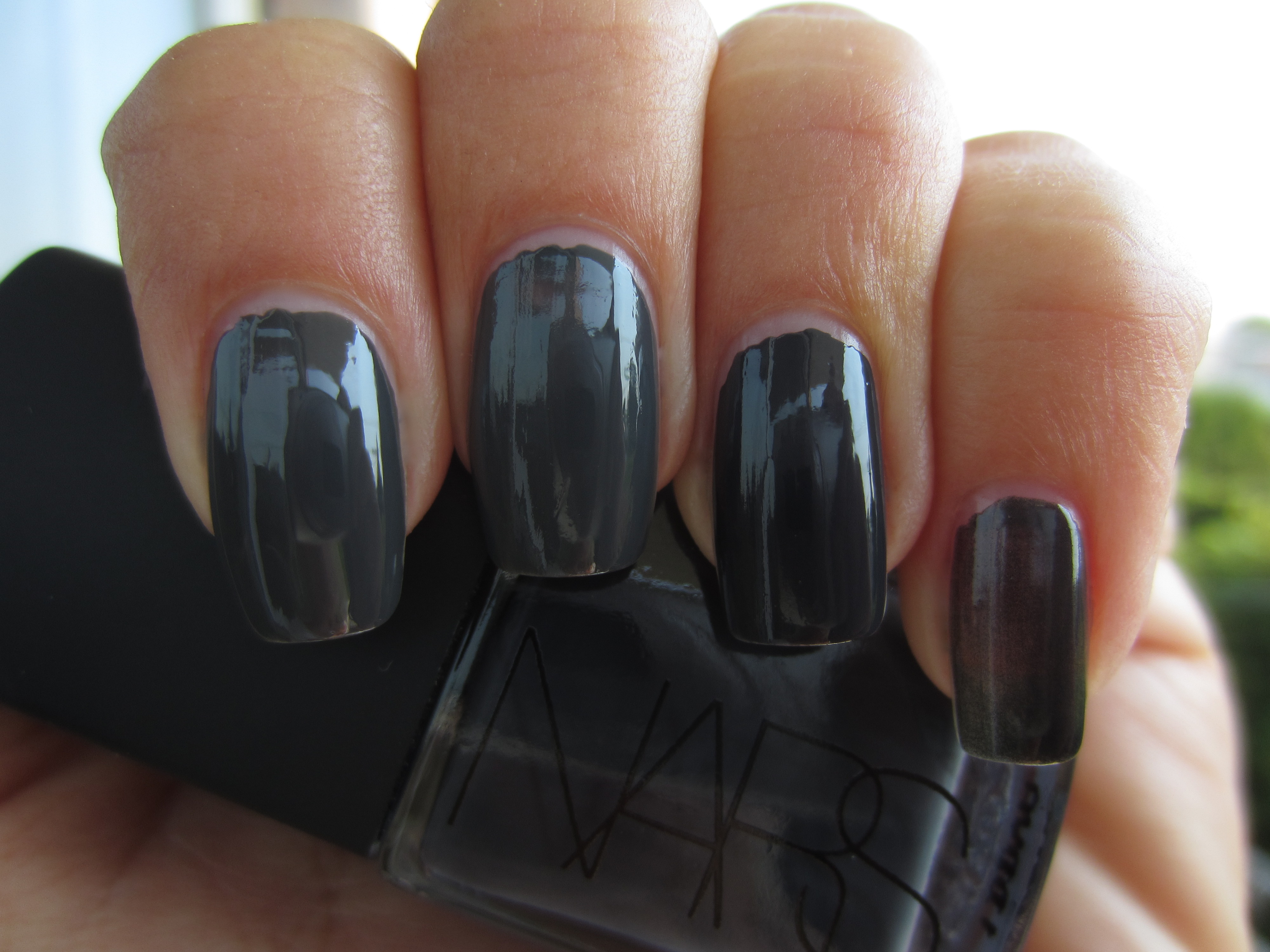
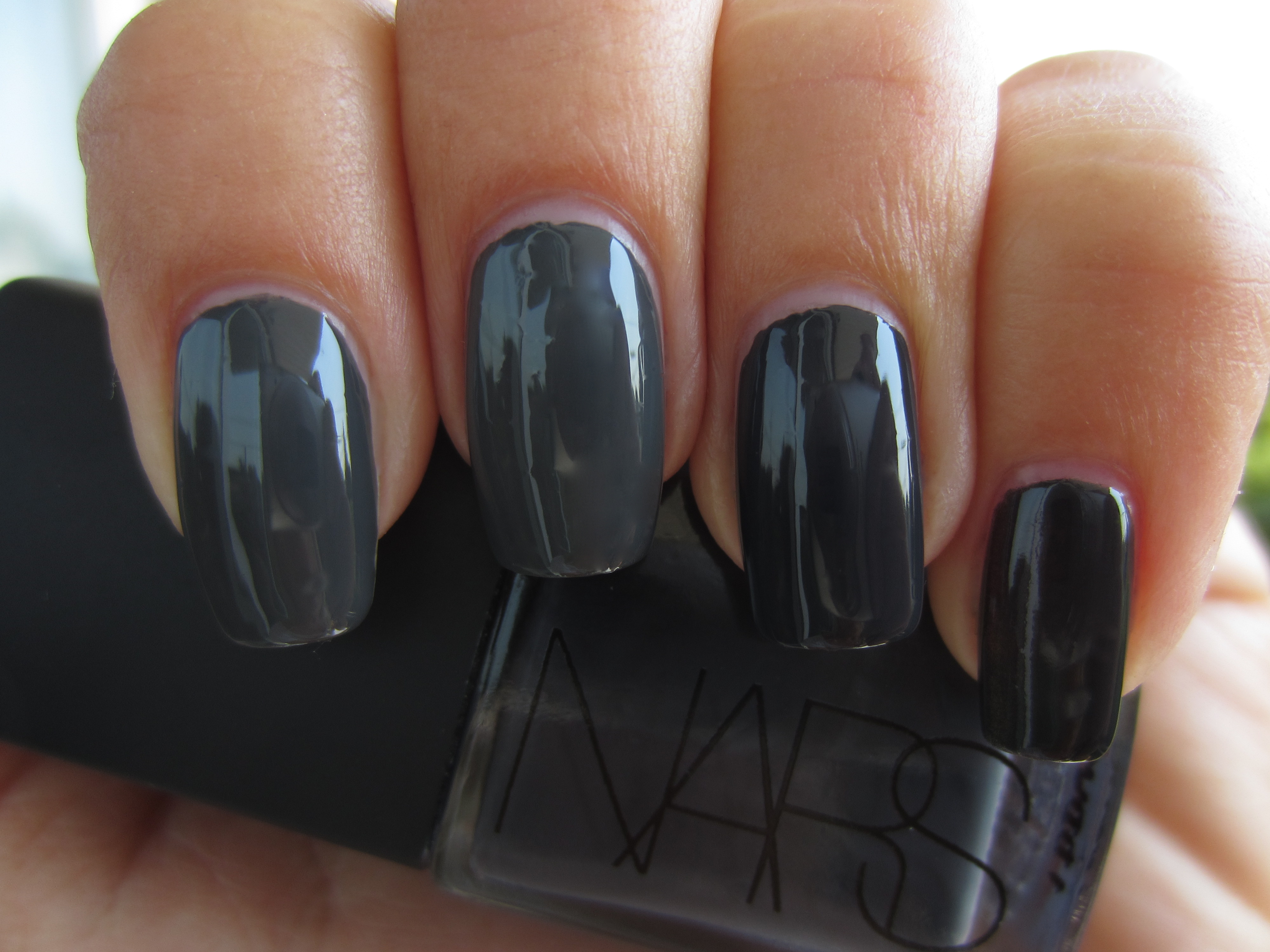
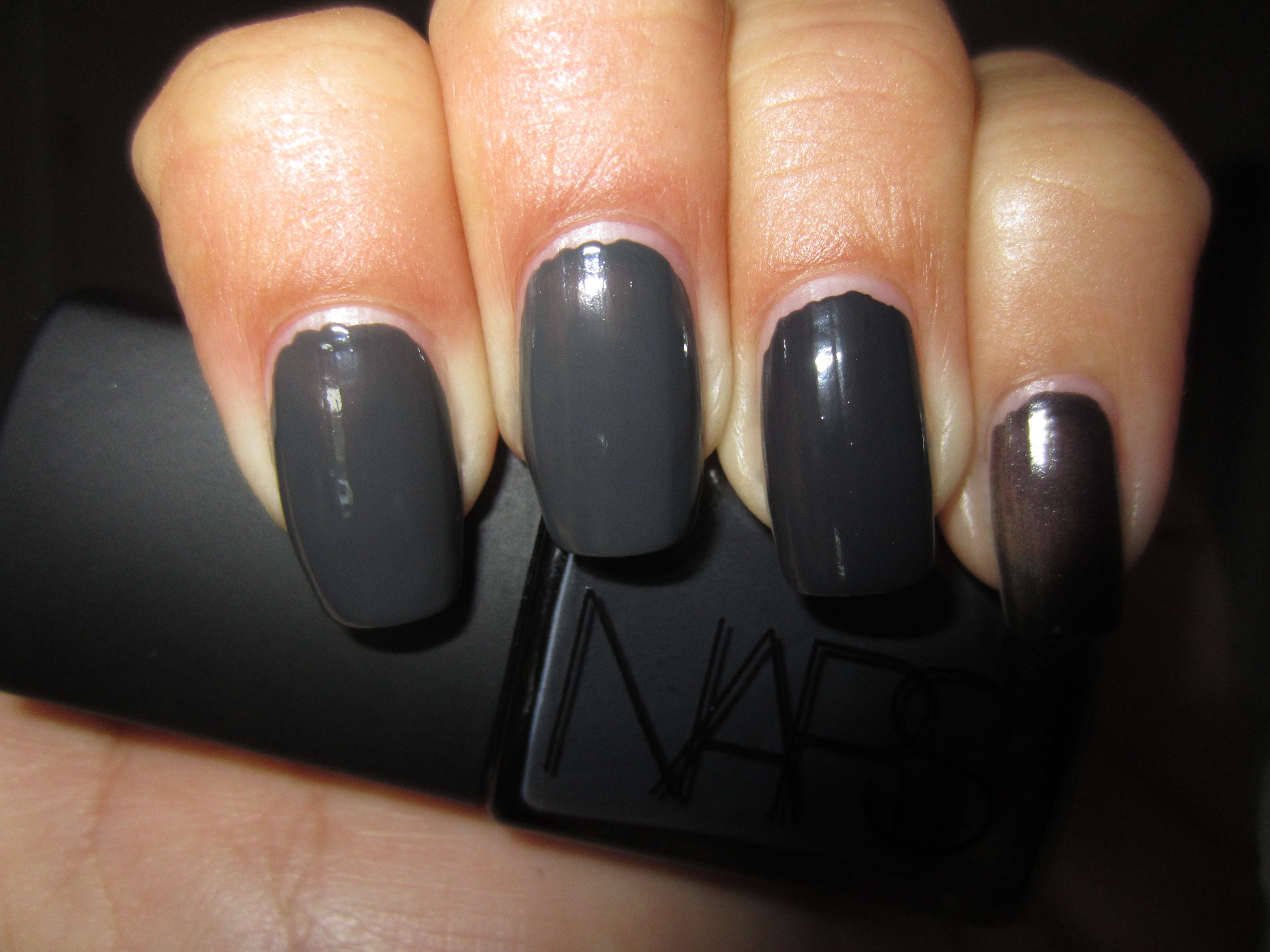
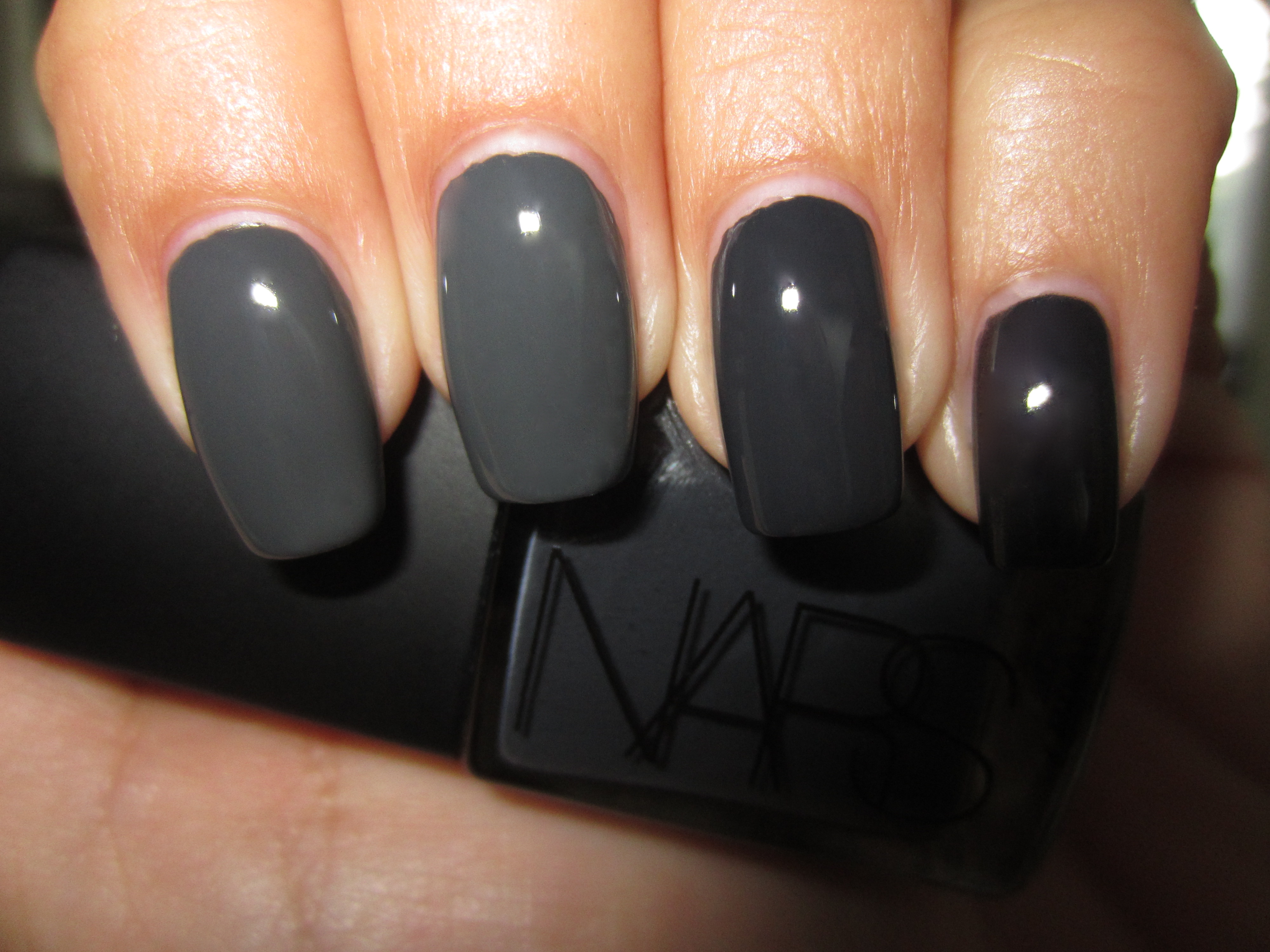
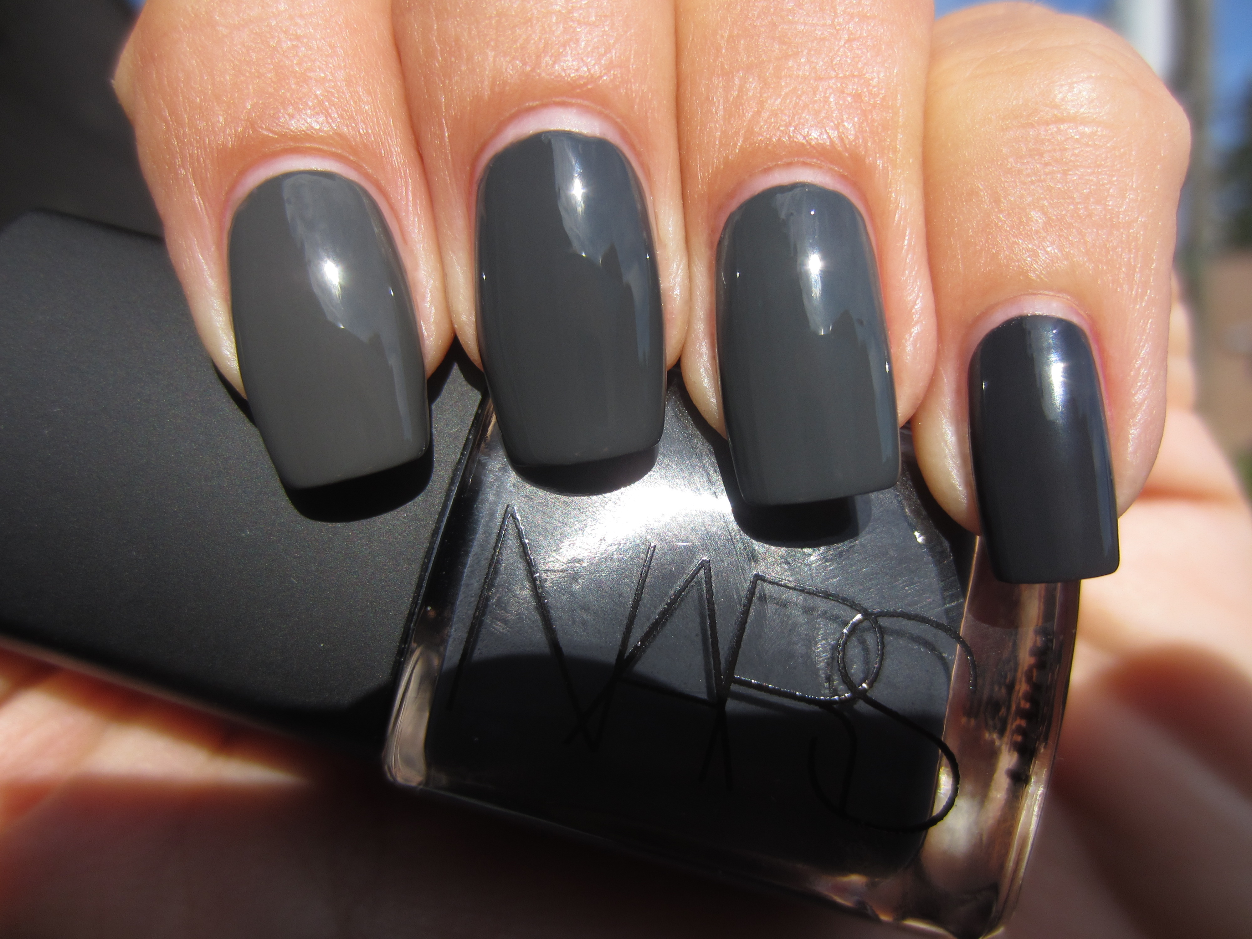
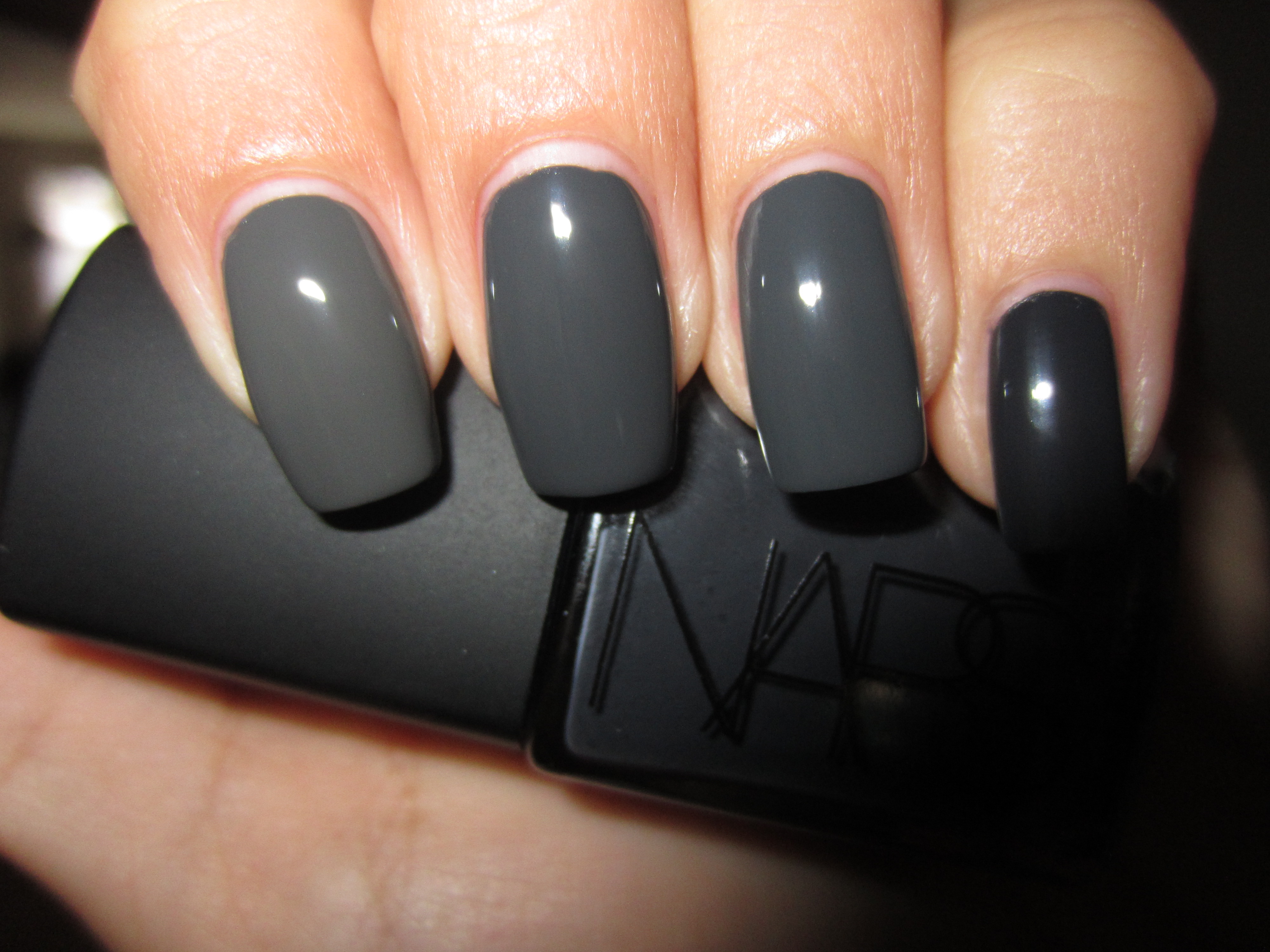
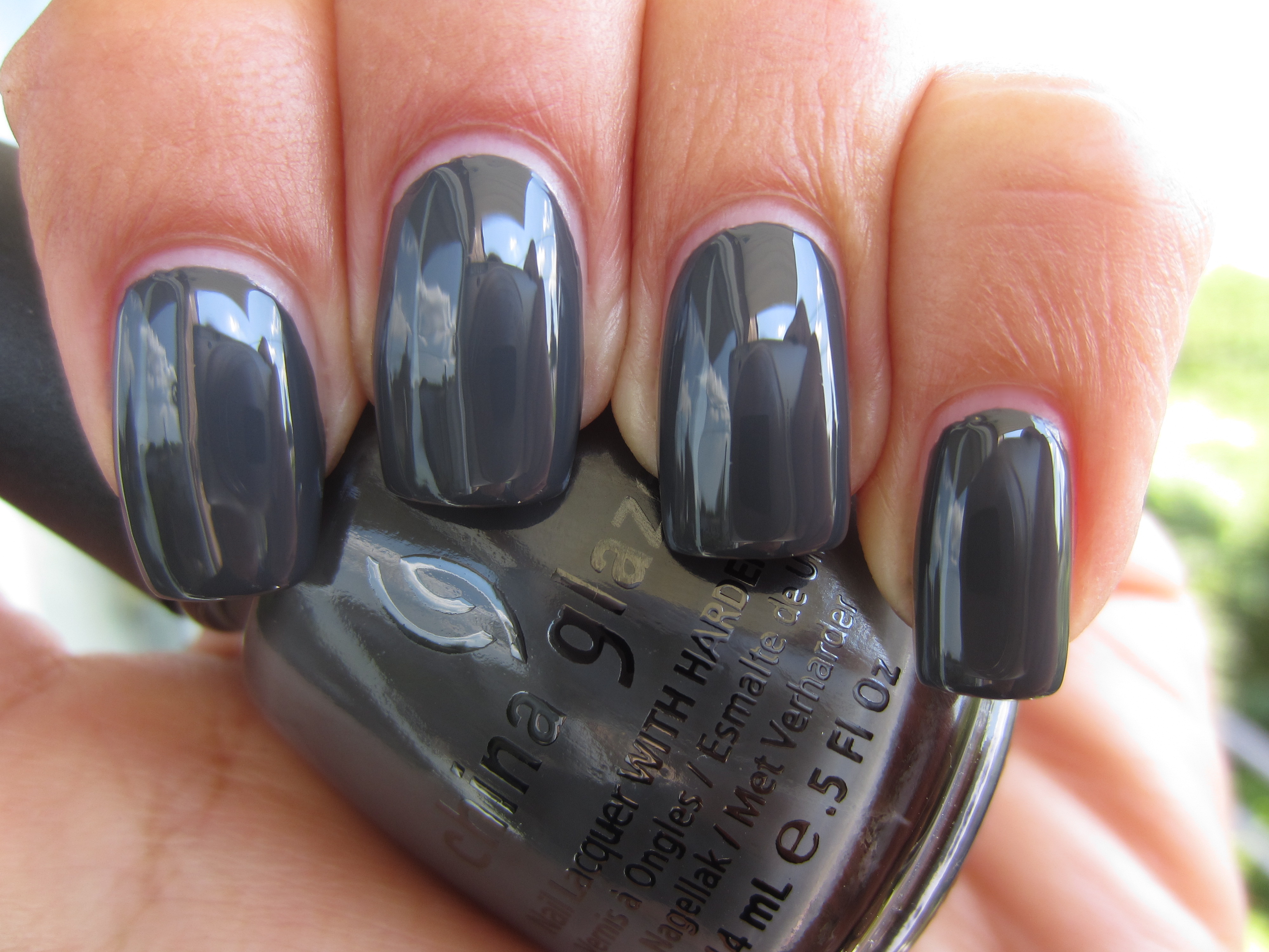
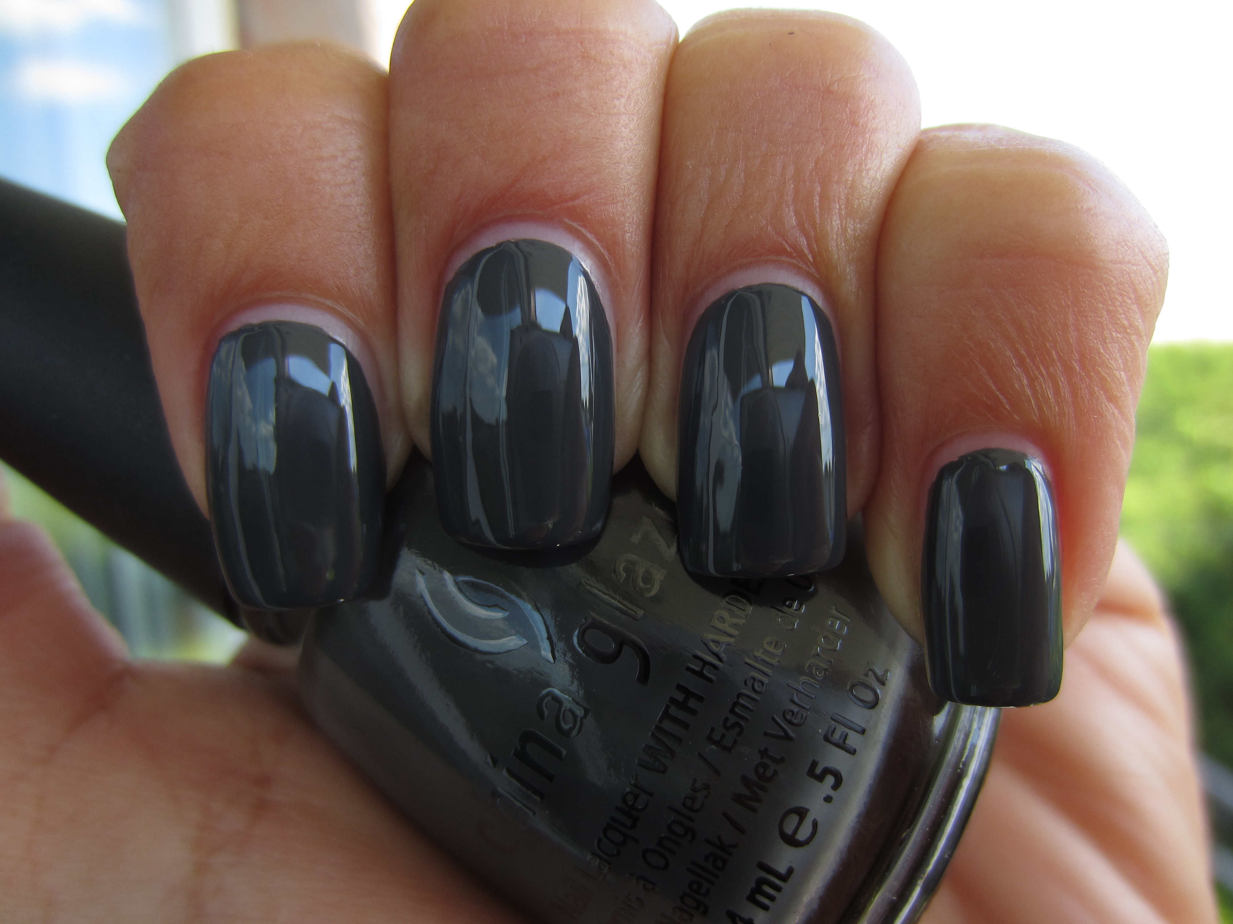
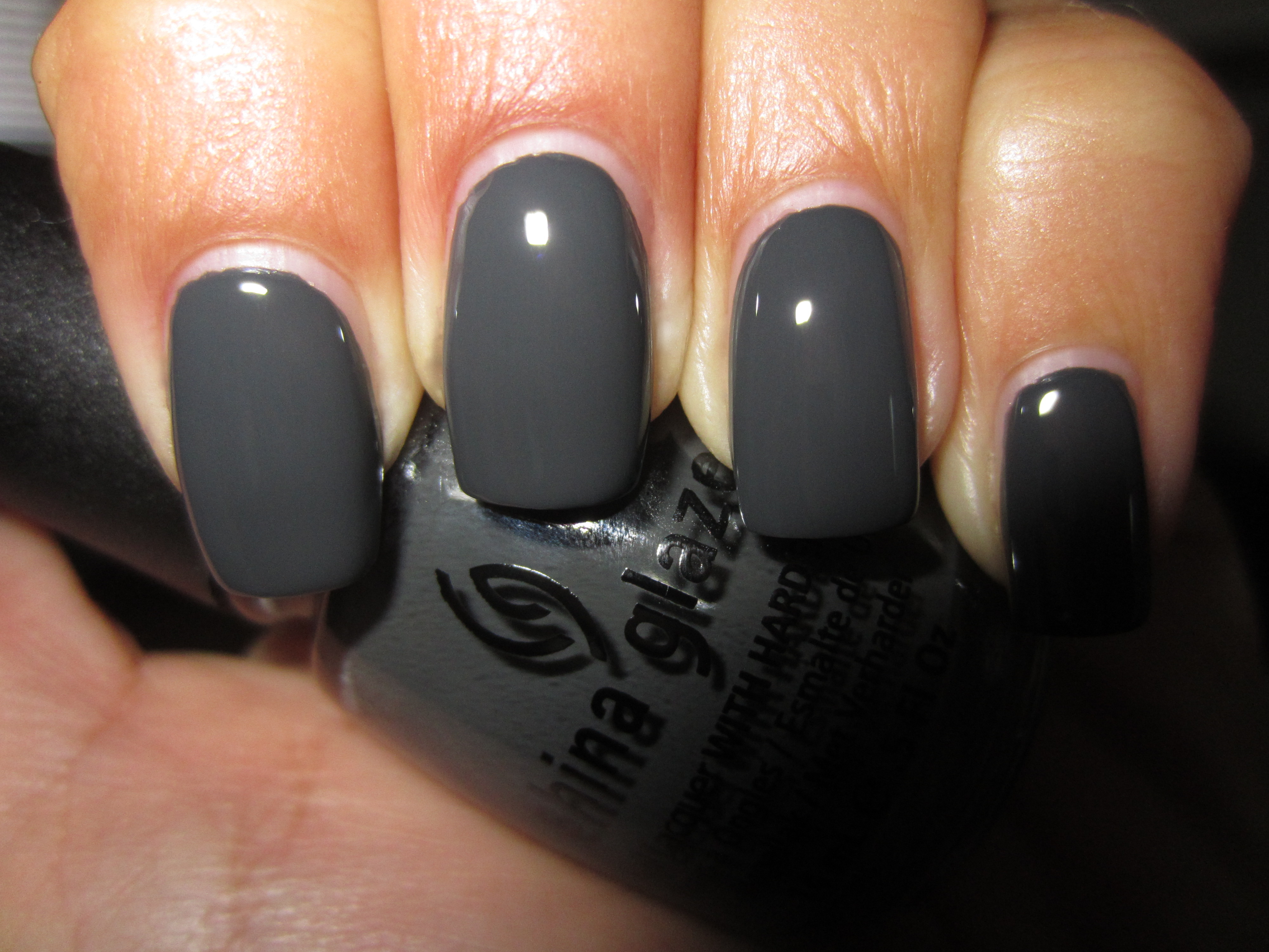
Across the horizon, deeply ominous clouds are massing, but you might call this the “Perfect Storm” instead! Fall 2011 has seen the release of a plethora of deep, near-black grey lacquers, with most of the major players in the industry launching their own version of this shade. Being naturally curious, I needed to know what, if any, set them apart and so combing through my stash, I chose these four to compare: China Glaze’s ‘Concrete Catwalk’ – Fall 2011 Metro Collection (reviewed here), Deborah Lippmann’s ‘Stormy Weather’ – Fall 2011 (reviewed here), NARS’ ‘Galion’ – Fall 2011 (reviewed here), and OPI’s ‘Suzi Skis In The Pyrenees’ – Fall 2009 Collection de España.
In order to better understand the differences (and similarities) between them, the following swatches show these shades with one coat of lacquer, no top coat (top photos), followed by two coats of lacquer and top coat (bottom photos). Further breakdowns are listed in a easy point format. Please note that all swatches were done with Seche Base Ridge Filling Top Coat, as well Revlon’s Quick Dry Top Coat for the second set.
- Index finger: China Glaze ‘Concrete Catwalk’
- Middle finger: Deborah Lippmann ‘Stormy Weather’
- Ring finger: NARS ‘Galion’
- Pinkie finger: OPI ‘Suzi Skis In The Pyrenees’
- The most similar formula ie: consistency & application – ‘Concrete Catwalk’ and ‘Stormy Weather’
- Most opaque formula: ‘Galion’
- Thinnest/sheerest formula: ‘Suzi Skis In The Pyrenees’
- Closest in colour: ‘Concrete Catwalk’ and ‘Stormy Weather’
- Glossiest finish: ‘Stormy Weather’
- Lightest in tone: ‘Stormy Weather’
Sunlight, one coat of lacquer – no top coat.
Sunlight, two coats of lacquer and top coat.
Indirect light, one coat of lacquer, no top coat.
Indirect light, two coats of lacquer and top coat.
Shaded light, one coat of lacquer, no top coat.
Shaded light, two coats of lacquer and top coat.
With flash, one coat of lacquer, no top coat.
With flash, two coats of lacquer and top coat.
Final thoughts: Before actually viewing all four shades together, I was convinced that they would be duplicates. Once I had gathered the bottles, however, I immediately saw several differences, but of course, the application that would be the final determinator. When OPI released ‘Suzi Skis In The Pyrenees’ back in the Fall of 2009, I was drawn to this shade, even though I wasn’t sure if I would wind up wearing it. Fast forward two years later, and it seems that dark grey is the “couleur de choix” on everyone’s list, from regular folks all the way to fashion designers. What I did not expect when I applied the four shades, was that the OPI would turn out to be so much sheerer than the rest, requiring a third coat if I wanted to achieve the same opacity as the rest (I stuck with two coats though, to keep things equal). The other interesting feature that I noted was that although ‘Concrete Catwalk’ was the closest to ‘Galion’ in terms of depth of tone, it actually shared a similar blueish base with ‘Stormy Weather’ versus ‘Galion’ and ‘Suzi Skis In The Pyrenees’ more greener base. I had a difficult time choosing which was the glossiest, and to be honest, ‘Stormy Weather’ only won by a hair, with ‘Concrete Catwalk’ breathing hungrily down its neck.
I thought I had covered all the brooding greys lurking in my stash, until a reader inquired how Essie’s ‘Power Clutch’ (Fall 2011 Collection, reviewed here), and so back to the drawing board I went to swatch them all again, minus the OPI this time. I should also mention that I was also asked if ‘Stormy Weather’ was a close duplicate for Dior’s ‘Gris Montaigne’, but as I had totally forgotten to include that one as well. Sigh.
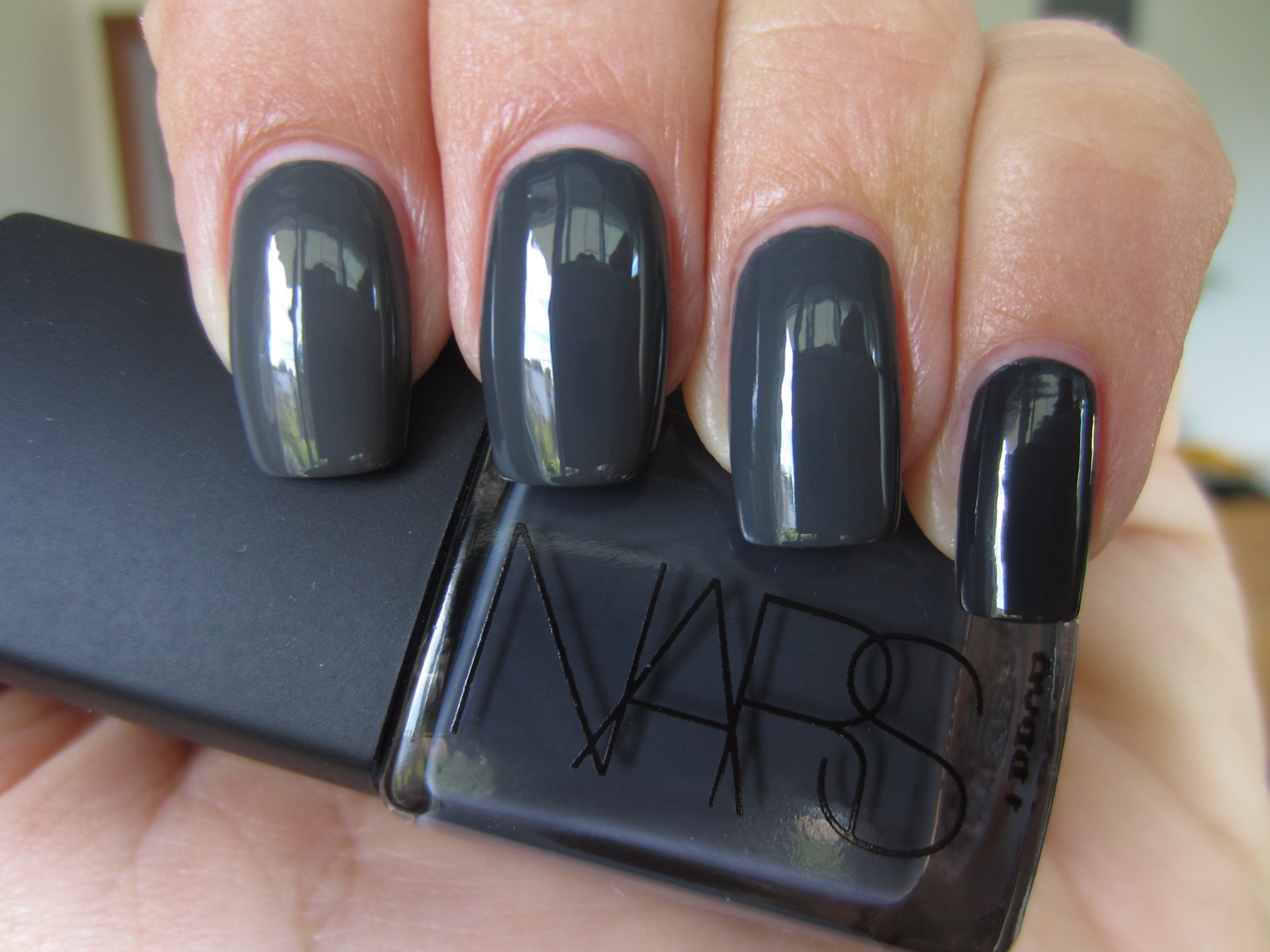
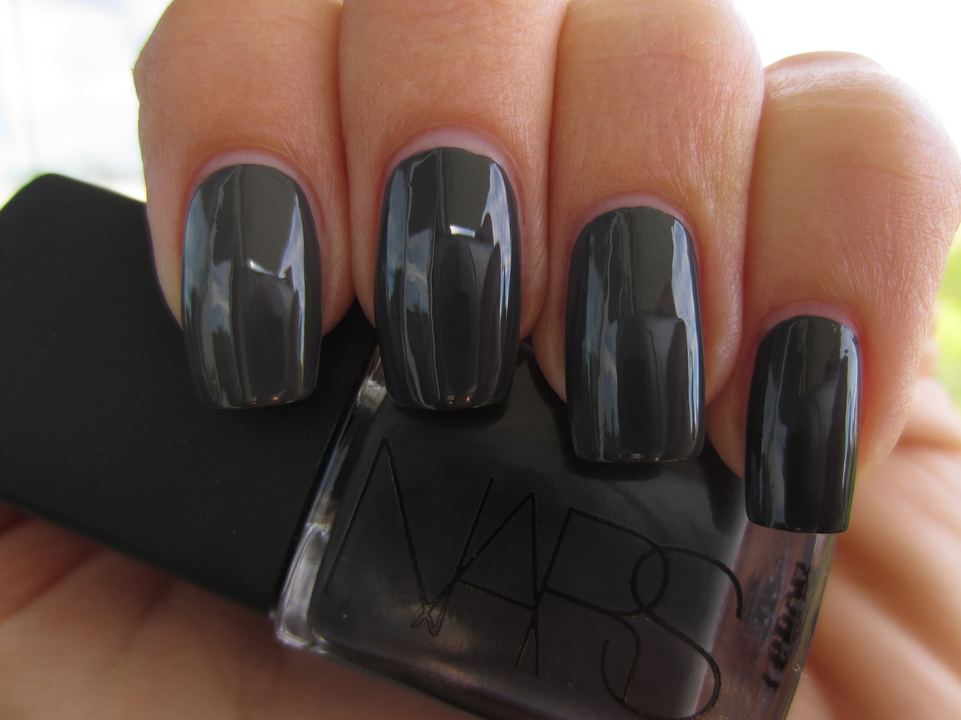
This second edition includes the following four lacquers:
- Index finger: Essie ‘Power Clutch’
- Middle finger: China Glaze ‘Concrete Catwalk’
- Ring finger: Deborah Lippmann ‘Stormy Weather’
- Pinkie finger: NARS ‘Galion’
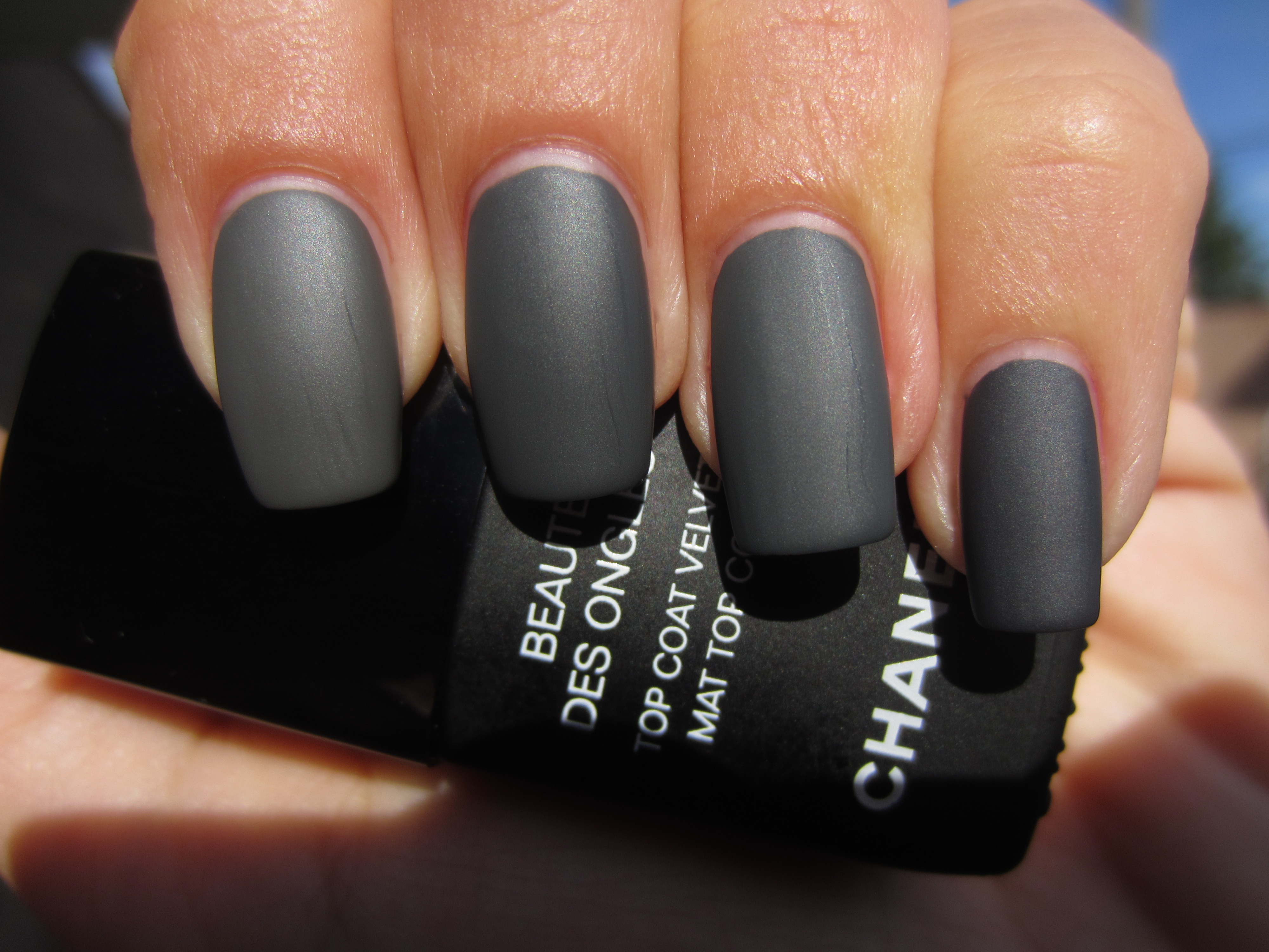
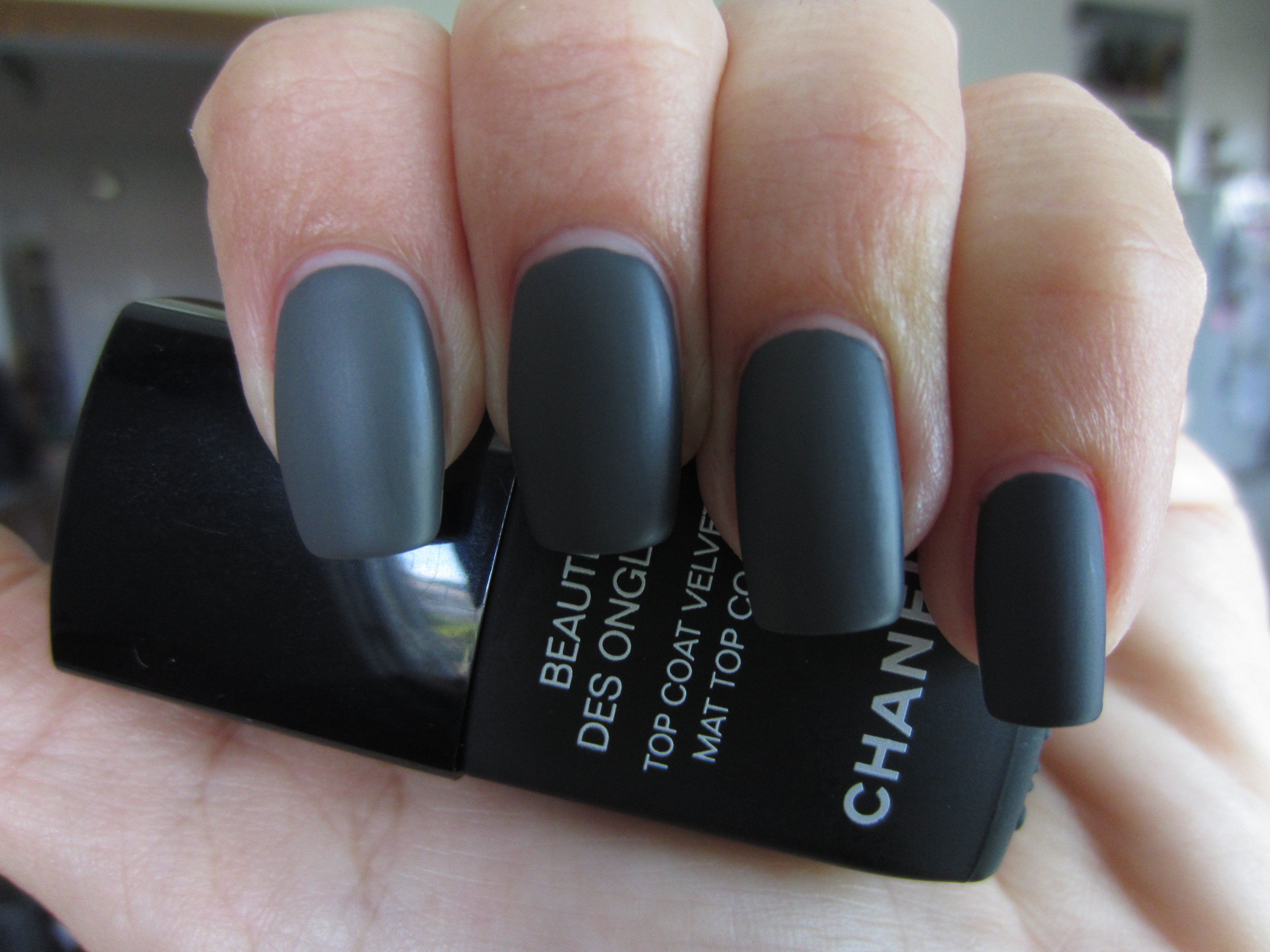
As with the first group reviewed, I have broken down in point format what their various differences and/or similarities are. Wanting to add a new slant to these shades and being somewhat fascinated by the modern and chic vibe given off by a satin finish, I chose CHANEL’s recently released ‘Mat Velvet Top Coat’ (review forthcoming) to layer on top. Please note that all the following swatches were done using Deborah Lippmann’s Rehydrating Base Coat.
- The most similar formula, ie: consistency & application: ‘Concrete Catwalk’ and ‘Stormy Weather’
- Most opaque formula and darkest in tone: ‘Galion’
- Thinnest formula and lightest in tone: ‘Power Clutch’
- Thickest formula: ‘Concrete Catwalk’
- Closest in colour: ‘Concrete Catwalk’ and ‘Stormy Weather’
- Bushiest brush: ‘Concrete Catwalk’
- Glossiest finish: ‘Stormy Weather’
Sunlight, two coats of lacquer, no top coat.
Sunlight, two coats of lacquer and Mat Velvet Top Coat.
Indirect light, two coats of lacquer, no top coat.
Indirect light, two coats of lacquer and Mat Velvet Top Coat.
Shaded light, two coats of lacquer, no top coat.
Shaded light, two coats of lacquer and Mat Velvet Top Coat.
With flash, two coats of lacquer, no top coat.
With flash, two coats of lacquer and Mat Velvet Top Coat.
Final thoughts: Grey, in all its tonal qualities, from soft dove all the way to a smudge of charcoal, bears a very sophisticated aura. Not quite as disturbing as gothic black, which, while immensely interesting to sport on your nails, is not necessarily the most wearable shade, nor as washed out as the lightest grey hue in the spectrum, these versions of dark grey are all immensely pleasing to the eye, and give your nails a very unique, urban, and elegant sophistication. This time around, I observed that in most of the swatches, ‘Concrete Catwalk’ once more looked most similar to ‘Stormy Weather’ with ‘Galion’ frequently completing the triad. I did not expect ‘Power Clutch’ to be as light, but next to the others, it seemed almost like their shadowy version. It should be noted that ‘Galion’ could also very well be a one-coater if applied thickly, but I prefer the evenness and control that two coats gives. The other notable fact, is that once you take all these lacquers into shaded light, you would be hard pressed to tell them apart, but the natural gloss they all share, is outstanding. What it all boils down to is a) your preference, b) availability, as some (like ‘Galion’) are limited edition and thus will be pulled from the roster once the season ends and c) cost, with China Glaze being the least expensive, followed by Essie at a mid range price, and lastly Deborah Lippmann and NARS as the two most expensive.
Mysterious, seductive, alluring….deep dark grey shades like all of the above, are an enigma, and I for one, just love keeping them guessing…..
Disclaimer: some products were provided by the company/PR for my unbiased consideration
China Glaze Fall 2011 – Metro Collection “Downtown” (swatches & review)
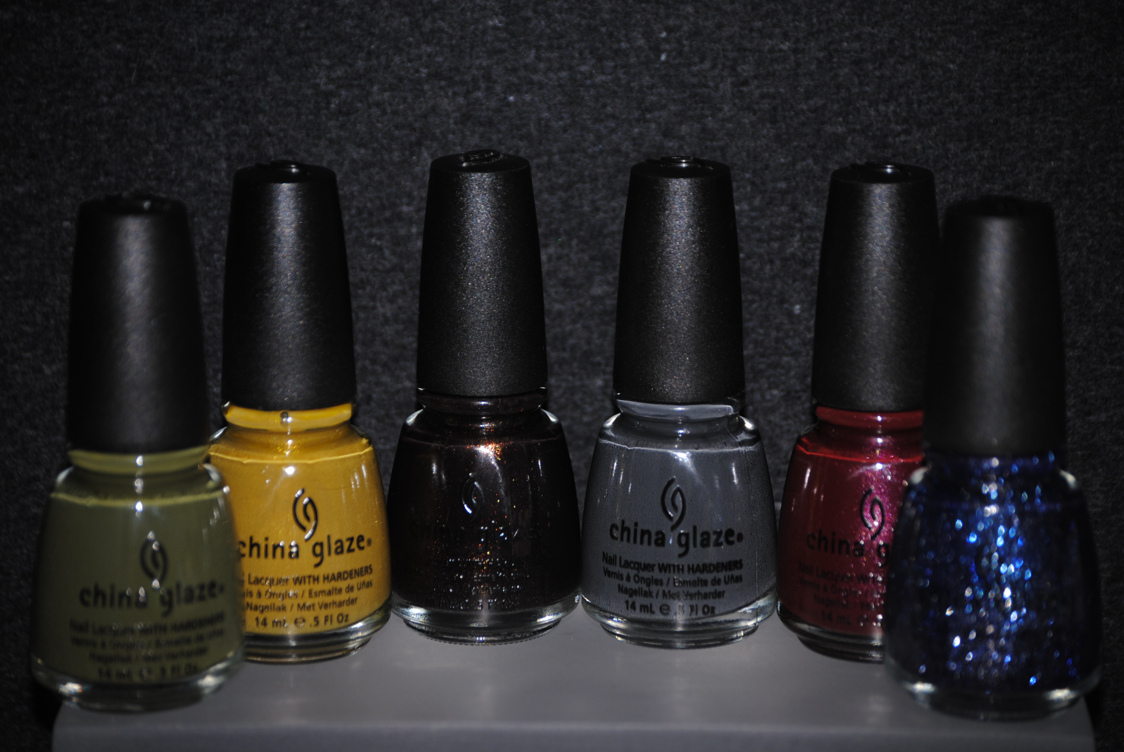
Downtown….where all the action is, or so the song says! Whereas the ‘Uptown’ collection (reviewed here) showed us the brighter and somewhat “elite” side of life in the city, the ‘Downtown’ collection brings us deeper towards the darkly throbbing heartbeat of this metropolis. The final six shades include: ‘Trendsetter’ – a murky but reflective mustard, ‘Westside Warrior’ – a fashionably chic military green, ‘Skyscraper’ – a glittering star-filled navy, ‘Concrete Catwalk’ – a deep & creamy pavement grey, ‘Loft-y Ambitions’ – a glimmering wine hue, and ‘Midtown Magic’ – a multi-faceted deep brown. All swatches are with Seche Base Ridge Filling Base Coat, two coats of lacquer, and Revlon Quick Dry Top Coat.
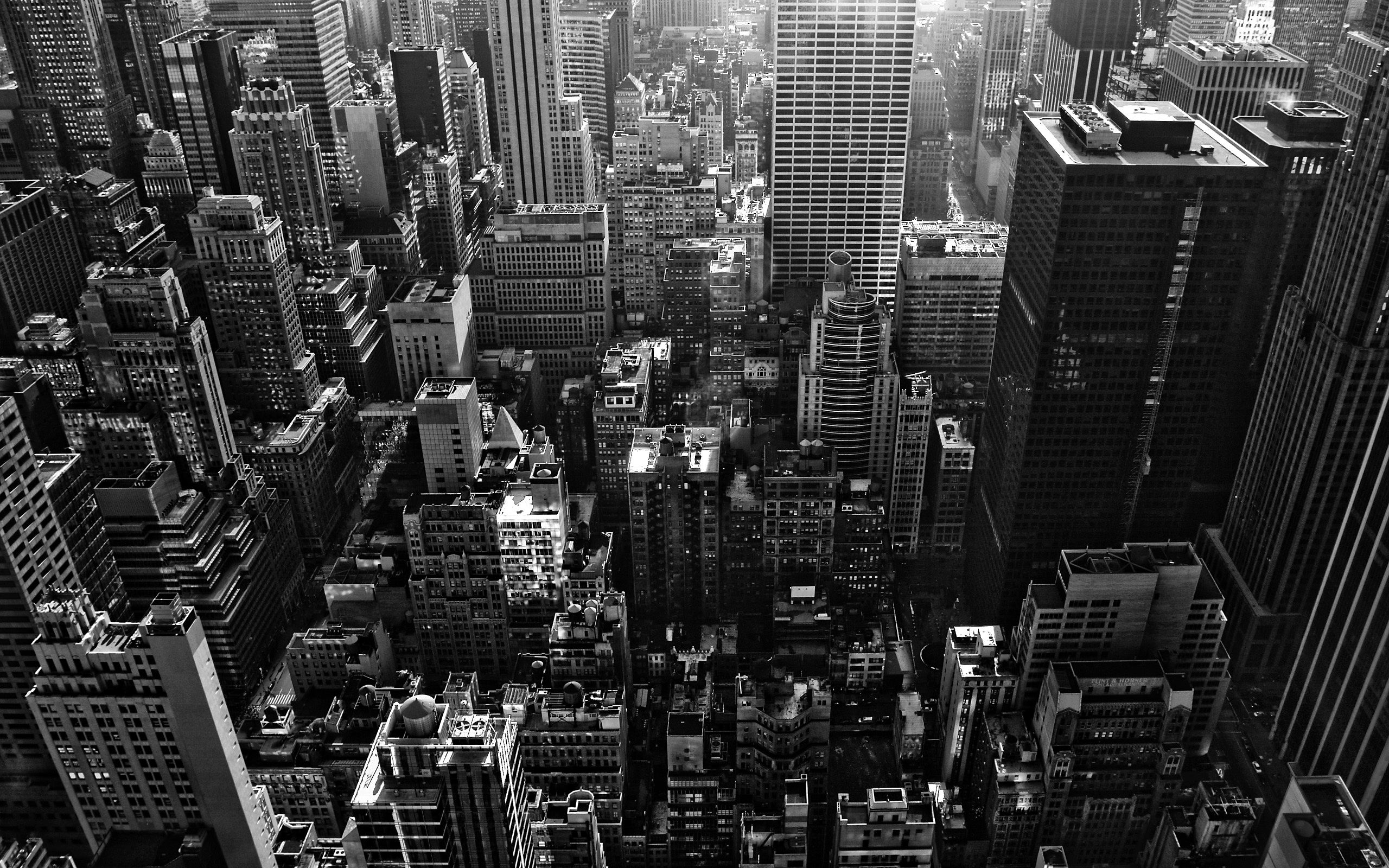
While I adore city living with it’s vibrant daytime cast of characters, it’s the seamier, more mysterious side of downtown life that captures my interest. When I hear “downtown”, I instantly associate it with one of two things: Batman’s home turf of Gotham, with its darkly brooding feel, or an aerial view like the one above, showcasing the multitudes of skyscrapers, all vying for space yet looking so imposingly regal.
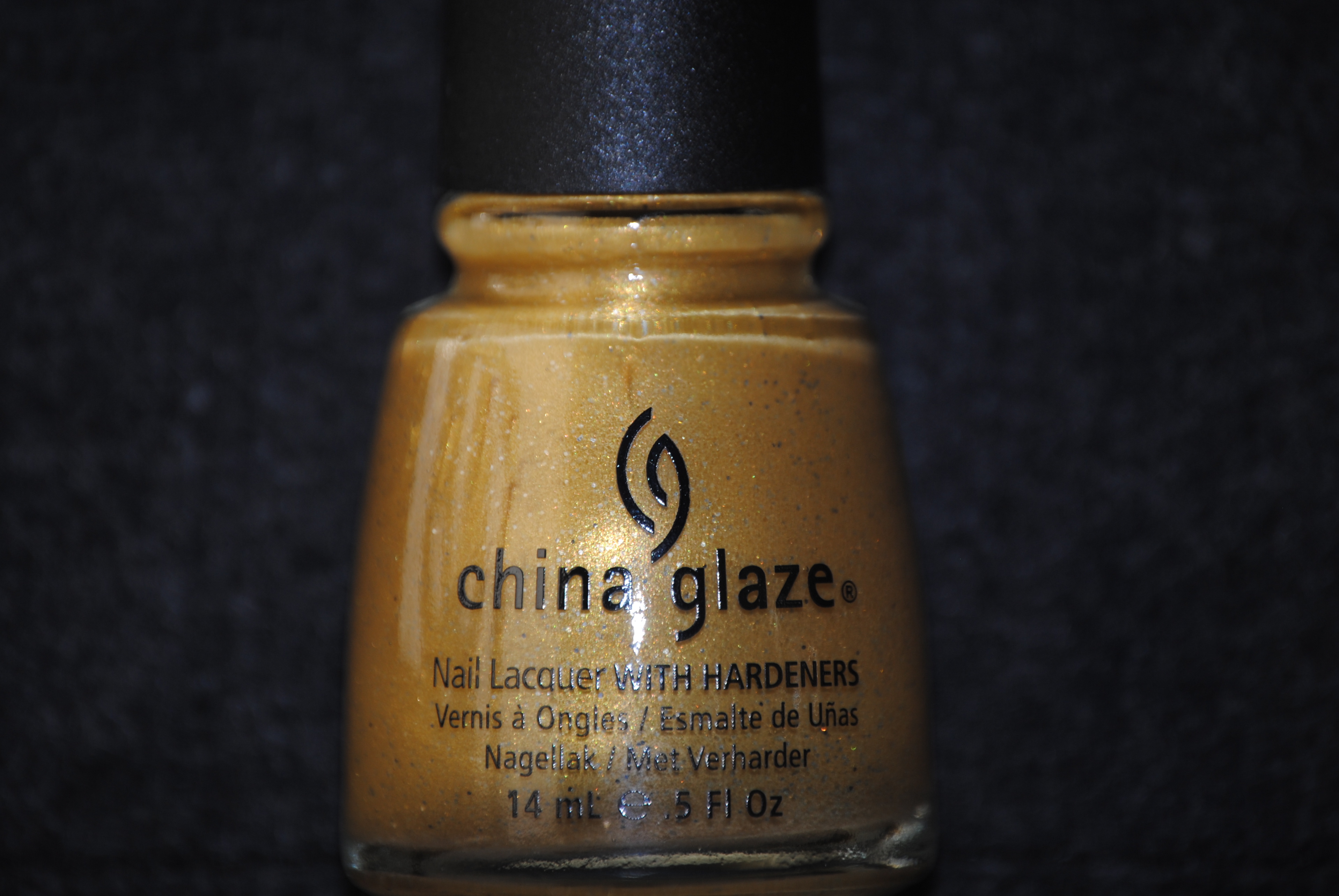
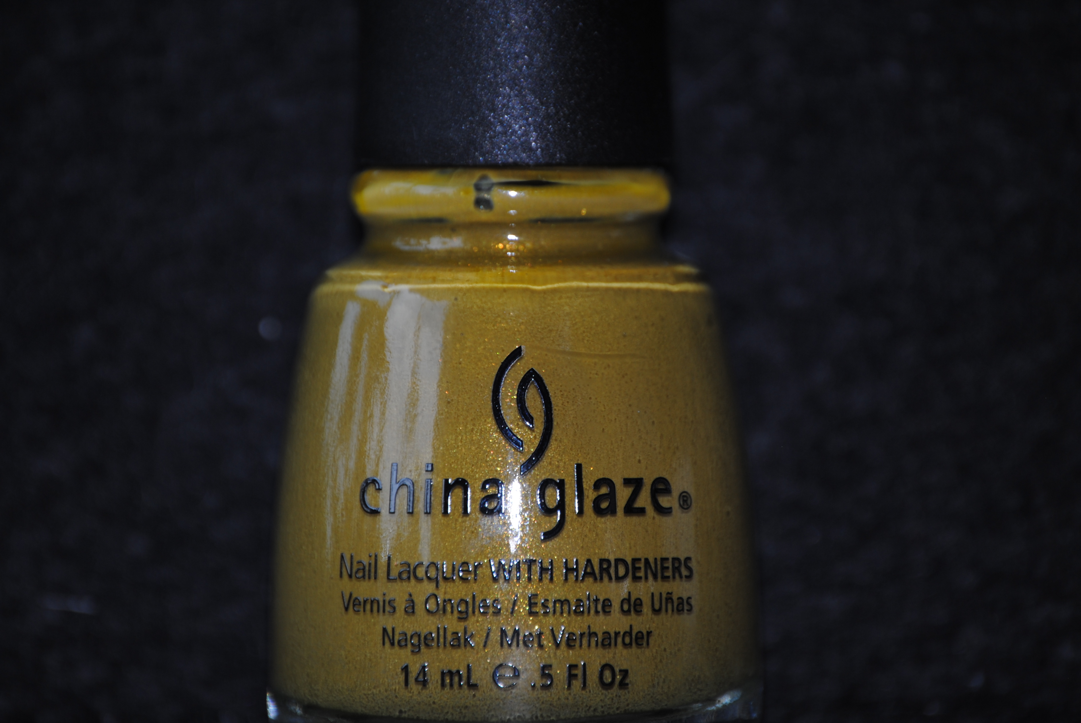
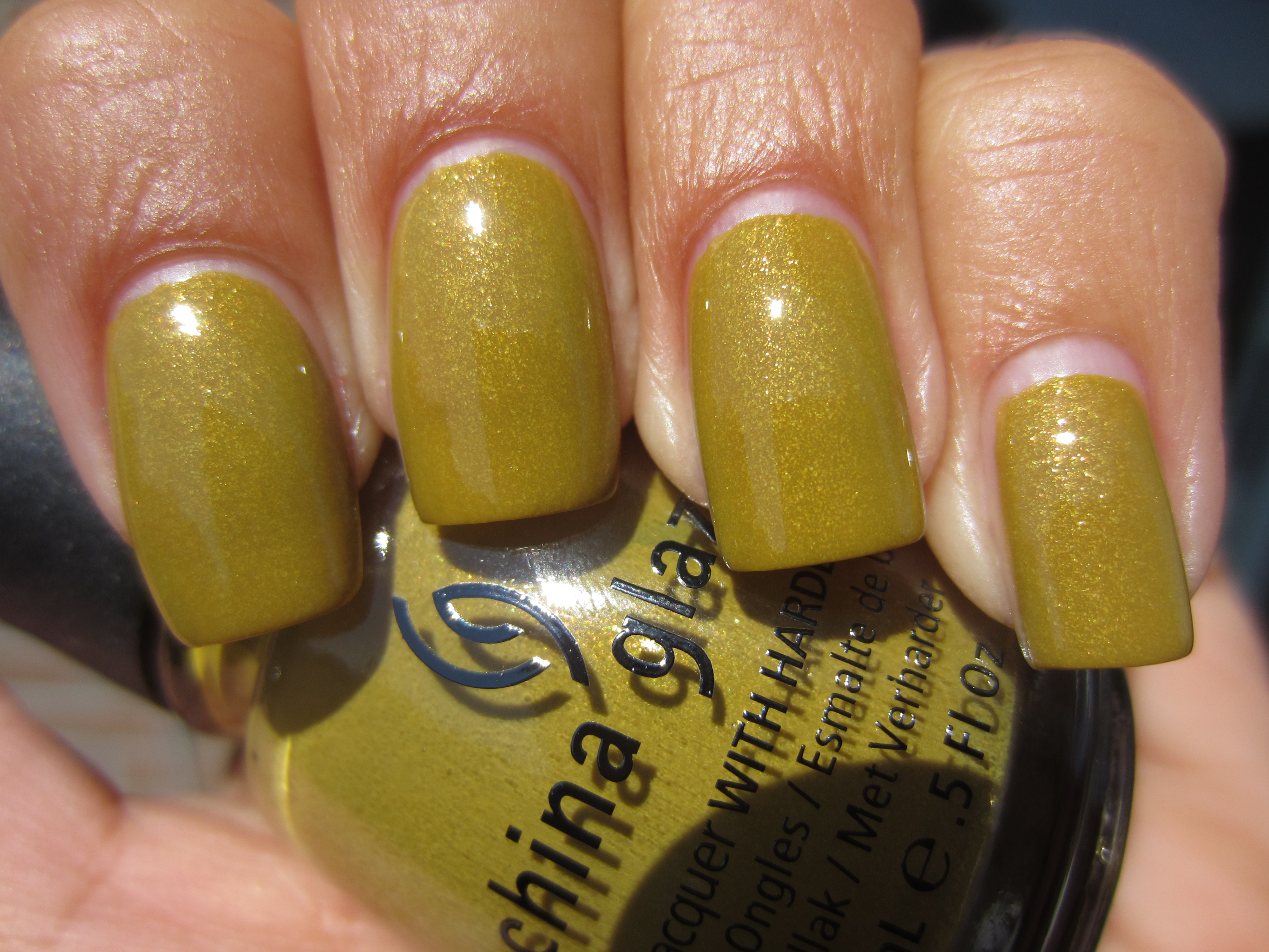
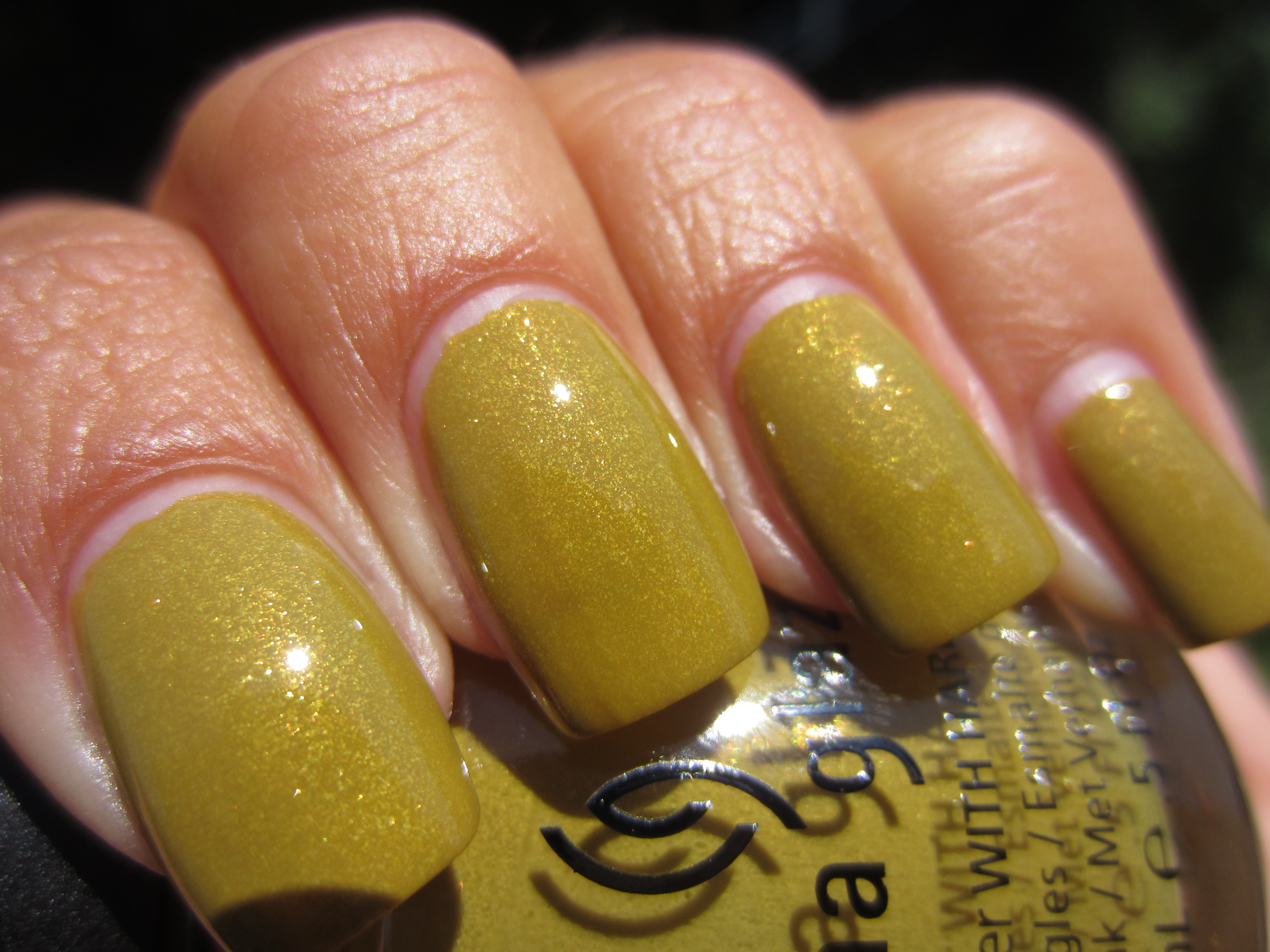
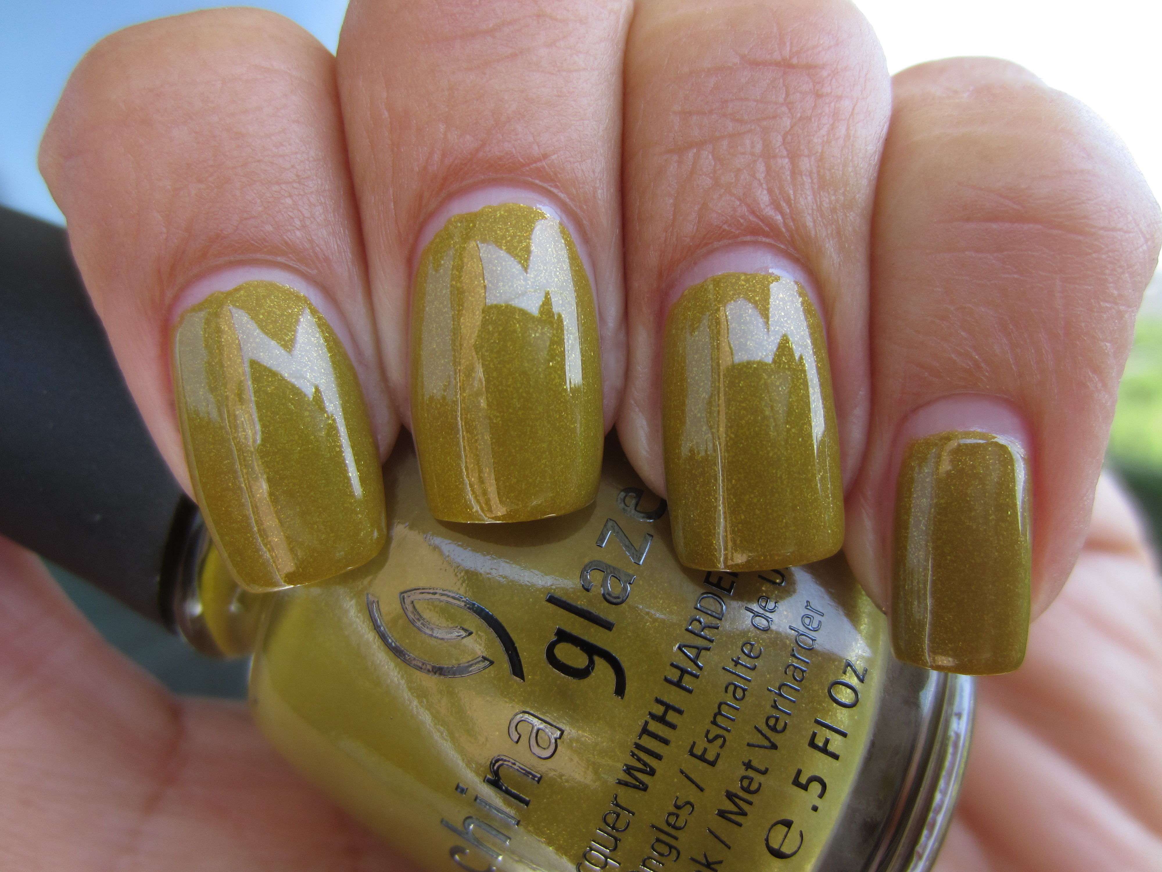
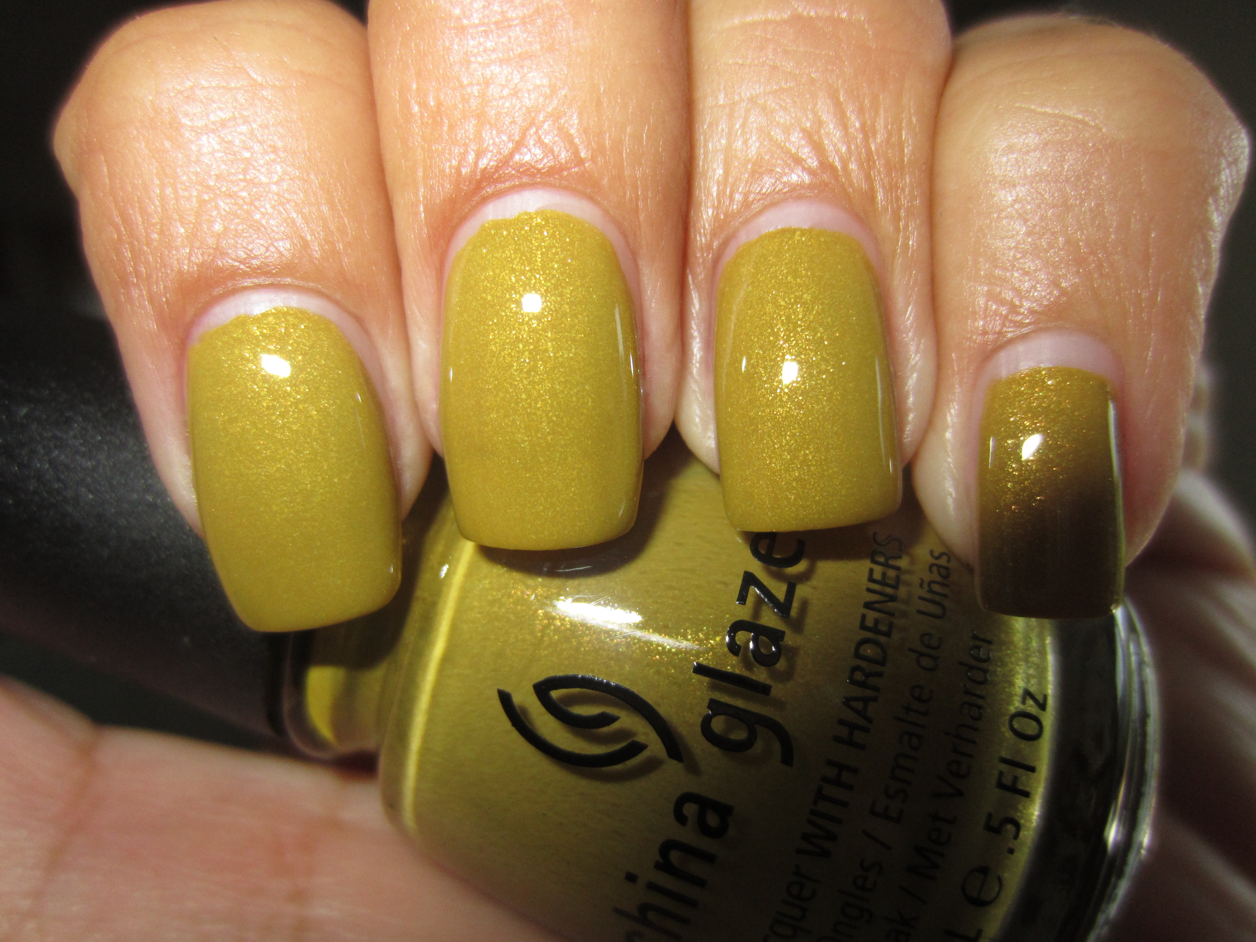
‘Trendsetter’ is unique, interesting and something of an eccentricity; it has the potential to be glaringly vivid, yet its dusty quality manages to keep it grounded. A muted mustard shade, it is made that much more original by the addition of ultra fine golden glitter, which peeks at you seemingly under the nail’s surface. The formula was a touch thick, yet effortlessly spreadable, leaving no brush strokes behind. While not as glossy as the crèmes of this collection, it certainly benefits by the addition of a top coat.
When viewed in full sun, ‘Trendsetter’ seems to take on a slight greenish tint, but its true ochre nature is completely revealed, as the shimmer appears to wink silver, gold, and even pink.
I included a closeup view of this shade, in order to give a better appreciation of the shimmer and the incredible depth of colour it imparts.
Seen in shaded light, ‘Trendsetter’ now takes on a much cooler cast, with the muted deep yellow now punctuated by the shadowy flecks of glitter.
I love how a view taken with flash really spotlights the intricate play of the ultra fine shimmer, showing why this varnish is so unique!
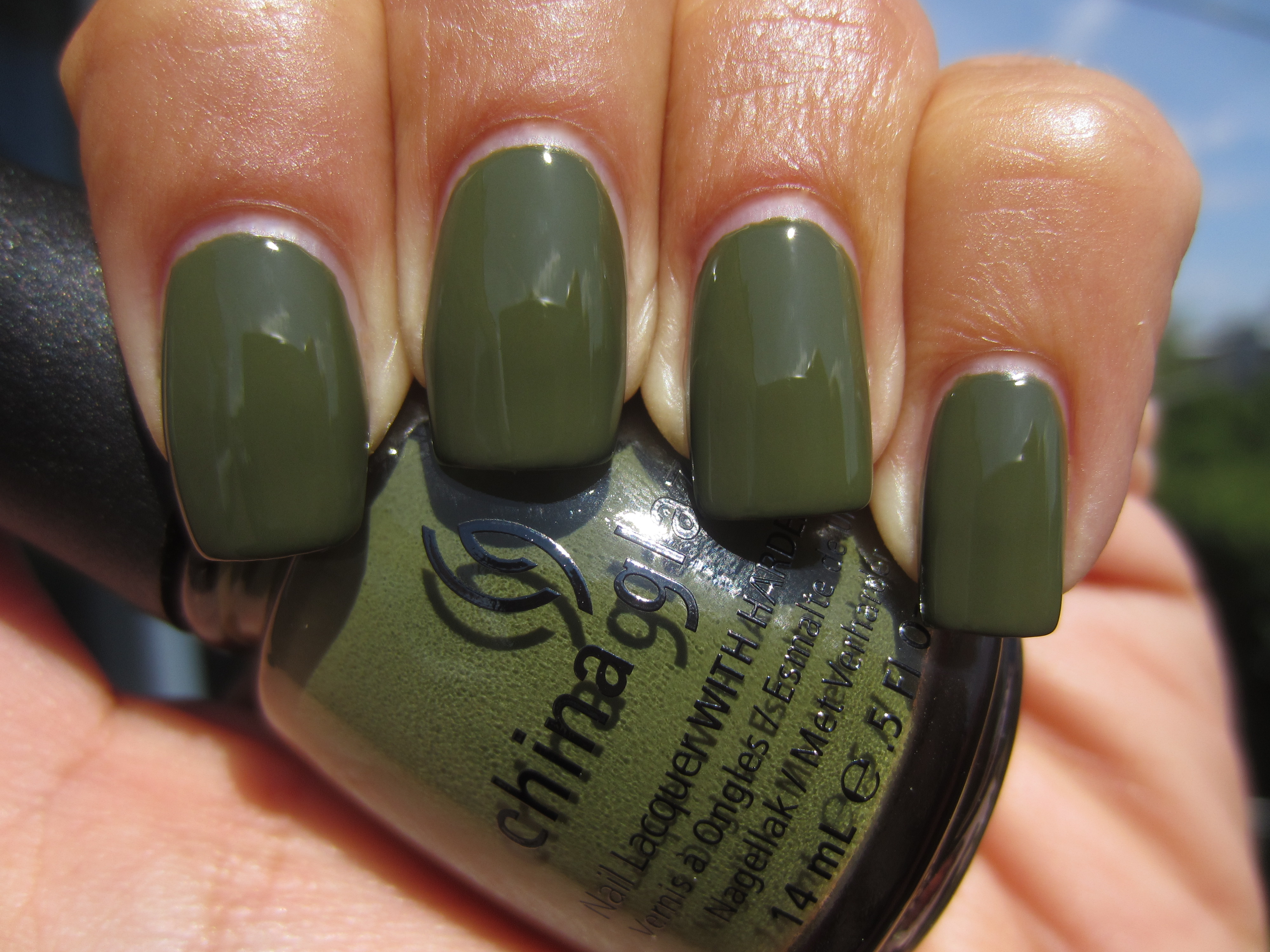
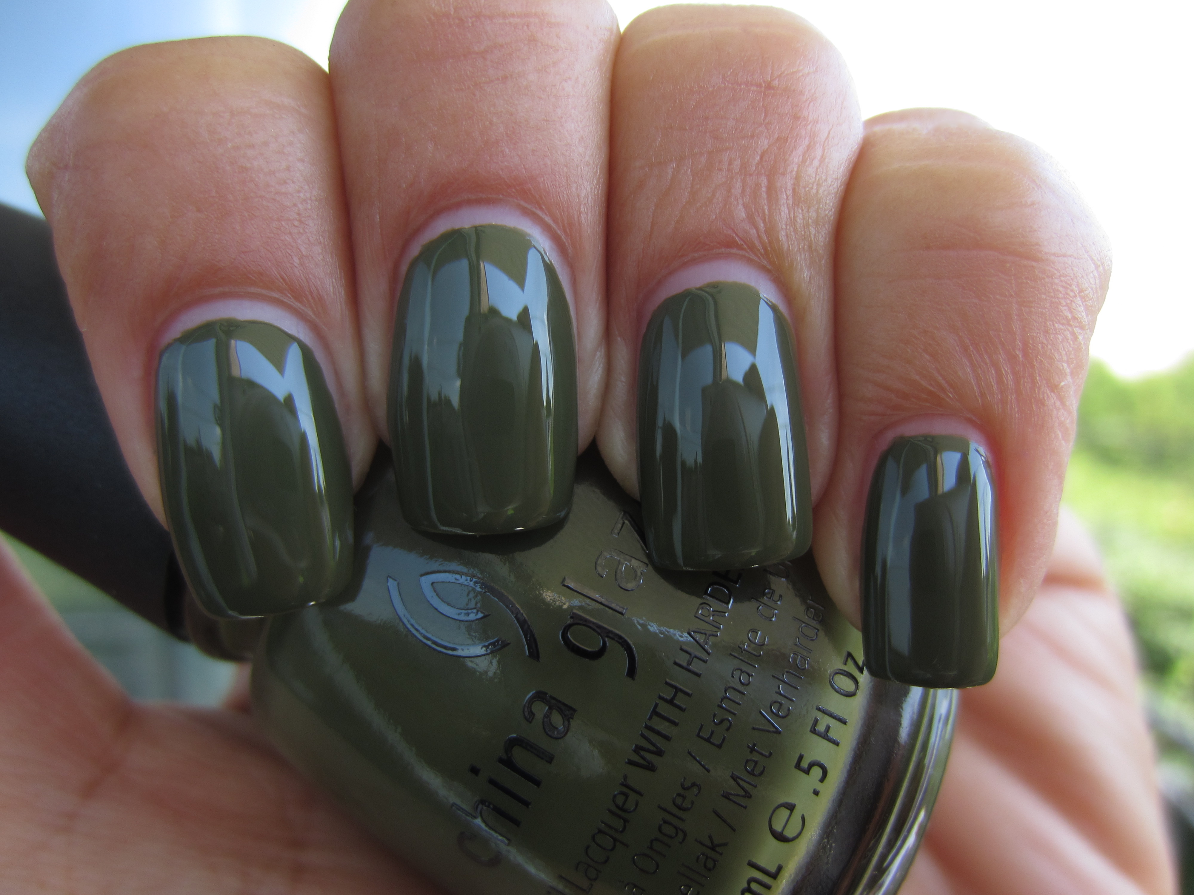
‘Westside Warrior’ is a deep, murky yet luxuriant olive green. This is the urban woman’s military polish of choice, offering the best of three worlds: a trendy hue, colour-saturated enough for the Fall, as well as the most reflective finish. Two coats were more than enough for complete opacity, and while the formula was on the thicker side, it spread so well as to be basically self-levelling. The creamy intensity of this shade has to be seen to be believed!
When seen in sunlight, not only is this shade lightened in hue, but hints at some yellow in the base, which lends it a wonderful warmth of tone.
Indirect lighting appears to add a grey veil over ‘Westside Warrior’, giving it a cooler cast and tamping down much of its creamy exuberance.
I absolutely love how shaded light adds such a densely rich layer to this shade, and serves to really highlight its intensely mirror-like finish.
As the level of creaminess is so luscious with this polish, the flash seems to be absorbed into its depths, yet still imparts a lovely reflective gleam.
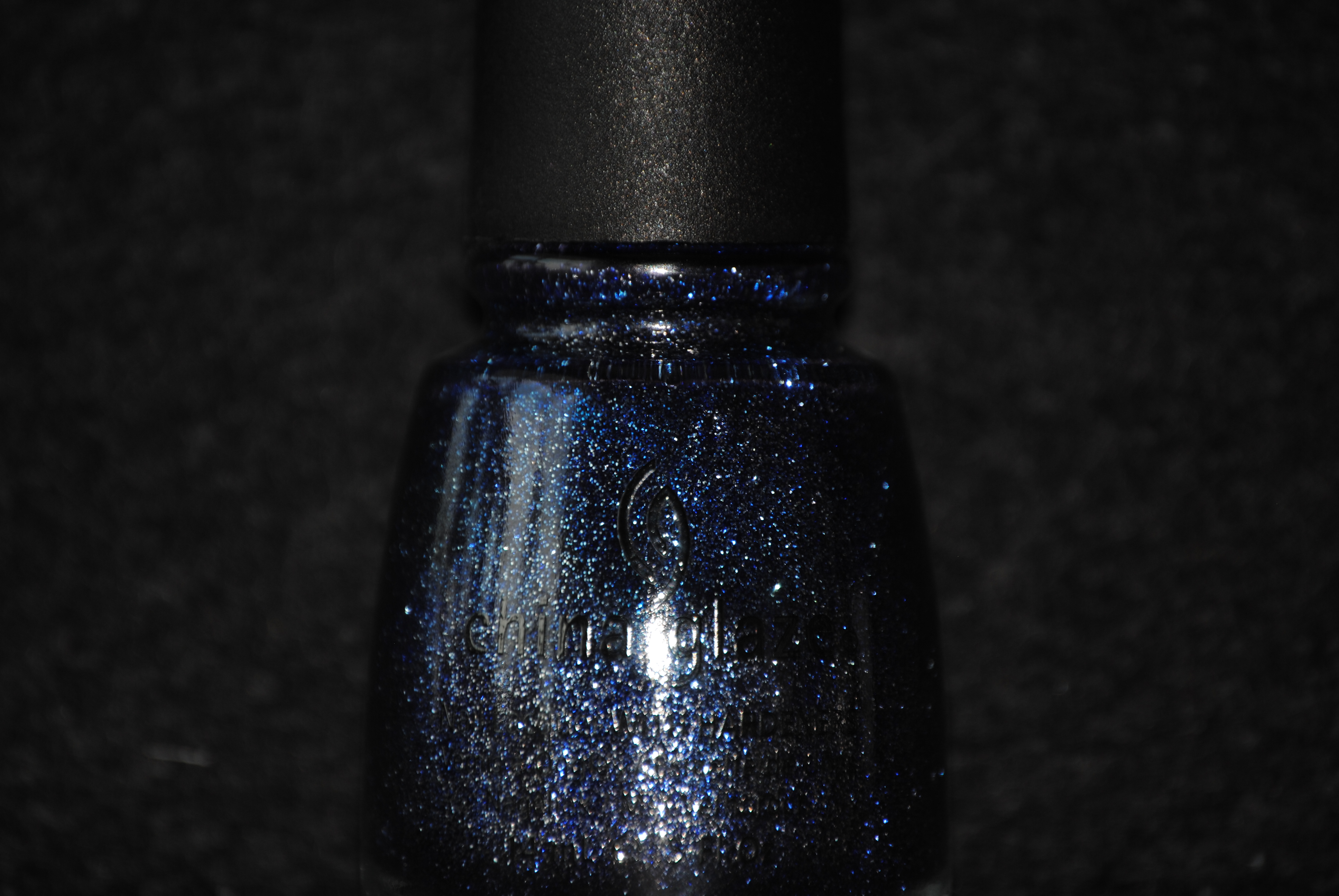
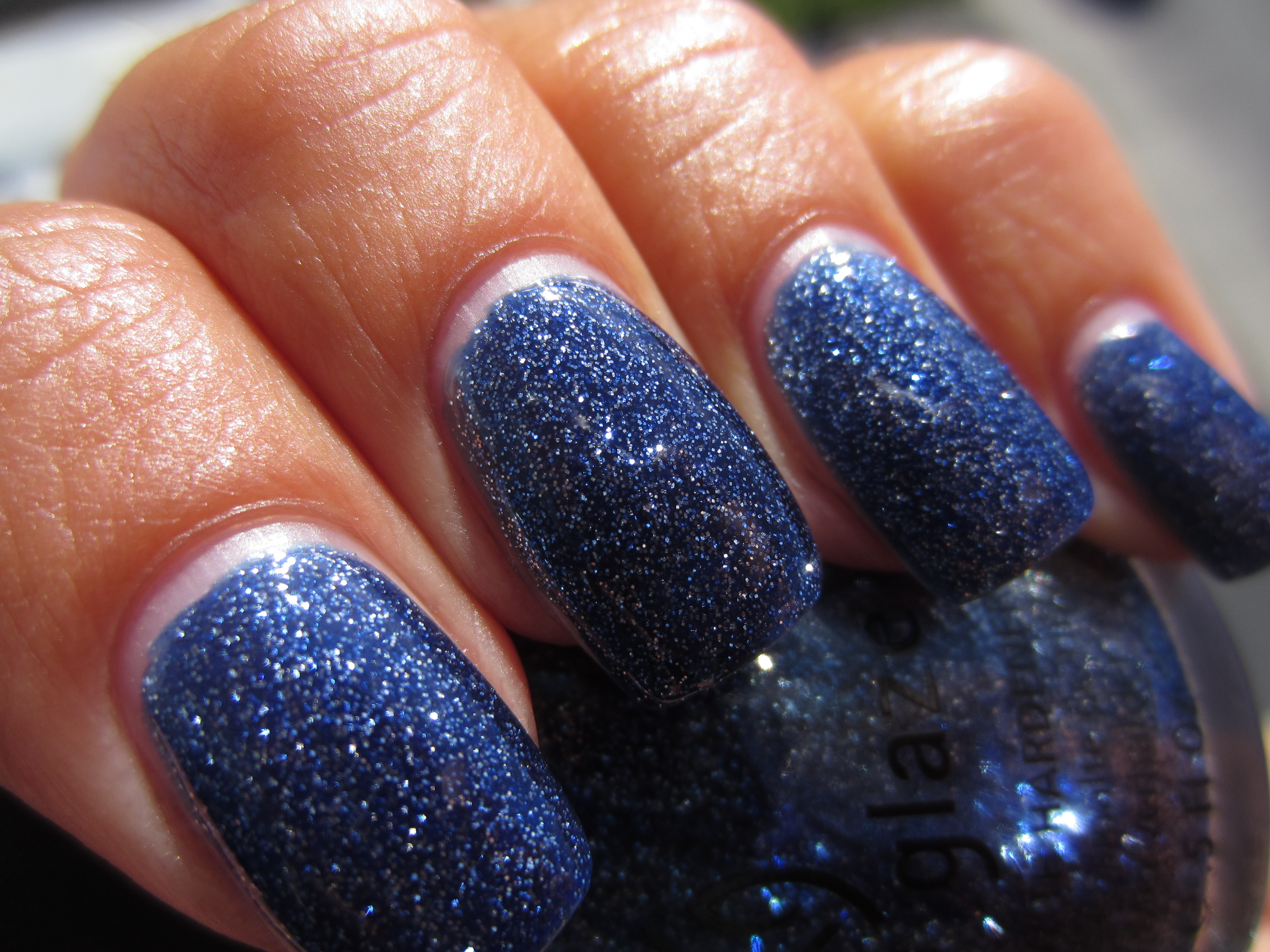
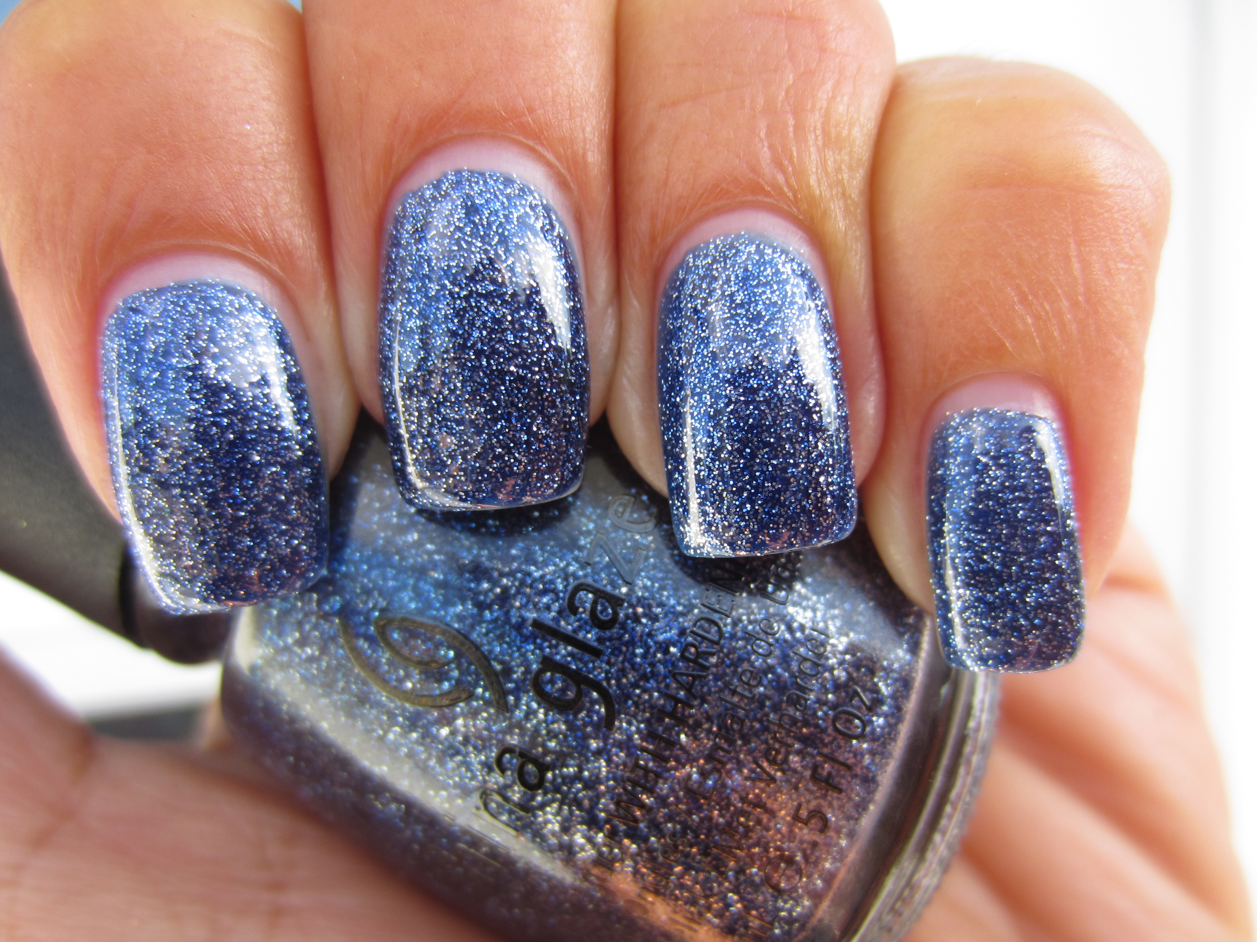
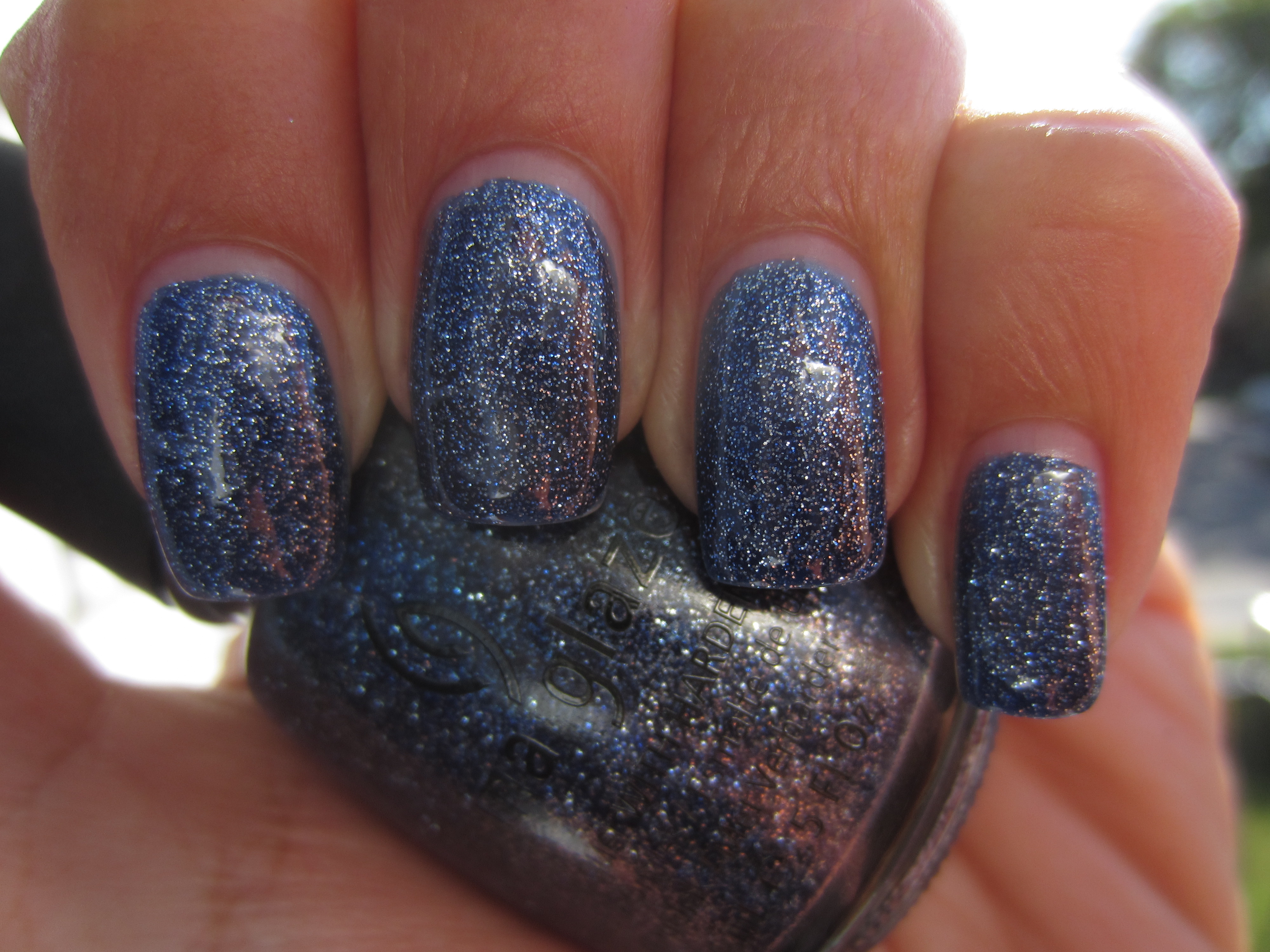
Wearing ‘Skyscraper’, is like adorning your nails with fragments of the night sky, glitteringly alive with a wealth of silvery stars. This is a deep, denim blue, literally packed with silver and blue glitter, yet it paradoxically bears a thicker formula which is smooth to the touch regardless of the amounts of glitter involved, as well as finishing surprisingly glossy. The bonus to this polish is how effortless it was to remove, leaving absolutely no staining behind.
A sunlight view gives your nails the look of the sky at twilight, when the sparkling stars make their first evening appearance, yet I love how the base shade seems to take on an almost ombré appearance.
This closeup angle gives the best view of how incredibly densely packed with myriad glitter this lacquer truly is, as well as how beautifully it all works together.
Seen in indirect light, ‘Skyscraper’ take on a much cooler toned persona, with the glitter now appearing like the drifting swirls of a shaken snow-globe.
I so love how shaded light not only deepens this polish to a warmer, more indigo hue, but lends an exotic gradient effect to the nail as well…stunning!
To truly appreciate its complete reflective wonder, ‘Skyscraper’ needs to be seen (preferably in person) with flash,….seriously mesmerizing!
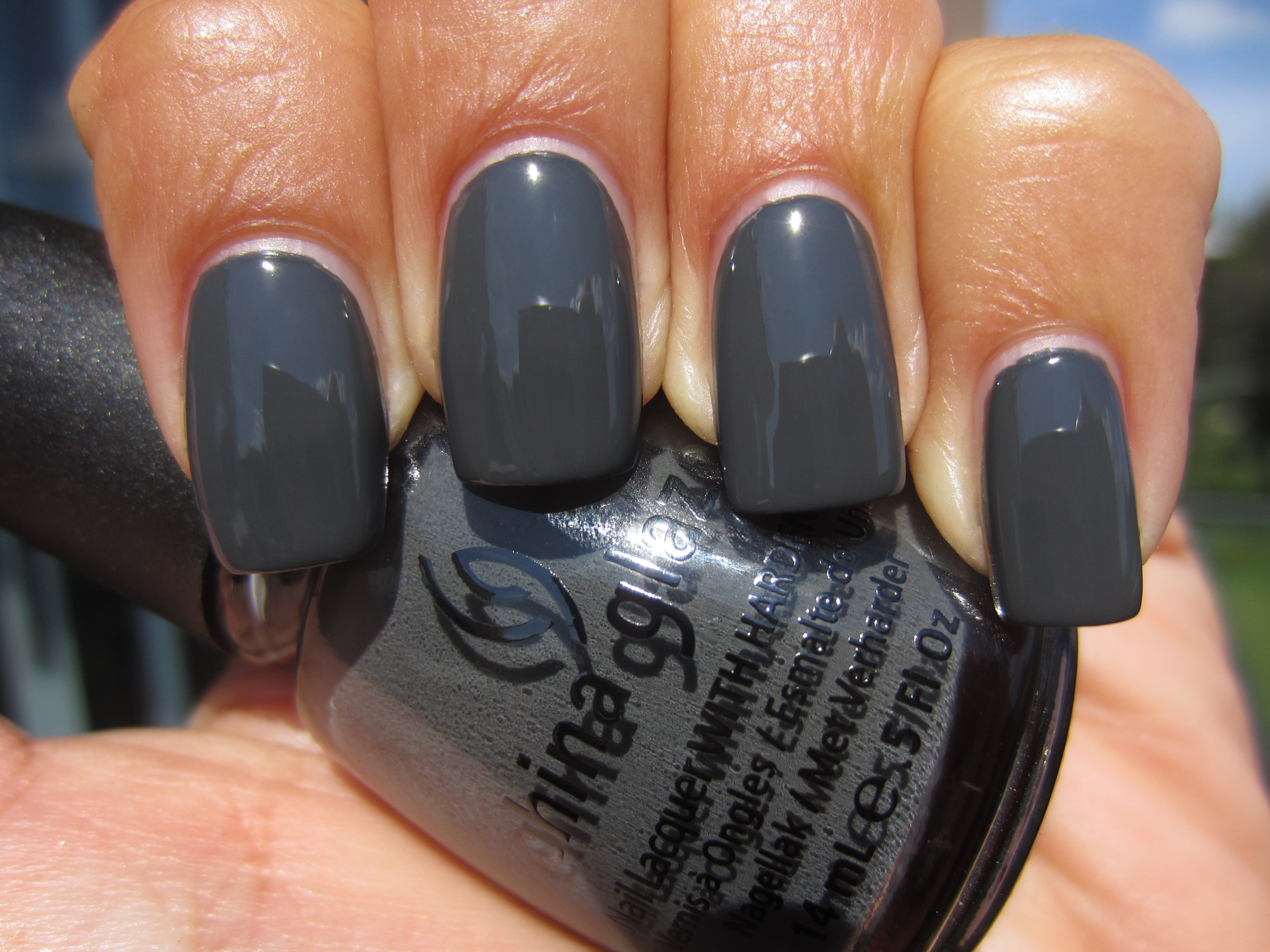
There have been several grey incarnations released this Fall by various brands, yet ‘Concrete Catwalk’ still finds a way to stand out, primarily due to its exceptional formula. Deeply, deeply creamy with the highest gloss quotient of the entire collection, it also bears a rather quick-drying and self-levelling finish, despite the formula being a touch thick. Intensely colour saturated, as well as sensually chic….what’s not to love?!
A view in sunlight, reveals this shade’s teal-like leanings, and while the colour appears paler in the bright light, it’s no less intense as a result.
Indirect lighting seems to throw an almost silvery mantle over ‘Concrete Catwalk’, giving it a much cooler appearance yet note how blindingly brilliant that glossy finish is!
While shaded light naturally lends this polish its deepest tone, it also serves to add a mysterious new element to the overall look.
A final view taken with flash, emphasizes this shade’s gorgeous lustre and displays a depth of tone that is simply amazing.
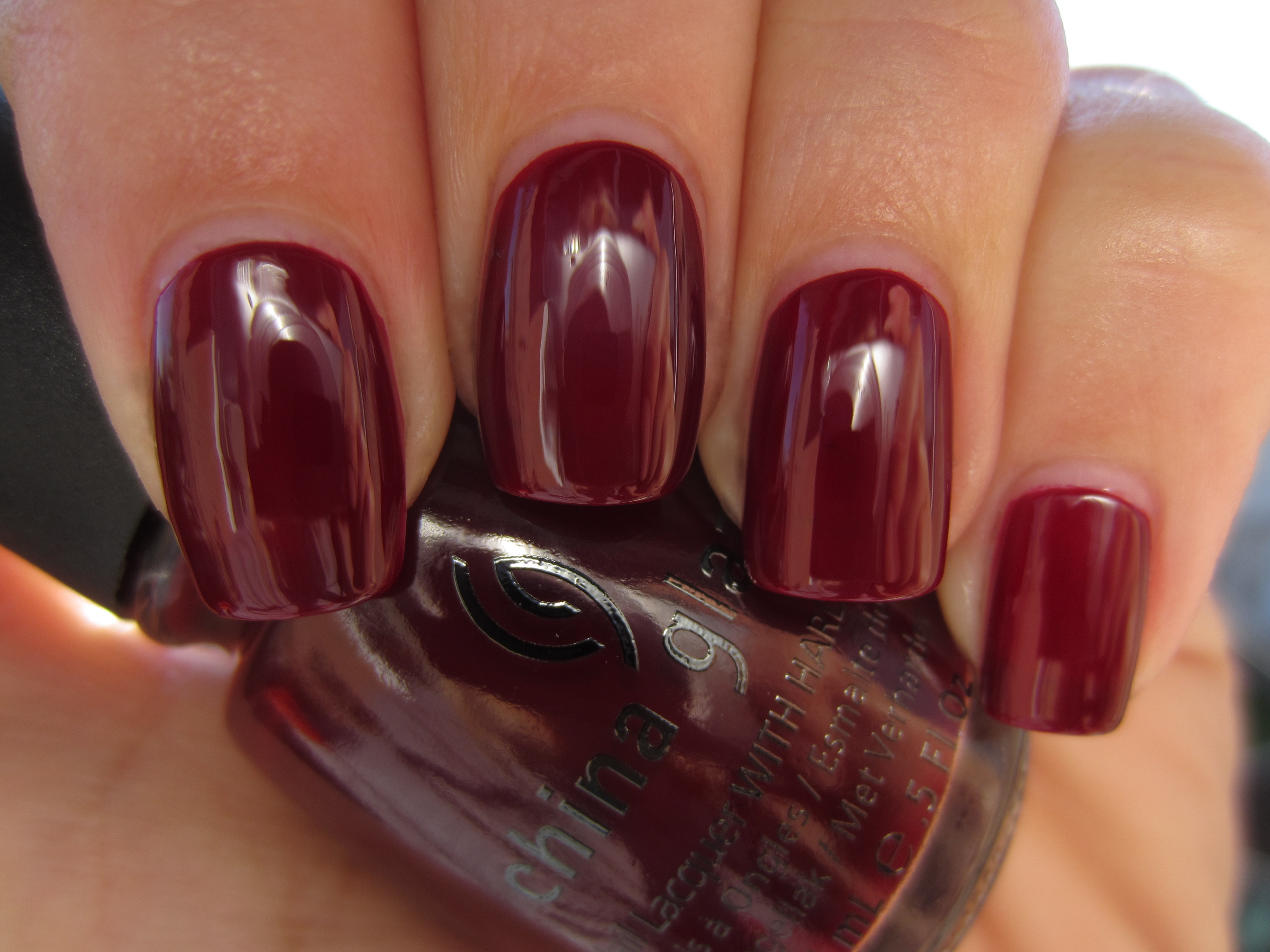
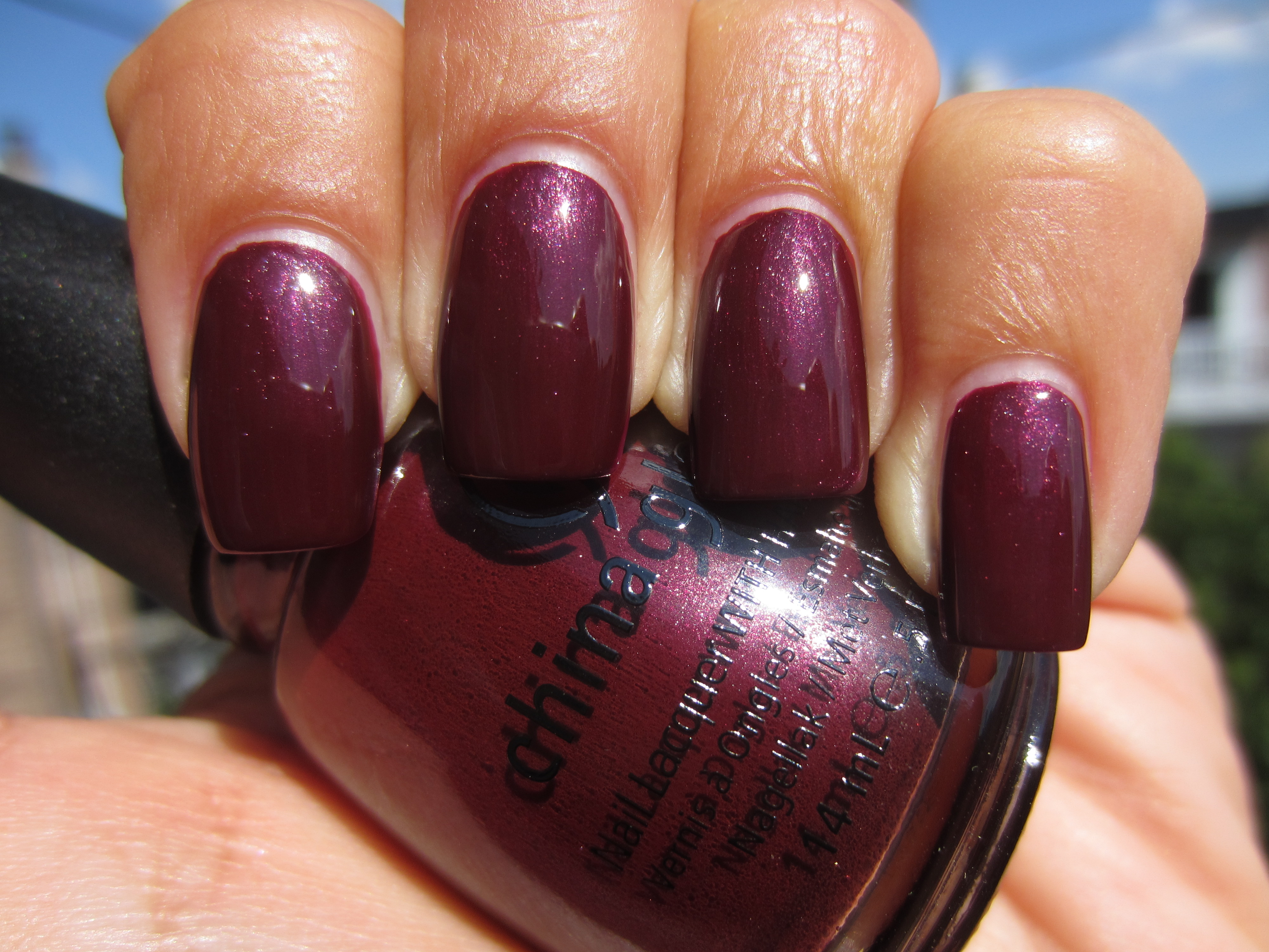
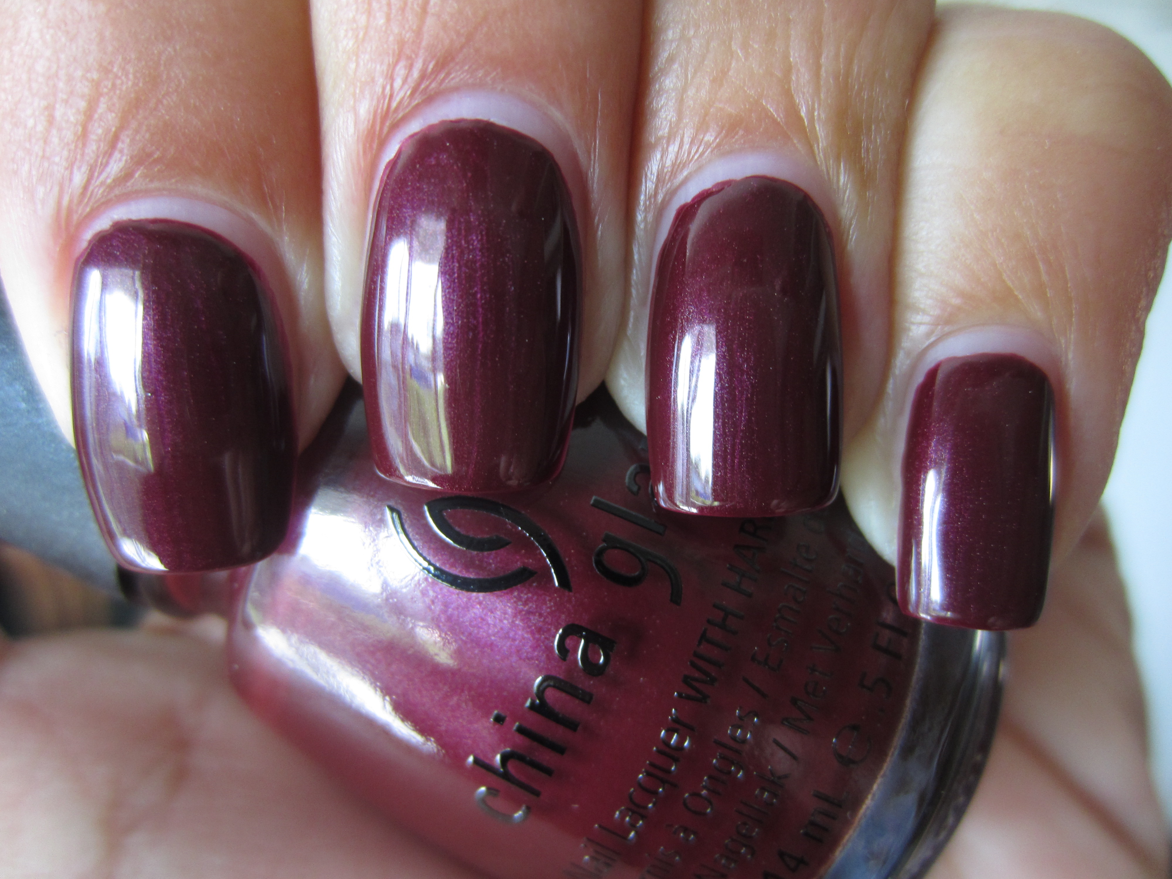
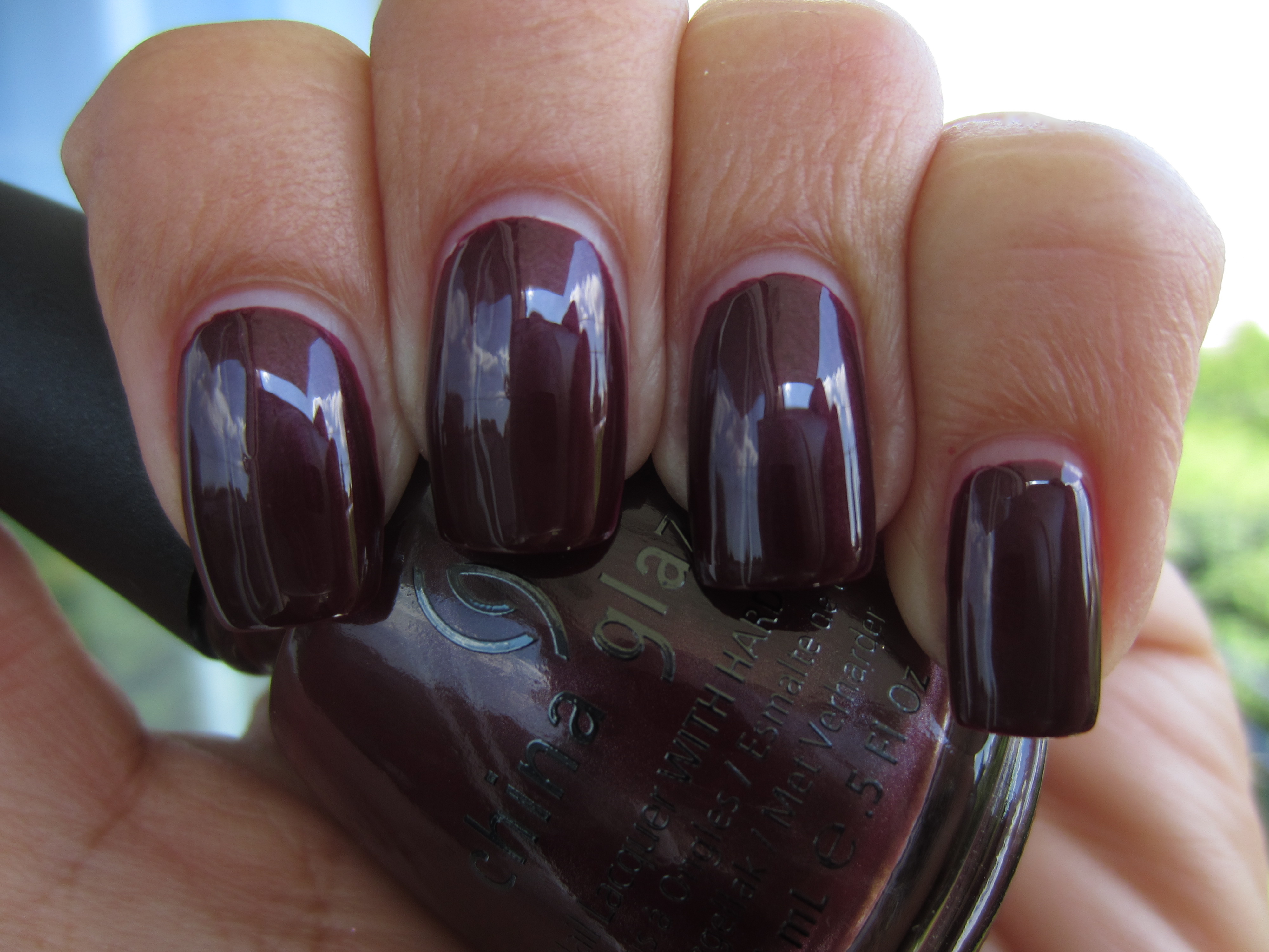
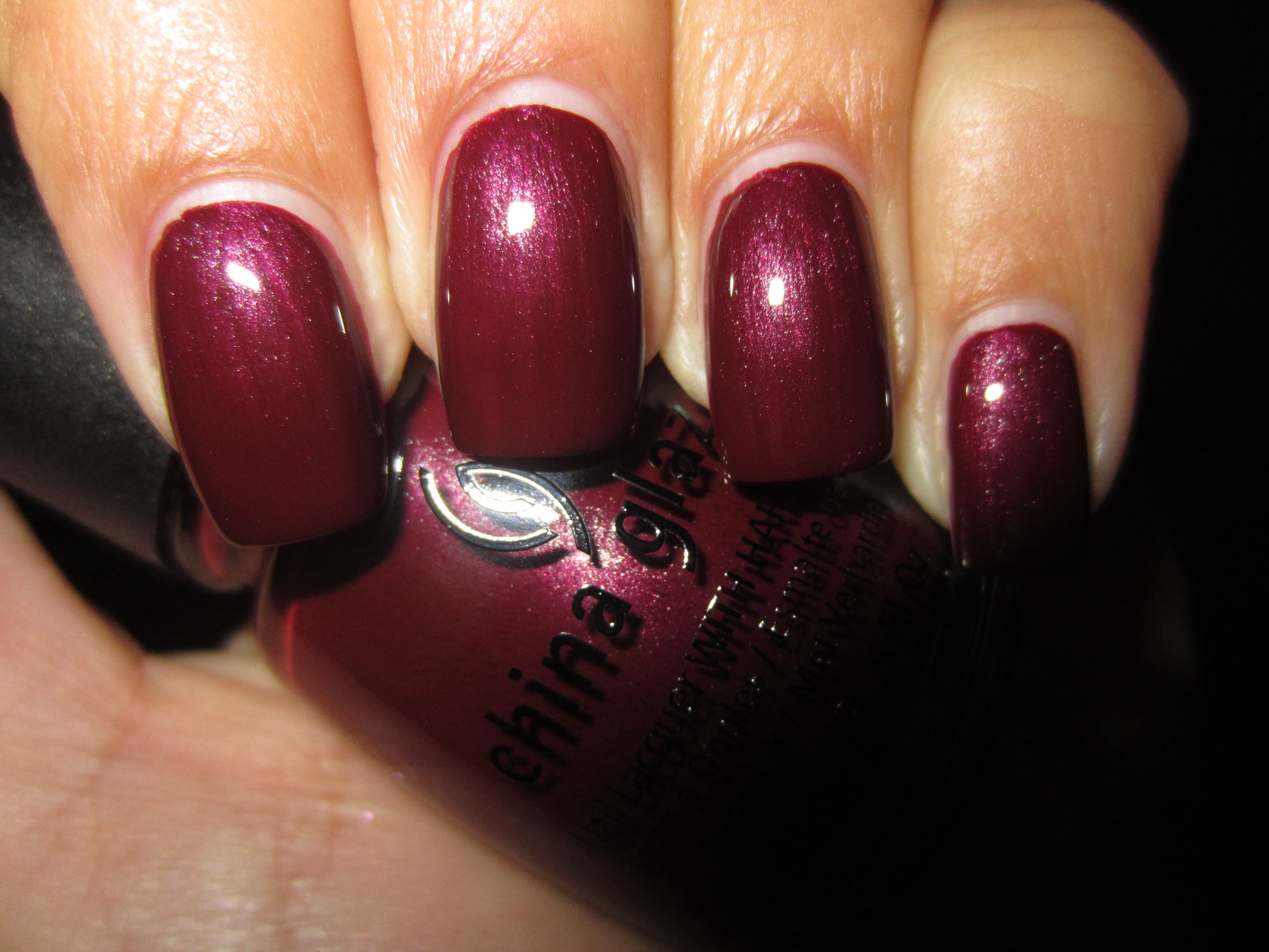
A complex yet utterly sophisticated hue, ‘Loft-y Ambitions’ is an absolutely perfect deep berry shade. Highly pigmented, with a smooth application and wonderfully glossy despite the addition of shimmer, it holds that “lit-from-within” look that is one of my absolute favourites. While removal was slightly messier due to it’s reddish nature, a second swipe with polish remover eliminated any traces left behind, with absolutely no staining.
When seen in sunlight, there seems to be a slight blueish tinge to this shade, which only adds to the interesting effect overall and highlights the shimmer.
A view in indirect light appear to lend a more brooding aura to ‘Loft-y Ambitions’, while banking its internal fire to a cooler level.
Interestingly enough, while shaded light gives this lacquer it’s darkest tone, it also now appear more of a deep raisin-like crème shade, adding to its complexity.
A final view taken with flash gives ‘Loft-y Ambitions’ a more wine-like hue, and spotlights the ultra fine, yet densely packed shimmer.
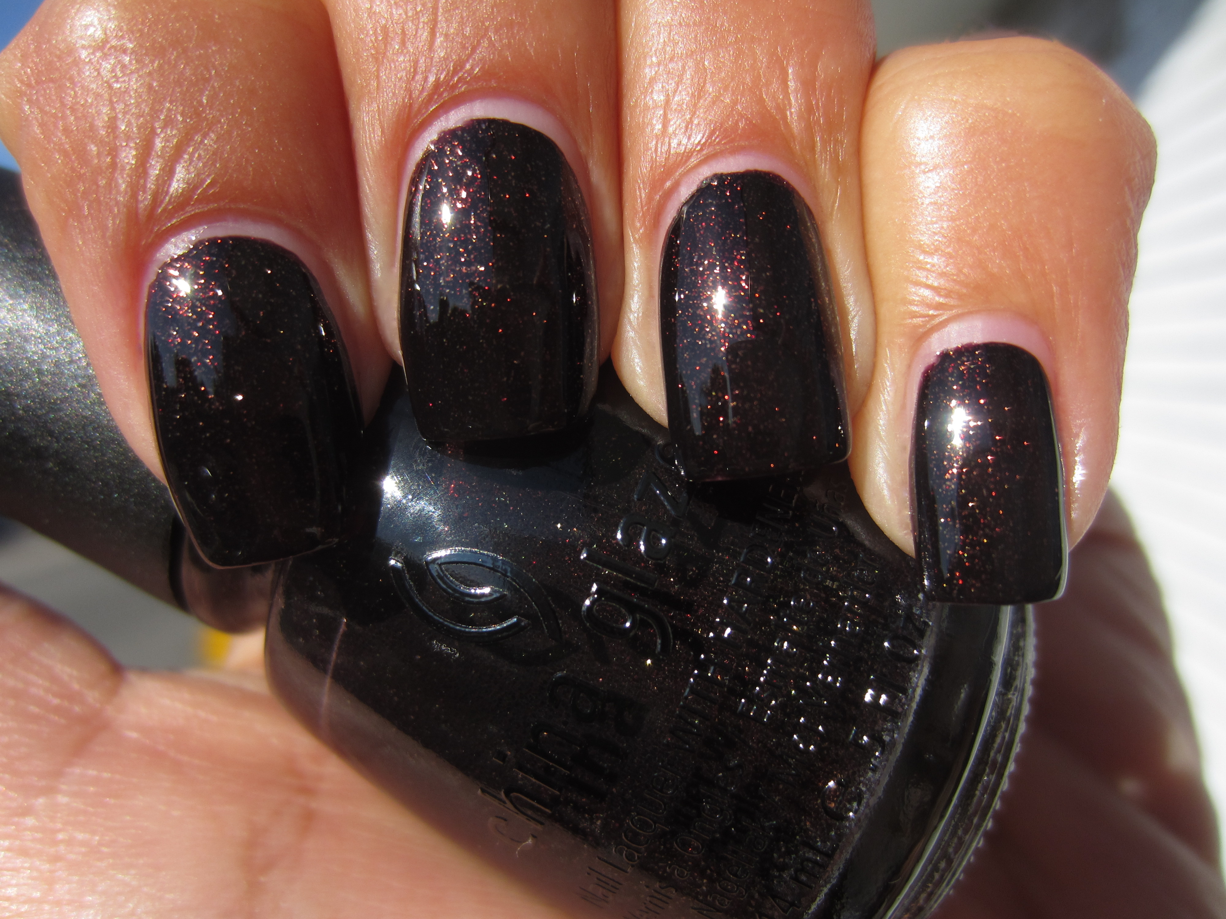
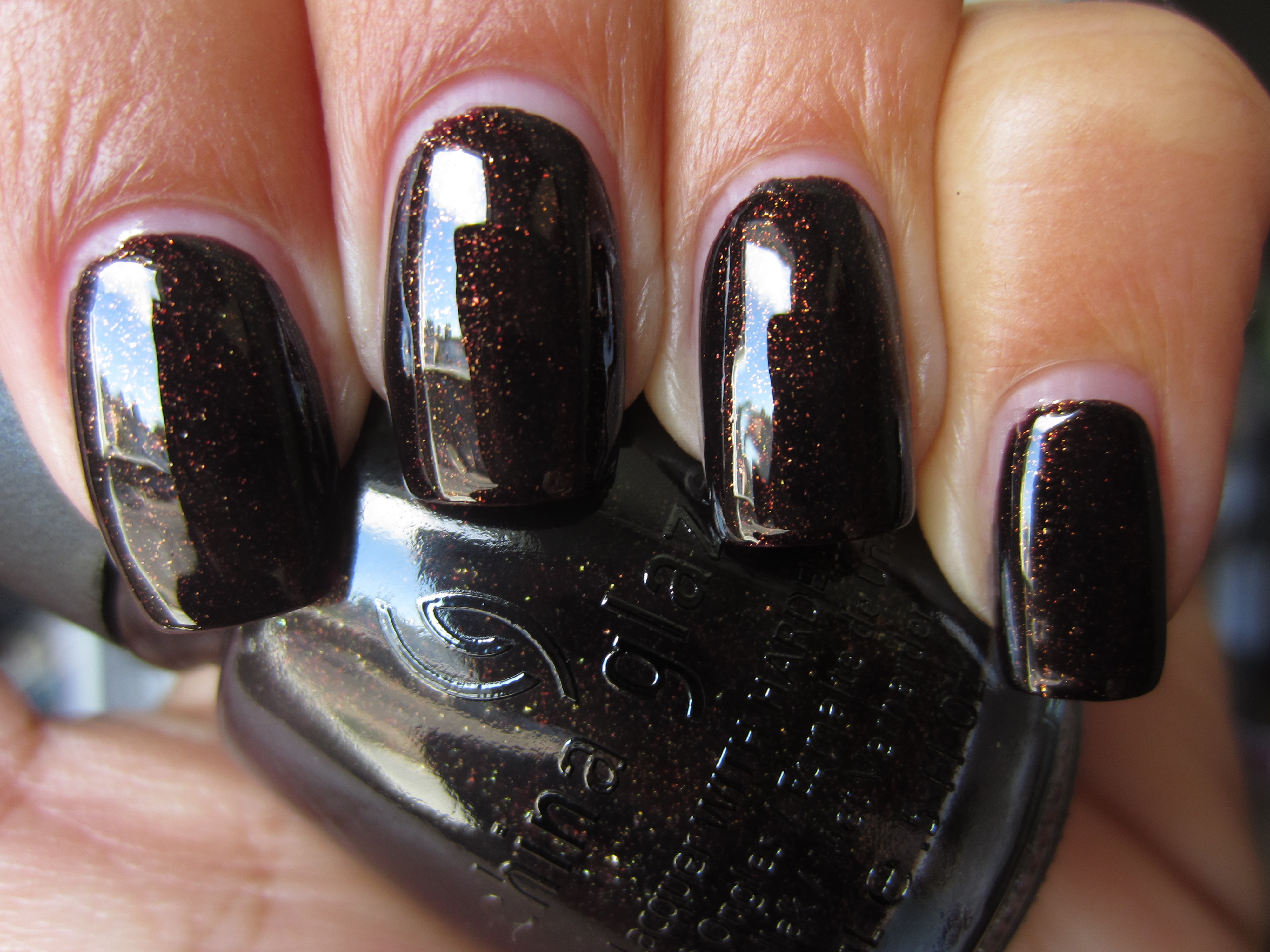
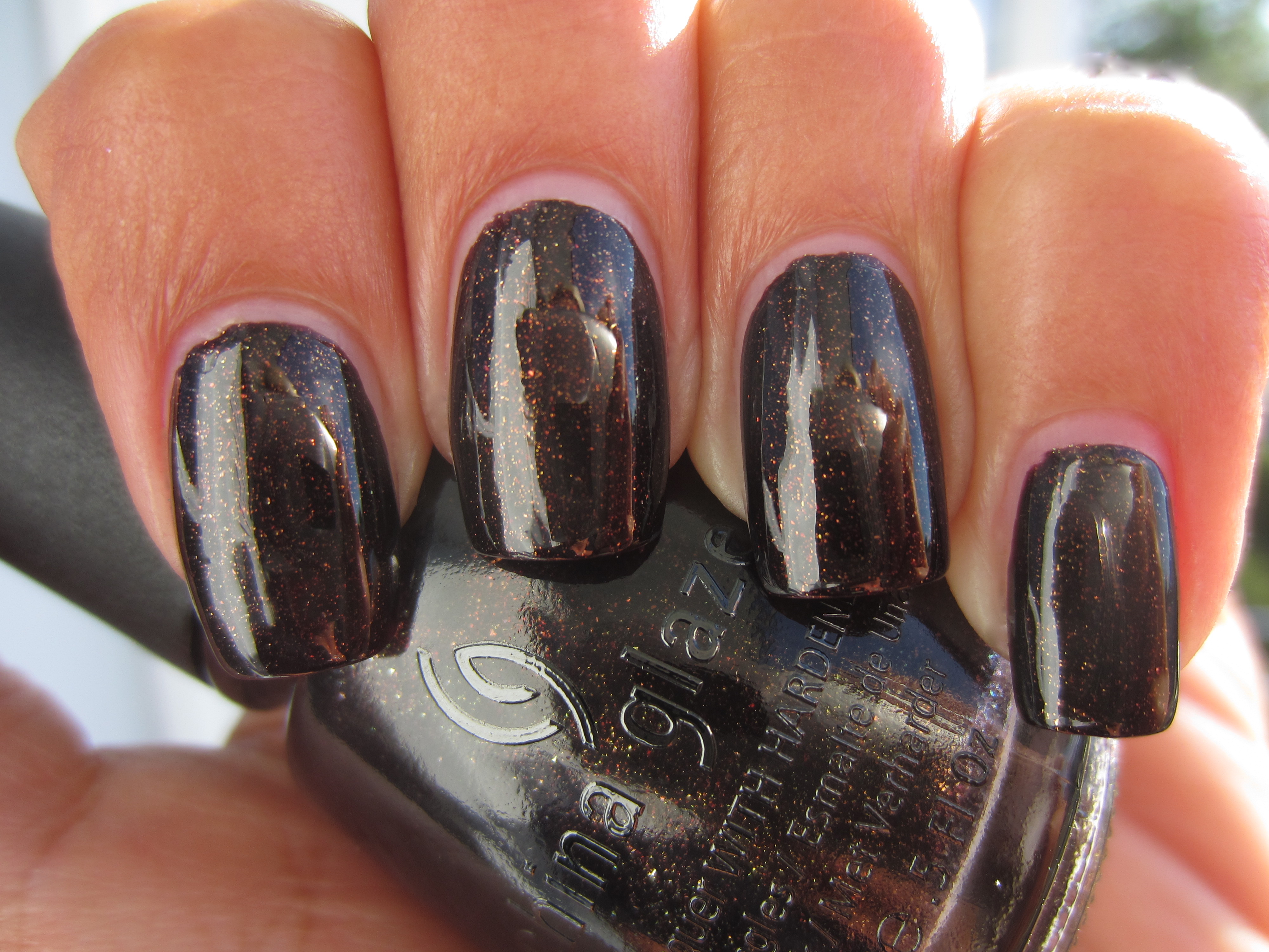
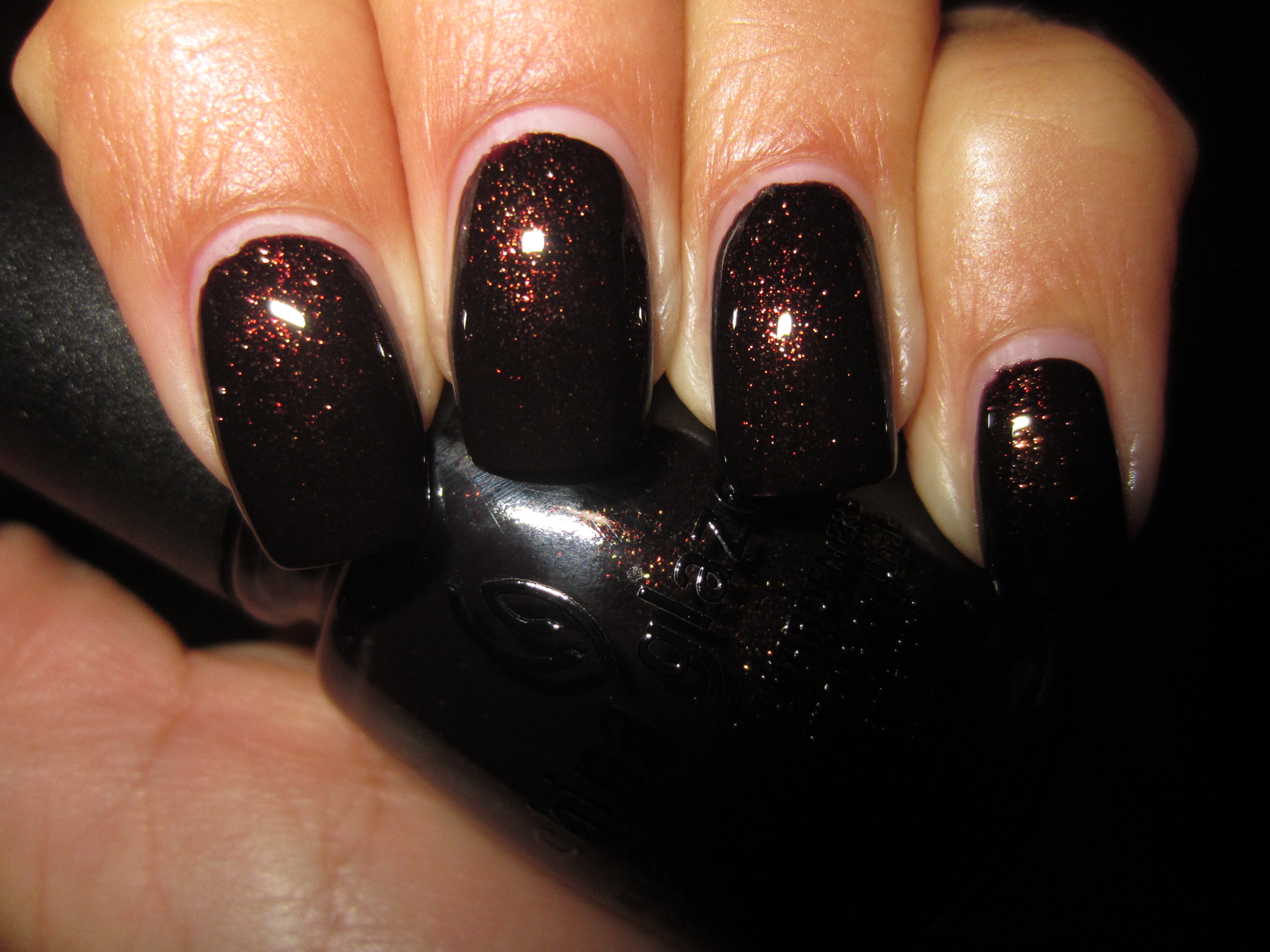
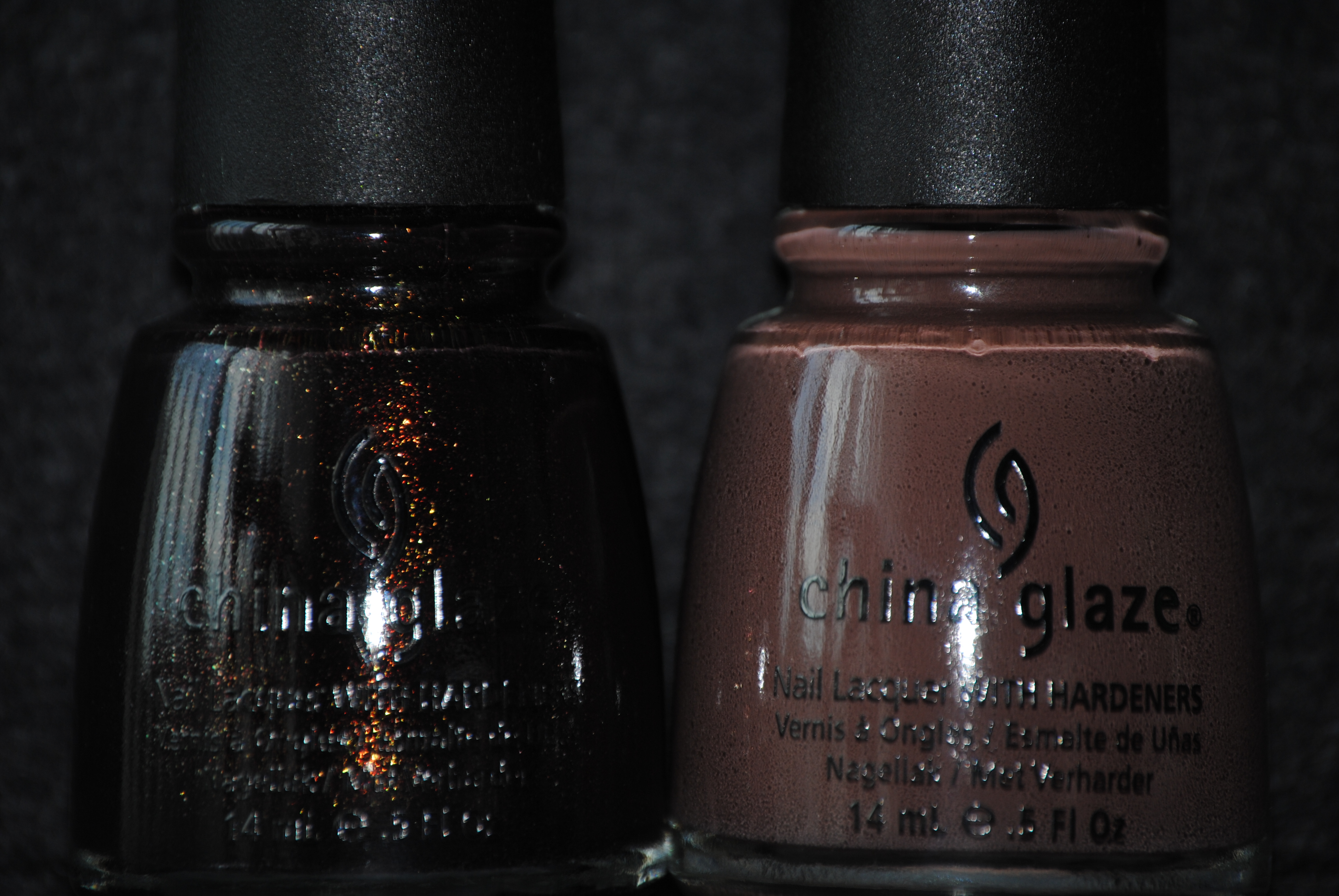
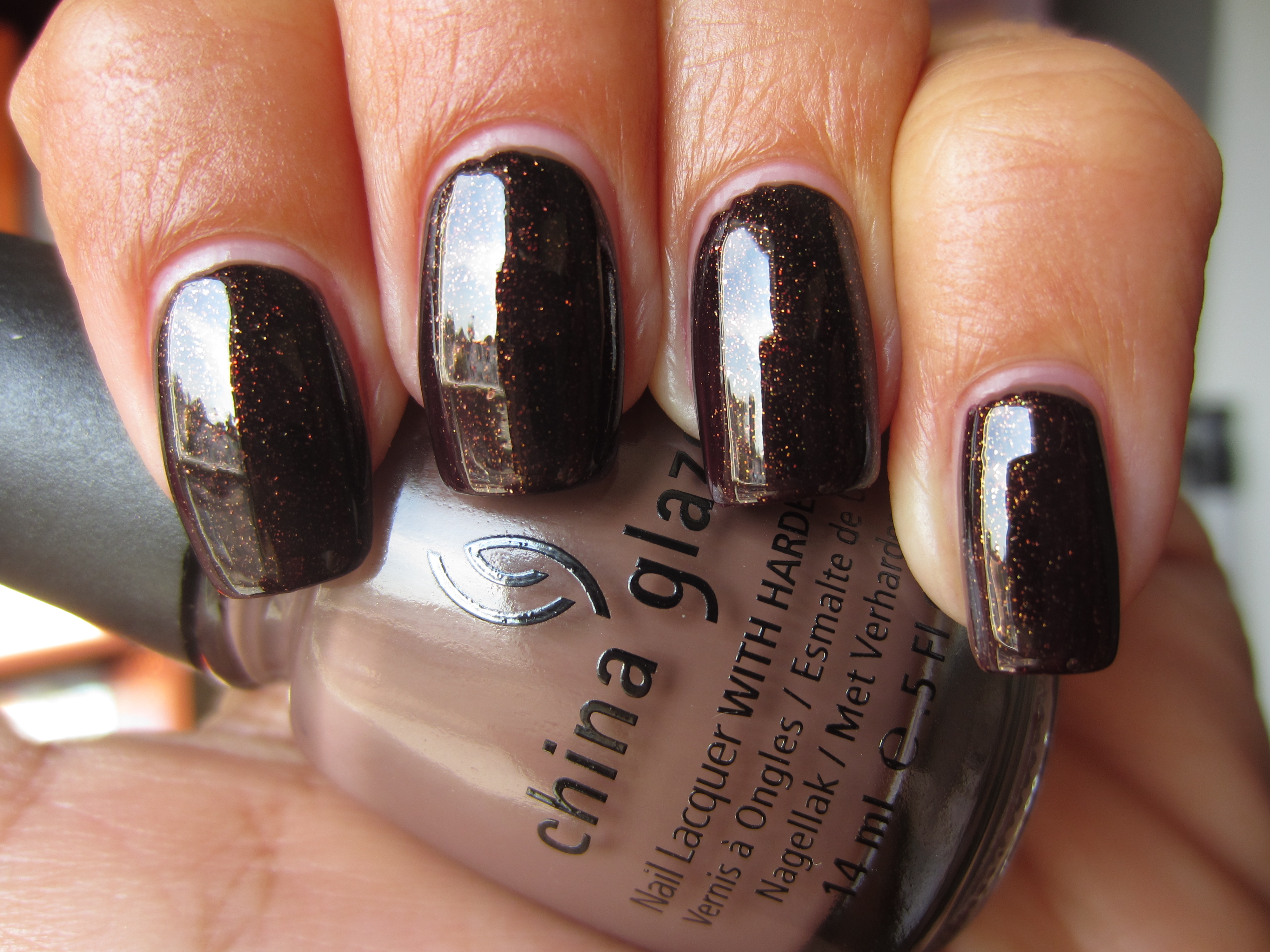
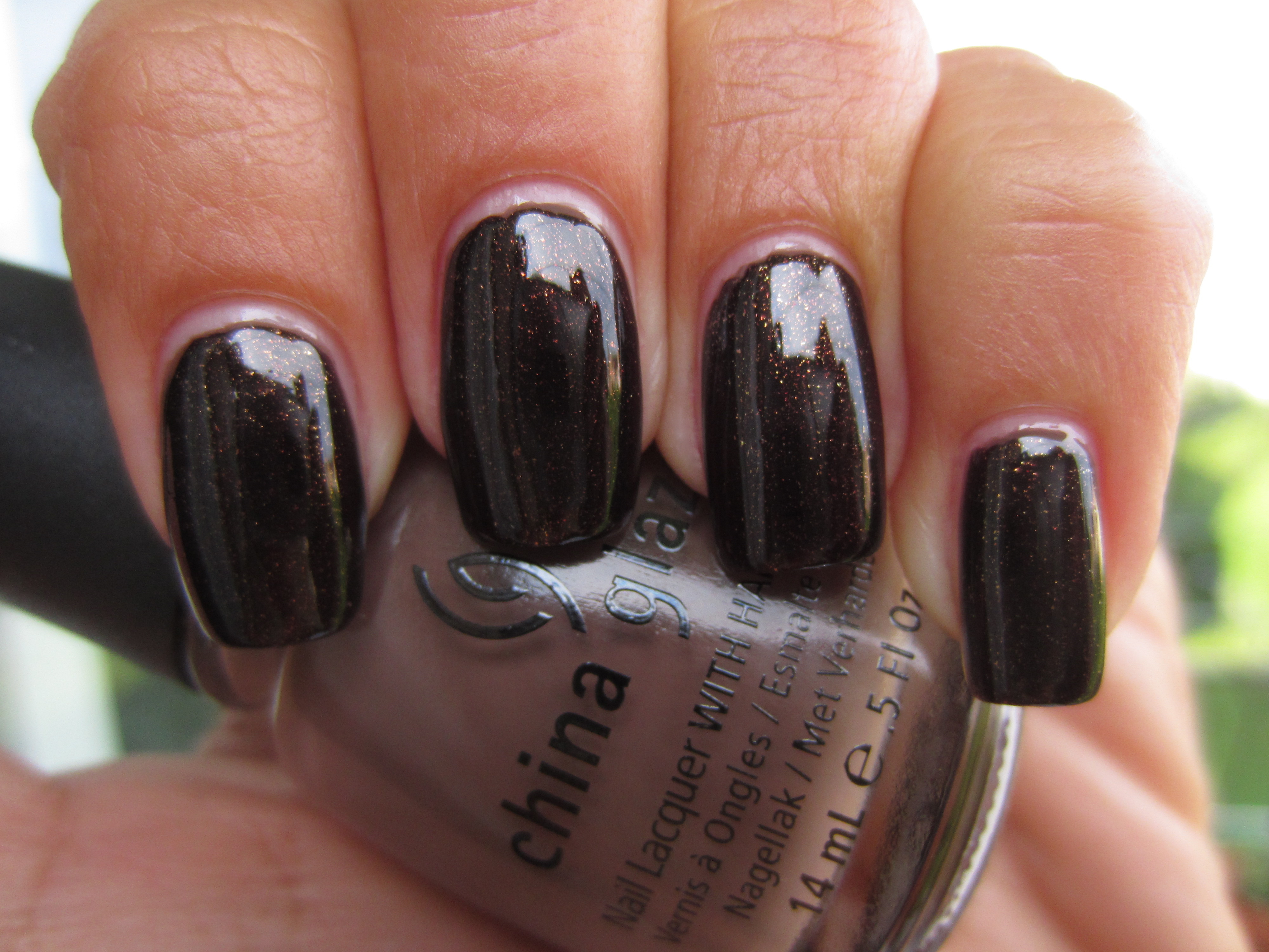
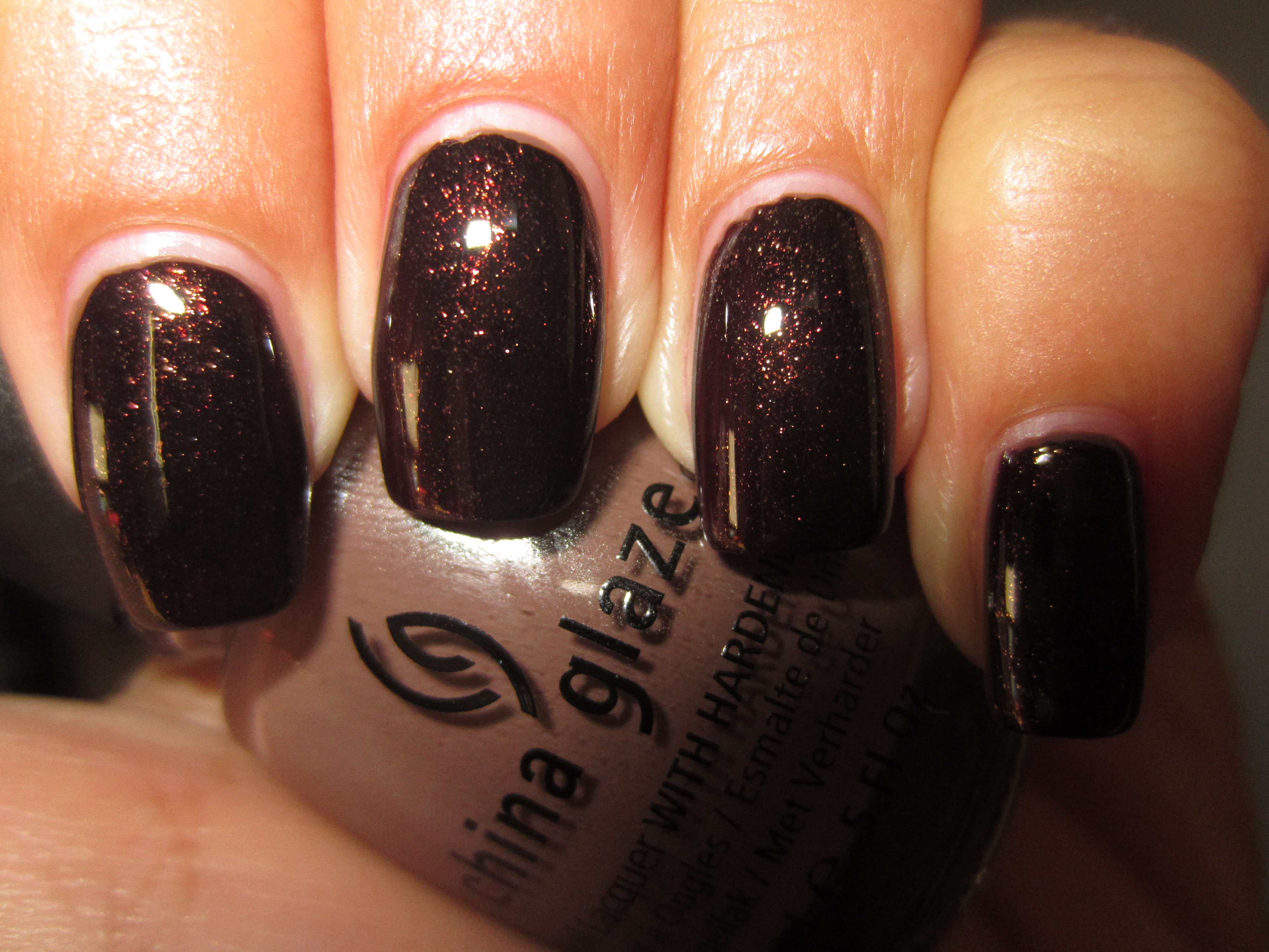
Every so often there comes along a lacquer that is so hard to define and pin down; ‘Midtown Magic’ is just such a shade. A deep prune base, filled with gold, amber, as well as some red ultra fine glitter, this polish had perfect opacity with just two coats, applied smoothly and easily, and while the natural finish was more satiny than gloss, its incredible 3D effect due to the varying levels of glitter, made up for that. Surprisingly easy to remove and relatively mess-free, this lacquer has completely captivated me…..insane!
Viewed in full sun, the reddish flecks become slightly more prominent, and add to this shade’s star-filled depths.
I am in awe over how indirect light reflects light off the glitter, which appears as simmering fiery points of light, just under the surface of the lacquer.
When seen in shaded light, ‘Midtown Magic’ takes on a smokier, more whisky-like persona, glowing at the tips with an almost amber light.
Ahhhh….this final view taken with flash, gives you the entire magnificence of this lacquer in one glance. Utterly original and spectacularly spell-binding….I LOVE this!!
I’ve included this short video clip of ‘Midtown Magic’ in action, which can also be found on my youtube channel (please click on the sidebar icon to subscribe – I’d love to have you join!)….enjoy!
Final thoughts: As I close up my review of this collection, I cannot help but be completely blown away. The colours overall, are all expected Fall shades, yet they still seem to bear some interesting new twist that elevates them to a whole new spectrum of hue. The quality of these lacquers is superb, the application smooth with a long tapering brush that is easy to handle, yet flexible enough to effortlessly reach all areas of the nail. The crèmes of this collections are exceptionally creamy and über-glossy, while the shimmers & glitters add a beautiful dimension of delicate sparkle. My favourites? All…although ‘Midtown Magic’ is utter genius, in my opinion. China Glaze’s vision of ‘Metro’ will leave suburbanites longing for fast paced-city living! Please feel free to visit the China Glaze website for more information on the brand.
*Disclaimer: product samples provided by the company/PR for my unbiased consideration
*Urban image credit
China Glaze Fall 2011 – Metro Collection “Uptown” (swatches & review)
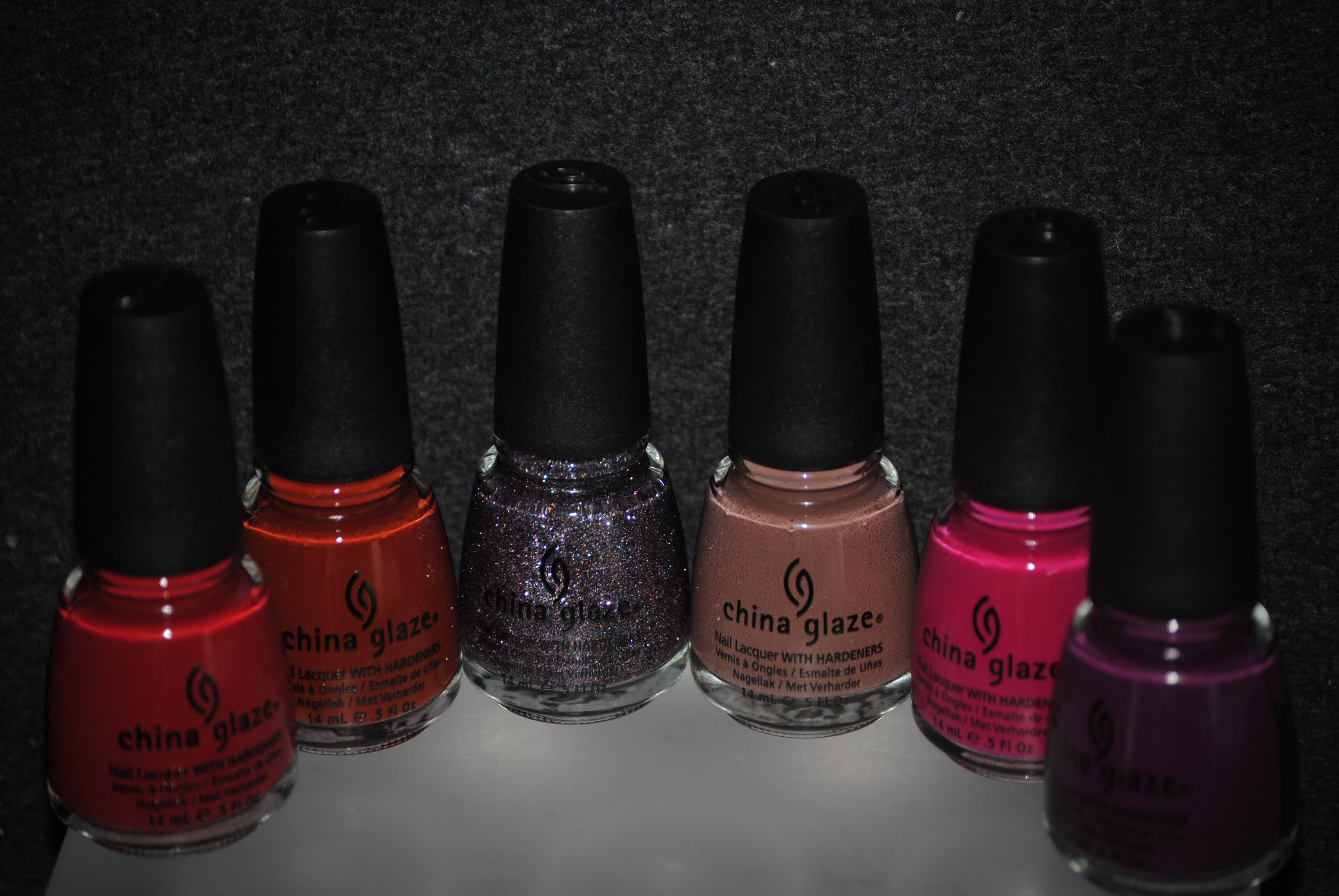
I have a weakness for the Fall collections, and China Glaze’s latest offering, the ‘Metro’ Collection, seamlessly melds the cooler autumnal vibe with the hot trends of today. Broken down into two subsets, first up are the six “Uptown” shades: ‘Brownstone’ – a rich russet crème, ‘CG In The City’ – a sheer lavender tinted sparkler, ‘City Siren’ – a creamy pink-tinged red, ‘Street Chic’ – the smoothest taupe ever, ‘Traffic Jam’ – a hot, hot raspberry crème, and finally, ‘Urban-Night’ – a deep and intense grape. All swatches are with Seche Base Ridge Filling Base Coat, two coats of lacquer, and Revlon’s Quick Dry Top Coat.
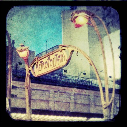
I wish to digress for a moment…..when I hear the word “metro”, the image that instantly pops into my mind, is the iconic art deco lettering for Paris’ subway system. Isn’t this sign just absolutely sublime? I adore the Art Deco movement’s organic nature!
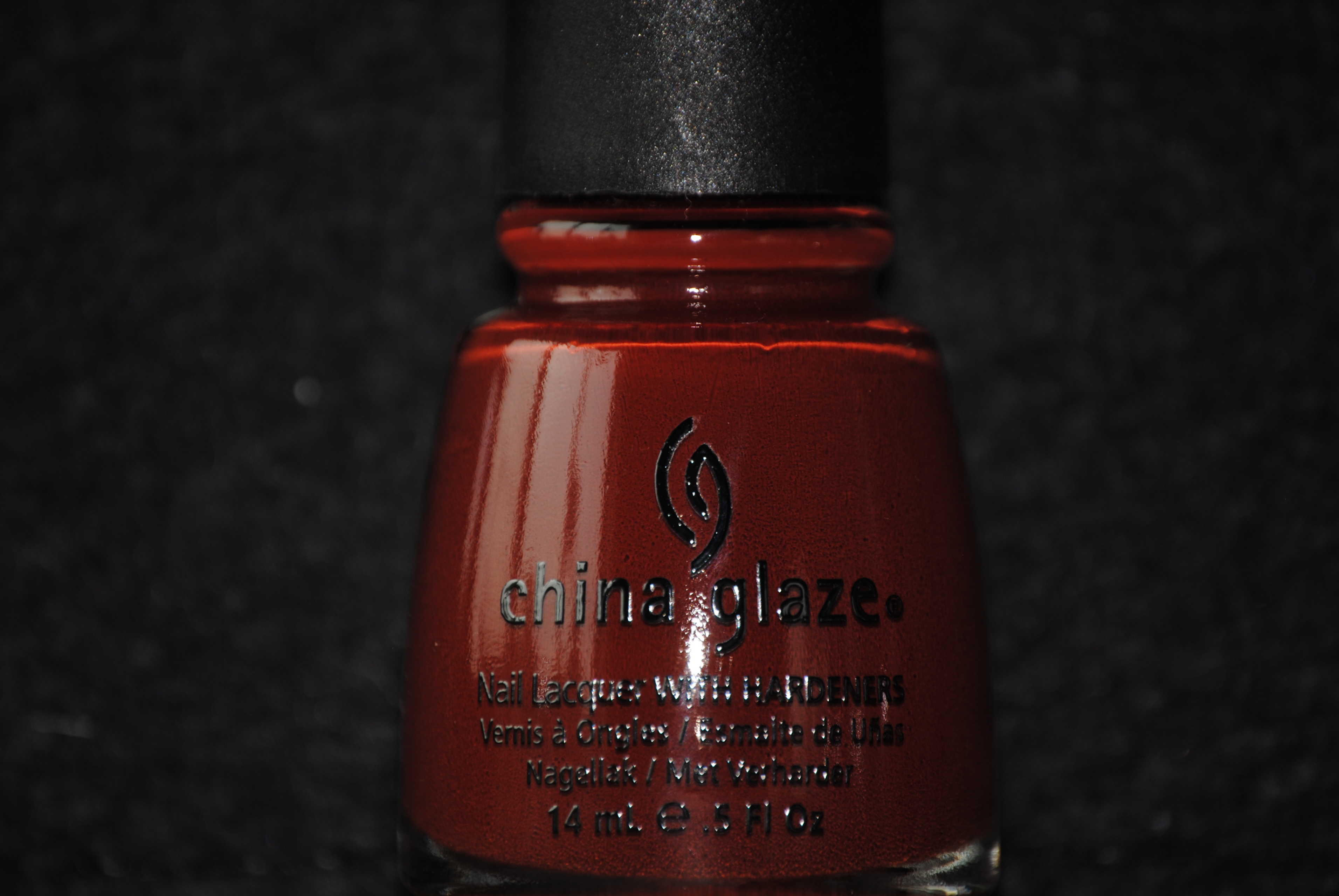
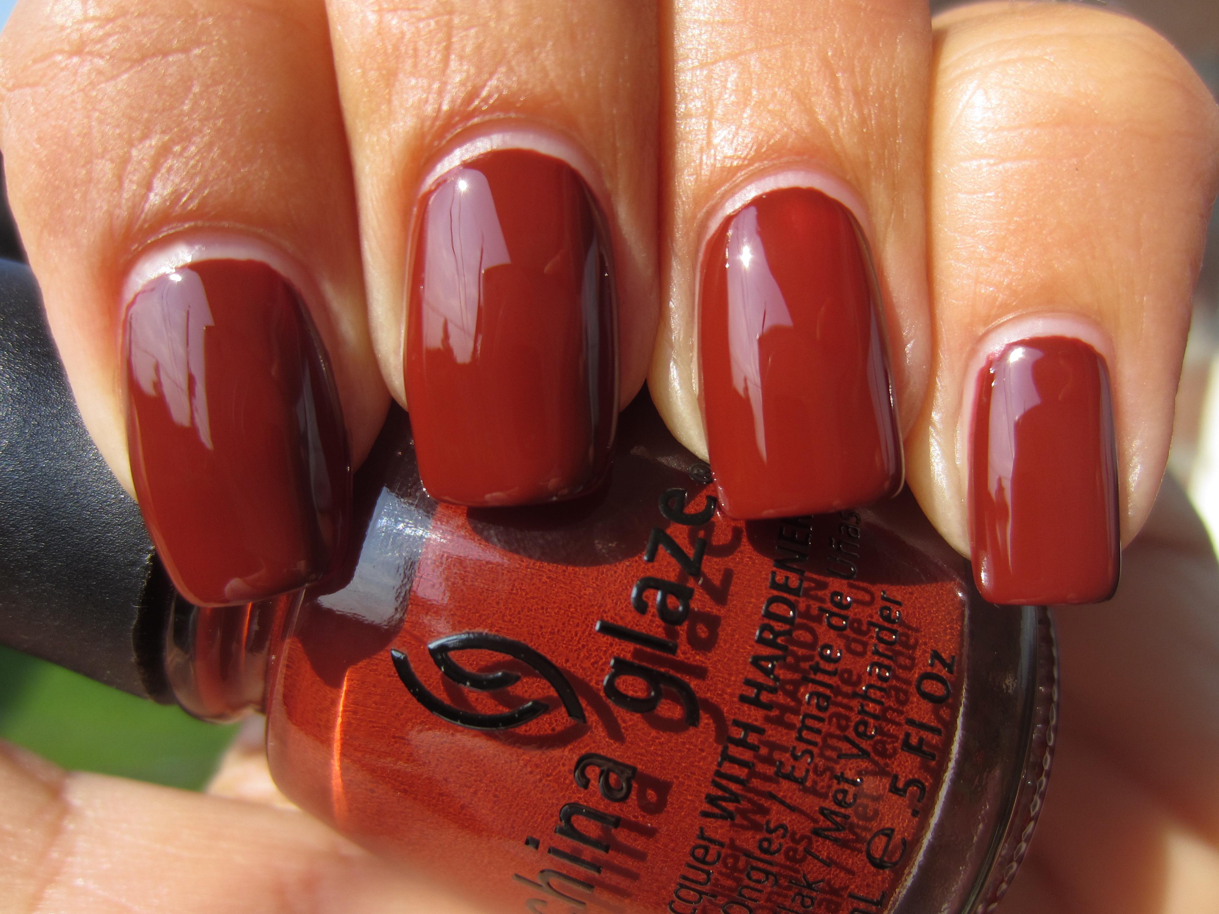
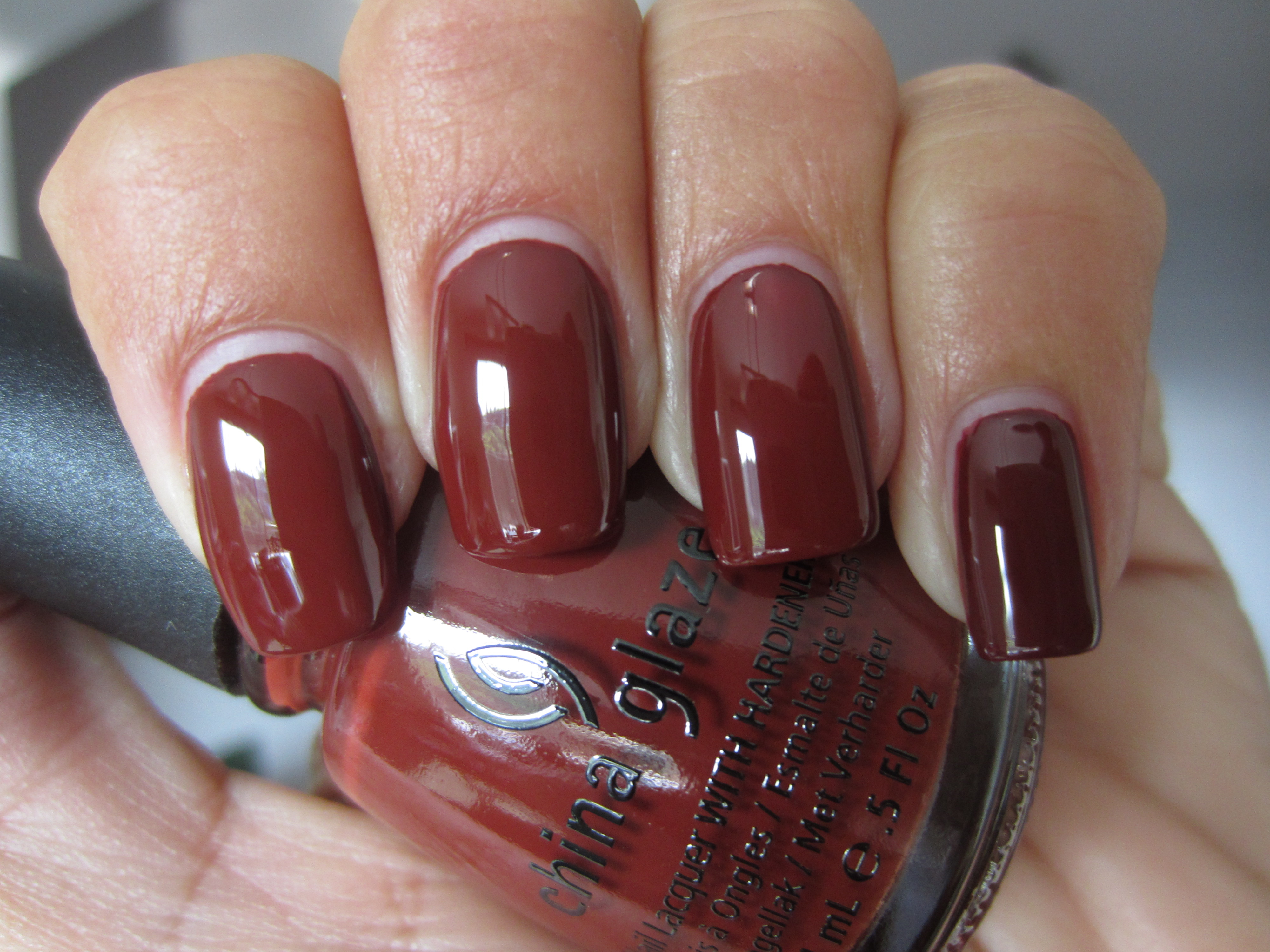
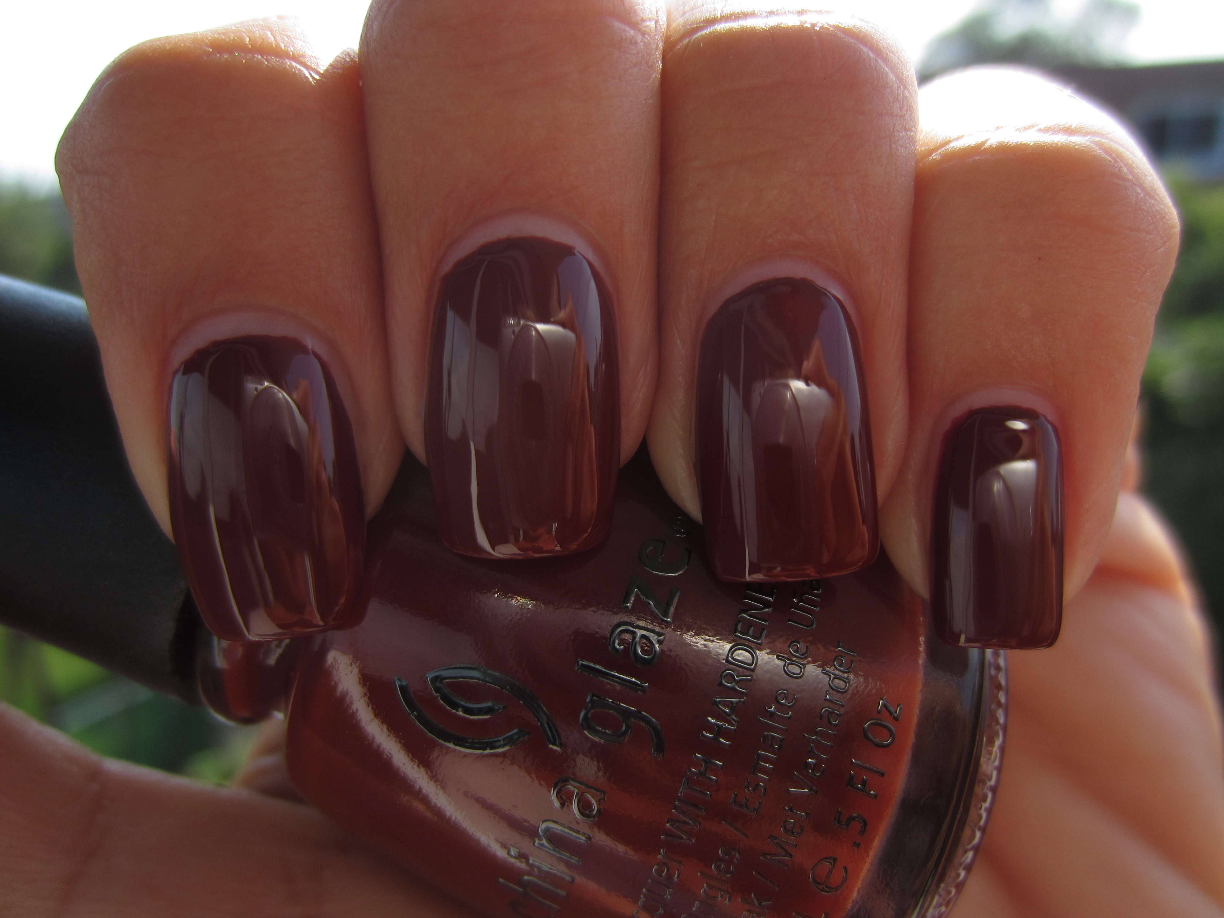
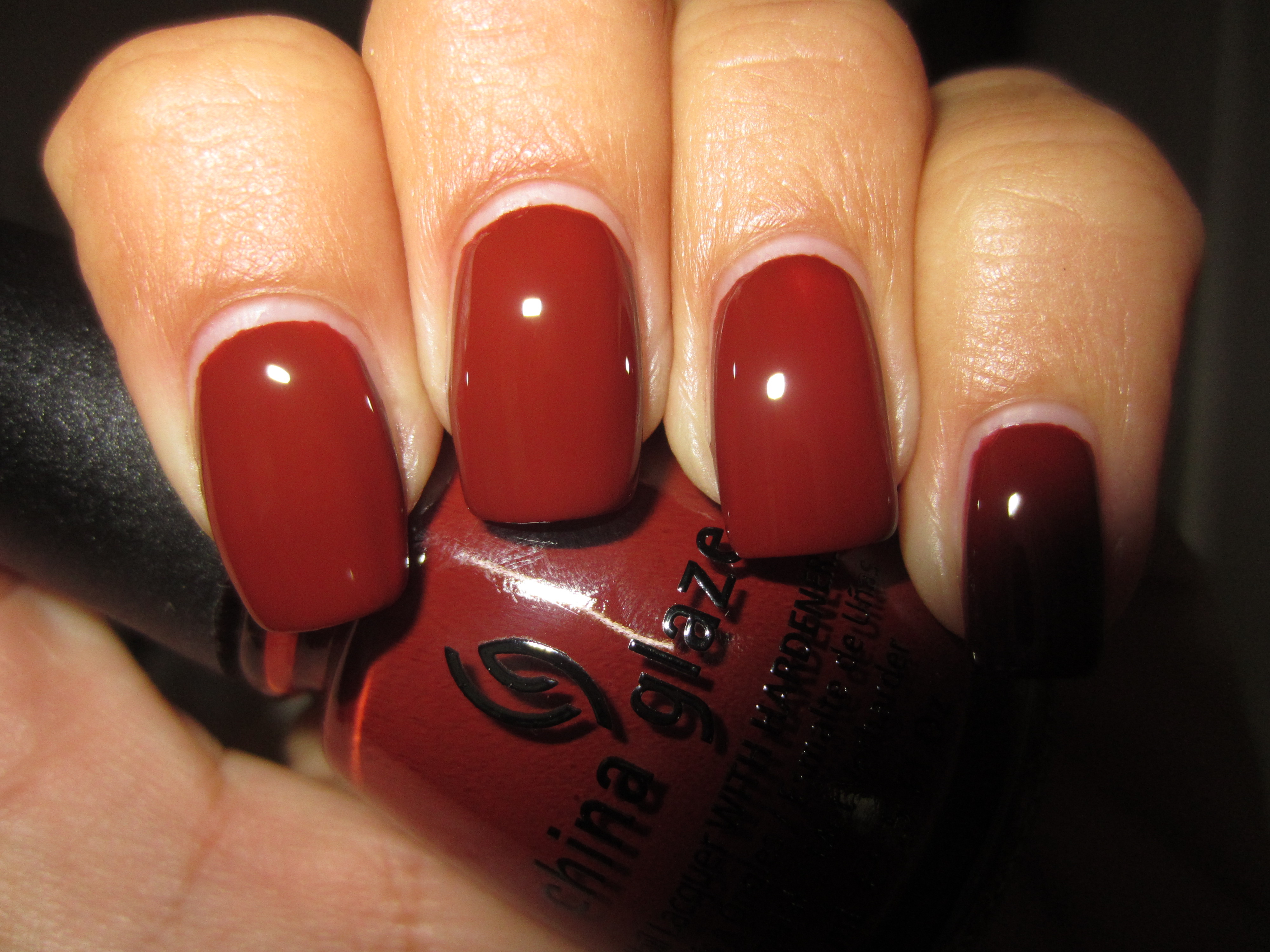
‘Brownstone’ is so perfectly named; wonderfully exuding that brown-red hue of freshly laid bricks, this polish had incredible pigmentation. Flowing rather thin but applying well, it levelled off to a beautiful smooth finish and was completely opaque in two coats, ending in a high gloss finish – even before a top coat was added!
Sunlight serves to bring out the burnt sienna-like tones of this lacquer and reveals hints of red in the base.
Seen in indirect light, ‘Brownstone’ now becomes a lusciously luxuriant brick red hue, glistening and regal.
A view in shaded light, deepens this tone and emphasizes more of its browner nature.
Interestingly enough, flash displays a lighter, more reddish side to ‘Brownstone’, and gives evidence of its deep glossy hue.
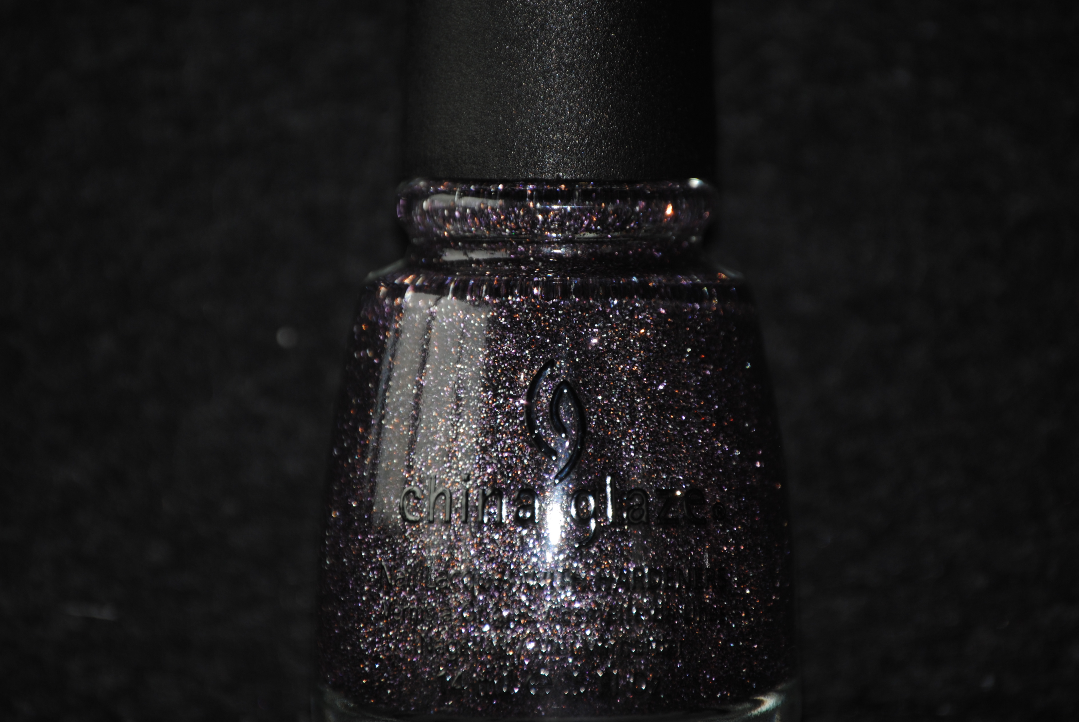
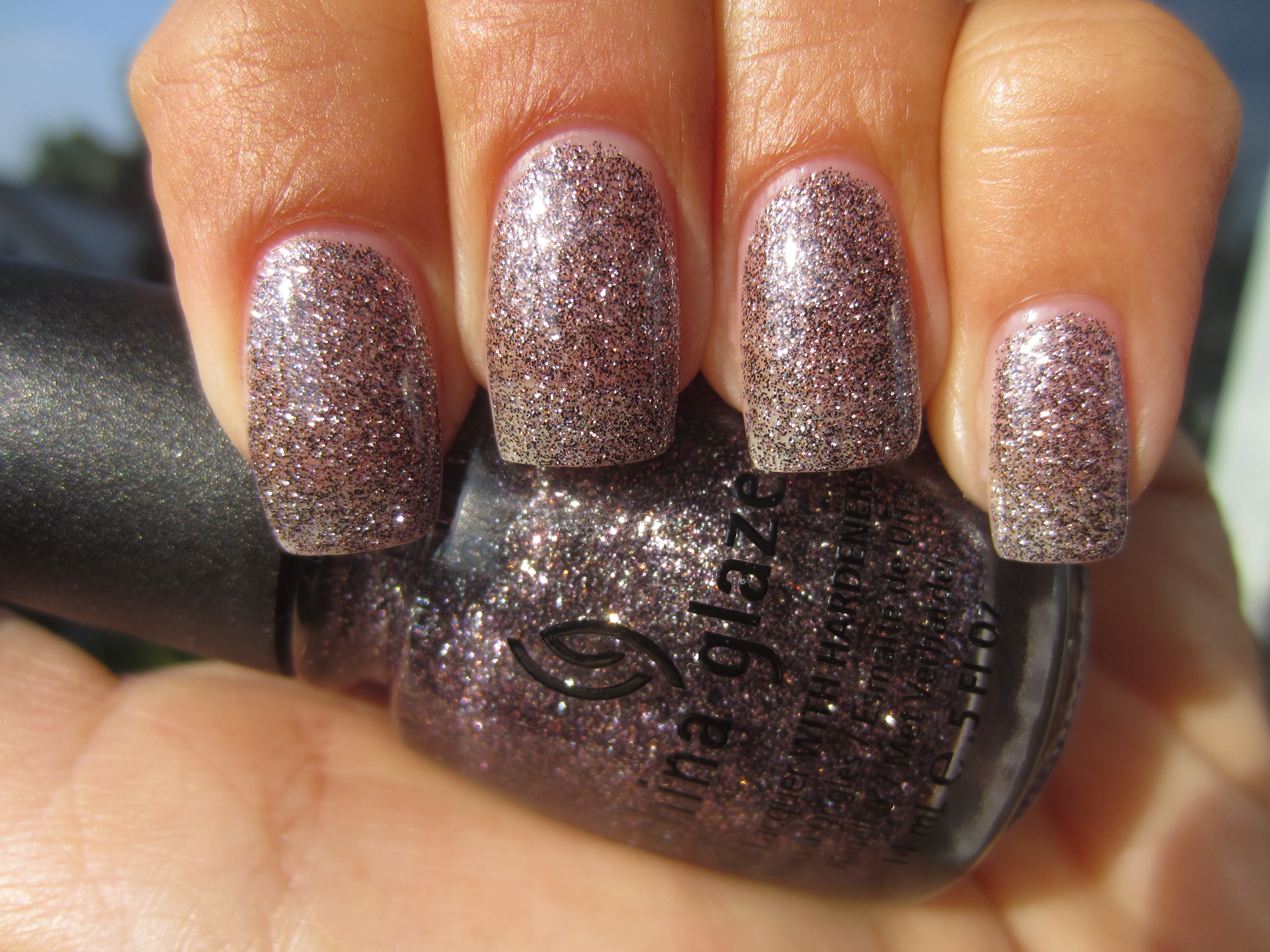
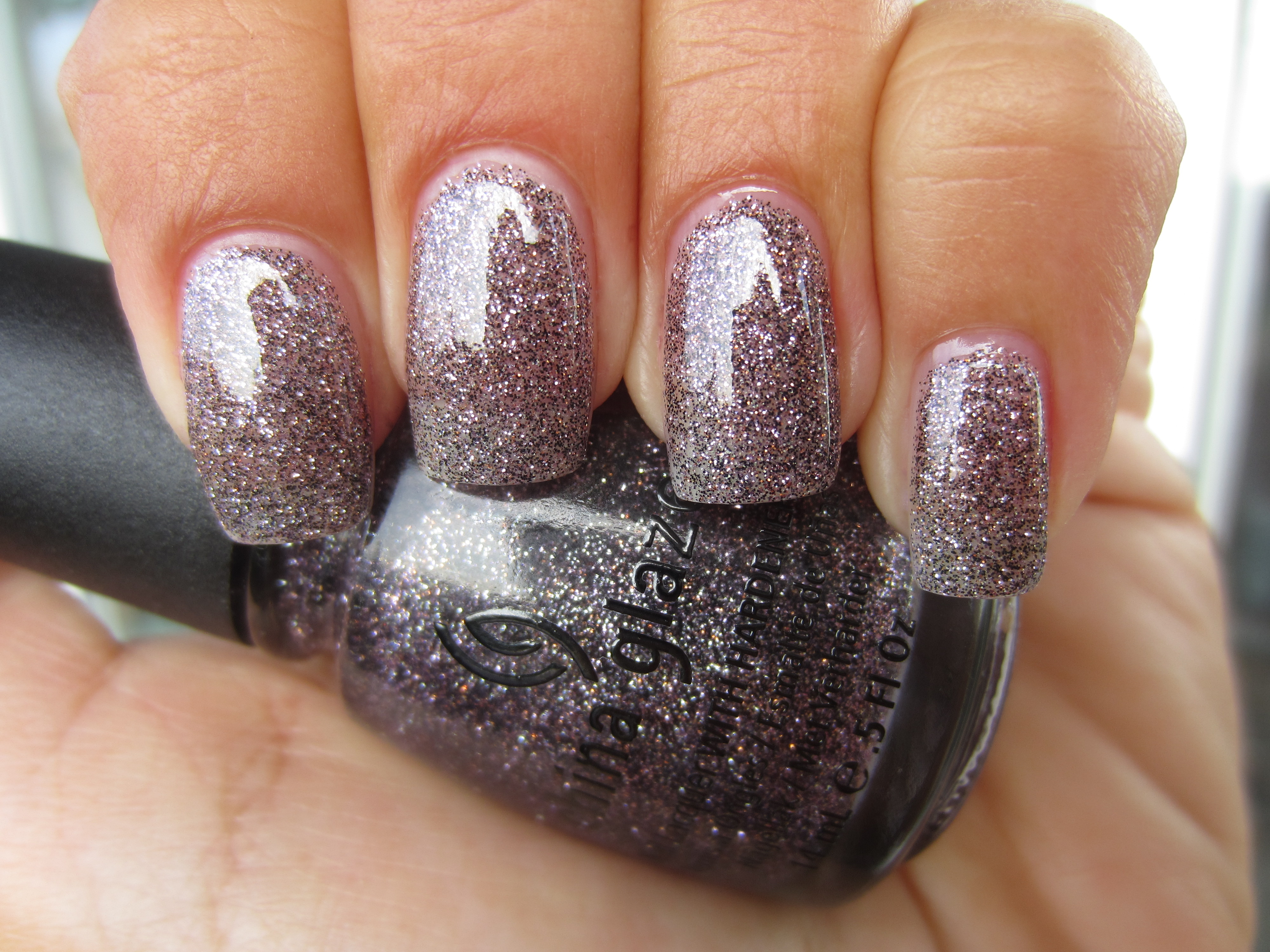
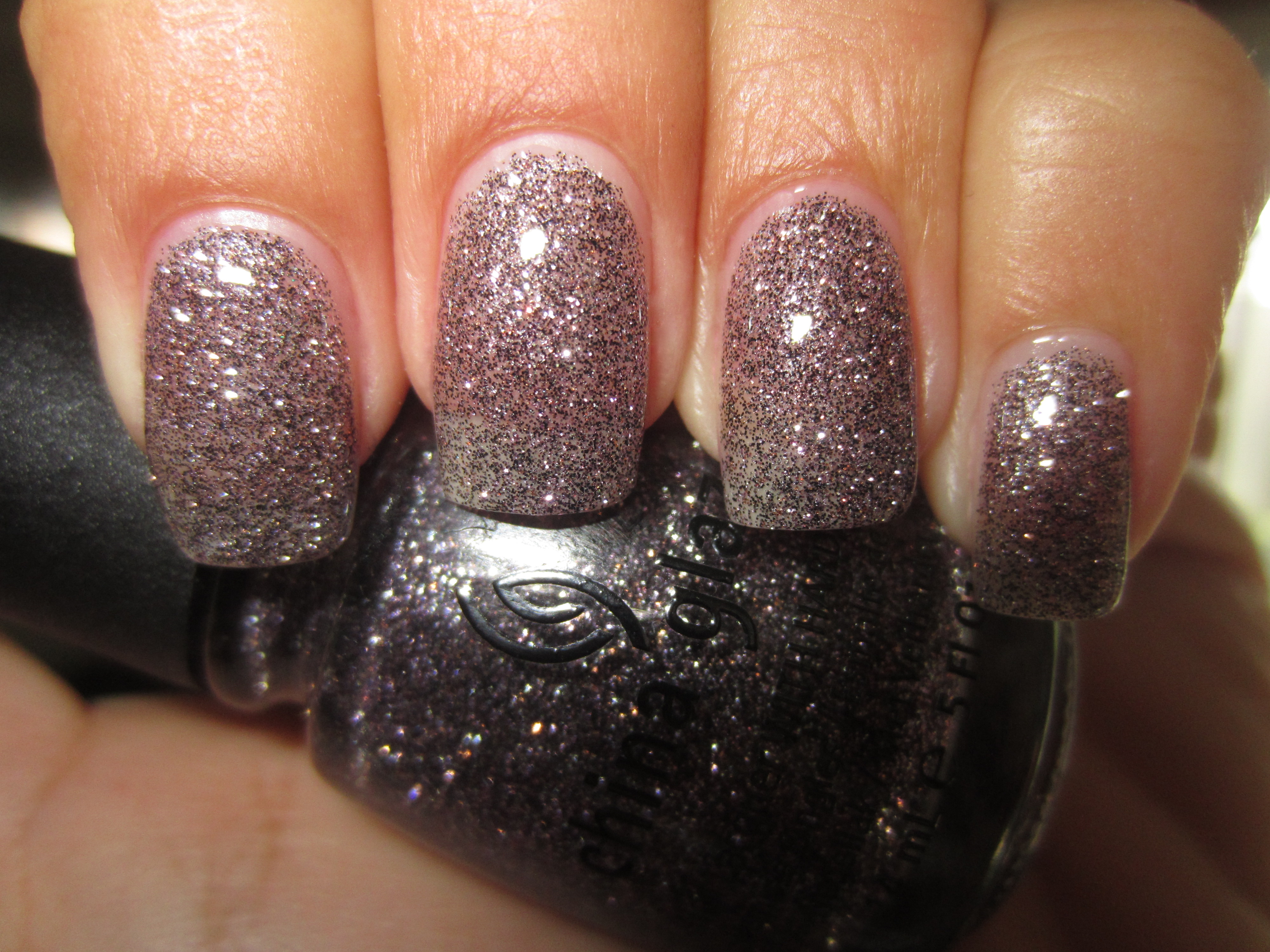
‘CG In The City’ has incredibly fine silver and purple glitter packed in a sheer purple base. The formula is of that thick suspension variety but with an easy application, and while full opacity will not be achieved, two coats were still dense enough to provide excellent coverage. Also a great layering polish (as seen further on in this post), by adding a layer of top coat, it ensures that the finish feels perfectly smooth to the touch.
Full sunlight enables you to pick out all the glittering bits of this lacquer and emphasizes it’s delicate brilliance.
Like the myriad specks one sees in a slab of granite, indirect light enhances ‘CG In The City’s’ multi-glitter complexity, but without the sparkle.
The purple base is much more in evidence when seen in shaded light, with the darker glitter flecks becoming fully prominent.
A final view taken with flash, reveals ‘CG In The City’s’ full glimmering beauty, and gives your nails the ethereal look of a twilit sky.
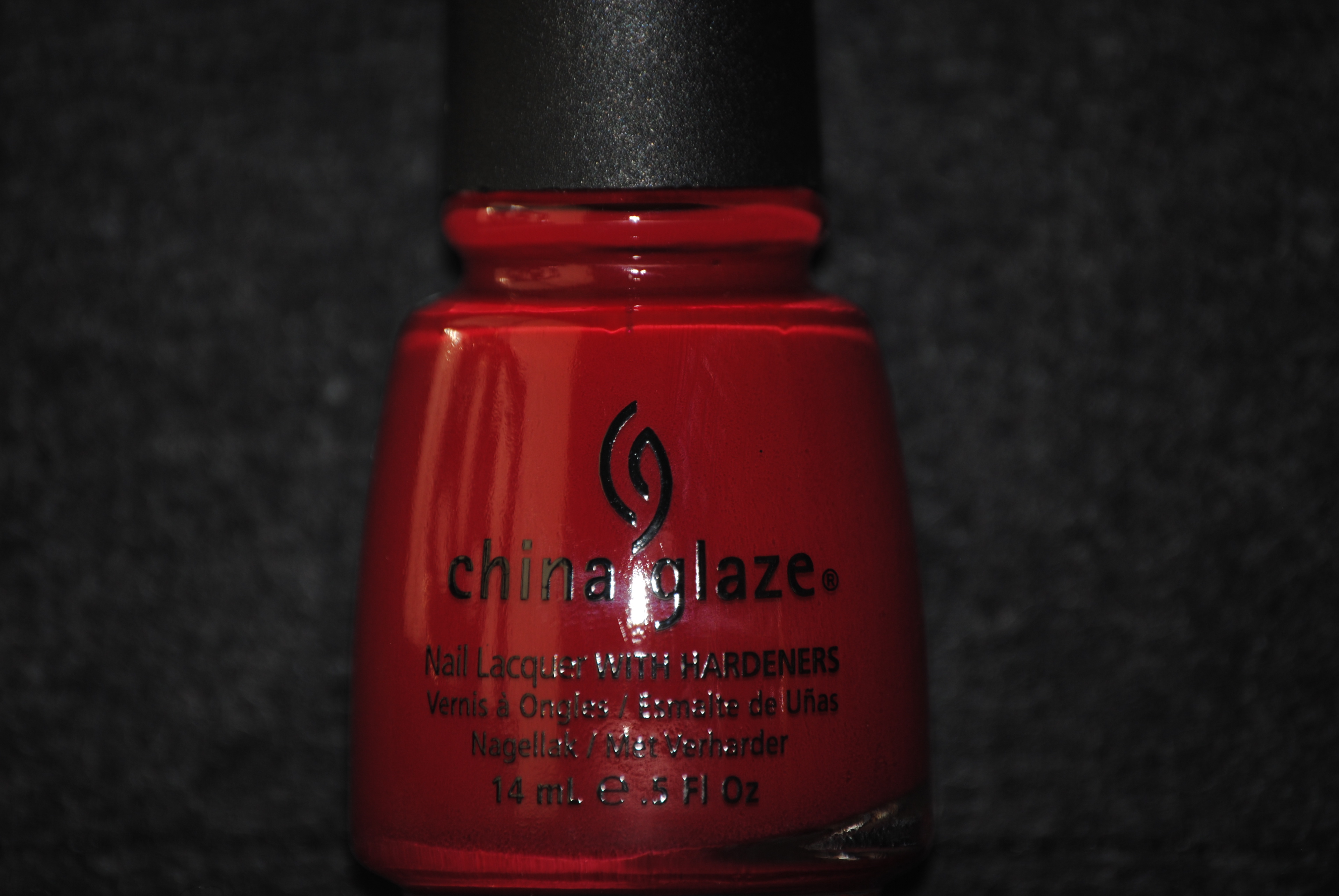
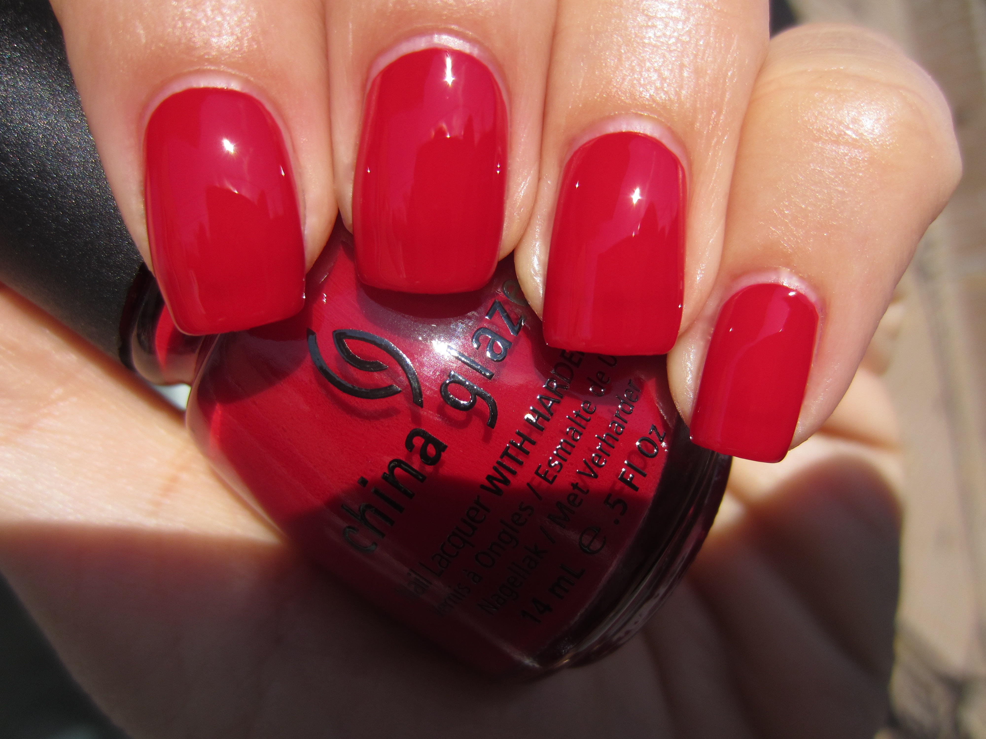
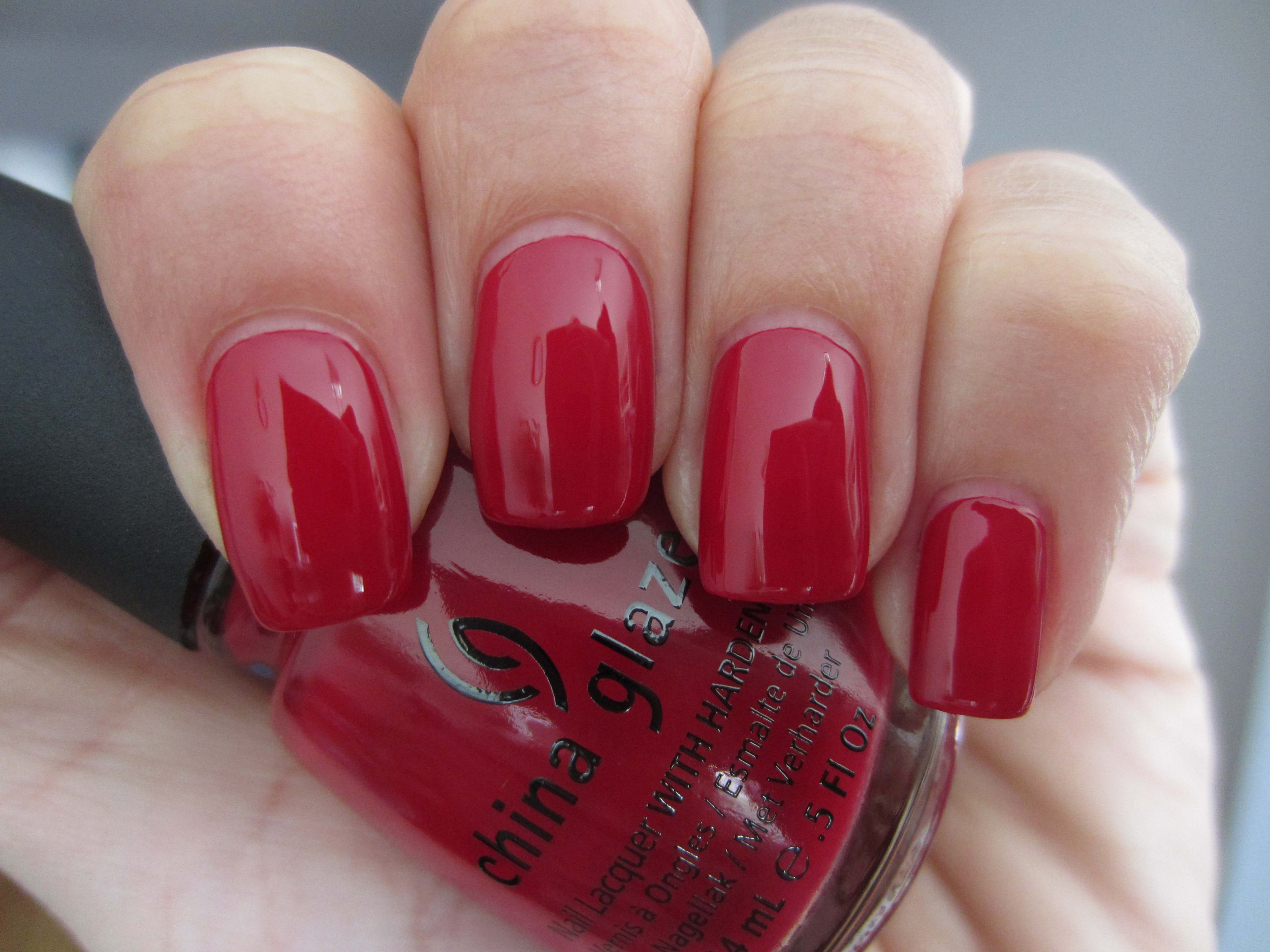
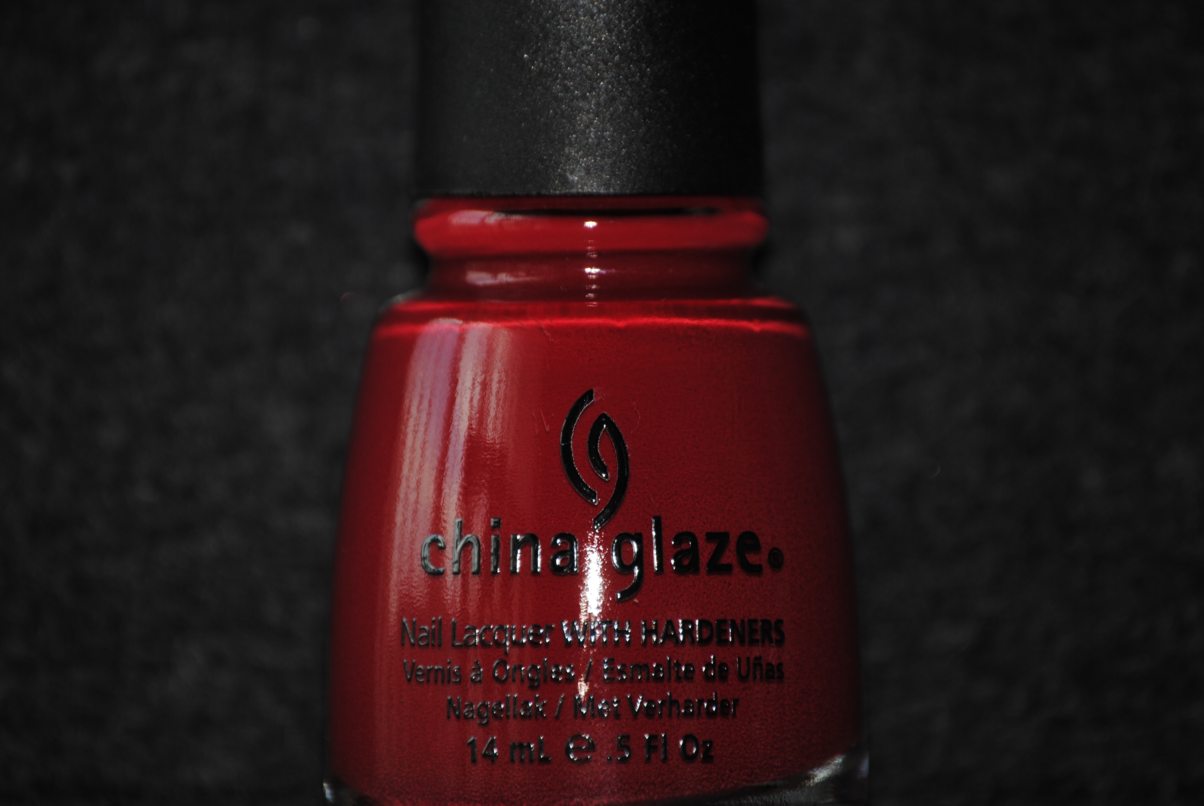
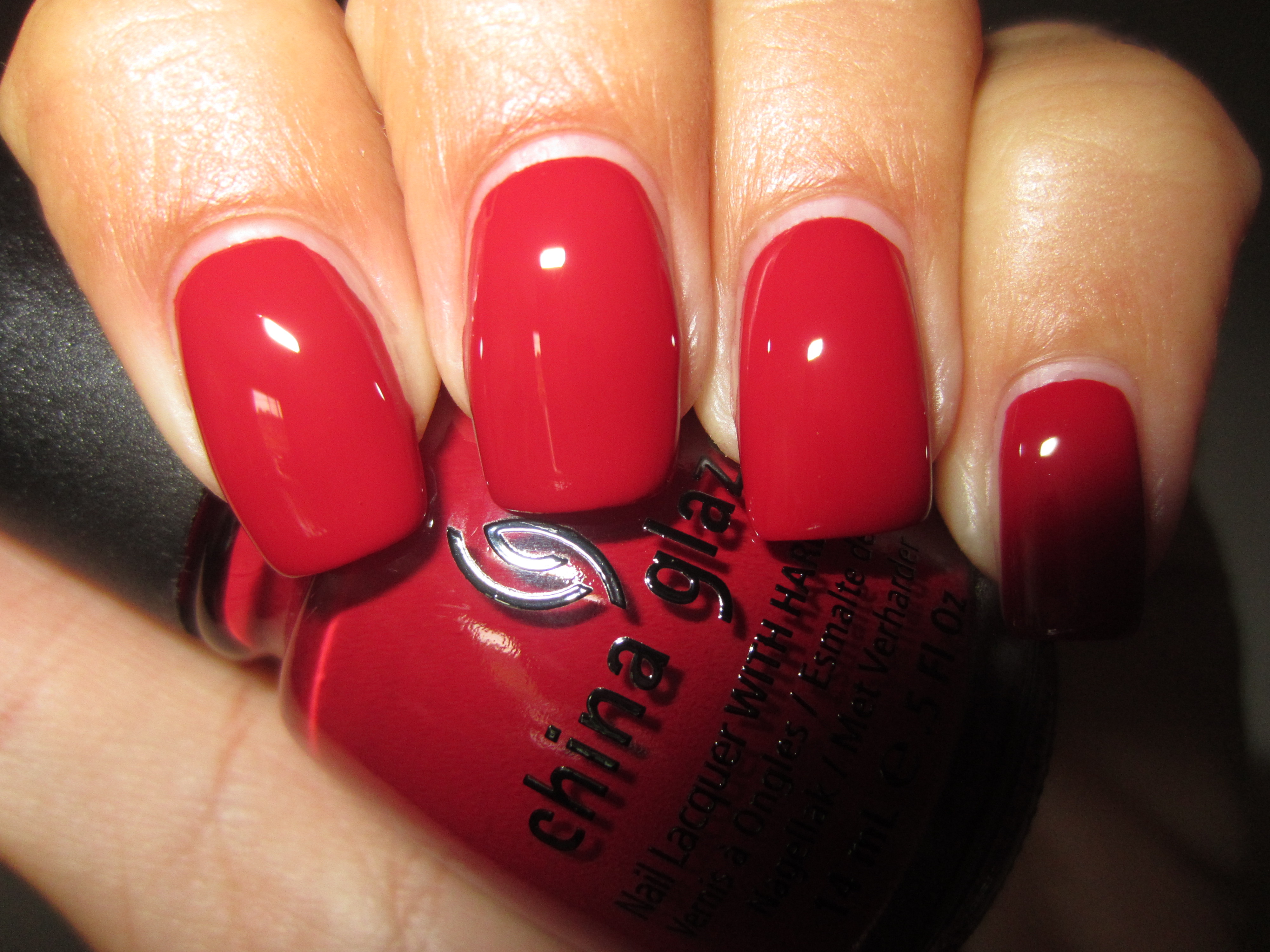
‘City Siren’ is a luxuriously jewel-like garnet hue, saturated in colour and the bearer of an almost impossibly creamy texture. There’s just enough pink in the base to keep this shade light-hearted and fun, yet there’s also enough depth of tone to add a touch of glamour and mystery. A colour that will suit basically every skin-tone across the spectrum, it had a slightly thicker formula than the rest and was fully opaque in two coats, yielding a beautifully smooth mirror-like finish.
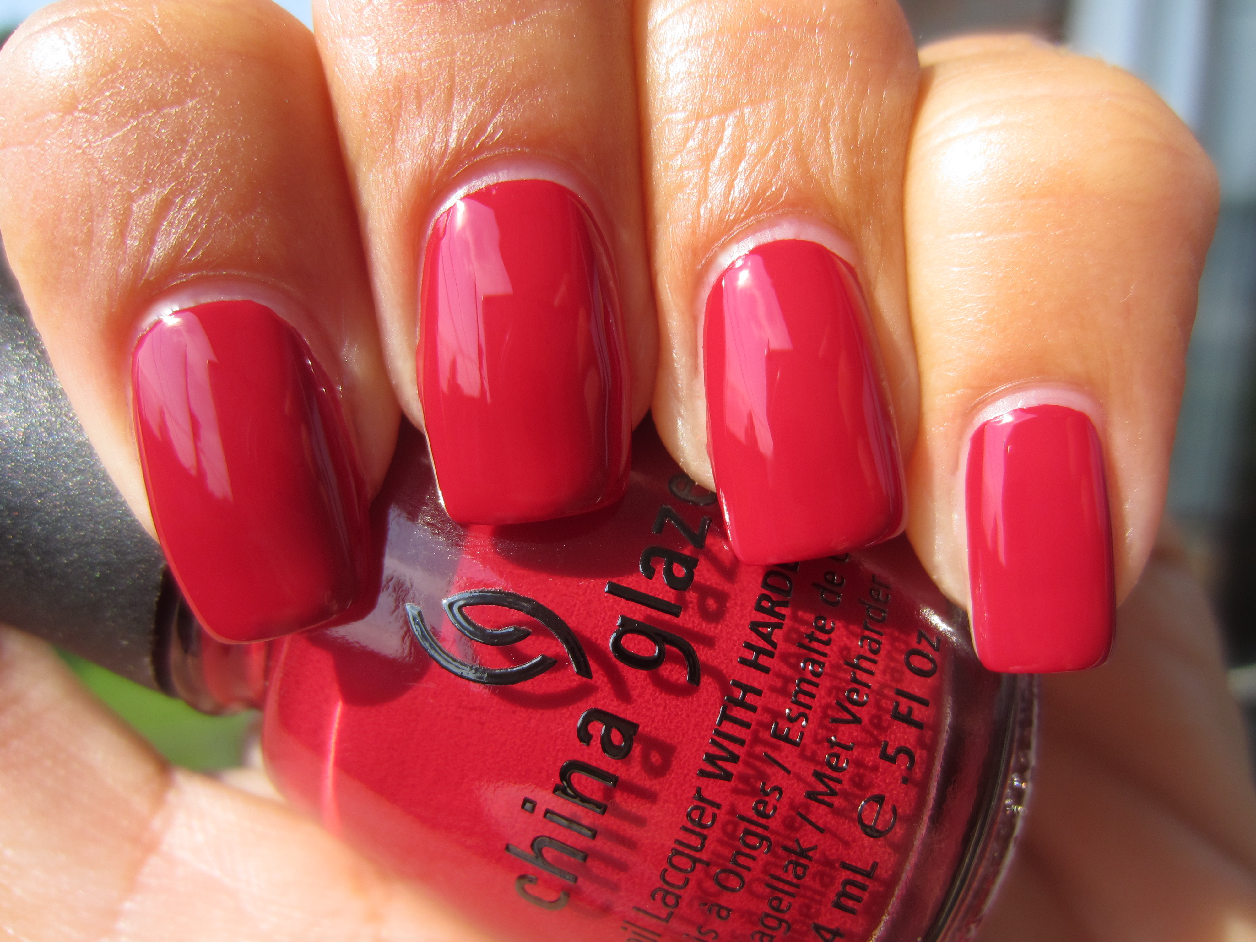
When seen in full sun, the pinker side of ‘City Siren’ becomes the focus, yet hints of red are still visible along the nail edges.
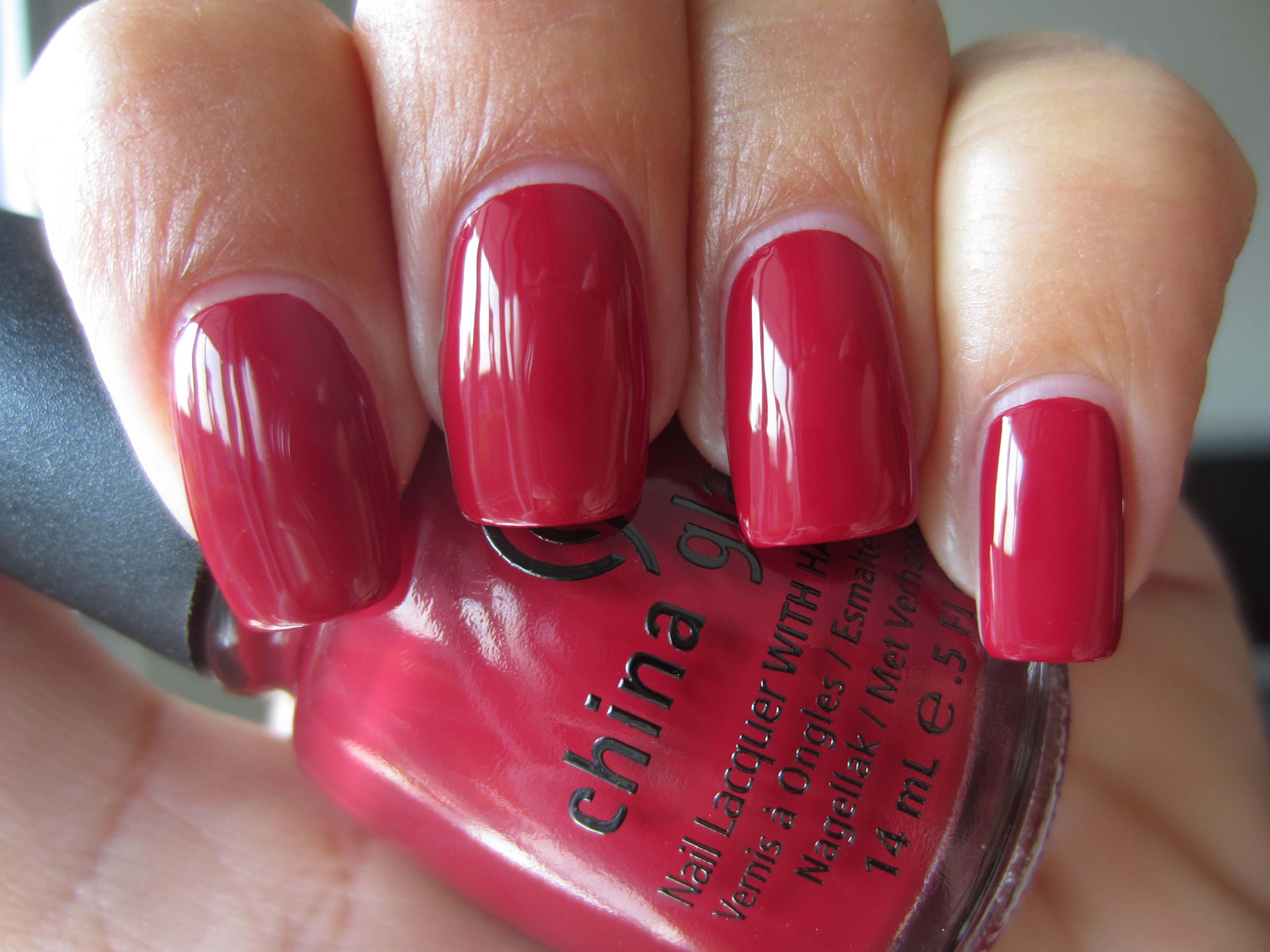
A view taken with indirect lighting gives off more of a claret-toned look, with vague hints of magenta in its depths.
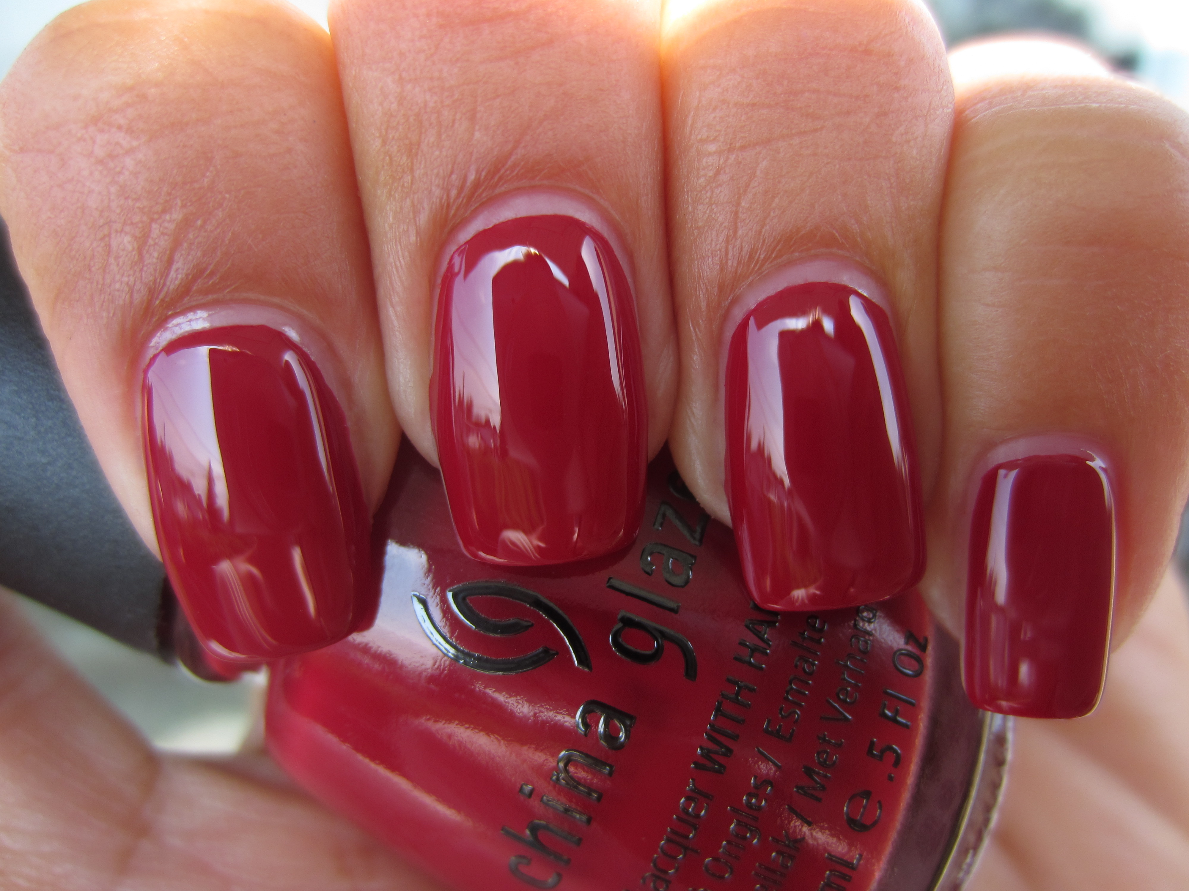
Shaded light serves to show off ‘City Siren’s’ blue-based red leanings and gives this shade an incredibly sultry look.
A final view taken with flash highlights more of a cherry red tone, but serves to show how beautifully glossy this lacquer is.
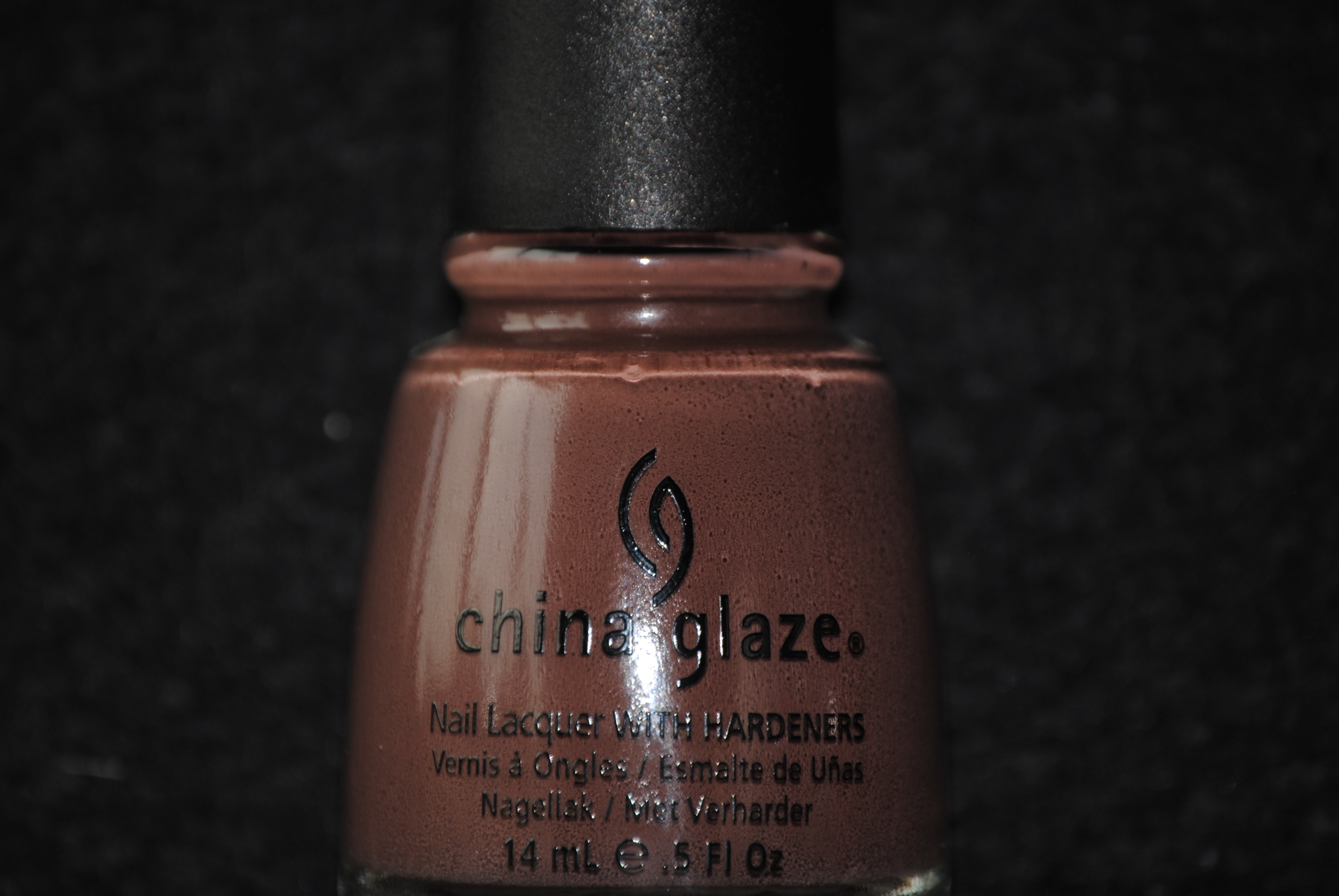
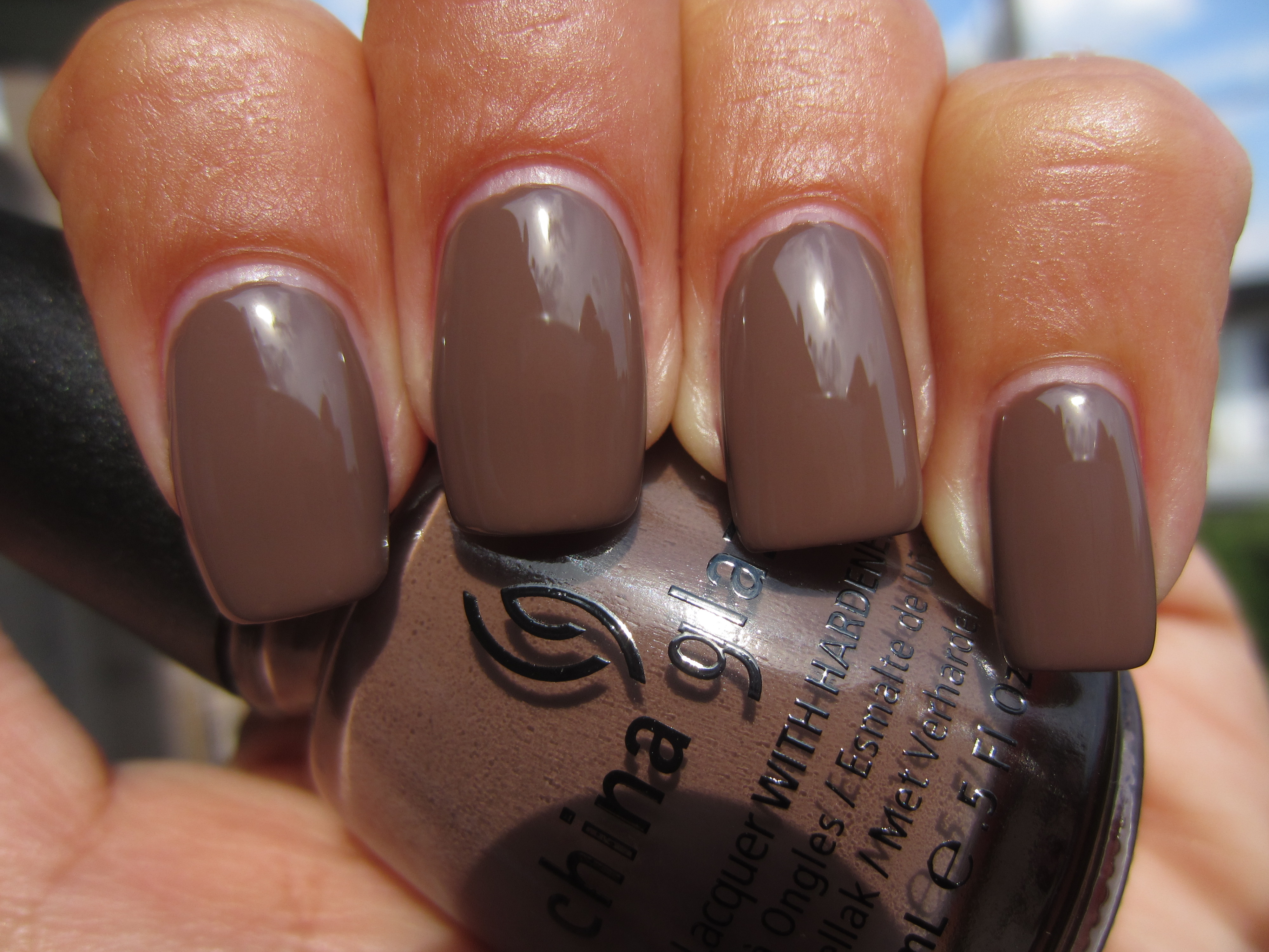
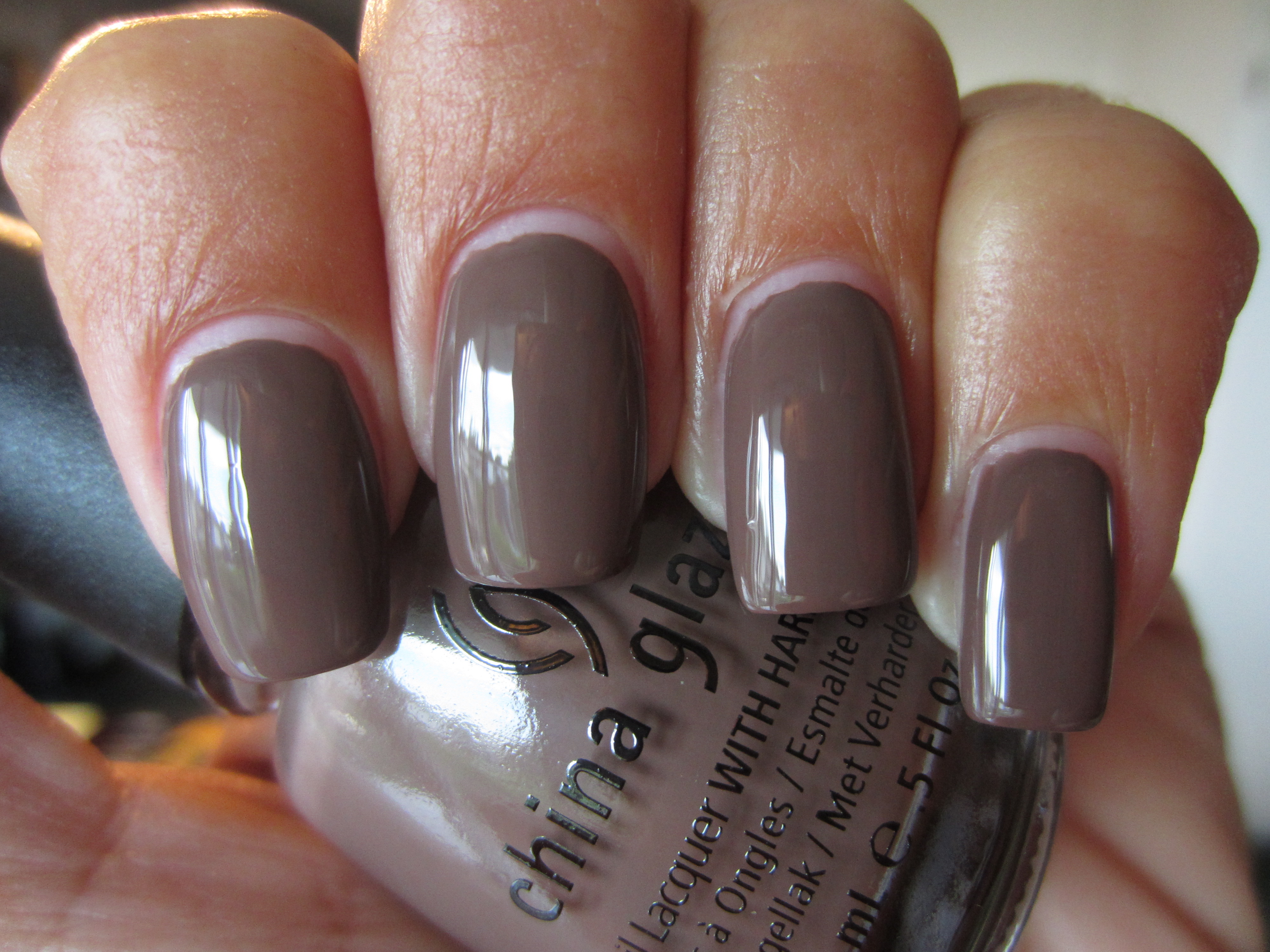
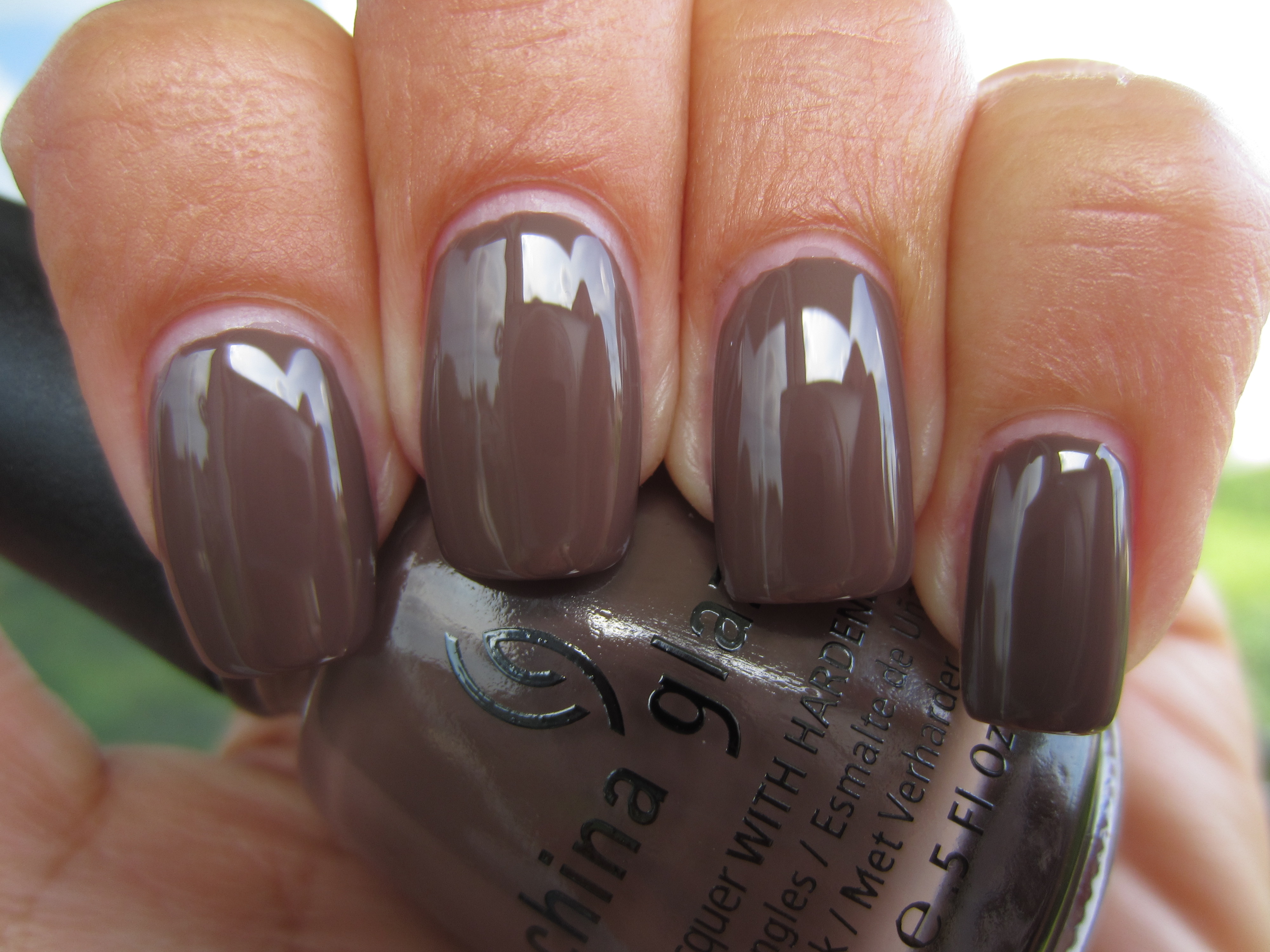
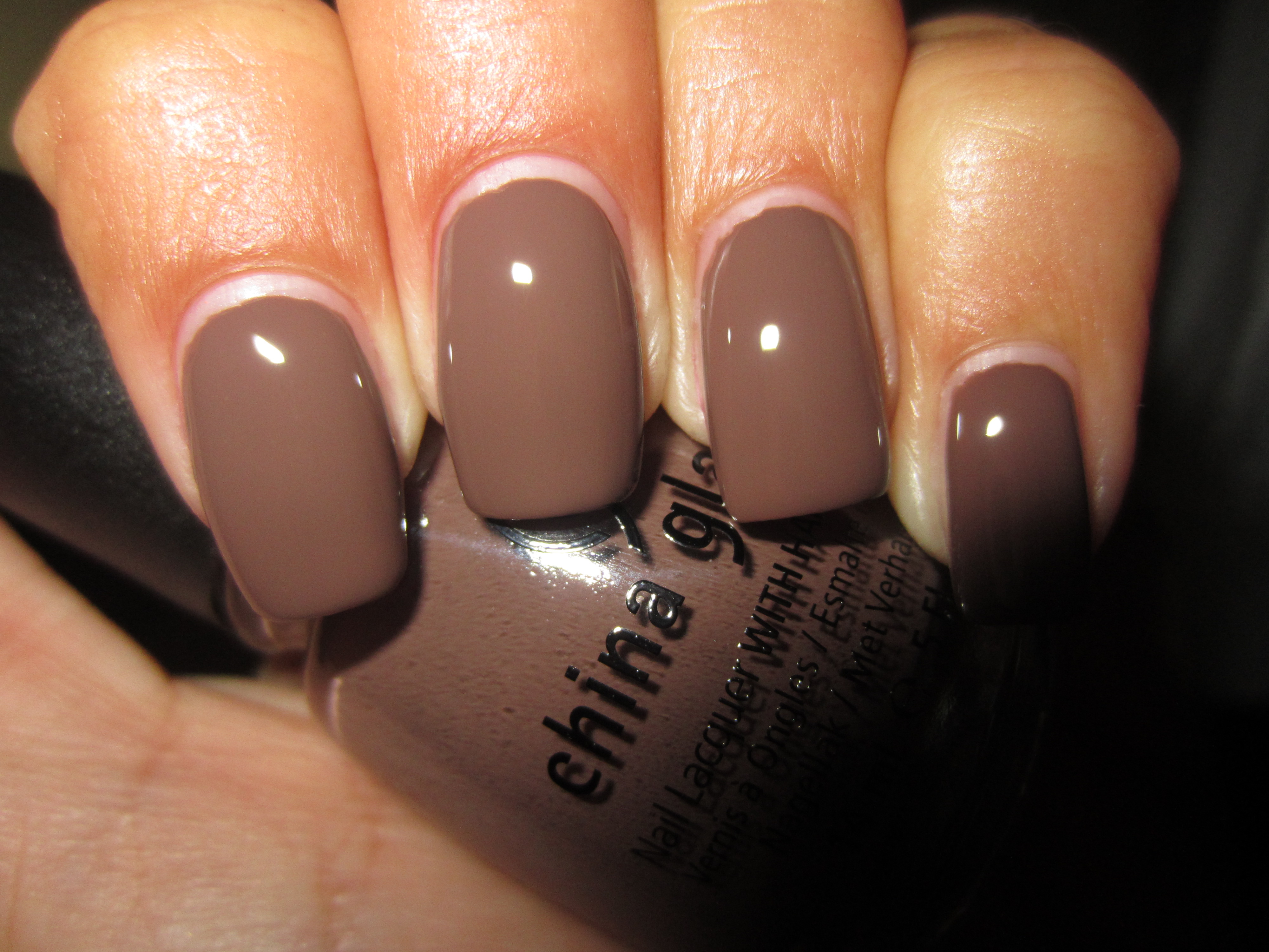
By now, it has become de rigueur to include some version of taupe in many collections, yet ‘Street Chic’ still seems to stand out, primarily because of its fabulous formula. As creamy as a bar of melted milk chocolate, it gives your nails that same decadent look, with a wonderfully self-levelling formula, as well as an ultra glossy shine at the end. All swatches are with two coats of lacquer.
Viewed in sunlight, there appears to be the vaguest hint of red lurking somewhere in this shade’s depth, adding an interesting element to this hue.
Seen in indirect light, ‘Street Chic’ takes on a much cooler persona, and now seems to be tinged lightly by a grey veiling of colour.
Shaded light seems to bring about yet another hue to this complex polish: pink, which not only extends this colour’s range, but adds such a lovely warmth.
A final view taken with flash emphasizes ‘Street Chic’s’ melted chocolatey goodness and reveals how it’s anything but neutral!
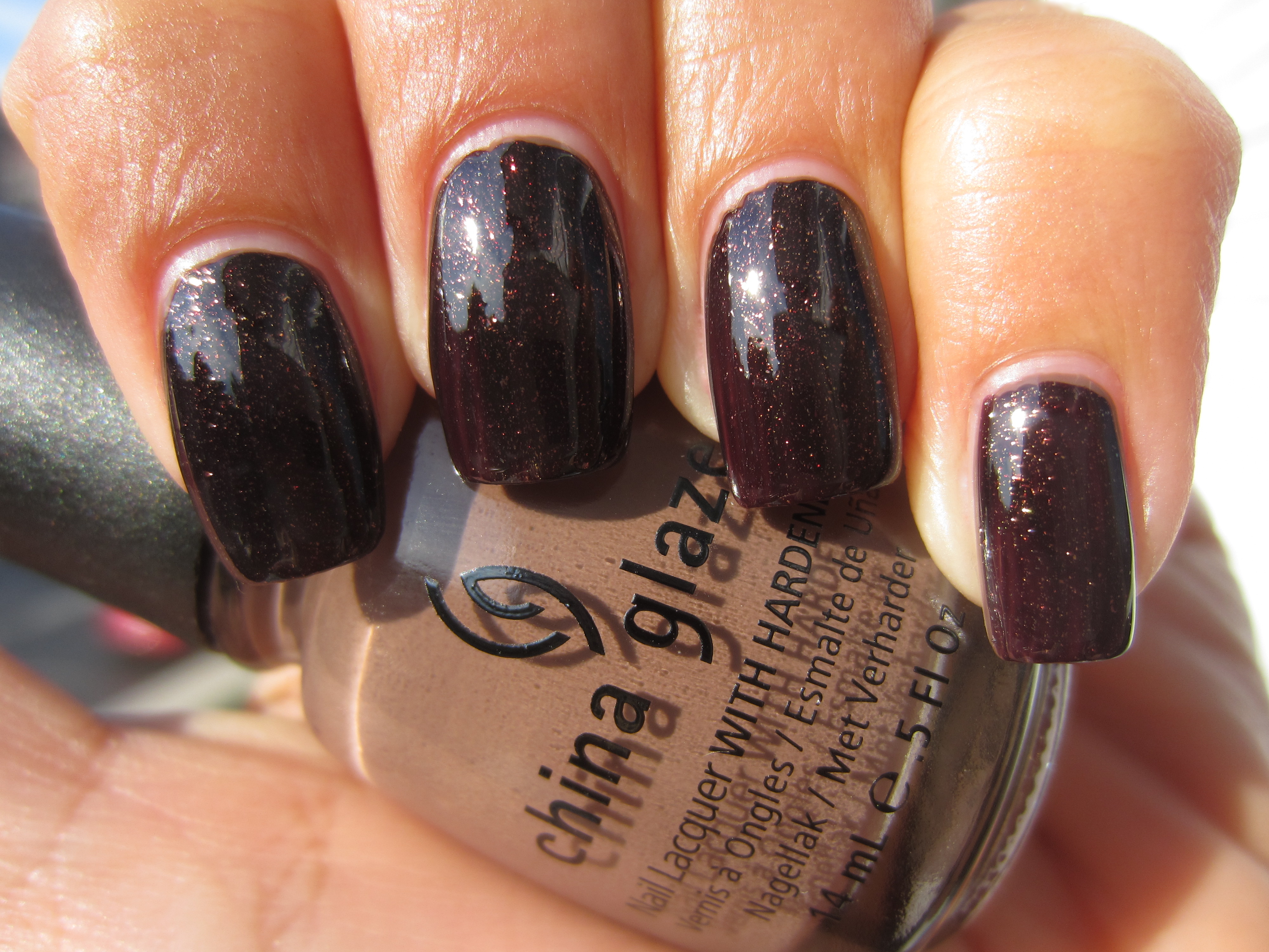
By layering one coat of ‘Midtown Magic’ (coming up in the 2nd half of this review, the “Downtown” Collection) over 2 coats of ‘Street Chic’, I was looking to see how this pair would interact….and I wasn’t disappointed!
I absolutely love how sunlight seems to bring out a more cognac side to this combo, with the glitter appearing to be trapped under the surface of the nail.
A view with indirect lighting reveals more of a whisky tone to the glitter, with the base shade become a complimentary deeper brown counterpart.
When seen in shaded light, this combination reminded me of a view of the cosmos, with the glitter winking out like so many stars at night.
A final view taken with flash reveals the ultra fine glitter in all its multi-dimensional form, with gold and burnt orange specks taking center stage….beautiful!
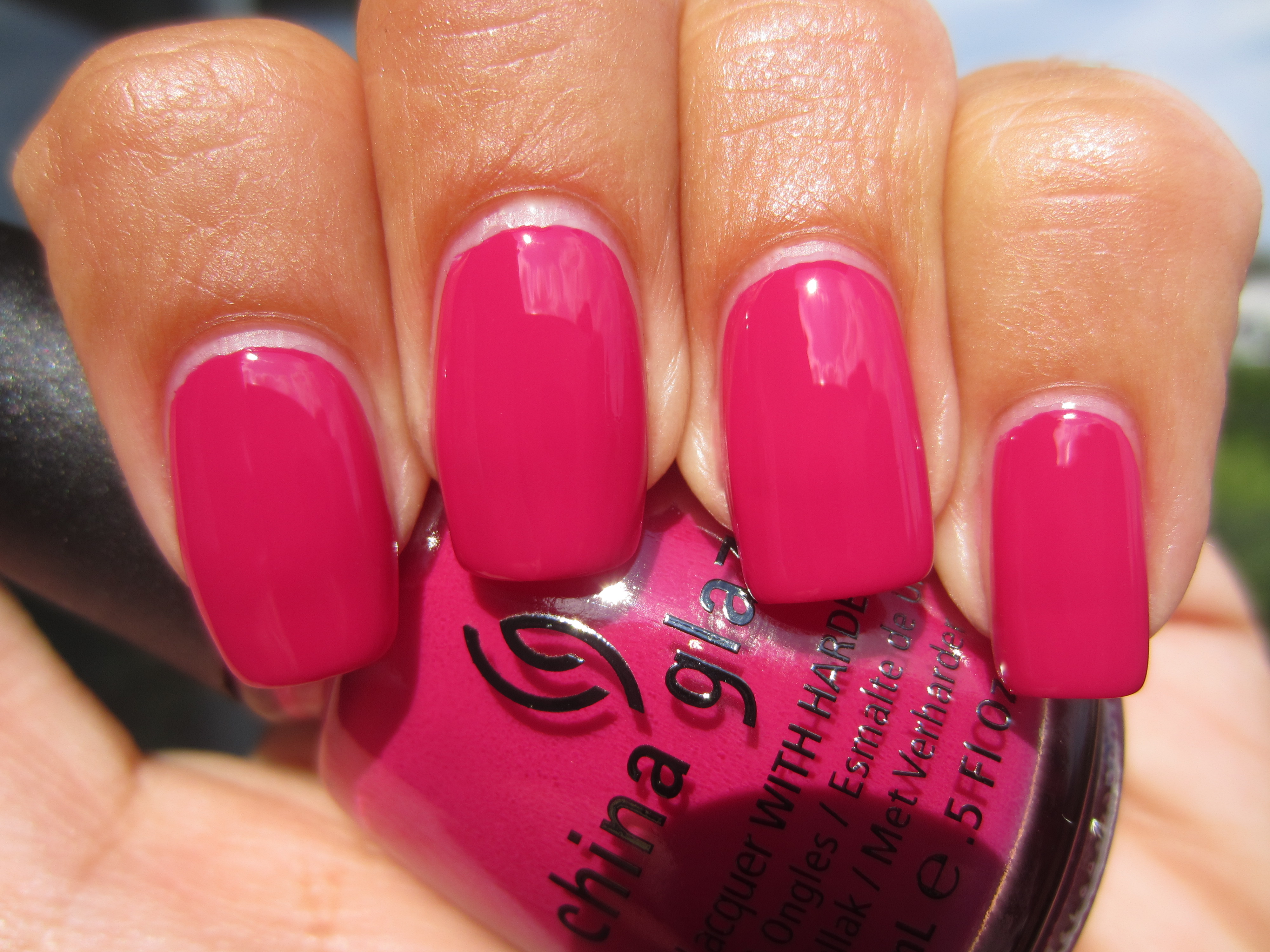
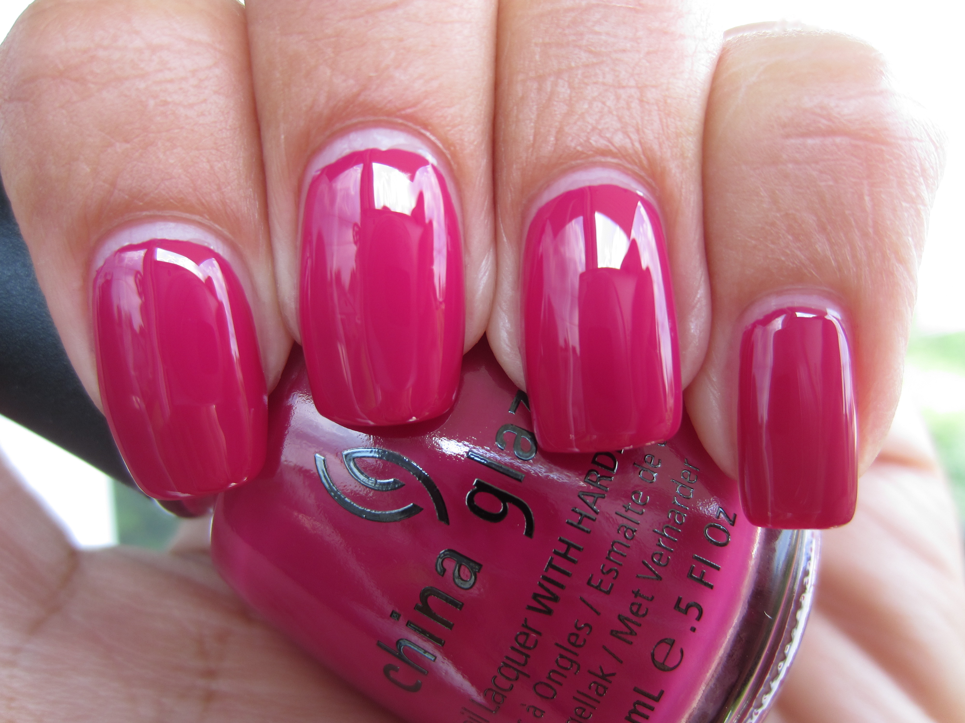
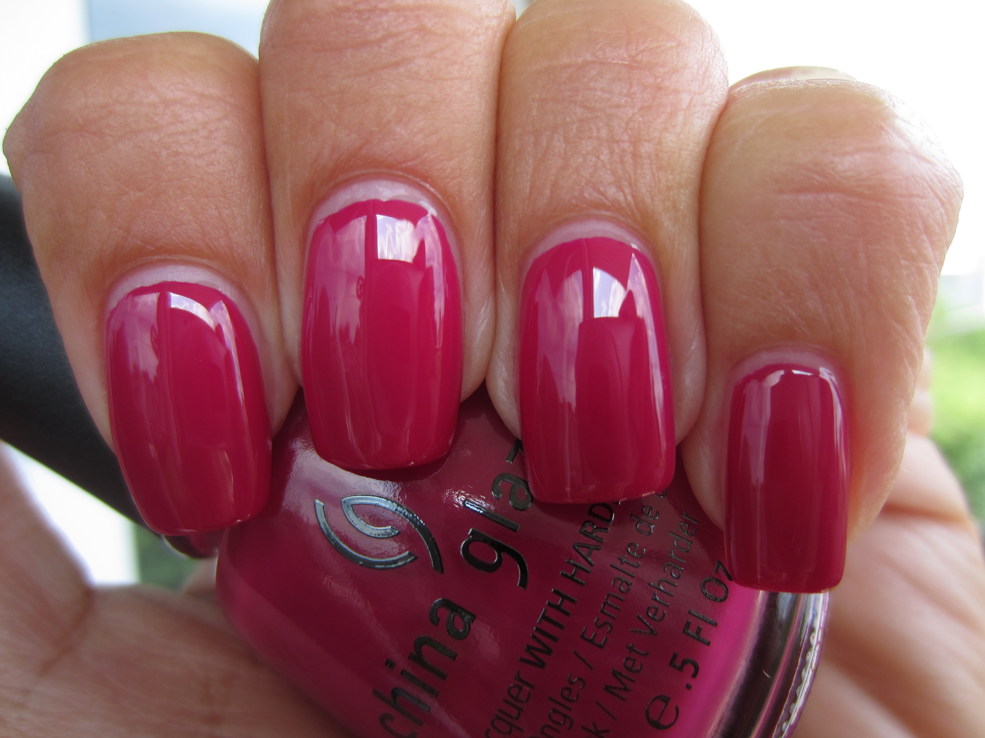
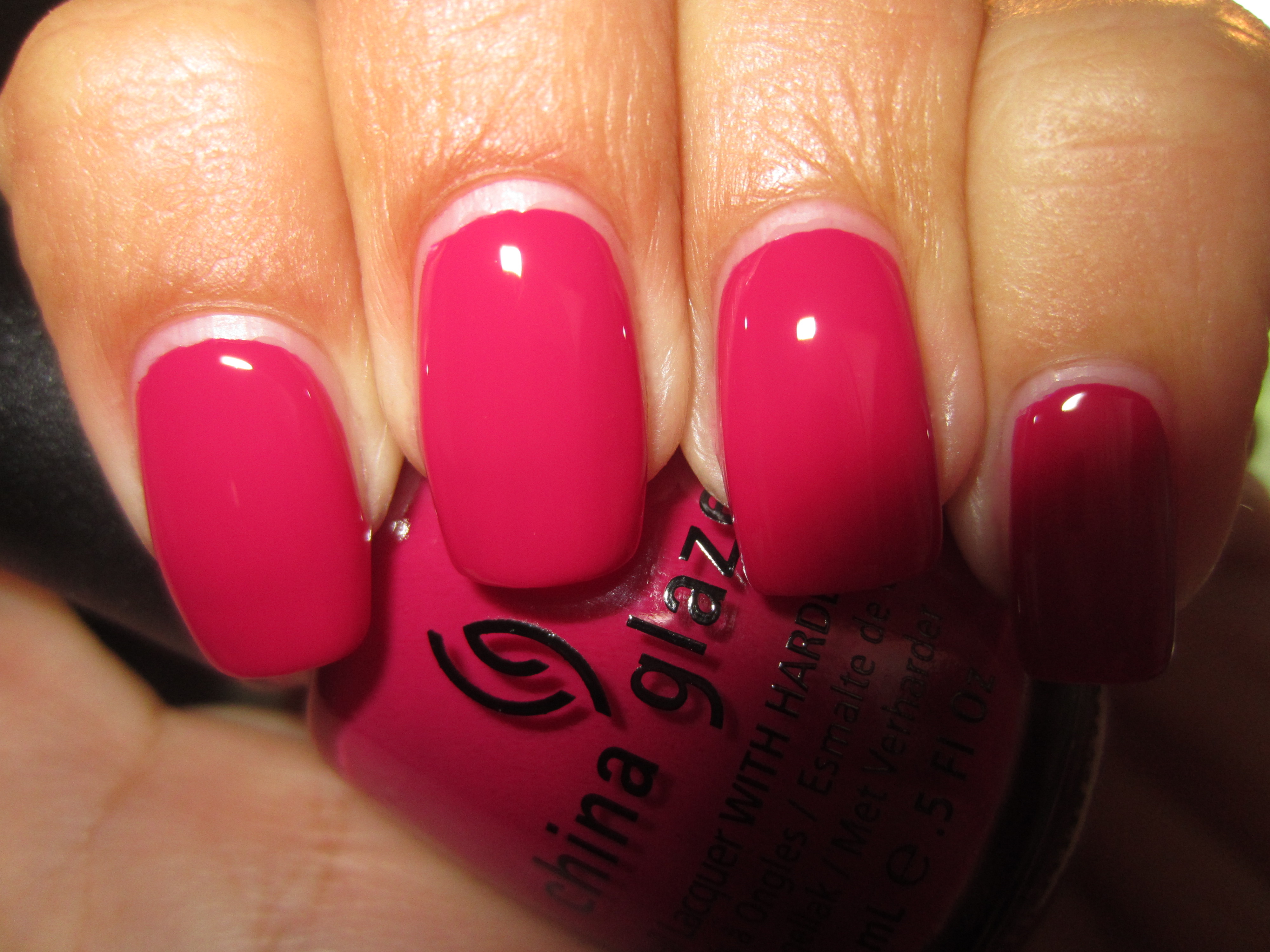
With a name like ‘Traffic Jam’, you would expect nothing less than a heart-stopping colour, and while not as eye-searing as a neon, this shade manages to definitely capture your attention…for all the right reasons! An utterly fantastic formula, which was not only self-levelling and incredibly glossy, but almost a one-coater as well, this is hands down the most delectably vivid raspberry crème shade that you will ever come across.
Seen in full sunlight, ‘Traffic Jam’ takes on a more bubble-gum pink hue, yet still seems to remain paradoxically bright and muted (don’t ask me how!)
Indirect lighting not only brings out a much cooler vibe to this shade, but deepens the pink tone to a more honeysuckle (remember, it’s the colour of the year!) tint as well.
Interestingly enough, shaded light appears to add warmth to ‘Traffic Jam’ and hints at some coral leanings in its base.
It is a view with flash that not only spotlights this shade’s brightest look yet, but also displays its über-glossy finish….don’t you just love this?!
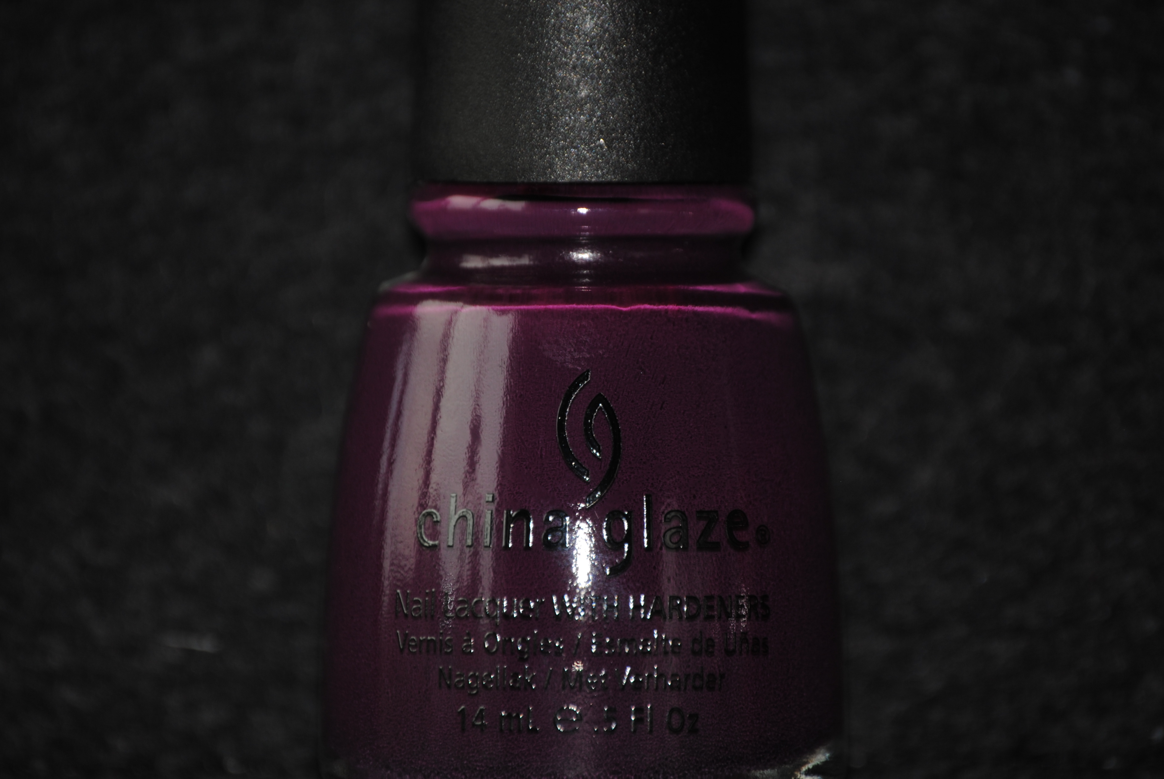
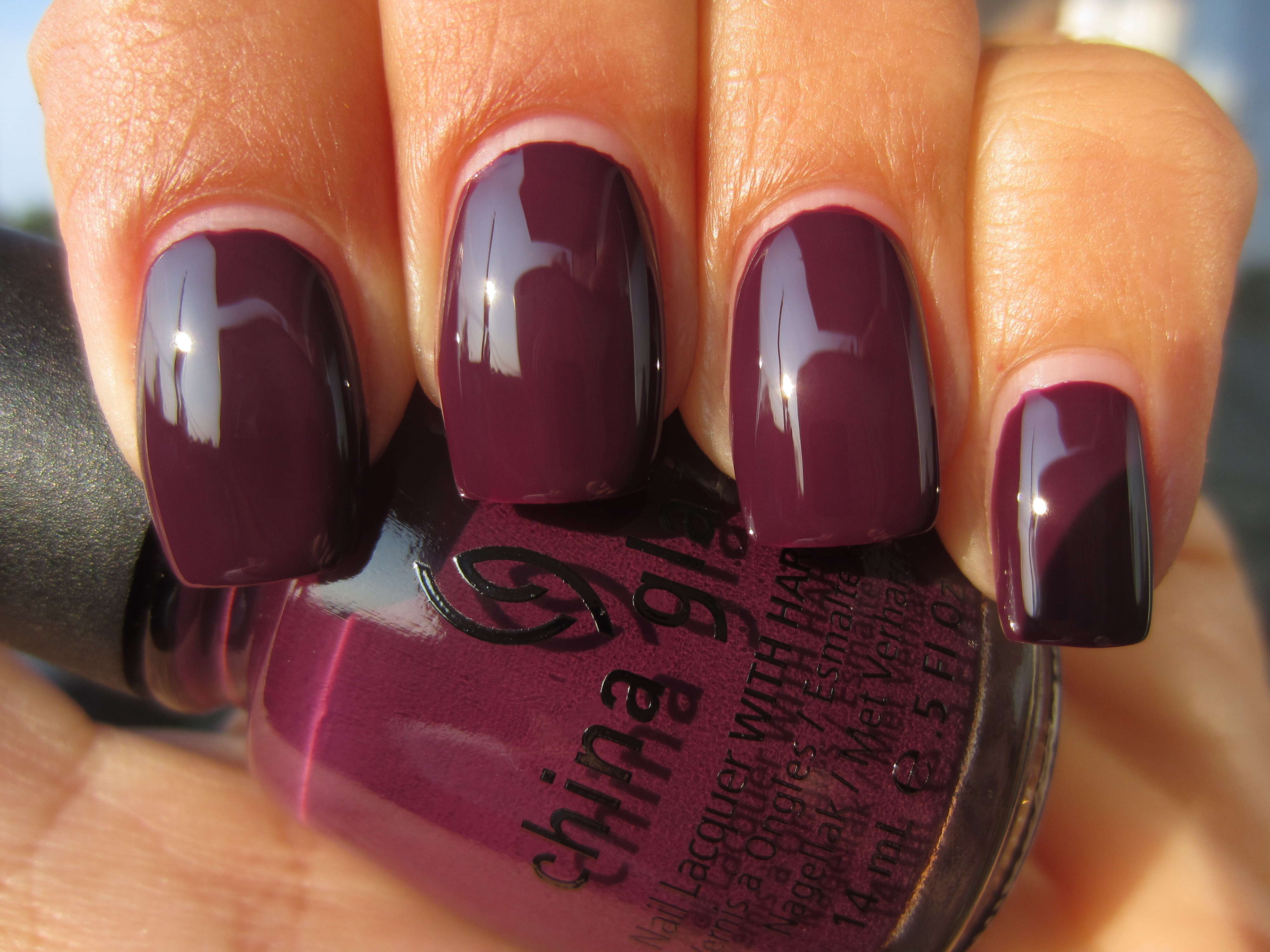
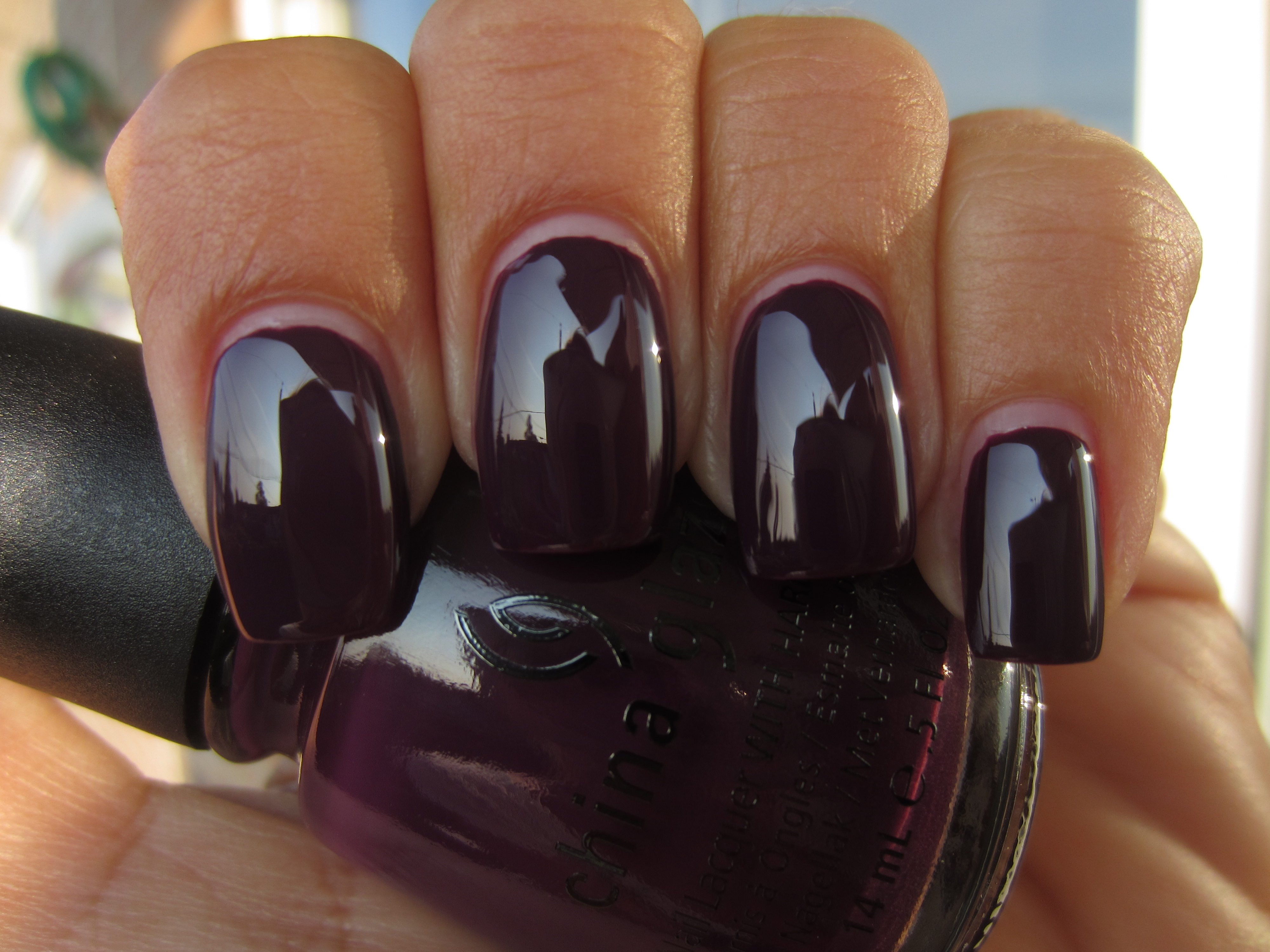
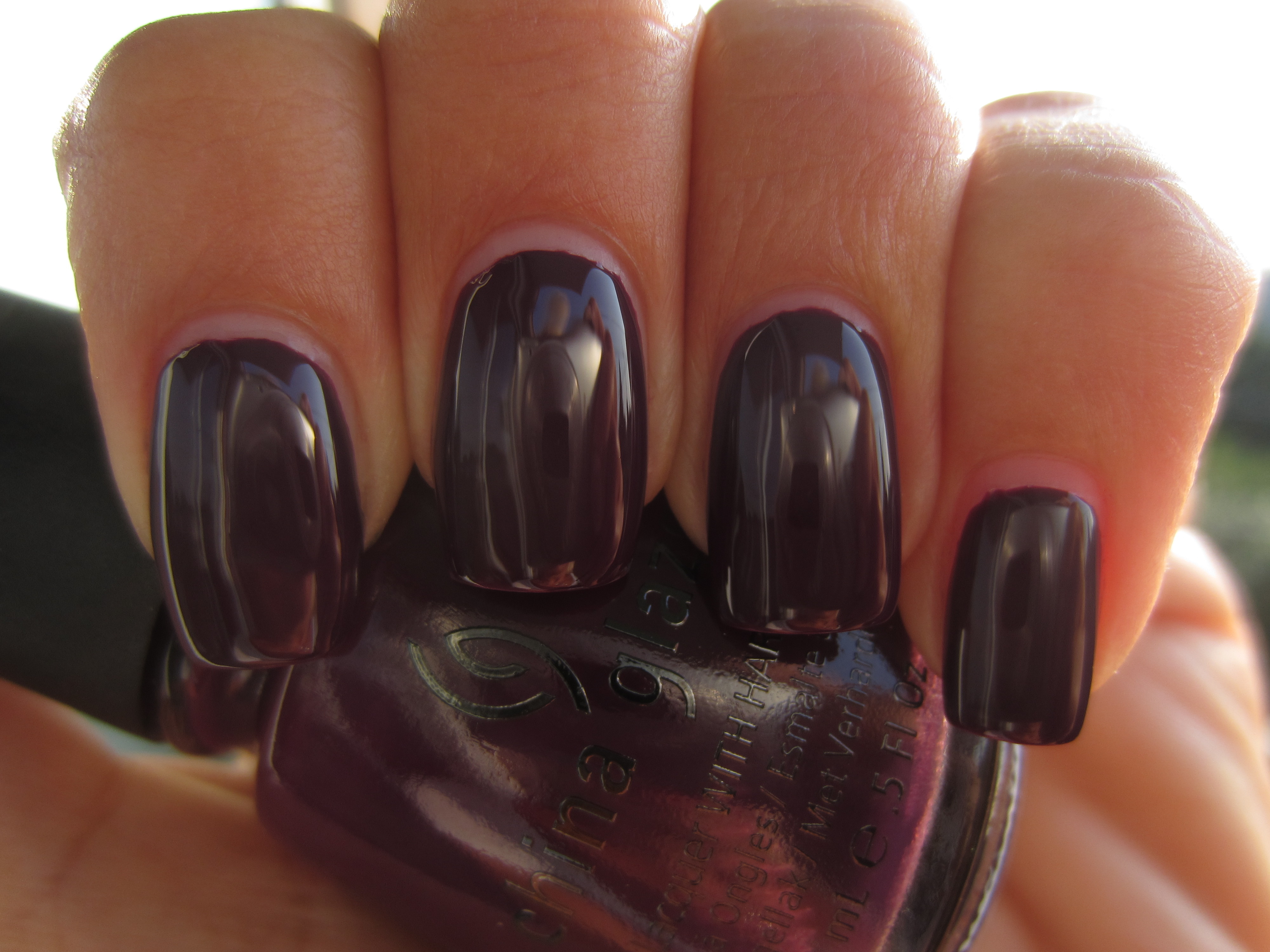
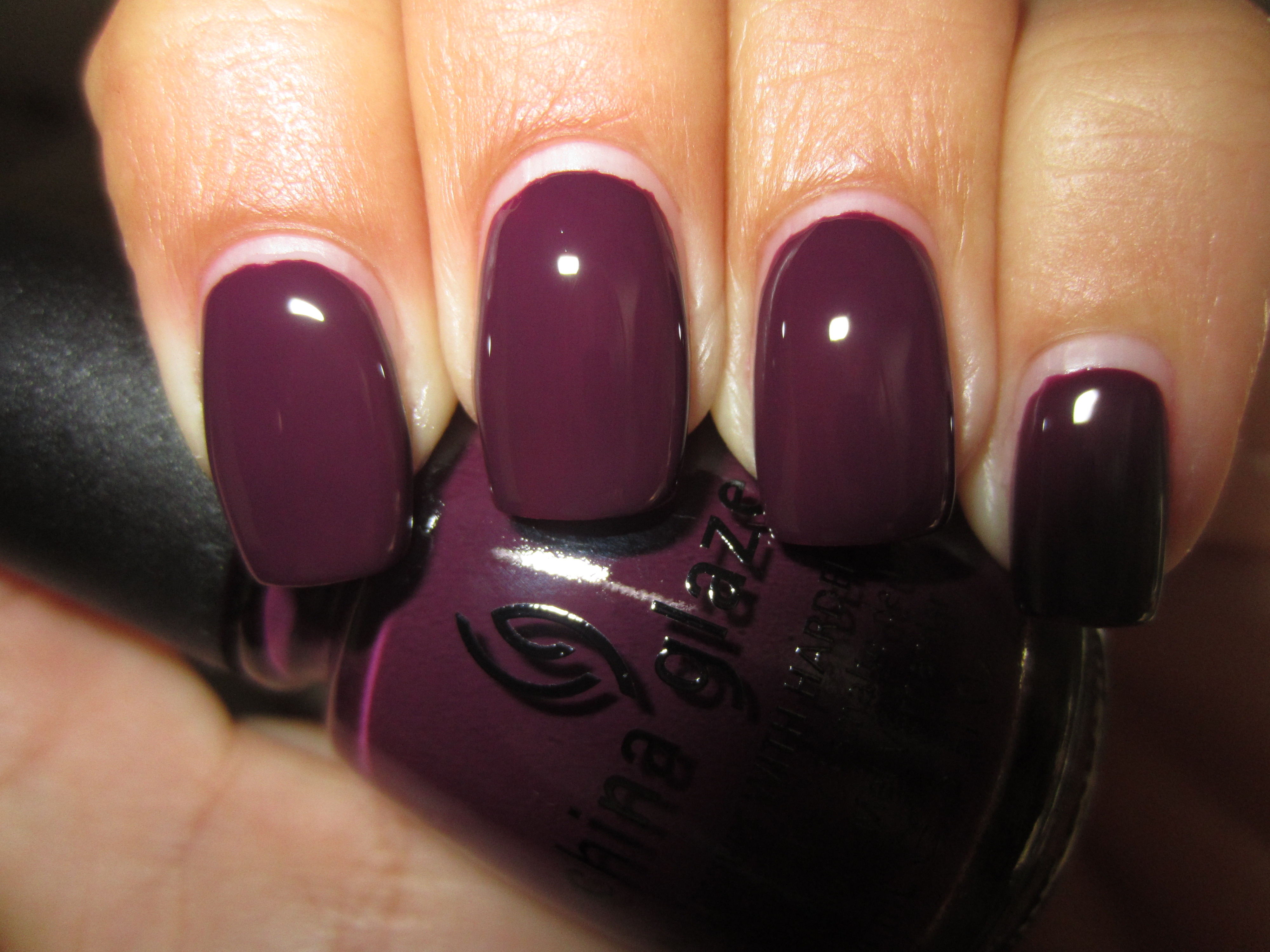
‘Urban-Night’ is so very well named; an apt description of the near black-purple night sky seen in practically every metropolis, this is as deep as grape can get, while still retaining all its colour. Another stellar formula, needing barely two coats for full opacity, it was smooth and shiny enough to look almost reflective and so very, very sophisticated!
Sunlight appears to lend this shade more of a burgundy tone, tamping down its purple side and highlighting some reddish leanings.
As this colour changes dramatically with the smallest shift, this first photo taken with indirect lighting reveals a more prune-like tone to ‘Urban-Night’.
Moving slightly, this second photo taken again in indirect lighting, now lends this shade a blacker, more mysterious air, glistening with a ruby inner fire.
When viewed in shaded light, I noted how ‘Urban’Night’ now appears more of warm-toned aubergine shade, but still managing to look so cool and royal.
Of course, it is a final view with flash that reveals this shade’s truest purple nature, with a glossy shine that looks so incredibly juicy!
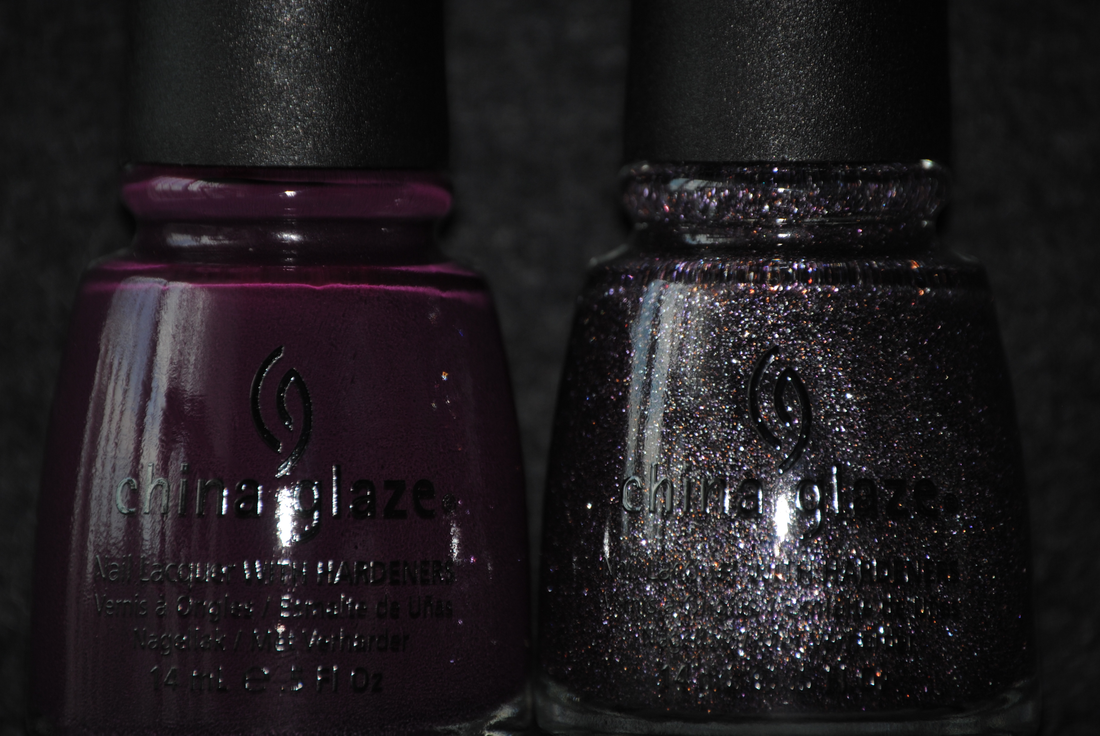
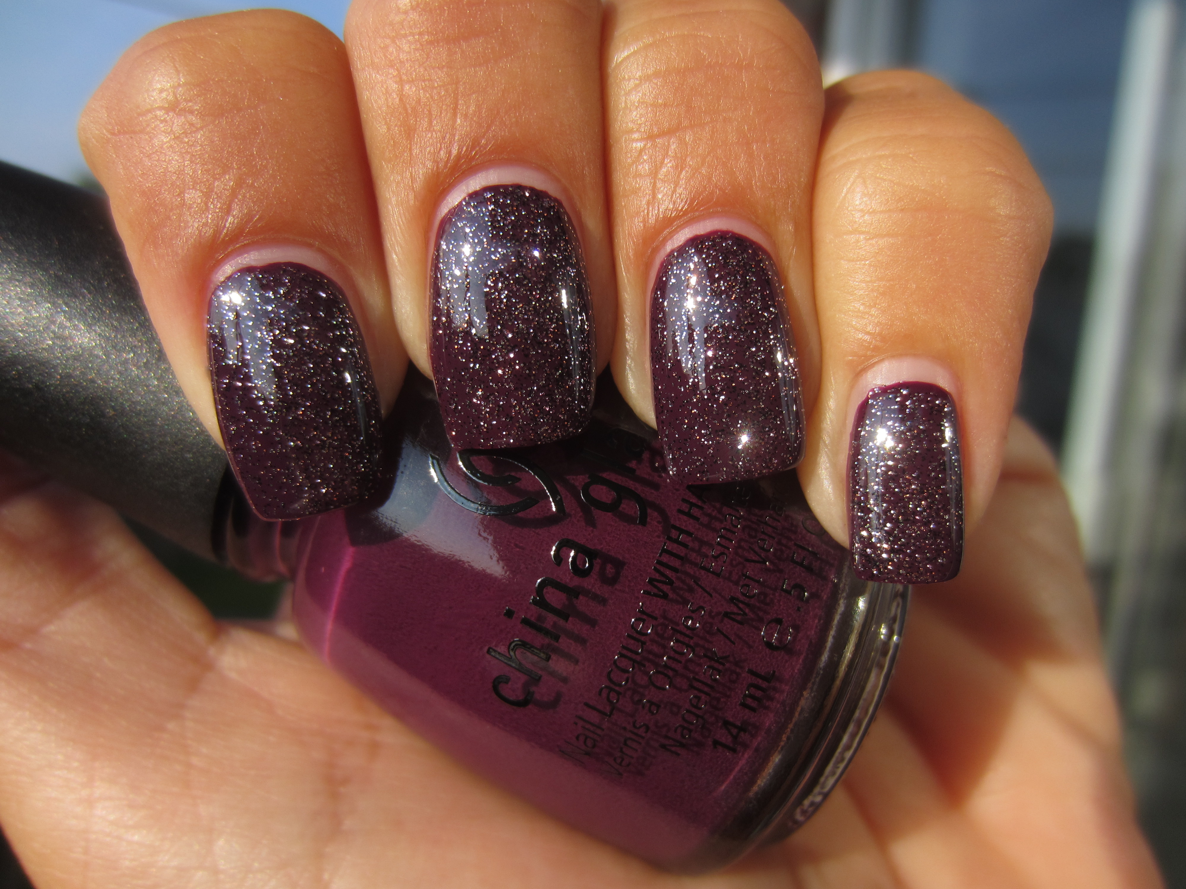
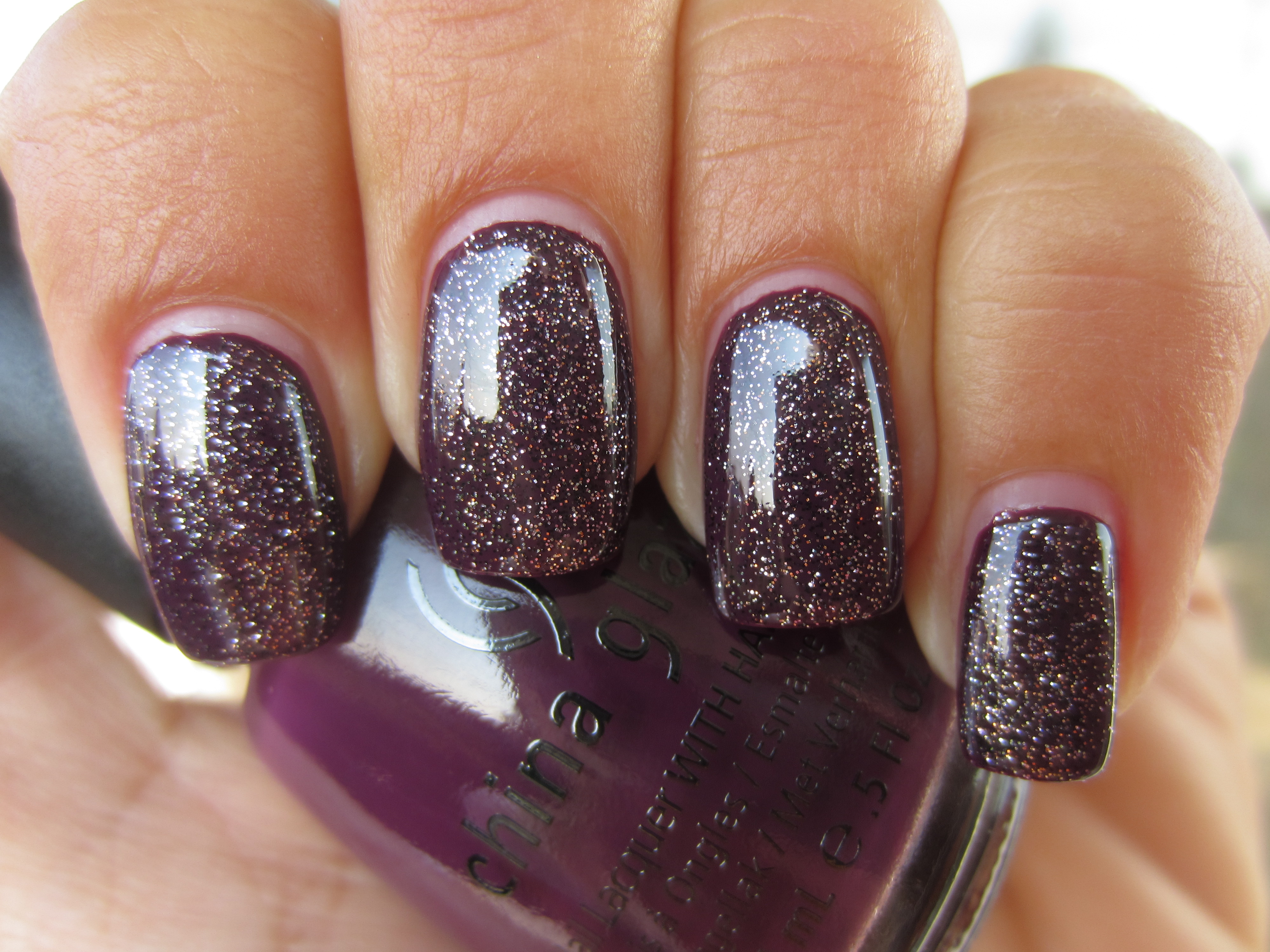
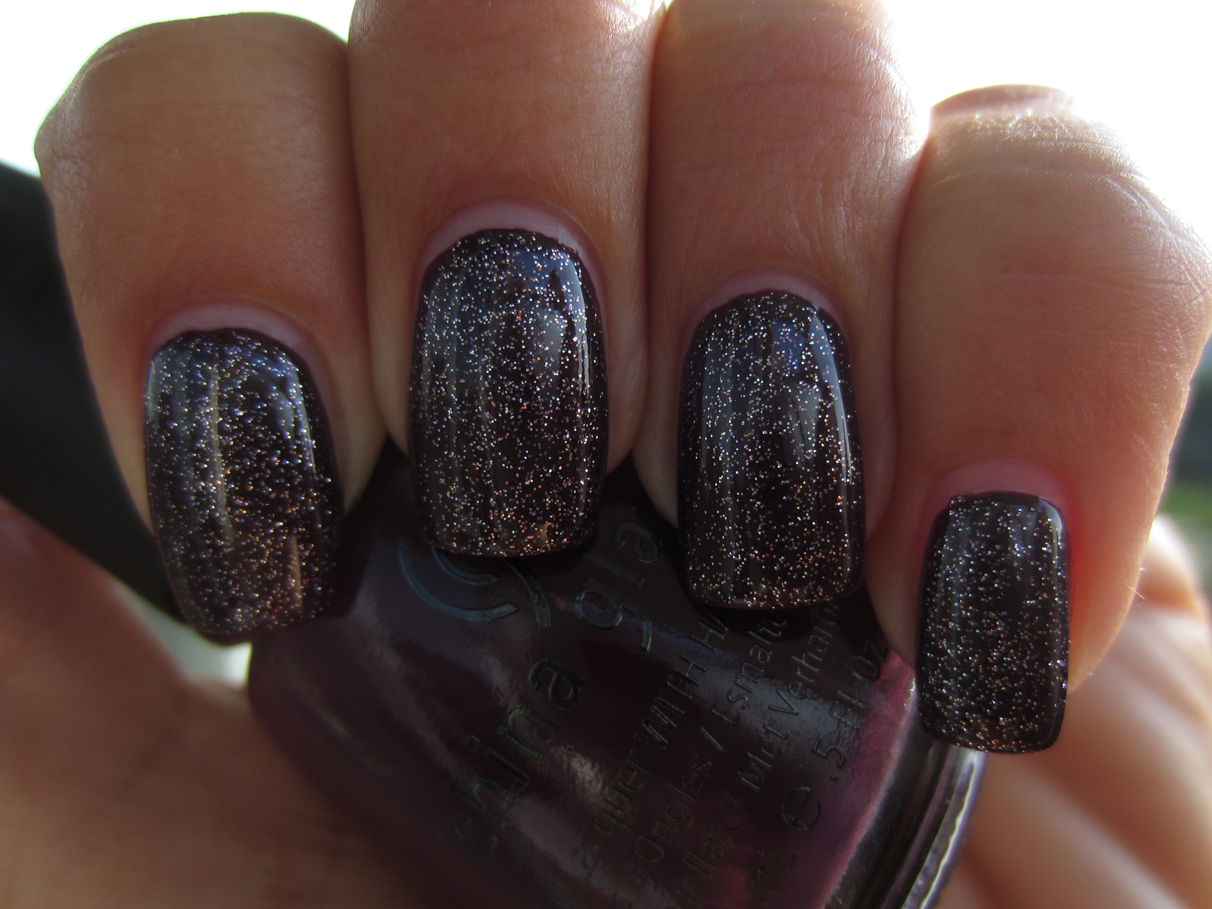
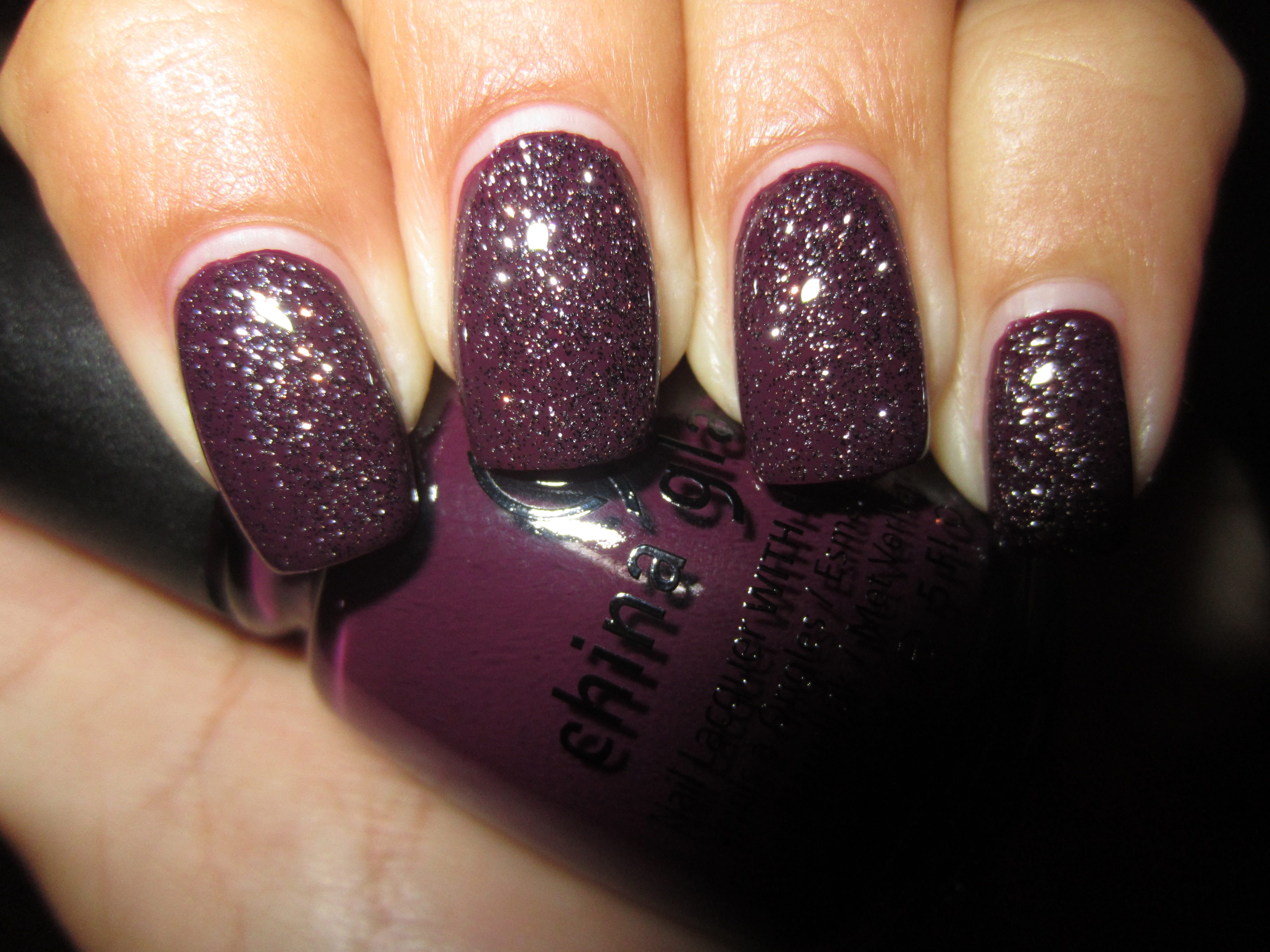
It seemed to me that a layer of ‘CG In The City’ would be a perfect match to two coats of ‘Urban’-Night’, as they both have a common purple theme, and it turns out that it was indeed a very symbiotic relationship!
I love how the sunlight takes the fine glitter specks of ‘CG In The City’ and reflects them so brilliantly, set against the perfect backdrop of ‘Urban-Night’.
A view in indirect light tones down the sparkling overlay and allows the base shade to be the primary focus.
I can’t help but be reminded of the galaxy once more, when this combination is viewed in shaded light, but this time appearing as stars set against the deepest dark of night….so sensually mysterious!
A final view taken with flash, and the combination becomes almost as explosive as the big bang! Scintillating, yet not over-statedly so…..brilliant!
Final thoughts: If it hasn’t become apparent enough by now, let me state right here, how absolutely impressed I am with this collection thus far. Beginning with a superb formula, requiring minimal application effort – they are all THAT easy to apply – brush stroke free and self-levelling, glassy finish and relatively quick dry time, along with a thin, tapered yet flexible brush for ease of use, there is absolutely nothing I don’t like about these six shades. The colours themselves, while not outrageous in hue, are a huge bonus as well because of their easily wearable shades. I am totally feeling the sophisticated look of the “Uptown” Collection…..stay tuned as I direct you next to the seamier side of city life, with the “Downtown” Collection!
*Disclaimer: product samples provided by the company/PR for my unbiased consideration
*Image credit


