- Beauty Journalist & proud Montrealer with a passion for beauty in all its fabulous diversity. "Beauty begins the moment you choose to be yourself" - Coco Chanel
To suscribe, please enter your email:
Archives
Categories
Categories
beauty Beauty Tools Blush Bronzers Brushes Chanel CHANEL Beauty CHANEL Makeup Chanel nail polish Cosmetics Dior Essie Eye Liner Eye Shadow eyeshadow eyeshadow palette Face Powders Foundation fragrance Guerlain Highlighter Highlight Powders limited edition limited edition beauty limited edition makeup Lip balm Lip Gloss Lip products lipstick luxury beauty luxury makeup MAC Makeup makeup Makeup Artist Makeup Brushes Mascara nail polish Nail Polish Comparisons NARS New OPI palette Perfume Skincare- @ommorphia on Instagram
-
Filed In: China Glaze
China Glaze ‘Crackle Glaze’ – part 1 (review & swatches)
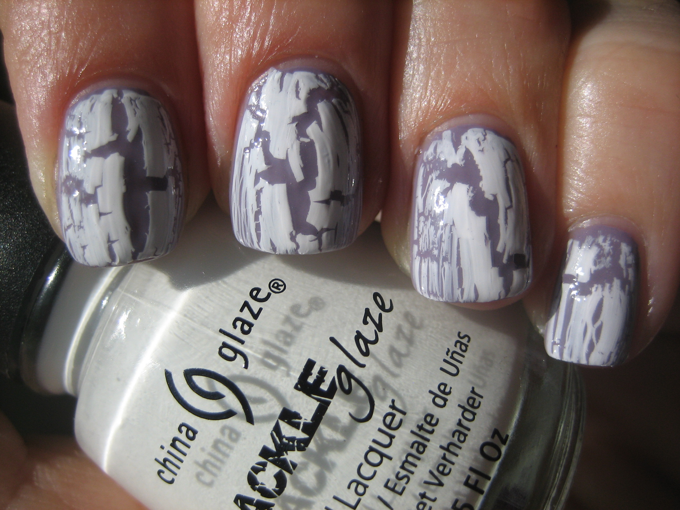
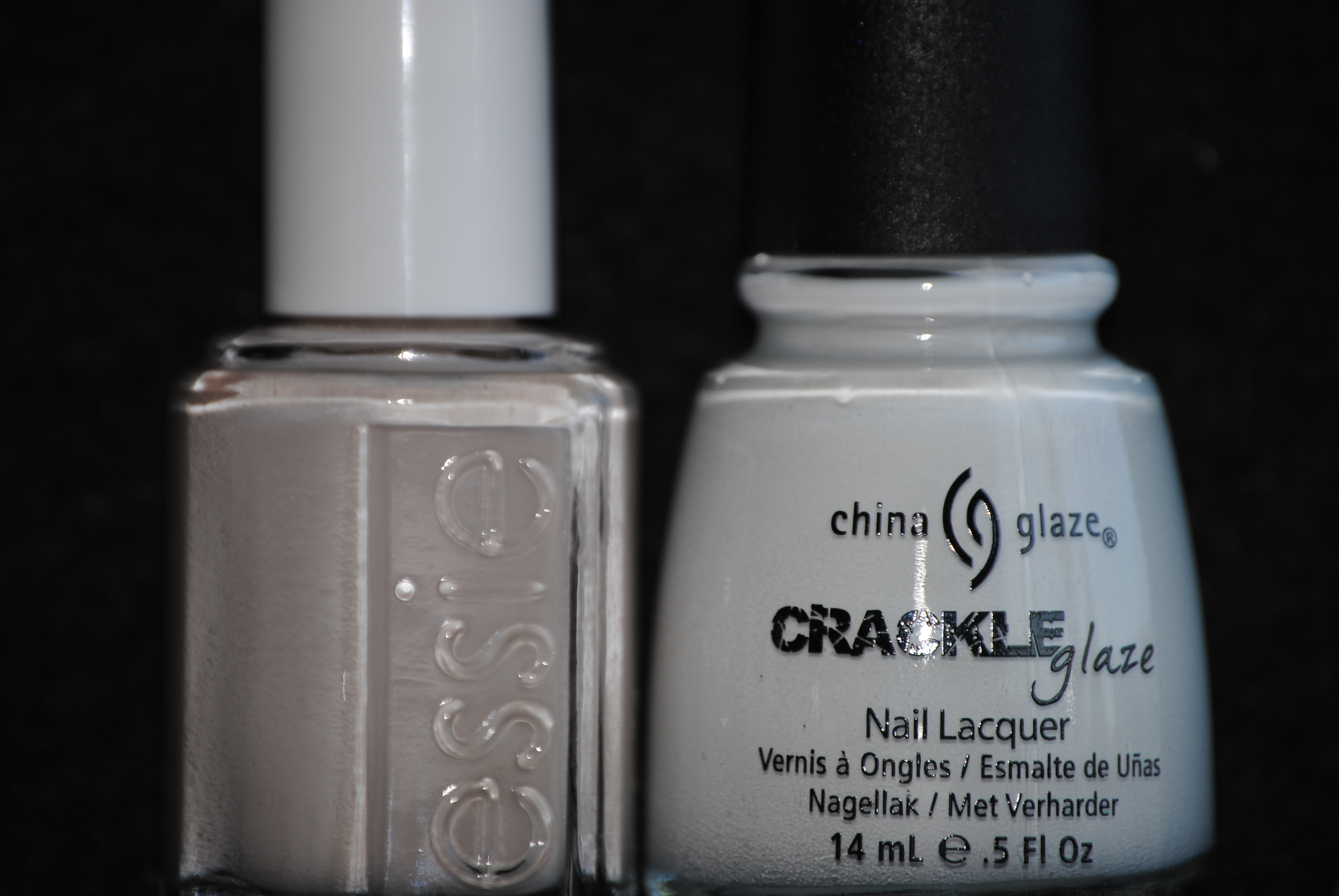
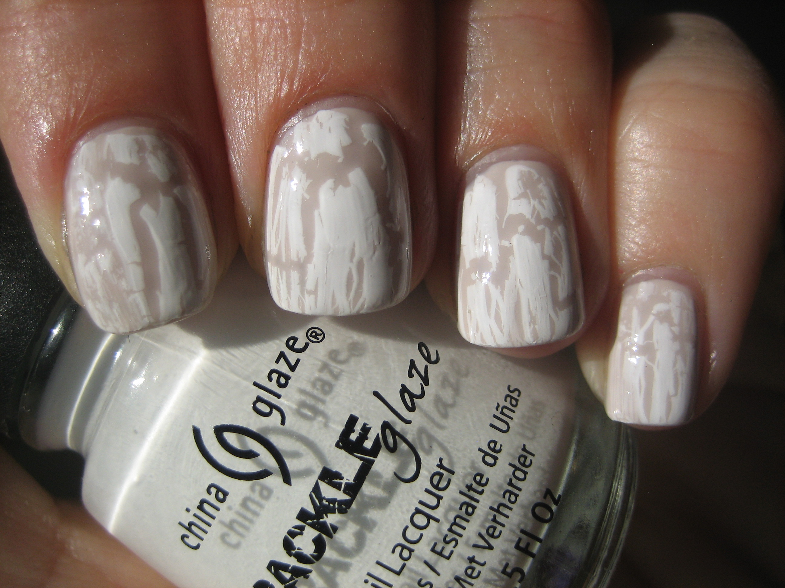
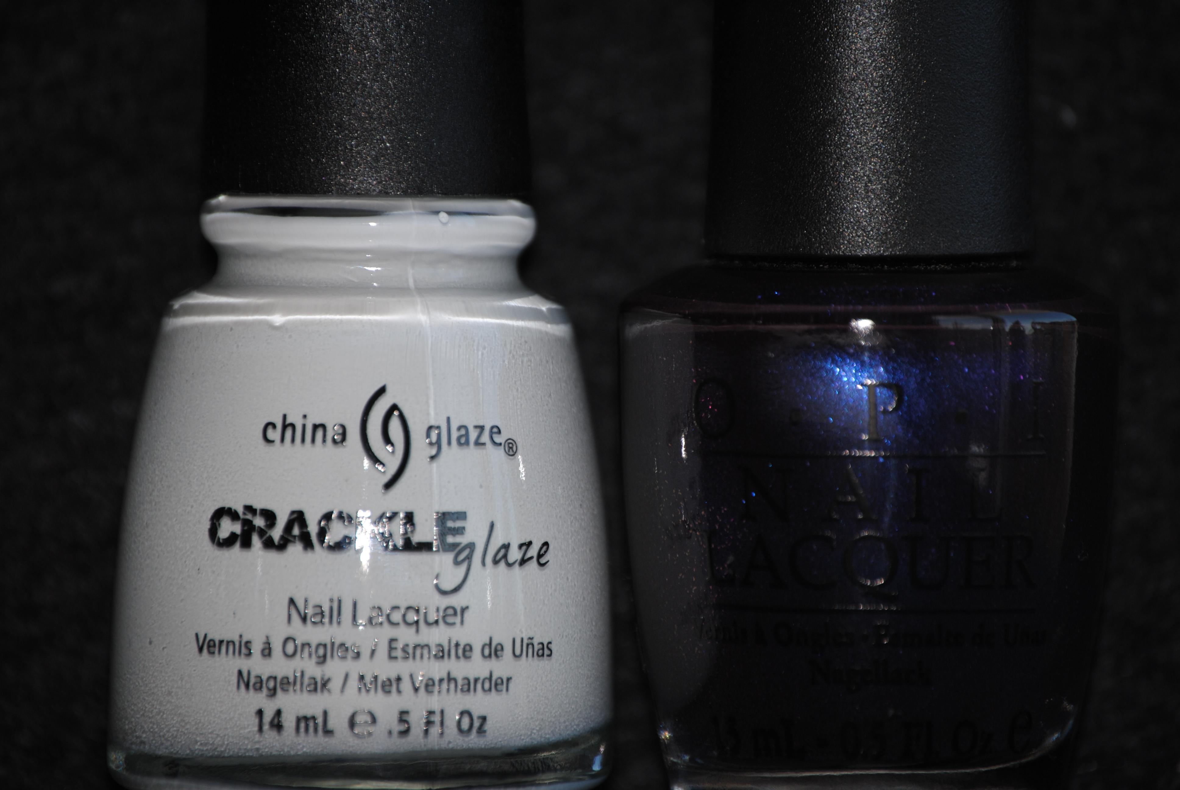
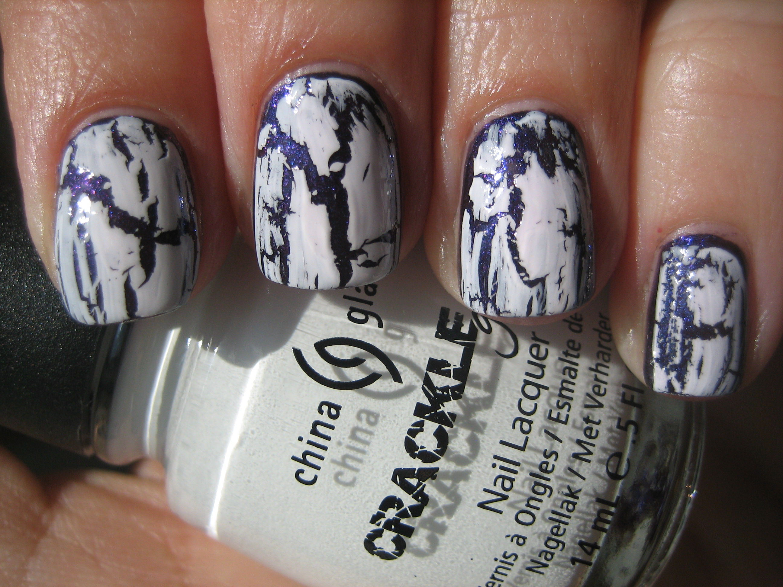
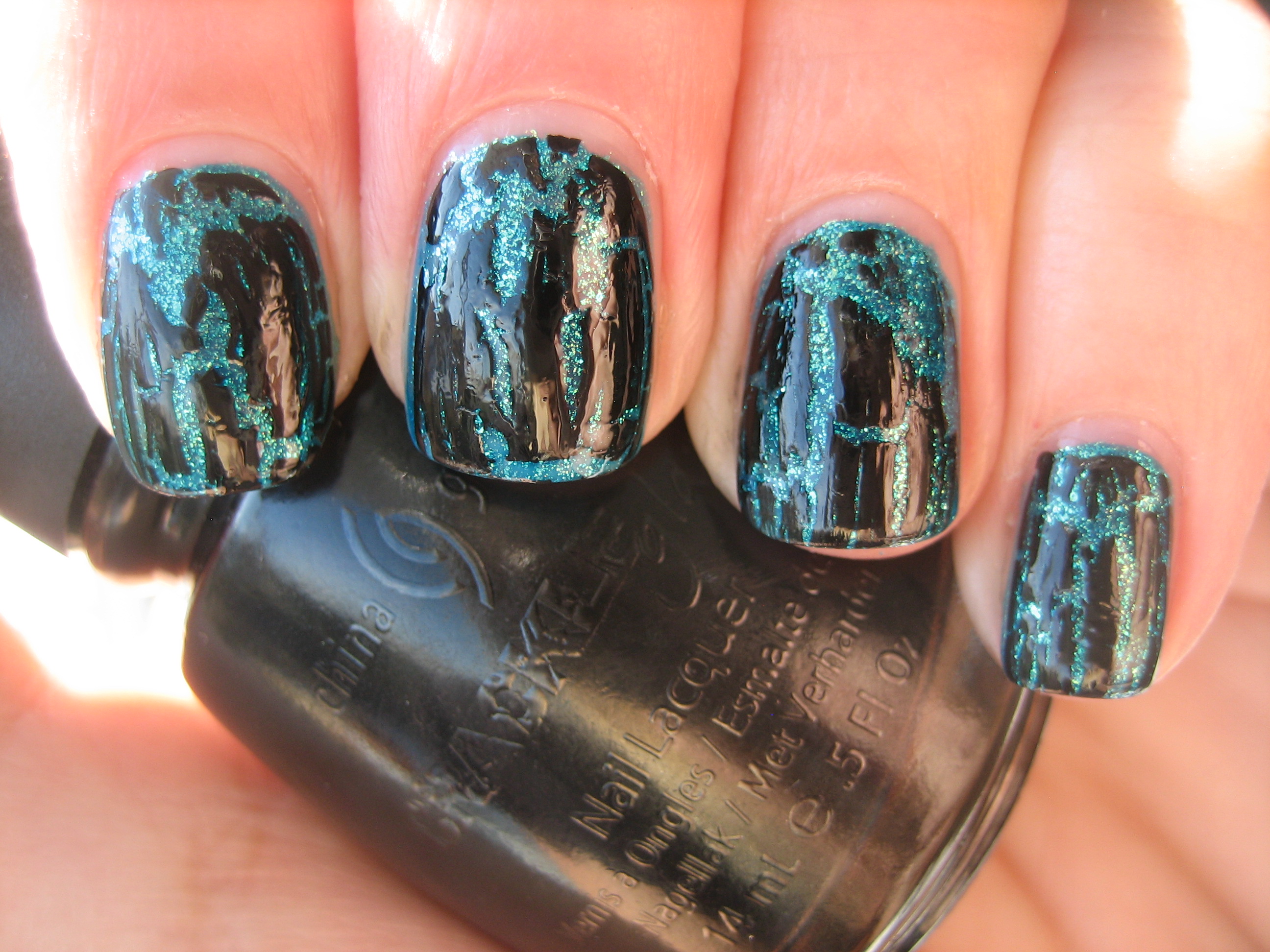
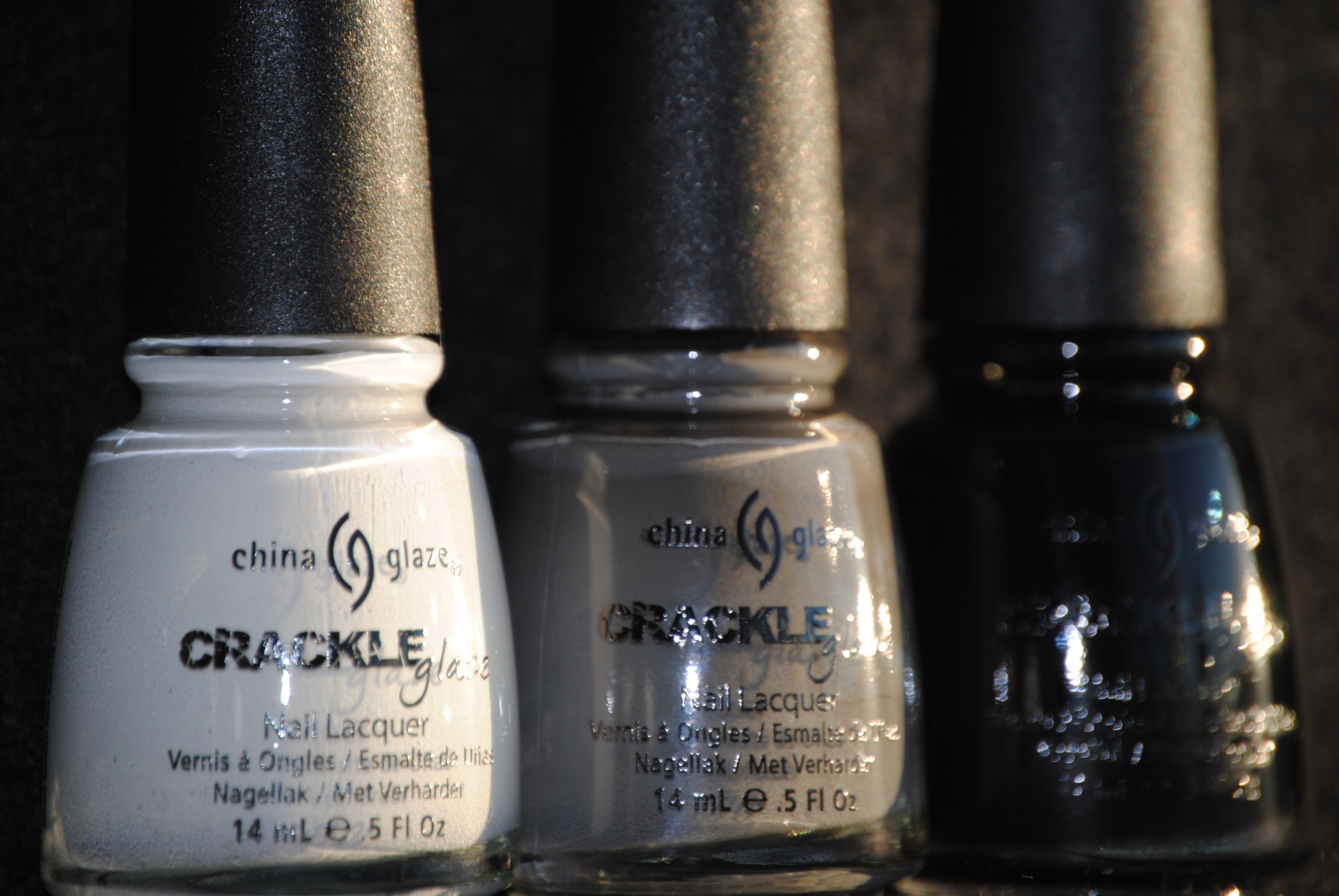
The long anticipated Crackle Glaze polishes from China Glaze are finally here! I have broken down my review into 2 parts, as I wanted to show you several looks that you can achieve with these lacquers, and so today I present you with part 1. The three polishes I refer to as “the darks” include ‘Lightning Bolt’ – a crisp white, ‘Cracked Concrete’ – a dolphin grey and ‘Black Mesh – a tar black. These polishes are not only easy to use, but having several shades to choose from gives you so many combinations to play with….you’re only limited by your own imagination! I wanted to show you how each of these Crackle Glazes can be adjusted tonally, depending on what base colour you opted for, and thus I came up with three looks: subtle, tone-on-tone and contrasting. All swatches are with Sèche Natural base coat and Essie Good To Go top coat.
At first I thought that ‘Lightning Bolt’ would prove to be somewhat chalky (à la Liquid Paper!), but it was interesting to note that it had a slight sheen to it when dry. Getting the hang of how much of the crackle to apply is somewhat trial and error, but also surprisingly easy. The beauty is that with this effect, there really are no mistakes; everything can be made to work.
For the subtle look, I applied two coats of a-england’s ‘Guinevere’, a dreamy & muted lilac (reviewed here), as my base shade. I like how the dusty lavender peeking through, harmonizes so well with the white, without coming off too strong.
To achieve the tone-on-tone look, I applied three thin coats of Essie’s ‘Body Language’, a grey tinged cream, as my base shade. While the crackle effect is not as pronounced, I love how understated this look is, delicate and lacey.
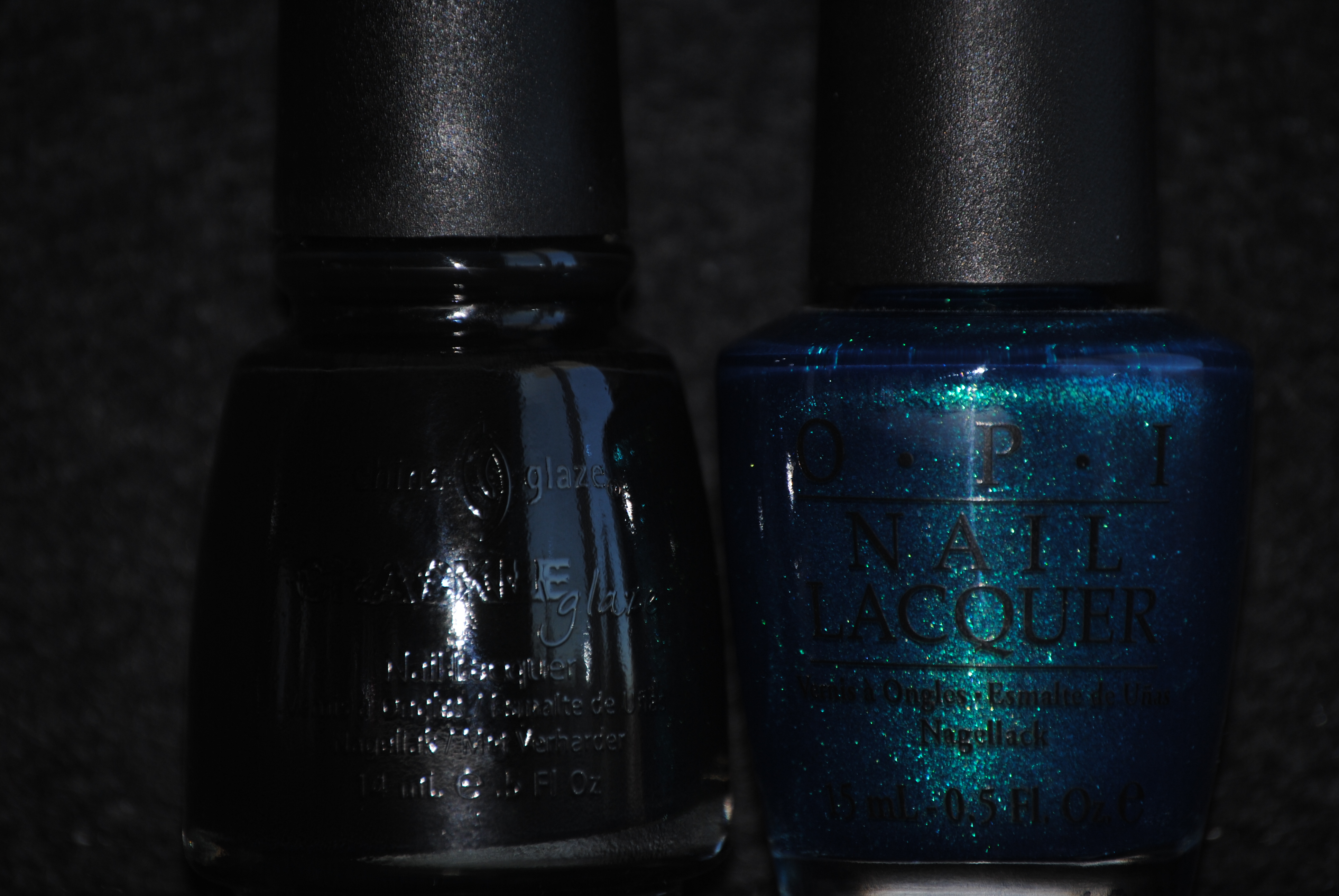
Finally, for the contrasting look, I applied two coats of OPI’s ‘Ink’, a deep cobalt with tons of fine multi coloured shimmer, as my base shade. What I enjoy about this contrast is how beautifully the darker base sets off the white crackle pattern.
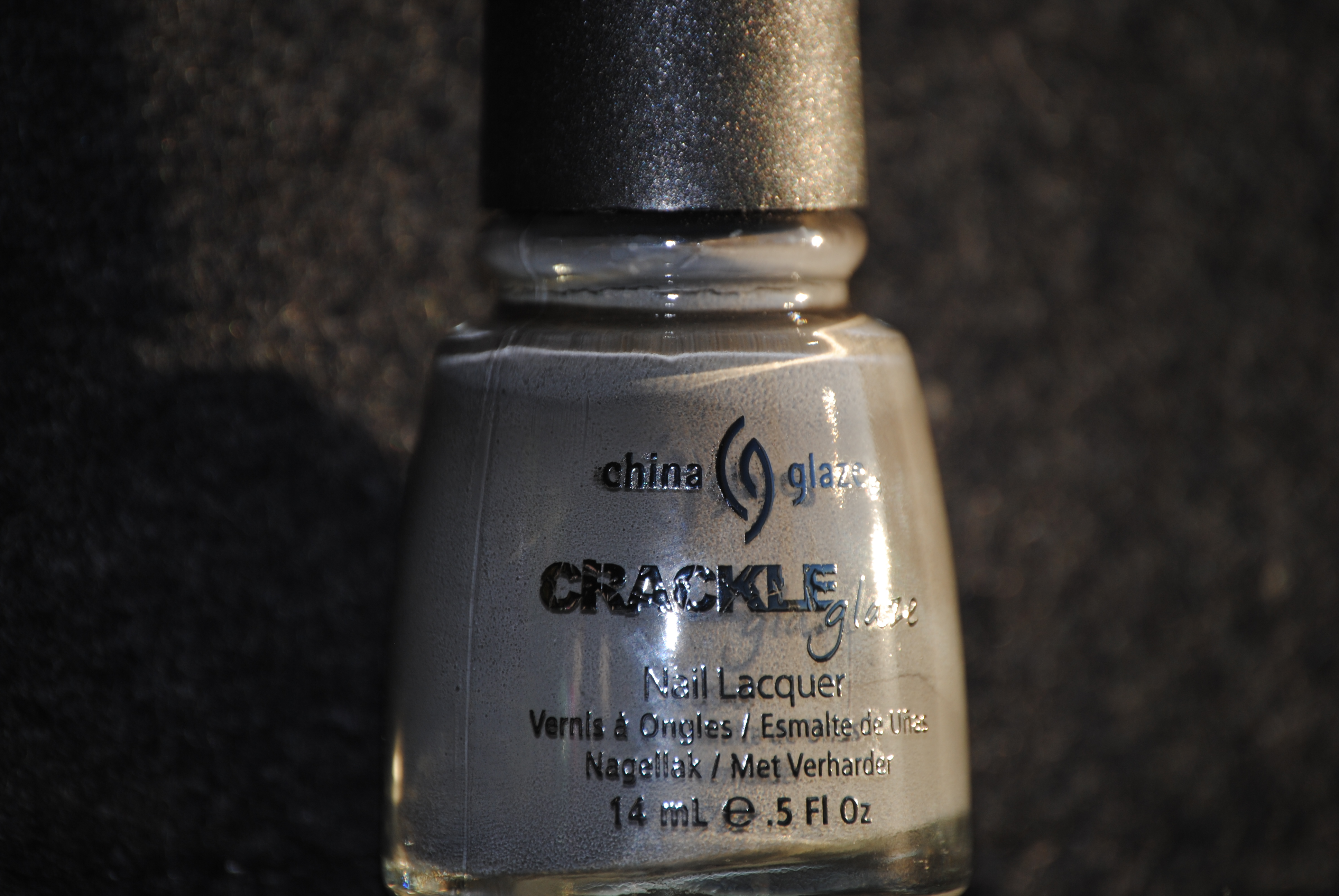
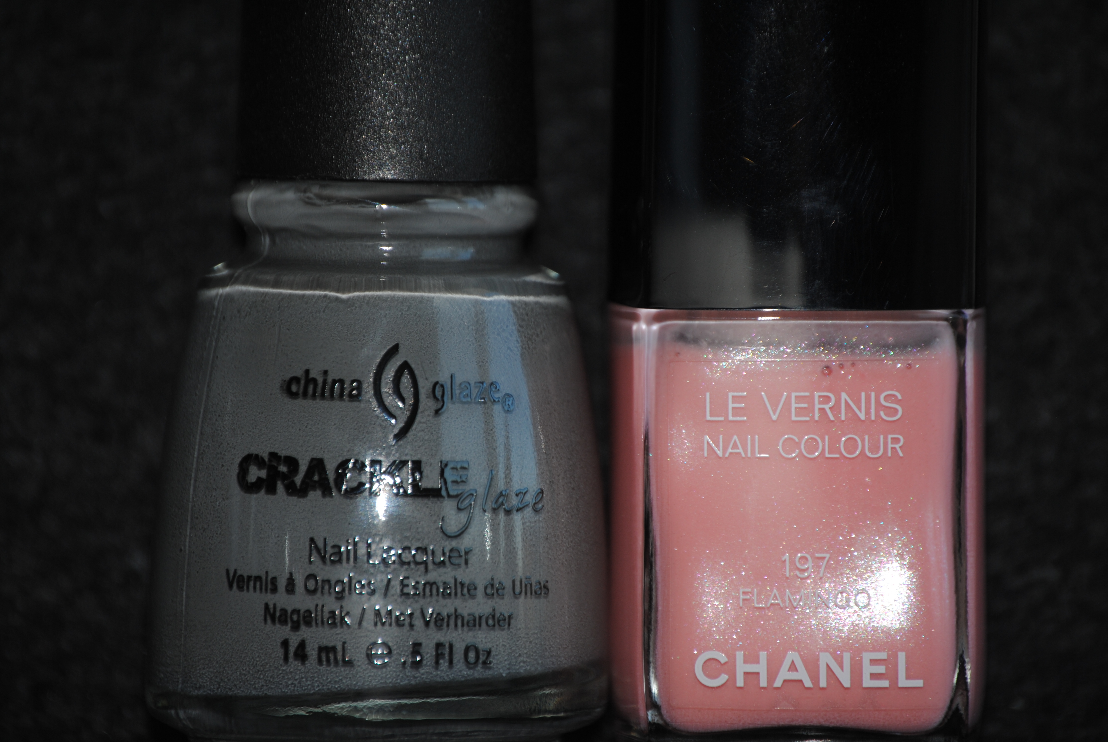
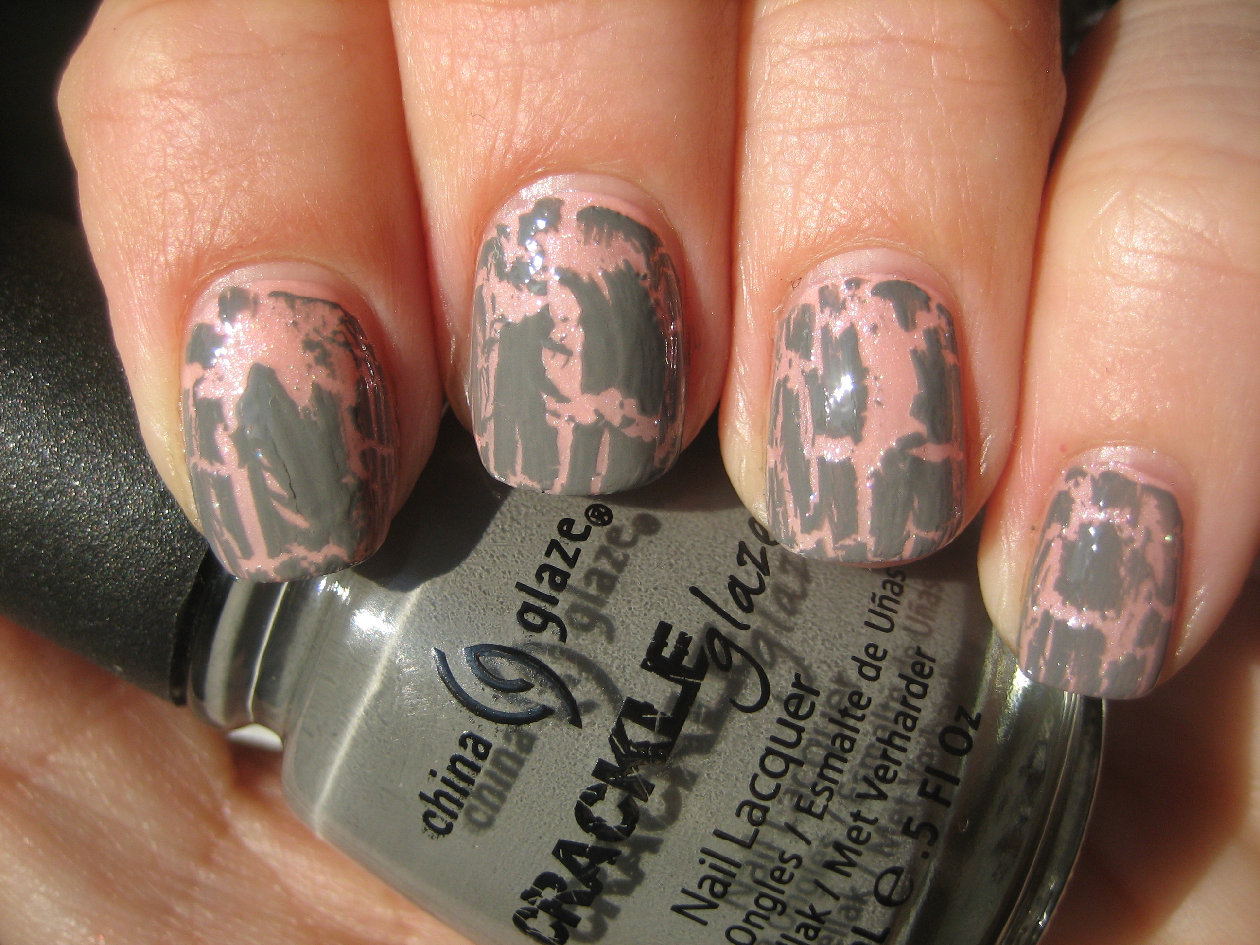
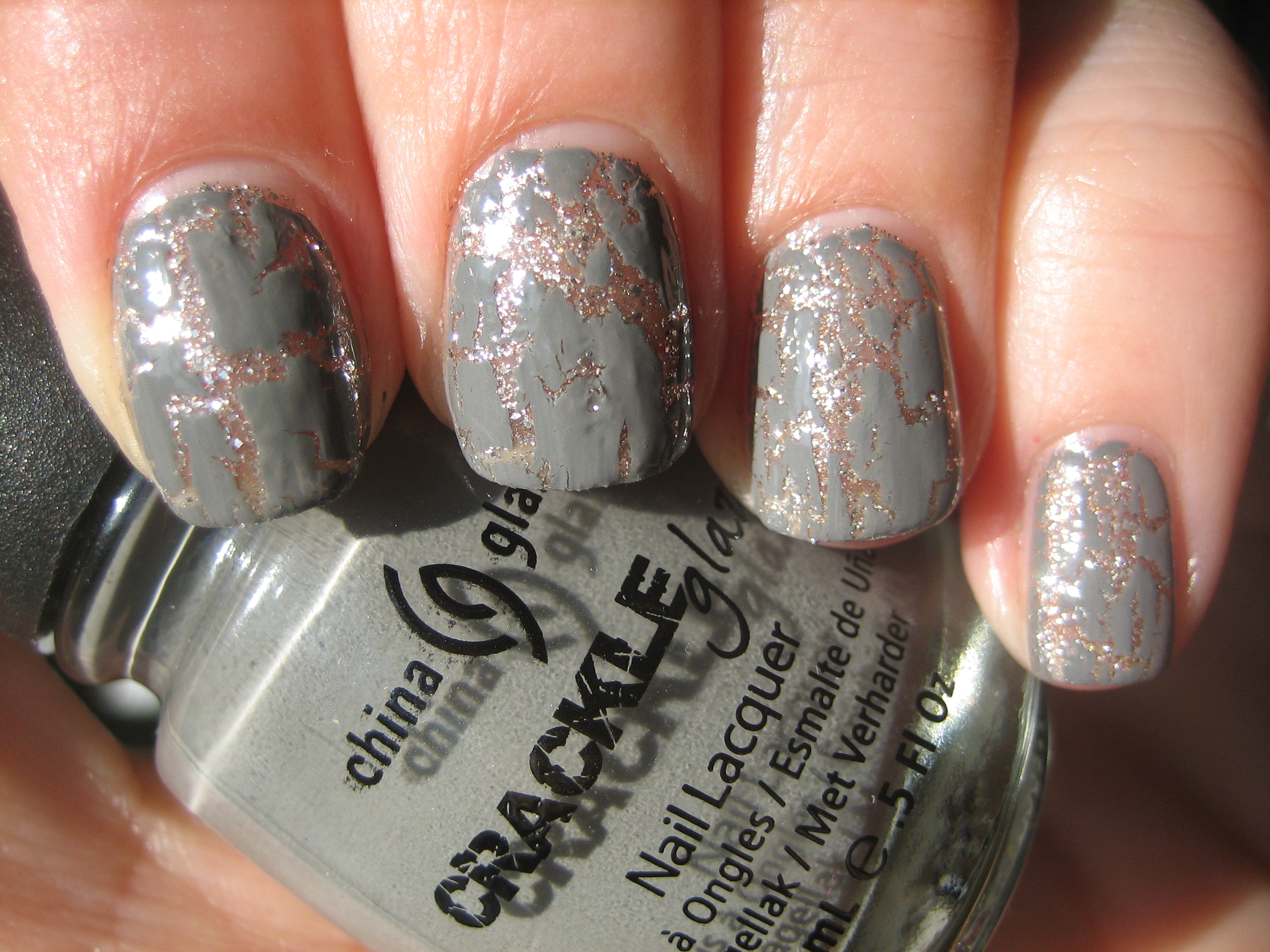
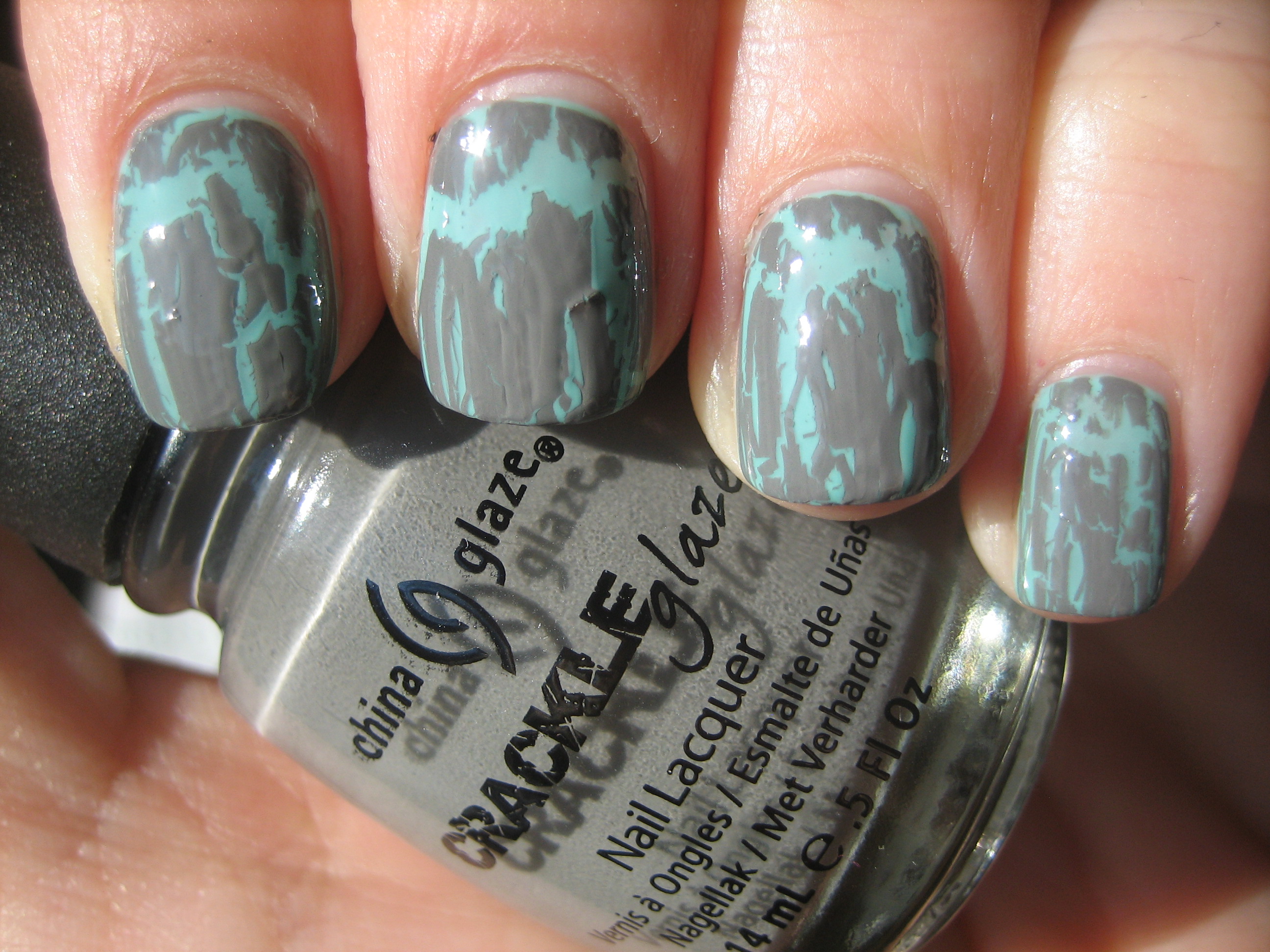
‘Cracked Concrete’ is easily the most versatile shade in the entire Crackle Glaze collection, as it is neither too neutral, too light or too dark. The layering combinations with this shade are endless and the formula was a good consistency.
For the subtle look, I applied three coats of CHANEL’s ‘Flamingo’, a shimmery peach tinted pink, as my base coat. I wanted a combination that was complimentary without being overwhelming, and I believe this works beautifully.
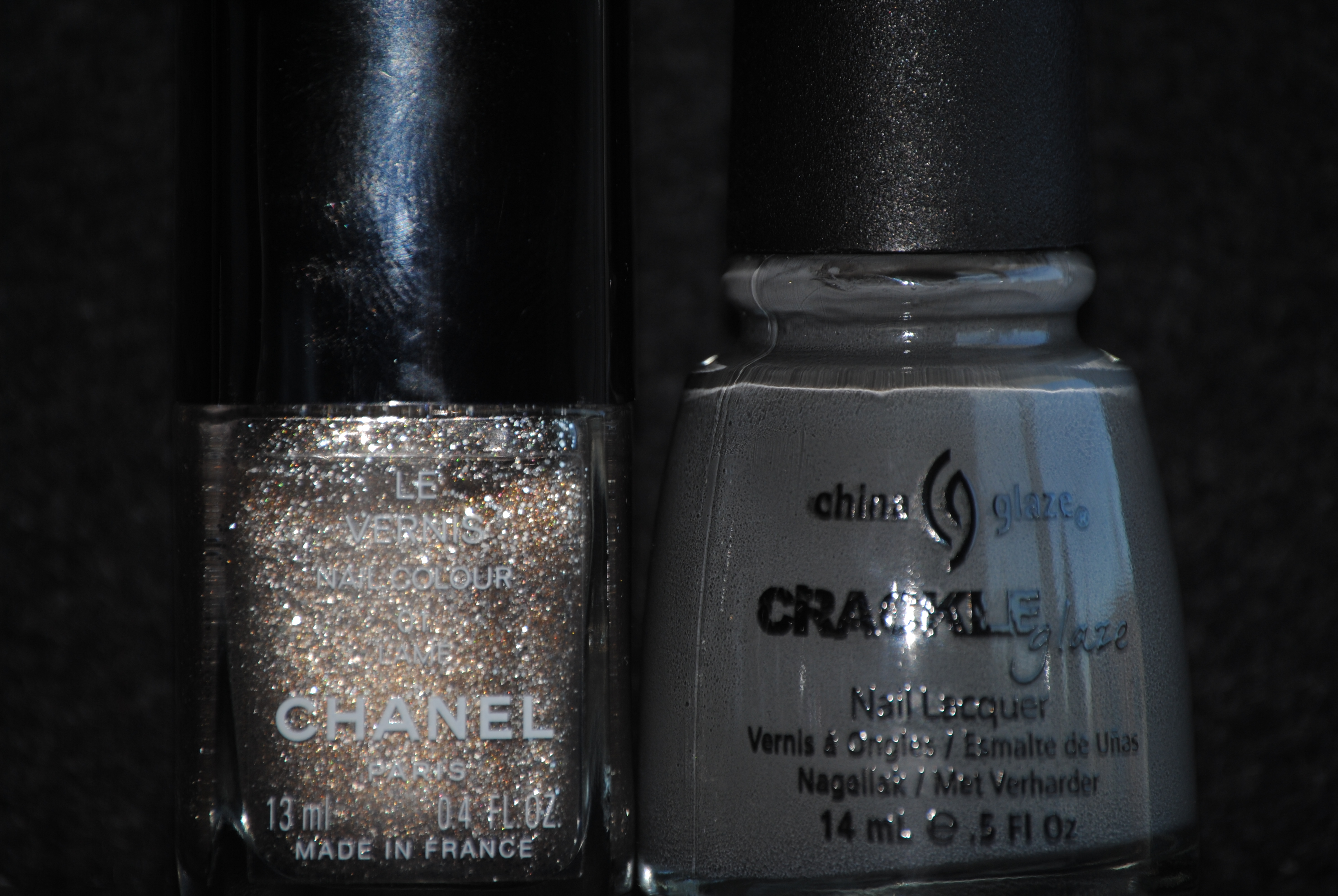
To achieve a tone-on-tone look with grey can be somewhat challenging, as you want enough differences to show without clashing. I solved this dilemma by applying three coats of CHANEL’s ‘Lamé’, a rather sheer grey tinted & profuse silver glitter. While there is enough tonal sameness, the glitter adds an interesting edge to tie this look together.
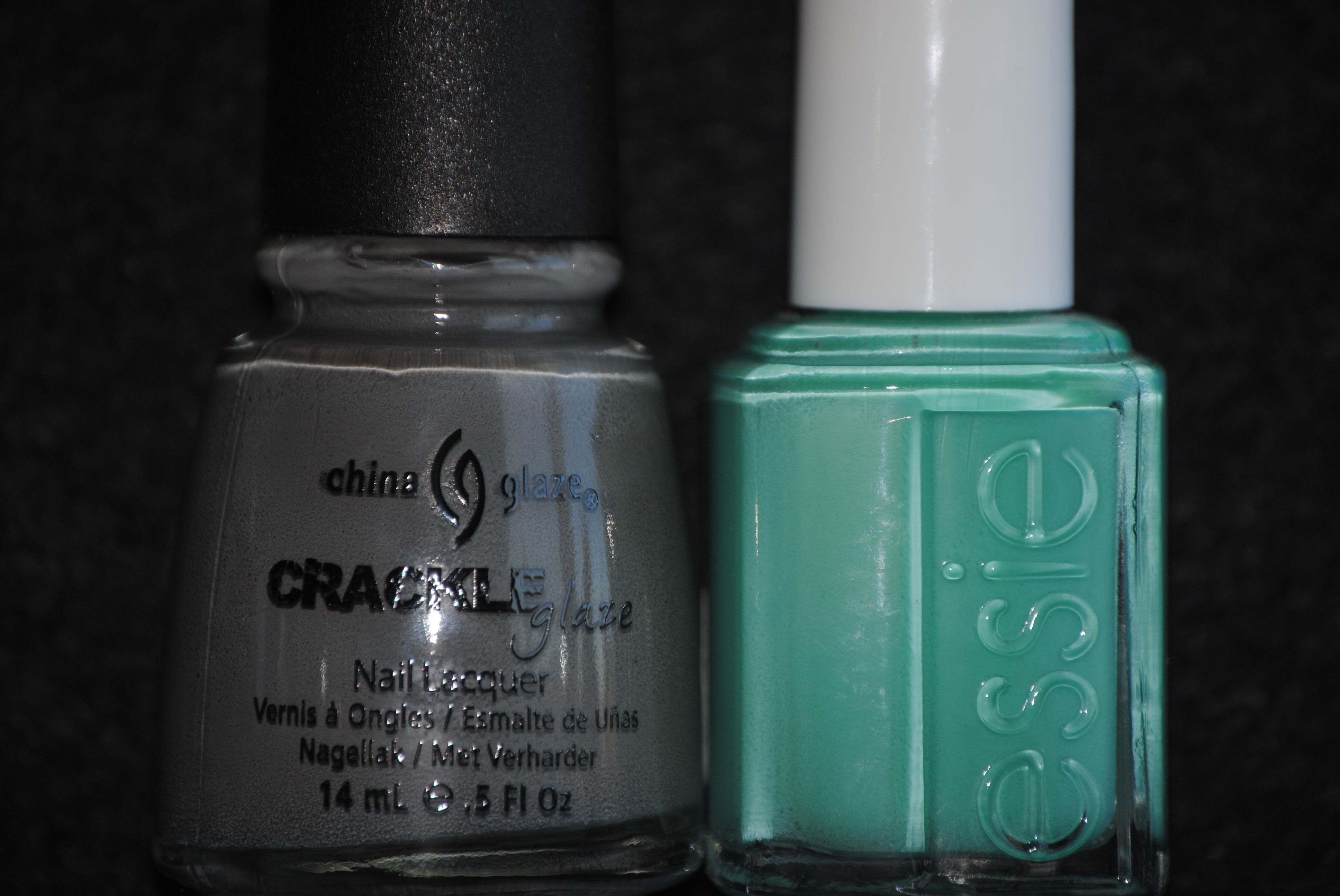
For the contrasting look, I still wanted to keep things sophisticated, and so I applied three coats of Essie’s ‘Turquoise and Caicos’ as my base shade. Once again, the sea inspired background hue serves to highlight the interesting patterns of the grey crackle.
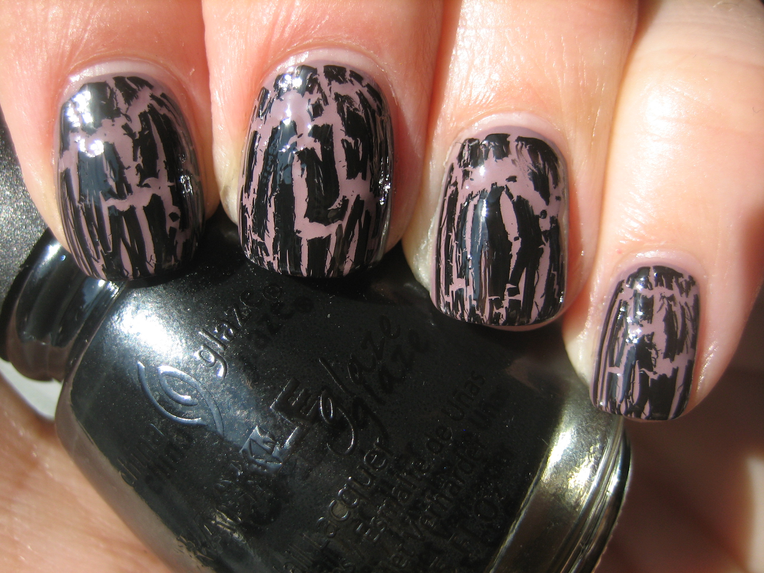
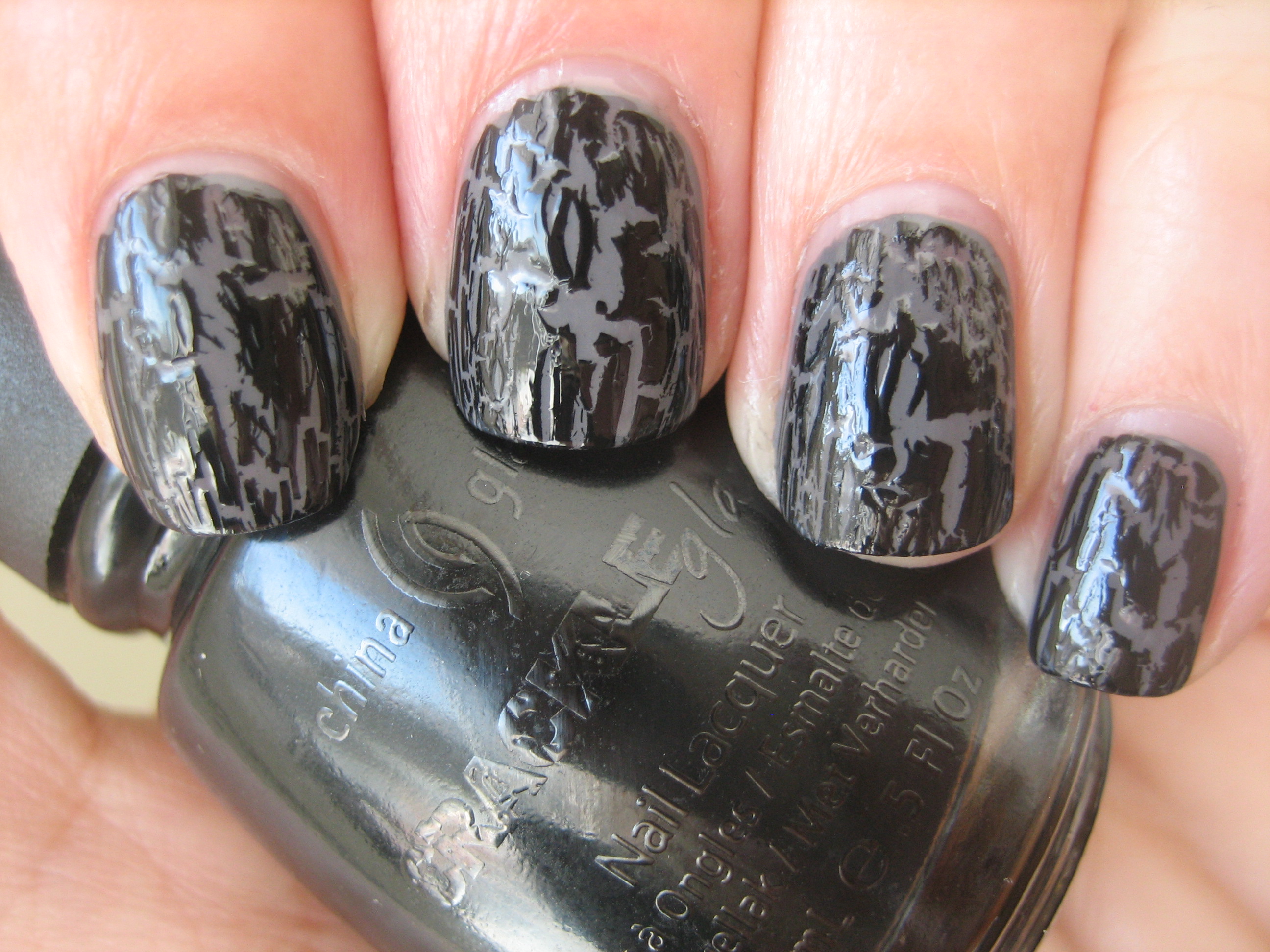
For those already familiar with OPI’s ‘Black Shatter’, the China Glaze version, ‘Black Mesh’ is quite similar, with the exception that I found this one to have somewhat more of a satin finish. The formula seemed a touch thinner than the other two, which I feel helps the polish spread faster, and the crackle effects seem more refined as a result.
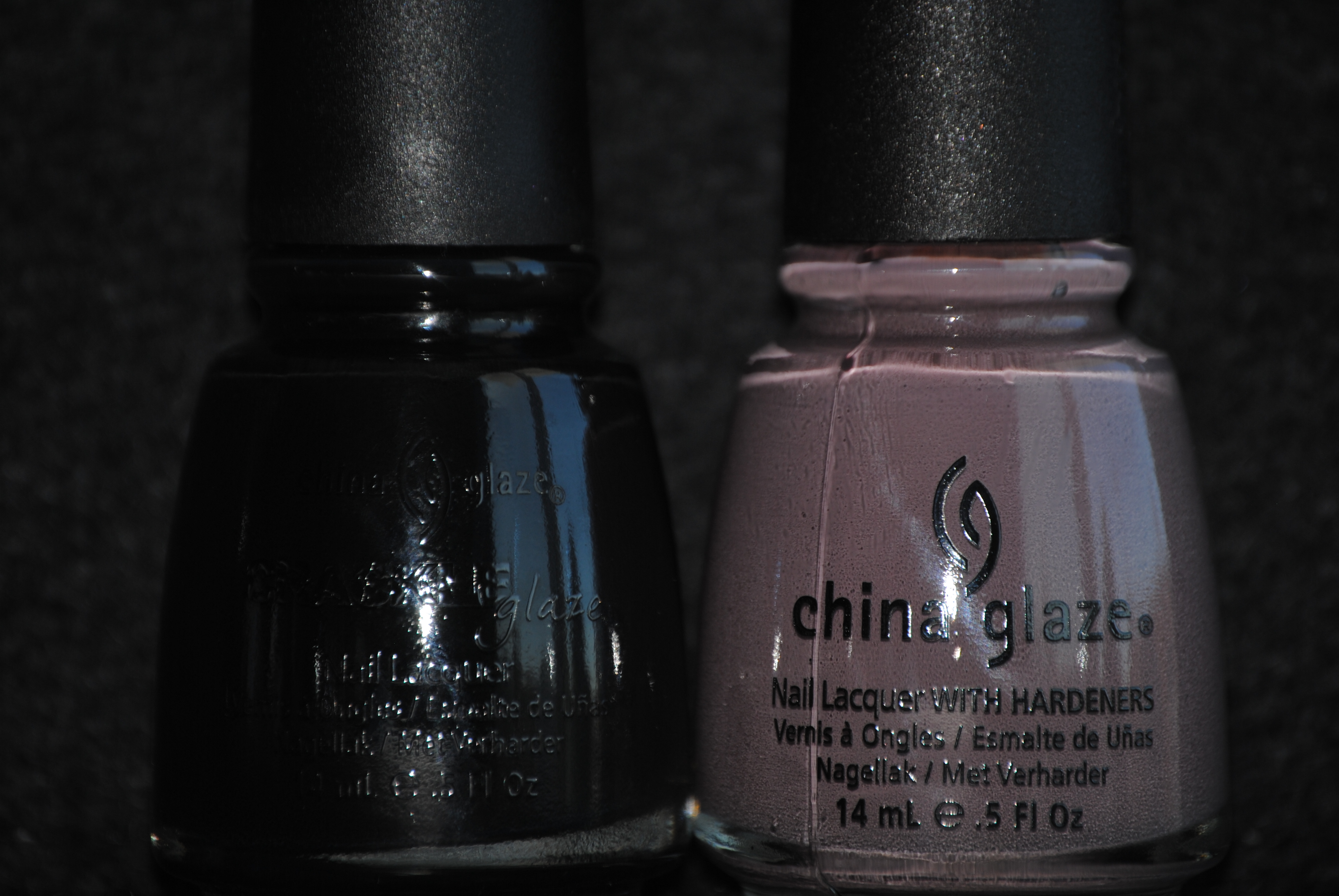
To achieve the subtle look I was going for, I applied two coats of China Glaze’s ‘Below Deck’ (reviewed here), a muted plum, from their ‘Anchors Away’ collection, as my base shade. The dusty mauve hue serves as the perfect foil for the black crackle effect without standing out too much, yet still manages to be quite chic looking. I was surprised by how much I really loved this one!
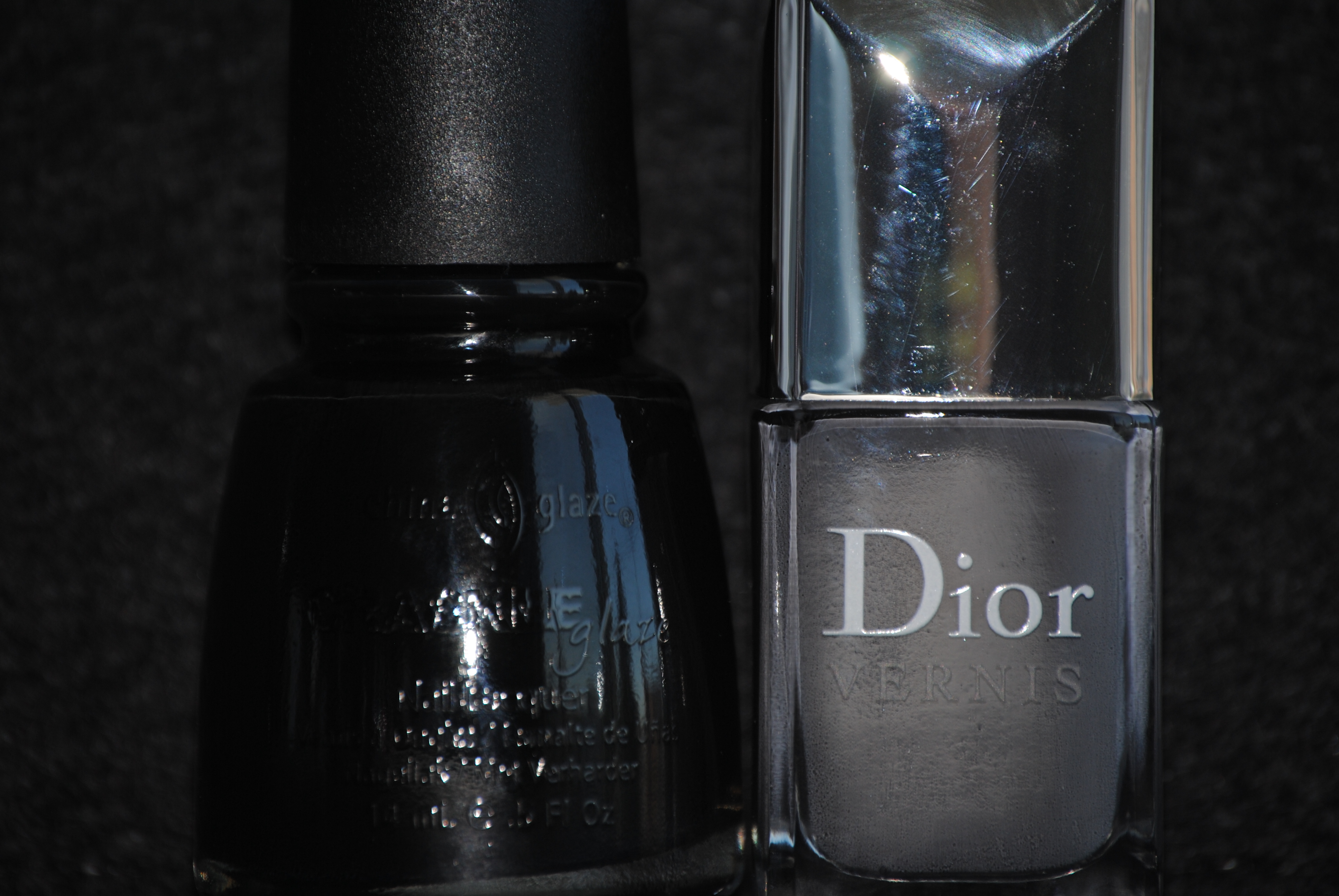
How do you achieve a tone-on-tone look with black? Use grey! I applied two coats of Dior’s ‘Gris Montaigne’, a buttery sealskin grey (reviewed here), as my base shade. The depth of this hue complimented the black shards of the crackle polish and helped blend the two together in wonderful harmony.
For my final contrasting look, I looked for something that would not be too familiar or garish, and so I applied three thin coats of OPI’s ‘Catch Me In Your Net’, an über-shimmery aqua blue, as my base shade. What the photos do not fully capture, is the scintillating glimmer peeking between the cracks, which only adds to the richness of both shades. This was a really mesmerizing combo!
Final thoughts: The first three of China Glaze’s Crackle Glazes are a smash hit! I am slowly coming around to this crackle fad, and that might be in part due to having played around a bit with these finishes. The company includes a wonderful little tag with each bottle, giving fairly clear instructions on how best to apply this finish, and it must be stressed that in order to achieve a great crackle effect, your base shade must be absolutely dry first. I really loved how each look came out and the biggest difficulty I had was in sifting through my stash to find appropriate matches…there are so many possibilities! Feel free to visit China Glaze’s website to see some other layering combinations. Stay tuned for my second part, where I will review the last three shades of this fabulous collection.
*Disclaimer: product samples were provided by the company/PR for my unbiased consideration
Reader Request: I Vant To Be A-Lone Star vs. Pelican Gray
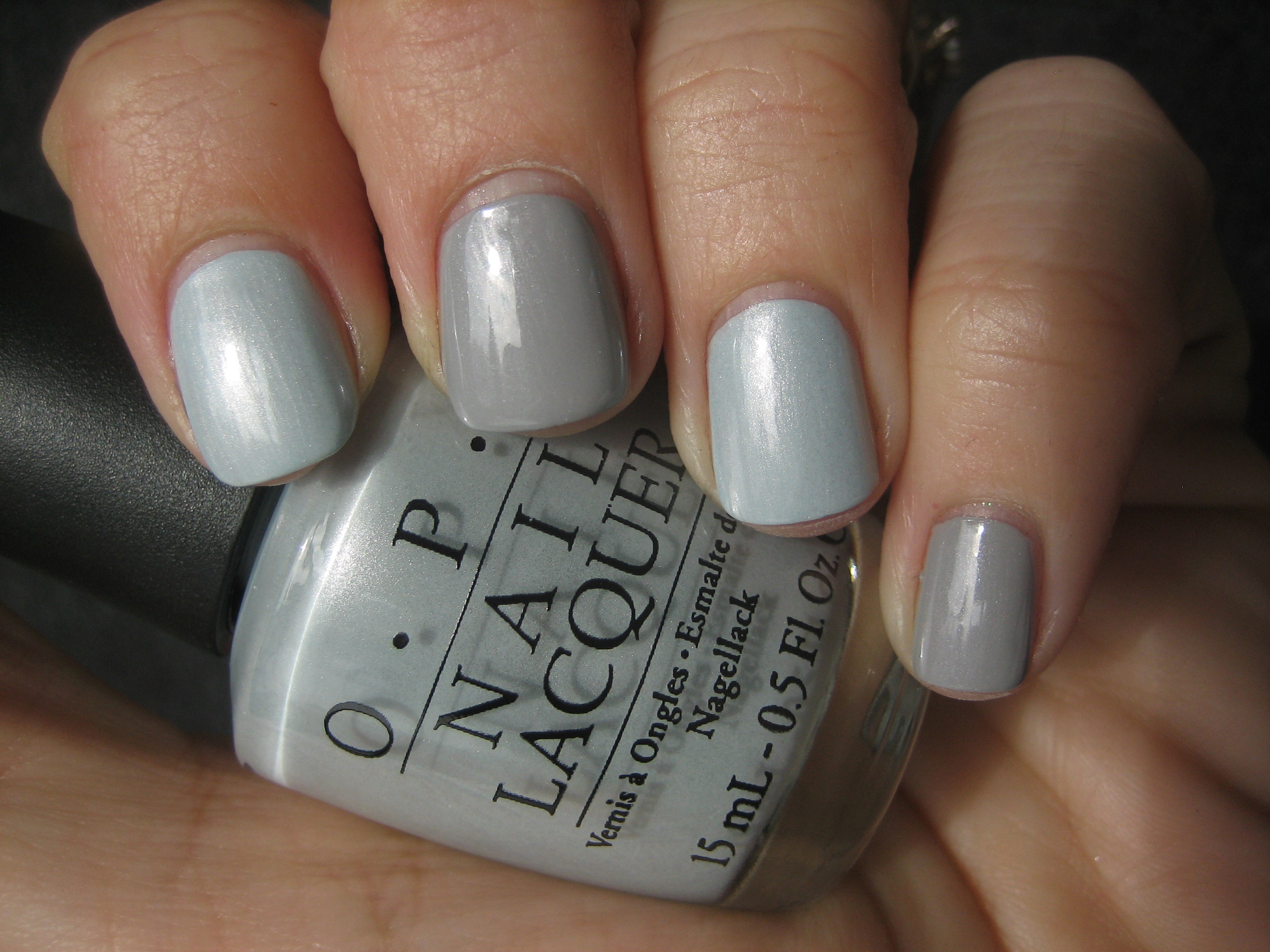
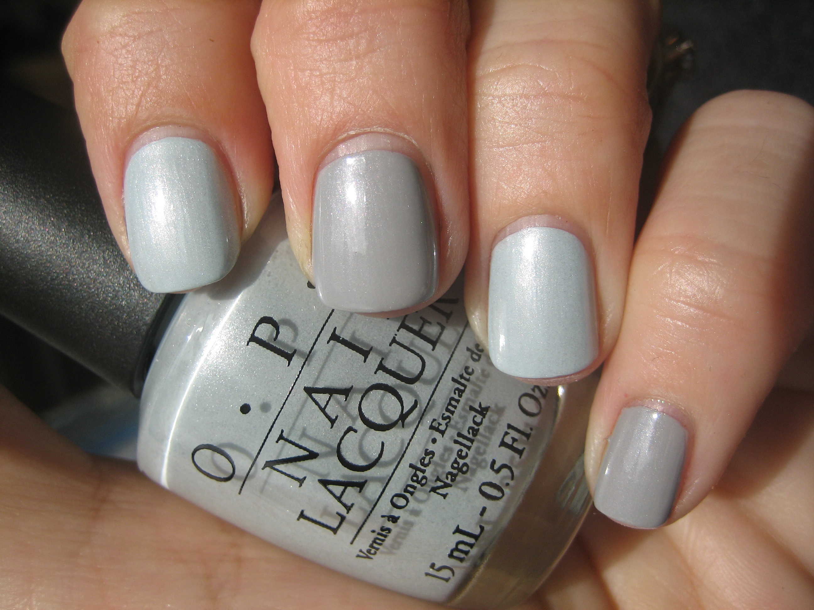
Recently, a reader asked me to compare OPI’s ‘I Vant To Be A-Lone Star’ against China Glaze’s ‘Pelican Gray’, and which one I prefer. To be totally honest, even though you might think these two shades are close enough, viewed in person it’s another story and so I have decided to explain the differences. As to which one I prefer, guess you’ll have to read on to find out….and no cheating by scrolling to the bottom! The following swatches are index & ring fingers – ‘I Vant To Be A-Lone Star’ and middle & pinkie fingers – ‘Pelican Gray’ and were prepared with Sèche Natural base coat and three coats of lacquer, no top coat.
Seen in natural light, at first glance you might think that the two shades look enough alike to not merit owning both. Upon closer look, however, the first think you notice is that the OPI has more of a dusty, faded blue tone to it against the pale concrete of the China Glaze. While they both have shimmer throughout, in my opinion the particles in ‘Pelican Gray’ seem slightly larger and certainly more sparse compared to the finer & denser pearly shimmer of ‘I Vant To Be A-Lone Star’ (that name…..cute but way too long, no?!) In darker lighting, the differences between them seem more pronounced; note how the tone on my pinkie seems deeper and obviously grey against the blue hue of my ring finger.
With full sun hitting these shades, the differences are not as easily discernible, but still definitely there. The formula and application on both was exceptional, giving decent coverage even with two coats, although I personally prefer three thinner coats for perfect smoothness and opacity. The other major difference is one relating more to personal preferences: the OPI sports their Pro Wide brush which makes for a quick application but can be challenging for those with smaller nail beds, versus the thinner and slightly more flexible brush of the China Glaze which makes it easier to get to the sides of your nails, but means that it requires more brush strokes. They both dried relatively fast, and while neither one has a high gloss finish, they each have enough natural shine and shimmer.
Final thoughts: I will go on record as stating that I absolutely LOVE both shades. I have a personal thing for grey tones, be they dark or light, creme, glittery, matte, suede, metallic, jelly or pearly. I love dusty, washed-out looking hues as well and I find that delicate shimmer is just so flattering on every skin tone. The faded periwinkle undertone of ‘I Vant To Be A-Lone Star’ is a different slant on this colour range and that makes it just a touch more unique in my eyes to merit it a “must have” in your nail polish arsenal. But if you’re like me, then you know that you absolutely MUST have ‘Pelican Gray’ as well, because the formula is so totally superb and the pearly shimmer really sweetens what would otherwise be a drab shade.
*Disclaimer: product samples provided by the company/PR for my unbiased consideration
China Glaze ‘Anchors Away Collection’ – part 3 (swatches & review)
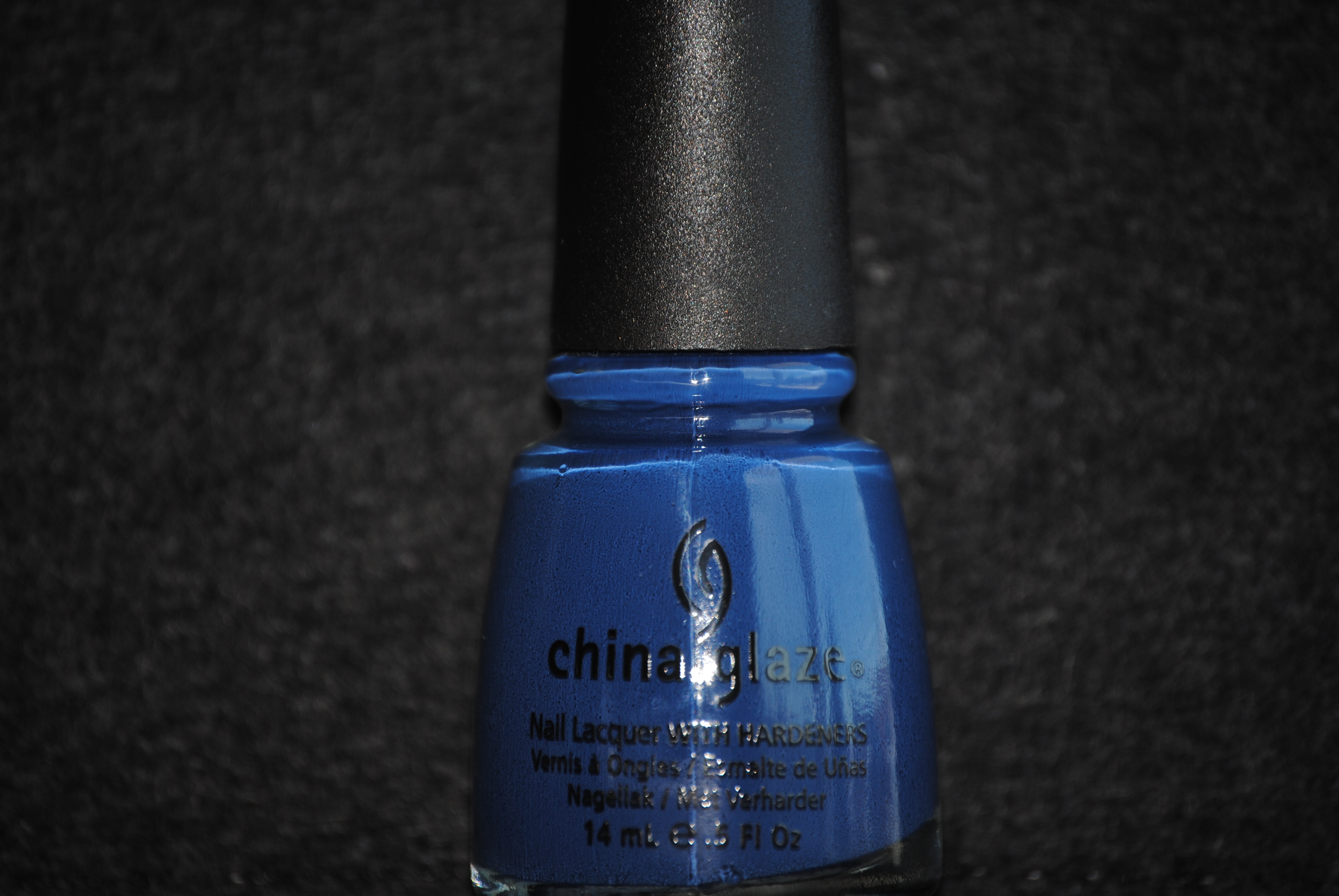
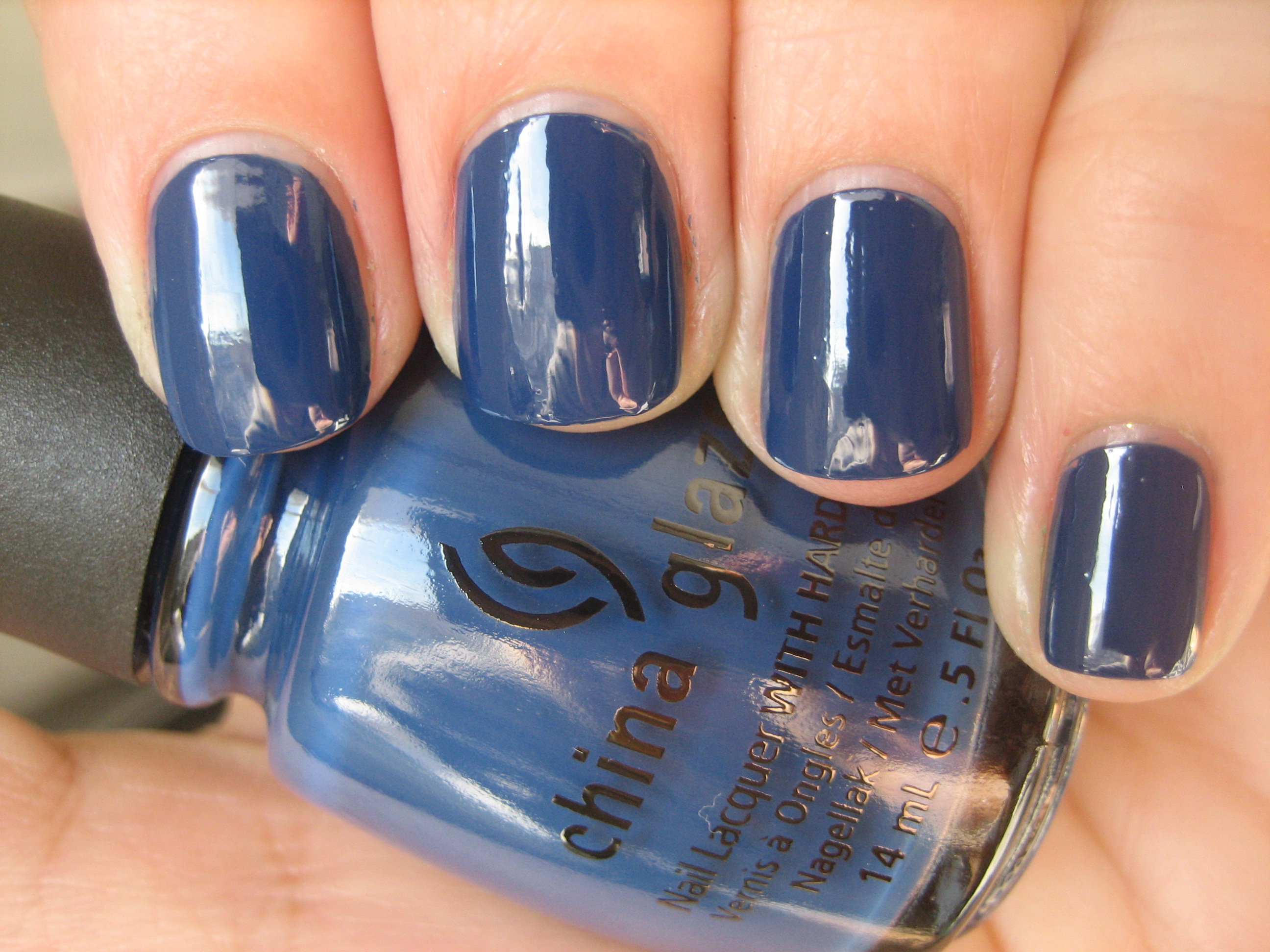
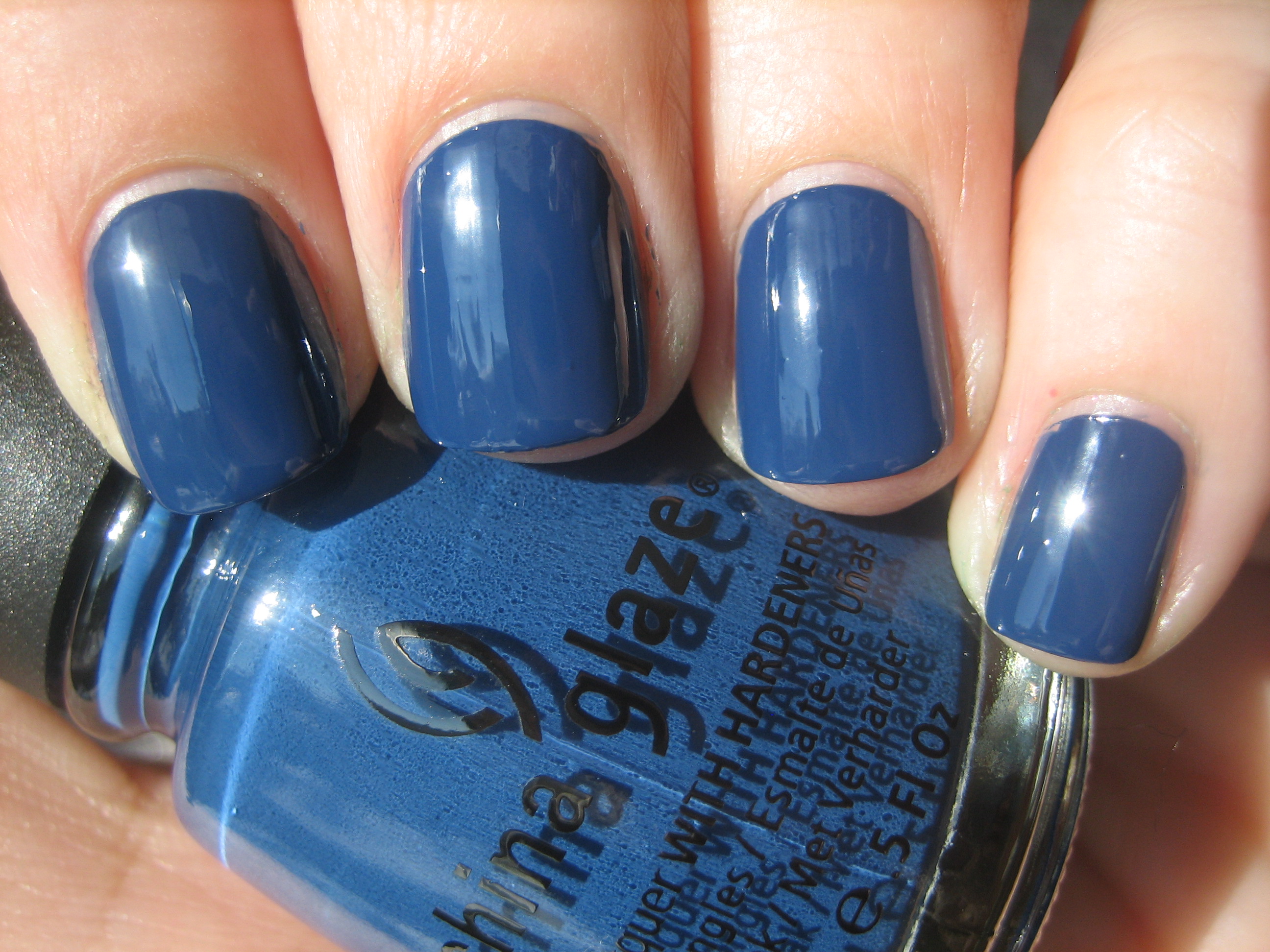
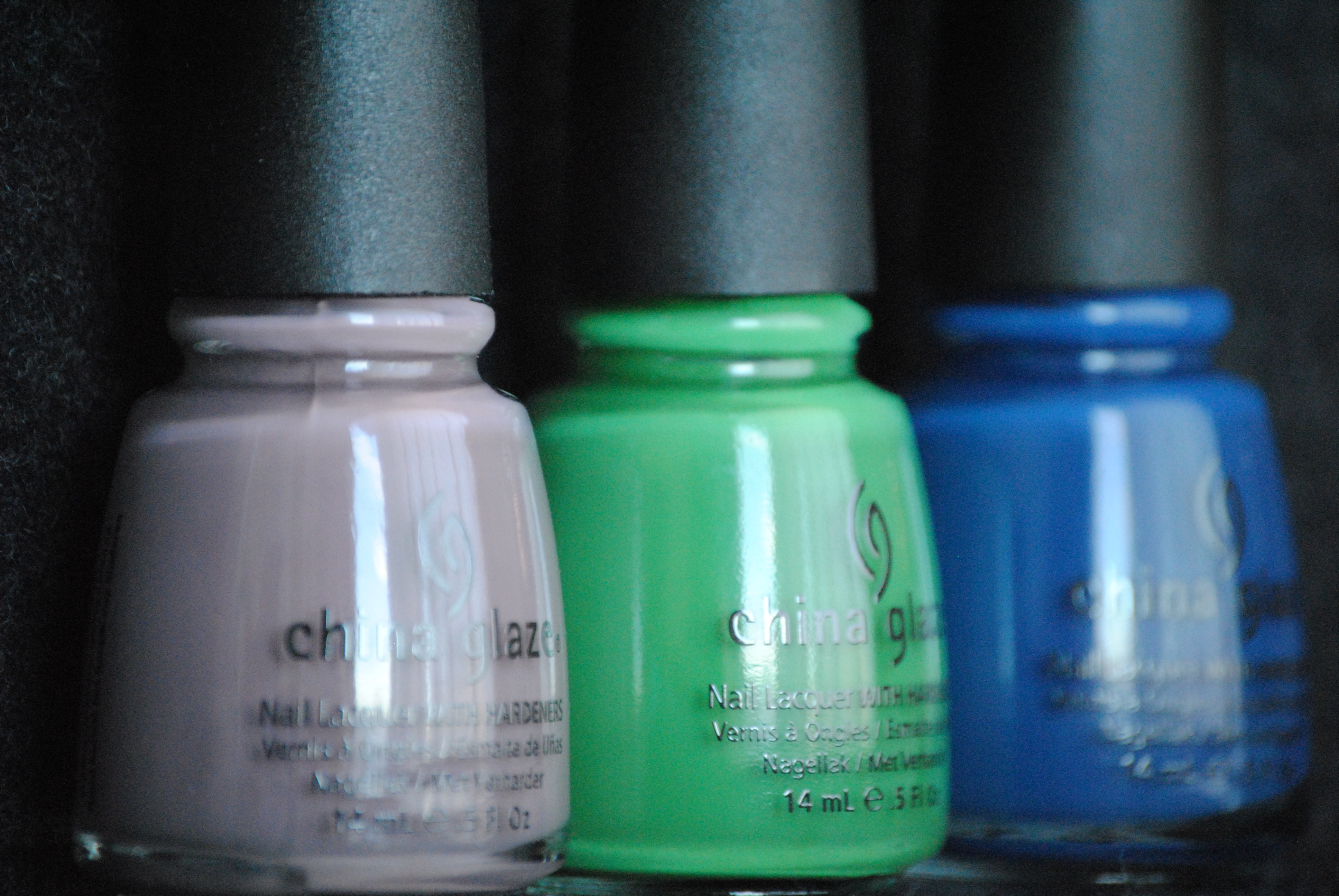
My last instalment of China Glaze’s ‘Anchors Away Collection’ is the three shades I refer to as the ‘darks’; while not classically dark hues, I refer more to the tonal base when compared to the rest of the collection, previously reviewed here and here. The formula is once again excellent and consistent with that of the rest, and the final glossy finish on these three was superb. The blue shade, ‘First Mate’, is the only one I had some issue with in the sense that there could be some minor staining, as with all blue pigmented shades, but a cotton pad well saturated with nail polish remover will easily solve that. All swatches are with Sèche Natural base coat and 2 coats of lacquer, no top coat.
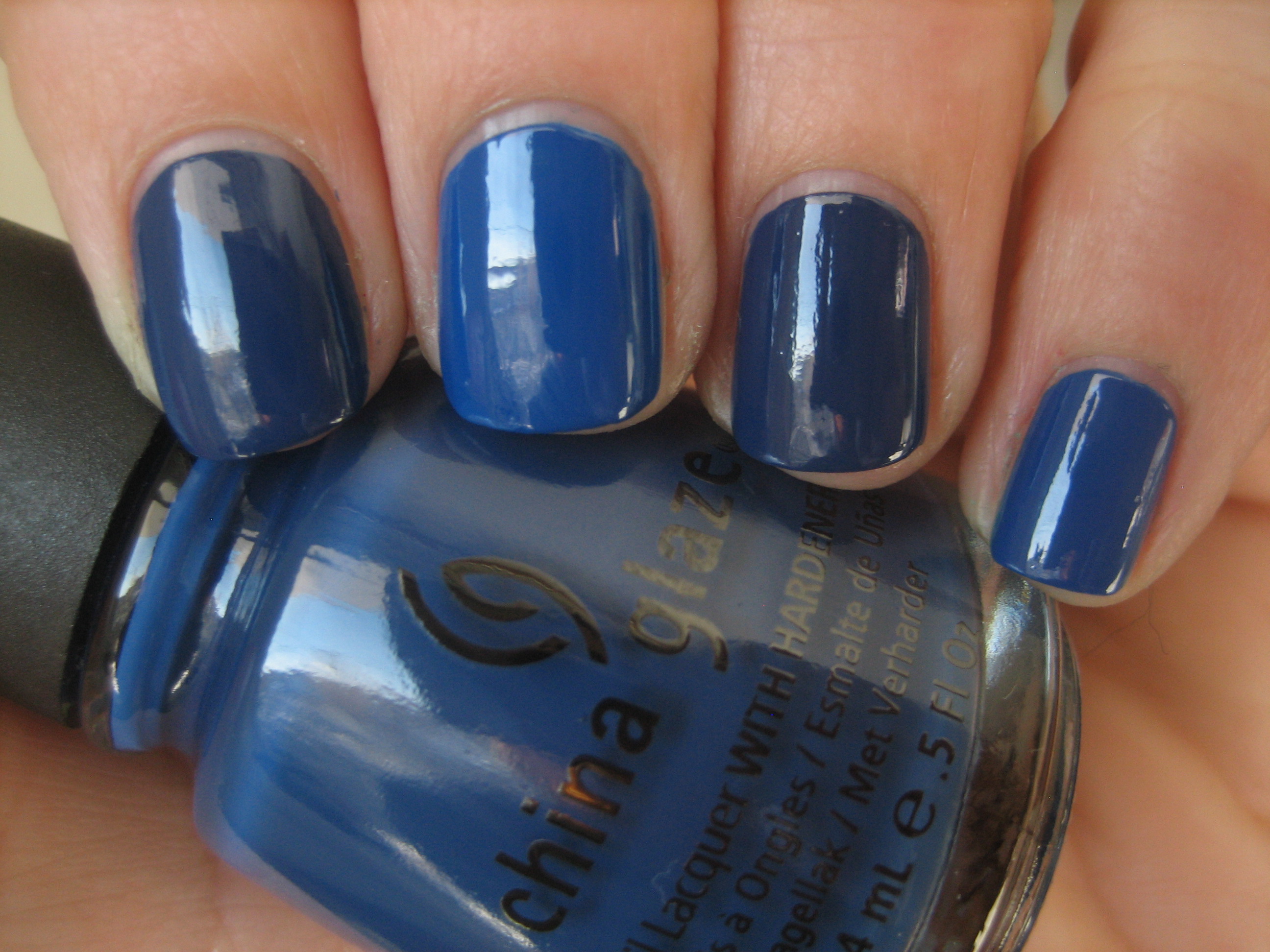
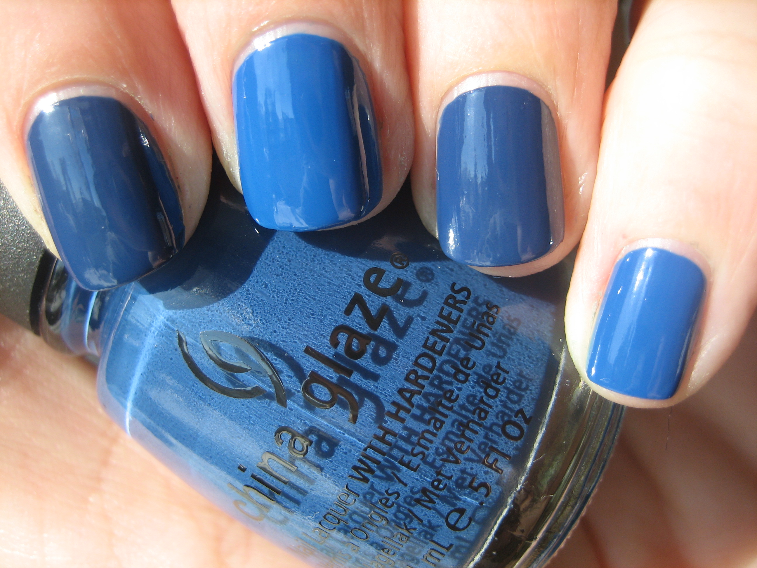
‘First Mate’ is a medium hued true blue shade. The colour is at once vibrant and dusty looking, but it will never appear as anything other than blue, even in the shade. Creamy and without a hint of shimmer, this is the first blue shade I’ve found that has neither green nor yellow in its base. The glossy finish is outstanding with this shade and the formula was completely self-leveling, leaving zero brush strokes behind.
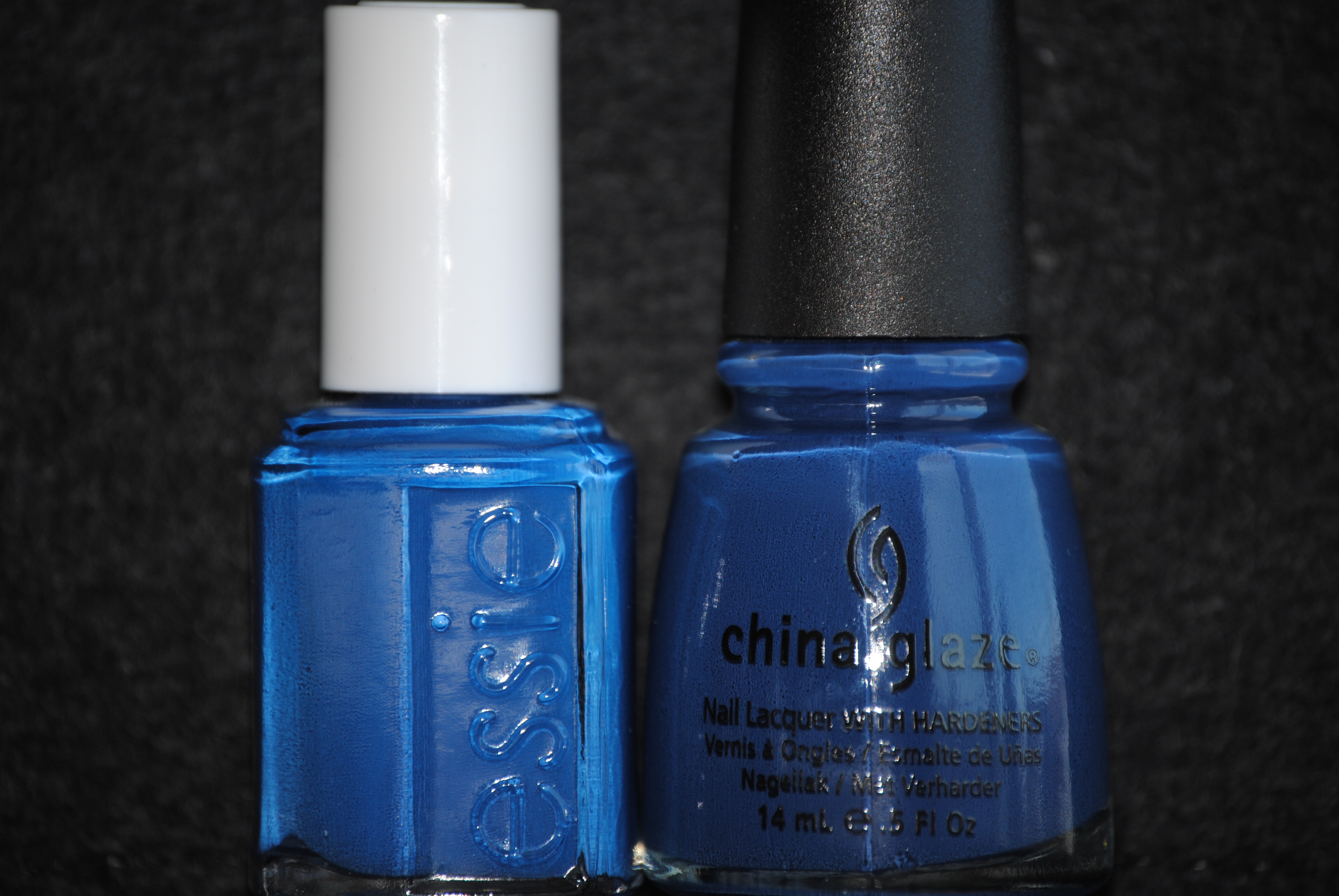
The closest colour I have in my collection to ‘First Mate’ is Essie’s ‘Mesmerize’ but you can clearly tell that while both are medium toned blue shades, that’s where the similarity ends. As you can see in the bottom photo taken in full sun, ‘Mesmerize’ is much brighter and somewhat lighter, and even the formula was thinner than that of ‘First Mate’. The glossy finish seems about the same and dry time was almost equal, however ‘First Mate’ is a shade that can easily move into the colder months as well, making it the more versatile of the two.
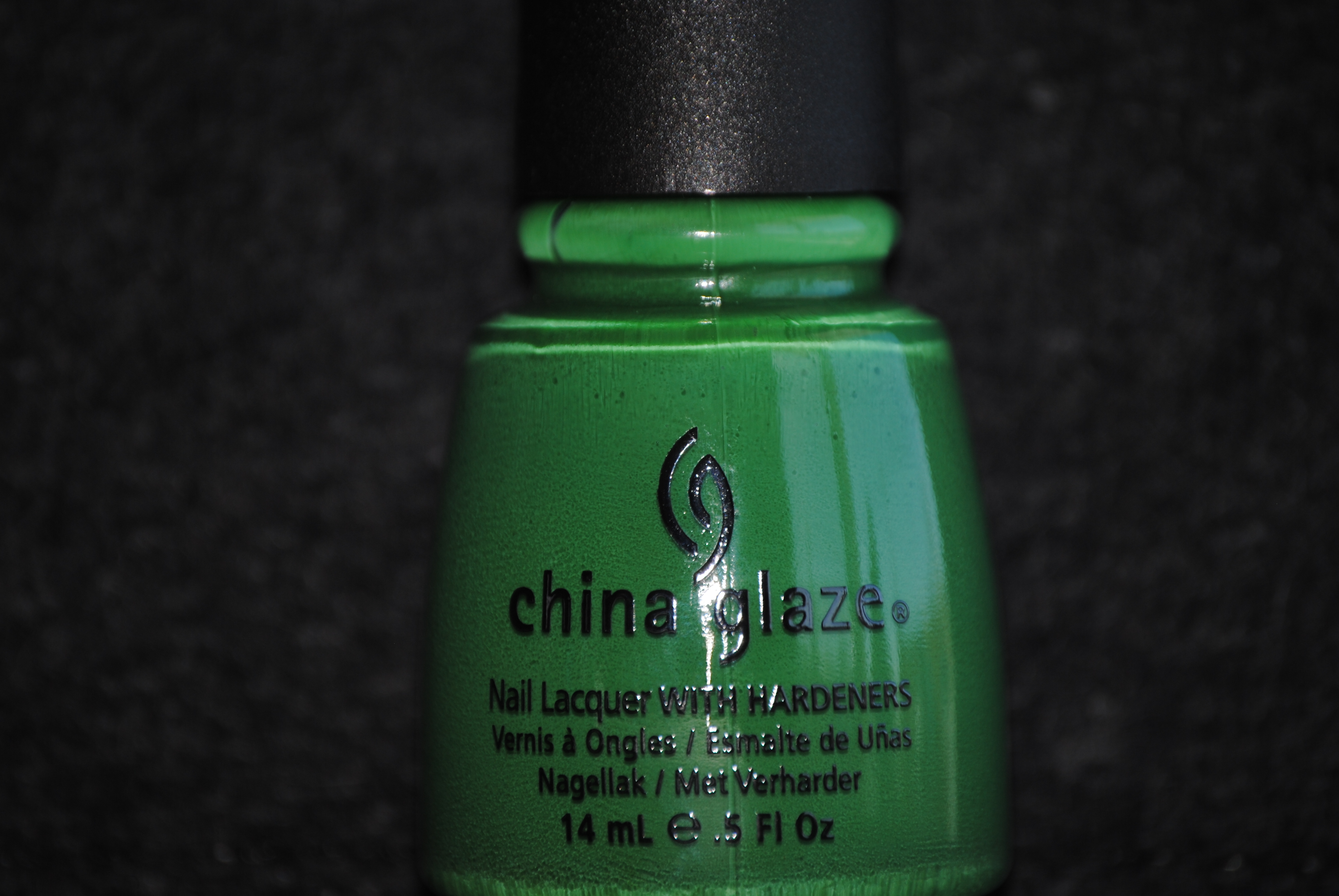
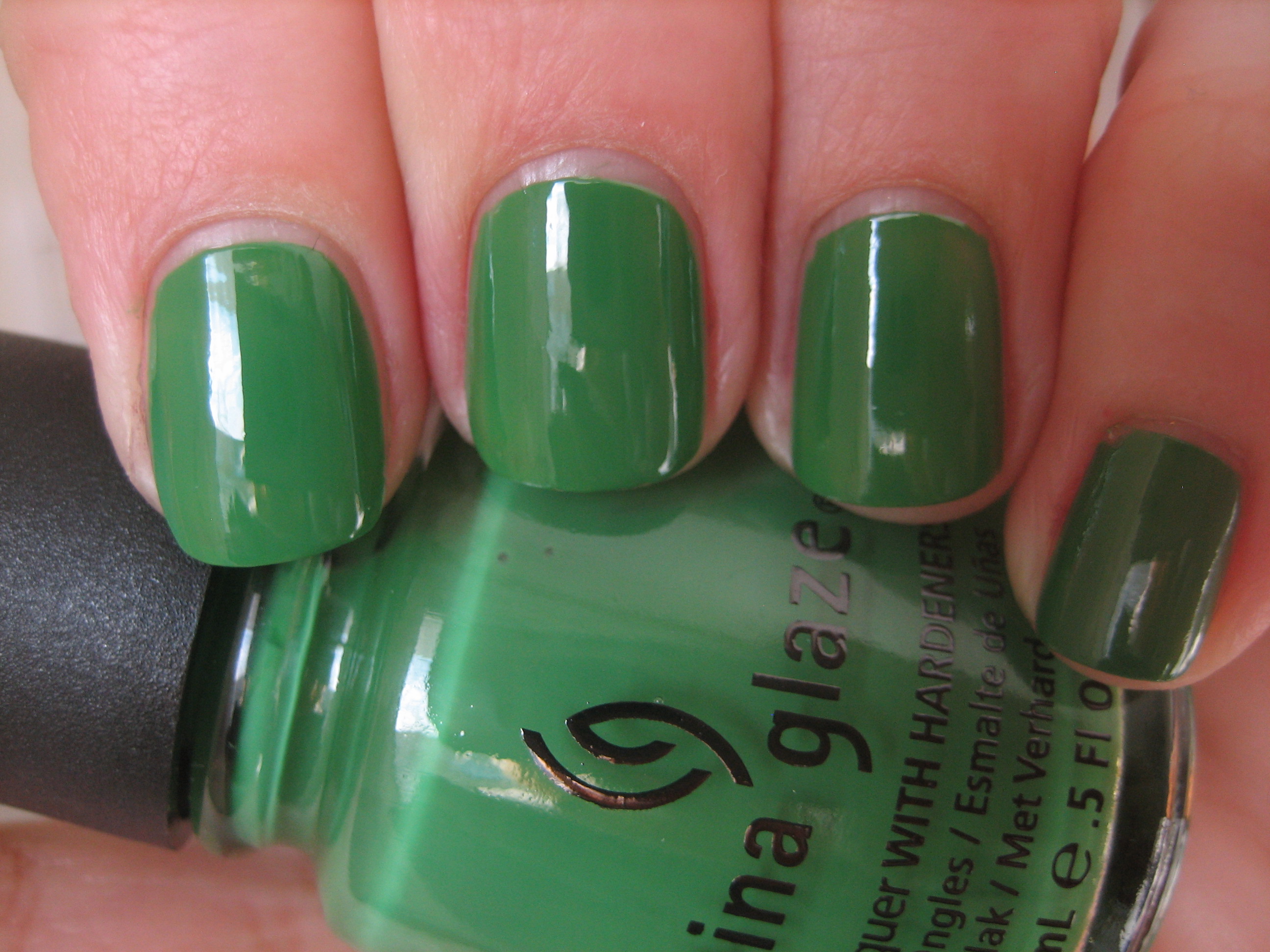
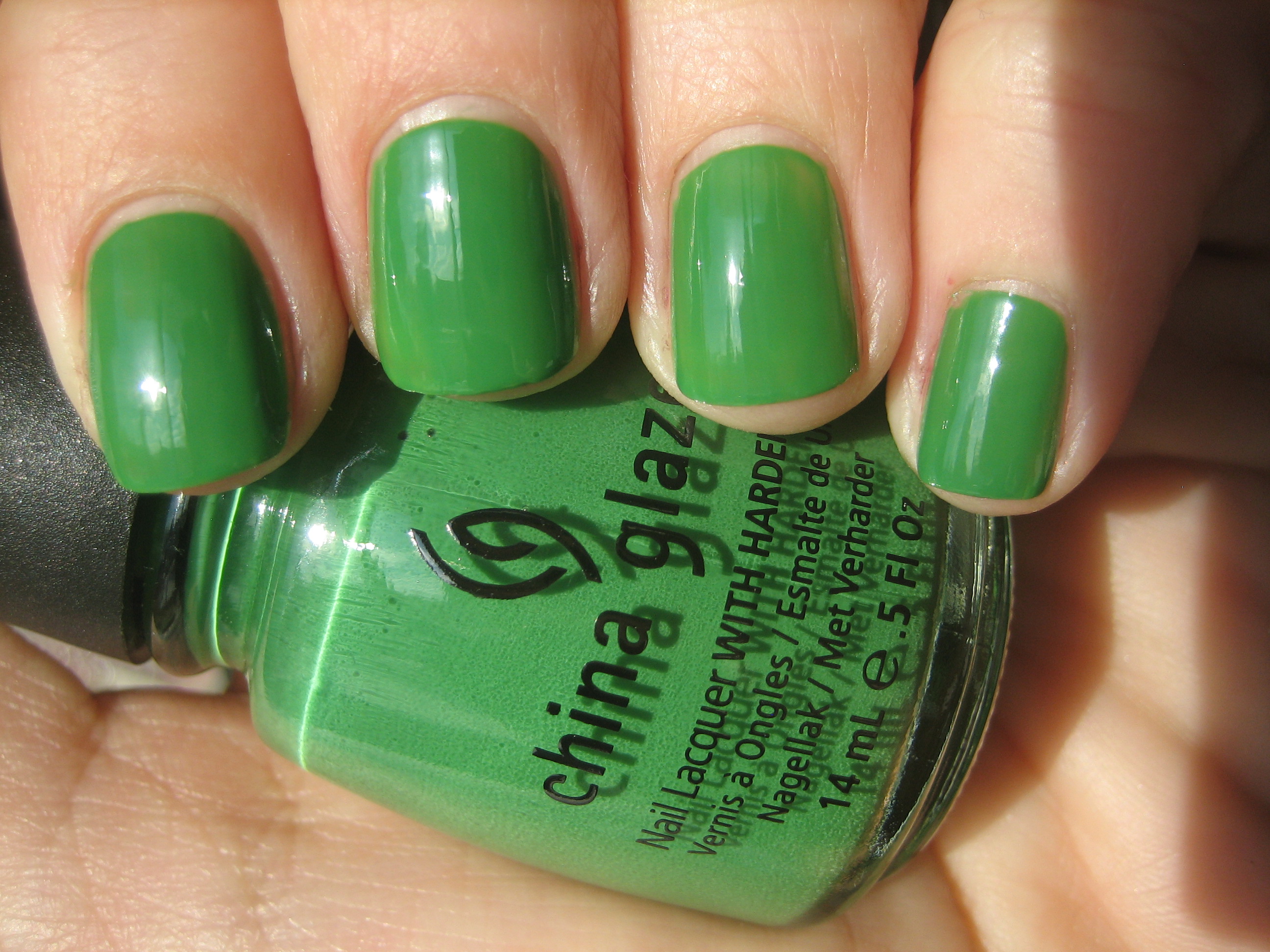
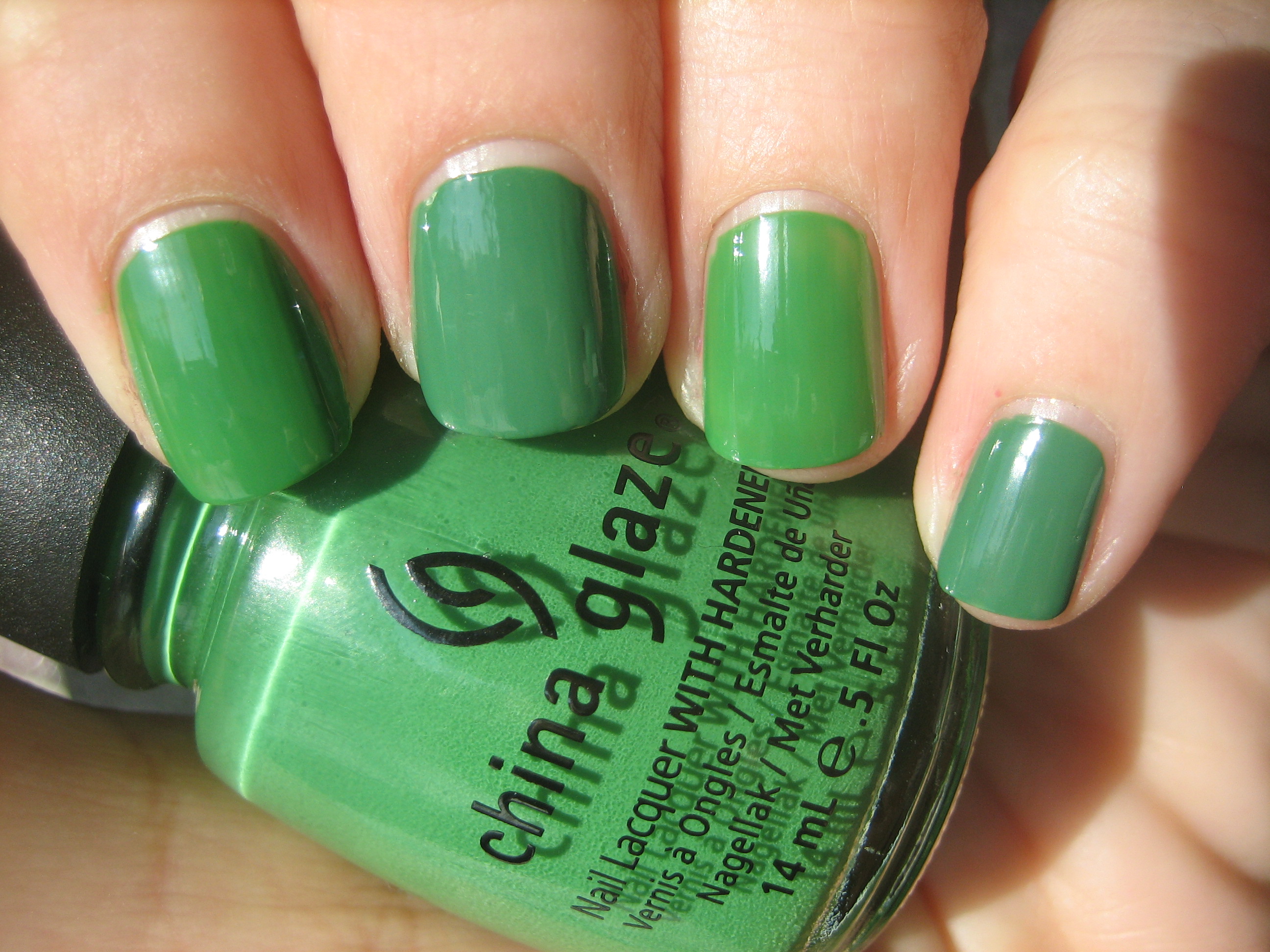
‘Starboard’ is the most vivid shade of the three I’m featuring here, being a bright grassy green creme. In shaded light (top photo) it becomes a touch more muted, but take this beauty out into full sun and…WHAM! It takes on an almost Crayola tone. Even without a top coat, I love how glossy this one is and while richly pigmented, I had no issues in clean up with this colour whatsoever. Such a fun shade…..very Kermit the Frog!!
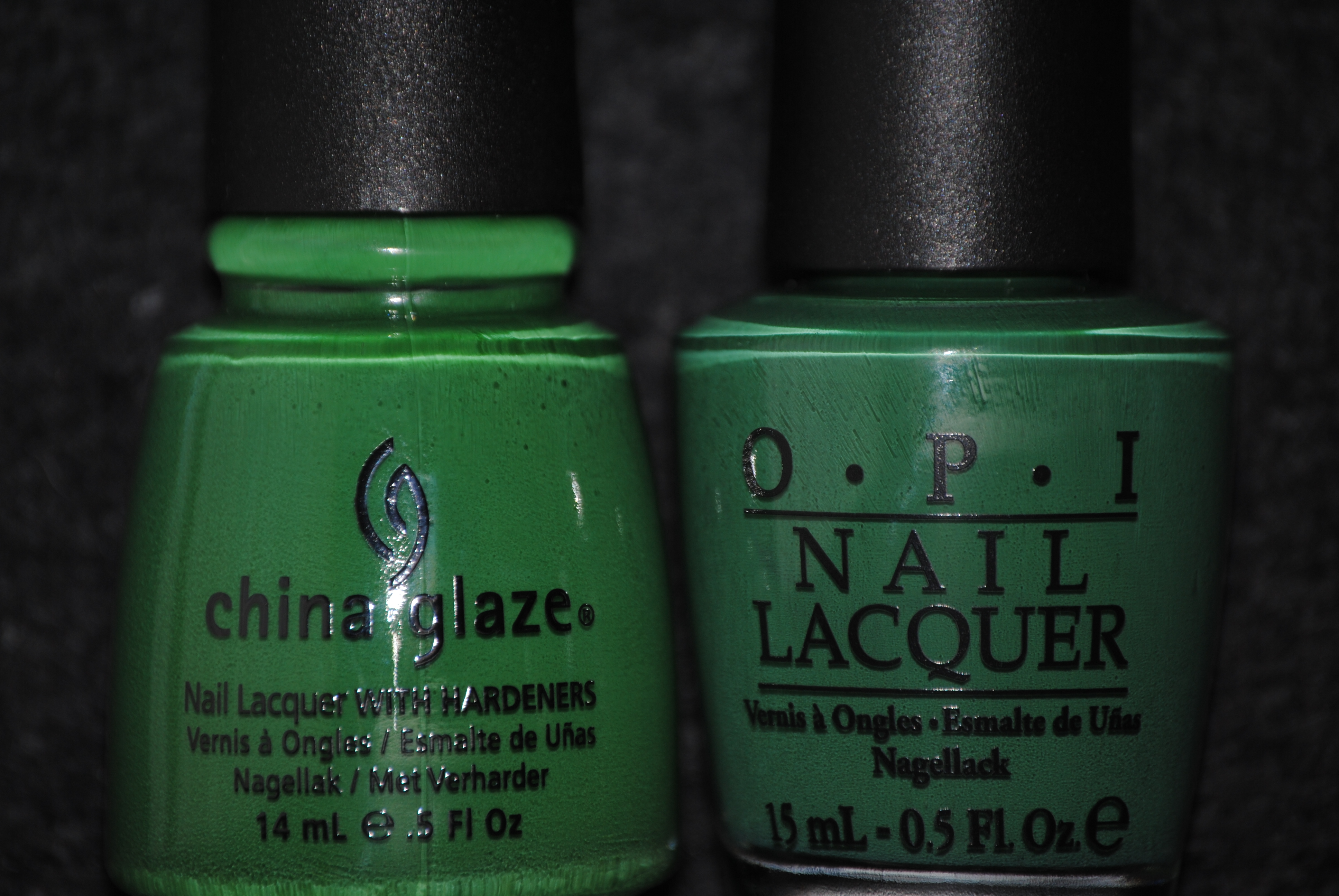
I initially thought that ‘Starboard’ was a duplicate for OPI’s ‘Don’t Mess With OPI’ (reviewed here), but once swatched, you can see how much more vibrant a green ‘Starboard’ is next to the OPI, which has a dustier look to it overall, even in full sun. The formula on the OPI was somewhat thicker as well and the other major difference was the brush, with China Glaze brushes being thinner and slightly more flexible, making them easier to reach you nail’s edge.
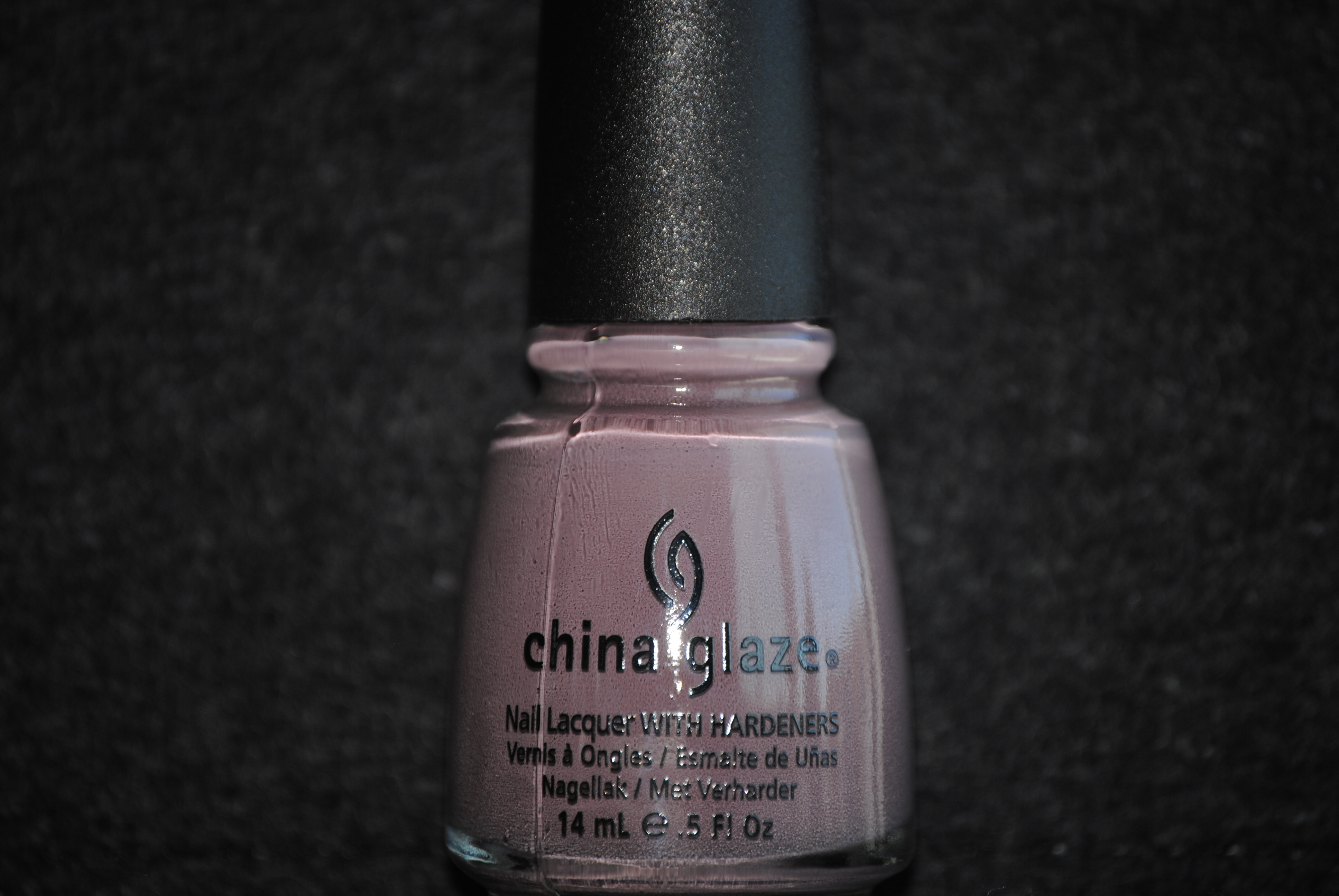
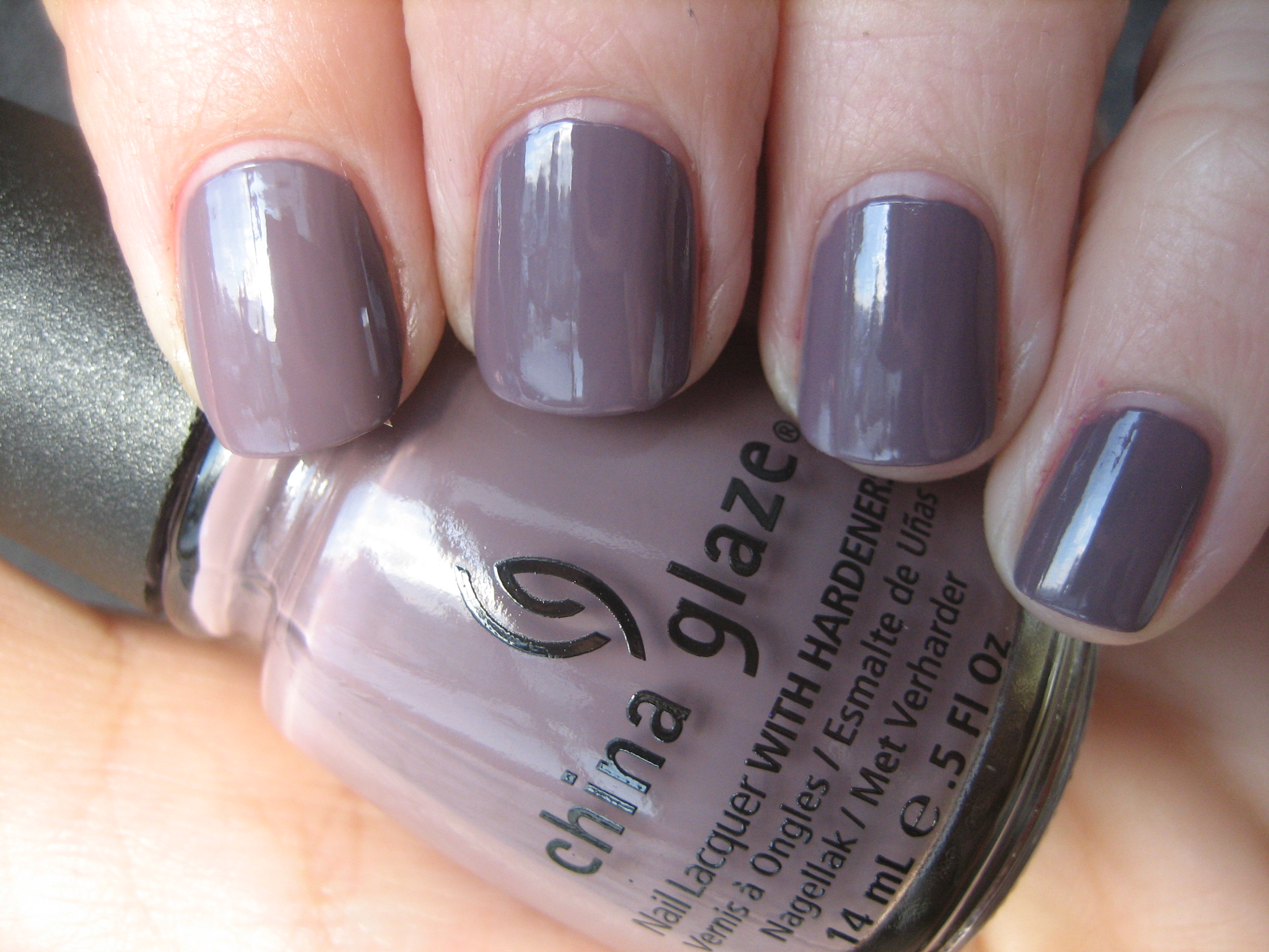
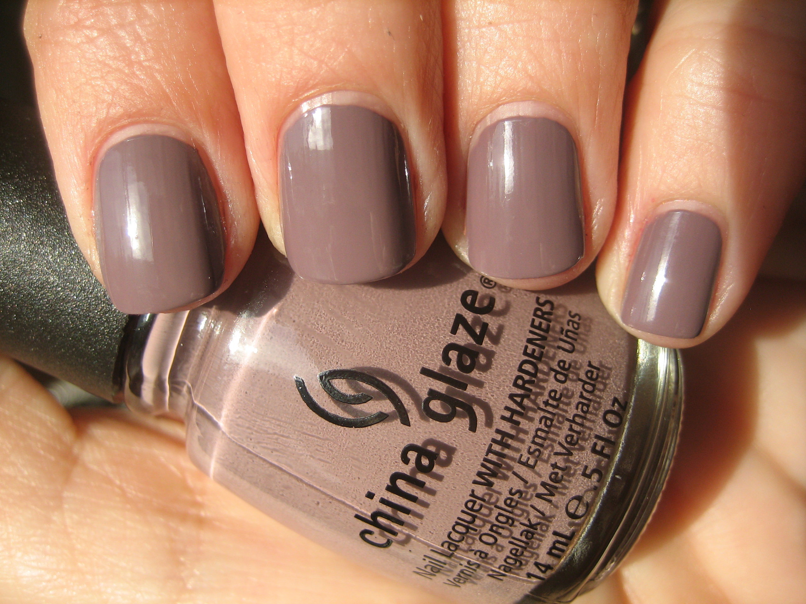
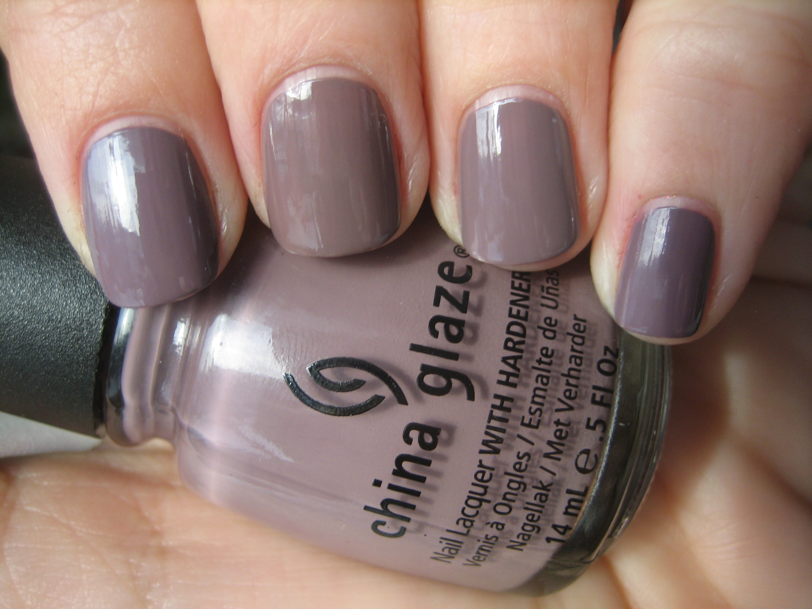
‘Below Deck’ is probably the trendiest shade out of the three and the most sophisticated looking. I love how it changes depending on the light, seeming either a hazy and dusky mauve (top photo), or more of a deeper beige/taupe (bottom photo). I have heard that this is supposed to be a resurrected shade for another China Glaze hue, ‘Channelesque’, however not having that polish nor having seen it, I cannot comment. Most companies have recently put out a shade similar to this, but once again, the China Glaze formula is stellar and I find that is not only a highly flattering colour, but one you won’t get tired of wearing.
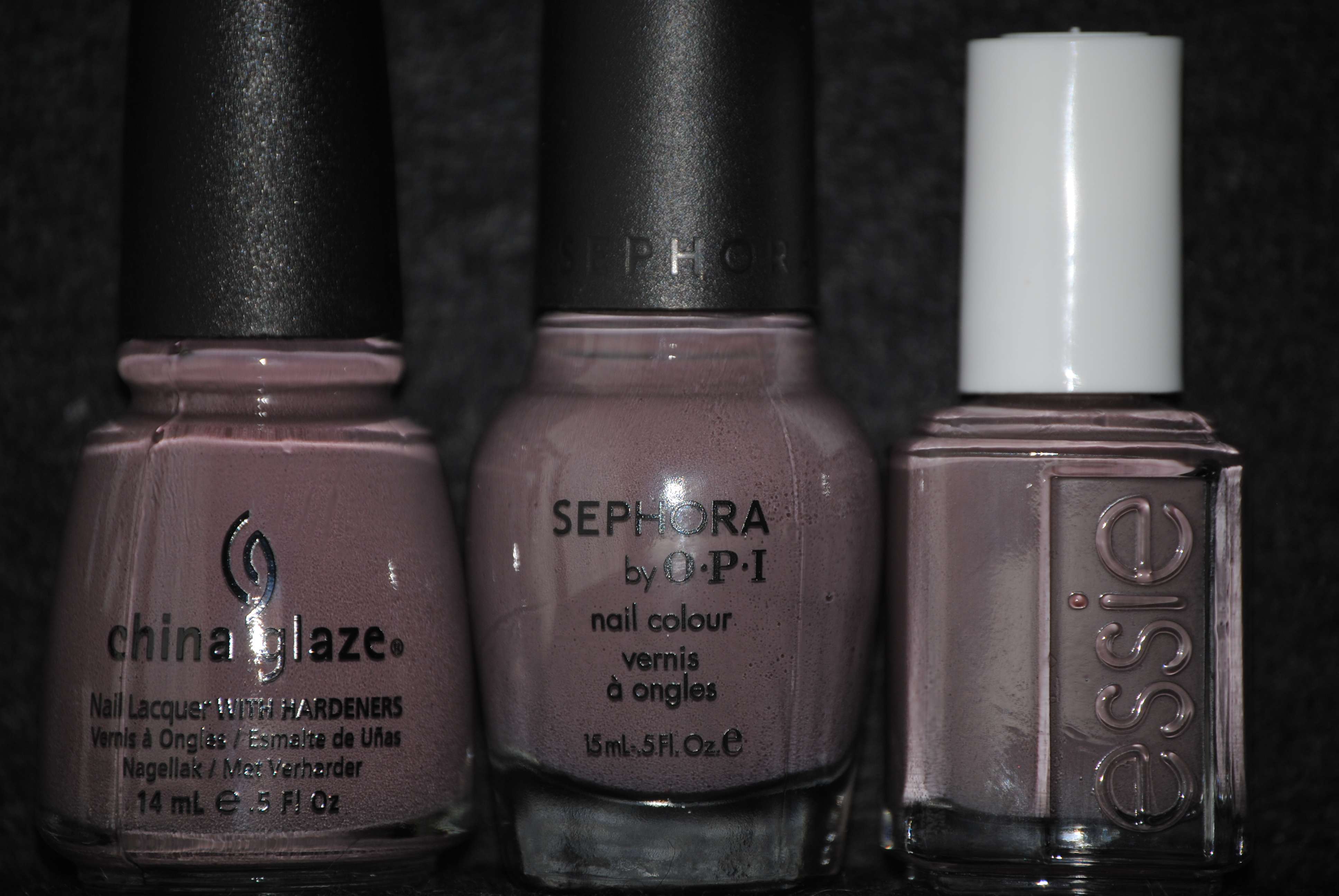
I found several close matches to ‘Below Deck’ in my stash, and the two that were the most fitting were the wildly popular Sephora by OPI’s ‘Metro Chic’ and Essie’s hot seller ‘Merino Cool’ from their Fall 2010 collection (reviewed here). In the swatch photo above, index & pinkie fingers are ‘Below Deck’, midde finger is ‘Metro Chic’ with ring finger sporting ‘Merino Cool’. You can see how ‘Below Deck’ falls somewhere between the two, but has definitely more of a mauve cast to it. ‘Merino Cool’ had the thinnest formula of the three and while they are all close, I still prefer the more purple base of ‘Below Deck’.
Final thoughts: While a green shade like ‘Starboard’ is not for the faint of heart, it is still a wonderfully bright shade without veering on the neon. ‘First Mate’ lends an air of coolness, much like a swift nautical breeze, and can easily transition from a summer to a more cooler temped hue, and finally ‘Below Deck’ is a hot trendy shade which can cut it as a work-place friendly hue, or leading edge modern. The only polish which I have not reviewed from this entire collection is ‘Sea Spray’, but that will be forthcoming quite soon. I find the entire ‘Anchors Away Collection’ a total win, not only for the shades but for the quality formula as well, and I highly recommend you get your hands on at least one shade…or all of them!
*Disclaimer: product samples provided by the company/PR for my unbiased consideration
China Glaze ‘Anchors Away Collection’ – Part 2 (swatches & review)
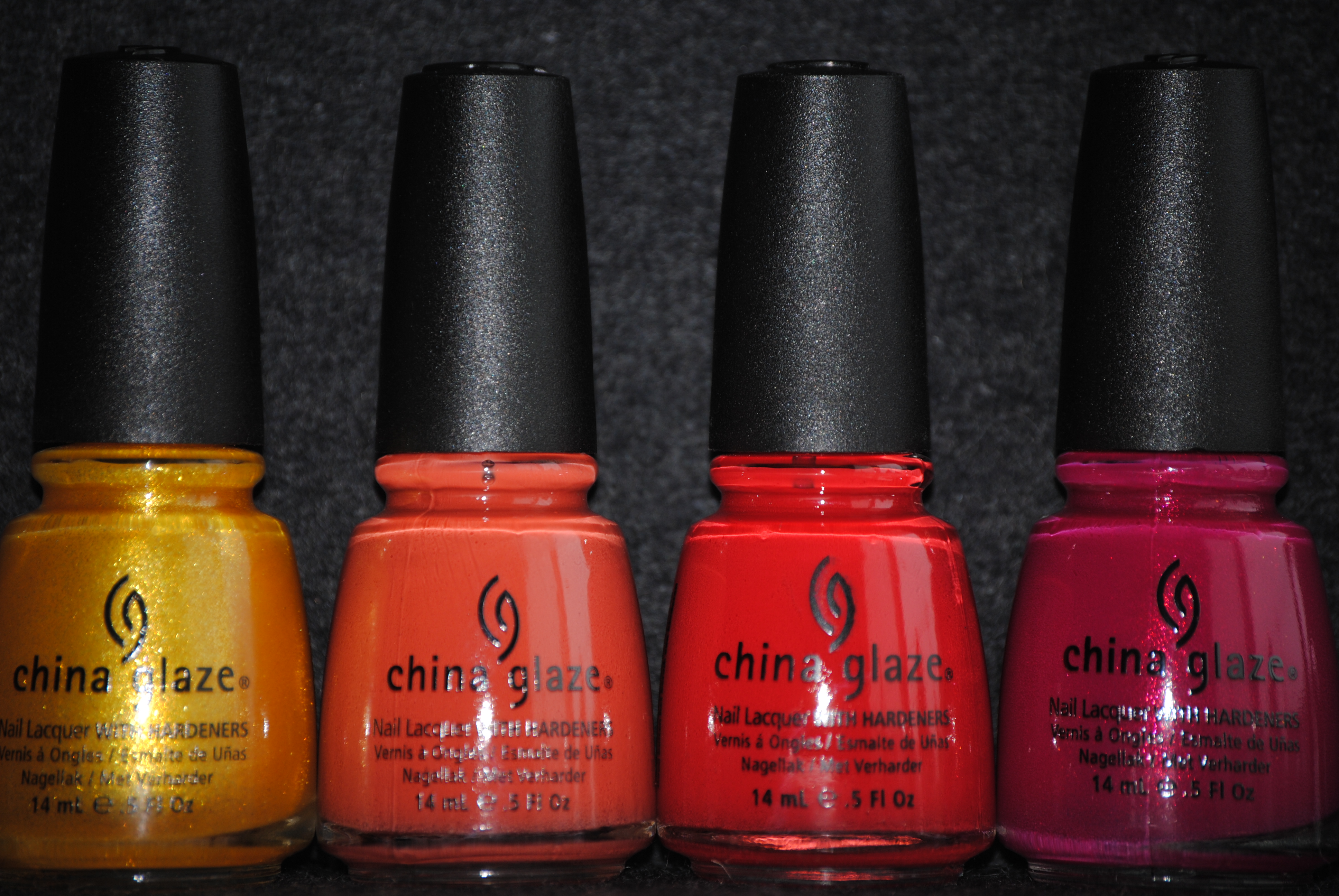
Part 2 of my review on China Glaze’s ‘Anchors Away Collection’ consists of four shades I refer to as the ‘brights’, for obvious reasons! As with part 1 reviewed here, I cannot help but be completely impressed with the formula on all these polishes; easy flowing, self-leveling and quick drying…what’s not to love?! All swatches are with Sèche Natural base coat, and 3 coats of lacquer, no top coat.
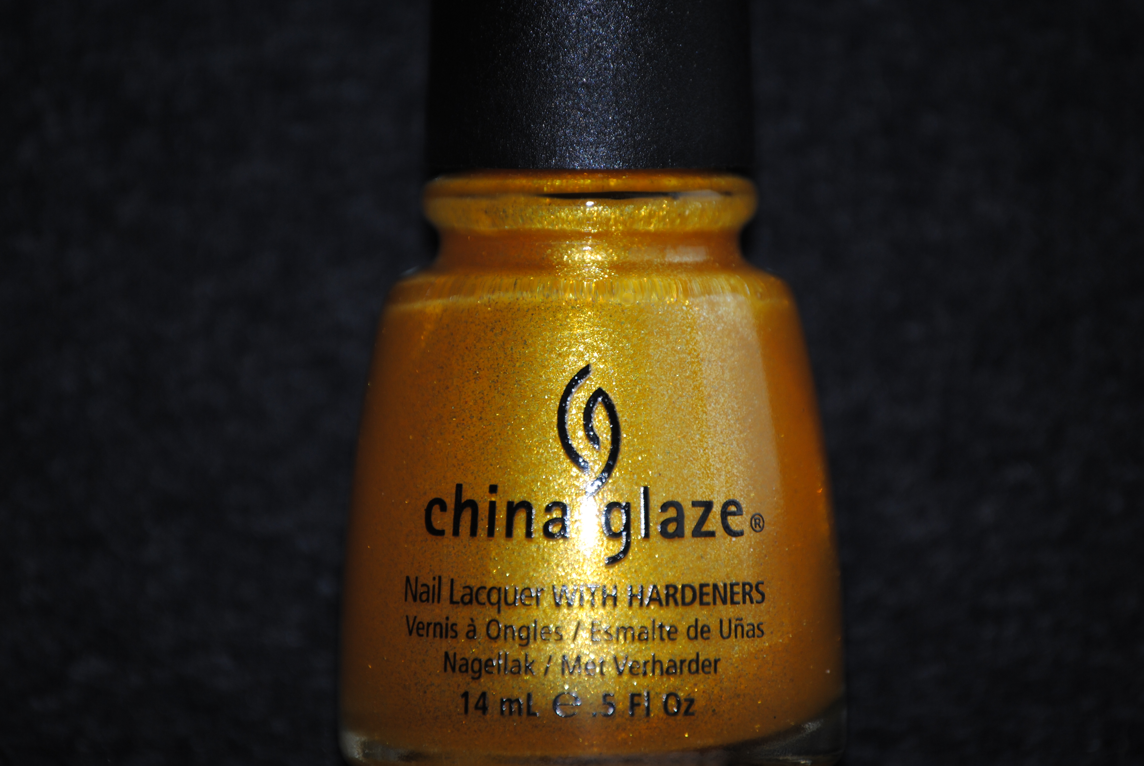
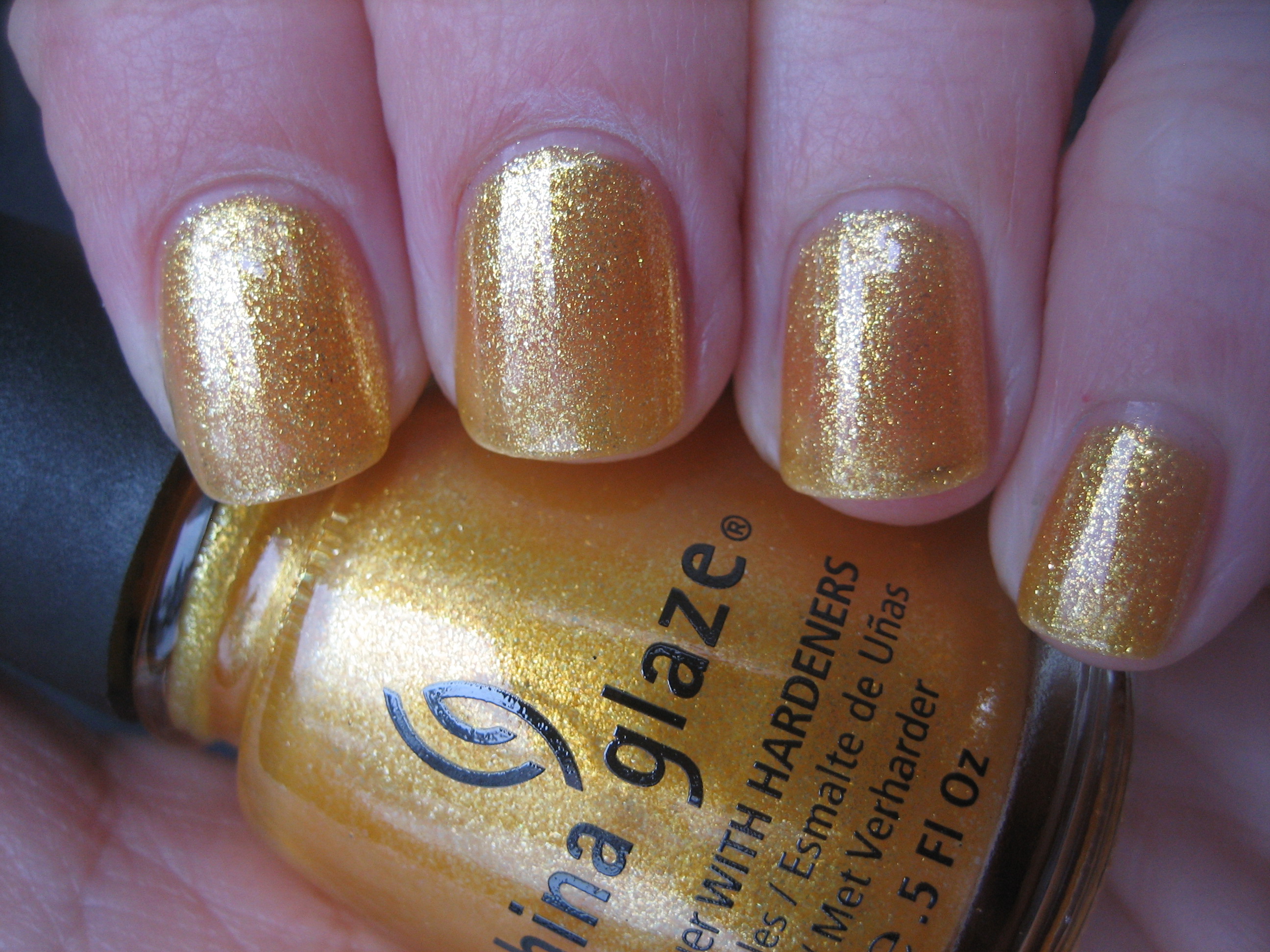
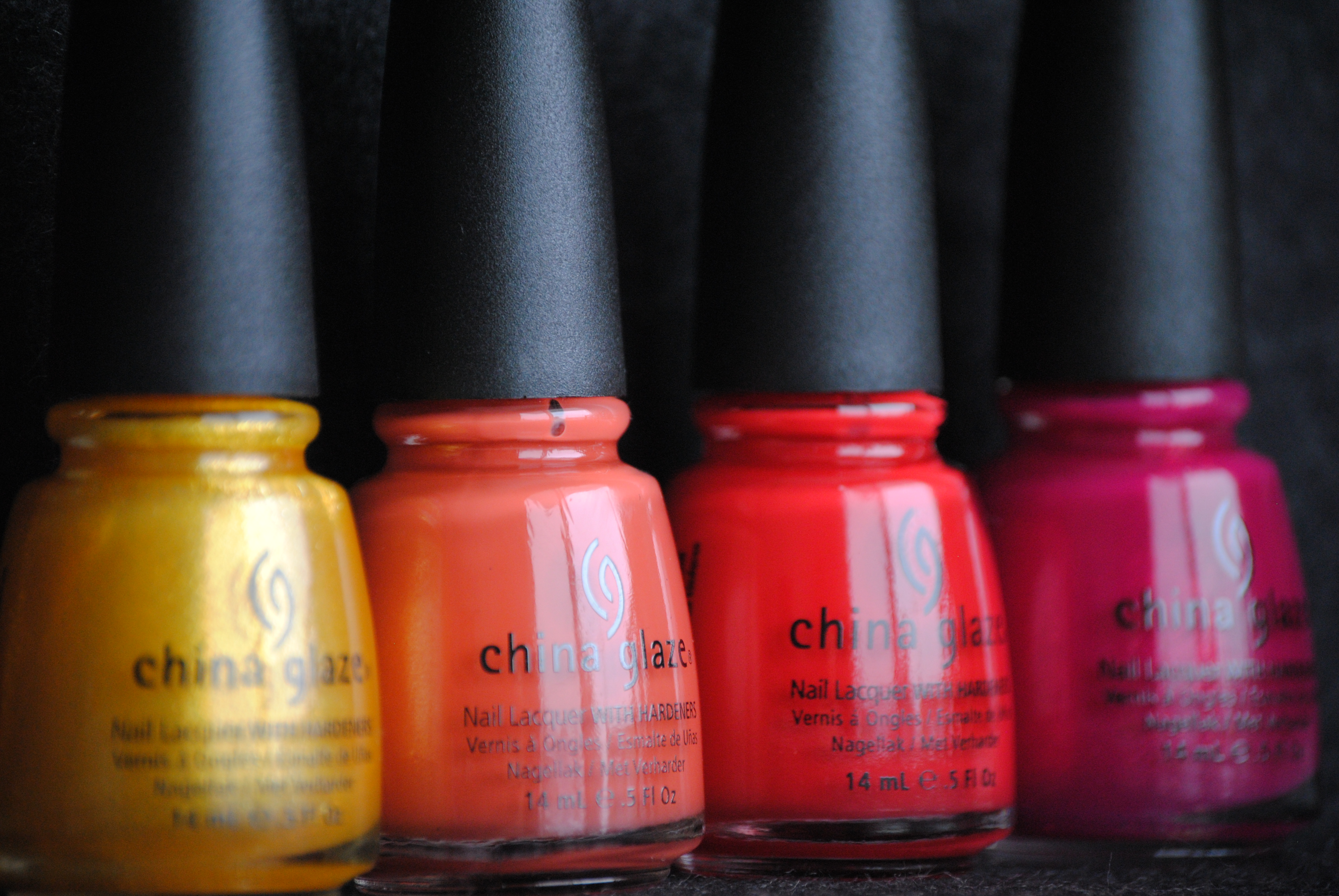
‘Lighthouse’ is a vivid, sunny golden-yellow sheer shimmery shade (say that fast 5 times!), loaded with tiny silver & gold glass flecks. While it did not reach full opacity even by the 3rd coat, it still gave more than decent coverage and all the shimmer made up for any sheerness. This looks more of a warm toned gold in the bottle, but I found that the minute silver flecks in its base means it can lean towards the cool side as well, depending on the light.
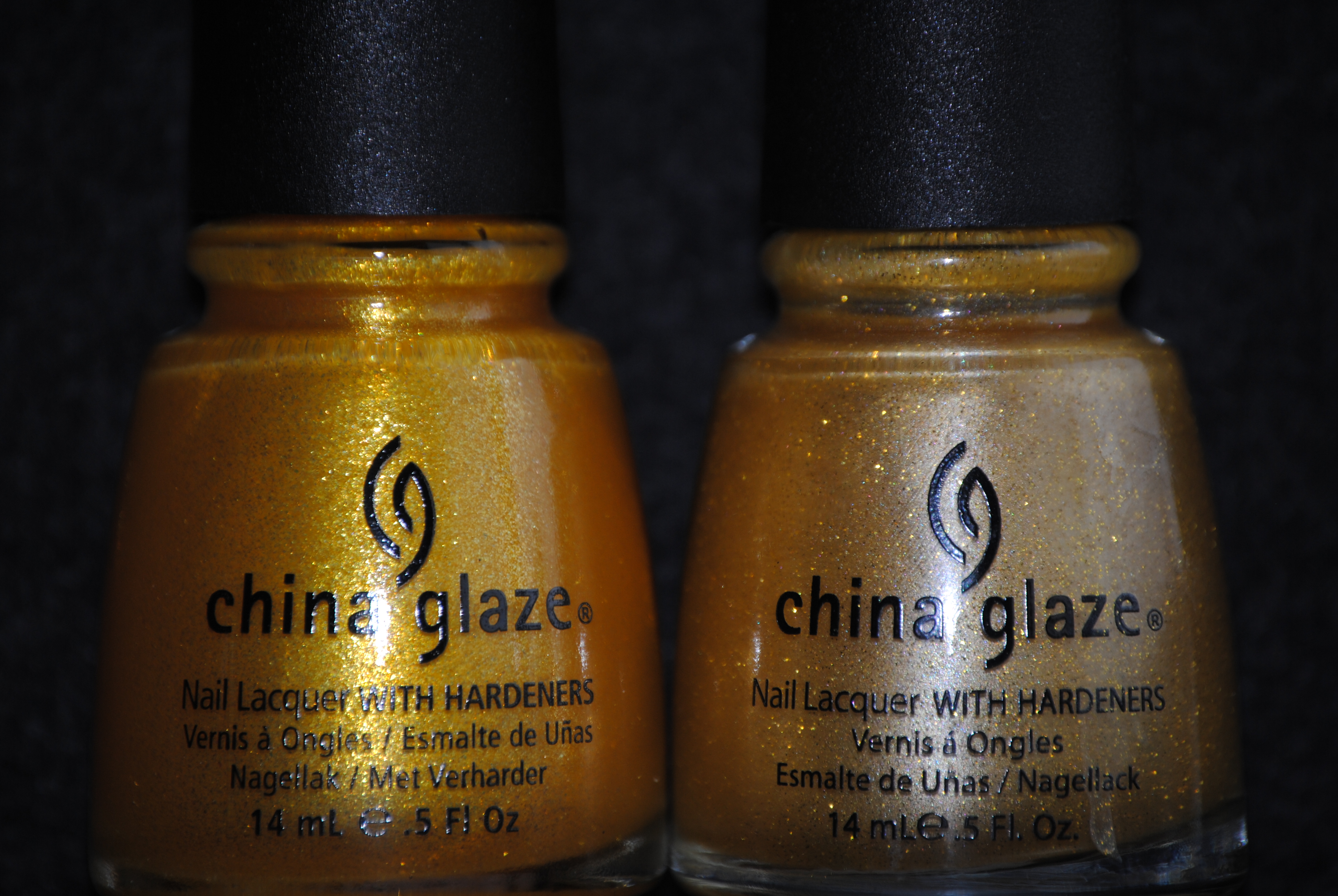
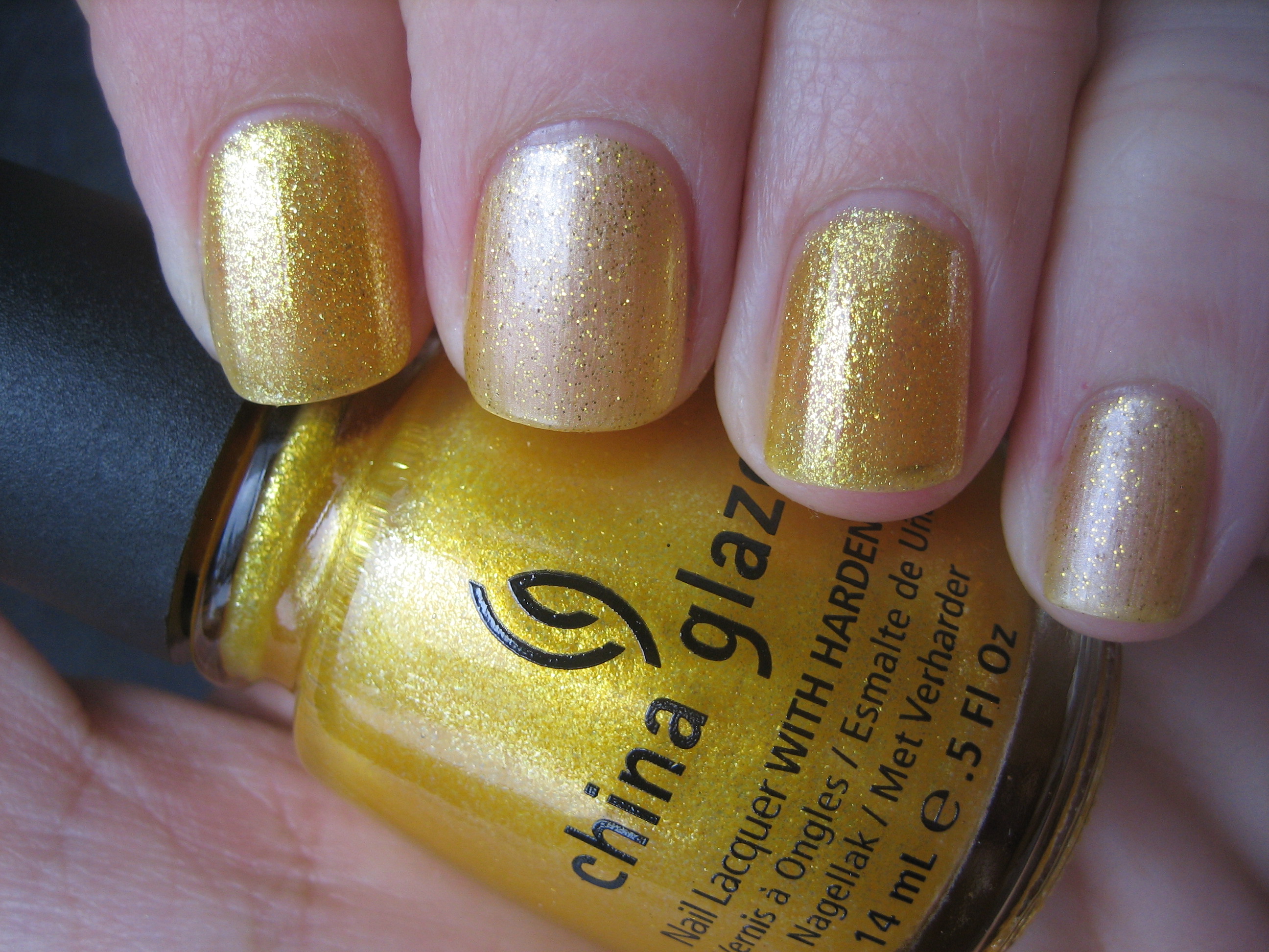
At first glance, I thought that ‘Lighthouse & Cowardly Lyin’ might be almost identical, but you can clearly see how much more of a pale lemon yellow Cowardly Lyin’ is beside the brighter gold of Lighthouse. Cowardly Lyin’ is also significantly thinner in application, with much sparser and slightly larger two-toned golden glitter throughout, lending it an almost spotted look next to Lighthouse.
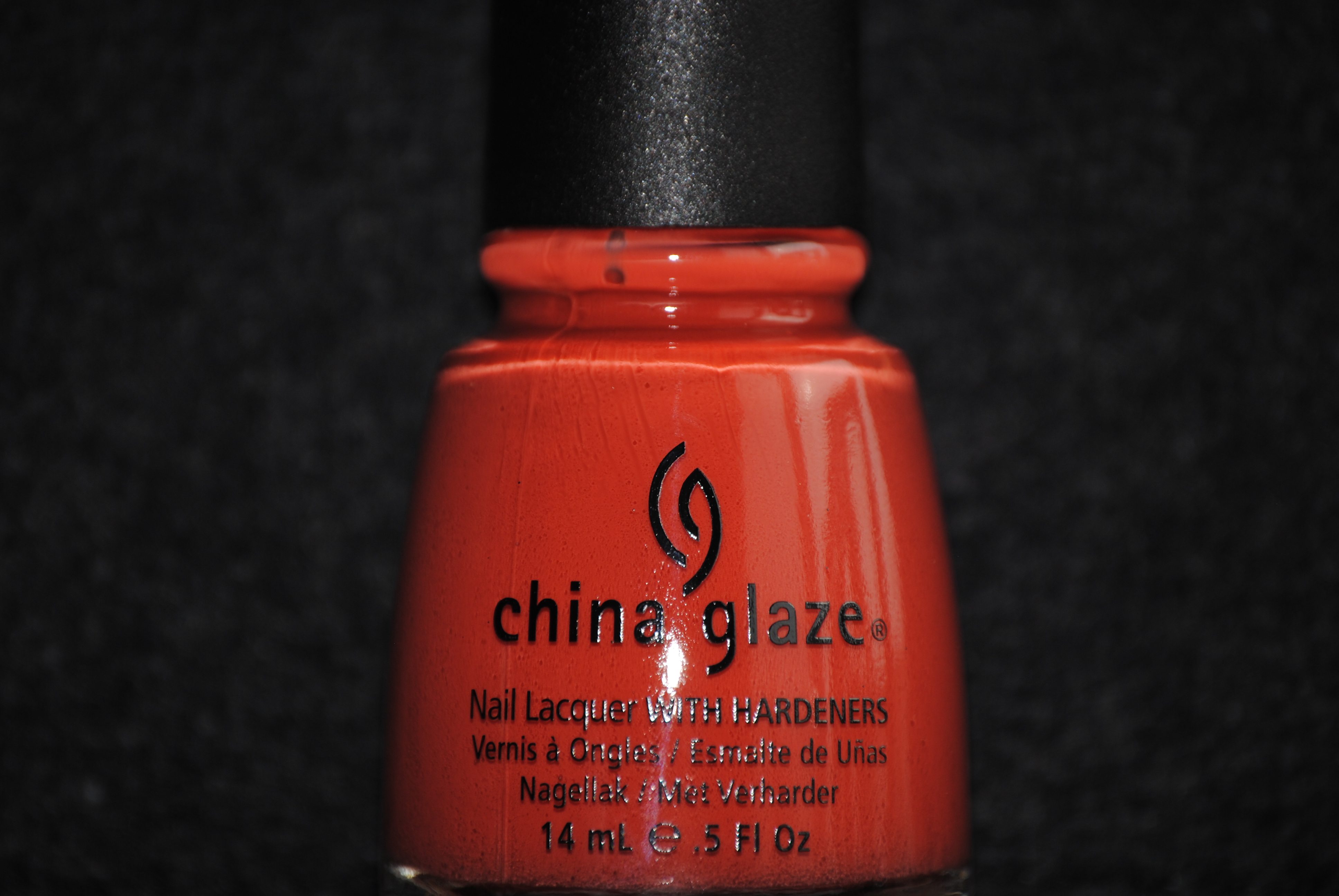
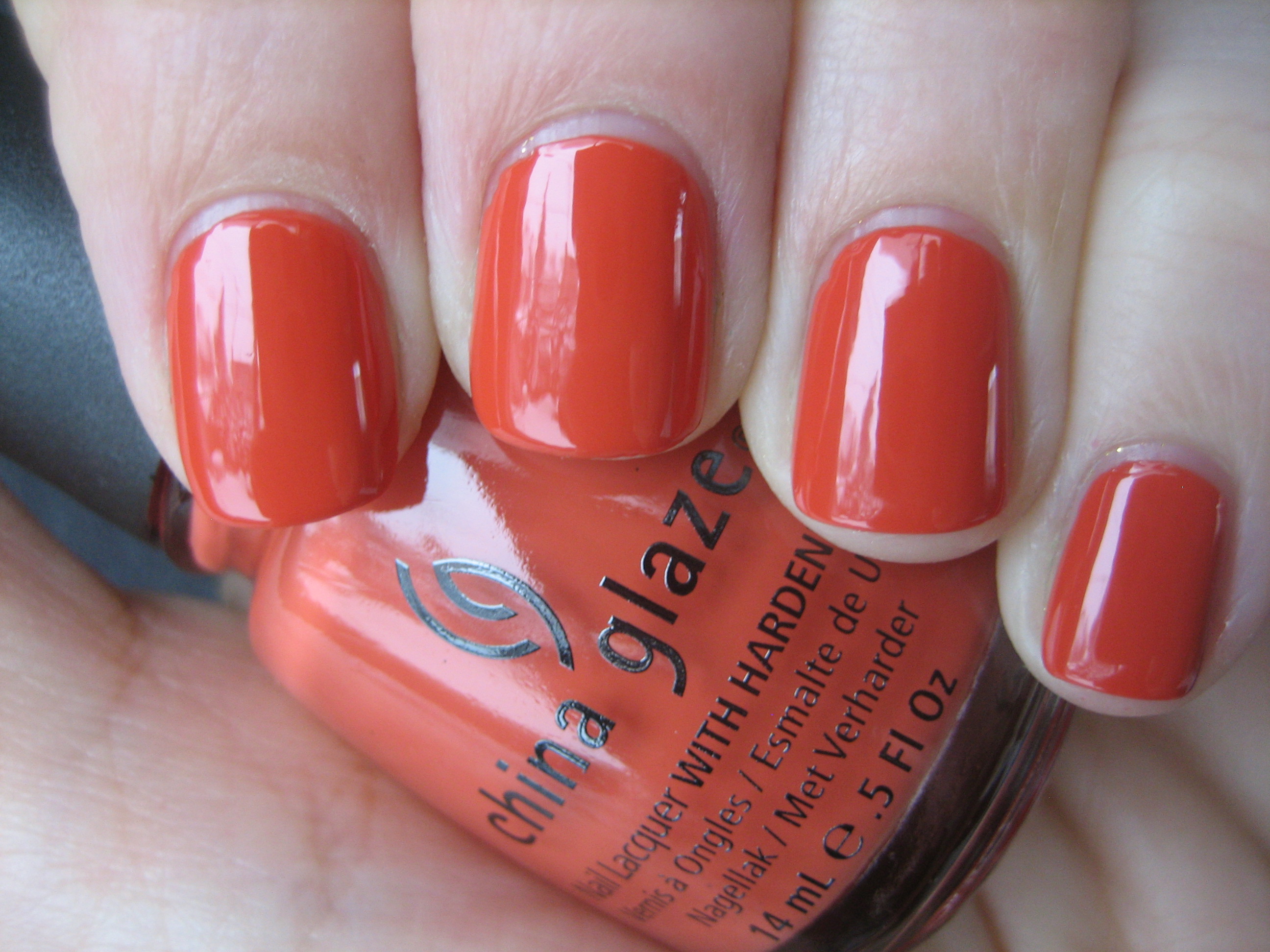
‘Life Preserver’ is a wonderfully rich-looking melon-coral creme. This shade completely reminds me of the faded red of a lifeguard’s buoy, making the name very fitting indeed! While anything orange based can be hard to pull off, the weathered look of this shade make it wearable by all skin tones and will be an amazing summer pedi look.
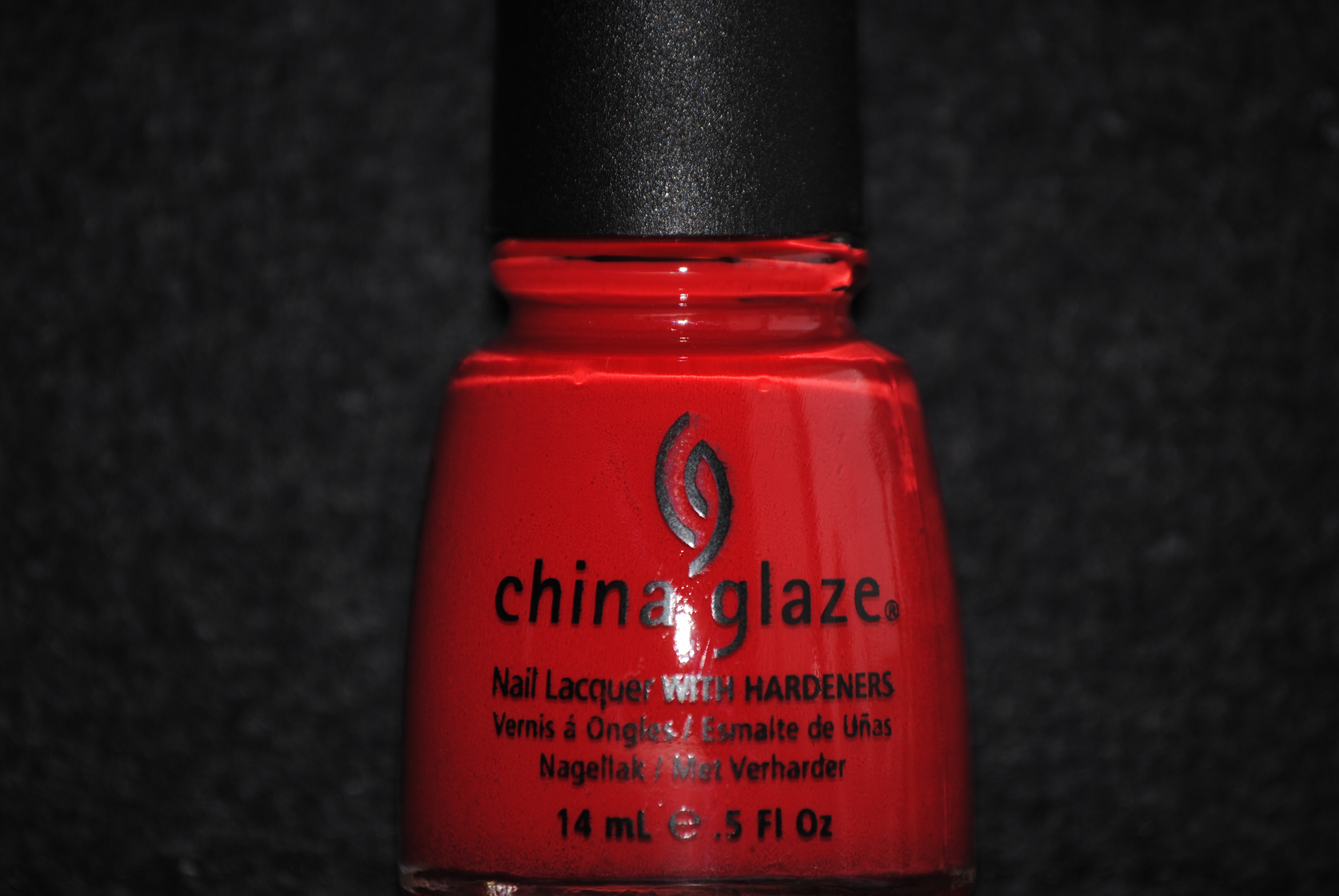
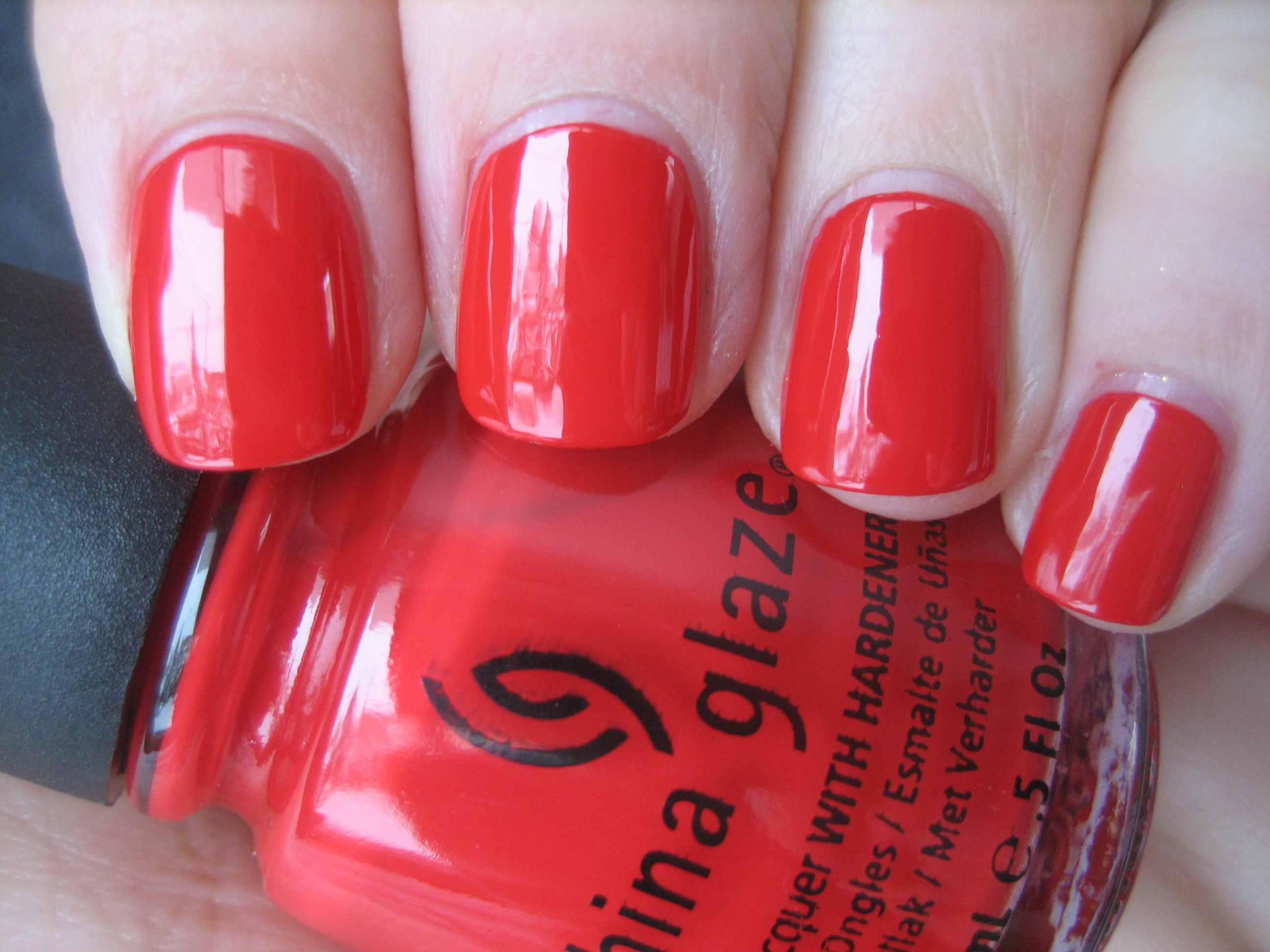
‘Hey Sailor’ had me stumped; at times it seemed like a blue-based red, at others more orangey. I decided that it must be a bit of both, which in my opinion makes this one of the more versatile reds I’ve seen, easily wearable by both cool & warm toned types. While a bright shade, it still seems to bear a slightly dusty look to it which means it will never seem either overpowering or too garish. As with all red lacquers, clean up can be a touch messy, but this wasn’t that difficult to remove.
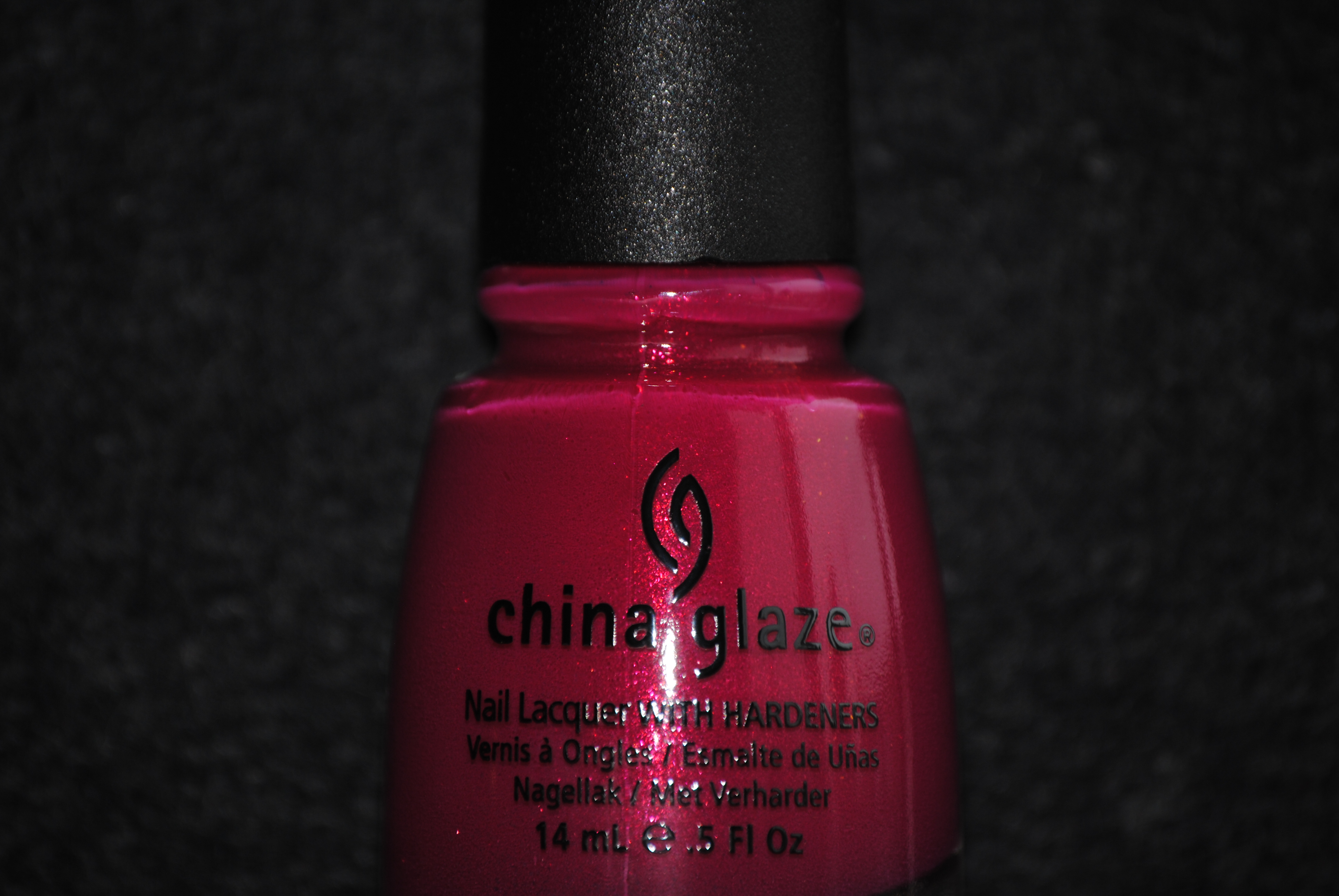
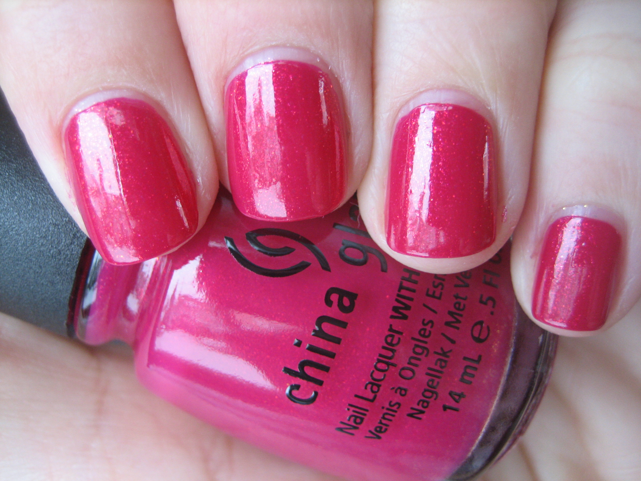
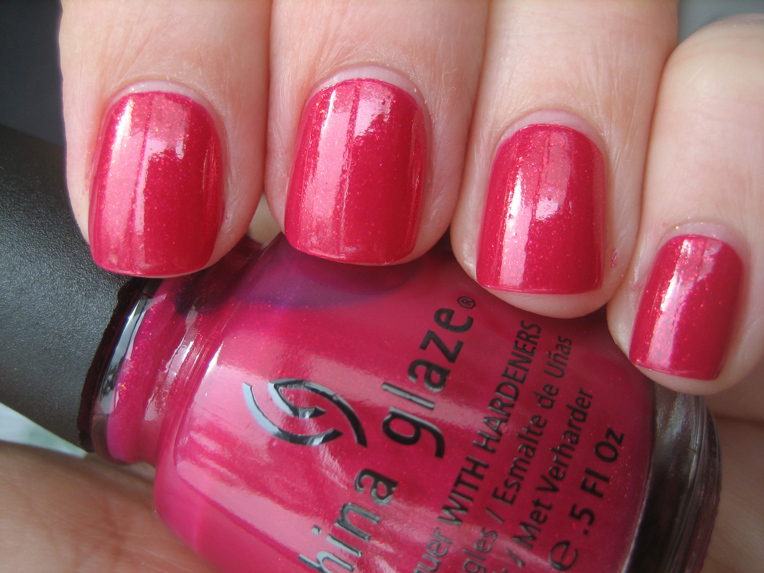
‘Ahoy!’ is the pièce de résistance of the 4 shades here! This is unique in my collection of shades, being a raspberry creme polish with an inner fire. The almost orangey looking inner glass flecks, seems to be suspended in the colour, giving this that ‘lit-from-within’ look that adds a whole new level of depth. In the top photo taken in natural light, you can see how cool toned it looks, when compared to the full sun of the bottom photo. I absolutely love how ‘happy’ this shade is and I could not stop staring at its swirling depths!
Final thoughts: The four shades here are all classic summery hues and will work beautifully as either manicure or pedicure shades. I love how this collection mixes not only bright shades with neutrals, and even some darker ones thrown in, but how varied the finishes are, making for an eclectically interesting range. Once again, I am thrilled with the amazing formula on all I’ve tried so far, and the creme shades in particular leave an incredibly glossy finish.
*Disclaimer: product samples were provided by the company/PR for my unbiased consideration
China Glaze ‘Anchors Away Collection’ – Part 1 (swatches & review)
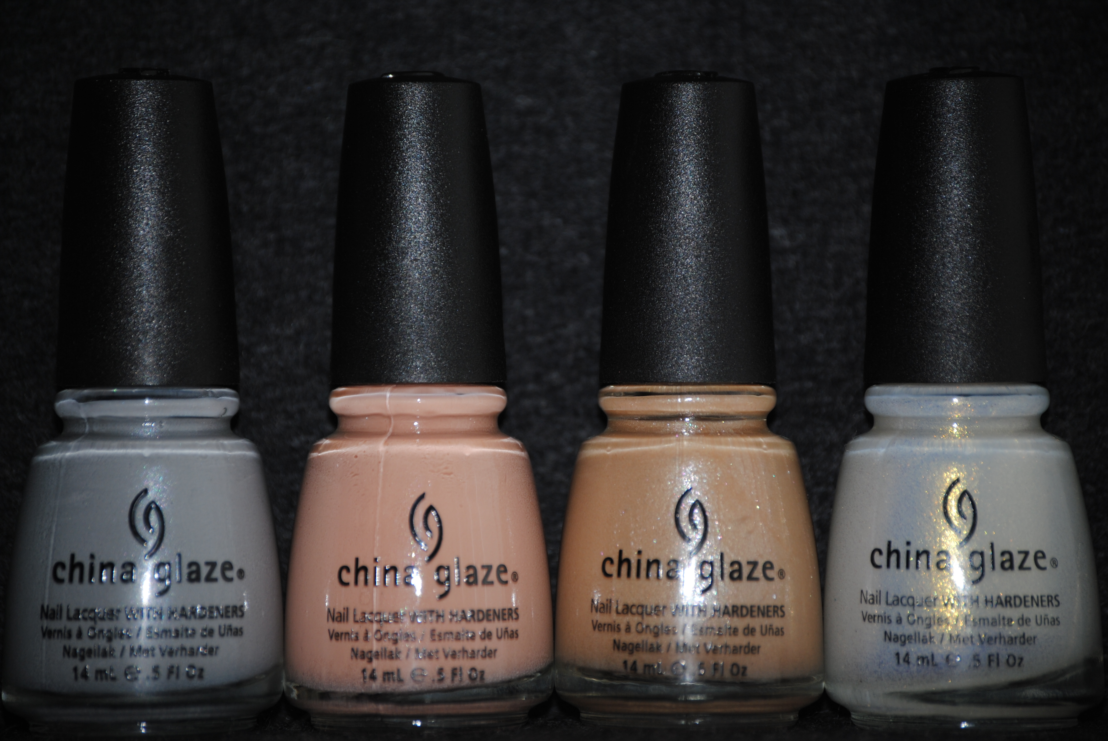
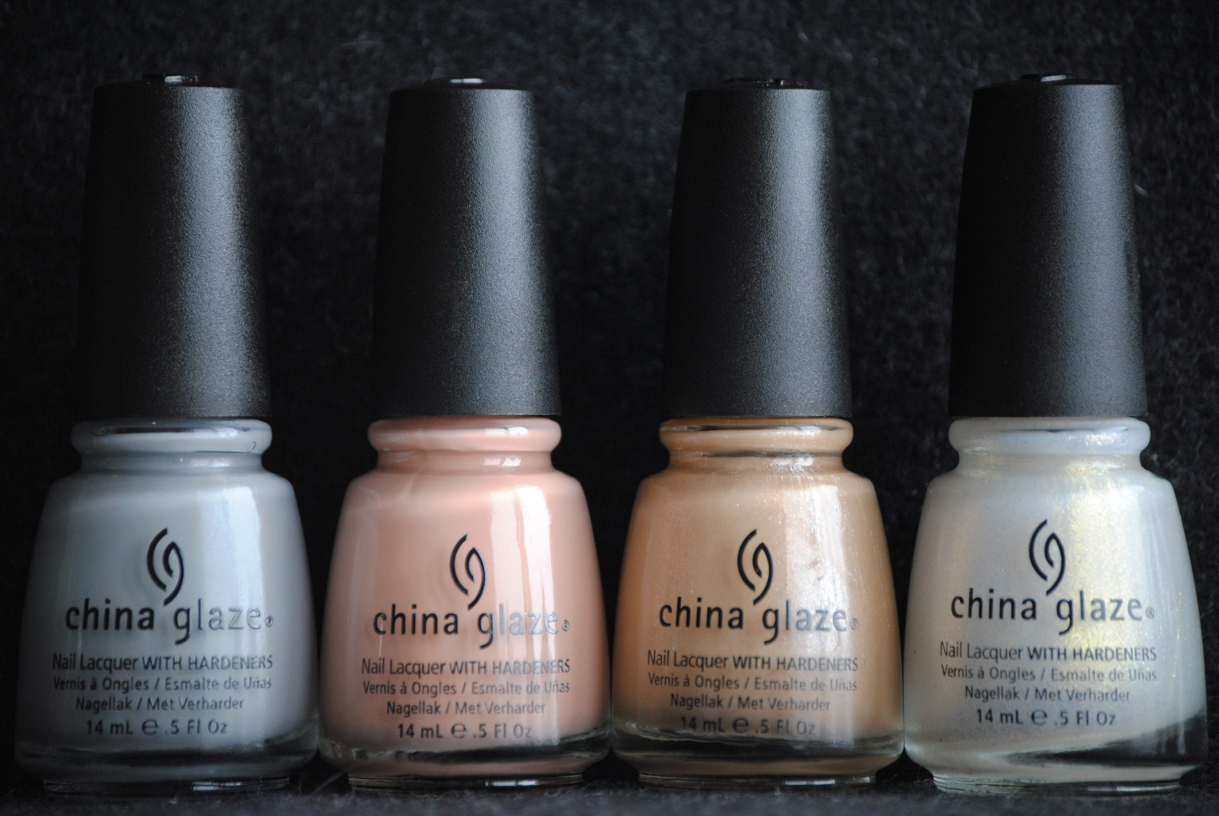
‘Anchors Away’ is the new Spring collection that China Glaze has just released, which includes 12 lacquers in a variety of hues and finishes; from creme to glass-flecked, muted to bold, there is something here that will appeal to everyone. In order that I give you the best in-depth review I can, I have broken down the collection and thus today I bring you 4 of the shades that I refer to as ‘the neutrals’. All swatches are with Sèche Natural base coat and 3 coats of polish, no top coat.
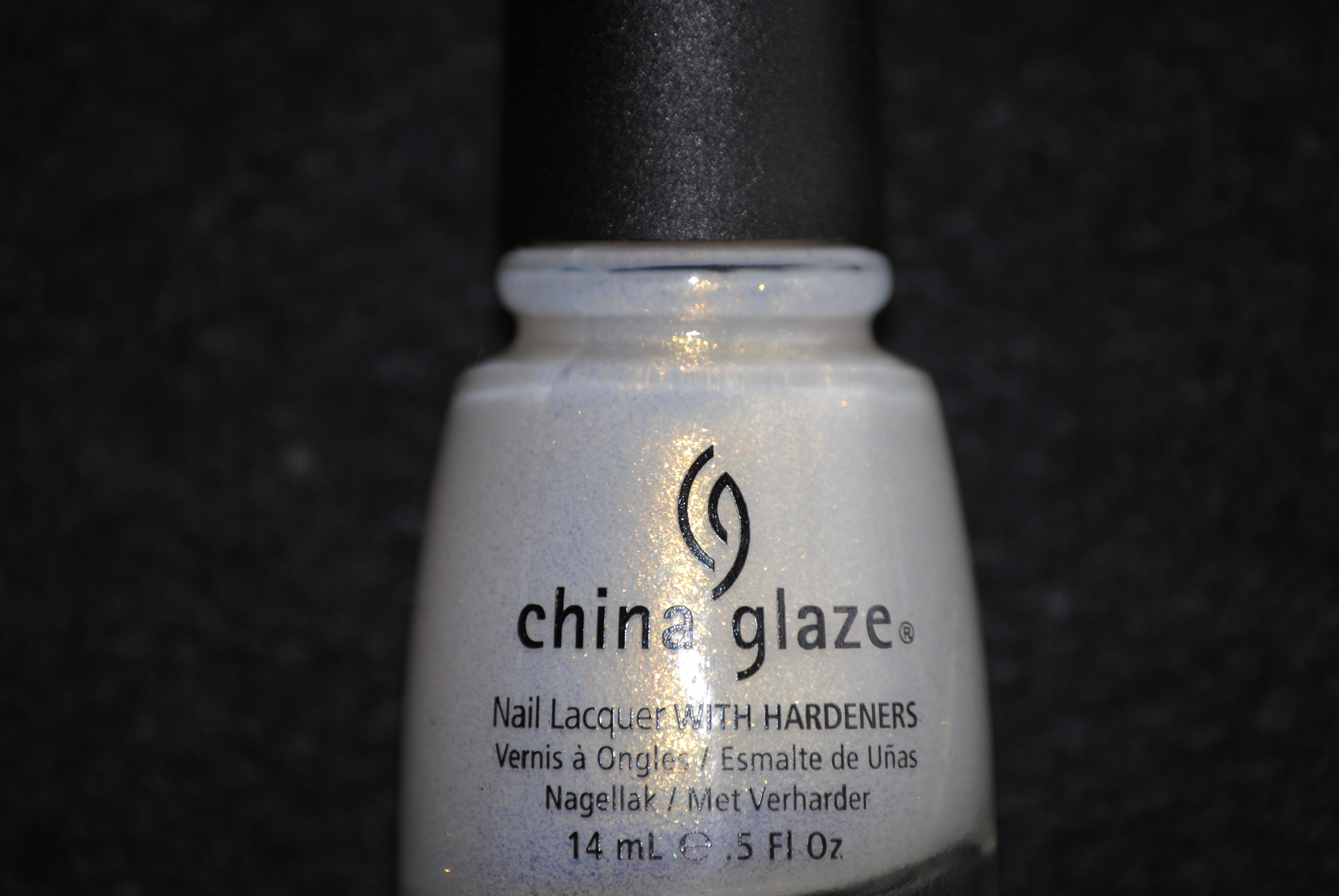
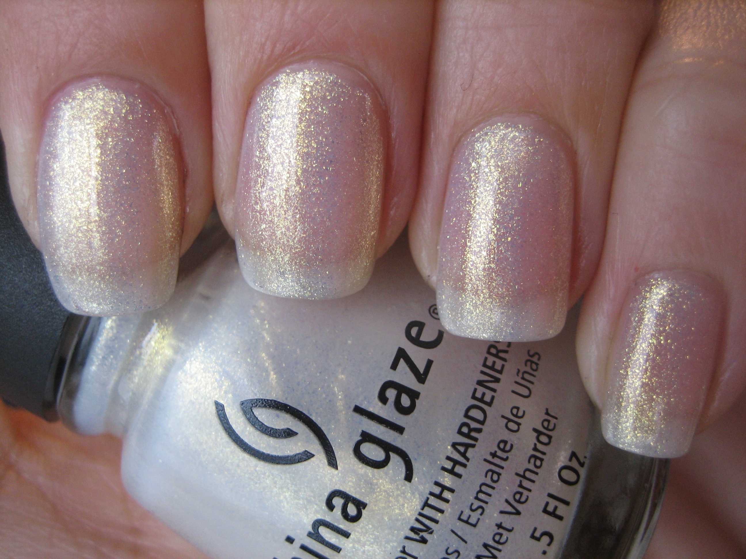
‘White Cap’ is a sheer pearly white, with tons of delicate gold micro shimmer. It can almost be considered an iridescent hue because of the golden flash to it. While it is sheer, you can build up a fairly decent opacity and the shimmer keeps it from being able to see too much visible nail line. The formula was amazing with a wonderful brush and the finish was smooth, despite the glittery bits.
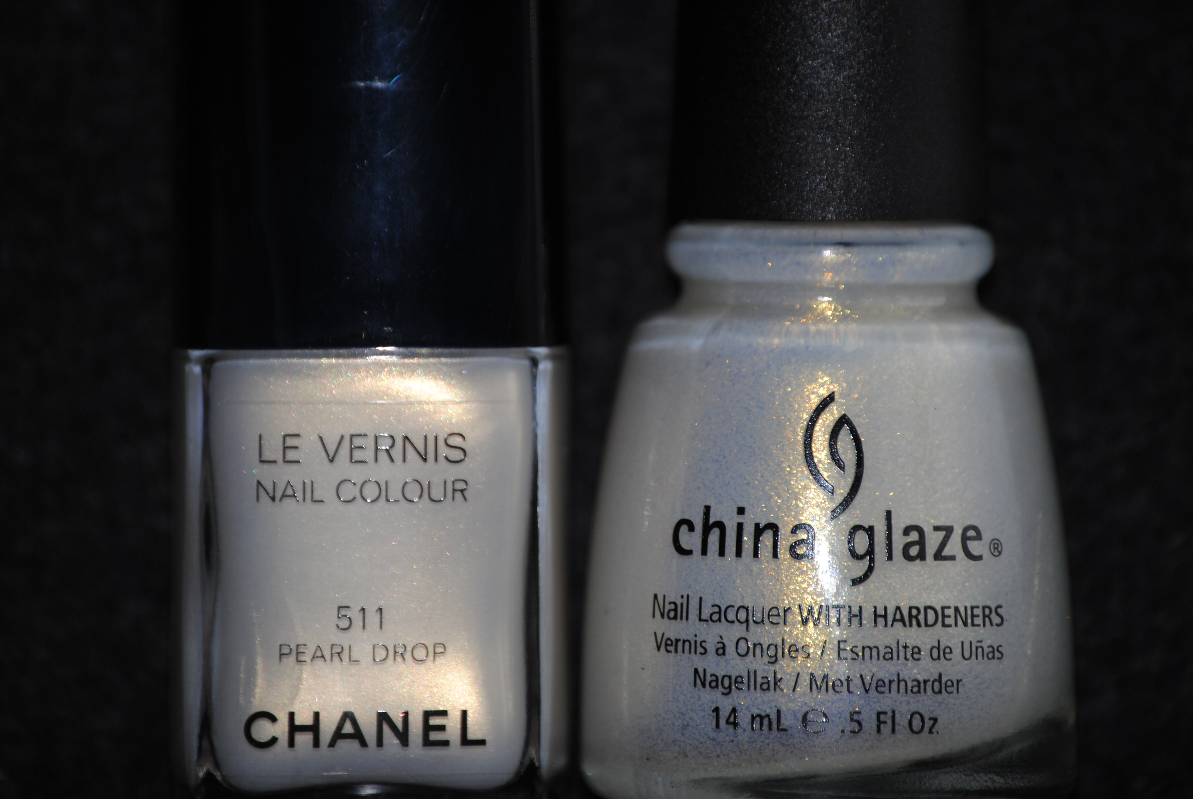
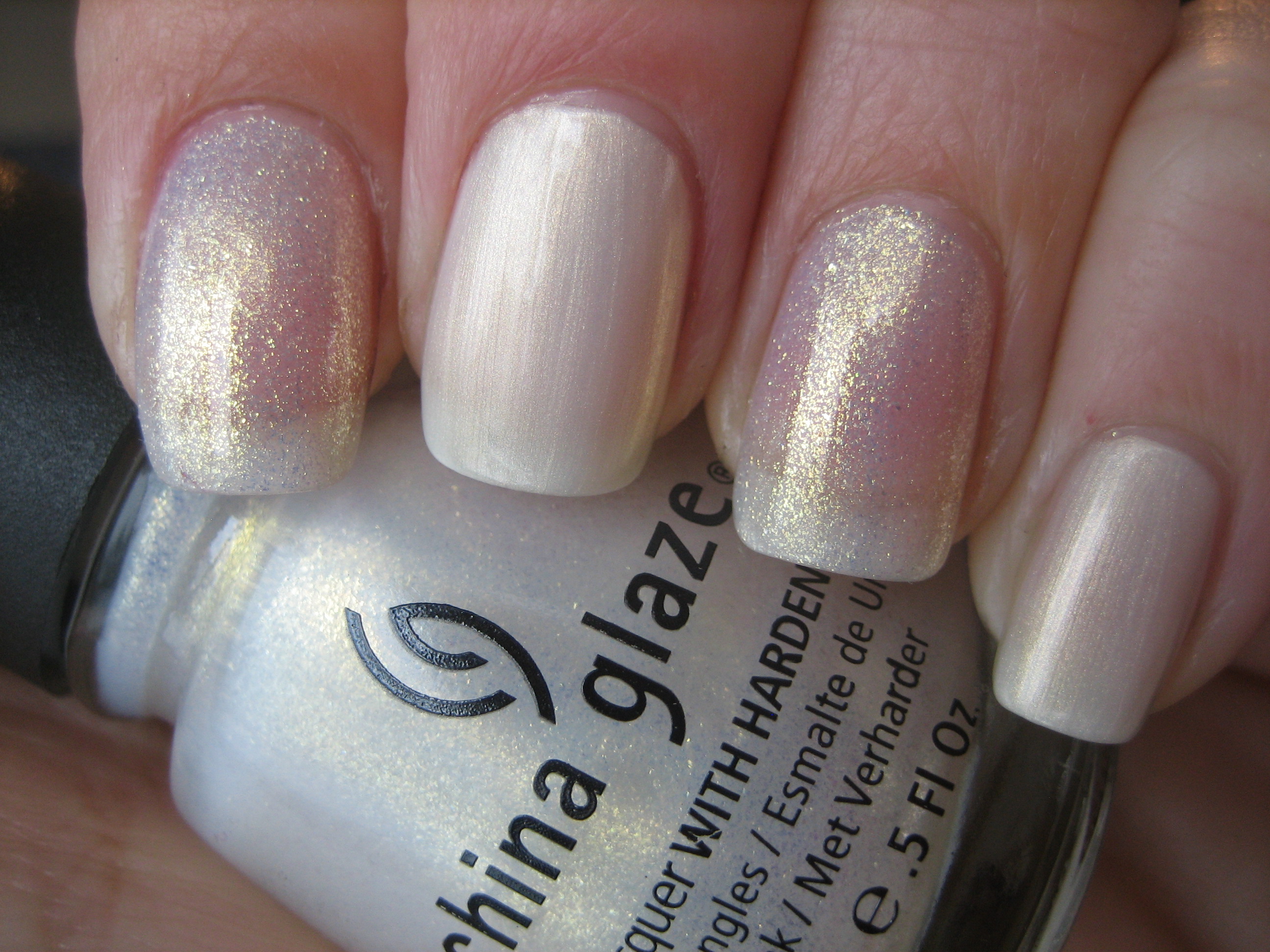
Because ‘White Cap’ reminded me of another similar shade, CHANEL’s ‘Pearl Drop’, I swatched them to compare. While they are both white frosted polishes with golden shimmer, that’s where the similarity ends. ‘Pearl Drop’ is significantly more opaque, with slightly more visible brush strokes and less shimmer throughout, giving it more of a pearl’s lustre. ‘White Cap’ has the same base colours, but in a much sheerer format and with a lot more gold going on. Photo above: index & ring fingers – White Cap, middle & Pinkie fingers – Pearl Drop.
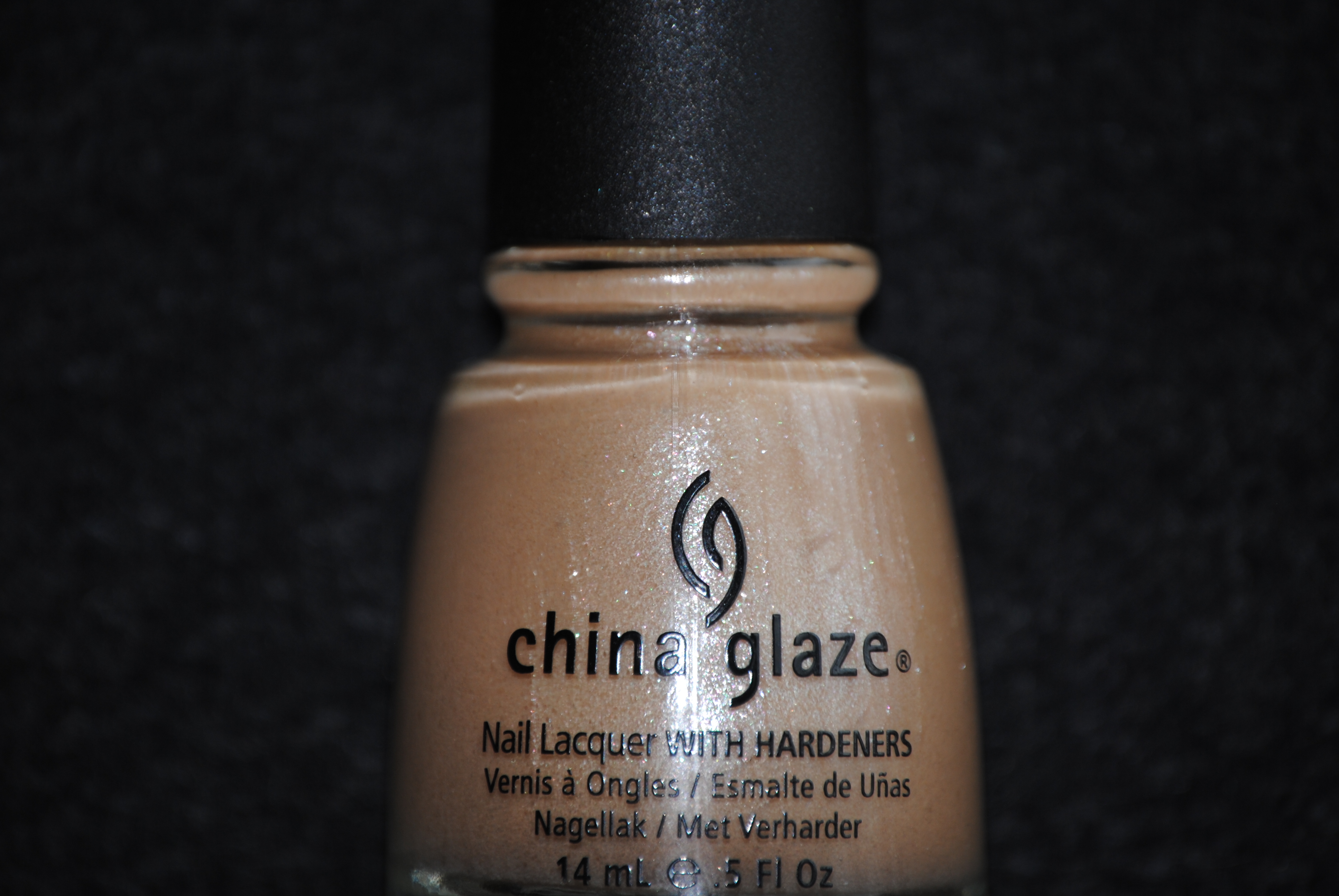
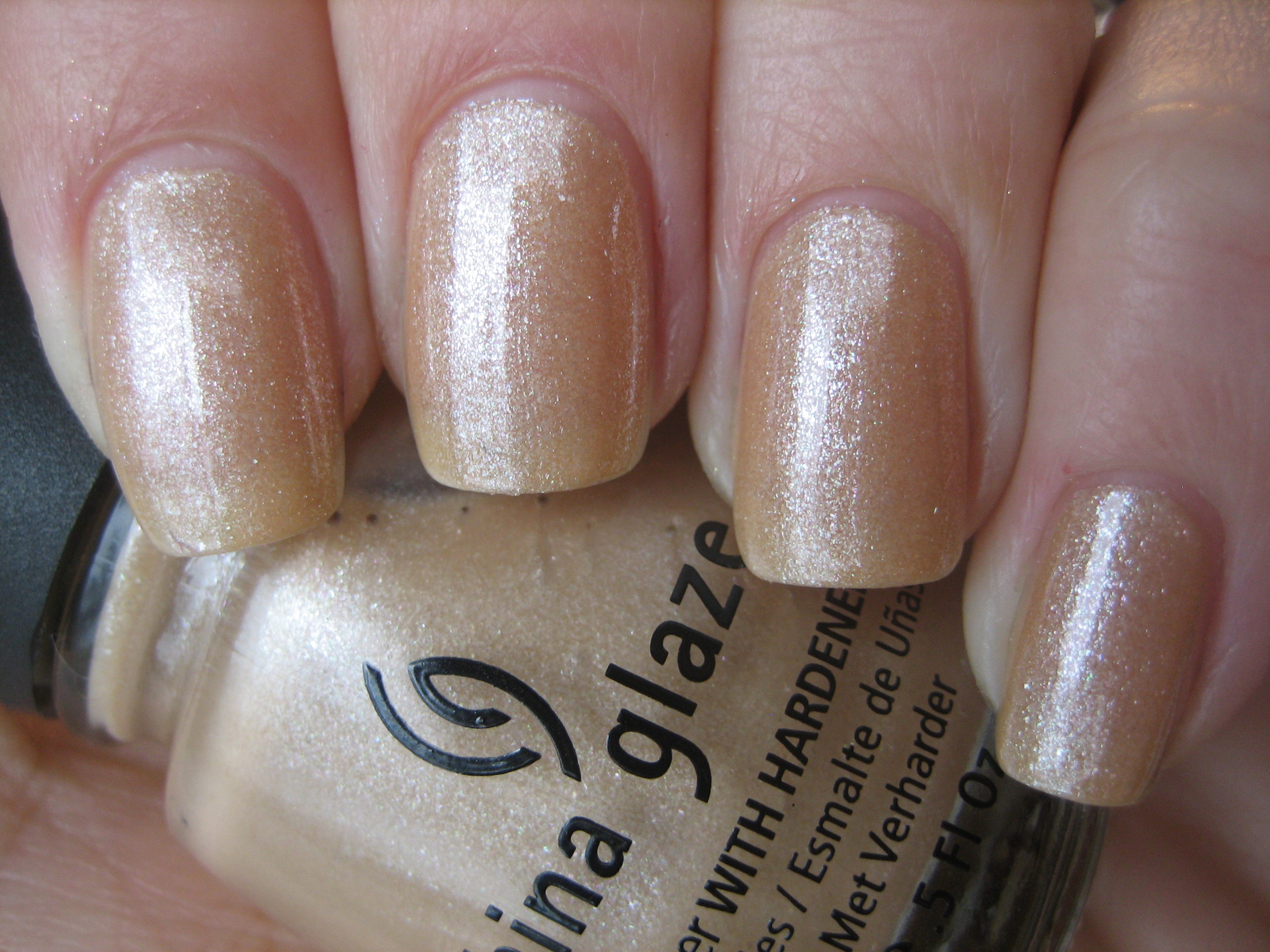
‘Knotty’ is another sheer polish, but this one is a complex mix of camel and blush with silvery, palest pink and some light green glass flecked shimmer throughout. It seems to lean slightly yellow, but the incredible shimmer keeps it from being a boring light taupe. This shade has excellent depth and it will definitely suit a variety of skin tones. Once again, the formula was superb.
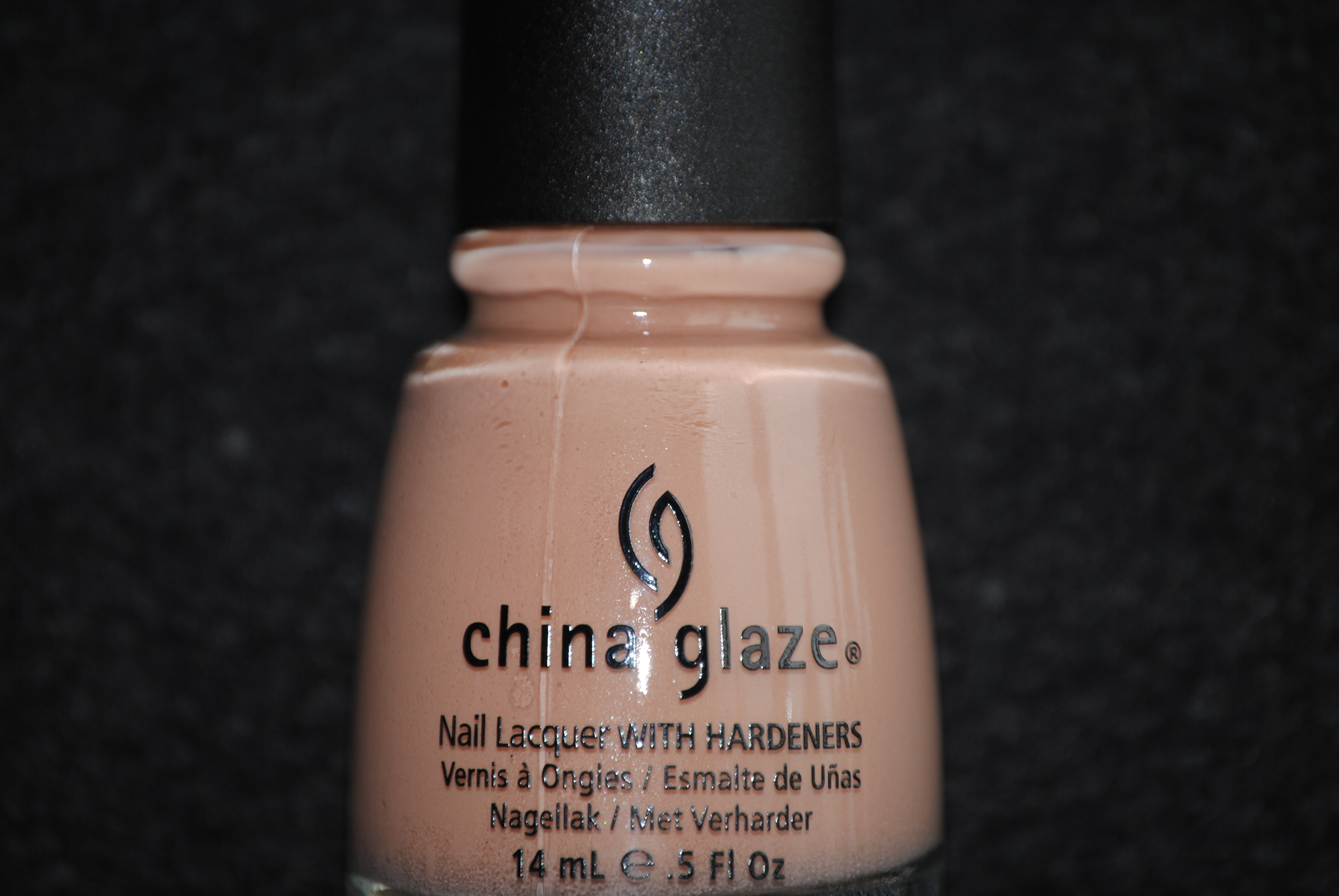
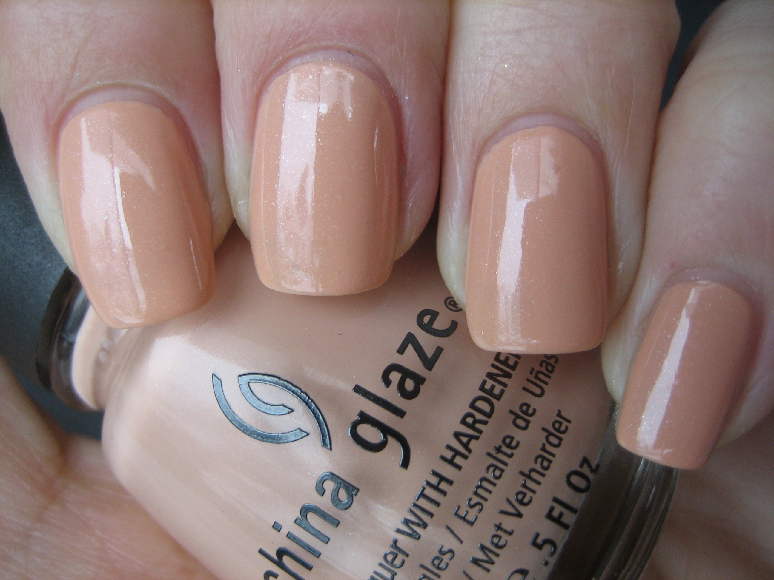
Looking at the bottle, I would have sworn that ‘Sunset Sail’ was a creme but upon viewing the pictures, I realized that it has a secret shimmer! This is an interesting nude shade with peach undertones and the delicate silvery micro shimmer not only lend it depth, but elevate it far above ‘mannequin hands’ into something definitely more wearable. Application & formula…what can I say? Awesome with nary a brush stroke in sight!
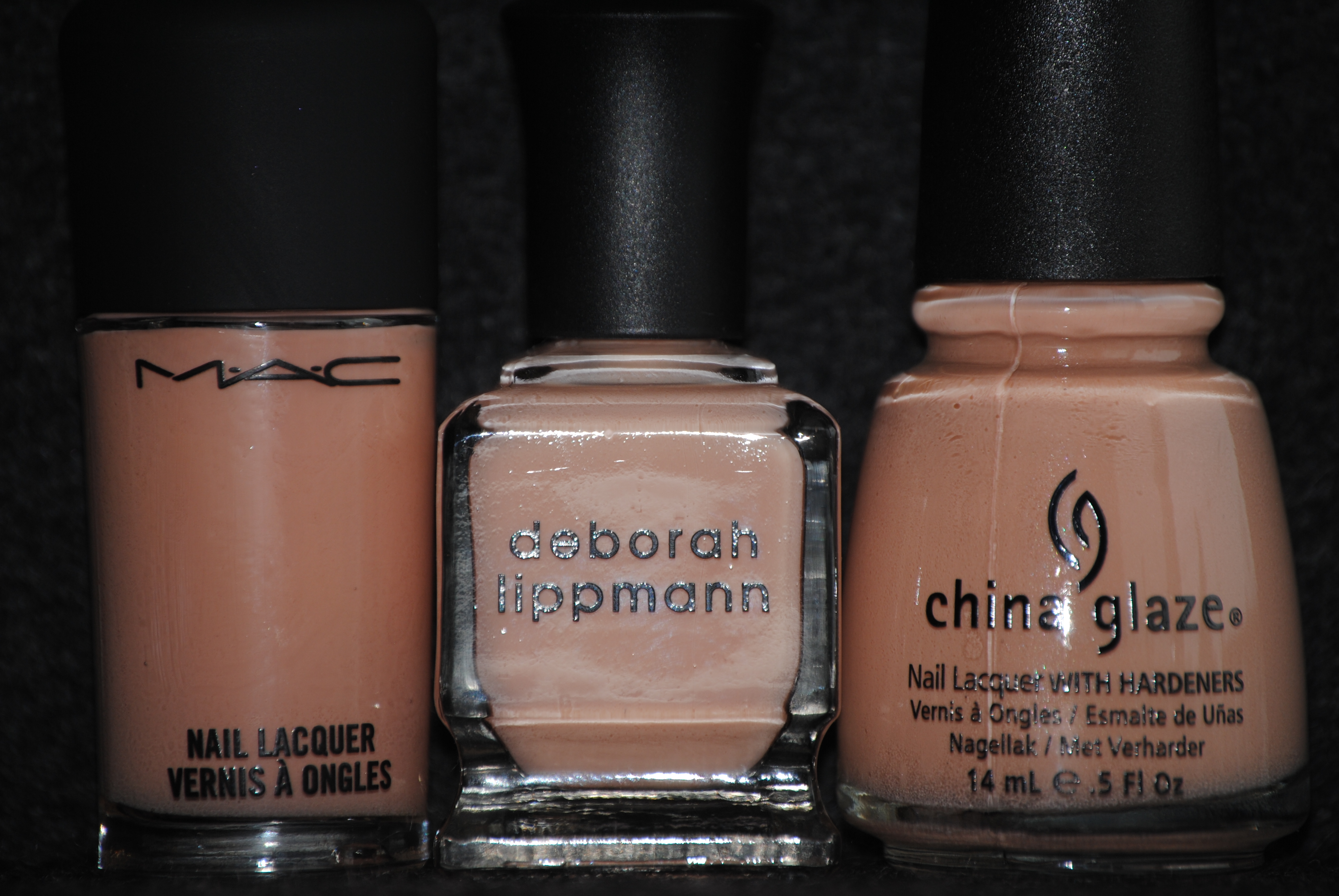
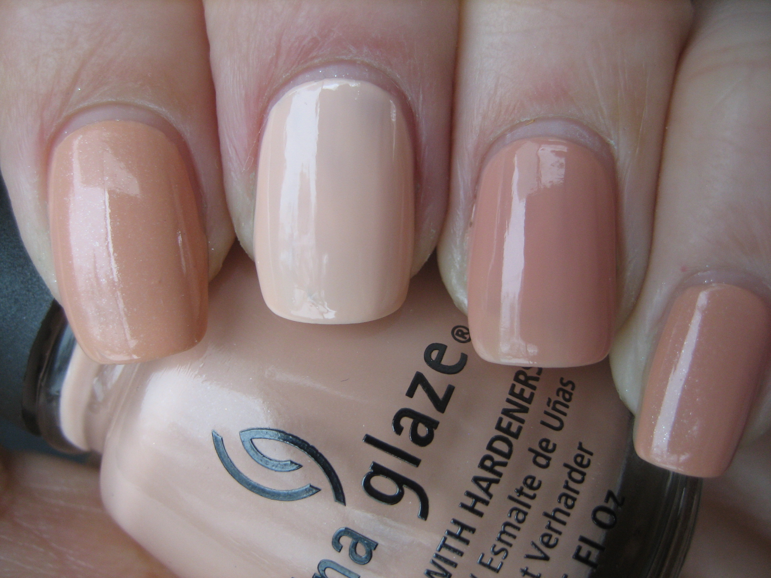
I would have sworn that I had something similar and the closest I came was with Deborah Lippmann’s ‘I’m Not That Innocent’ and MAC’s ‘Blissed Out’, but ‘Sunset Sail’ falls somewhere between the two. While the bottle colour between the Lippmann polish and the China Glaze seemed almost identical, the Lippmann turned out to be not only paler, but the formula was significantly thinner and slightly streaky; the MAC was a thin formula as well, but the hue fell slightly darker, albeit a close match in tone. The major difference was that neither of the other 2 polishes had that secret shimmer and so seemed a little flat when next to ‘Sunset Sail’. Photo above: Index & pinkie fingers – Sunset Sail, middle finger – I’m Not That Innocent and ring finger – Blissed Out.
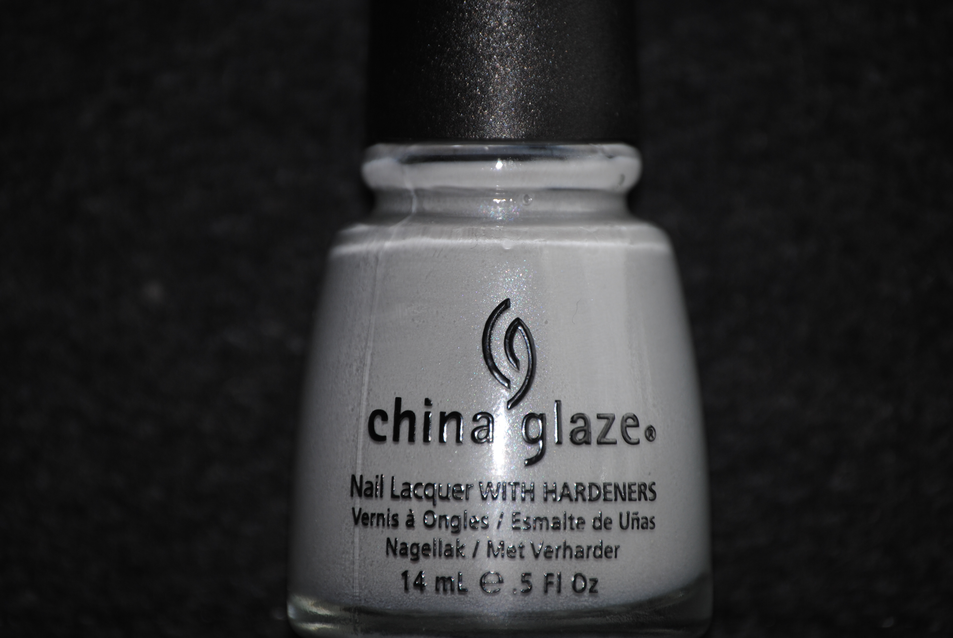
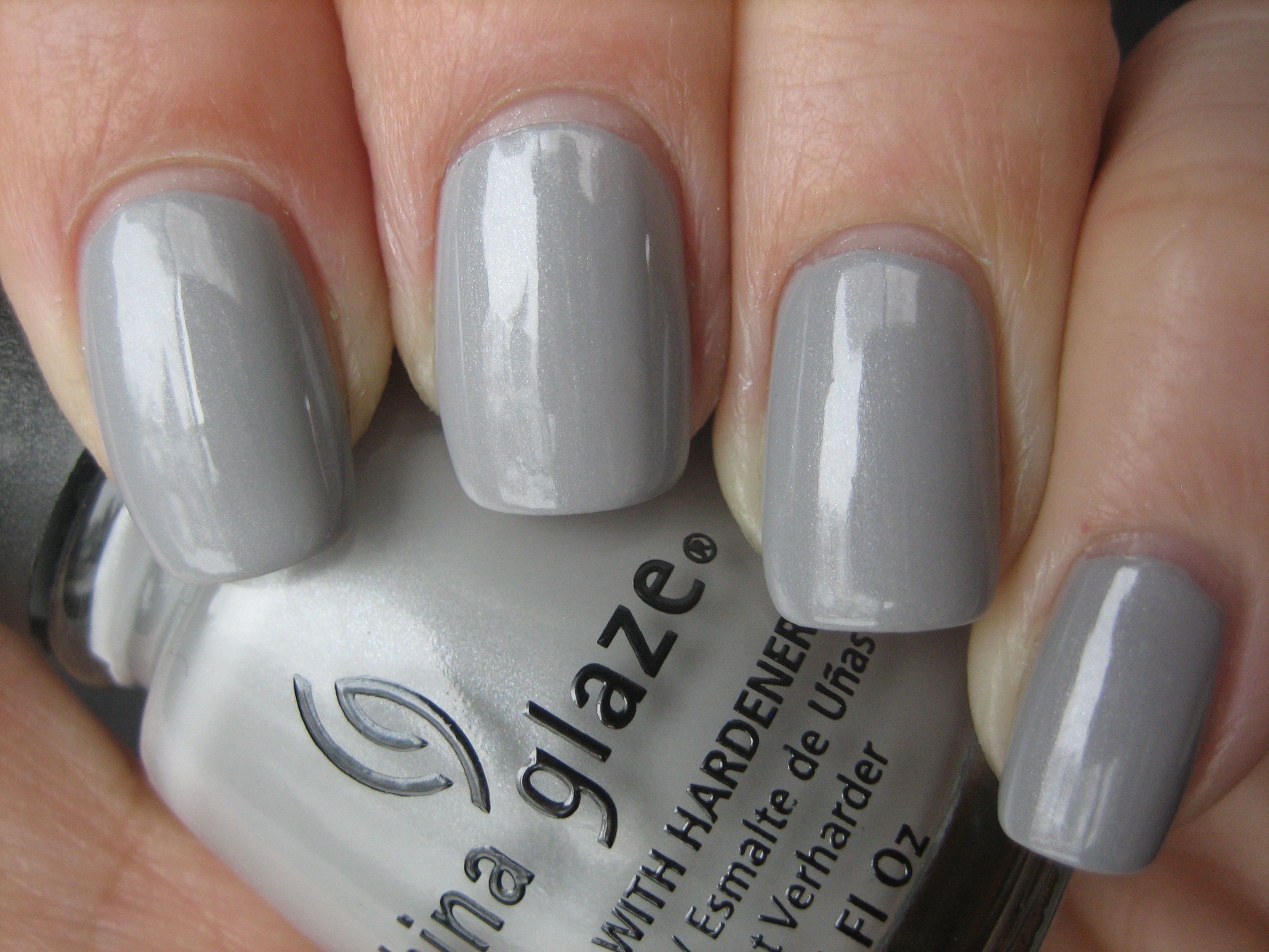
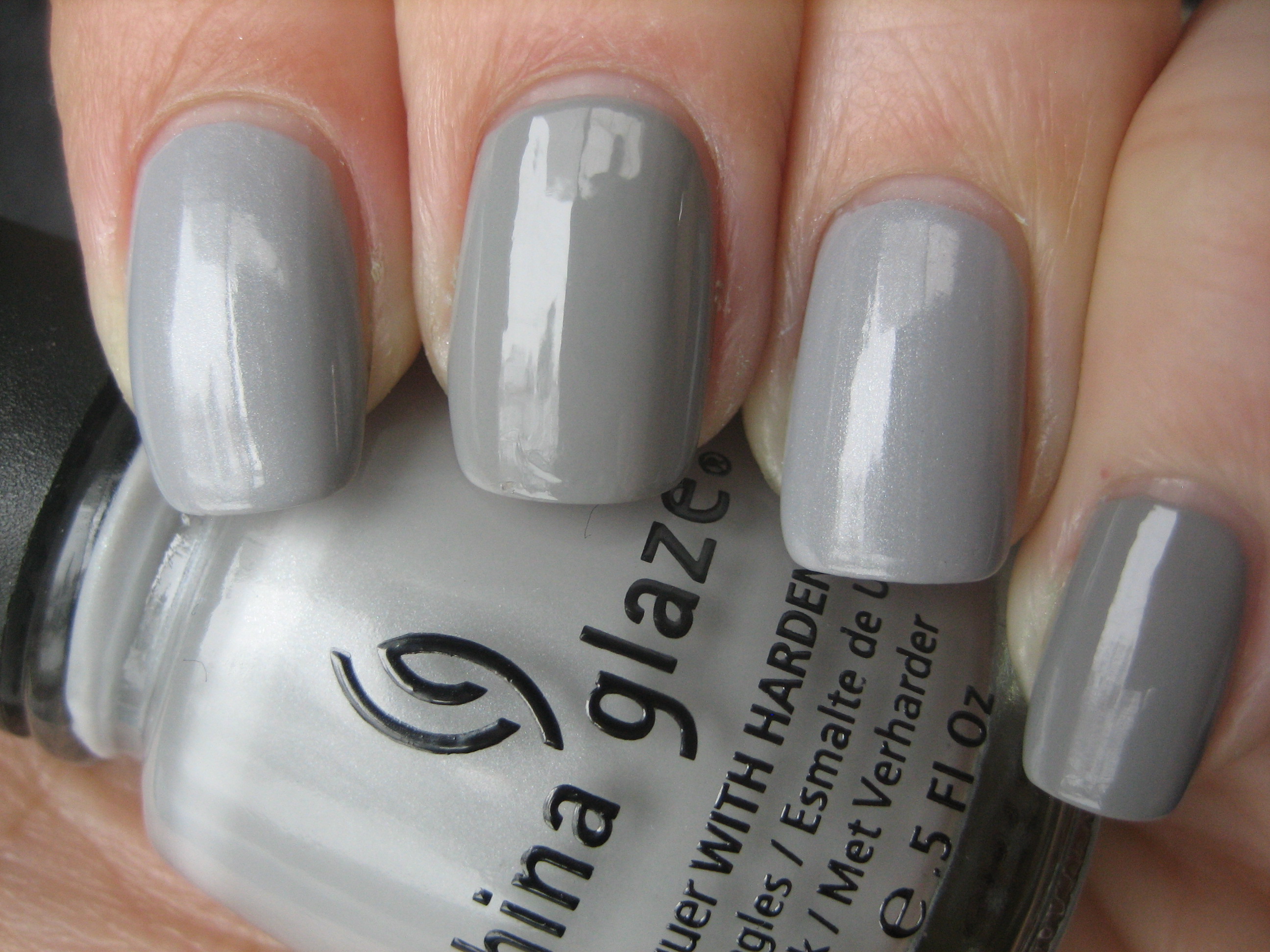
‘Pelican Gray’ is a soft-washed dove grey. Once again, what I thought was a creme polish turned out to have that inner secret shimmer! I love how it’s not that noticeable to the naked eye, but lends such depth to the final look. The shade itself reminds me of tiny beads of rain on a pane of glass; I am totally having a grey moment right now and this one is clean, simple and so romantically beautiful. Needless to say, the formula was incredible and seemed basically self-levelling. Love it!
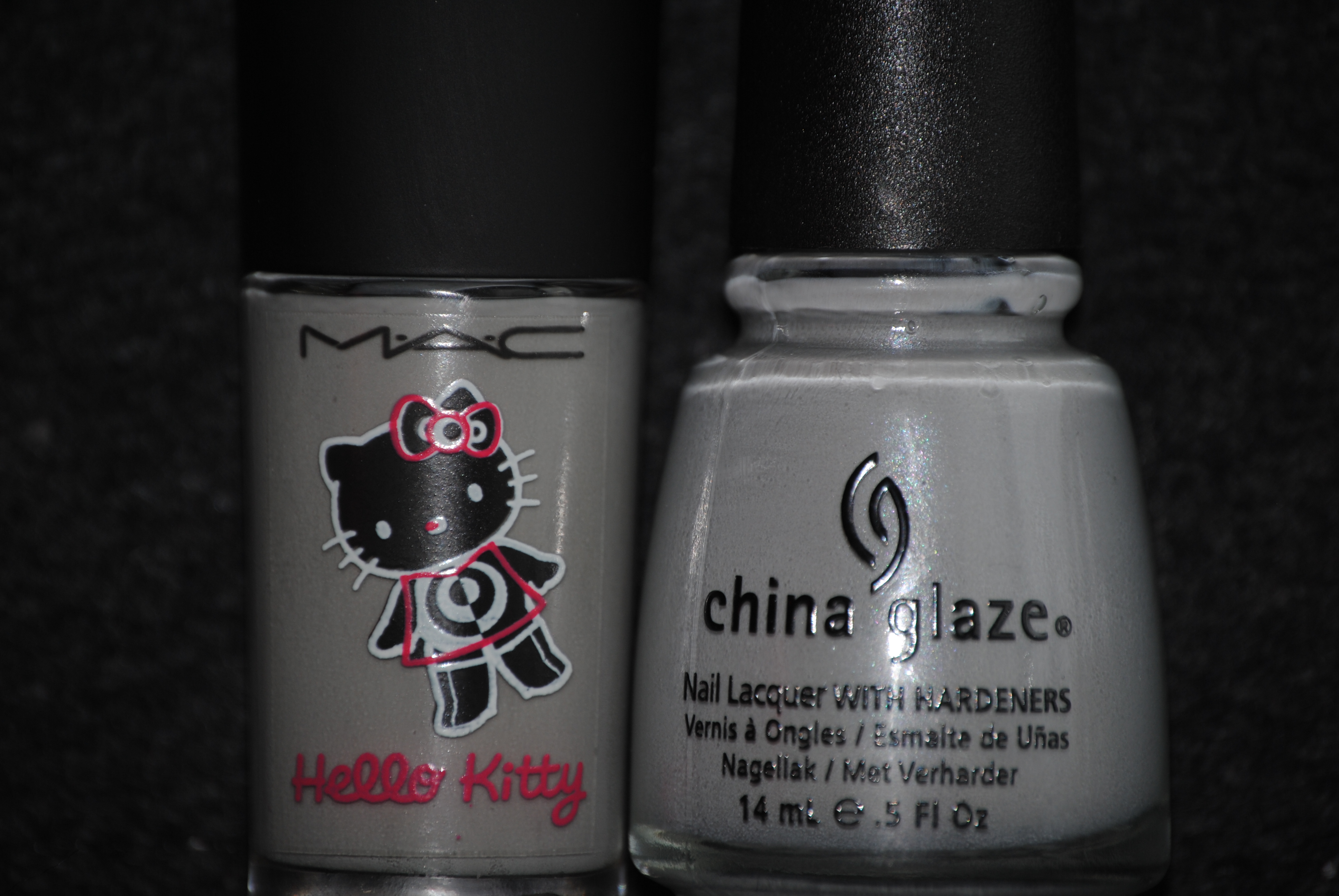
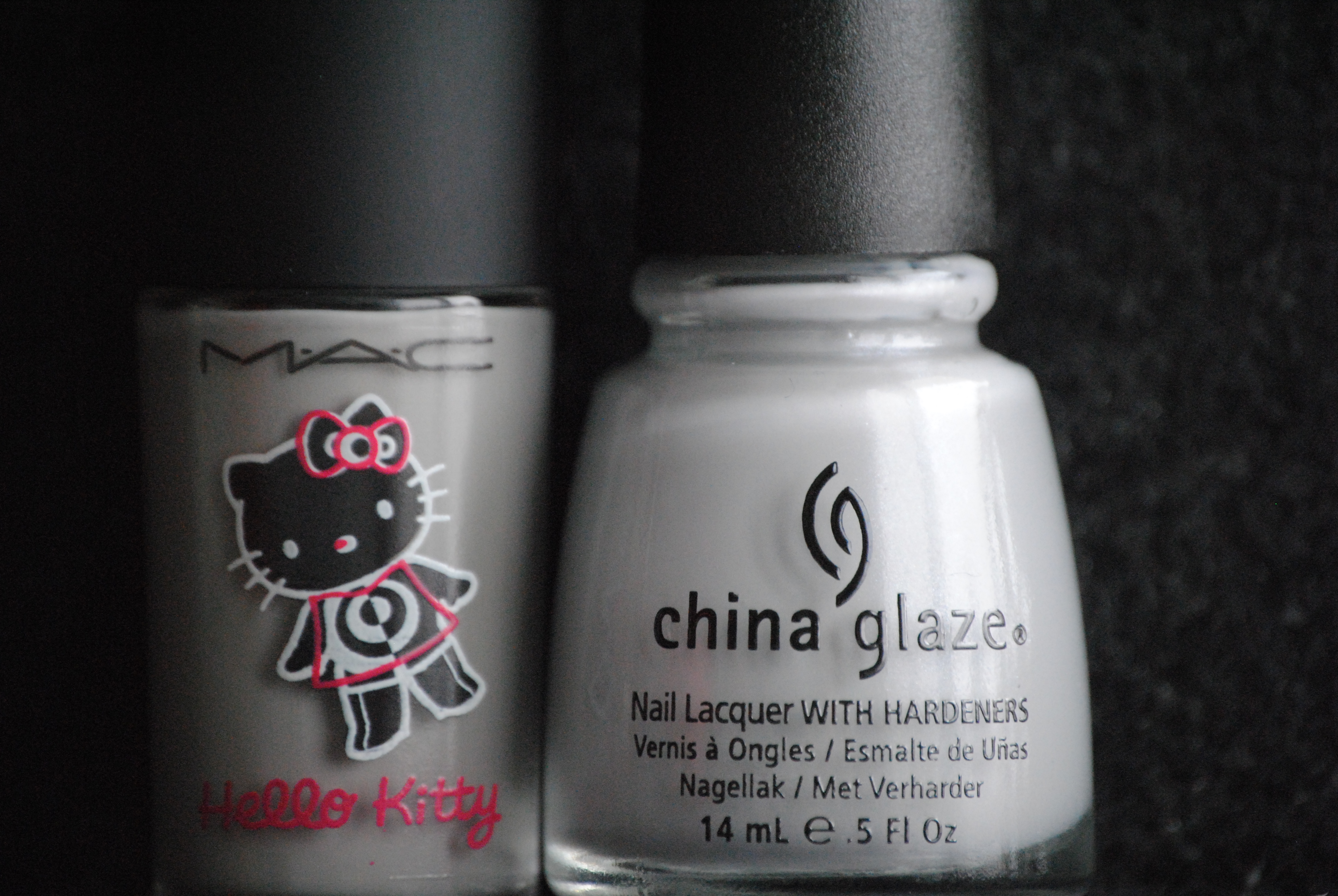
From the greys in my stash, the closest I found was MAC’s ‘On The Prowl’ from their Hello Kitty Collection of a few seasons ago. The two seemed somewhat similar, but when swatched, you can see that the MAC seems to have a slightly greener undertone when compared to ‘Pelican Gray’, which definitely looks bluer. While thinner in consistency, the MAC formula still gave decent coverage but once again, looks almost 2-dimensional next to the shimmery beauty that is ‘Pelican Gray’. Photo above: index & ring fingers – Pelican Gray, middle & pinkie fingers – On The Prowl.
Final thoughts: The first 4 of this collection, while neutral shades, are anything but boring. The formula is beyond excellent and the addition of that something extra, be it inner shimmer or glass flecks, gives each shade a unique cast. In line with the more delicate side of the season, these colours seem to best represent the promise of Spring and I feel that they are all wearable yet modern hues. Stay tuned for the next segment of swatches!
*Disclaimer: Product samples were sent by the company/PR for my unbiased consideration.


