
Filed In: Nail Polish Comparisons
CHANEL #583 Taboo (Limited Edition) & a comparison

CHANEL, long the master of covetable nail lacquers (amongst other products), has done it again with the release of their limited edition shade, #583 Taboo. Sure to stand tall amongst such cult faves such as Jade, Nouvelle Vague, and Ciel de Nuit, this nocturnal hue is almost hypnotic to look at; what at first appears as a shimmery vampy hue, bears a surprise with each brush stroke and true to CHANEL’s inimitable style, is destined to spawn many look-a-likes. I can guarantee that none will come close, however.

CHANEL #583 Taboo

CHANEL #583 Taboo

CHANEL #583 Taboo

CHANEL #583 Taboo (CAD $27.00) – a complex multi-chrome eggplant/wine base hue filled with ultra fine ribbons of purple and burgundy shimmer throughout and with mega colour shifting properties that throw out purple/indigo flashes, depending on the angle and lighting. The contents at the bottle’s neck appear rather inky in tone, belied by the application, which lays down more dark violet at the first coat. Pigmentation is STELLAR and the flow is simply phenomenal, while the final result is of that lit-from-withing glow which I absolutely adore – very much like a banked fire. Mysterious, sensual, provocative and intriguing — this shade is all that, and more, with the added bonus of absolutely no staining left behind upon removal. Coats applied: 2, plus top coat (although its rich colour saturation can easily make it pass for a 1-coater)

CHANEL #583 Taboo

CHANEL #583 Taboo

CHANEL #583 Taboo

CHANEL #583 Taboo

CHANEL #583 Taboo

CHANEL #583 Taboo vs OPI German-icure by OPI – when I went looking for a comparison shade, the only one that came to mind was OPI’s German-icure by OPI (reviewed here) from the Germany Collection. A quick note: there have been many discrepancies as to the true name of this OPI shade, but my rep still insists that the one I have is rightly named, and not ‘Every Month is Oktoberfest’ as most people claim. Whatever. How the two compared:
- index & pinkie fingers – German-icure by OPI: less purple in base colour, burgundy tones more prominent with a finer shimmer throughout
- middle & ring fingers – #583 Taboo

CHANEL #583 Taboo vs OPI German-icure by OPI

CHANEL #583 Taboo vs OPI German-icure by OPI
cheap finasteride
cheap flomax
cheap fluoxetine
cheap lasix
Last word: I’ll make this easy: you NEED this shade. Unique and totally captivating, completely unlike anything else CHANEL has ever produced, this is one of those lacquers that will have you long regretting passing it up. The application is flawless and the range of colours found in this one bottle ensures that it will suit basically every skin tone and every season, at that. As stated from the start, it is a limited edition shade – don’t say you weren’t warned. Definitely back-up worthy.
Available now through all CHANEL counters.

*Disclosure: Product samples provided by the company/PR for my unbiased consideration


CHANEL – Le Vernis L’Été Papillons for Summer 2013 Limited Edition

When my CHANEL Sales Agent showed me the early promotional images for this collection a few months ago, I’m sure I must have gasped out loud upon spotting these 3 beauties – that green! that blue! Once again, with the L’Été Papillons for Summer 2013 Collection (you can read my review on the new Stylo Eyeshadows here), CHANEL has proven why this venerable brand is at the top of its game, releasing a beautifully themed grouping of products that not only embody the spirit of the season, but that manage to perfectly capture the ephemeral – yet utterly brilliant – colours of delicate butterfly wings.
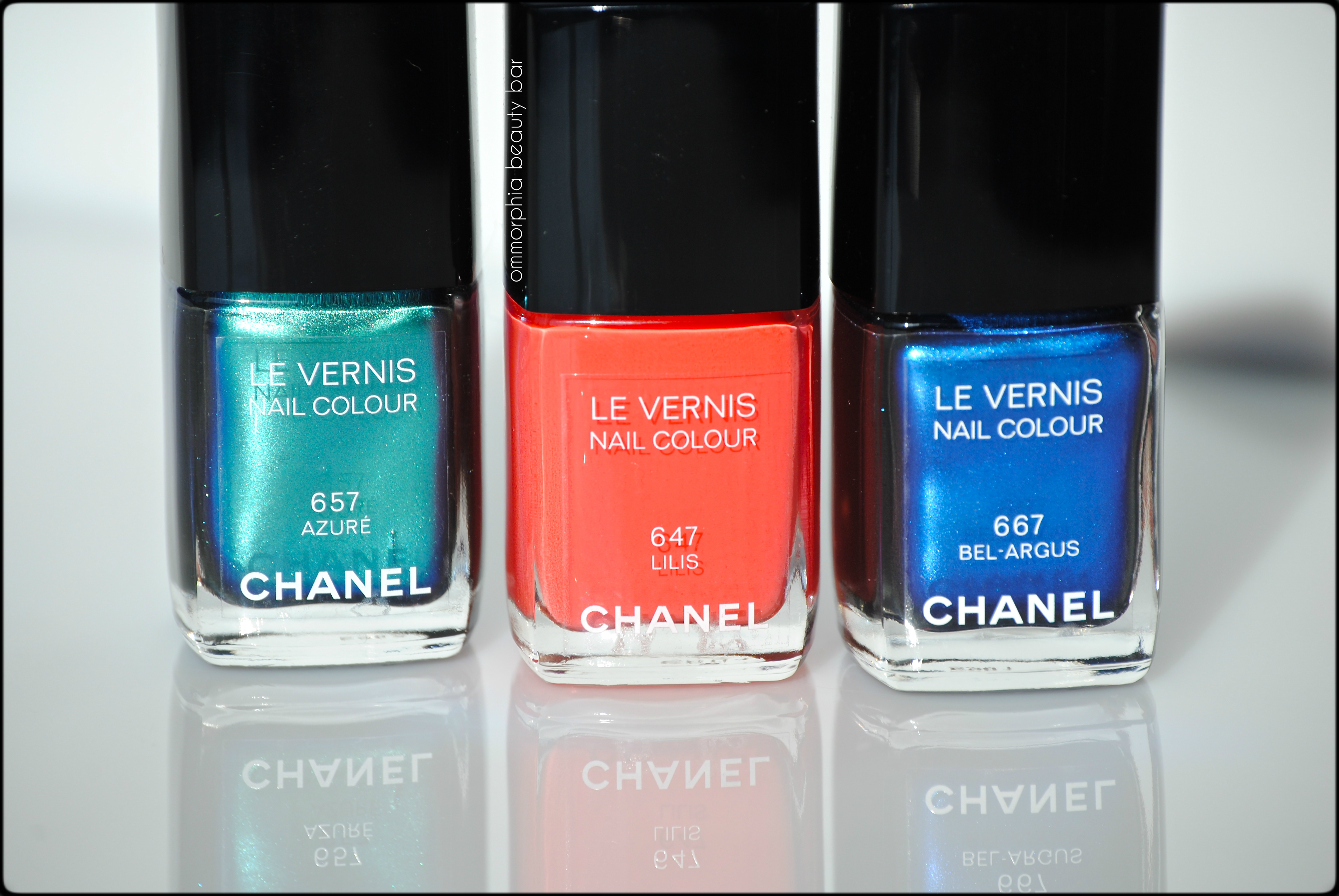
These three limited edition lacquers (each CAD $27.00 13 ml/0.4 fl.oz) come in the iconic CHANEL rectangular bottle with the removable outer square cap, revealing a smaller & user-friendly ribbed inner cap. The wand is an easy to work with length, while the brush itself is one of the best I’ve worked with; flexible enough to splay evenly when pressure is applied, while being neither too thick/bushy nor too thin.
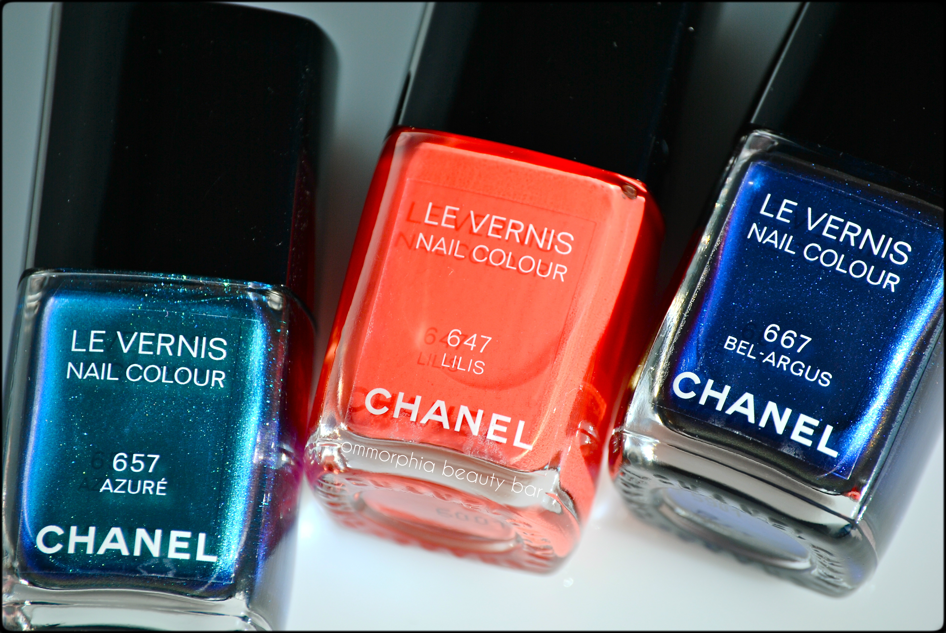
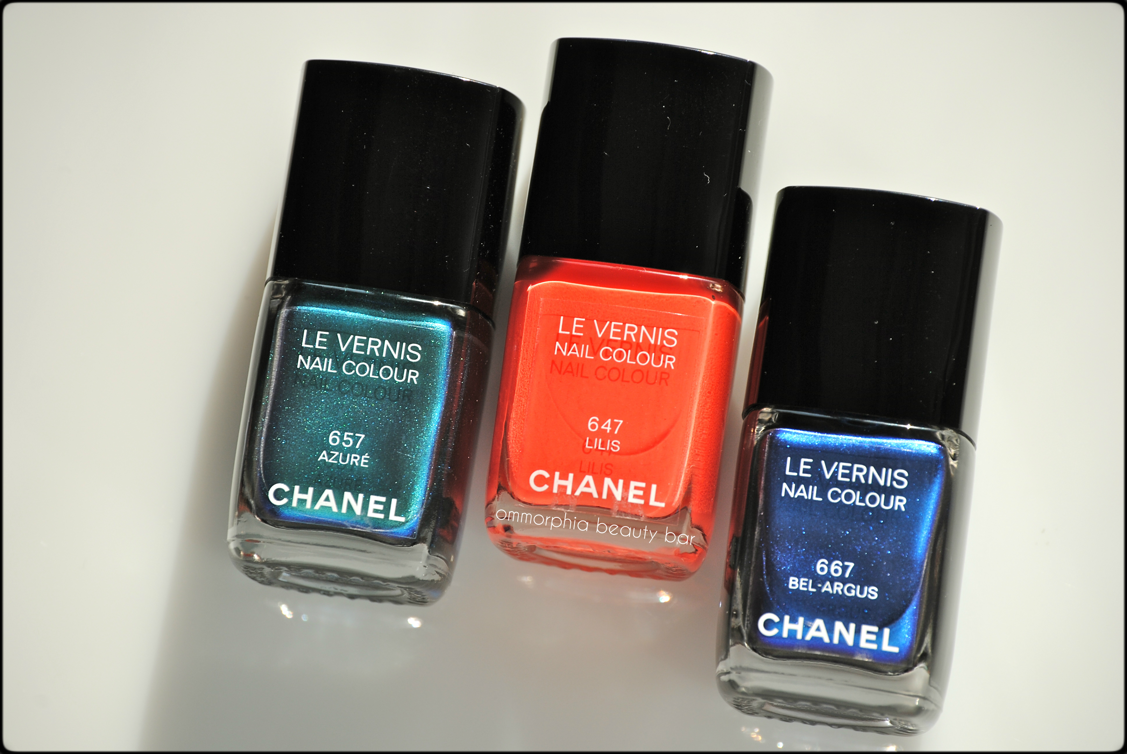
CHANEL L’Été Papillons Summer 2013 – #657 Azuré, #647 Lilis, #667 Bel-Argus
CHANEL L’Été Papillons Summer 2013 – #657 Azuré, #647 Lilis, #667 Bel-Argus
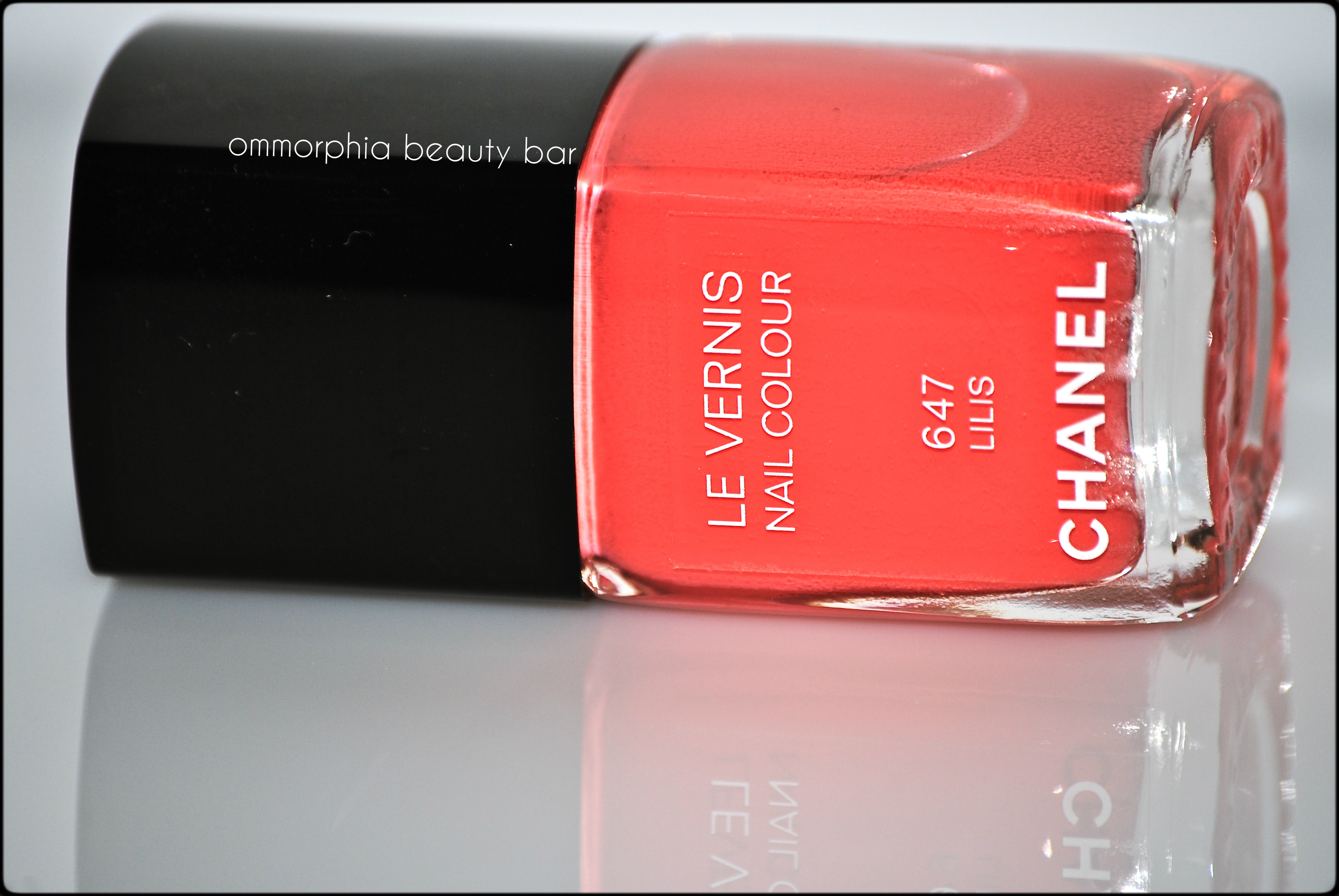
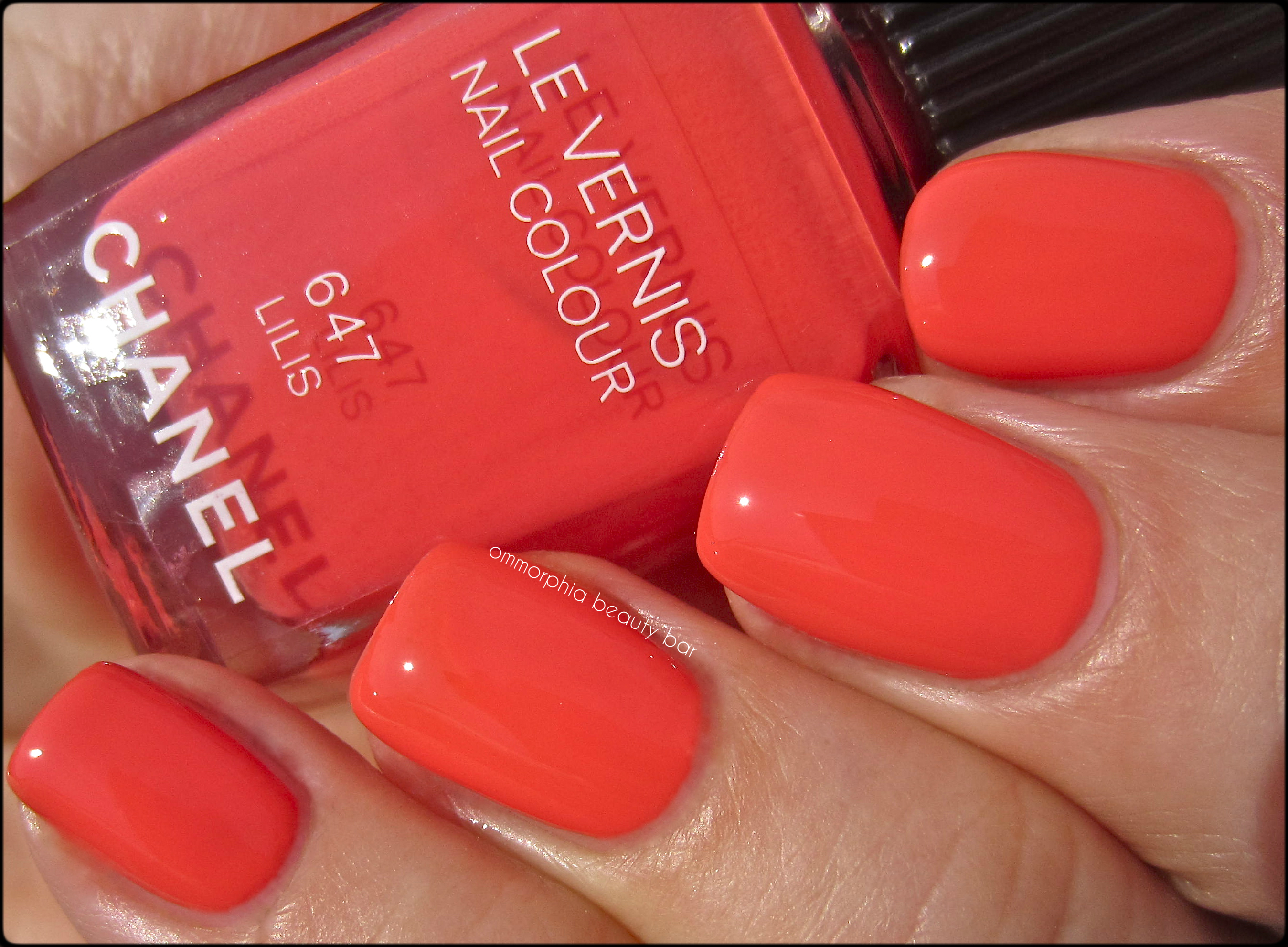
#647 Lilis – an ultra smooth coral-salmon hue in a crème/jelly hybrid formula, bearing intense colour saturation and able to suit both warm & cool skin tones equally. Completely non-staining upon removal. Coats applied: 2, plus top coat
CHANEL – #647 Lilis
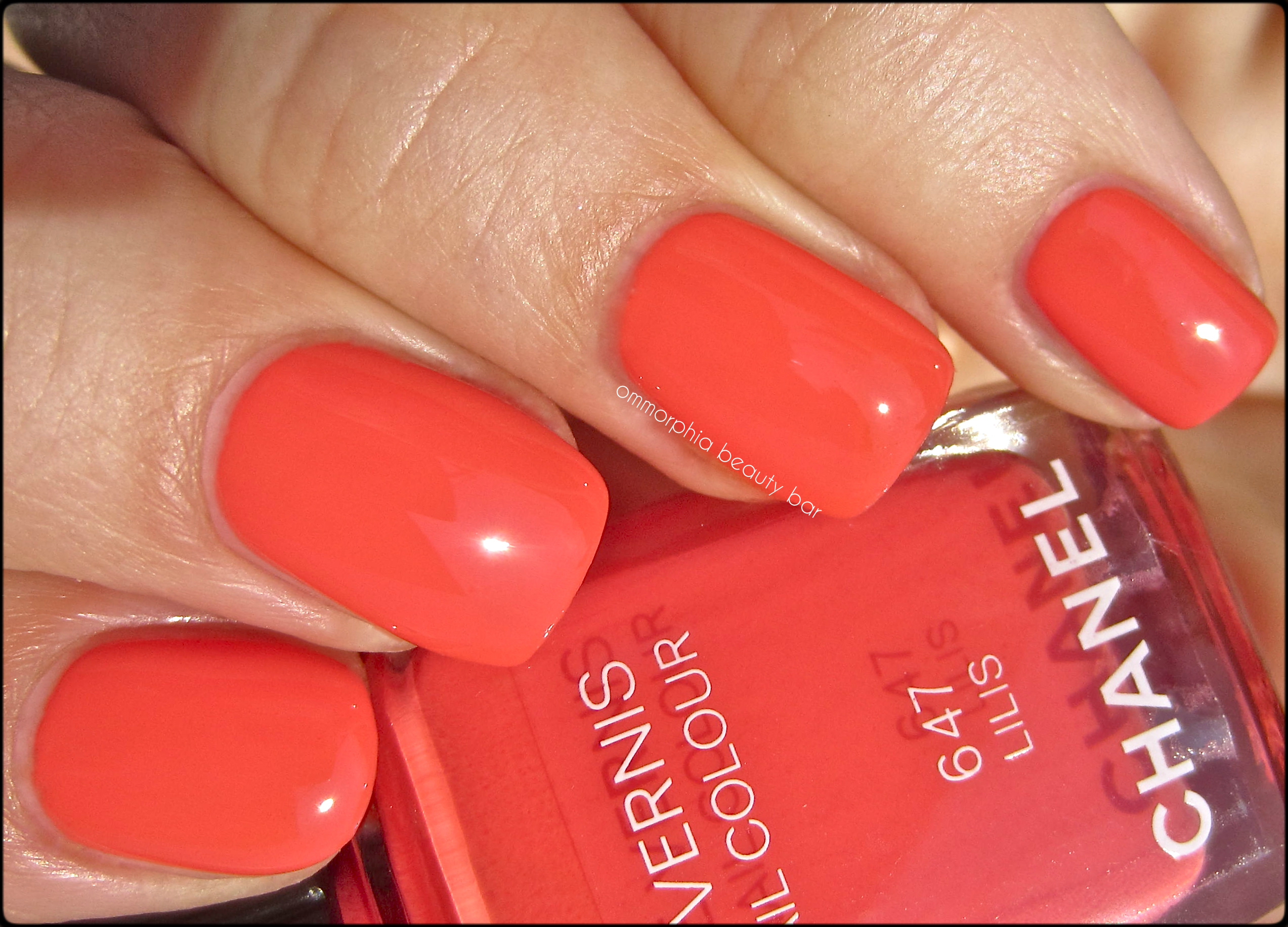
CHANEL – #647 Lilis
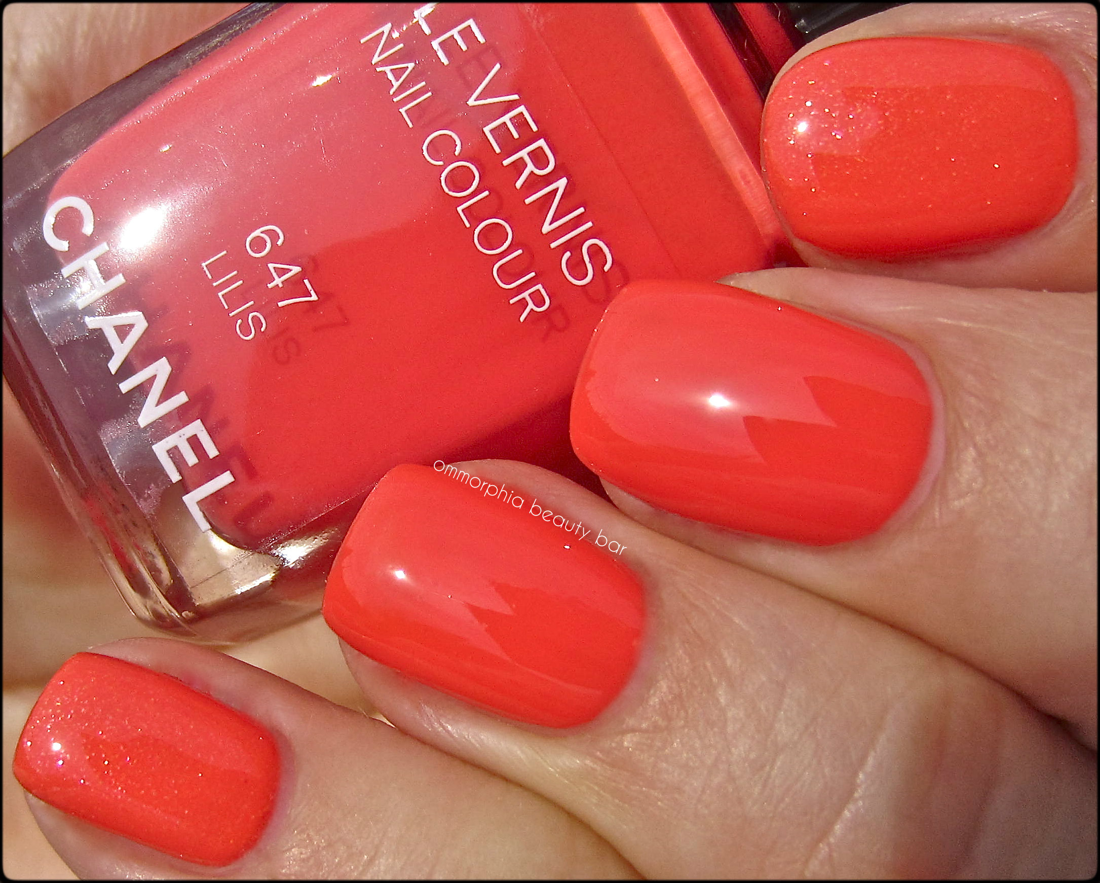
- Middle & ring: CHANEL – #647 Lilis
- Index & pinkie: Dior #433 Délice – thicker formula, higher pigmentation, visible pink, gold & silver finely ground glitter, satin natural finish which can make the base tone appear a few degrees lighter
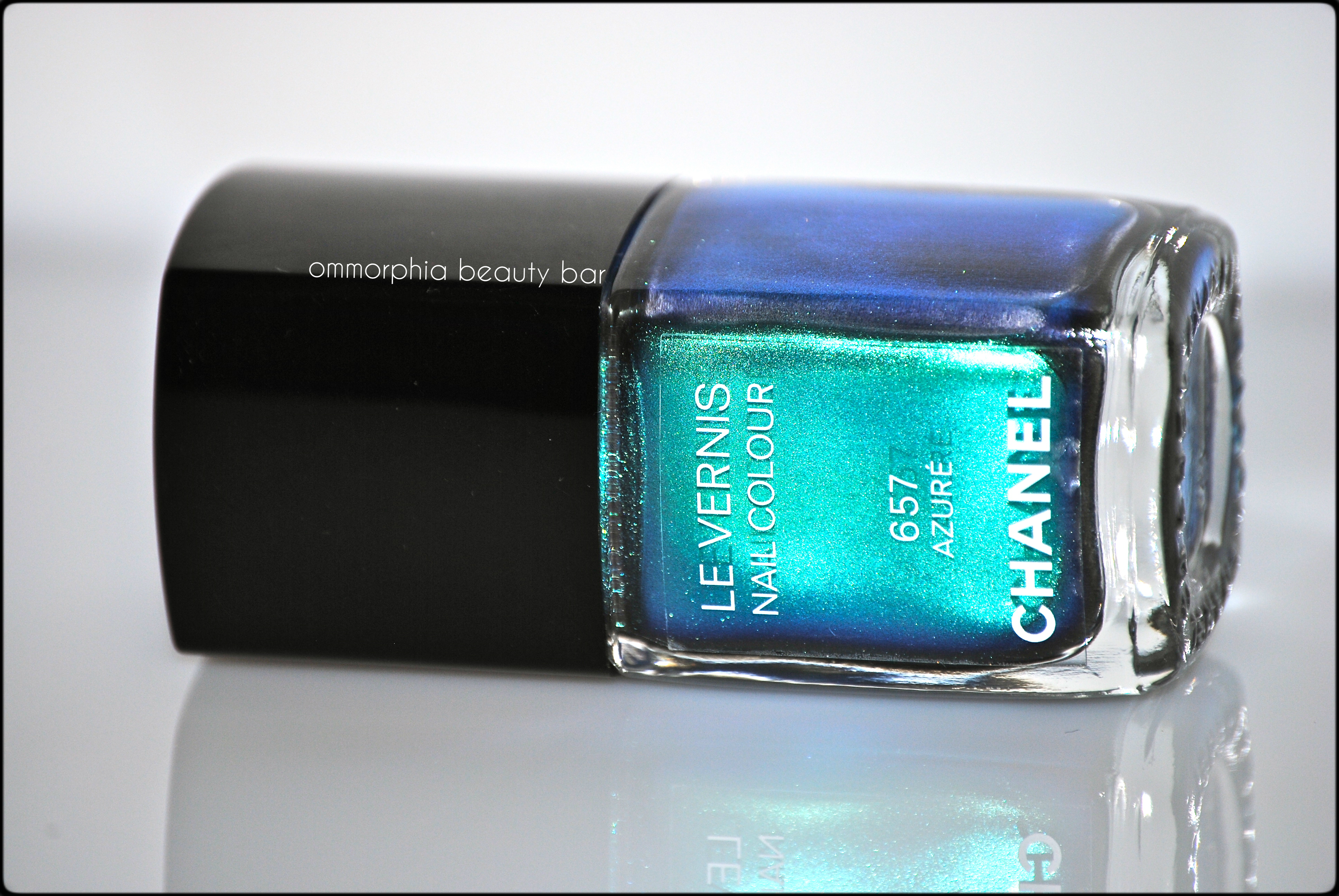
#657 Azuré – a multi-dimensional teal duo chrome that gives off iridescent green, blue, purple and some scant bronze flashes, depending on the light and angle. Due to its metallic nature, a steady hand is a must in application, in order to avoid any visible brush strokes (which are actually much less pronounced in person than my high resolution images may show here). The paradox is with the formula: the first coat may seem rather sheer when you apply it, but this shade becomes fully opaque by the next coat – just make sure to work quickly, as this is a quick-drying lacquer. Coats applied: 2, plus top coat
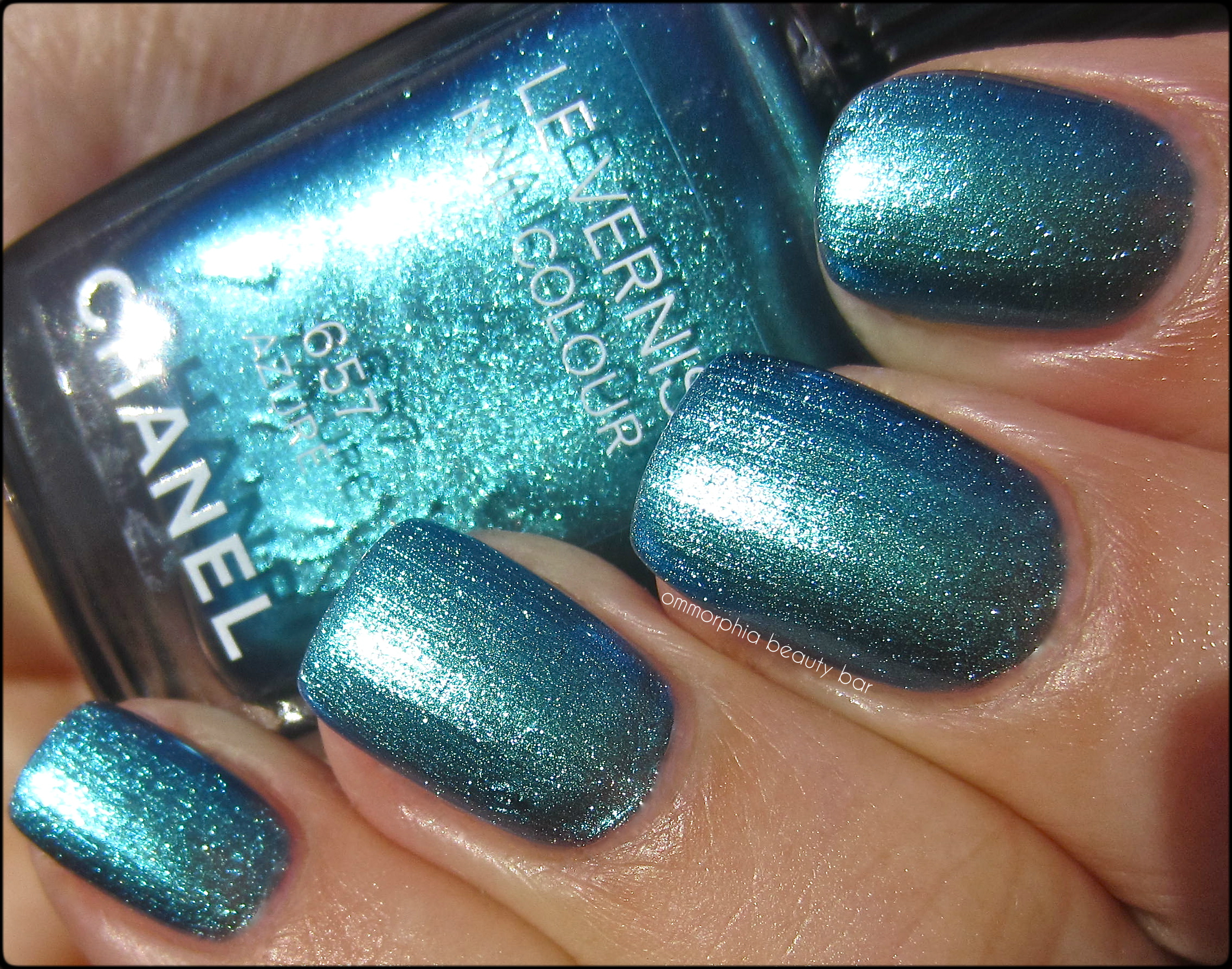
CHANEL – #657 Azuré

CHANEL – #657 Azuré
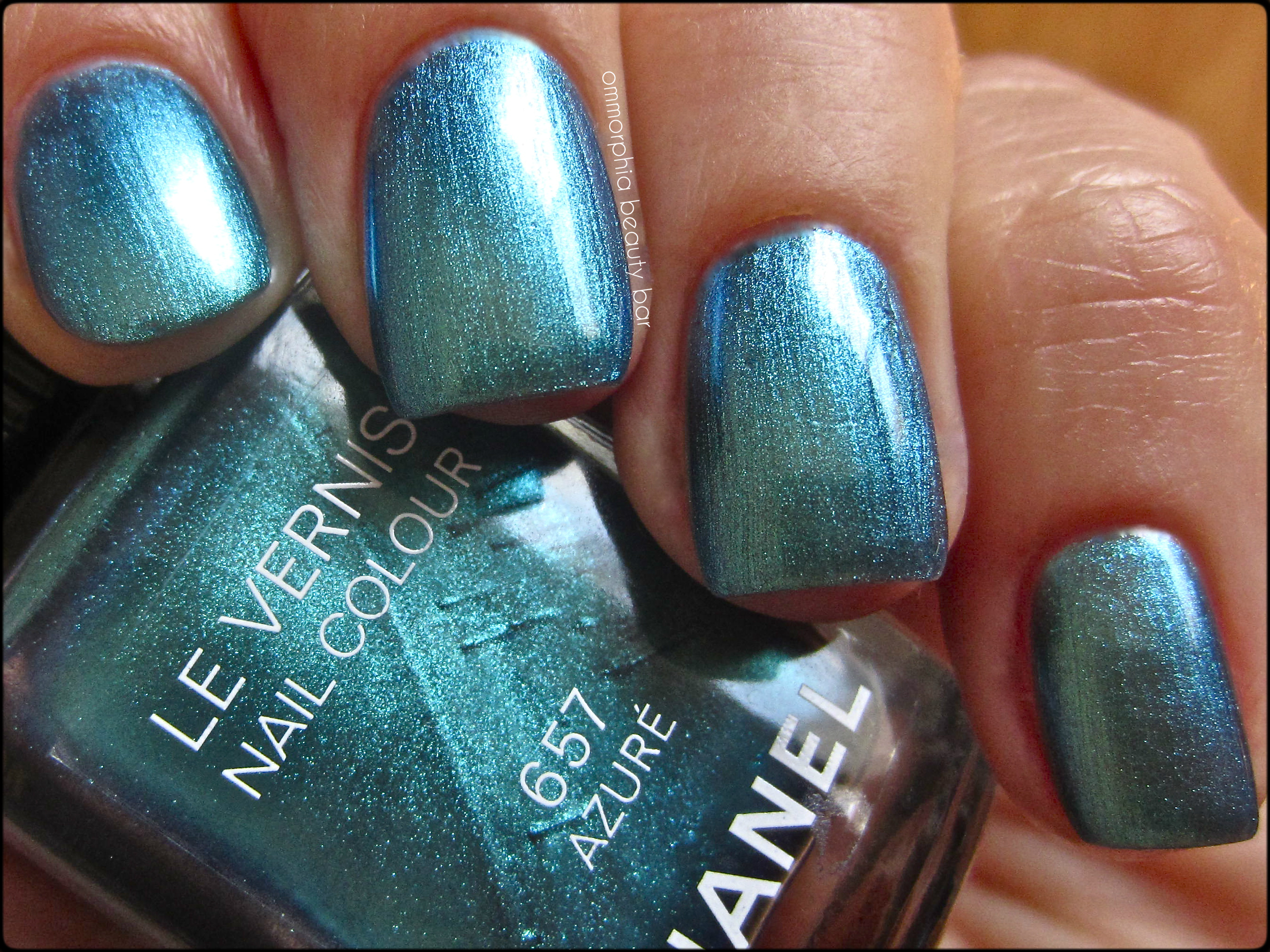
CHANEL – #657 Azuré
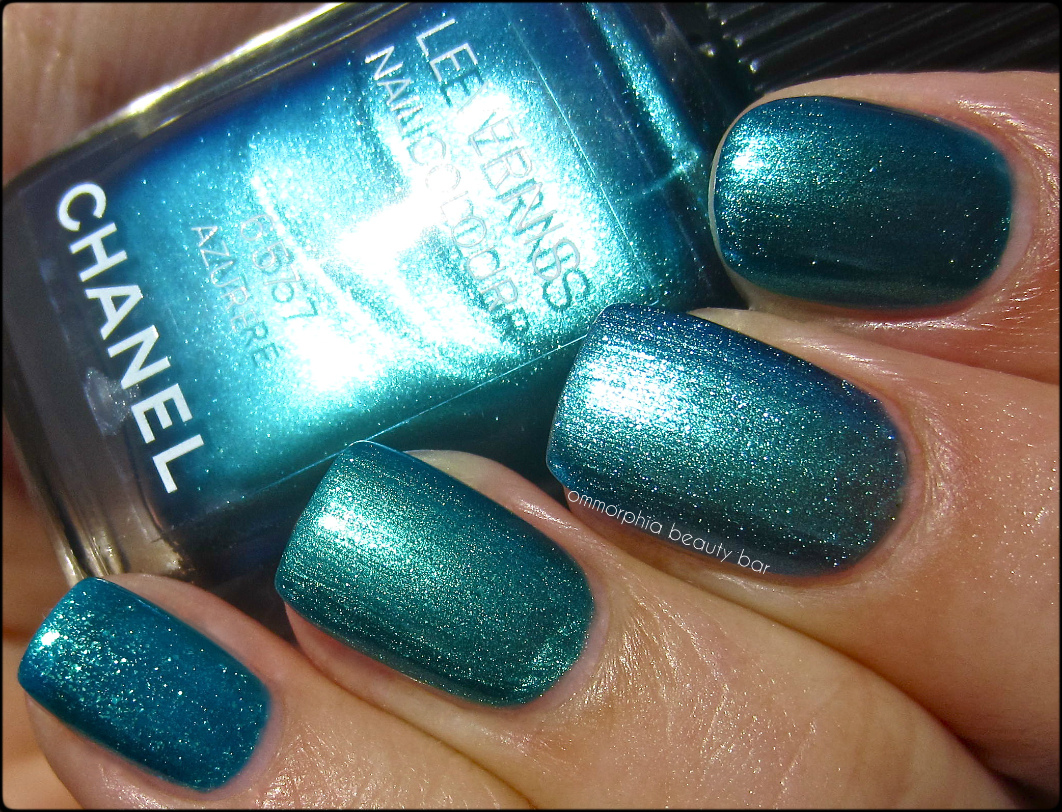
- Index: China Glaze ‘Deviantly Daring’ (reviewed here) – the closest colour-wise, more pigmented with the shimmer slightly more defined, a few degrees deeper/greener leaning – 2 coats
- Ring: Dior #704 from the Samba Duo (Birds of Paradise Collection) – duller finish, more green tinged, not as obviously metallic – 2 coats
- Middle: CHANEL #657 Azuré
- Pinkie: OPI ‘Catch Me In Your Net’ – sheerer formula, blue leaning, visibly larger shimmer with ground gold & teal/aqua glitter – 2 coats
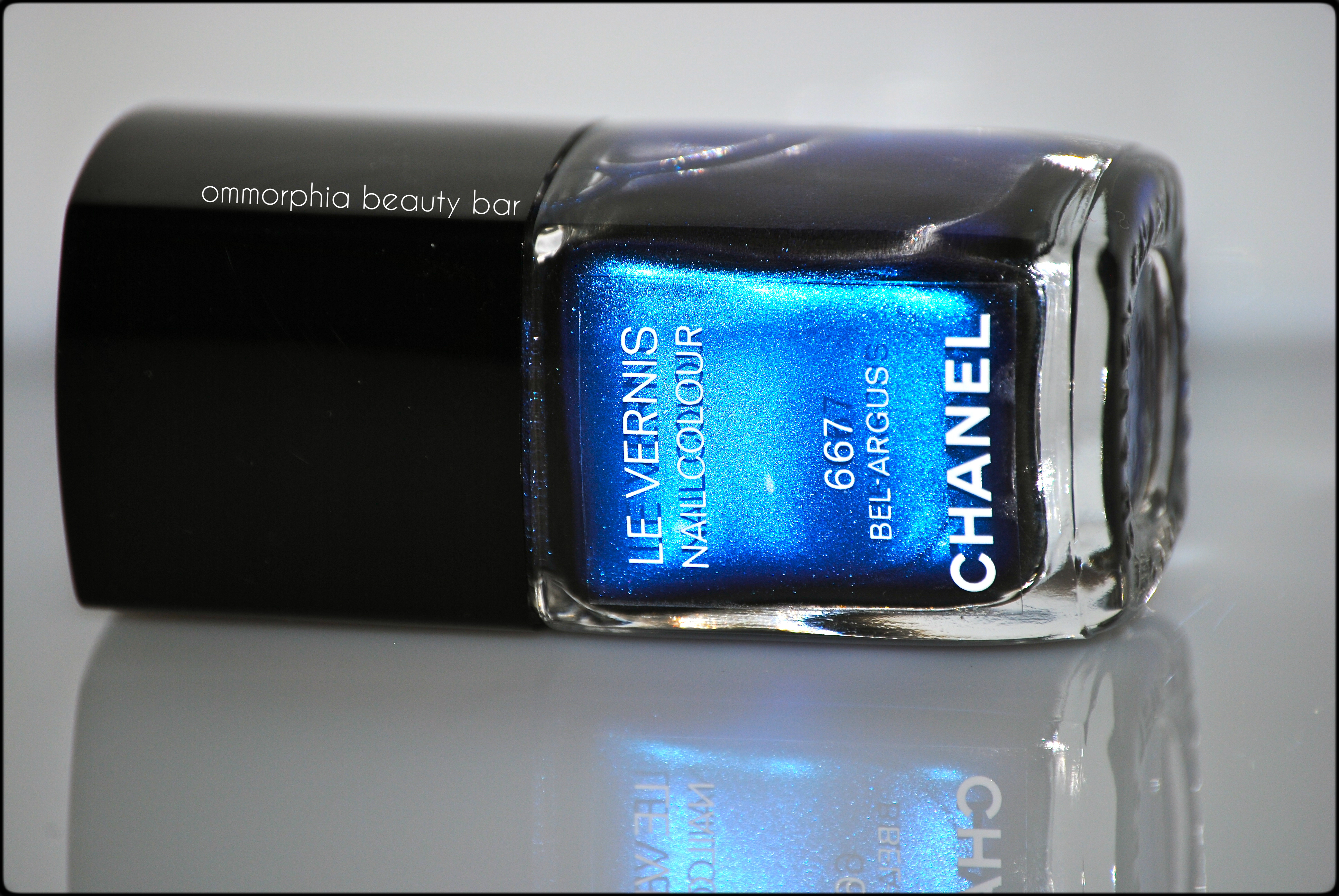
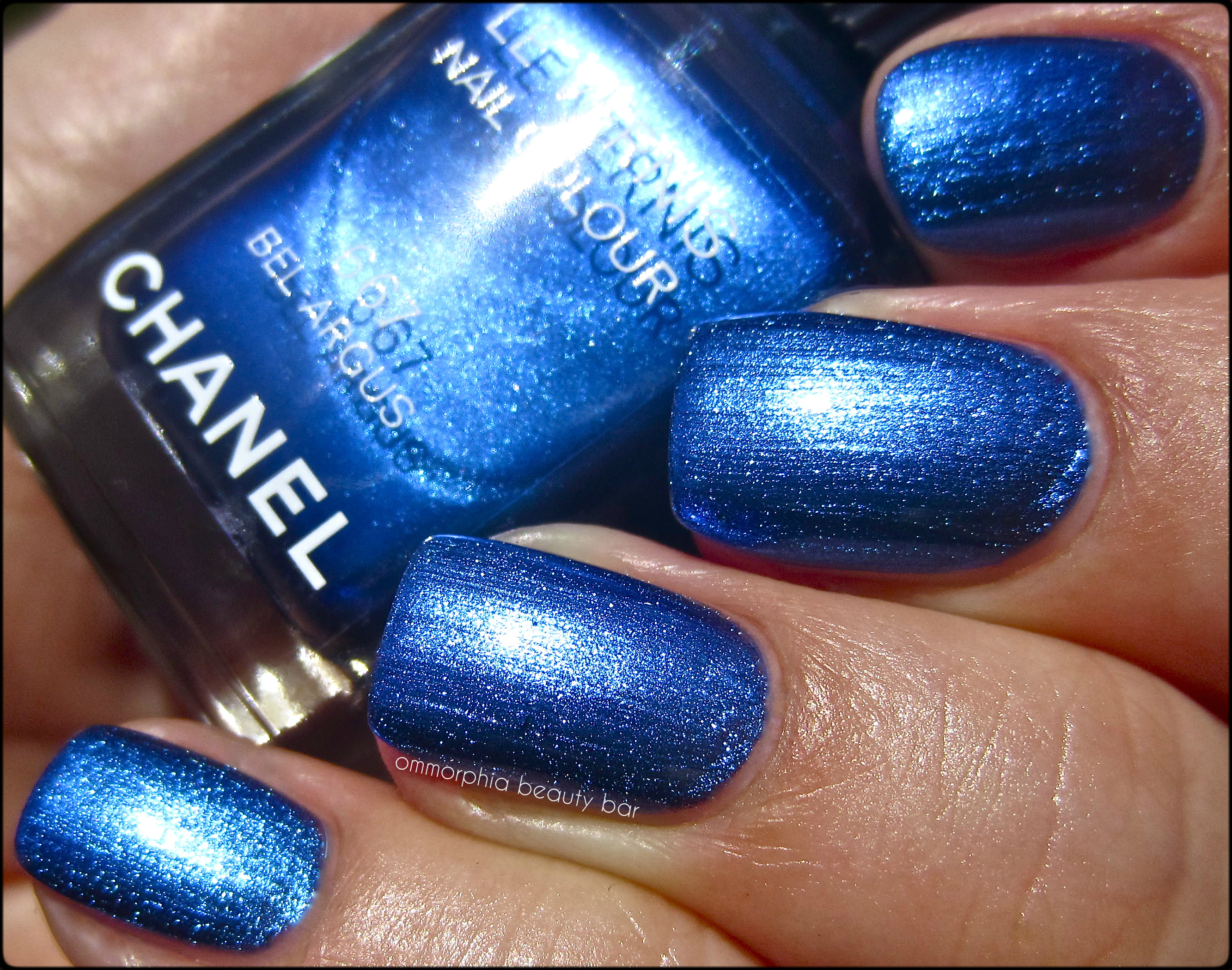
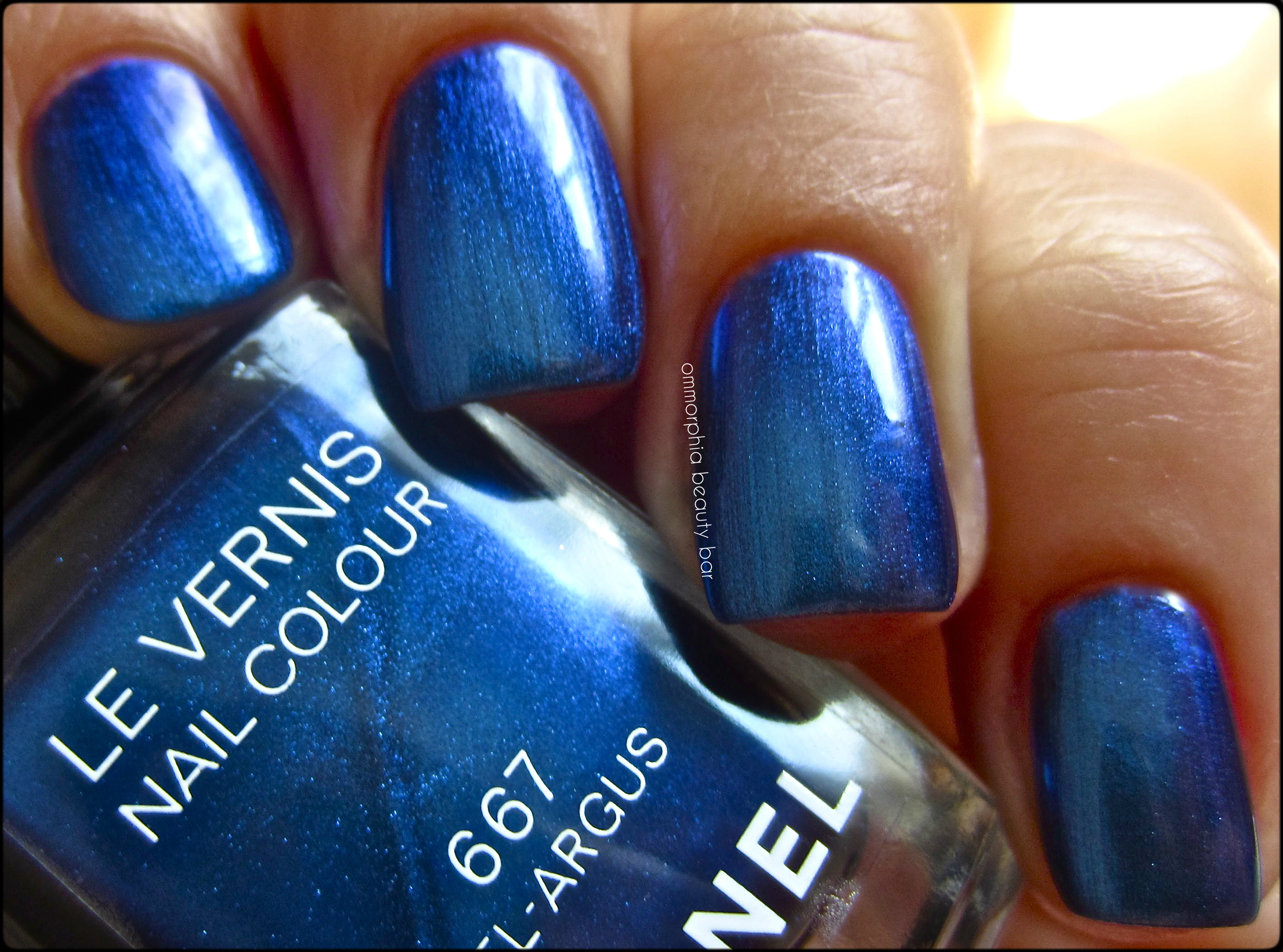
#667 Bel-Argus – a complex royal blue chrome/metallic shade with a distinct purple/indigo colour shift. The formula is much more forgiving – both in terms of application re: any visible brush strokes, as well as dry time – than Azuré. Absolutely breathtaking to look at with intricately swirling cobalt depths give Bel-Argus a unique tone, making it almost luminous, in fact. Bonus: non-staining upon removal. Coats applied: 2, plus top coat
CHANEL – #667 Bel-Argus
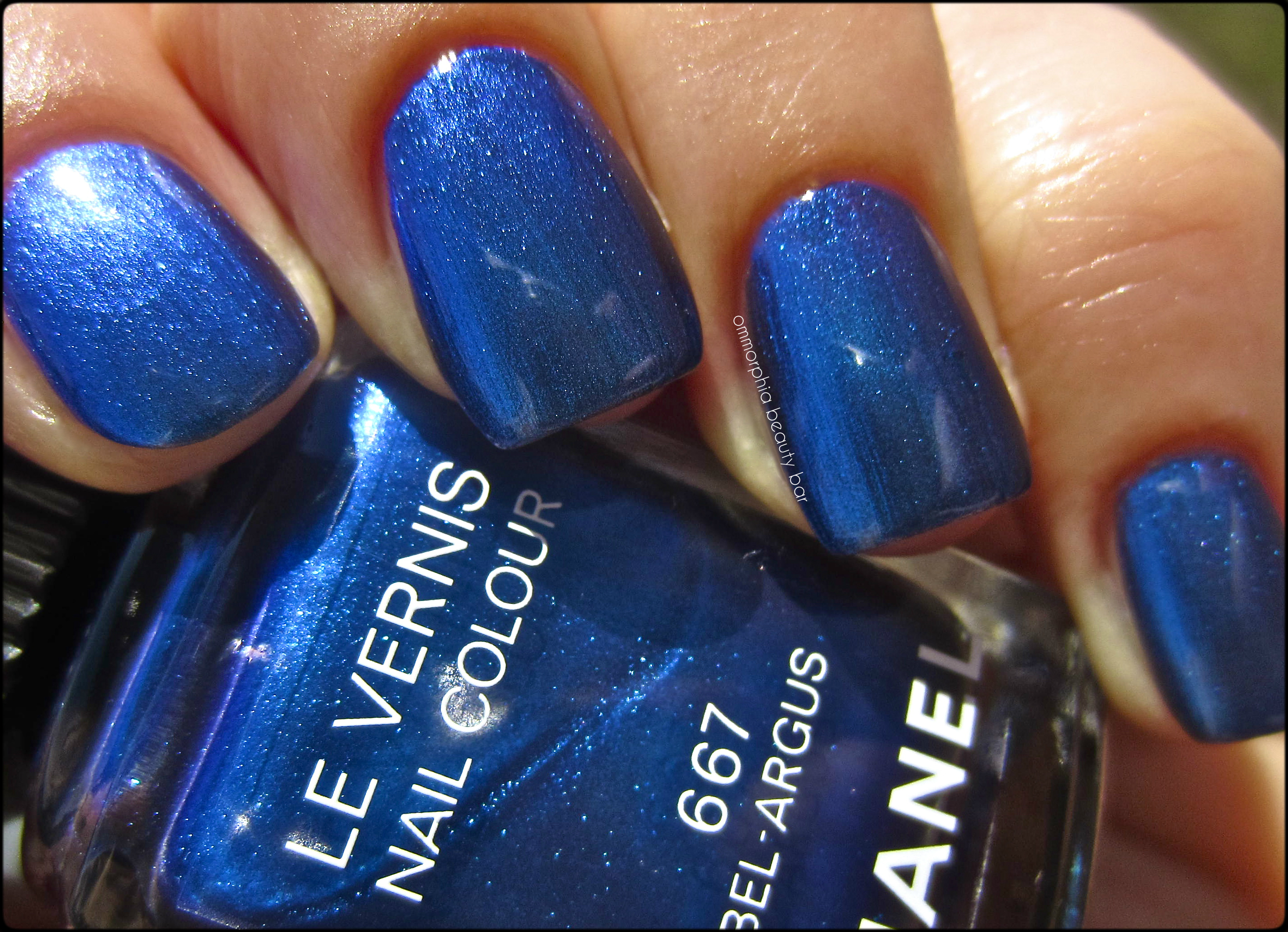
CHANEL – #667 Bel-Argus
CHANEL – #667 Bel-Argus

- Middle & ring: CHANEL – #667 Bel-Argus
- index & pinkie: Chine Glaze ‘Want My Bawdy’ (reviewed here) – thinner & sheerer formula, shimmer larger & more visible, purple-leaning – 2 coats
Last word: I couldn’t be happier with this trio of colours CHANEL chose to release for their Summer 2013 Collection – vibrant, almost thrumming with life & beauty, they are as gorgeous to wear, as to look at. I thought at first that ‘Lilis’ might be have a duplicate in my extensive personal CHANEL collection, but I couldn’t find any with the same tone and/or vibrance. It goes without saying that both ‘Bel-Argus’ and ‘Azuré’ are completely unique for CHANEL – and even amongst the comparisons I showed – and certainly worth picking up as well. My favourites? ALL. And just as fleeting as butterflies, that’s how quickly this collection will disappear, I’m giving you fair warning … run, don’t walk, to stake your claim on any of these lovelies.
I picked these up from The Bay (Canada).
Essie – Resort 2013 Collection

If Essie’s goal is to help banish the winter blahs, then I’d say they’re off to a great start with their Resort 2013 Collection of these four happy & colour saturated hues. With a mix of crème and jelly finishes, as well as a nice selection of brights and/or aquatic tones, these four shades manage to perfectly capture the essence of the warmer weather to come .. which couldn’t be soon enough for me.

Essie – Resort 2013 Collection
Under Where – (get it? “underwear”? yes…totally cheesy of me …) a bright lilac hue with pink undertones in a jelly-esque formula, that gives surprisingly good coverage even by the first coat – totally self-levelling and highly glossy at the finish. Coats applied: 2, plus top coat

Essie – Under Where

Essie – Under Where

Positive that I had at least 1 shade in my collection that would be a near duplicate to ‘Under Where’, I was pleasantly surprised to note that I actually had nothing even remotely like it; I opted to compare it to ‘Nice is Nice’ (reviewed here), although the differences are glaringly obvious.
- index & pinkie fingers: ‘Nice is Nice’ (2 coats) – thinner flow, hybrid crème-jelly formula, lavender toned and more blue based, several degrees lighter overall
- middle & ring fingers: ‘Under Where’
First Timer – vivid aqua green crème hue with yellowish undertones, in a thicker formula that applied a touch patchy with the first coat, but levelled off completely by the second, becoming fully opaque. Highly colour saturated and almost bordering on neon, there was absolutely no staining upon removal. Coats applied: 2, plus top coat

Essie – First Timer

Essie – First Timer

While I own basically every green shade that Essie has produced, the only one that came even remotely close was ‘Turquoise & Caicos’, although even that’s a stretch, as can be seen by the swatches.
- index & pinkie fingers: ‘Turquoise & Caicos’ (3 coats) – more muted in tone, blue leaning, sheerer formula and a significantly thinner flow
- middle & ring fingers: ‘First Timer’
Come Here – electric coral/poppy hue with hot pink undertones – just shy of looking fully neon, in an ultra-pigmented formula that can almost pass as a 1-coater. Perfectly self levelling in application, it bears a nice shine at the finish, although not super glossy. Bonus: non-staining upon removal. Coats applied: 2, plus top coat

Essie – Come Here

Essie – Come Here

I easily found 3 shades in my Essie collection that seemed at first glance to be clones of ‘Come Here’, but I opted to compare it to the 2 closest: ‘Olé Caliente’ (reviewed here), and ‘Flirt’.
- index finger: ‘Olé Caliente’ (2 coats) – sheerer, hybrid crème-jelly formula, a hair lighter & just a touch less vivid in tone
- middle & pinkie fingers: ‘Come Here’
- ring finger: ‘Flirt’ (2 coats) – fully pigmented, similar formula although a touch more red/orange leaning, glossiest natural finish
In The Cab-Ana – vibrant Robin’s Egg Blue shade in a crème formula, highly colour saturated, completely self-levelling and with a beautifully glossy finish. Bonus: non-staining upon removal. Coats applied: 2, plus top coat

Essie – In The Cab-Ana

Essie – In The Cab-Ana

I was convinced that ‘In The Cab-Ana’ was an exact match to ‘Where’s My Chauffeur’ (reviewed here), but swatching the two proved otherwise.
- index & pinkie fingers: ‘Where’s My Chauffeur’ (2 coats) – thinner & slightly sheerer formula, more of a “Tiffany Blue” and bearing greenish undertones
- middle & ring fingers: ‘In The Cab-Ana’
Final thoughts: I confess to being a bit disappointed when I first beheld these shades, as at first glance none of them seemed that original colour-wise to me. I was also positive that with an Essie collection as extensive as mine, I would own several near-copies of each hue presented, but ‘Come Here’ was the only shade that has a twin (or triplet, in this case). I don’t wear lilac & lavender shades often, but I must admit that ‘Under Where’ is a shade that will suit all skin tones, while ‘First Timer’ is a great way to wear a bright green without coming off as too “Crayola”. My favourite of them all, is hands down ‘In The Cab-Ana’ (that name … resigned sigh), and if you missed out on ‘Where’s My Chauffeur’, you definitely need to pick this up. So yeah, no news-breaking colours, but a well-executed little collection, with formulas that are all a pleasure to apply!

Kindly provided by Essie for my unbiased consideration
CHANEL – Le Vernis Eastern Light & Western Light

To celebrate the opening of their largest boutique at Hysan Place in Hong Kong, CHANEL has released a small and limited edition capsule collection, consisting of an eyeshadow palette (Pearl River) and the 2 new nail lacquers shown here, ‘Eastern Light’ and ‘Western Light’ – colours inspired by the city’s contrasts of deep browns to brilliant whites. As it was recently announced that Peter Philips would be stepping down from his position as CHANEL’s Makeup Global Creative Director, this now becomes the last makeup collection he will have designed for the brand.
I have to state that I feel so blessed to have a husband who not only accepts, but understands (and indulges) my passion for CHANEL, as these 2 limited edition beauties formed part of his Valentine gifts to me (the last gift, CHANEL’s ‘Mouche de Beauté’ will be shown soon) – definitely the way to my heart ♥ I’ve also been trying to narrow down my wishlist of CHANEL’s fragrances amongst their ‘Les Exclusifs’ Collection, so the 3 scent samples that were included could not have come at a better time – plus, I just adore how they look!

CHANEL – Hong Kong Collection

CHANEL – Hong Kong Collection

CHANEL Eastern Light – (CAD $27.00 – 13 ml/0.4 fl.oz) a cool white crème hue with faint blueish undertones, that applies basically streak-free even by the 1st coat. Bearing a perfect density to the formula – neither too thick nor thin, it falls in a self-levelling way and leaves an ultra glossy finish behind. I absolutely LOVE its pristine whiteness – looks exactly like freshly fallen snow! Coats applied: 2, plus top coat

CHANEL – Eastern Light

CHANEL – Eastern Light
While I own several other CHANEL white shades, they all have shimmer of some type, and so I didn’t bother comparing those to Eastern Light. The next closest I own, are Essie’s ‘Blanc’, and OPI’s ‘My Boyfriend Scales Walls’ (reviewed here), and how they compared (2 coats each, plus top coat):
- index finger: OPI ‘My Boyfriend Scales Walls’ – thinner density, excellent flow to the formula, comes across as slightly grey tinged beside the other 2
- middle & pinkie fingers: CHANEL ‘Eastern Light’
- ring finger: Essie ‘Blanc’ – formula a degree thicker and just slightly more opaque, colour seems a bit more vivid to the naked eye, closest in tone

CHANEL – Eastern Light & comparisons

CHANEL – Eastern Light & comparisons

buy renova online bloinfobuy.com/renova.html no prescription
CHANEL Western Light – (CAD $27.00 – 13 ml/0.4 fl.oz) a deep brown/mink hue filled with ultra-fine reddish shimmer in a quasi-sheer jelly-esque formula, that becomes perfectly opaque by the second coat. The shimmer is more visible in the bottle than what comes across on the nail, but it definitely adds a multi-dimensional touch to a colour that manages to stay just shy of appearing black. A decadent & luscious looking dark chocolate shade, the glassy finish makes the addition of top coat almost redundant – totally LOVE its molten look! Coats applied: 2, plus top coat

CHANEL – Western Light, detail

CHANEL – Western Light

CHANEL – Western Light

CHANEL – Western Light, with flash
While I do own a few brown toned CHANEL lacquers for comparison, none of them had either the same depth of tone or a similar shimmer; ‘Vertigo’ (reviewed here), and ‘Haute Chocolat’ (reviewed here) were my original choices, and I also included the original ‘Rouge Noir’ (reviewed here), as asked by several readers. How they compared (2 coats each, plus top coat):
- index finger: Vertigo – similar “hidden shimmer” effect, excellent pigmentation, more crème-like formula, same muddied tone although it looks grey-based in comparison
- middle finger: Eastern Light
- ring finger: Haute Chocolat – definitive dark brown hue, slightly sheerer formula, golden shimmer that is as apparent on the nail as in the bottle
- pinkie finger: Rouge Noir – oxblood hue, crème formula, the glossiest of them all, looks burgundy beside the others
buy revatio online bloinfobuy.com/revatio.html no prescription

CHANEL – Western Light & comparisons

CHANEL – Western Light & comparisons, with flash

Les Exclusifs de CHANEL samples in: Sycomore, 31 Rue Cambon, and Coromandel
Final thoughts: Knowing that these two varnishes form part of Peter Philips’ last creation for CHANEL, makes it a little poignant for me and I’m very happy to have them in my collection for that reason, as well as the fact that I don’t own anything like them from this brand. The formula for each was simply superb; while I’ve always maintained my love of deeply brooding hues, lately I’ve been strangely drawn to whites, and ‘Eastern Light’ is a true standout, with it’s crisp tone and paradoxically opaque yet translucent appearance. ‘Western Light’ is absolutely perfect for when you want a dark shade that’s NOT black, and I can even see these two working together in a unique French mani (note to self: must try this).
buy sinequan online bloinfobuy.com/sinequan.html no prescription
Available now through the CHANEL site (for US readers only) and through select CHANEL boutiques – mine were purchased through the Holt Renfrew Bloor St. location – remember that these are limited edition.

*Disclosure: Product samples provided by the company/PR for my unbiased consideration
YSL – La Lacque Couture #18 Bleu Majorelle

When YSL Beauté re-vamped their nail lacquer line with the now larger and permanent colour line up, one of the shades that literally stood head & shoulders above them all, was the vibrant #18 Bleu Majorelle; the problem lay in that it was constantly sold out at every counter I visited, else I would have snagged this beauty long ago. Never mind … it’s mine now!
There’s an interesting connection/history behind this particular blue shade, and the house of YSL; M. Saint Laurent who often visited Marrakech, Morocco for design inspiration, fell in love with a botanical garden there created by French artist Jacques Majorelle. Along with his partner Pierre Pergé, M. Saint Laurent then bought the garden 1980 and not only lovingly restored it all, but added a new design to it with each visit, preserved it as a museum of Islamic art, and eventually had his ashes scattered there when he passed away in 2008.
The original garden was created in 1924 by French artist Jacques Majorelle, who drew inspiration from the blue colour found in local Moroccan tiles, and he used this colour throughout the garden, painting the walls, fountains, and features of the villa in this intensely blue shade, finally trademarking the name “Majorelle Blue”.

Majorelle Garden – Marrakech, Morocco (source)

YSL – #18 Bleu Majorelle

YSL – #18 Bleu Majorelle

YSL – #18 Bleu Majorelle – (CAD $27.00 10 ml/0.34 fl.oz) an intensely vivid ultra blue shade, in a STELLAR jelly-esque formula that applies streak-free and in a buttery smooth self-levelling way. Highly colour saturated and perfectly opaque at 2 coats, the finish is insanely brilliant. Bonus: absolutely non-staining upon removal. Coats applied: 2, plus top coat

YSL – #18 Bleu Majorelle

YSL – #18 Bleu Majorelle

YSL – #18 Bleu Majorelle, matte

YSL – #18 Bleu Majorelle, matte

While I own several bright blue shades in my personal collection, I was surprised to find that only one was close enough to Bleu Majorelle to warrant a comparison – Essie’s ‘Butler Please’ (reviewed here), and even further stunned at how close the two are colour-wise; with the naked eye, you can just make out a hint of variance between them, but the biggest difference lies in the price tag with the Essie being easily 1/3 the cost of the YSL.
- index & pinkie fingers: Essie ‘Butler Please’ – 1st coat not as smooth laying, thicker formula, colour almost identical but perhaps a couple of degrees less intense, not as naturally brilliant, non-staining as well
- middle & ring fingers: YSL #18 Bleu Majorelle

YSL – #18 Bleu Majorelle vs Essie ‘Butler Please’

YSL – #18 Bleu Majorelle vs Essie ‘Butler Please’
buy valtrex online bloonlineandnew.com/valtrex.html no prescription
Final thoughts: There is everything to love about this varnish, starting from the eye-catching colour, the amazing application, long-lasting & glossy formula, to the fact that it’s completely non-staining … all well worth the rather steep price tag, in my opinion. The fact that ‘#18 Bleu Majorelle’ is part of YSL’s permanent range is also a bonus – no need to run out and stockpile. A truly spectacular blue that manages to look sophisticated, modern, classy & edgy at the same time – also perfect for when you want to make a unique fashion statement.
buy ventolin online bloonlineandnew.com/ventolin.html no prescription
I picked mine up at Holt Renfrew (Canada).

buy wellbutrin online bloonlineandnew.com/wellbutrin.html no prescription
*Disclosure: Product samples provided by the company/PR for my unbiased consideration


