
Filed In: nail polish
a-england | The Blessed Damozel, Heavenly Quotes Collection

There are lacquers, and then there are lacquers; what makes a-england polishes stand out, is an ephemeral quality that is hard to pin down, but is strongly felt nevertheless. With her love of art, beauty, and literature – in particular the Pre-Raphaelite period, Adina Bodana (the creative genius behind this brand) continues to draw inspiration from one of her favourite artists of that period, Dante Gabriel Rossetti. The latest addition to her Heavenly Quotes Collection, is The Blessed Damozel – a lush purple hue with what appears to be plume-like swirls of colour running throughout the base, all of which only add to its hypnotic appeal.
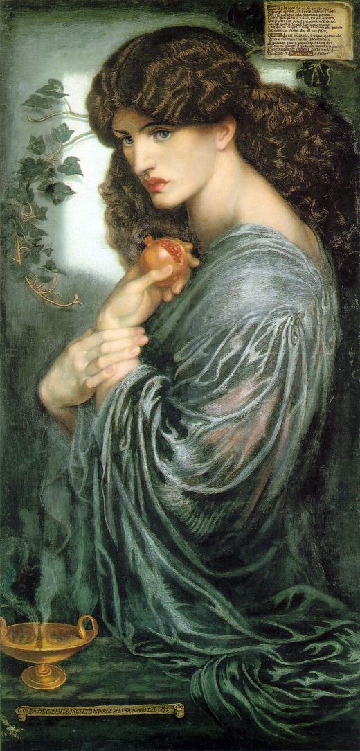
Originally published in 1850 (and subsequently revised twice after that), Rossetti’s poem, The Blessed Damozel, was partially inspired by Edgar Allen Poe’s ‘The Raven’, a story of love, grief, unrequited yearning, and celestial bodies. Interestingly, Rossetti’s poem preceded his painting of the same name, with a maiden (the ‘Damozel’) in heaven gazing down in eternal mourning at her earth-bound lover.
Purple, a hue long associated with both royalty and that of death, also happens to have been a favourite with artists of the Pre-Raphaelite movement such as Rossetti; the undulating pattern seen in the bottle of a-england’s The Blessed Damozel combined with the intensity of colour, perfectly captures the essence of a deep abiding passion clouded by loss. In other words, Adina has done it again and has managed to bring a piece of literature to life in nail lacquer form.

The Blessed Damozel (1875-78), Dante Gabriel Rossetti (credit)

The Blessed Damozel (poem originally published in 1850), Dante Gabriel Rossetti (credit)

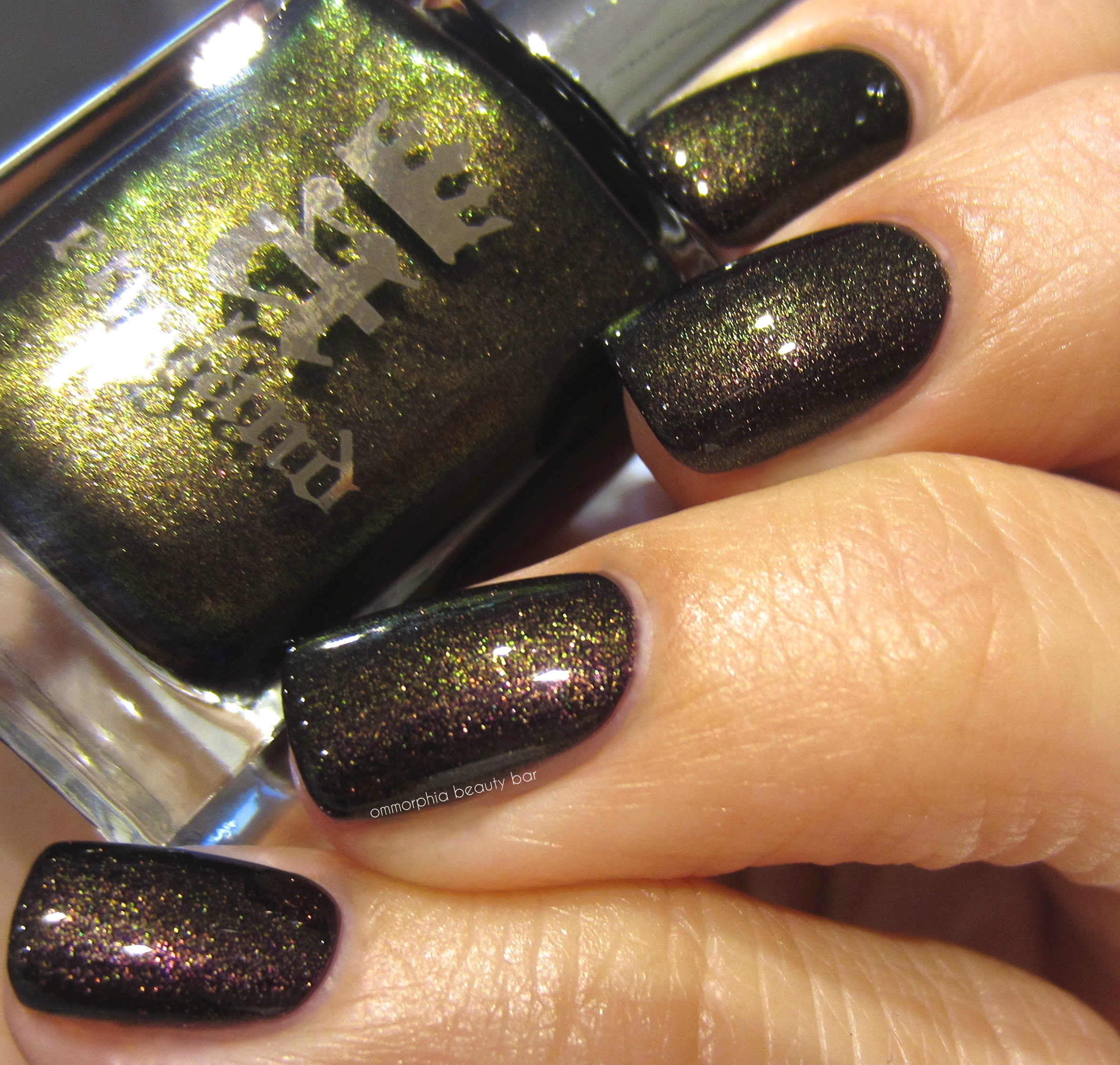
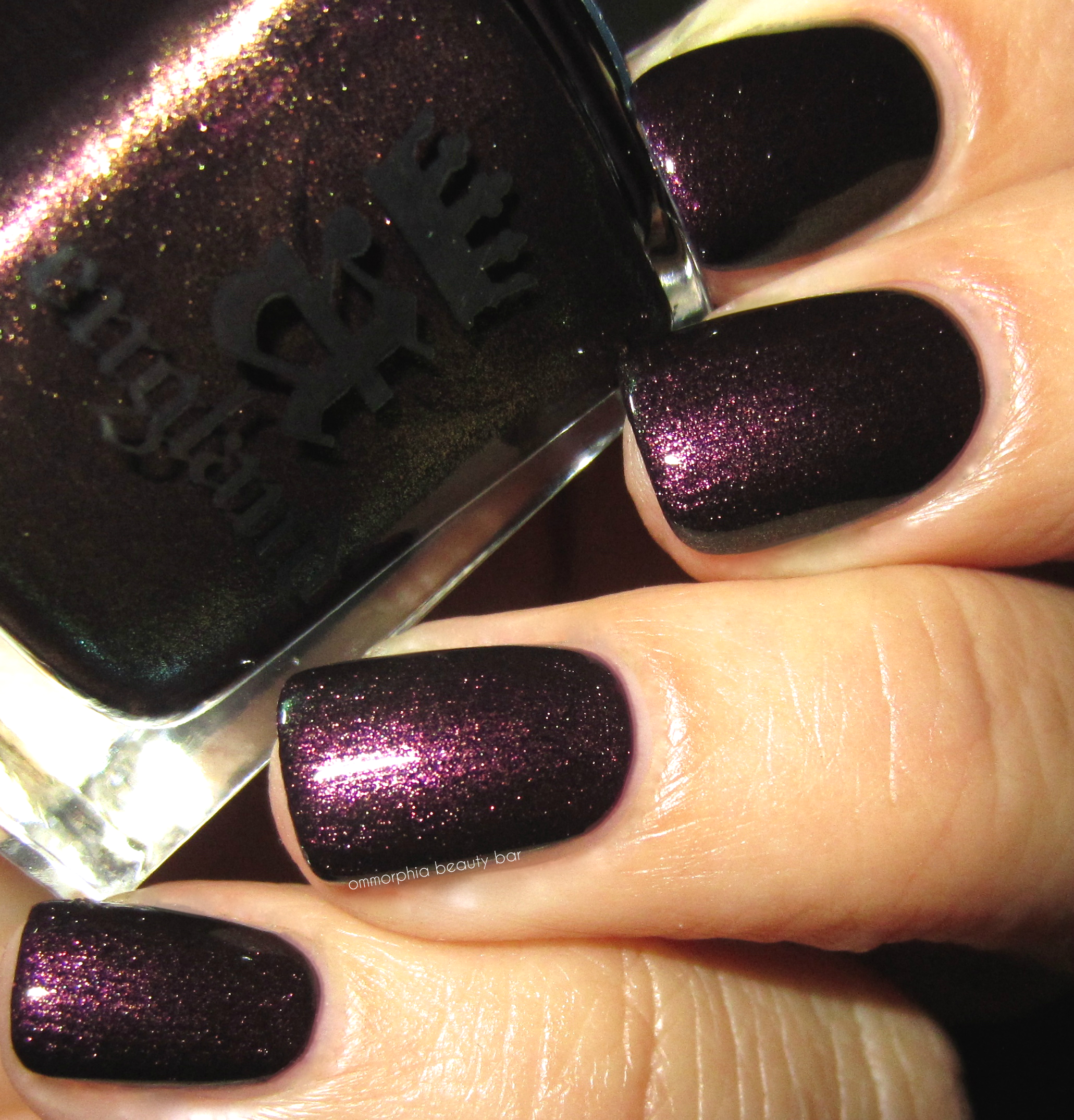
The Blessed Damozel | A deeply regal violet with ultra fine inner shimmer in a formula that leans slightly towards the thick side, but which levels out easily and beautifully, with no pooling towards the cuticles. The high saturation of colour means you can basically get away with one coat for full coverage, although I personally prefer the look of two. As the finish is shiny but not glossy, adding a top coat really enhances all the inner fire of this shade and truly makes it stand out. Bonus: non-staining upon removal.
Coats: 2, plus top coat

a-england | The Blessed Damozel, Heavenly Quotes Collection

a-england | The Blessed Damozel, Heavenly Quotes Collection

a-england | The Blessed Damozel, Heavenly Quotes Collection

a-england | The Blessed Damozel, Heavenly Quotes Collection

a-england | The Blessed Damozel, Heavenly Quotes Collection

a-england | The Blessed Damozel, Heavenly Quotes Collection (detail)
It’s no secret that I have a soft spot for this brand, and my love for a-england (and its founder) have been well documented over the years in many posts (click on the a-england tab in the sidebar to see swatches of the entire range), but something about The Blessed Damozel has resonated with me on an almost visceral level; it satisfies my need for broodingly moody shades but stays clear of looking too blackened, provides a multi-dimensional depth of tone thanks to the inner shimmer, and just looks so incredibly velvety and luxurious on the nails. Doesn’t get better than that, I tell you.
The Blessed Damozel is part of a-england’s permanent collection. Find more information on the entire range via a-england.co.uk – Find your nearest retailer here.

Press sample kindly provided by a-england for my unbiased consideration


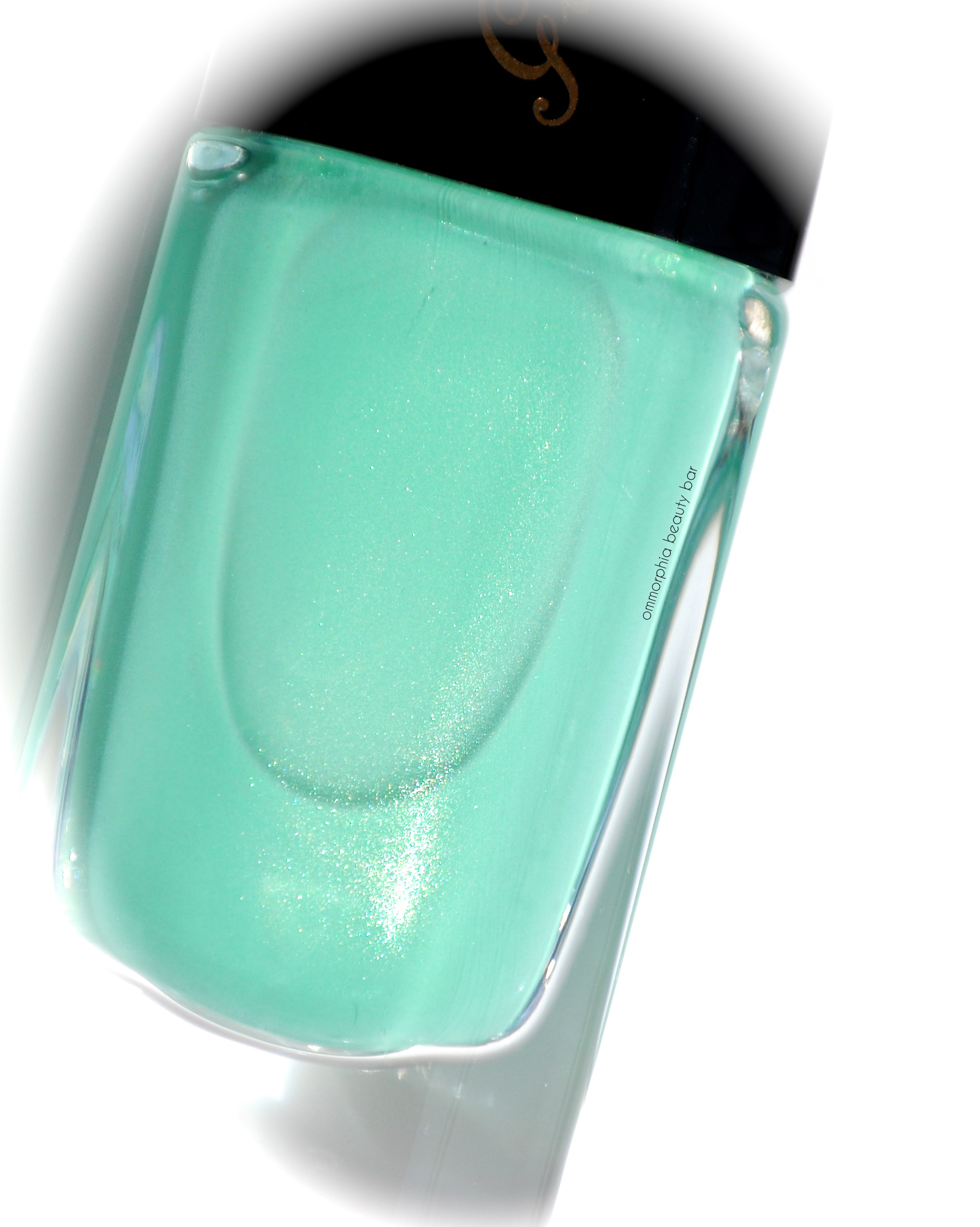
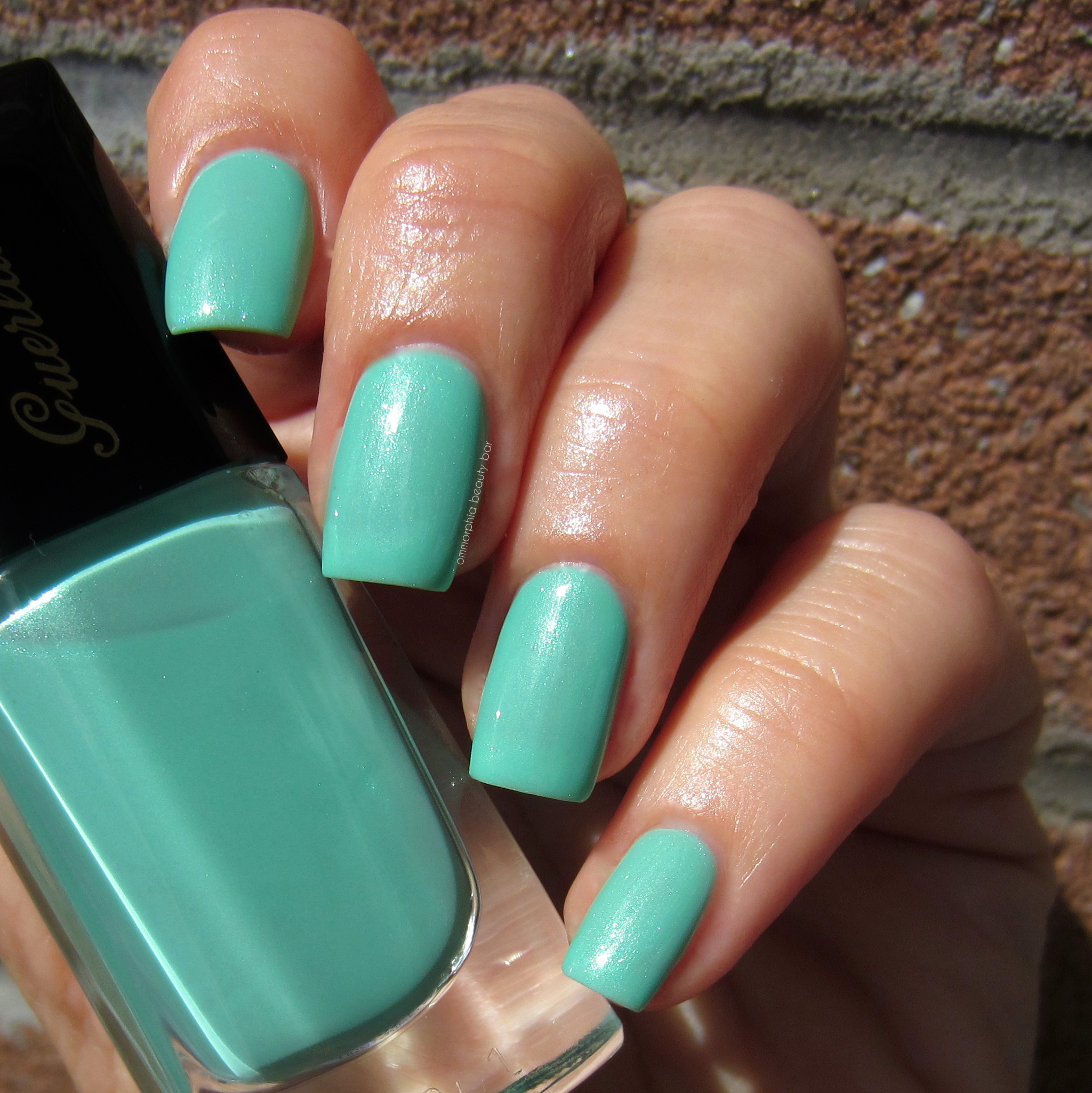
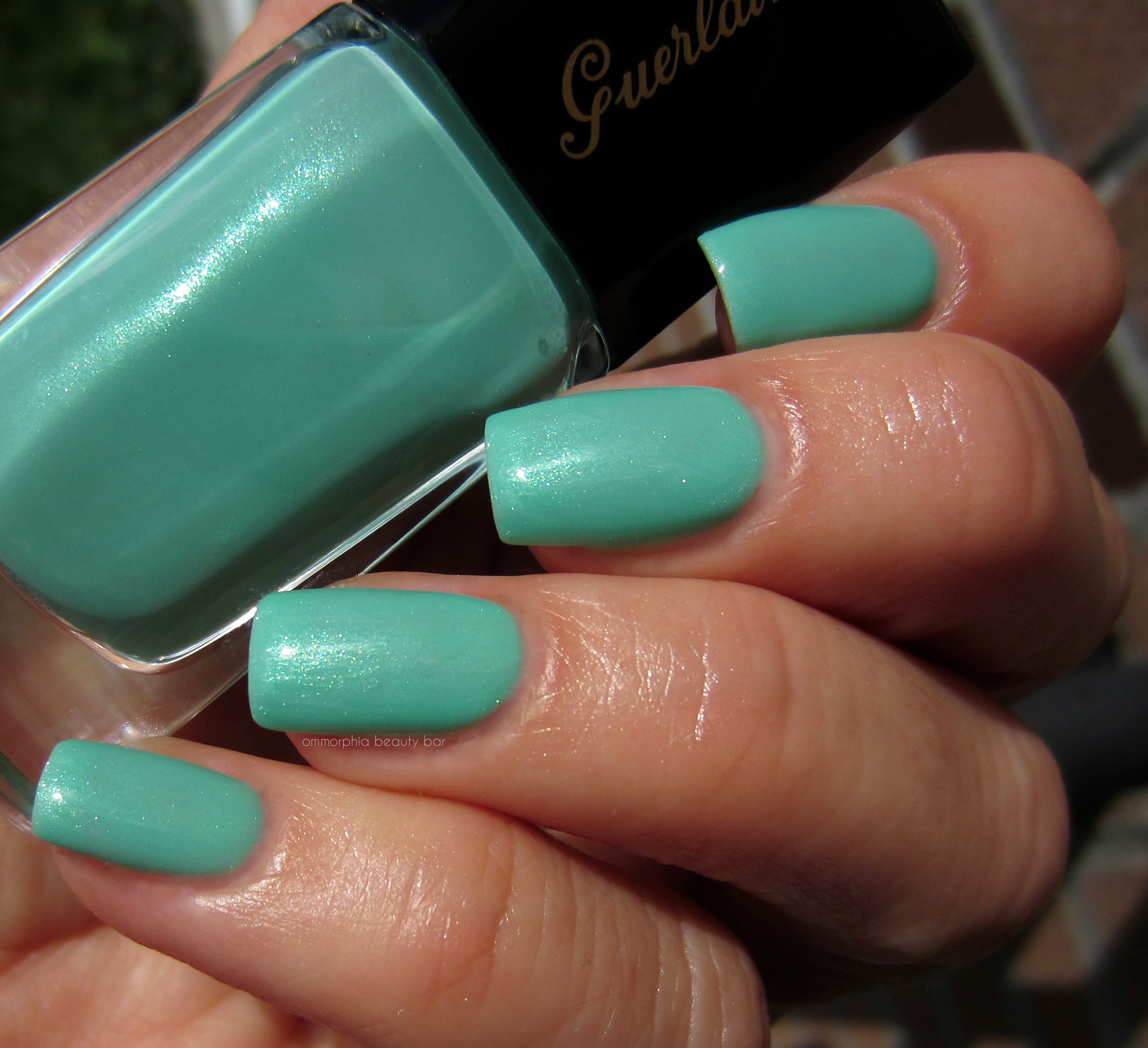
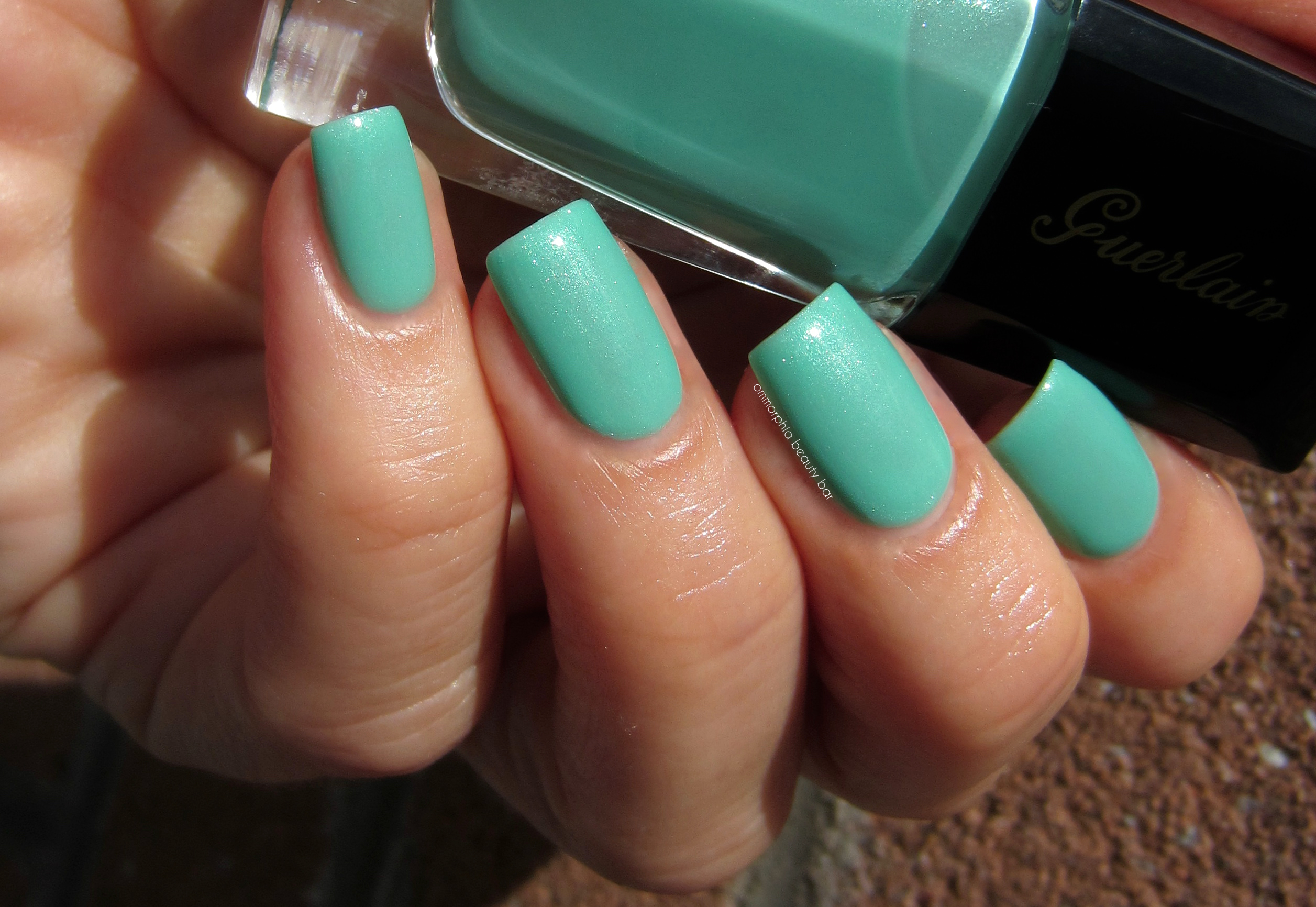
Guerlain | La Laque Couleur 700 Blue Ocean

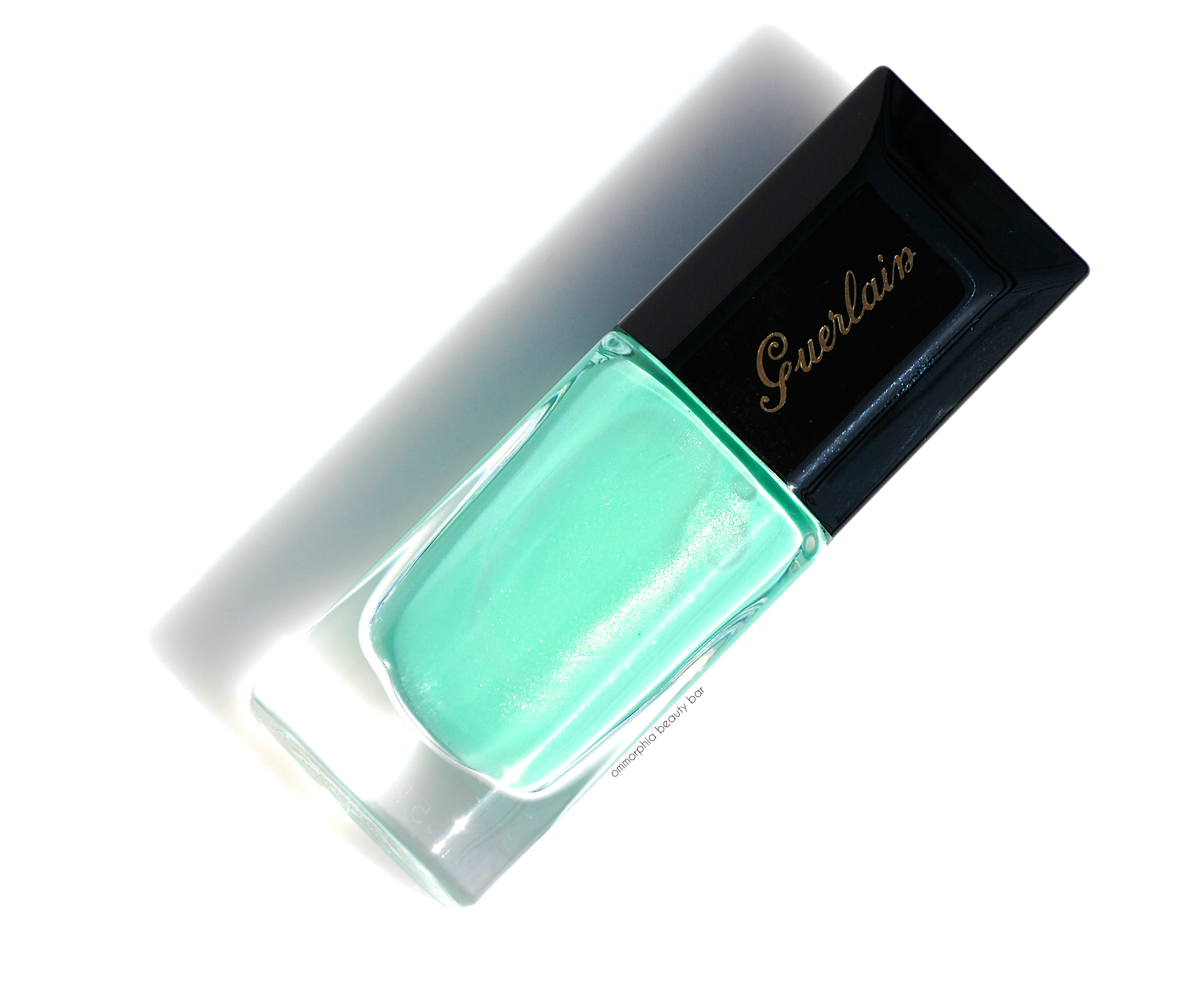
When Guerlain released their Summer collection, I was immediately drawn to 700 Blue Ocean (CAN $29.00), a shimmery aquatic confection that so perfectly reflected the feeling of Summer (and speaks to my beach-loving heart) … a season I’m nowhere near ready to let go of yet.
The breakdown: One of the most stunning aqua shades I’ve ever come across (or worn, for that matter), the formula of 700 Blue Ocean is near perfection in so many aspects: excellent density and flow (neither too runny nor thick, and will not pool around the cuticle area), a non-patchy & self-levelling application, and comes to a high gloss at the finish. The shimmer is exceptionally finely ground and flashes with a prismatic/silvery light at some angles, lending an added depth of tone to what is already a sublime hue. The first coat applies semi-sheer, but still provides decent coverage, while two coats will be much more opaque (those with longer nails will still see visible nail line – nothing that a third thin coat couldn’t take care of, although I personally love a slight translucency with this type of colour; gives it a more oceanic vibe).
I need to add that if you’ve never tried a Guerlain nail polish, then you’re missing out on not only an amazing formula, but one of the best brushes around; slightly bevelled and with the perfect combination of superior splay, flexibility, and density – all you need do is place this brush at the top of the nail bed, and let it do the rest for you. Flawless application in almost one swipe. For real.
Coats applied: 2 over Guerlain’s Nailift La Base base coat (which is phenomenal, by the way – review forthcoming), plus top coat.

Guerlain | La Laque Couture 700 Blue Ocean (Limited Edition)
Guerlain | La Laque Couture 700 Blue Ocean (Limited Edition)
Guerlain | La Laque Couture 700 Blue Ocean (Limited Edition)
Guerlain | La Laque Couture 700 Blue Ocean (Limited Edition)
Guerlain | La Laque Couture 700 Blue Ocean (Limited Edition)

Guerlain | La Laque Couture 700 Blue Ocean (Limited Edition)
The bad news: 700 Blue Ocean is a limited edition shade. The good news? Some counters may still have a bottle squirrelled away. That being said, if you’re a fan of aquatically-themed lacquer hues, or in the market for a spectacular nail polish, then I strongly suggest you try and hunt this little lovely down. It’s worth it, believe me.
Guardian beauty products are available at The Bay & thebay.com, Sephora & sephora.com, and Holt Renfrew across Canada. Find more information on the brand via www.guerlain.com
Press sample kindly provided for my unbiased consideration
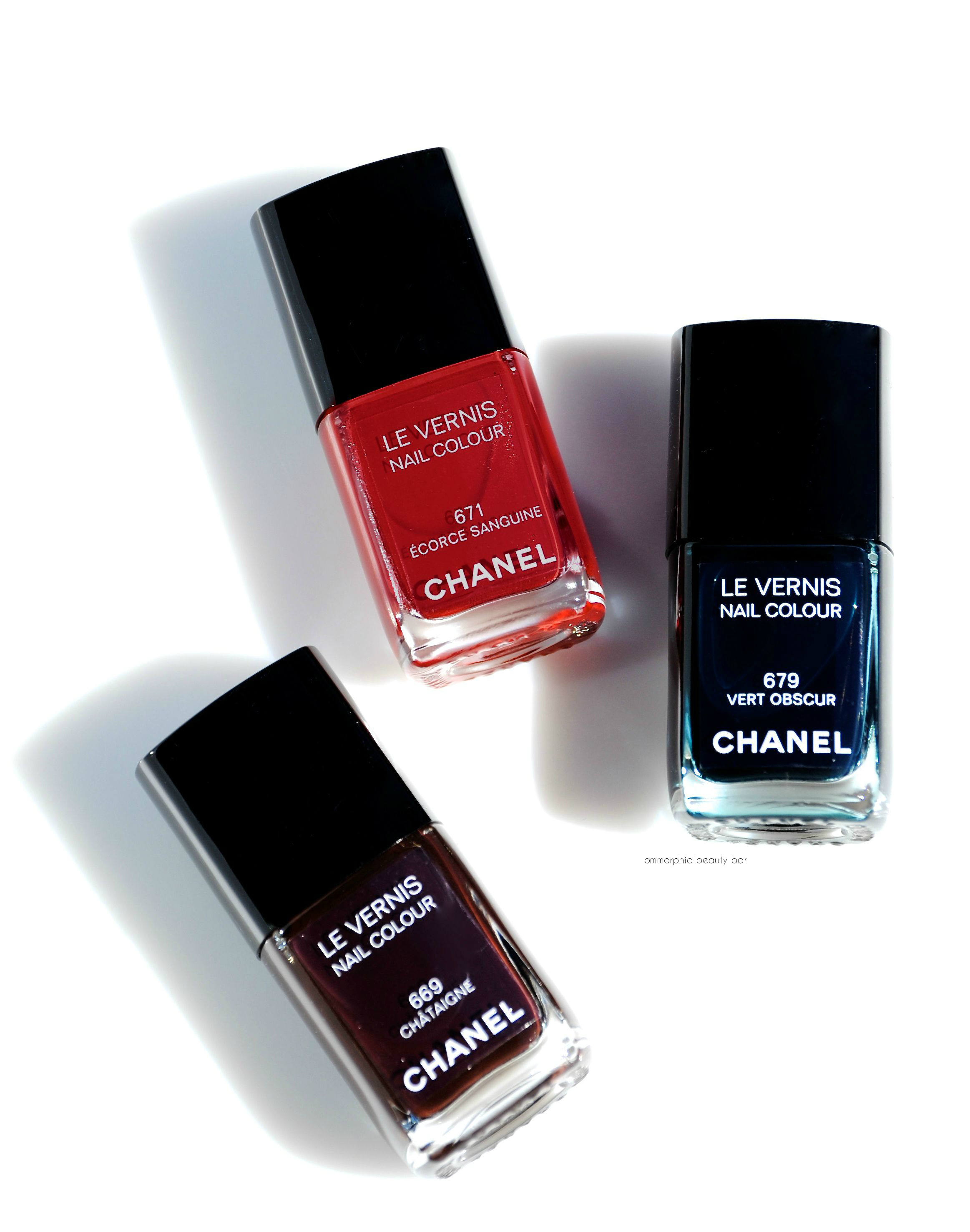
CHANEL | Le Vernis Châtaigne, Écorce Sanguine & Vert Obscur, Fall 2015

The CHANEL Les Automnales Collection (already reviewed: Entrelacs Eyeshadow Palette, Pensive Rouge Allure & Téméraire Rouge Coco Shine, Tissé d’Automne, 914 Feuille & 918 Ardent) has so perfectly captured the essence of Fall with every single beauty offering – in particular with the nail lacquers. Taking cues from nature herself, the three limited edition shades of this collection (CAN $31.00 each) – Écorce Sanguine, Châtaigne, and Vert Obscur, are like taking a stroll through a dense forest and discovering unexpected pops of colour: the fiery red of changing leaves, the deep earth underfoot, and the sun-dappled but deeply mysterious greenery all around. Makes me want to head up to my chalet in the mountains right this second, and just breathe it all in, I tell you.
INSPIRATION: ocellated turkey feather

CHANEL | 669 Châtaigne, 671 Écorce Sanguine, & 679 Vert Obscur
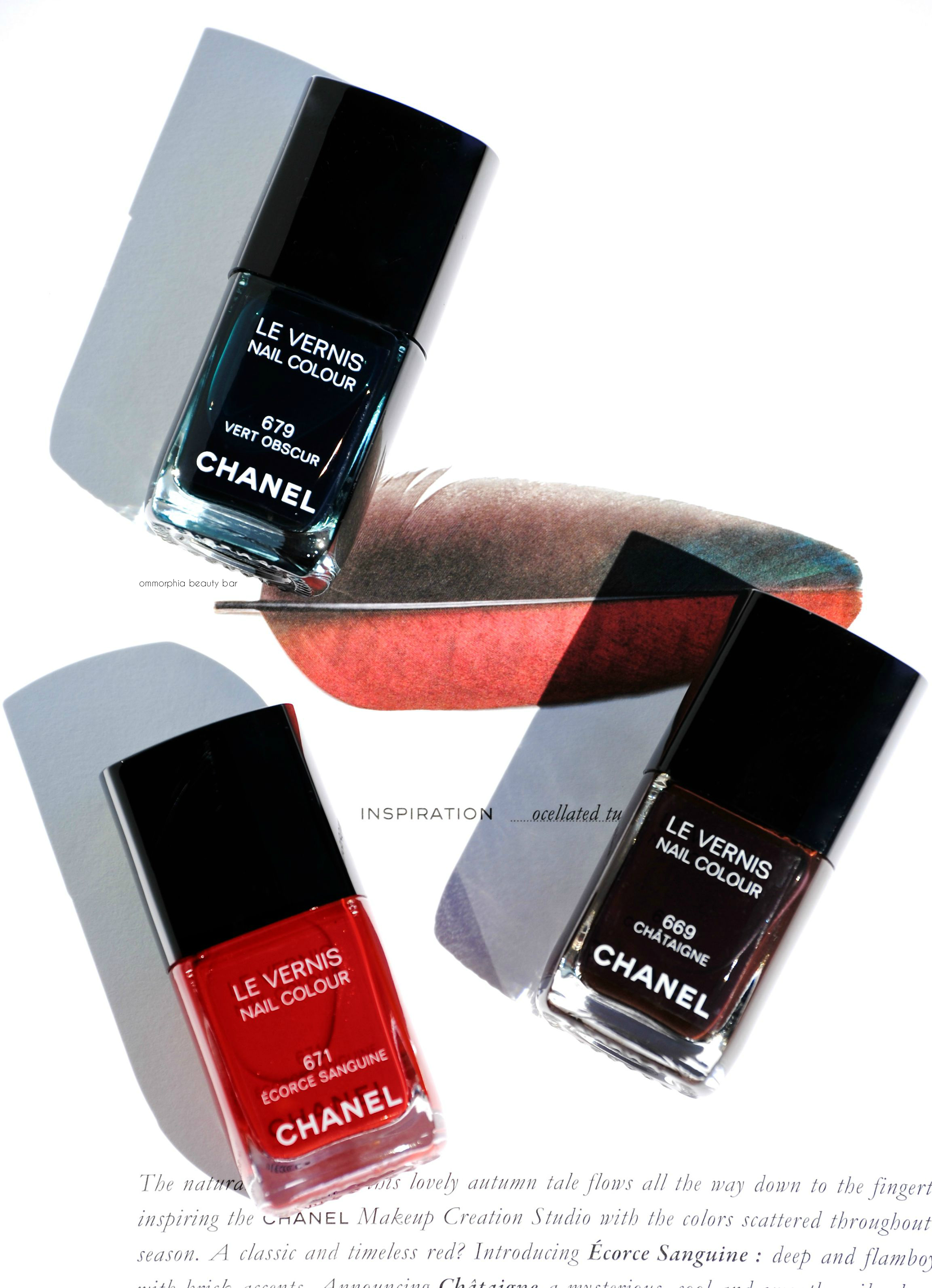
CHANEL | 669 Châtaigne, 671 Écorce Sanguine, & 679 Vert Obscur
669 Châtaigne | Deep chestnut brown with plum undertones in a hybrid crème/jelly formula. Self levelling on application, this shade bears the typical springiness associated with this type of lacquer – which in no way affects how it applies, coming to an ultra-high gloss finish (that doesn’t really need top coat, although I never go without just the same; helps to seal everything in and make the shade last longer). A totally fresh & modern alternative to black polish. BONUS: non-staining upon removal.
Coats applied: 2, plus top coat

CHANEL | 669 Châtaigne swatch

CHANEL | 669 Châtaigne swatch
671 Écorce Sanguine | Almost a ‘one-coat-wonder’, this is a warm leaning red shade with burnished & slightly brown-based undertones, bearing ultra fine bronze shimmer in the formula – but of the stealth variety; you definitely need sunlight or direct light hitting your nails to bring out this feature. Self-levelling and with a glossy finish at the end, this is a relatively non-staining hue (for a red this saturated), although I wouldn’t skip base coat just the same. Note that the formula while somewhat thickish, applies easily and will not pool around the cuticle area of the nails.
Coats applied: 2, plus top coat
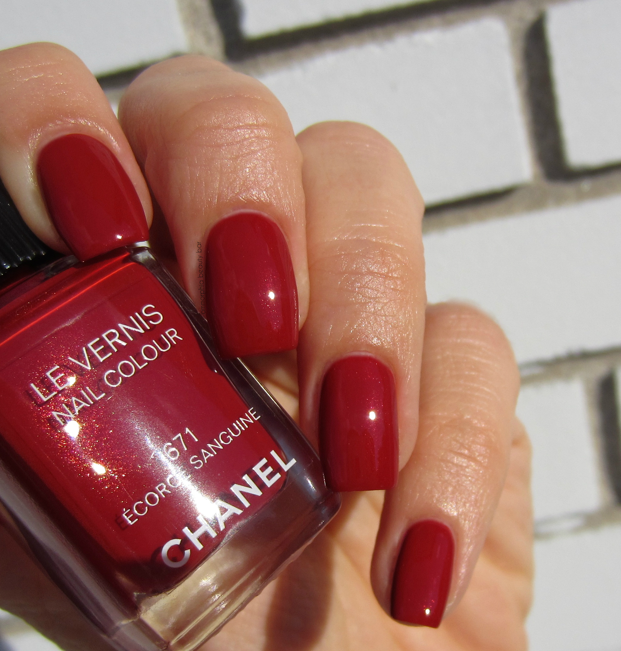
CHANEL | 671 Écorce Sanguine swatch
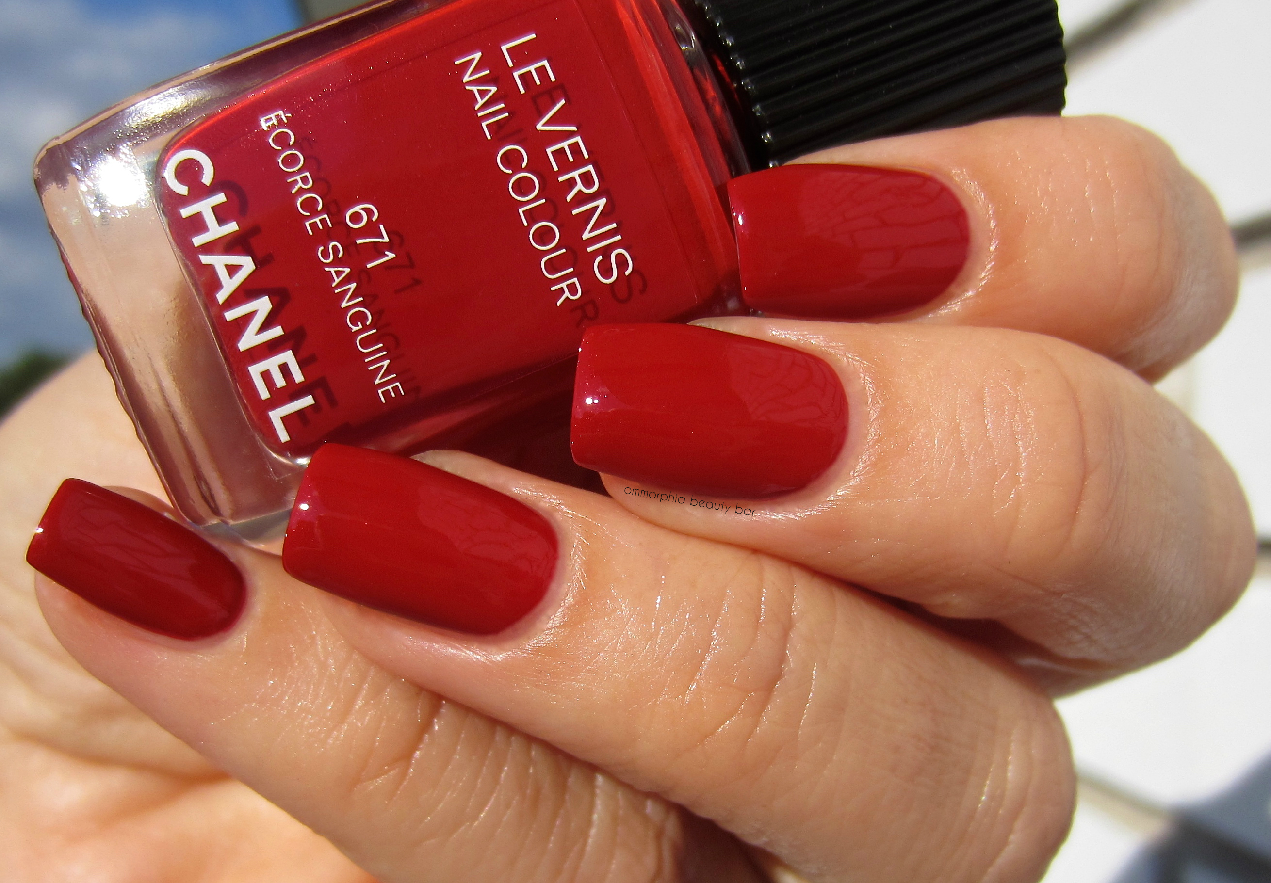
CHANEL | 671 Écorce Sanguine swatch
679 Vert Obscur | A blackened teal in a hybrid crème/jelly format that bears absolutely no shimmer whatsoever, applying in a self-levelling way and coming to an über-glossy finish. The paradox here, is that while the formula seems a little thin and semi-sheer (note how the dark green tones are so apparent at 1 coat), it becomes completely opaque by the 2nd coat, as well as absorbing most of that green colour. Once again, this is an excellent option to wearing straight up black polish – although you do need to see this shade in bright/direct light, to appreciate the teal undertone. Personally, I love the look at 1 coat; it’s like ombré nail art, without any skills/effort needed to achieve that effect. BONUS: non-staining upon removal.
Coats applied: 2, plus top coat

CHANEL | 679 Vert Obscur swatch (1 coat)
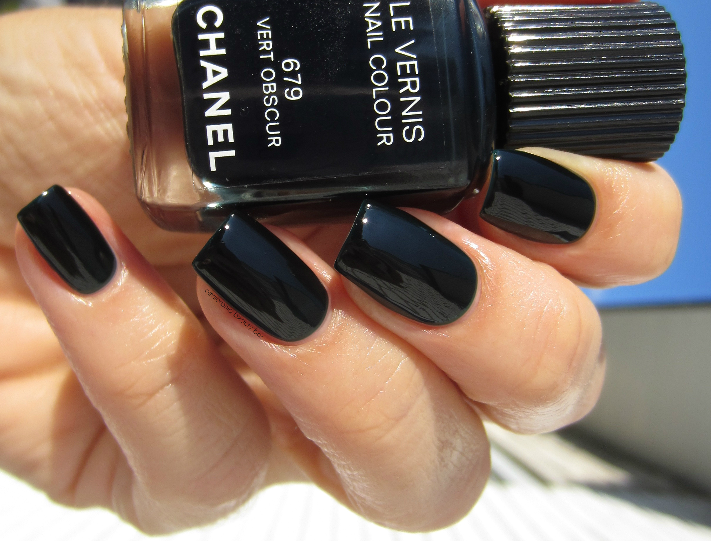
CHANEL | 679 Vert Obscur swatch (2 coats)
CHANEL | 669 Châtaigne, 671 Écorce Sanguine, & 679 Vert Obscur
After a Spring and Summer filled with bright/vivid/pastel shades, I for one, am just so totally ready to bring back my true loves: brooding nail lacquer colours. There is something so lush and rich about the three hues of this collection, and while the actual colours themselves may not be groundbreaking (with the possible exception of Châtaigne, as browns are not that prevalent with most brands), it’s the way they apply that pushes all my buttons. That being said, I do believe that if there’s any area where CHANEL needs to up their game, it’s with the brush shape – and while I personally have never had an issue with it, there are several more effective options out there now. Just that one small change, will elevate this brand’s lacquers to a level everyone else only dreams of … I’m just saying.
The CHANEL Collection Les Automnales 2015 is available now at all counters nationwide, including Hudson’s Bay and thebay.com (Canada). Find more detailed information on the collection via www.chanel.com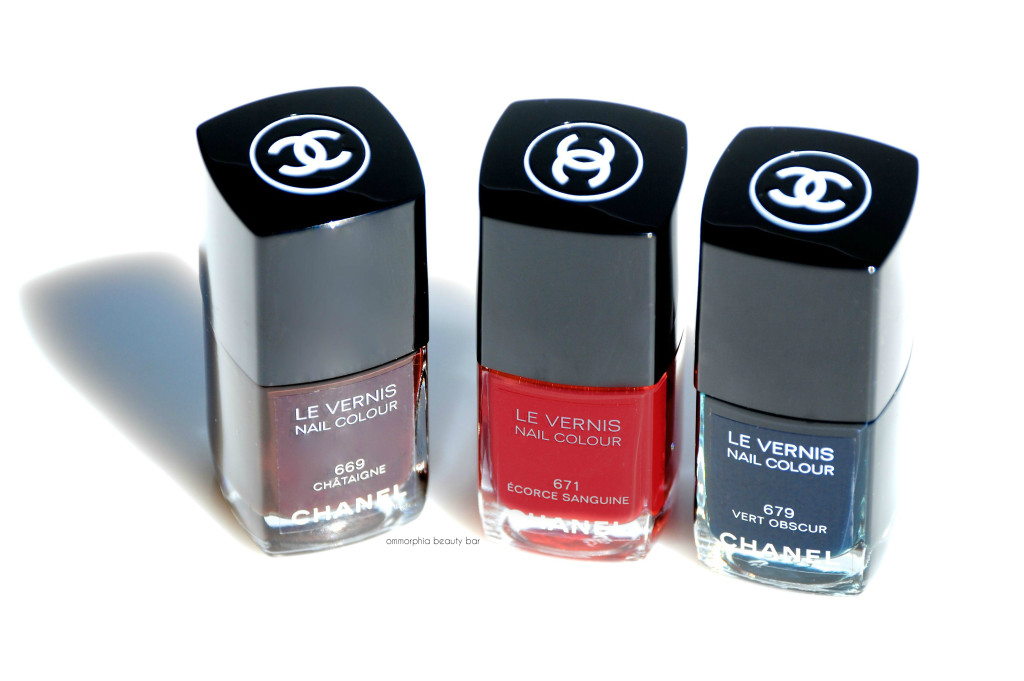
Press samples kindly provided for my unbiased consideration
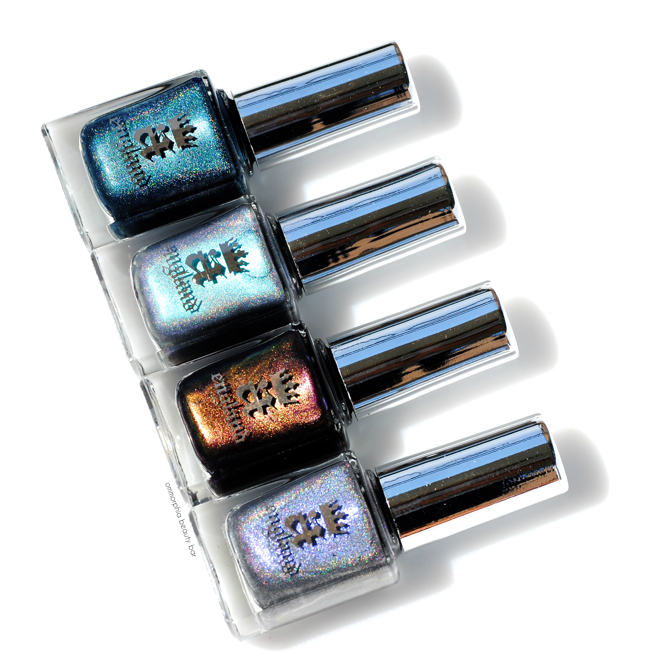
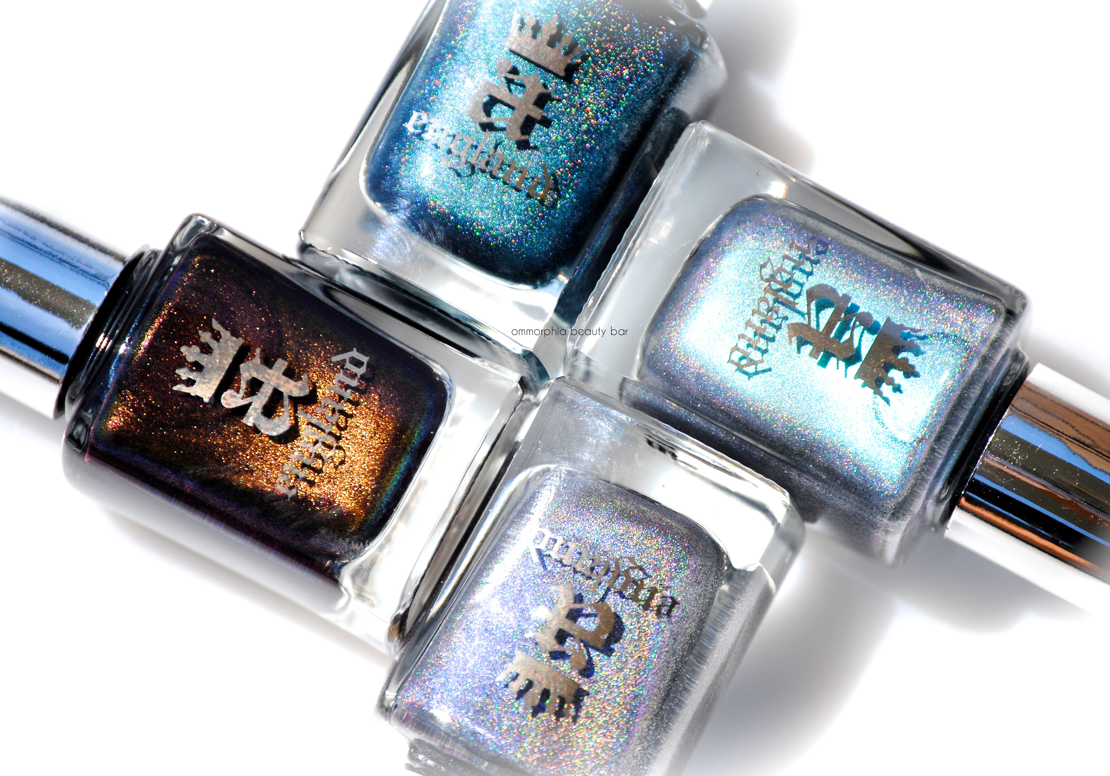
a-england | Rossetti’s Goddess

With her passion for art, literature, and beauty, Adina Bodana (aka: the creative mastermind behind boutique nail lacquer brand, a-england), draws inspiration from the life & works of Dante Gabriel Rossetti to bring forth her latest collection, Rossetti’s Goddess – four complex shades that bear a multitonal and magical prismatic gleam.
Rossetti, one of the founders of the Pre-Raphaelite Brotherhood, infused an undertone of sensuality to the medieval-revival style of his art and poetry, most of which was strongly influenced by his life’s personal events that also included his long-running love affair with muse Jane Morris – the wife of his friend and peer, William Morris. With the Rossetti’s Goddess Collection, Adina once again manages to effortlessly marry touches of history to beauty and has single-handedly created a new industry category, or what I like to call: Art/Lacquer. Rossetti’s intense and somewhat brooding artistic undercurrents are clearly displayed with this capsule collection – all done in that impeccable a-england way.
As with other prismatic shades in the a-england family, the four shown here come to a satin rather than glossy finish – which can be a unique look as is, but become so much more elevated when layered with top coat.
All swatches shown are with 2 coats of lacquer (each) and top coat.

a-england | Rossetti’s Goddess
a-england | Rossetti’s Goddess
a-england | Rossetti’s Goddess

a-england | Rossetti’s Goddess

a-england | Rossetti’s Goddess

Portrait of Jane Morris, Dante Gabriel Rossetti (1868)

Jane Morris | A slate/steely grey shade with strong violet reflects and light silvery glints. The prismatic effect is quite evident when seen in person, but can be rather camera-shy unless taken with flash, all of which serves to nevertheless add a stunning dimension of tone. The formula falls on the thicker side (the thickest of the 4, in fact) and is basically opaque at 1 coat – a plus if you’re in a hurry.
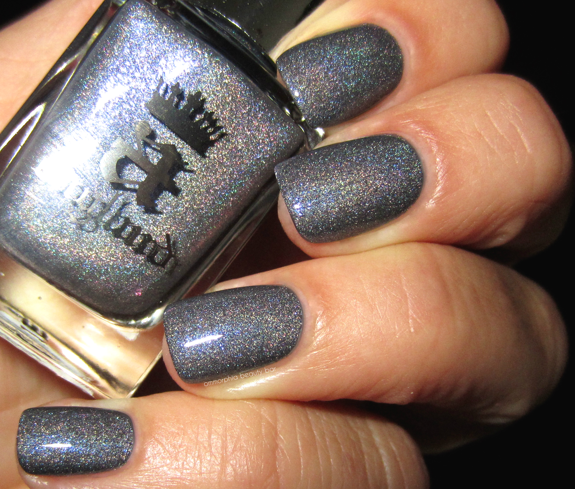
a-england | Jane Morris
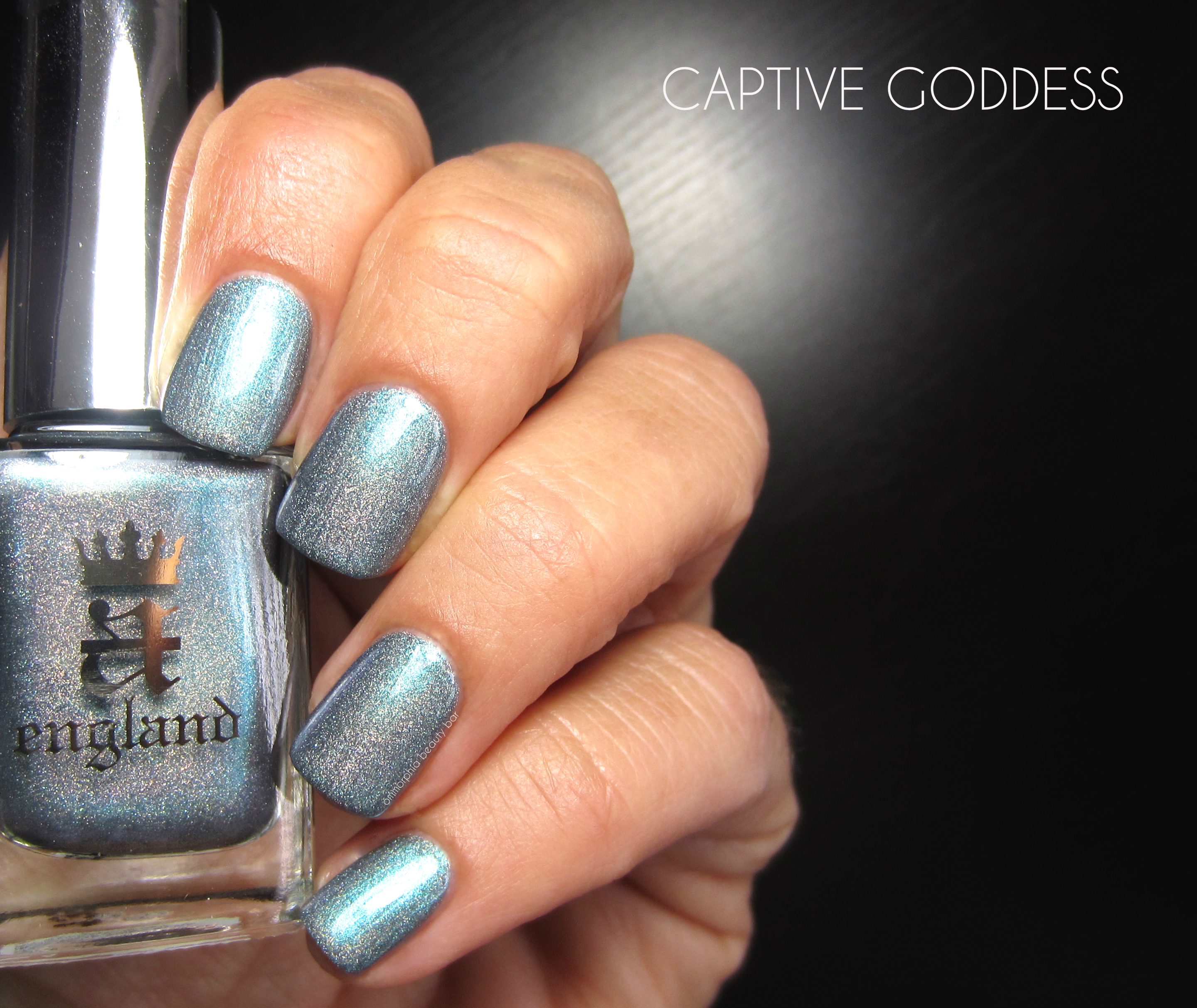
Captive Goddess | An icy cerulean blue with aqua reflects and a scattered, but still clearly visible holographic effect. The formula is a bit of a contradiction; relatively thick in flow but with a sheer-leaning application, but still very easy to apply and which becomes completely opaque by the 2nd coat. The paler hue of this shade makes the prismatic part of it appear to pool along the sides and tips of the nails (more so than the middle), which only adds to its uniqueness.
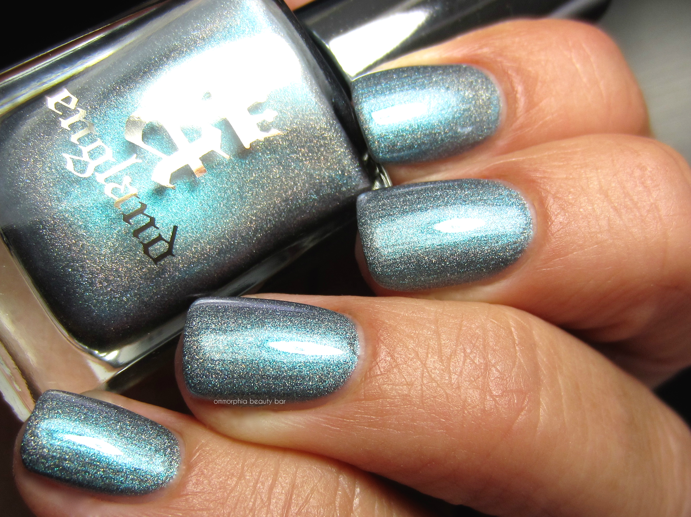
a-england | Captive Goddess
Jane Morris painted as Proserpine, Dante Gabriel Rossetti (1874)
In Greek (and Roman) mythology, Hades – God of the Underworld – falls in love with beautiful Persephone (Proserpine), daughter of Zeus and Demeter (Goddess of Agriculture & Fertility, also known as Ceres) and kidnaps her to become his wife. Demeter in her anguish to have her daughter returned, refuses to allow any crops to grow until Zeus intervenes on her behalf and manages to convince Hades to release his reluctant bride. Told not to eat or drink anything in the Underworld or risk staying there forever, Persephone rashly eats a few pomegranate seeds in gratitude of her upcoming release, which then binds her forever to Hades for part of each year. Demeter to this day, continues to grieve for her missing daughter during that time – Winter – and refuses to permit anything to grow upon the land, relenting only when the two reunite once more each Spring.

Proserpine | A smoky deep teal with a multi-layered scattered holographic effect. The formula here is nothing short of amazing: self-levelling, perfectly opaque at just 1 coat, and stays exactly where placed without pooling along nail edges or cuticles. While deeper lighting dims the prismatic flare to a certain degree, sunlight brings it to absolutely gorgeous and brilliant life. BONUS: non-staining upon removal.

a-england | Prosperine

Incense Burner | The undisputed Pièce de Résistance of the collection, this shade almost defies description; an aubergine/olive multichrome hue with a strong topaz flash and a formula that can be described in one word: STELLAR. The first coat lays down a rich eggplant purple, and while that seems to be the general colour of this shade, that changes depending on one’s angle of vision and the light – at times calling forth a greener hue, then morphing into a more mauve/brown/amber tone. Truly hypnotic and very unique in my collection, I can assure you.
Trying to capture the many facets of Incense Burner (inspired by the actual incense burner seen in the lower left hand corner of the above painting of Proserpine, symbolic of her attribute as a Goddess in her own right) can prove tricky at best, so I’ve included a few extra photos to portray its gorgeousness as accurately as possible. Enjoy!

a-england | Incense Burner
a-england | Incense Burner
a-england | Incense Burner
No more words are really needed, are they? Following the tradition of putting forth an amazing product, Rossetti’s Goddess from a-england is a collection worthy of both its historical inspiration and the brand itself, known for quality above all else. My favourites here are hands down Incense Burner and Proserpine (dark, mysterious & brooding shades get me every time), although Jane Morris and Captive Goddess are simply perfect for the season now and will no doubt transition beautifully once the weather starts to cool again, faithfully completing the cycle of the myth itself. Bravo & well-done, Adina.
Available now through a-england, where you can also find a complete list of stockists for your location.

Press samples kindly provided for my unbiased consideration
Dior Vernis | Sunwashed, Sunkissed & Tie Dye Top Coat, Summer 2015

The Dior Tie Dye Collection for Summer 2015 is all about that bohemian vibe (ahhh …those lazy days ahead …), filled with an eclectic mix of both brilliant and diffused colours. The two nail lacquers – 319 Sunwashed & 239 Sunkissed (CAN $28.00 each, with a 3rd shade released in Europe) perfectly exemplify this theme with their sun-faded tone, while the Die Dye Top Coat (CAN $29.00) helps to jazz things up with a splash of translucent colour.
If you’re unfamiliar with Dior polishes, you need to change that STAT, because this formula and brush rank as one of my absolute favourites and definitely sets the bar high for all other brands. The lacquer formula was given an overhaul a little over a year ago and now displays an increase in pigments & colour saturation, combined with a built-in top coat for a long-lasting gel effect shine – all courtesy of advanced resins and Techno-Polymers. The brush is made of unicorn hair, or at least that’s what it feels like (how cool would that be?); dense and rather bushy-looking, the slightly chiselled edge makes application child’s play: with just the lightest pressure, the bristles splay perfectly along the nail bed for a precise and effortless application. As a nail polish fiend, I can’t extoll its virtues enough – trust me on this.
*Note that both the lacquers and top coat are all limited edition.


319 Sunwashed | This is a soft buttercup-yellow shade in a mid-sheer formula with jelly-like tendencies, both in application and its cushiony glossy finish. Displaying a sun bleached and rather weathered tone, it holds that patented Dior ‘secret shimmer’ that’s not very visible to the naked eye (unless seen in direct sunlight), but which adds a lovely overall depth. On shorter nails, full opacity will be reached at 2 coats, while longer lengths will still show a slight nail line – but I personally love this translucent effect, as it makes yellow so much more wearable this way, not to mention perfectly in line with the whole laid-back hippie theme. Coats applied: 2, plus top coat

239 Sunkissed | Just when I thought that Dior had created the perfect nude shade with Lady (reviewed), THIS comes along. Bearing a perfect mix of peach, beige, and pink tones in the base, 239 Sunkissed takes things a step further and displays one of the best formulas for a nude that I’ve ever come across. Streak-free, self levelling, über-glossy at the finish and holding traces of ‘secret shimmer’, this shade not only comes to a smooth opaque finish at two coats, but I’ll go on record as saying it will suit basically all skin tones across the board – and that’s not easy to do when dealing with this colour family. Well done, Dior. Coats applied: 2, plus top coat

Tie Dye Top Coat | This is a more pigmented and deeper shade of rose than Dior’s Nail Glow, with a cooler-leaning tone due to the blueish tint in the base. This topper can easily be worn on its own, which is my personal preference, actually – and not only because I lack the necessary nail art skills to use it creatively, but for the candy-like look it gives nails: 1 coat provides a healthy wash of colour, with a deeper – but still sheer flush – at 2 coats. The formula falls on the thick side and has a tendency to spring back somewhat during application, but the glass-like glossy finish makes up for that slight drawback. Bonus: Relatively quick drying as well. Coats applied: 2, no other top coat

Applying the Tie Dye Top Coat straight up over 319 Sunwashed, gives the yellow base a peachier tone and due to the nature of this topper, it also provides a natural ombré effect; by varying the pressure of the brush along the nail, you can amplify this look quite easily (middle finger). Or, you can always get creative and use a dotting tool, a thin brush, or even bits of sponge to dab on patterns along the nails and create your own custom look. Finish off with a clear top coat to seal everything in, as well as to provide a smoother appearance.

Applied over 239 Sunkissed, the Tie Dye Top Coat provides a deeper pink colour that also takes this nude shade from warm into cooler territory (but still quite wearable just the same). Once more, you can easily create your own patterns using your preferred method – or experiment with new ways and see what turns up; random attempts usually create some fabulous designs (especially if you’re not a seasoned nail art pro, like me).
Dior surprised me with these; to begin with, I expected the usual brights, vivid, neons, etc and instead, there are just 2 shades in what initially appears to be rather lukewarm colours, and a cheery topper to add confusion to the mix. But looks can be deceiving; the second I began applying these shades, my love of deep hues was basically chucked out the window – they’re THAT fabulous (and I don’t even like yellow. Imagine that). Where things get a little tricky, is with the Tie Dye Top Coat; in theory it sounds amazing and the answer to every nailart-challenged person out there, but the application is not exactly there yet. Still, after playing with it for a few weeks now, I have surprised myself by finding new ways to apply it (not always successfully, mind you) and have realized that I prefer it solo. Please feel free to let me know how you’ve worn this – would absolutely love to hear! All in all, I don’t think it’s meant to take itself all that seriously – after all, it’s a SUMMER collection and that means: anything goes!
The Dior Summer 2015 Tie Dye Collection is available now through The Bay & thebay.com, Sephora & sephora.com, and Holt Renfrew stores across Canada (links provided for convenience). Fine more information via dior.com

Press samples kindly provided for my unbiased consideration/post contains affiliate links


