
Filed In: nail polish
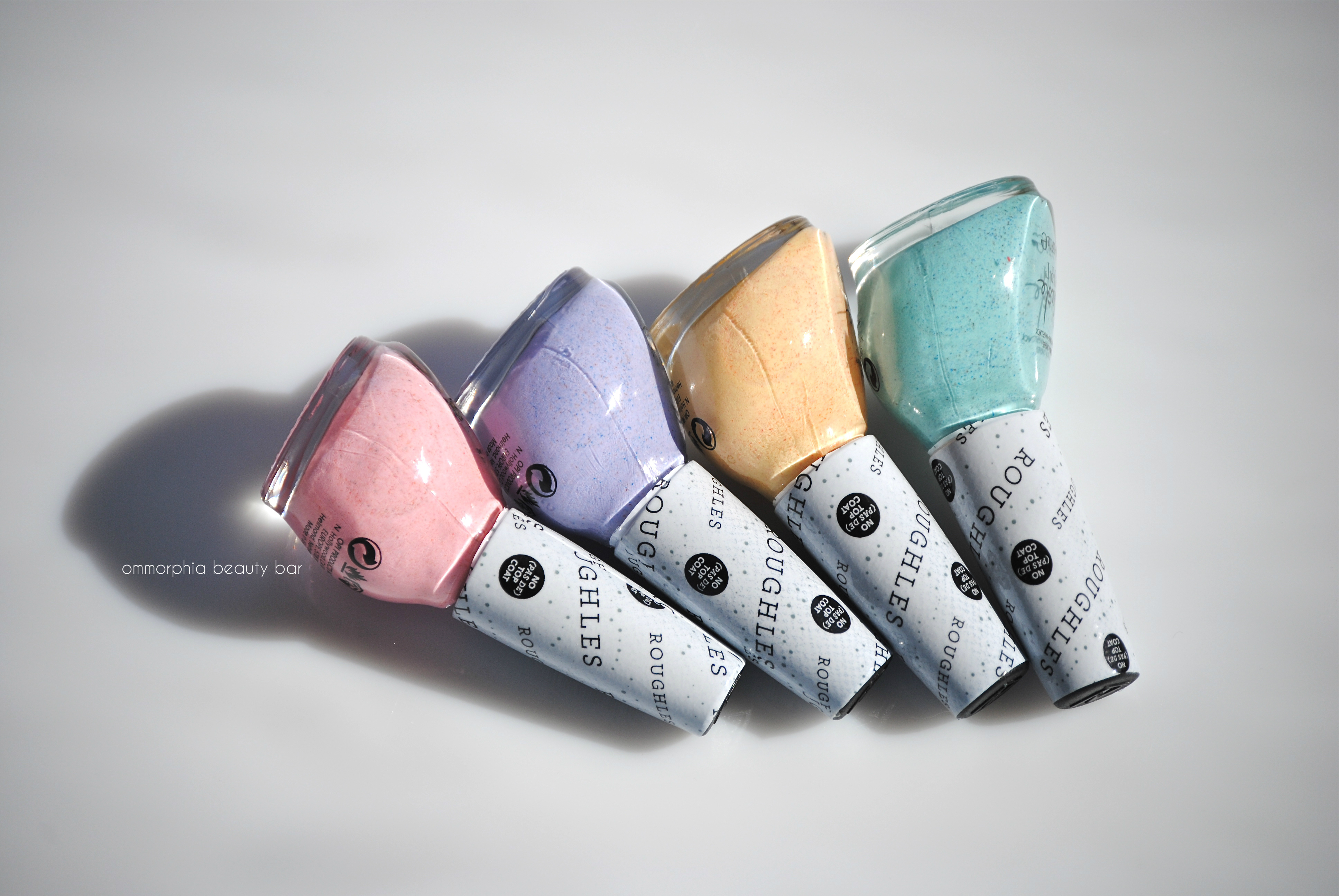
Nicole by OPI – Roughles Collection, Limited Edition
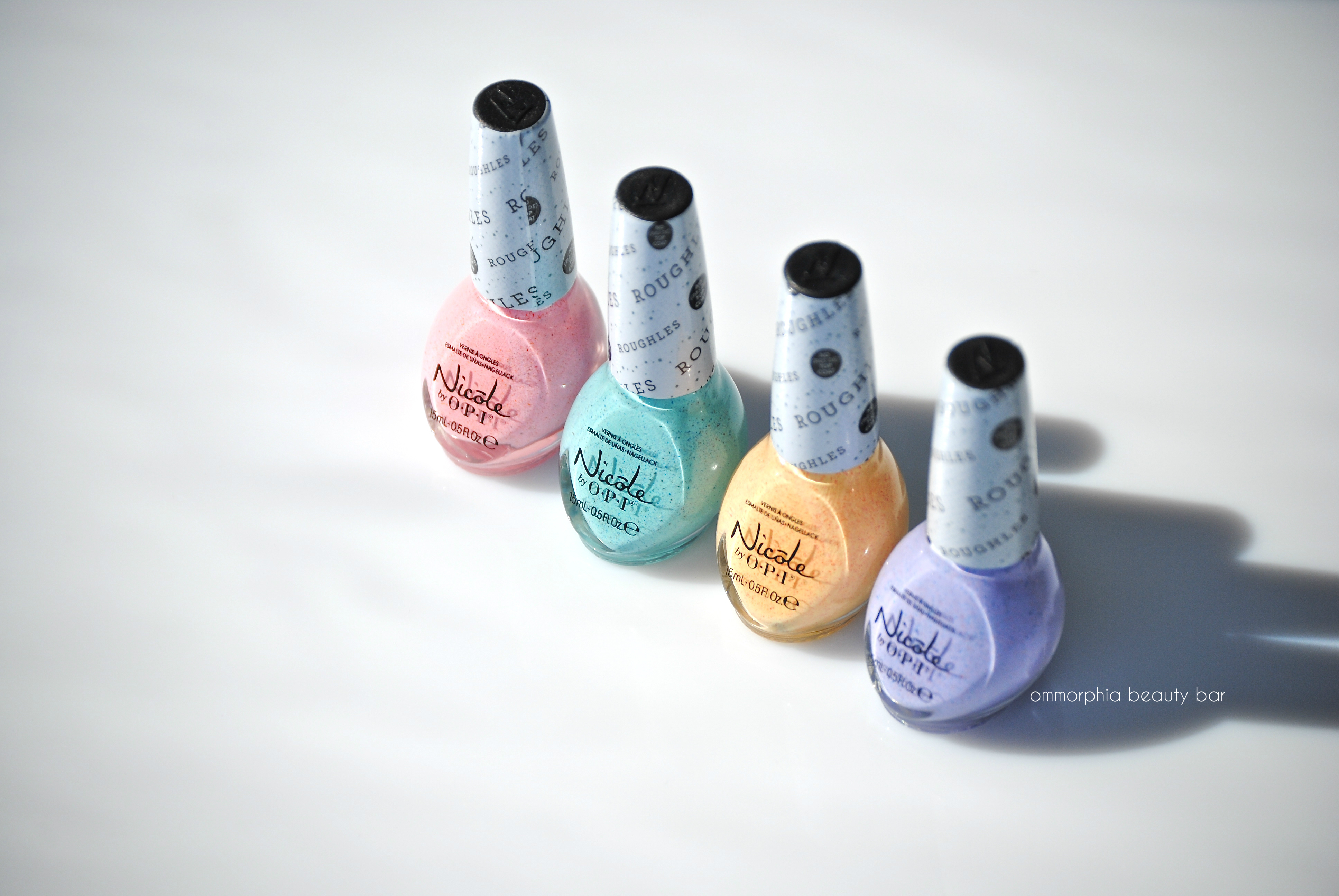
For Spring 2014, Nicole by OPI has just released their ‘Roughles Collection’ (pronounced “ruffles”), four traditional pastel hues with a unique twist. Colour-wise, these four shades are spot on to kick-off the warmer weather, and whether you’re a fan of textured polish or not, they are undeniably sure to draw your attention, but in a more subtle and gentler kind of way.
The formula on all four may be a touch thicker than that of traditional crème lacquers, but still quite easy to work with. One thing you should note is that they all seem to have these “threads” (the textured part, I’m guessing) that may required you to nudge them into place at the nail’s free edge. Other than that, clean up is simple and I love how the formula stays exactly where placed, without pooling or running into the cuticles. If your polish is prone to chipping, I advise running your brush lightly along your nail edge to seal everything in – but no top coat, as that would be totally redundant here. As to removal, be prepared to use a touch of elbow grease.
For the last photo, I tried my hand at creating a rainbow mani using all 4 Roughles, and even though the finished look is a touch chunkier than I was going for, I actually rather like it – not bad for a first attempt, right?!
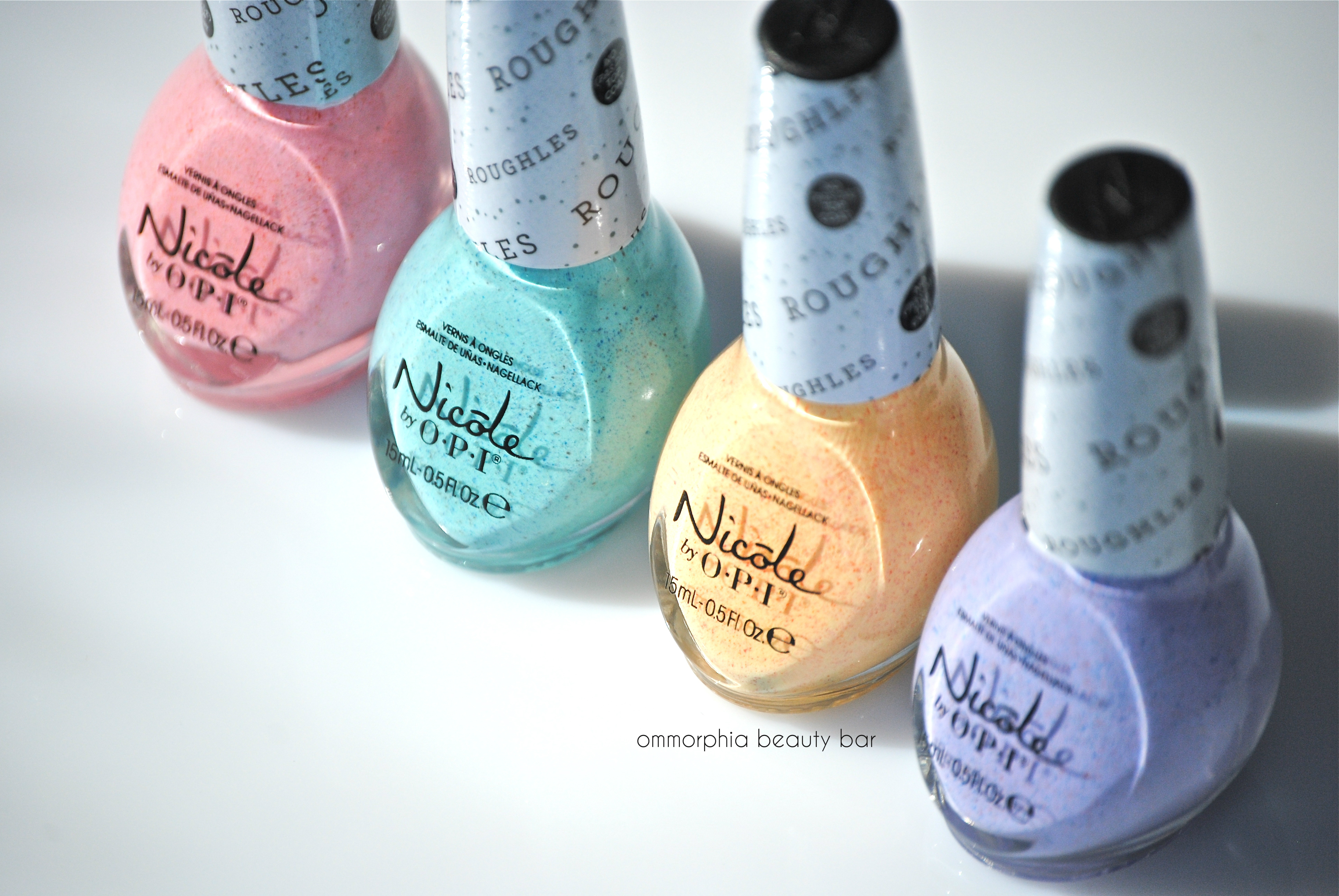
Nicole by OPI – Roughles Collection
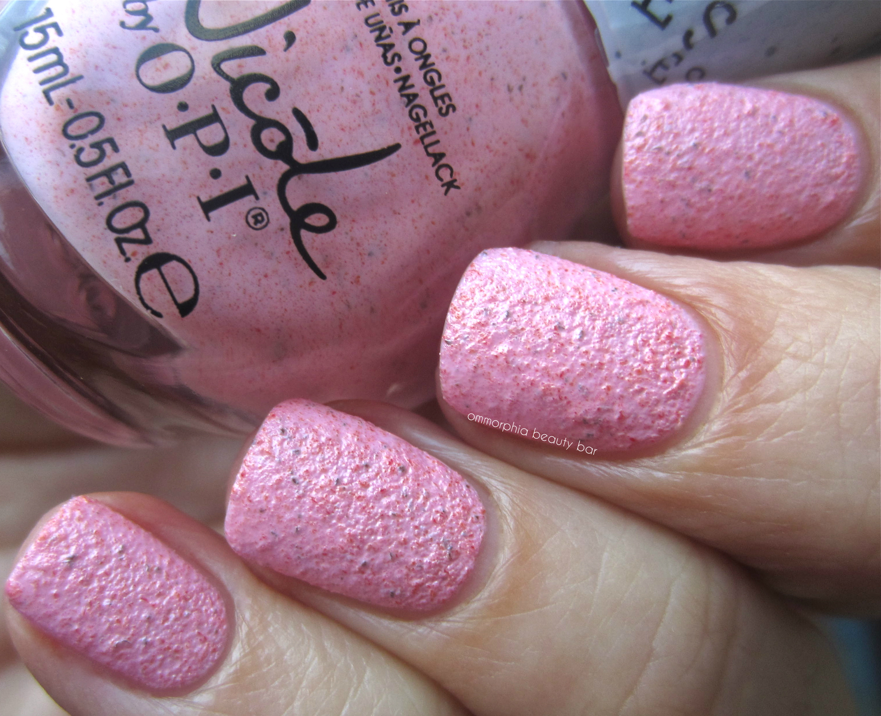
Sand in my Shoe – a buttercup yellow hue (totally reminds me of frothy egg yolks shrugs) with scattered red specks throughout, in a medium-thick formula with excellent opacity & coverage, leaving behind a raised/textured finish. Coats applied: 2
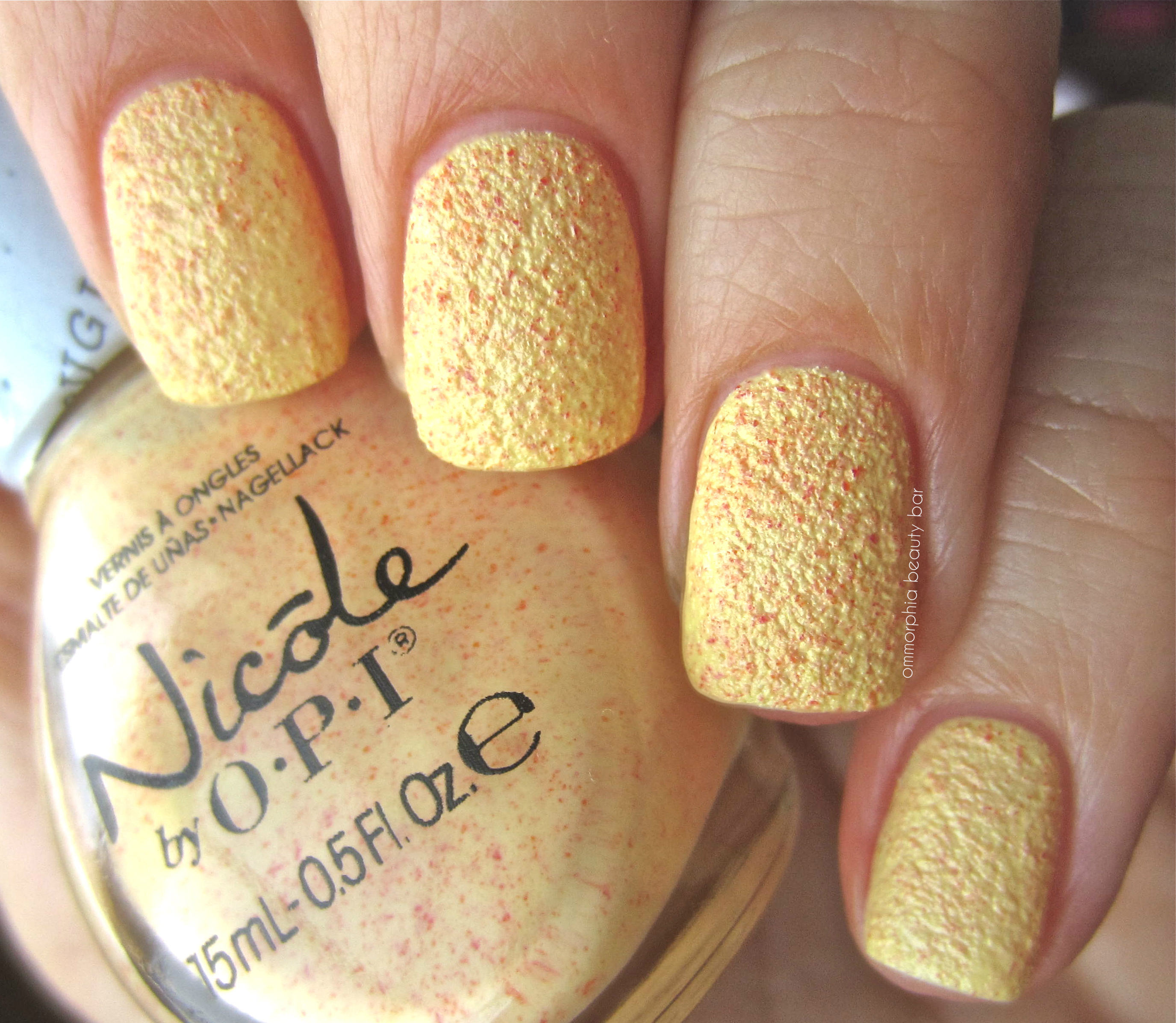
Nicole by OPI Roughles Collection – Sand in my Shoe
I’m Stucco on You – a soft lavender hue with red and blue flecks throughout (which effectively makes this shade both warm AND cool leaning), in a slightly thinner flowing formula than Sand in my Shoe – a highly flattering colour for all skin tones. Coats applied: 2
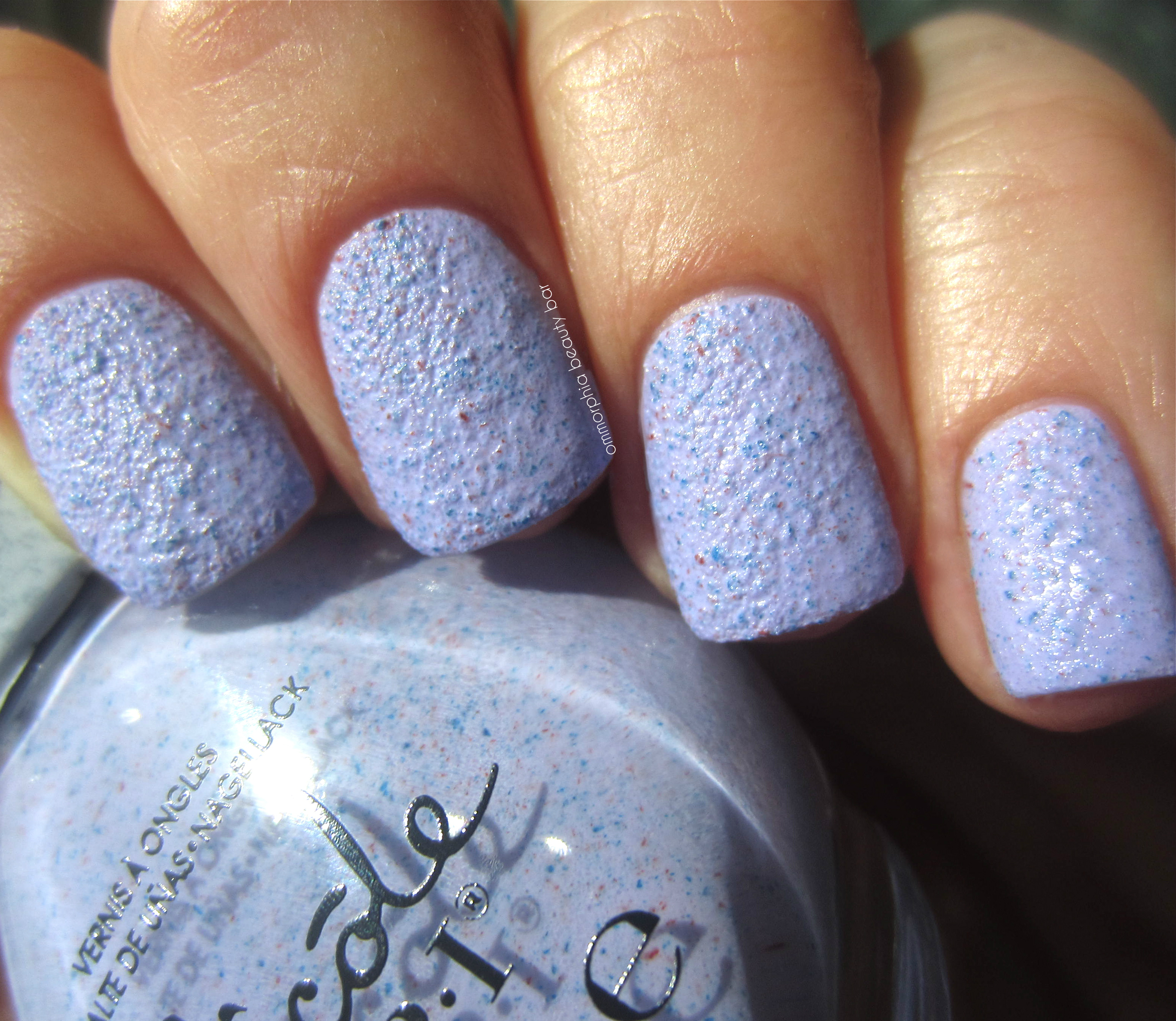
Nicole by OPI Roughles Collection – I’m Stucco on You
Rock the Look – a cotton candy pink hue with a unique combination of both red and charcoal scattered specks throughout, making this shade lean more cool than warm which in turn keeps it looking more “grown-up”. Coats applied: 2
Nicole by OPI Roughles Collection – Rock the Look
On What Grounds? – a saturated aqua hue (Tiffany Blue? Robin’s Egg Blue?) with navy and some sparser charcoal specks in the base. A super easy formula to work with and in a shade that looks amazing on everyone – LOVE! Coats applied: 2
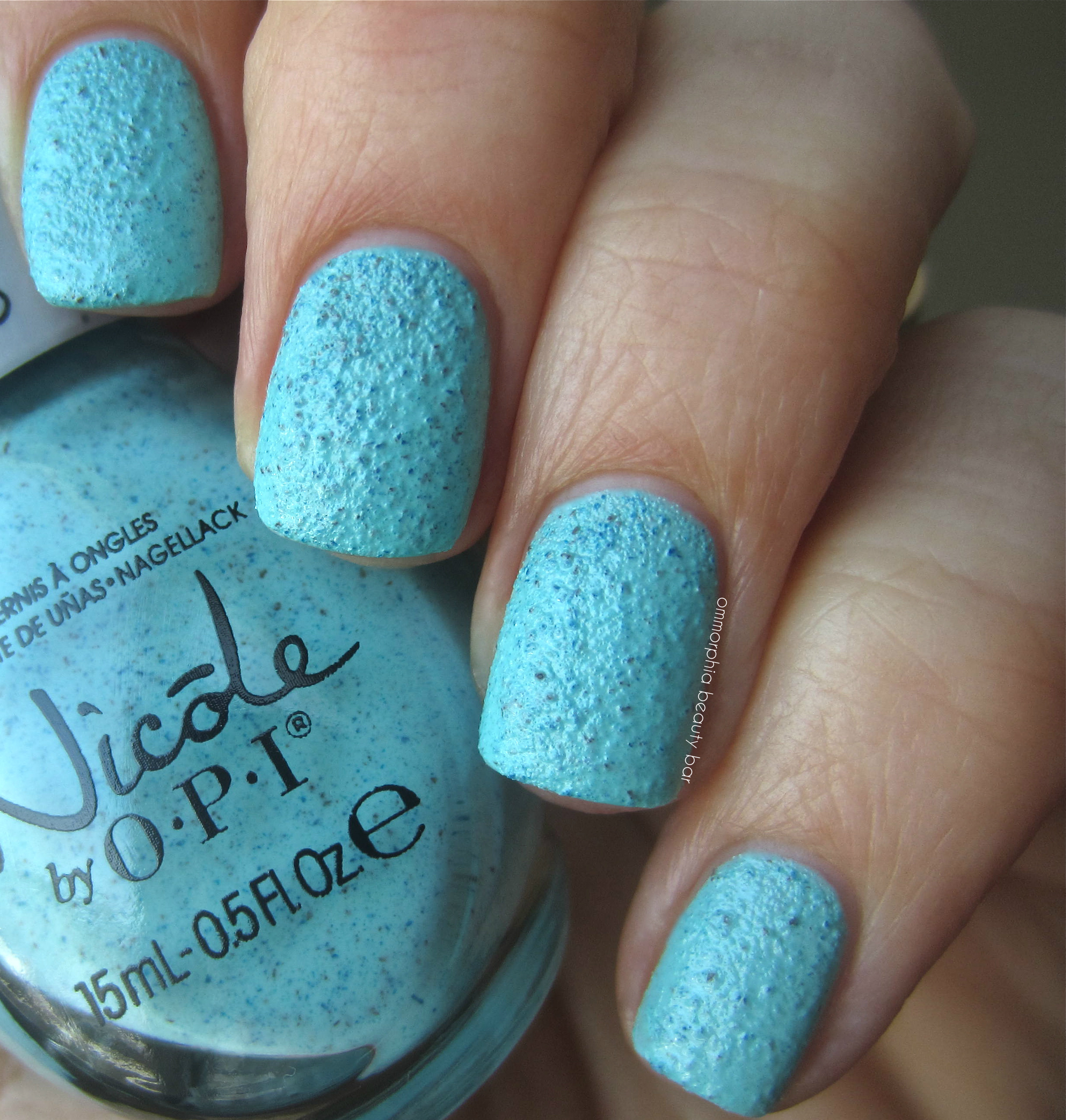
Nicole by OPI Roughles Collection – On What Grounds?
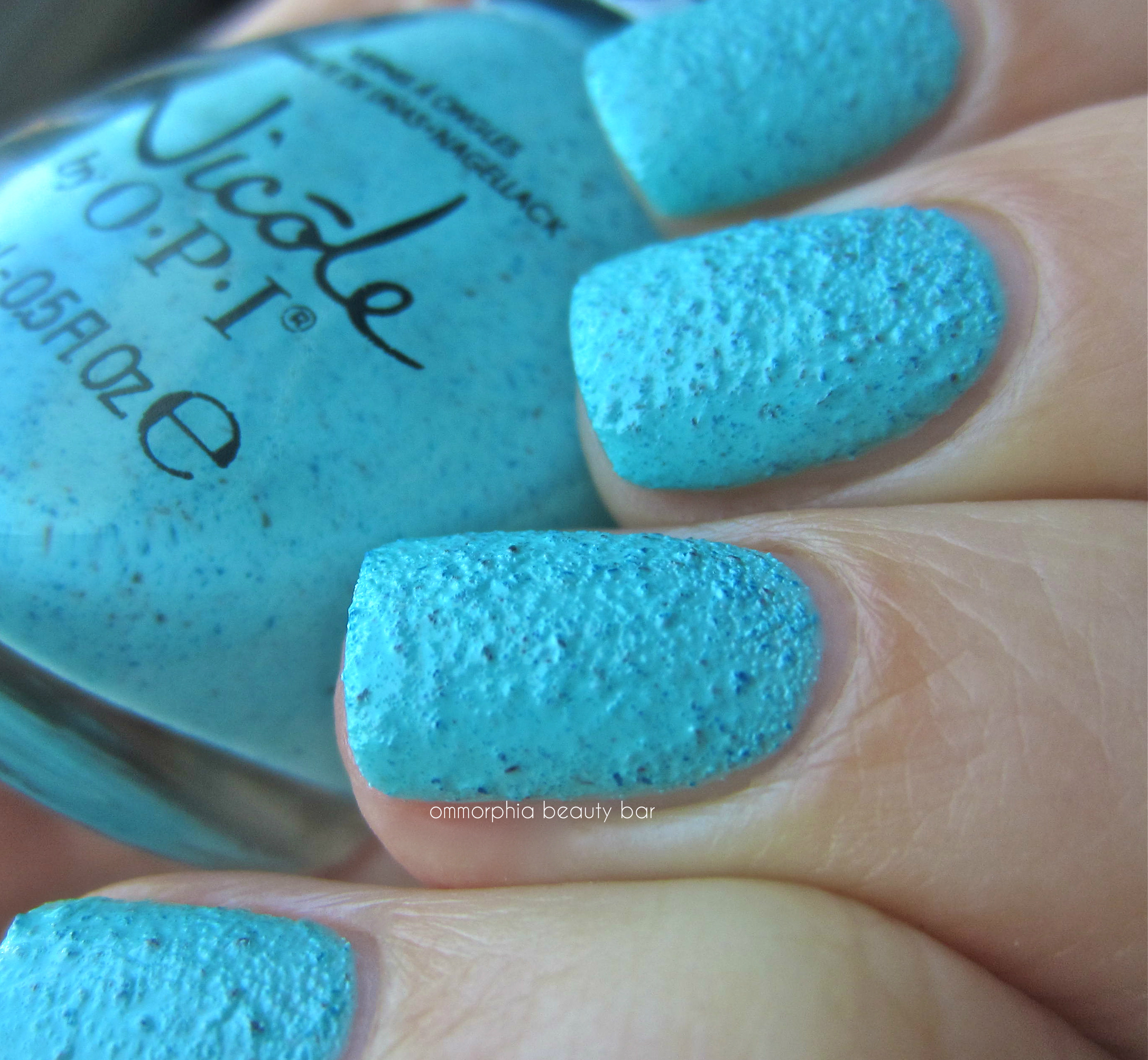
Nicole by OPI Roughles Collection – On What Grounds? (detail showing the raised/textured surface)
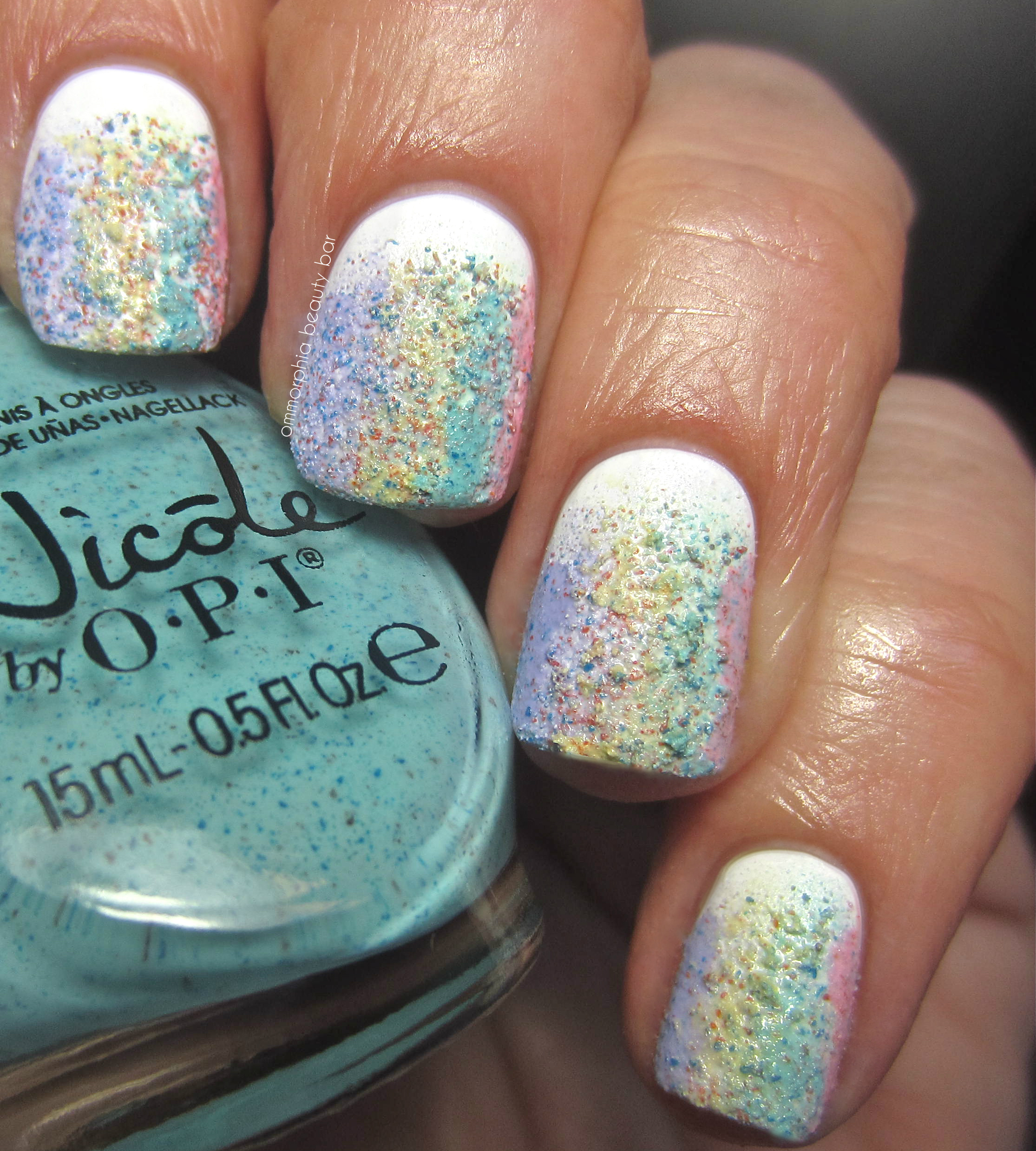
Nicole by OPI Roughles Collection – rainbow mani
I have always maintained that I am a “colour purist” and tend to stick to crème hues as personal favourites, but lately I’ve been expanding out of that box and embracing both colour and texture. Still not quite there yet, and I may never have the patience to sit through intricate nail art work, but I can definitely fake it with the help of textured polish. The four shades of Nicole by OPI’s Roughles Collection make me smile and think of Summer days, lemonade stands and staring at clouds (someone wants to be a kid again…)
For more information, visit:
*Disclosure: Product samples provided by the company/PR for my unbiased consideration
Buy Lipitor uk
Buy Plavix uk
Buy Prednisolone uk
Buy Sildenafil uk


Essie Spring 2014 Collection with Comparisons

At first glance, you might be tempted to think that there’s absolutely nothing that unique about Essie’s Spring 2014 Collection, but one swatch of each shade would prove you dead wrong. The six colours shown, are a wonderful representation of the season but yet classic enough to be easily worn throughout the year.

Essie Spring 2014
Romper Room – a soft petal pink hue that was probably the only fussy one of the entire group, but as I’m 100% addicted to white-leaning shades, Romper Room is so worth the extra effort. As with many pastels, the first coat may apply a touch patchy – I found it easiest to work 3 thin coats with a good wait time in between each for the best results. Final look is self-levelling and highly glossy. Coats applied: 3 (thin), plus top coat

Essie Spring 2014 – Romper Room
Spin the Bottle – a buttery smooth nude with pink tints in the base for a touch of warmth that applyies with amazing coverage: self levelling, non-patchy, and very glossy at the finish. Oh yeah, and my new favourite nude shade. Coats applied: 3 (thin, for photo purposes), plus top coat

Essie Spring 2014 – Spin the Bottle
Fashion Playground – a semi-sheer celadon green hue with ultra-fine silvery shimmer that remains hidden for the most part, but can occasionally flash when it catches the light. I FREAKING LOVE THIS COLOUR. Very retro appearing – think Fender Stratocaster guitar or FireKing mixing bowls, and completely unique in my Essie collection. Coats applied: 3 (thin – that 3rd coat is TOTALLY worth the extra step), plus top coat

Essie Spring 2014 – Fashion Playground
Truth or Flare – a semi sheer Wedgewood chine blue shade with a dusty/translucent appeal and in a jelly formula, rendering it totally self-levelling and über-glossy at the finish. Coats applied: 2, plus top coat

Essie Spring 2014 – Truth or Flare
Hide & Go Chic – a denim blue, hybrid crème-jelly hue so highly colour saturated, that you barely need more than 1 coat for full coverage. Self levelling and ending in a glossy shine, the bonus is that it is also completely non-staining upon removal. Coats applied: 2, plus top coat

Essie Spring 2014 – Hide & Go Chic
Style Hunter – a tropical rich magenta hue in a crème-jelly ultra pigmented hybrid formula with an absolutely superb flow, opacity and application. Self-levelling, ridiculously glossy and non-staining upon removal, this is a colour that will be highly flattering on a broad spectrum of skin tones. Coats applied: 2, plus top coat

Essie Spring 2014 – Style Hunter

The following comparisons are all using Essie shades in tones I found the closest to the Spring 2014 hues – all are 3 coats applied, no base or top coat:
- Romper Room
- Guchi Muchi Puchi – similar tone but slightly bluer based, less opaque than Romper Room
- Better Together – warmer toned, peach-tinted, sheerer than Romper Room
- Fashion Playground
- Absolutely Shore – no shimmer, much paler green but with similar sheerness to Fashion Playground
- First Timer – no shimmer, more opaque than Fashion Playground
- Truth or Flare
- Bikini So Teeny – silver shimmer throughout and brighter than Truth or Flare
- Lapis of Luxury – more blue based but with same dusty tone as Truth or Flare
- Coat Azure – densely shimmer packed, bluer and more opaque than Truth or Flare
- Spin the Bottle
- Not Just a Pretty Face – very similar in tone but much sheerer than Spin the Bottle
- Topless and Barefoot – sheer, paler and more beige in tone than Spin the Bottle
- Style Hunter
- Wife Goes On – crème formula, a brighter pink base and a touch more opaque than Style Hunter
- Hide & Go Chic
- Mesmerize – brighter and bluer based than Hide & Go Chic
- Smooth Sailing – cornflower blue base filled with fine prismatic shimmer and sheerer than Hide & Go Chic
I found something to love about each and every shade of this collection, with Romper Room, Fashion Playground, and Spin the Bottle total standouts for me personally. I can already see Style Hunter as a sandal-worthy pedi shade, and even though the Truth or Flare and Hide & Go Chic will transition beautifully into the cooler months down the road, they are both bright enough to wear now as well.

Kindly provided by Essie for my unbiased consideration
Dior – Manucure Transat (LE) Yacht, Sailor & Captain, Summer 2014

For Spring 2014, Dior has taken to the high seas, drawing inspiration from the brand’s archived first Resort and Spring lines of 1948. With its nautically-inclined palette of blue, red and beige, the 3 Limited Edition Manucure Duo sets from the Transat Collection each also come with their own mini nail file and striped nail stickers (clear background to let the base hue show beneath) printed with the CD logo. Unforgettable, primary, and at the height of chic, these 3 shades are timeless and trendy at the same time, with formulas that completely deliver.
NOTE: None of the following swatches are shown with the accompanying stickers, but I recommend that you ensure your base hue is 100% dry before applying them, in order to achieve optimum results.

Dior – Manucure Transat Summer 2014

Dior – Manucure Transat Summer 2014

Dior – Manucure Transat Nail Polish & Couture Stickers Duo, Summer 2014
#210 Yacht (CAN $31.00) – Café au lait crème hue with the tiniest silver shimmer – which I didn’t even realize was there until I saw the photos, but that serves to add an overall nice depth of tone. The formula is sublime and possibly one of the best nude shades ever: excellent flow & opacity/coverage, totally self-levelling and ending in a high gloss shine. Coats applied: 2, plus Dior’s Gel Top Coat

Dior – #210 Yacht

Dior – #210 yacht
#700 Sailor (CAN $31.00) – Beyond blue: this is über blue. An electric indigo blue with a jelly-like formula and filled with ultra-fine silver shimmer. I can’t extoll the virtues of this shade enough: great opacity even by the 1st coat, completely self-levelling, ridiculously glossy and non-staining upon removal. Drop. Dead. Gorgeous. Coats applied: 2, no top coat

Dior – #700 Sailor

Dior – #700 Sailor
#750 Captain (CAN $31.00) – A luscious scarlet/chilli pepper red hue with that same almost imperceptible silvery shimmer as that in #210 Yacht, in a crème-jelly hybrid formula that at first glance appears to have slight orange undertones, but which rounds it out nicely. A superb application – from the flow, coverage and high gloss finish, with the added bonus of being non-staining upon removal. Coats applied: 2, plus Dior’s Gel Top Coat

Dior – #750 Captain

Dior – #750 Captain
If asked before swatching, I would have said that #700 Sailor was my pick of the three but after wearing each, I absolutely refuse to pick just one. #710 Yacht may very well be the best nude shade I’ve worn to date, as it leans neither too pink, grey, or yellow, making it the ideal candidate for my skin tone. #750 Captain is a brilliant red that falls somewhere between light & dark, and I can totally see it as the perfect Summer pedi shade while #700 Sailor is the eye-catcher of the trio, but what renders it totally sublime in my book, is its non-staining appeal (already planning a backup of this one).
Available now exclusively at Holt Renfrew (Canada) and Saks (US), the Transatlantique Collection will be coming to Dior counters everywhere else as of May 1 (note that Dior.com does not ship to Canada). For more information on the brand:

*Disclosure: product samples provided by the company/PR for my unbiased consideration
shu uemura Green Pearl & Lavender Pearl – Bijoux Collection Spring 2014

The Bijoux Collection for Spring 2014 by shu uemura takes its inspiration from precious gems, filled with beautifully multi-faceted light yet subtle enough to be worn every day. The two limited edition lacquers may seem ethereal and softly delicate, but something about the way their shimmers catch the light will leave you staring. And let’s just admire their perfectly Springtime freshness, shall we?

shu uemura Bijoux Collection Spring 2014 – Green Pearl & Lavender Pearl

Green Pearl (CAN $25.00) – Delicately pale seafoam green hue with crushed pearl shimmer.The flow was absolutely spot-on, self levelling and laying down exactly where applied without any dragging or pooling issues, with excellent coverage even at the first coat and leaving behind a natural glossy finish. Coats applied: 2, plus top coat
*NOTE: there may be some shimmer migration upon the skin with removal – nothing that a second pass with remover can’t solve, however.

shu uemura Bijoux Collection Spring 2014 – Green Pearl

Lavender Pearl (CAN $25.00) – An airy lavender hue filed with opalescent and crushed pearl shimmer. The formula is a touch thinner than that of Green Pearl, making it slightly easier to apply, but with the same perfect flow & beautiful glossy shine at the end. TIP: thin coats will yield the best and most even coverage. Coats applied: 3 (thin), plus top coat

shu uemura Bijoux Collection Spring 2014 – Lavender Pearl
The Japanese aesthetic of understated beauty espoused by the shu uemura brand, may not be what Westerners are used to, but I for one have embraced it wholeheartedly, as I find that this philosophy works to subtly enhance what we’re all born with, as opposed to trying to change and/or cover things up. That’s not to say that I don’t appreciate skillfully applied makeup or vibrant colour; it’s closer to the truth to say that working with shu products almost forces you to take a step back and appreciate the “art of making up”. The two limited edition shades of the Bijoux Collection apply that same principle to the nails with shades that are soothing yet still glam, and will definitely earn second looks.
The shu uemura limited edition Bijoux Collection is available now (Holt Renfrew in Canada). Find more information via:

*Disclosure: Product samples provided by the company/PR for my unbiased consideration
Buy Flomax canada
Buy Abilify canada
Buy Aciphex canada
Buy Amitriptyline canada
L’Oréal Paris – Gold Dust Nail Color

The L’Oréal Paris Gold Dust Collection (CAN $6.99 each), is comprised of 9 sparkling textured glitter lacquers – 5 of which I’m showing here today. What sets these apart from other textured polishes, is the incredibly complex & multi-dimensional brilliance they give off, as well as the surface feel which is almost suede-like and not chunky-glitter rough. I’ve mentioned often enough what a ‘colour purist’ I am when it comes to my nails, but wearing textured polish (like these) gives me that extra shot of sizzle when I want something more. Like Haute Couture nails, if you will.
As these lacquers are not meant to be worn with top coat, that’s how I’m showing them (my personal preference), although that option is always available – just be prepared to add several layers to get a smooth finish. I also noticed that upon removal, there’s a fine shimmer that can spread along the skin – nothing that an extra pass with remover can’t take care of, however.

L’Oréal Paris – Gold Dust Nail Color
#140 Diamond in the Rough – amethyst sparkle with amazing coverage even at the first coat. Tone on tone (the shimmer and larger hex glitter pieces are the same colour as the base hue), the formula has a medium-thick flow but very easy to work with. Coming to a soft textured finish (think: finest grit sandpaper), this shade displays a rich brilliance. Coats applied: 2

L’Oréal Paris – Diamond in the Rough
#142 Pop the Bubbles – aqua sparkle in the same format (tone on tone) and application as the previous shade. I experienced some flooding of this polish at the cuticles, although I suspect that might have been due to the wonky brush (it happens), because other than that, the formula was fine. Coats applied: 2

L’Oréal Paris – Pop the Bubbles
#136 Too Dimensional? – violet base hue with both tone on tone shimmer and larger hex glitter pieces, as well as oxidized gold crushed shimmer added to the mix. The formula, while slightly more sheer than the previous two, is simple to work with, becoming completely opaque by the second coat. There’s a hint of a duo-chrome quality to this shade which makes the overall appearance so complex – LOVE! Coats applied: 2

L’Oréal Paris – Too Dimensional?
#141 Hidden Gems – a dark grey base hue with teal shimmer and silver large hex glitter pieces. The formula appears mid-sheer at initial application, but becomes magically opaque by the second coat and winds up in a moody, brilliant & utterly luxurious finish. Bonus: non-staining upon removal. On a side note, this was the shade I wore to usher in the New Year! Coats applied: 2

L’Oréal Paris – HIdden Gems
#139 Rough Around the Edges – charcoal base hue filled with crushed diamond-like shimmer, in a semi-sheer formula that also has a jelly-like quality to it. Becoming totally opaque by the second coat, the finish appears to display a touch more glossiness than any of the others. A great alternative to wearing straight-up black, I was curious to see this matte (see second swatch); it looks like granite this way & very original. Coats applied: 2

L’Oréal Paris – Rough Around the Edges

L’Oréal Paris – Rough Around the Edges, mattified
If I had to choose favourites, I’d have to say it’s a toss-up between Too Dimensional? and Hidden Gems, with Rough Around the Edges a close third – but that’s based on personal colour preferences, and has nothing to do with the actual application/formula, as they’re all pretty amazing.
The L’Oréal Paris Gold Dust Nail Color Collection is available now. Find more information via:

*Disclosure: Product samples provided by the company/PR for my unbiased consideration
Buy Amoxicillin canada
Buy Clomid canada
Buy Cymbalta canada
Buy Cytotec canada


