Filed In: nail polish
CHANEL – Le Vernis L’Été Papillons for Summer 2013 Limited Edition

When my CHANEL Sales Agent showed me the early promotional images for this collection a few months ago, I’m sure I must have gasped out loud upon spotting these 3 beauties – that green! that blue! Once again, with the L’Été Papillons for Summer 2013 Collection (you can read my review on the new Stylo Eyeshadows here), CHANEL has proven why this venerable brand is at the top of its game, releasing a beautifully themed grouping of products that not only embody the spirit of the season, but that manage to perfectly capture the ephemeral – yet utterly brilliant – colours of delicate butterfly wings.
These three limited edition lacquers (each CAD $27.00 13 ml/0.4 fl.oz) come in the iconic CHANEL rectangular bottle with the removable outer square cap, revealing a smaller & user-friendly ribbed inner cap. The wand is an easy to work with length, while the brush itself is one of the best I’ve worked with; flexible enough to splay evenly when pressure is applied, while being neither too thick/bushy nor too thin.
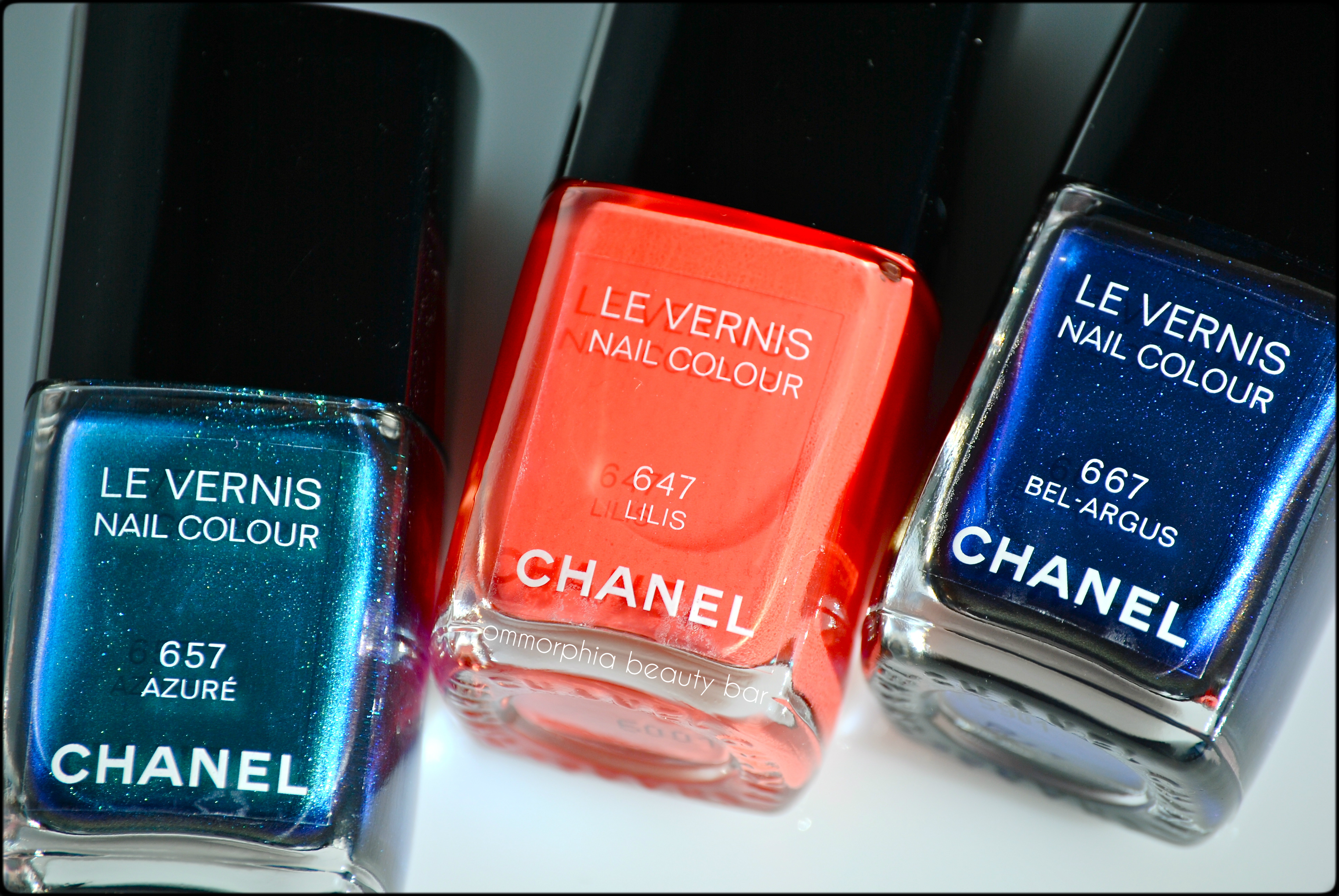
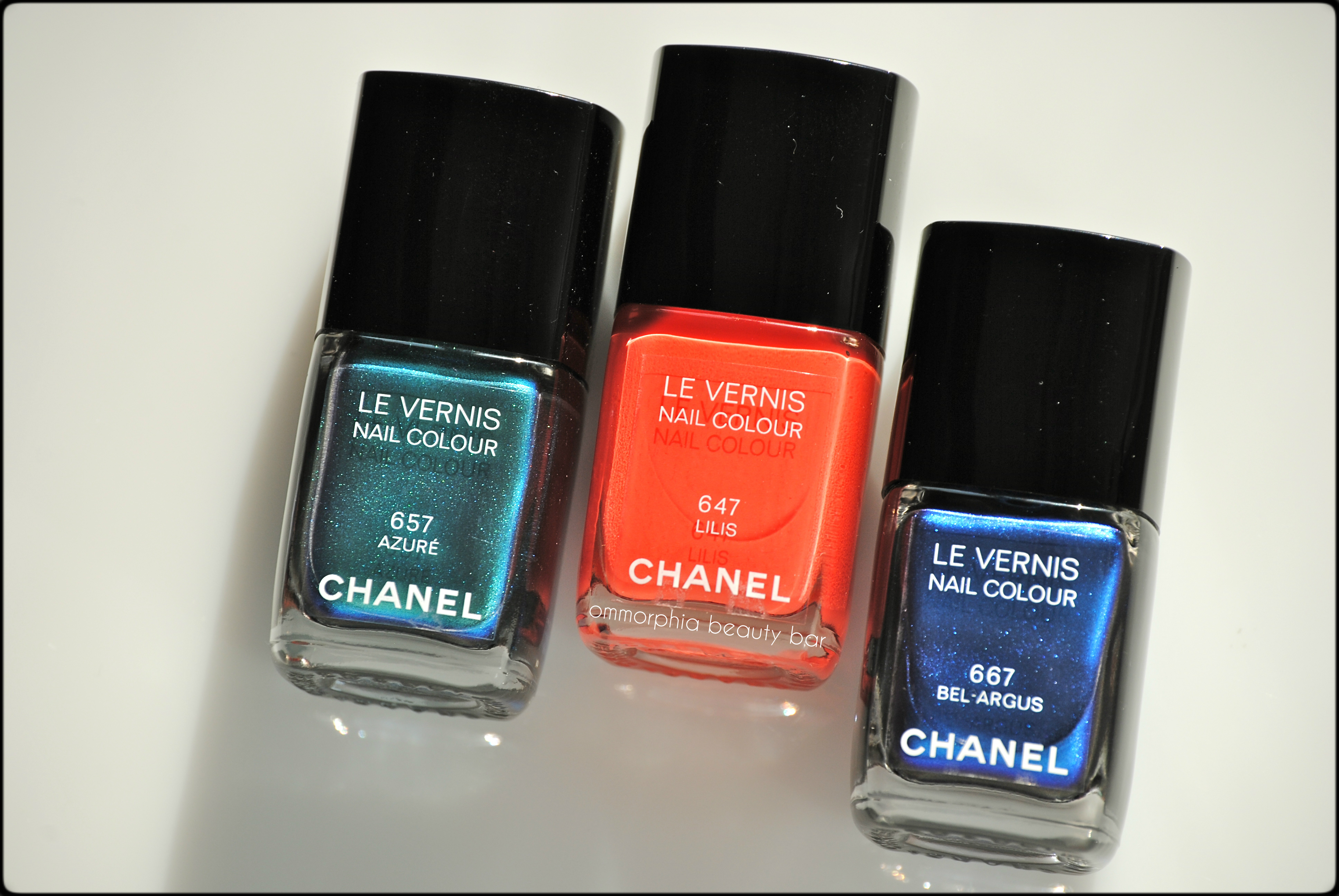
CHANEL L’Été Papillons Summer 2013 – #657 Azuré, #647 Lilis, #667 Bel-Argus
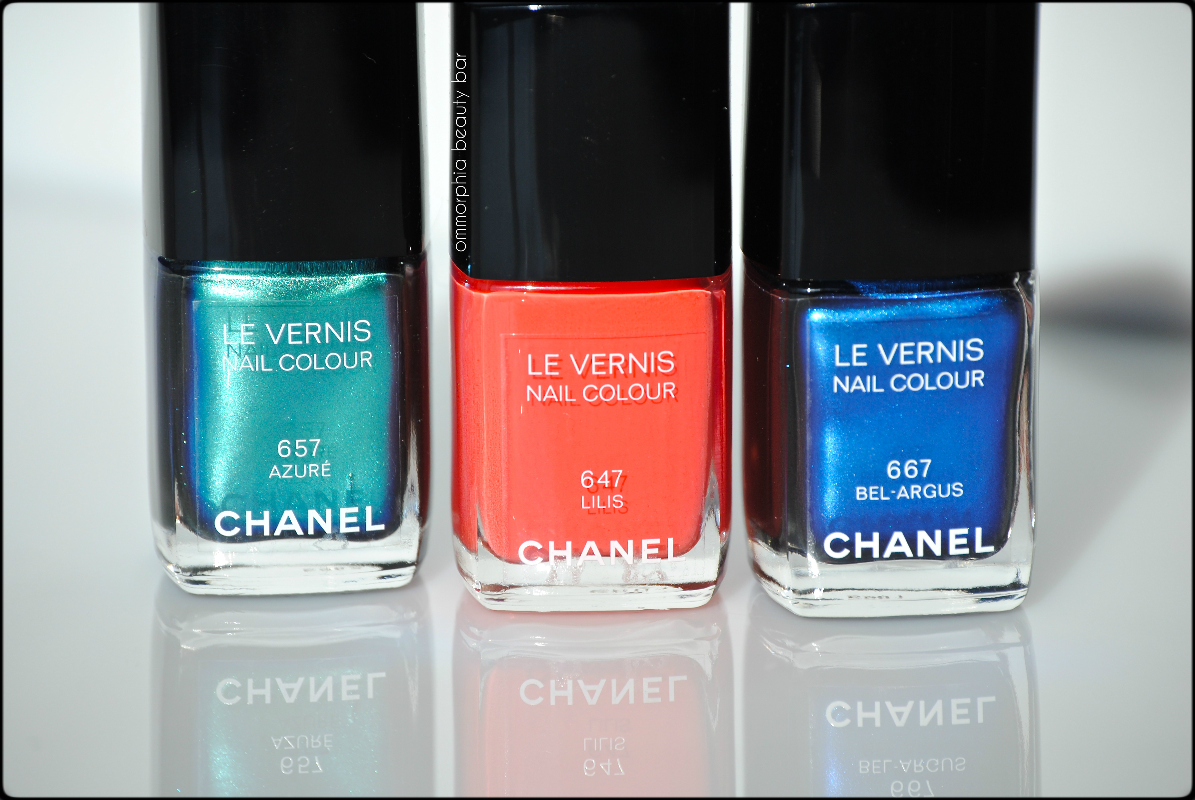
CHANEL L’Été Papillons Summer 2013 – #657 Azuré, #647 Lilis, #667 Bel-Argus
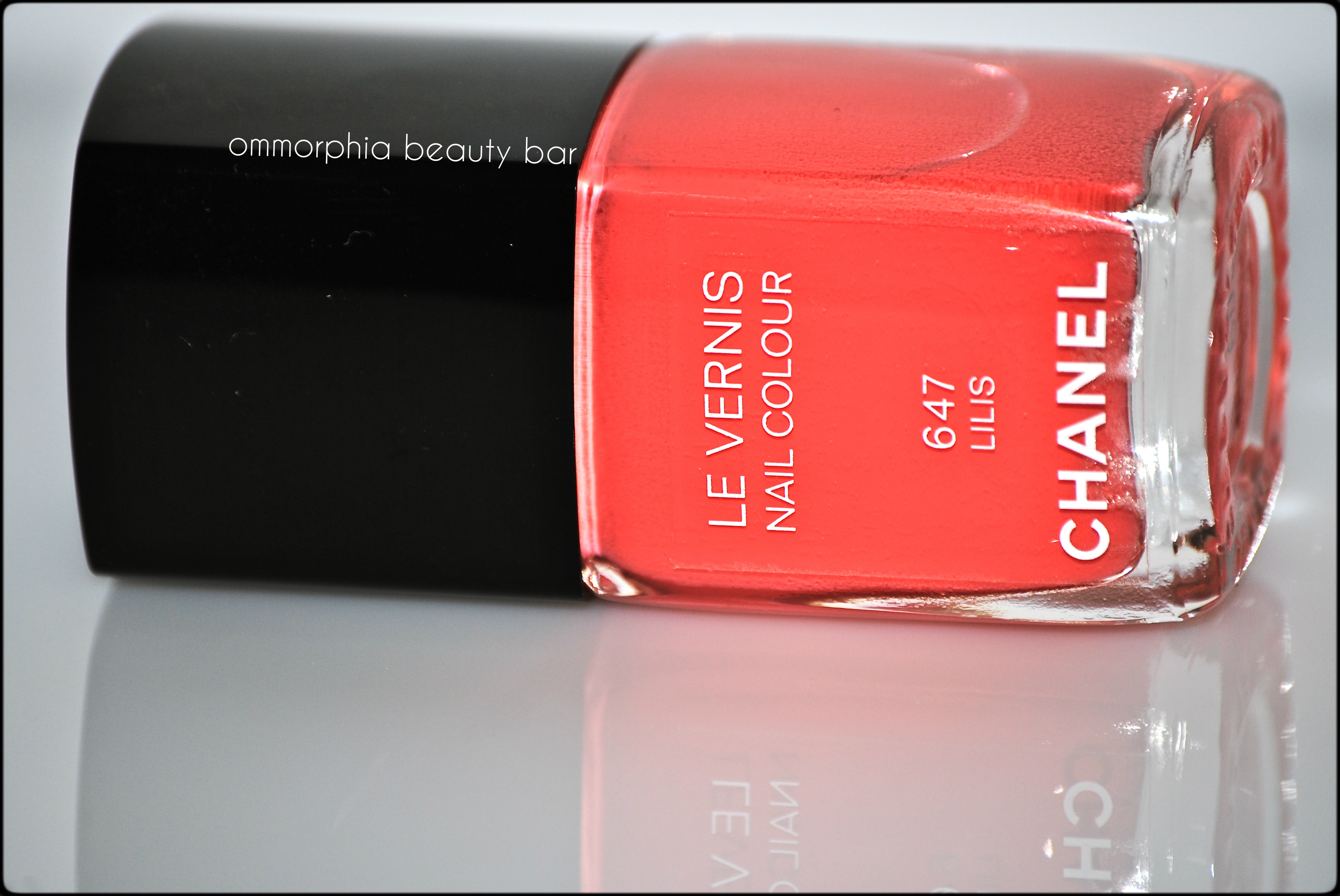
#647 Lilis – an ultra smooth coral-salmon hue in a crème/jelly hybrid formula, bearing intense colour saturation and able to suit both warm & cool skin tones equally. Completely non-staining upon removal. Coats applied: 2, plus top coat
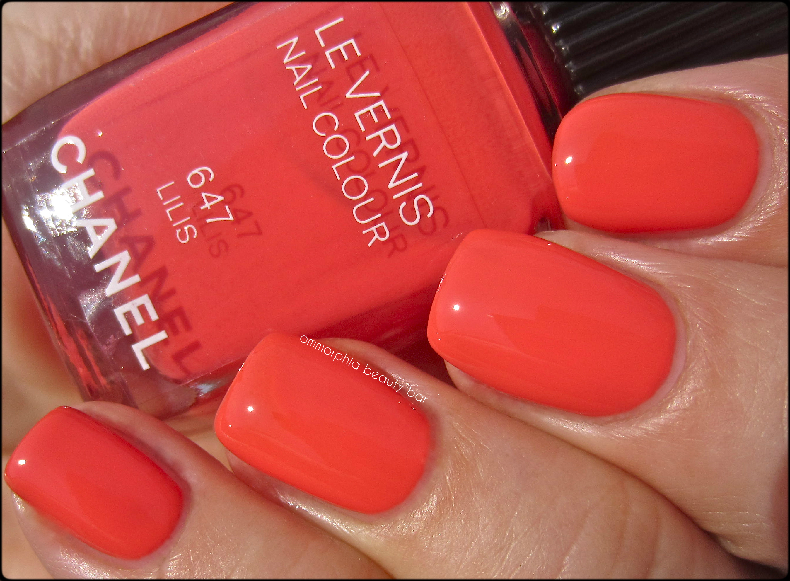
CHANEL – #647 Lilis
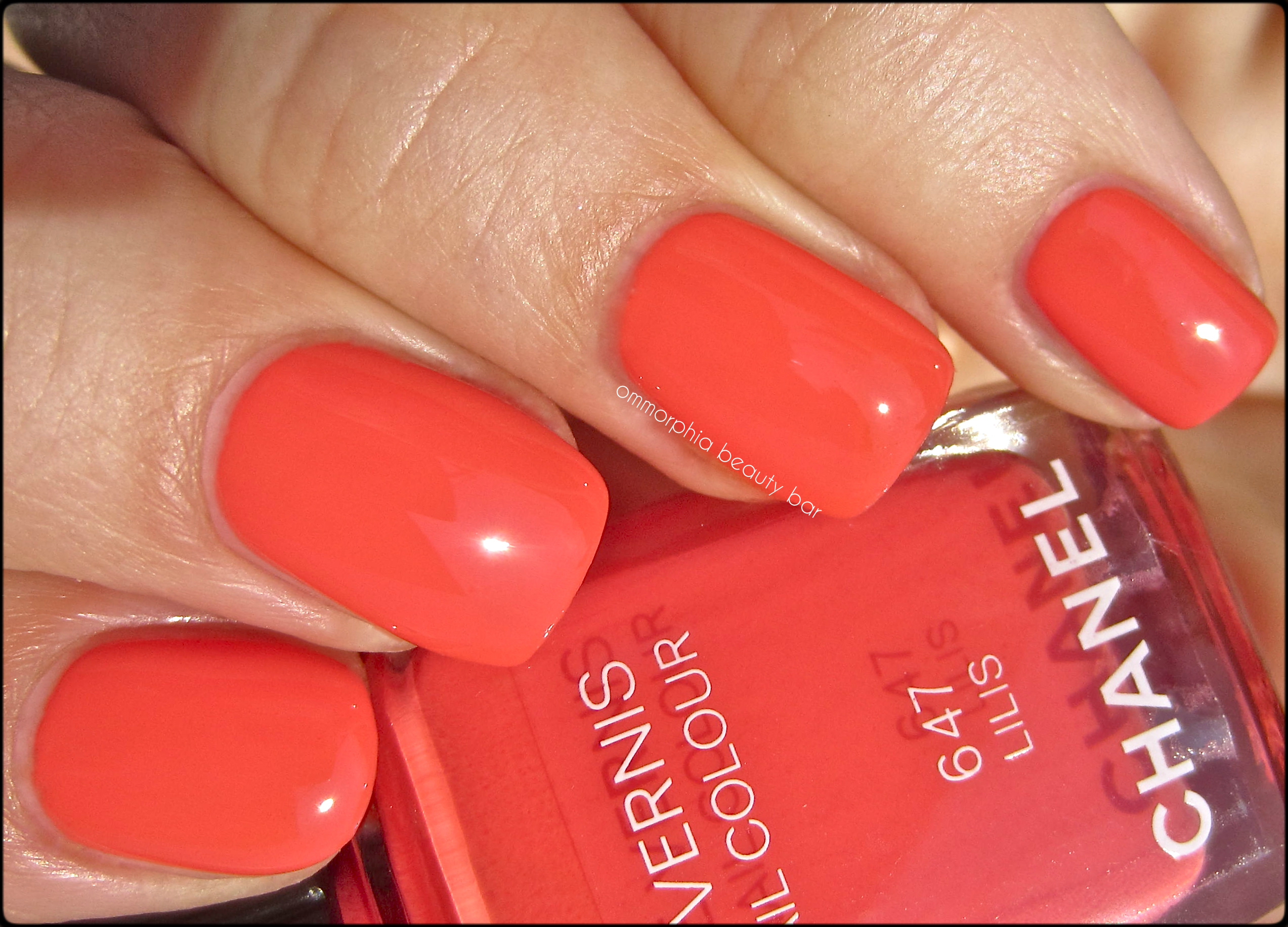
CHANEL – #647 Lilis
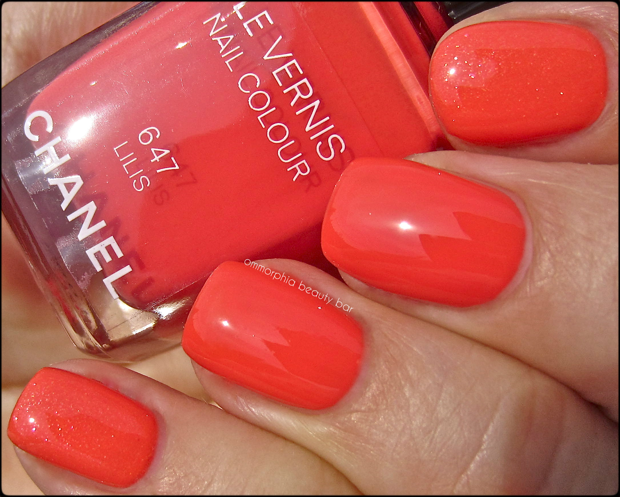
- Middle & ring: CHANEL – #647 Lilis
- Index & pinkie: Dior #433 Délice – thicker formula, higher pigmentation, visible pink, gold & silver finely ground glitter, satin natural finish which can make the base tone appear a few degrees lighter
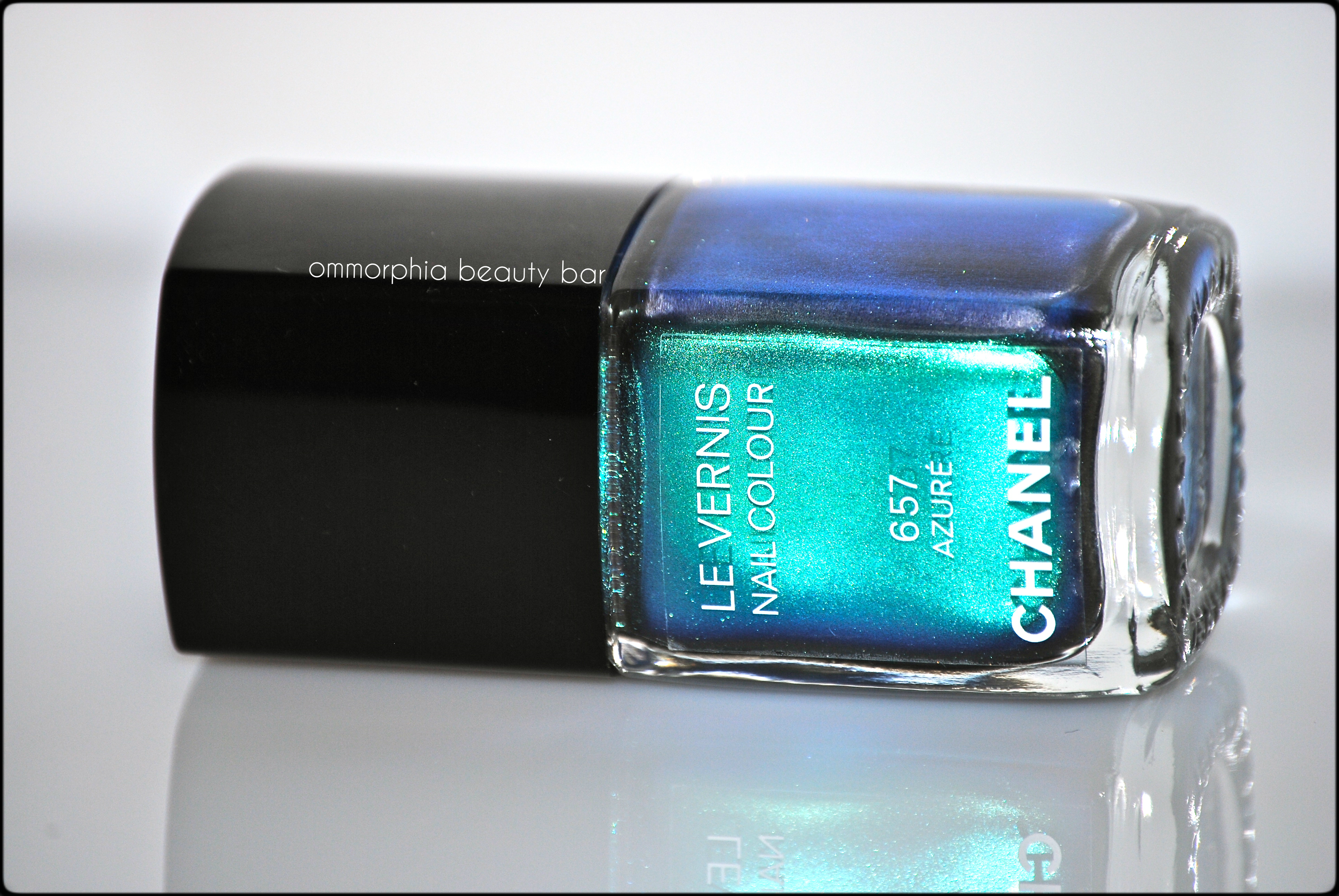
#657 Azuré – a multi-dimensional teal duo chrome that gives off iridescent green, blue, purple and some scant bronze flashes, depending on the light and angle. Due to its metallic nature, a steady hand is a must in application, in order to avoid any visible brush strokes (which are actually much less pronounced in person than my high resolution images may show here). The paradox is with the formula: the first coat may seem rather sheer when you apply it, but this shade becomes fully opaque by the next coat – just make sure to work quickly, as this is a quick-drying lacquer. Coats applied: 2, plus top coat
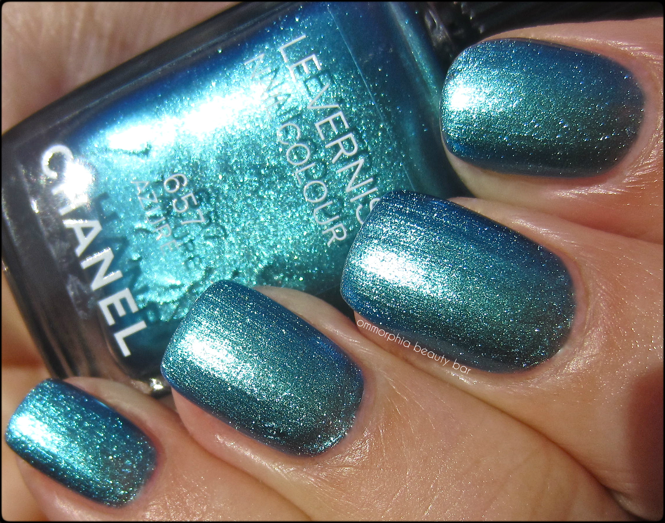
CHANEL – #657 Azuré

CHANEL – #657 Azuré
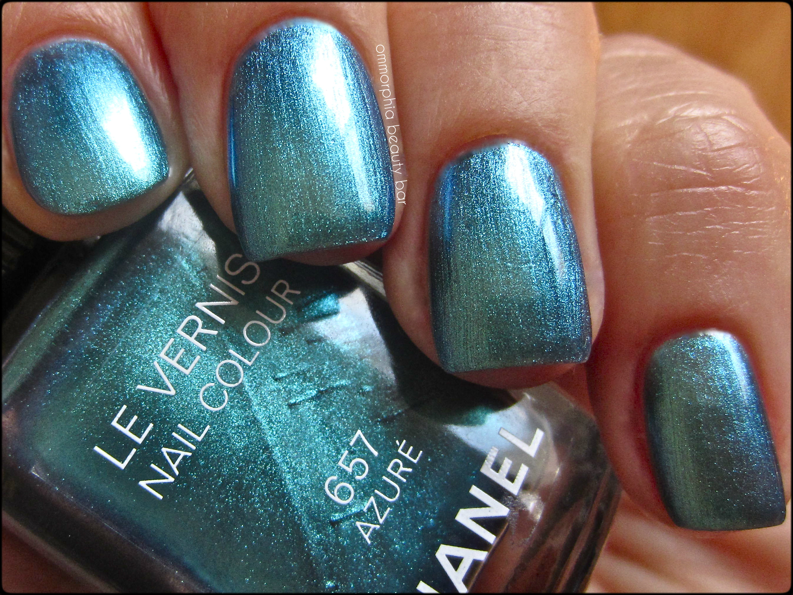
CHANEL – #657 Azuré
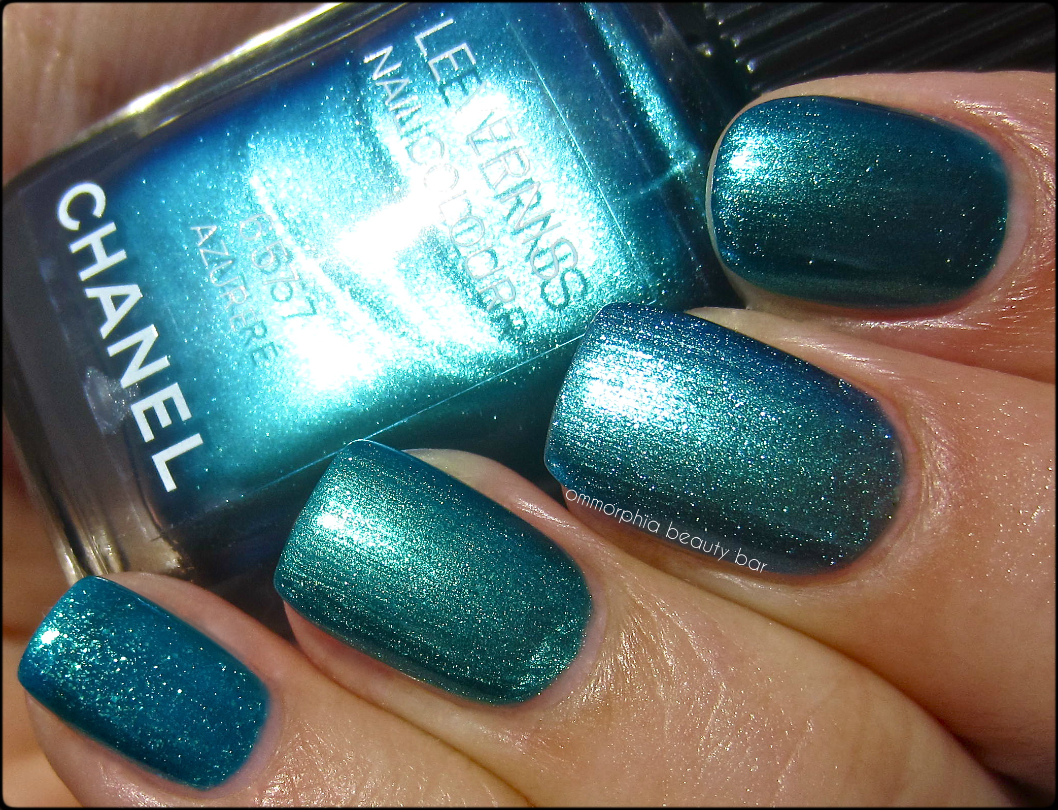
- Index: China Glaze ‘Deviantly Daring’ (reviewed here) – the closest colour-wise, more pigmented with the shimmer slightly more defined, a few degrees deeper/greener leaning – 2 coats
- Ring: Dior #704 from the Samba Duo (Birds of Paradise Collection) – duller finish, more green tinged, not as obviously metallic – 2 coats
- Middle: CHANEL #657 Azuré
- Pinkie: OPI ‘Catch Me In Your Net’ – sheerer formula, blue leaning, visibly larger shimmer with ground gold & teal/aqua glitter – 2 coats
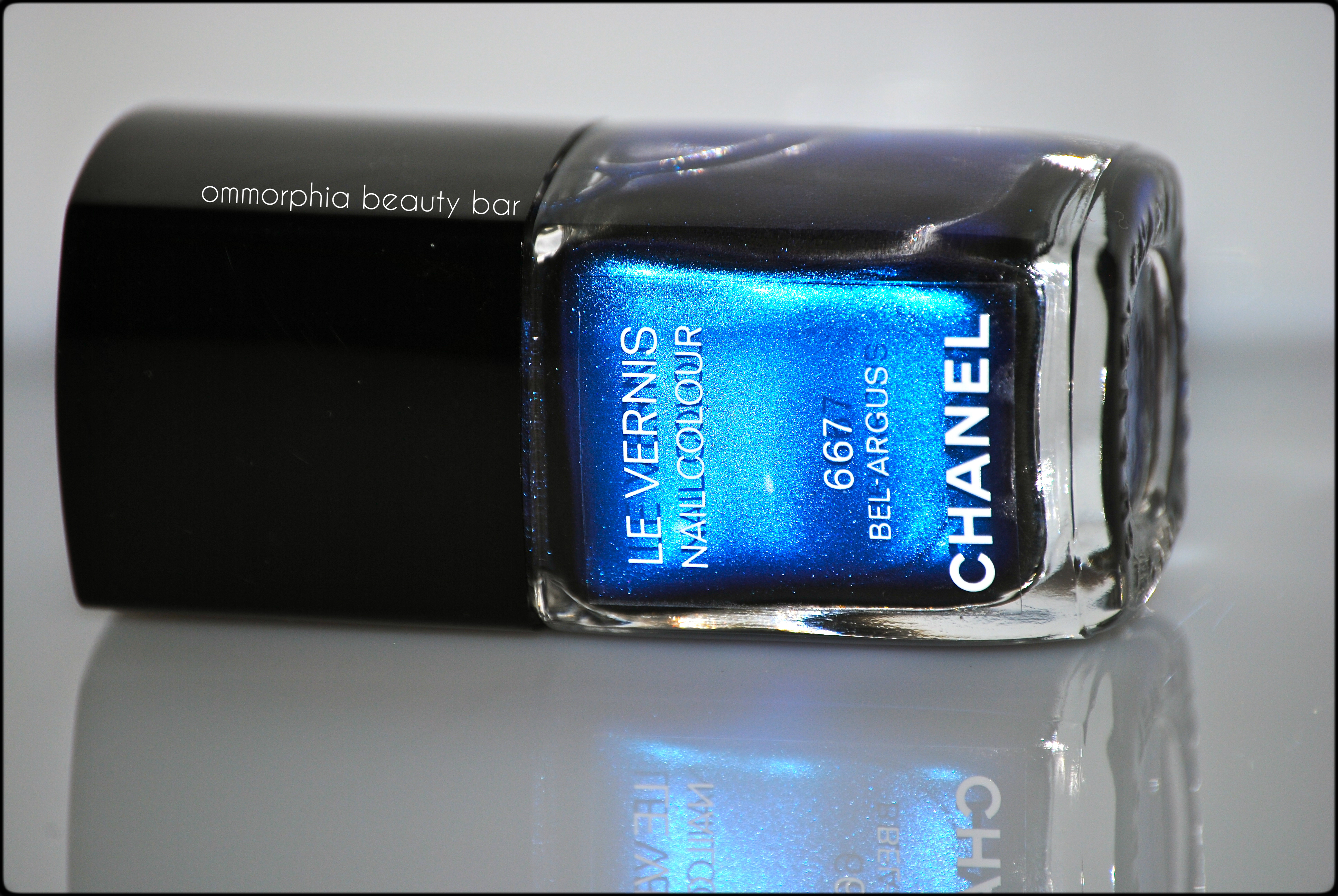
#667 Bel-Argus – a complex royal blue chrome/metallic shade with a distinct purple/indigo colour shift. The formula is much more forgiving – both in terms of application re: any visible brush strokes, as well as dry time – than Azuré. Absolutely breathtaking to look at with intricately swirling cobalt depths give Bel-Argus a unique tone, making it almost luminous, in fact. Bonus: non-staining upon removal. Coats applied: 2, plus top coat
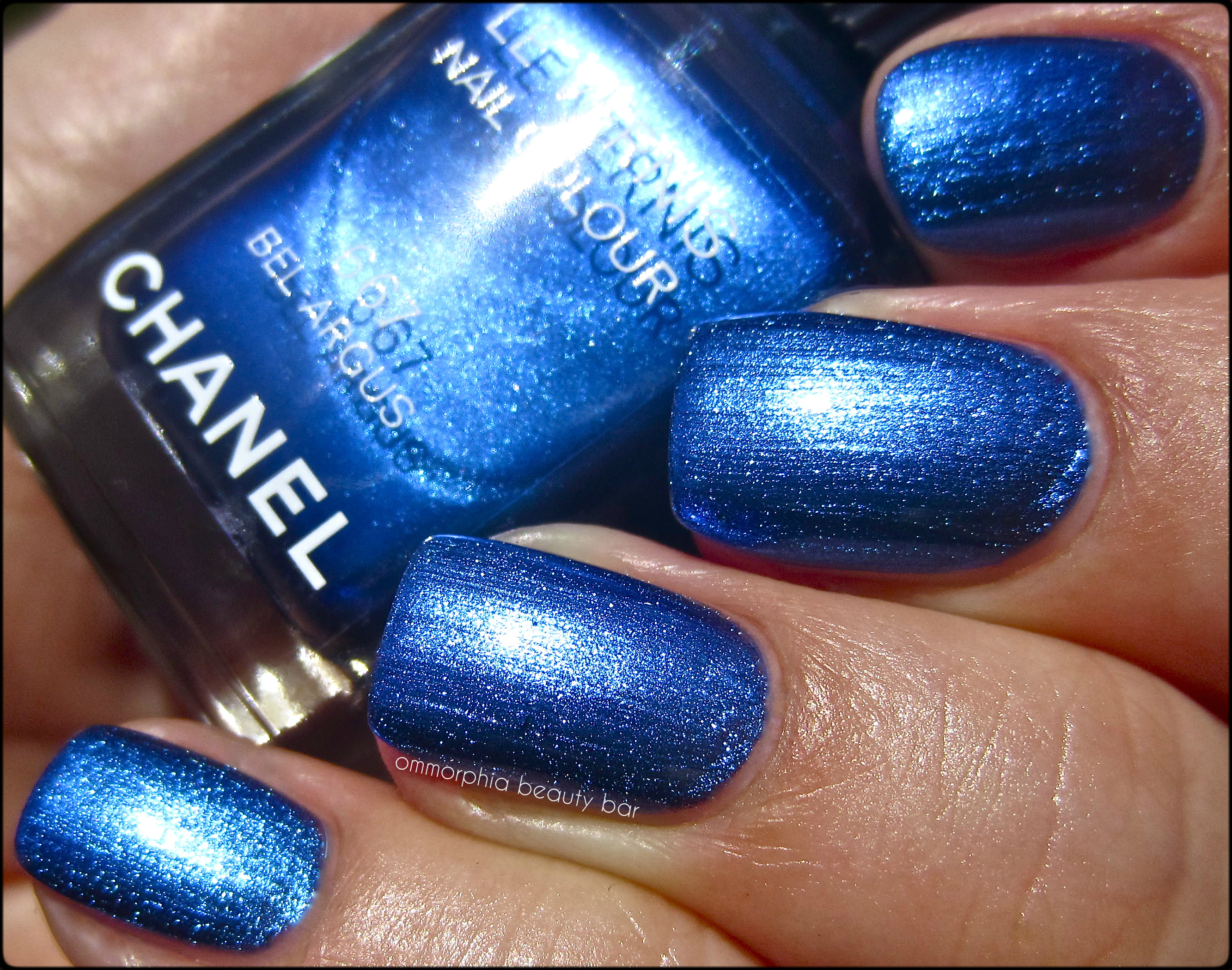
CHANEL – #667 Bel-Argus
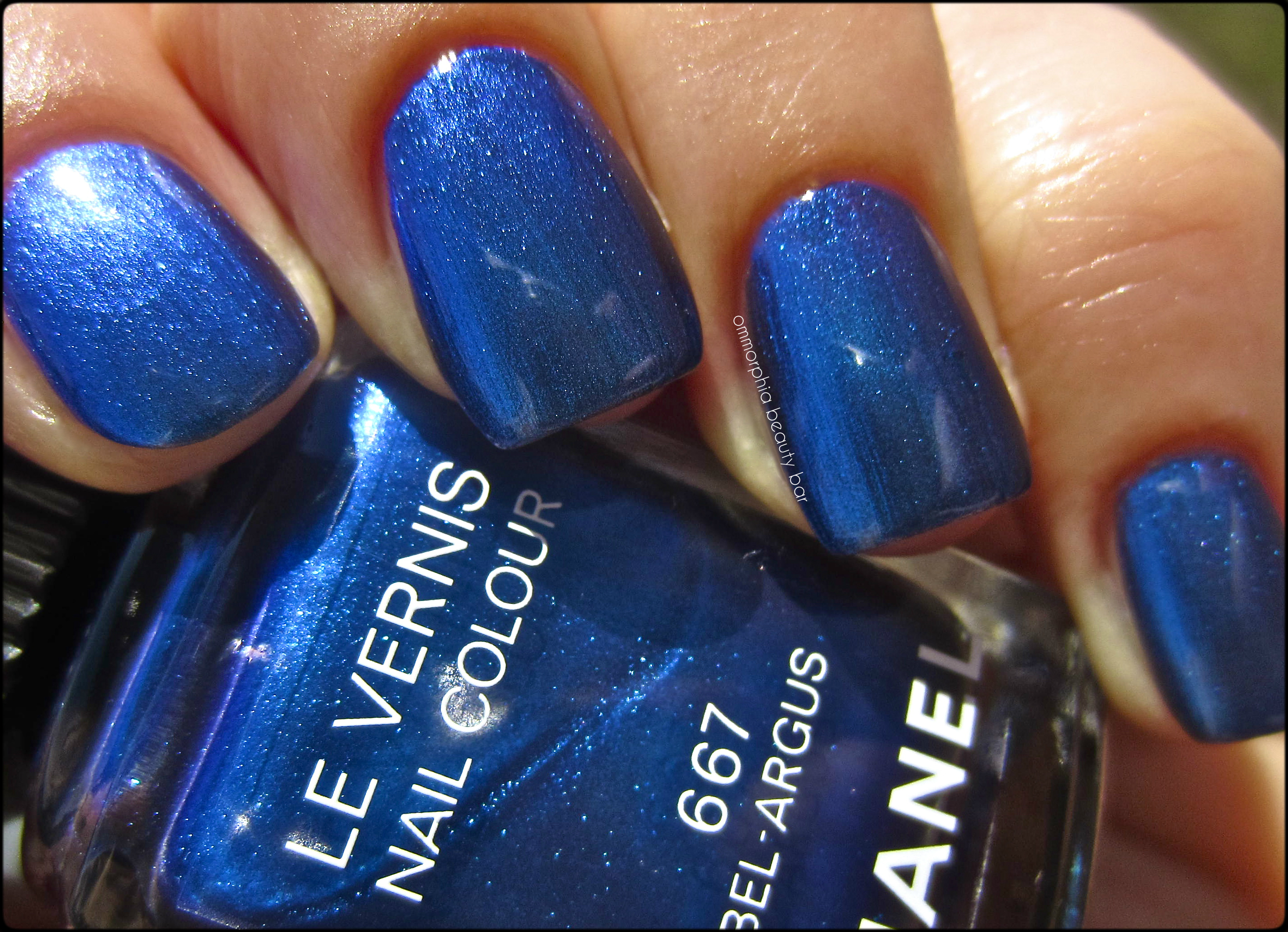
CHANEL – #667 Bel-Argus
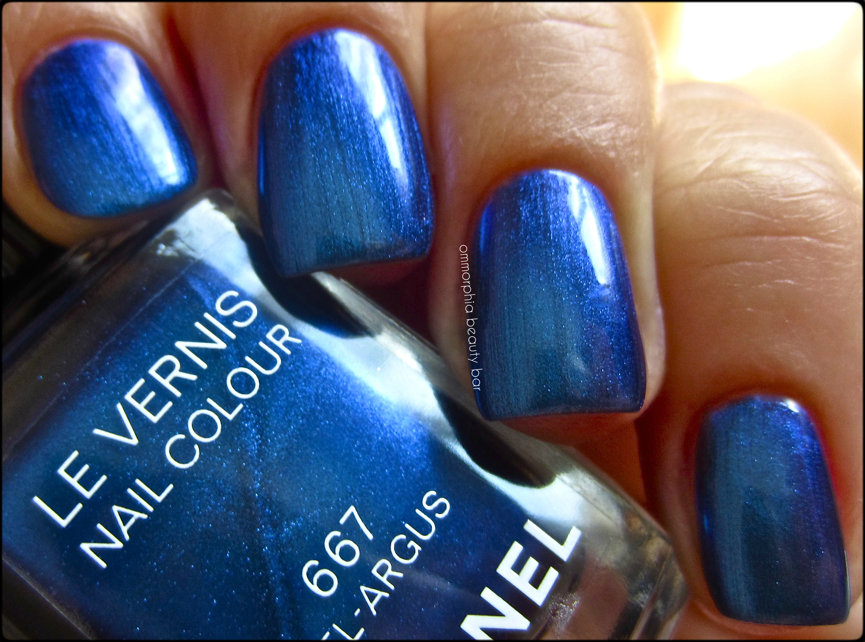
CHANEL – #667 Bel-Argus

- Middle & ring: CHANEL – #667 Bel-Argus
- index & pinkie: Chine Glaze ‘Want My Bawdy’ (reviewed here) – thinner & sheerer formula, shimmer larger & more visible, purple-leaning – 2 coats
Last word: I couldn’t be happier with this trio of colours CHANEL chose to release for their Summer 2013 Collection – vibrant, almost thrumming with life & beauty, they are as gorgeous to wear, as to look at. I thought at first that ‘Lilis’ might be have a duplicate in my extensive personal CHANEL collection, but I couldn’t find any with the same tone and/or vibrance. It goes without saying that both ‘Bel-Argus’ and ‘Azuré’ are completely unique for CHANEL – and even amongst the comparisons I showed – and certainly worth picking up as well. My favourites? ALL. And just as fleeting as butterflies, that’s how quickly this collection will disappear, I’m giving you fair warning … run, don’t walk, to stake your claim on any of these lovelies.
I picked these up from The Bay (Canada).


Essie – Neon 2013 Collection

When I think of neon, the term “retina- searing” usually comes to mind, which is so NOT the case with Essie’s new Neon 2013 Collection. Inspired by the partying/clubbing scene but displaying a mellower side to neon, these hues have something most fluorescent shades lack: wearability & a hint of sophistication – not just lacquers for the teeny- bopper set any more.
Note that there is a 6th shade not shown (a blue called ‘Bouncer It’s Me’) – which I’ll be hopefully reviewing soon. As with most neon varnishes, all of these have a satiny finish, so adding top coat is a must in order to have them really stand out.
TIP: Essie suggests layering these shades over a white such as ‘Blanc’ (as I have done here), in order to make the colours really pop. All swatches are with base and top coats.

Essie – Neon 2013 Collection
Boom Boom Room – like a pastel on steroids, this hot bubblegum pink is not a colour I would expect to find in a collection of neons, but it definitely isn’t your average dainty pink hue – think more sassy girl. The formula was the thickest of them all, but still applied easily enough and in a non-patchy manner. Coats applied: 2

Essie – Boom Boom Room

Essie – Boom Boom Room
Bottle Service – An electric pink hue with hints of violet undertones, I found this oddly compelling and just so incredibly flattering. The formula was of medium-thick density, although applied easily and smoothly along the nails. Coats applied: 2

Essie – Bottle Service

Essie – Bottle Service
Saturday Disco Fever – a sizzling traffic-cone orange hue with some slight hot pink undertones, in a quasi-sheer jelly-esque formula (that was a mouthful) with an easier flow than the first 2 shades. Without the layer of Blanc underneath, I would imagine that this might need a 3rd coat for full opacity – something to bear in mind. Coats applied: 2

Essie – Saturday Disco Fever

Essie – Saturday Disco Fever
DJ Play That Song – An intensely “throbbing” violet-purple hue with the most amazing formula of the group, flowing smoothly and in a totally self-levelling way. Even though this shade is warm leaning, I still feel that it will suit basically all skin tones across the board. Coats applied: 2
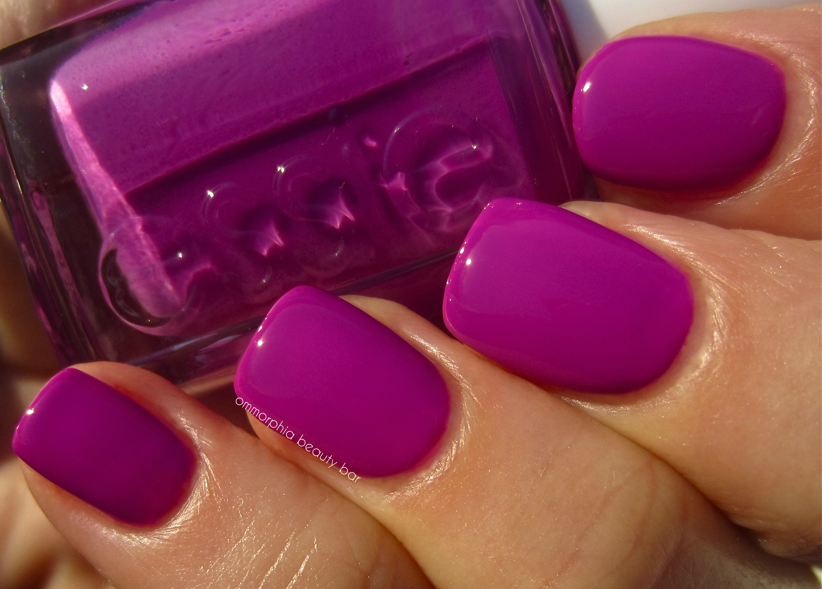
Essie – DJ Play That Song

Essie – DJ Play That Song
Shake Your $$ Maker – a vibrant Crayola-ish grass green hue, in the sheerest formula of them all. Even though I detect hints of yellow in the base, I found this colour to be an exceptionally well-balanced green and one that does not give off the dreaded “lobster hands” effect. Coats applied: 3 (thin)
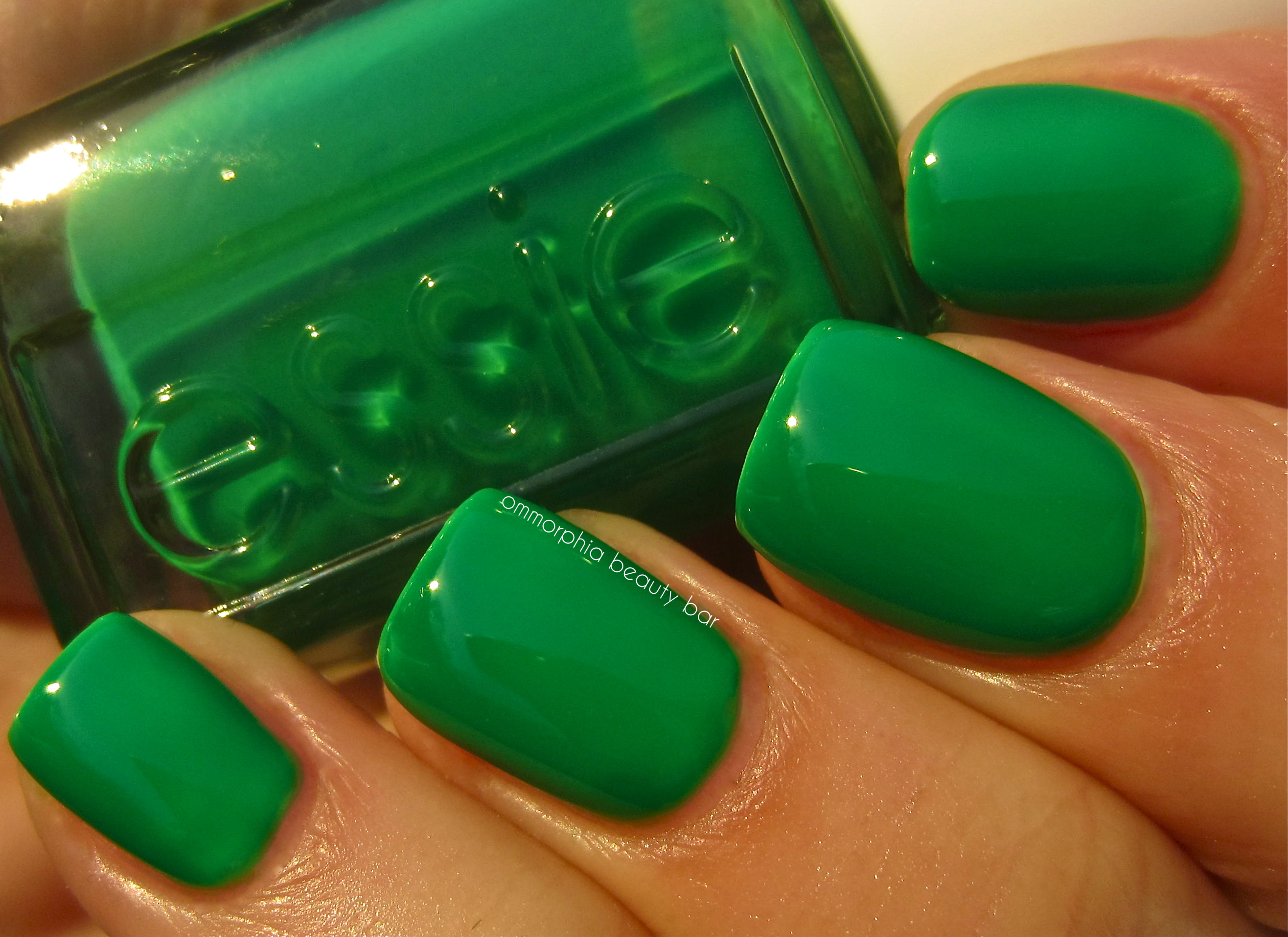
Essie – Shake Your $$ Maker
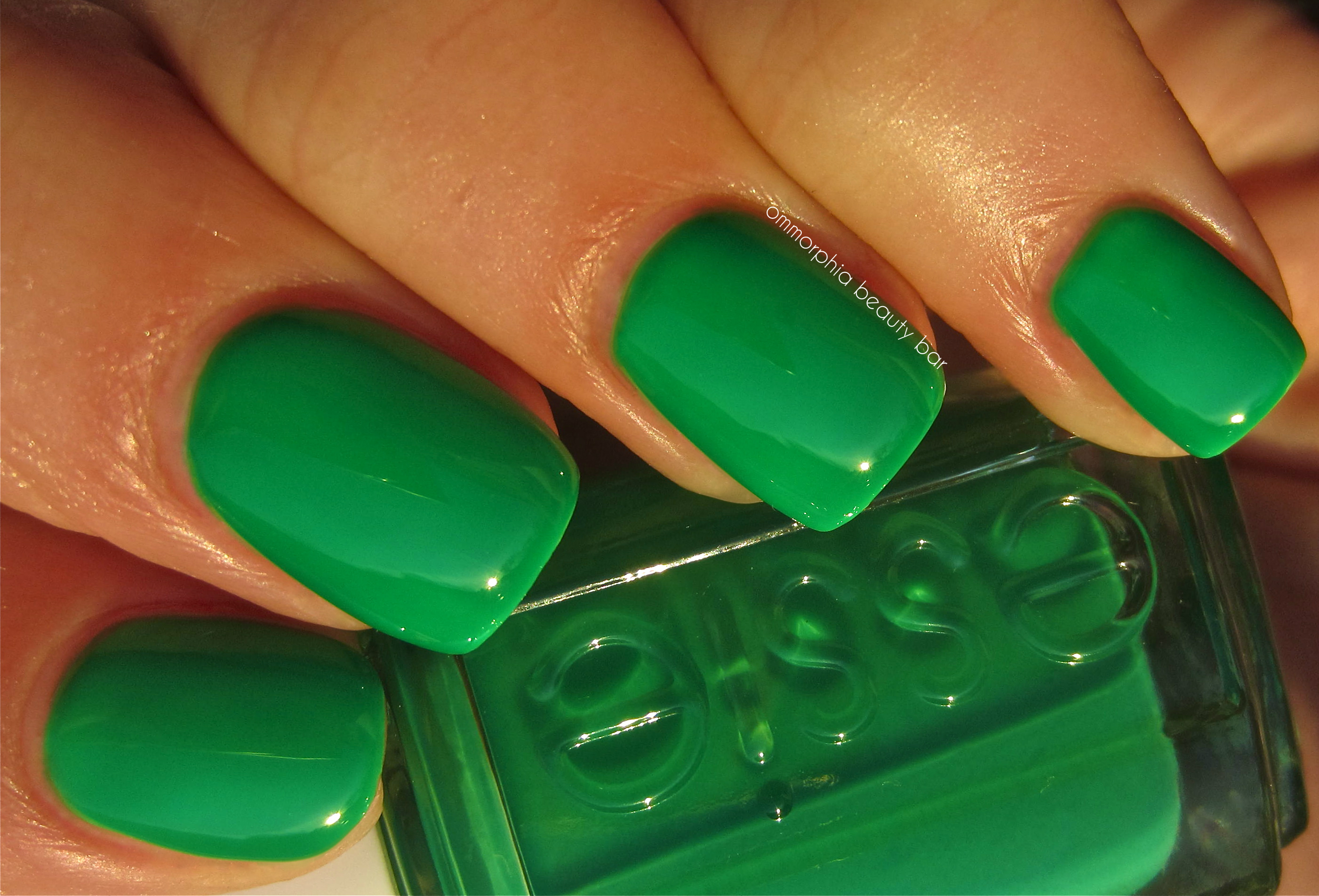
Essie – Shake Your $$ Maker
Last word: I confess that I’m not usually a fan of neons – I’m guessing it’s an age thing – however I can definitely see myself getting behind a few of these. ‘Bottle Service’ and ‘DJ Play That Song’ are my absolute favourites and I can just picture them as summertime “notice me” pedi shades. I’m looking forward to seeing how Essie interprets neon blue, because something tells me I’ll be falling for that one too … it’s the aquatic lover in me, wouldn’t you know!
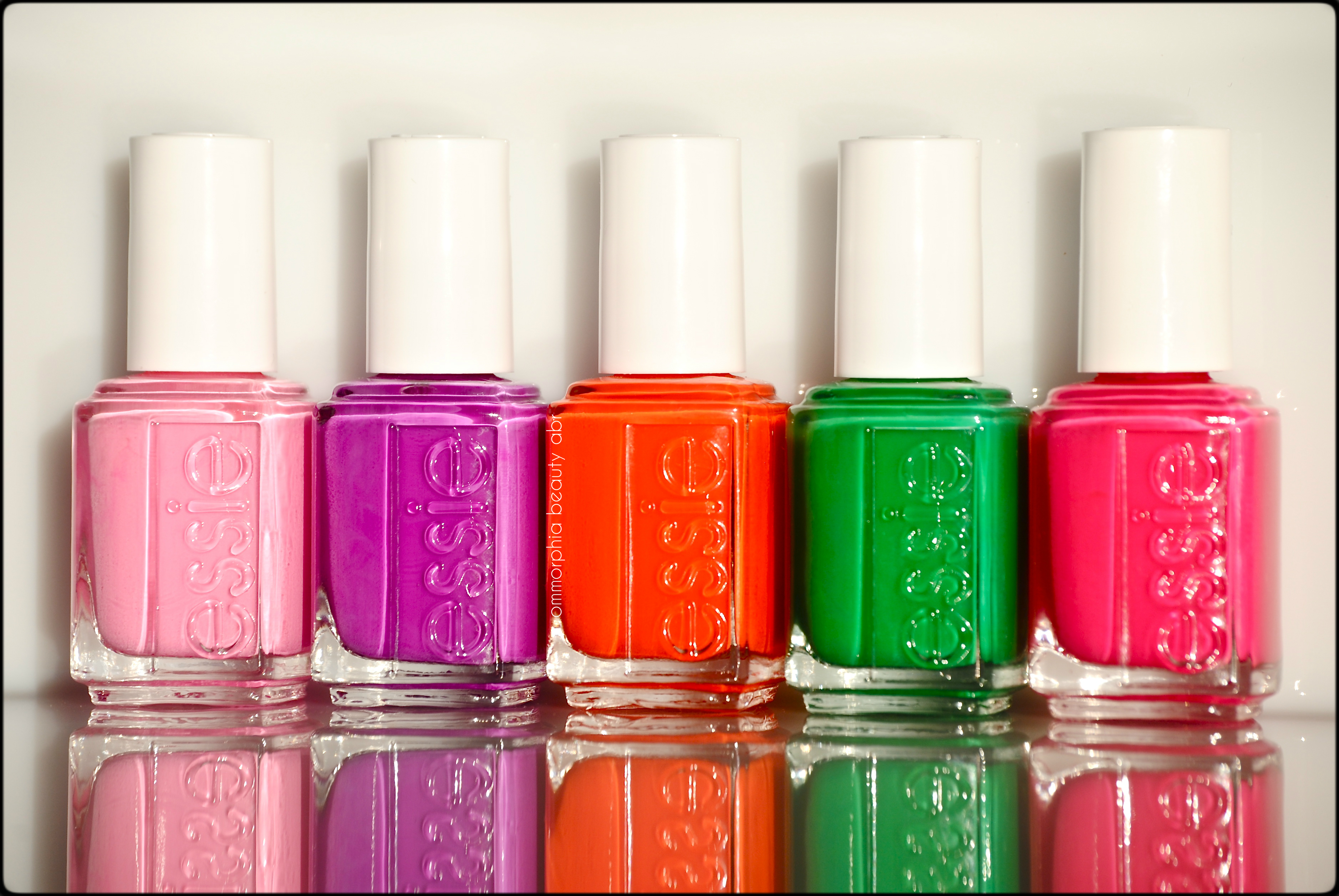
Kindly provided by Essie for my unbiased consideration
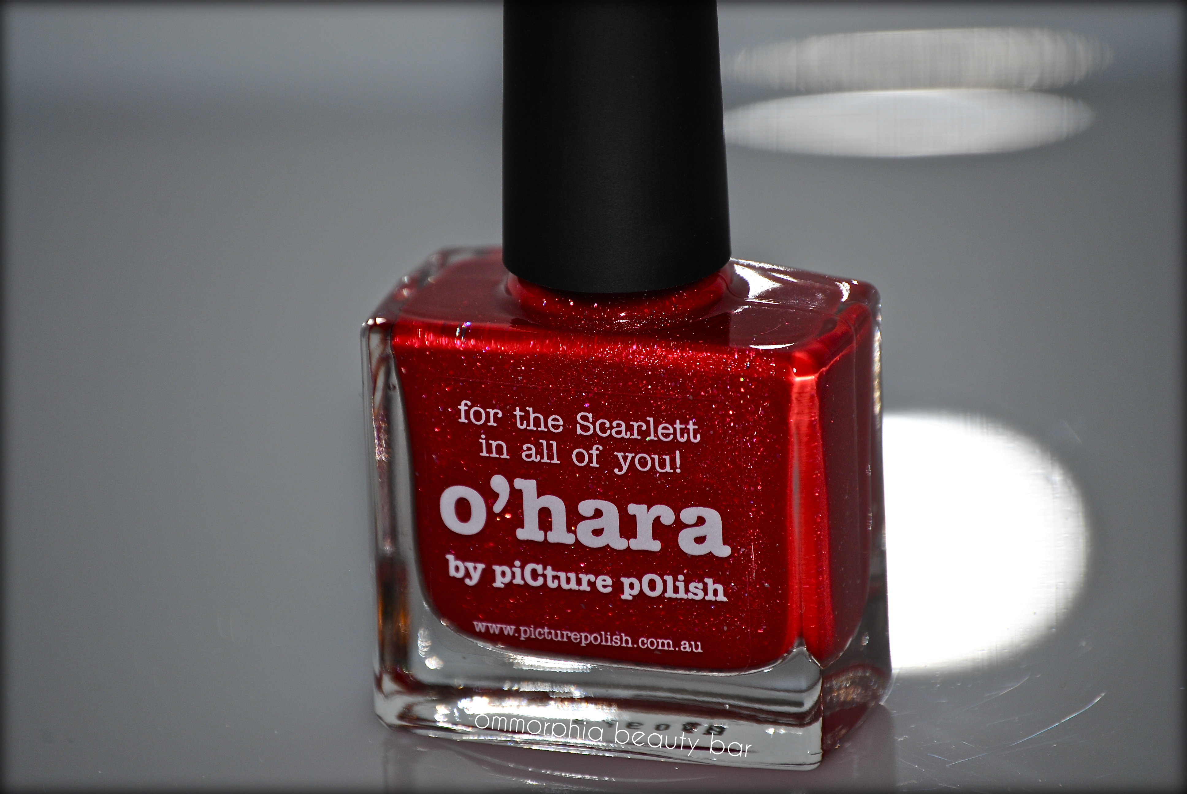
Picture Polish – O’Hara
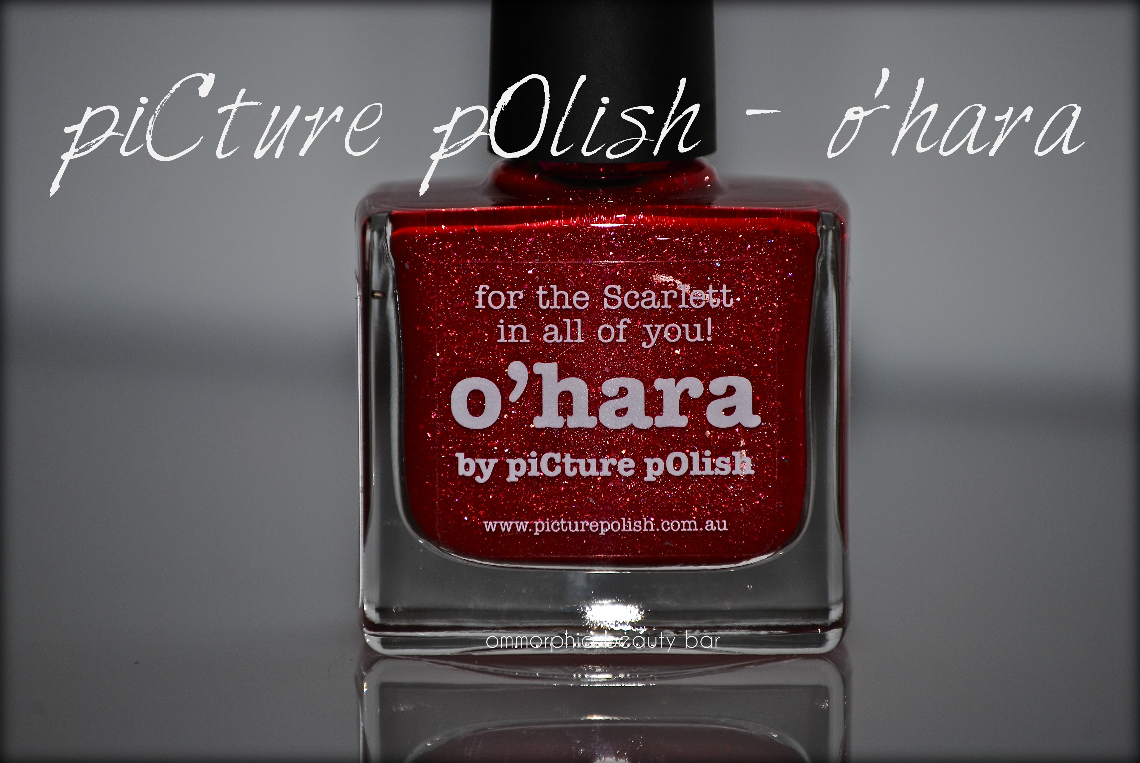
Something tells me that if Scarlett O’Hara, that memorable heroine portrayed by Vivan Leigh in the classic film ‘Gone with the Wind’ were to wear nail polish, then THIS would definitely be her shade; vibrant, bold, powerful and just a little bit sassy – much like the character herself. Make no mistake about it; this is a lacquer hue made to be noticed … and that’s always a good thing in my book.
All swatches are with base and top coats.

Vivien Leigh – in “scarlett red” (source)
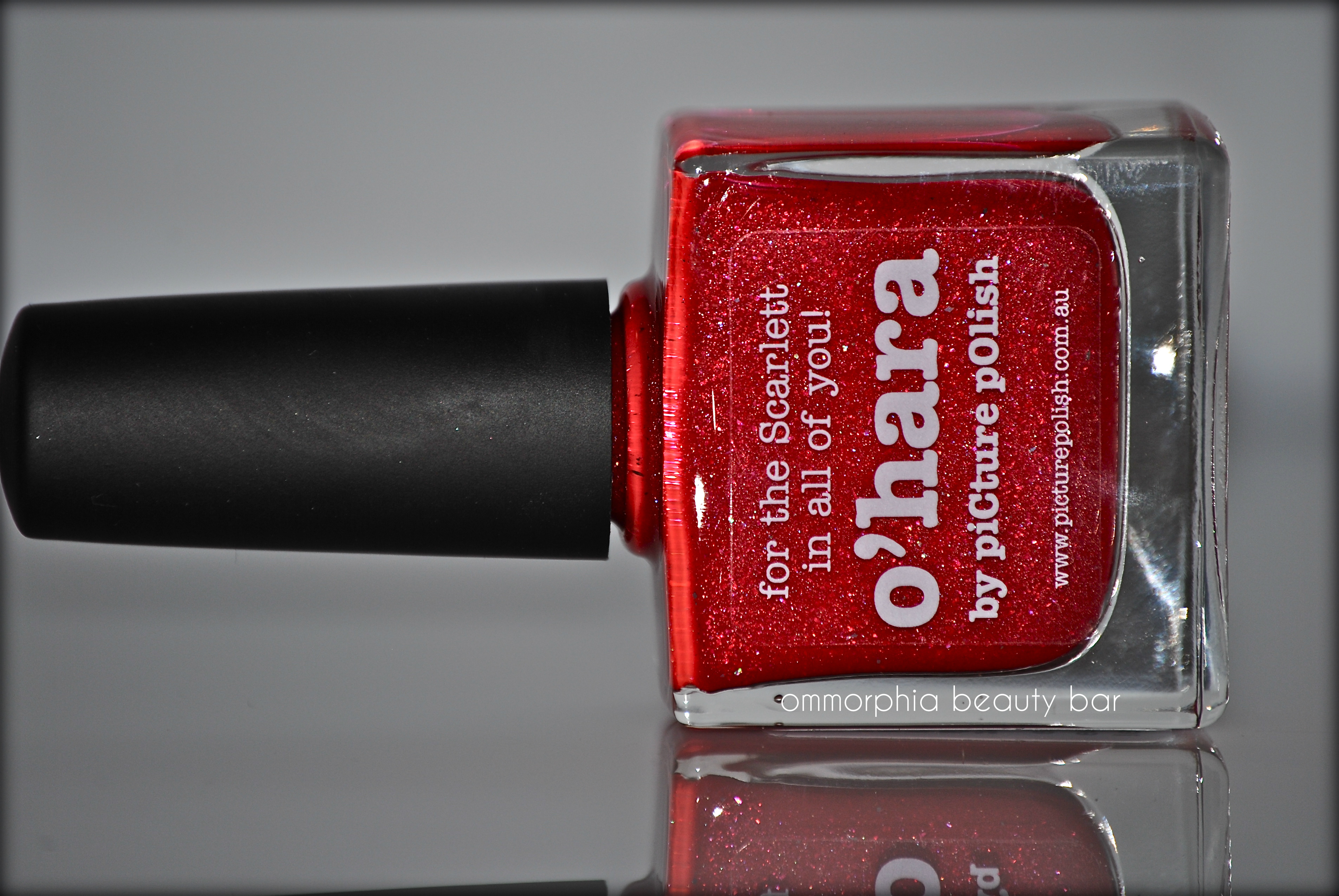
piCture pOlish – o’hara (CAD $14.50 11 ml) – a scarlet jelly-crème hybrid formula with hot pink undertones, and filled with ultra fine prismatic glitter flecks. Bearing an excellent self-levelling flow and a nice glossy shine at the finish, there is something almost hypnotic about how this shade’s holographic particles capture the light – spectacular! Tip: do not skip base coat for application, as this could leave some light staining behind. Coats applied: 2
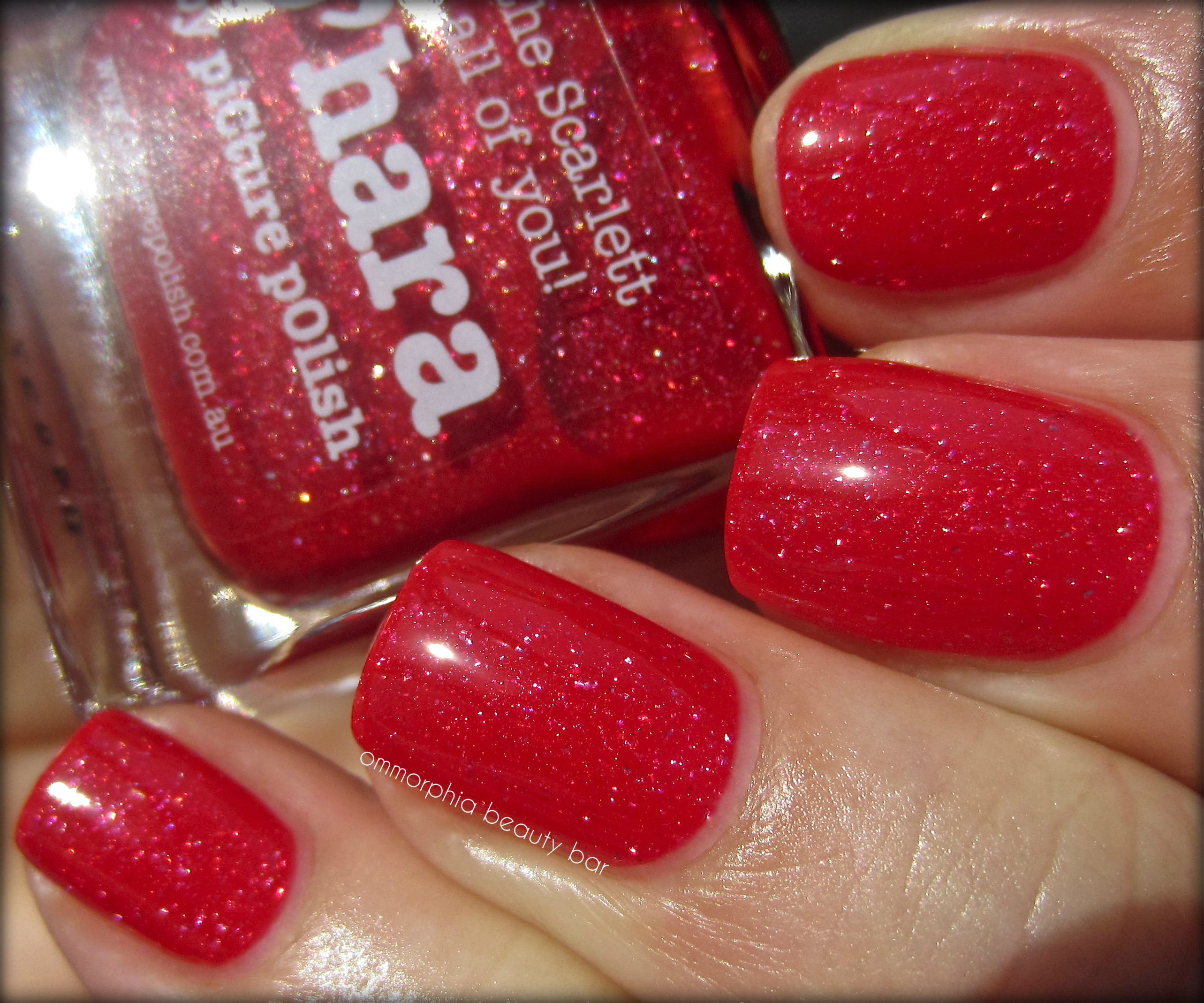
piCture pOlish – o’hara
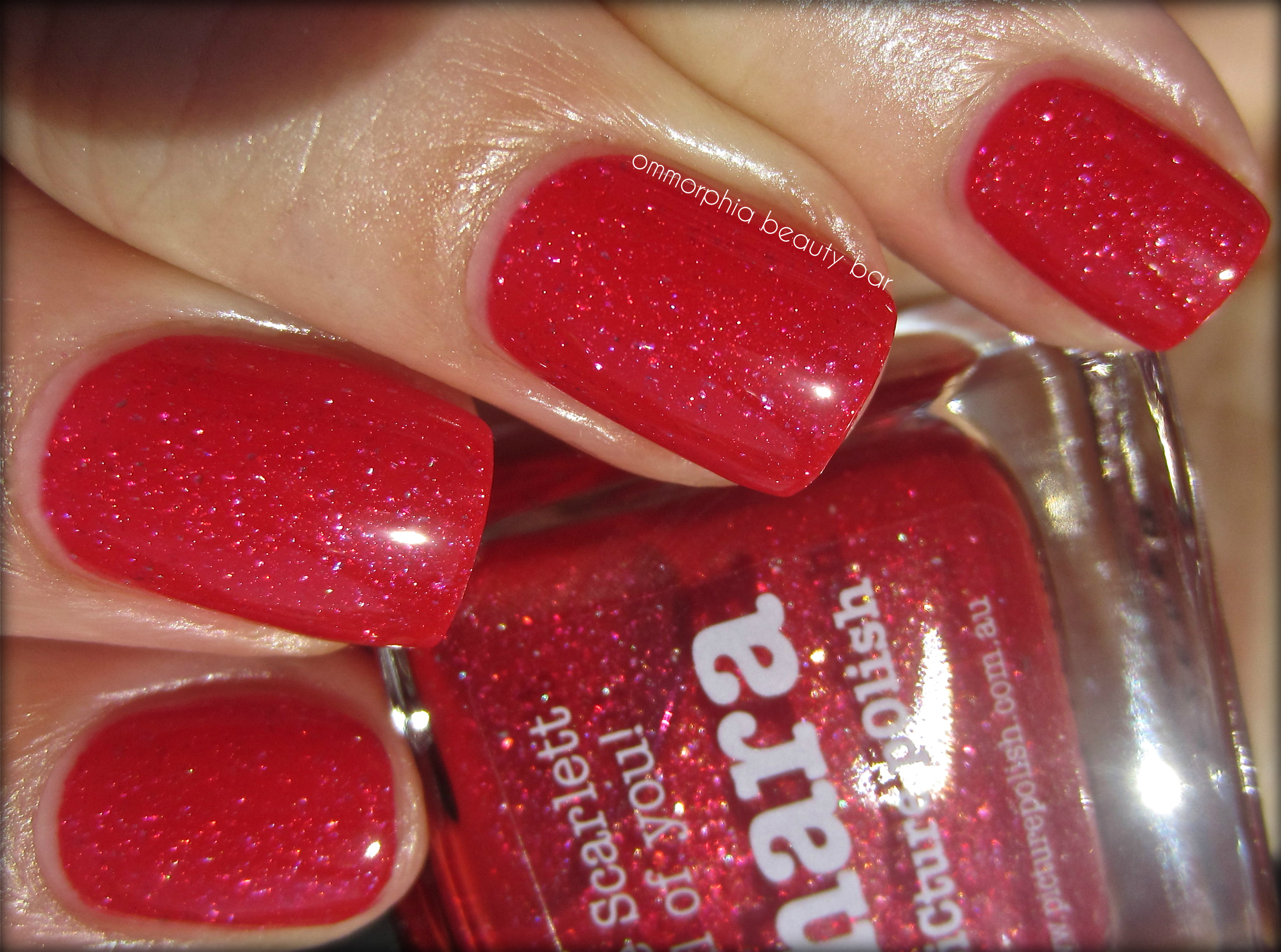
piCture pOlish – o’hara
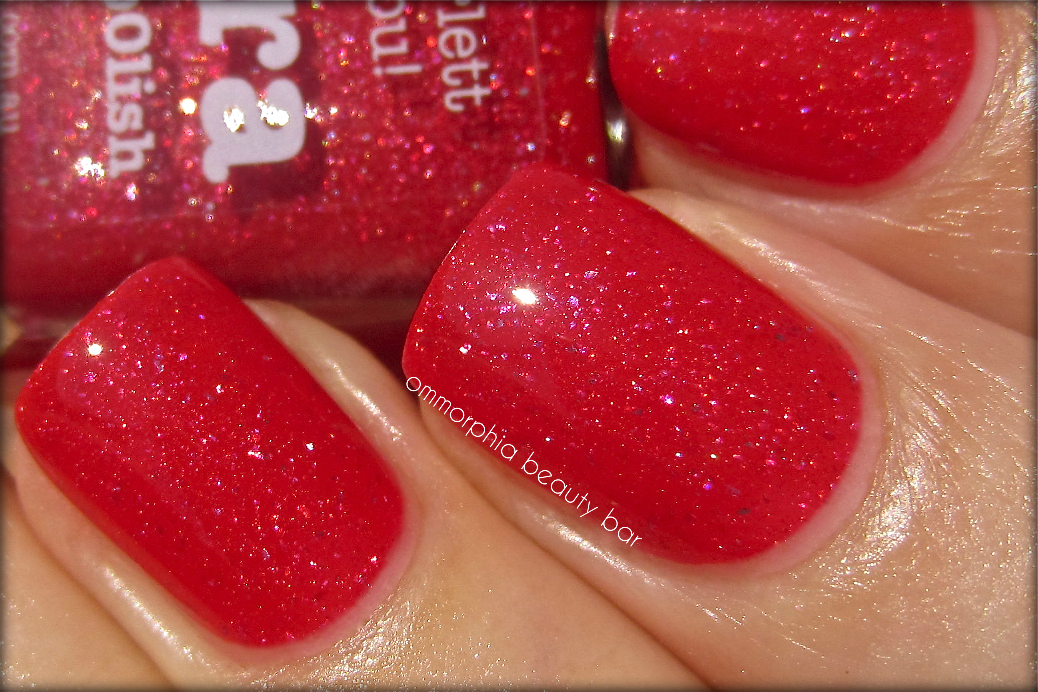
piCture pOlish – o’hara (macro)
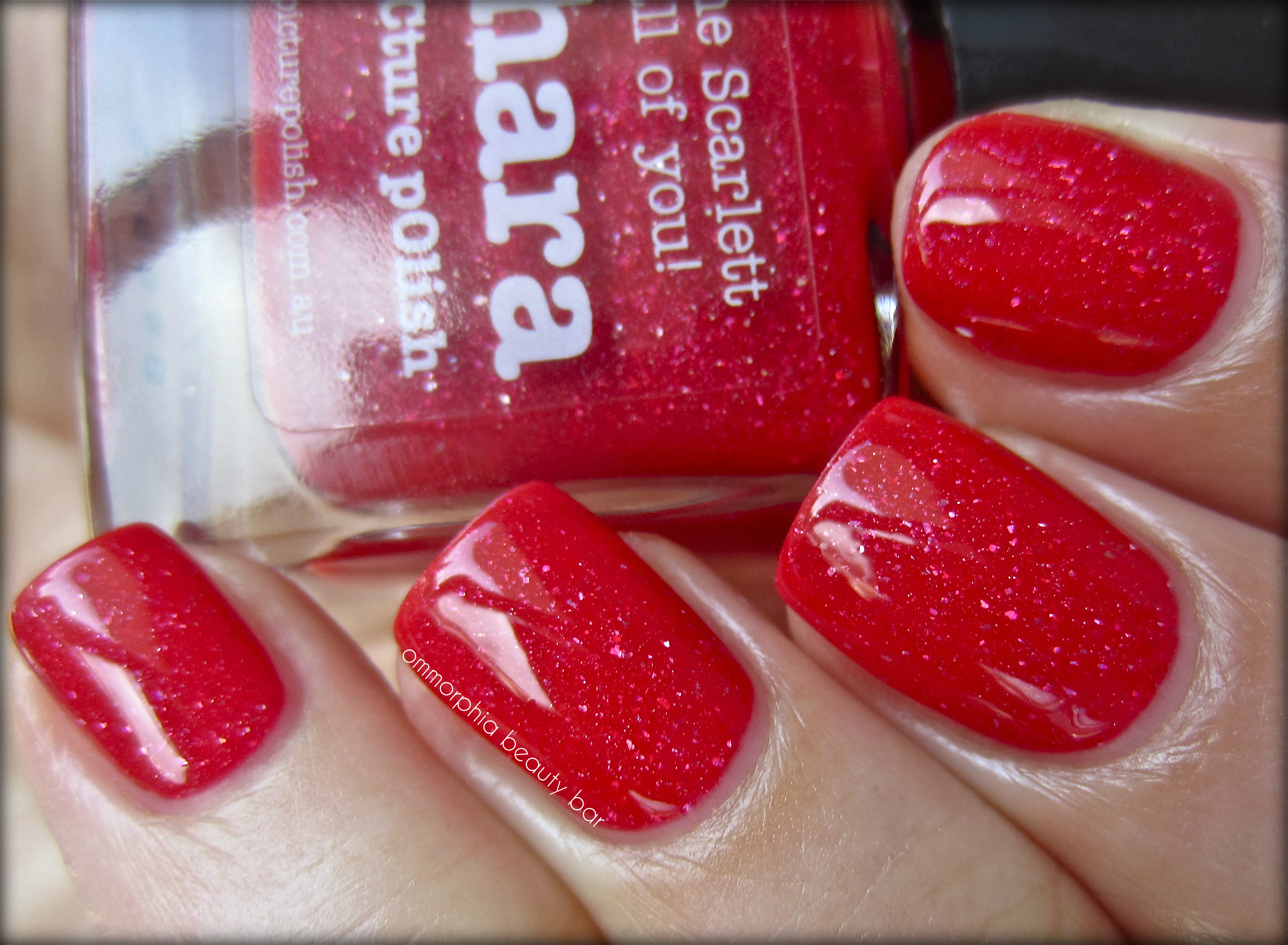
piCture pOlish – o’hara (natural light)
buy Tretinoin online onlineandnewblo.com/ no prescription
Last word: The third in a series of piCture pOlish shades that I’m currently testing & reviewing, ‘o’hara’ does NOT disappoint. A unique twist on a classic red shade and made all the more interesting by the addition of prismatic glitter, I like how these rainbow flashes are visible under any light, and do not sink into obscurity as can happen with some darker hues. Perfectly in line with the warmer weather that’s coming (fingers crossed), let your fingers (or toes) make a statement … without saying a word.
You can find the full range of piCture pOlish products through their website, or feel free to follow via twitter, facebook, Pinterest or Instagram
buy proscar online onlineandnewblo.com/proscar.html no prescription
*Disclosure: Product sample provided by the company/PR for my unbiased consideration
Essence – #02 My Little Kimono (Cherry Blossom Girl Collection)

Essence is a brand that is relatively new to me, having only arrived at Montréal retailers about a year ago – although I’ve heard nothing but good things about this incredibly low-priced beauty range. Part of the Cherry Blossom Girl collection (originally released September 2012 in other parts of the world – Spring 2013 for North America), ‘My Little Kimono’ is the only shade out of the 4 varnishes that drew me in, although for $1.99 each I could just as easily splurged for the set.

My Little Kimono (CAD $1.99 0.7 ml/0.23 fl.oz) – a warm minky taupe hue with grey/mauve undertones & filled with ultra fine pearly shimmer. The medium thick formula was easy to apply, although I found the brush a tad too wide and somewhat floppy for my taste (I prefer a thinner brush for more control and a precision application). The pigmentation is excellent with plenty of colour saturation per coat, and the finish was not only self-levelling, but quite glossy as well. Coats applied: 2, plus top coat

Essence – My Little Kimono

Essence – My Little Kimono
buy lexapro online andnewbloonline.com/lexapro.html no prescription

Essence – My Little Kimono, matte

Essence – My Little Kimono, matte
Final thoughts: ‘My Little Kimono’ is such a totally wearable and flattering shade for a multitude of skin tones, and weighing in at $1.99 (I still can’t get over that price), makes it one of my better beauty bargains. Very close to one of my all-time favourite Essie shades ‘Mochacino’ (reviewed here) but at a fraction of the price, the finely ground pearlescent shimmer in this shade gives a nice edge to what would otherwise be a run-of-the-mill neutral. I should mention that had it not been this post of Liz’s (Beauty Reductionista), I wouldn’t even have been aware of this collection … so I blame her for this purchase!
buy lipitor online andnewbloonline.com/lipitor.html no prescription
I found the Cherry Blossom Girl Collection at Pharmaprix (Shoppers Drug Mart for the rest of Canada).

buy lopid online andnewbloonline.com/lopid.html no prescription
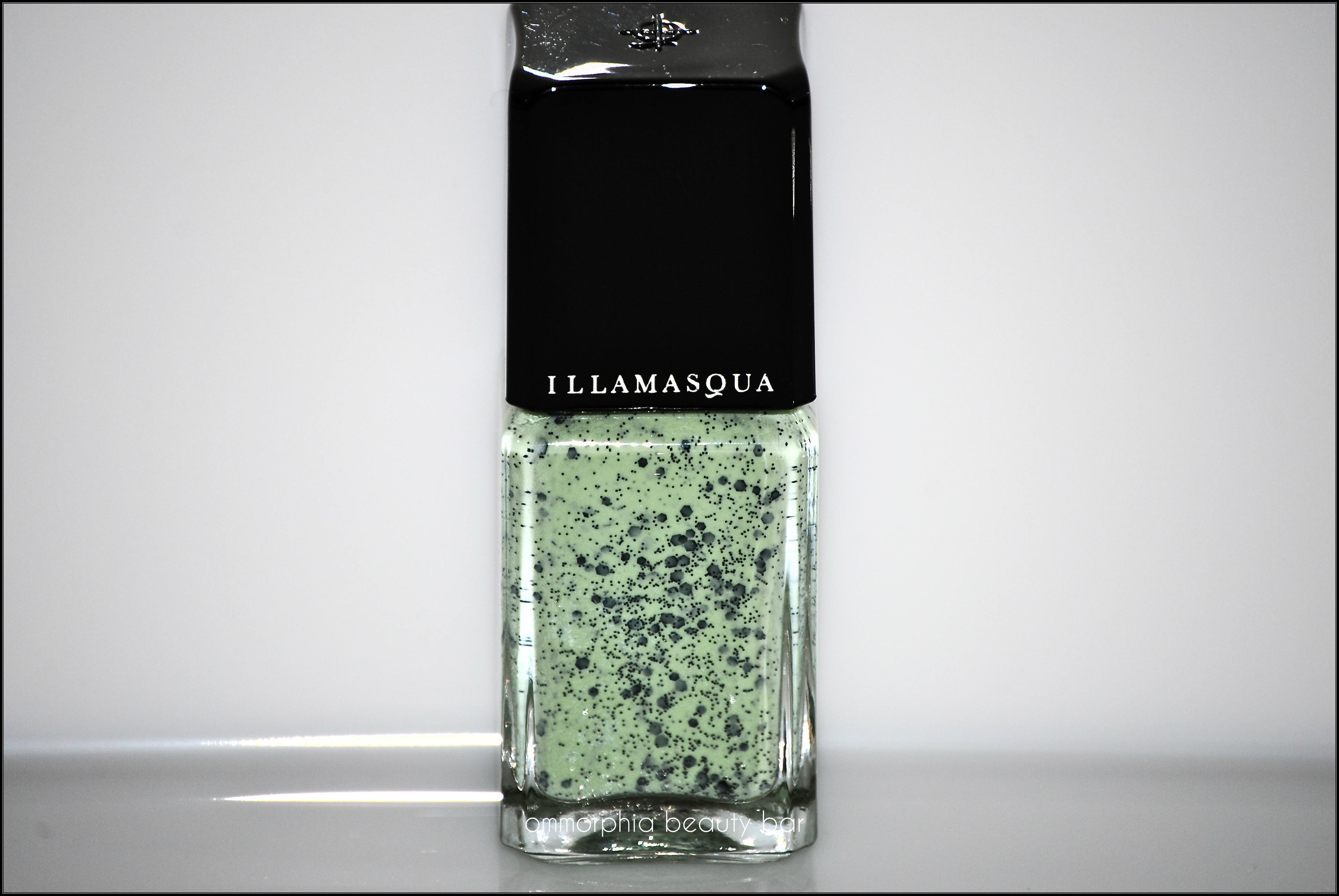
Illamasqua – Speckled Nail Varnish in Mottle
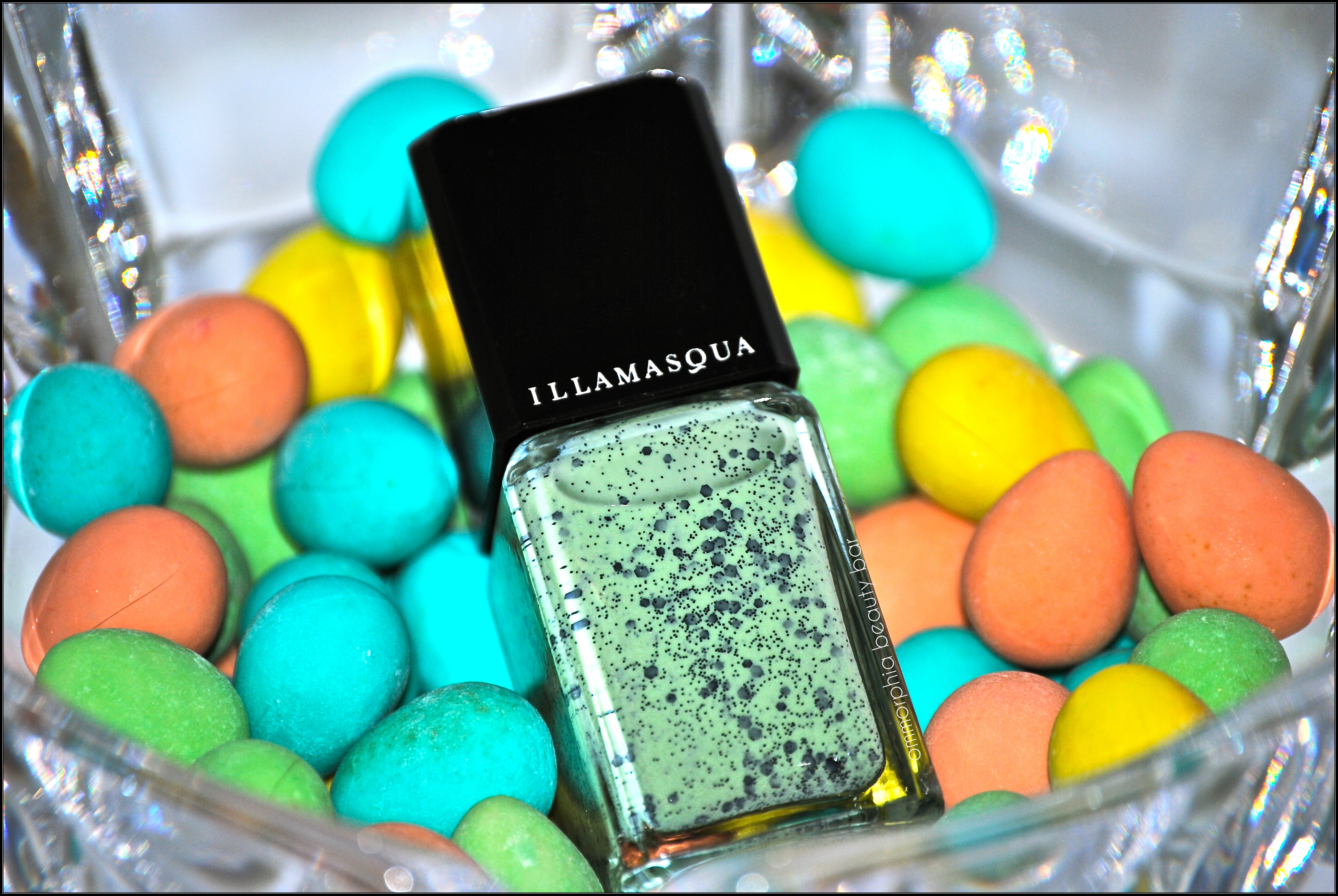
Brand new for Spring 2013, Illamasqua introduces a unique new finish in their lacquer lineup released in conjunction with their latest “I’m Perfection” Collection – 5 new shades of Speckled Varnish, meant to mimic the speckled look of bird eggs and all of their imperfect beauty, as found in nature. Of the 5, I was most drawn to ‘Mottle’ – I love the way the glitter pieces seem to paradoxically stand out and also stay just out of reach, from their seafoam green background, although I confess to having my eye on a few more of these shades – time for another shopping trip, I think.

Illamasqua – Mottle
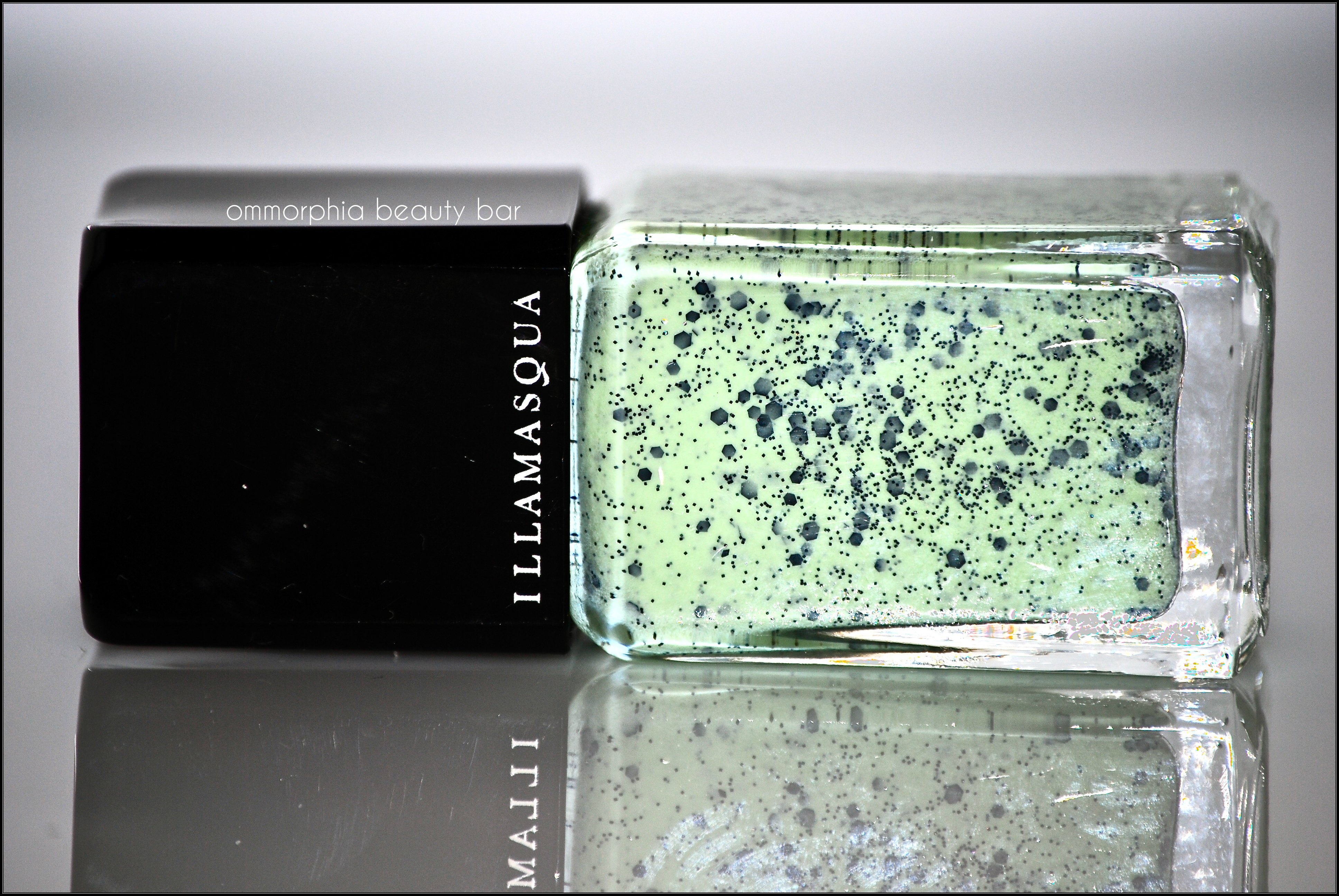
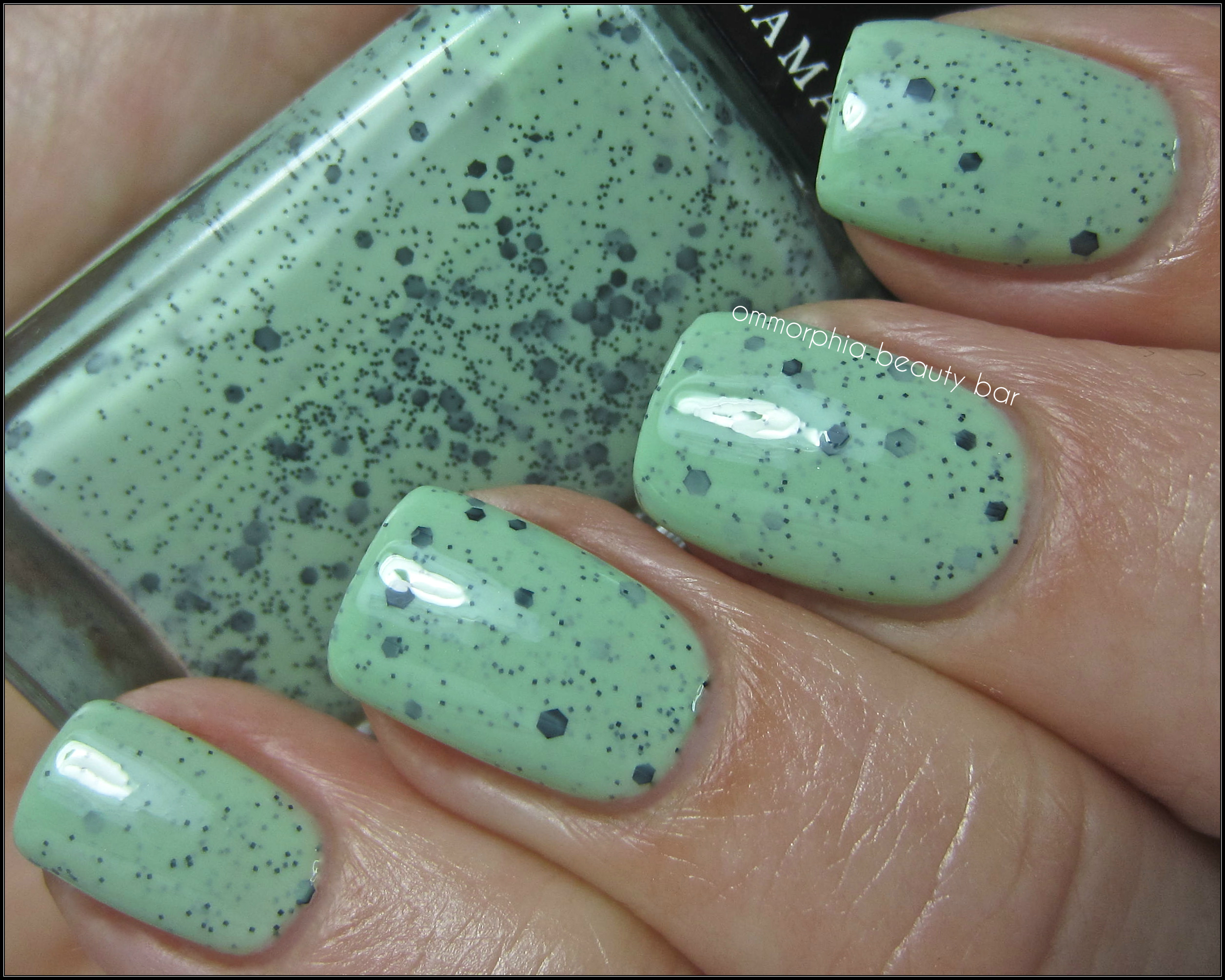
Illamasqua Speckled Nail Varnish in Mottle – (CAD $18.00 15 ml/0.5 fl.oz) a milky mint green base filled with ultra fine black glitter as well as black hexagonal glitter pieces in small & medium sizes. With a superb flow and a perfect viscosity to the formula, application was effortless, completely self-levelling, and glossy enough at the finish to make top coat basically redundant – but don’t skip that step nonetheless. Each brush stroke yields a healthy and fairly equal amount of glitter & colour, so no extra “fishing” or placement is needed, although keep in mind that this look is all about “nature” and meant to be slightly imbalanced. I was surprised to find the end result smooth to the touch, as I was expecting a lacquer with this much going on to be rather bumpy – so not the case here. Absolutely loving its diffused/filtered look, as though the glitter has risen from the bottom to come just shy of the surface – totally fascinating. Bonus: fairly easy removal. Coats applied: 3 (thin – mainly for pictures, as 2 coats provides more than adequate coverage), plus top coat.
buy prednisone online blobuyinfo.com/prednisone.html no prescription
Illamasqua – Mottle
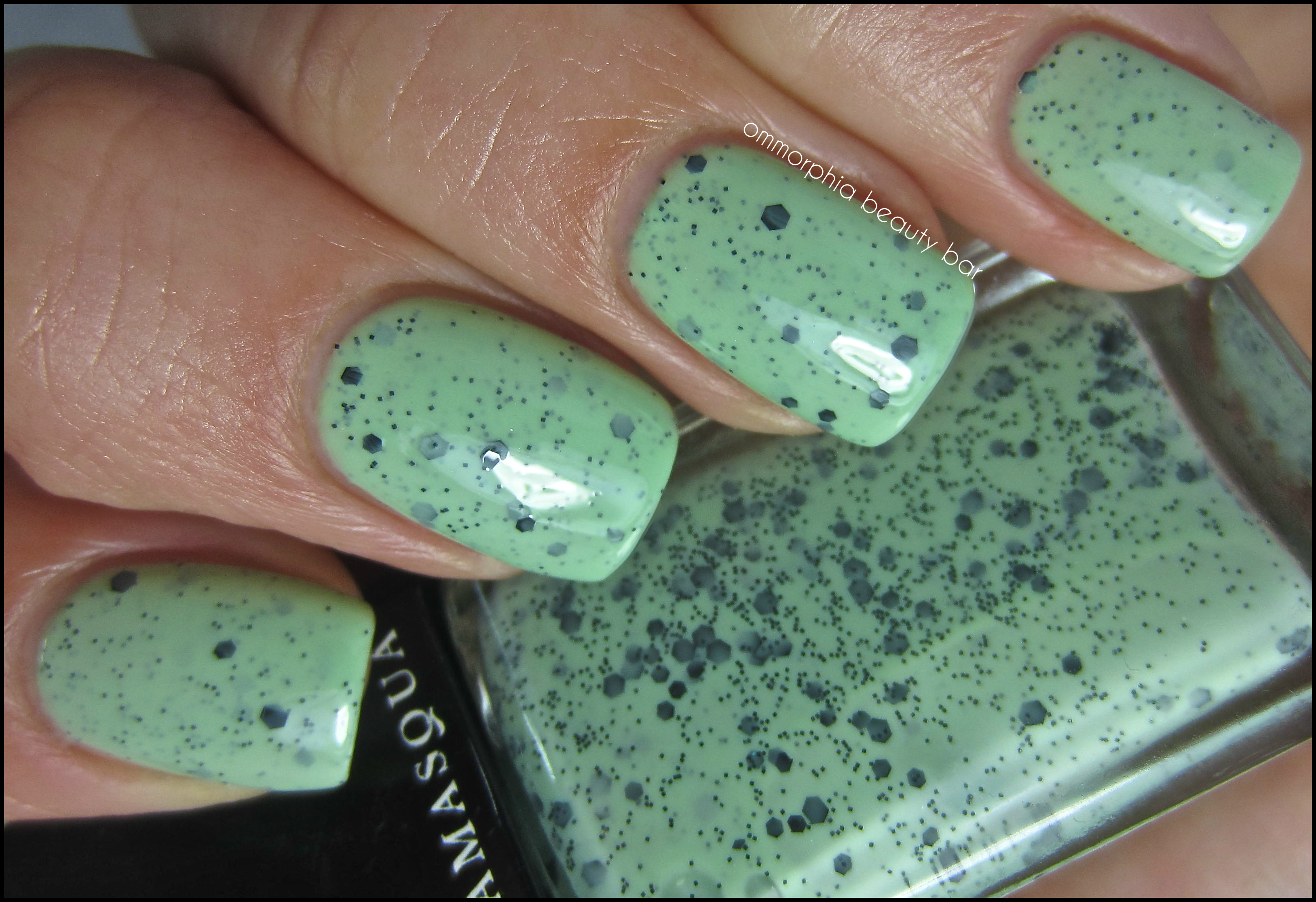
Illamasqua – Mottle
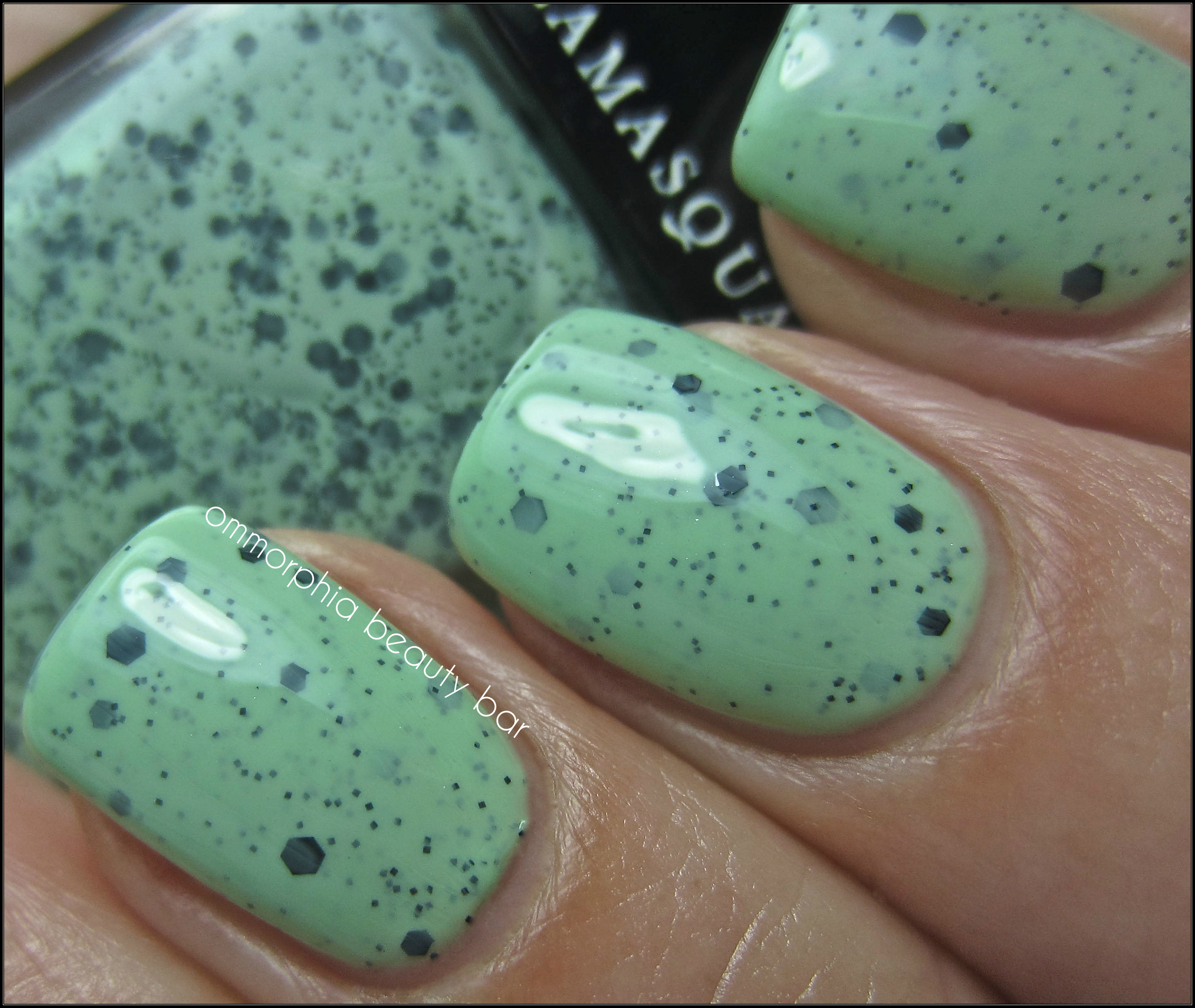
Illamasqua – Mottle

Illamasqua – Mottle
buy prelone online blobuyinfo.com/prelone.html no prescription
Final thoughts: With all the different types of polishes and finishes that I’ve worn, ‘Mottle’ is the one that made me stare the longest at my nails. There’s a uniqueness to this finish, that I feel elevates it beyond the usual standard glitter polish; understated and almost organic in feel, all the components are in place for something truly special – from the formula, the colour, to the final finish. Then there’s that whole mint-chocolate ice cream vibe it’s got … the final & irresistible push.
Illamasqua varnishes are available through Sephora – I purchased mine in store.
buy prevacid online blobuyinfo.com/prevacid.html no prescription