
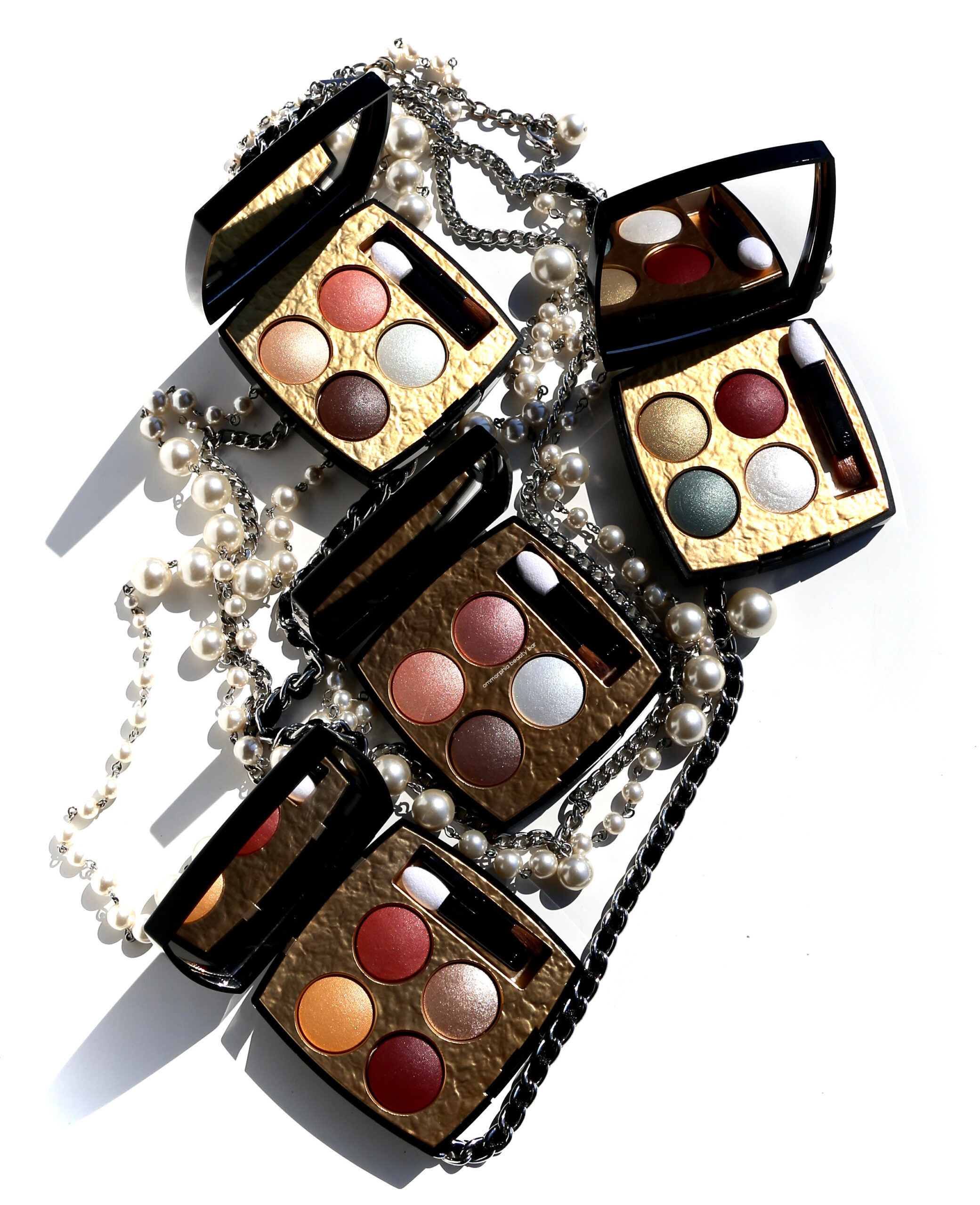
Drawing inspiration from the Byzantine influences behind many of Gabrielle Chanel’s jewelry pieces, CHANEL’s Les 4 Ombres Byzance palettes are makeup works of art. With their jewel-toned colour harmonies and lavish interiors, they are all collector-worthy … and limited edition (tell me you didn’t see that coming).
Follow @ommorphia YouTube ♦ Instagram ♦ Facebook ♦ Twitter ♦ Pinterest ♦ Bloglovin’

Housed in the brand’s black lacquered cases, they are embossed with the iconic double C’s done in gold, with each palette provided its own protective velveteen sleeve.
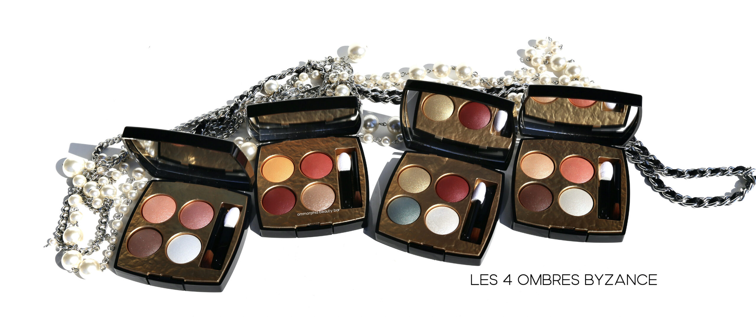
The four colour ways of this collection are evocative of fine jewelry and have been carefully selected by the CHANEL Makeup Creation Studio to be representative of that theme. Each palette consists of 2 medium shades (top row), one light (bottom right), and one dark (bottom left) and come in a variety of finishes: satin, metallic, and crystalline. They can also be worn a variety of ways — it all depends on your preferences. The light shade of each palette is also quite versatile as it can be worn on its own, as a highlighter (inner eye corner, under the brow bone) or even layered over other shades to create something entirely unique. The texture of each hue is stellar; made with mineral-origin pigments for optimal colour payoff plus vegetable oils for a glistening effect and ease of application, applying buttery smooth, and finally, all are super easy to blend. Staying power when worn over primer, is also excellent & stays true throughout wear.

The shades of each palette aren’t the only stars; the hammered gold effect that they’re nestled in is also reminiscent of that seen in jewelry, and becomes the perfect foil for the eyeshadows. This is also something quite unique where CHANEL palettes are concerned, and the collector in me gets positively giddy over details like that. Something else that I find interesting with this collection, is that there’s something here to suit all tastes; two palettes lean somewhat neutral (Parure Cristal and Parure Vénitienne), one is rather bold (Parure Impériale) and the last, Parure Baroque, provides richness of colour. Each palette also includes a couple of brushes that are ok to use in a pinch, but I would personally like to see CHANEL do away with these altogether as I never use them and prefer my own brushes for the job.

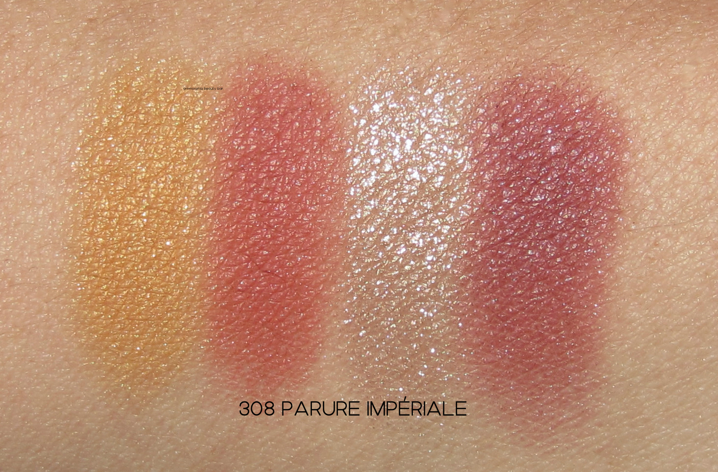
308 Parure Impériale (CAN $89.00) | An opulent colour harmony featuring shades of:
- Yellow Sapphire, top left
- Red Quartz, top right
- Garnet, bottom left
- Rose Gold top coat, bottom right
As someone who can not get enough of red/reddish eyeshadow hues, I love the colour way of this palette and what’s more, I feel like these shades can also double as blush if needed (say you’re travelling and didn’t want to cart a bunch of products along). What makes this quad unique, however, is that antique gold hue; it’s so lush and provides that perfect “jewelled” touch.

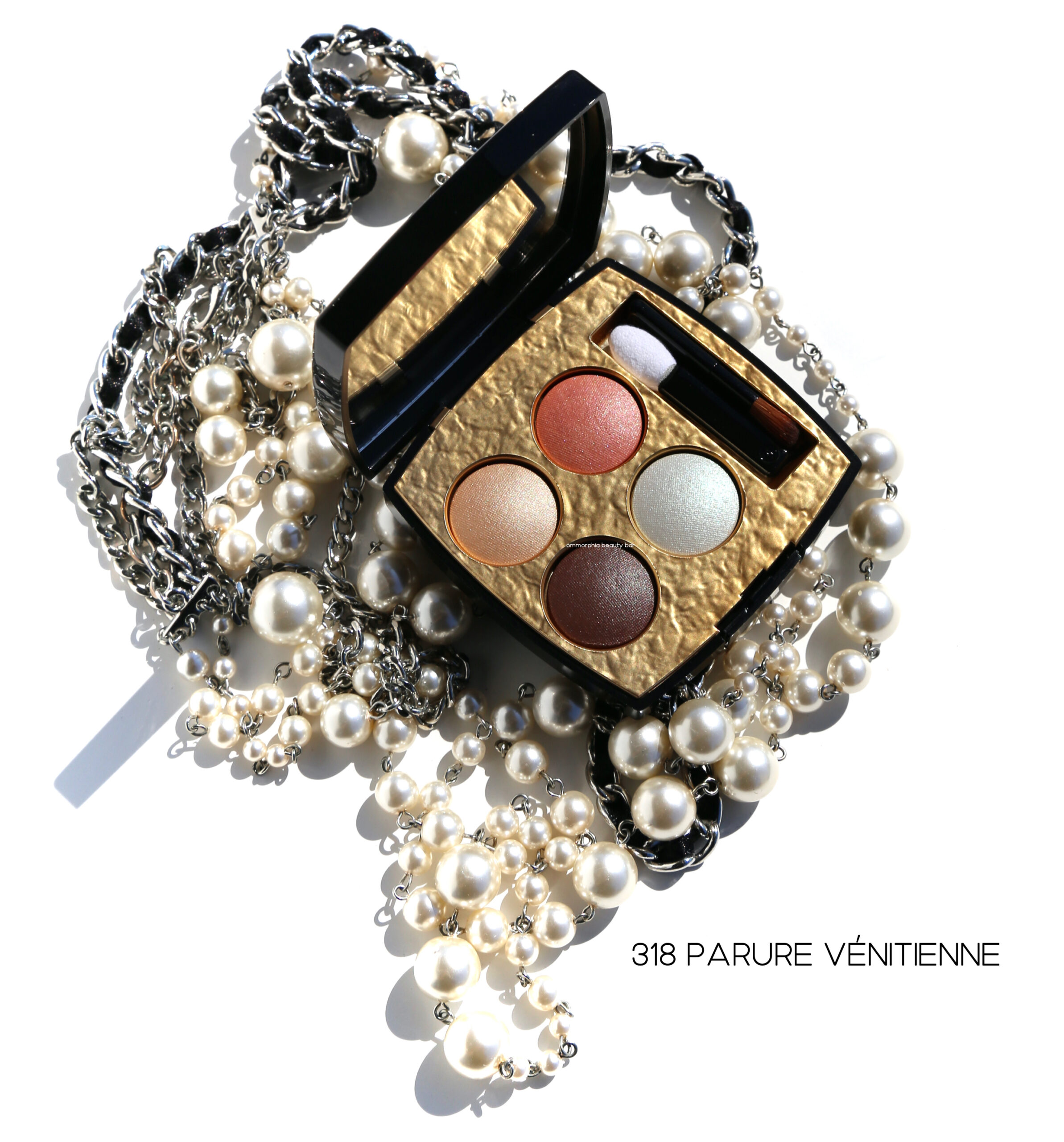
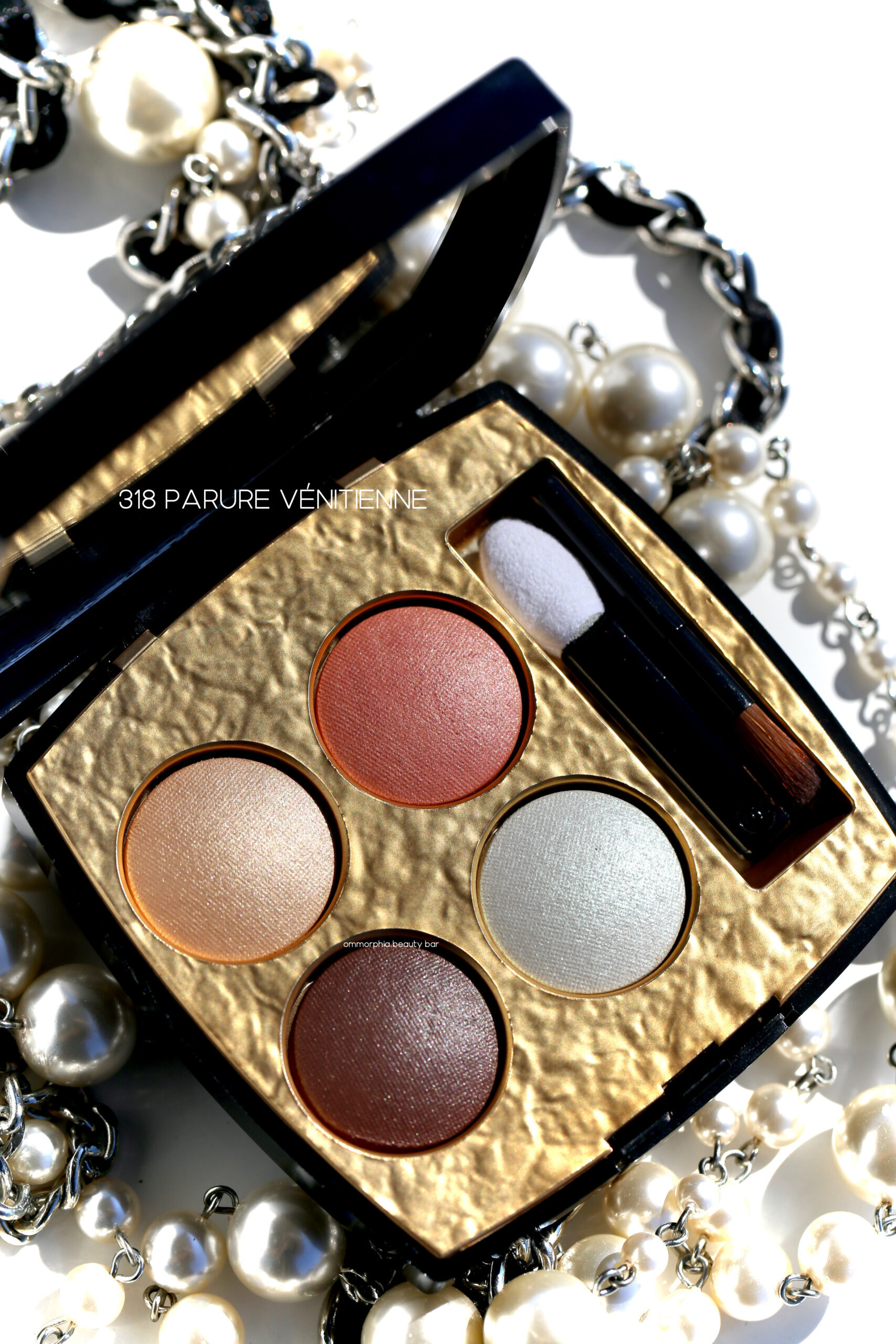
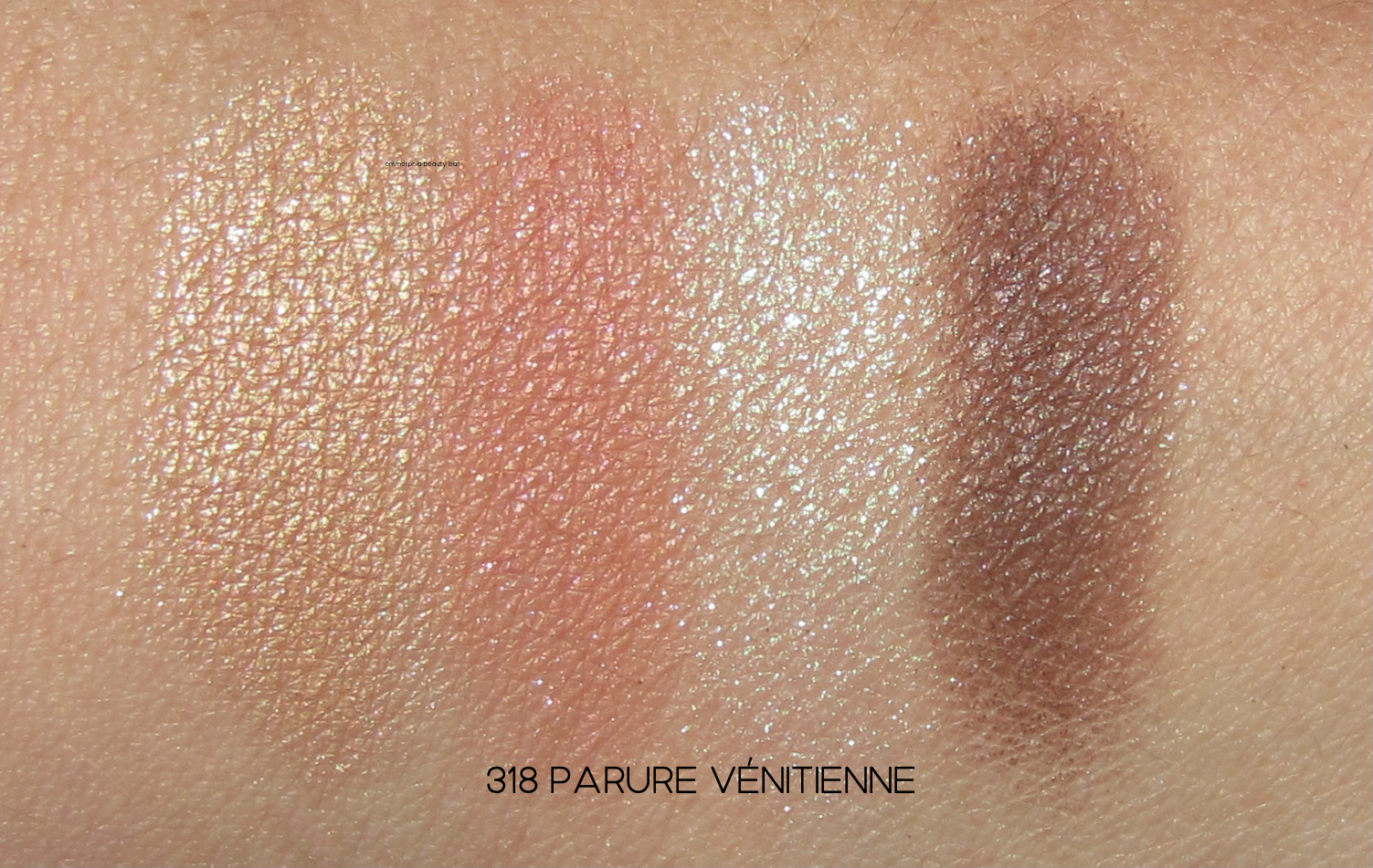
318 Parure Vénitienne (CAN $89.00) | A colour harmony featuring shades of:
- Beige Gold, top left
- Carnelian, top right
- Brown Amber, bottom left
- Green Moonstone top coat/icy white hue with a glistening sea green shimmer, bottom right
The warmer-leaning of the two ‘neutral’ palettes from this collection, these still manage to provide quite an impact — in particular the highlight shade that’s absolutely SPECTACULAR. Serisously, my camera was unable to capture its entire multi-chrome glory, but it’s one of those hues you can’t stop looking at. Soooooo good.

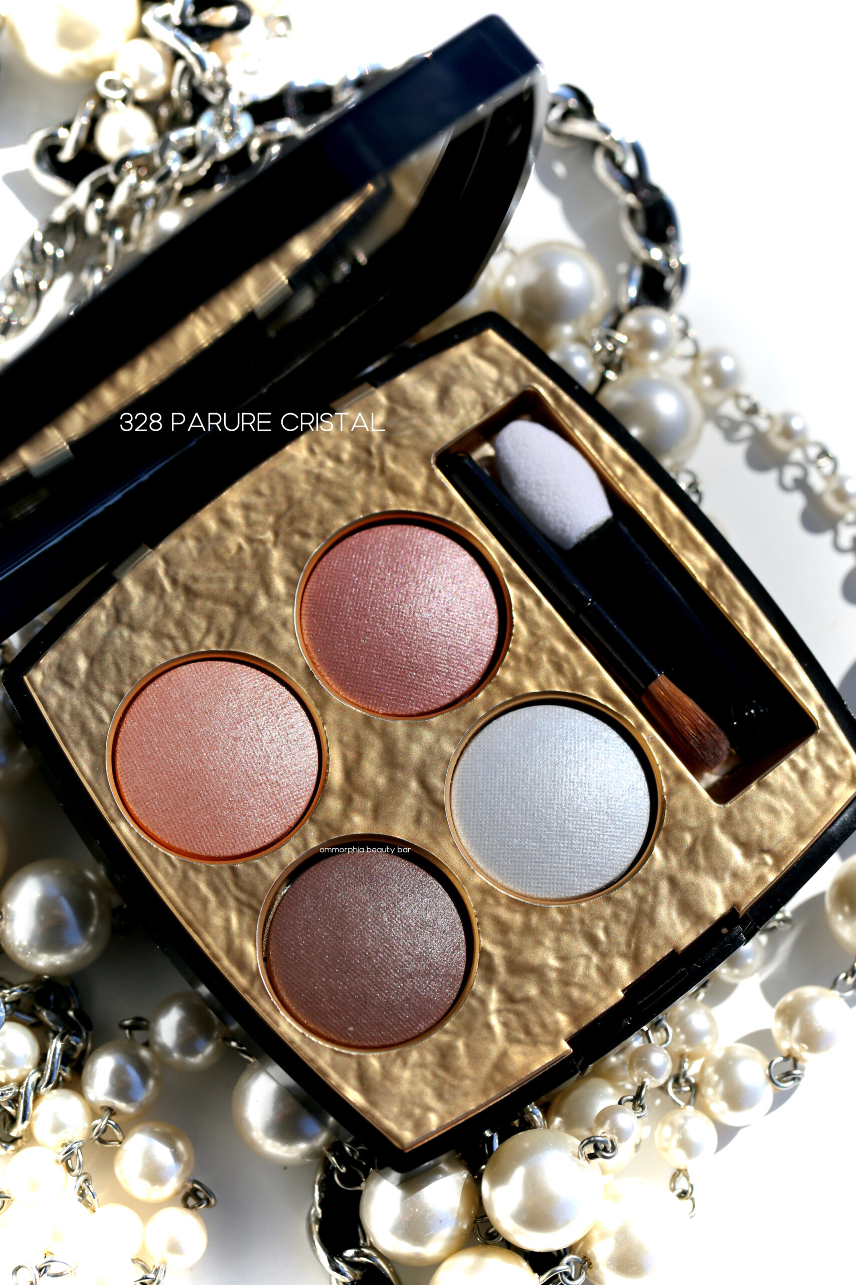
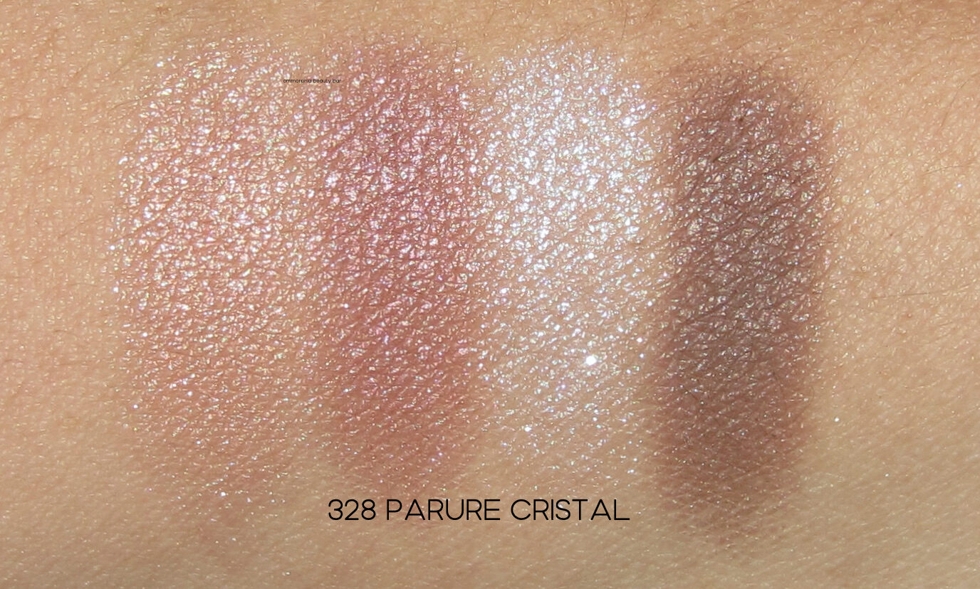
328 Parure Cristal (CAN $89.00) | A colour harmony featuring shades of:
- Pink Opal, top left
- Rose Quartz, top right
- Smoked Quartz, bottom left
- Aqua Quartz top coat/a pearlescent sky blue, bottom right
This palette is the cooler-leaning of the neutral quads and while the shades come across as subtle, they are still bang-on perfect for those who want fuss-free makeup, or if you’re looking for something that doesn’t require an editorial touch to apply. But make no mistake; all four can still be worn quite dramatically and look quite sophisticated.
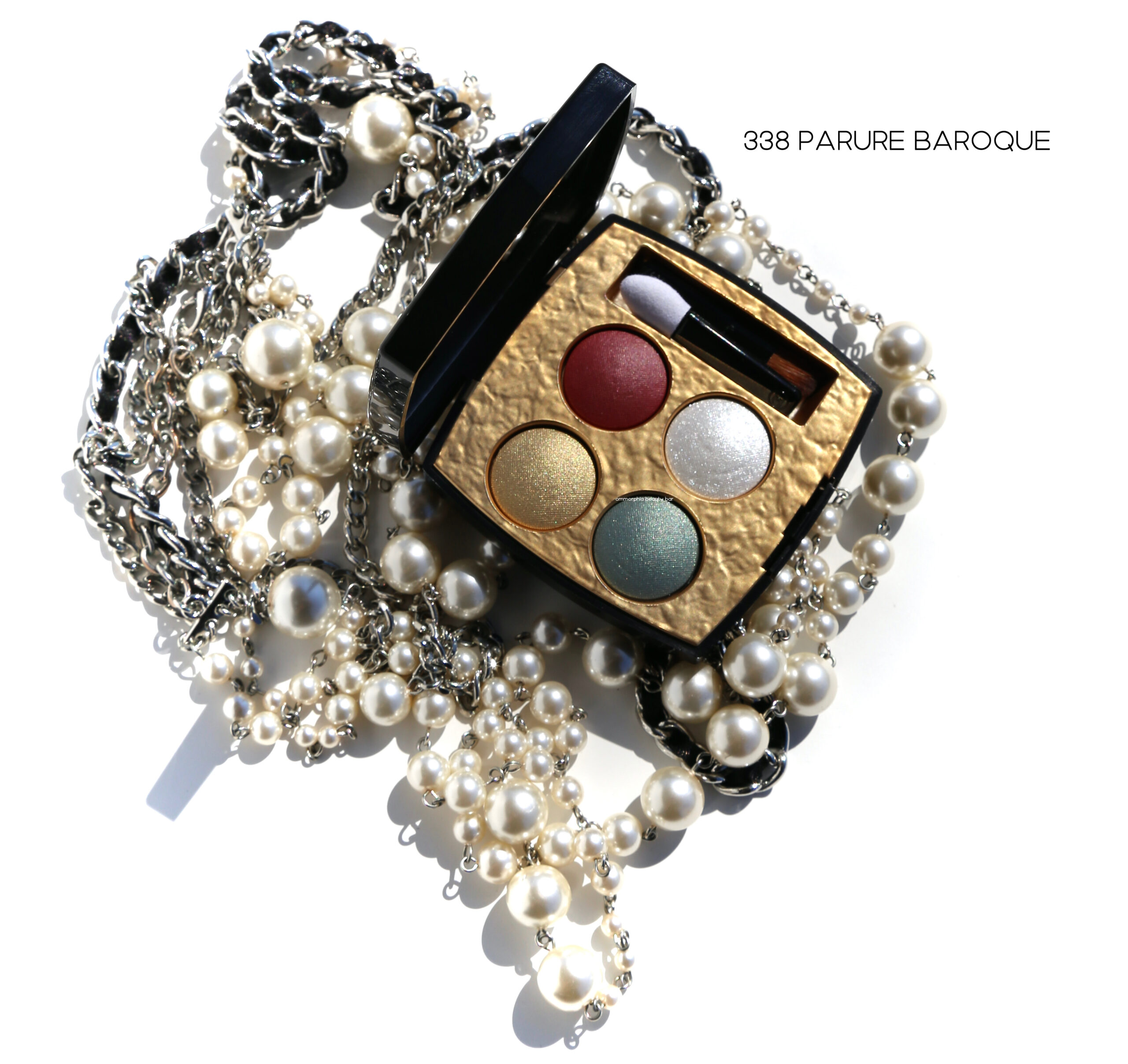
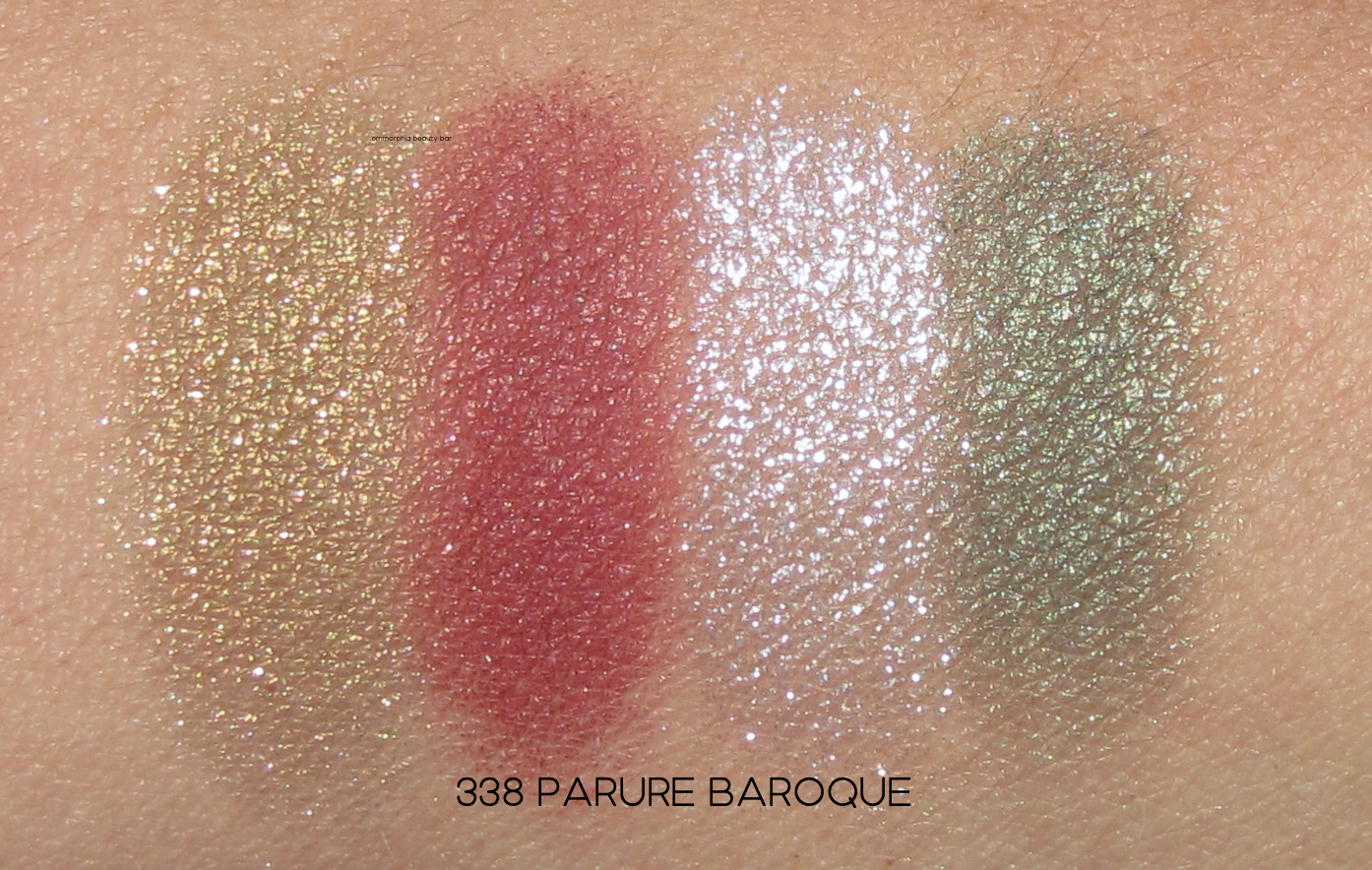
338 Parure Baroque (CAN $89.00) | A lush colour harmony featuring shades of:
- Antique Gold, top left
- Ruby Red, top right
- Emerald, bottom left
- Shimmering pearl white top coat, bottom right
Even if you’re not a fan of bold colours, the beauty of this palette is undeniable and so hard to resist. But while strong-appearing, all shades actually apply in a softer way, which in turn makes them much easier to wear. What’s more, the deeper hues can each be worn as a single wash of colour all over the lid (this method provides fuss-free impact), while the highlight shade needs to be seen to be believed; the shimmer and intensity is like nothing else I own. Pure CHANEL magic.

Do NOT ask me to pick a favourite, because the truth is that I adore all four. Each can be tailored to a specific mood I may be in, or even colour-matched to an outfit. The fact that all deliver on quality and performance is very welcome, because their steep price sure isn’t. Of course, these are limited and I have no doubt they’ll sell out lightning fast — just putting that out there.
Available at CHANEL counters and online


2 Responses to CHANEL · Les 4 Ombres Byzance