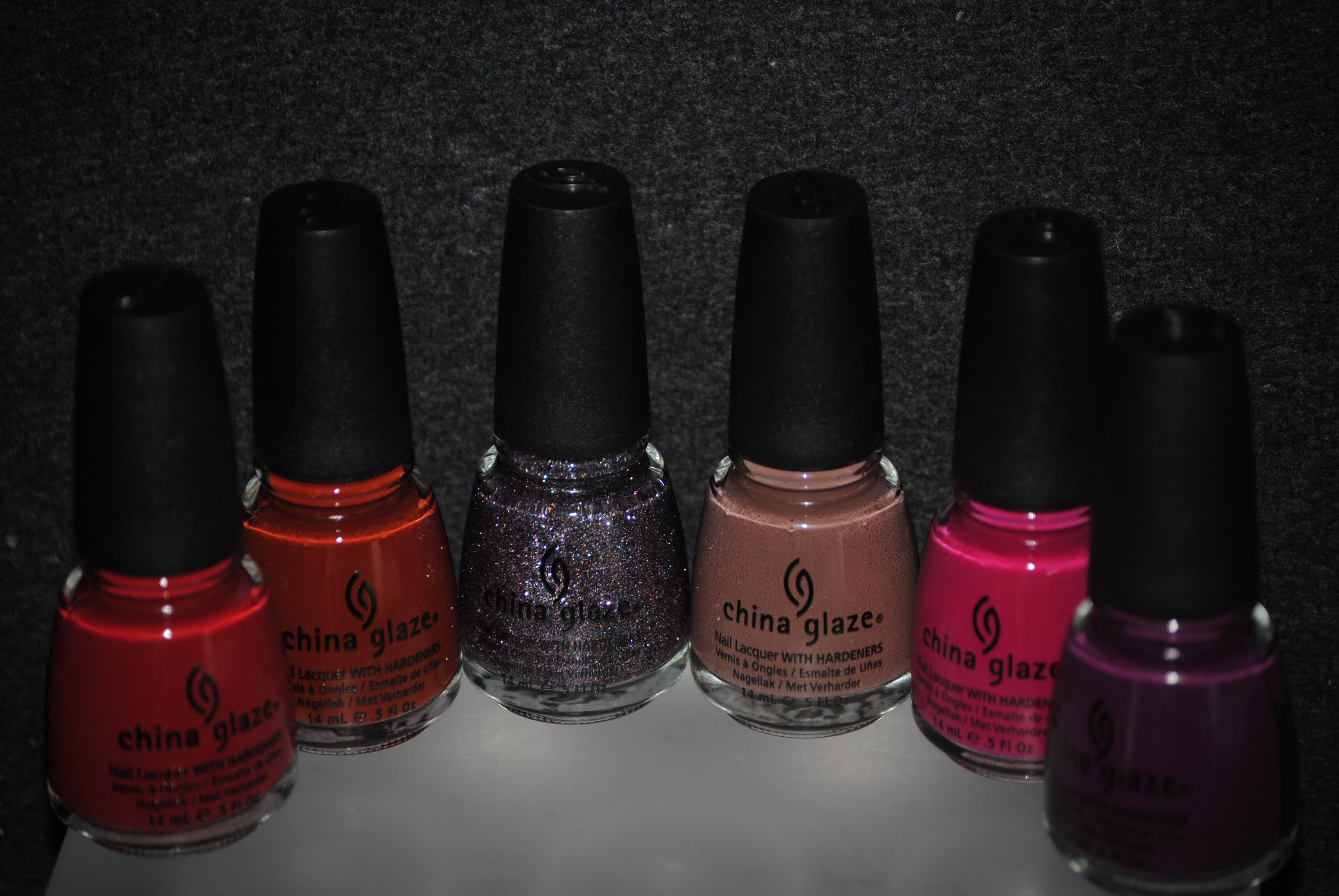
I have a weakness for the Fall collections, and China Glaze’s latest offering, the ‘Metro’ Collection, seamlessly melds the cooler autumnal vibe with the hot trends of today. Broken down into two subsets, first up are the six “Uptown” shades: ‘Brownstone’ – a rich russet crème, ‘CG In The City’ – a sheer lavender tinted sparkler, ‘City Siren’ – a creamy pink-tinged red, ‘Street Chic’ – the smoothest taupe ever, ‘Traffic Jam’ – a hot, hot raspberry crème, and finally, ‘Urban-Night’ – a deep and intense grape. All swatches are with Seche Base Ridge Filling Base Coat, two coats of lacquer, and Revlon’s Quick Dry Top Coat.
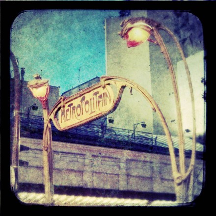
I wish to digress for a moment…..when I hear the word “metro”, the image that instantly pops into my mind, is the iconic art deco lettering for Paris’ subway system. Isn’t this sign just absolutely sublime? I adore the Art Deco movement’s organic nature!
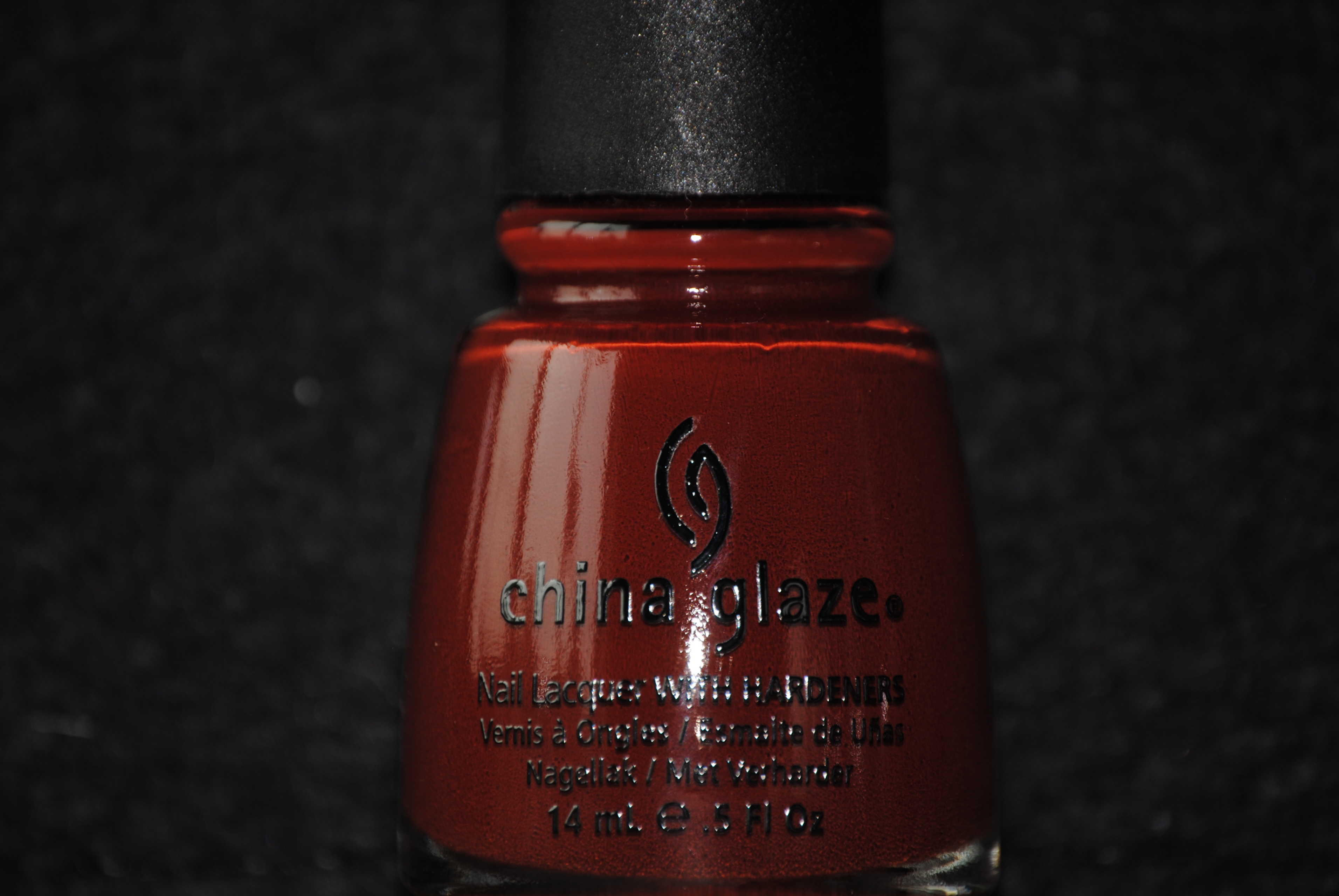
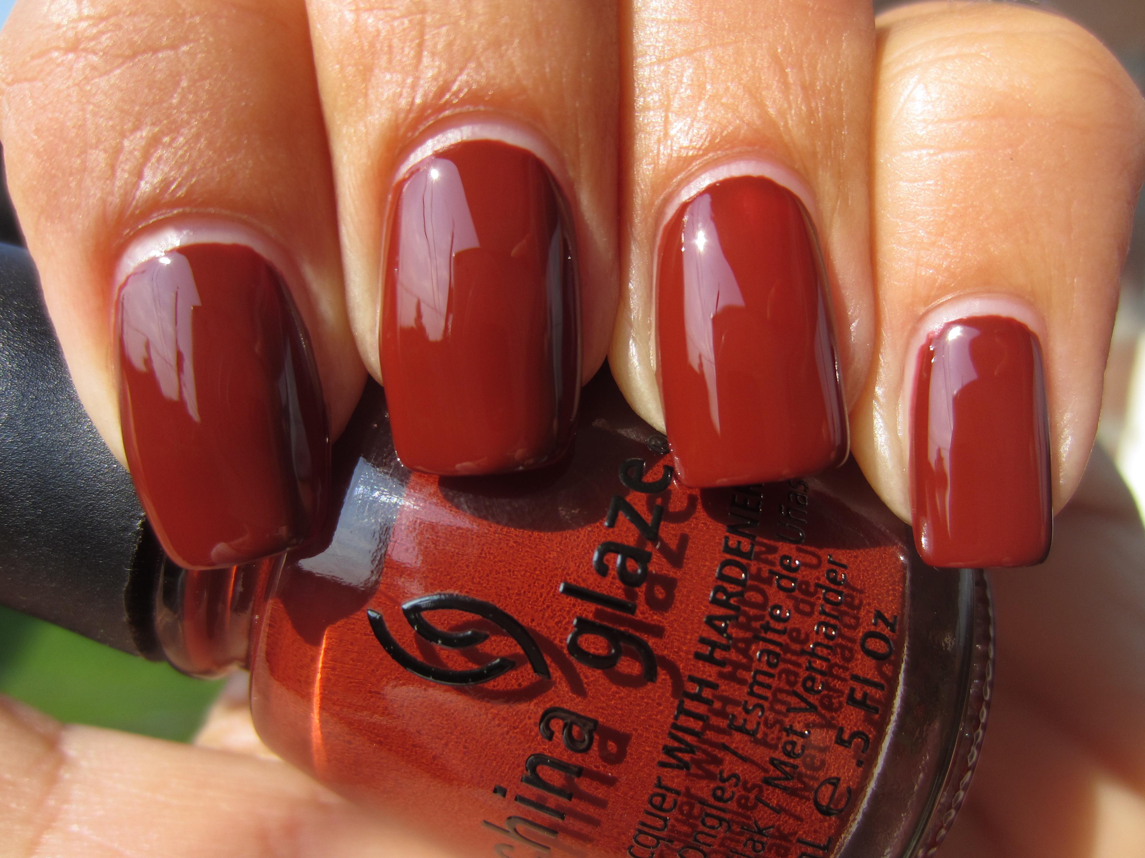
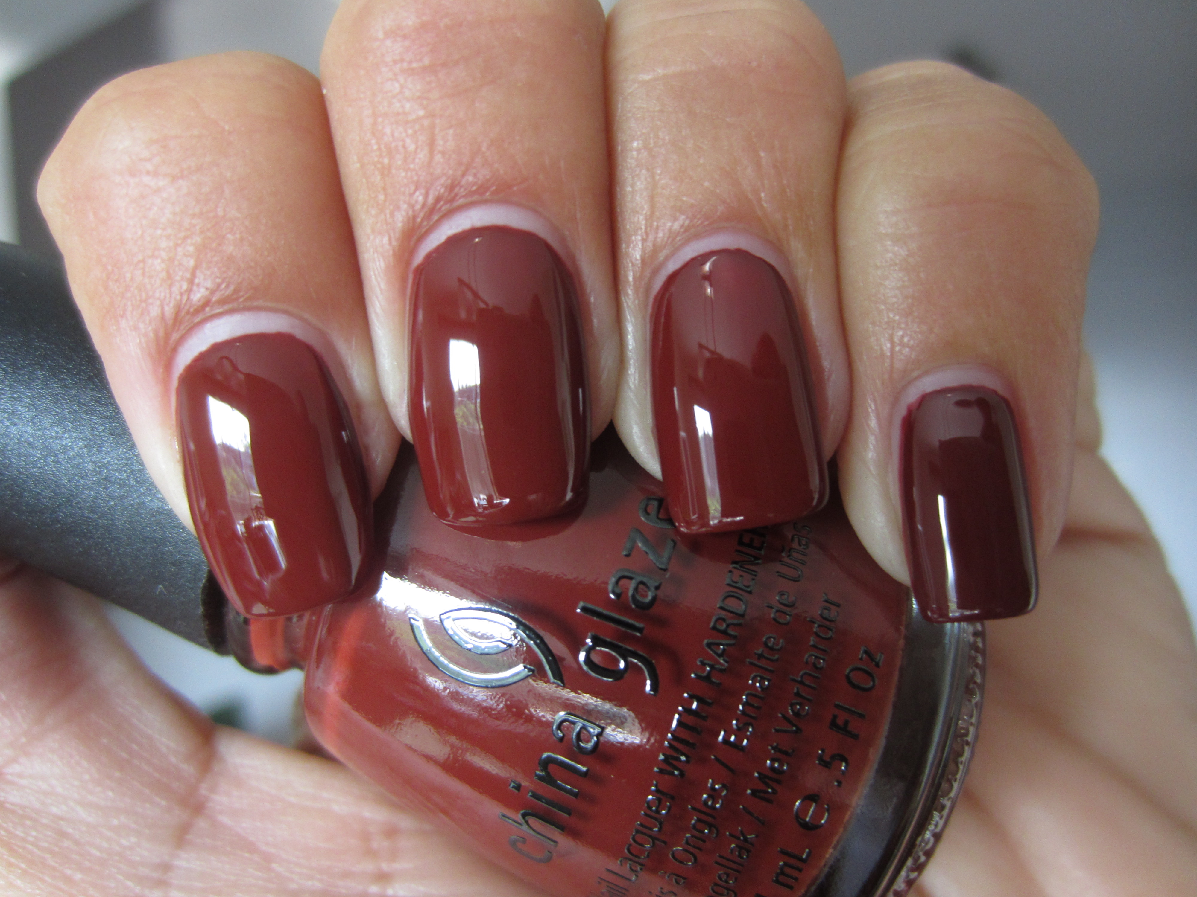
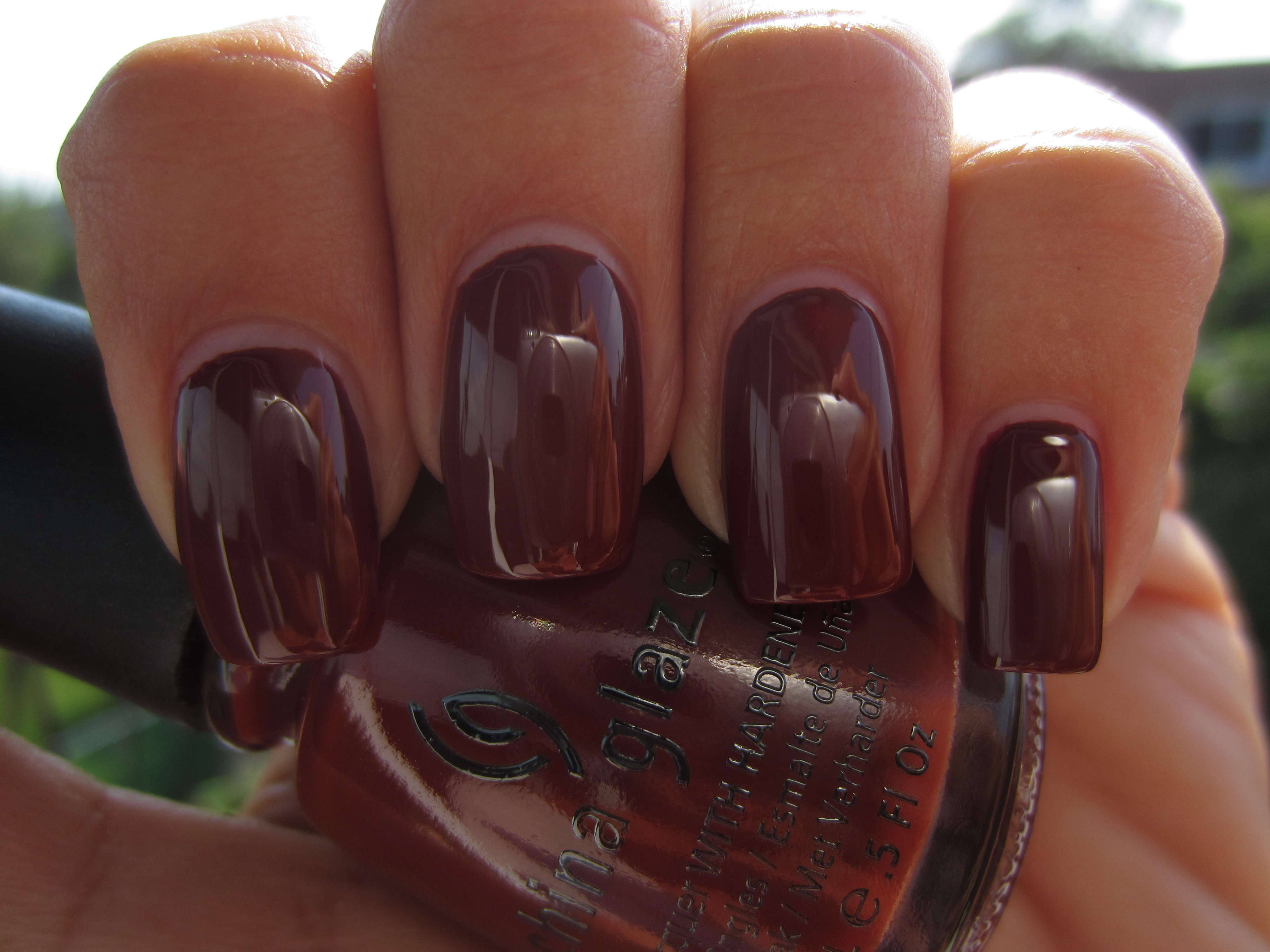
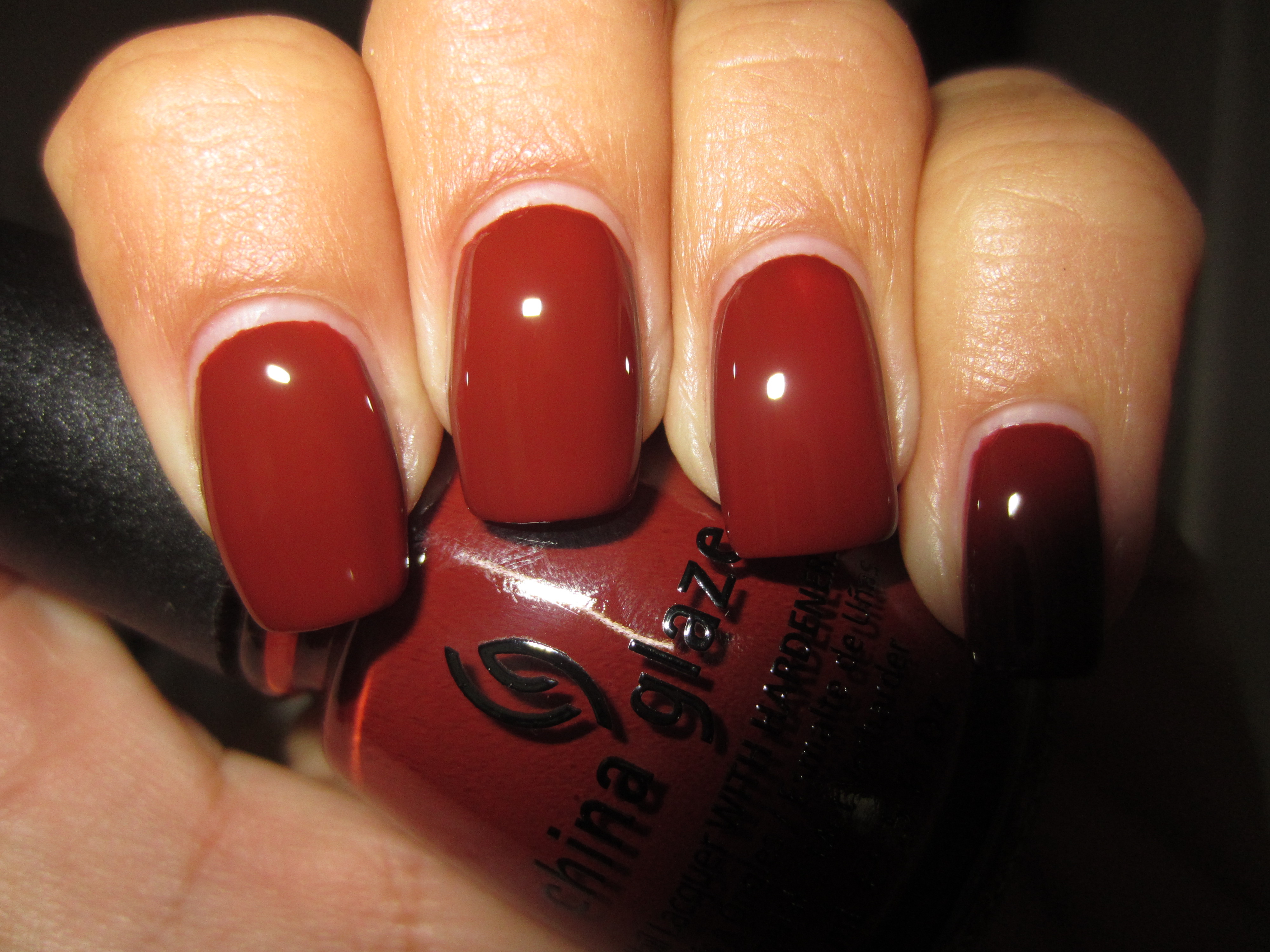
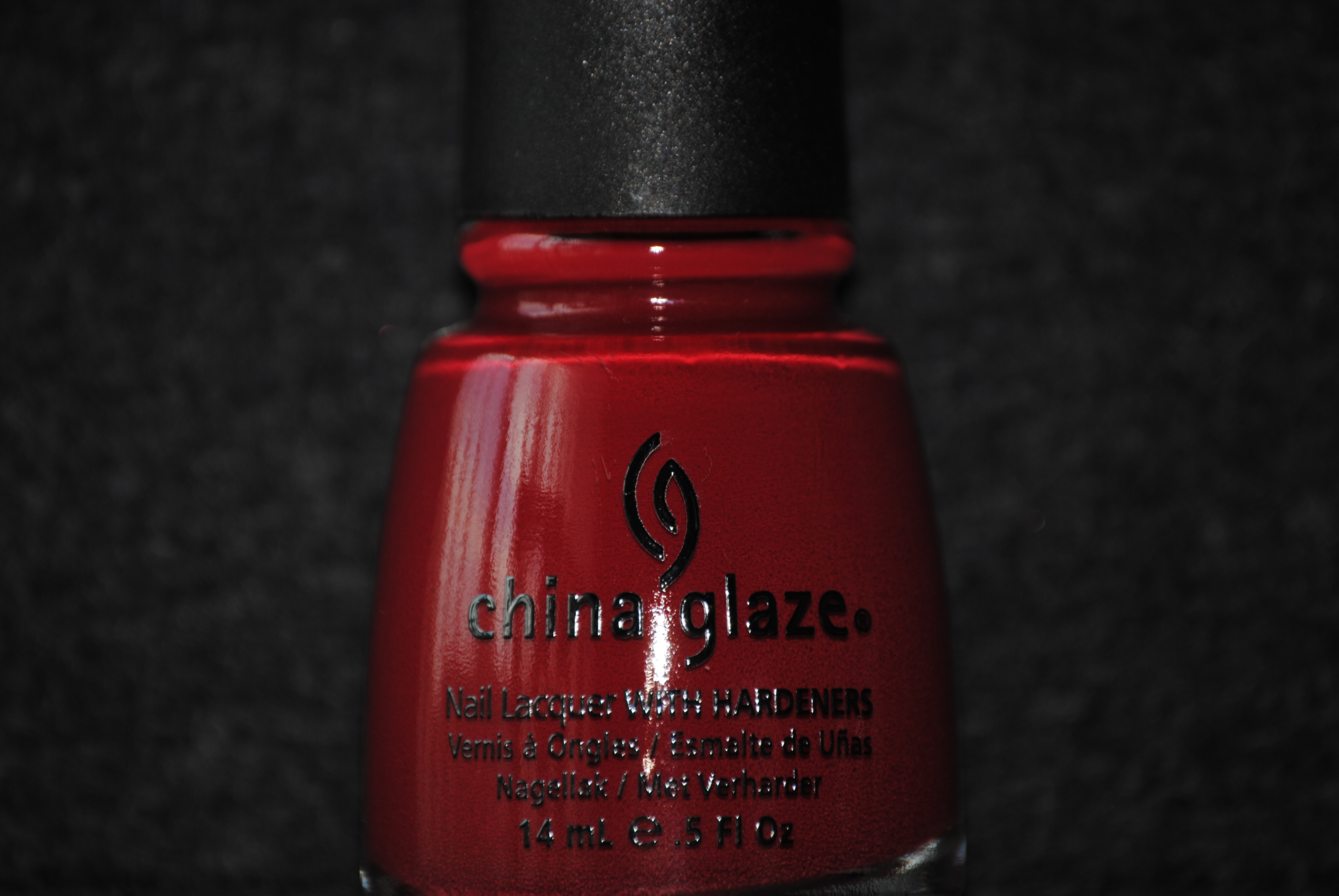
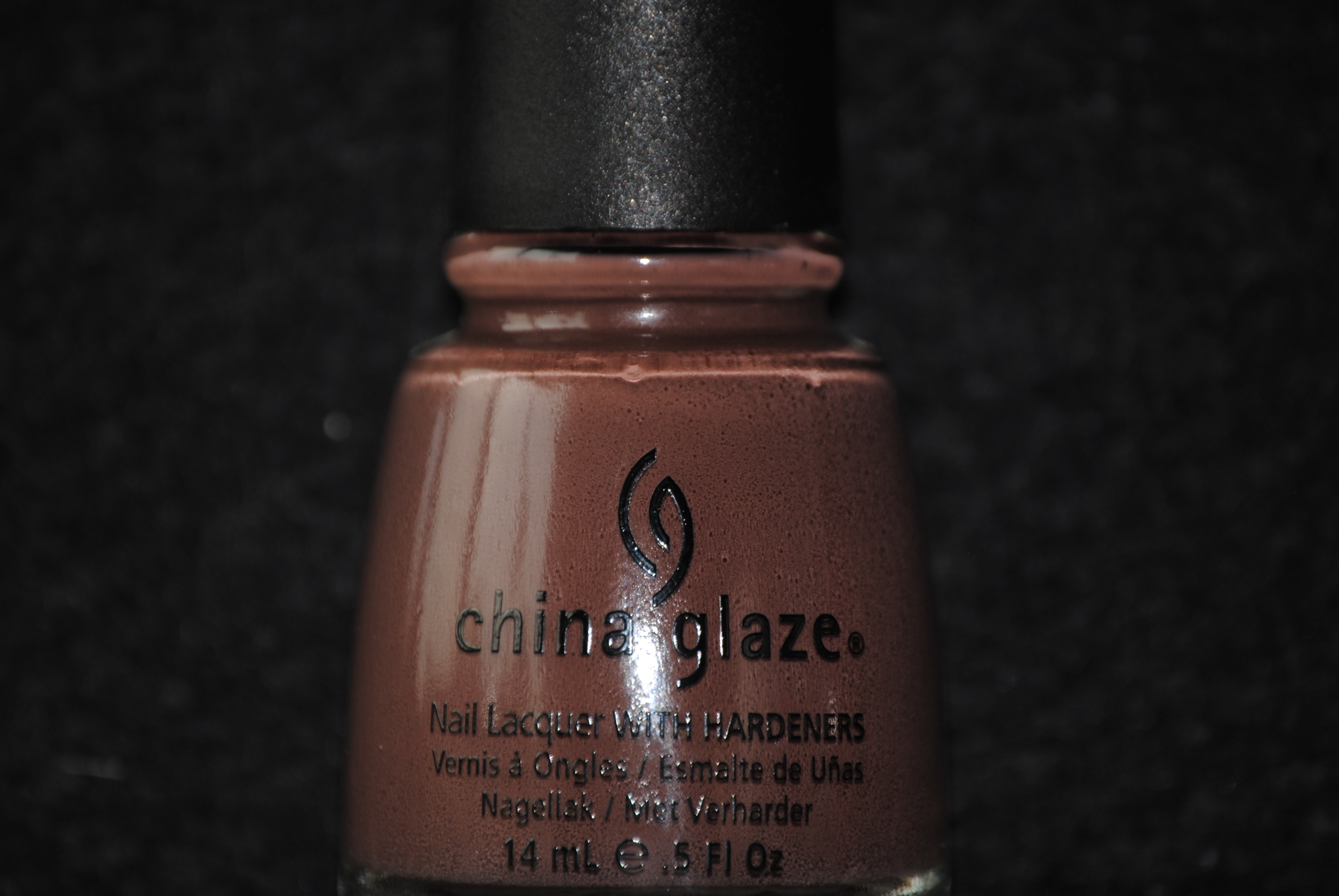
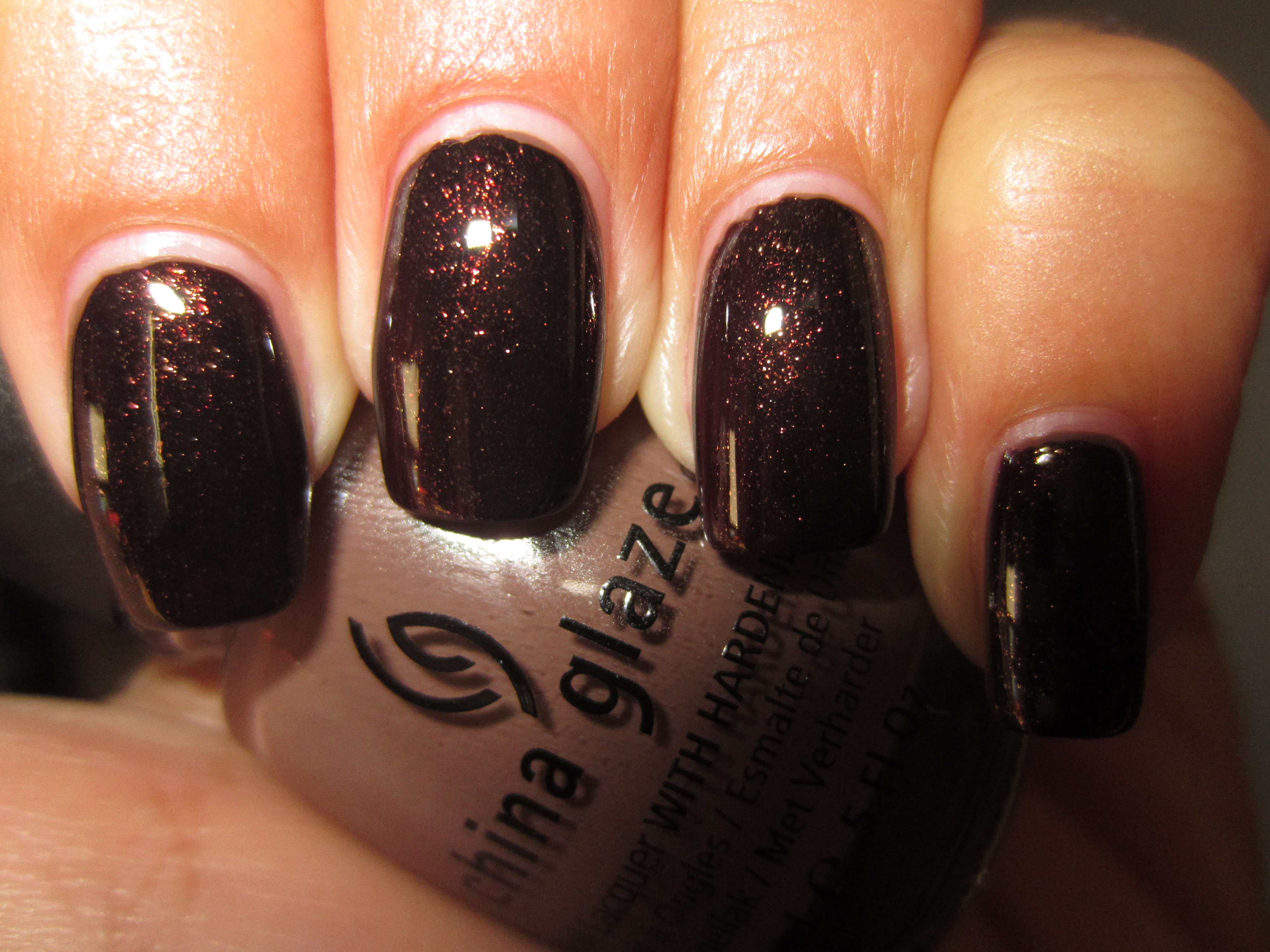
‘Brownstone’ is so perfectly named; wonderfully exuding that brown-red hue of freshly laid bricks, this polish had incredible pigmentation. Flowing rather thin but applying well, it levelled off to a beautiful smooth finish and was completely opaque in two coats, ending in a high gloss finish – even before a top coat was added!
Sunlight serves to bring out the burnt sienna-like tones of this lacquer and reveals hints of red in the base.
Seen in indirect light, ‘Brownstone’ now becomes a lusciously luxuriant brick red hue, glistening and regal.
A view in shaded light, deepens this tone and emphasizes more of its browner nature.
Interestingly enough, flash displays a lighter, more reddish side to ‘Brownstone’, and gives evidence of its deep glossy hue.
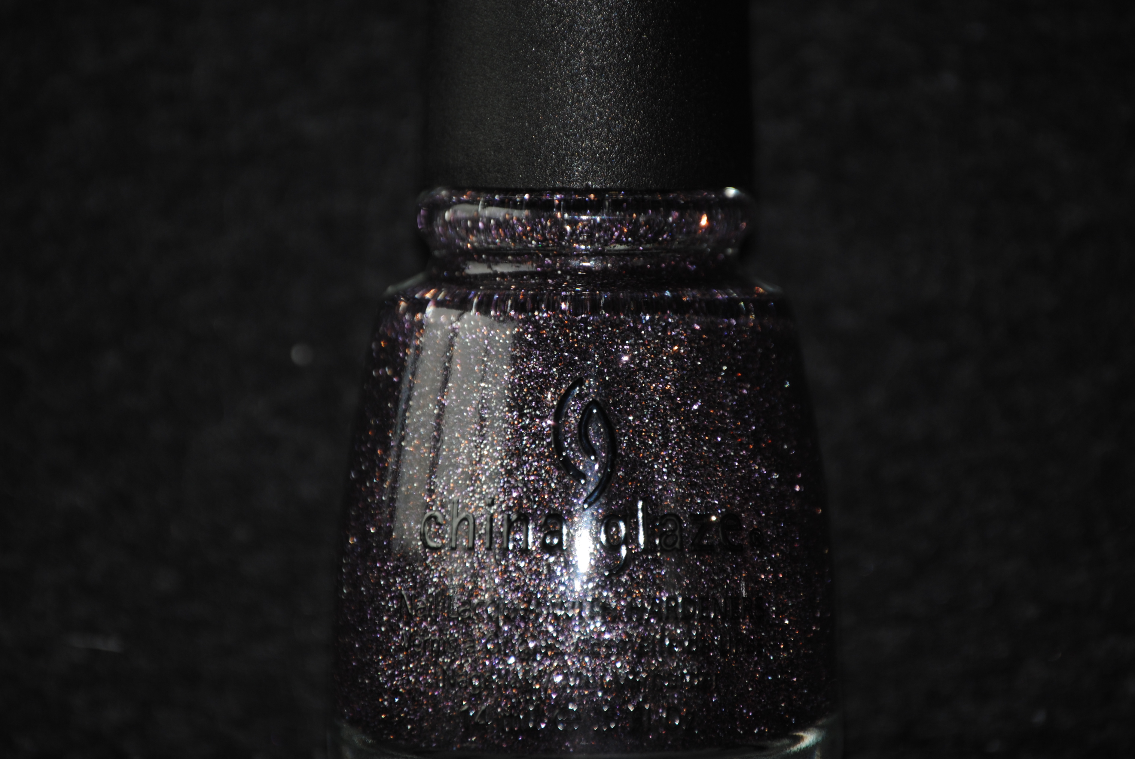
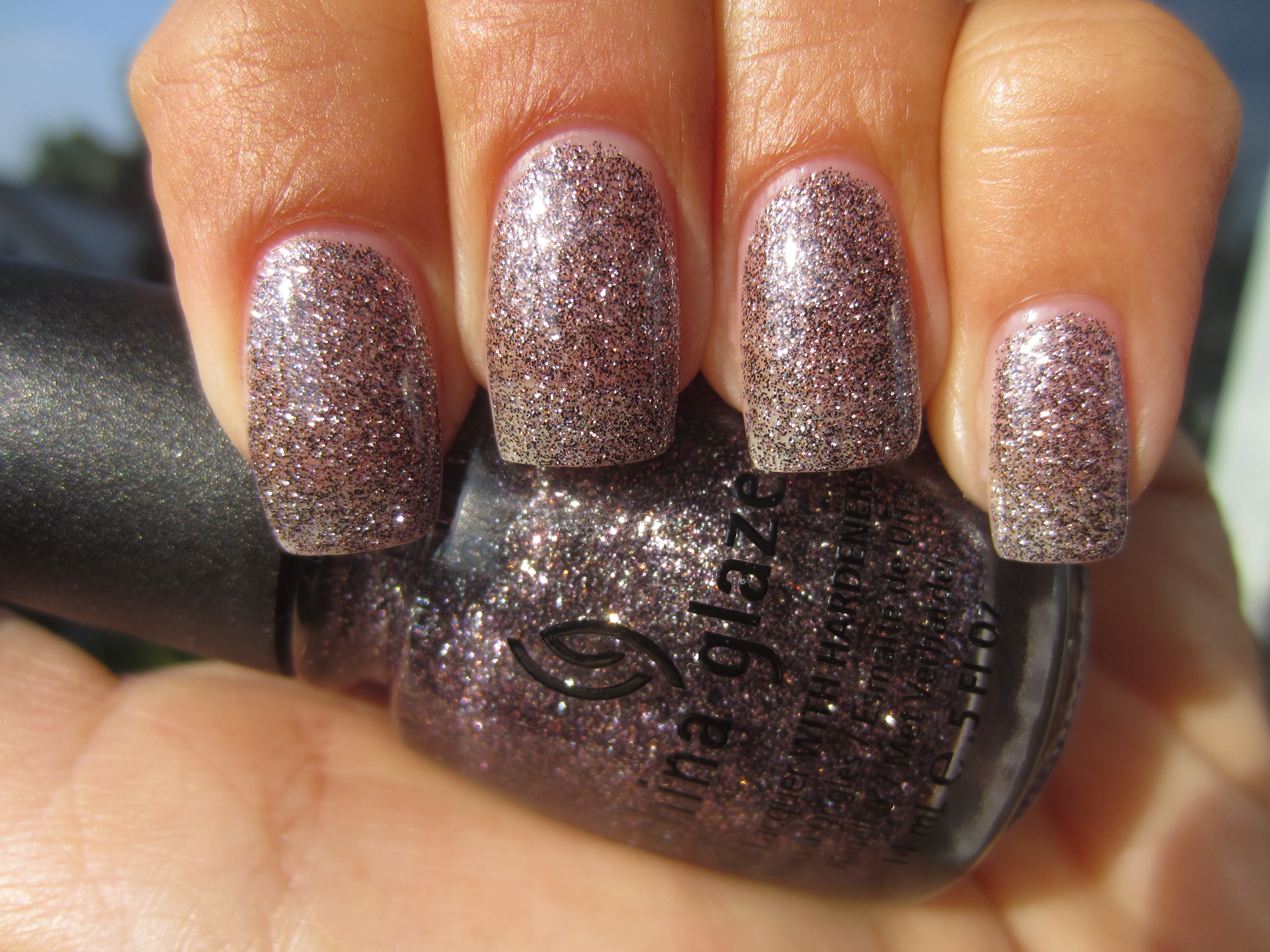
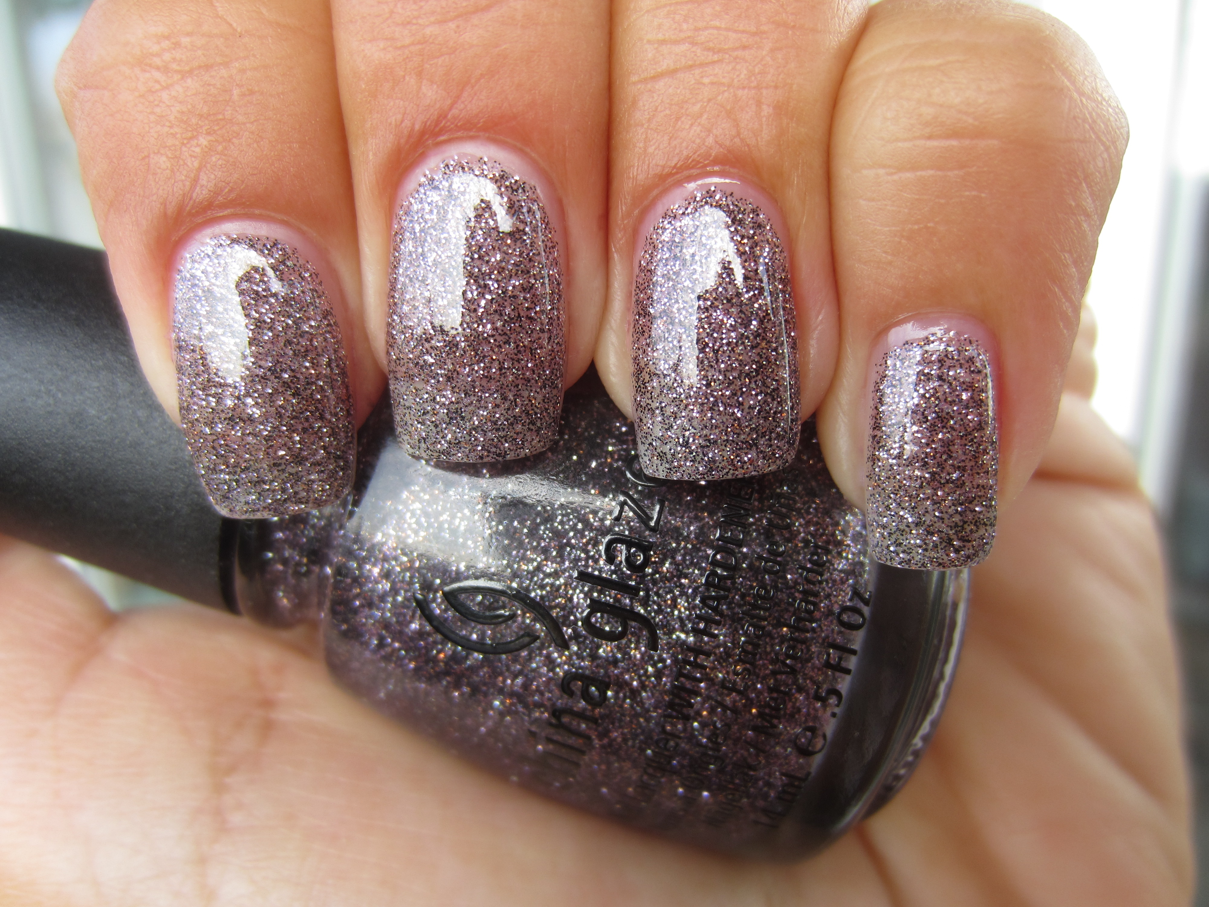
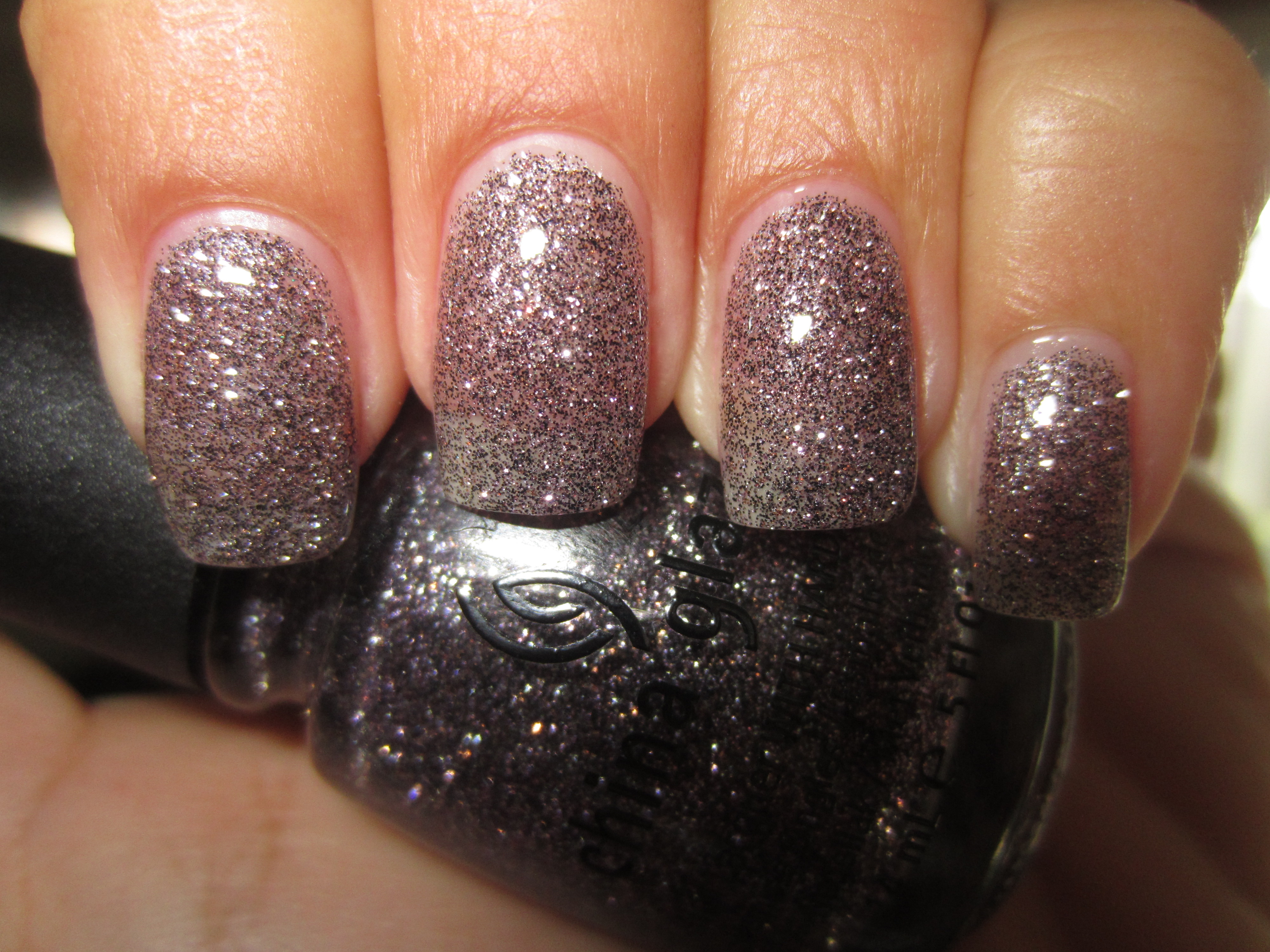
‘CG In The City’ has incredibly fine silver and purple glitter packed in a sheer purple base. The formula is of that thick suspension variety but with an easy application, and while full opacity will not be achieved, two coats were still dense enough to provide excellent coverage. Also a great layering polish (as seen further on in this post), by adding a layer of top coat, it ensures that the finish feels perfectly smooth to the touch.
Full sunlight enables you to pick out all the glittering bits of this lacquer and emphasizes it’s delicate brilliance.
Like the myriad specks one sees in a slab of granite, indirect light enhances ‘CG In The City’s’ multi-glitter complexity, but without the sparkle.
The purple base is much more in evidence when seen in shaded light, with the darker glitter flecks becoming fully prominent.
A final view taken with flash, reveals ‘CG In The City’s’ full glimmering beauty, and gives your nails the ethereal look of a twilit sky.
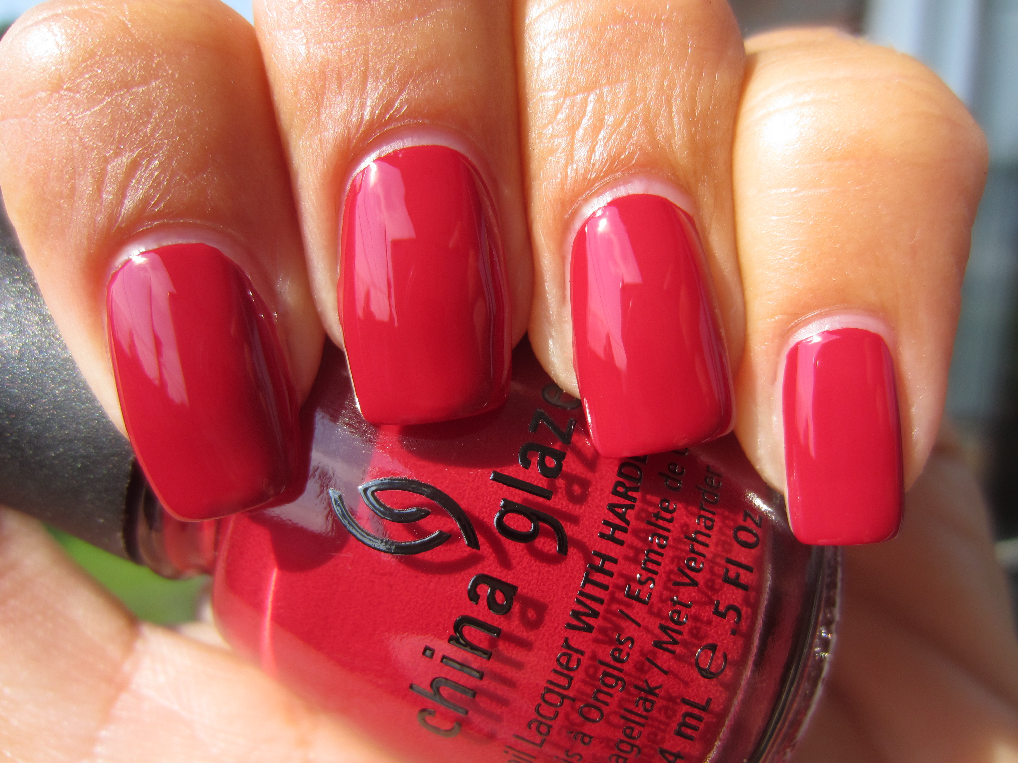
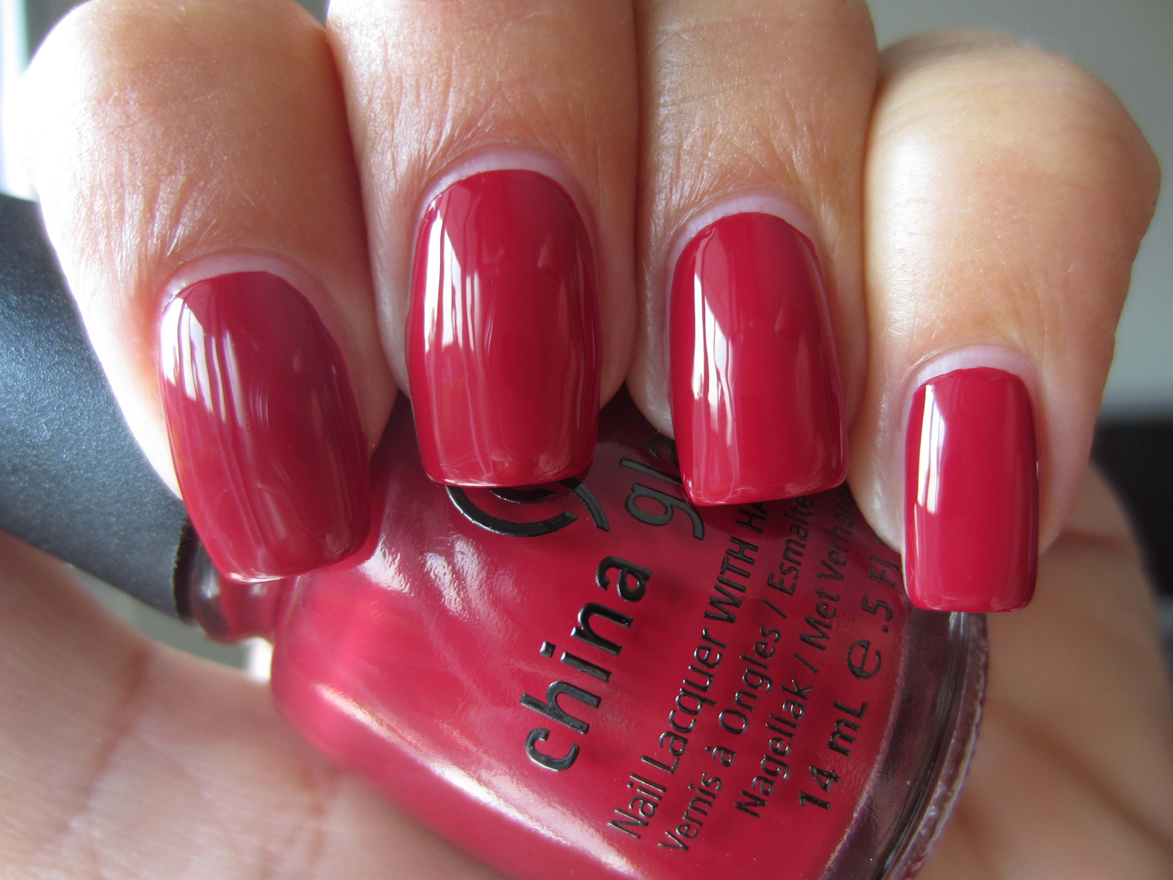
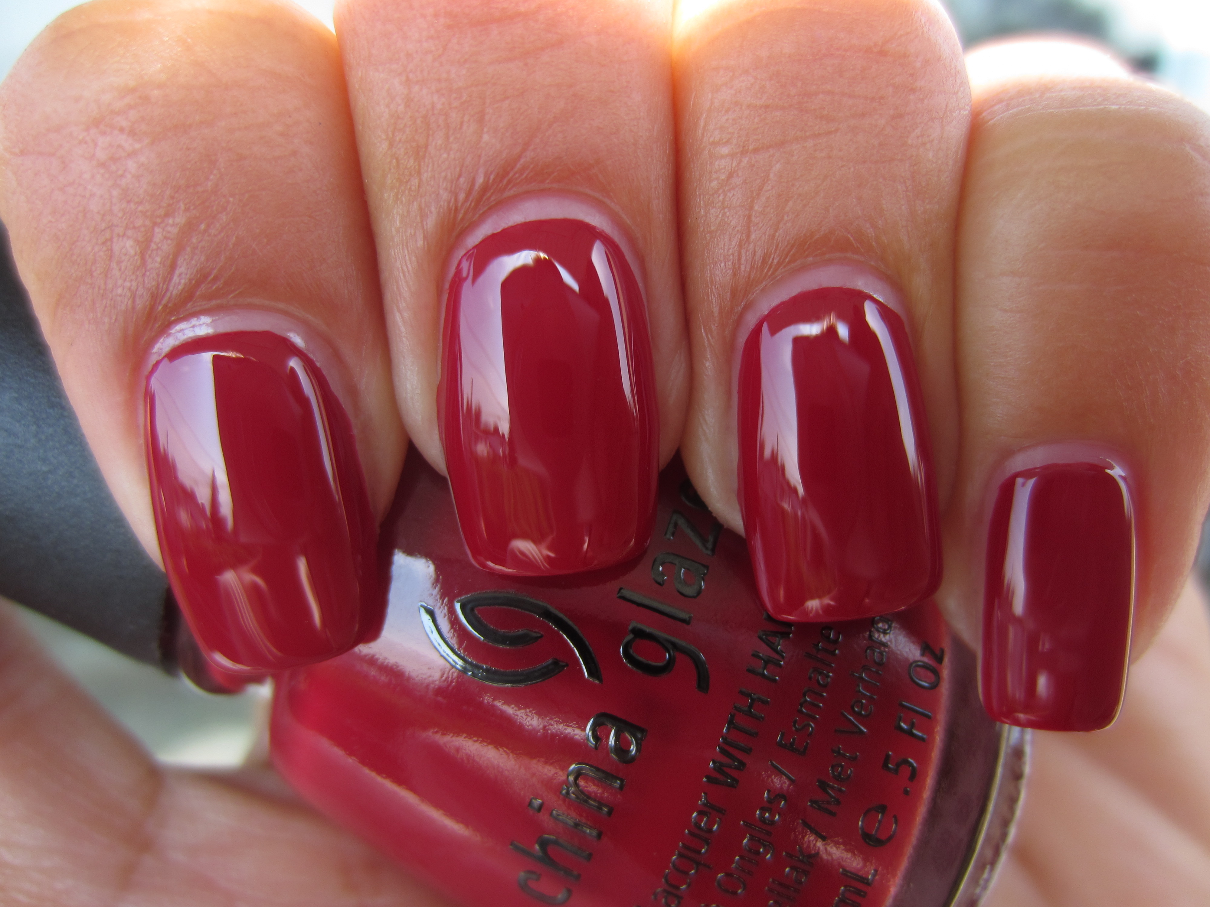
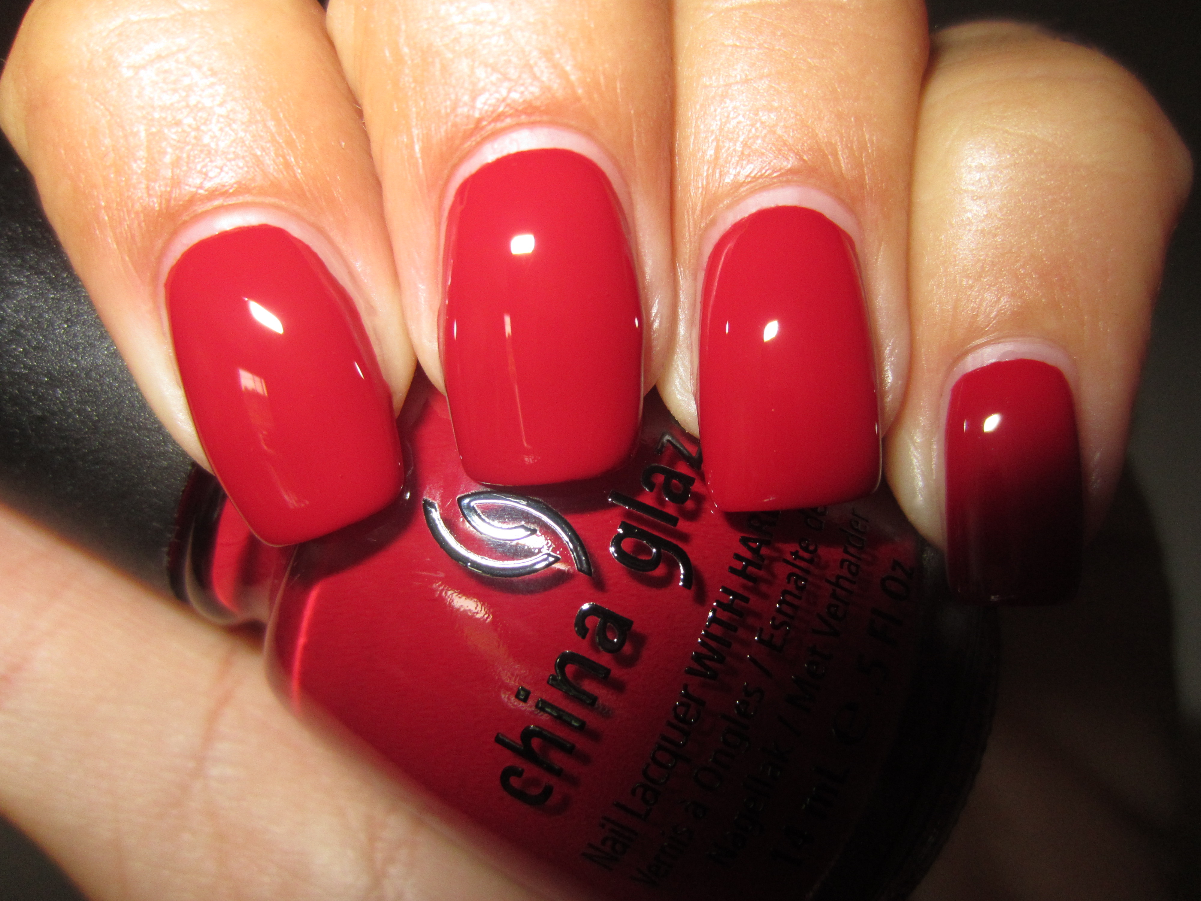
‘City Siren’ is a luxuriously jewel-like garnet hue, saturated in colour and the bearer of an almost impossibly creamy texture. There’s just enough pink in the base to keep this shade light-hearted and fun, yet there’s also enough depth of tone to add a touch of glamour and mystery. A colour that will suit basically every skin-tone across the spectrum, it had a slightly thicker formula than the rest and was fully opaque in two coats, yielding a beautifully smooth mirror-like finish.
When seen in full sun, the pinker side of ‘City Siren’ becomes the focus, yet hints of red are still visible along the nail edges.
A view taken with indirect lighting gives off more of a claret-toned look, with vague hints of magenta in its depths.
Shaded light serves to show off ‘City Siren’s’ blue-based red leanings and gives this shade an incredibly sultry look.
A final view taken with flash highlights more of a cherry red tone, but serves to show how beautifully glossy this lacquer is.
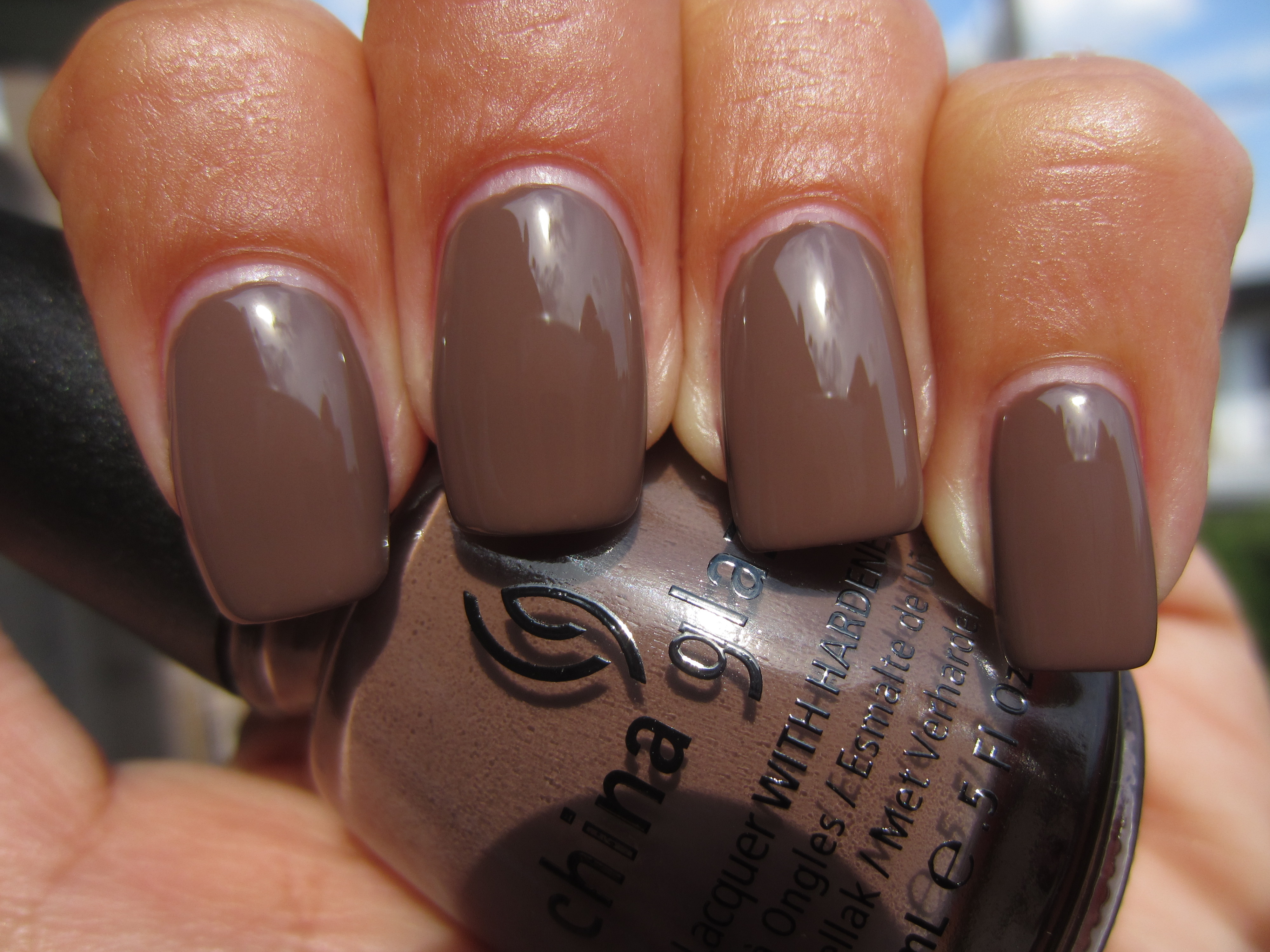
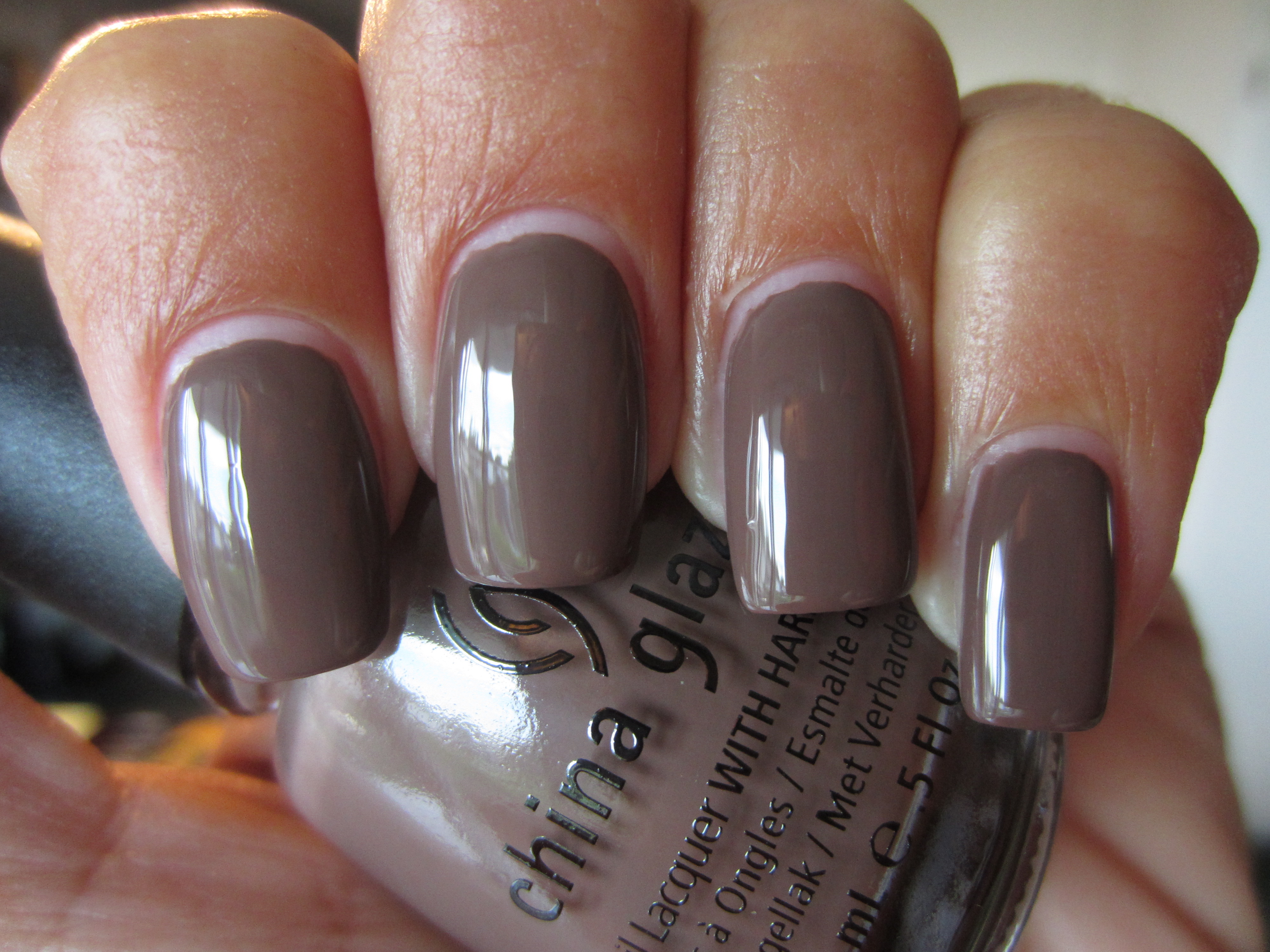
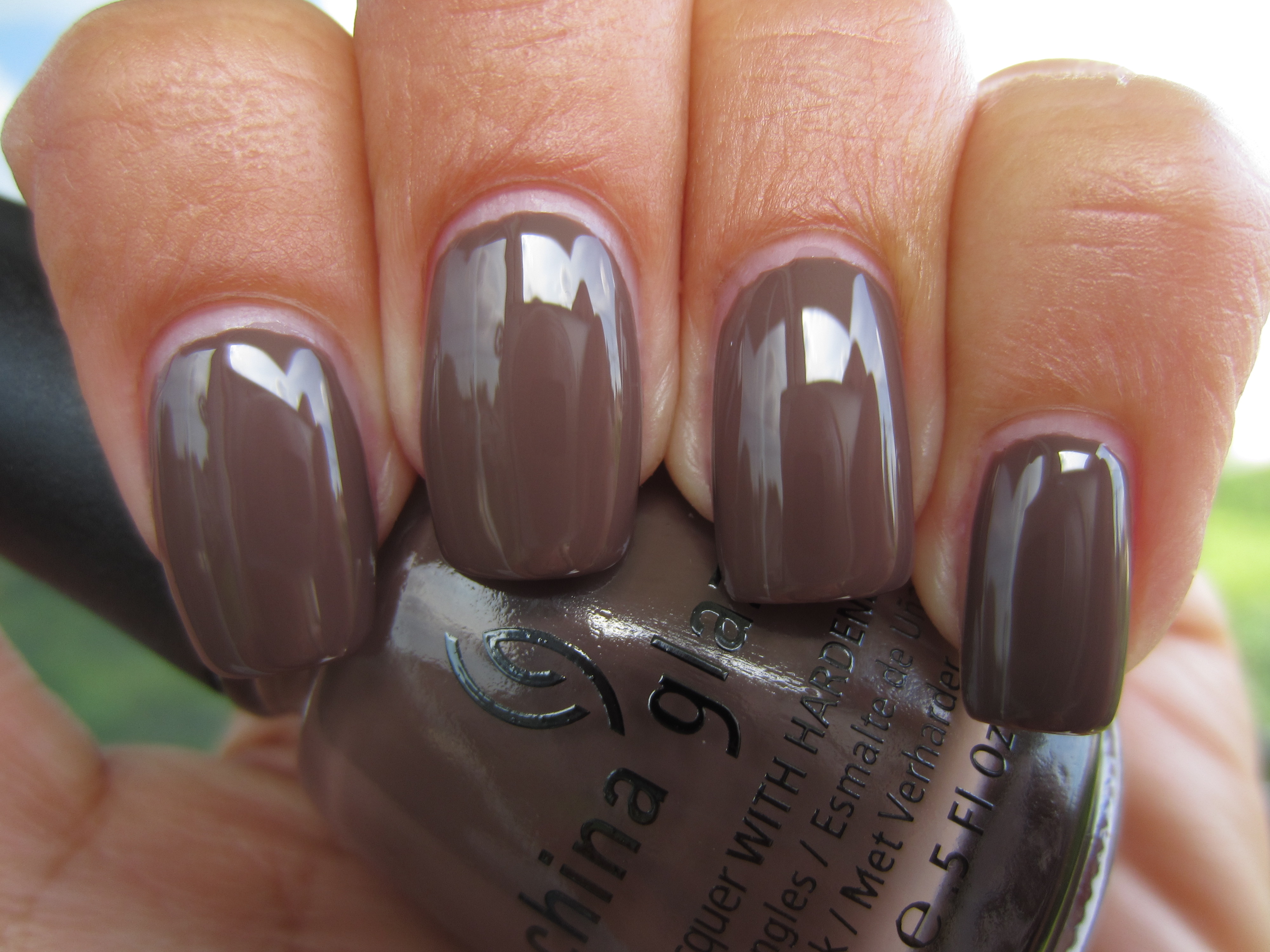
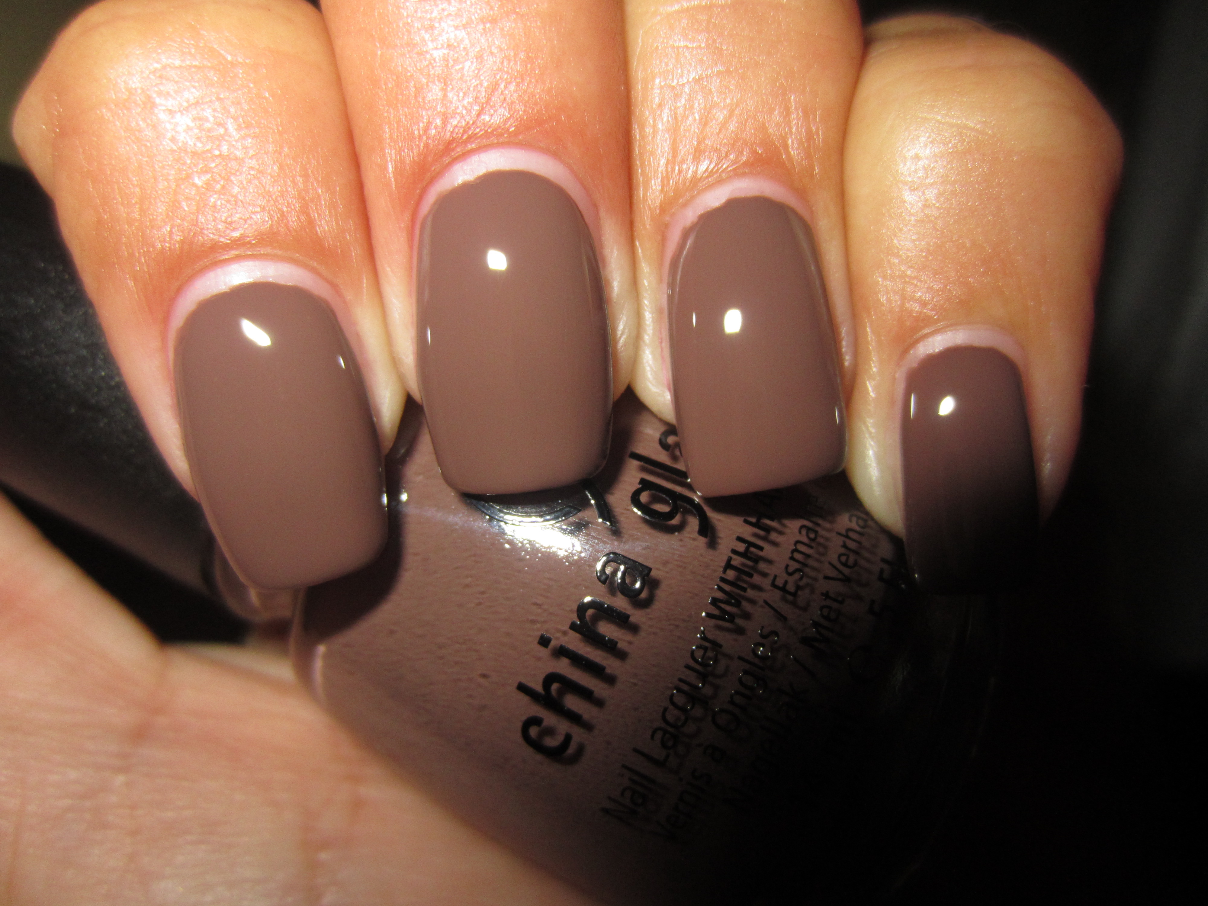
By now, it has become de rigueur to include some version of taupe in many collections, yet ‘Street Chic’ still seems to stand out, primarily because of its fabulous formula. As creamy as a bar of melted milk chocolate, it gives your nails that same decadent look, with a wonderfully self-levelling formula, as well as an ultra glossy shine at the end. All swatches are with two coats of lacquer.
Viewed in sunlight, there appears to be the vaguest hint of red lurking somewhere in this shade’s depth, adding an interesting element to this hue.
Seen in indirect light, ‘Street Chic’ takes on a much cooler persona, and now seems to be tinged lightly by a grey veiling of colour.
Shaded light seems to bring about yet another hue to this complex polish: pink, which not only extends this colour’s range, but adds such a lovely warmth.
A final view taken with flash emphasizes ‘Street Chic’s’ melted chocolatey goodness and reveals how it’s anything but neutral!
By layering one coat of ‘Midtown Magic’ (coming up in the 2nd half of this review, the “Downtown” Collection) over 2 coats of ‘Street Chic’, I was looking to see how this pair would interact….and I wasn’t disappointed!
I absolutely love how sunlight seems to bring out a more cognac side to this combo, with the glitter appearing to be trapped under the surface of the nail.
A view with indirect lighting reveals more of a whisky tone to the glitter, with the base shade become a complimentary deeper brown counterpart.
When seen in shaded light, this combination reminded me of a view of the cosmos, with the glitter winking out like so many stars at night.
A final view taken with flash reveals the ultra fine glitter in all its multi-dimensional form, with gold and burnt orange specks taking center stage….beautiful!
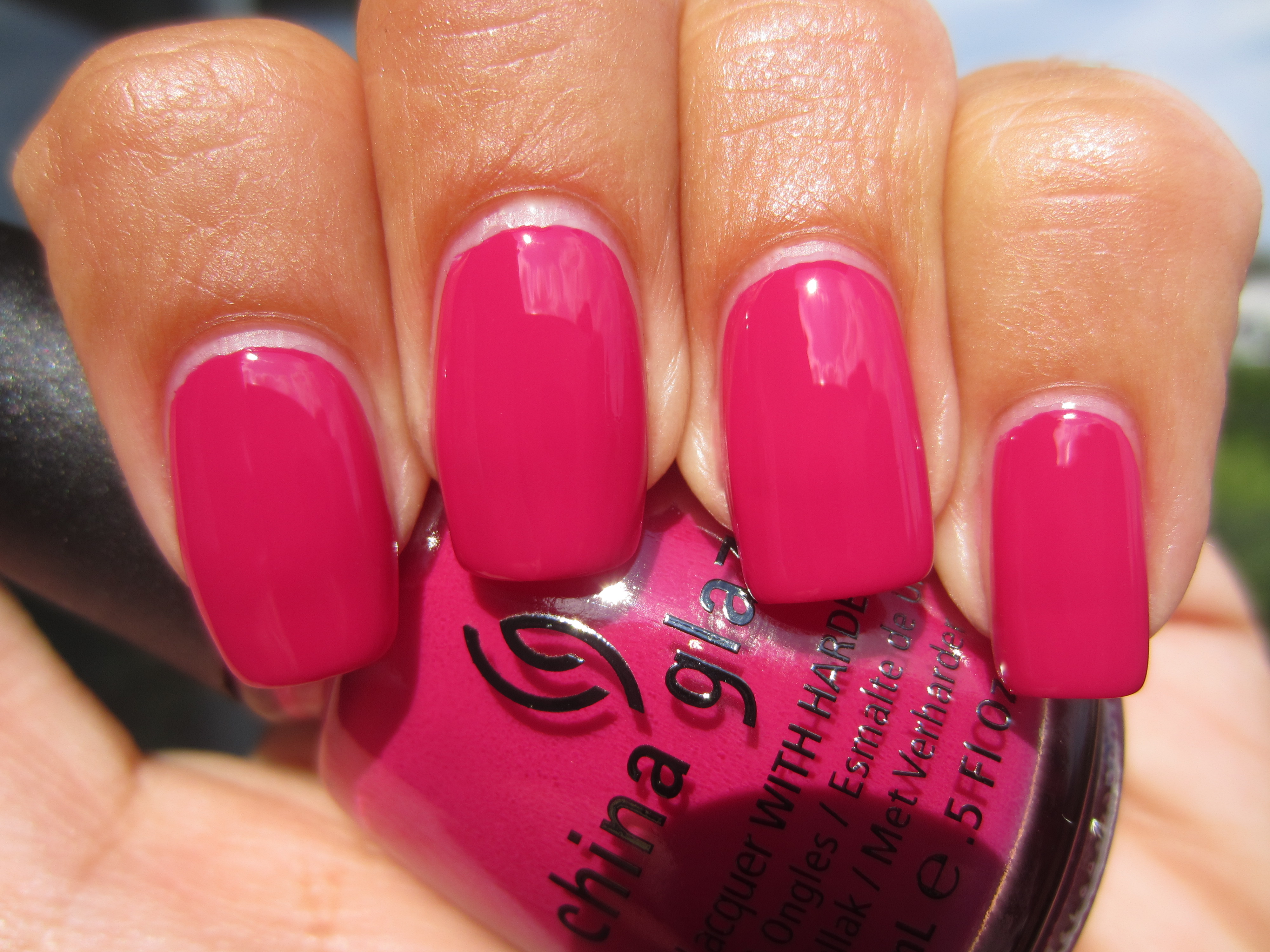
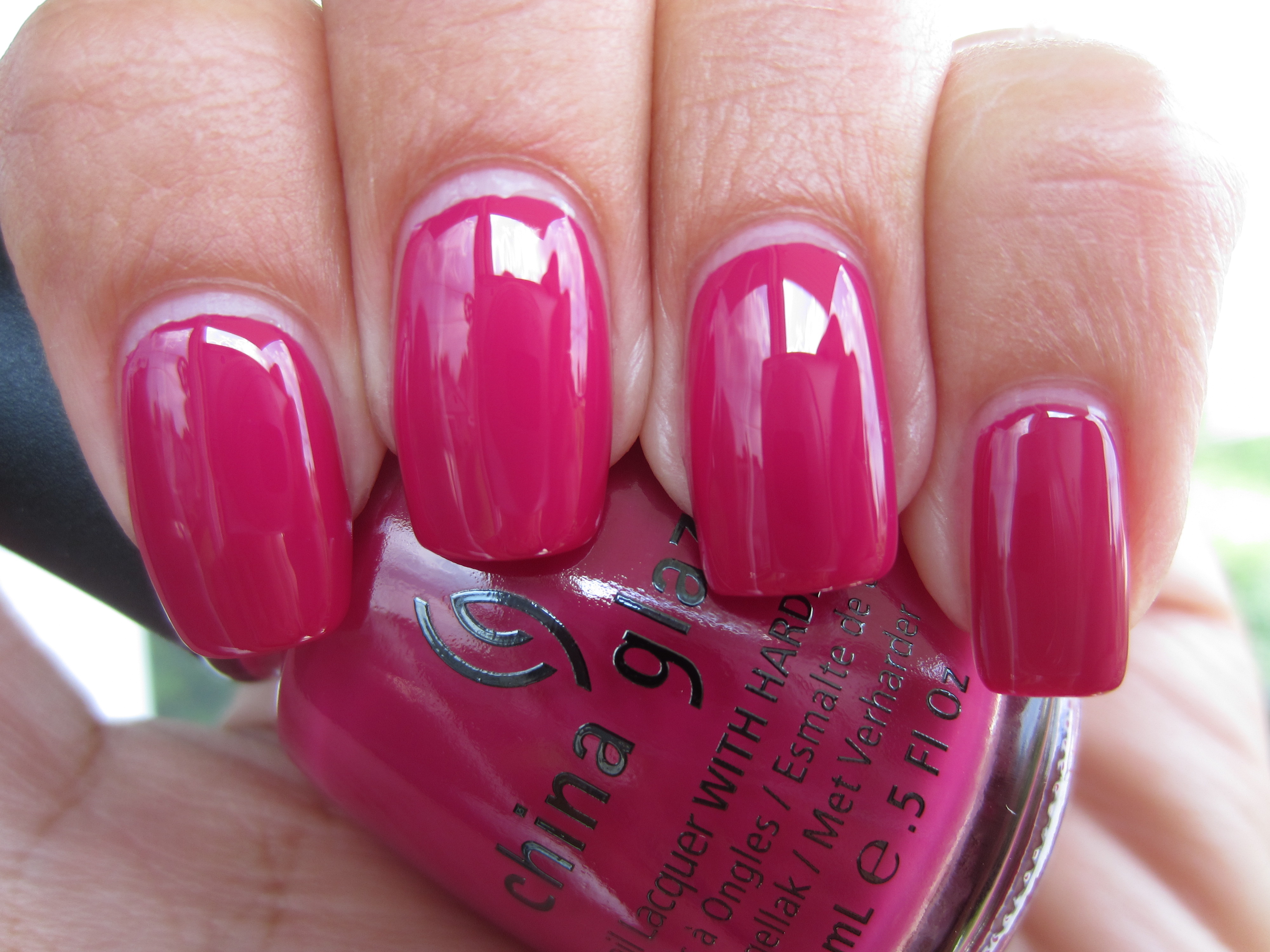
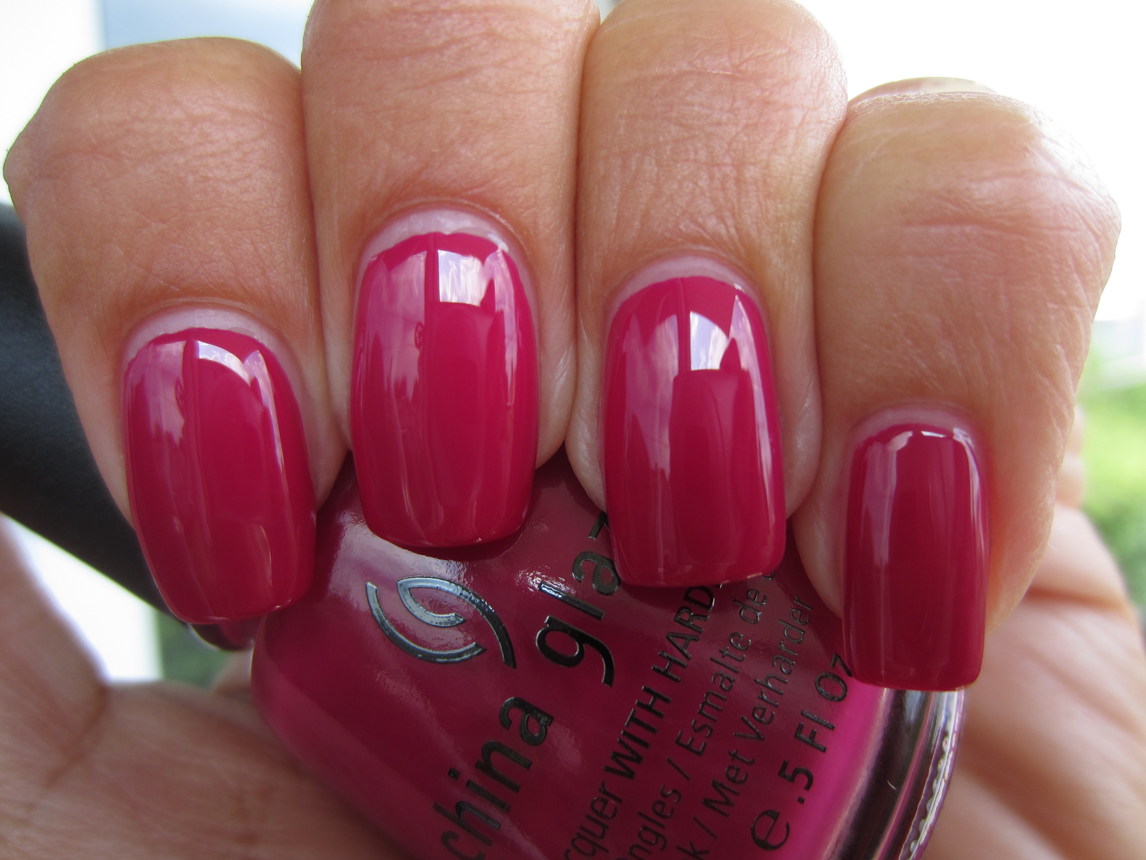
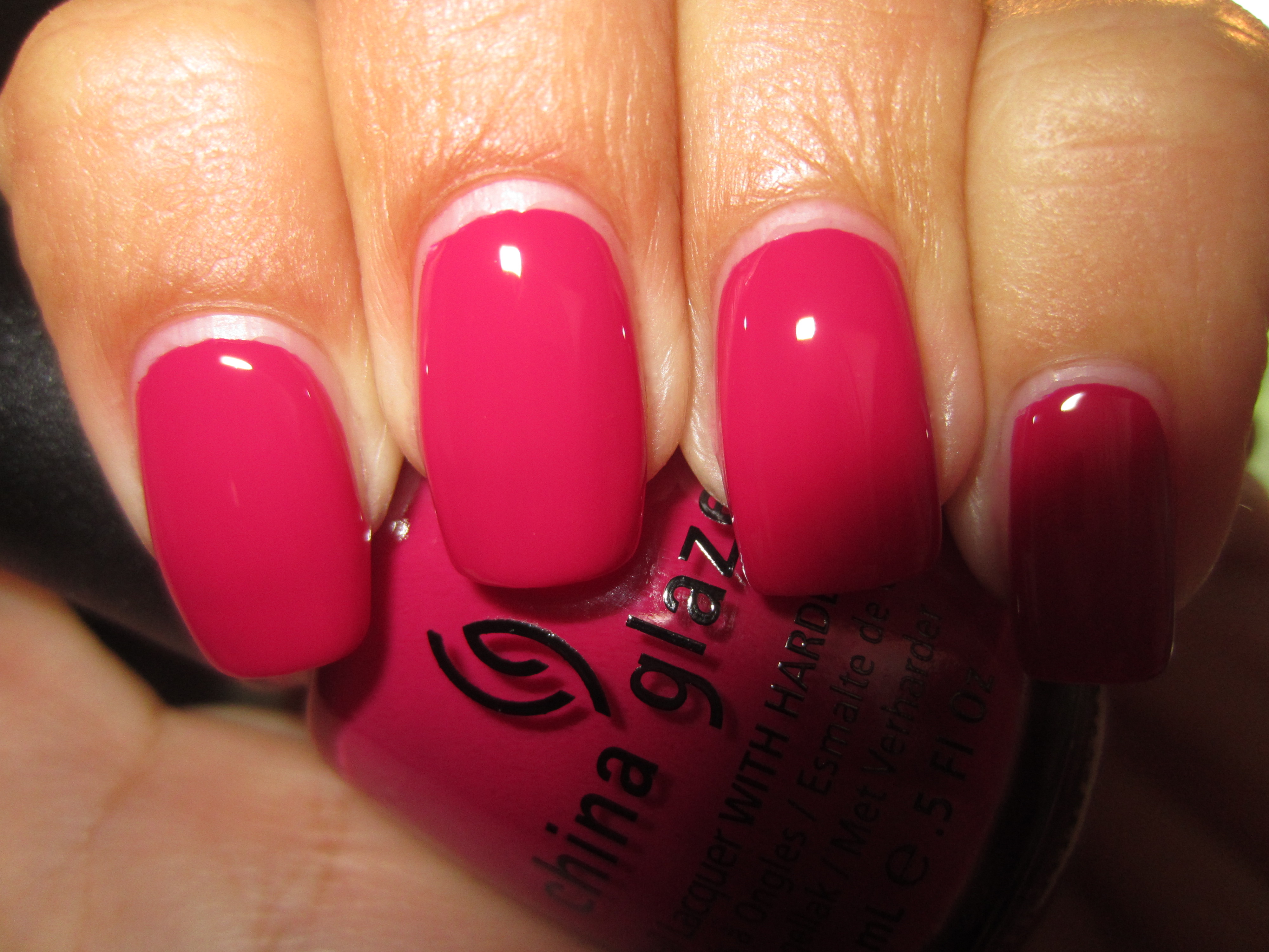
With a name like ‘Traffic Jam’, you would expect nothing less than a heart-stopping colour, and while not as eye-searing as a neon, this shade manages to definitely capture your attention…for all the right reasons! An utterly fantastic formula, which was not only self-levelling and incredibly glossy, but almost a one-coater as well, this is hands down the most delectably vivid raspberry crème shade that you will ever come across.
Seen in full sunlight, ‘Traffic Jam’ takes on a more bubble-gum pink hue, yet still seems to remain paradoxically bright and muted (don’t ask me how!)
Indirect lighting not only brings out a much cooler vibe to this shade, but deepens the pink tone to a more honeysuckle (remember, it’s the colour of the year!) tint as well.
Interestingly enough, shaded light appears to add warmth to ‘Traffic Jam’ and hints at some coral leanings in its base.
It is a view with flash that not only spotlights this shade’s brightest look yet, but also displays its über-glossy finish….don’t you just love this?!
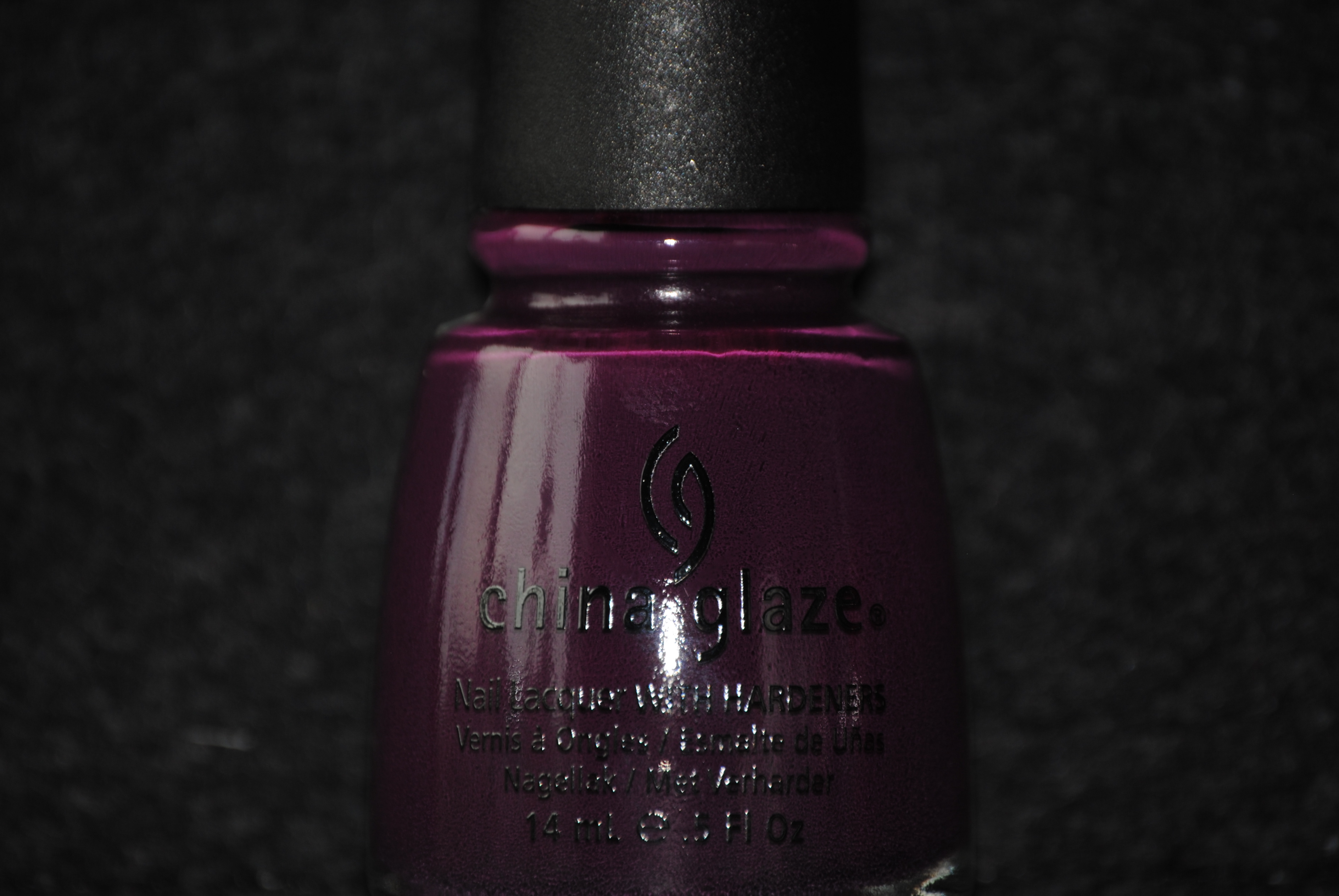
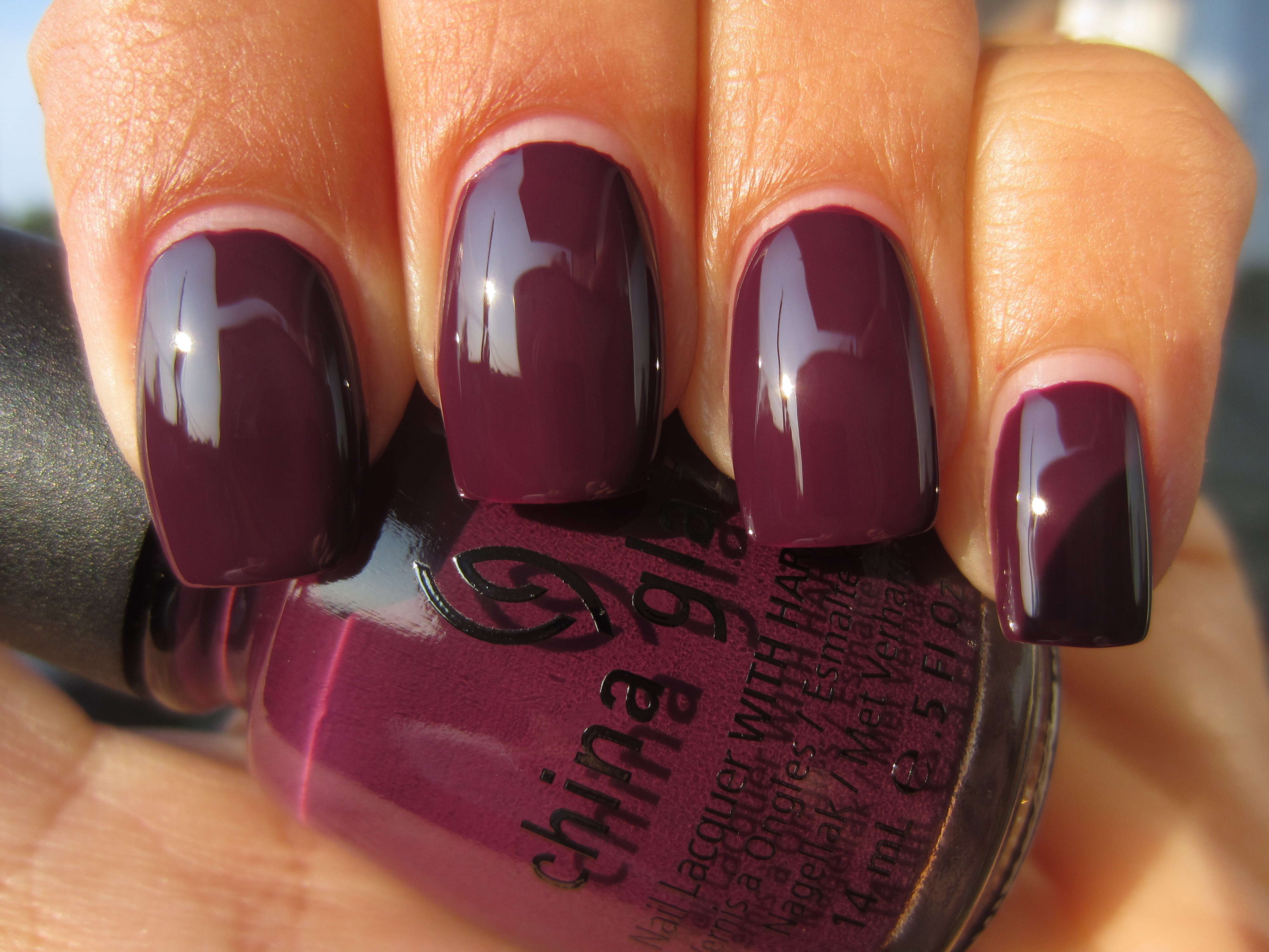
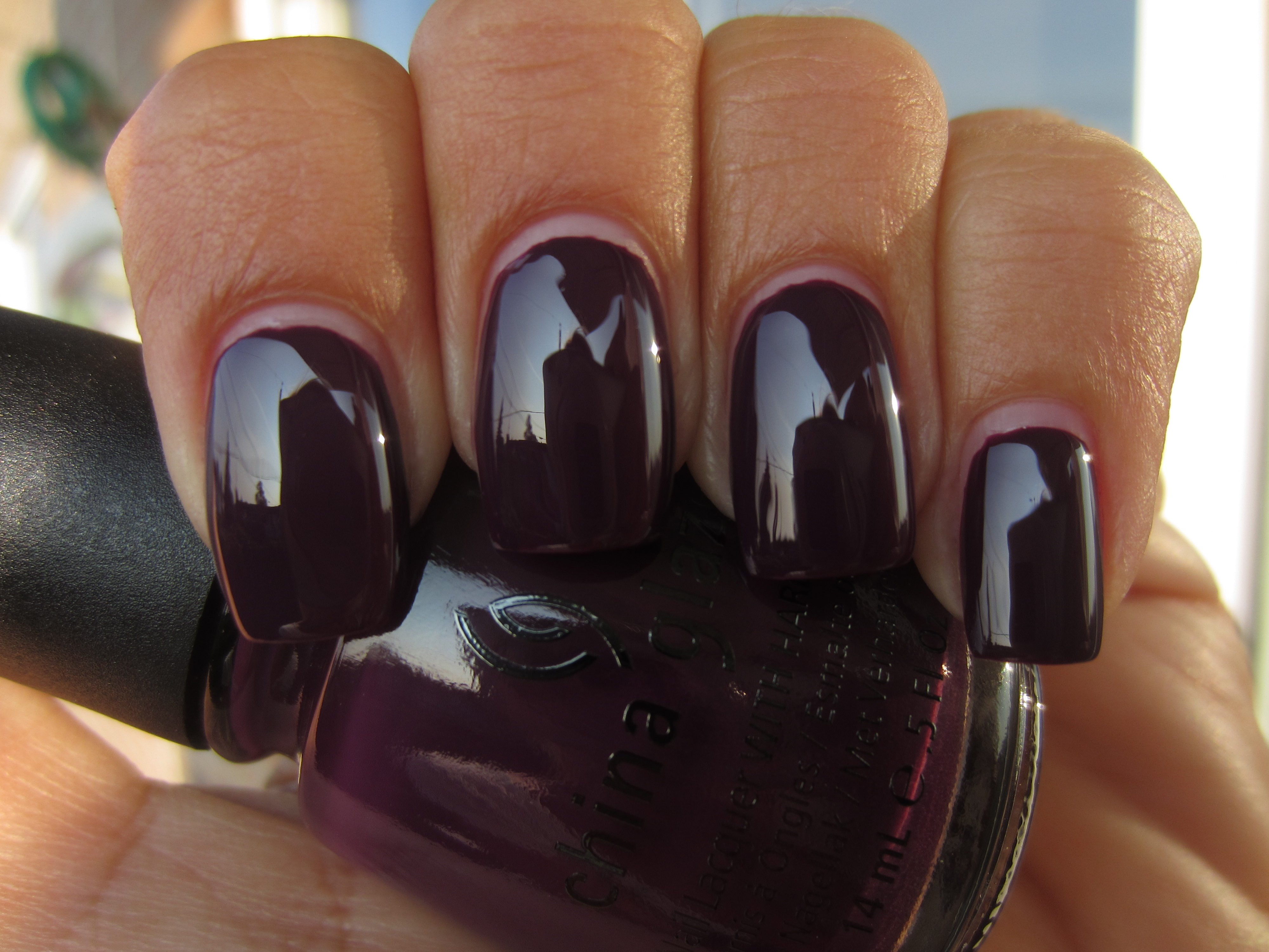
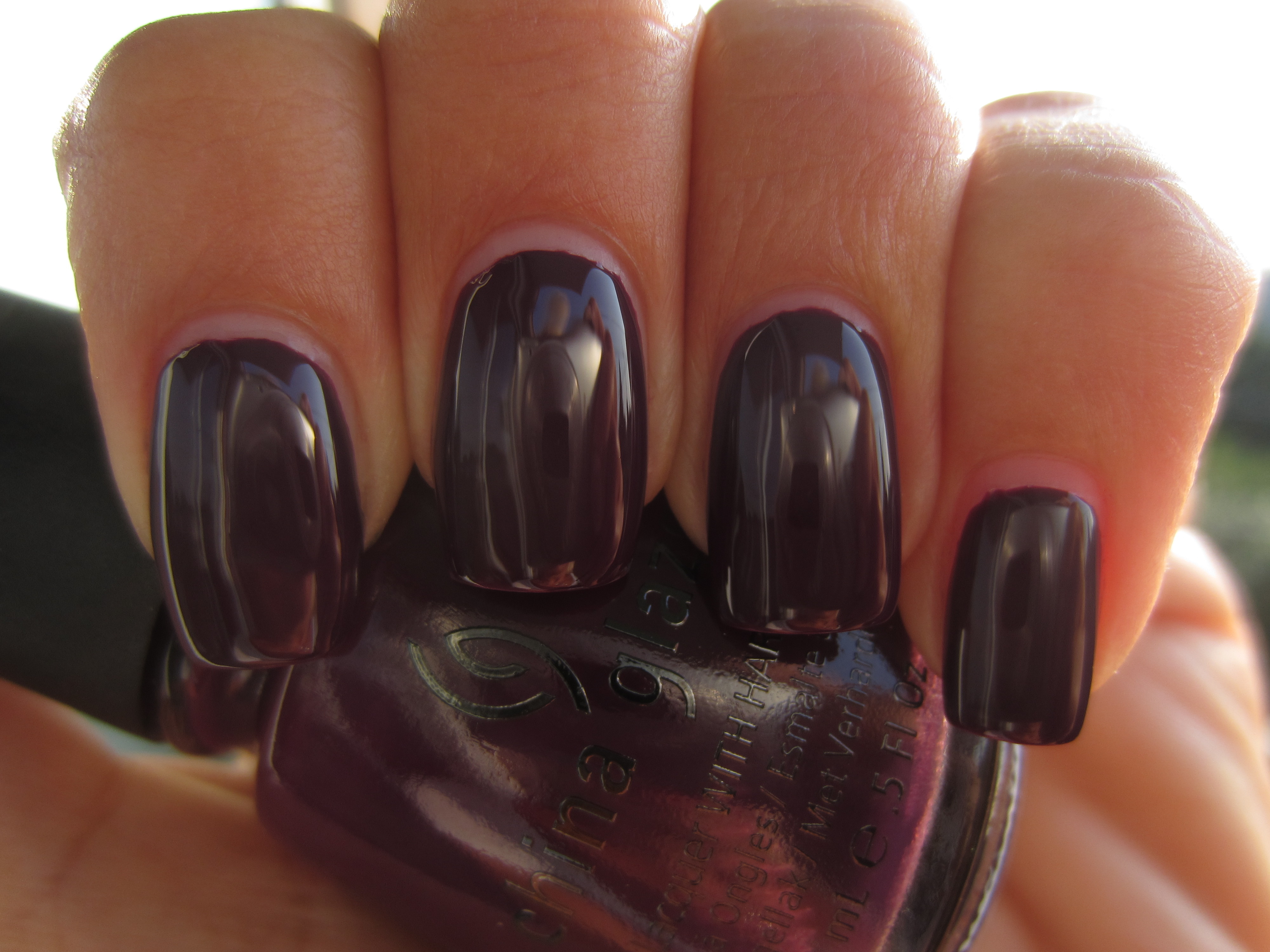
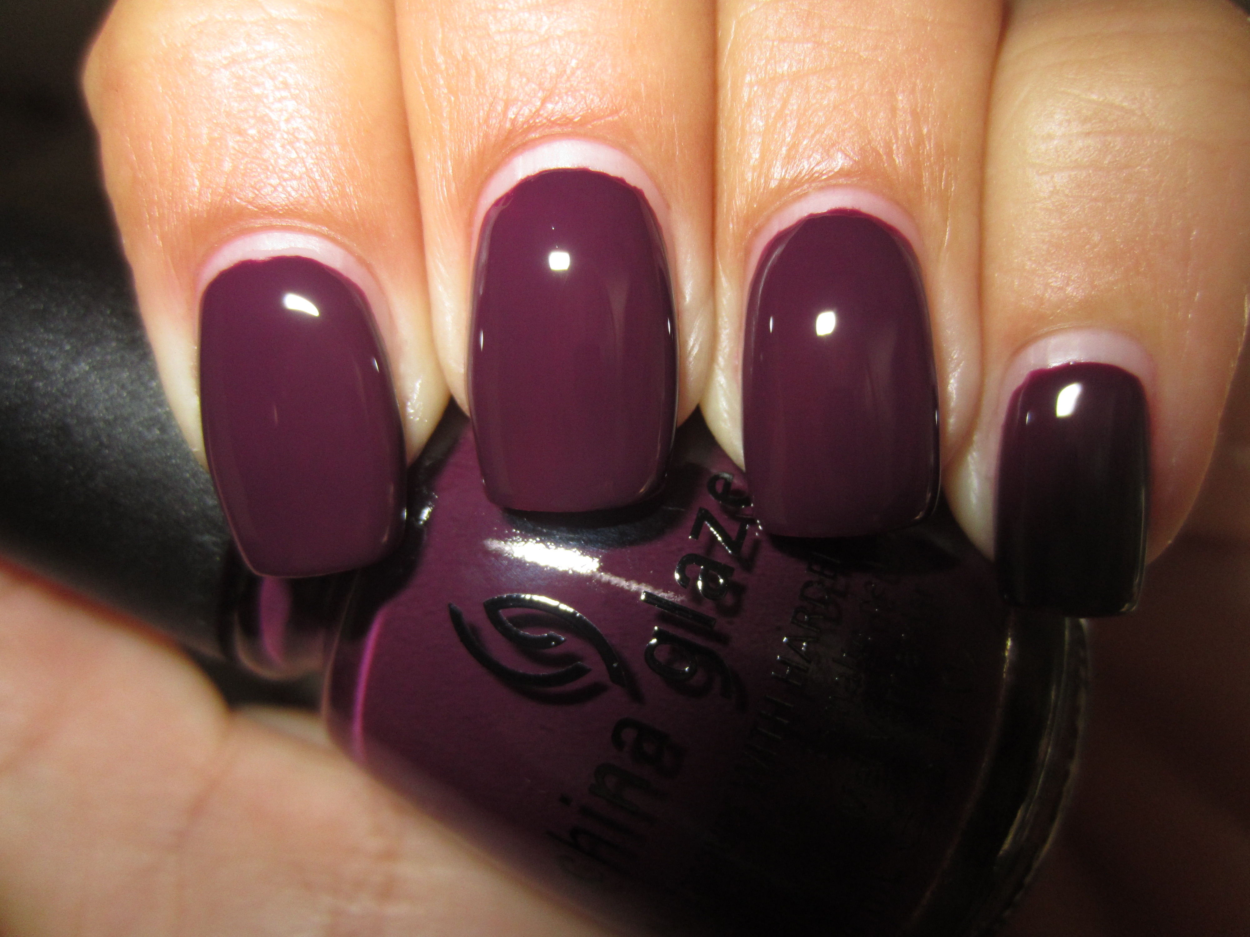
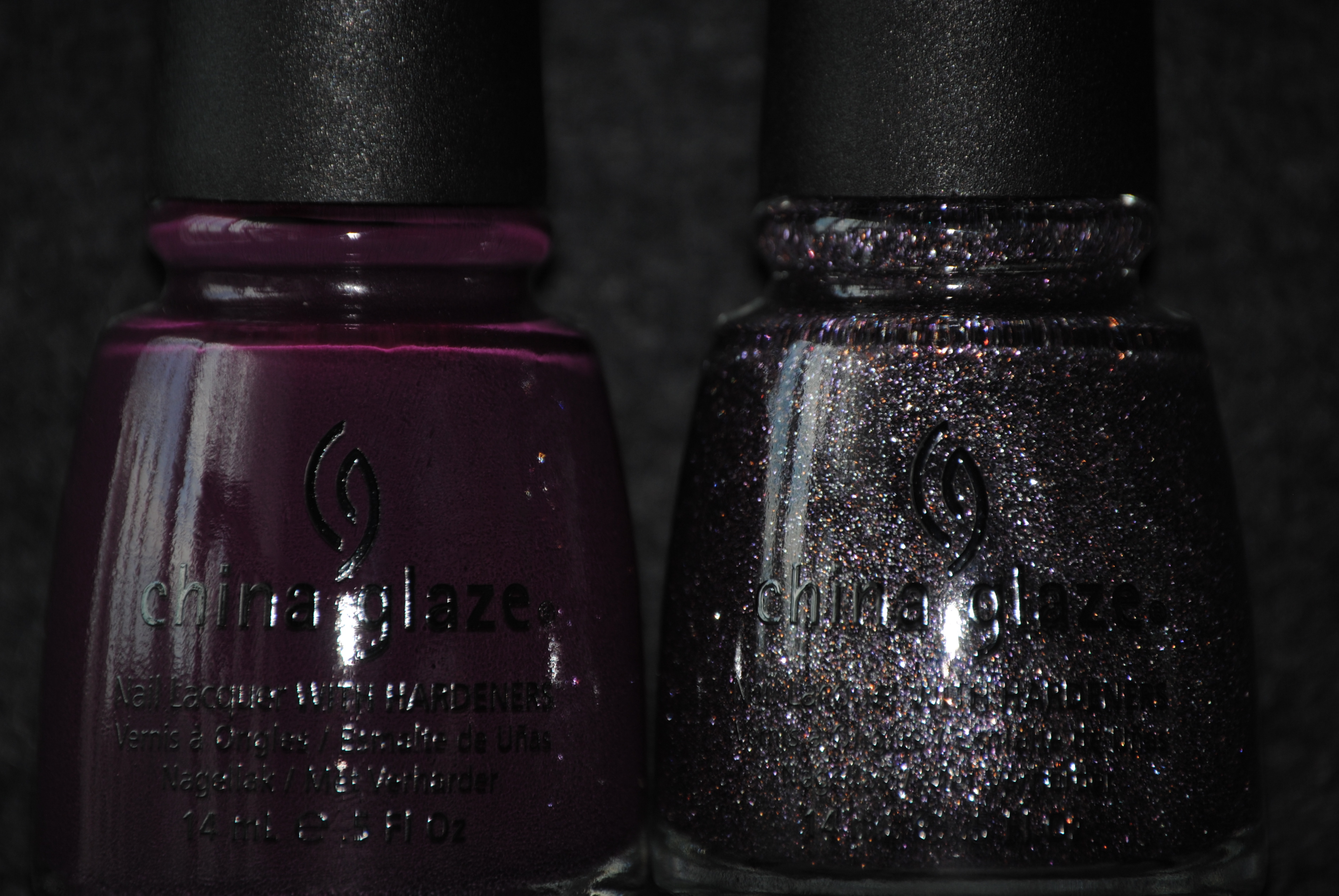
‘Urban-Night’ is so very well named; an apt description of the near black-purple night sky seen in practically every metropolis, this is as deep as grape can get, while still retaining all its colour. Another stellar formula, needing barely two coats for full opacity, it was smooth and shiny enough to look almost reflective and so very, very sophisticated!
Sunlight appears to lend this shade more of a burgundy tone, tamping down its purple side and highlighting some reddish leanings.
As this colour changes dramatically with the smallest shift, this first photo taken with indirect lighting reveals a more prune-like tone to ‘Urban-Night’.
Moving slightly, this second photo taken again in indirect lighting, now lends this shade a blacker, more mysterious air, glistening with a ruby inner fire.
When viewed in shaded light, I noted how ‘Urban’Night’ now appears more of warm-toned aubergine shade, but still managing to look so cool and royal.
Of course, it is a final view with flash that reveals this shade’s truest purple nature, with a glossy shine that looks so incredibly juicy!
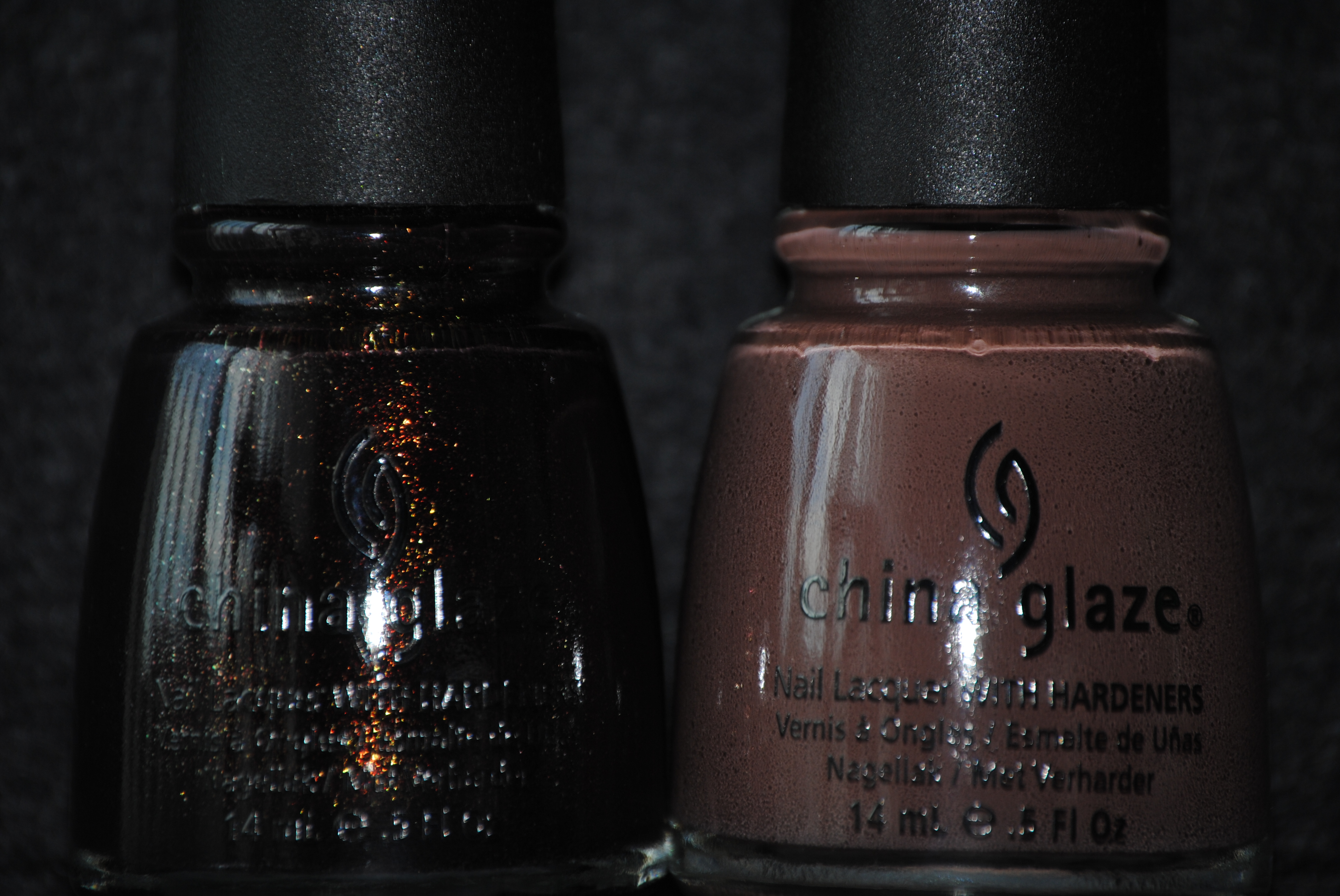
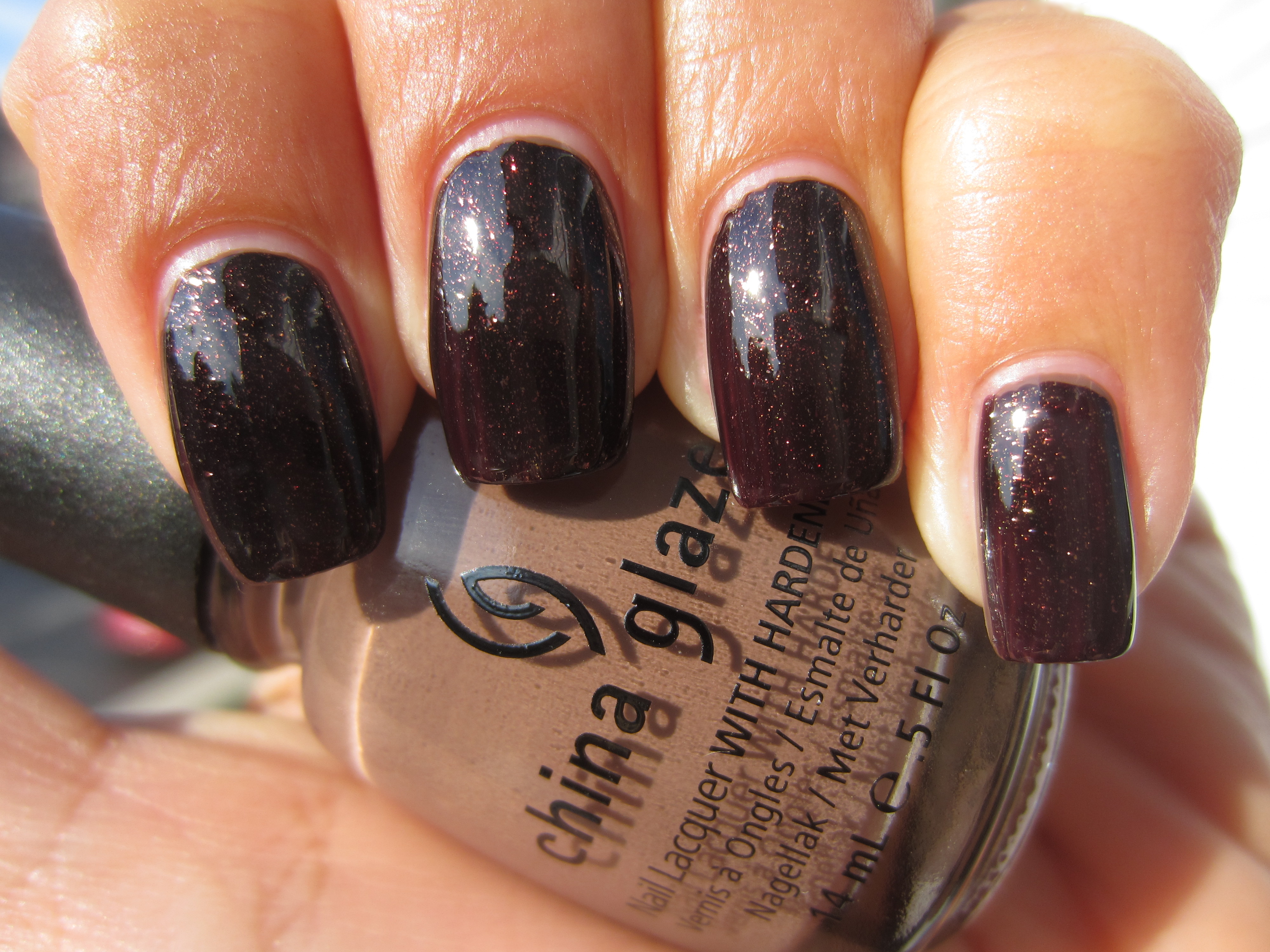
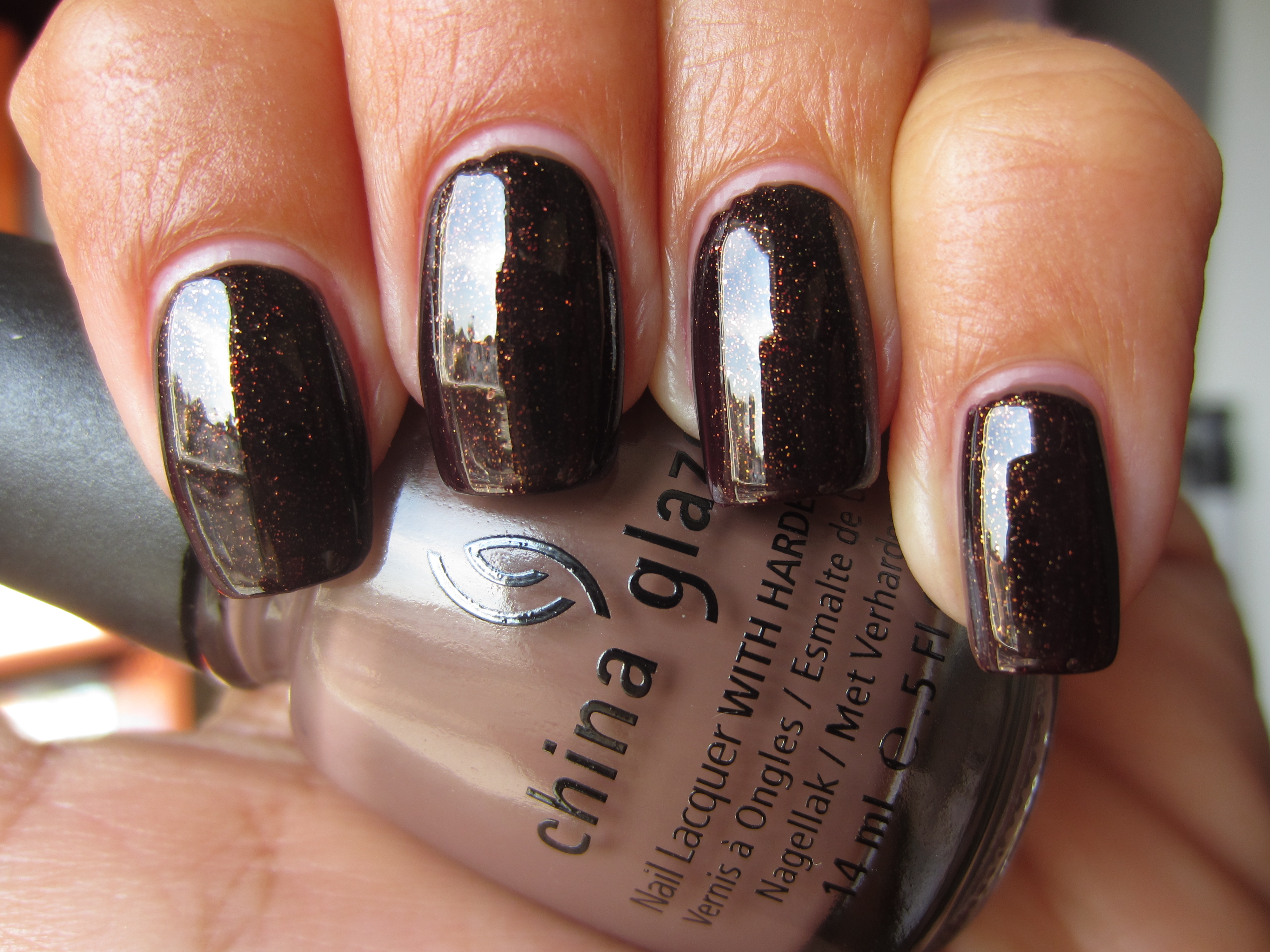
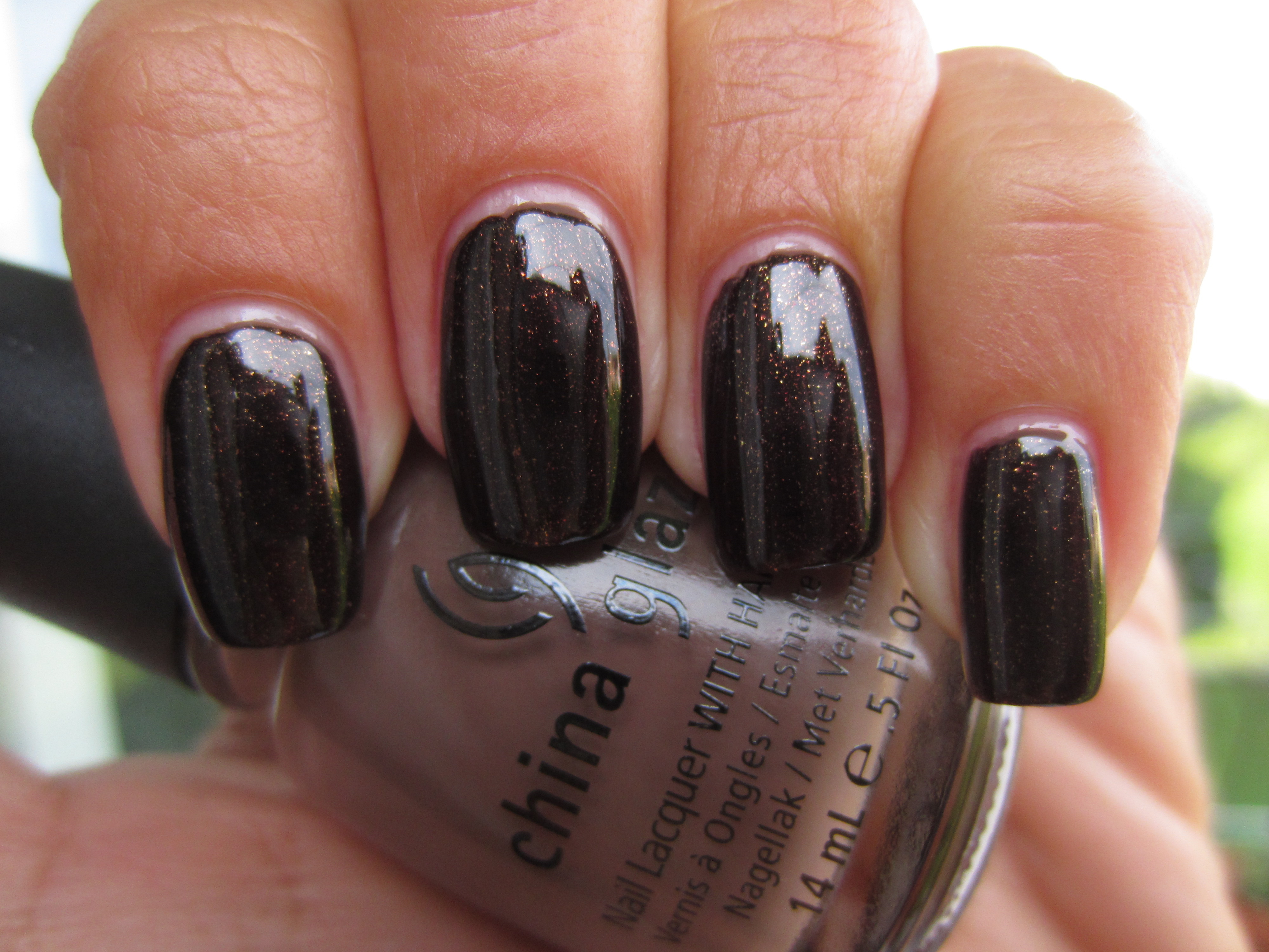
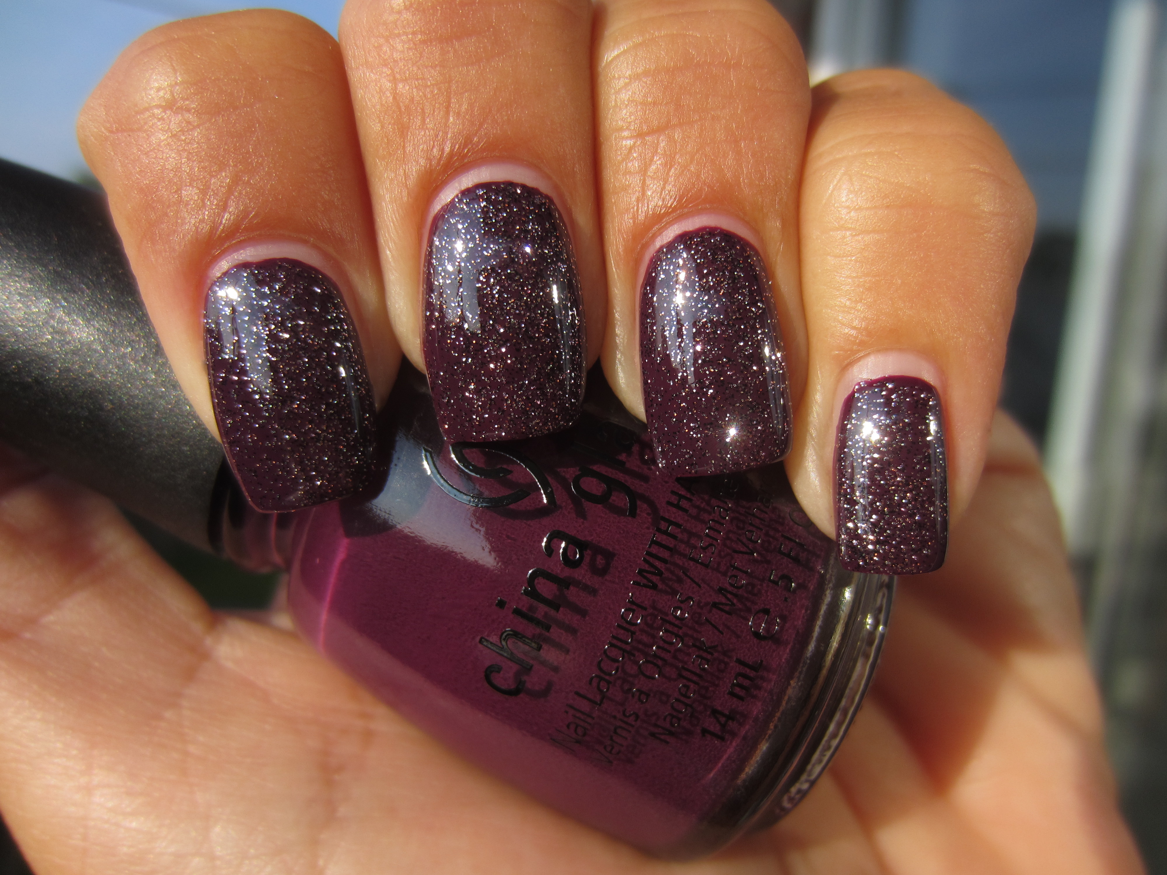
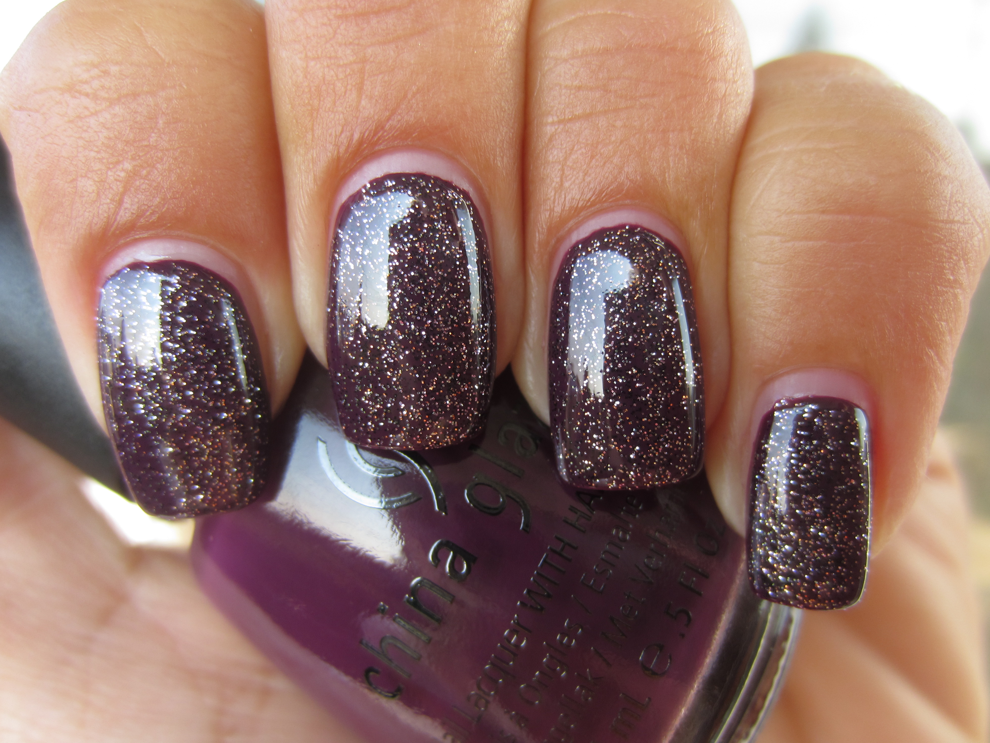
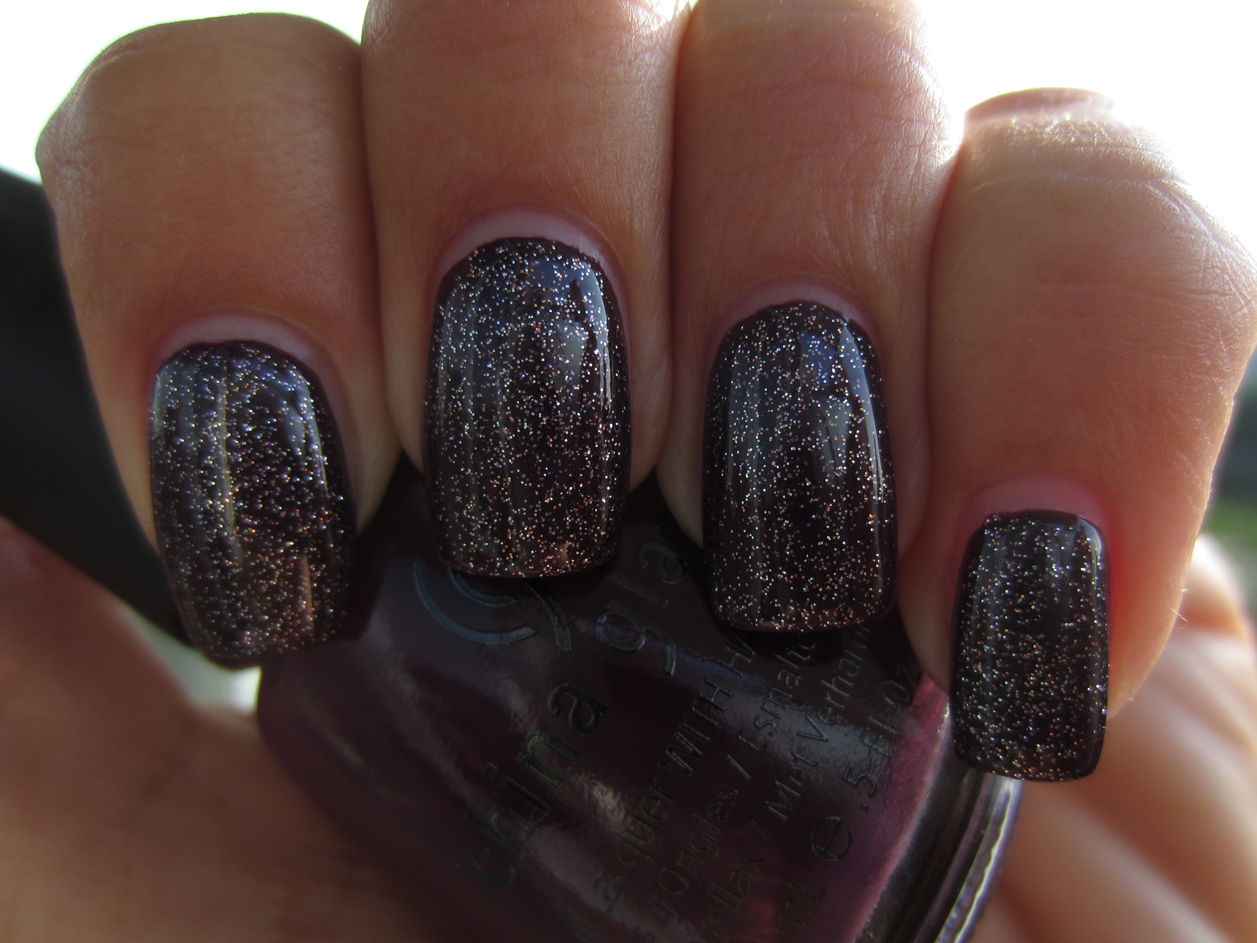
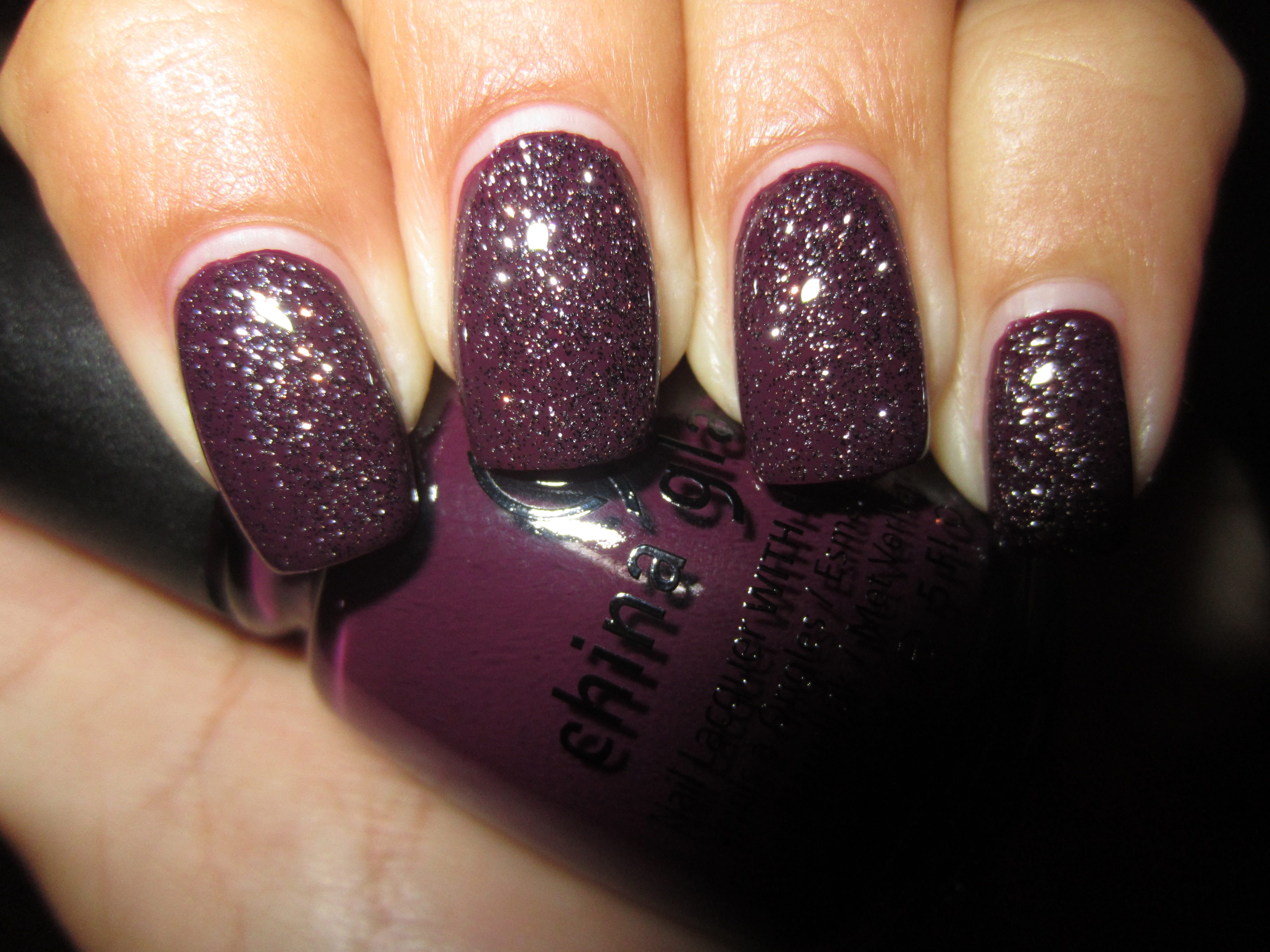
It seemed to me that a layer of ‘CG In The City’ would be a perfect match to two coats of ‘Urban’-Night’, as they both have a common purple theme, and it turns out that it was indeed a very symbiotic relationship!
I love how the sunlight takes the fine glitter specks of ‘CG In The City’ and reflects them so brilliantly, set against the perfect backdrop of ‘Urban-Night’.
A view in indirect light tones down the sparkling overlay and allows the base shade to be the primary focus.
I can’t help but be reminded of the galaxy once more, when this combination is viewed in shaded light, but this time appearing as stars set against the deepest dark of night….so sensually mysterious!
A final view taken with flash, and the combination becomes almost as explosive as the big bang! Scintillating, yet not over-statedly so…..brilliant!
Final thoughts: If it hasn’t become apparent enough by now, let me state right here, how absolutely impressed I am with this collection thus far. Beginning with a superb formula, requiring minimal application effort – they are all THAT easy to apply – brush stroke free and self-levelling, glassy finish and relatively quick dry time, along with a thin, tapered yet flexible brush for ease of use, there is absolutely nothing I don’t like about these six shades. The colours themselves, while not outrageous in hue, are a huge bonus as well because of their easily wearable shades. I am totally feeling the sophisticated look of the “Uptown” Collection…..stay tuned as I direct you next to the seamier side of city life, with the “Downtown” Collection!
*Disclaimer: product samples provided by the company/PR for my unbiased consideration
*Image credit








28 Responses to China Glaze Fall 2011 – Metro Collection “Uptown” (swatches & review)