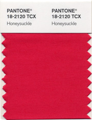
Pantone, the leading global authority on colour, has declared that ‘honeysuckle’ is the colour of the year for 2011!
For those wondering what colour honeysuckle is, as you can see in the picture above, this is an exceptionally vibrant red-based pink shade and according to an online search I did, the honeysuckle flower has long been associated with happiness. Last year’s ‘it’ colour, turquoise, appeared in everything from wall paint to nail polish (hello: CHANEL’s Nouvelle Vague, Essie’s Turquoise & Caicos!) and stood for an escape from the harshness of everyday life. According to Pantone’s press release, they describe honeysuckle as follows:
Energizing Honeysuckle Lifts Spirits and Imparts Confidence to Meet Life’s Ongoing Challenges
Honeysuckle emboldens us to face everyday troubles with verve and vigor. A dynamic reddish pink, Honeysuckle is encouraging and uplifting. It elevates our psyche beyond escape, instilling the confidence, courage and spirit to meet the exhaustive challenges that have become part of everyday life.
“In times of stress, we need something to lift our spirits. Honeysuckle is a captivating, stimulating color that gets the adrenaline going – perfect to ward off the blues,” explains Leatrice Eiseman, executive director of the Pantone Color Institute®. “Honeysuckle derives its positive qualities from a powerful bond to its mother color red, the most physical, viscerally alive hue in the spectrum.”
Eiseman continues, “The intensity of this festive reddish pink allures and engages. In fact, this color, not the sweet fragrance of the flower blossoms for which it was named, is what attracts hummingbirds to nectar. Honeysuckle may also bring a wave of nostalgia for its associated delicious scent reminiscent of the carefree days of spring and summer.”
Honeysuckle is guaranteed to produce a healthy glow when worn by both men and women. It’s a striking, eye-catching hue that works well for day and night in women’s apparel, accessories and cosmetics.
Looking through my stash of nail polish, I realized that while I have a reds, pinks and several corals, I didn’t have anything close to what I imagined honeysuckle to be and so I went out and picked up what to me best represents this colour: Essie’s ‘Wife Goes On’ from their 2007 Starting Over collection. Just as Essie’s ‘Silken Cord’ took me by surprise by how much I loved the shade (especially on me!), I was completely blown away by Wife Goes On!
This is as close to Pantone’s swatch (pictured above) as I could find; Wife Goes On is a creamy, intensely deep dark pink shade with raspberry leanings. The formula was the best I’ve tried yet from Essie, being opaque from basically the first coat, neither too thick nor thin, gliding on with ease (and almost self-levelling) & ending with a high gloss finish. I have to say that I’m glad I tested it out at the store first because this shade is so much deeper & brighter on the nail than the bottle colour itself. I used base coat, 3 coats of polish and Sèche Vite top coat. Did I say how much I love this colour? I can’t stop looking at my nails and I’m sure that even for a summer pedi, this will be absolutely phenomenal! (all I have to do now is find the perfect sandals to match the polish……..!!)
Seriously……..doesn’t this colour make you happy just looking at it?!!


Pingback: Head To Toe In Honeysuckle, Do You Dare? « Eiseman Color Blog