- Beauty Journalist & proud Montrealer with a passion for beauty in all its fabulous diversity. "Beauty begins the moment you choose to be yourself" - Coco Chanel
To suscribe, please enter your email:
Archives
Categories
Categories
beauty Beauty Tools Blush Bronzers Brushes Chanel CHANEL Beauty CHANEL Makeup Chanel nail polish Cosmetics Dior Essie Eye Liner Eye Shadow eyeshadow eyeshadow palette Face Powders Foundation fragrance Guerlain Highlighter Highlight Powders limited edition limited edition beauty limited edition makeup Lip balm Lip Gloss Lip products lipstick luxury beauty luxury makeup MAC Makeup makeup Makeup Artist Makeup Brushes Mascara nail polish Nail Polish Comparisons NARS New OPI palette Perfume Skincare- @ommorphia on Instagram
-
Tag Archives: a-england swatches
a-england: ‘The Legend’ (photos, swatches & review)
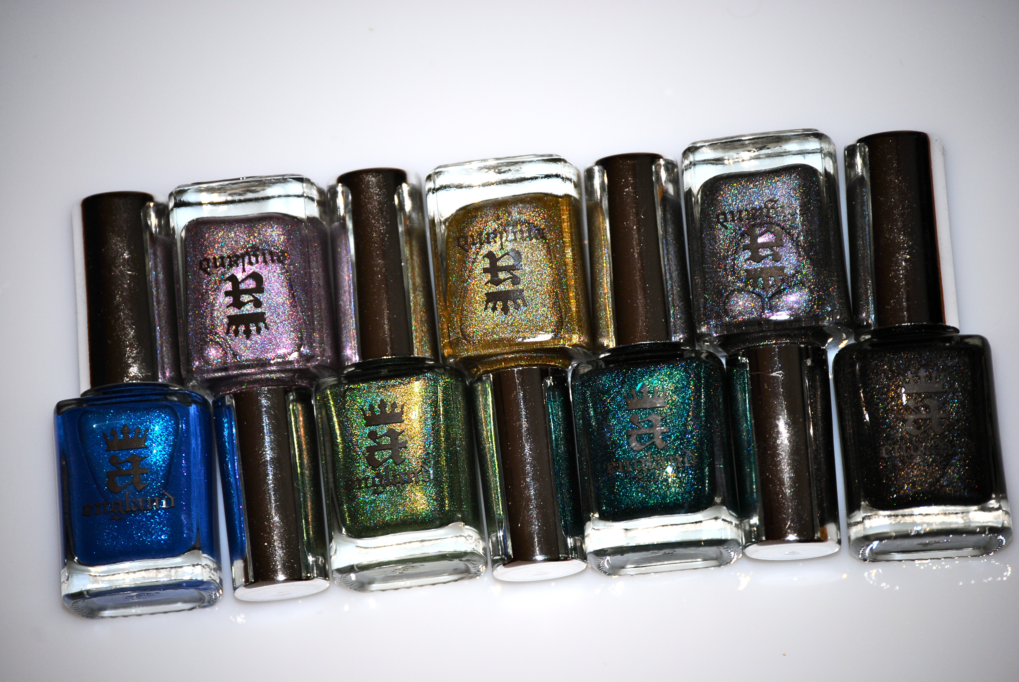
The much anticipated collection from a-england has finally arrived: my beauties, allow me to introduce you to ‘The Legend’ – seven incredibly complex and ephemeral lacquers, filled with such wonder, that they almost defy description. All swatches are with a-england’s ‘The Knight’ Base Coat, two coats of lacquer each, and ‘The Shield’ Top Coat (previously reviewed here).
The epic tale of St. George and the dragon is shrouded in much mystery, but at its core it is a tale of incredible bravery and honour. The story begins with a prosperous kingdom, a king and his lovely daughter, and a tyrannical dragon that terrorizes the land unless he is appeased by a sacrificial maiden. In the name of fairness, the king devised a lottery system where the names of all eligible girls are added; It was a terrible day when the king drew his own daughter’s name to be sacrificed, the pure of heart Princess Sabra, but she faced her fate stoically. Along came the sainted knight George, and upon viewing the doomed maiden tied to a tree, took it upon himself to challenge and ultimately slay the dragon, thereby freeing the land from its thrall and restoring peace to the kingdom.
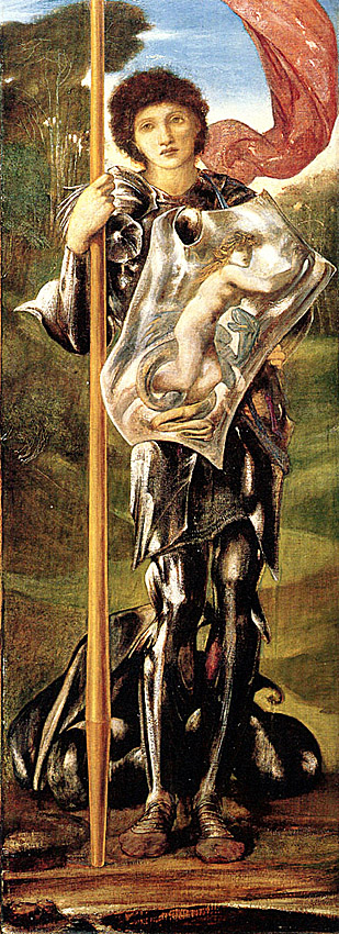
– Saint George by Edward Burne-Jones (1873-77)
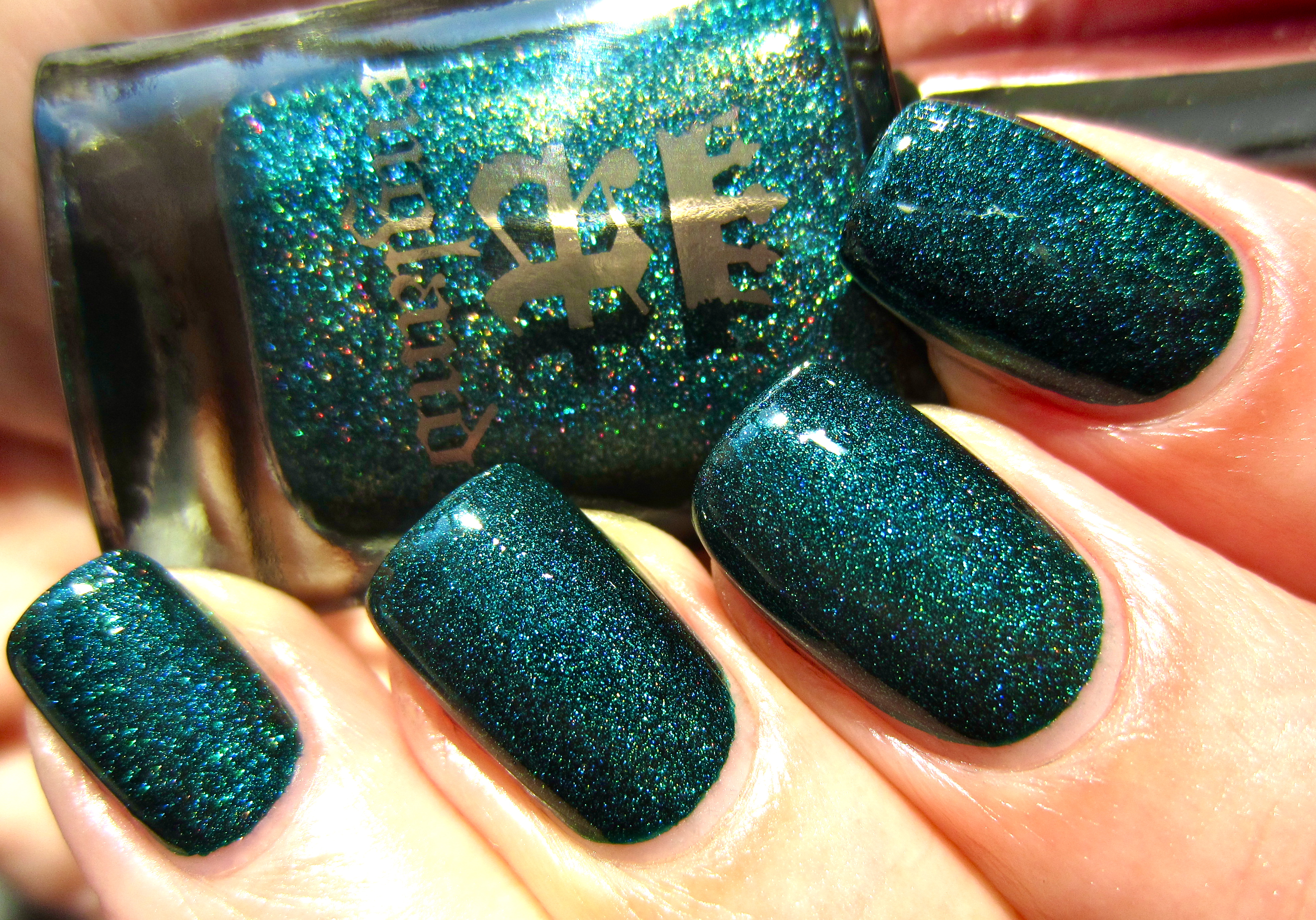
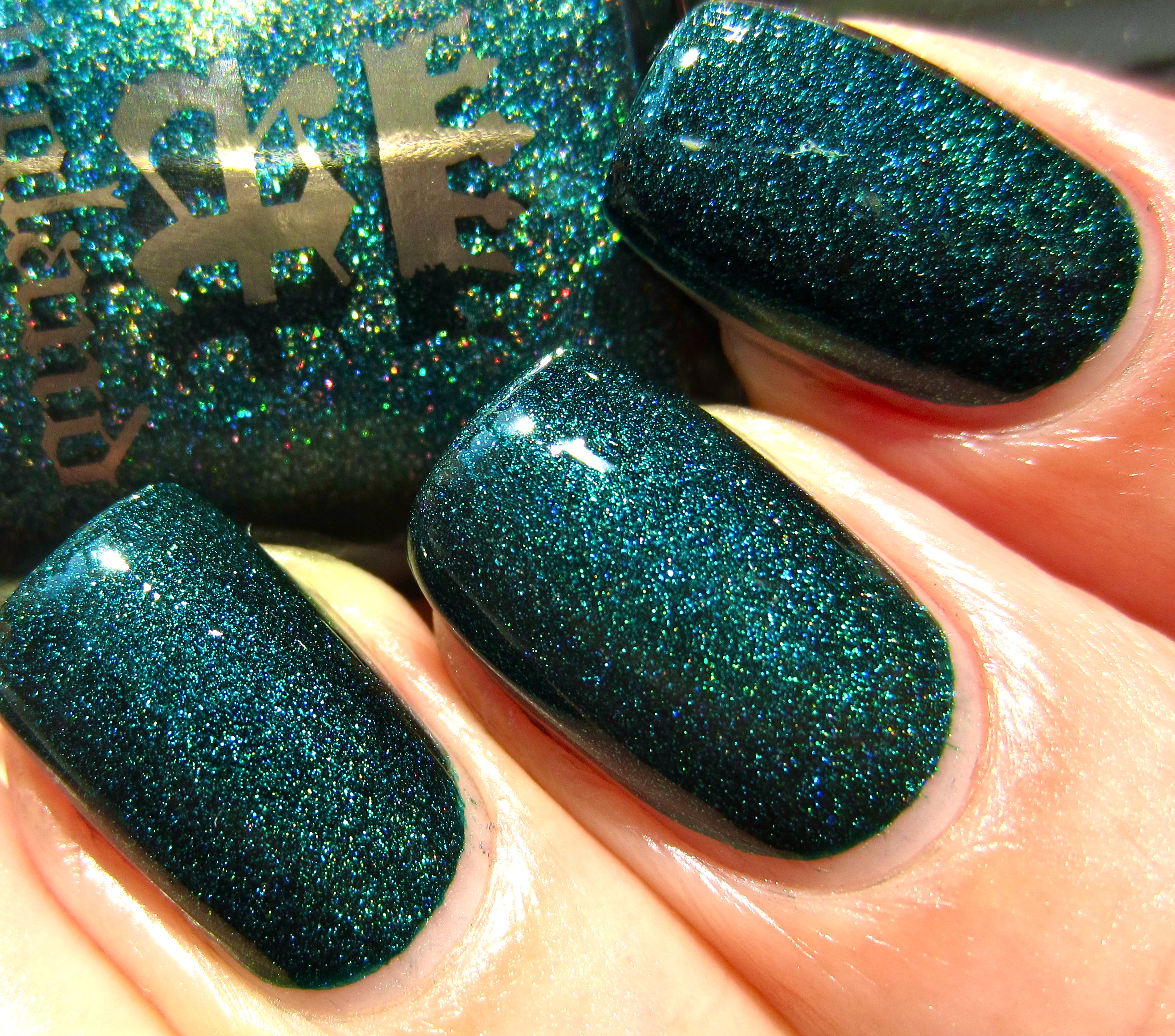
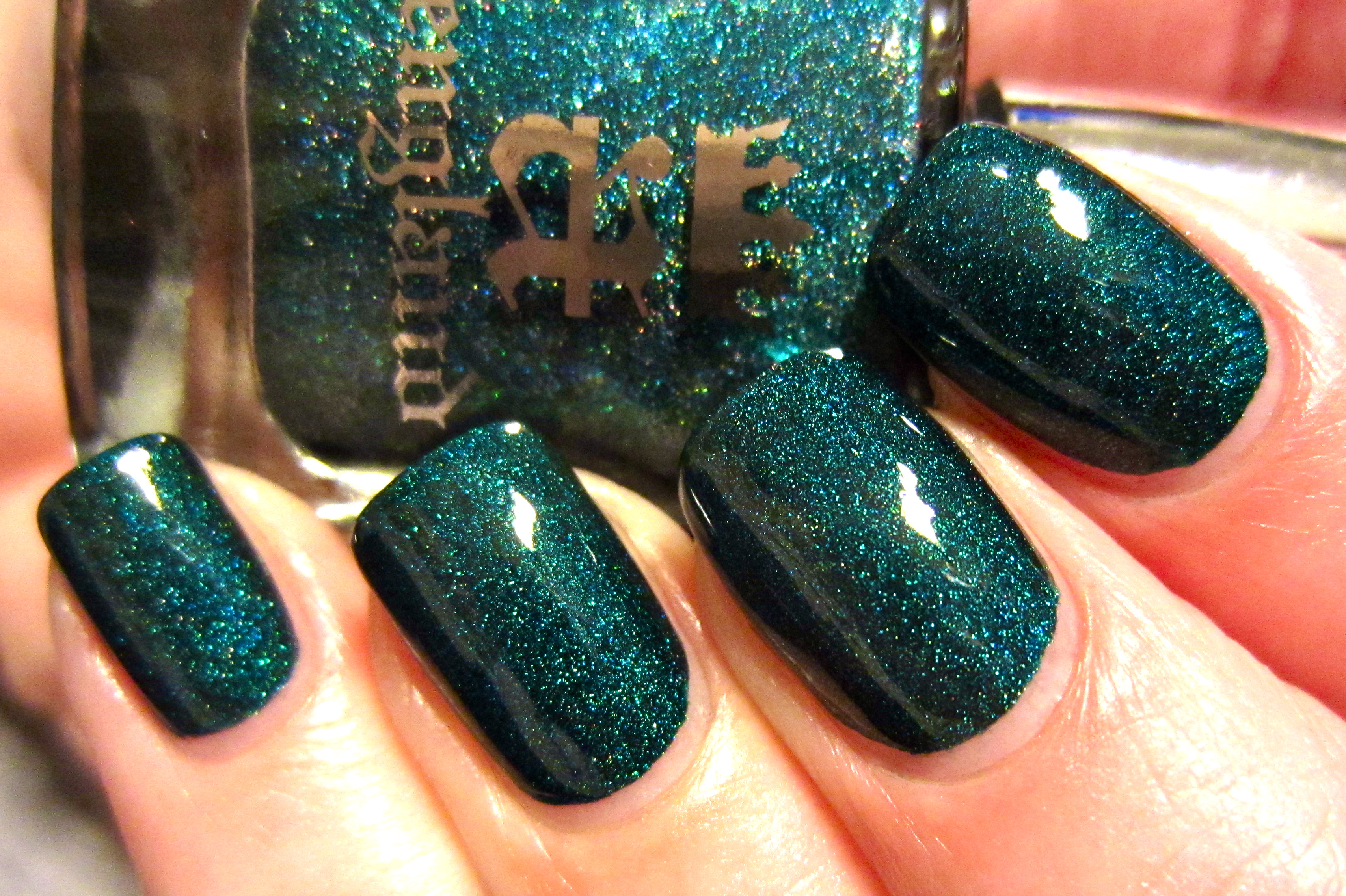
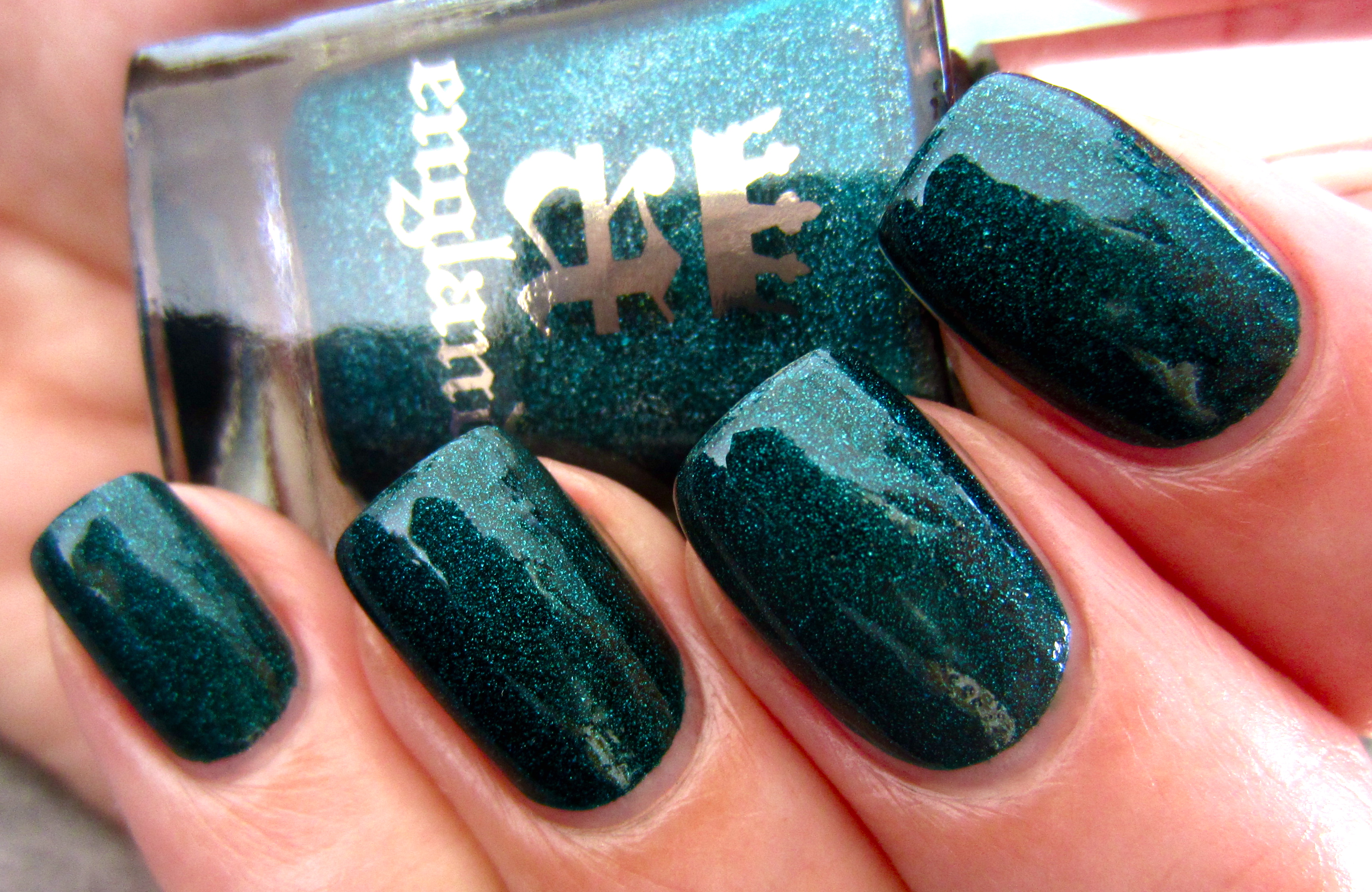
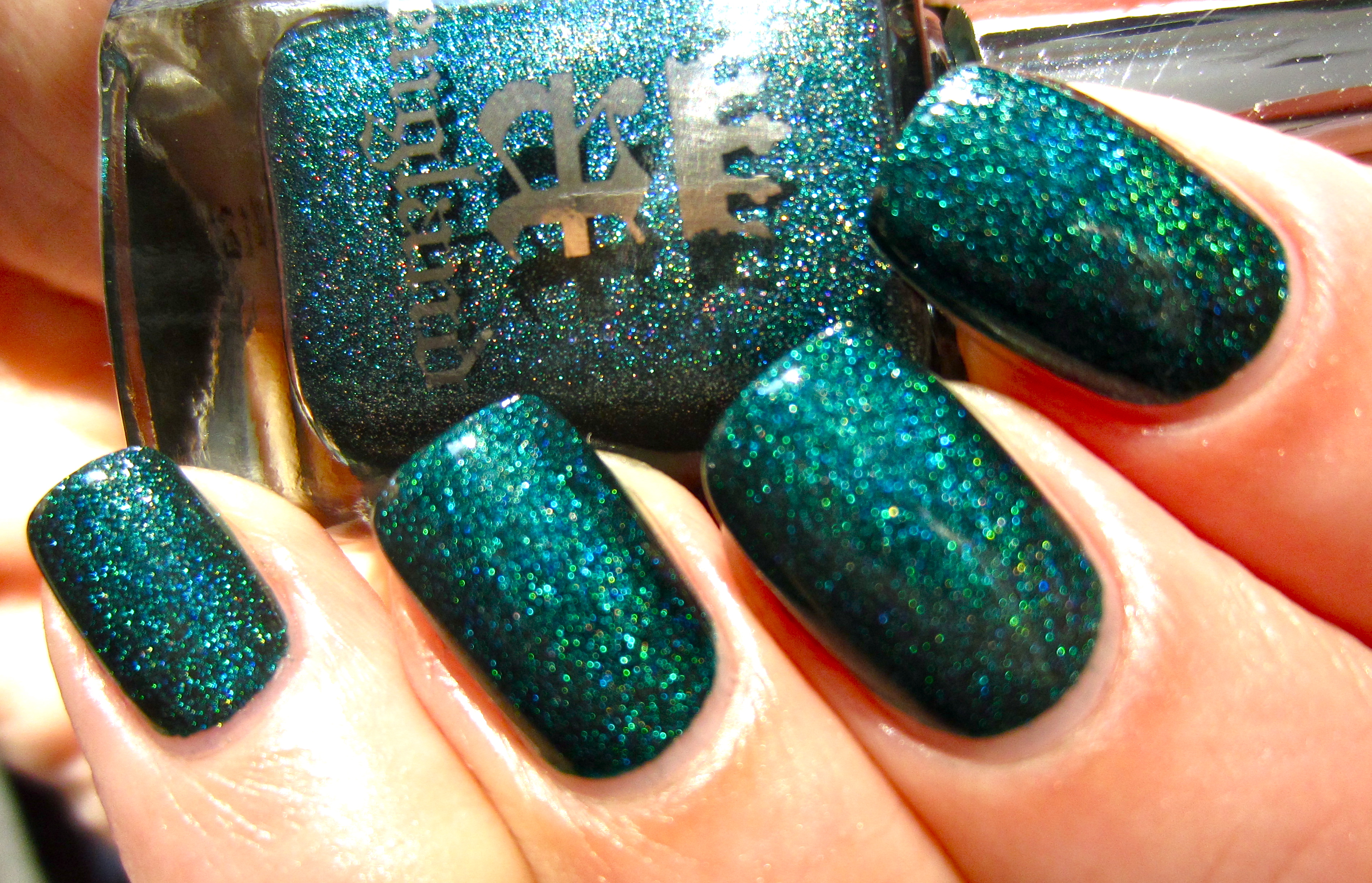
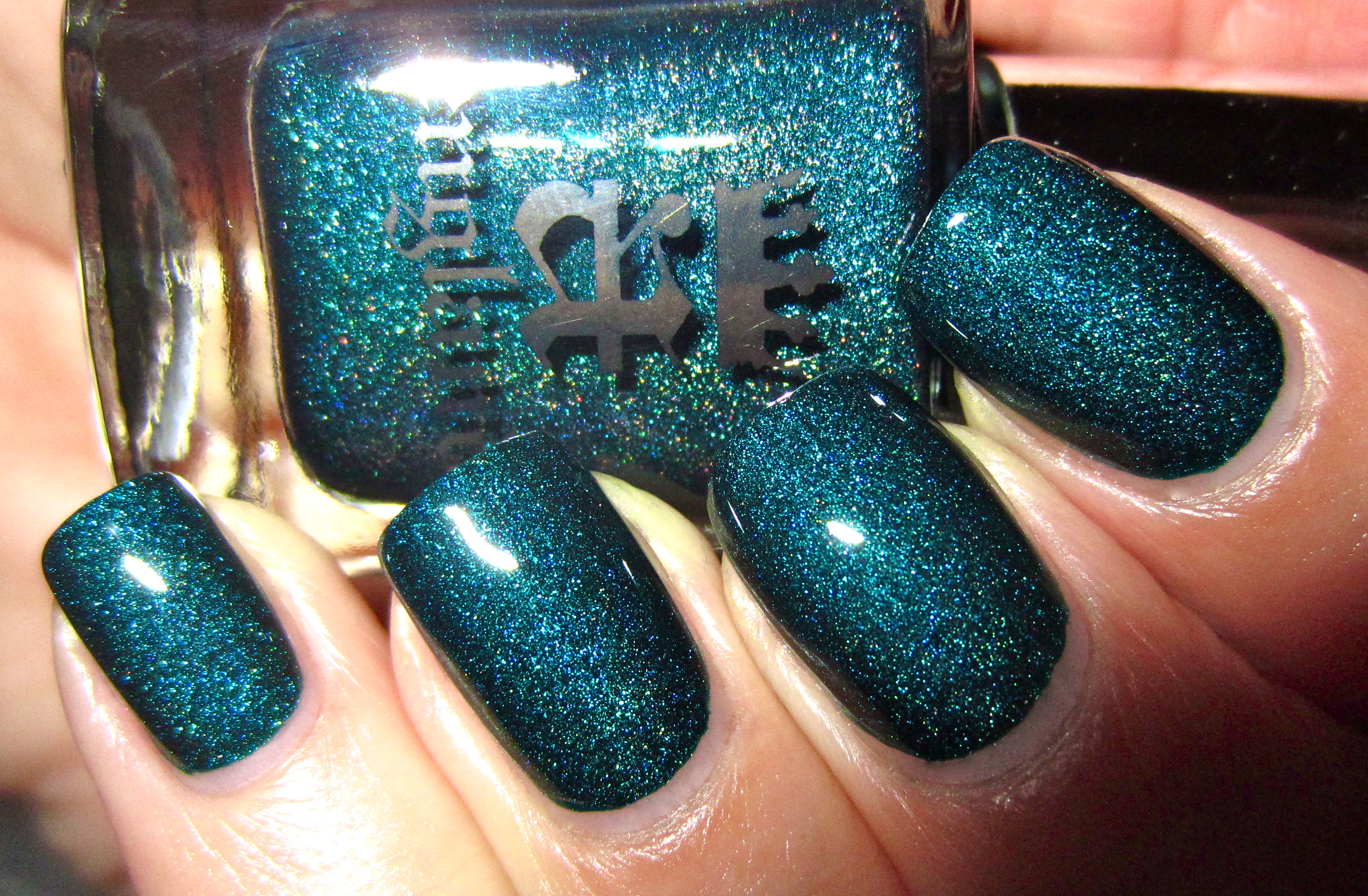
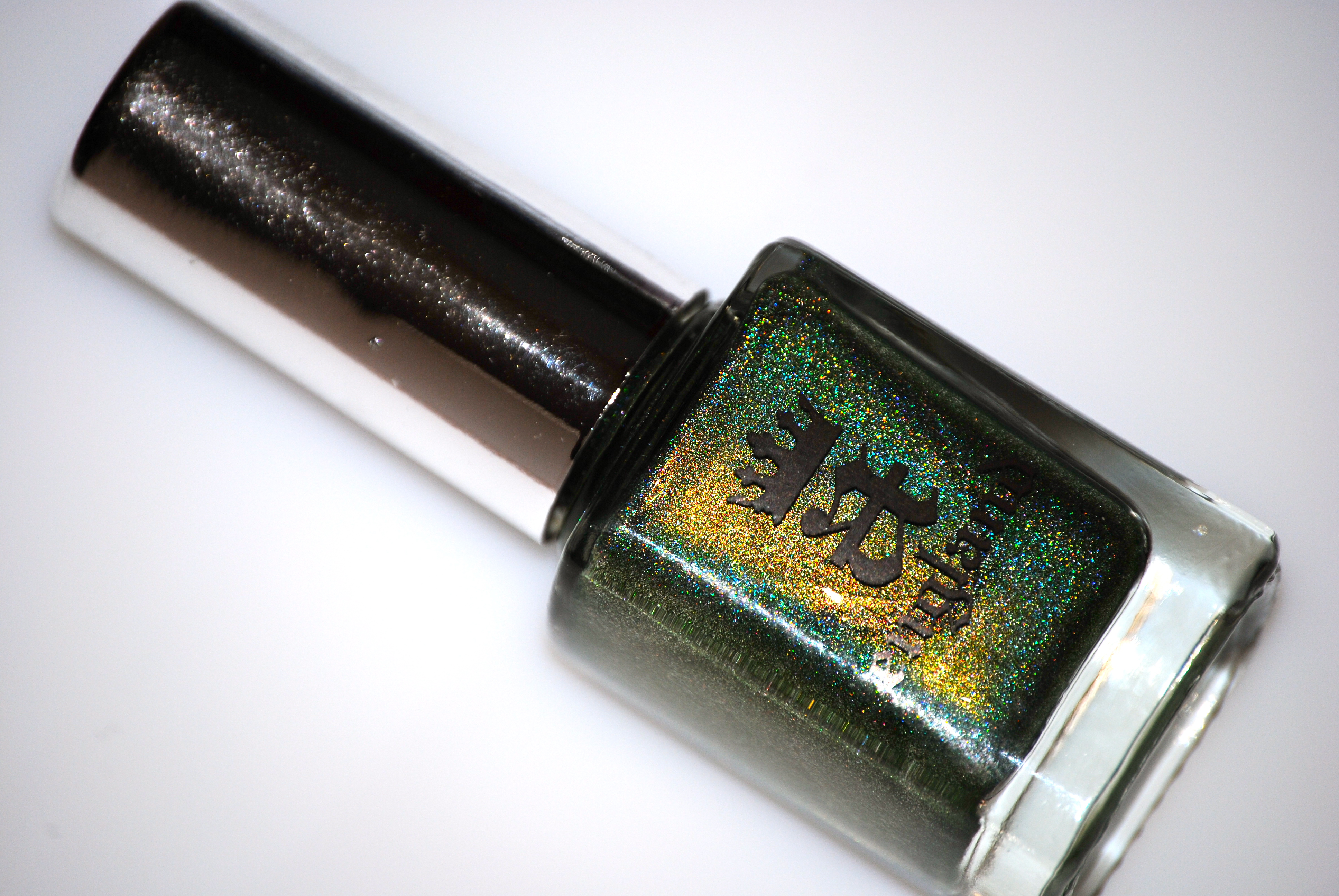
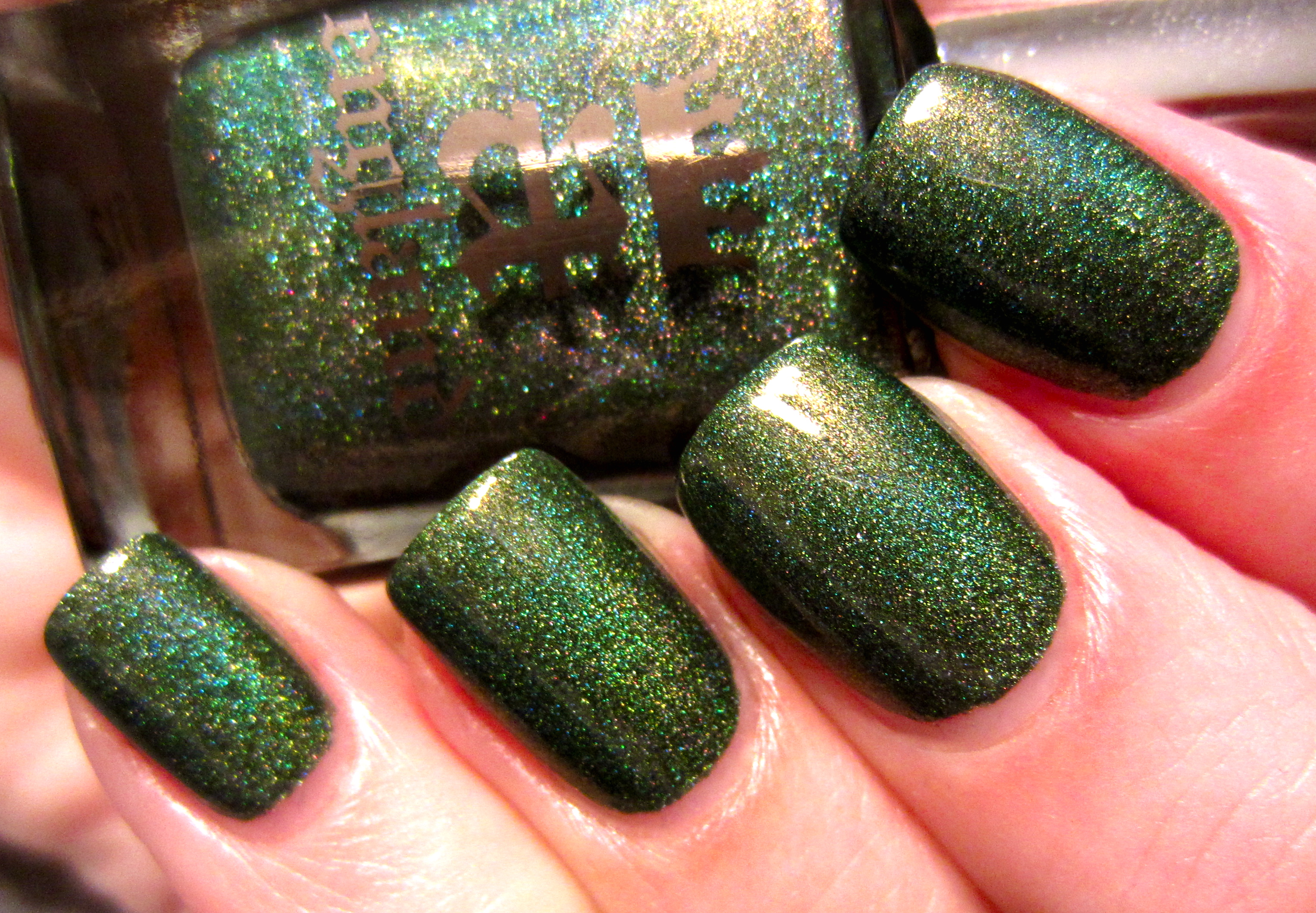
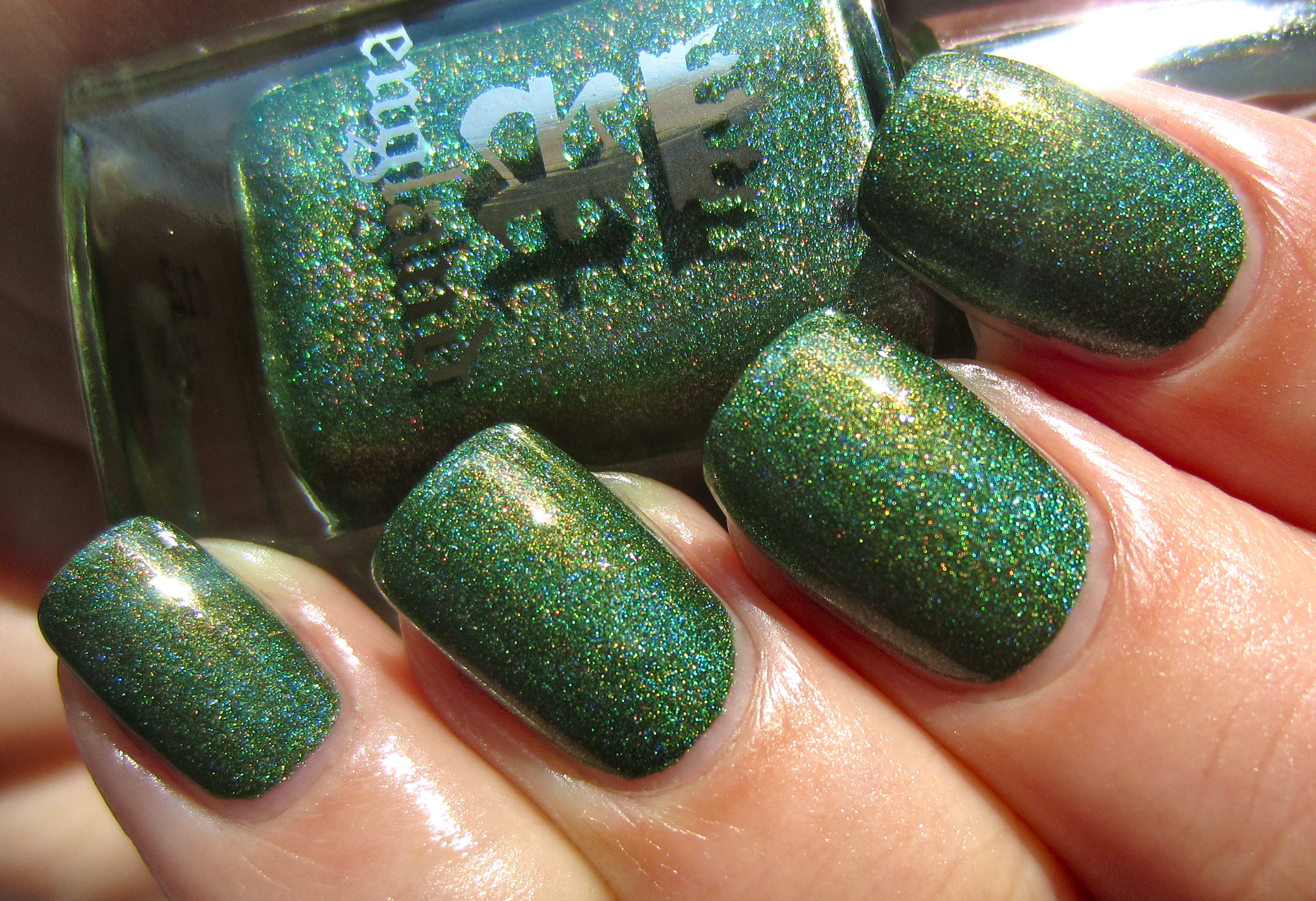
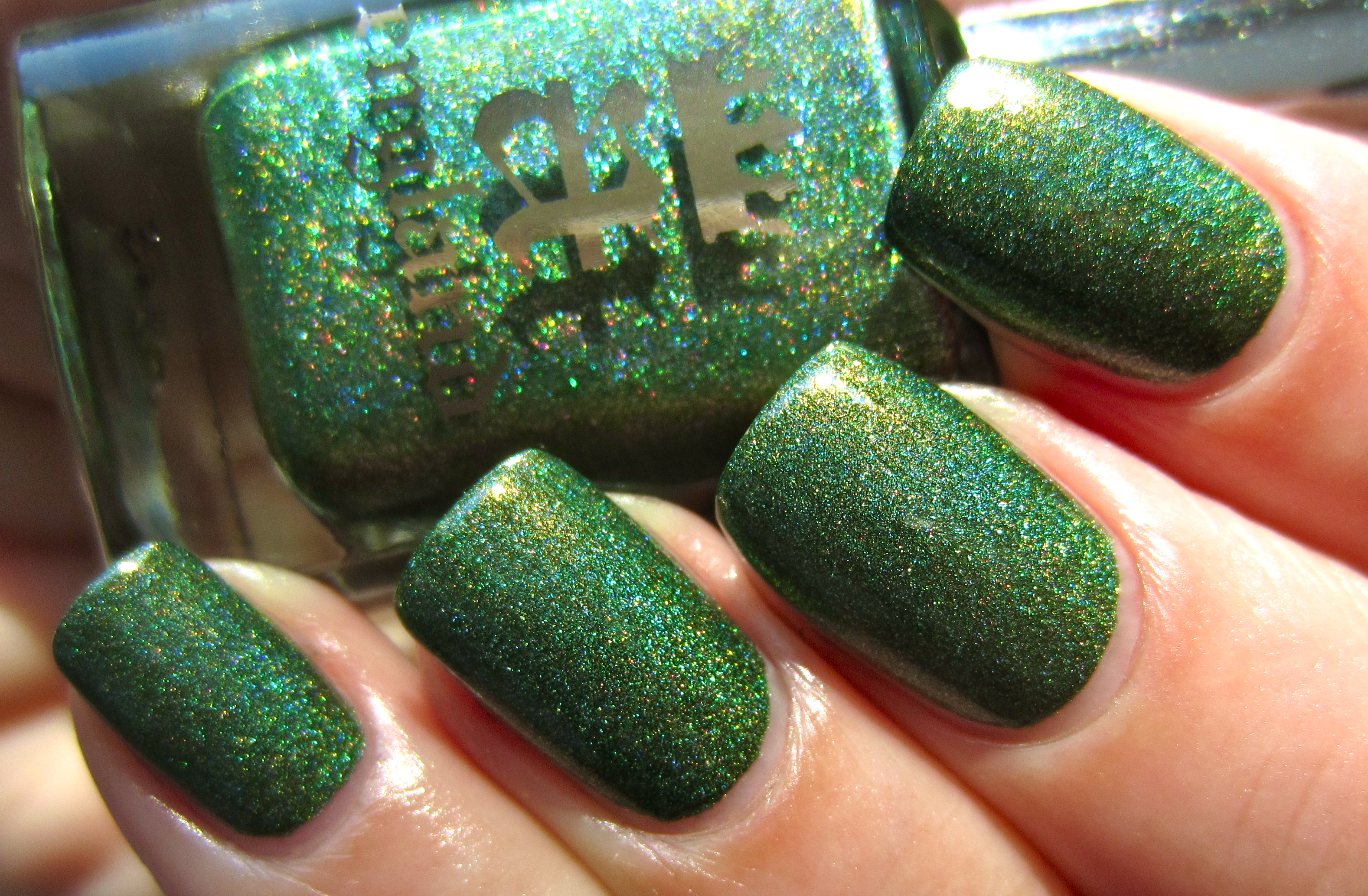
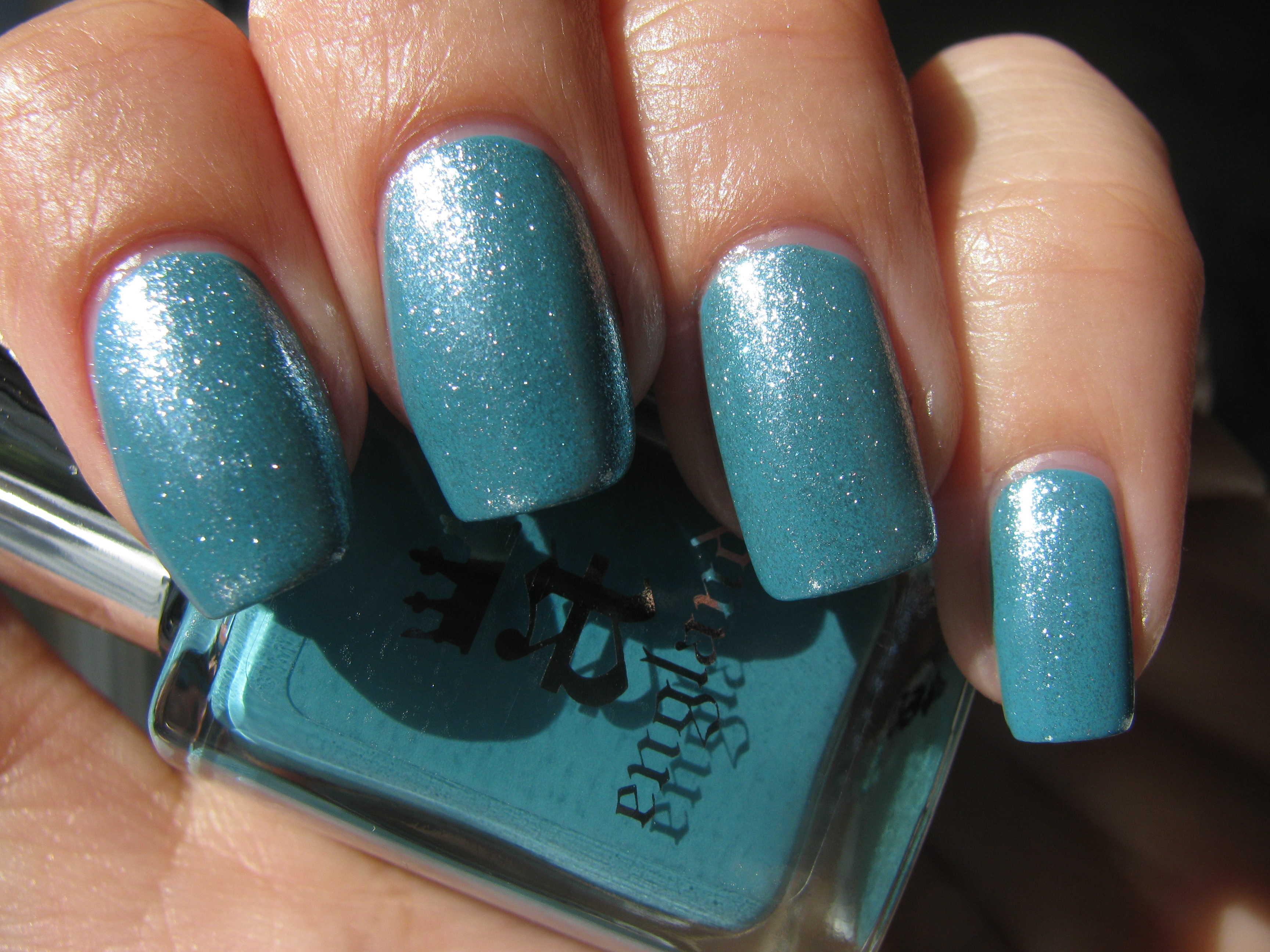
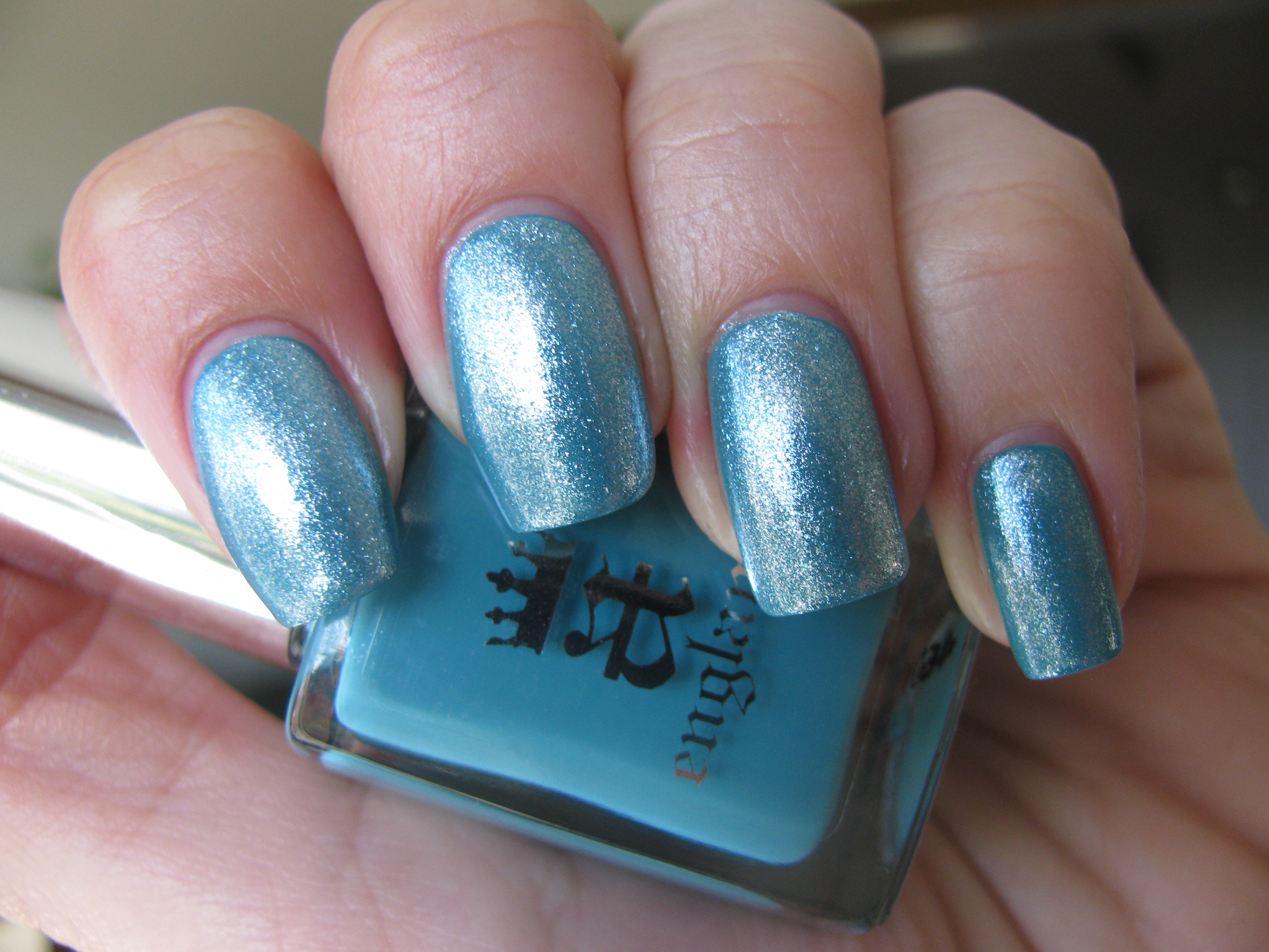
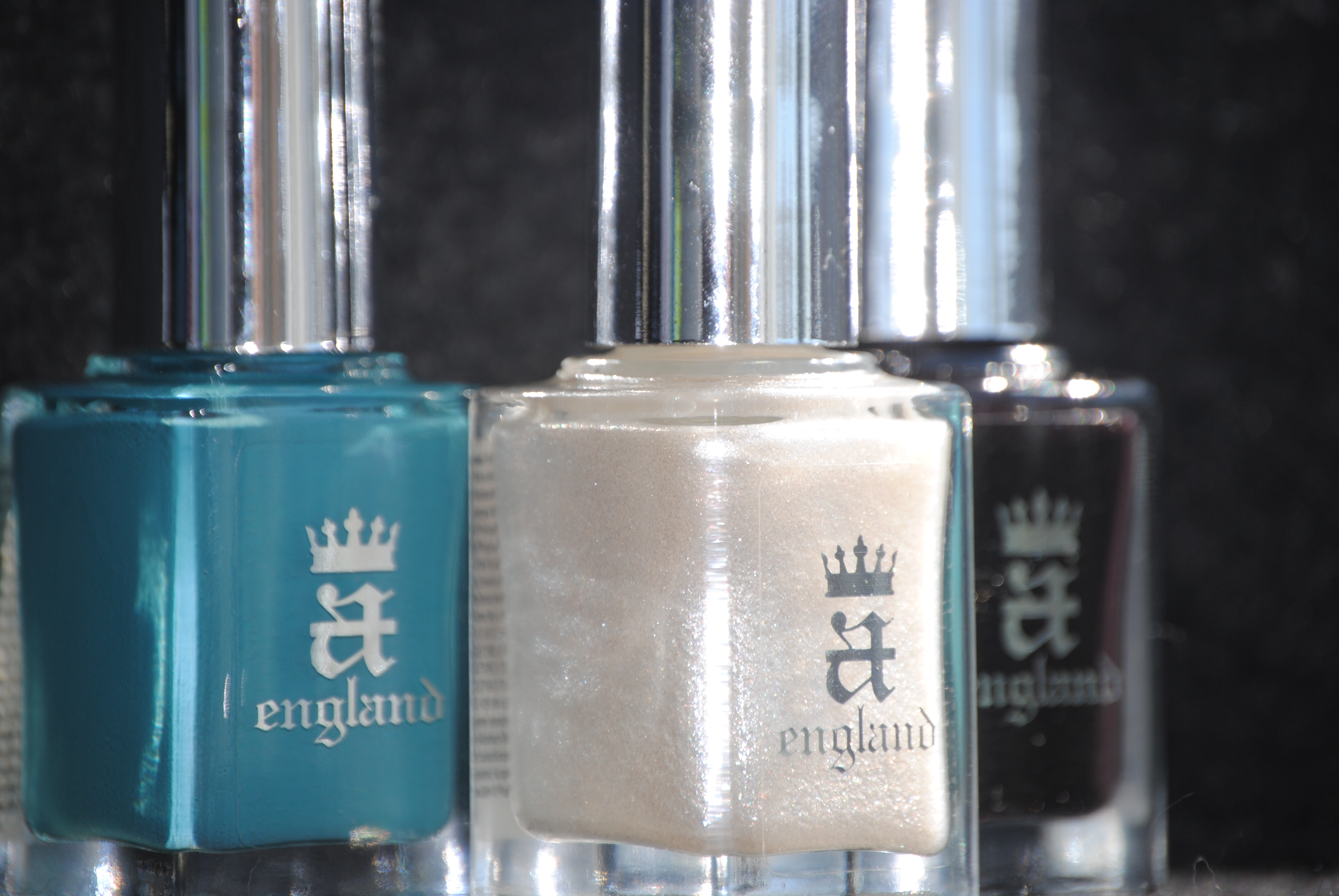
‘Saint George’ is teal perfection; a deep true melange of blue and green, it bears ultra-fine scattered holographic particles throughout which cast various golden glints in the light. Much like the saint himself and his valiant heart, this shade seems to literally glow with an inner fire. The formula was utterly sublime, flowing exceptionally well and being intensely colour saturated – almost a one-coater if applied thickly enough, with a wonderful self-levelling finish and beautiful glossy shine at the end. I was pleased to note that with a lacquer as pigmented as this, that there was basically no staining left behind, although I would definitely recommend that you do not skip the base coat.
Sunlight displays every nuance of this shade, in all its profound depth.
A closeup photo reveals the beautiful interplay of ‘Saint George’s’ various hues.
While slightly subdued, even indoor lighting cannot tamp down this shade’s viridian beauty.
Seen in a darker light, indoors.
A deliberately blurred photo, in order to emphasize each and every colour.
A final view taken with flash, continues to impress by spotlighting the intensity of ‘Saint George’.
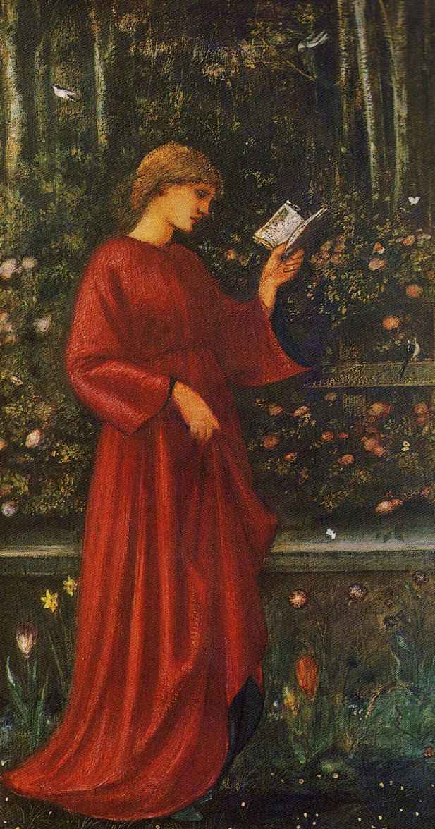
– Princess Sabra (The King’s Daughter) by Edward Burne-Jones (1865-66)
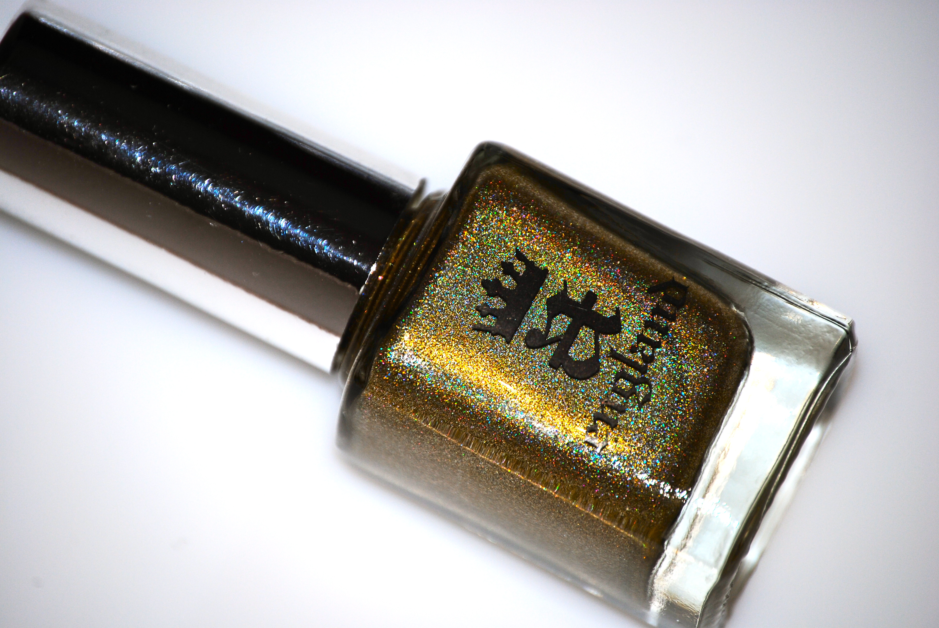
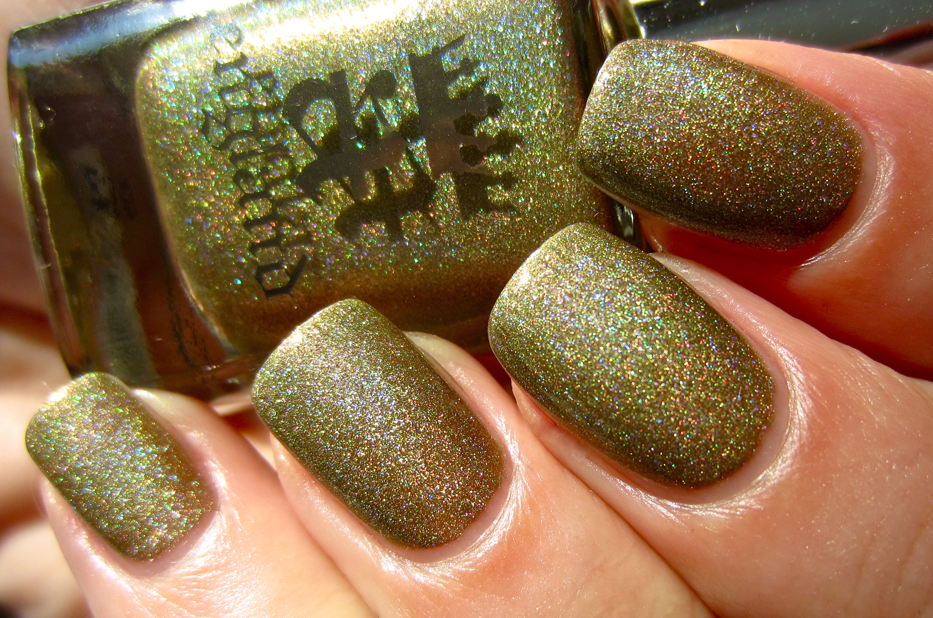
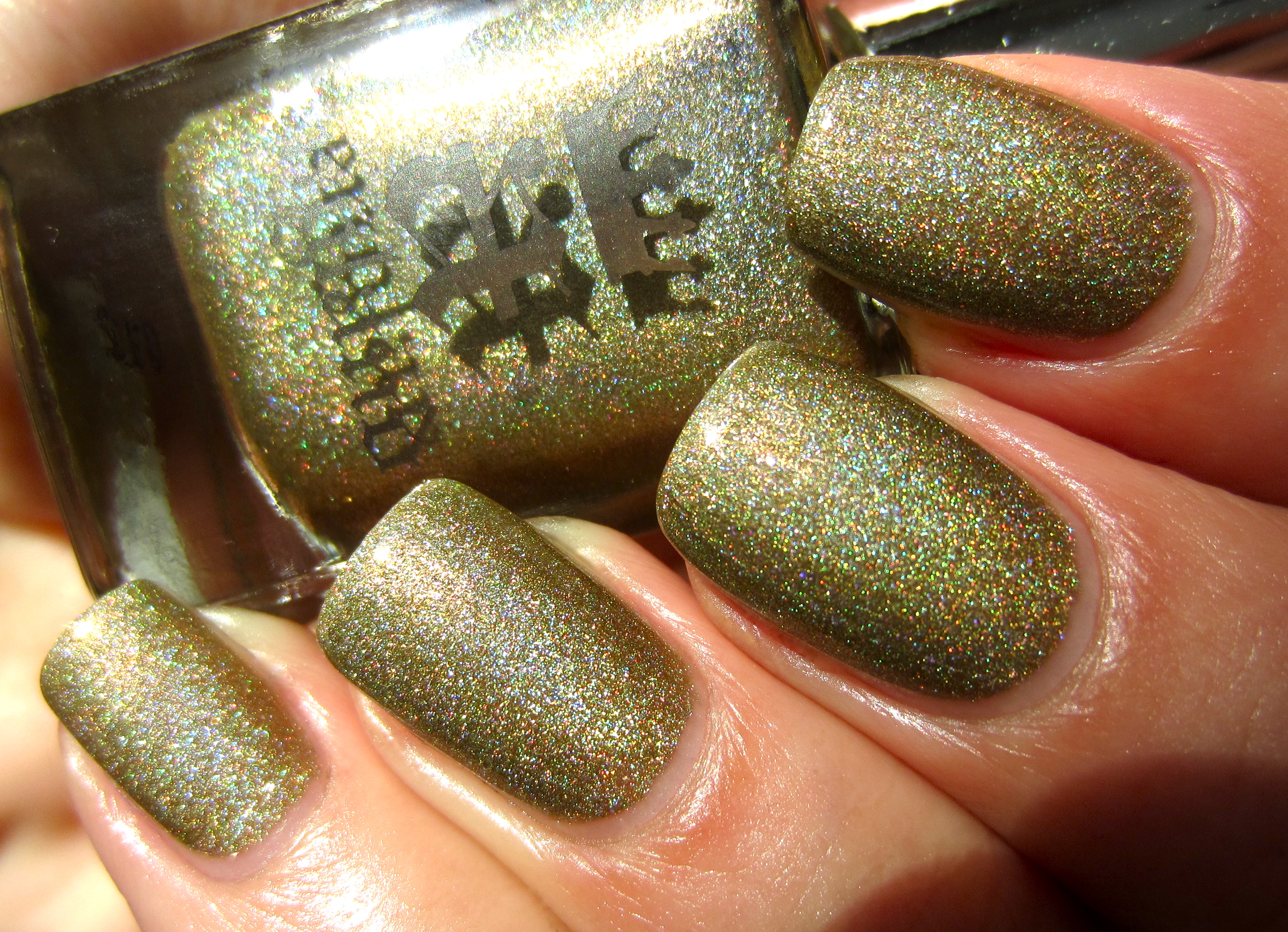
‘Princess Sabra’ (‘Tristam Eyes’ – in homage to Adina’s incredibly handsome & regal cat!), is everything you want a pale gold-leaning shade to be – giving a nod to its royal pedigree, as well as also bearing an exceptional scattered holographic effect to add to its richness. With olive undercurrents at its base and glints of green, pink & pale blue shimmering within, the formula once more was a dream to work with, applying completely self-levelling and remaining quite glossy at the finish. It must be noted that each and every one of these shades was utterly smooth to the touch when dry, and removal was incredibly easy as well.
Sunlight shows off every stunning facet of this shade, fairly thrumming with life.
A second view in sunlight, emphasizing a slightly deeper tone.
A closeup photo displays ‘Princess Sabra’s’ intricate dance of each colour.
Seen indoors, more of the antique gold tone is visible, but with still visible glints of the other hues.
A deliberately blurred photo, in order to emphasize each and every colour.
A final view taken with flash highlights the burnished beauty of ‘Princess Sabra’, and reveals her inner complex nature.
– Dragon Head by Bob Eggleton
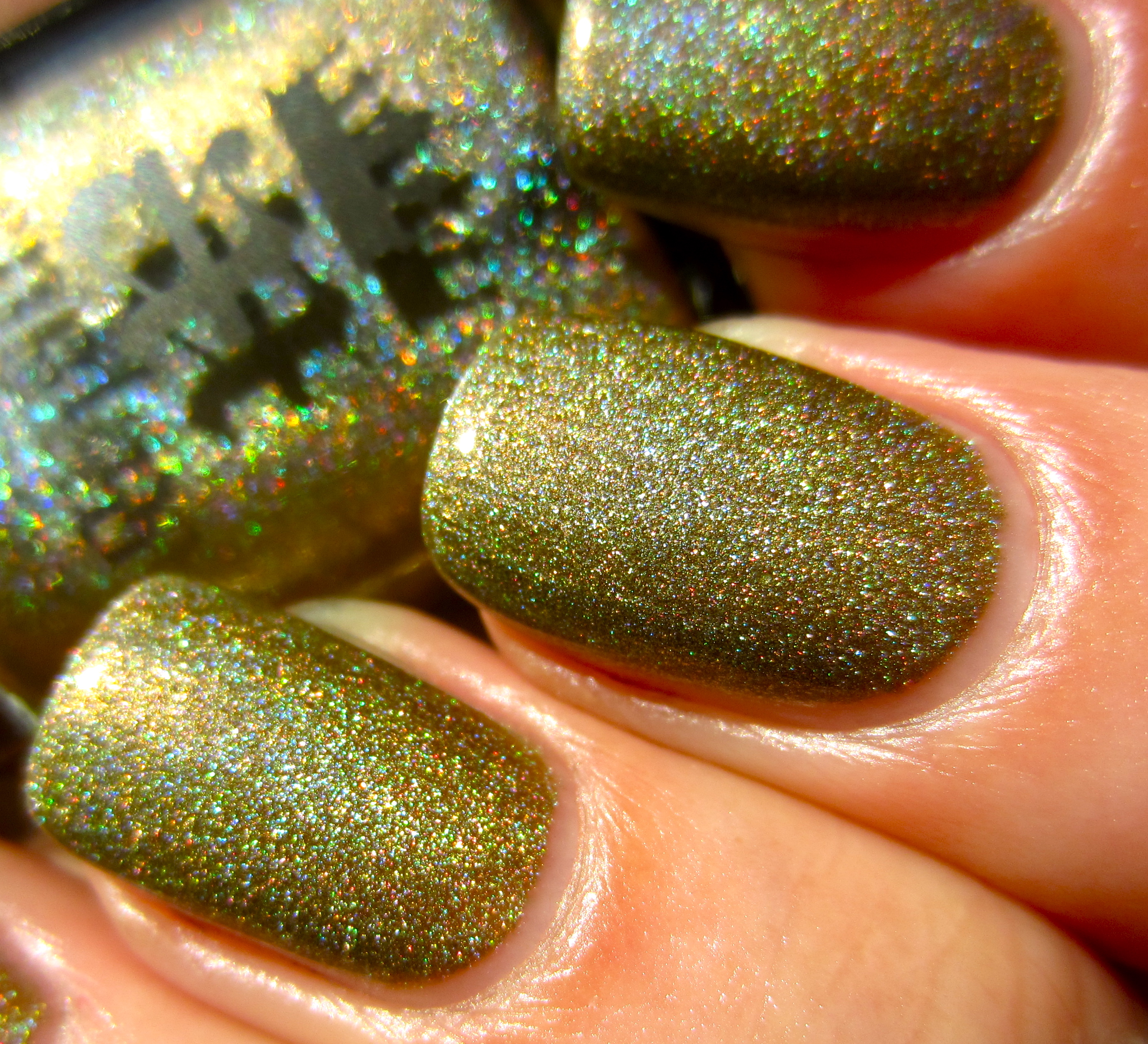
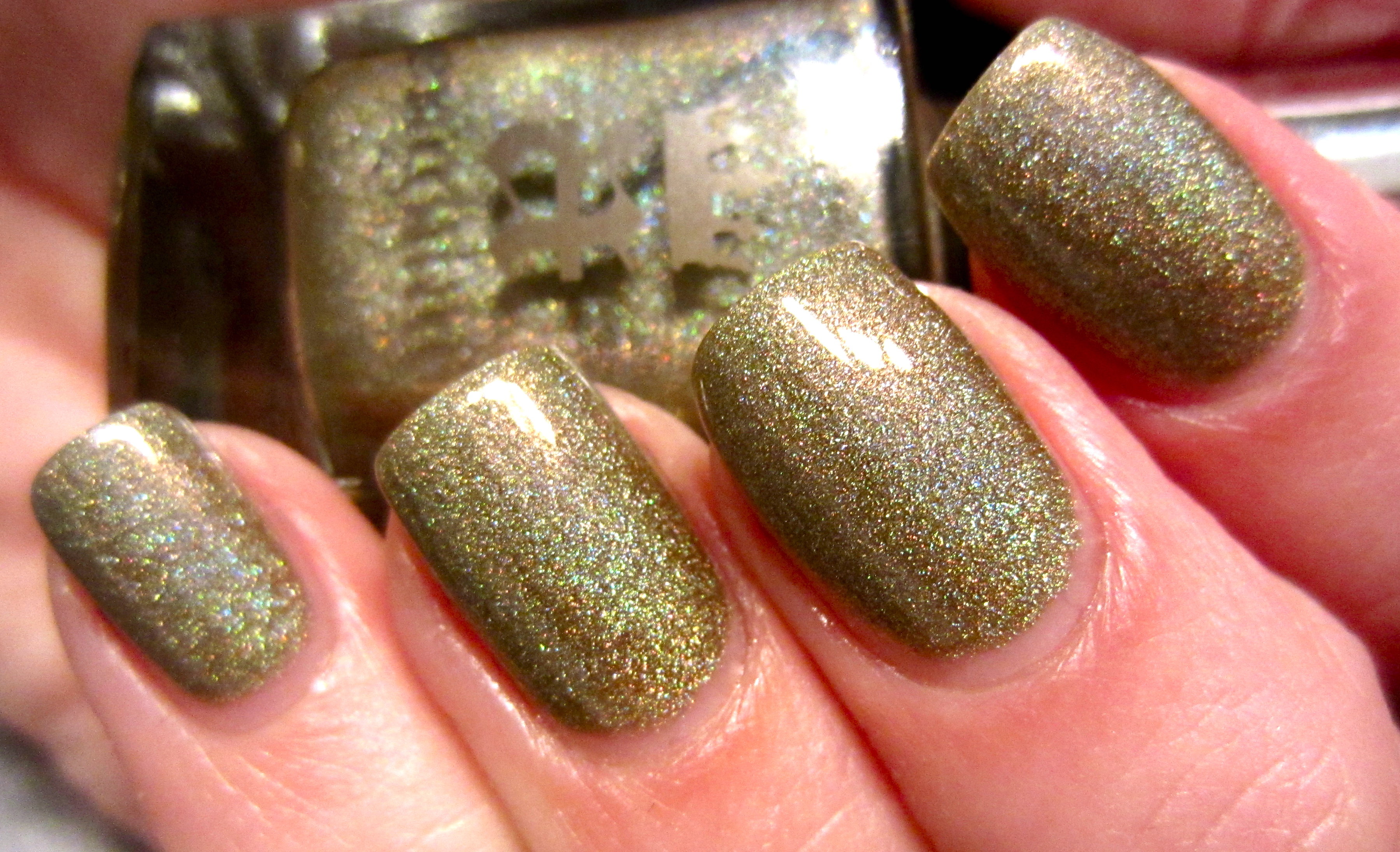
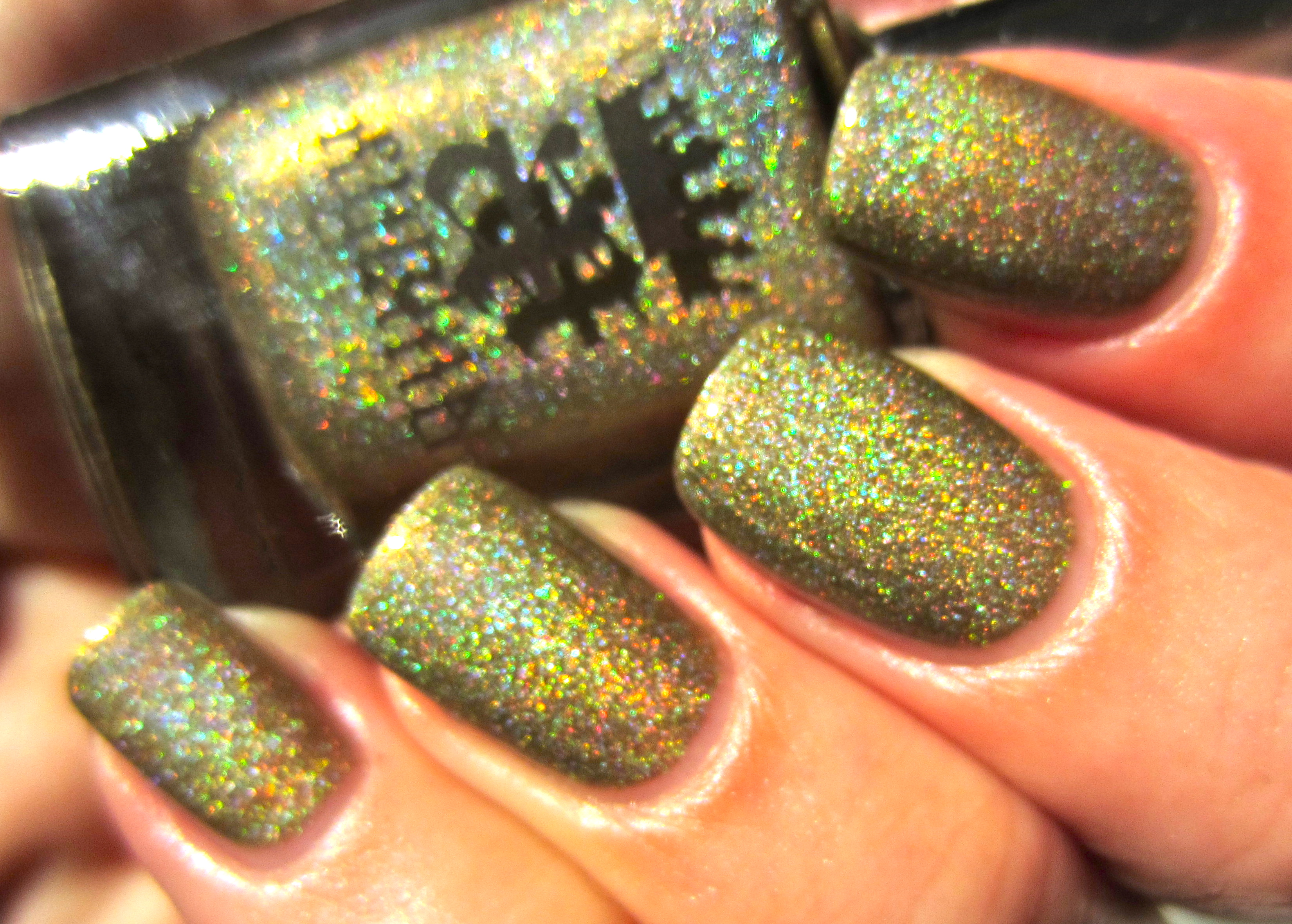
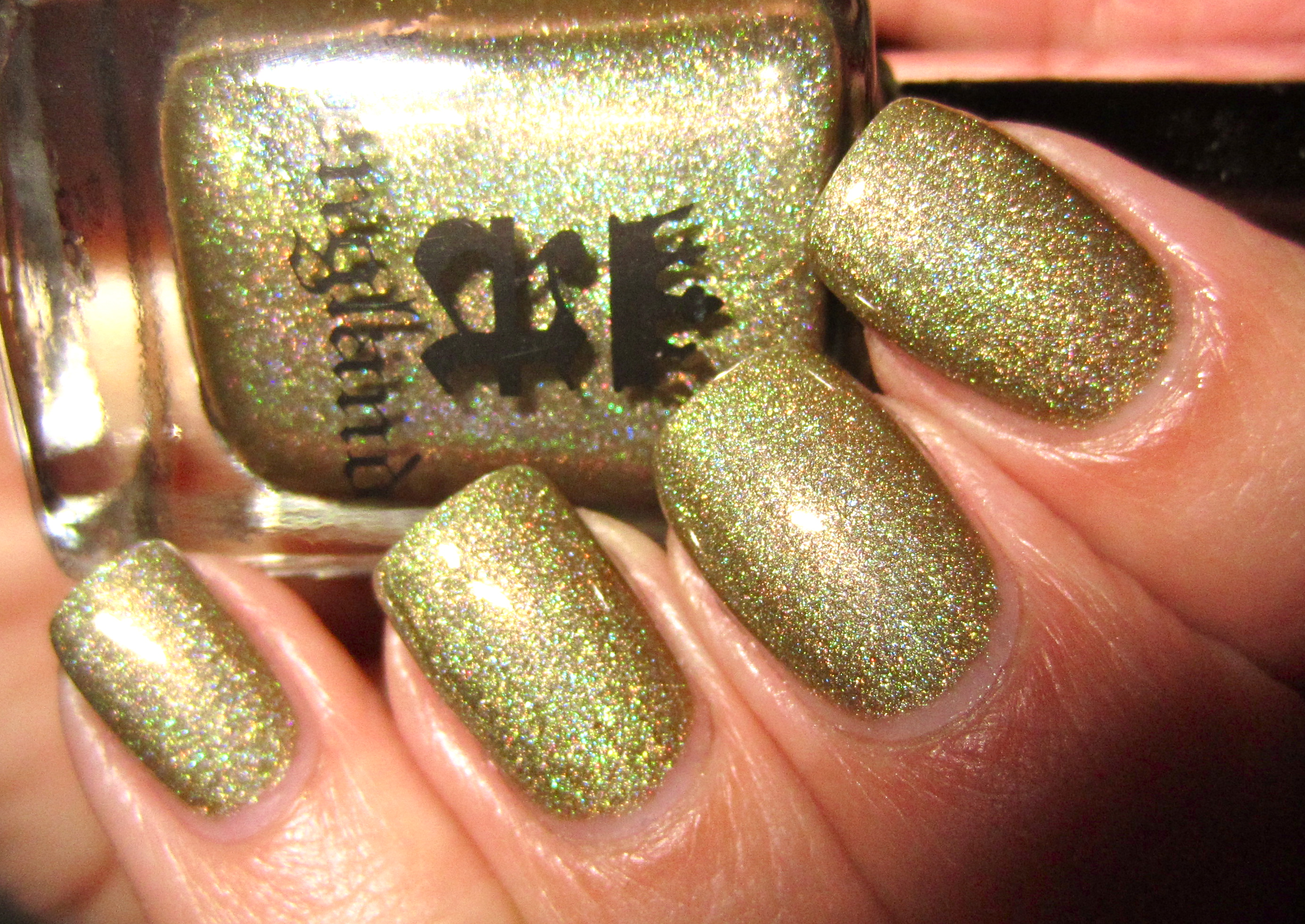
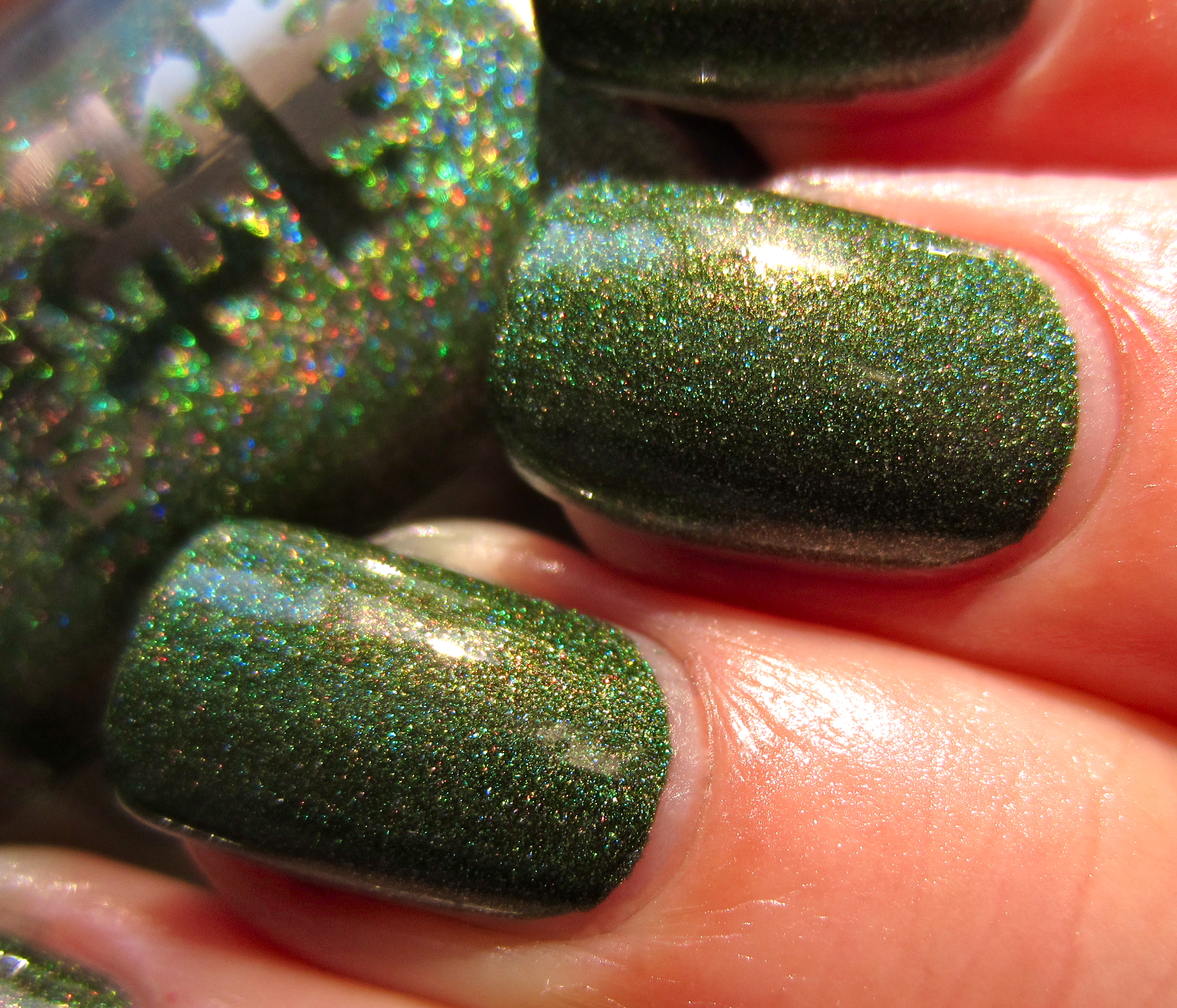
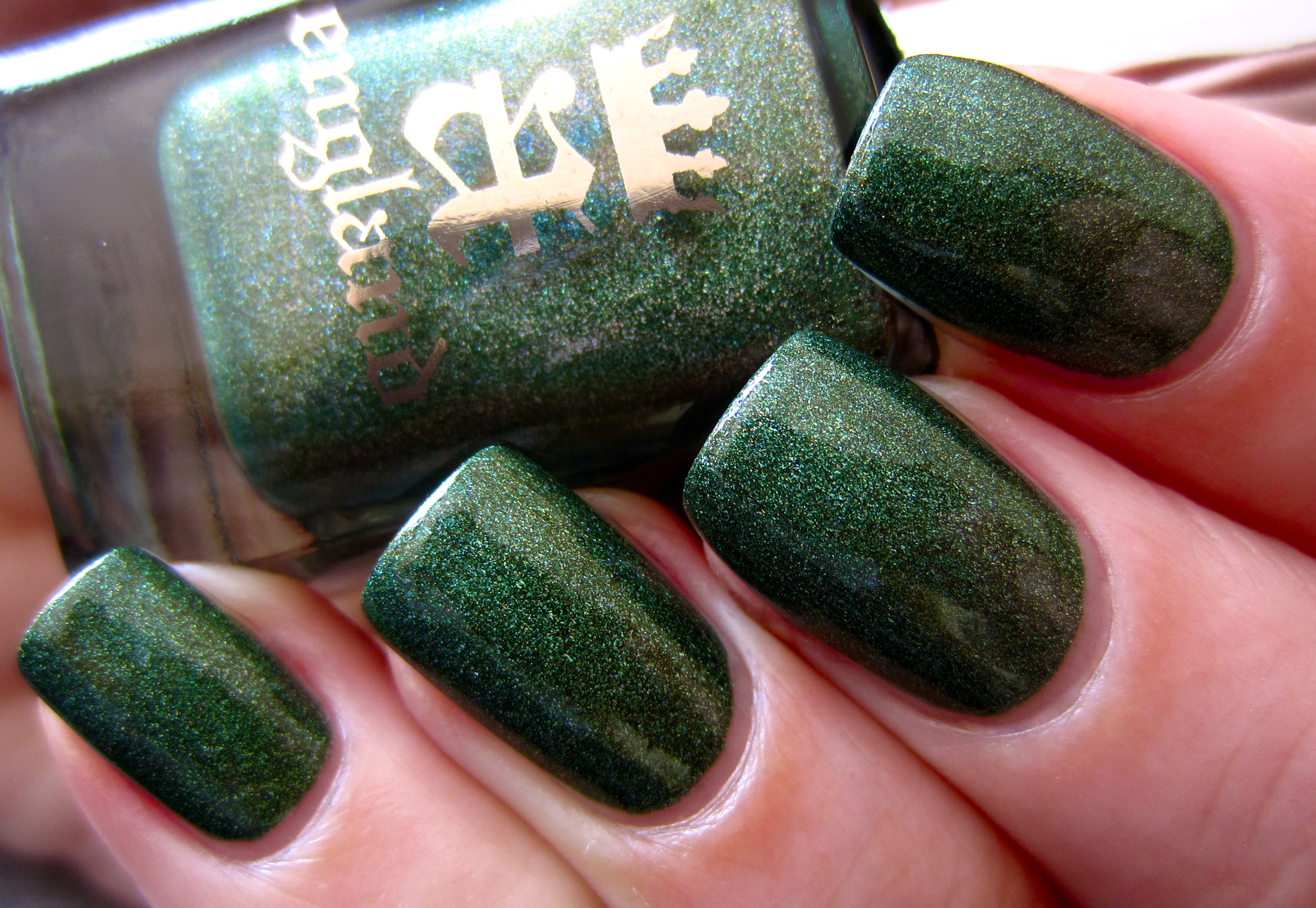
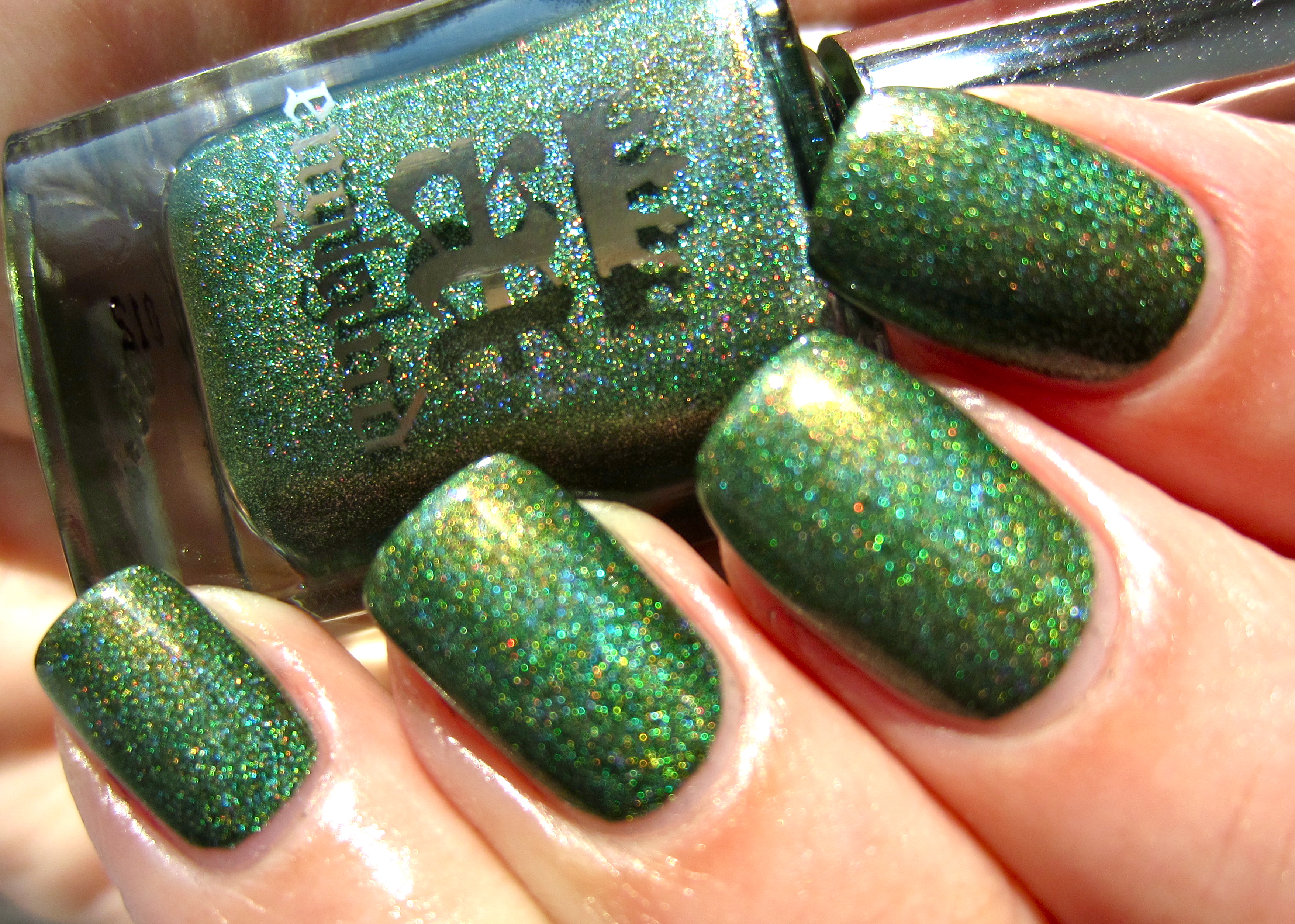
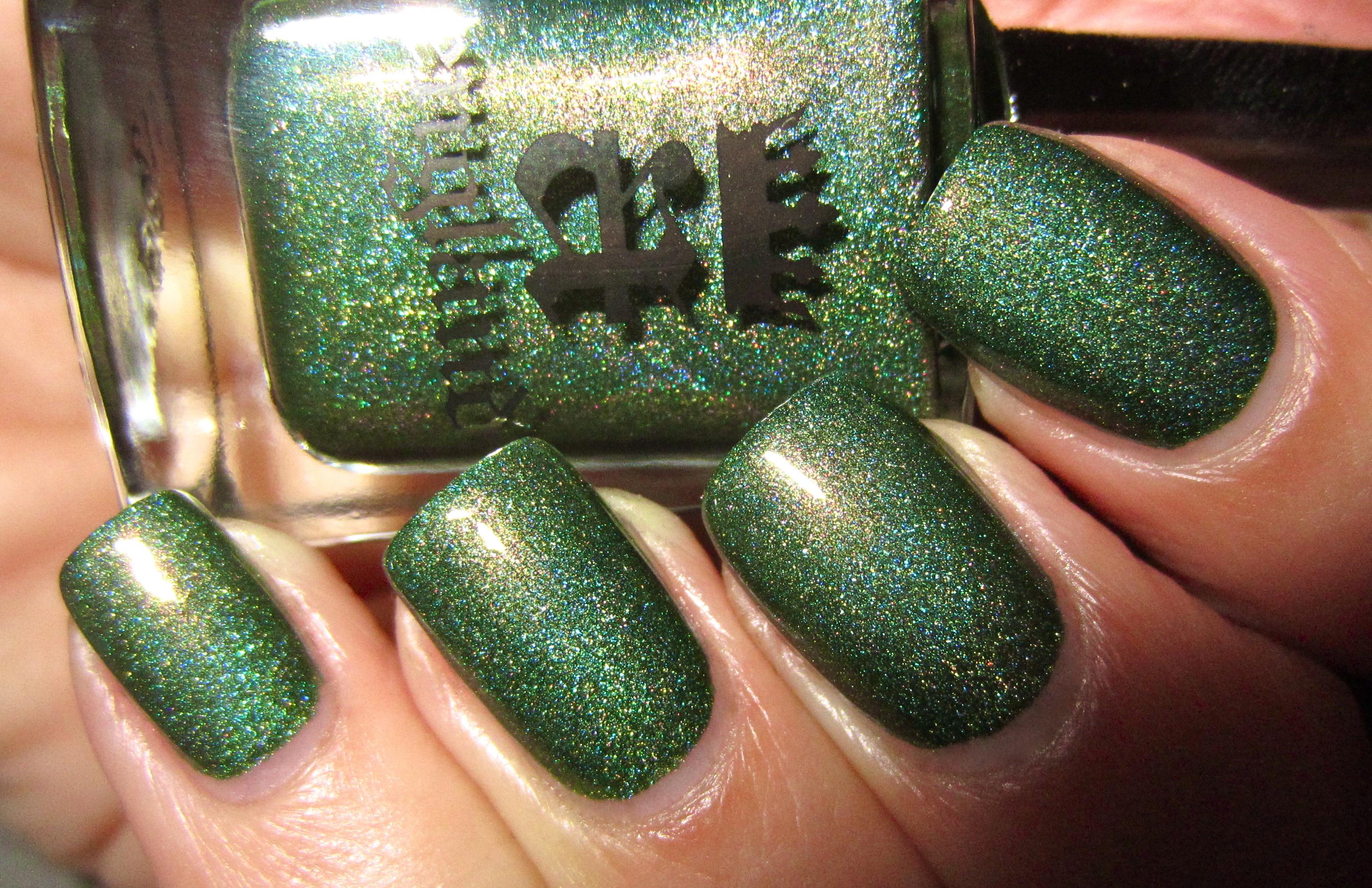
‘Dragon’, a luxuriant verdant green hue with an incredibly fine holographic mix, sends off deep bronze-like flashes in the light, much like the scales of a dragon would as he basks in the sun’s warmth. The formula was beyond superb, applying so easily and being densely pigmented enough to pass for a one-coater, if desired. A beautifully self-levelling surface and glass-like finish, staring into this ‘Dragon’s’ depths can be as dangerous as the beast itself … utterly mesmerizing!
This sunlight view displays a deep greener side to ‘Dragon’, with a paler core in the center that almost seems alive.
In this second sunlight view, the blue holographic particles within are clearly seen at the surface level.
A last sunlight photo highlights the true grassy-green colour of ‘Dragon’s’ base hue.
This closeup photo serves to show every delicate nuance that make up this shade.
Seen indoors, a deeper tone is achieved, but no less beautiful for its intensity.
A deliberately blurred photo, in order to emphasize each and every colour.
A final view taken with flash brings out the blue, pink and golden highlights that make up the heart of this shade.
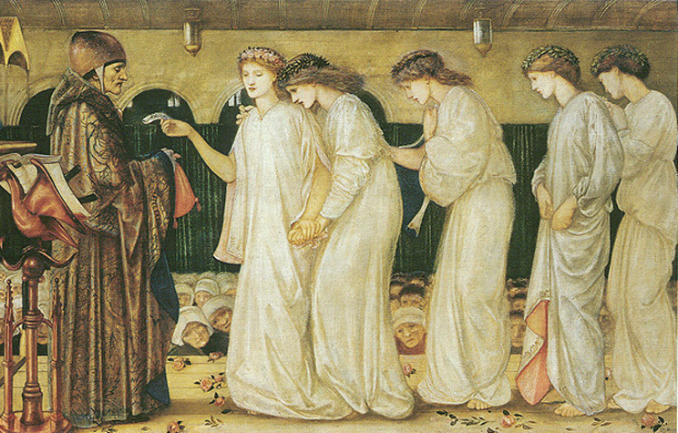
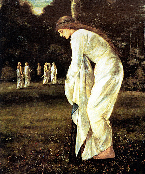
– Saint George And The Dragon Series: Princess Sabra Drawing The Lot by Edward Burne-Jones (1865-66)
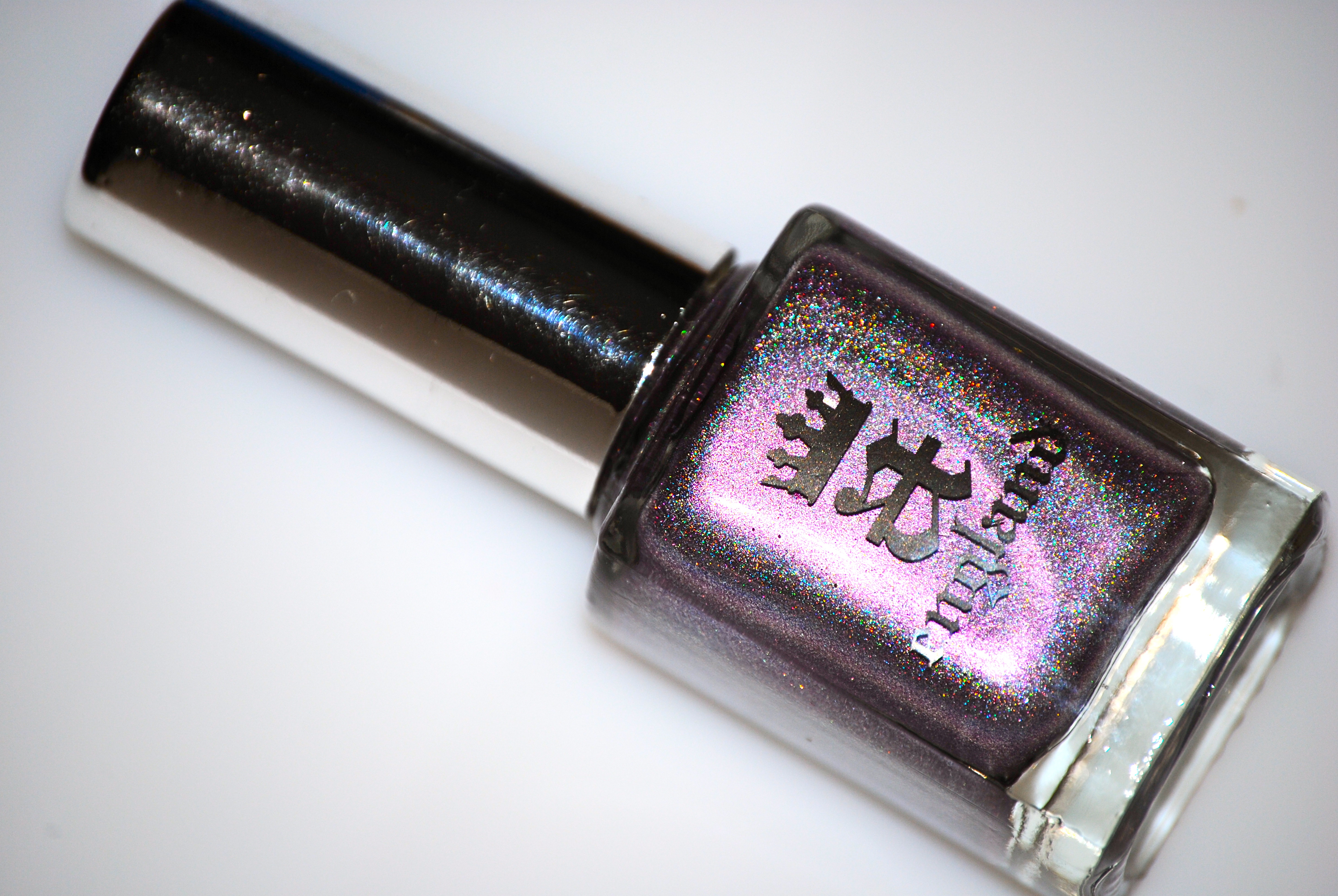
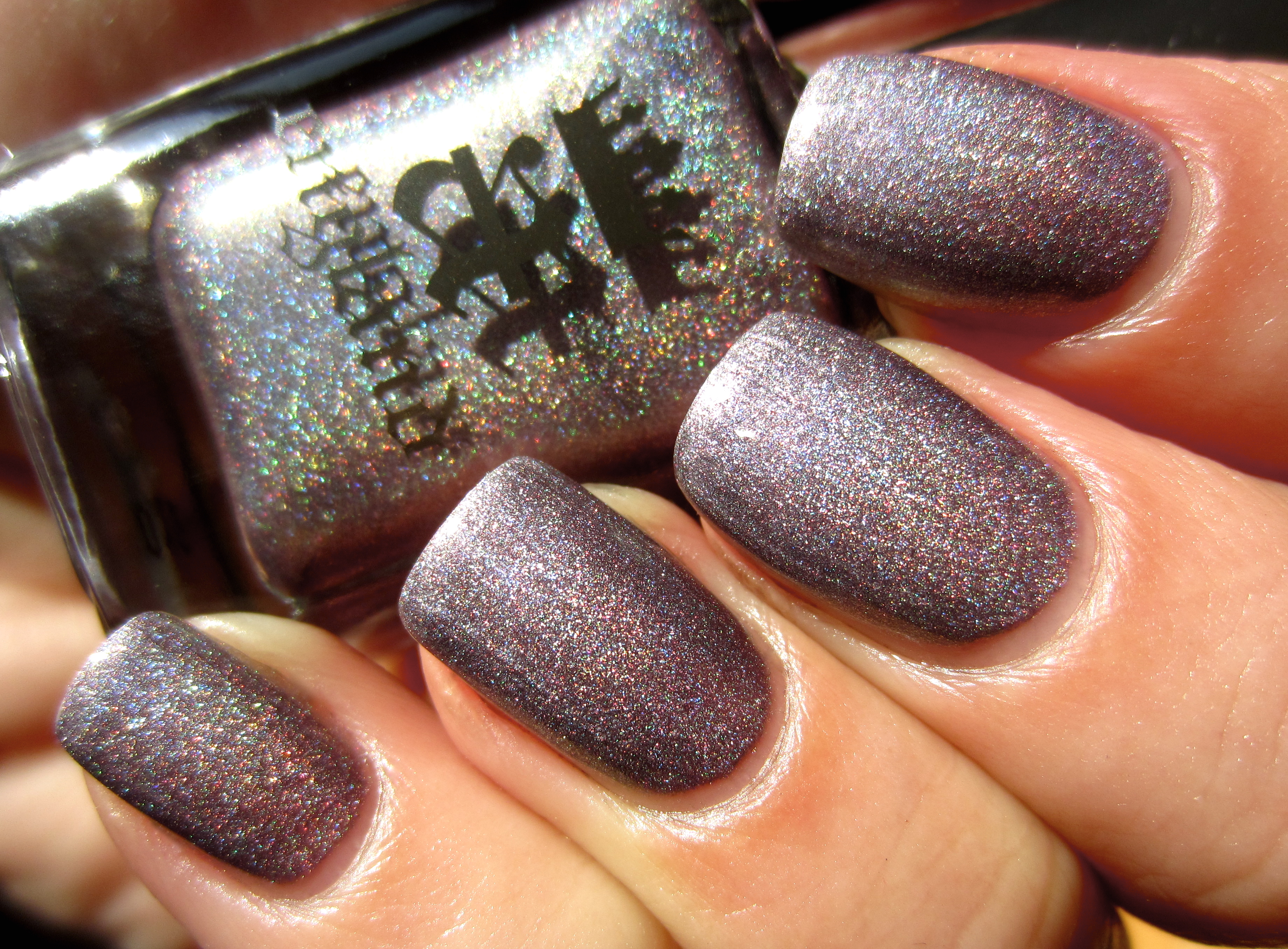
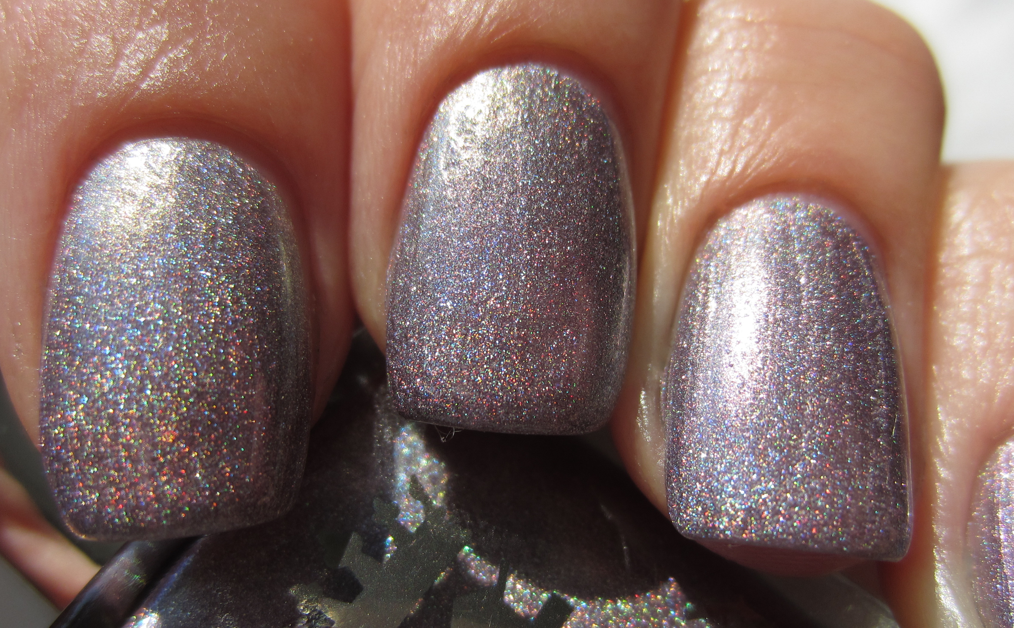
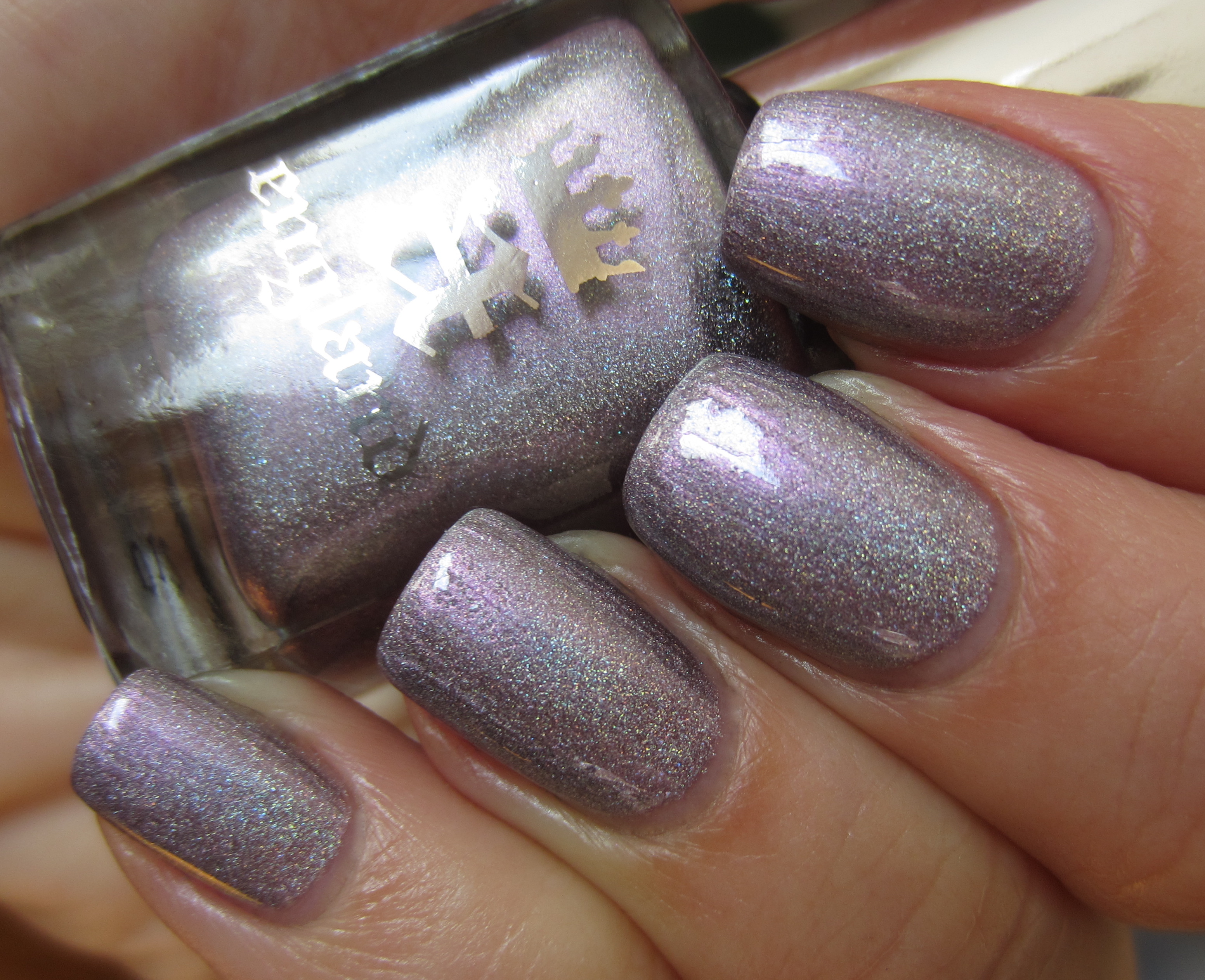
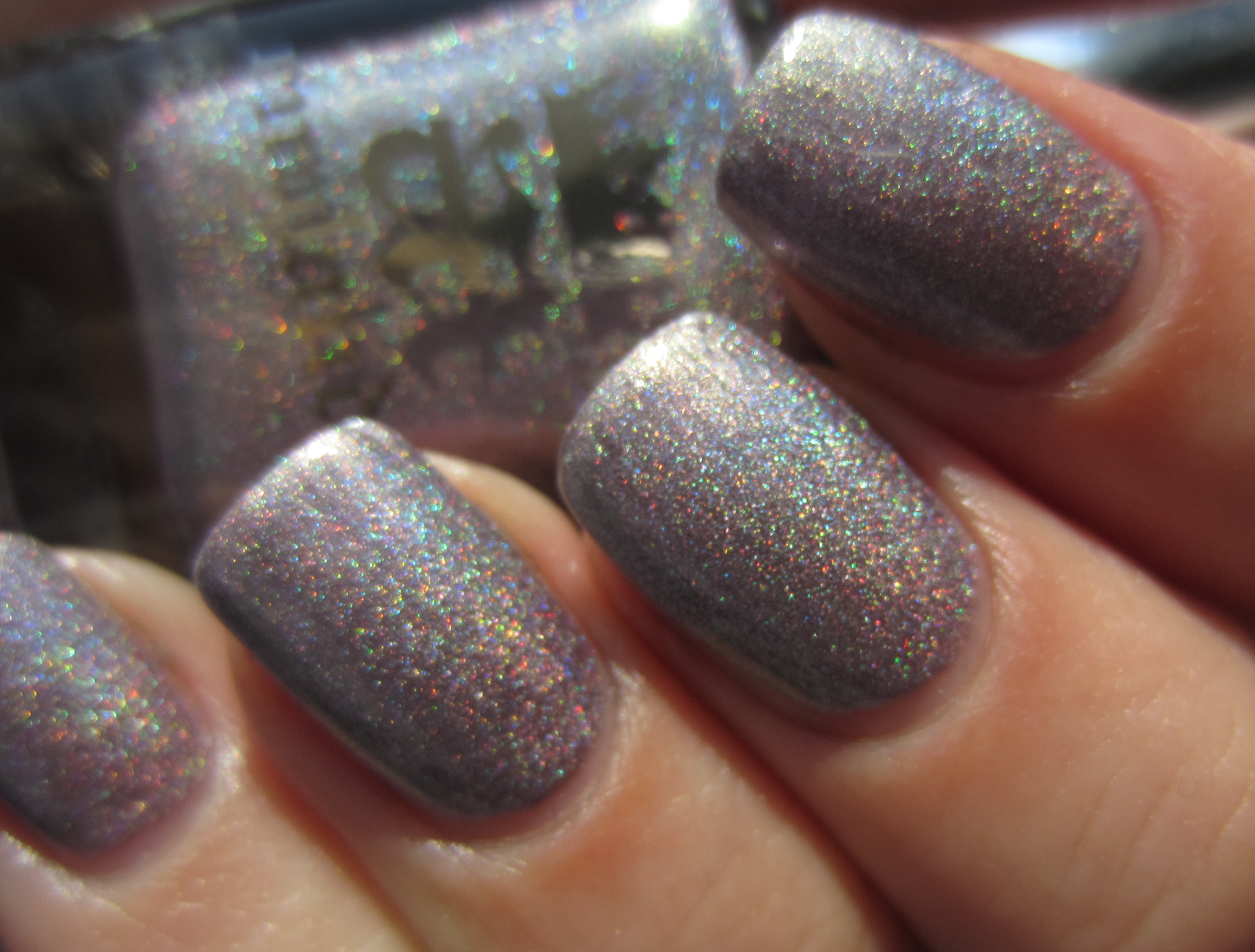
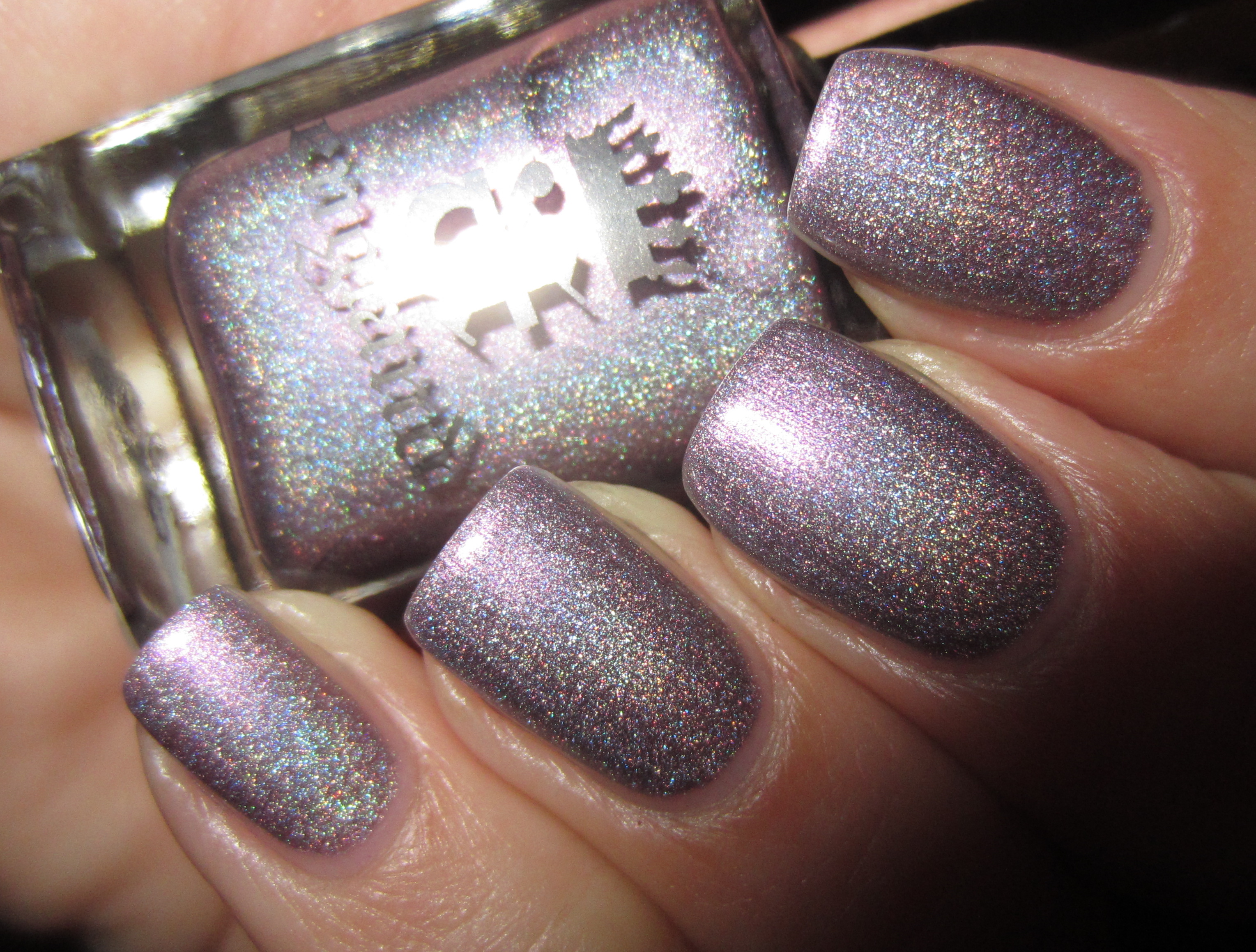
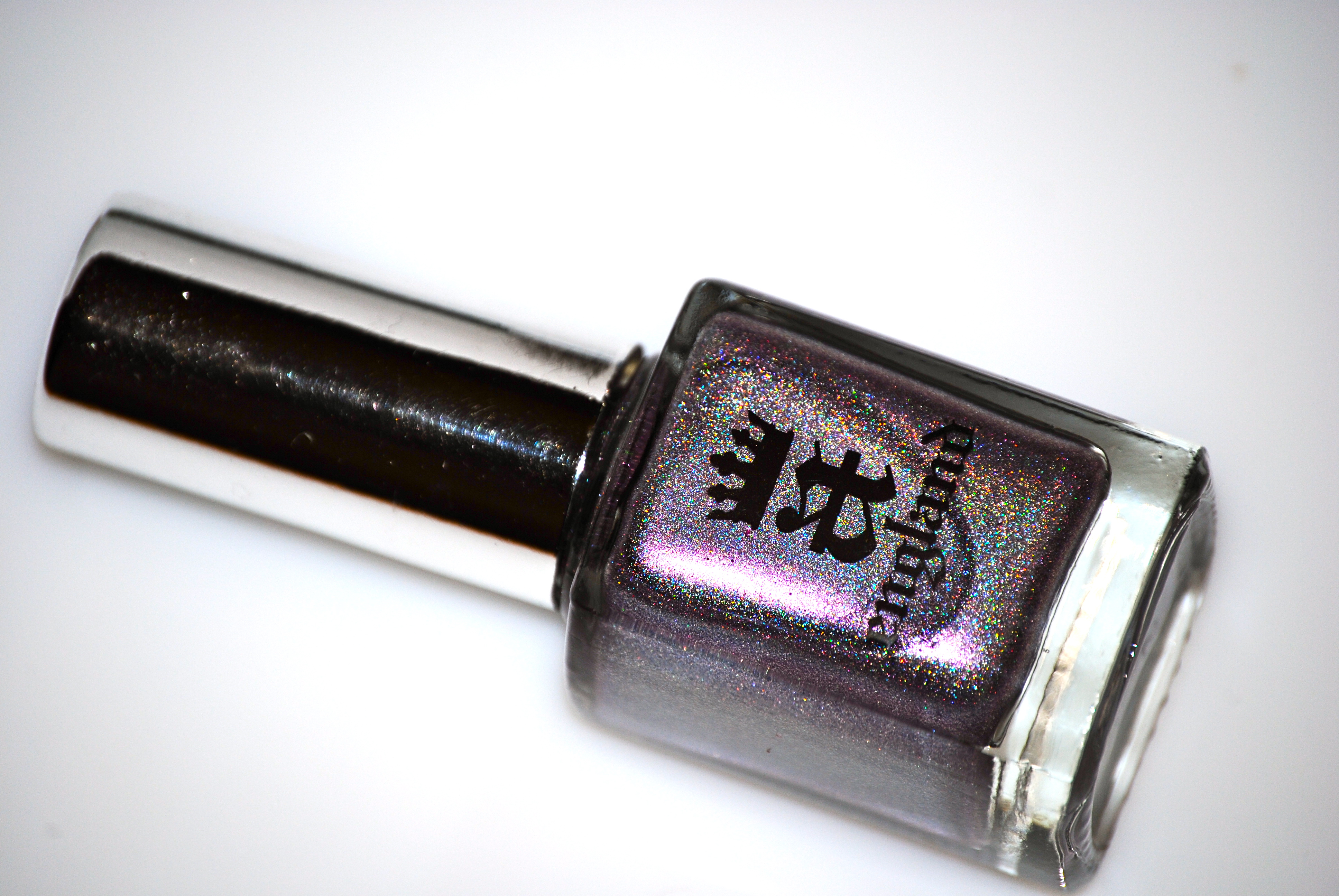
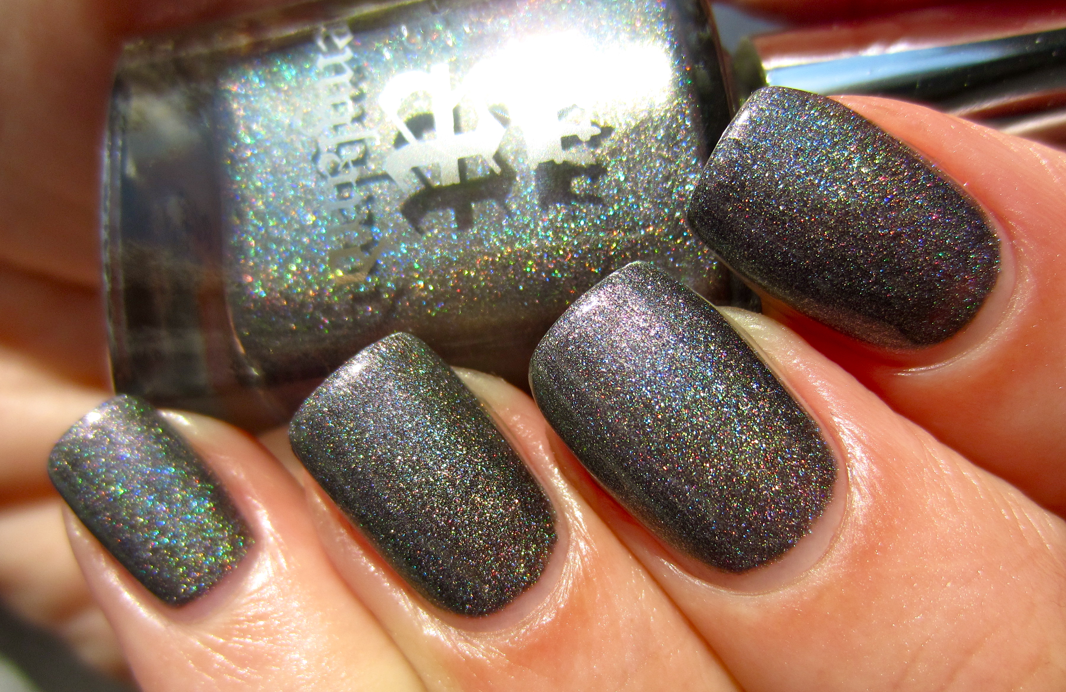
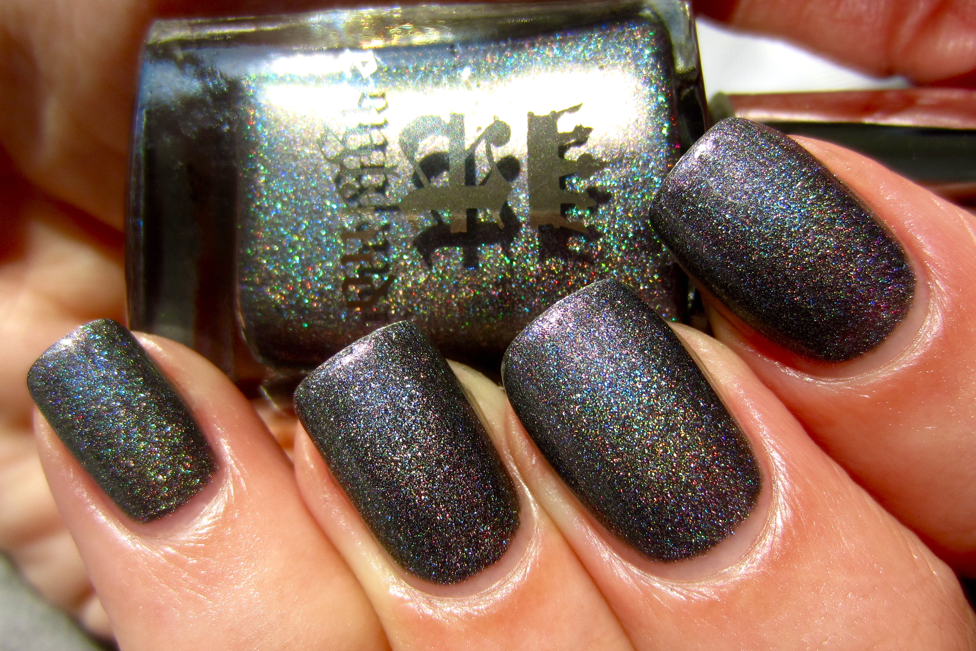
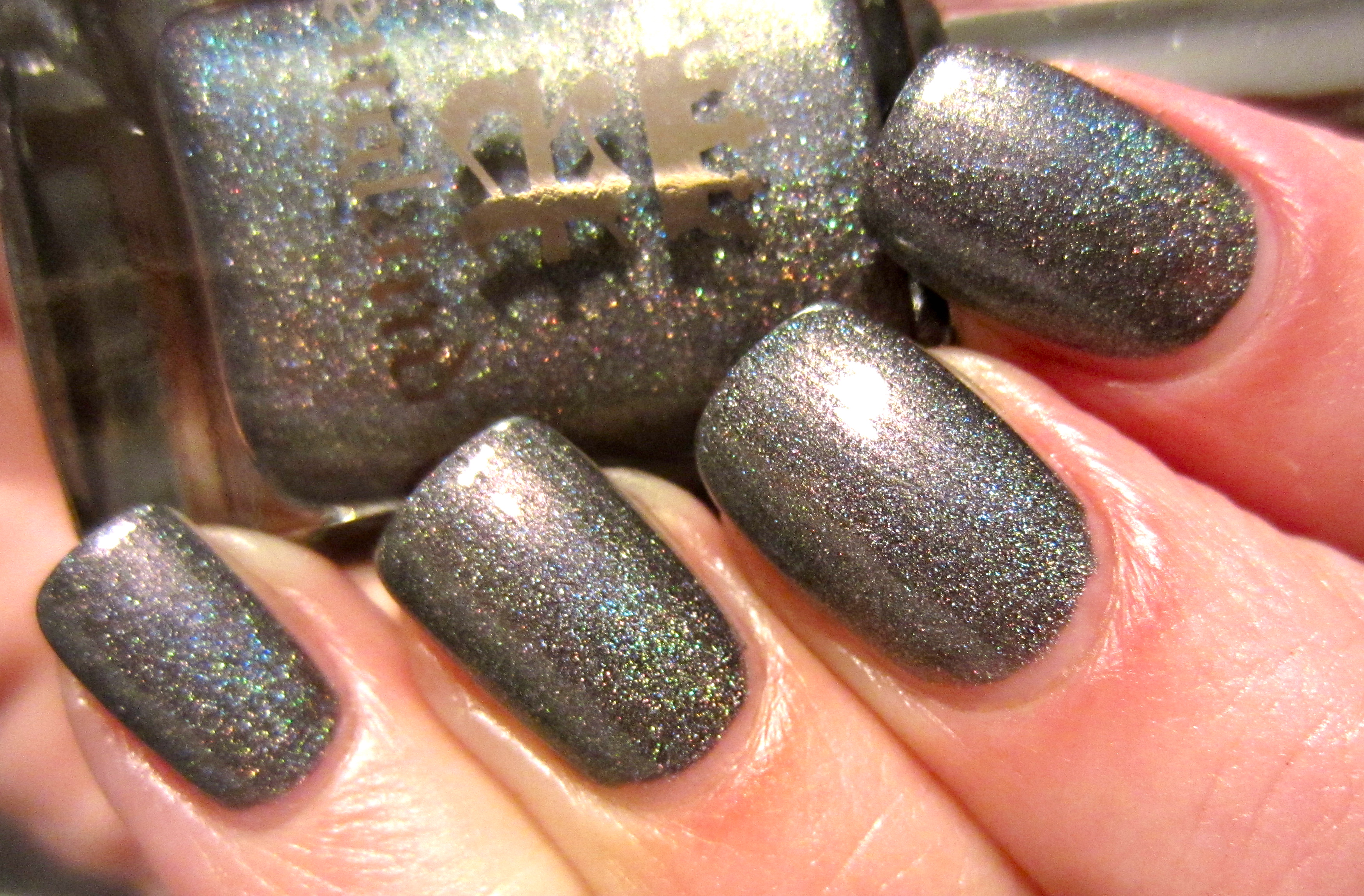
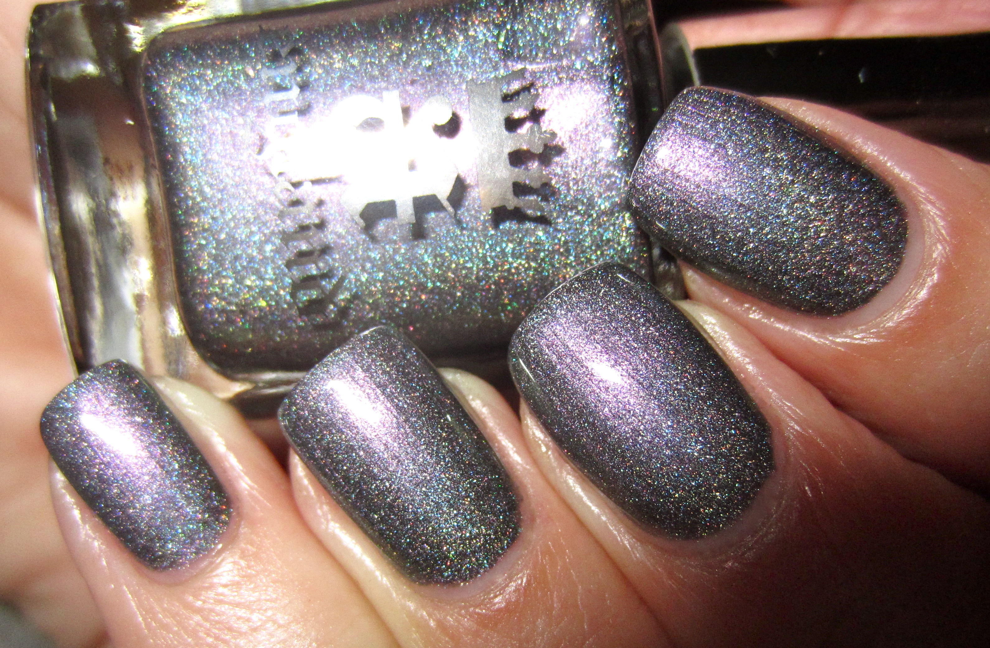
‘Princess Tears’ is a divine yet subtle collection of colours, being at once dove-grey, some lilac leanings, as well as pink and blue holographic pieces thrown in to round it out. Like the glistening twin tracks falling sorrowfully from Princess Sabra’s eyes, the crystalline reflections of this shade are truly ethereal to behold. Continuing with the same stellar formula, application was easy – reaching perfect opacity with two coats, self-levelling, and ended in an excellent gloss at the finish.
This sunlight angle appears to pull out more of the lavender/pink nature of ‘Princess Tears’…
… however a secondary sunlight photo now draws upon the silvery grey tones of this shade’s base hue.
In this closeup photo, note how its holographic beauty plays along the nail edges.
Indoor lighting works some magic on ‘Princess Tears’, by gently calling forth the lilac tones to take center stage.
Once more, a deliberately blurred photo to truly give the clearest indication of the myriad hues that make up this colour.
A final view taken with flash does everything right for this lacquer, seeming to spotlight every tone at the same time, yet still showing each separately – an intriguing contradiction!
– Saint George And The Dragon: The Princess Tied To The Tree by Edward Burne-Jones (1866)
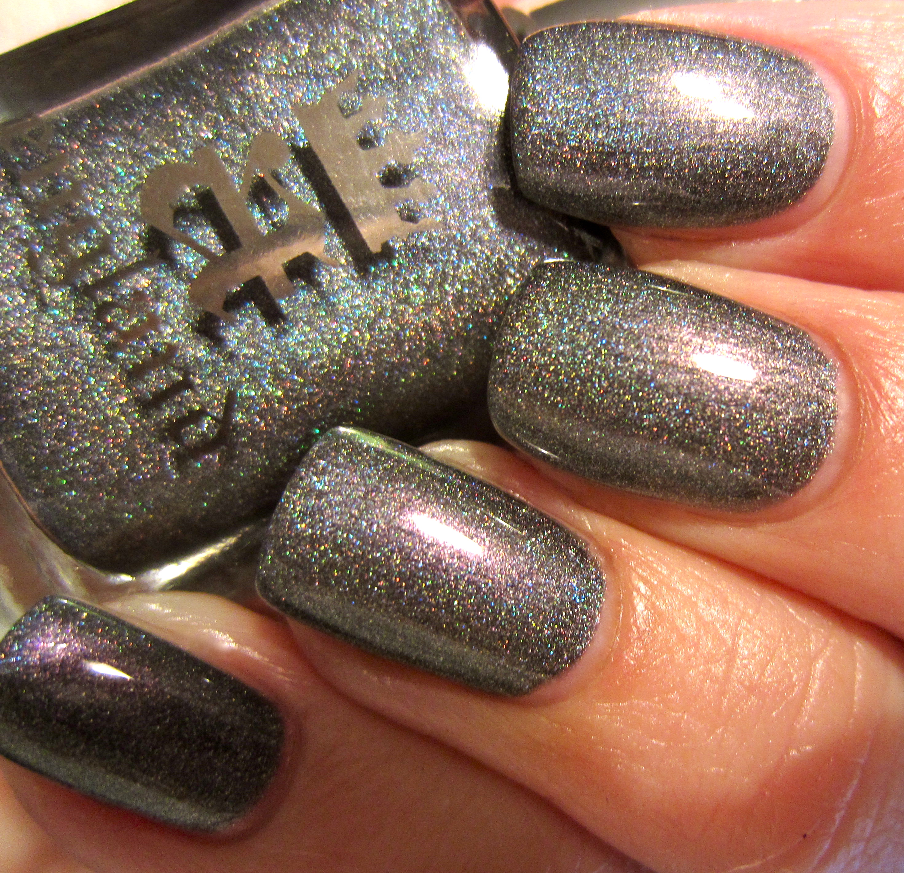
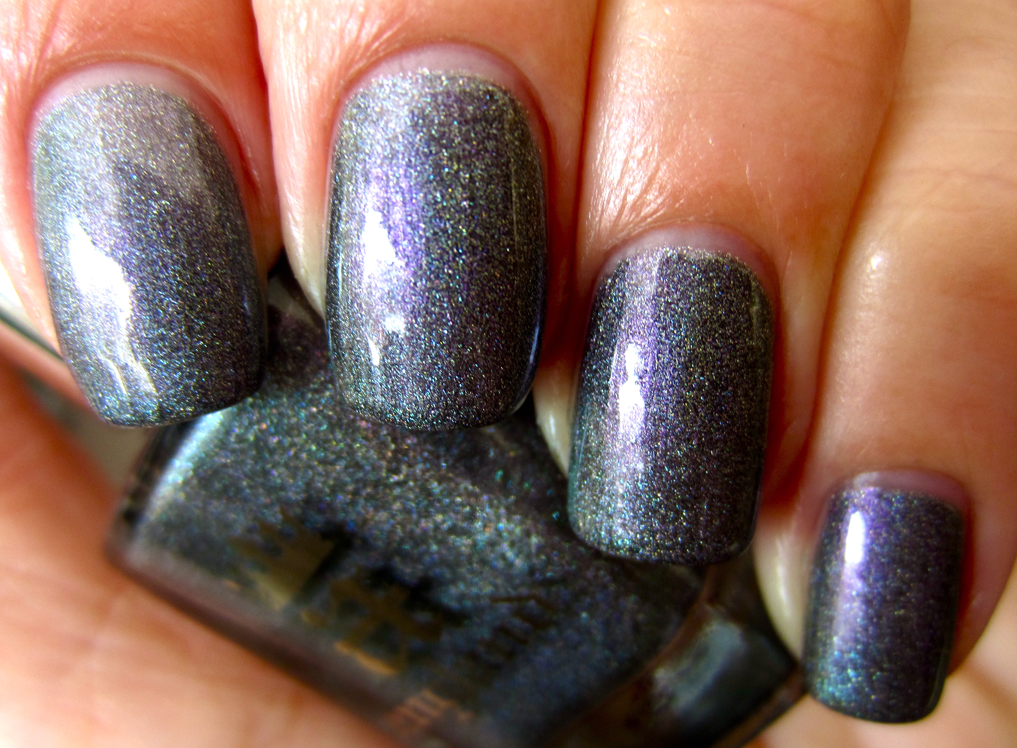
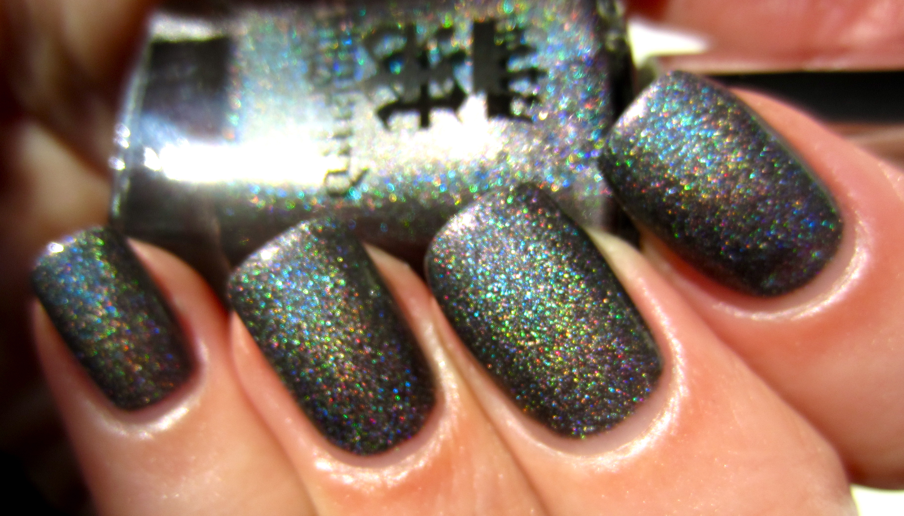
‘Ascalon’, is nothing short of “majestic”; the legendary title of St. George’s sword, this name was later used by Sir Winston Churchill for his personal aircraft during WWII. This is that particular shade that literally dares you to try and pin it down; at once steely grey, then morphing into a lavender/green/aqua/pink/gunmetal duochrome wonder before your very eyes, I was instantly CAPTIVATED! Following in the footsteps of the rest of this collection, the formula was once more flawless, flowing smoothly from the perfect density brush, leaving a gorgeous shine at the end.
Note how in this sunlight photo the deep steel tones form the background on which the holographic particles play.
In this secondary sunlight view, I love how the tips seem kissed by a pale lavender hue, while further up the nail, some golden tones seem to peek through.
This final photo taken in sunlight, now emphasizes ‘Ascalon’s’ more tungsten side.
This closeup photo taken indoors, gives the clearest view how each colour of this shade harmonizes so well.
In this indoor photo, a transformation is on display, with a violet core and verdigris tips adding to the illusion that is ‘Ascalon’.
A deliberately blurred photo to show how complex this shade truly is … and how intensely colourful at heart!
A final view taken with flash tones down this shade’s greyer nature, and seems to pull forth more of its lavender leanings, with the shimmering particles adding visual depth.
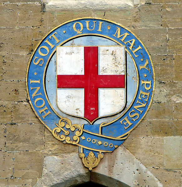
– Order Of The Garter symbol
Known as the oldest and most prestigious order of chivalry in England to this day, The Order of the Garter was founded in 1348 by King Edward III. Claiming St. George as the country’s patron saint and based upon the sainted knight’s many brave & chivalrous acts, The Order remains one of the monarch’s truly personal, executive prerogatives – bestowed rarely and only to those most deserving of this honour. The origins of the use of a garter here are a touch obscure, but probably reference the “garters” soldiers used to apply their battle armor, while the motto of the Order is: “Honi soit qui may y pense” which translates to “shamed be the person who thinks evil on it”, most likely referencing “accursed be a cowardly and covetous heart” – qualities that are anathema to a true hero.
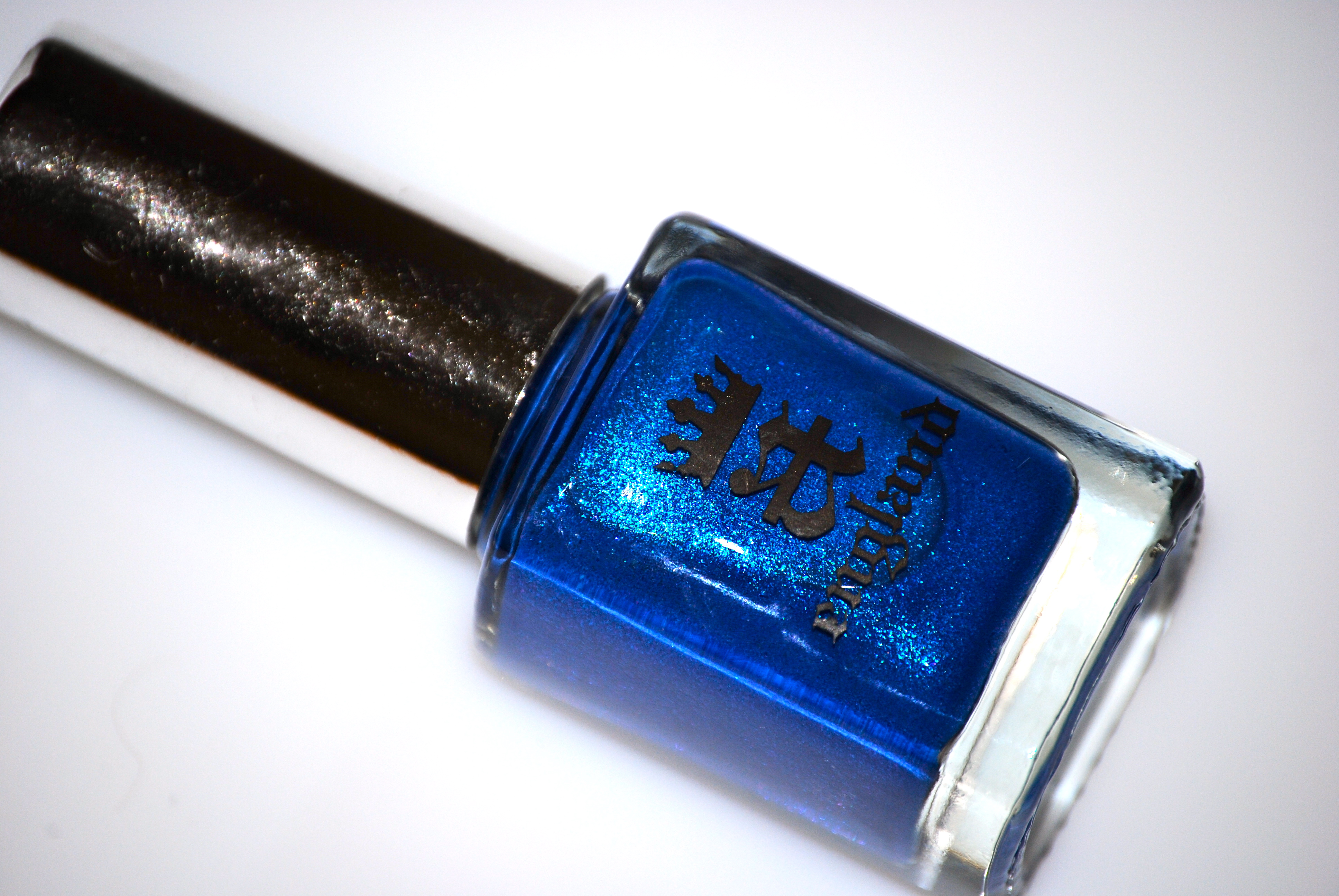
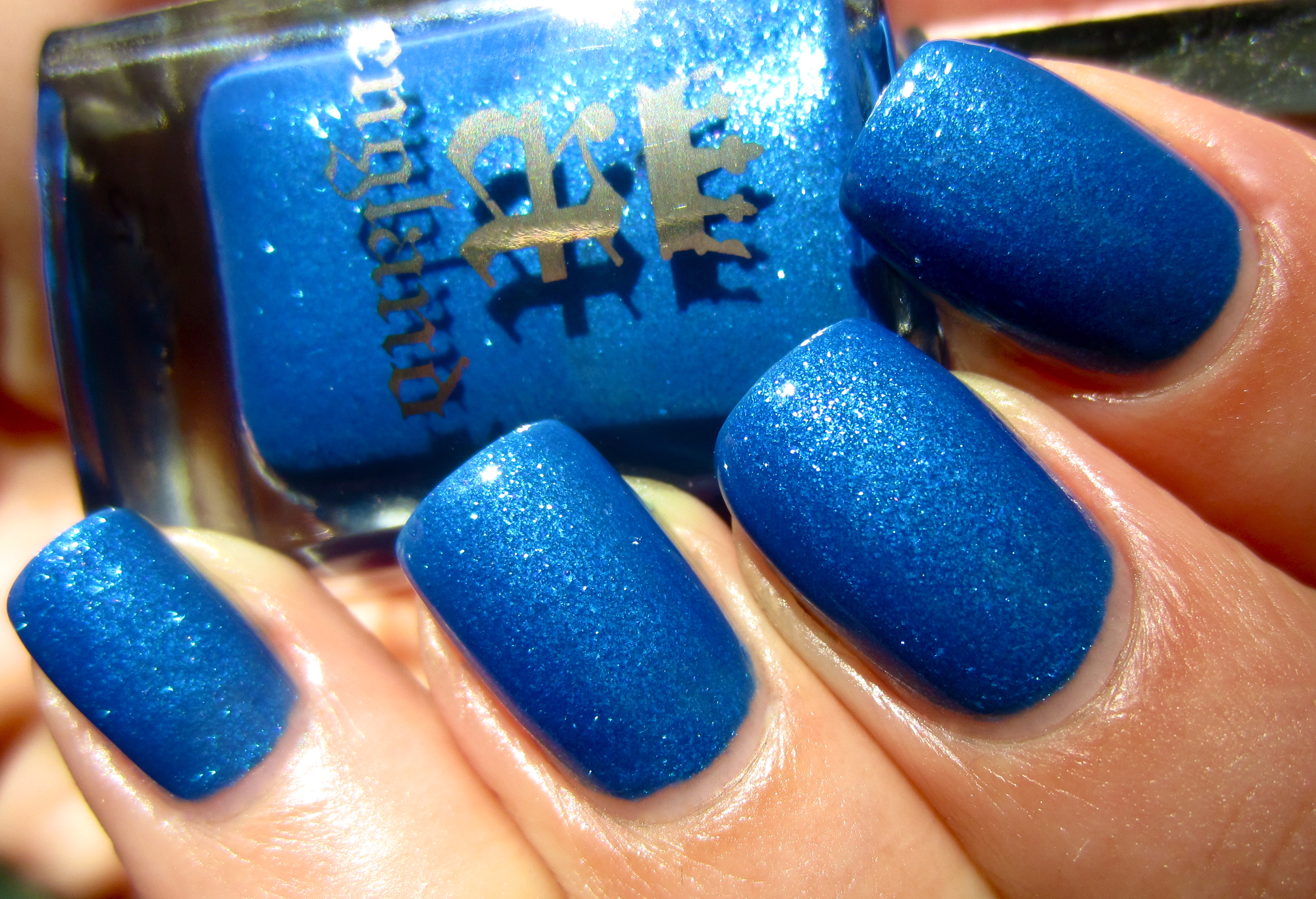
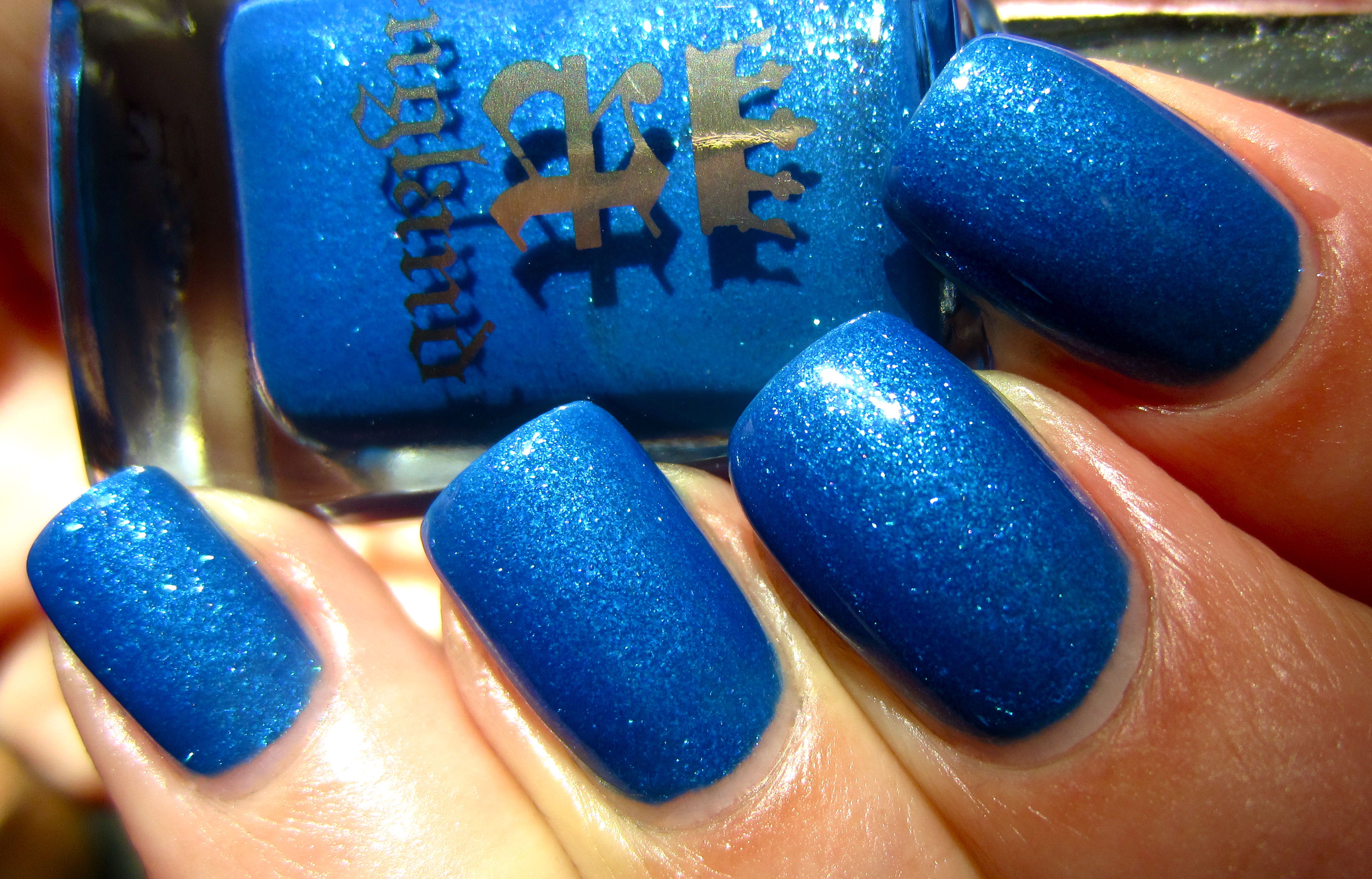
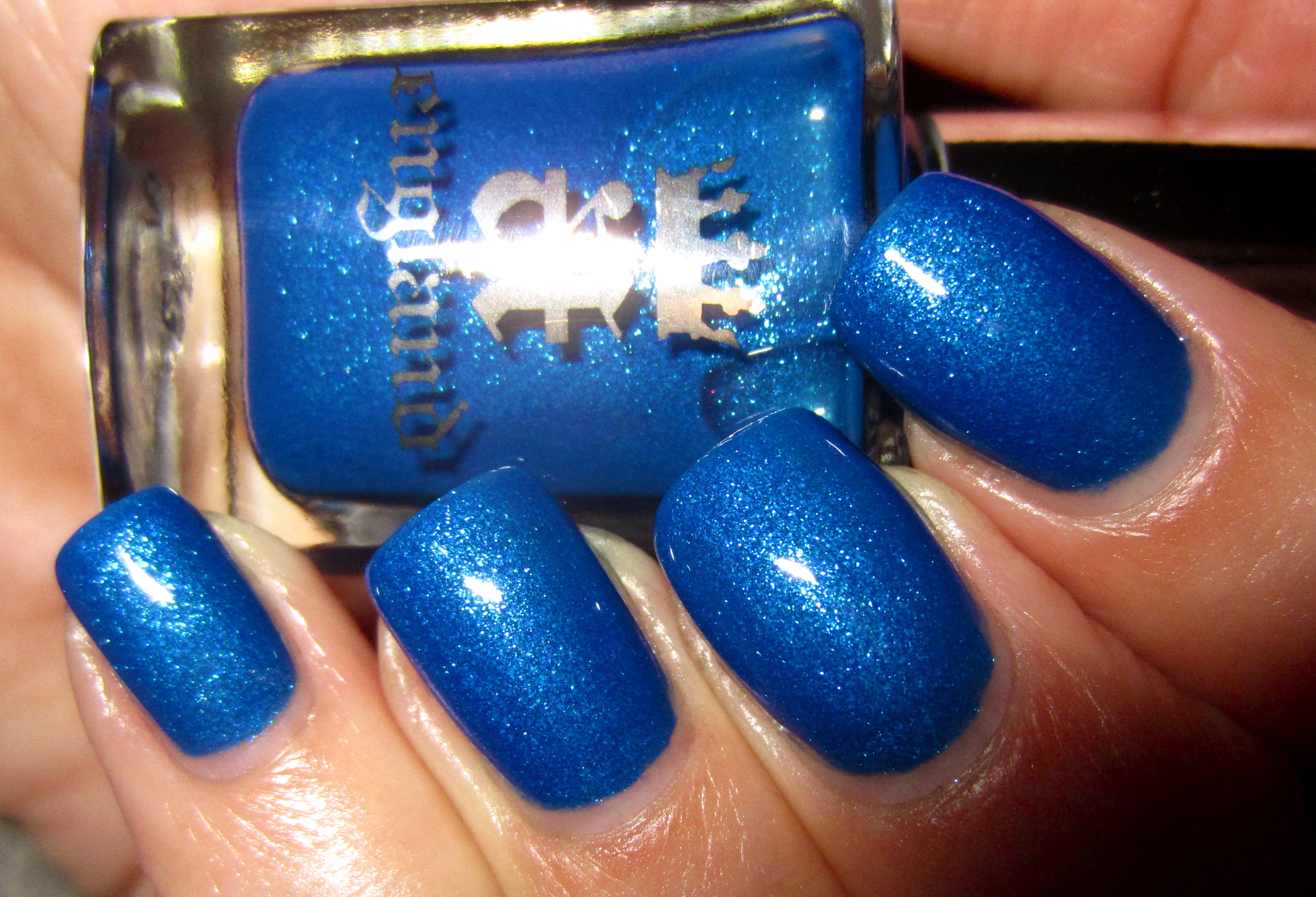
‘Order Of The Garter’ is a richly regal shade of blue, filled with an incredible amount of glass-like flecks, adding such an intense depth to this shade. Like the aristocratic heritage of The Order itself, this colour is to be worn with heroic pride! A slight departure in the formula here from the rest of this collection, it was just a touch more sheer, yet two coats were all that were needed to achieve perfect and full opacity. Bearing the same self-levelling properties of the rest, along with a beautiful shine at the finish, I was so pleased to find that there was absolutely NO staining left behind.
Seen in sunlight, the deeply aquatic tones of this shade are complimented by the faint magenta flecks in its base.
In this secondary sunlight photo, the glass flecks appear like microscopic stars trapped under the surface … stunning!
This closeup view displays the luxuriously rich blue core of ‘Order Of The Garter’.
This first photo taken indoors, does nothing to detract from this shade’s shimmering beauty.
While obviously deeper in tone, this second indoor view still maintains this shade’s true depth of hue.
A deliberately blurred photo, to perfectly emphasize the glimmering effect of ‘Order Of The Garter’.
A final view taken with flash reveals the intricate depth of tone that the glass flecks add to this deeply cerulean shade.
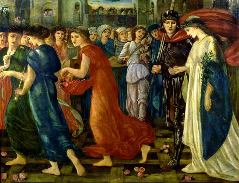
– Saint George And The Dragon Series: The Return by Edward Burne-Jones (1866)
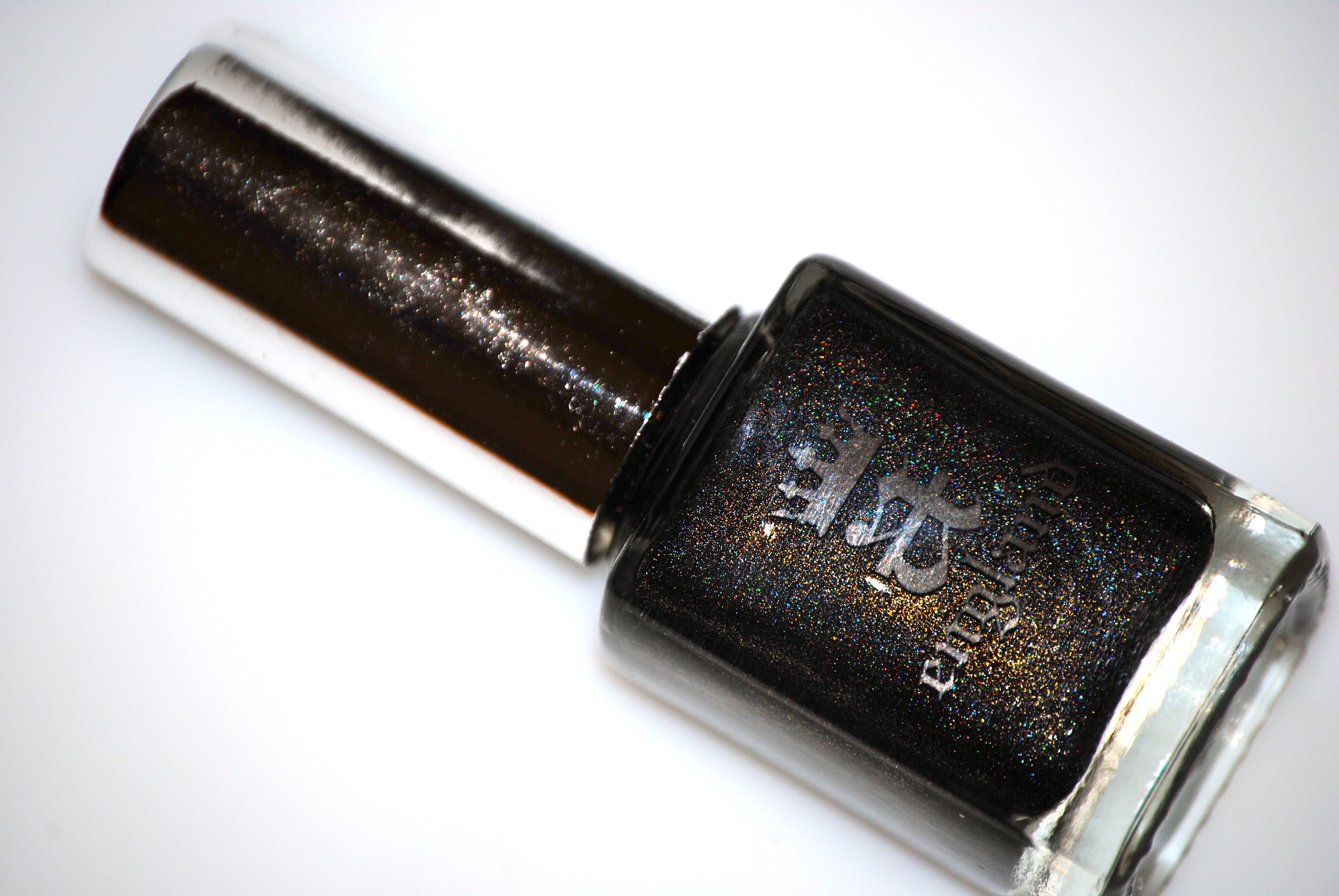
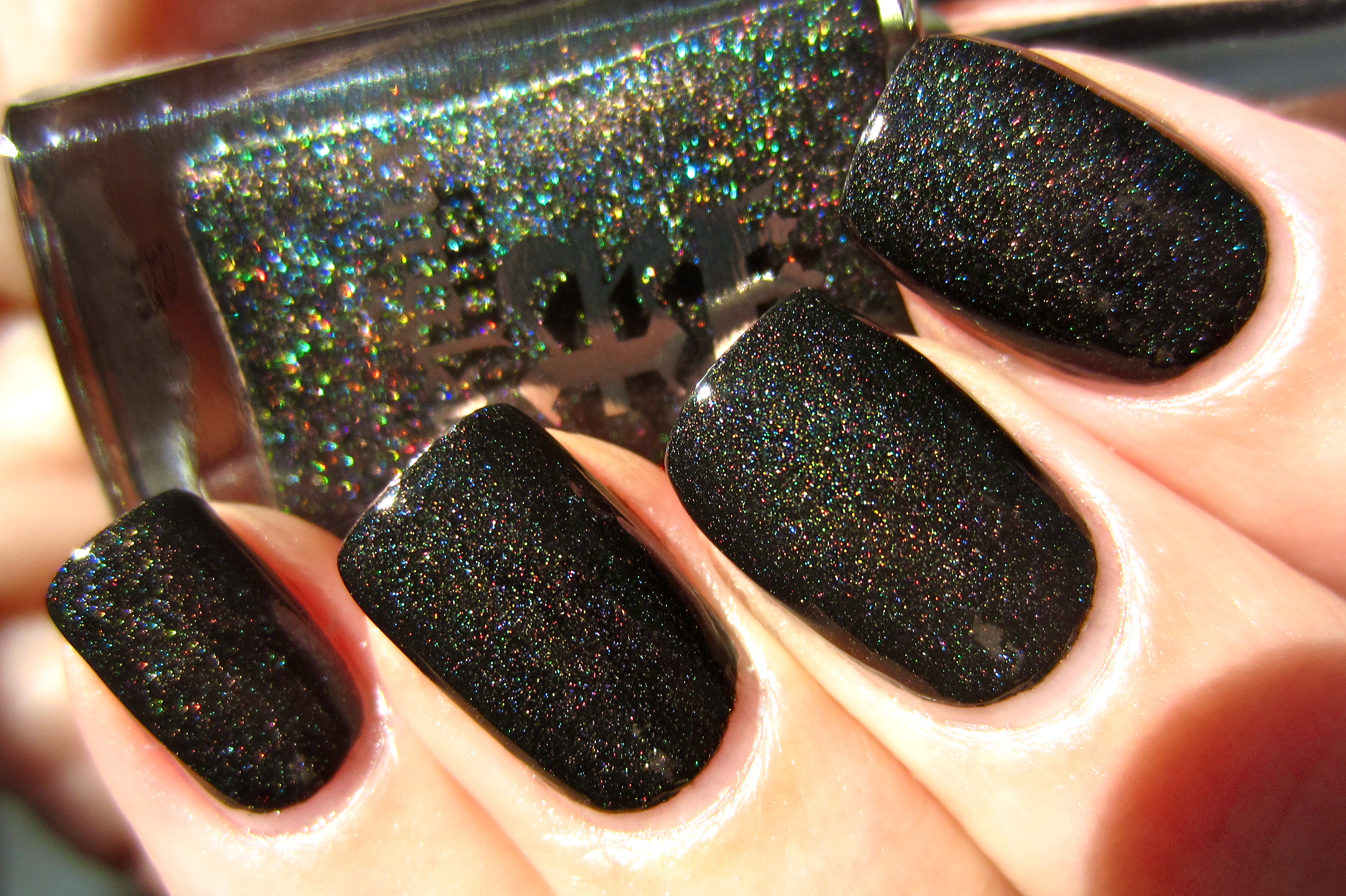
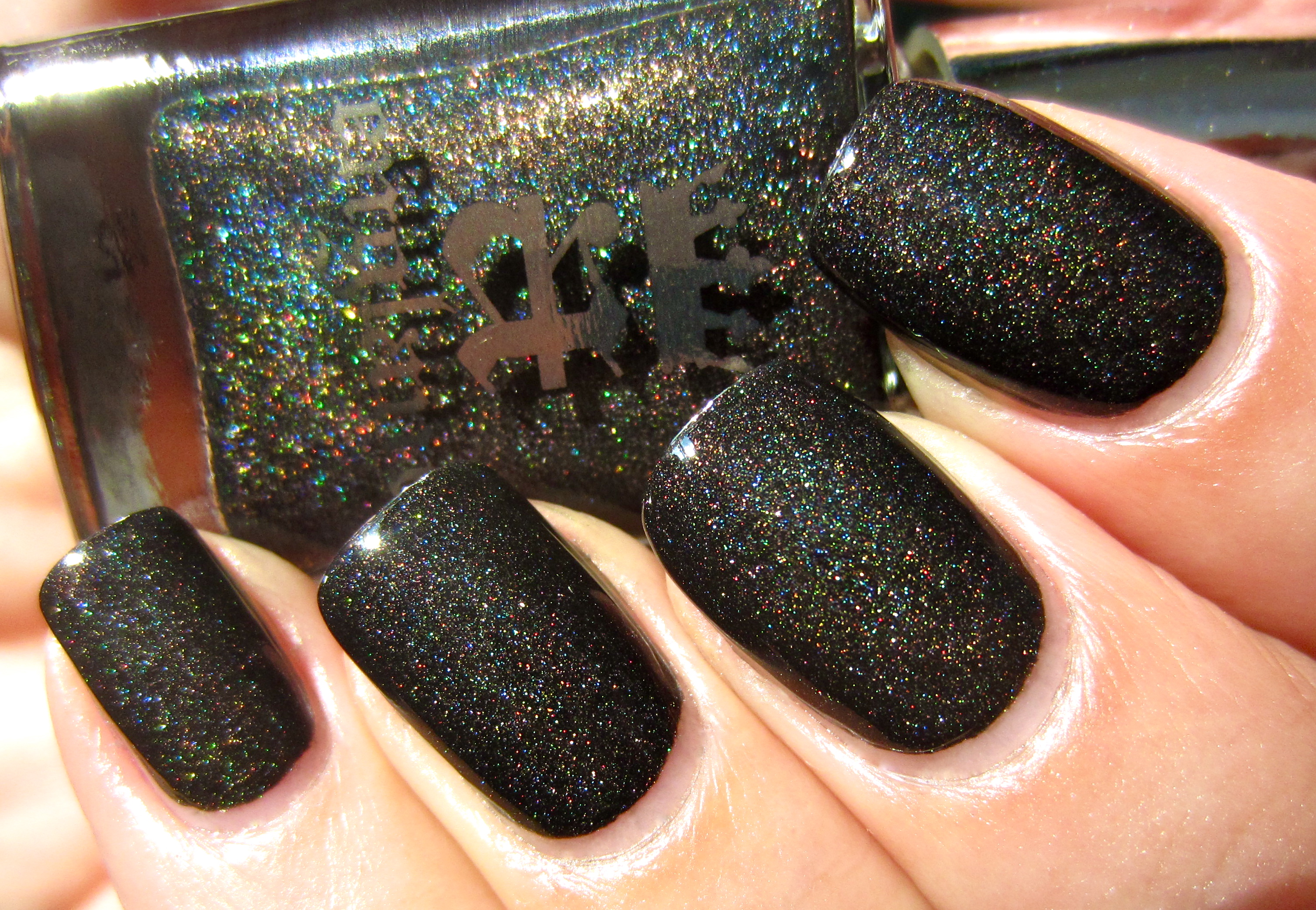
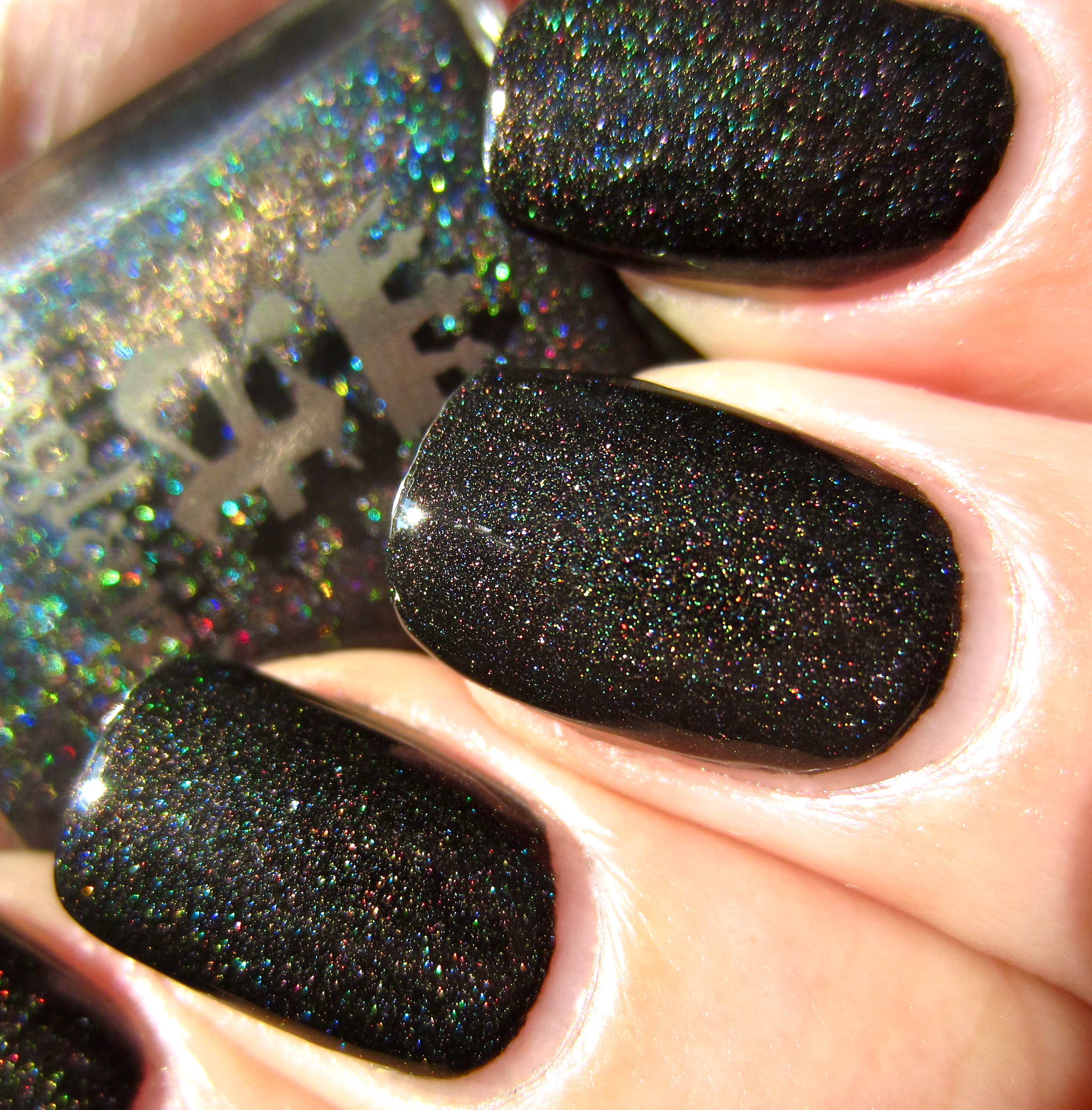
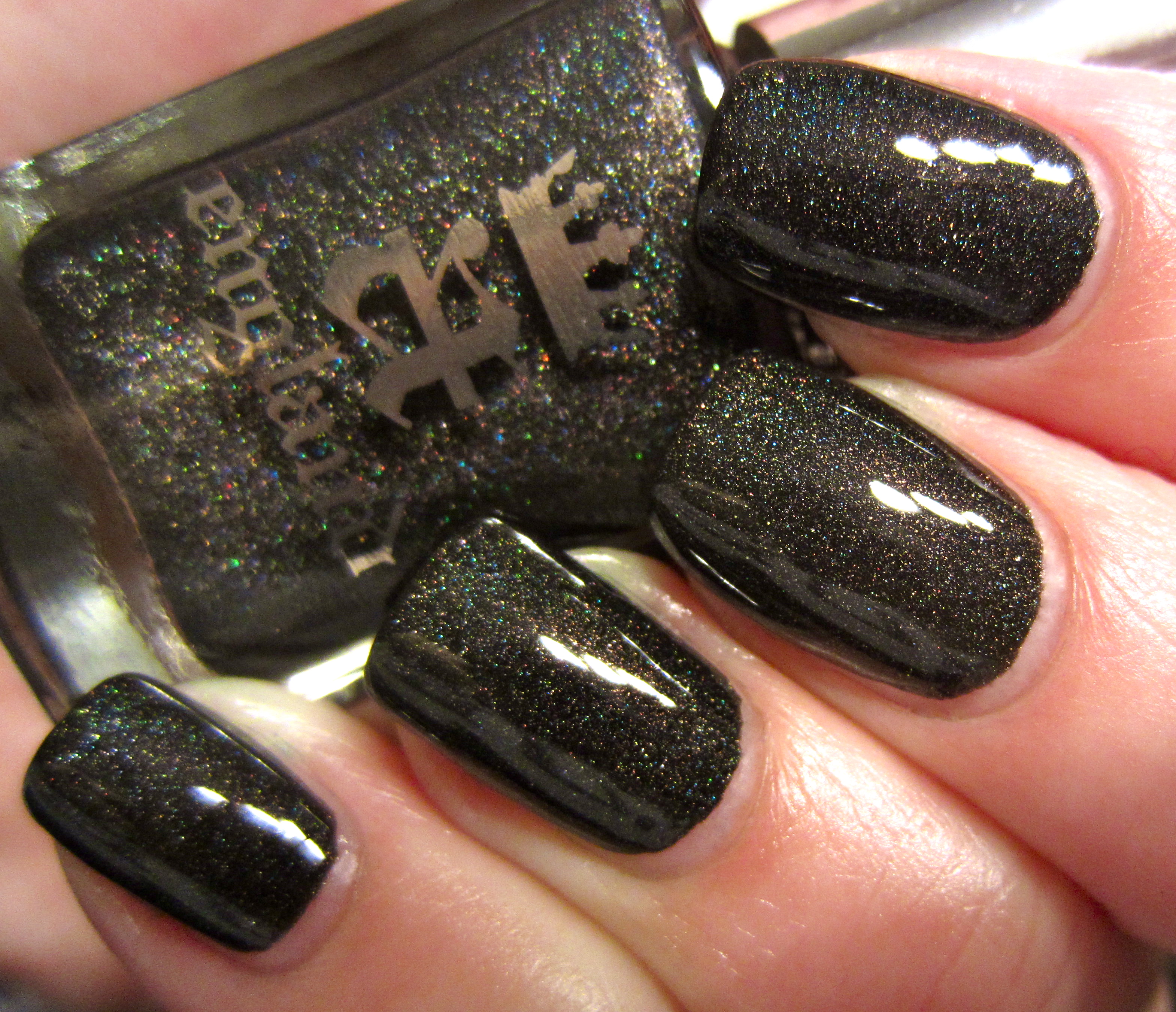
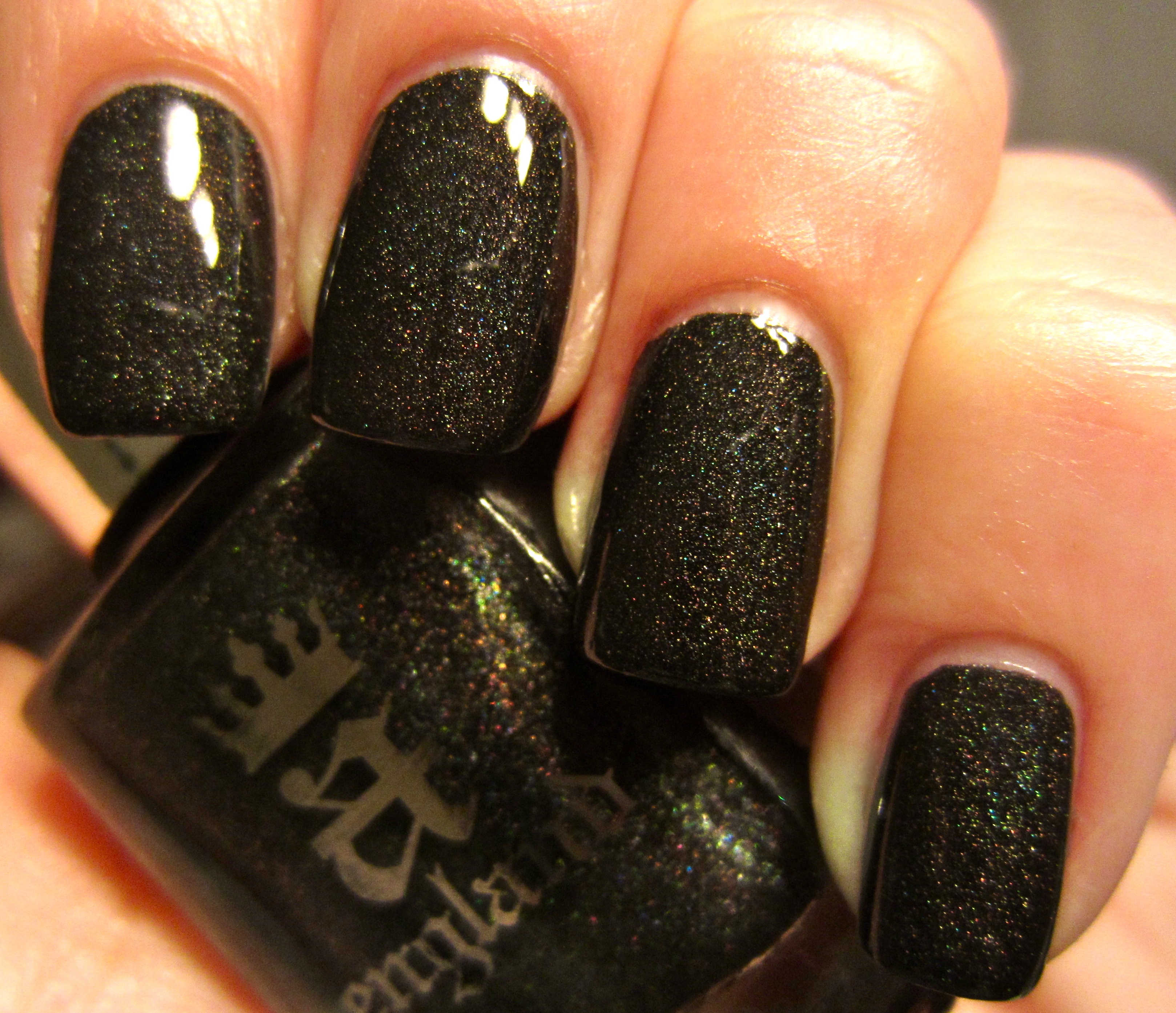
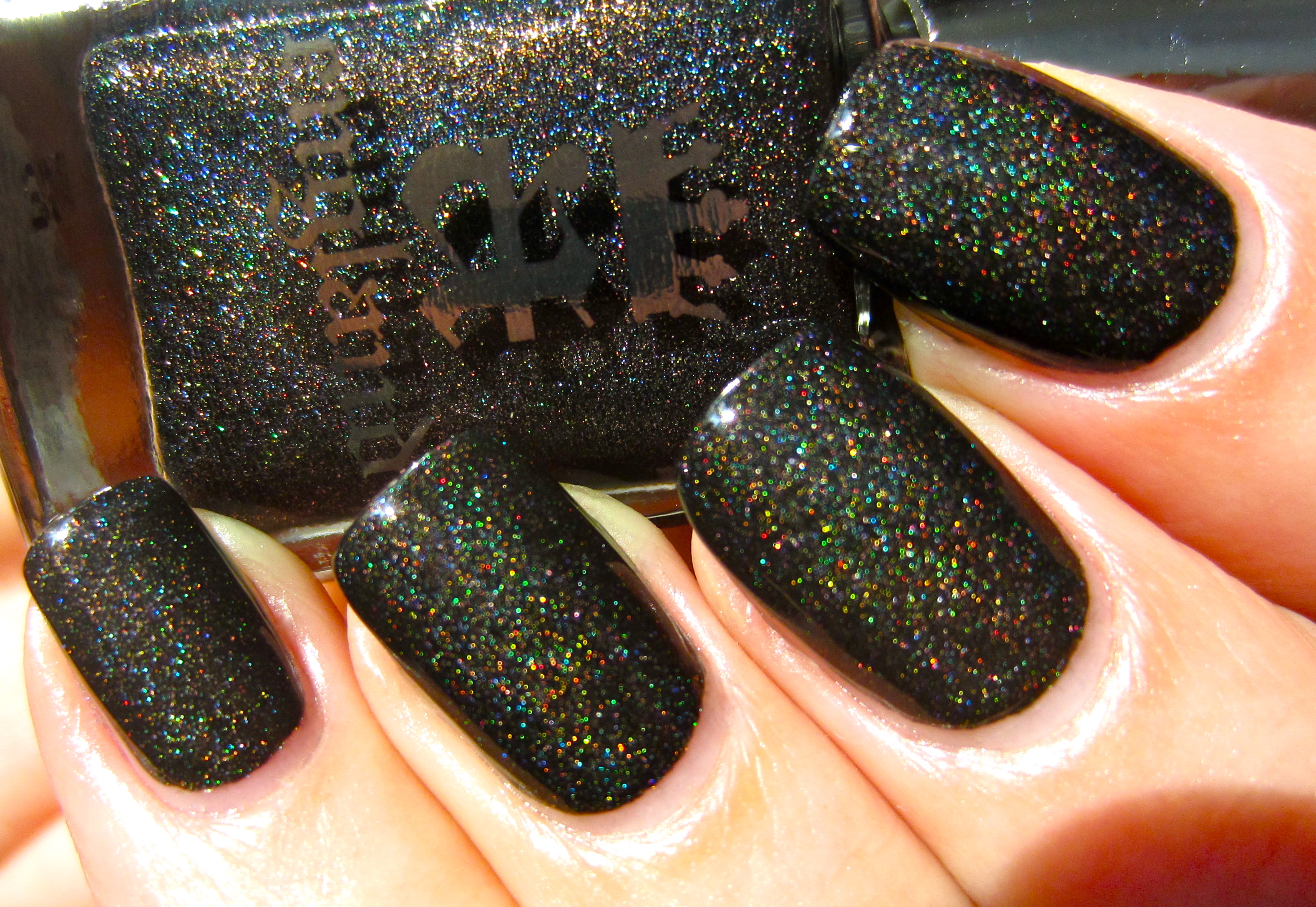
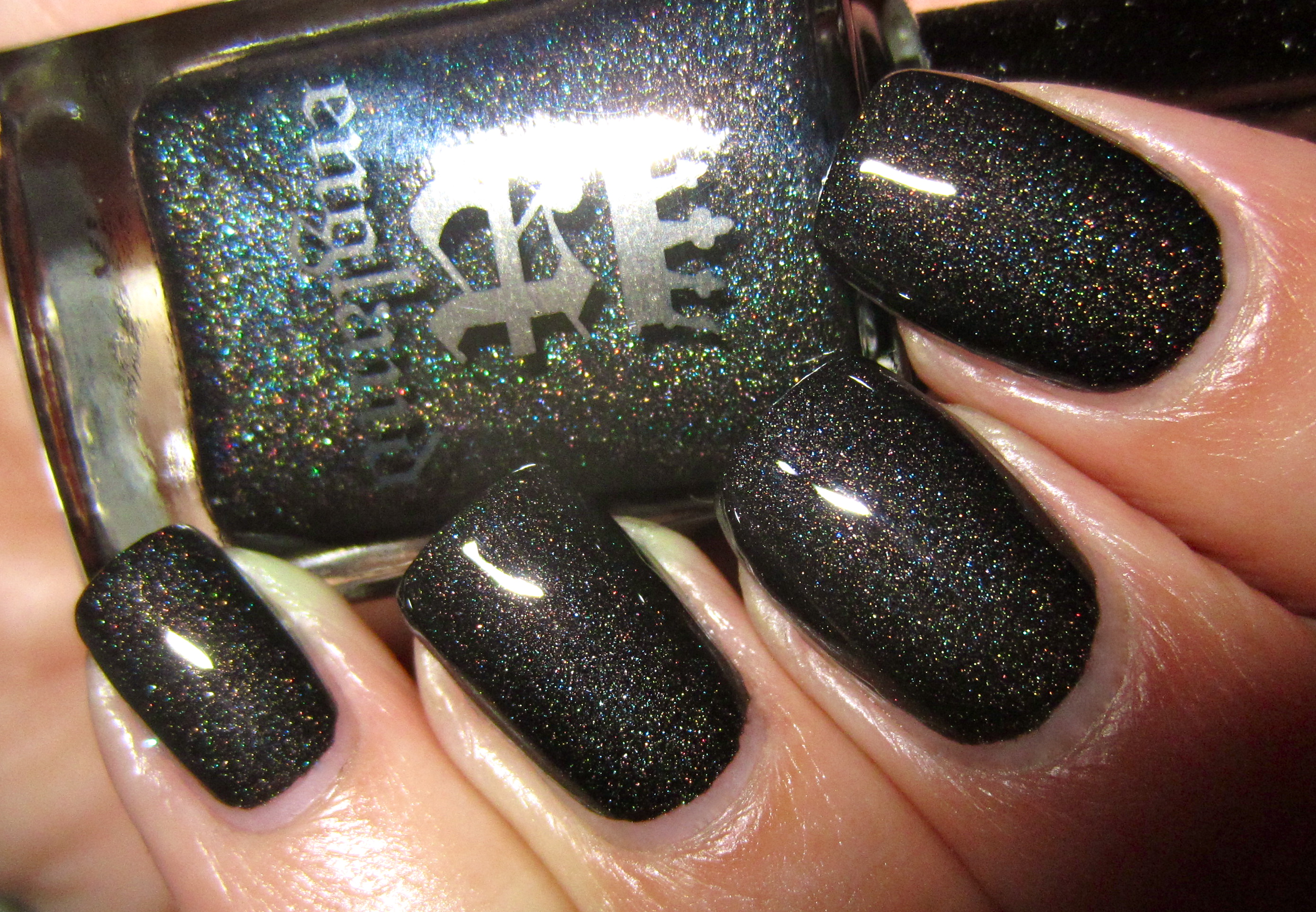
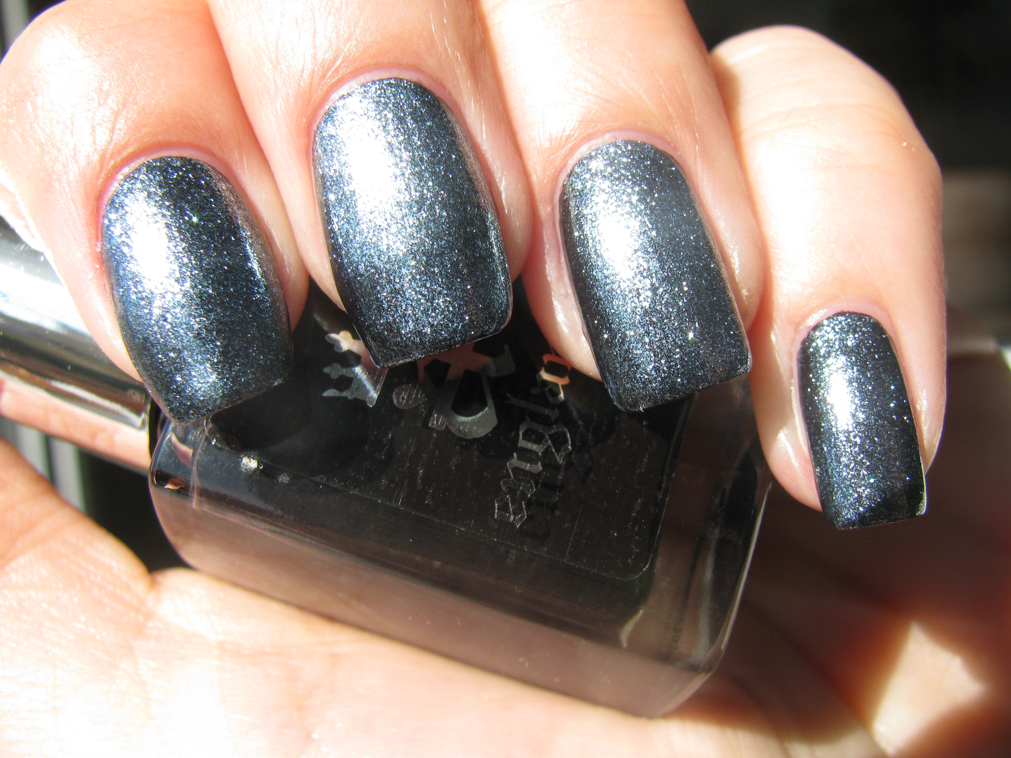
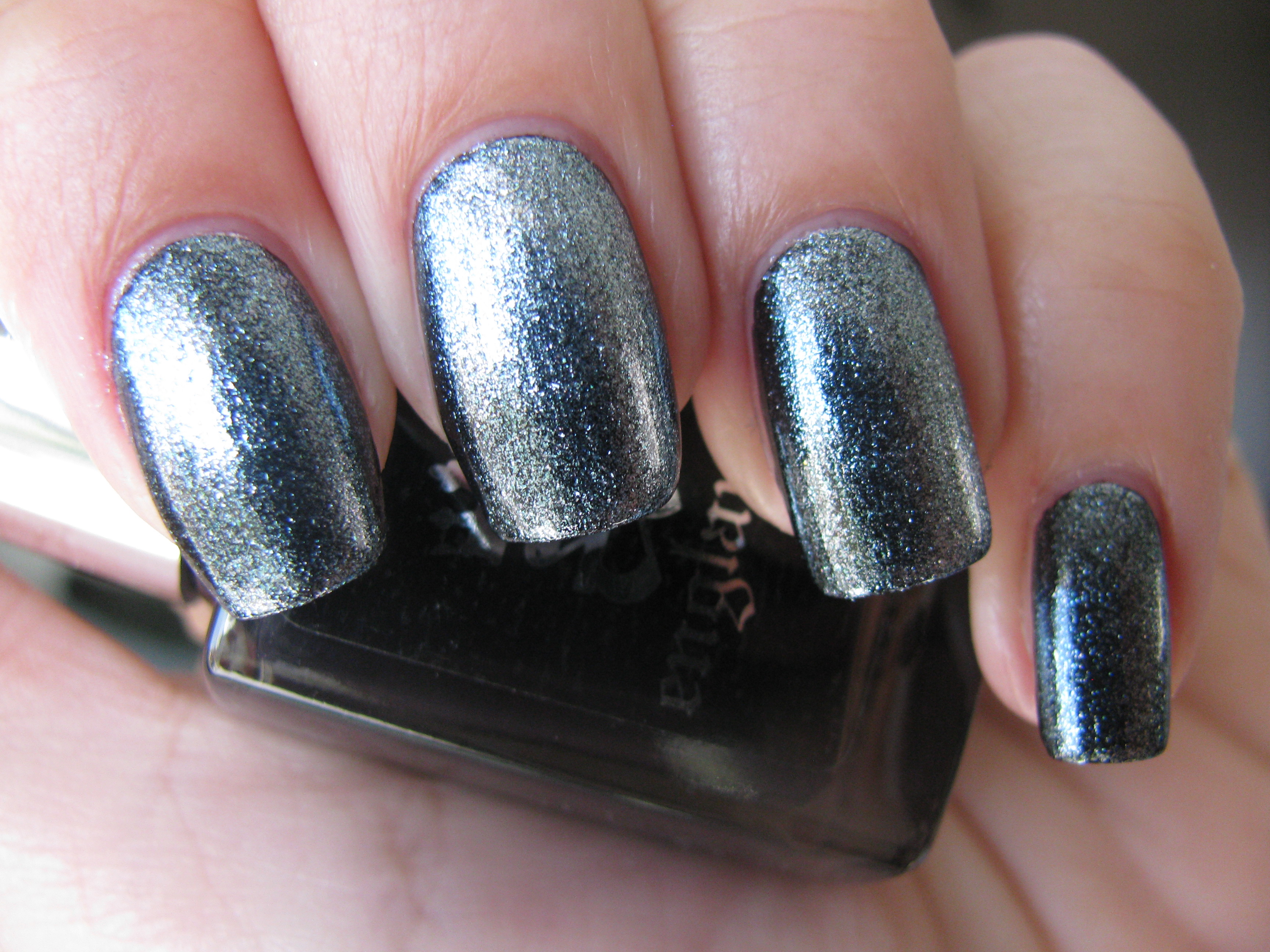
‘Bridal Veil’, is that truly indefinable colour; a deep black base plays host to a multitude of holographic particles, displaying an almost surreal flash of prismatic colours. Representative of the dark veil of mourning Princess Sabra wore to attend her doom, the glimmering flashes within portray that hope is never to be forgotten. The formula here was in a word: INSANE!! So highly pigmented, it can definitely and easily be applied as a one-coater, flowing so well and ultra-creamy. A perfect black hue for today’s woman, it is modern, edgy, urban, and so incredibly sensuous – almost a tactile experience! Bonus: absolutely zero staining.
Seen in sunlight, this shade is almost unbelievable in its complexity.
A second sunlight view reveals ‘Bridal Veil’s’ truly luminous look, with all the holographic pieces on full display.
This closeup view spotlights not only the many hues of this shade, but how well the deep onyx background shows them off to perfection.
The lustrous nature of ‘Bridal Veil’ is beautifully shown in this photo taken indoors.
Another angle (indoors), takes you more towards this shade’s darkly brooding side.
A deliberately blurred photo gives the best indication of the complex array of colour.
A final view taken with flash, and you have a galaxy splashed across your nails … hypnotically beautiful!
Final thoughts: If you haven’t figured it out by now, this collection has not only blown me away, it has made me fall in love with nail lacquer all over again on a whole new level. Once more, Adina Bodana, one of the most beautiful souls it is my absolute pleasure to know, and über-creative genius/founder of a-england lacquers, not only transports us to a world we can only imagine, but allows us to physically indulge in it, with these seven sure-to-be cult shades. The formula on each was of such a superior grade, almost applying themselves, while the brush is that perfect mix of dense fibres and flexibility, allowing for a flawless application. A unique range of colours, these shades are made that much more special by the addition of ultra-fine holographic particles (with the exception of ‘Order Of The Garter’ – bearing glass flecks instead), they will become available soon on a-england’s site, but for now, they can be ordered through email at hello@a-england.co.uk. The bar has been set high with this collection, my beauties – your only dilemma will be in which shade to choose, a task I envy no one!
*Disclaimer: Product samples provided by the company/PR for my unbiased consideration
a-england: Tristam, Elaine & Camelot (swatches/review)
With a triumphant fanfare, I bring you the last three ‘Mythicals’ from a-england’s maiden collection:’ Tristam’ – an intriguing blue holographic, ‘Elaine’ – the deepest amethyst and ‘Camelot’ – an intense ebony. To round off this entire collection, there are the backbones of any good mani/pedi as in a base and top coat, or in this case, ‘The Knight’ and ‘The Shield’ respectively. While a relative newcomer in the nail varnish playing field, a-england has quickly and well-deservedly, garnered a reputation as being a collection not only worthy of cult status, but a line of products to which all other brands will be compared to. All swatches are with ‘The Knight’ base coat, two coats of lacquer (except where stated otherwise) and ‘The Shield’ top coat.
Much like the honourable and love-lorn knight of the Round Table, ‘Tristam’ – the varnish – is a complex yet mesmerizing vortex of colour. A deep blue denim coloured base holds masses of tiny holographic particles that not only captivate the eyes, but add such an interesting depth to this shade. As with basically all of a-england’s polishes, this was highly saturated in colour and one coat was almost more than enough. Note how in full sun (2nd photo) as well as how a flash image (3rd photo) displays this prismatic effect in such spectacular glory! A shade truly worthy of the gallant knight who joined the quest for the Holy Grail, this will add an intriguing mix of elegance and daring chicness to your tips. A stunner!
‘Elaine’ is so richly pigmented and the creamiest deep mauve shade I have ever come across. Exhibiting a brooding depth in keeping with the tragic lady’s unrequited love of Sir Lancelot, this lacquer has a curious duality to it, made even more unique as it is a crème shade. When viewed in full sun but depending on the angle with which light hits it, it can appear either carefree (top photo) or seriously intense (middle photo), while shaded light (bottom photo) lends it a more calming coolness. The self levelling formula combined with its über-glossy finish elevates this polish far above other similar hues.
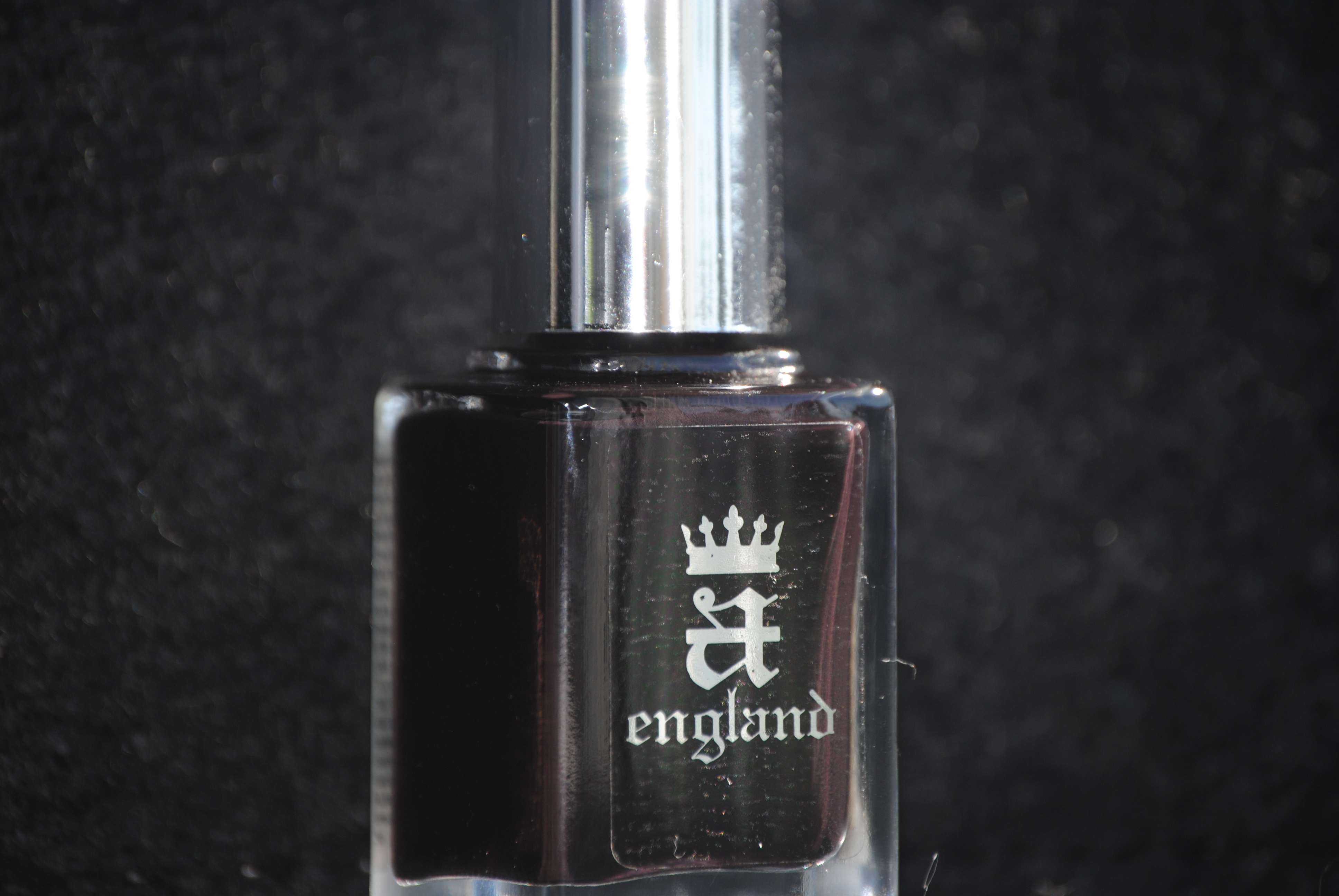
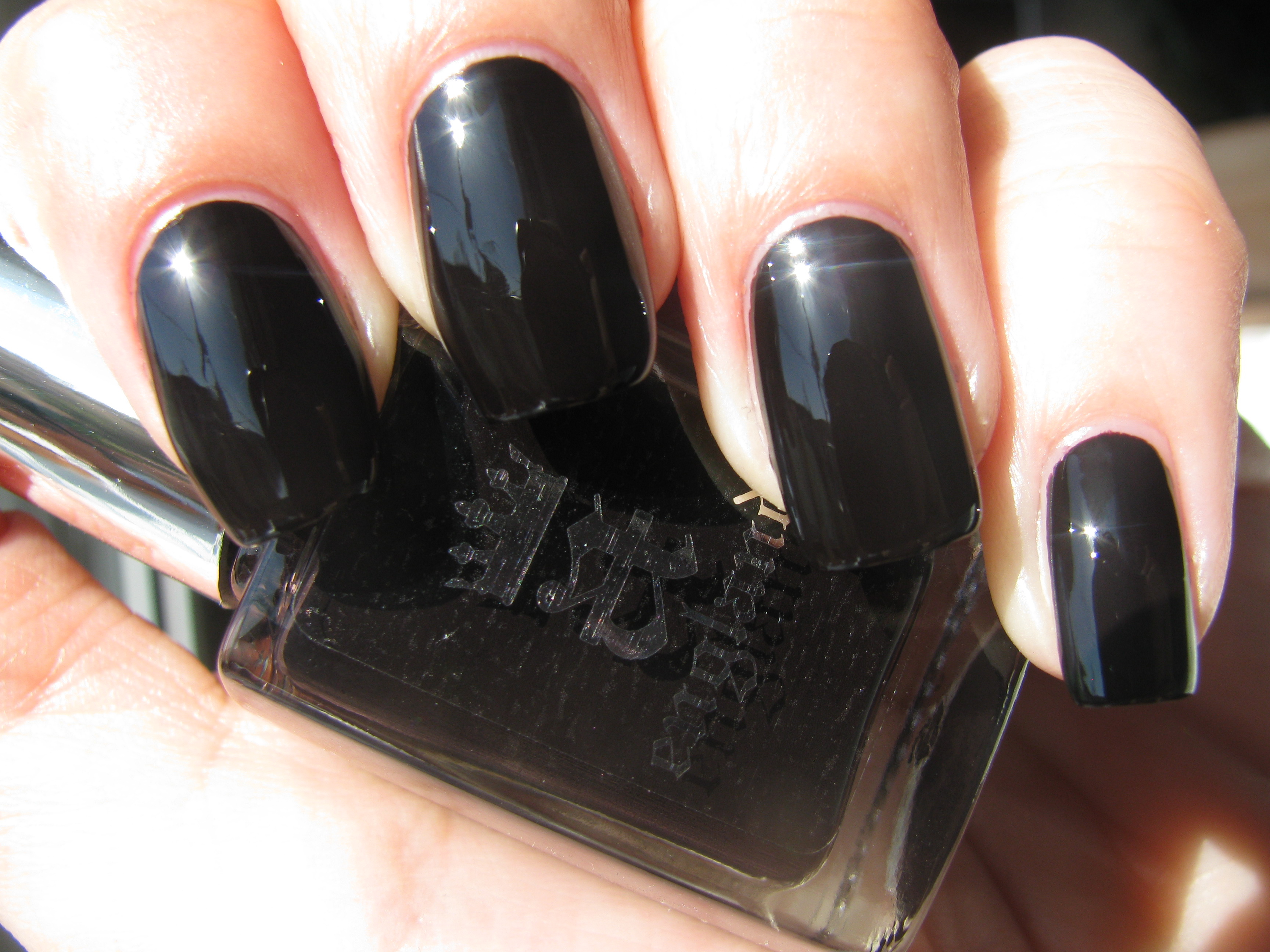
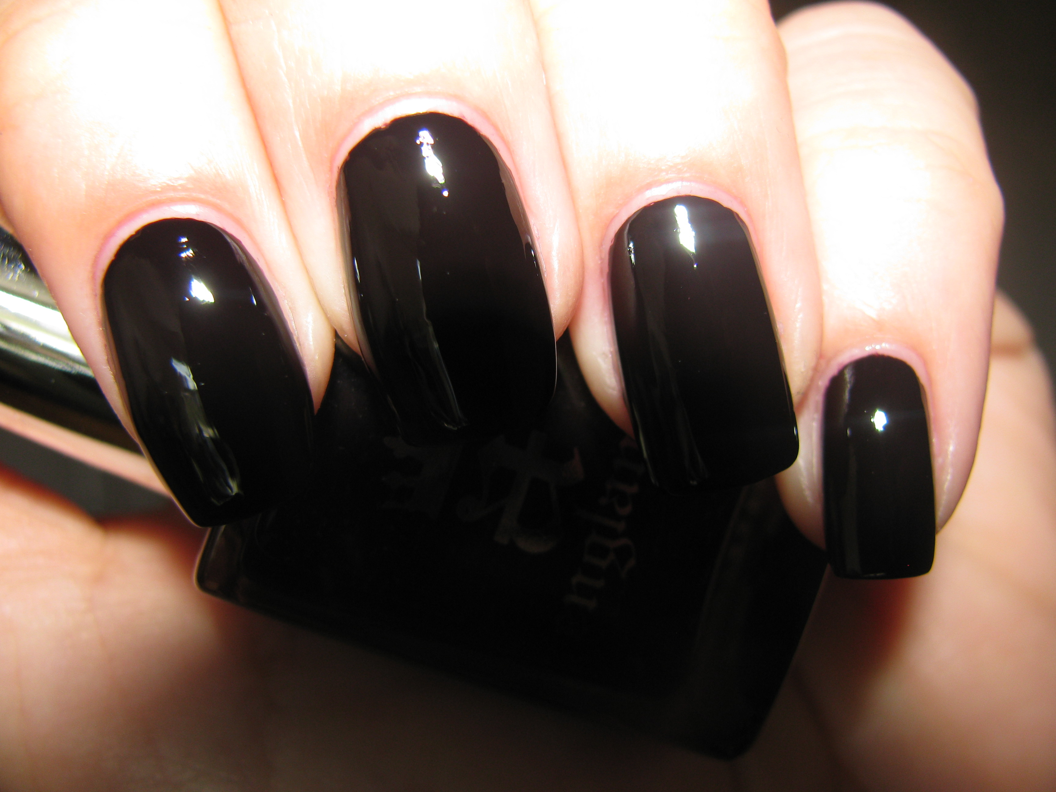
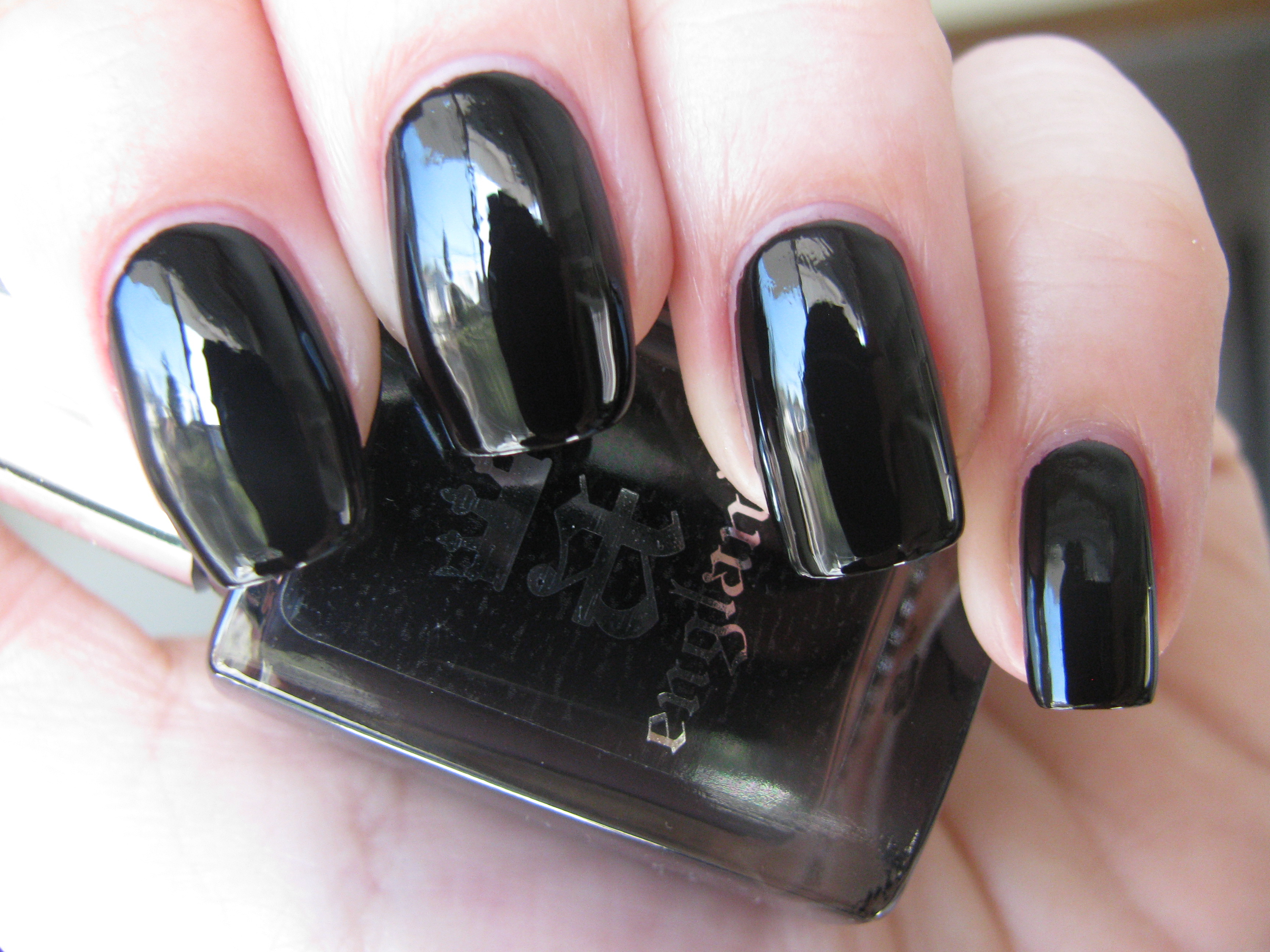
‘Camelot’. A legend out of time and mind. While one might not expect black to represent that historic name, it is nonetheless quite fitting. This is a shade of not only the deepest ebon, but as light absorbing as the midnight sky. The most highly pigmented lacquer I have ever come across, it is completely opaque in one coat, although I chose to do two here for my review. A top coat is almost superfluous, as its mirror like finish is almost astonishing to behold, while the formula flows like night effortlessly off the brush. Encompassing Camelot’s nobleness as well as its doomed history, this shade is at once regal and gothic, but with a fresh and modern vibe. I am beyond infatuated with the mystery of this ‘Camelot’!
To add a unique and interesting element to ‘Elaine’, I experimented with layering ‘Morgan Le Fay’ (reviewed here) on top, and was completely blown away by the results. ‘Elaine’s’ deep amethyst base lends an interesting undercurrent to the scintillating sparkle of ‘Morgan Le Fay’, yet the two combined become a deep almost gunmetal-like hue. The top two photos taken in full sun, show how shimmery or intense this combo can look, once again depending on the light, yet shaded light lends it a much cooler, silvery cast. The closeup shot (3rd photo) gives you a view of the myriad sparkling hues found deep inside!
Not wanting to disturb the grandeur that is ‘Camelot ‘, but wanting to change it up a bit just the same, I layered a coat of essie’s ‘matte about you’ and held my breath; ‘Camelot’ reinvented! While not a full matte finish, I am absolutely in love with the almost rubberized yet sleekly modern feel of this look. Another unique aspect of this combination is that its dulled finish will perfectly offset whatever you’re wearing, and instead of competing with your final look, will only add that much more visual interest overall. There is no doubt that this combination will guarantee you will be stopped and asked about it…as I was!
Anyone who has a love of nail lacquers, be they amateur dabblers or professional technicians, all have one underlying pursuit: to find that elusive perfect top and base coat. Well, you need look no further than ‘The Knight’ base coat and ‘The Shield’ top coat. I have tried many products and while some have impressed me greatly, others have failed me miserably. ‘The Knight’ goes on easily, in a formula that is not too thin, but has an easy fluidity, and dries reasonably quickly to a soft shiny finish. ‘The Shield’ has an excellent viscosity and flows so well across your nails, perhaps not drying as rapidly as Sèche Vite, but the payoff is twofold: high, high gloss and absolutely no shrinkage or pulling of your lacquer. There is no doubt that this base and top coat work incredibly synergistically with all of a-england’s varnishes, but having tried them with many other brands as well, I now know that I have found my “holy grails” (pun intended!).
Final thoughts: I am almost sad that my saga of a-england’s ‘Mythicals’ has come to a close, but like all good stories, it is the telling of it that counts! These are not only lacquers that are free from all harmful toxins and never tested on animals, but of such a high calibre that is highly appreciated from any and all who try them. I cannot say enough about the saturation of pigments and while the hues themselves may not be the most eccentric we’ve seen, they all nonetheless possess that certain something extra which makes them vibrant and fresh. If you haven’t already tried this brand, then I urge you to go over to the company’s website and view them…perchance to dream, or to buy! Please note that until July 1st, a-england also offers free postage & packaging worldwide.
*Disclaimer: Product samples were provided by the company/PR for my unbiased consideration
a-england: Morgan Le Fay, Galahad & Lancelot (swatches/review)
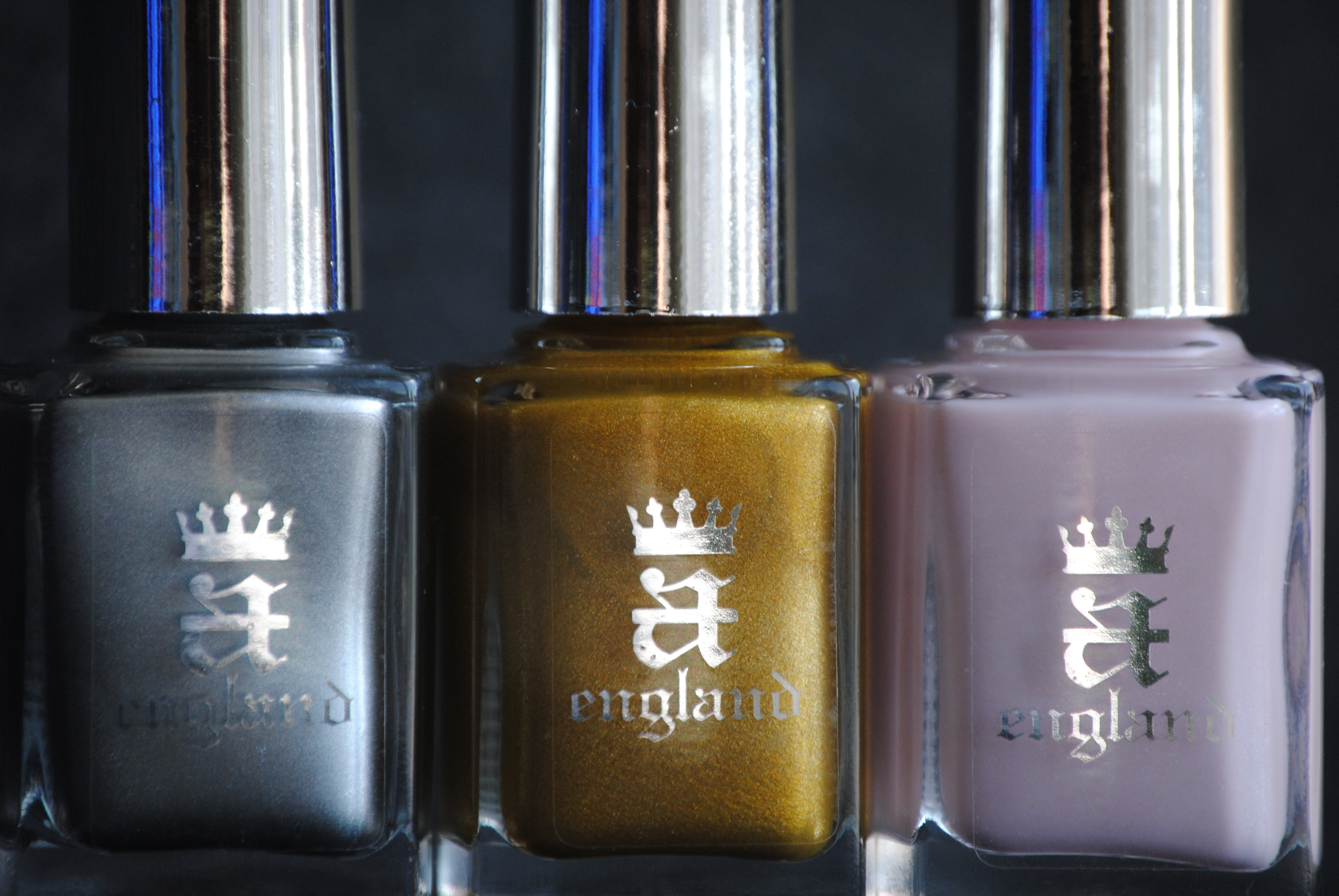
If you haven’t already fallen head over heels for a-england’s amazing polishes (reviewed here, here and here), then I bring you three more reasons to do so: ‘Morgan Le Fay’ – a pearly gossamer veil, ‘Galahad’ – a youthfully exuberant blue, and ‘Lancelot’ – a brooding blackened garnet. The rich tapestry of colour that embodies King Arthur’s England, are perfectly & artistically captured by this young line and what a pleasant bonus that the formula is so sublime with each and every one! All swatches (except when layered) are with Sèche Clear base coat, two coats of lacquer and Poshé top coat.
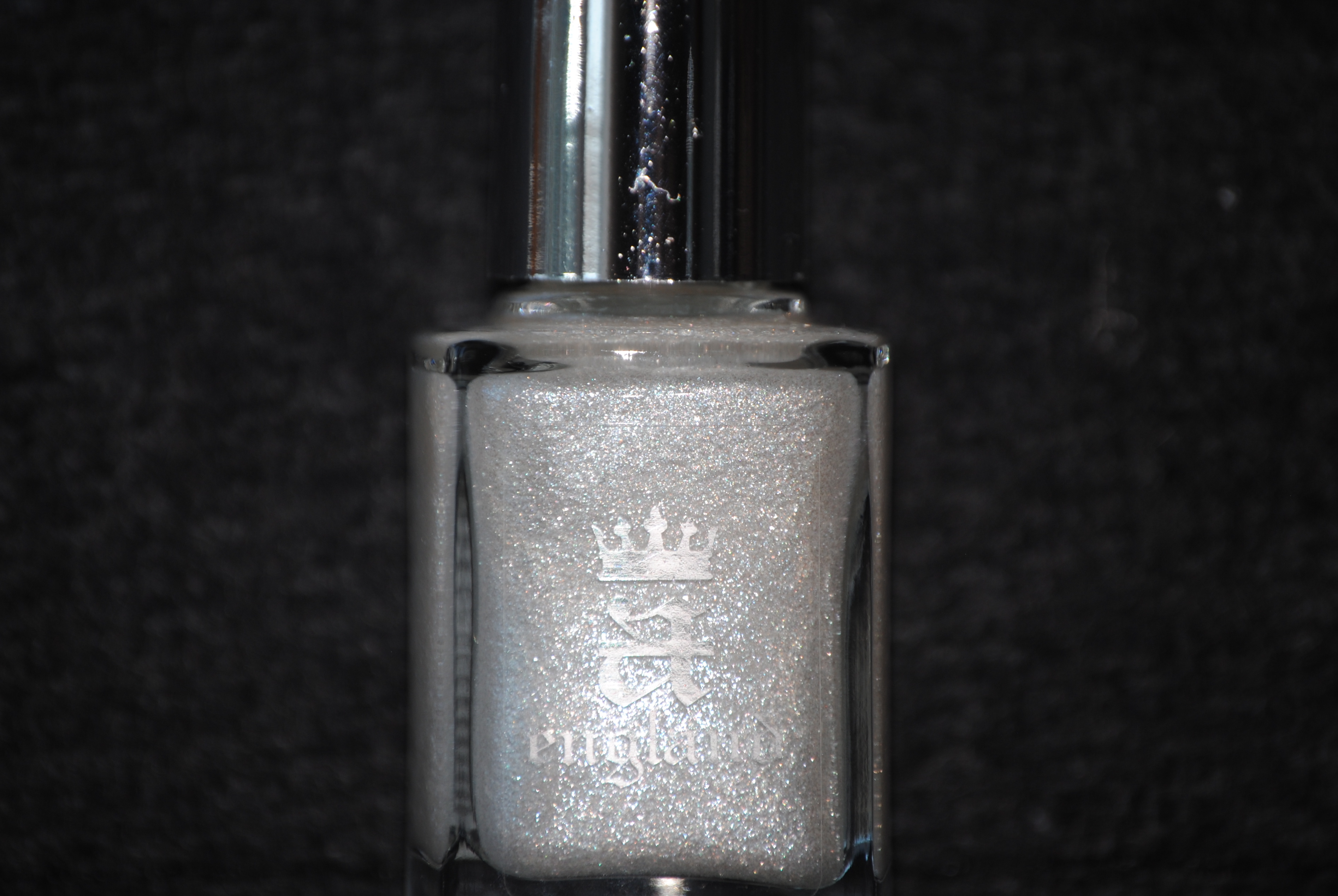
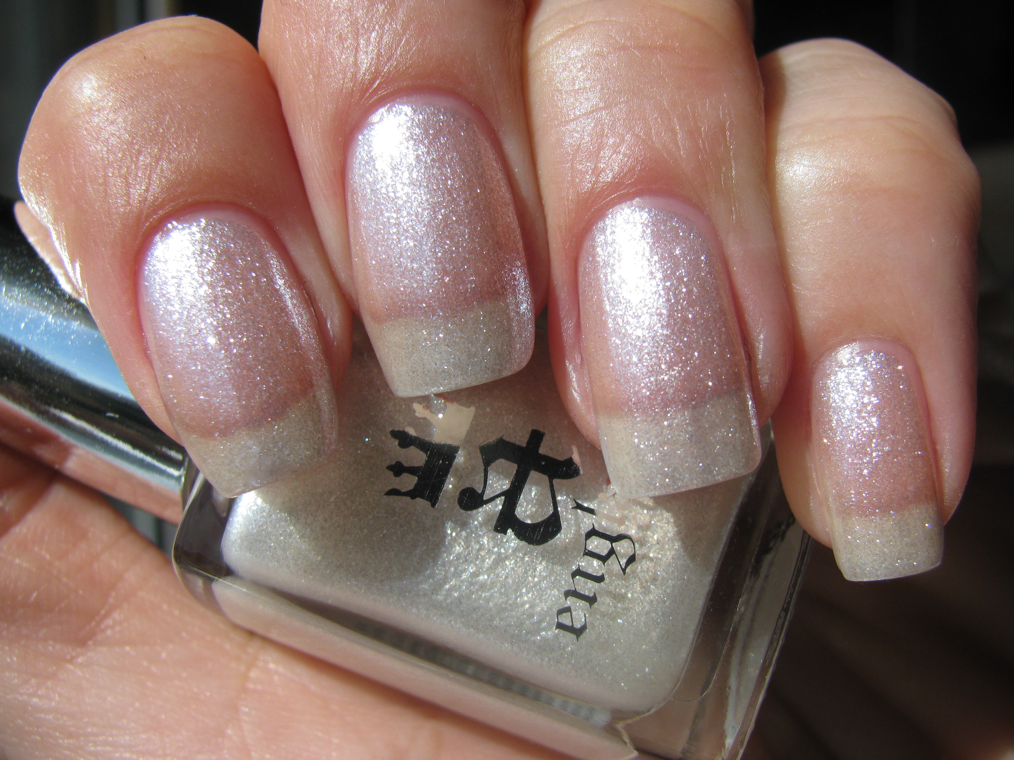
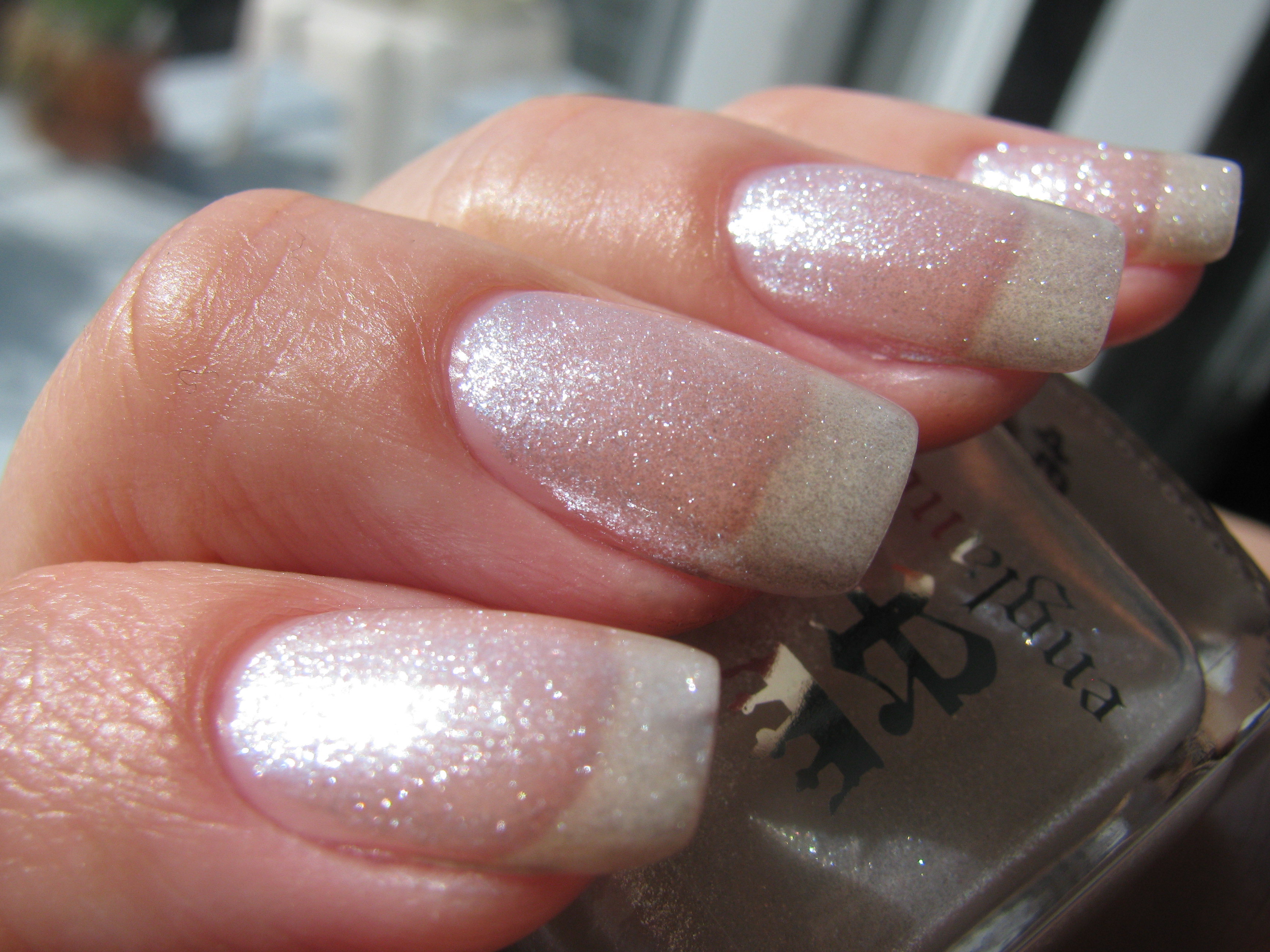
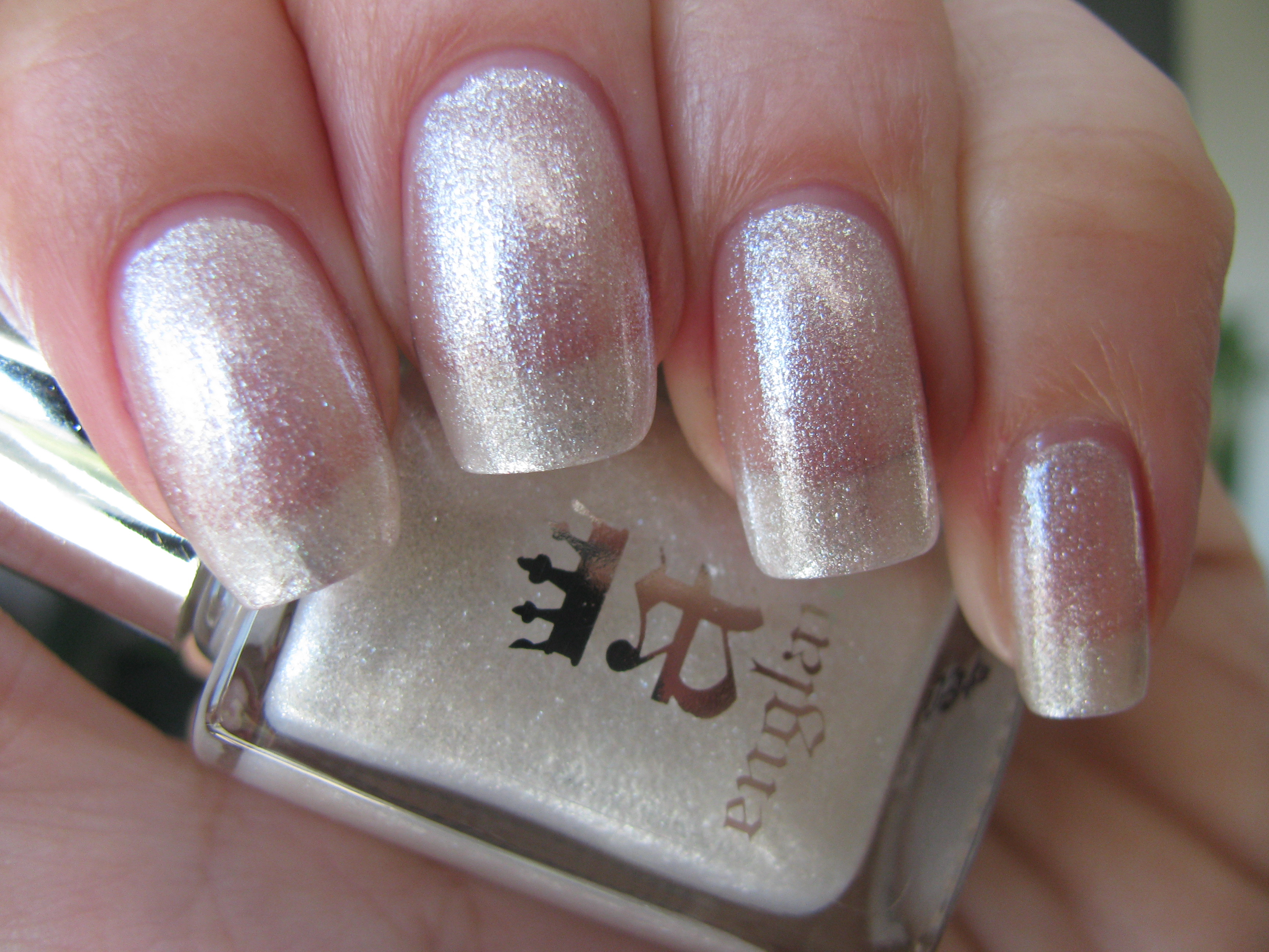
Known as King Arthur’s ambitious half sister, who then went on to seduce him, I half expected ‘Morgan Le Fay’ to be a sombre and Vampy shade; how I love her crystalline representation instead! This polish, while meant for layering, is quite stunning on its own as well. A true pearly hue, this has magical fairy dust strewn throughout, giving your nails an almost living ‘glow’. This was the only lacquer of them all, where I applied three coats, but two gives basically the same look – the formula is that rich. The glittering particles lie flat upon application and offer up a smooth surface, while a layer of top coat only adds to the incredible brilliance of the overall look. Notice how sunlight (top photo) brings out a whiter hue, while shaded light (bottom photo) lends the polish a silvery sheen….bewitching!
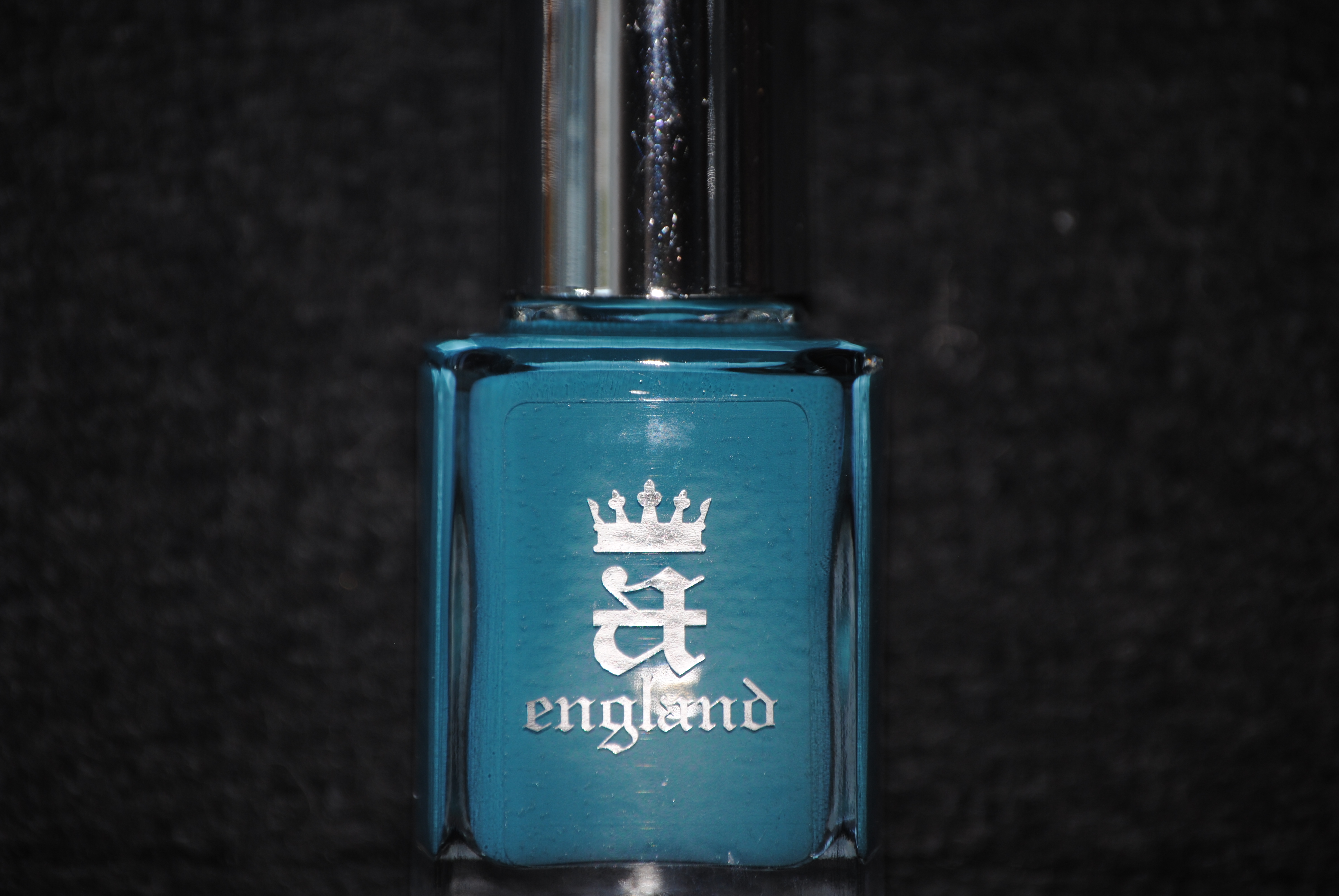
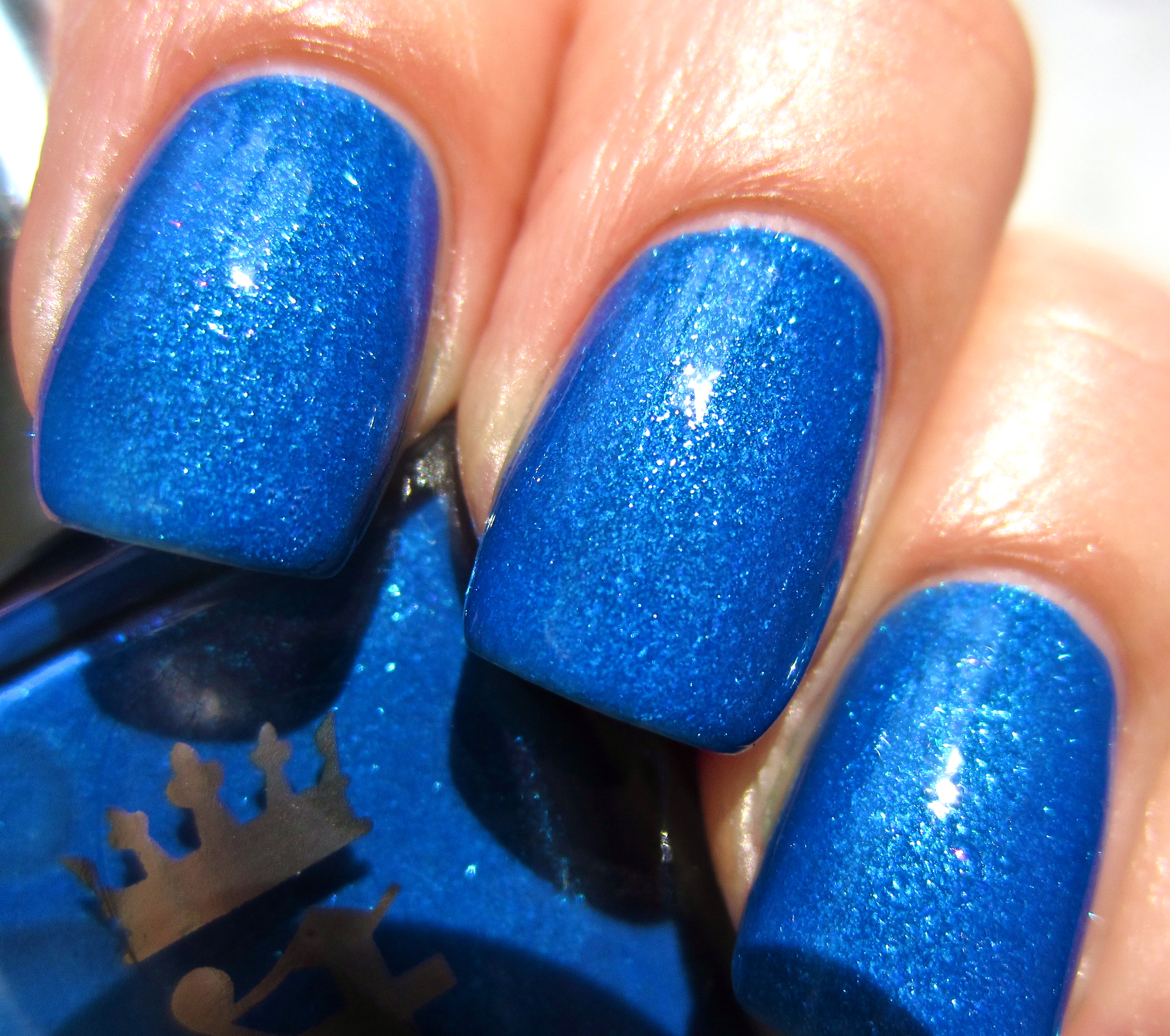
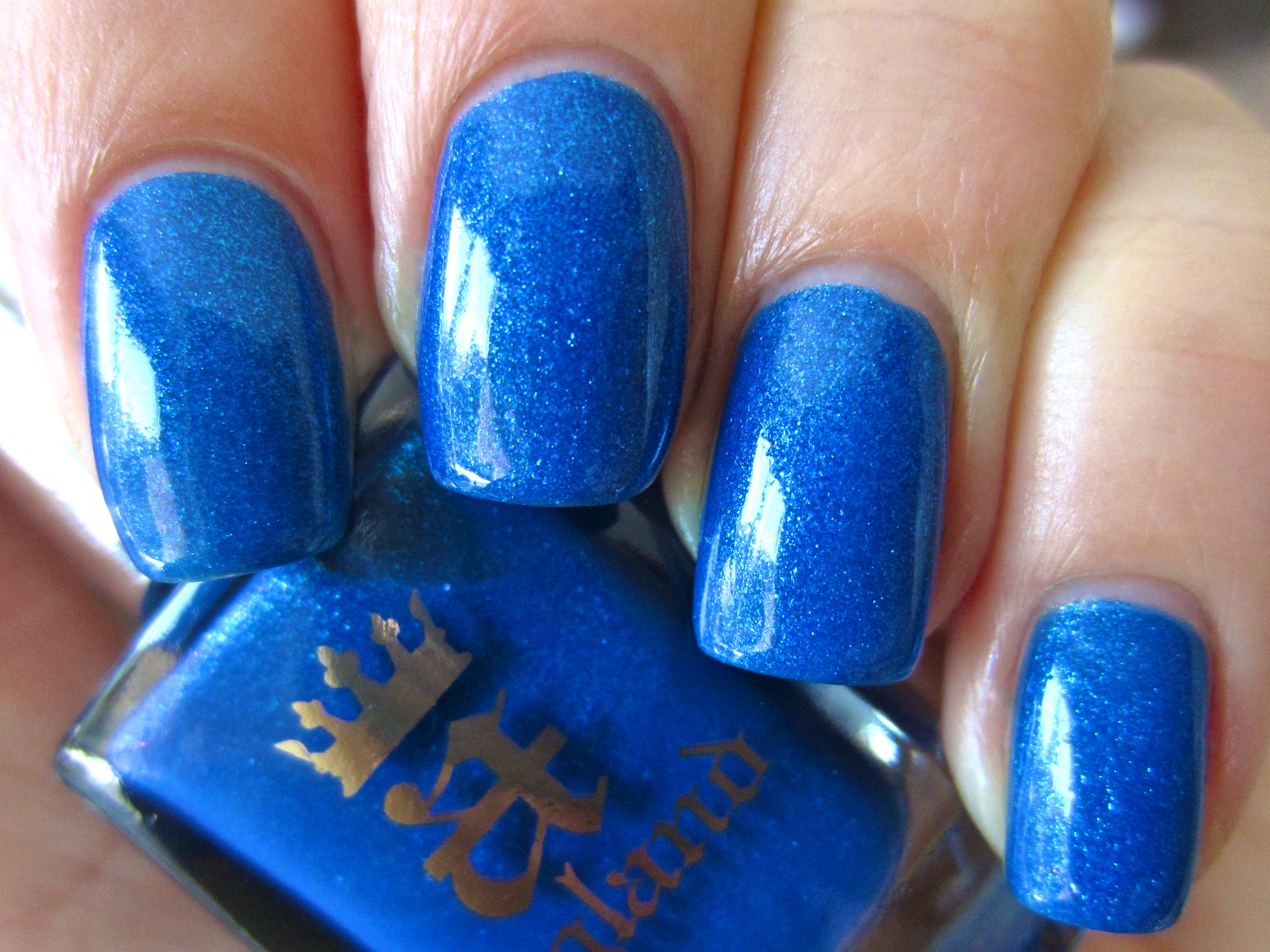
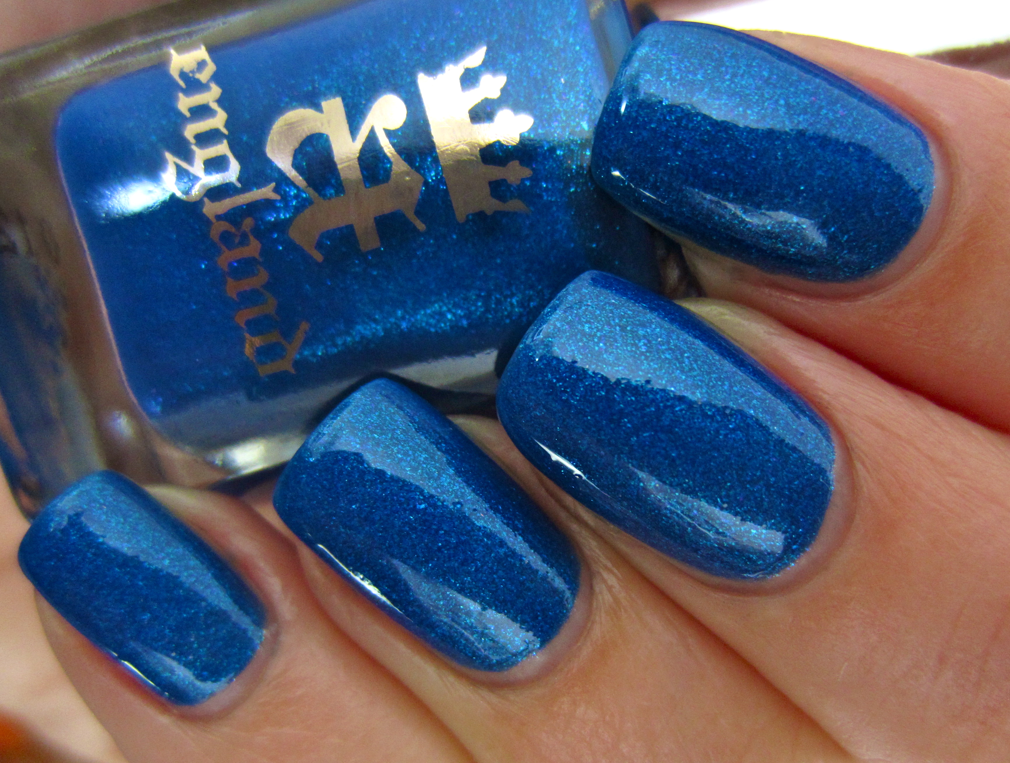
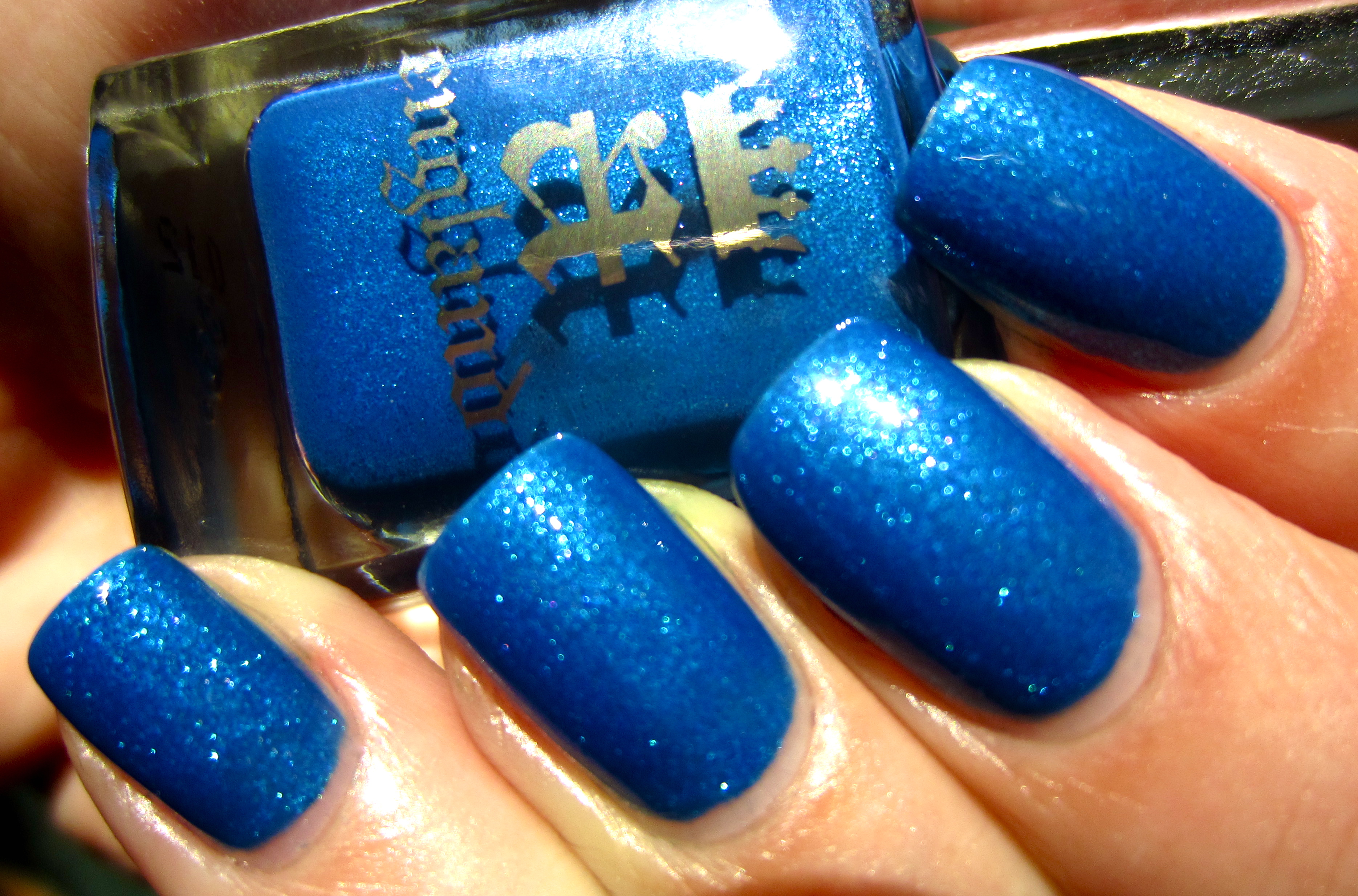
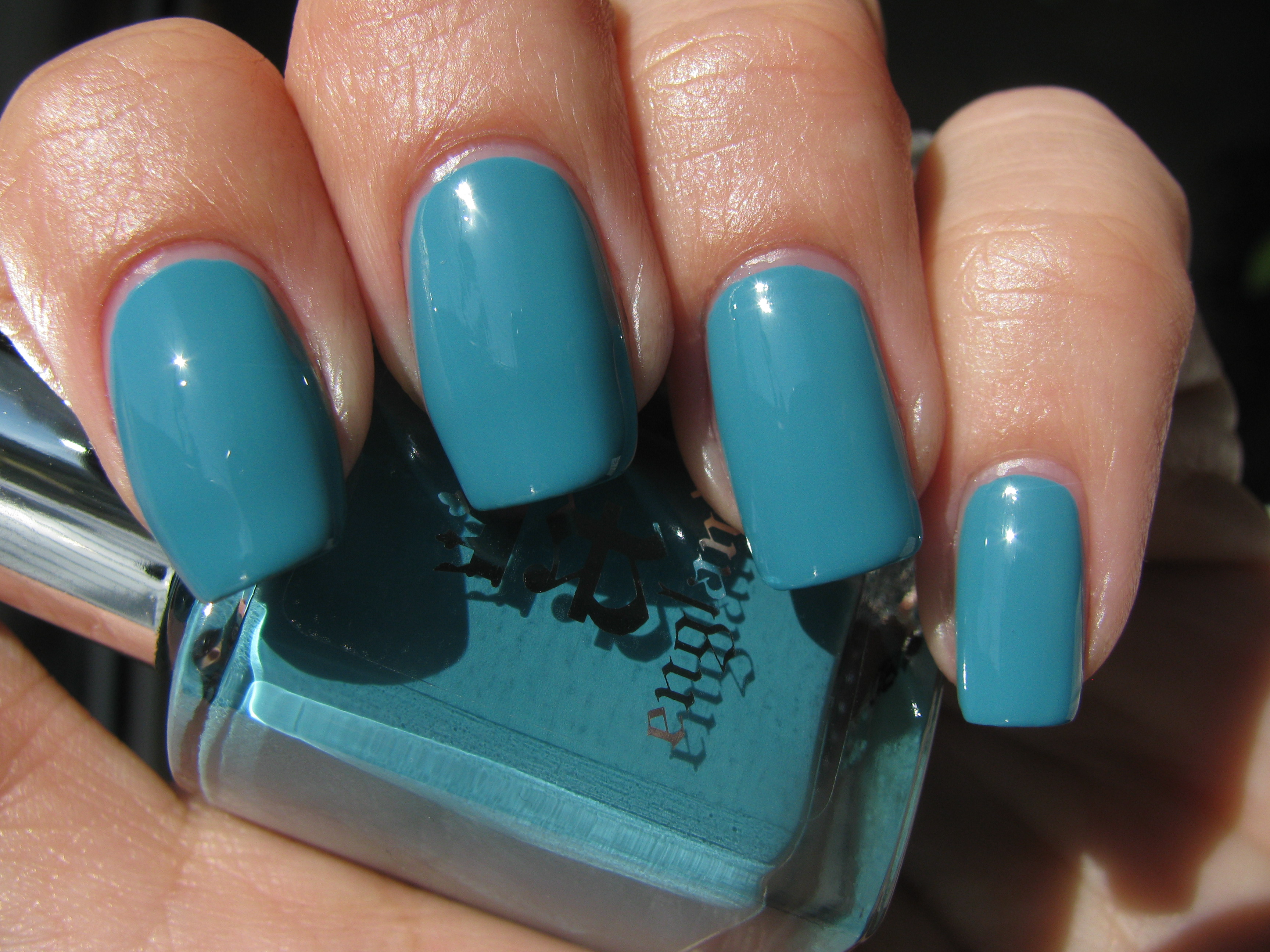
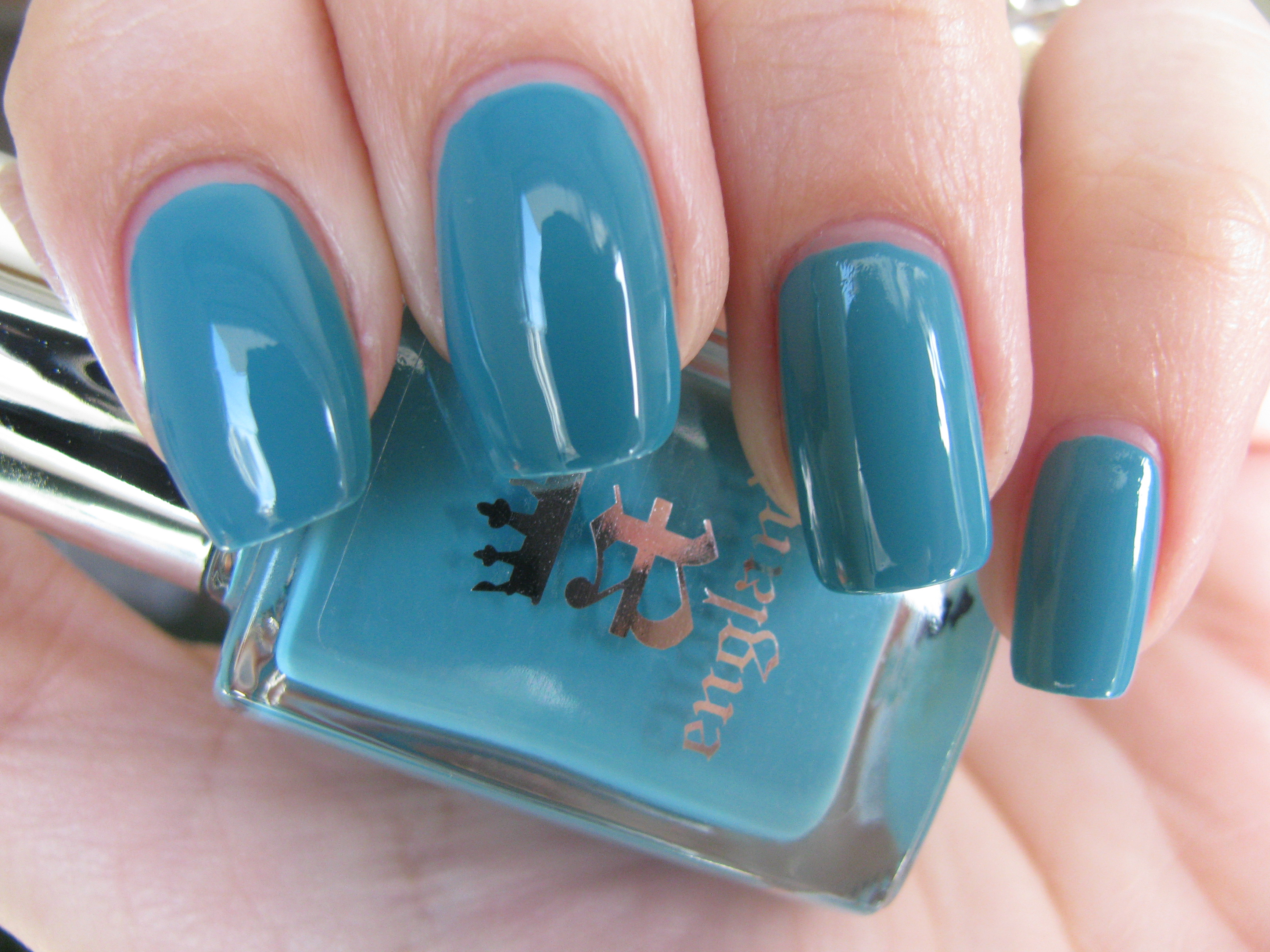
How appropriate that ‘Galahad’, one of three Arthurian knights found worthy enough to enter the presence of the Holy Grail, would be represented by the purity of this cerulean blue. Seen in full sun (top photo), I find myself mesmerized by it’s creamy azure depth and even shaded light (bottom photo) does not detract from that. With the first coat, I achieved perfect coverage, with an easily spreading and self-leveling formula. The brush is tapered, neither too thick nor thin, making it so easy to not only apply, but reach all edges clearly. The resulting end shine was absolutely brilliant, even before a top coat was added.
‘Lancelot’…that tortured knight, whose love for his king and queen, tore him apart, is so perfectly encapsulated in this deeply mysterious blackened ruby shade. Never reaching the deep ebony of a true black, you can still see near the top of the nail bed the blood red influences behind its inky depths. Practically fully opaque at one coat, I applied two here for swatching purposes, and could not believe how the polish seemed to glide onto my nails, and the sheer brilliance of the resulting end shine. In the middle photo, note how flash displays the shade’s deep red base. There is something so sophisticated and noble about this polish which just goes to show you that this knight had his ‘dark’ side as well.
When I layered ‘Morgan Le Fay’ over ‘Galahad’, the new hybrid colour that emerged was an ethereal shade straight out of a fairytale. A sparkling blue, this combination reminded me of the sunlight dancing off the surface of the ocean.
Layering ‘Morgan Le Fay’ over ‘Lancelot’ produced a most startling effect: I now had the cosmos arrayed on my fingertips. The hypnotic pull of this combination needs to be experienced, as well as seen!
Final thoughts: This is a range of products that has exceeded all my expectations, starting with the names, the bottle shape with wonderful brushes, to the colours themselves and exceptional formula. I love how the shades all work synergistically with each other, and the layering combinations using ‘Morgan’Le Fay’ are basically limitless. As if you needed another reason to indulge in these beauties, know that a-england lacquers are free from all harmful toxins and completely cruelty-free as well. Please feel free to visit a-england’s site for purchase or more information (the even offer international shipping!).
*Disclaimer: product samples provided by the company/PR for my unbiased consideration
a-england: Iseult, Holy Grail & Excalibur (review/swatches)
I continue to be impressed with a-england’s superb line of lacquers; today I bring you my third review on these beauties (part 1 reviewed here and part 2 here) which consists of ‘Iseult’ – an elegant princess pink, ‘Holy Grail’ – a pure molten gold and ‘Excalibur’ – a gleaming steely silver. One of the things I absolutely love about this range, is the high saturation of colour, along with the excellent application, high glossy shine and wonderful hues….oh wait; that’s more than one thing, right?! All swatches are with Sèche Natural base coat and two coats of lacquer, no top coat.
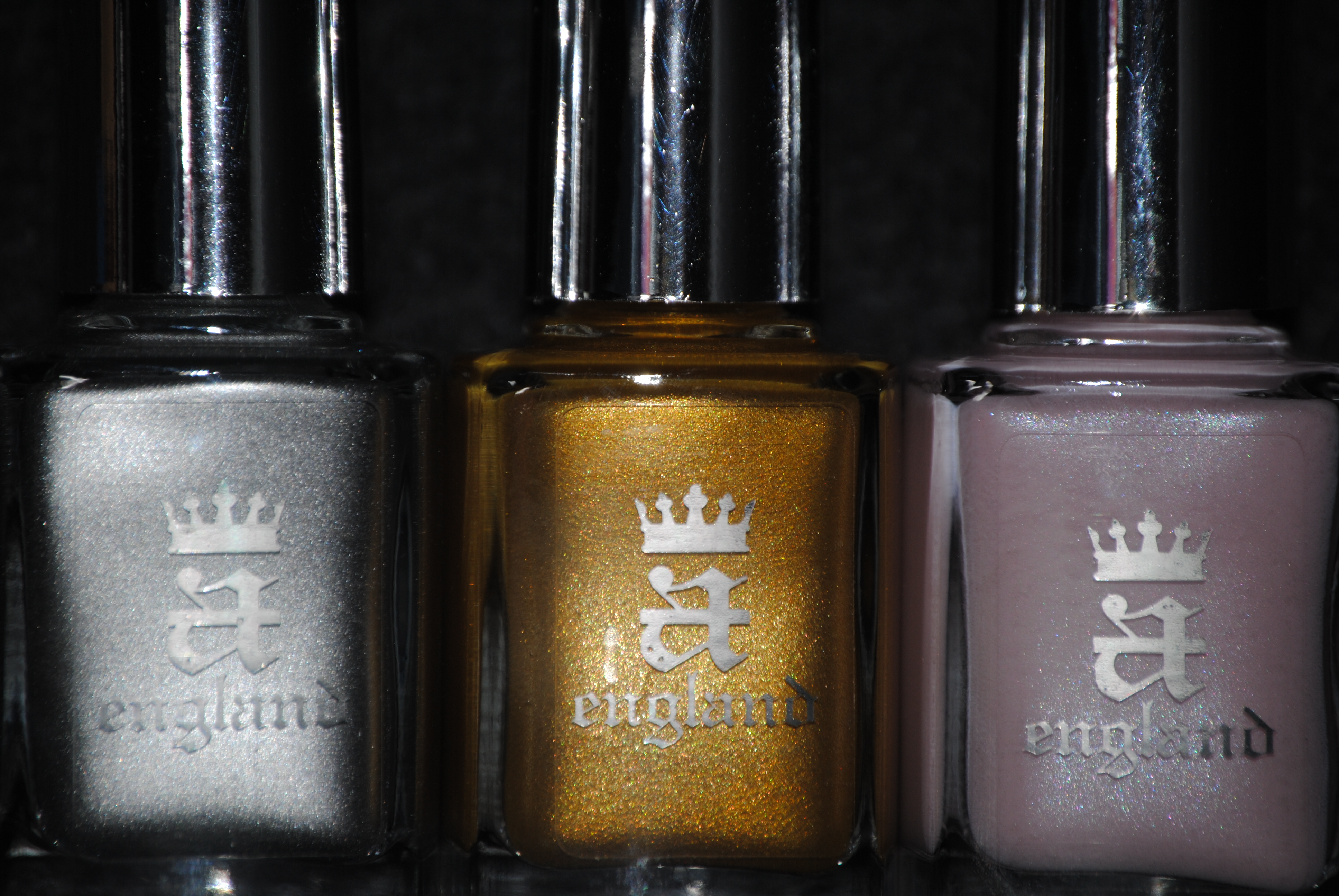
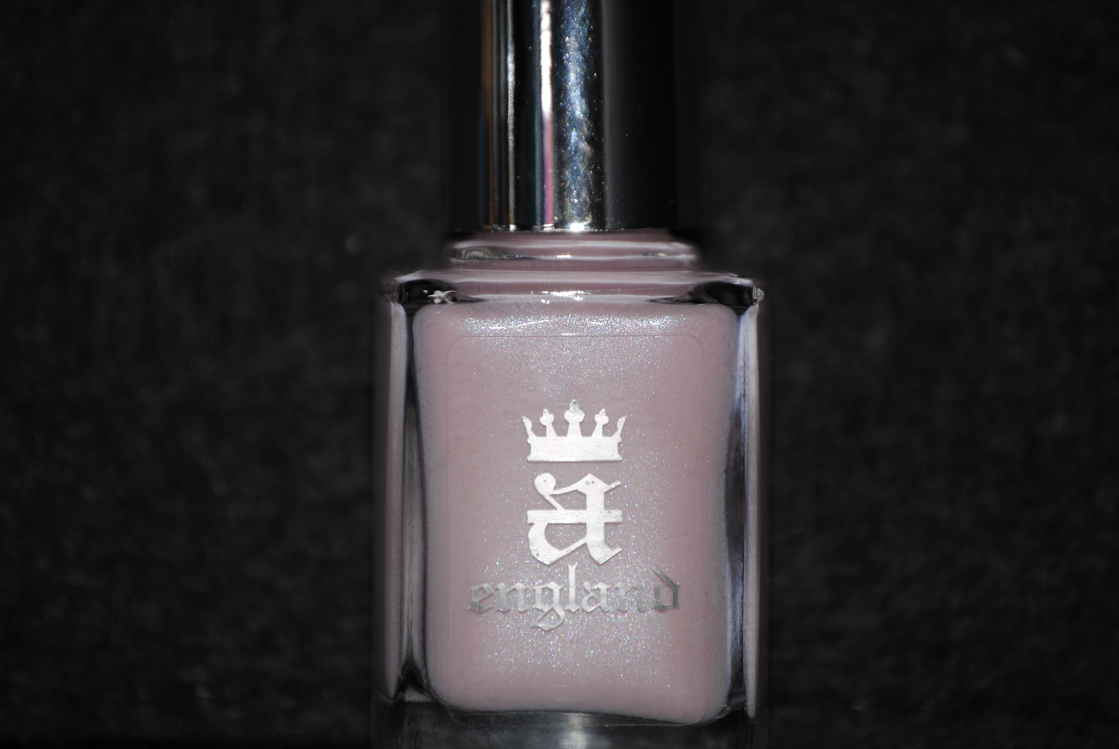
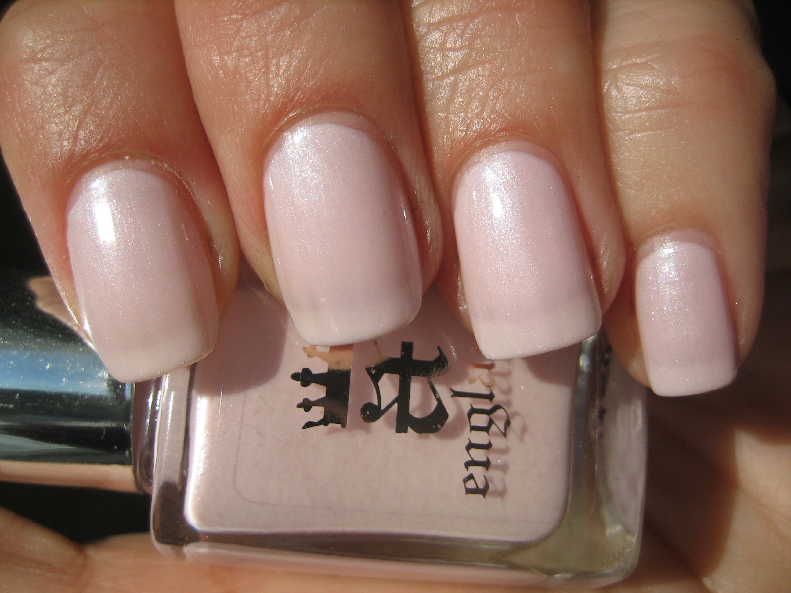
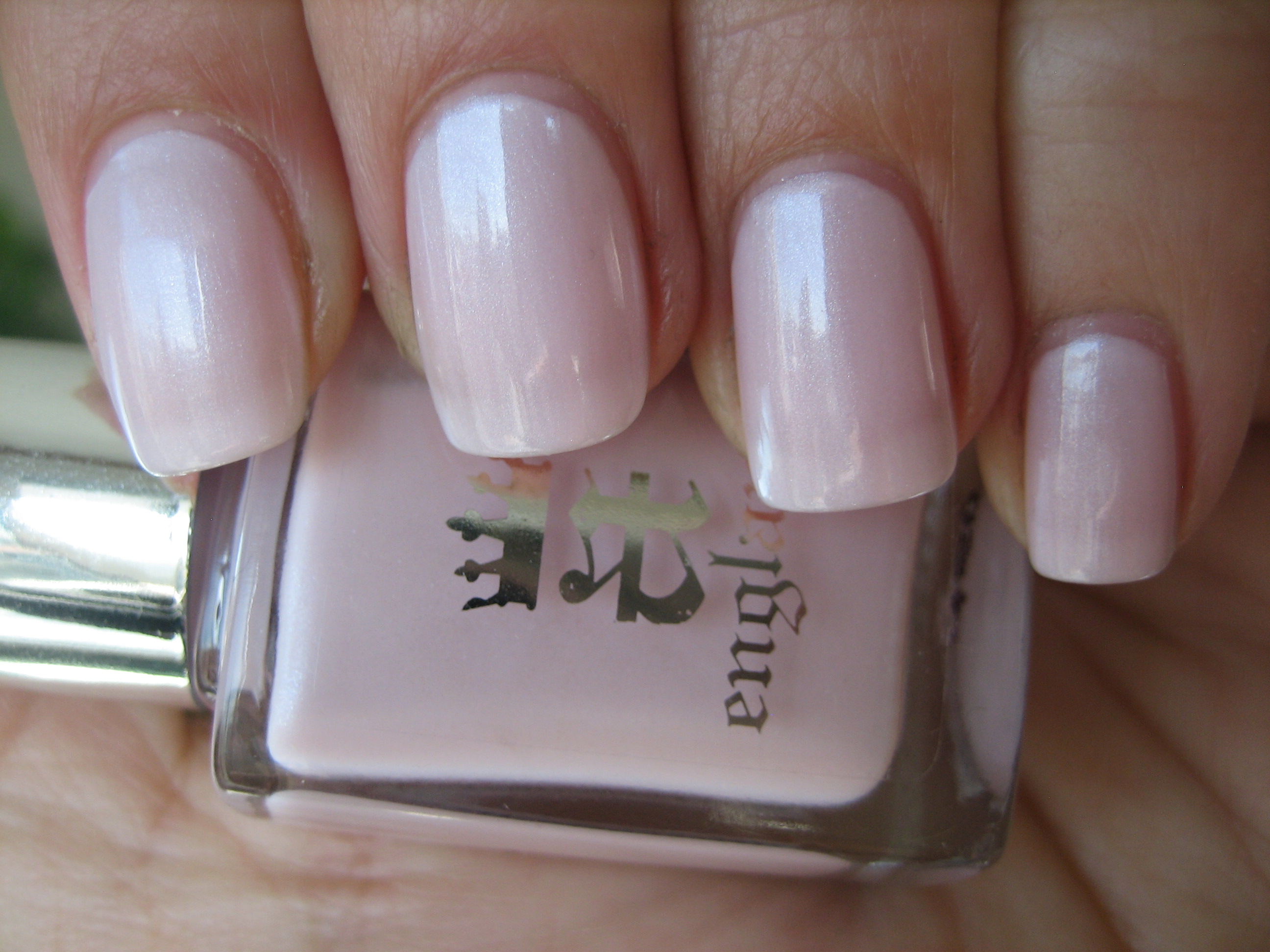
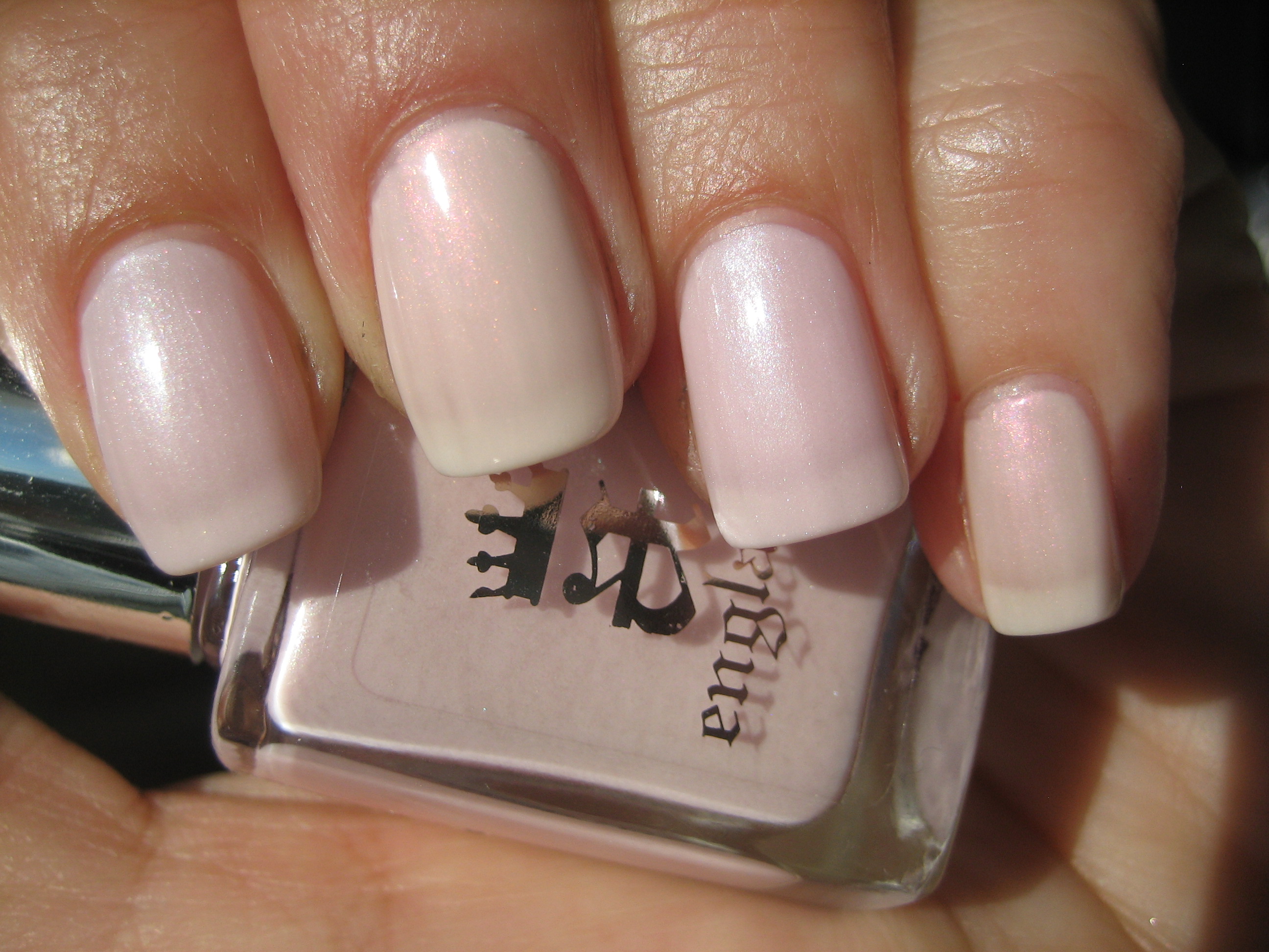
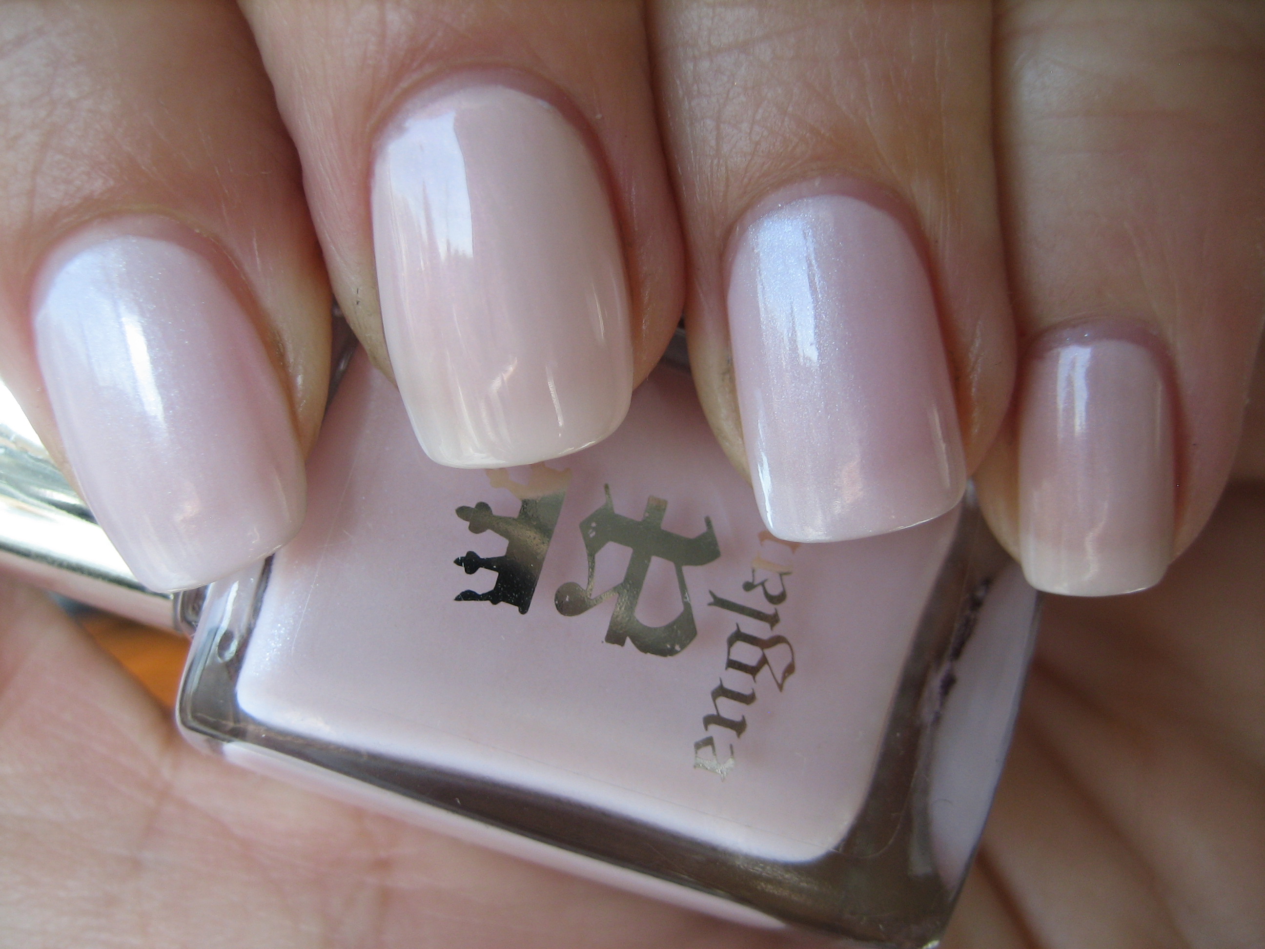
I confess that I initially passed over ‘Iseult’ in favour of certain other shades in the range but am so glad I finally got the chance to review this, as it has now become one of my favourite all time polishes. Never having been a ‘pink’ inclined person, ‘Iseult’ has made a believer out of me; this is an ethereal and dainty shade, of the most delicate pink (think inner part of a seashell) with a subtle silver, pink and some blue micro-shimmer in the base, lending it such incredible depth. Note how whether seen in full sun (top photo) or indirect light (bottom photo), the secret silver shimmer is always apparent. Not meant to be overly opaque, it has a modern yet ladylike feel to it and I love the clean and polished look it lends your nails. Pure bliss!
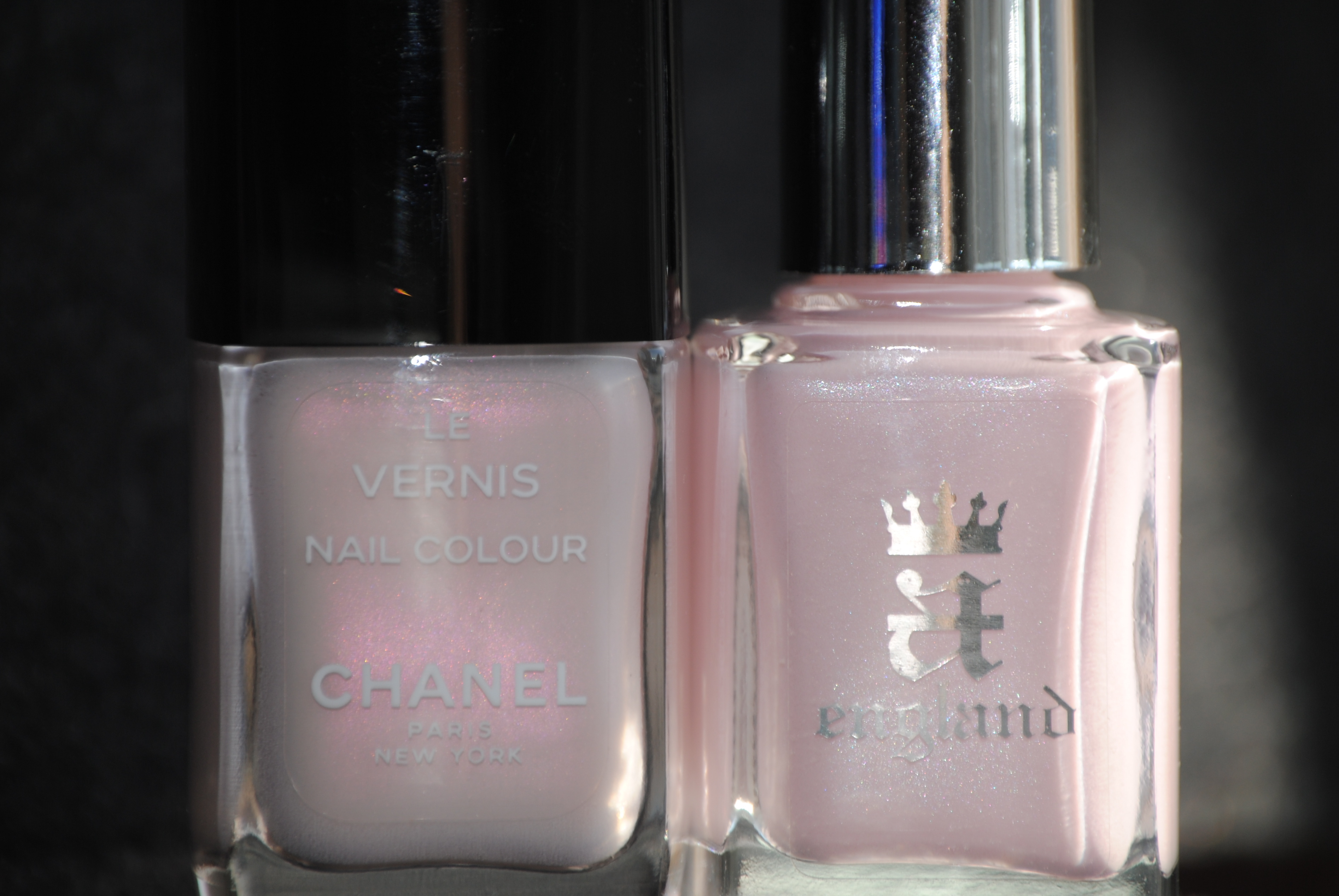
Going through my stash, I found that I didn’t have many shades in this range and the only one that came close is ‘Opal’, a discontinued shade from CHANEL. While the base tone seems to be very close, the biggest difference between the two is the lack of obvious silver shimmer and increase in pink shimmer of the CHANEL. ‘Iseult’ also seems to be a more cool toned hue, probably based on its delicate blue shimmer. I also found that ‘Opal’ seemed almost yellowish in comparison to the ballerina pink of ‘Iseult’.
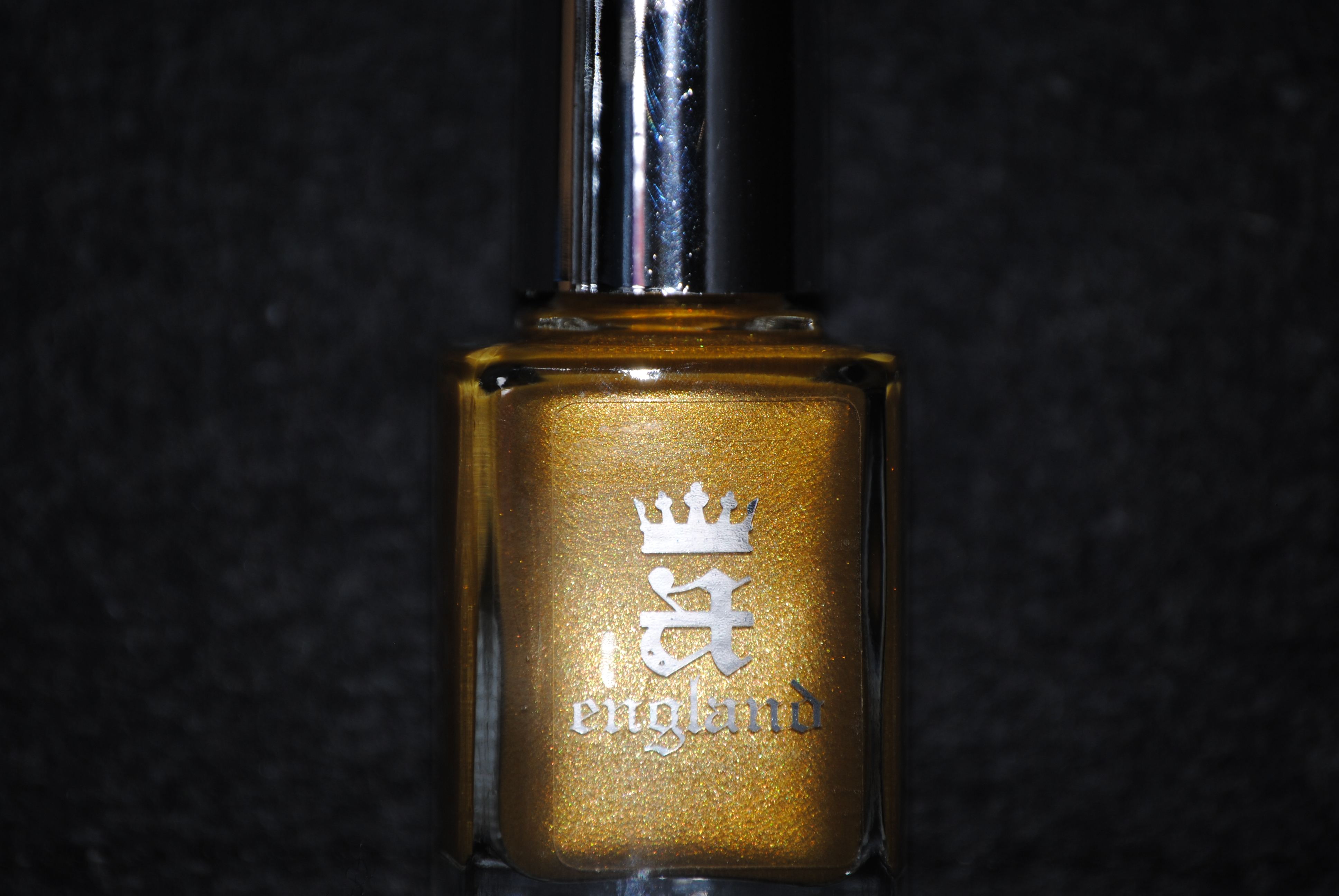
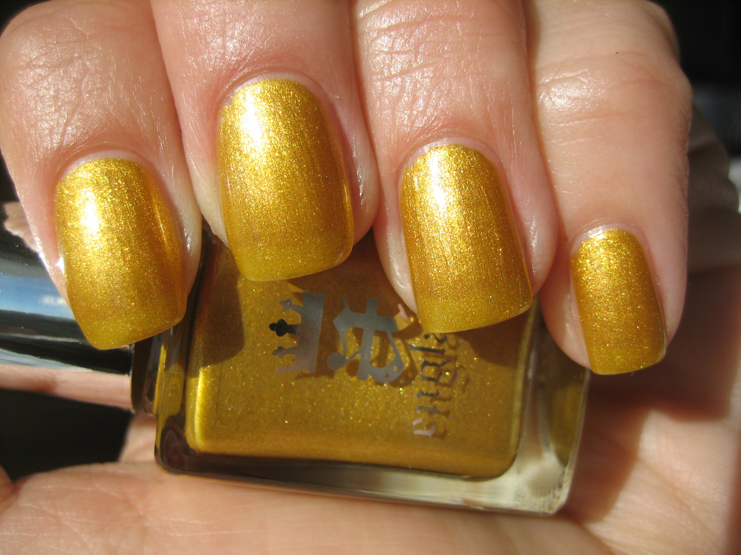
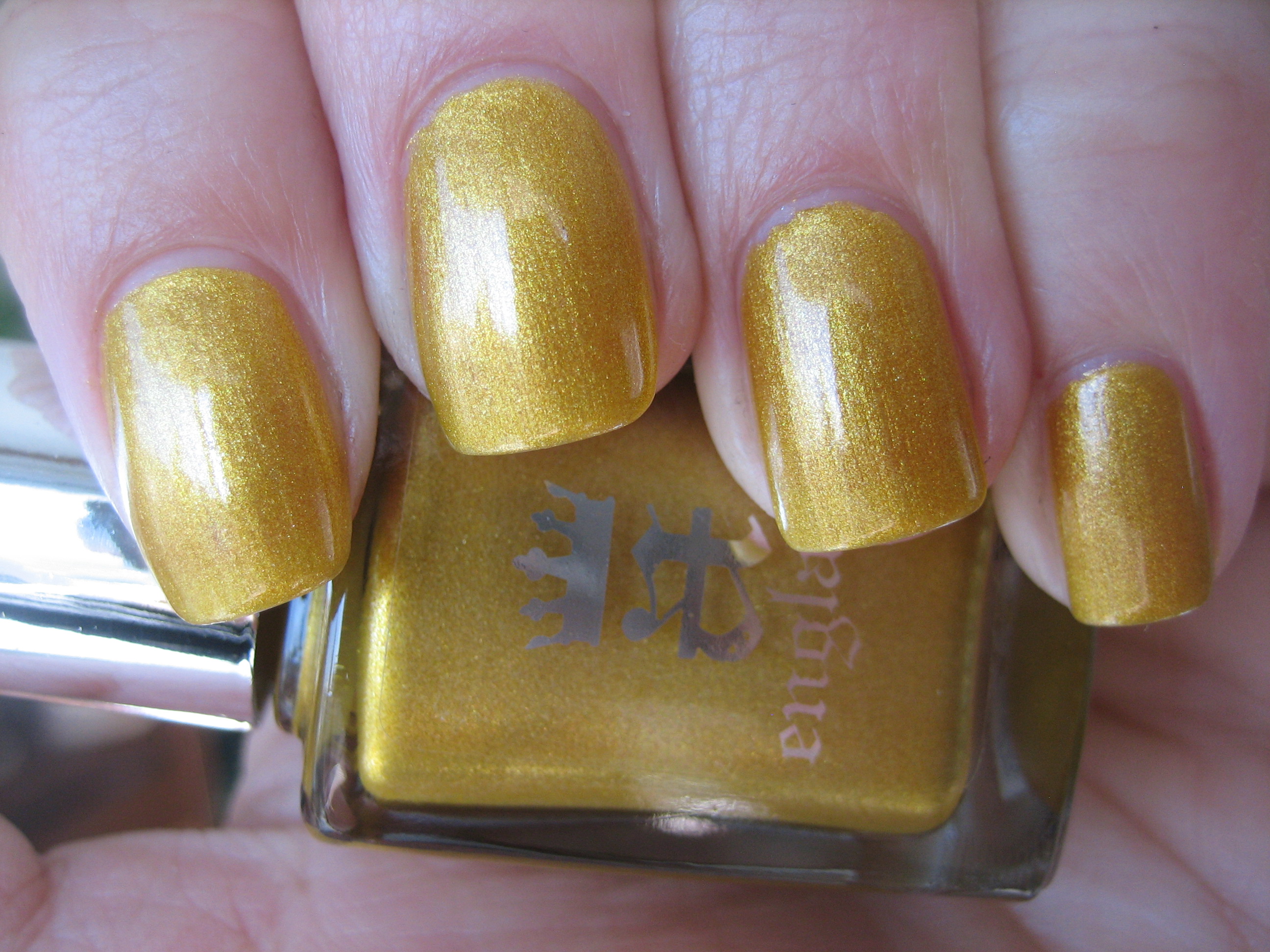
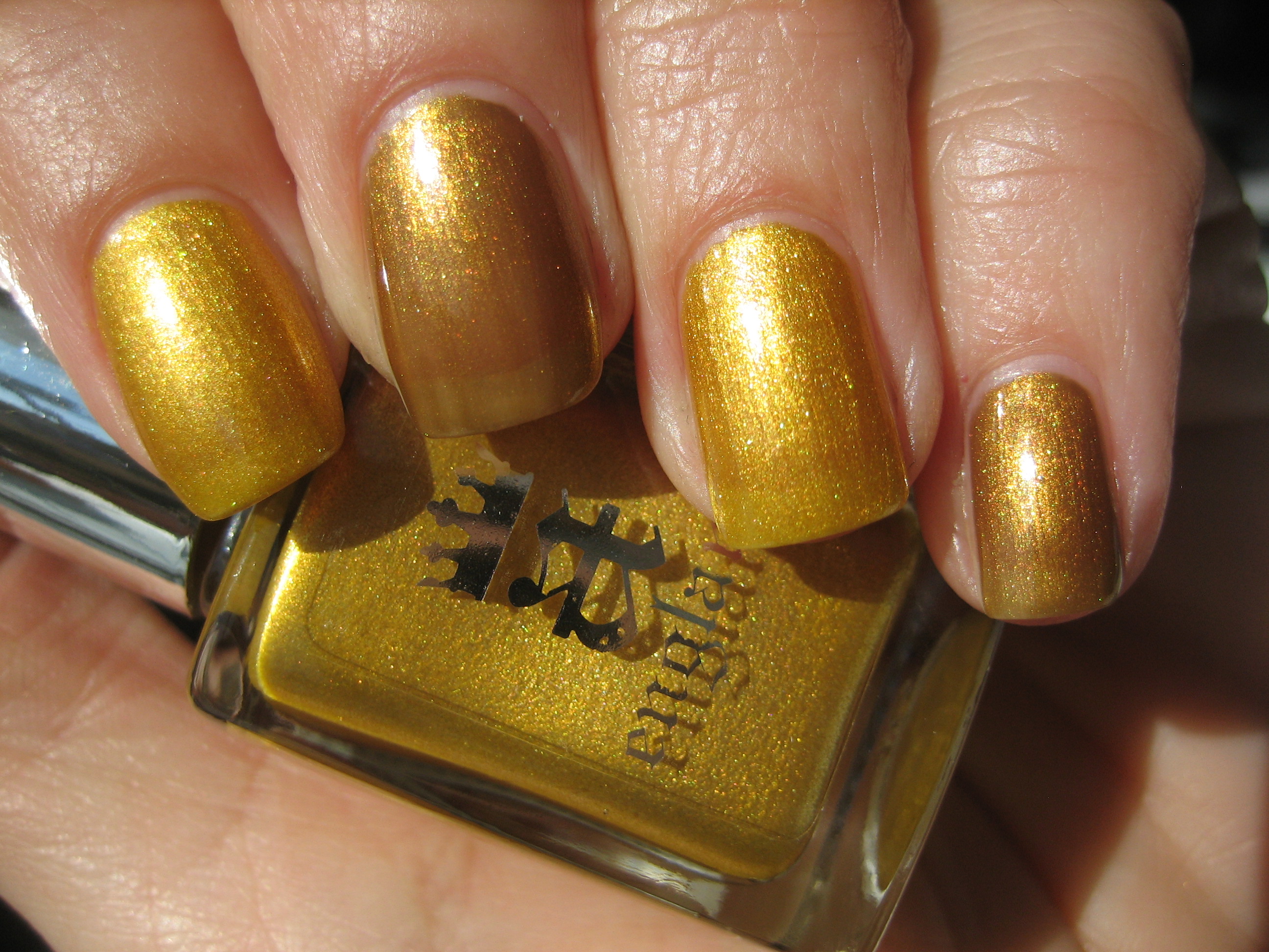
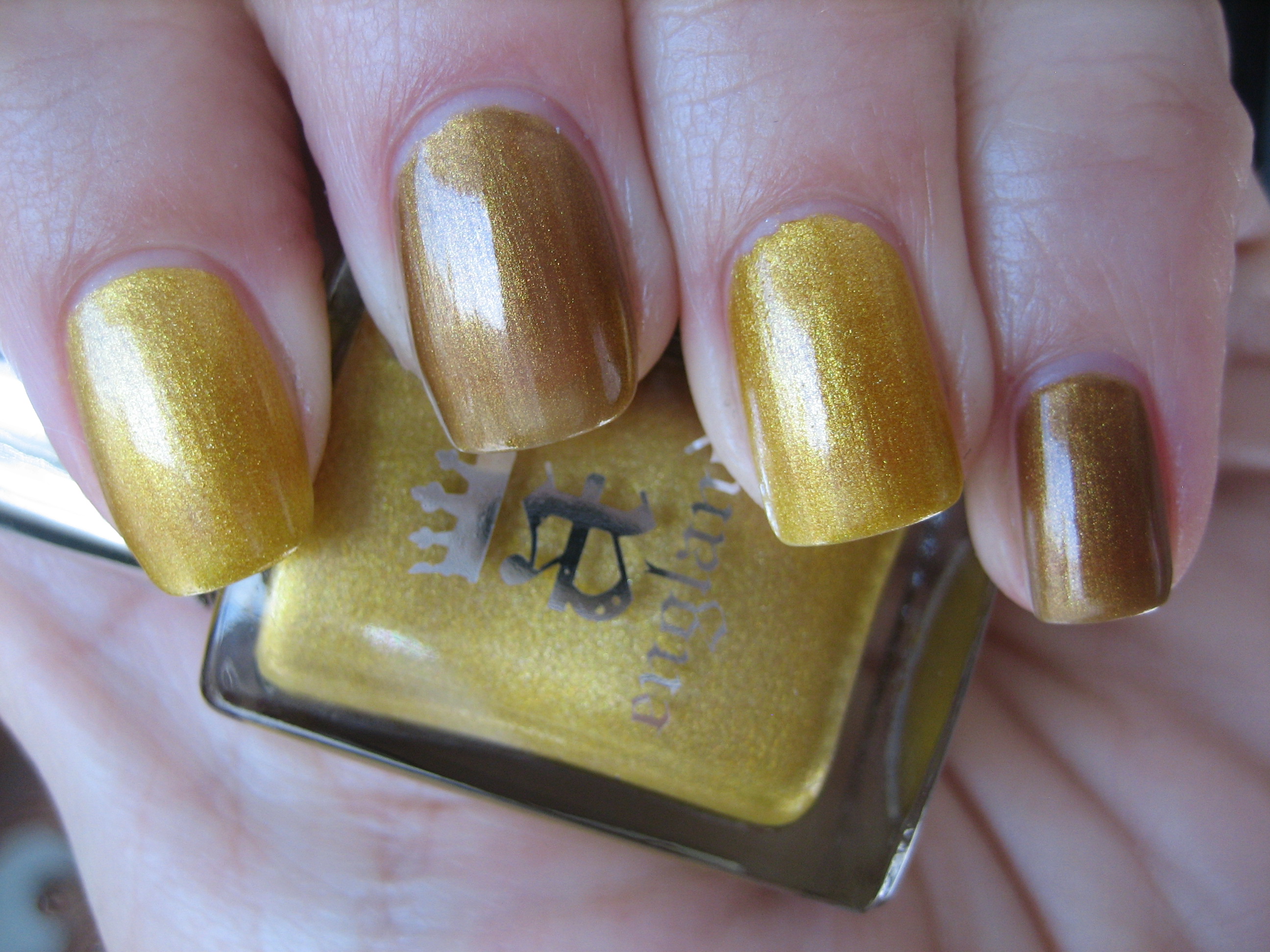
‘Holy Grail’ is an antiqued looking golden hue, with very subtle reddish and green flecks of shimmer in its base. This is the colour I imagine that chalice of legend would be; a deep yet vibrant gold. At two coats, it still isn’t fully opaque, but I prefer it that way as it will never come off as too bright or gaudy but more of a regal yet wearable shade. Note how intensely it sparkles when viewed in full sun (top photo) yet how indirect light (bottom photo) tones it down enough to fully enjoy its depth.
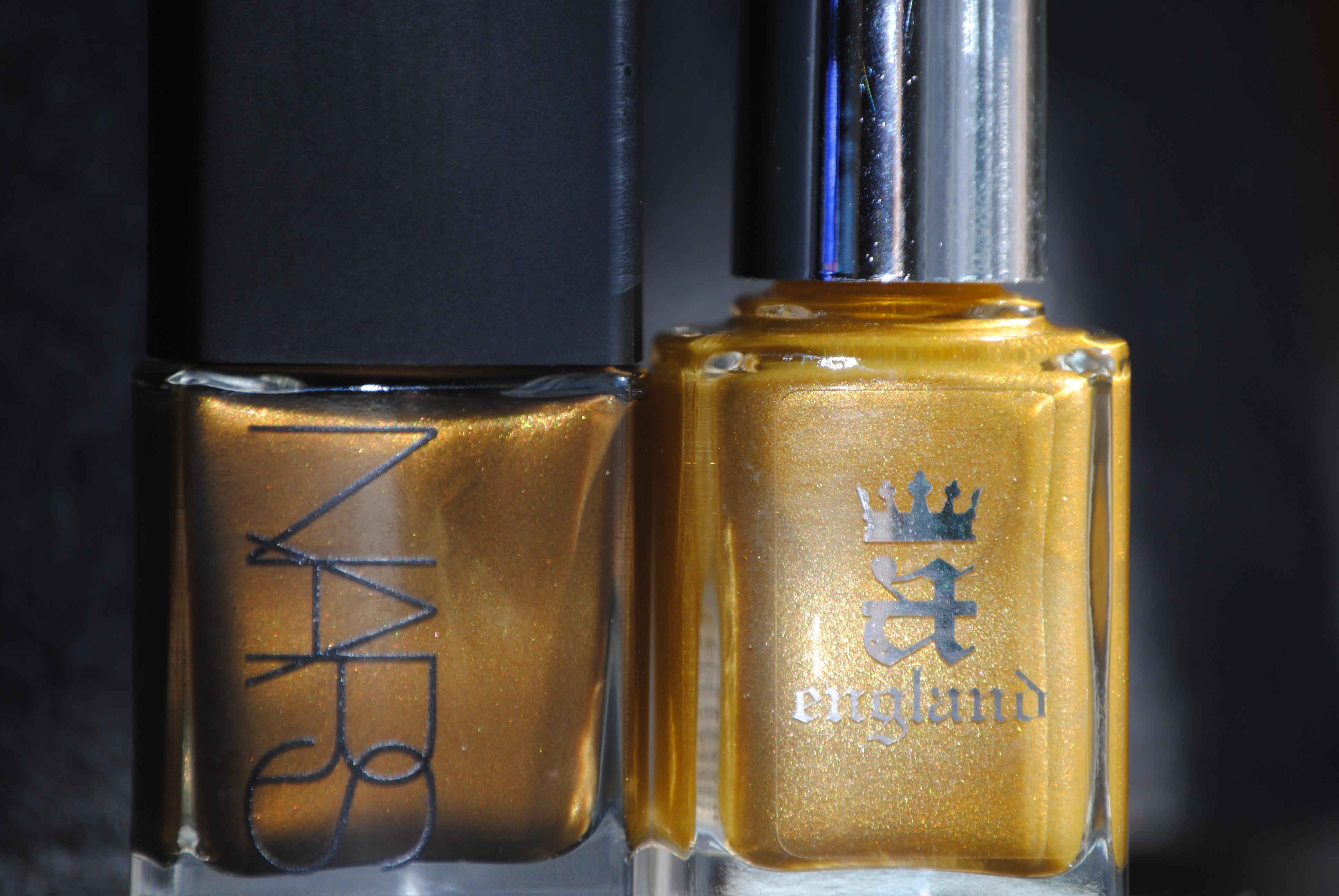
Among the few golds I have in my stash, the closest I found was NARS’ ‘Desperado’ (reviewed here) and even though the bottle shades seem quite close, note how much lighter ‘Holy Grail’ appears on the nail. The similarity between the two is primarily in the hues of the shimmer particles they both possess which cloaks them each with a patina of age to them. ‘Desperado’ also seems to bear a somewhat brassier look to it, compared to ‘Holy Grail’s’ true molten gold hue. Note how full sun (top photo) brings out a different gleam in each, while indirect light (bottom photo) points out the obvious tonal differences.
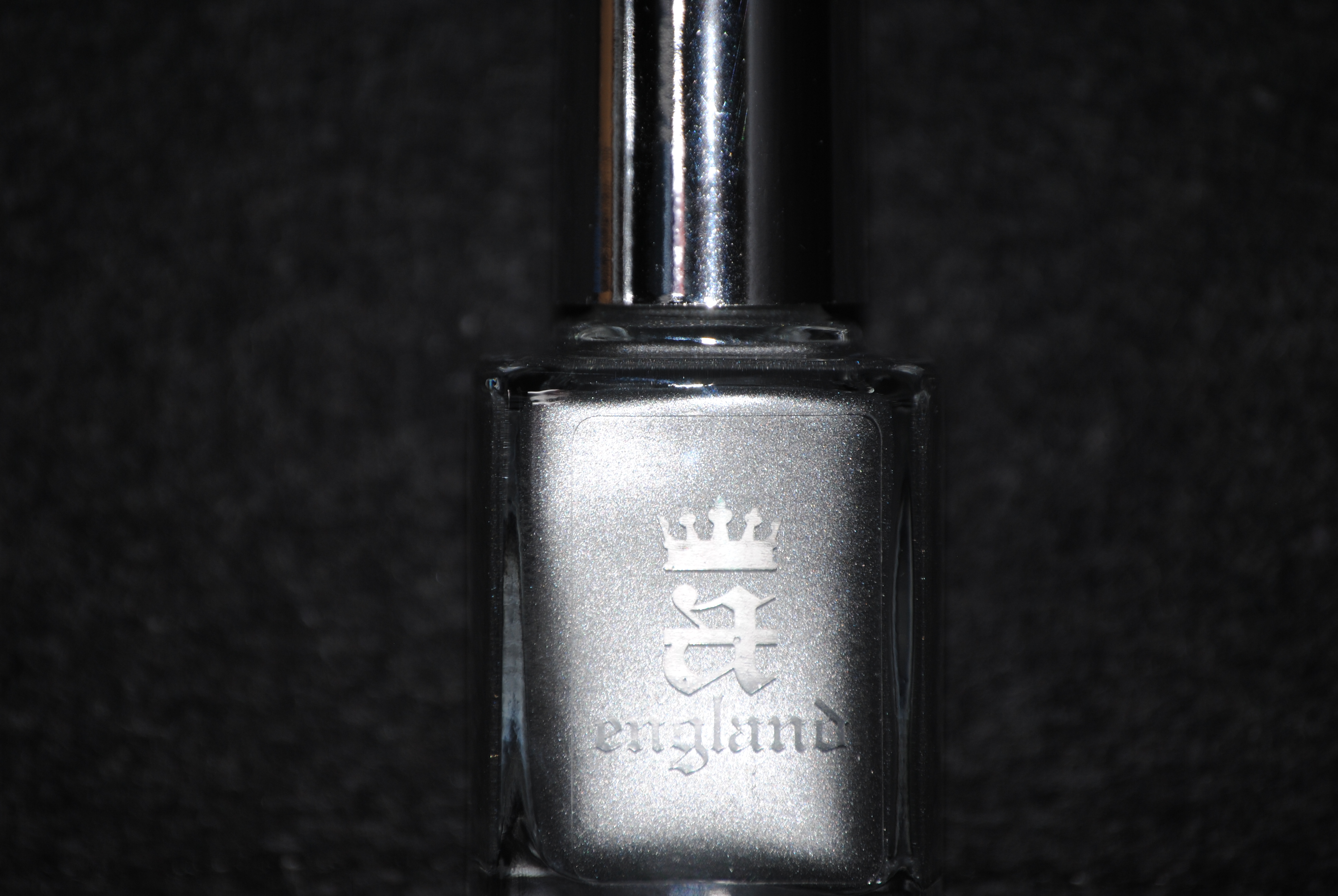
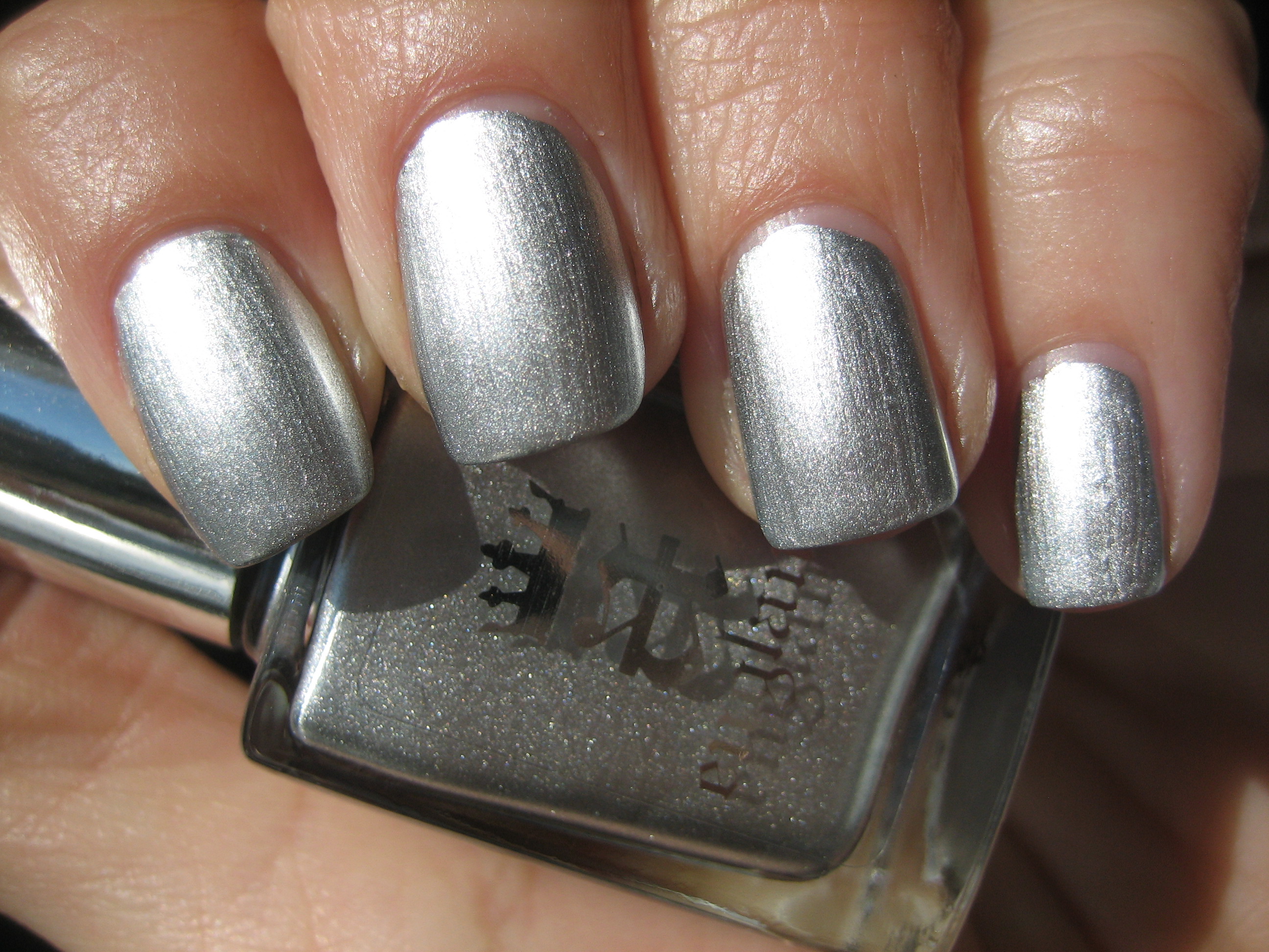
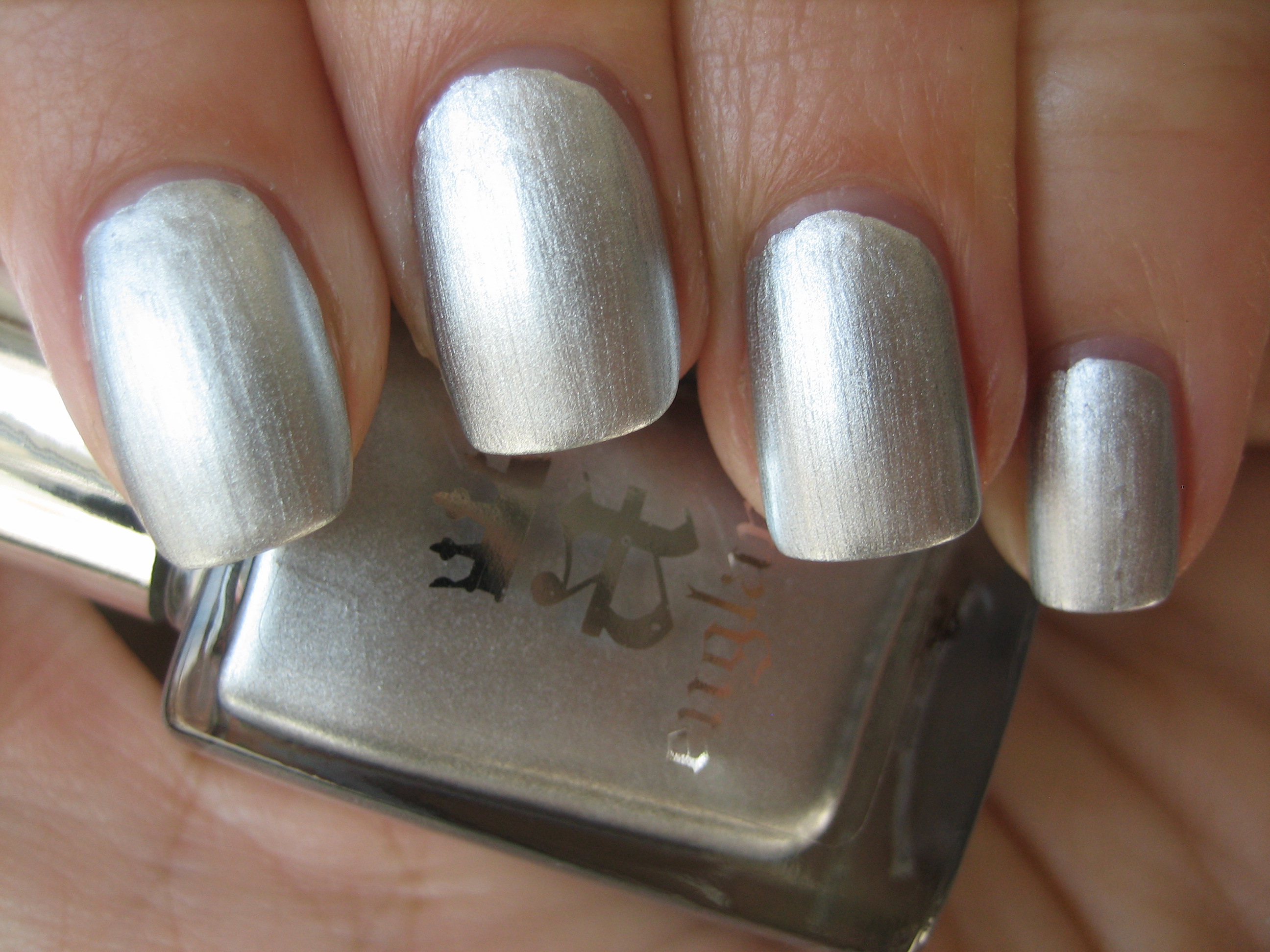
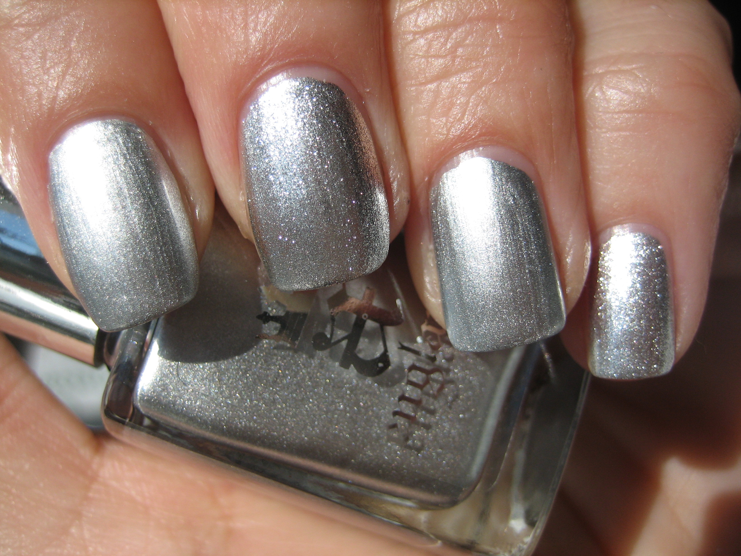
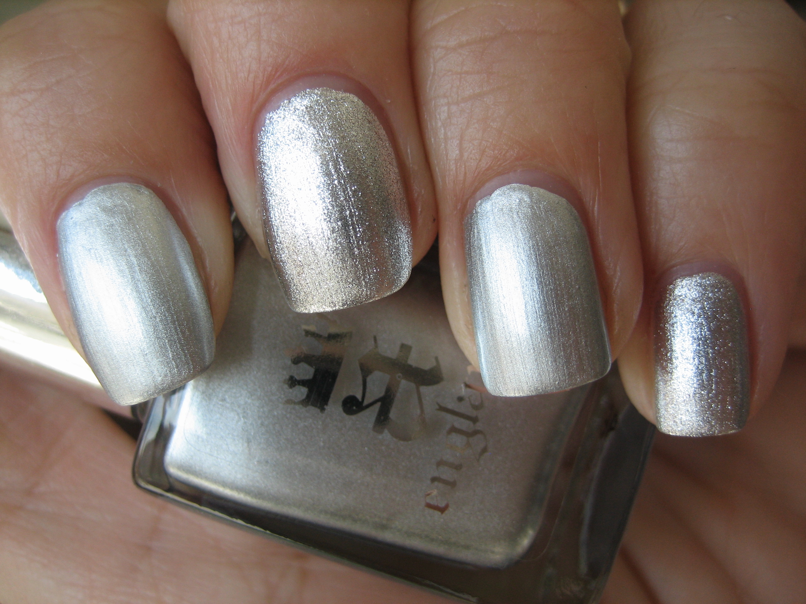
Finally, we have ‘Excalibur’, a gleaming silver metallic foil hue. The intensity of the shine on this one was absolutely insane; seen in sunlight (top photo), you would be hard pressed to view it without sunglasses and I love how even in indirect light (bottom photo) you still have that reflective finish. The application was as smooth as butter, and probably because it is a foil polish, dry time was super fast, with no brush strokes to speak of. This is the silver hue I think of when I think of King Arthur’s sword of legend; forged of the finest metals and imbued with magic……superb!
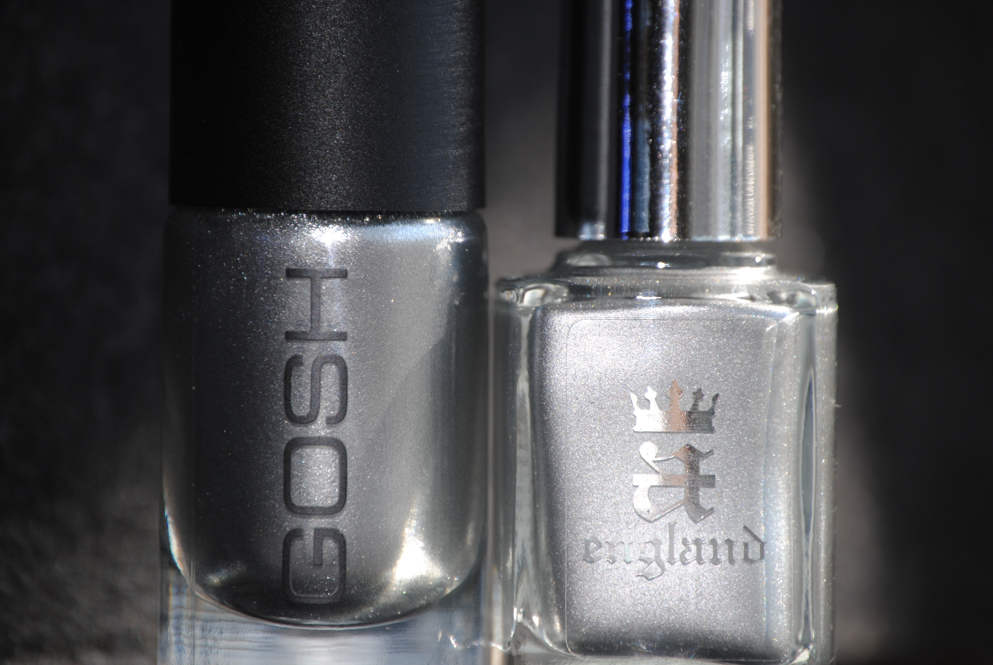
The closest shade I have in my collection is Gosh’s ‘Silver’ (reviewed here), another metallic foil polish with slightly more grey in its base and chunkier foil particles as well. While they were both quite similar in application, ‘Excalibur’ has a much smoother finish and was fully opaque with two thin coats whereas ‘Silver’ was just a touch thinner making it minimally less opaque.
Final thoughts: At the risk of repeating myself, this entire line is more than worthy of its royal and historical references and each polish to date has totally impressed me. I find myself captivated by the highly pigmented shades and I love that they are all easily two-coaters. Even without a top coat, the resulting end shine is mirror like and while the colours themselves are not outrageous hues, they all have a certain undefinable “something” that takes them to a whole new level. Apart from being free from all harmful toxins, the range is also animal cruelty-free and the entire line is personally overseen by the founder and creator, the ingenious Adina Bodana. All polishes (including base and top coats) retail for £ 9.50 and the company also offers international shipping for your convenience. For more information or to order, please visit a-england’s website here.
*Disclaimer: Product samples were provided by the company/PR for my unbiased consideration
a-england: Merlin, Avalon & Perceval (review/swatches)
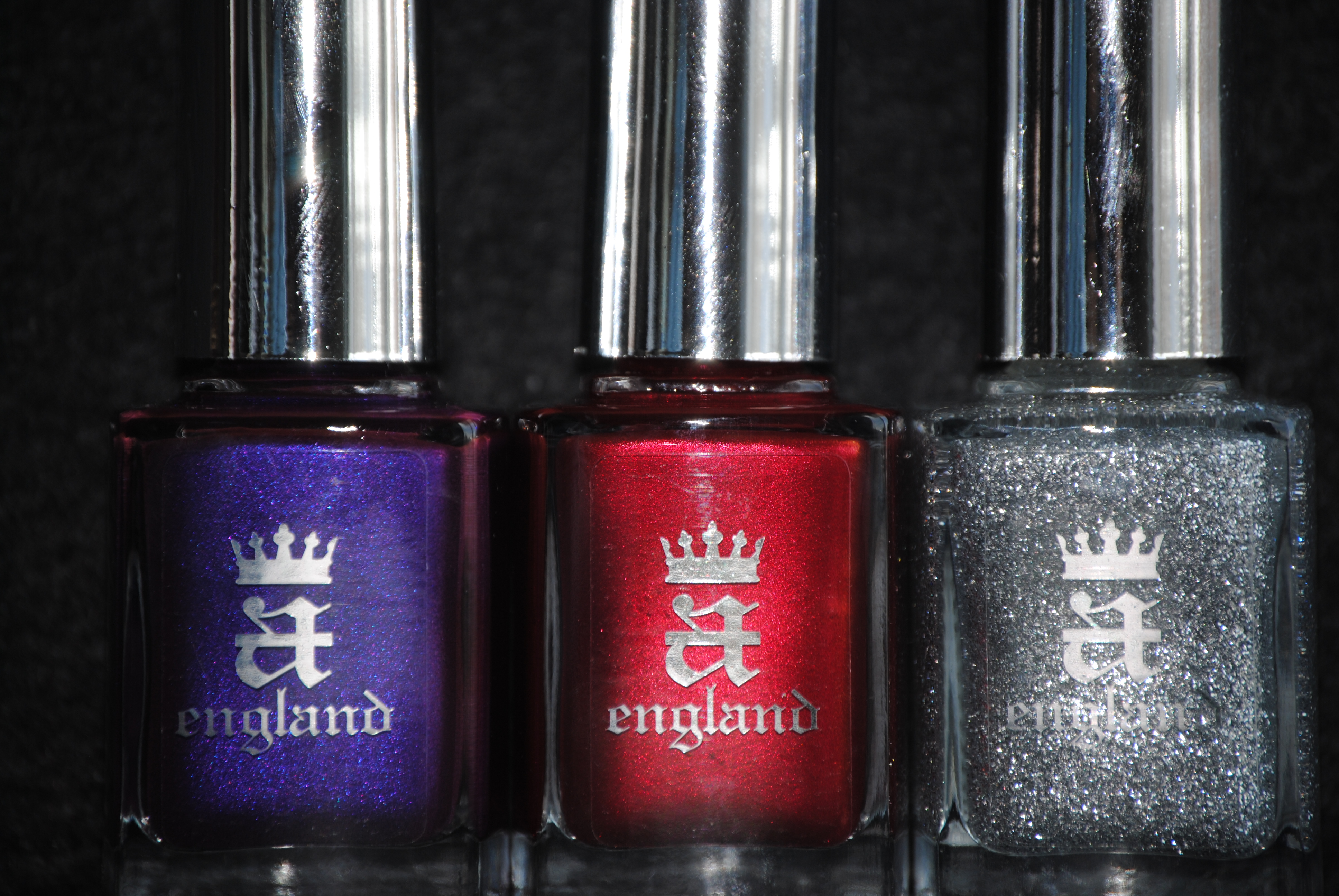
This past January, a new star in the world of nail lacquer, appeared on the horizon: a england. With my first review of these beauties, it was instant LOVE. The jewel-like hues, the incredibly smooth formula, the wonderfully flexible brush plus the high shine finish convinced me that this was a line of polishes of sublime perfection. The brain child of the highly talented Adina Bodana, these are polishes that are meant to “crown your hands and feet“. How appropriate then that her first collection should revolve around that most regal of legends, King Arthur. The three shades I bring you today are Merlin – a stunning silver sparkler, Avalon – deep royal purple and Perceval – intense shimmery garnet. All swatches are with Sèche Natural base coat and two coats of lacquer (except where noted in the comparisons), no top coat.
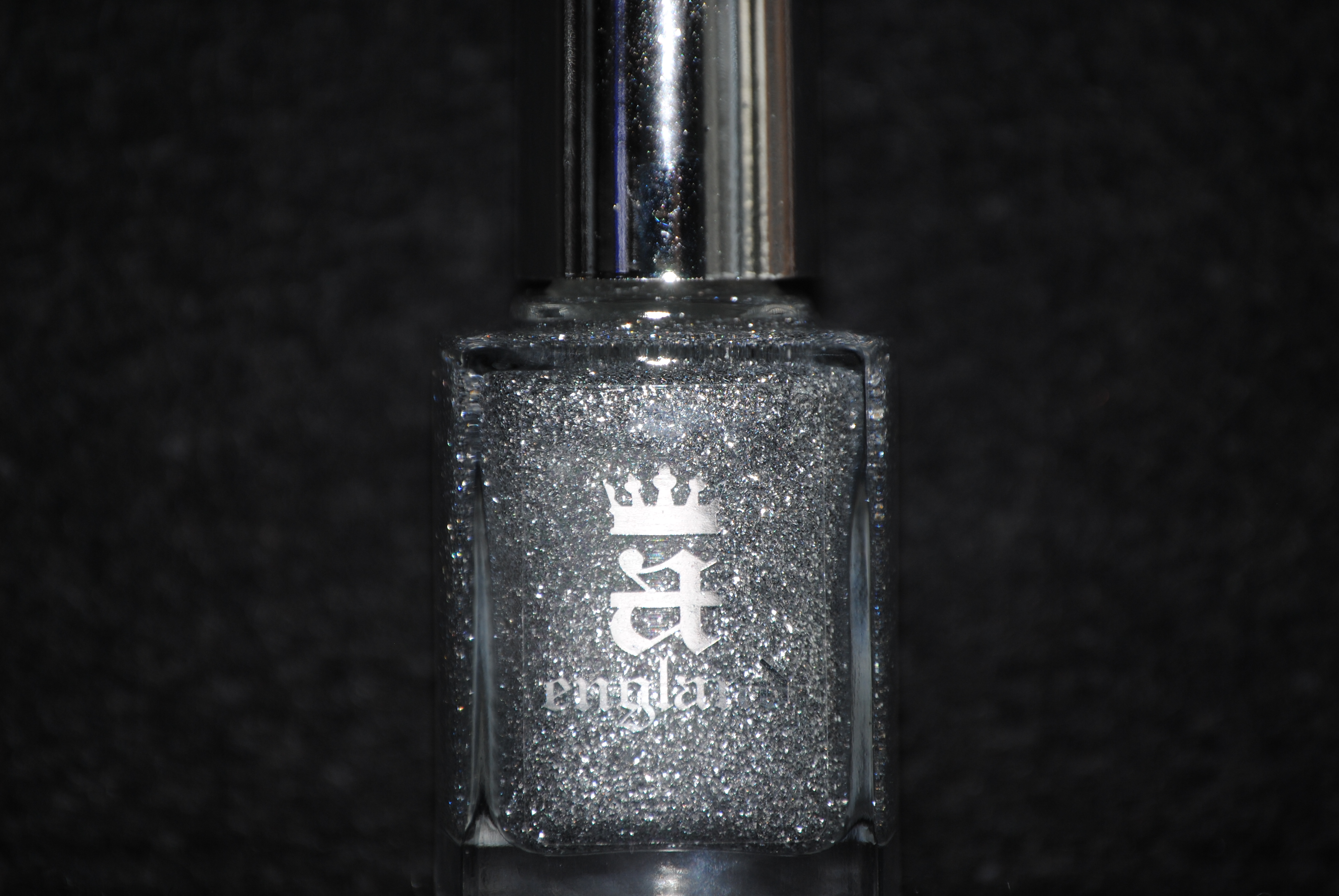
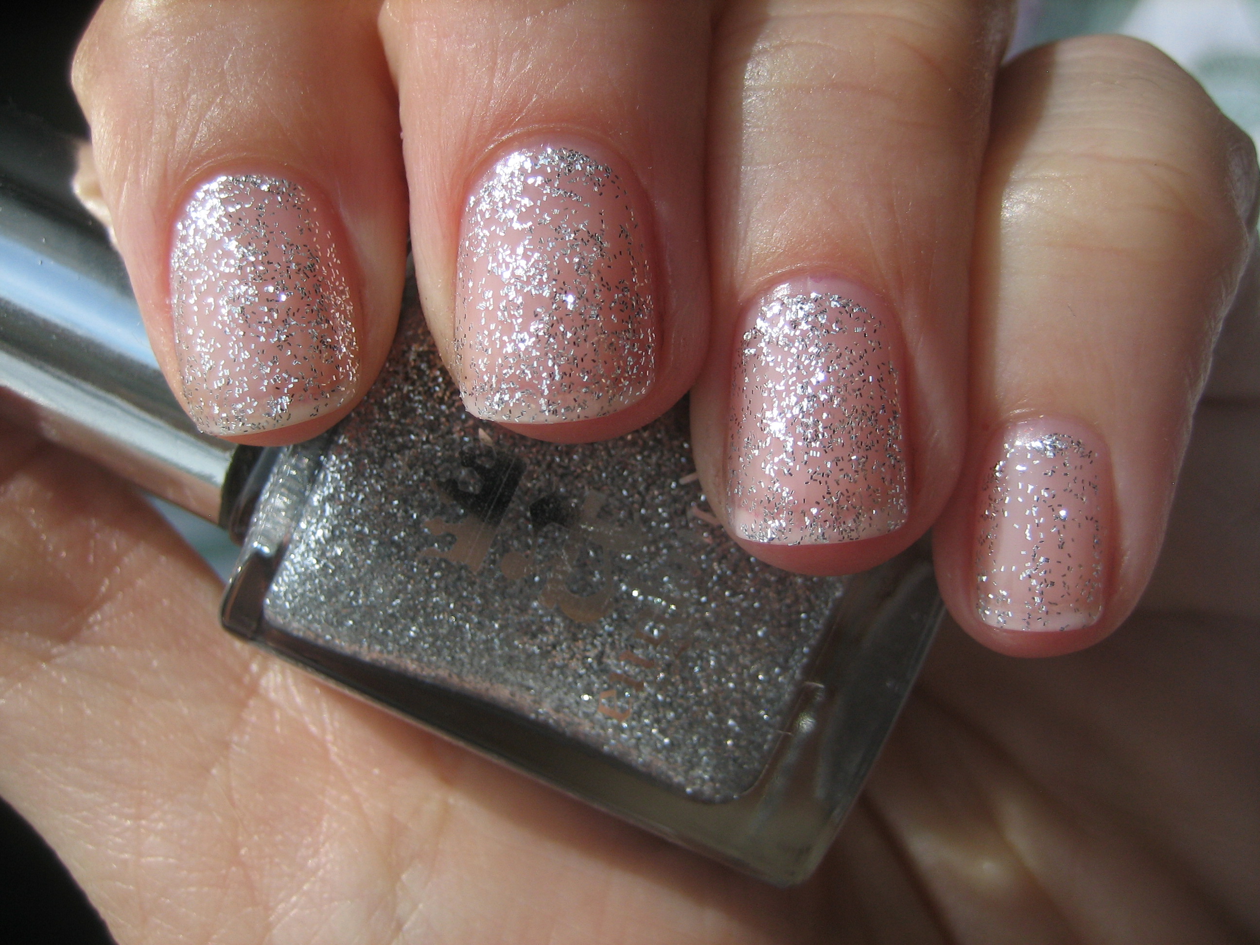
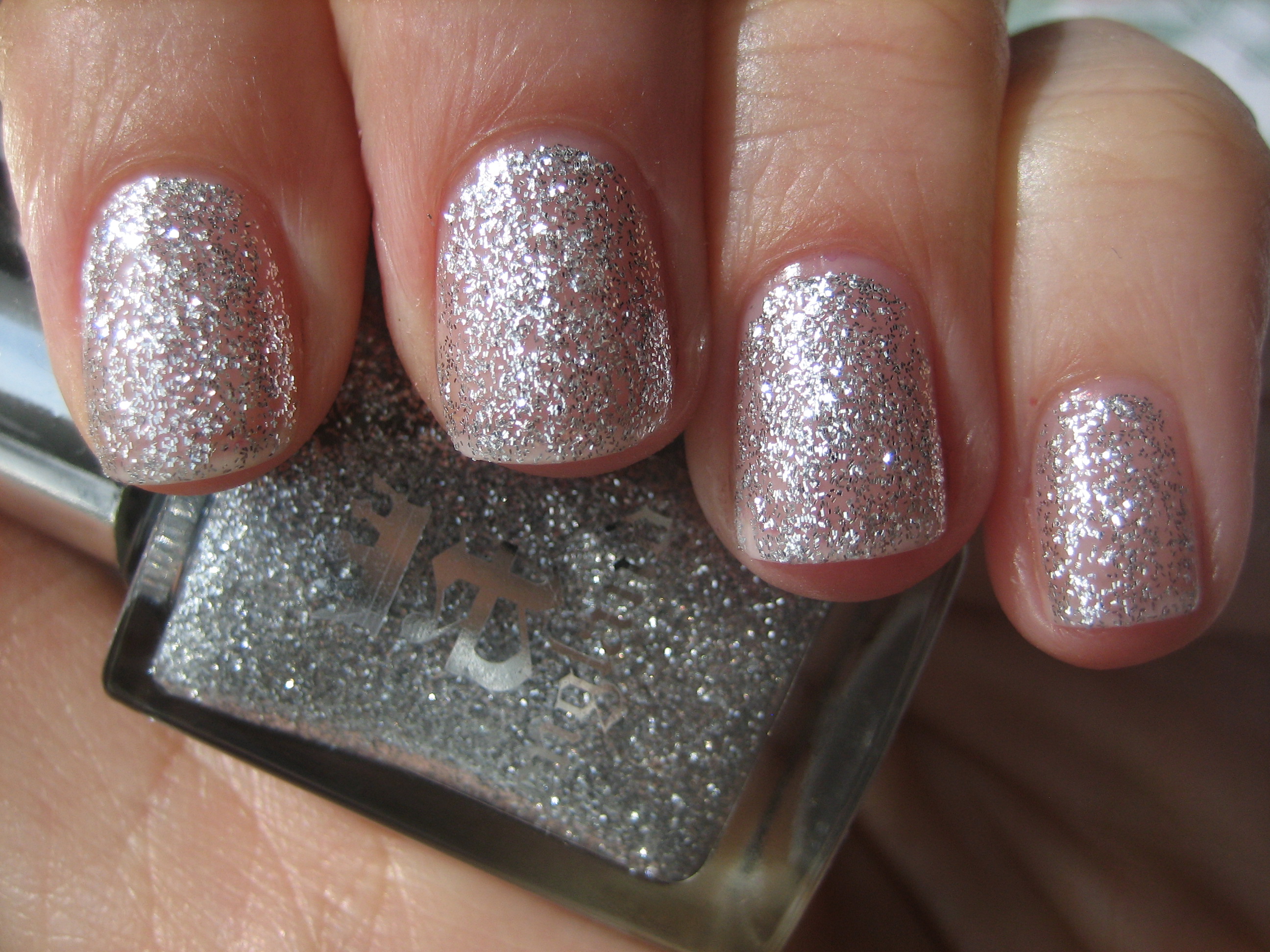
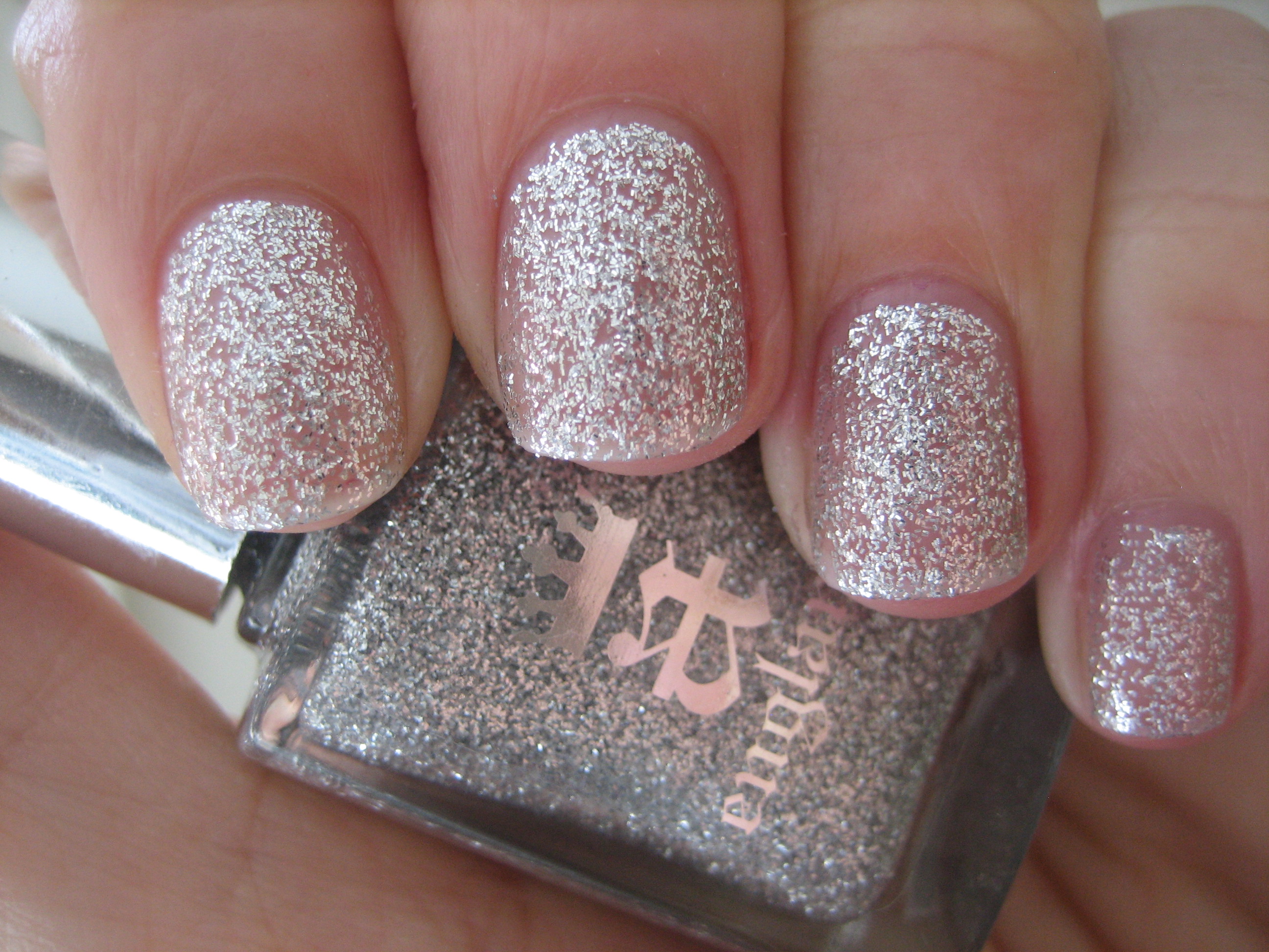
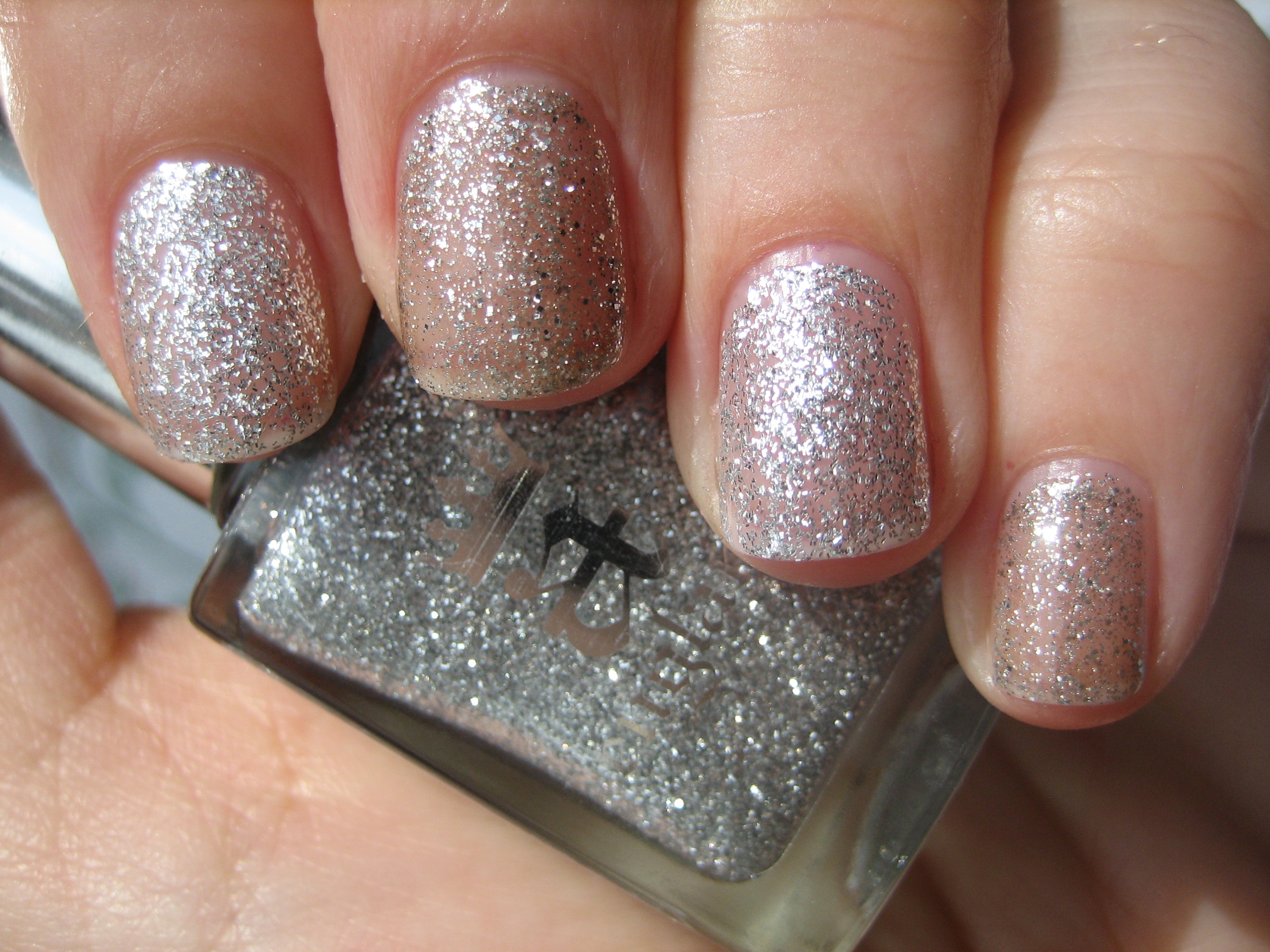
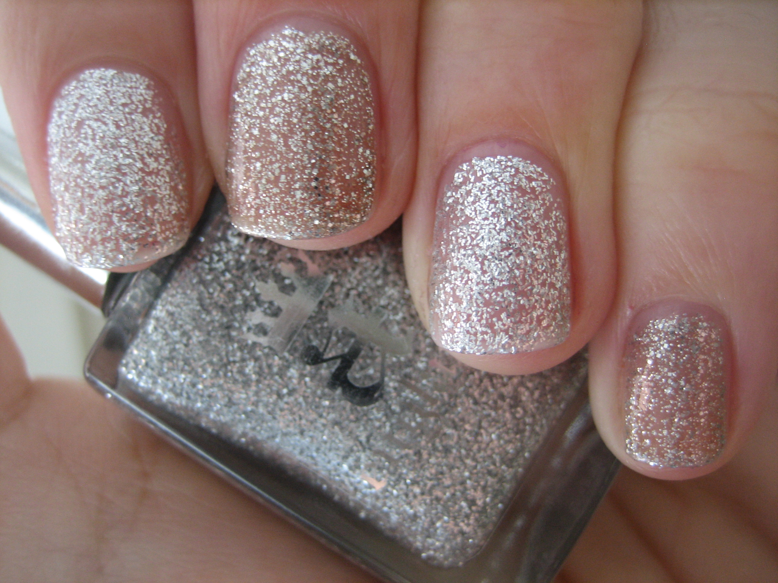
‘Merlin’ is described as a “spectacular scintillating silver” and is exactly that. Filled with varying sizes of both square & oblong pieces of highly reflective silver glitter, this is a semi-sheer polish that builds to good opacity by the second coat. Easy to apply and well flowing, this is excellent as a stand alone shade, or brilliant when layered as a top coat. Top swatch photo: 1 coat, middle photo: 2 coats (both taken in sunlight), bottom photo: indirect light (click to see detail of the glitter pieces). Representative of Merlin’s incandescent magical powers, this lacquer simply glows on your fingertips.
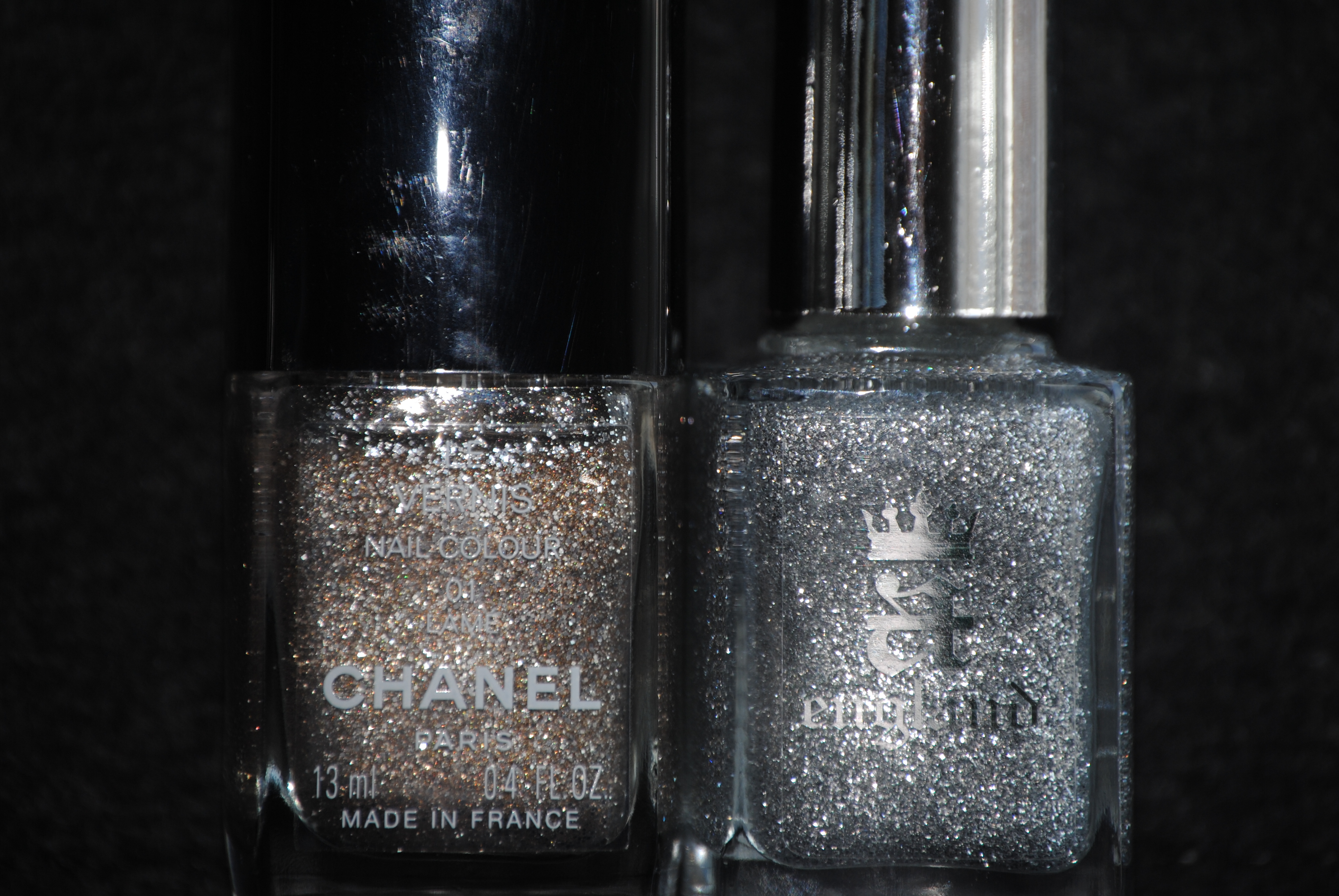
Looking through my stash, I came across CHANEL’s ‘Lamé’ which was the closest in hue and texture, although where ‘Merlin’ is a white-silver, ‘Lamé’ comes across as slightly more golden-tinged. The glitter pieces in ‘Lamé’ are also of only one size, which changes the density of the layering, and the other main difference is that ‘Lamé’ needed three coats to reach the same opacity level of ‘Merlin’, at two coats. Swatch photos above were taken in full sun (top) and indirect light (bottom).
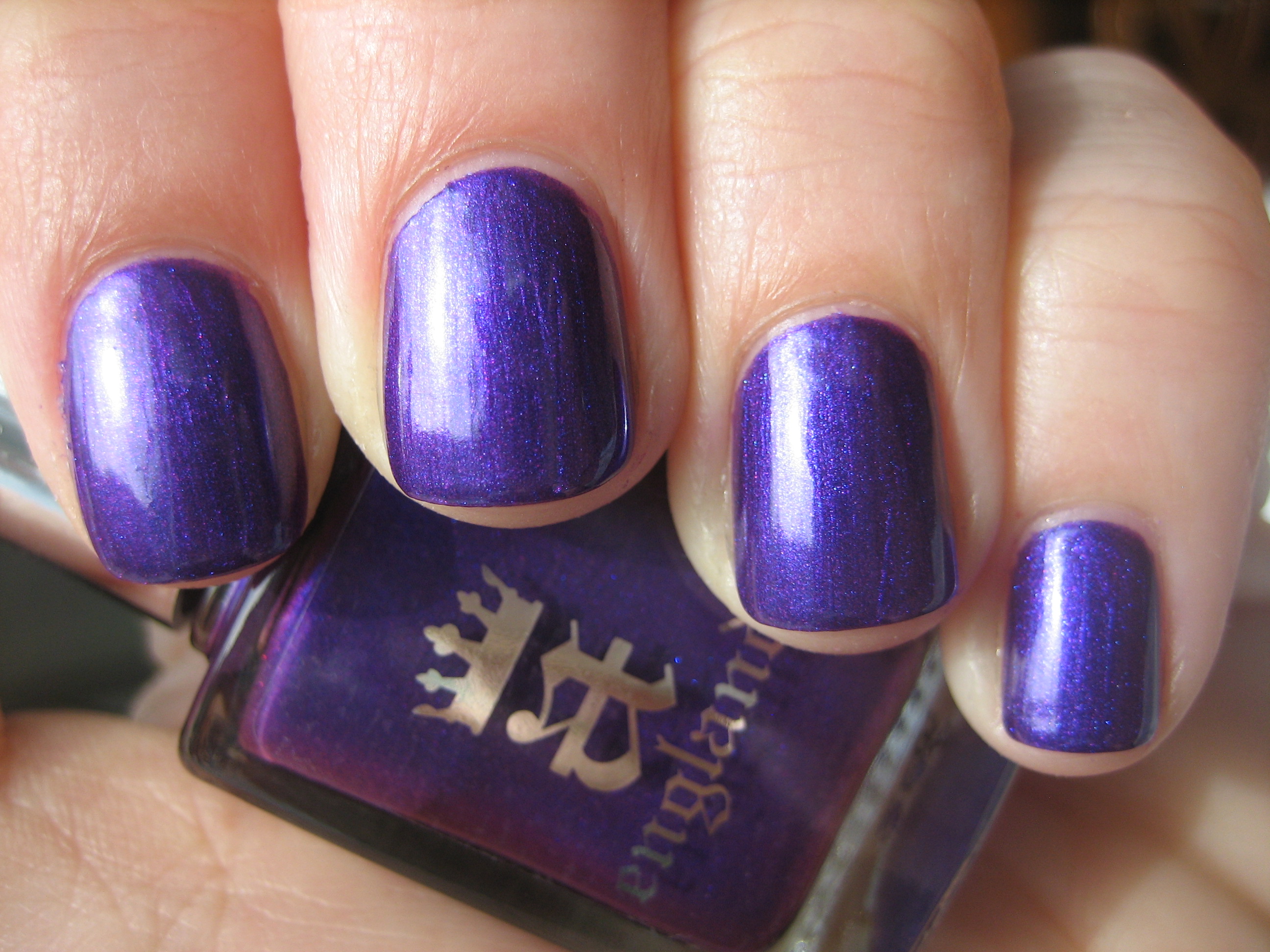
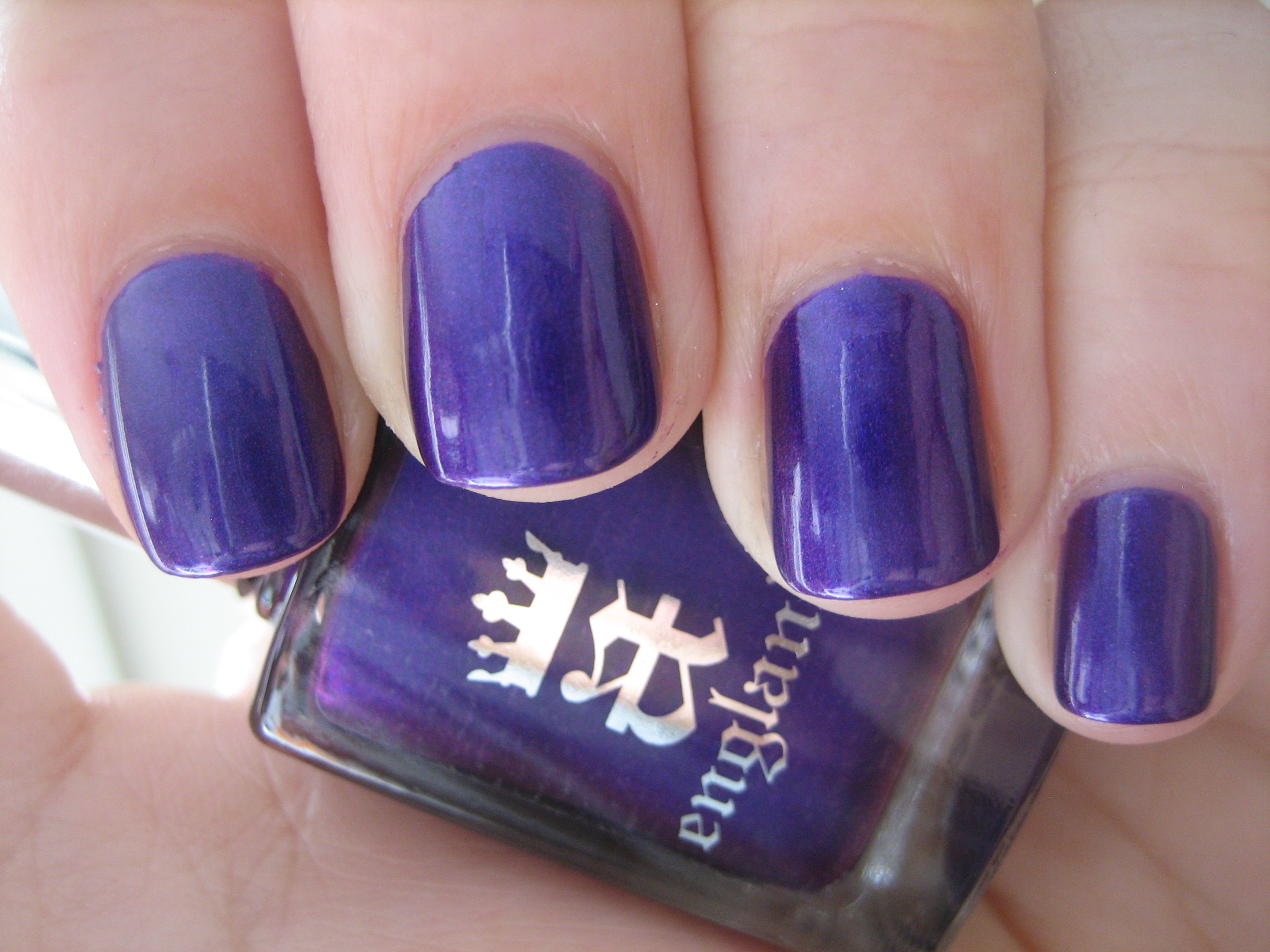
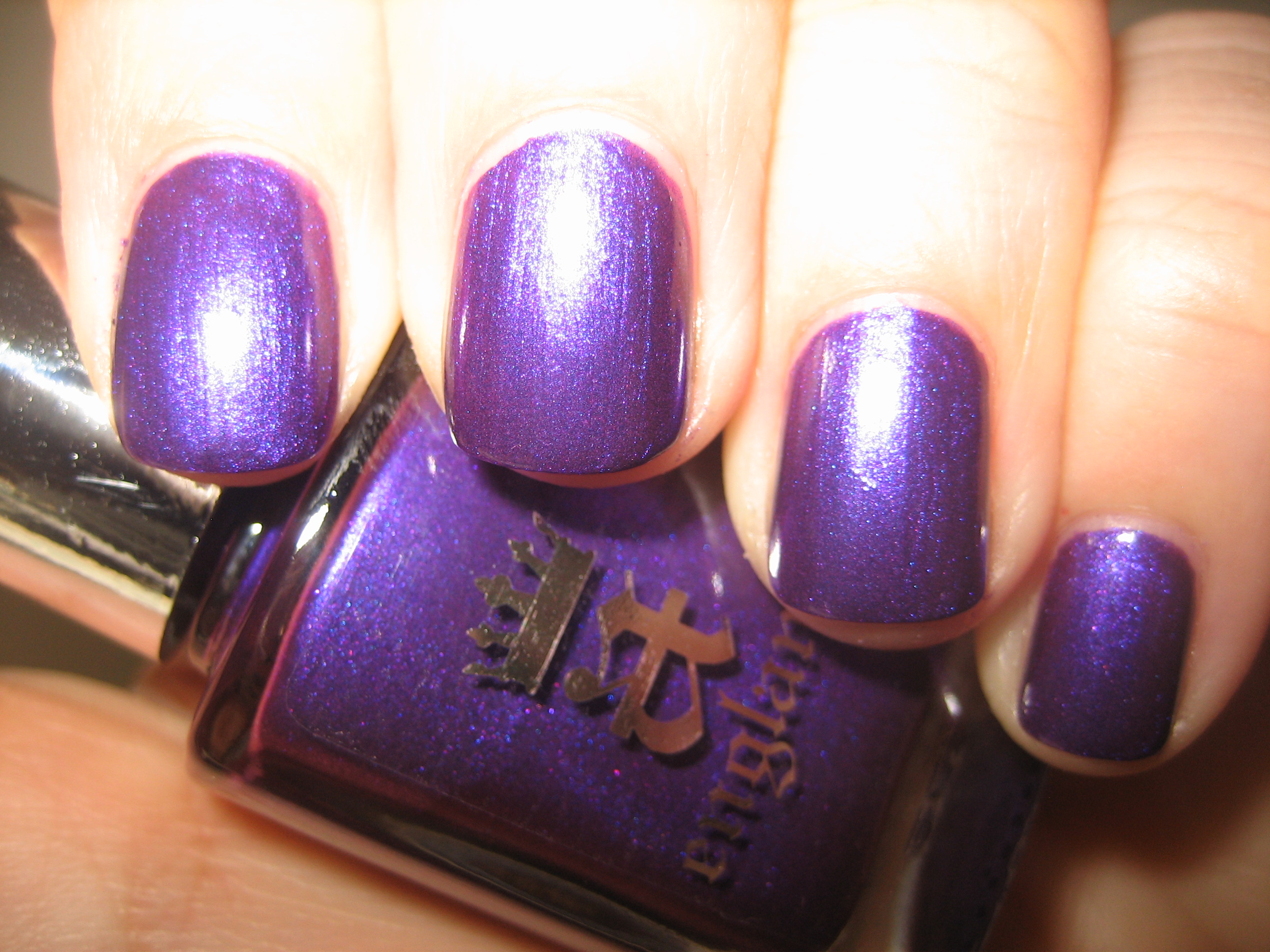
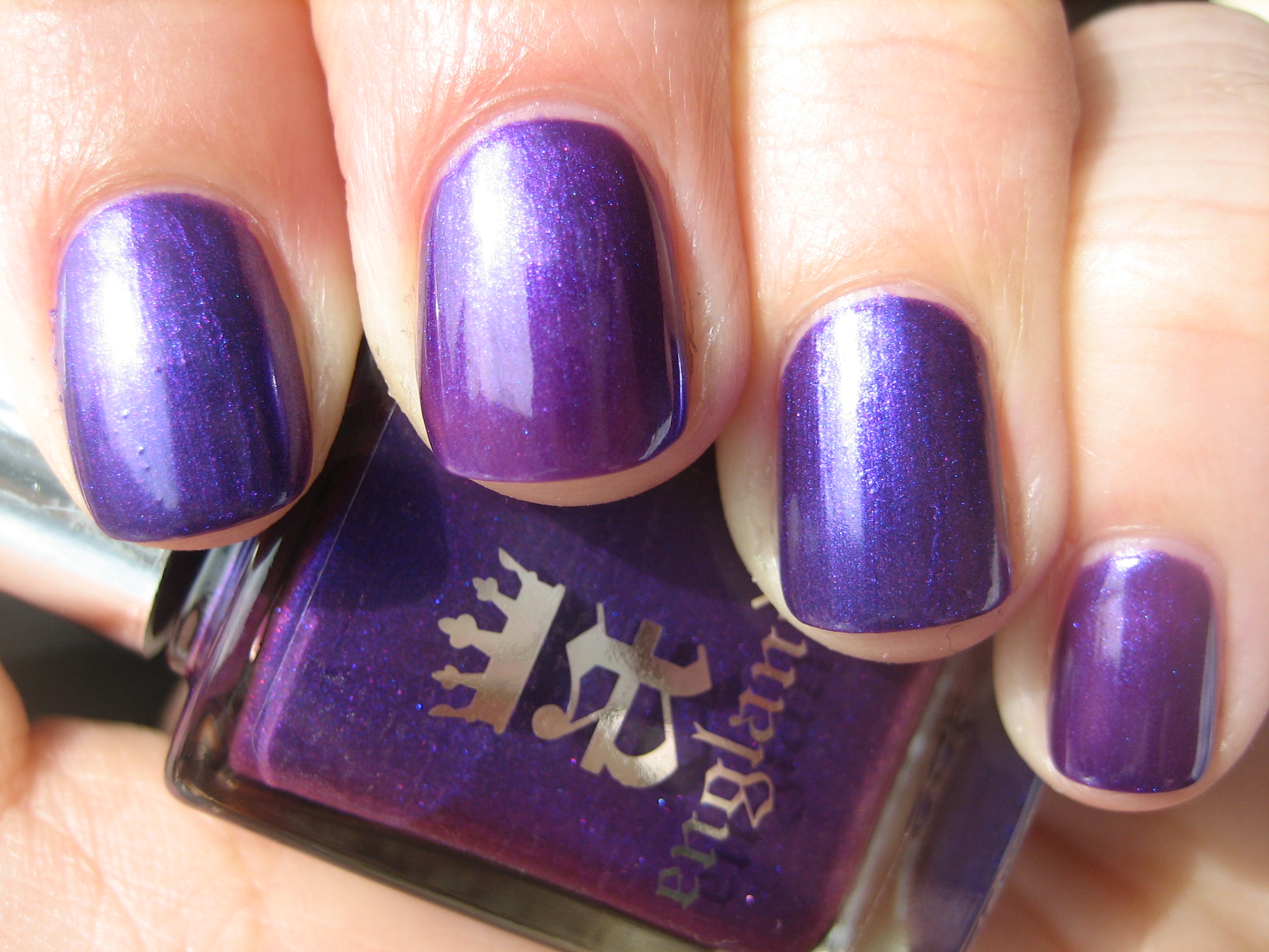
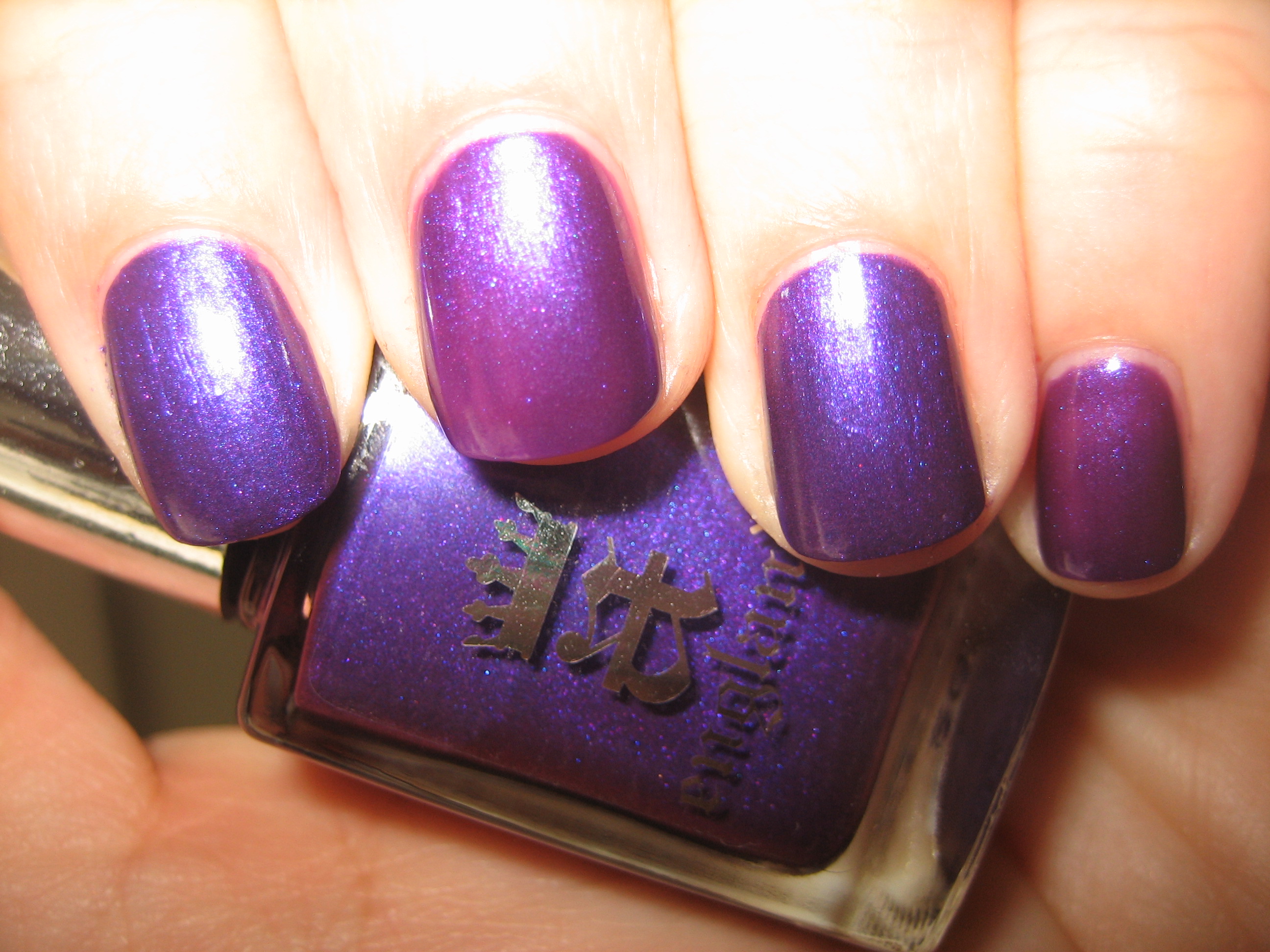
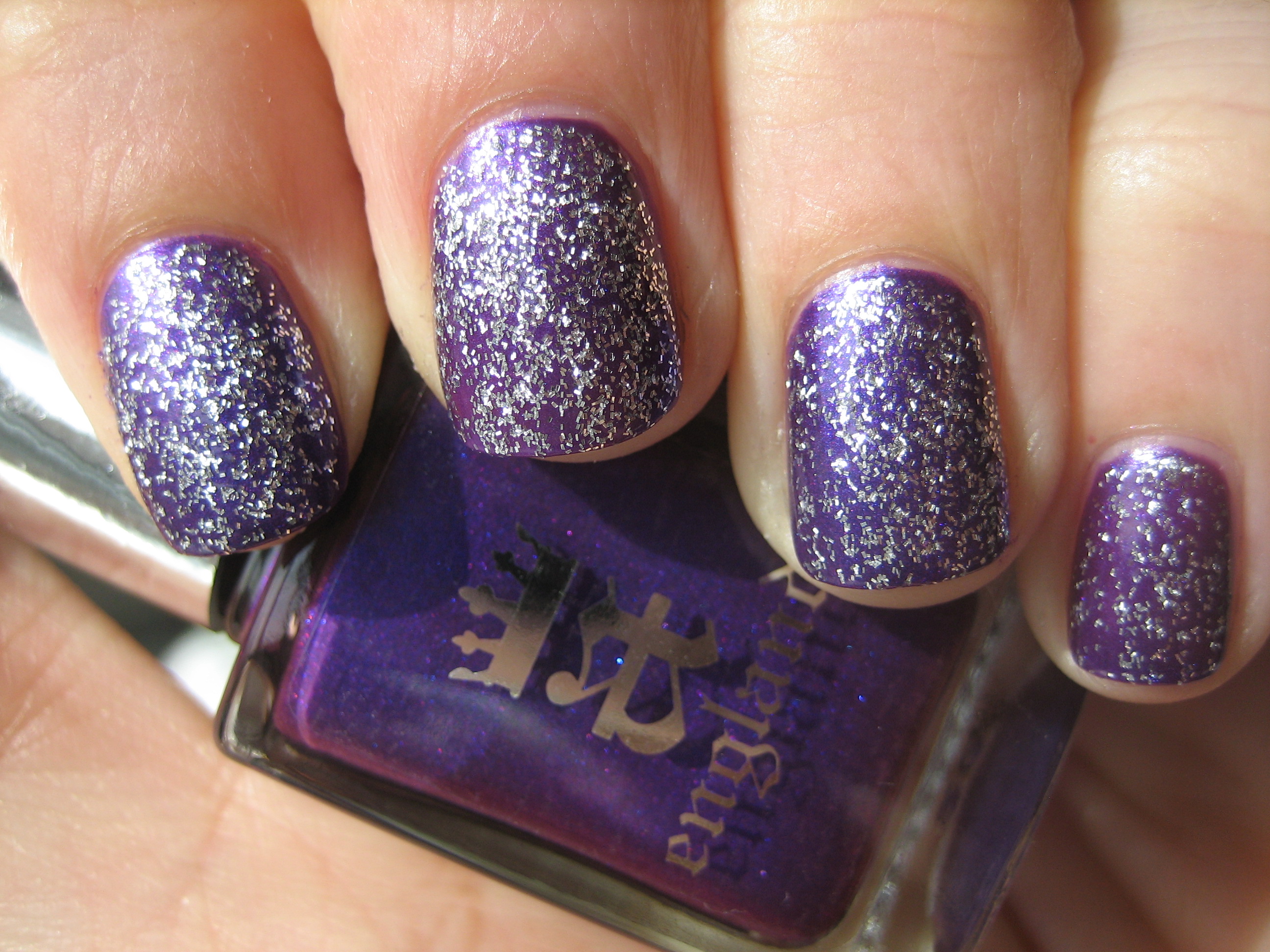
My photos of ‘Avalon’ cannot truly do this shade justice; this is the most regal and intense purple I have yet to come across, and what makes it even more unique is the minute pink and blue shimmer in its depths. So densely saturated in colour, it was practically a one coater, although the swatches here are with two coats. The top and middle swatch photos show it to pull more bluer than it actually is, while the last photo (taken with flash) gives a better indication of its true violet undertones. Application was flawless with the loveliest glassy finish. ‘Avalon’, the royal and sacred island, home to Vivian, The Lady of the Lake…and some say the final resting place of King Arthur himself. This shade is truly breathtaking!
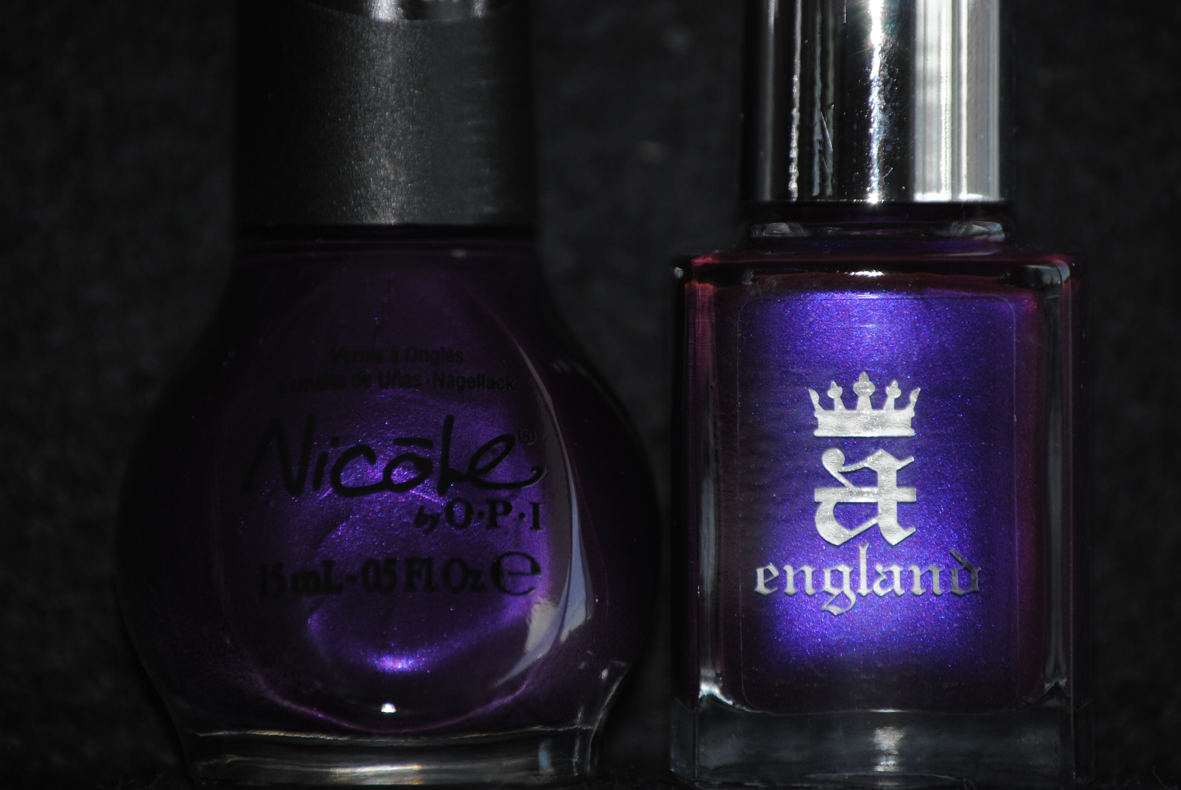
Of course, when I looked for a match, I found only one that came somewhat close: Nicole by OPI’s ‘Prized Possession Purple’ from the One Less Lonely Girl collection. While both shades bear similar blue & pink micro shimmer, ‘Prized Possession Purple’ is definitely a lighter hue and much more sheer, needing three coats to come close to the opacity of ‘Avalon’s’ two coats (top photo taken in sunlight, bottom photo with flash). To make things interesting, I then layered one coat of ‘Merlin’ on top and was captivated by the pattern, which looks almost like stars glimmering in a twilight sky. Swatch photos above are: index & ring fingers – ‘Avalon’, ring & pinkie fingers: ‘Prized Possession Purple’.
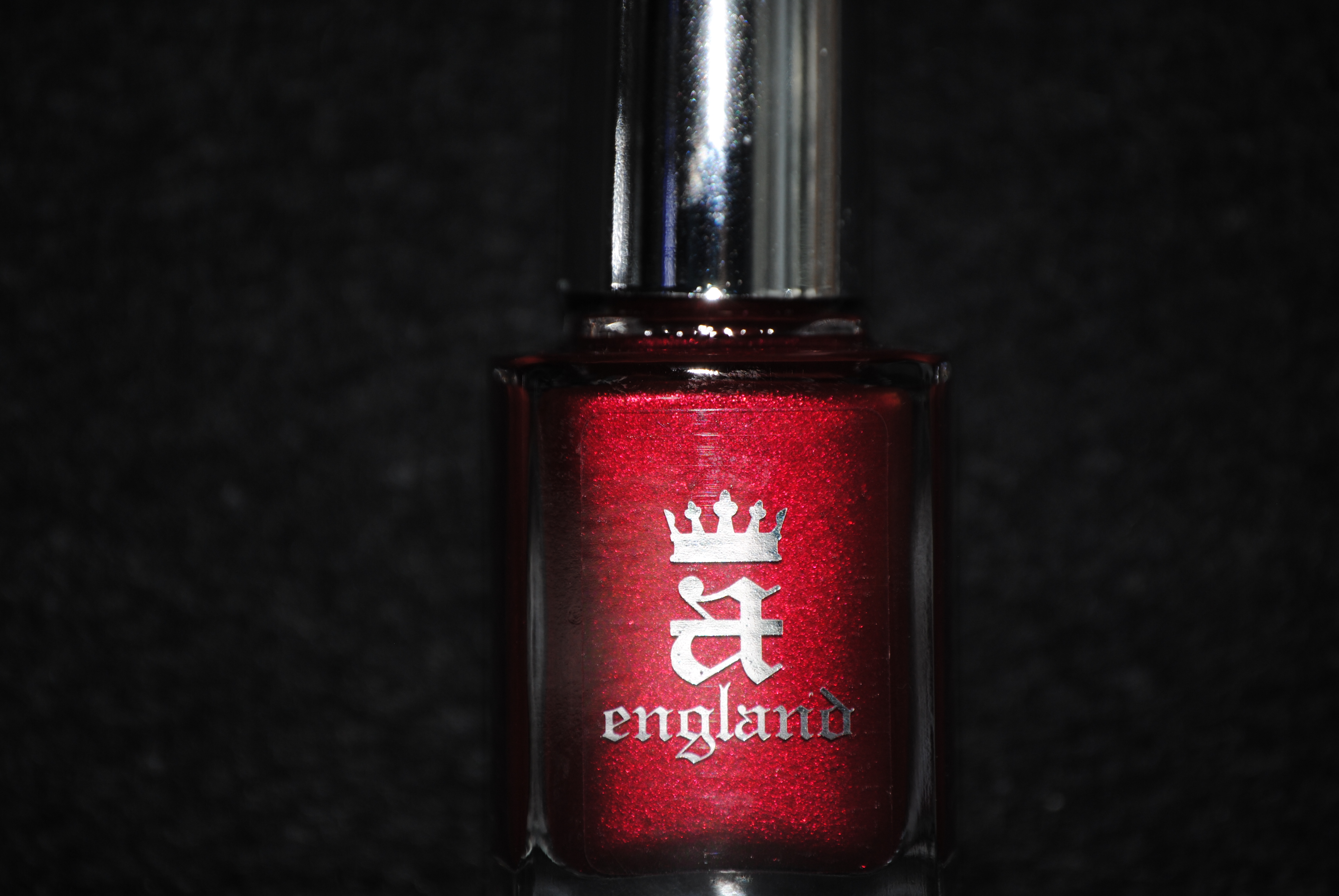
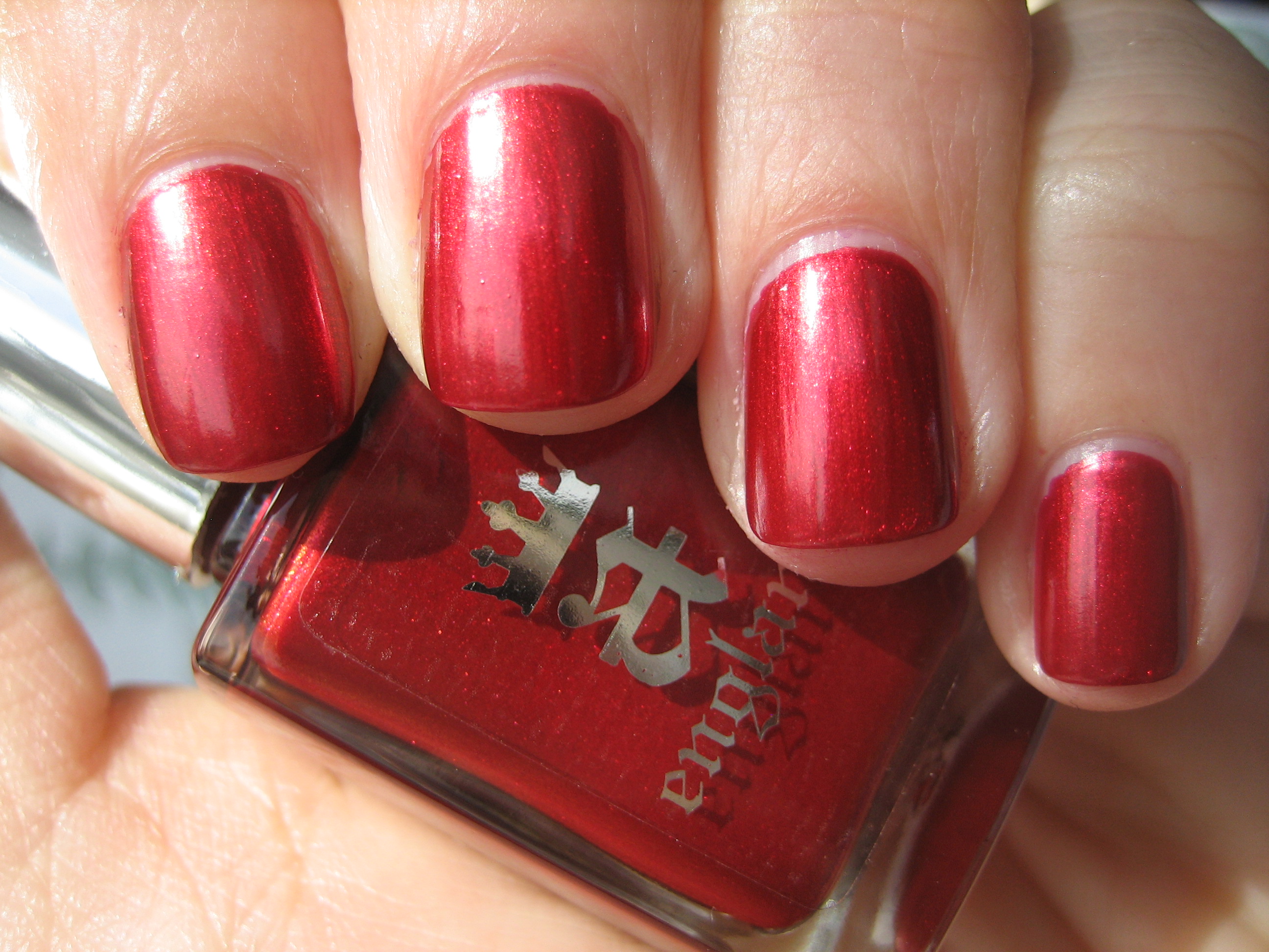
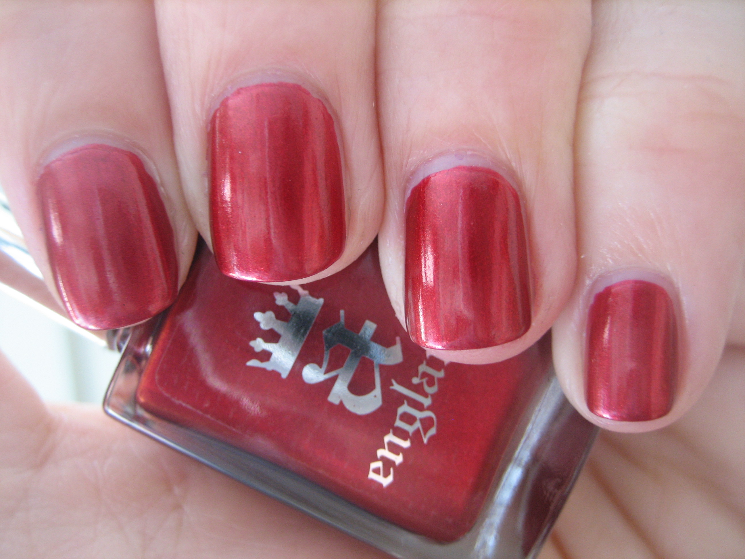
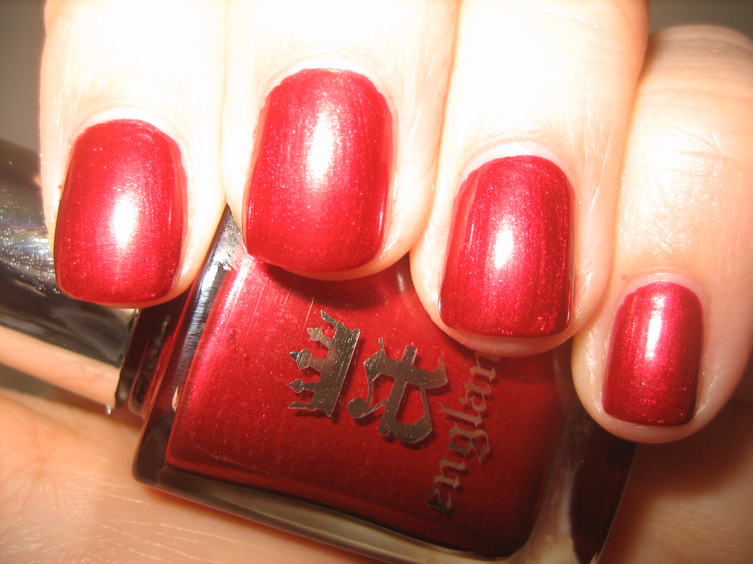
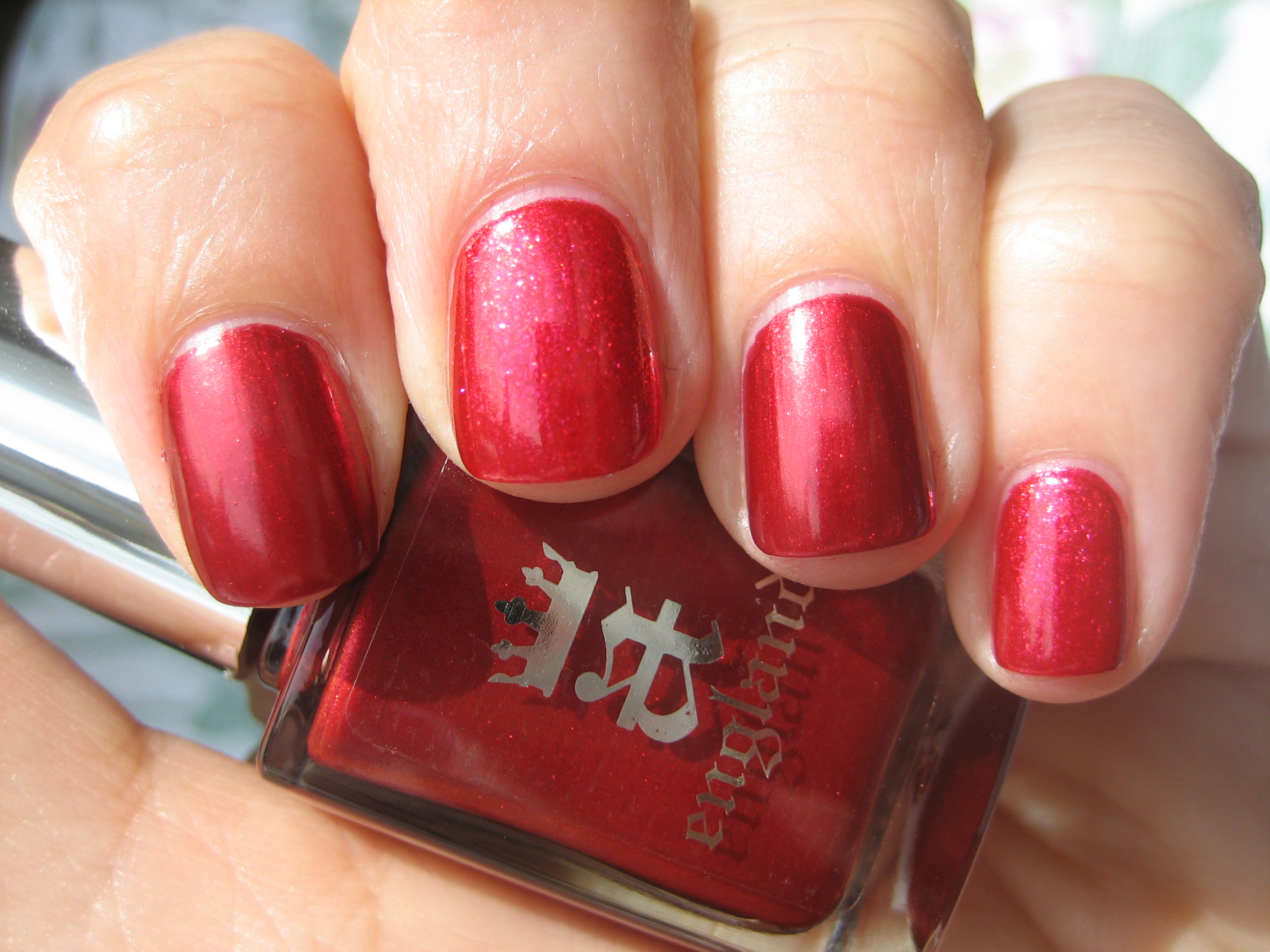
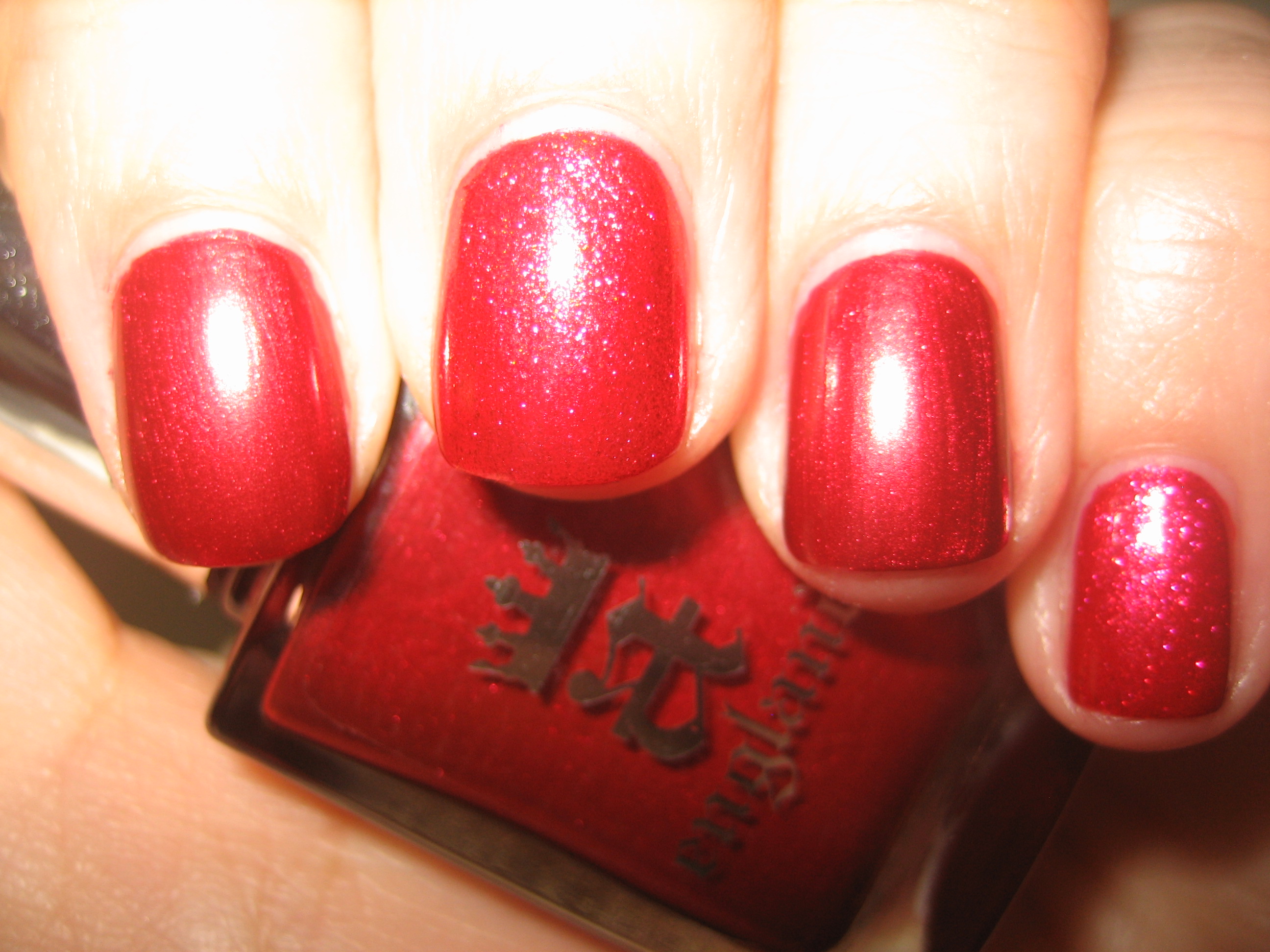
‘Perceval’ has an indescribable raw beauty; this is a deep almost ruby shade, with incredibly fine golden shimmer seeming to simmer in its depths. I fell for this ‘lit-from-within’ shade from the moment I saw it, and having such an incredible formula to work with, made it that much sweeter. Note how when seen in sunlight (top photo) as compared to indirect light (middle photo) the colour shifts from fiery to slightly cooler, while flash (bottom photo) brings out all the internal glimmer. This is an intense, jewel shade and will compliment all skin tones…I dare you to try and stop looking at it when you wear it! It is so fitting that ‘Perceval’ is a red, being the colour representative of loyalty and undying love, as was this virtuous knight who swore his allegiance to King Arthur, and legend has it that he was among those knights who found the Holy Grail to help heal his dying king. A true swoon-worthy shade…love!
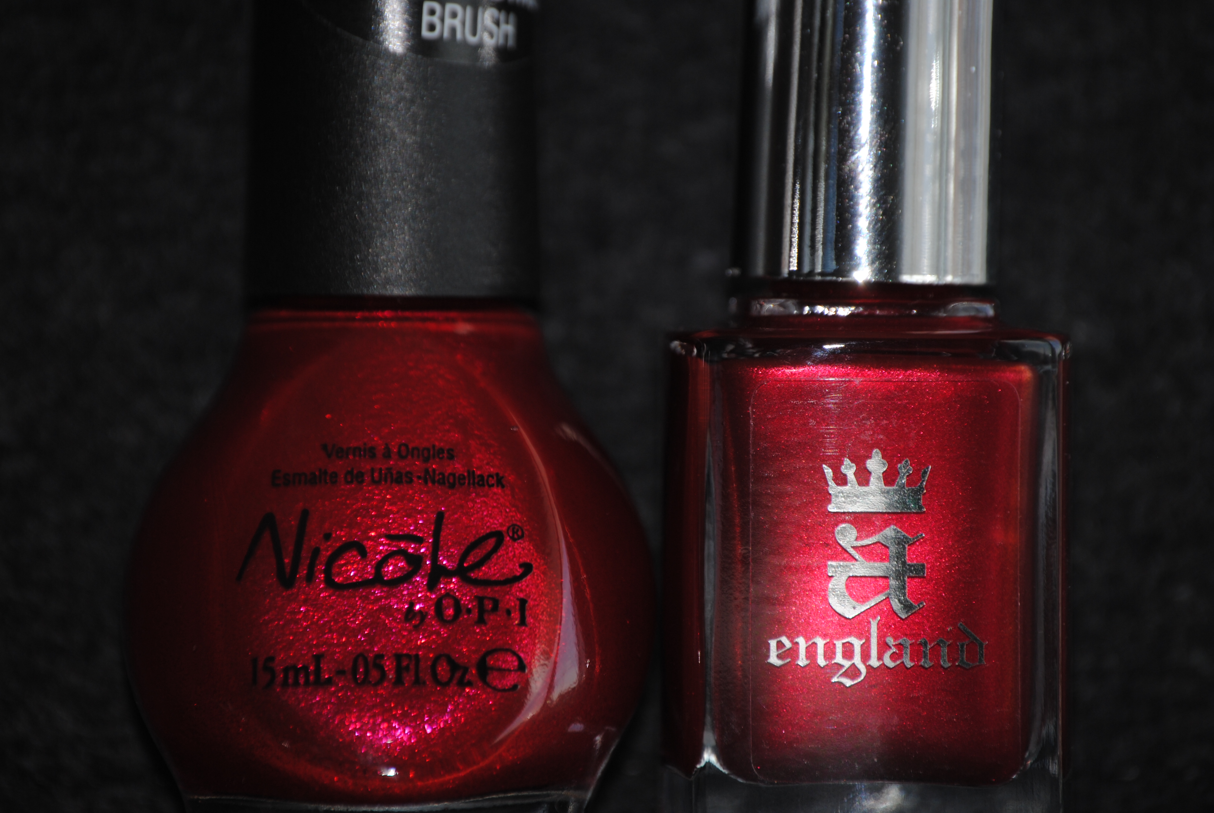
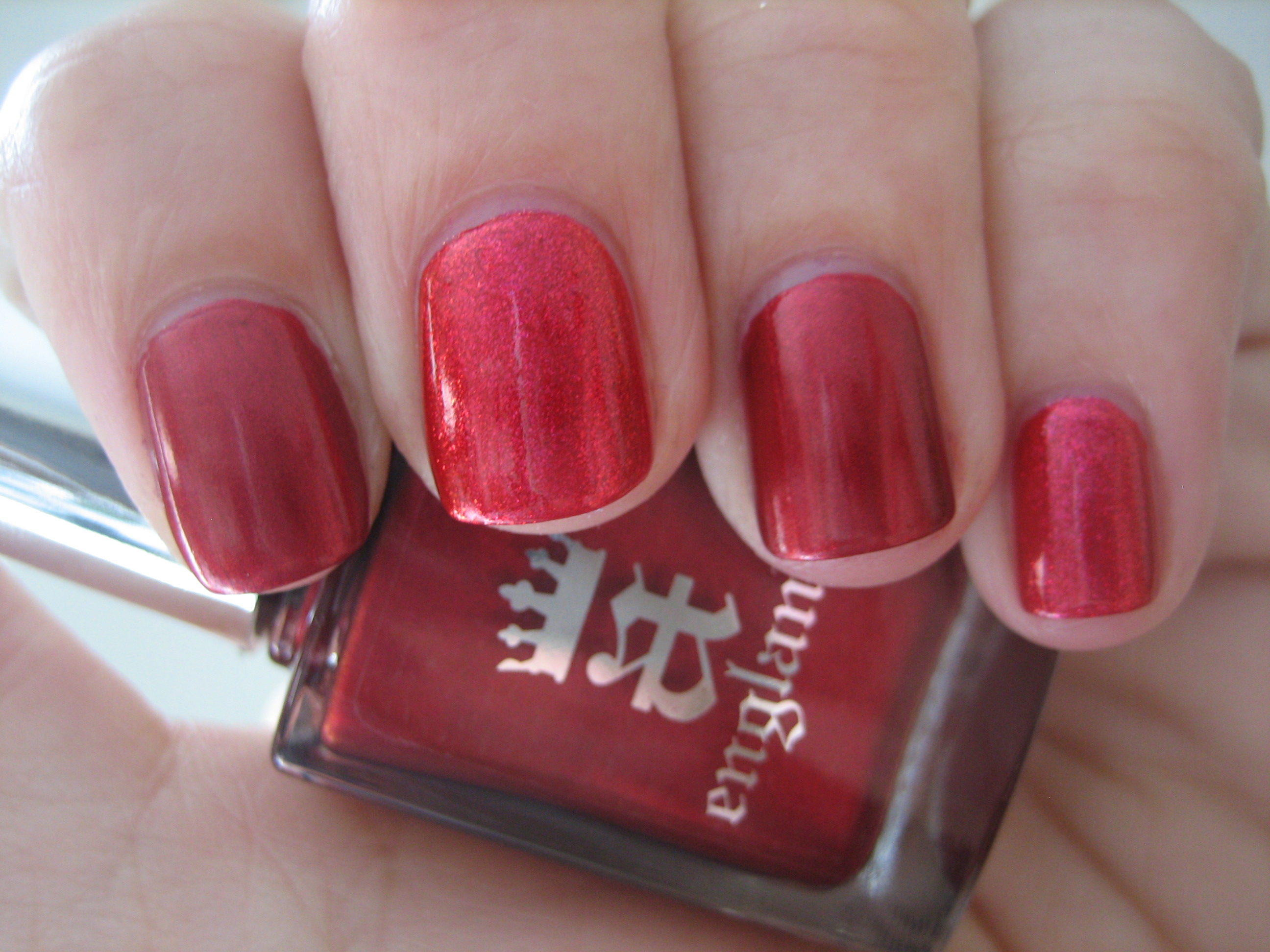
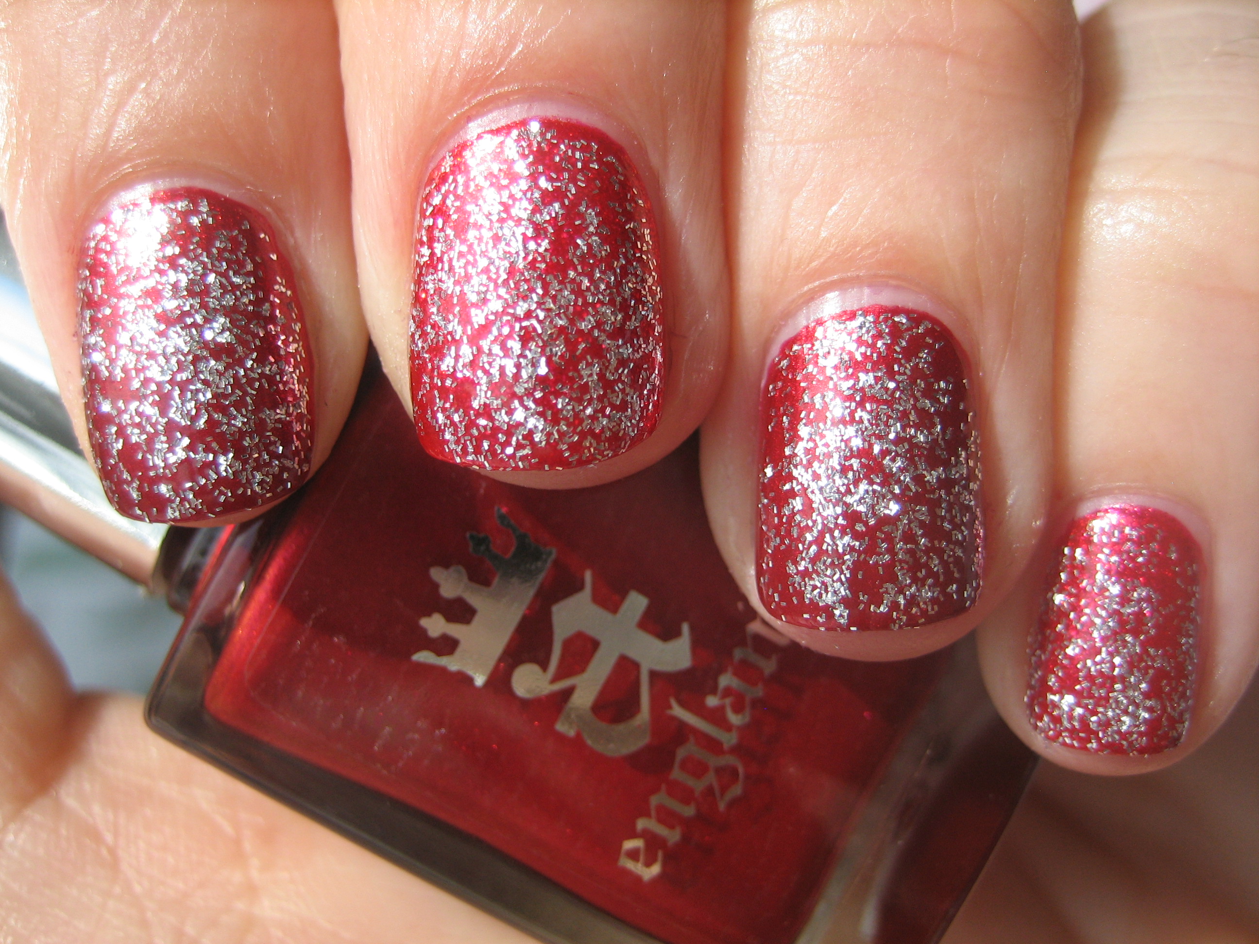
In my stash of numerous red shades, once again the closest I came to a match was with Nicole by OPI’s ‘OMB!’ from the One Less Lonely Girl collection, but there are still significant differences. First of all, ‘OMB!’ is much more sheer, requiring three coats to reach the opacity of ‘Perceval’s’ two coats, and the former’s base shade is several tones lighter and more pink tinged. ‘Perceval’s’ base is somewhat more saturated as well, making the shimmer particles of ‘OMB!’ seem slightly sparser. Even with a coat of ‘Merlin’ layered on top, you can still see the deep ruby hue of ‘Perceval’ peeking through. Swatches photos above are: index & ring fingers – ‘Percival’, middle & pinkie fingers – ‘OMB!’.
Final thoughts: From the six shades I have reviewed and swatched to date of this incredible new line, I cannot help but be so impressed across the board, from the richness of the colours, the almost self-levelling formula, the excellent brush and the high gloss shine. They are colours we may have seen before, but somehow Adina manages to infuse each and every shade with that little extra magical touch, taking them from the ordinary to the sublime. Worthy of their regal and historical heritage, these are shades suited for royalty….or for anyone who always dreamed of being a princess, at the very least! This line of exquisite lacquers can be purchased through their website and they also offer international shipping…you really have no reason not to try them now! If you’ve been wanting to try these polishes out, here’s another incentive: from now until April 16th, and when you join a-england on their Facebook page, receive 20% off your entire order by typing in the promo code available.
*Disclaimer: product samples provided by the company/PR for my unbiased consideration

