
Tag Archives: swatches
Dior 5 Couleurs Collection Fall 2014 | Trafalgar trio

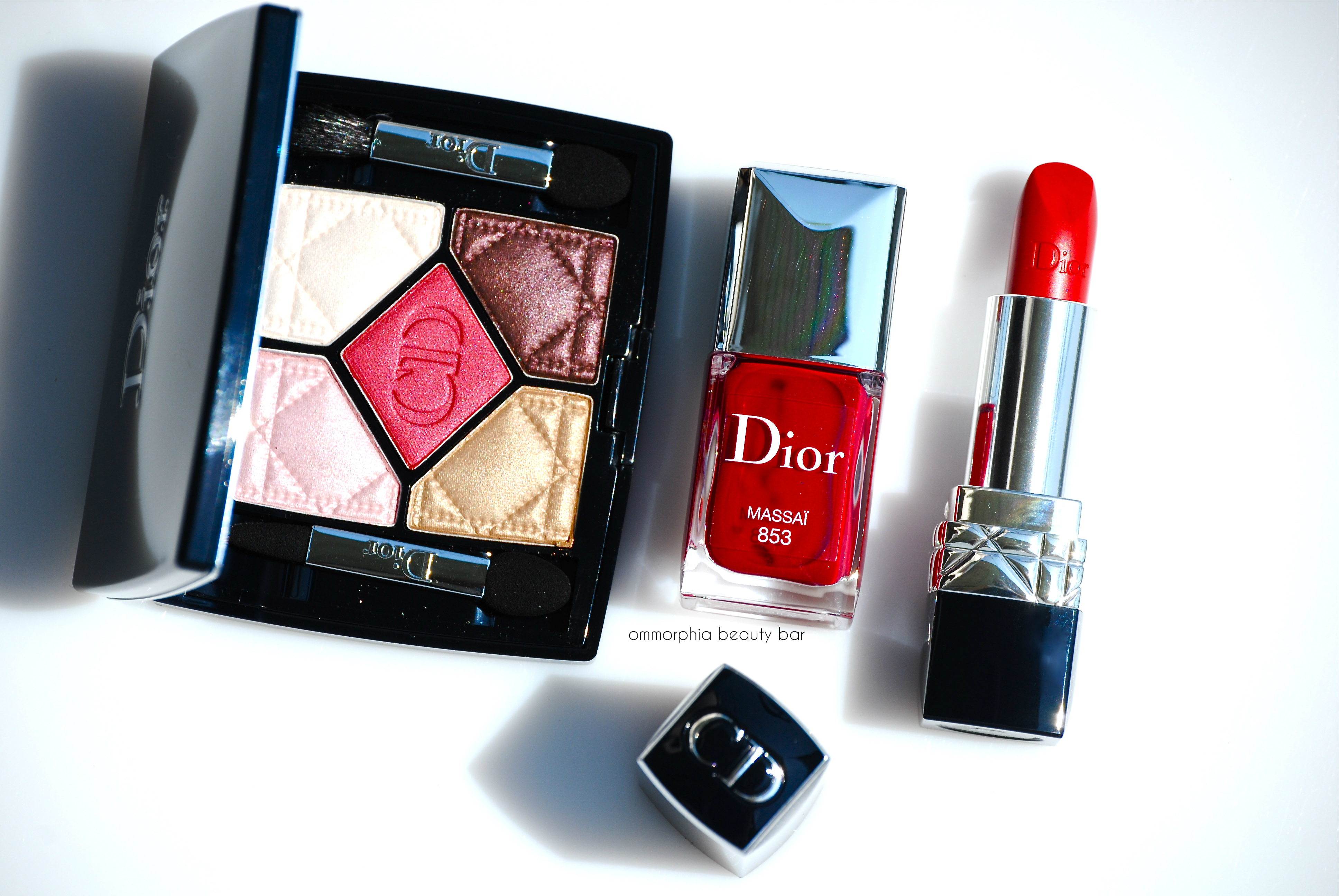
The last grouping I have to show you from the new Dior 5 Couleurs Collection for Fall 2014, is the stunning Trafalgar Trio – you might say that I saved the most impressive for last. In the 50’s, M. Dior would send out scarlet coloured designs during catwalk shows (the precursor to runway shows) to ‘wake up’ the audience and get their attention; he called these designs his ‘Trafalgars’. With deep vibrant red as the dominating thread of this trio, there is something both classic and fierce about wearing this shade on eyes, lips & nails; a colour that has always been synonymous with both passion and empowerment is given a fresh new twist here for 2014.
You can read my full reviews on the other 5 Couleurs releases here:

Fashion illustration by René Gruau for Dior – 1947 (source)
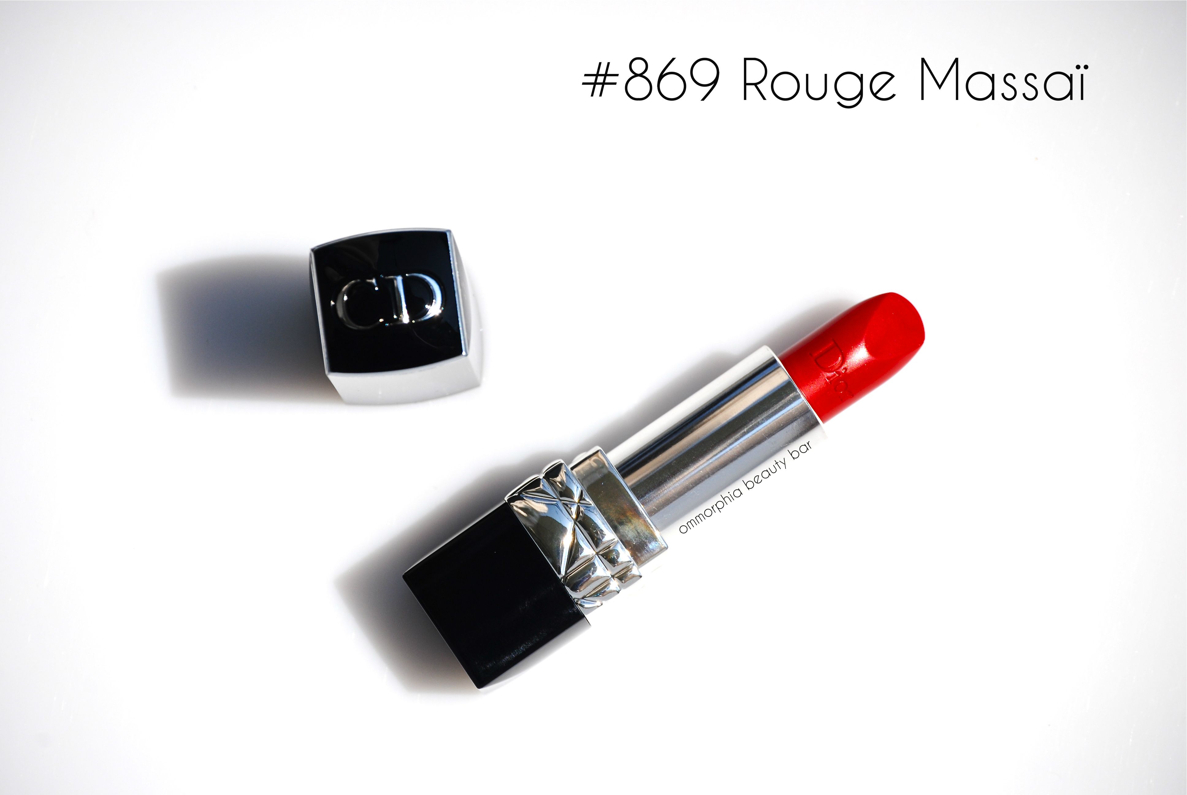
Rouge Dior #869 Rouge Massaï (CAN $36.00) | Finding the perfect red shade for one’s skin tone is almost as difficult as finding the perfect nude, but once located, it becomes a thing of utter bliss. The combination of both cool (blue tinted) and warm (orange tinted) tones found in #869 Rouge Massaï make this almost a universal red and the absolutely right one for me in particular. Served beautifully by the Rouge Dior richly nourishing formula, it applies in a highly colour saturated and creamy manner, with just enough shine to give lips a lush look. As this is a very pigmented hue, proper prep beforehand will minimize any bleeding or feathering into any lip lines – a clear waxy pencil like No Bleeding Lips (reviewed here), does an amazing job of keeping everything in place. Lasting power is impressive as well, going long past the 8 hour mark before any significant fading, although some touch-ups may be necessary after eating and/or drinking.
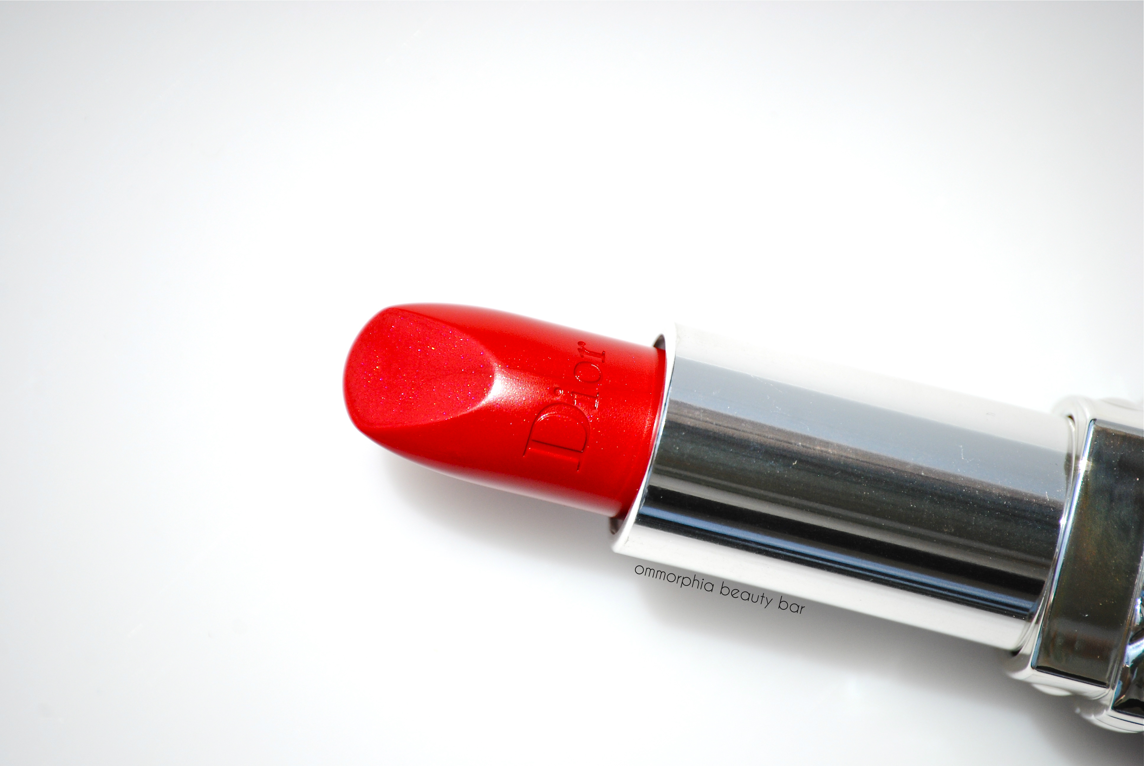
Dior 5 Couleurs Collection Fall 2014 | Rouge Dior #869 Rouge Massaï
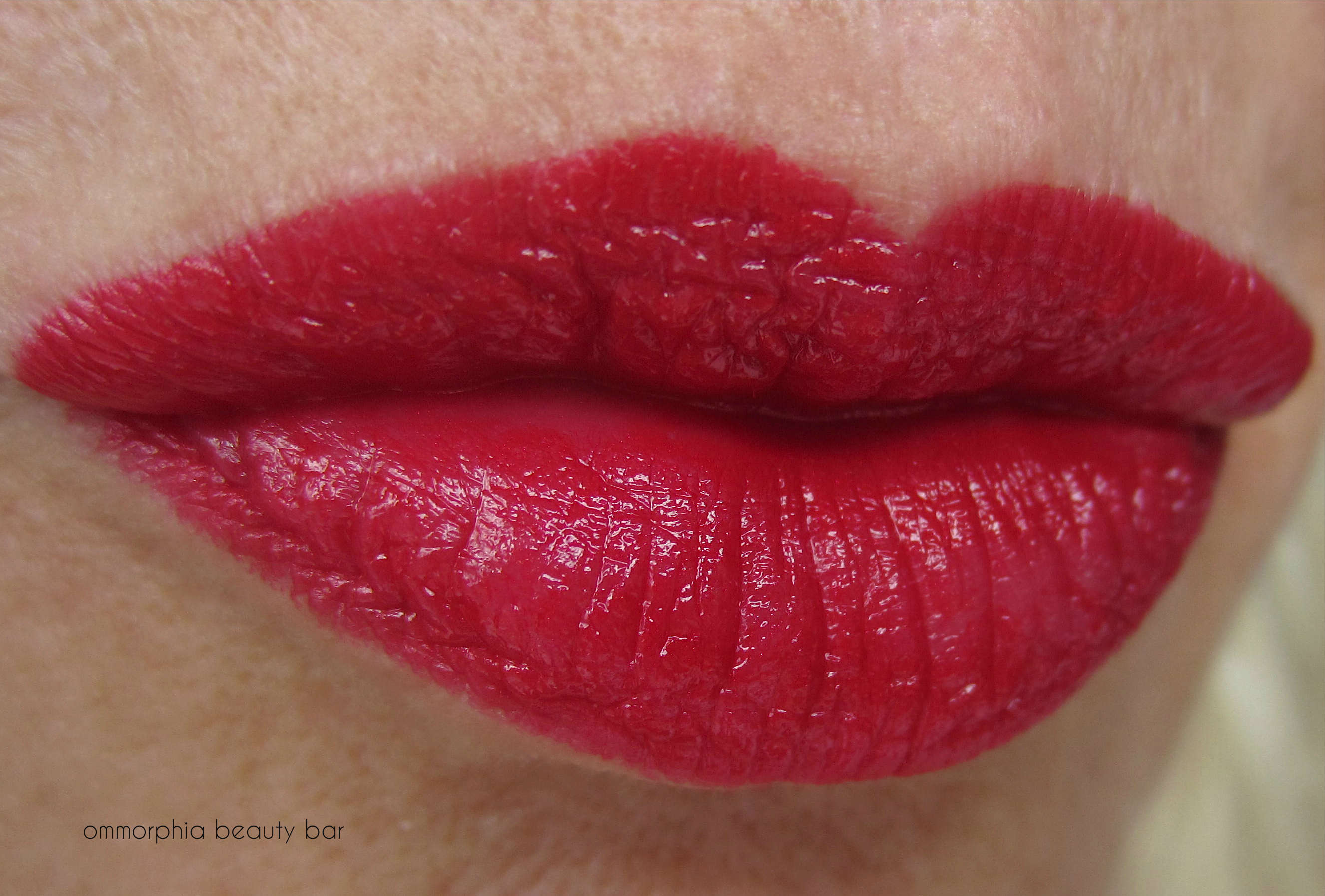
Dior 5 Couleurs Collection Fall 2014 | Rouge Dior #869 Rouge Massaï
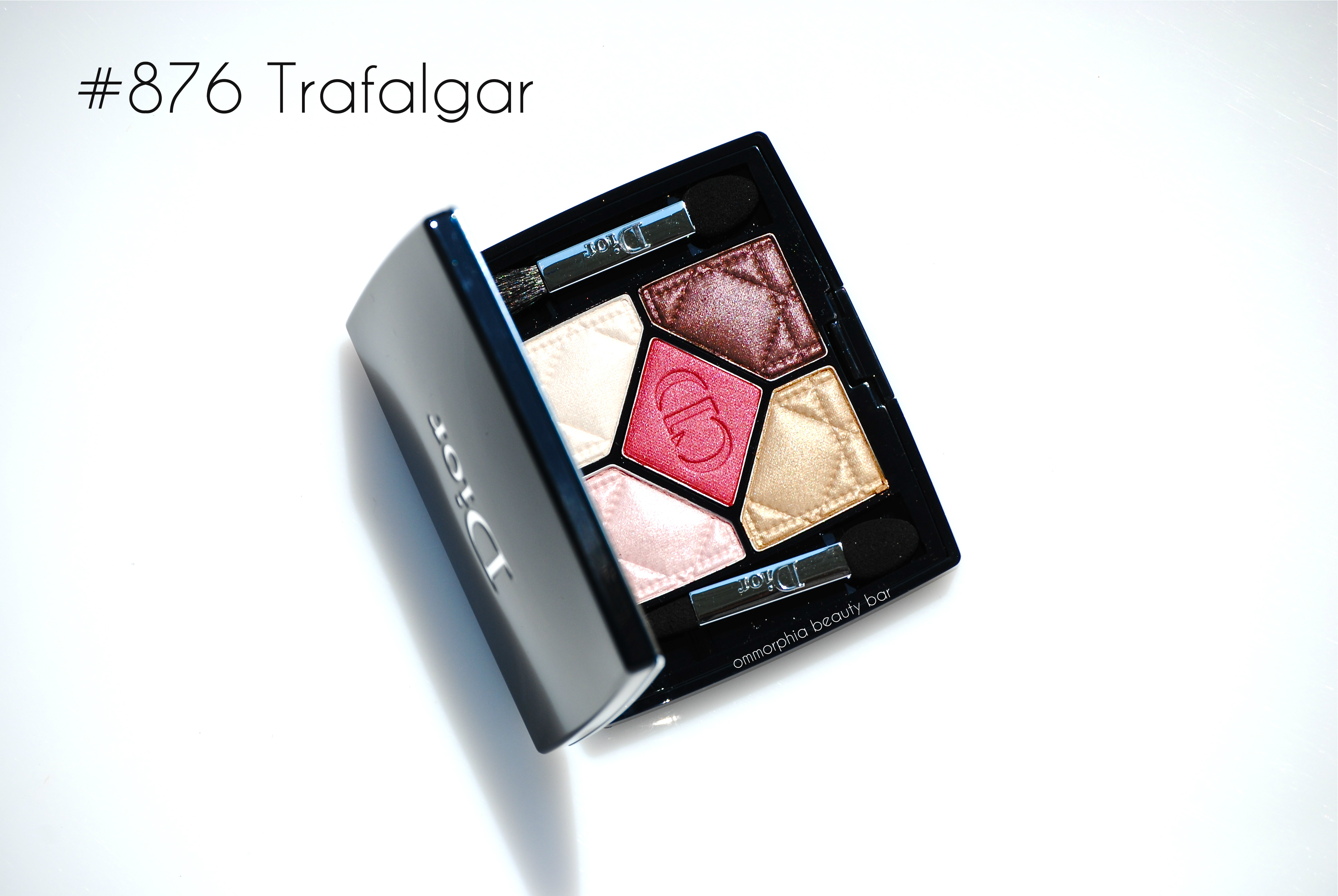
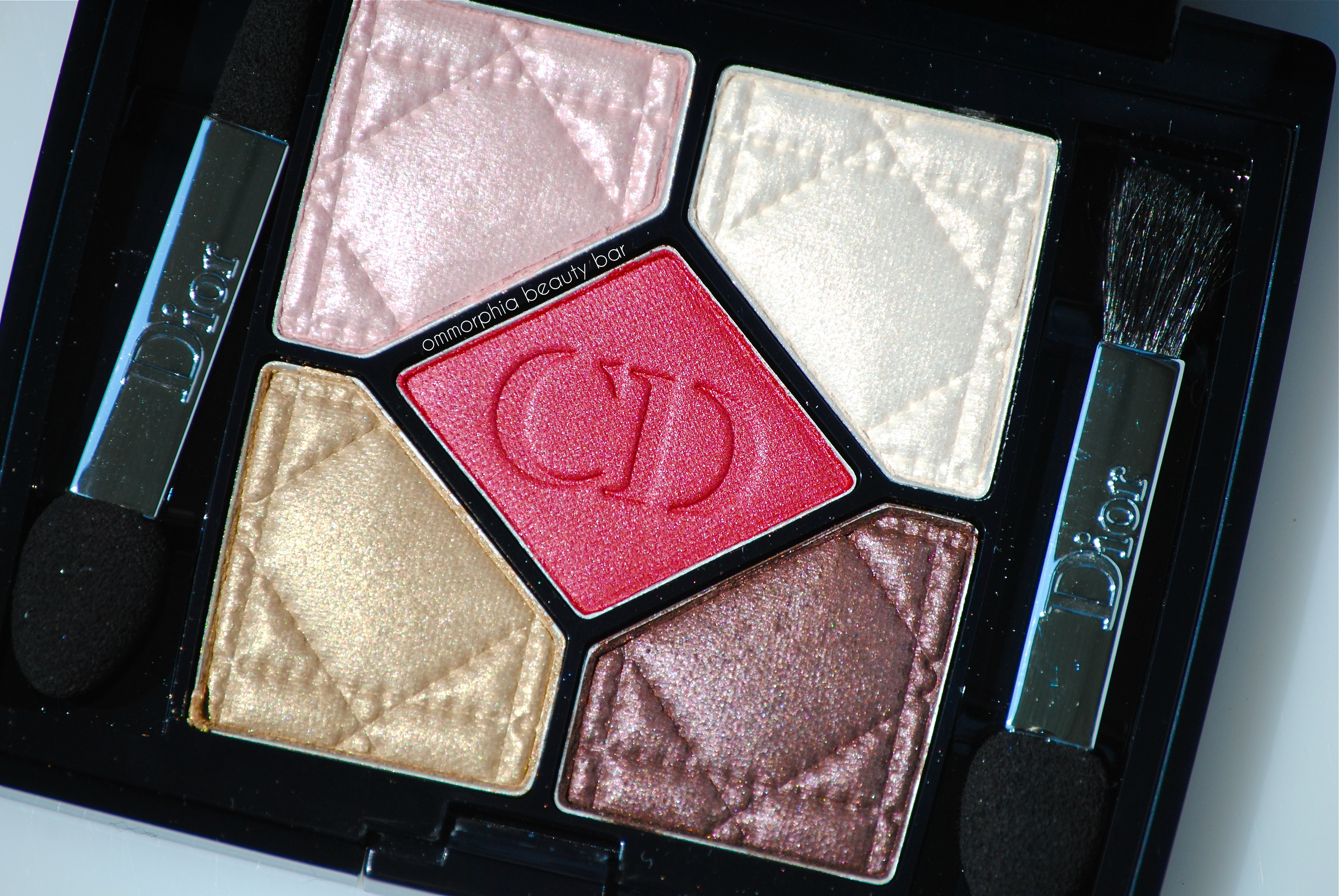
5 Couleurs #876 Trafalgar (CAN $61) | Built around the central red hue, this exquisite palette is a study of how the unexpected can come together in a beauty product, and make you fall in love with colour all over again. A breakdown of the colours, starting clockwise from the top left:
- a ballerina pink hue in a satin finish, lightest pigmentation of the 5 but still easily built up for visibility
- soft white with pale pink reflects, fairly well pigmented
- deep red with a magenta gleam for depth, incredible pigmentation whether applied dry or dampened
- dirty plum hue with a pink/lilac gleam, excellent colour saturation and blendability factor
- antique gold in a satiny formula and with a soft finish, easily intensified when applied damp
I always felt that a strong red colour for eyes worked best primarily in an editorial shoot, but then Dior’s #876 Trafalgar palette came along and blew that theory to bits. To begin with, every single one of these 5 shades applies like a dream; by using the pale pink as an all over wash on the eyelid with the white lightly dabbed at the inner corners, followed by a faint hint of the red at the outer third of the crease for depth and a spot of colour, yields a soft yet still visually unique daytime look. For a completely unexpected twist on the classic smokey eye, the 2 bottom shades combined with the central red hue make for an arresting yet still so totally wearable look. The touch of magenta running through this red shade turns it into a serviceable colour think: the warmth of brown with the impact of black, but in … red. With almost no powdery residue upon swirling my brushes through any of the shades & each offering a wonderful blendability, staying power (on primed lids) is amazing as well – going long past the 12 hour mark, although the 2 lighter shades will have a tendency to fade first.
Dior 5 Couleurs Collection Fall 2014 | #876 Trafalgar
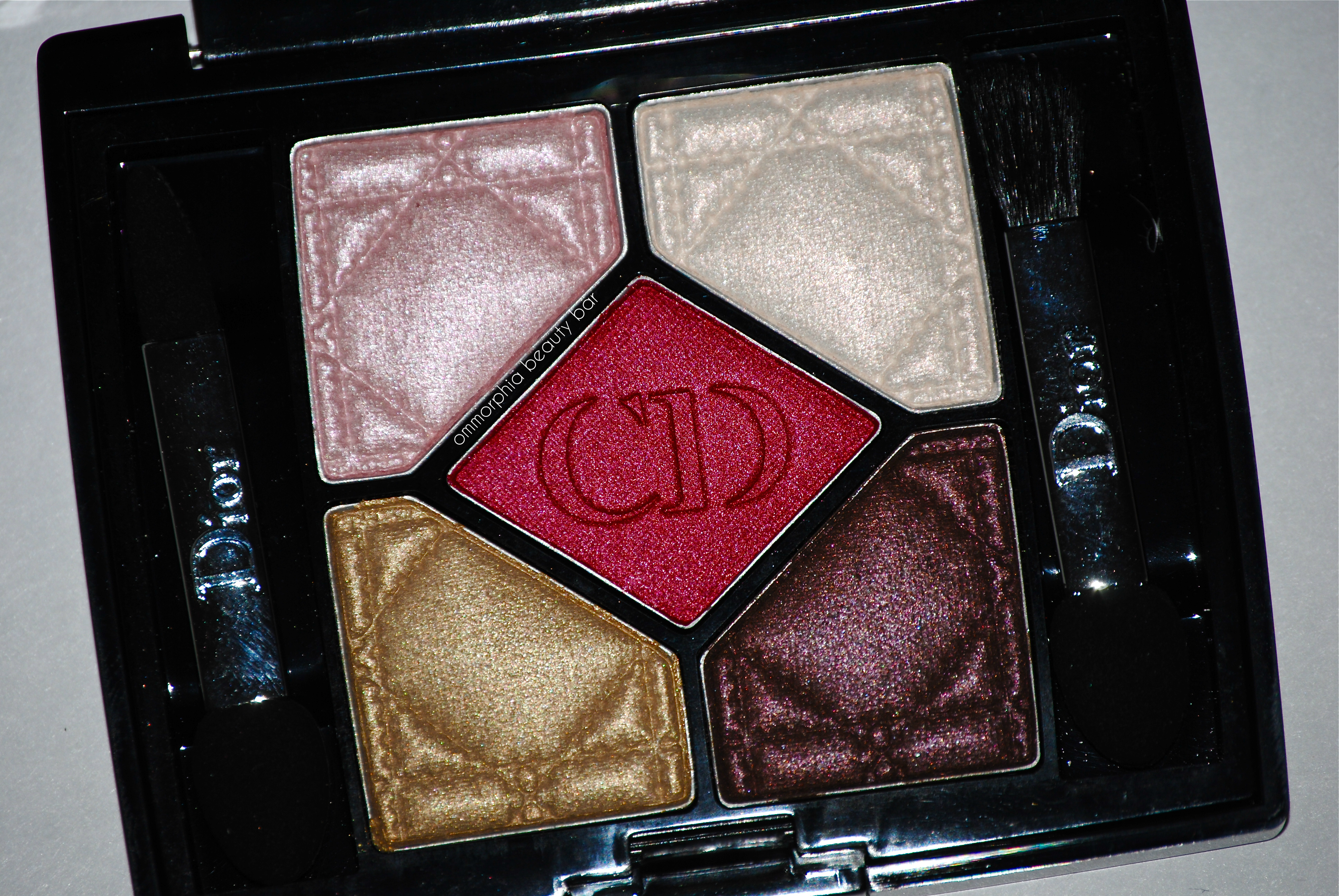
Dior 5 Couleurs Collection Fall 2014 | #876 Trafalgar, with flash
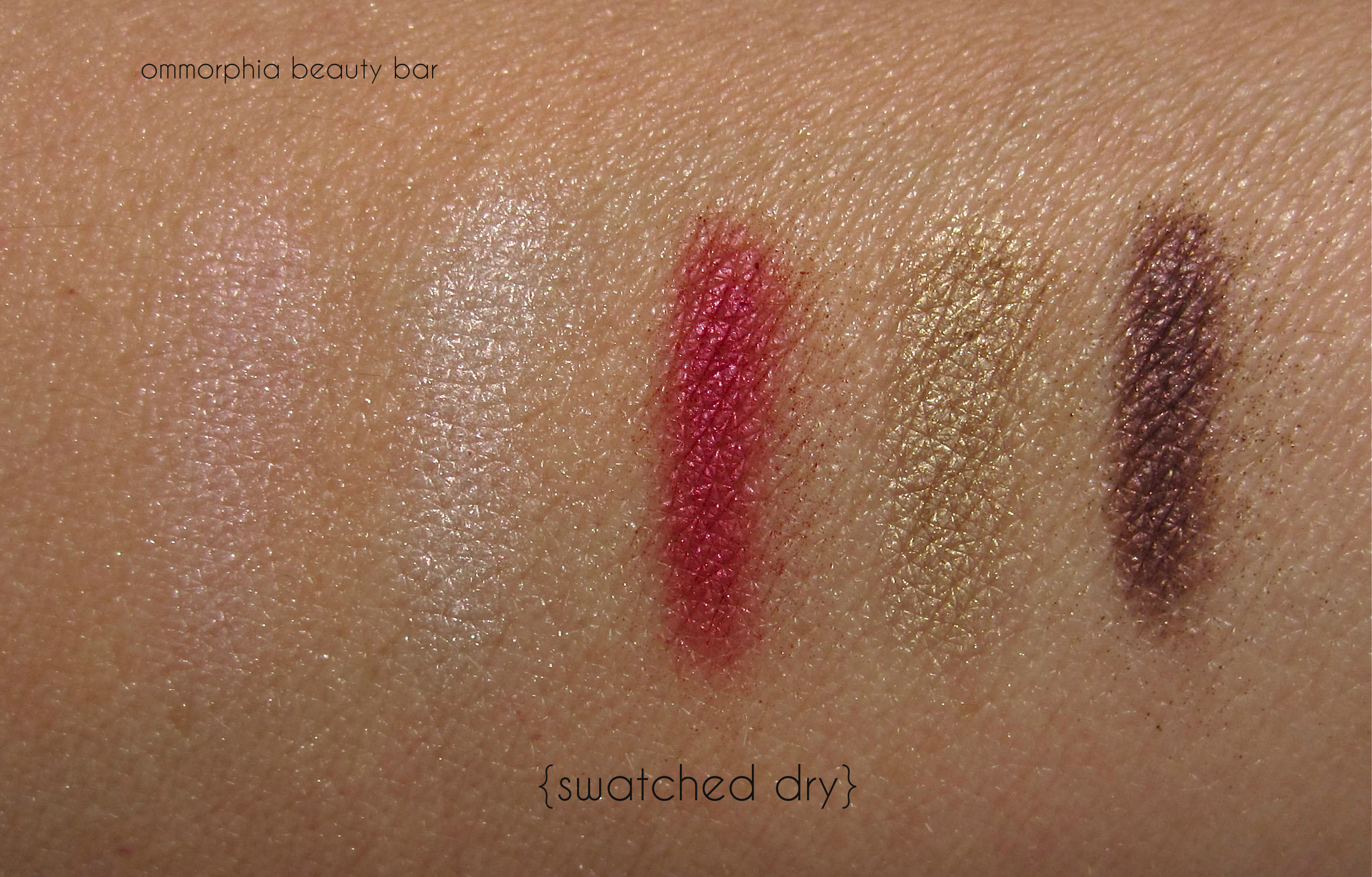
Dior 5 Couleurs Collection Fall 2014 | #876 Trafalgar, swatched dry
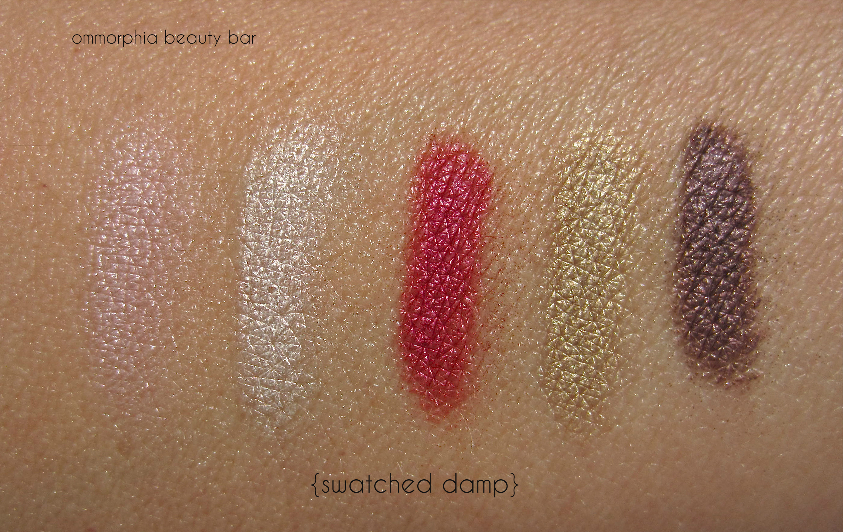
Dior 5 Couleurs Collection Fall 2014 | #876 Trafalgar, swatched damp
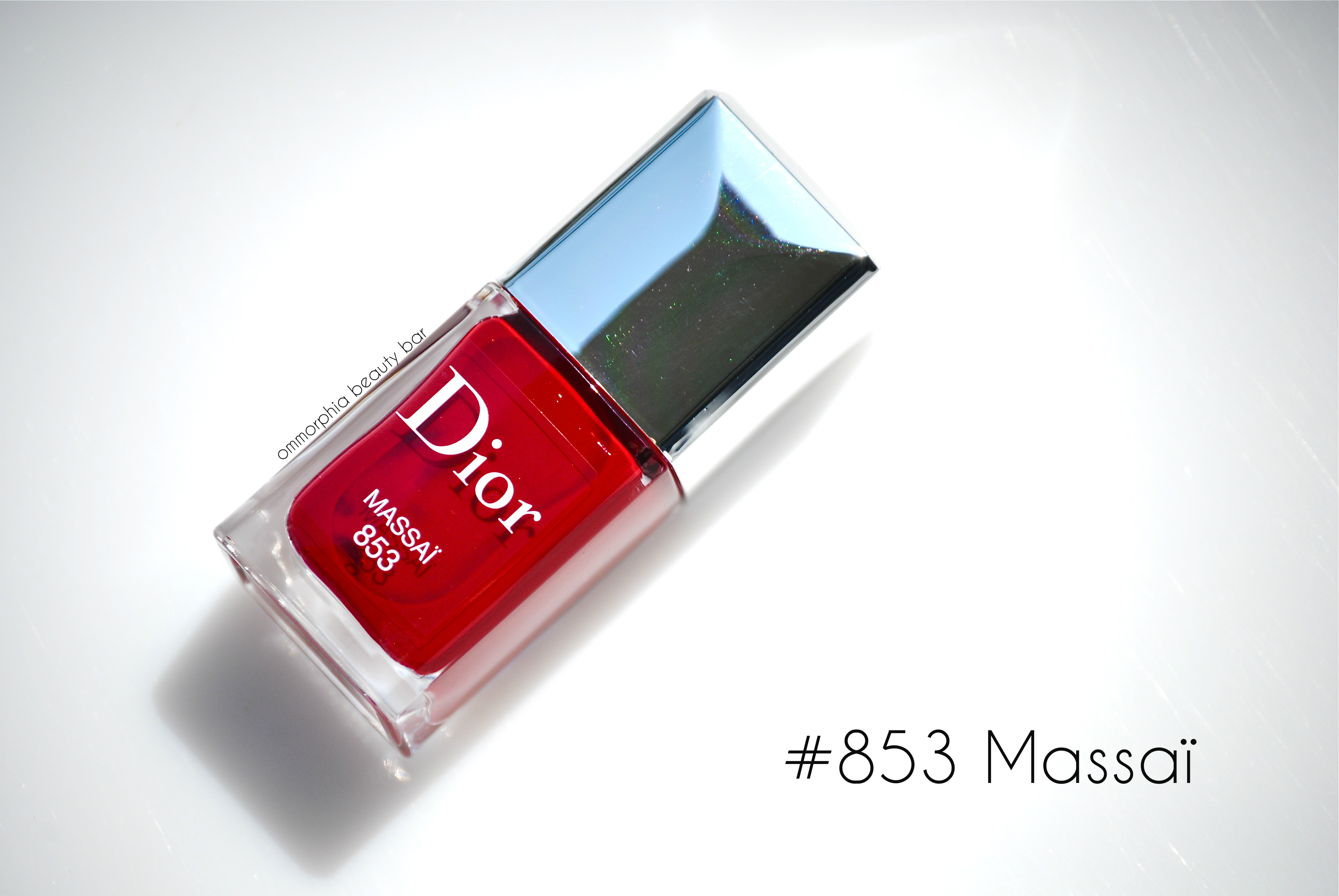
Dior Vernis #853 Massaï (CAN $26.00) | A tribal red hue with hints of berry in the base in a highly pigmented crème formula, with both cool and warm undertones – enabling #853 Massaï to suit basically all complexions across the spectrum. Self-levelling and ending in a mirror-like shine, this shade is at once vibrant and richly dark, a truly decadent red: sophisticated and oozing loads of sex appeal … simply sublime. Bonus: non-staining upon removal (provided you apply base coat first). Coats applied: 2, plus top coat

Dior 5 Couleurs Collection Fall 2014 | Dior Veris #853 Massaï

Dior 5 Couleurs Collection Fall 2014 | Dior Veris #853 Massaï, in sunlight
Upon first receiving this entire collection, I confess that my beauty-loving heart skipped a beat when I looked at the #876 Trafalgar palette. Apart from the central red hue (as if that wasn’t enough, right?), I also couldn’t stop staring at the gold and plum shades, but that first look was quickly followed by the thought: “how wearable are they, really?”. Very, as it turns out. All I’ll say here, is that you need to swatch this for yourself to truly understand. Red lipstick is a staple every woman should have in her makeup wardrobe but as mentioned above, finding that perfect shade is not always easy – at least it never has been for me. Until now. Yes, I’ve probably said that before with other brands, but with this combination of cool/warm red tones and ultra-moisturizing formula, I’m in heaven with #869 Rouge Massaï. Finally, red nails – you either love them or hate them, and since I place in the former category (plus, is there really anything sexier than a red nail?) I’ll tell you why I have totally fallen for #853 Massaï: this is a luxurious red, deep & rich but still vibrant, super glossy, & basically non-staining (a major selling point when dealing with red hues). Enough said.
Available now at all Dior counters, find more information via:
*Disclosure: Product samples provided by the company/PR for my unbiased consideration


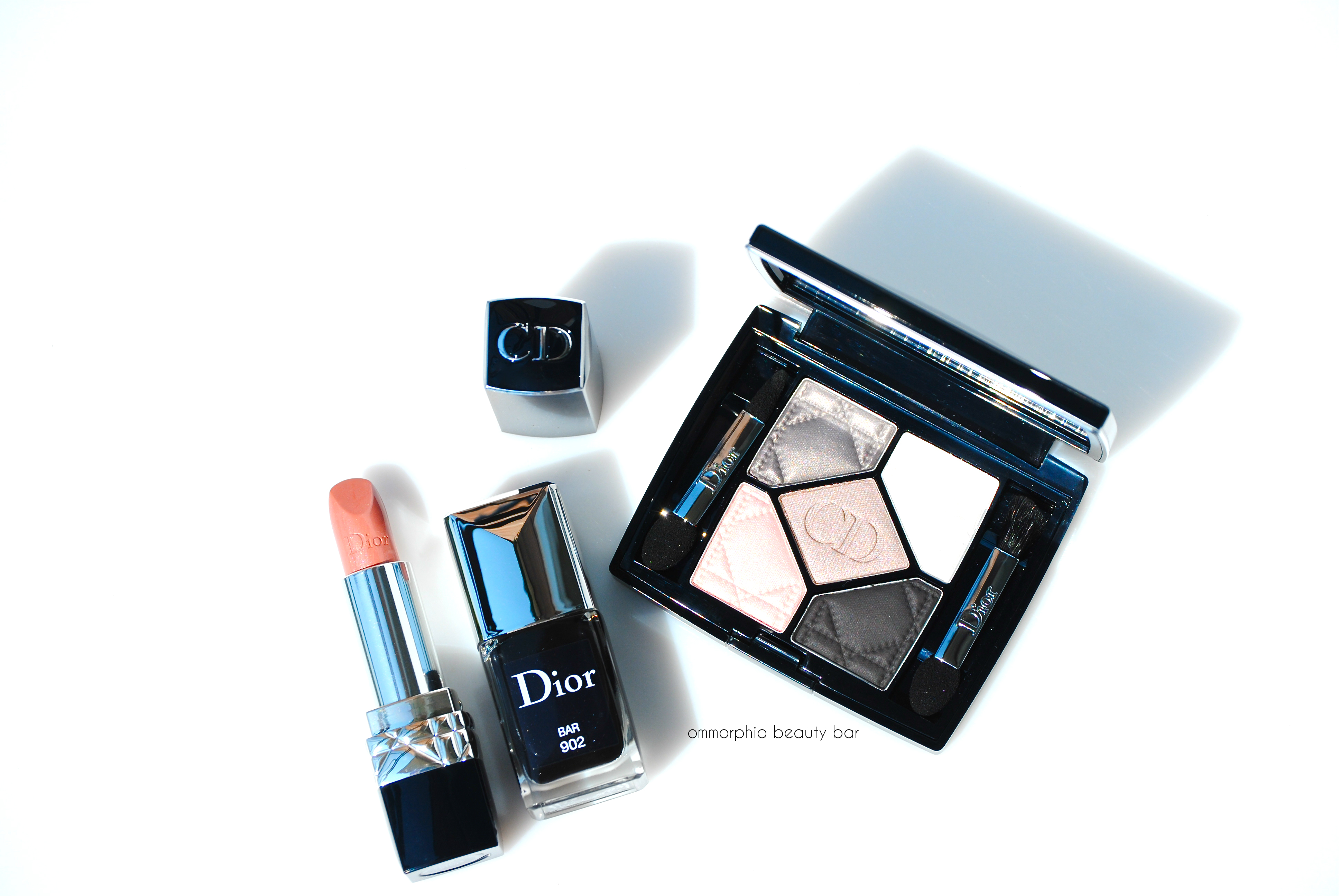
Dior 5 Couleurs Collection Fall 2014 | Bar trio

In 1947, M. Dior created quite a stir in the world of fashion with the introduction of a unique silhouette: the legendary ‘Bar Ensemble‘, a tailored and minimalistic yet still quite feminine tone, dubbed the “New Look“. The newly released Bar Trio from the 5 Couleurs Collection for Fall 2014 (see my previews reviews on the other trios here, here and here), pays homage to that look in shades of grey, black and beige – all working in harmony yet with enough dark touches to keep things modern and edgy.

Dior legendary Bar Ensemble – New Look (1947)

Rouge Dior #317 Bar (CAN $36.00) | A pinky nude lipstick hue made totally unique by grey/lavender undertones and a fine silvery sheen in the über-hydrating Rouge Dior format. Finding the right neutral lipstick shade to suit my skin tone can be a daunting task as most can pull either too flat or ashy on me, but something about the combination of colours here just works; I’ll even go out on a limb and say that #317 Bar may very well be my most favourite nude lipstick shade to wear. EVER. Any settling into lip lines is minimal at best (keep in mind that as my photos are high resolution, they magnify EVERYTHING) and wear time was about average for a shade as light as this, about 4-5 hours before reapplying (no mirror needed for that either – another plus), leaving my lips feeling super nourished long after all traces of colour had gone.
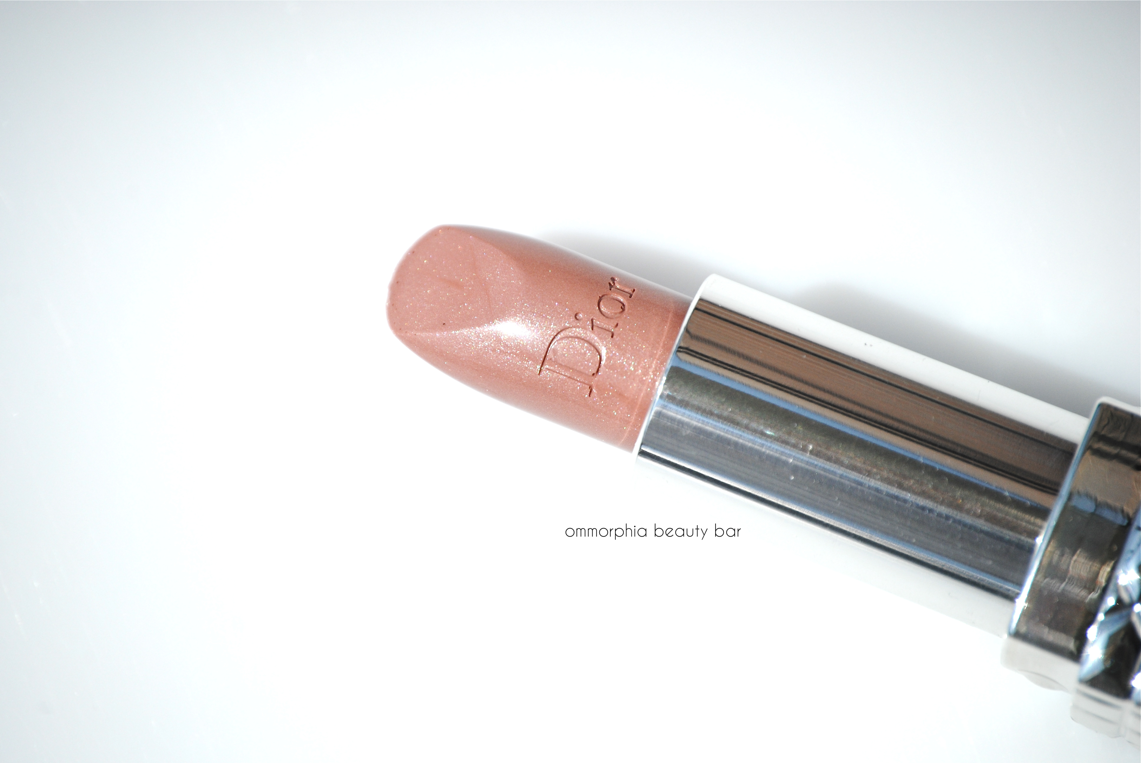
Dior 5 Couleurs Collection Fall 2014 | Rouge Dior #317 Bar
Dior 5 Couleurs Collection Fall 2014 | Rouge Dior #317 Bar

5 Couleurs #056 Bar (CAN $61.00) | The most neutral leaning of the 5 eye shadow palettes released with this new collection, #056 Bar has quickly become my go-to range of shades for every day. A breakdown of the colours, starting clockwise from the upper left:
- silky taupe with grey undertones (slightly cool leaning) and superb pigmentation
- cool white frosty hue with light silvery reflects, well pigmented and non-chalky
- soft mauve (warm leaning) with a light pink duo chrome-like sheen, satin formula with excellent pigmentation
- matte soft black, great pigmentation and excellent blendability
- cool baby pink in a frosted formula, least pigmented of the 5, pink tone more apparent when applied damp
As a taupe fiend, I couldn’t be happier to see 2 versions in this palette – and both quite different one from the other. Some matte black shades can appear quite flat and light-absorbing, but the one in this grouping seems to defy that principle with its unique velvety softness and the easy manner with which it can be blended – or taken to a new level of dark by applying it with a dampened brush. The pale pink shade when applied dry seems like a slightly different version of white against my skin tone, but on the eye it appears to reveal more colour – especially when juxtaposed beside the others (which goes to prove that arm swatches are not always a good indicator of how a particular colour will appear on the lids), but it still bears the least amount of pigmentation (unless applied with a damp brush) making it an excellent highlight hue (inner eye corners or under brow bone). Apart from the 2 palest hues, I experienced no powdery residue or kickback when swirling my brush through the shades and regardless of pigmentation levels, they all blended beautifully.
One of the main advantages offered by the #056 Bar palette, is the total wearability of these shades and how well they should compliment basically all skin tones across the spectrum. Another plus is how travel-friendly this palette is, small enough to take up little room in your makeup case and with plenty of look options offered by the 5 shades.

Dior 5 Couleurs Collection Fall 2014 | #056 Bar

Dior 5 Couleurs Collection Fall 2014 | #056 Bar, with flash

Dior 5 Couleurs Collection Fall 2014 | #056 Bar, swatched dry
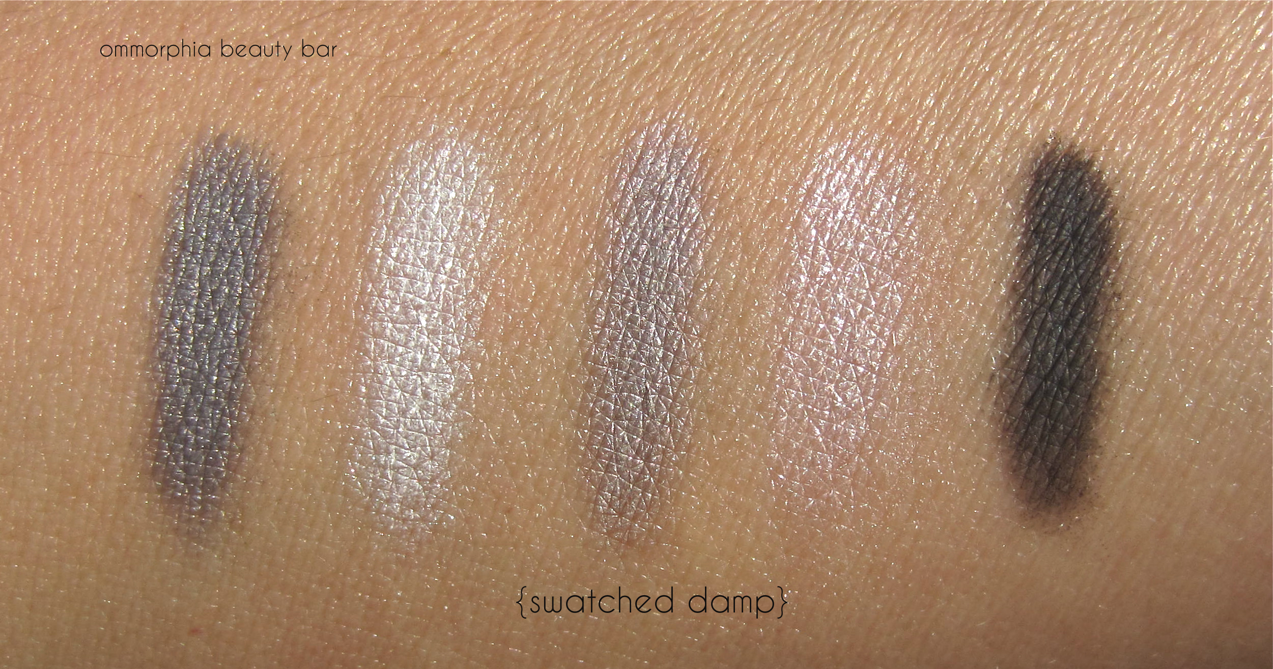
Dior 5 Couleurs Collection Fall 2014 | #056 Bar, swatched damp
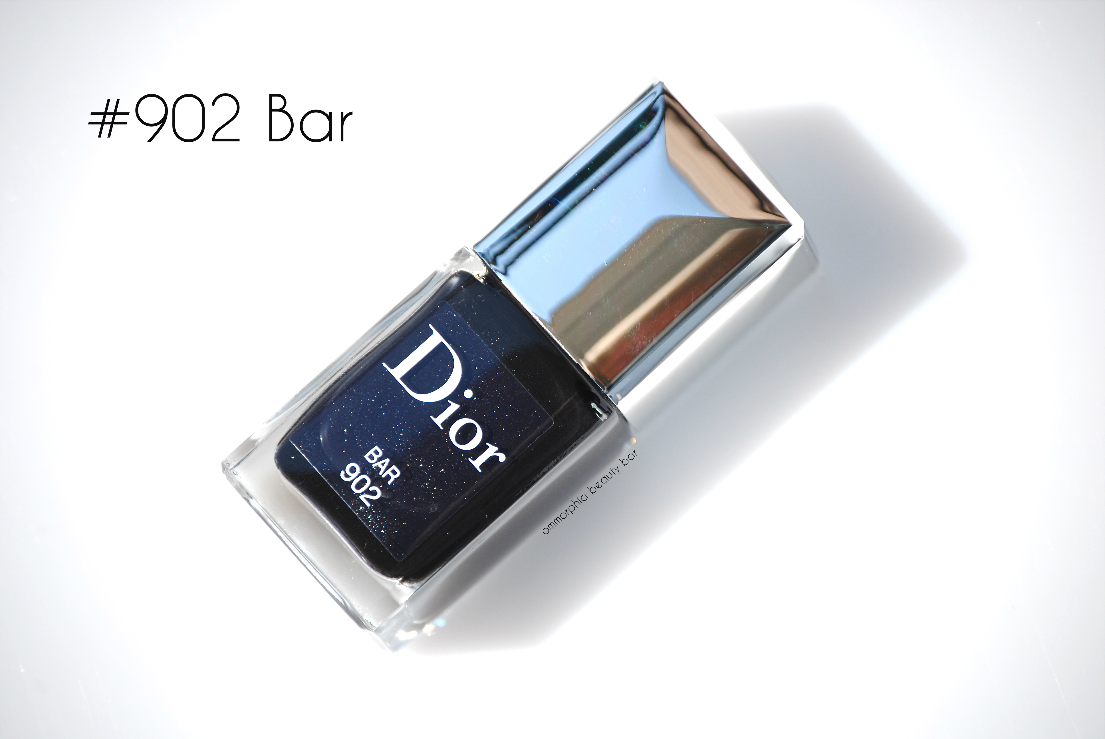
Dior Vernis #902 Bar (CAN $26.00) | An obsidian black hue with Dior’s secret shimmer that adds a unique overall depth (not very overt but still visible to the naked eye), in a plush jelly-like formal. Self-levelling and with a mirror-like shine at the finish, #902 Bar is a decadent black shade that appears almost velvety soft (sounds odd, but that’s what the final look reminds me of) and has enough cool & warm tones to suit all skin tones. Bonus: non-staining upon removal (provided base coat is applied first). Coats applied: 2, plus top coat

Dior 5 Couleurs Collection Fall 2014 | Dior Vernis #902 Bar

Dior 5 Couleurs Collection Fall 2014 | Dior Vernis #902 Bar, in sunlight
In case it wasn’t made clear in my breakdowns above, I am absolutely in LOVE with all three items of the Bar Trio. I’ll keep it short: for all who love neutral eyeshadow shades, then the #056 Bar palette is definitely worth looking into. For lips, don’t be fooled by the cool gleam of #317 Bar; there is some sorcery at work here, as this shade seems to work on all. As for nails, #902 Bar is an obvious urban yet sensual hue, made even more distinctive when seen in contrast to lighter makeup. So much for keeping it short – just goes to show you that this trio is a total hit … at least for me. prescription
Available now at all Dior counters, find more information via:
*Disclosure: Product samples provided by the company/PR for my unbiased consideration
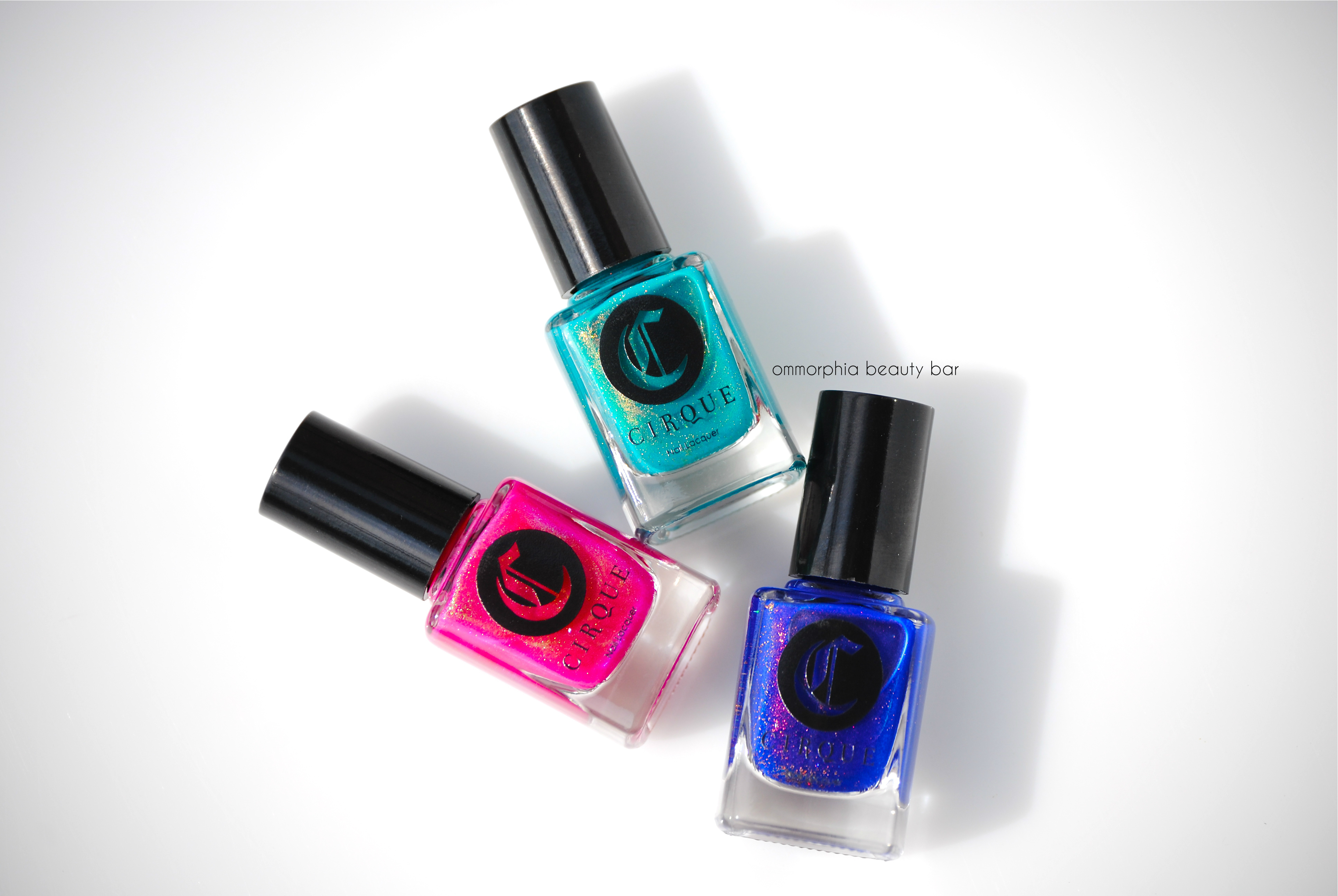
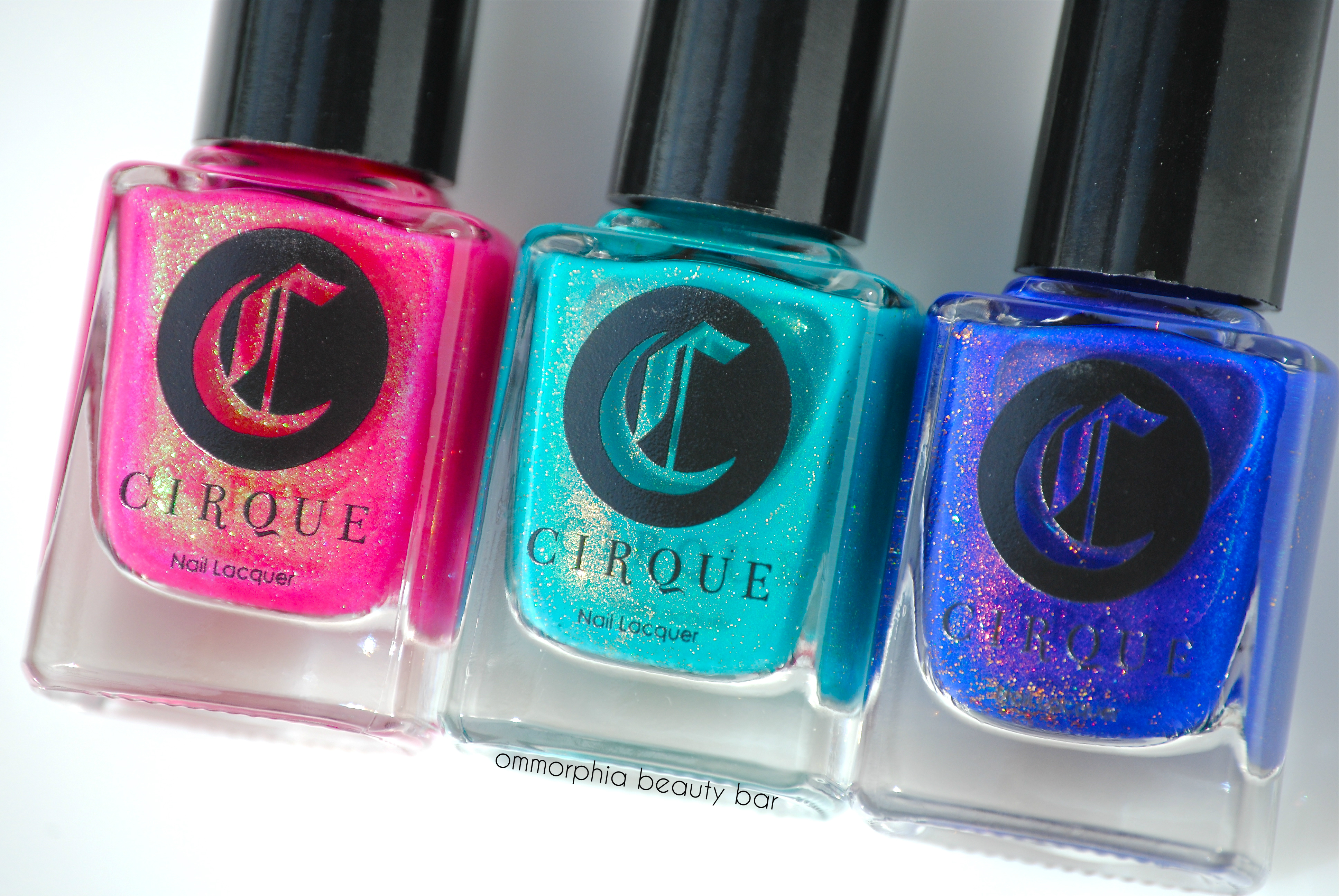
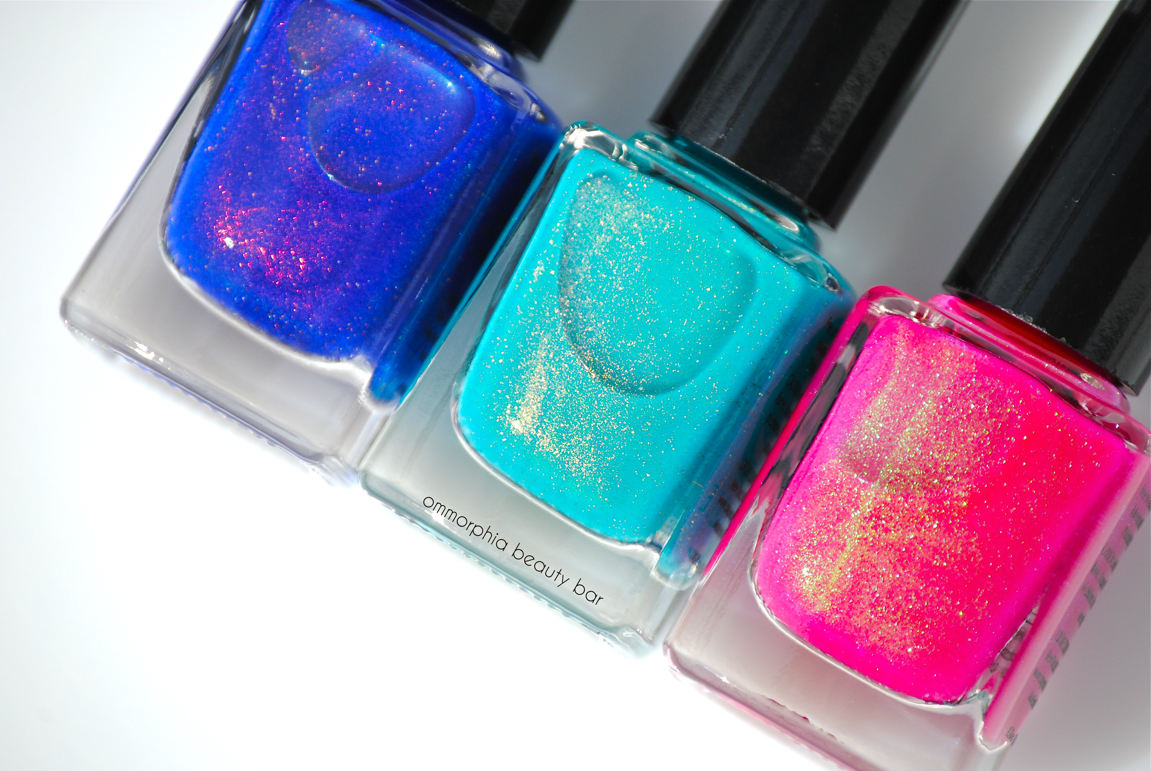
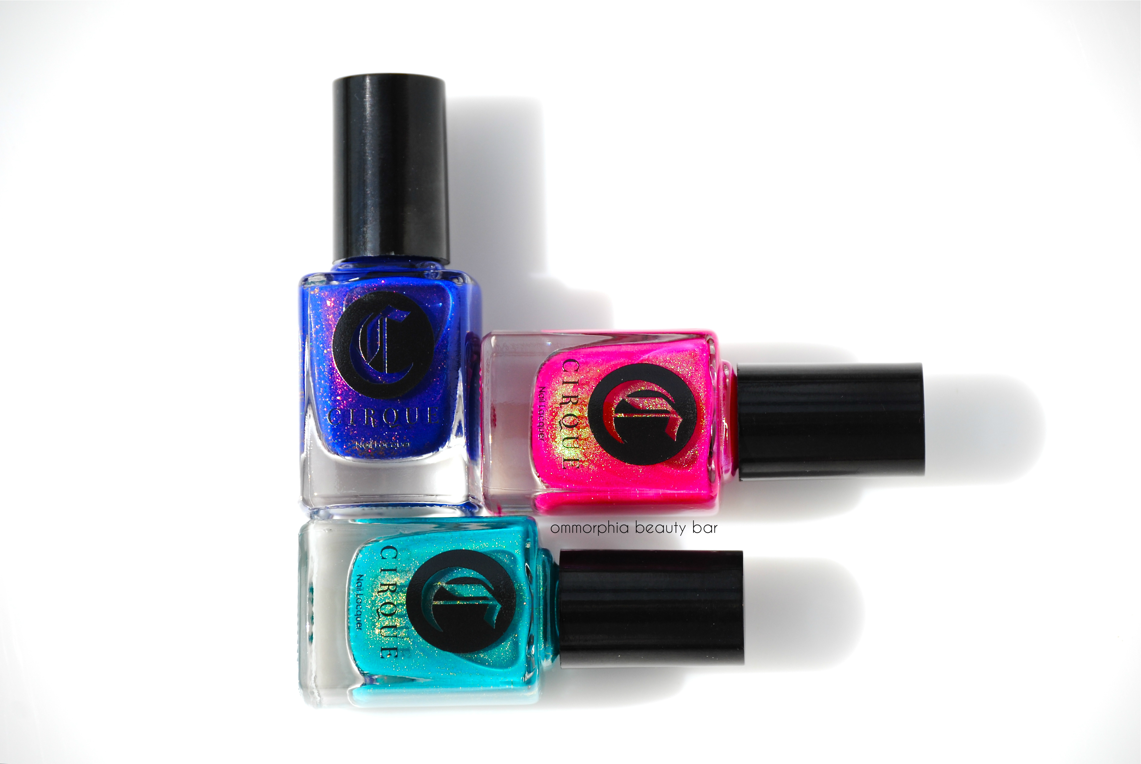
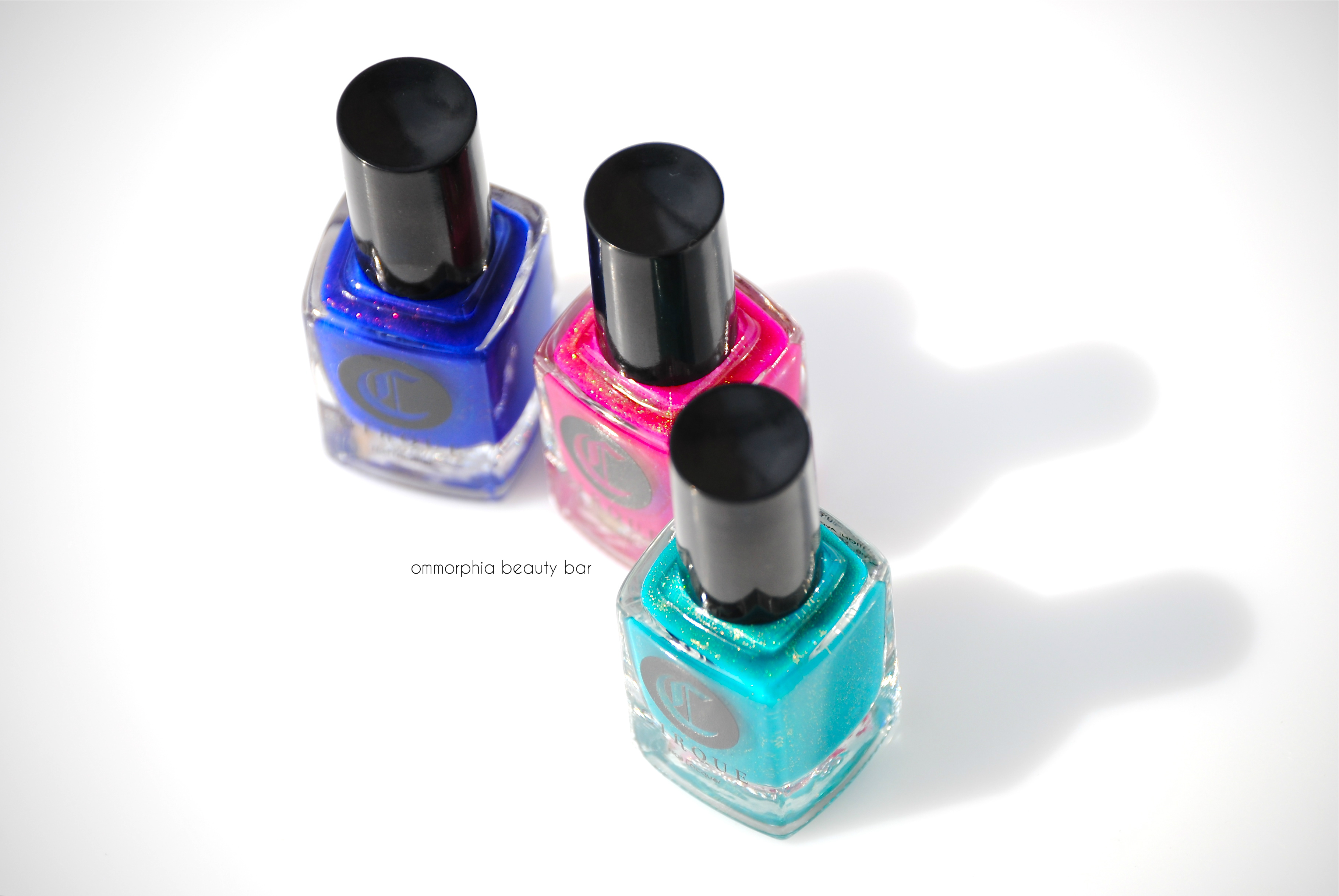
Cirque Colors | Kontiki Collection, Limited Edition

Cirque Colors has just recently released three vivid (and limited edition) shades inspired by Summer’s heat: the Kontiki Collection. Filled with colour-shifting shimmer that both captures and reflects light, the formula is not only lushly decadent in appearance, but free of all nasty toxins. Annie Pham, the creative genius behind the brand, has also gone one step further and added essential oils of lavender and clary sage to the formula; nails are fortified and smell simply divine as the polish dries. First seen in Cirque Colors’ Coronation (reviewed here), all three shades of the Kontiki Collection bear a similar otherworldly glow, giving nails a gorgeous and dangerously hypnotic appeal (don’t drive and stare).
All swatches are were done with the brand new Holdfast™ Base Coat (garlic-infused to strengthen & anchor – and no, it doesn’t smell) and Liquid Laminate™ Top Coat from Cirque Colors, 2 products that I am absolutely obsessed with and which I cannot recommend strongly enough. Seriously.

an idyllic island scene or where I want to be right now …
Cirque Colors | Kontiki Collection, Limited Edition
Cirque Colors | Kontiki Collection, Limited Edition
Cirque Colors | Kontiki Collection, Limited Edition
Cirque Colors | Kontiki Collection, Limited Edition
buy avapro online salempregnancy.org/wp-content/languages/new/avapro.html avapro no prescription
Dear Dahlia | A Popsicle pink hue with colour-shifting shimmer that flashes primarily green & oxidized gold, in a semi sheer jelly-like formula that comes to a semi-glossy finish. Self-levelling and squishy looking, short nails won’t need more than 2 coats for decent opacity, although longer nails could use a 3rd to cover any visible nail line. Personally, I love it with a slight translucency – it seems to elevate Dear Dahlia above your average pink jelly. Coats applied: 2, plus top coat
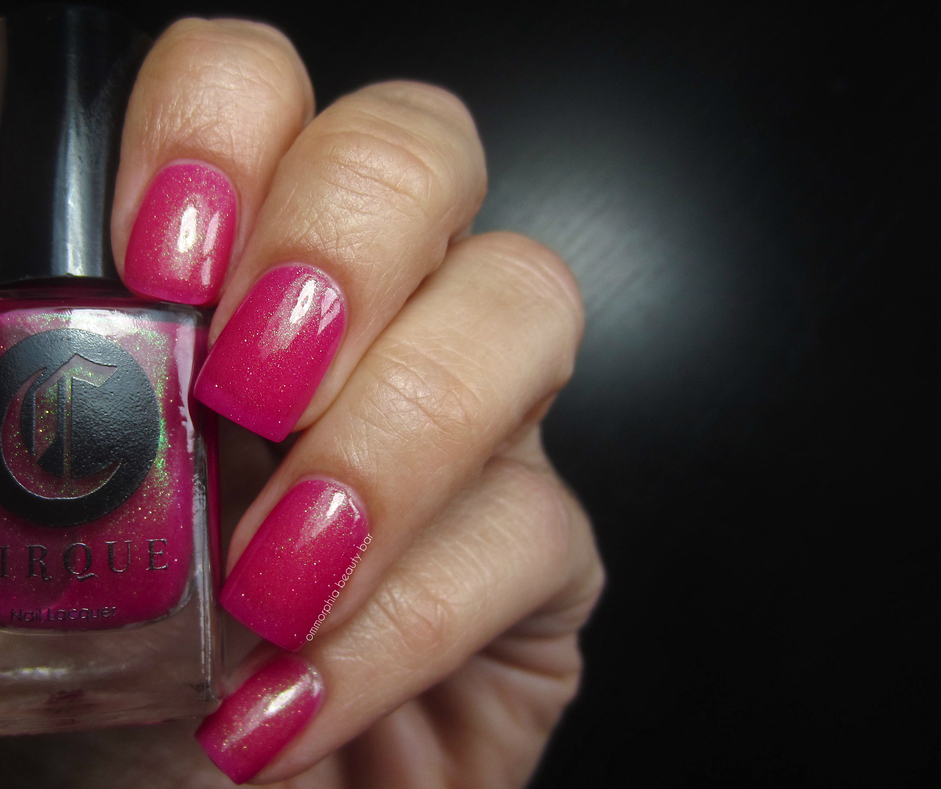
Cirque Colors Kontiki Collection | Dear Dahlia
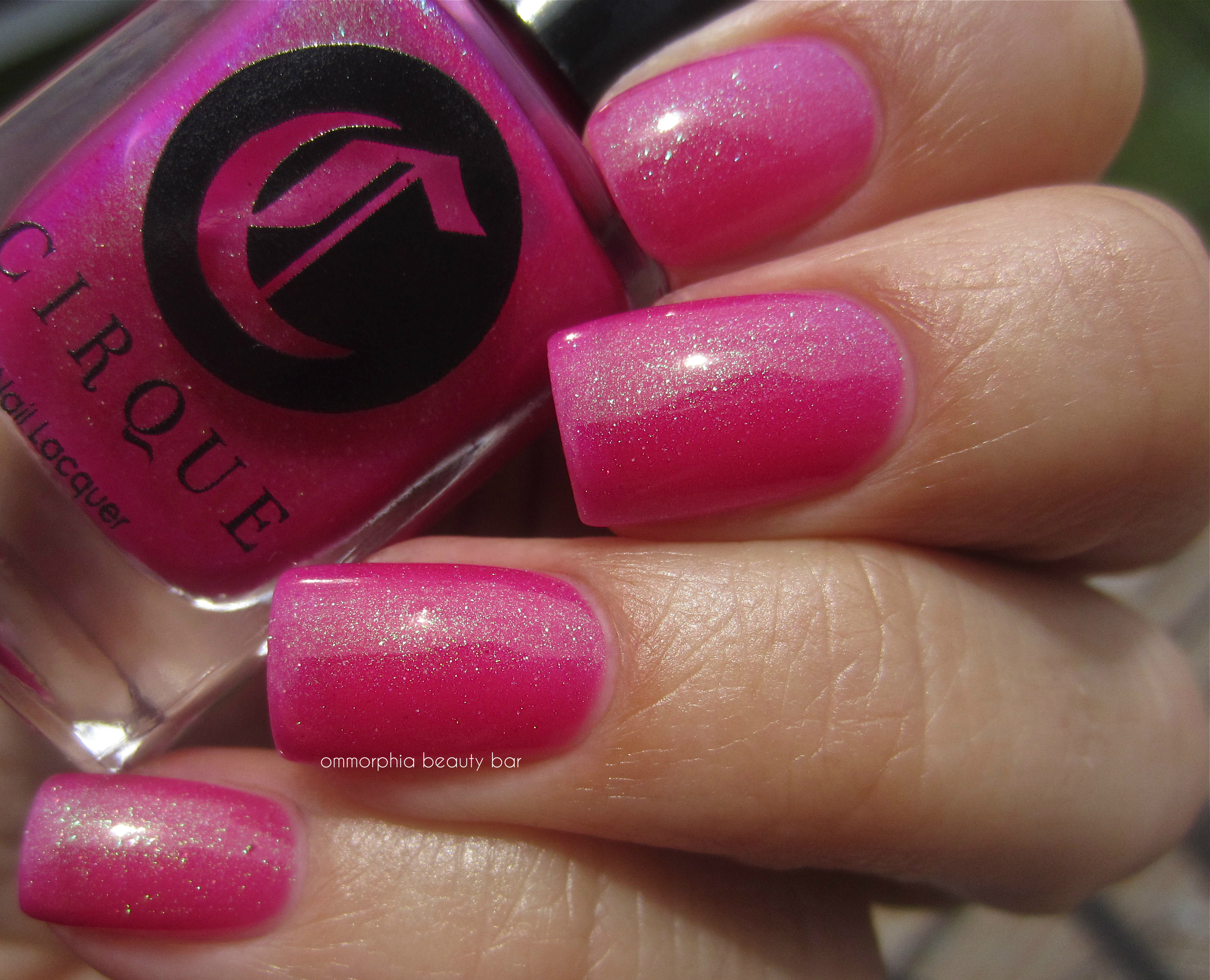
Cirque Colors Kontiki Collection | Dear Dahlia
Thicker Than Water | A vivid turquoise/aqua hue filled with colour-shifting shimmer that flashes primarily antique golden, in a self-levelling jelly-like formula that comes to a glossy natural finish. Slightly sheer, Thicker Than Water can also be applied over “undies” (i.e.: a ridge-filling base coat that offers some opacity), or left at 2 coats for a sea glass-like translucency. As I have a mega weakness for these types of shades, I love that this still manages to be totally unique in my collection. Bonus: non-staining upon removal. Coats applied: 3 (thin), plus top coat
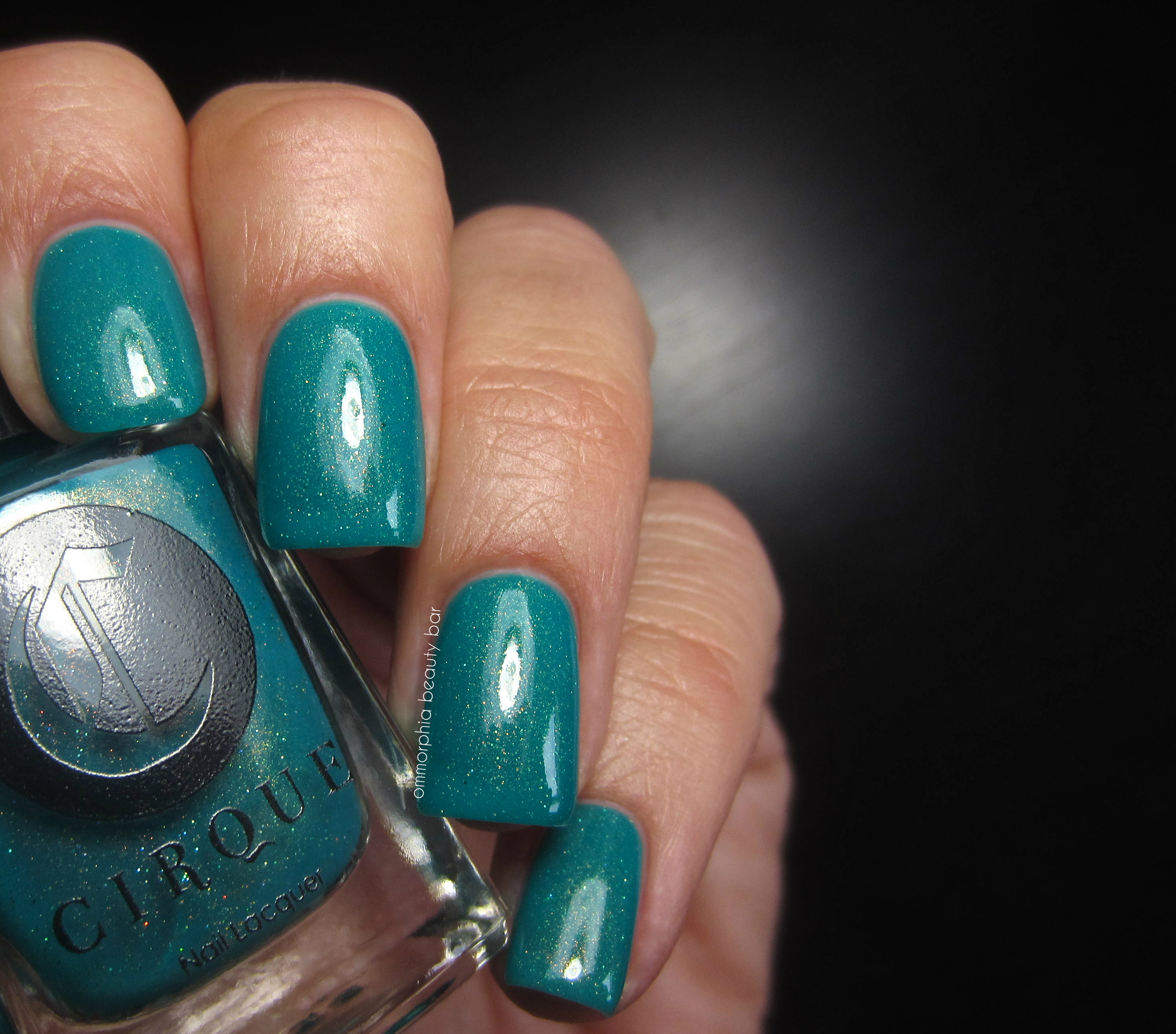
Cirque Colors Kontiki Collection | Thicker Than Water

Cirque Colors Kontiki Collection | Thicker Than Water
buy dilantin online salempregnancy.org/wp-content/languages/new/dilantin.html dilantin no prescription
Midsummer Night | Prepare to be wowed: a totally hot indigo/ink blue shade filled with colour-shifting shimmer that flashes primarily dark pink with golden glints, in a self-levelling jelly-like formula with a ridiculously easy flow and glossy finish. There’s this ‘lit-from-within’ glow to Midsummer Night, an especially strong effect seen along the nail centers – truly SPECTACTULAR! I honestly don’t have enough superlatives to adequately describe this beauty. Coats applied: 3 (thin), plus top coat
NOTE: I doubled up on base coat as a precaution before applying the actual polish, as blue shades can be notorious stainers – happy to report no staining left behind upon removal with this method.

Cirque Colors Kontiki Collection | Midsummer Night
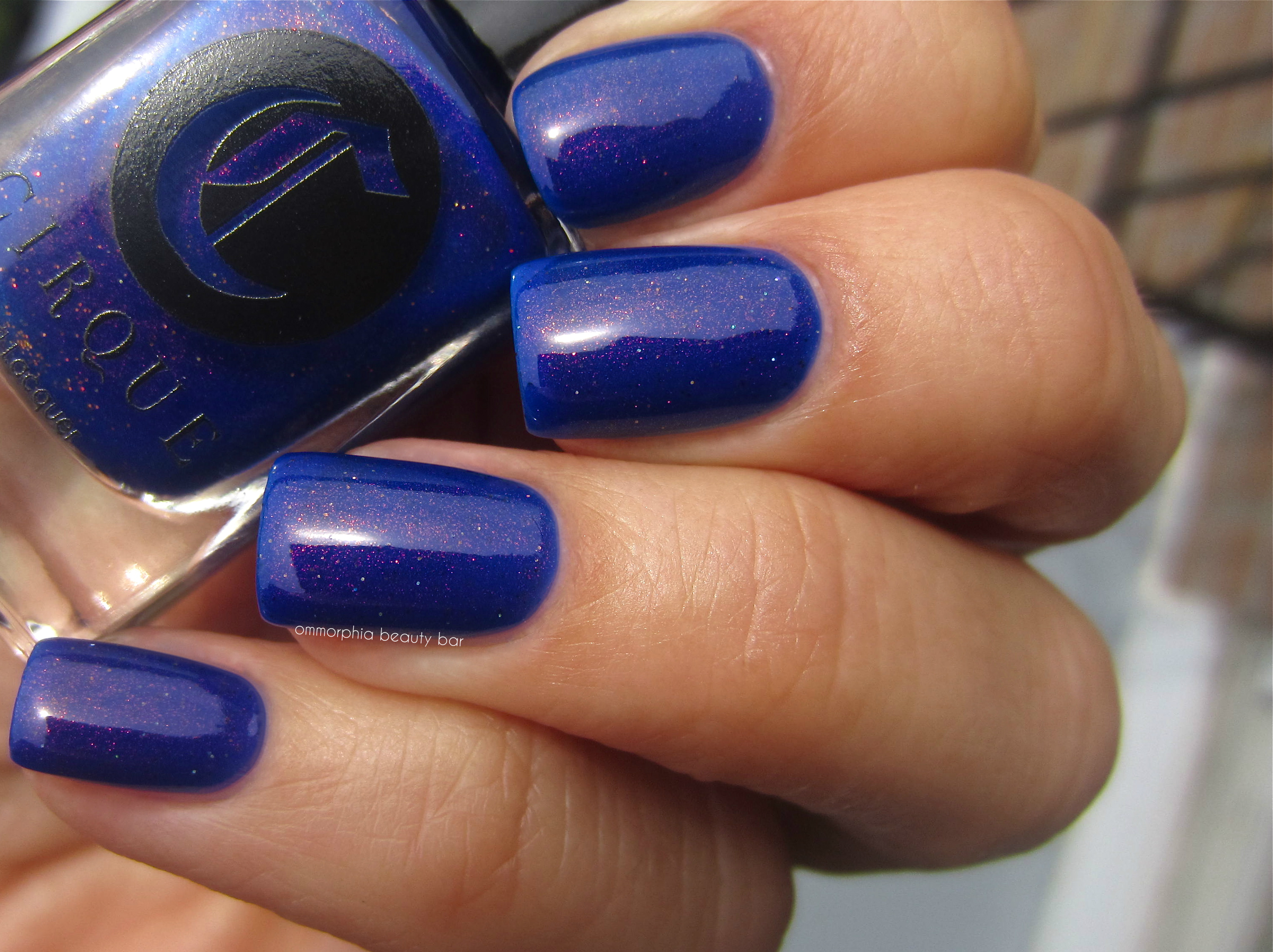
Cirque Colors Kontiki Collection | Midsummer Night
This collection may be small, but it packs a powerful punch: pink, turquoise, cobalt – three shades that we’ve all come across in one form or another, are somehow still made unique by the addition of the colour-shifting shimmer seen here. My favourites are without a doubt Thicker Than Water and Midsummer Night – both are gorgeous and so very eye-catching … not to mention how they totally speak to my beach-loving ways.
Available now, but bear in mind that this is a limited edition collection. Find more information via:
*Disclosure: Product samples provided by the company/PR for my unbiased consideration
buy sinequan online salempregnancy.org/wp-content/languages/new/sinequan.html sinequan no prescription
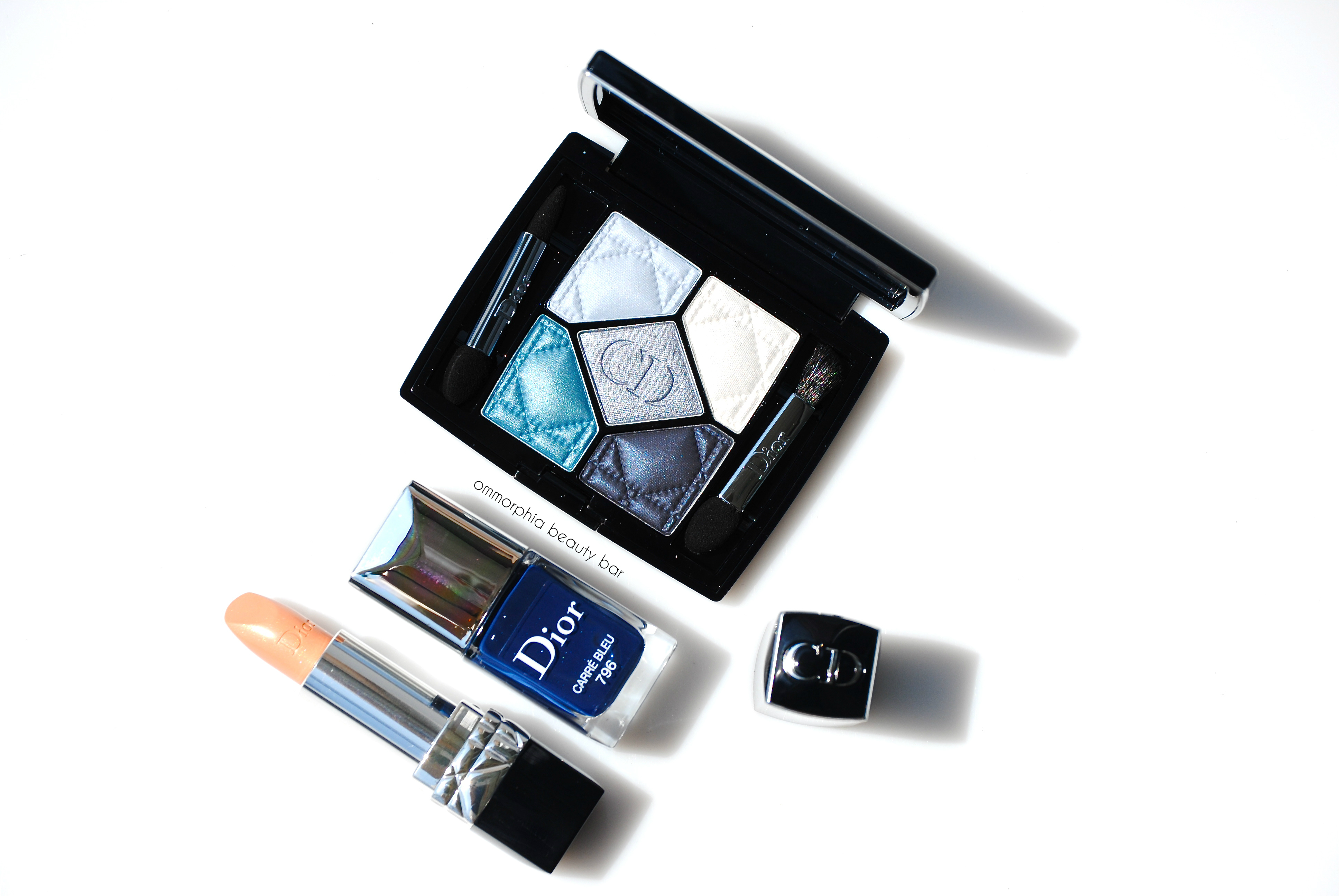
Dior 5 Couleurs Collection Fall 2014 | Carré Bleu trio

In 1969, Dior beauty made quite a sensation with the launch of the “Les Yeux Dior” eye shadow collection, and for 2014, the brand is once again revolutionizing the blue eye look. Instead of the 80’s overdone excesses, think ‘sophisticated modern’ with these hues, made that much more wearable by their sublime textures. Juxtaposing the palette, is a softly golden/nude lip, while nails once again call your attention with their midnight intensity. The Carré Bleu trio is a selection of blue shades that definitely impresses (see my reviews on the previous trios here & here) and well worth looking into, especially if you’ve always steered clear of blue shades before.

Raf Simons, Creative Director of Christian Dior & an image from the Cruise 2014 Collection
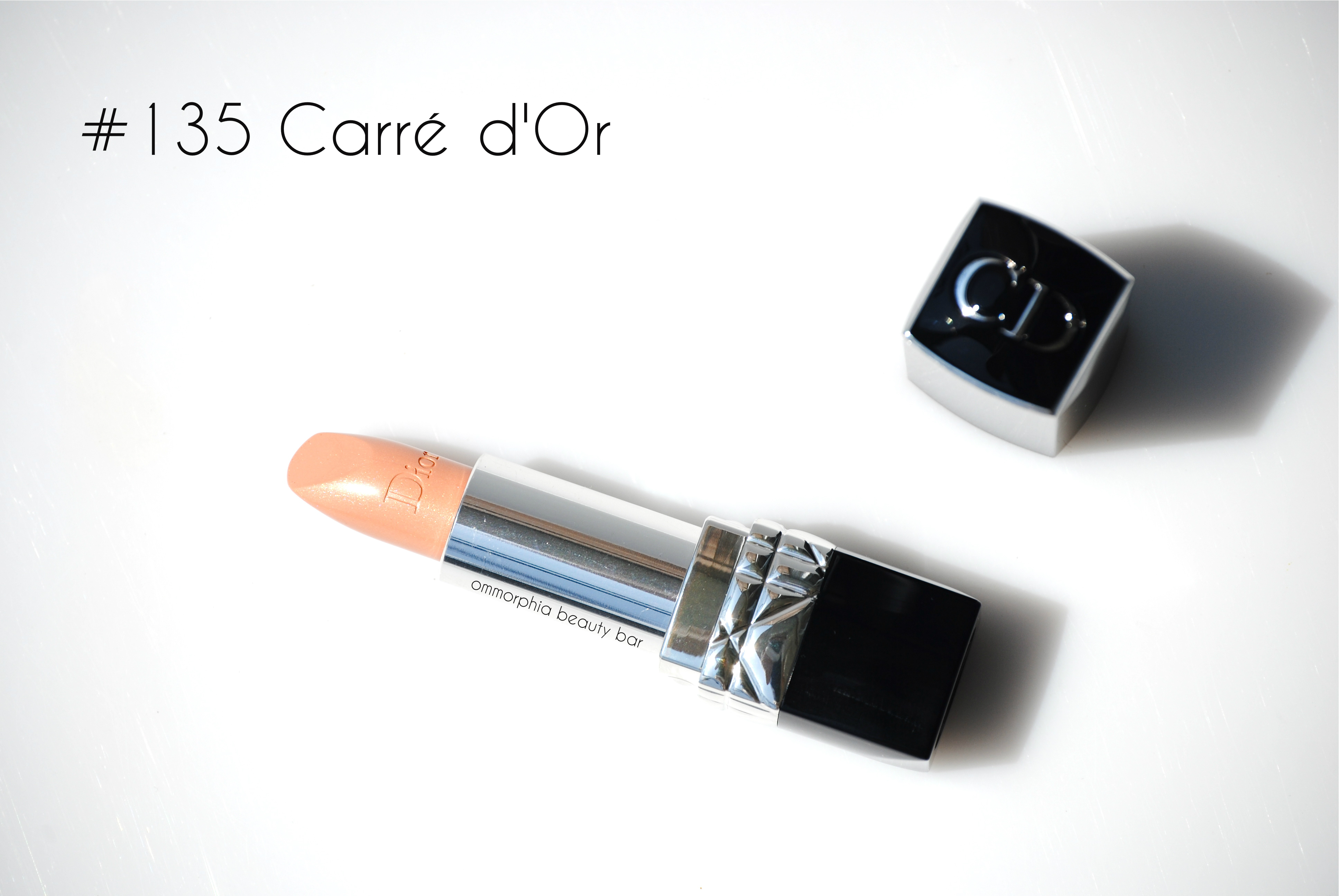
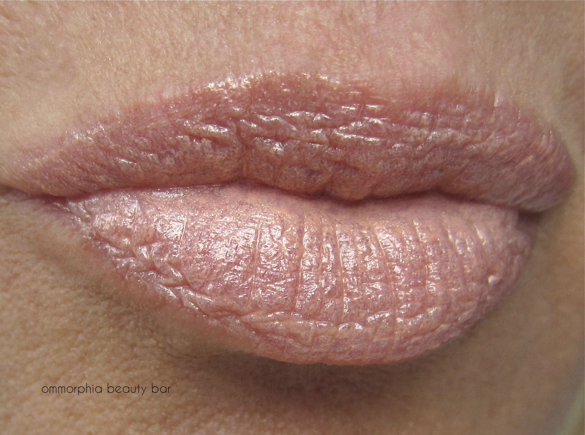
Rouge Dior #135 Carré d’Or (CAN $36.00) | An ultra pale nude shade with light golden reflects along with a pearly gleam, in Dior’s ultra-creamy and moisturizing formula. As this is such a light shade, it’s not without some issues; for starters, lips need to be smooth and flake-free before applying #135 Carré d’Or, or you run the risk of it catching on every little flaw and ultimately magnifying said flaws. On darker skin tones, ordinarily a nude this pale would pull somewhat ashy but there is enough hint of gold to keep it looking mod and fresh. Those with super fair complexions will absolutely love this as well, as once again the gold tints bring just enough colour to keep lips from looking washed out. On my light-medium skin tone, #135 Carré d’Or works – but not at first application (which only seemed to emphasize all my lip lines, of which I apparently have a bazillion), but after wearing it for a few minutes, it seemed to warm up and give a soft nude glow which I absolutely love. Wear time, as expected for a hue this light, was average – about 4-5 hours without reapplying, although once more, my lips felt well nourished and soft long after the colour had worn off.
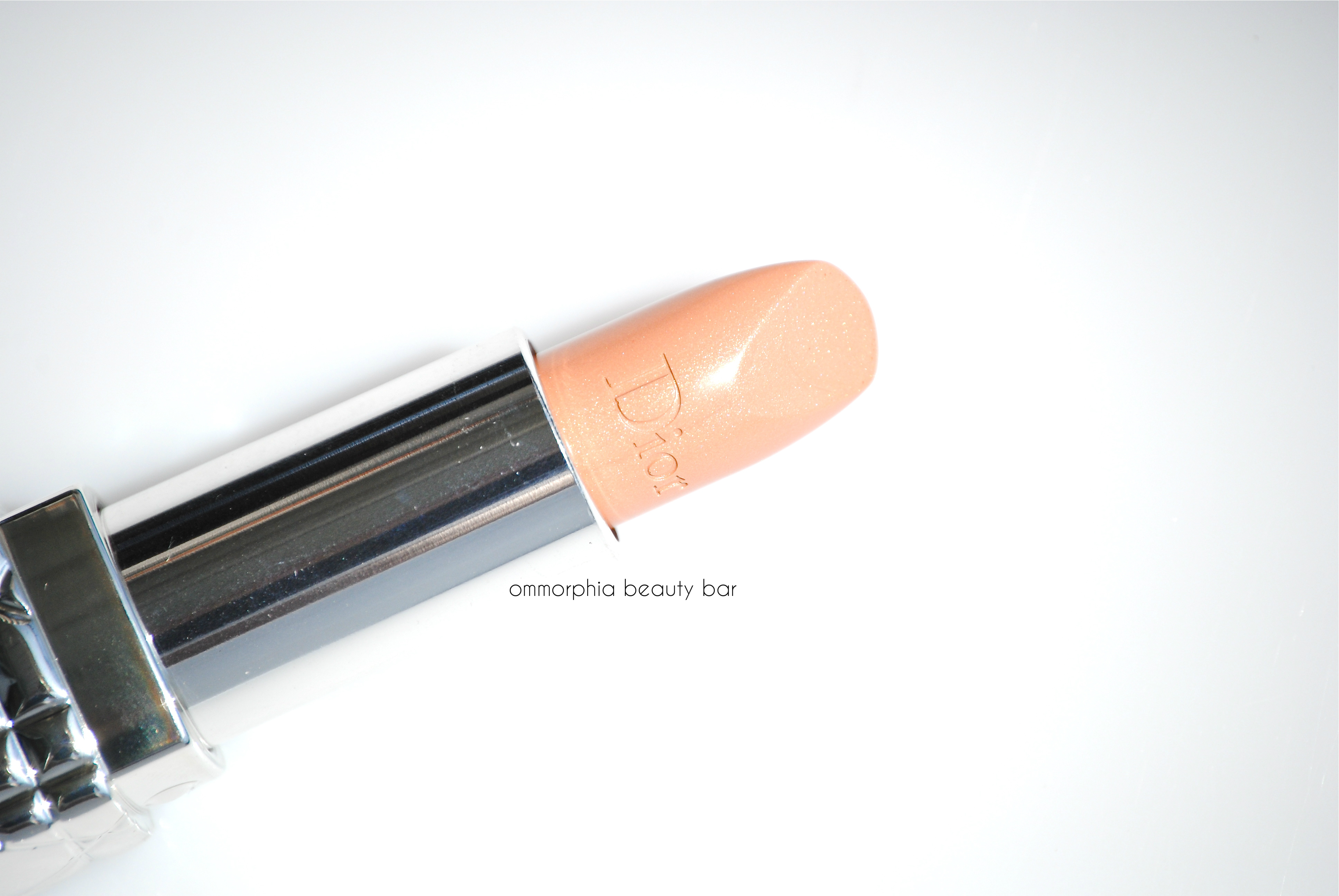
Dior 5 Couleurs Collection Fall 2014 | Rouge Dior #135 Carré d’Or
Dior 5 Couleurs Collection Fall 2014 | Rouge Dior #135 Carré d’Or

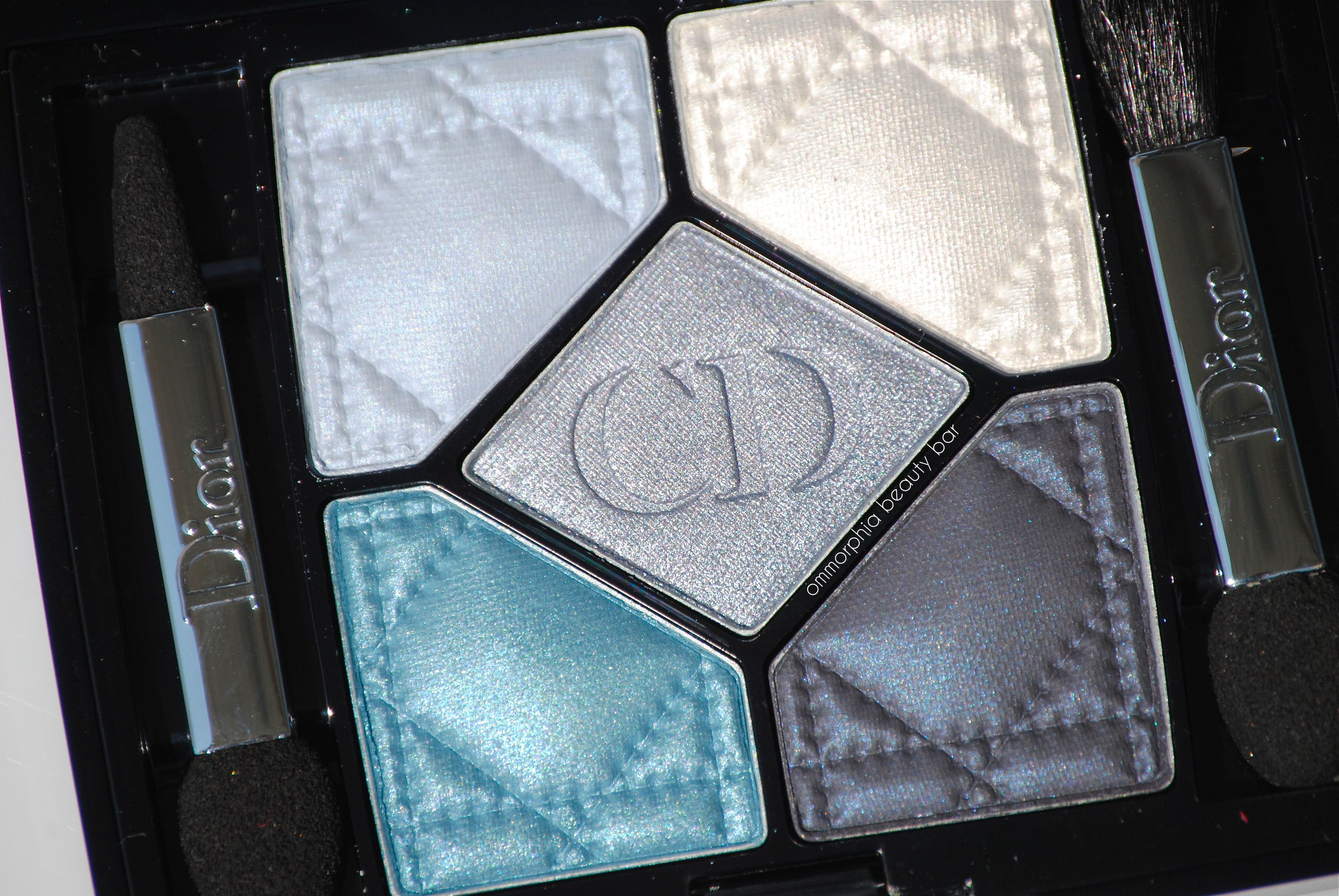
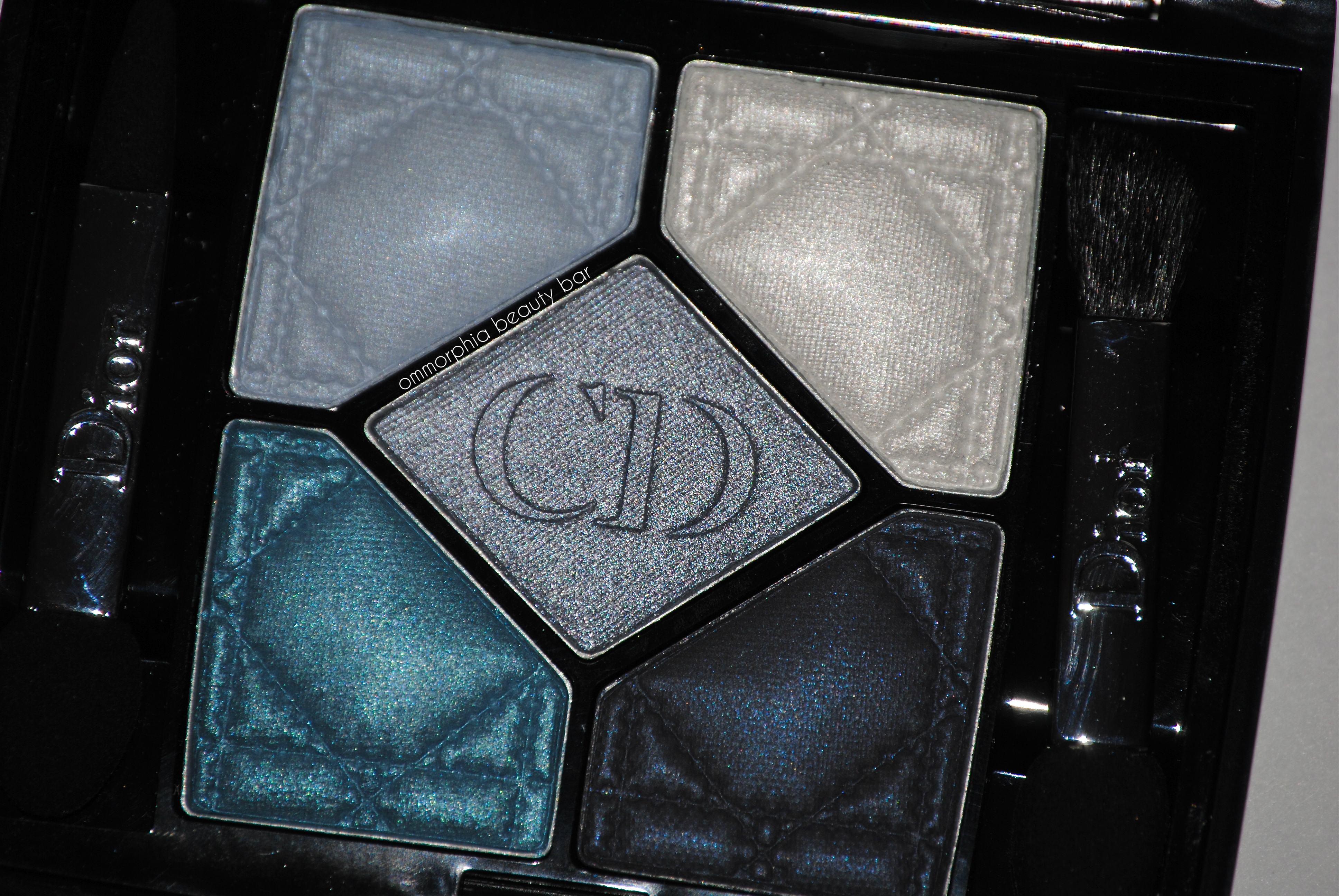
5 Couleurs #276 Carré Bleu (CAN $61.00) | A truly spectacular eye shadow palette in varying tones of cool and warm blue shades. A breakdown of the hues, starting clockwise from the upper left:
- pale sky blue with a hint of grey in the base, well pigmented satin finish
- off-white with a light pink/gold gleam, applies much softer than it looks in the pan & makes for an amazing highlight shade
- steel blue with pink/grey undertones for depth & warmth, superb pigmentation and blendability
- blackened navy with blue reflects (which only really show up when this is applied damp), surprisingly more sheer than it looks in the pan
- mid-tone turquoise with amazing pigmentation, ultra creamy application in a dense satin finish
As mentioned in my previous reviews on the Dior palettes, the compact has been designed to help you create several looks; using the top 2 shades with the middle hue provides a soft, more daytime-friendly look, while the bottom 2 shades + the middle hue are great for evening drama, but once again, the options lay open before you. As all of these colours can be worn either straight from the pan (dry) or with a dampened brush for serious depth and impact, there are then multiple ways to wear any or all of the shades.
Usually a compact will also include a matte shade as a sort of counterpoint to the other textures, but as the darkest shade here applies with the least amount of shine, it serves beautifully in that capacity. I experience no fallout or powdery residue when swirling my brush through any of the colours and find that they all afford a seamless blending ability, one into the other. Each shade has a sort of ‘sub-colour’ running through it, giving depth and providing visual interest, keeping them from appearing flat (and boring) once applied.
Dior 5 Couleurs Collection Fall 2014 | #276 Carré Bleu
Dior 5 Couleurs Collection Fall 2014 | #276 Carré Bleu, with flash

Dior 5 Couleurs Collection Fall 2014 | #276 Carré Bleu, swatched dry

Dior 5 Couleurs Collection Fall 2014 | #276 Carré Bleu, swatched damp
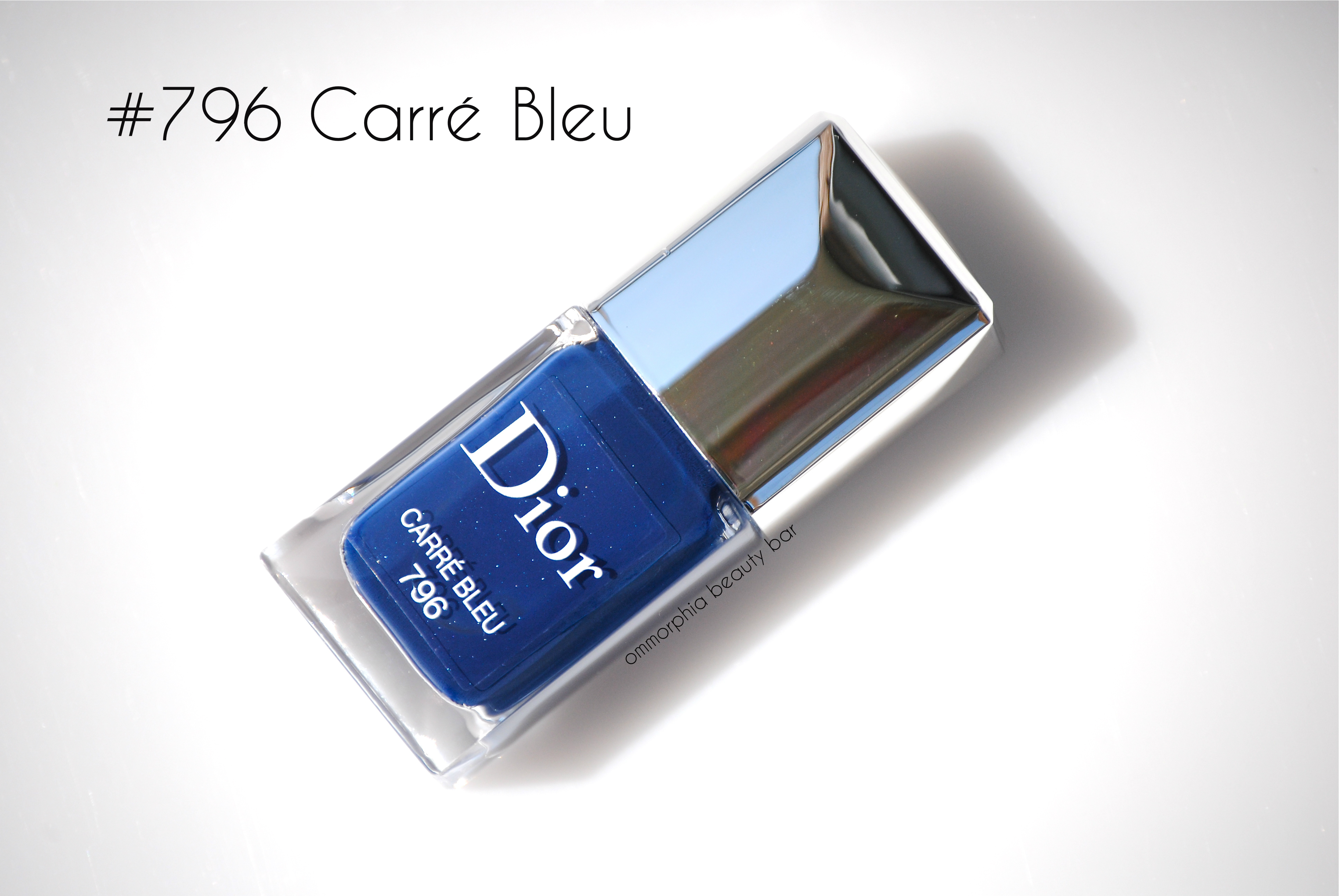
Dior Vernis #796 Carré Bleu (CAN $26.00) | A rich denim blue shade with Dior’s ‘secret shimmer’ (or not so secret in this case), that still remains subtly visible once applied, in an über-glossy & totally self-levelling jelly-like formula. There’s a cushiony, almost plush overall look to #796 Carré Bleu, and while the colour is indeed dark, it still manages to retain its blue properties and never really veers into black territory, giving your fingers a long & elegant appearance. Non-staining upon removal – provided you apply base coat first, otherwise I can’t guarantee it won’t lightly stain. Coats applied: 2, plus top coat

Dior 5 Couleurs Collection Fall 2014 | #796 Carré Bleu

Dior 5 Couleurs Collection Fall 2014 | #796 Carré Bleu, in sunlight
Definitely light years out of my colour comfort zone, I could not help but fall absolutely in love with the #276 Carré Bleu palette from the second I laid eyes on it – the love only intensified as soon as I began swatching. This variation on a blue theme stands unique in my collection and I can’t state often enough how simply amazing the new textures are to use. If you love a smokey eye, then here’s a brand new way to wear it: softly silvered and ever so subtle with the top 2 & middle hues – simply stunning, I tell you. The lipstick is a touch finicky, but I love its tone just the same (makes me think of 60’s icon Twiggy) – just be aware going in that proper prep is key for a flawless look. A dark blue nail will be seen all over the place come the Fall, and the Dior formula is one of the best out there – I can’t recommend enough that you indulge in a shade. Or five.
Available now at all Dior counters, find more information via:
*Disclosure: product samples provided by the company/PR for my unbiased consideration
Dior 5 Couleurs Collection Fall 2014 | Rose Tutu trio

The Rose Tutu trio from the Dior 5 Couleurs Collection for Fall 2014, features a palette which bears both warm & cool pink tones, as well as a very ladylike pink lipstick and coordinating pink nail lacquer – all three items looking deceptively soft. I say deceptively, because appearances can be misleading as once again, it’s all about the textures (first mentioned in my review of the Dior Pied-de-Poule trio here). What I found refreshing to see with the launch of these reformulated eyeshadow palettes, is how Dior appears to have embraced – as well as thought of – the many varieties of complexions, offering selections to suit the very fair (as with this trio here) to the darkest (the Trafalgar trio comes to mind, to be shown in an upcoming review), although that being said, I urge you to experiment at the counter as you just never know how a particular palette will work on your own skin.

Jennifer Lawrence in her stunning baby pink Dior gown at the 2013 Oscars (remember her famous trip up the stairs to collect her award?)

A vintage sketch of a Dior pink gown from the 50’s

Rouge Dior #354 Rose Tutu (CAN $36.00) | This is a carnation pink hue with warm undertones (I can almost detect hints of pale coral) and the finest pearly shimmer (not really visible when applied, but which serves to add depth and a lustrous shine), in Dior’s buttery soft and ultra-creamy formula. Considering the colour seen in the tube, I expected #354 Rose Tutu to apply rather opaquely, but was pleasantly surprised to find it actually slightly sheer, making it not only an extremely wearable pink shade, but one that will suit even those who never thought they could wear pink (like me). Imbued with Dior’s signature rose scent (how appropriate, right?) – which fades quickly after initial application, staying power was average, giving me about 5 hours of solid wear before fading, although there was still a light rosiness seen once it had worn off and my lips felt very hydrated and well-moisturized – a huge bonus that comes with this formula.
Oh yeah, I should mention here that this may very well be the first pink lipstick that I have ever been obsessed with.

Dior 5 Couleurs Collection Fall 2014 | Rouge Dior #354 Rose Tutu

Dior 5 Couleurs Collection Fall 2014 | Rouge Dior #354 Rose Tutu

5 Couleurs #846 Tutu (CAN $61.00) | Forget everything you ever thought about pink eyeshadow, because the #846 Tutu palette is about to blow all that out of the water. To begin with, the textures found here all bear gleam of varying intensities – from a delicate pearl, to a more complex shine – with zero fallout, no powdery residue, or annoying glitter to contend with. A breakdown of the shades, starting clockwise from the upper left:
- warm peachy pink, the least pigmented overall and one that pulls more silvery on my skin tone – best used as a highlight shade
- cool lavender pink with excellent pigmentation & super easy application, with a slight duo chrome effect
- deep rose and the darkest shade in this palette, warm leaning but with some silvery gleam that will also suit cooler complexions
- lilac pink with excellent pigmentation and a subtle but stunning shimmery effect, superb application
- pale pink with a gray/gold duo chrome effect, amazing colour saturation for such a light shade
The challenge I faced with this palette, was basically: how to wear pink colours on my eyes, without looking like A) I’ve been crying or B) that I have an eye infection? In truth, I can’t see anyone wearing all five of the #846 Tutu shades at one time, but it’s actually quite easy to create looks with several of the colours.
Option 1
Combine the top 2 hues + the centre shade for a soft, ballerina-esque daytime look: use the top right colour all over the mobile lid and along the lower lash line, then add touches of the middle colour to the outer crease for depth and a touch of impact, finish with the top left colour on the brow bone and inner eye corner
Option 2
Combine the lower 2 hues + the centre shade for a soft smokey eye: smudge the middle and the bottom right colours along the mobile lid to the crease, create more drama by dampening your brush and adding more of the middle colour to the upper lash line and outer crease, then run this same shade along the lower lash line to the inner corner. Finish by applying the bottom left colour to the inner corner of the eye as well as the lower lash line (over the middle hue).
Option 3
Create a fresh & wide-eyed look by applying the bottom right shade all over the mobile lid to the crease, then take a fluffy brush and run it along the crease to diffuse and blend the two shades together, finish with multiple coats of a volumizing/thickening mascara.
See what I mean? Once you start playing around with this palette, it literally opens up the door to so many possibilities you may never have thought of before. I also love how this is a welcome change from the traditional dark smokey eye, although incorporating a deep plum or grey/charcoal here can also look spectacular.

Dior 5 Couleurs Collection Fall 2014 | #846 Tutu

Dior 5 Couleurs Collection Fall 2014 | #846 Tutu

Dior 5 Couleurs Collection Fall 2014 | #846 Tutu, swatched dry

Dior 5 Couleurs Collection Fall 2014 | #846 Tutu, swatched damp

Dior Vernis #254 Rose Tutu (CAN $26.00) | A true pink hue with Dior’s ‘secret shimmer’ (which translates as depth when applied, not really visible) in a crème/jelly hybrid formula. More warm than cool leaning, there is just the perfect amount of colour to #254 Rose Tutu to keep it from veering into juvenile territory, giving it instead a feminine, fresh & fun kind of vibe. The application is on par with the rest of Dior’s newly revamped lacquers: superb, as in totally self-levelling and ending with an insanely glossy shine. As with the lipstick shade above, I do believe I may have just found THE perfect pink nail polish for my skin tone as well. Coats applied: 2, plus top coat

Dior 5 Couleurs Collection Fall 2014 | Dior Vernis #254 Rose Tutu

Dior 5 Couleurs Collection Fall 2014 | Dior Vernis #254 Rose Tutu
While I’ve always experimented with beauty, I’ve also tended to stay clear of pale pink colours (major clashing with my skin tone) but for some odd reason, I’ve also always been so drawn to them as well – a beauty dilemma. Seriously. The Dior Rose Tutu trio has given me options I’ve never had before, but what makes each of these products outstanding, is the quality and fresh, new, and sophisticated textures that every single item so incredibly wearable. Bear in mind that while I’m showing each of the new launches as trios, there are no hard & fast rules – feel free to mix and match at will, as there appears to be a seamless compatibility and harmony with all these new releases. Then again, you should be warned that it may prove impossible to not want them all.
Available now at all Dior counters, find more information via:

*Disclosure: product samples provided by the company/PR for my unbiased consideration


