
Tag Archives: swatches
Dior | Diorskin Nude Air Sérum de Teint

The latest innovation from Dior Beauty, Diorskin Nude Air Serum Foundation (CAN $53.00, available in 8 shades), is a medium coverage ‘light-as-air’ talc-free foundation, and loaded with volatile oils that evaporate almost immediately, leaving behind a weightless veil of pure pigment along the skin. According to the brand:
“For the first time in a foundation, Dior has introduced an innovative combination of plant oils, vitamins and minerals. Hyper-Oxygenated oil loaded with air bubbles, breathes vital energy into skin cells. Ideally stimulated from within, the skin breathes and becomes more beautiful. Cranberry oil – rich in essential fatty acids – provides the skin with the necessary antioxidants to help it glow, day after day. The complexion is velvety, imperceptibly even, and looks radiantly healthy”
Thanks to a slew of technological breakthroughs in the beauty industry just these past few years alone, foundation has come a long way; Dior has taken things to a whole new level with with their new Serum Foundation, a product that not only provides coverage, but leaves a flawless finish behind, and this with added skincare benefits plus SPF 25.
This may be Dior’s first Serum Foundation, but Giorgio Armani Beauty was the forerunner of this type of product, with the release of Maestro Fusion Makeup back in 2012. Even the bottle shapes and droppers are quite similar between the two powerhouse beauty brands, although the texture is where things start to take different paths (more details on this further down the post).
Other new releases in the Diorskin range, also include Nude Air Loose Powder (CAN $60.00, available in 4 shades) Nude Air Pressed Powder (CAN $59.00, available in 3 shades – review forthcoming), as well as Nude Air Tan Powder (CAN $59.99, available in 3 shades – review forthcoming), all products that are meant to impart that healthy glow ‘bonne mine’ effect, and further enhance the flawless look that begins with application of the Nude Air Serum Foundation.

Diorskin | Nude Air Sérum de Teint 020 Light Beige

Diorskin | Nude Air Sérum de Teint (6 of the 8 available shades are shown)

Diorskin | Nude Air Sérum de Teint 020 Light Beige

Diorskin Nude Air Sérum de Teint 020 Light Beige | The shade I was sent, 020 Light Beige, turns out to be quite the perfect match for my skintone at the moment (although I’ll probably have to get something deeper once the warmer weather hits), and even though I detect a slight pinkish hue to this shade which had me concerned about any clashing with my light yellow undertone, it instead serves to bring about a more brightened appearance to my skin. Before starting application, you do need to shake the contents of the bottle thoroughly to ensure that all components are properly mixed together. The fragrance is a not-unpleasant herbal/green scent that I’ve come to associate with most Dior foundations, although I do not detect any scent once the product is applied (still worth noting for those with sensitivities).
For initial application I prefer using Dior’s paddle-style foundation brush (reviewed), although you can also use your fingers; I just find the brush easier for spreading the product along the skin. After shaking the contents, I add about 4 drops of the Nude Air Serum Foundation into the palm of my hand, apply that to my face (don’t forget your neck, ears, and jawline) then if needed, I add another drop or two to areas that need a bit more coverage. While this foundation is not too layerable, you can build up some areas that require a touch more opacity – but don’t expect fully opaque coverage.
Alternately, and probably my favourite method of applying this type of dry-oil foundation, is by using a dual-fibre brush; I add about 4-5 drops of foundation to the back of my hand, lightly dab the brush through the product and then start by stippling that all over my face (to begin with), followed by sweeping the brush along the skin until the desired coverage has been achieved. This method yields an almost ‘air-brushed’ effect, and can pass muster even under the closest scrutiny.
Once applied, I sometimes go in with Dior’s flat-topped foundation brush (also reviewed) to buff it all in and give the most seamless, flawless-looking finish to the skin (you can also use a dry beauty sponge, or a dense-headed face brush – it all depends on what you already own and what you’re comfortable using). Once set, the resulting finish is not exactly matte, and definitely not dewy; there’s a natural-looking radiance to the skin, while the complexion is truly enhanced and very even-looking. Lasting power is excellent, and I’m able to get a full day’s wear (easily 10-12 hours), without any oxidation whatsoever (where the foundation colour begins to take on a yellowish cast) and neither do I notice any separation, as sometimes can happen around the nose area. My pores also seem a lot less noticeable and even though this is not touted as a mattifying product, I find that it does an excellent job at keeping any oiliness I usually get around the T-zone, to a minimum. Stated as being equally wearable for all skin types, my feeling is that the Nude Air Serum Foundation will be more suitable on those normal, combination, or oily skin, as this formulation has the potential to emphasize any dry patches on the face, which can be reduced to a certain degree by ensuring your skin is properly moisturized beforehand. Even if you do have dry skin, I still recommend giving it a test run at your local Dior counter just the same – it’s well worth looking into. Overall, there’s a subtle but absolutely gorgeous luminosity imparted to the complexion with this finish, and I love how even my skin looks without any of that heavy caked-on feeling at all.

Diorskin | Nude Air Sérum de Teint 020 Light Beige (click to enlarge for ingredients list)

Diorskin | Nude Air Sérum de Teint 020 Light Beige with dropper

Diorskin | Nude Air Sérum de Teint 020 Light Beige, applied

Diorskin | Nude Air Sérum de Teint 020 Light Beige, lightly blended

Diorskin | Nude Air Sérum de Teint 020 Light Beige, blended out

The following are all similar in formula to the Nude Air Serum Foundation (although not necessarily in colour/shade). As stated above, the Armani Maestro Fusion foundation was first out of the gate in this category, and has since gone on to spawn numerous versions from most brands across the board. During humid, hot weather, the Maestro foundation is a Godsend, as it keeps my skin oil-free throughout the wearing; the only issue is that it really doesn’t do well with any dry bits, catching & emphasizing them quite vividly. CHANEL’s Velvet Lumière has the most plush dry-down of them all, although I’m not that crazy about the strong scent (which eventually does fade) and how pink-tinged it is (this brand needs to include more yellow bases in their foundation ranges), as well as the fact that it’s the messiest to use, seeing as how there is no included applicator system. Fusion Ink from YSL is the closest in both texture and finish to the Diorskin Nude Air, and my only issue is that the shade I own is too dark for me to use now. Lastly, Maybelline’s Dream Wonder is great bang for the buck, providing a finish that may not be an exact duplicate, but damn close to its [much] pricier counterparts.
Quick comparison breakdown:
- CHANEL Perfection Lumière Velvet (30 Beige) – (CAN $48.00/30 ml 1 fl.oz) No applicator, the strongest scented of the group, slightly more pigmented (which translates as deeper coverage), touch more of a velvety finish
- GIORGIO ARMANI Maestro Fusion Makeup (6.5) SPF 15 – (CAN $68.00/30 ml 1 fl.oz) Dropper applicator, softest overall fragrance, driest finish, excellent mattifying properties
- YSL Fusion Ink Foundation (B 40 Beige) SPF 18 – (CAN $64.00/25 ml 0.84 fl. oz) Spade shaped applicator, fragrance starts off a touch acrid but dries down more powdery, close in finish/texture as Nude Air (gives that same radiance)
- Maybelline Dream Wonder Liquid Touch Foundation (40 Nude) – (CAN $14.99/20 ml) Spade shaped applicator, slightly more silicon-like in feel, thinner coverage but still well within the same finish as the rest, best price point

Diorskin Nude Air Sérum de Teint & applicator comparisons

Diorskin Nude Air Sérum de Teint 020 Light Beige & comparisons, applied

Diorskin Nude Air Sérum de Teint 020 Light Beige & comparisons, lightly blended

Diorskin Nude Air Sérum de Teint 020 Light Beige & comparisons, blended out
Even though I’ve tried out several other dry-oil foundations, there’s something almost magical about the Diorskin Nude Air Serum Foundation, as it meets al my criteria: a lightweight feel (I cannot stand the suffocating feel of heavy/opaque foundations), enough coverage to even out but one that still lets your skintone show through, mattifying (which also eliminates the need for excessive powdering to keep those pesky oils slicks at bay), and a flawless finish. If you like your foundations weightless, light-medium coverage, and have normal, combination or oil-prone skin, then look no further: this is the one. For those with drier skin or who prefer something that provides serious coverage, you might want to skip this and look instead to something a lot more emollient. Thank God for choices.
PS: With Valentine’s Day around the corner, Diorskin Nude Air has you covered – and I’m betting your sweetheart will surely be mesmerized by your flawless complexion, amongst other things.
Lauching at all Dior counters across Canada as of mid-february. Find more information on the brand at www.dior.com

Press sample provided for my unbiased consideration


Essie | Spring 2015 Collection

Oh, Essie – you had me at Spring, and then these shades come into my life and just like that, it’s amore. The new Spring 2015 Collection from Essie (launching in March), draws inspiration from an abundantly flowering garden, filled with a profusion of colour to reawaken our senses – all of which have probably been in hibernation from this miserably cold Winter. This jolt of colour is so welcome right now, and ∗almost∗ makes the cold weather bearable. At least this collection makes Spring seem that much closer.
It must be said, that Essie listens to their fans/devotees/groupies/addicts (take your pick. Pick, get it? Couldn’t resist including a garden/flower references. Shamelessly cheesy, but cute, no?) and continues to improve the formula. All six crème shades of this collection (not one drop of shimmer in sight) are a total joy to work with, applying in an effortless and self-levelling way, with several that don’t even need more than 1 coat for full opacity. All the swatches below are with 2 coats of lacquer each, as well as added top coat.


Perennial Chic | Described as “tawny tulip”, I say it’s more of a dollskin pink (or even Band-Aid pink), a neutral hue that is nowhere near what I consider tawny. The formula is semi-sheer and there’s a touch of patchiness seen with application of the first coat – normal for this type of shade – although Perennial Chic definitely becomes fully opaque with a second layer. This is a warmer leaning nude (I detect hints of peach in the base) and a colour that should be fairly easy for most skin tones to pull off, although I’m personally on the fence with the way it looks on me.

Picked Perfect | Described as “antique almond peony”, the antique almond part is about right, although I’m not feeling peony – more milk chocolate latte, instead. The formula here is thicker than that of Perennial Chic, but that works in its favour as it stays exactly where placed without any migration into surrounding skin. Picked Perfect applies in an über-creamy way and can almost be opaque at 1 coat if you load up your brush just right – totally surprising & so welcome. An absolutely perfect nude.

Blossom Dandy | Essie sure has the baby blue/mint category down pat, and Blossom Dandy is poised to be one of the biggest hits of this collection. This shade is incredibly difficult to properly capture in pictures; described as “mint crème hydrangea”, I say it’s closer to baby aqua that leans more blue than green, but again, that depends on the light and angle you’re coming from. I found the formula to be excellent and had no patchy issues to deal with whatsoever (unlike Essie’s Mint Candy Apple which always seems to apply rather chalky on me). All I know, is that I’m bsolutely loving Blossom Dandy and its mix of cool and warm tones should make it a winner for all skin tones across the board.

Petal Pushers | Lord, I do love me a good grey and Petal Pushers is pushing ALL my buttons. The formula here has a jelly-esque feel; slightly springy, ridiculously glossy, and leaving that plush look behind. Described as a “smoky stone rose” (how utterly romantic – I love the imagery of that description), I detect hints of blue and some mauve-y purple in the base, which lend this colour depth and keep it from appearing flat and one-dimensional. Perfection, I tell you.

Flowerista | Described as a “passionate plum dahlia”, I would have to agree – except I’d also add magenta in there as well. The formula is beyond amazing and can literally be a one coat wonder (especially if you load your brush up right), with a perfect flow, density and coverage – as well as a high-gloss shine at the finish (you don’t even need top coat, it’s THAT shiny). Once again, capturing all the colour nuances here proved difficult, as Flowerista can appear more purplish at some angles/lighting, or more pink-tinted at others. Either way, it’s gorgeous. Best part? Non-staining upon removal.

Garden Variety | Let’s just take a collective moment to absorb the gorgeousness of this colour, shall we? Sigh. Described as an “exotic teal blue orchid”, Garden Variety is all that — and more. An intense turquoise hue in a hybrid crème-jelly formula, there is a perfect density, opacity, and flow seen upon application, while the glossy finish is nothing less than spectacular. I detect more blue tints in the base, although there are small hints of green that peek through at certain angles (and yes, you would not believe how hard it was to accurately capture the colour in photos here as well – my camera just would.not.cooperate), all of which make this shade universally wearable by all skin tones. While relatively non-staining upon removal (relative to something so pigment-saturated in this colour group), I would not recommend skipping base coat just the same. Love, love, love this shade. Love.
A floral-inspired collection for Spring – how original, right? And yet, somehow Essie has managed to take this ubiquitous theme, shake it up, and then inject some new life into it. It doesn’t hurt that each and every formula of each and every shade is just perfect and make application fun, instead of a chore. With the exception of Perennial Chic (although I am oddly attracted to it, even if I’m not that thrilled with how it looks on me. So weird, that), I adore them all, with a 3-way tie between Blossom Dandy, Petal Pushers, and Garden Variety vying for top spot while both Flowerista and Picked Perfect are not that far behind. Final verdict: this entire collection is 100% win and well worth investing in.

Press samples provided for my unbiased consideration
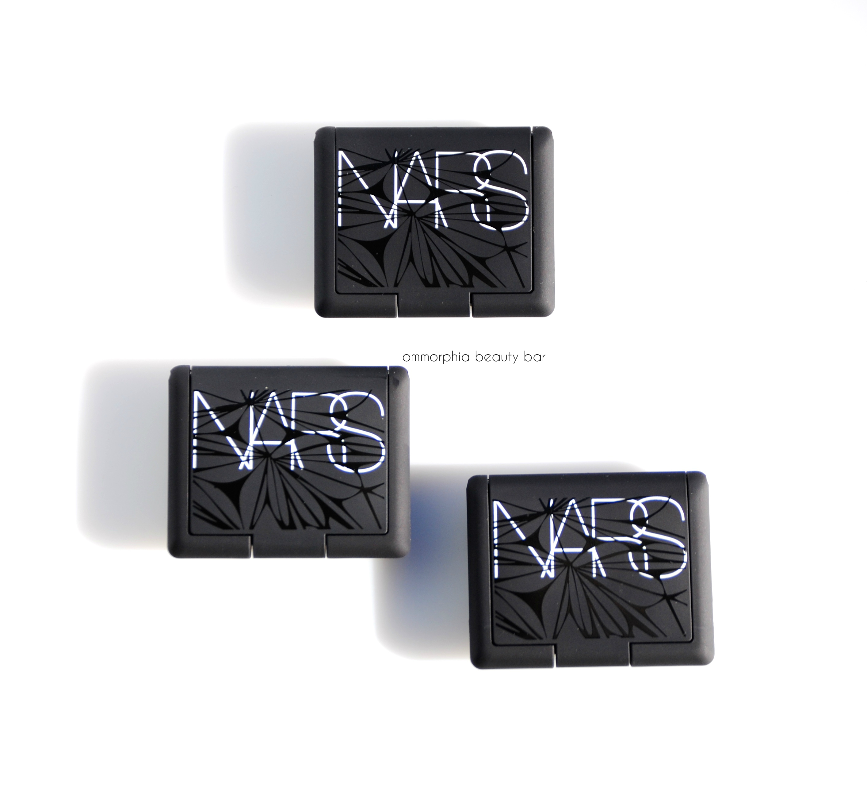
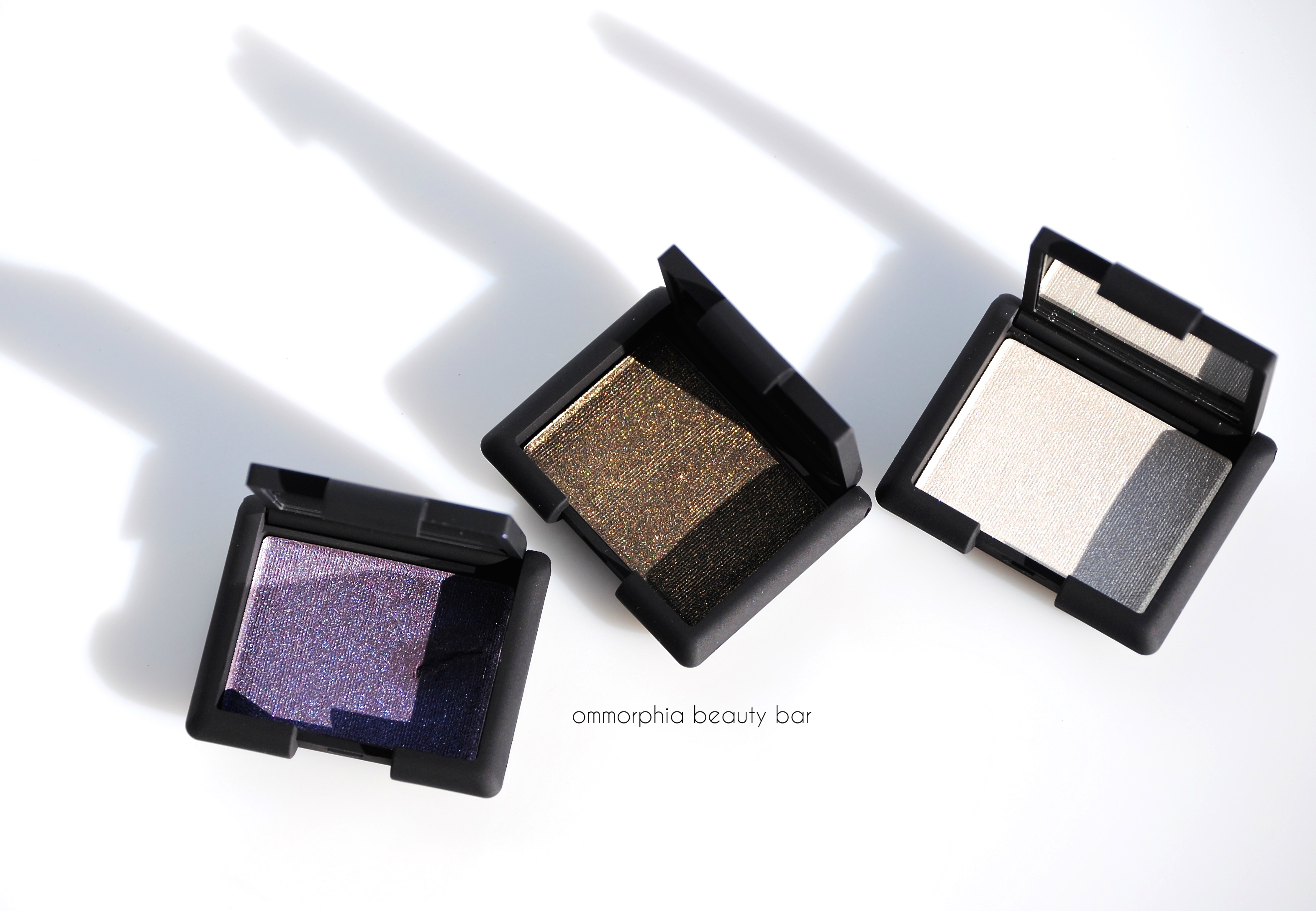
NARS Laced With Edge Holiday 2014 | Hardwired Eyeshadow in Opal Coast, Canberra & Gabon

For this year’s Laced with Edge Holiday 2014 Collection, NARS has released three limited edition Hardwired Eyeshadows in a sophisticated array of lustrous jewel-like colours in a powdered pigment formula the delivers intense iridescence. The exterior packaging bears LA-based architectural designer Chris Kabatsi’s intricate computer-generatated algorithm ‘Nebula’ design, a beautifully rendered modern interpretation of lace (also previously shown here and here).
Watch this short clip to see why I’m currently obsessing over Opal Coast

NARS Laced With Edge Holiday 2014 | Hardwired Eyeshadow, Limited Edition (with flash)
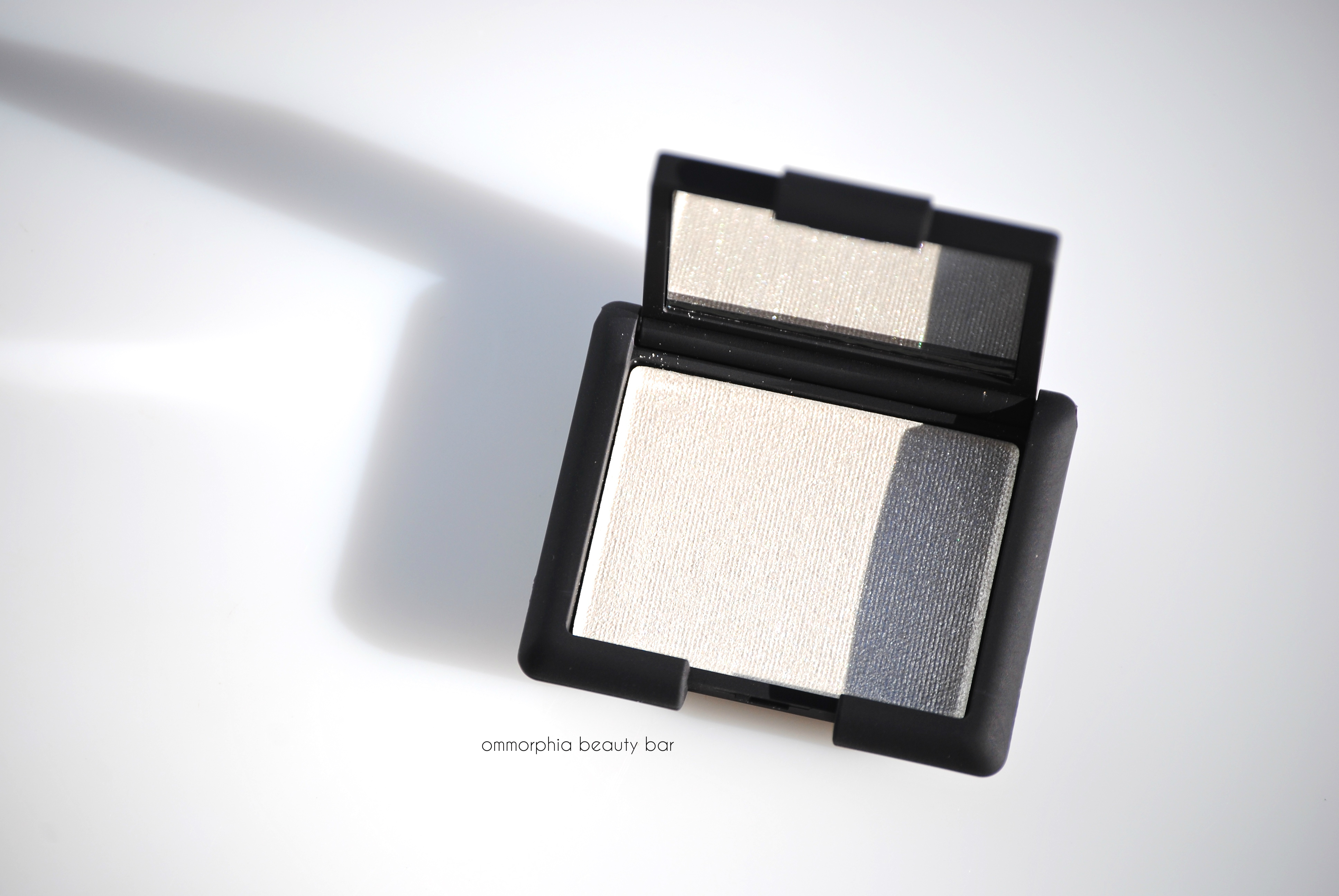
Opal Coast Hardwired Eyeshadow, limited edition (CAN $28.00) | Not your average frosty white eyeshadow, Opal Coast leans slightly warm due to the detailed mix of pink and light golden hues in the base. I experience absolutely no powdery kickback with any of these shades upon swirling my brushes through them, neither is there any shimmer falldown. I absolutely love wearing this all over the lid with just a few swipes of mascara – gives eyes that ‘wide-awake’ look and dresses them up just enough to look done, but never overly so.
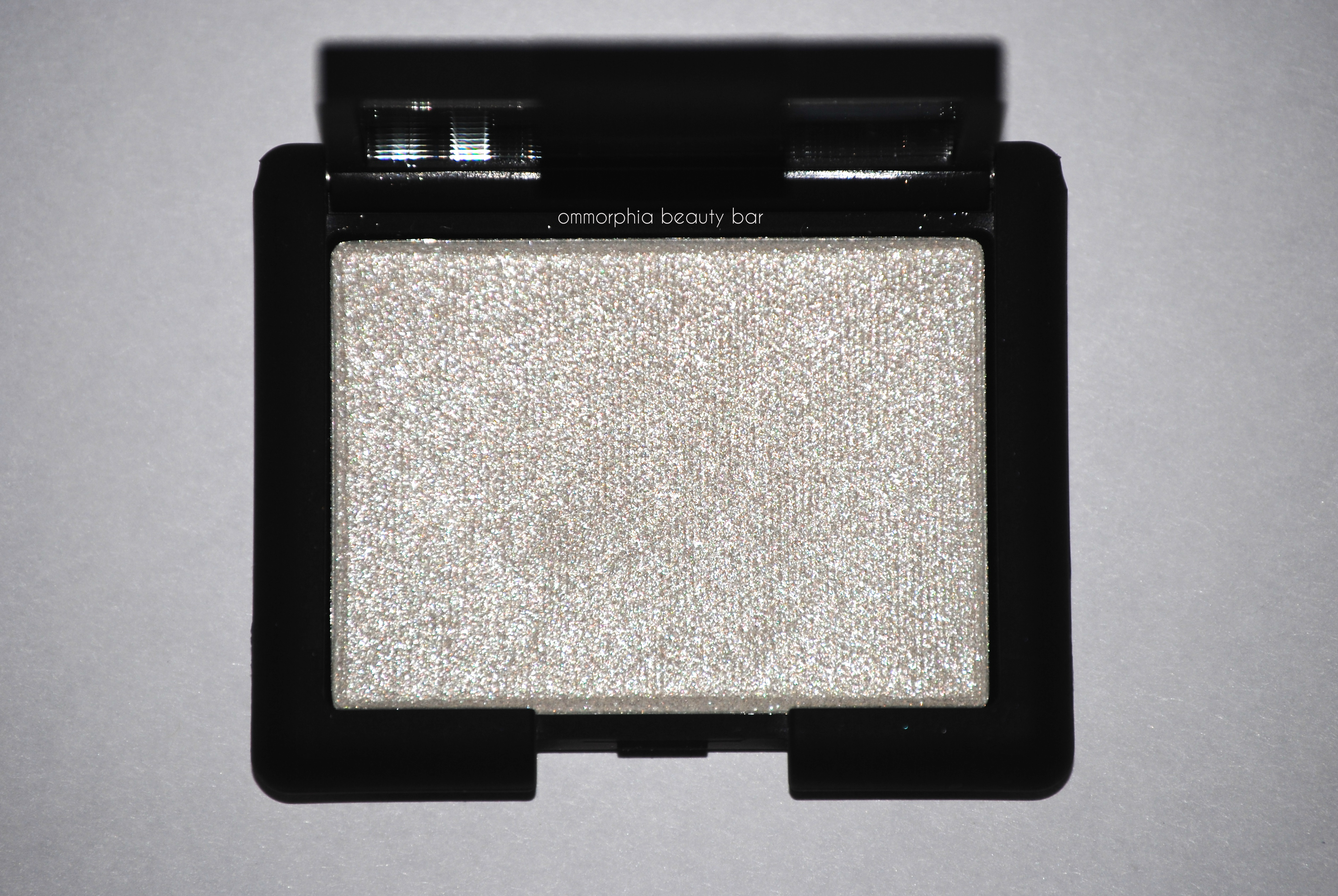
NARS Laced With Edge Holiday 2014 | Opal Coast Hardwired Eyeshadow (with flash)
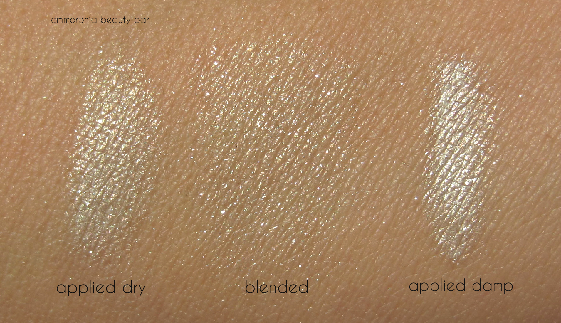
NARS Laced With Edge Holiday 2014 | Opal Coast Hardwired Eyeshadow
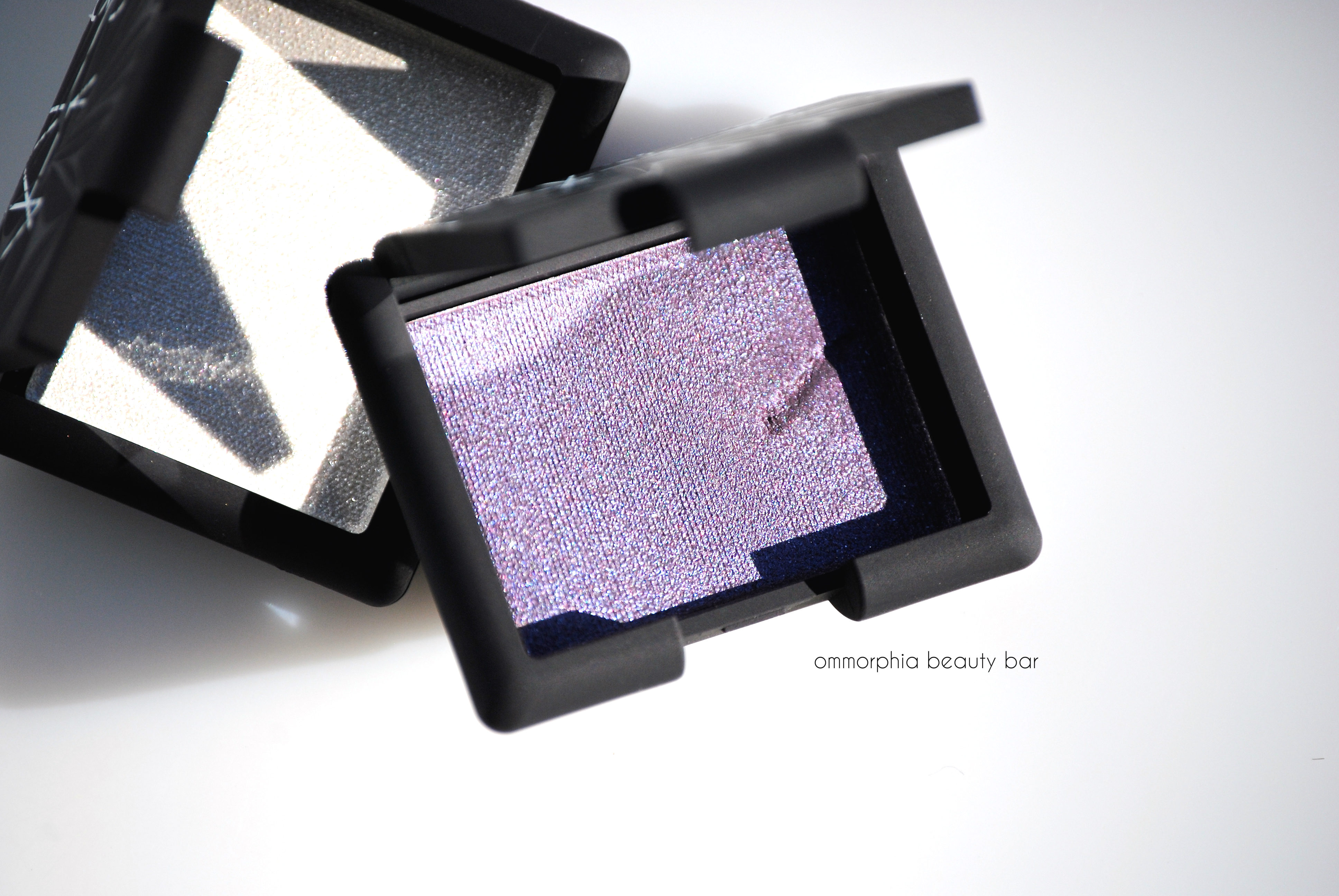
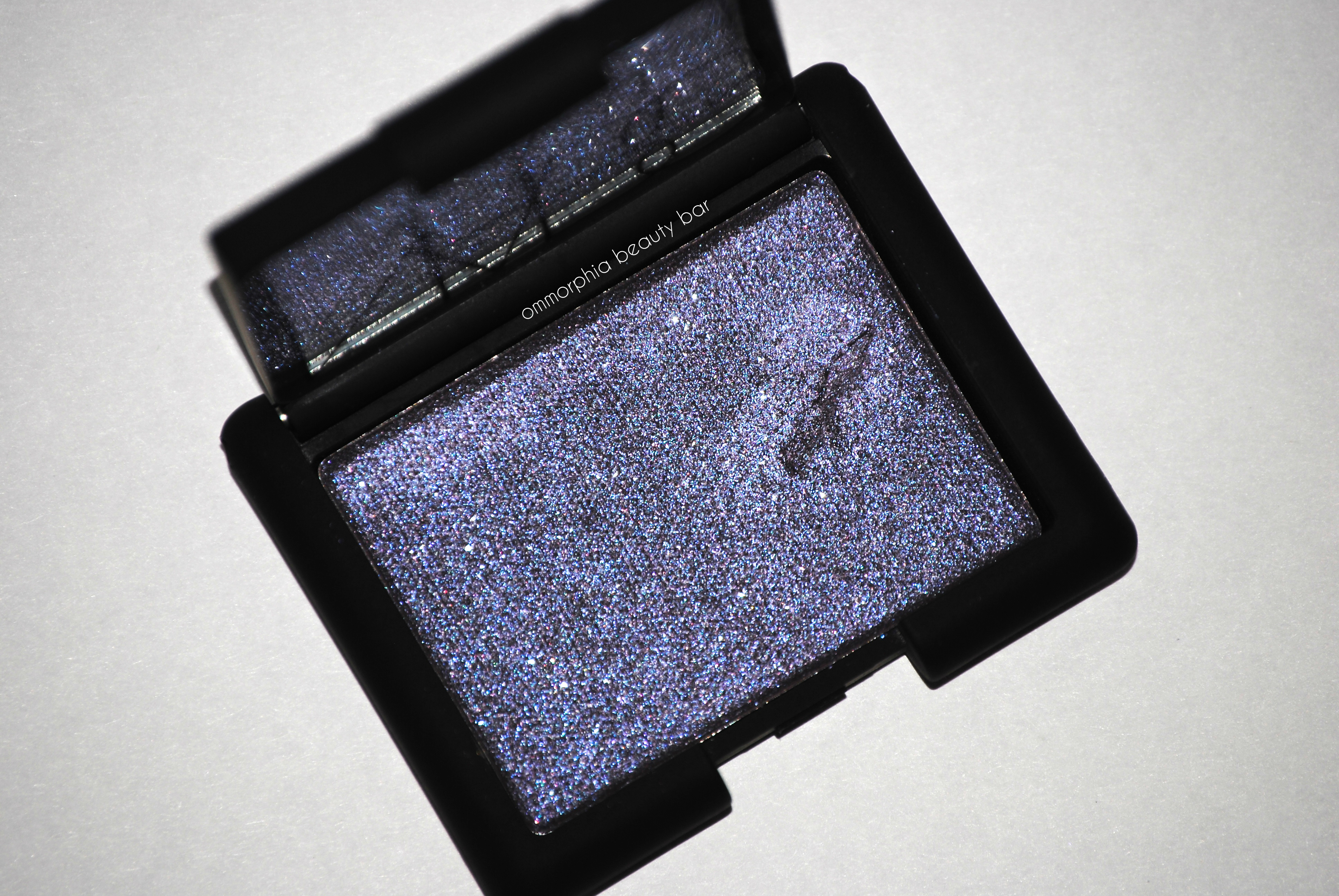
Canberra Hardwired Eyeshadow, limited edition (CAN $28.00) | A dusky purple base hue with slight greyish undertones, combined with a vivid amethyst overtone – a combination that makes it so difficult to accurately capture in photos all the glorious purple-ness that is Canberra. Along the lines of both Kauai, and Jardin Perdu, there’s no denying that NARS creates some of the most complex purple eyeshadows available. A sweep across the lids gives a gorgeous wash of colour, but I find that this shade looks even more impressive when applied to the lower lash line – makes my green eyes really stand out.
*The gouge mark seen on the pan surface was created through my carelessness while taking product photos – and drives my OCD self crazy every time I look at it.
NARS Laced With Edge Holiday 2014 | Canberra Hardwired Eyeshadow (with flash)
NARS Laced With Edge Holiday 2014 | Canberra Hardwired Eyeshadow
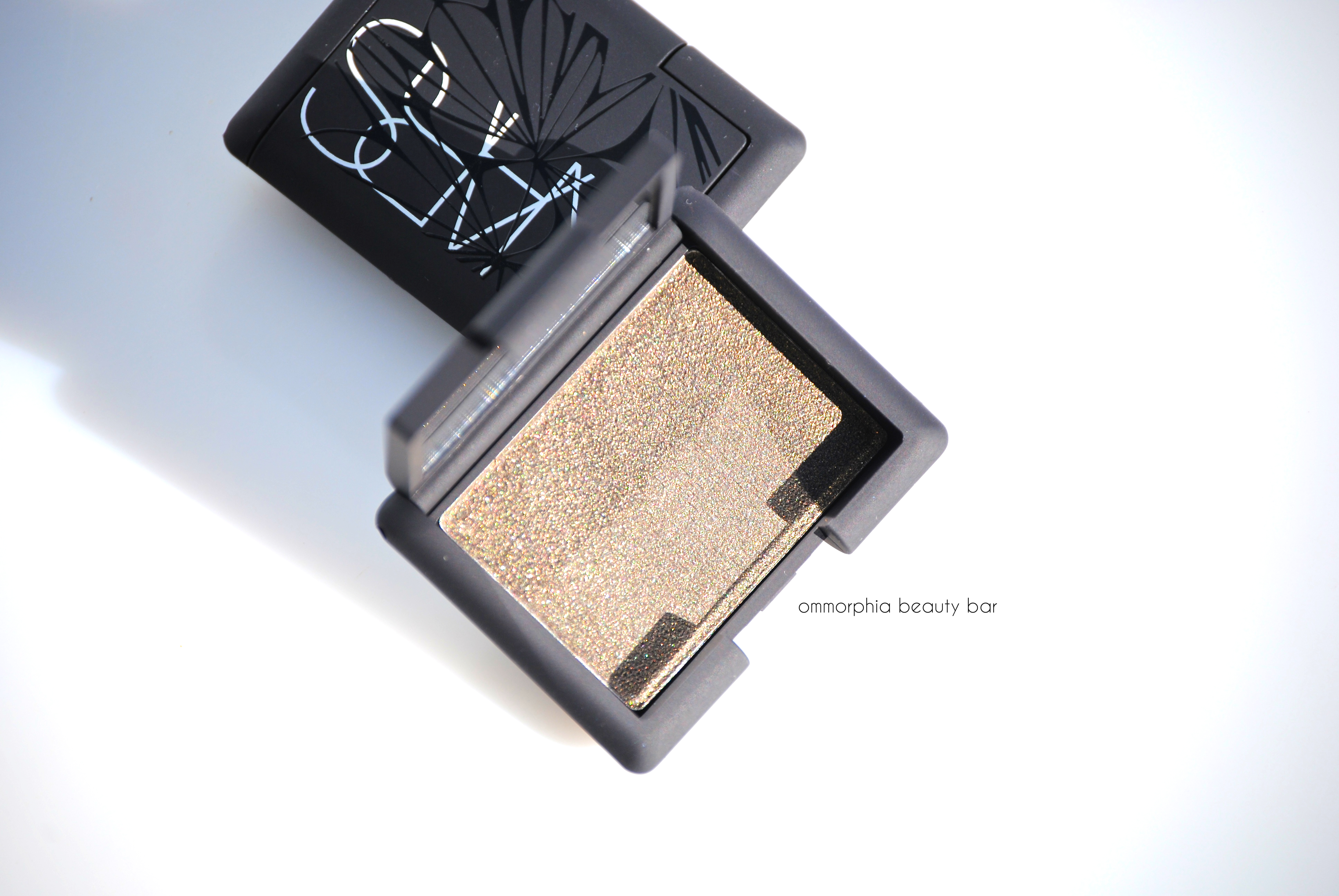
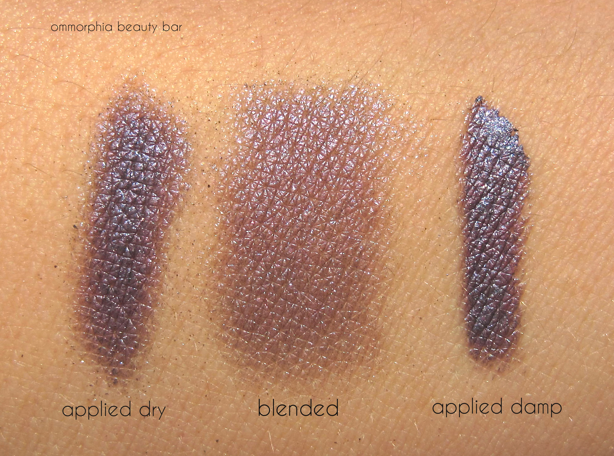
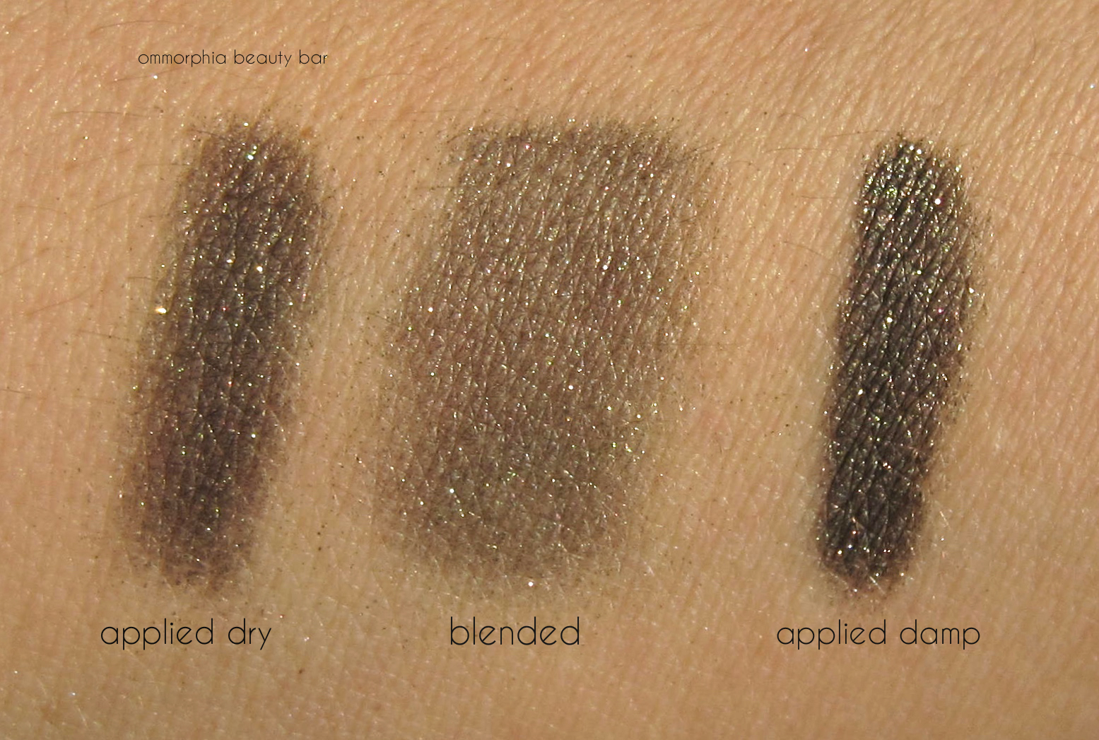
Gabon Hardwired Eyeshadow, limited edition (CAN $28.00) |A blackened khaki with ultra fine bronze/gold shimmer for depth. Absolutely delicious for creating an effortless smokey eye, applying Gabon with a damp brush brings this shade to a whole new level of intensified brilliance, and really serves to bring out its elaborate shimmer. Simply too gorgeous, and a shade I find myself reaching for quite a bit lately, especially when I want to add a bit more drama to my eye look.
It should be stated that all three shades display an impressive staying power; applied over primer, they stay perfectly applied until removed, without any fading or creasing.
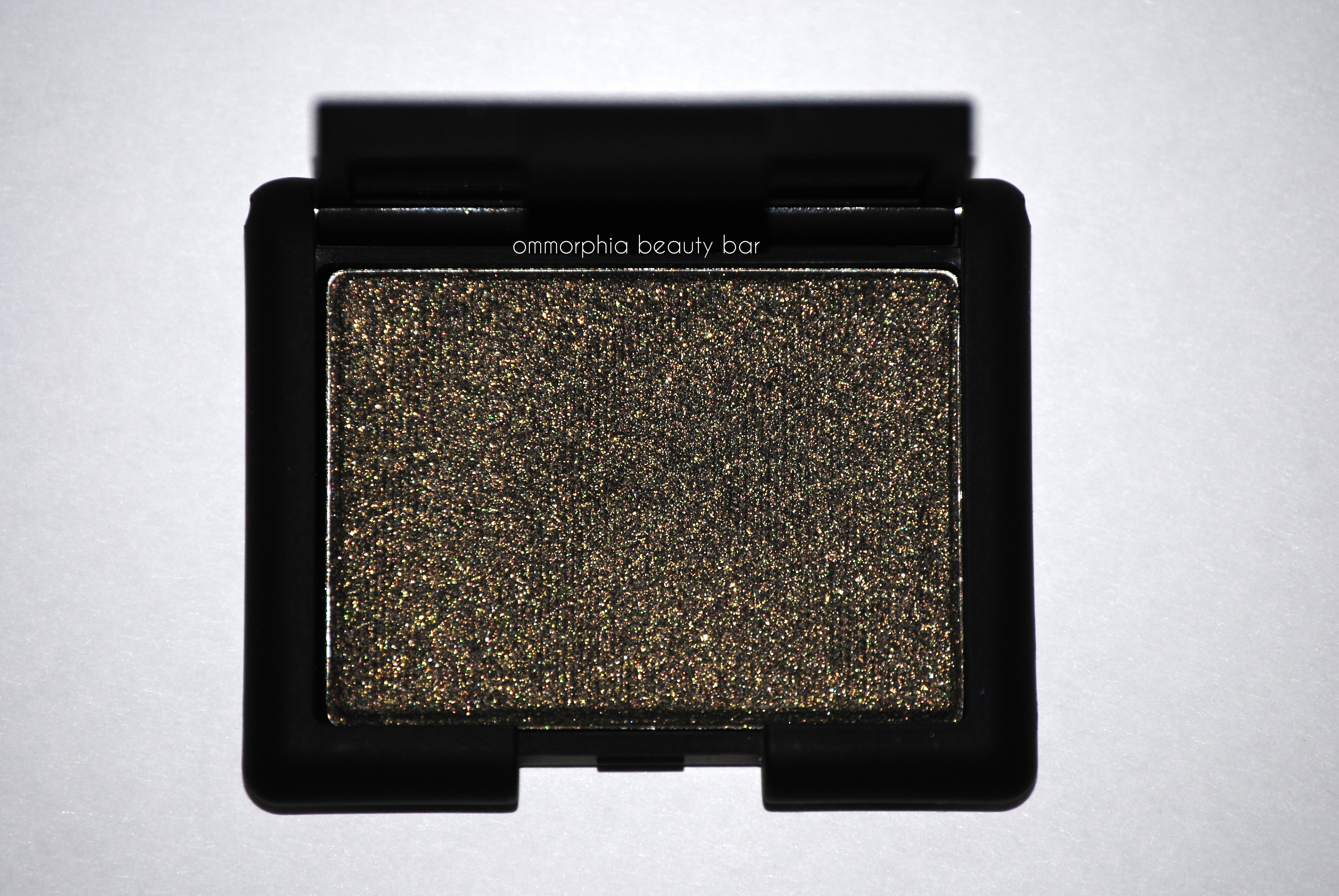
NARS Laced With Edge Holiday 2014 | Gabon Hardwired Eyeshadow
NARS Laced With Edge Holiday 2014 | Gabon Hardwired Eyeshadow
Definitely a far cry from the usual holiday renderings, I love how each shade brings something new to the table – whether worn individually or combined with the others. To pick a favourite amongst the three is useless for me; they are all unique and with such perfect formulas, that they almost apply themselves (wouldn’t that be great?). Opal Coast is that perfect ‘Ice Queen white’, but with subtle touches of warmth (and thus making it more ‘human’), Canberra provides a splash of colour that can be both understated and impactful at the same time, while Gabon redefines a traditional smokey look. For me, these are all must-haves and definitely worth adding to one’s eyeshadow collection.
The NARS Hardwired Eyeshadows from the Laced with Edge Holiday 2014 Collection are available now for a limited time – find more information by visiting www.narscosmetics.com
Press samples provided for my unbiased consideration
OPI | Ford Mustang by OPI (Limited Edition)

This year, Ford Mustang celebrates its 50th Anniversary as well as an induction to a very exclusive club: vehicles in continuous production for 50 years. Inspired by the rich heritage behind one of North America’s original muscle cars, OPI has created the Ford Mustang by OPI Collection, 6 limited edition shades (CAN $11.50/each), with Race Red a signature vehicle colour that is still available to this day.
On a personal note, I love what this collection represents: fierce feminism, a concept that happens to resonate with who I am as well. After all, is there anything sexier than a woman who not only knows how to rip up the road in a car with this much horsepower, but can do so with perfectly manicured nails? (not to mention stiletto heels … and yes, that was me).

Ford Mustang Convertible

Ford’s iconic Mustang

OPI | Ford Mustang by OPI

OPI | Ford Mustang by OPI

50 Years of Style | A semi-sheer pale gold metallic hue with a subtle pink opalescent tinge in the base, that veers a bit towards the frosty side and which leans both cool & warm, making it easily wearable by a wide range of skin tones. A steady hand is definitely needed in application to avoid overly visible brush strokes. Coats applied: 2, plus top coat

Girls Love Ponies | An intensely colour saturated and vibrant – but still classy – fuchsia with blue undertones in the base, in a crème/jelly hybrid formula. Self-Levelling and with a super glossy shine at the the finish, amazing coverage is reached even with the first coat. Bonus: non-staining upon removal. Coats applied: 2, plus top coat

Angel with a Leadfoot | A brilliant white crème hue with cool undertones, which displays amazing coverage even by the first coat. Self-levelling, non-patchy and quite glossy at the finish, this may very well be the easiest and best white lacquer I’ve tried to date. Coats applied: 2, plus top coat

The Sky’s the Limit | A cerulean base hue filled with ultra fine glass-flecked bits in: green, bronze and copper. Self-levelling and with a brilliant (almost hypnotic) shine at the finish, the effect is like that of stars captured at the surface level of the polish shrugs (or a slightly bluer version of OPI’s cult shade Catch Me In Your Net). There’s a serious incandescent glow going on with this shade – love it! Relatively non-staining upon removal (but do NOT skip base coat). Coats applied: 2, plus top coat

OPI | The Sky’s the Limit

Race Red | A warm toned chilli pepper red hue with orange undertones in the base, in a hybrid crème/jelly formula. A superb application: self-levelling, high pigment concentration and über-glossy at the finish, it’s also relatively non-staining upon removal, provided you do not skip base coat first. Coats applied: 2, plus top coat

Queen of the Road | What appears as just another black shade at first glance is in fact incredibly complex; a semi-sheer charcoal base hue that oddly enough holds olive/khaki undertones. The crème formula displays some jelly-like characteristics in the glossy & plush finish, with the first coat appearing like a blackened khaki, but which then turns into a pearlized gunmetal by the second layer (think: black pearl). There’s this stunning, albeit subtle, moiré effect seen at the finish which I so did not expect (but absolutely love). Note: on longer nails, the tips may seem translucent at 2 coats, easily resolved by adding a 3rd coat. Coats applied: 3 (thin), plus top coat.

OPI | Queen of the Road
The sports/muscle car fiend in me loves the entire concept behind this collection, but the lacquer fiend in me is even more thrilled by the reality of these shades. With the exception of 50 Years of Style (not the best gold for my skin tone), I adore each and every hue – as well as the names. My love affair with white hues is still going strong, and Angel with a Leadfoot is beyond spectacular in this colour category. Naturally, Queen of the Road has my name all over it (car fiend, remember?), but I did expect to fall for Girls Love Ponies – and I never, ever, wear pink. The gorgeousness of The Sky’s the Limit is not to be missed – just giving you fair warning.
Available now, but for a limited time. Find more information via the website.

Press samples provided for my unbiased consideration
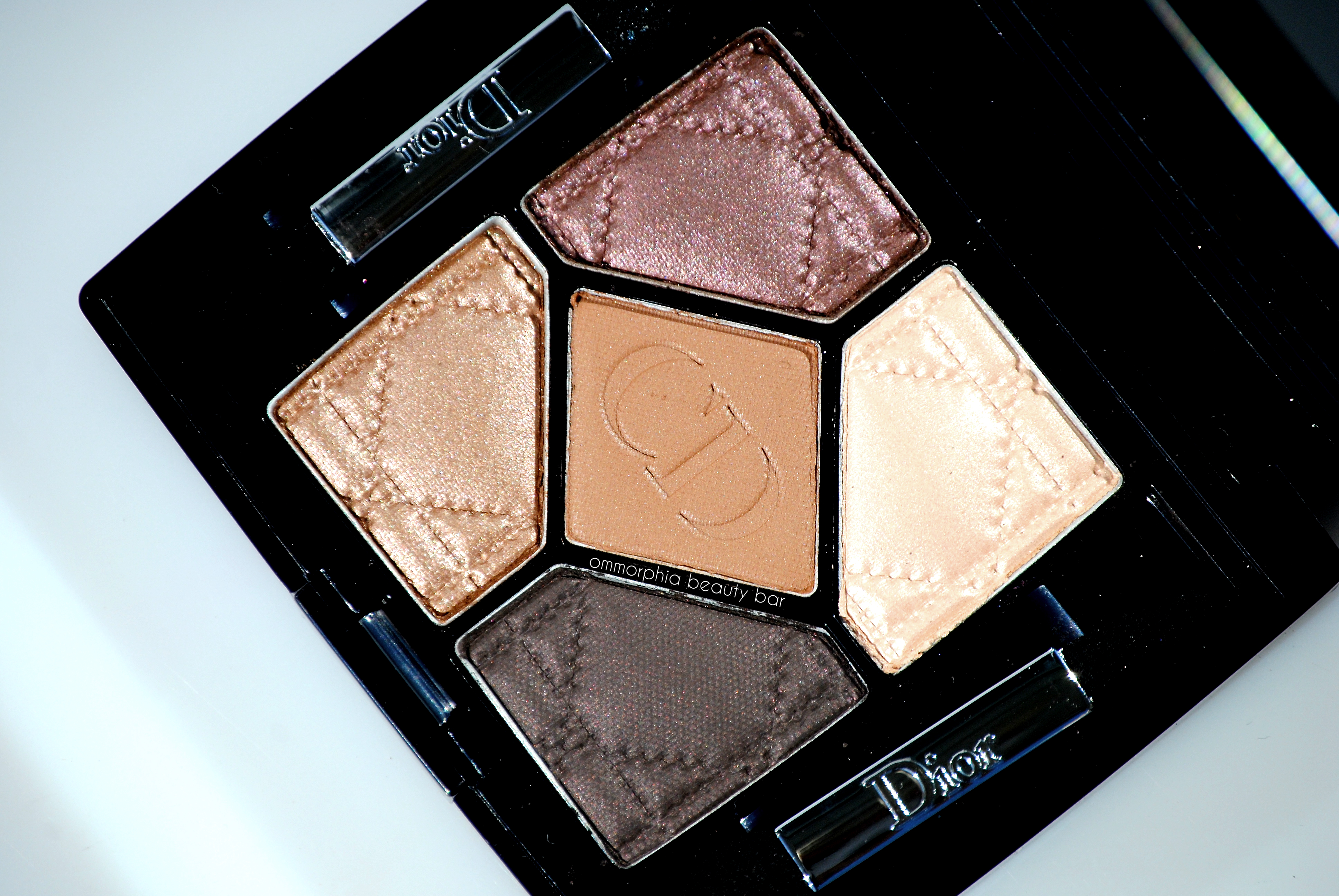
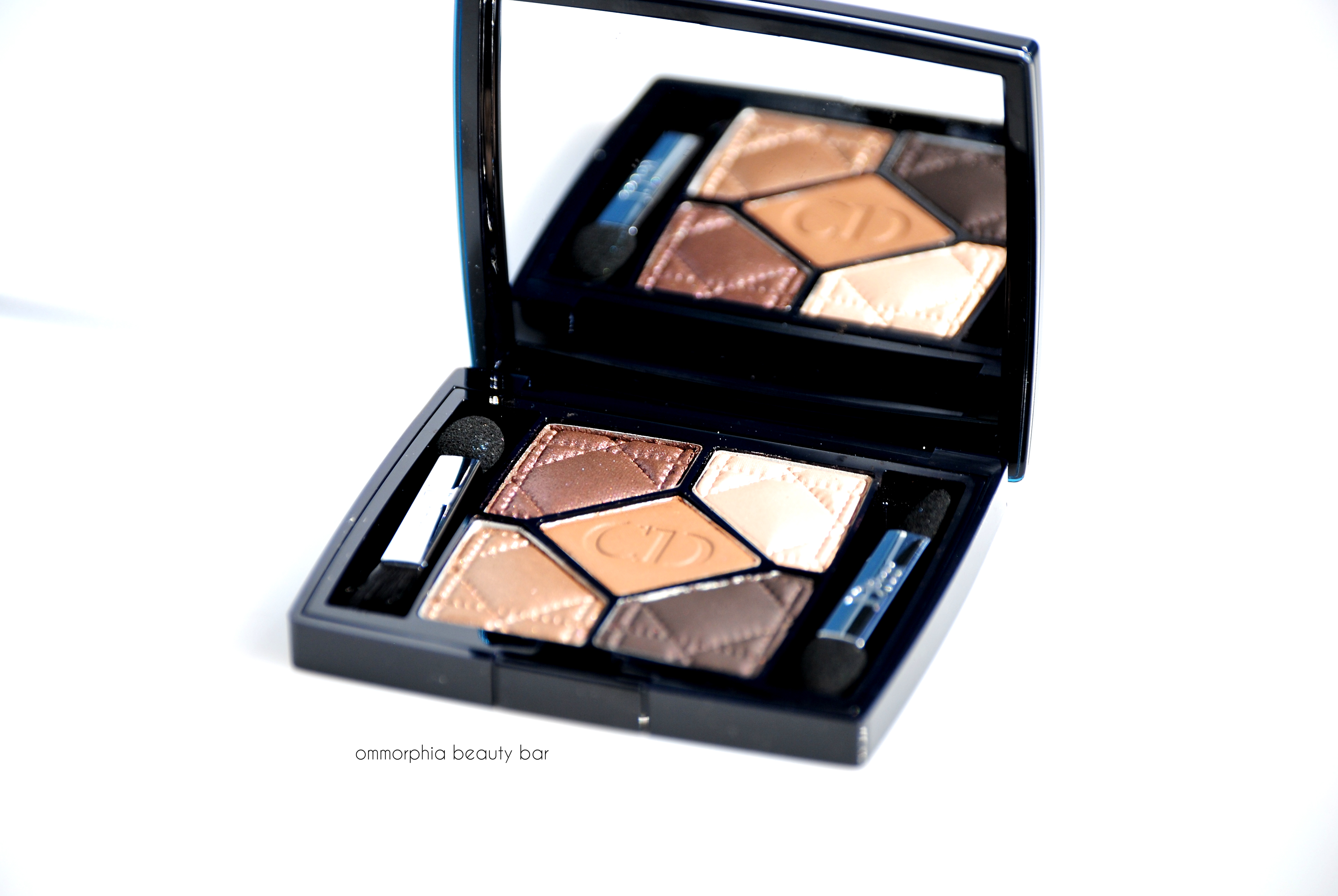
Dior 5 Couleurs | 796 Cuir Cannage

One of 12 new 5 Couleurs Eyeshadow Palettes recently released by Dior (previously reviewed: Bar, Carré Bleu, Rose Tutu, Pied-de-Poule and Trafalgar), 796 Cuir Cannage is a gorgeous grouping of totally wearbable neutral hues. Even with the recent glut of similarly toned palettes flooding the market lately, 796 Cuir Cannage still manages to somehow stand out, and I’ll go on record as saying that the buttery texture of each shade definitely has something to do with that.

Dior 5 Couleurs | 796 Cuir Cannage

Dior 5 Couleurs | 796 Cuir Cannage

796 Cuir Cannage (CAN $61.00) | Each 5 Couleurs palette is created to be a ‘wardrobe for the eyes’, with the centre shade acting as the anchor. The top 2 lighter shades are perfect for casual and/or daytime wear, while the 2 deeper hued bottom shades add depth and drama. Just as Dior fashion spotlights a variety of textural effects, the same concept has been applied to the eyeshadow palettes, combining matte, satin, iridescent and occasionally glitter textures, depending on the palette chosen. The bottom label shows a small pictogram of the colours within, and even the included brushes are of decent enough quality to be used in emergency situations. As an added bonus, all 5 Couleurs Eyeshadow Palettes can be applied either dry or with a dampened brush to amp up the intensity. The shades of Cuir Cannage (clockwise, starting from the top left):
- brown/mauve (satin) with subtle plum iridescence
- parchment/bone (pearlized) with subtle grey/pink pearl
- blackened brown (matte/satin hybrid)
- warm bronze (satin/shimmer hybrid) with incredibly complex shimmer
- camel (matte)
The texture of each shade is absolutely stellar – no chalkiness or powdery residue visible when swirling my brushes across any of them them. The top right shade is quite subtle on me, but is perfect to be used on the inner eye corner or as a brow bone highlighter. All are easily buildable, and there’s excellent colour saturation even with the first swipe. The darkest shade is surprisingly not as intense as what you see in the pan, and gives a sooty charcoal-like effect (perfect for creating a smokey eye look). I found that every single one of these hues not only compliments each other so perfectly – which translates as numerous colour combinations to play with – but all blend so easily as well. Staying power is excellent: over primed lids, I was able to get a minimum of 10 hours wear, without any signs of fading or creasing.

Dior 5 Couleurs | 796 Cuir Cannage
Dior 5 Couleurs | 796 Cuir Cannage

Dior 5 Couleurs | 796 Cuir Cannage (with flash)
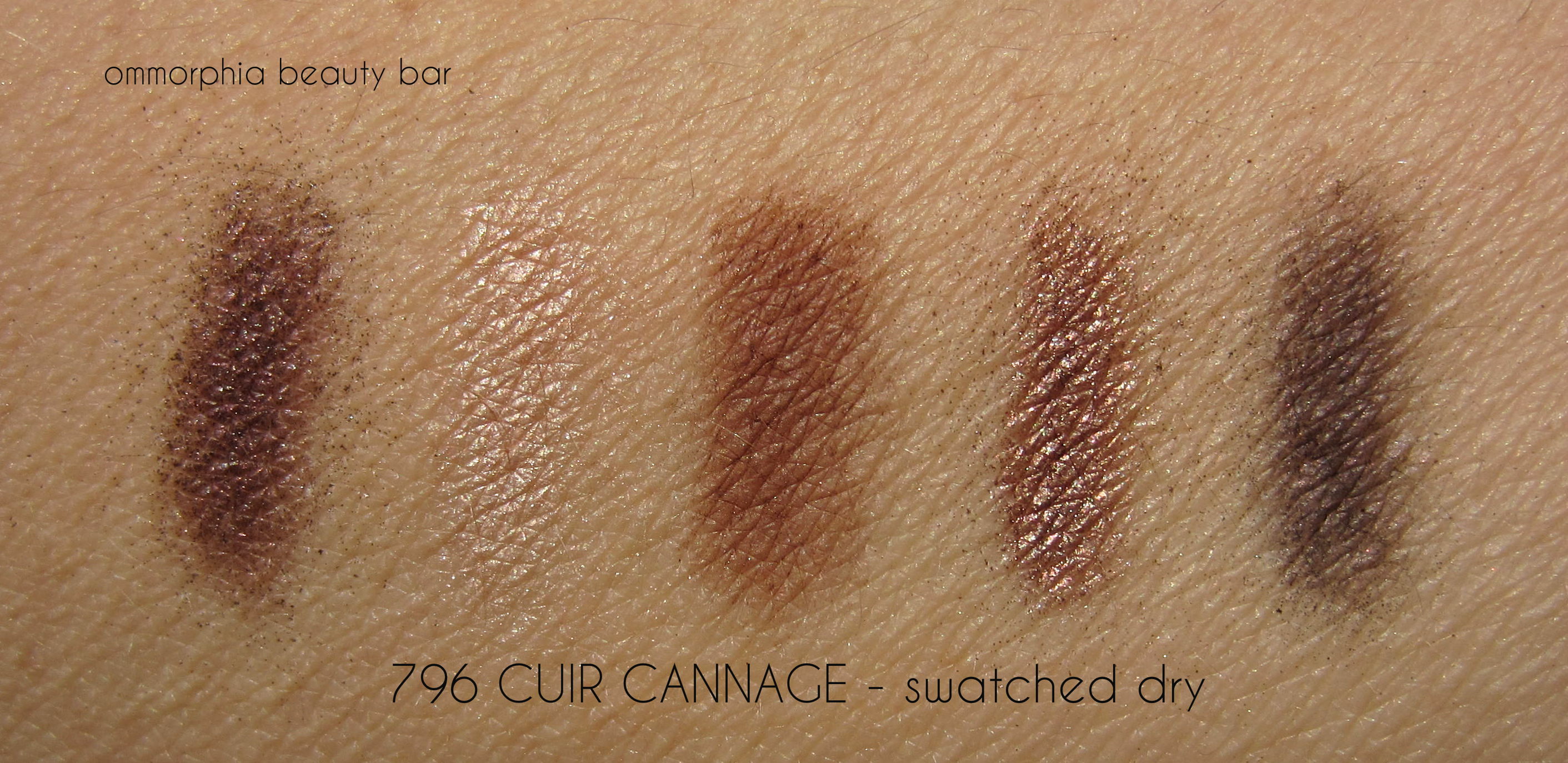
Dior 5 Couleurs | 796 Cuir Cannage, swatched dry
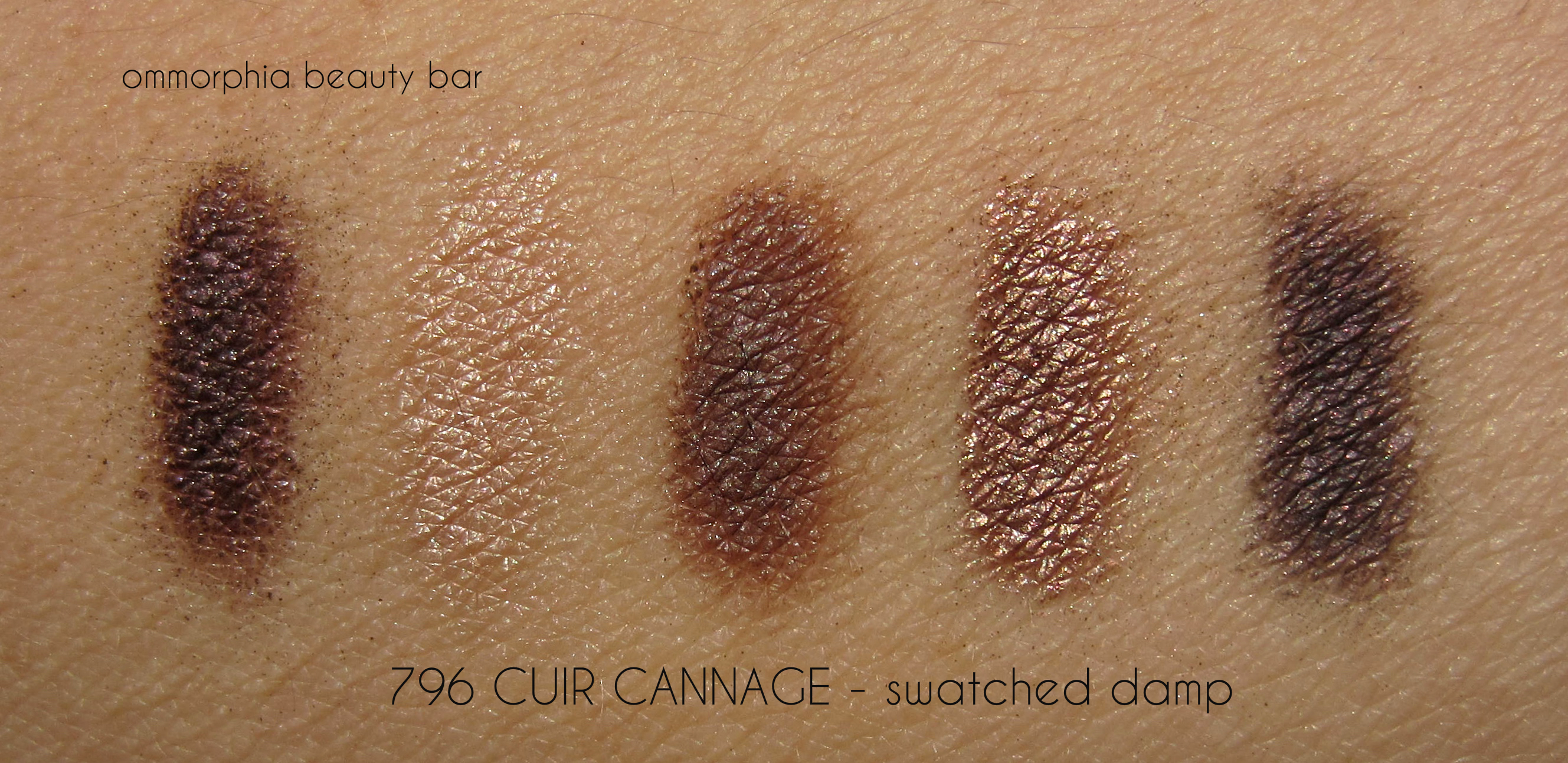
Dior 5 Couleurs | 796 Cuir Cannage, swatched with a damp brush

I opted to compare 796 Cuir Cannage to other smaller similarly toned palettes in my collection (I didn’t bother with palettes that had more than 5 shades – that would have taken me weeks to go through it all), with 4 CHANEL quads showing the most promise. Apart from the difference in number of shades (5 vs 4), here are the breakdowns (click to enlarge):
- CHANEL 226 Tissé Rivoli – closes in overall tone/colour, more shimmer, no mattes
- CHANEL 234 Poésie – cooler leaning, significantly more shimmer, no mattes
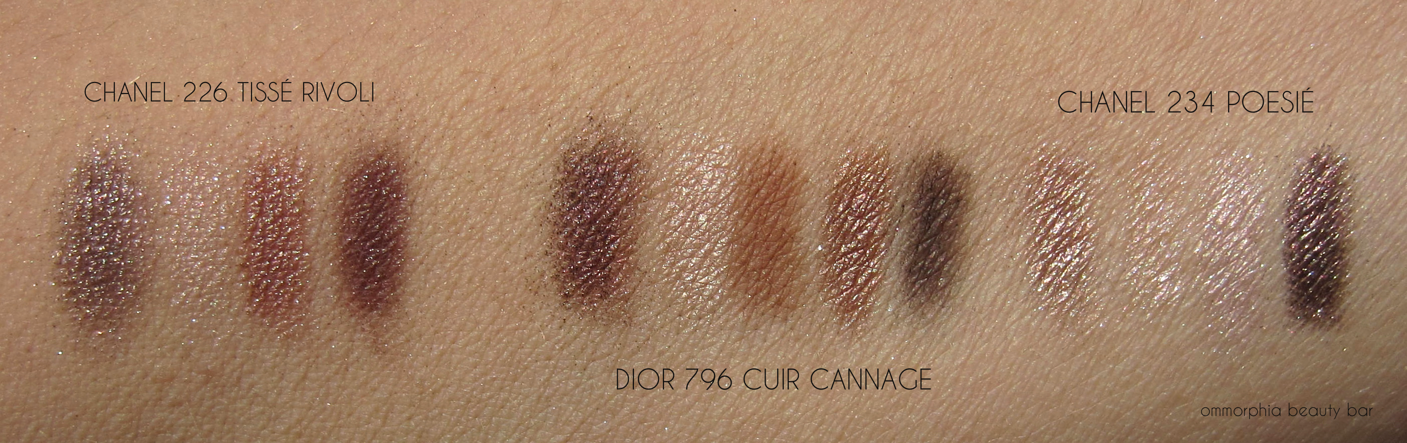
Dior 5 Couleurs | 796 Cuir Cannage and comparsion swatches
- CHANEL 34 Éclosion – overall more pink toned, sheerer textures
- CHANEL 42 Séduction – darkest & shades similar, sheerer textures
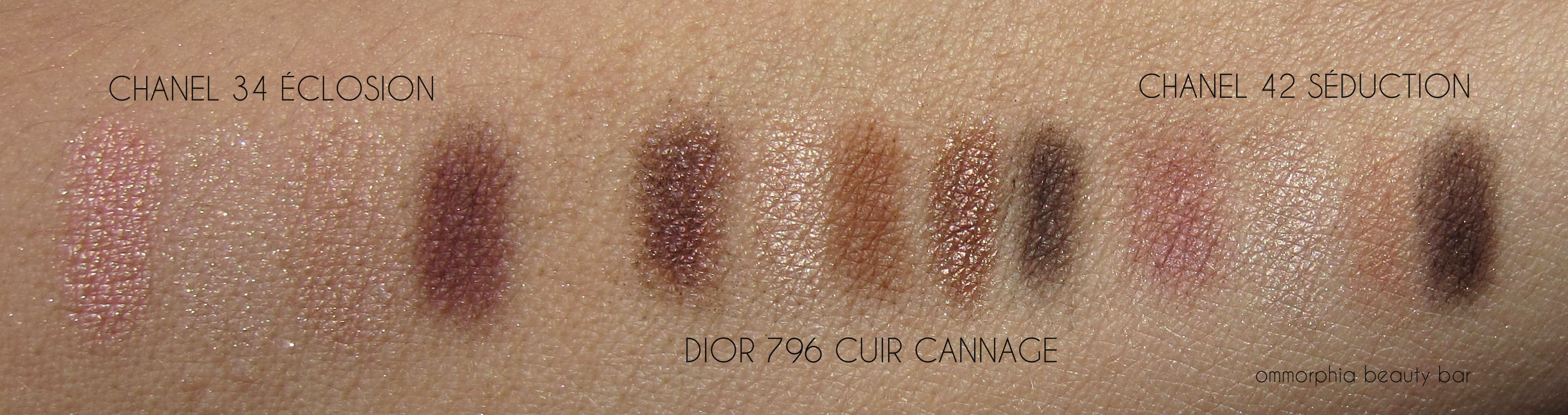
Dior 5 Couleurs | 796 Cuir Cannage and comparsion swatches
In short, 796 Cuir Cannage is total love for me and an absolute must have, especially if you’re a fan of neutral shades, as I am. Everything is just right with this palette: from the colours of the shades and the many combinations you can create with just this one palette, to the textures and its portability – most useful when travelling and you don’t want to lug your entire vanity with you.
Available through all Dior counters nationwide. Find more information here.
Press sample provided for my unbiased consideration


