Filed In: Nail Polish Comparisons
Essie – Masquerade Belle vs. Wicked vs. Clutch Me If You Can vs. Berry Hard

Masquerade Belle in the Essie Winter 2010 Collection brought to mind another Essie vampy shade: Wicked. I also pulled out Clutch Me If You Can & Berry Hard from my stash, as they seemed fairly close as well and wanted to swatch plenty of options to show you. For all pictures, the swatches are in the following order: pinkie – Berry Hard, ring – Clutch Me If You Can, middle – Wicked and index – Masquerade Belle.
I find that when swatching similar shades, the first coat always manages to make them look very similar. Just like mixing a scent, the bottom note, or in this case the first coat, shows the true base of the shade. In this case, with the exception of Wicked which leans towards a more brick tone, they all seem to have a berry hue.

In sunlight

In natural shaded light
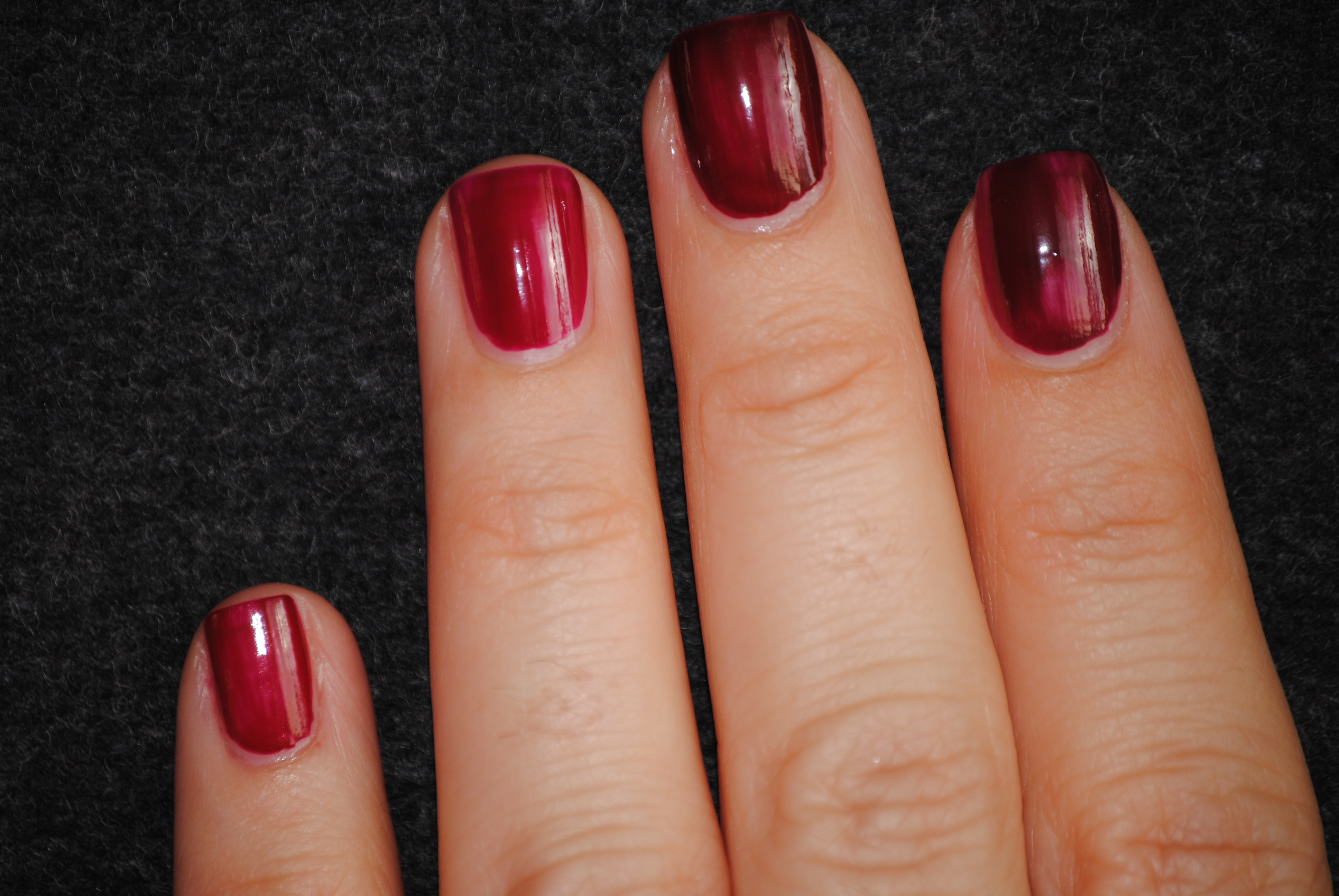
In natural light
The second coat here is where the differences start to make themselves more visible.

In sunlight

In natural light
Upon applying the third and final coat,

In sunlight

In natural shaded light
Final thoughts: Since these shades are all Essie, obviously the brushes are exactly the same, but the application and flow differed slightly. Berry Hard & Clutch Me if you Can had the thinnest consistency and most even application, while Wicked was definitely the thickest. Even though Masquerade Belle & Wicked are not exact duplicates of each other, they are enough alike that if you have one you don’t necessarily need the other, although in sunlight, you can tell that Wicked is the vampier and deeper of the two. Personally, I love that Masquerade Belle doesn’t lean towards a blackened burgundy even in low light, but always stays true to its deep claret shade, while Wicked will seem darker in low light. There are still enough differences between them that you can justify having both (see how easy it is to explain my nail polish addiction?!!)

*Masquerade Belle is on the left, Wicked on the right


Essie ‘Hot Coco’ vs. OPI ‘Over the Taupe’ vs. Essie ‘Mink Muffs’

With the success Essie had in ‘Mink Muffs’ from their Fall 2009 collection, it’s not all that surprising that they would want to introduce a similar shade in their Winter 2010 release. At first glance, Hot Coco and Mink Muffs seem to be almost identical, and even after swatching them, it’s so, so, so hard to tell them apart. I also found that OPI’s Over the Taupe was the triplet of the other two and so I swatched them all together to compare. All are with base coat and 3 coats of polish in total.
The first coat shows barely discernible differences between the three; indeed, they even all have basically the same application pattern!

ring: Hot Coco, middle: Over the Taupe, index: Mink Muffs (sunlight)
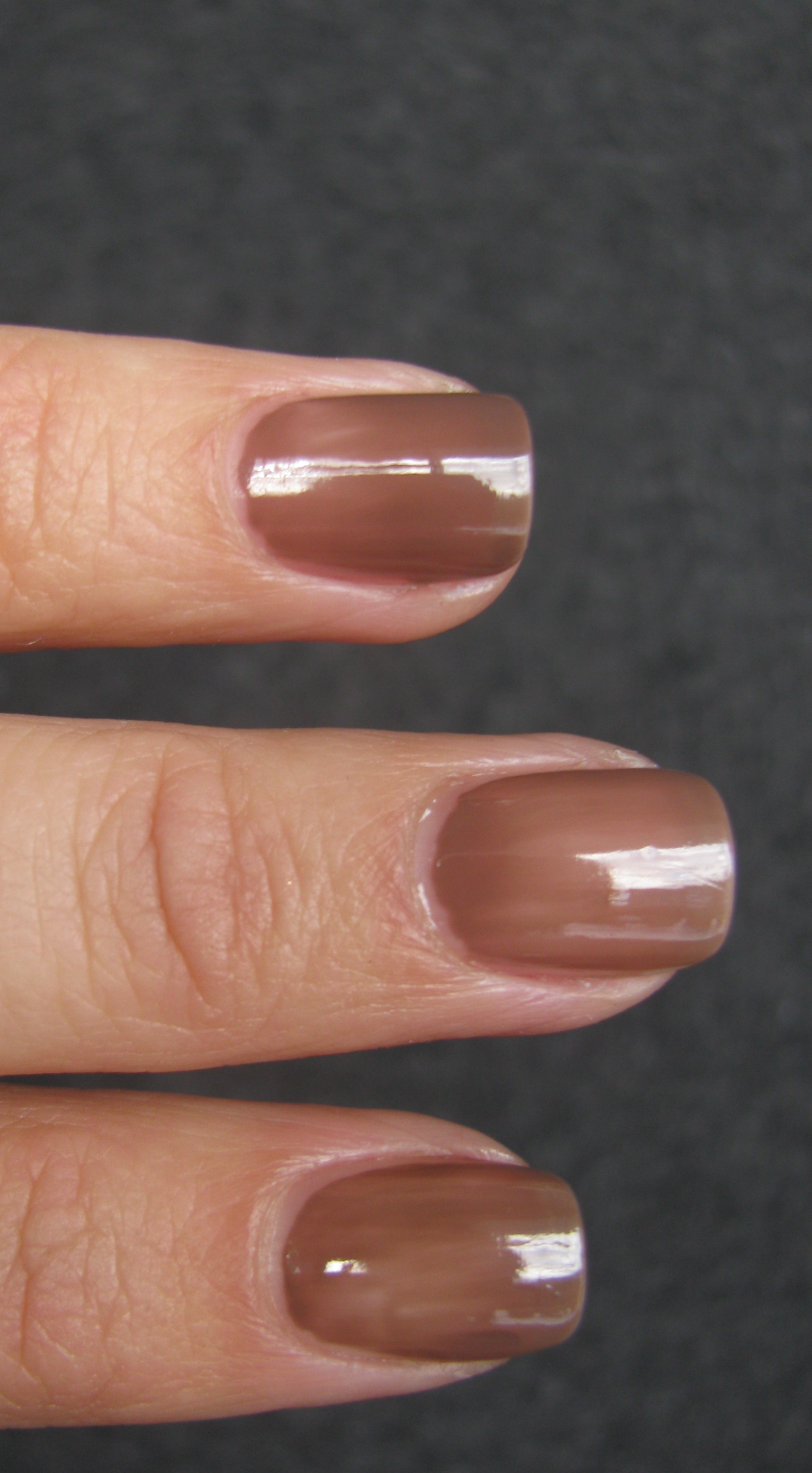
ring: Hot Coco, middle: Over the Taupe, index: Mink Muffs (natural lighting)
With the second coat, you can tell that Over the Taupe is slightly lighter in hue, but still so close to the other two.

ring: Hot Coco, middle: Over the Taupe, index: Mink Muffs (sunlight)

ring: Hot Coco, middle: Over the Taupe, index: Mink Muffs (natural lighting)
The final coat gives the best indication of any differences, but even at that, you’d need a microscope to really tell them apart! In natural or indoor lighting, if I didn’t know which was which, I would never be able to tell them apart. Only in sunlight or very bright light can you see that Mink Muffs seems to have slightly more depth and pulls the ‘coolest’ out of the bunch, Over the Taupe is the lightest with trace lavender hints and Hot Coco seems to be a perfect mix between the other two, with a negligible touch of mauve. All three have that melted milk chocolate goodness to them!

ring: Hot Coco, middle: Over the Taupe, index: Mink Muffs (sunlight)

ring: Hot Coco, middle: Over the Taupe, index: Mink Muffs (natural lighting)
Final thoughts: If you missed out on Mink Muffs, then snatch up Hot Coco from this year’s Winter collection as it is basically identical. OPI’s Over the Taupe was from a past collection as well, but you can probably still find it at your regular OPI retailers. Can you tell which one is which in the picture below?!

*Hot Coco is the one on the left!
Essie ‘Velvet Voyeur’ vs. OPI ‘Lincoln Park After Dark’ vs. Essie ‘Luxedo’

With Essie’s latest two releases, namely the fall and winter collections respectively, we saw the inclusion of a vampy shade in each, with ‘Velvet Voyeur’ for fall and ‘Luxedo’ in the winter collection. My first thought on viewing both was that they bore a striking resemblance to OPI’s ‘Lincoln Park After Dark’ and so I decided to compare the three. Upon looking at the three together, it’s almost as if LPAD is a perfect combination of the other two, but the application showed otherwise!
What I noticed with the first coat, was that Velvet Voyeur had the most plum tone, LPAD was the lightest with a brighter berry base and Luxedo definitely had more of a prune base, being the obvious darkest of the three.

ring: Velvet Voyeur, middle: LPAD, index: Luxedo
The second coat saw Velvet Voyeur and Luxedo almost opaque with Velvet Voyeur having hints of mauve while Luxedo had deepened to a more burgundy shade. LPAD was still the most ‘berry’ and sheerest in application of the three.

ring: Velvet Voyeur, middle: LPAD, index: Luxedo
With the final and 3rd coat, Velvet Voyeur reached its full potential of deep mauve, Luxedo finished up as a blackened prune, while LPAD’s final look was a deep mauve as well but with definite notes of berry/burgundy in its depths. Of the three, Velvet Voyeur had the easiest application but still a touch streaky, Luxedo had the thickest formula and LPAD was the thinnest in consistency but the streakiest. I do feel that all three shades require 3 coats for maximum coverage as you can clearly see bald patches if left with just 2 coats. I used OPI’s Start to Finish Base Coat but left out top coat for the pictures (please excuse the less than perfect application and tiny bit of cotton fluff stuck to my index finger! That’s what you get when you rush things!)

ring: Velvet Voyeur, middle: LPAD, index: Luxedo (in sunlight)
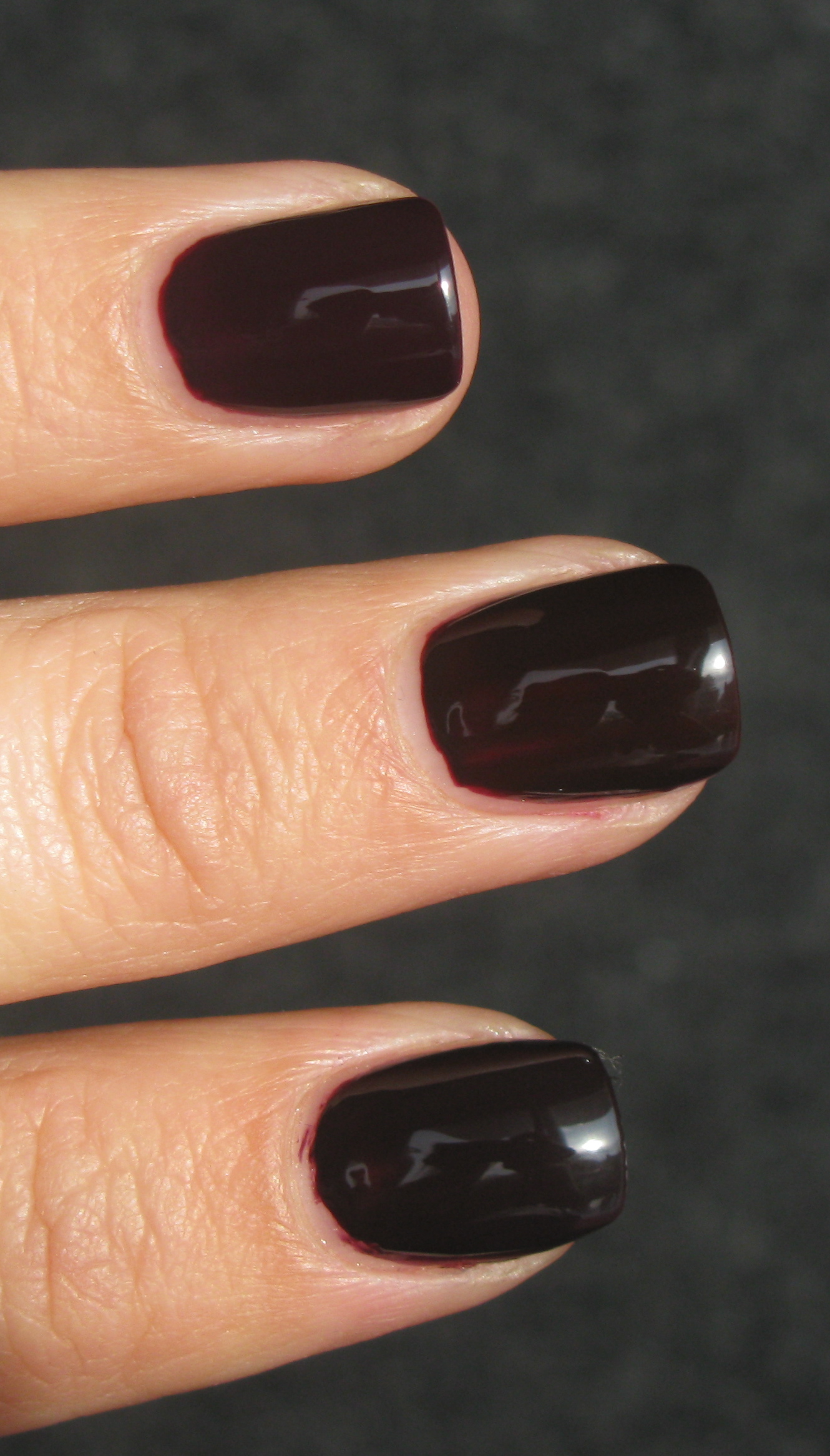
ring: Velvet Voyeur, middle: LPAD, index: Luxedo
Final thoughts: When all three shades were dry, it was almost impossible to tell Velvet Voyeur and Lincoln Park After Dark apart. While Luxedo was very close in tone, you could still tell that it was by far the darkest of the three. If you don’t have LPAD, then Velvet Voyeur is, in my opinion, almost an exact match — perhaps not with the first coat, but certainly by the last. Also, depending on what kind of brush you like to use, it might determine your choice: OPI has a much wider brush giving you faster coverage but can be difficult for those with narrower nails, while Essie’s brush is thinner & daintier, requiring more strokes for full application but easier to control and more suitable for smaller/narrower nails.
Rescue Beauty Lounge Housewives of Tudor England Collection review & swatches
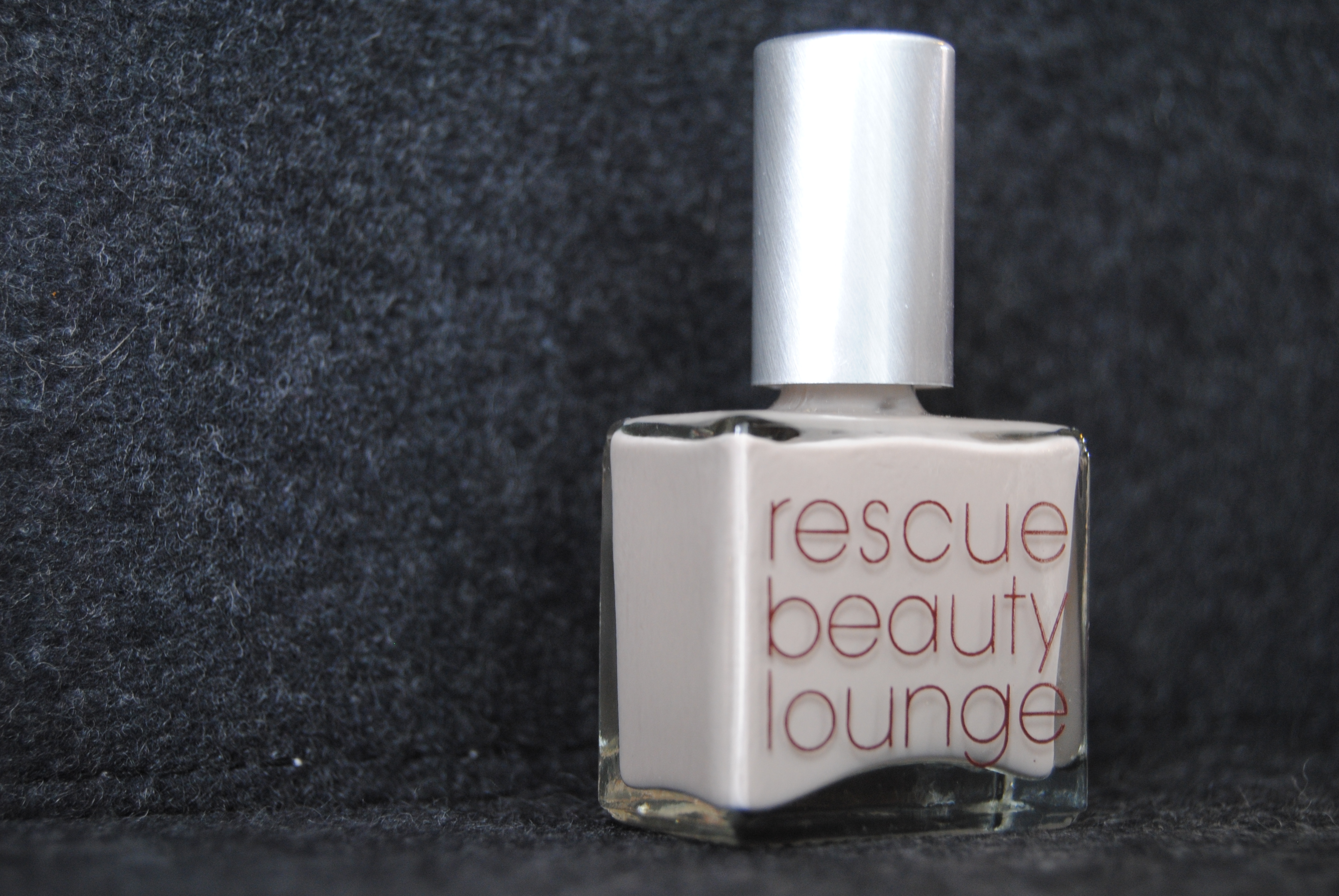
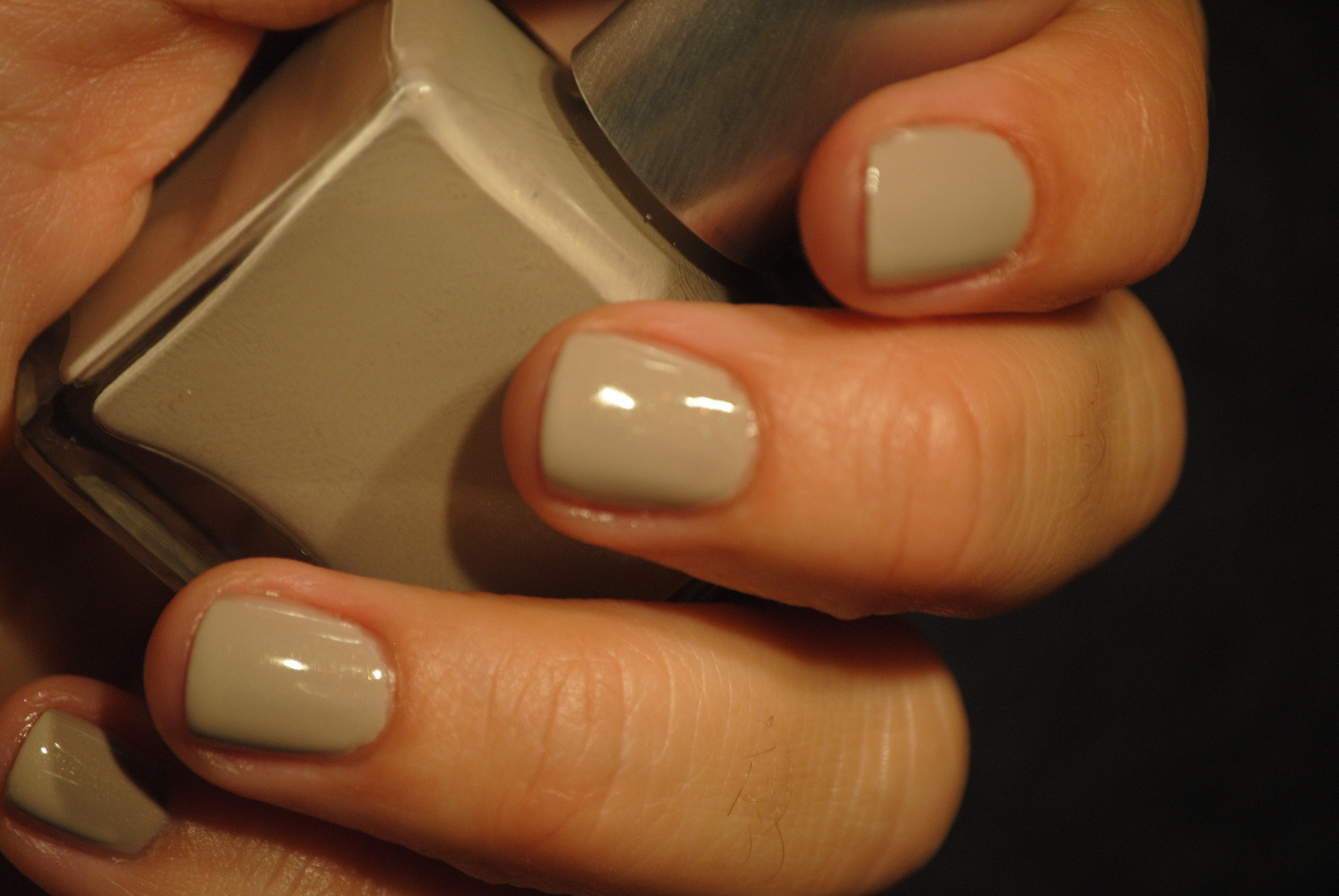
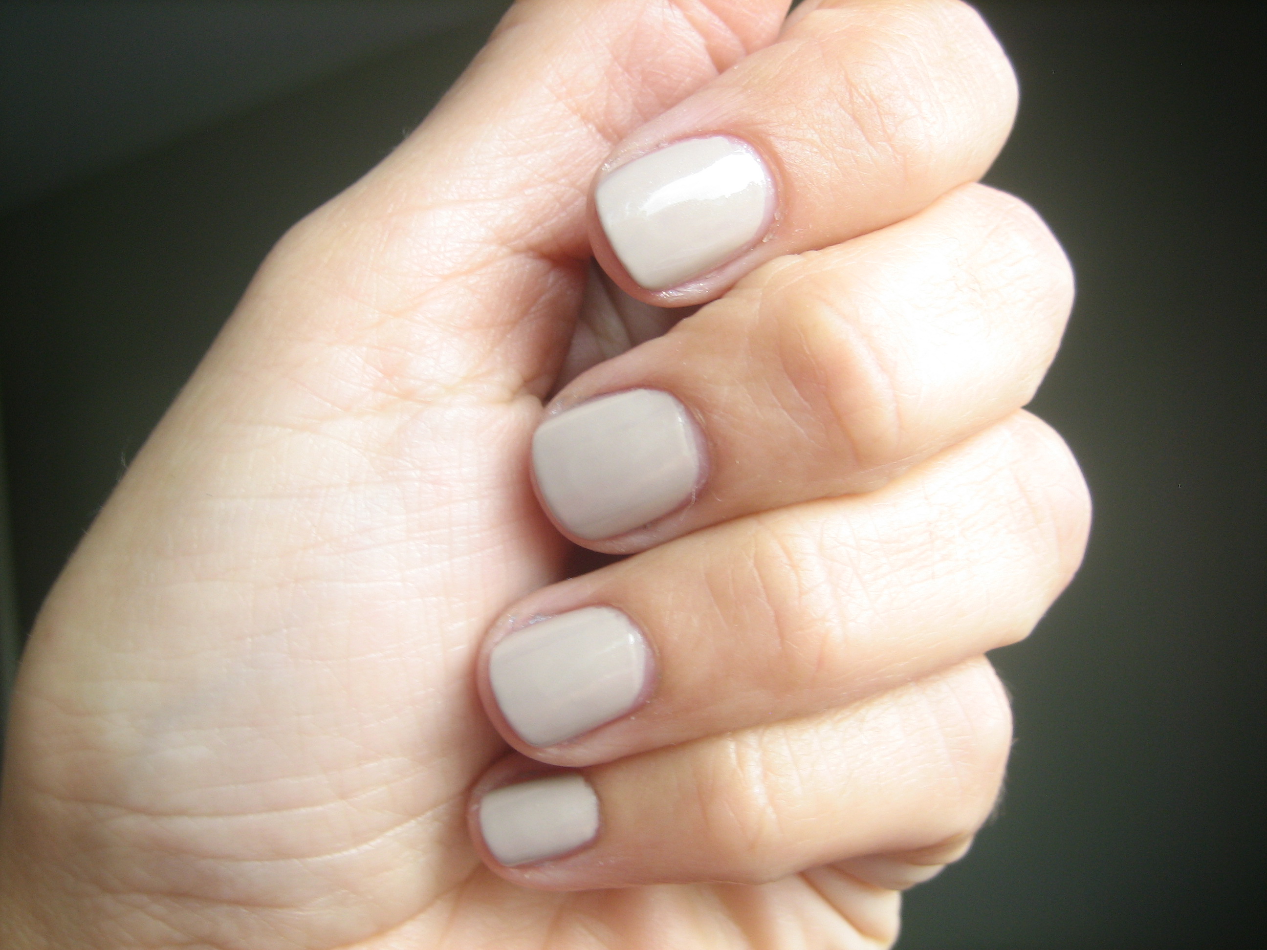
The first colour of this collection that I’m reviewing is called ‘Jane’, a neutral greyed-out mushroomy colour with cooler undertones and very fine shimmer throughout. The application was smooth and flowed well, and while the shimmer is more obvious when looking at the bottle, it is less apparent on the nail. I imagine with full sun hitting this colour, the shimmer will be easily seen.
This shade still seems to be riding high in popularity this season with many companies coming out with their own variations but what makes this taupey nude unique, is its wearability. It looks to be flattering on both cool and warm skin-toned types without giving the dreaded ‘mannequin’ hands look. While subtle enough to be worn during the day, making it a workplace-friendly colour, it’s still edgy enough to be worn as an evening look as well, in particular accompanied with a more intense eye.
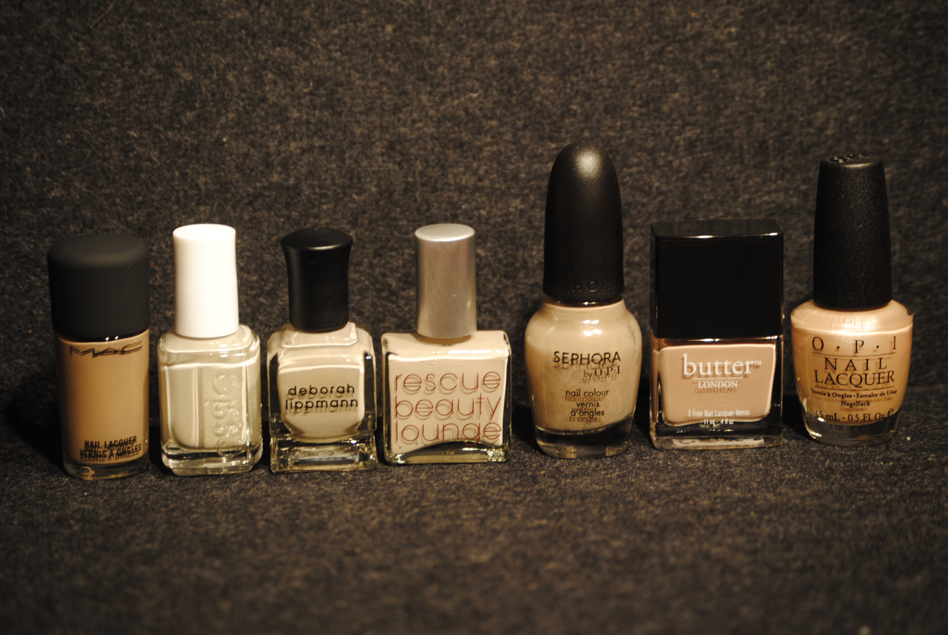
I searched my stash for similarly toned colours and found these (from left to right): MAC ‘Earthly Harmony’, Essie ‘Playa Del Platinum’, Deborah Lippmann ‘Waking Up In Vegas”, (Rescue Beauty Lounge ‘Jane’), Sephora by OPI ‘Under My Trenchcoat’, Butter London ‘Yummy Mummy’ and OPI ‘Fiji Weejee Fawn’.
- Earthly Harmony is significantly darker with very fine gold and pink shimmer throughout
- Playa Del Platinum is the closest match, although it has no shimmer whatsoever and leans more towards a paler grey hue
- Waking Up In Vegas which I thought would be almost a duplicate translates much darker on the nail, pulling more on the taupe side with no shimmer
- Under My Trenchcoat has a darker taupe cast as well as very fine gold and silver shimmer
- Yummy Mummy has mauve leanings with extra fine silver shimmer
- Fiji Weejee Fawn is the outside of the bunch, with an almost peachy tone and a pearly shine

I swatched 4 of the 6 colours against Jane to further show you the differences between them: thumb – Jane, index – Waking Up In Vegas, middle – Playa Del Platinum, ring – Under My Trenchcoat and pinkie – Earthly Harmony. All were swatched with Deborah Lippmann’s Rehydrating Base Coat, 2 coats of polish of each colour and Seche Vite Dry Fast Top Coat.
All in all, I find the versatility and wearability of Jane, not to mention the colour’s spot-on trendiness, the winner of this collection, although if asked, I would be hard pressed to choose just one colour….that’s why I picked up the whole set I guess!!
PS: Trying to figure out what it is that makes Jane unique among all the other mushroomy-nudes out there, I realize that it’s the slightest hint of mauve in the colour’s base which warms it up enough to compliment every skin tone, as well as the fine shimmer that gives it such depth without looking washed out on your hands. Enjoy!
NARS Mash vs MAC Seriously Hip
I recently picked up NARS’ new re-issued Mash nail polish (2010) and thought it looked very close to MAC’s Seriously Hip nail polish (Style Black Collection 2009) until I swatched them.
Looking at the bottles, there is a distinct resemblance but Mash definitely has a more lighter olive cast to it (top picture), with a more delicate golden shimmer while Seriously Hip (bottom picture) comes out as a blackened olive with larger golden flakes throughout. Even though the shade differences between the two are apparent, they are both in the same colour family. Removing Mash was easy and despite being a darker shade, it did not stain the nail.
Seriously Hip, while not that difficult to remove, did leave some of the gold flakes behind and there was some very slight staining, easily removed with another swipe of nail polish remover. The NARS polish also had a thinner consistency and a thinner more flexible brush than the MAC, making it somewhat easier to control in application. I used Deborah Lippmann’s Rehydrating Base Coat, 2 coats of each polish and Poshe Super-Fast Drying Top Coat
Both these shades seem right on target for Fall’s cooler temperatures, but I have to admit that the golden shimmer of Mash makes this particular shade a fresher, newer alternative to the darkness of Seriously Hip. While the MAC shade is not available anymore, you should grab Mash while you can, as it is a brought-back-limited shade from the NARS vaults and a colour I’m sure will go fast.