Filed In: Nail Polish Comparisons
Reader Request: I Vant To Be A-Lone Star vs. Pelican Gray

Recently, a reader asked me to compare OPI’s ‘I Vant To Be A-Lone Star’ against China Glaze’s ‘Pelican Gray’, and which one I prefer. To be totally honest, even though you might think these two shades are close enough, viewed in person it’s another story and so I have decided to explain the differences. As to which one I prefer, guess you’ll have to read on to find out….and no cheating by scrolling to the bottom! The following swatches are index & ring fingers – ‘I Vant To Be A-Lone Star’ and middle & pinkie fingers – ‘Pelican Gray’ and were prepared with Sèche Natural base coat and three coats of lacquer, no top coat.

Seen in natural light, at first glance you might think that the two shades look enough alike to not merit owning both. Upon closer look, however, the first think you notice is that the OPI has more of a dusty, faded blue tone to it against the pale concrete of the China Glaze. While they both have shimmer throughout, in my opinion the particles in ‘Pelican Gray’ seem slightly larger and certainly more sparse compared to the finer & denser pearly shimmer of ‘I Vant To Be A-Lone Star’ (that name…..cute but way too long, no?!) In darker lighting, the differences between them seem more pronounced; note how the tone on my pinkie seems deeper and obviously grey against the blue hue of my ring finger.

With full sun hitting these shades, the differences are not as easily discernible, but still definitely there. The formula and application on both was exceptional, giving decent coverage even with two coats, although I personally prefer three thinner coats for perfect smoothness and opacity. The other major difference is one relating more to personal preferences: the OPI sports their Pro Wide brush which makes for a quick application but can be challenging for those with smaller nail beds, versus the thinner and slightly more flexible brush of the China Glaze which makes it easier to get to the sides of your nails, but means that it requires more brush strokes. They both dried relatively fast, and while neither one has a high gloss finish, they each have enough natural shine and shimmer.
Final thoughts: I will go on record as stating that I absolutely LOVE both shades. I have a personal thing for grey tones, be they dark or light, creme, glittery, matte, suede, metallic, jelly or pearly. I love dusty, washed-out looking hues as well and I find that delicate shimmer is just so flattering on every skin tone. The faded periwinkle undertone of ‘I Vant To Be A-Lone Star’ is a different slant on this colour range and that makes it just a touch more unique in my eyes to merit it a “must have” in your nail polish arsenal. But if you’re like me, then you know that you absolutely MUST have ‘Pelican Gray’ as well, because the formula is so totally superb and the pearly shimmer really sweetens what would otherwise be a drab shade.

*Disclaimer: product samples provided by the company/PR for my unbiased consideration


Nude Perfection

The issue, for me at any rate, about trying on so many different nail polishes in one week (or sometimes even in one day!) is that at one point I reach a saturation point. Once in a while I like to take a break from all the varieties of colours, textures, and finishes, and immerse myself in something neutral and well, soothing, but I still want to have some pizzazz on my nails.

Enter my search for the perfect nude polish. Going through my catalog of lacquers, I realized that ‘nude polish’ comes in as many varieties as ‘nude bodies’, with no two alike; there’s grey-based nudes and peach-based nudes, even yellow-based nudes but I finally found what I was looking for in OPI’s ‘Tickle My France-y’ (TMF) from their 2008 Fall Collection de France release. This shade is understated, elegant and sublime ‘nude perfection’. The mauve undertones in its depths, elevate this shade from lifeless to a muted vibrancy and I love the fact that it has such a creamy look to it. The application was excellent, being neither too thick nor too thin and while I saw some ridges at first, it levelled out almost instantly to a smooth finish. The pictures are with base coat, 3 coats of polish and Sèche Vite top coat.

in sunlight

with flash

in natural light
Of course, I couldn’t leave things alone without trying to find at least one comparison, and the closest one I had was another favourite go-to polish of mine, Deborah Lippmann’s ‘Fashion’.

The first thing I noticed, was that in deeper light, the two shades looked very similar, but in regular lighting, you can immediately see that fashion is more yellow-based and with subtle taupe/tan hints. The formula was slightly thinner as well and the Lippmann polish had a superior glossy finish, even without the addition of a top coat. Pinkie & middle fingers: Tickle My France-y, ring & index fingers: Fashion.


Final thoughts: they are both equally beautiful in their own right; TMF has OPI’s patented pro-wide brush which can be more challenging for some people to use, while Fashion comes with a thinner, tapered & more flexible brush. They both work on either cool or warm skin types and they both lend a stunning ‘polish’ (sorry….no pun intended!) to your fingers. Nude shades also have the unique ability of giving your hand an elongated & tapered appearance which is quite elegant. I love the slight pinkish hue of TMF as I find it compliments whatever you’re wearing and it never makes your hands look ruddy. Lippmann polishes, while amazing, are more expensive than OPI, which can be one deterrent for some people. Sophy Robson, Britain’s ‘manicure queen’, lists OPI’s ‘Tickle My France-y’ as her favourite nude polish of all time, so I guess I’m in good (and exalted!) company in my choice as well!

*Photo of nude art courtesy of Night Agency
OPI & China Glaze – Christmas Twins?!

While away on vacation this past summer, I finally had the opportunity to try China Glaze nail polishes; after hearing about them for so long but never being able to find a retailer near me, I was happy to pick up three shades: 2 were from their Fall 2010 Vintage Vixen collection (‘Emerald Fitzgerald’ & ‘Jitterbug’) , and the third from their regular lineup, the much talked-about ‘Lubu Heels’….but more on that one another time!
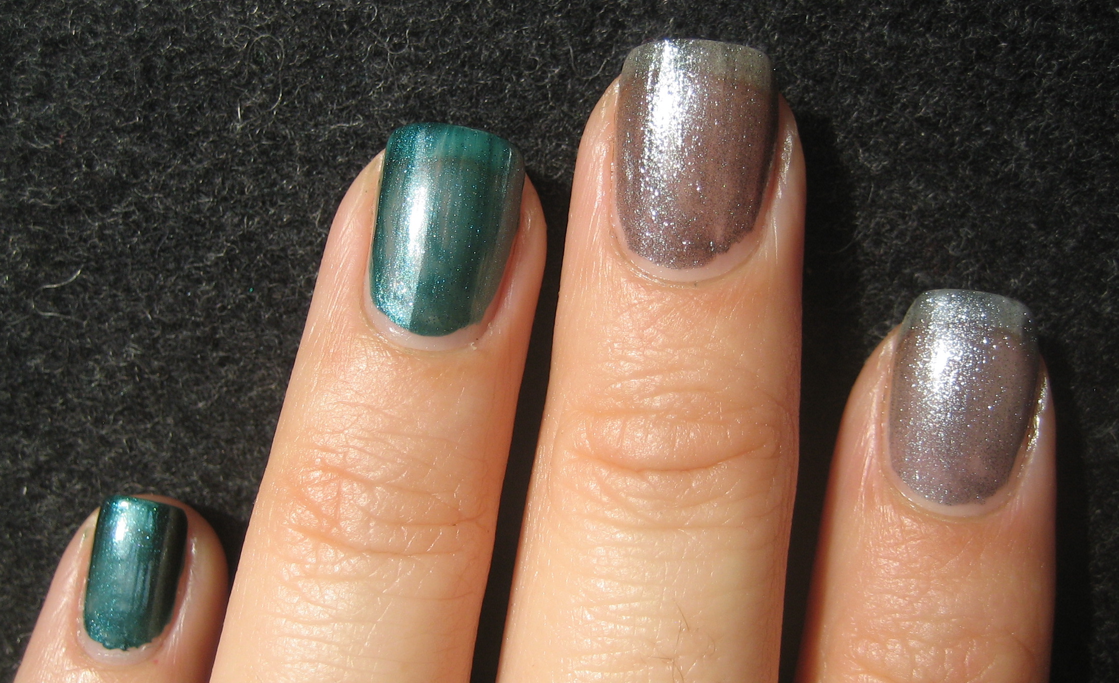
When I returned home, the much anticipated OPI Swiss Collection for Fall 2010 had just been released, and so I hurried over to pick up the 2 colours I had been waiting for: ‘Lucerne-Tainly Look Marvelous’ & ‘Cuckoo For This Color’. Imagine my surprise when I realized that these shades mirrored each other! I put off swatching them because I was upset at myself for duplicating lacquers, but decided to give them another chance…..that, and the fact that the shades seem somehow appropriate for the Christmas season! All swatches are: pinkie-Emerald Fitzgerald, ring-CFTC, middle-LTLM, index-Jitterbug and all are with base coat and Sèche Vite top coat.

First up we have OPI’s Lucerne-Tainly Look Marvelous (LTLM) versus China Glaze’s Jitterbug; the formula on both seemed similar, with both of them flowing easily, no visible brush strokes and a beautiful foil finish. The biggest differences are in the tonal qualities; Jitterbug has a blueish tinge to it making it look more like steel, versus LTLM’s slightly greenish undertone, making it more of a gunmetal. The other thing I noticed is that the OPI was significantly glossier & more sparkly, even before a top coat was added.
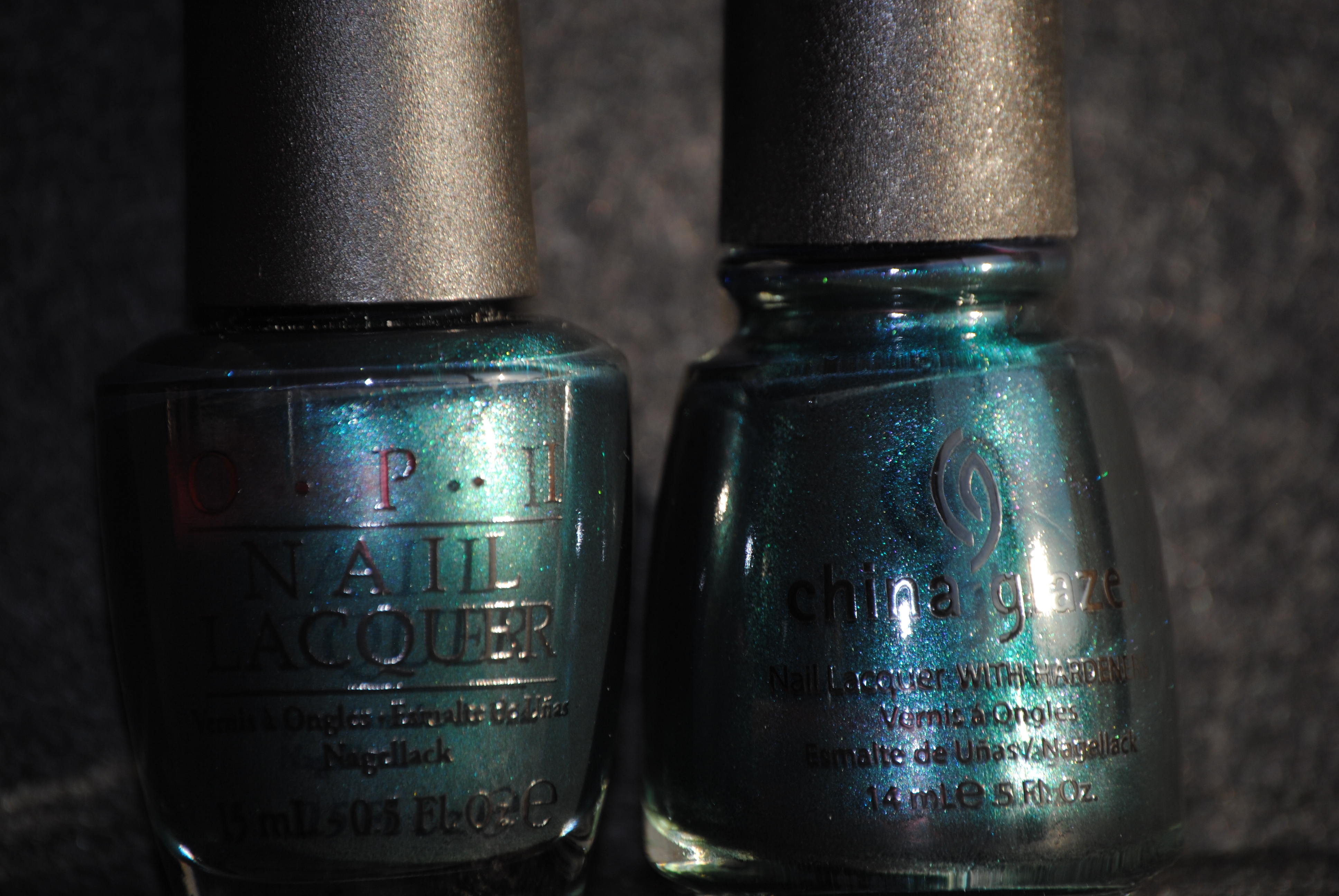
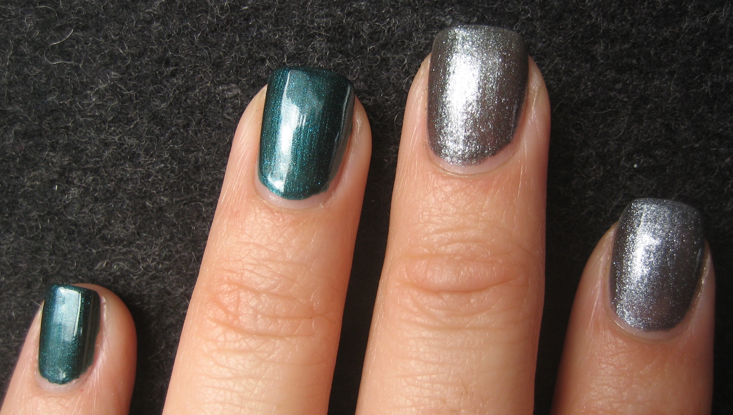
Next up is OPI’s Cuckoo For This Color (CFTC) versus China Glaze’s Emerald Fitzgerald (EF); once again, the formula was similar but whereas the previous two had a thinner consistency making for an excellent application, these were on the thick side, making them more difficult to apply evenly. Both are stunning true teals, but whereas Emerald Fitzgerald has a deeper finish and more blue in it’s base, CFTC is slightly lighter with greener undertones. Both have delicate shimmer in their depths but CFTC’s seems to be closer to the surface, giving it slightly more vibrancy.
first coat
second coat

third coat
The first coat shows similar application on all & no real differences; by the second coat, they are basically opaque and you can just see the slight variations between them. I applied a third coat, primarily because I like the finished look, but to see them at 100% opacity. The other main difference is the brush; the China Glaze brush is thin & flexible making it easy to get to the edges of your nail whereas the OPI brush is that ‘pro-wide’ brush and slightly more rigid, making it more challenging for those with smaller nail beds. As well, the two teals show the slightest of brushstrokes, which is probably due to the thickness of the formulas themselves.
Final thoughts: obviously, if you have one pair, you certainly don’t need the other as they are basically identical. It probably comes down to what you wish to spend (the OPI tends to run about $4.00 more than the China Glaze), which brush you prefer and the availability of each range. Personally, I love the colour combination of these two shades (might just have to make a ‘statement mani’ to show you…….!!) and they really do put me in Christmas state of mind….picture glittery tinsel on fragrant evergreen trees!
Essie Silken Cord vs. Lollipop

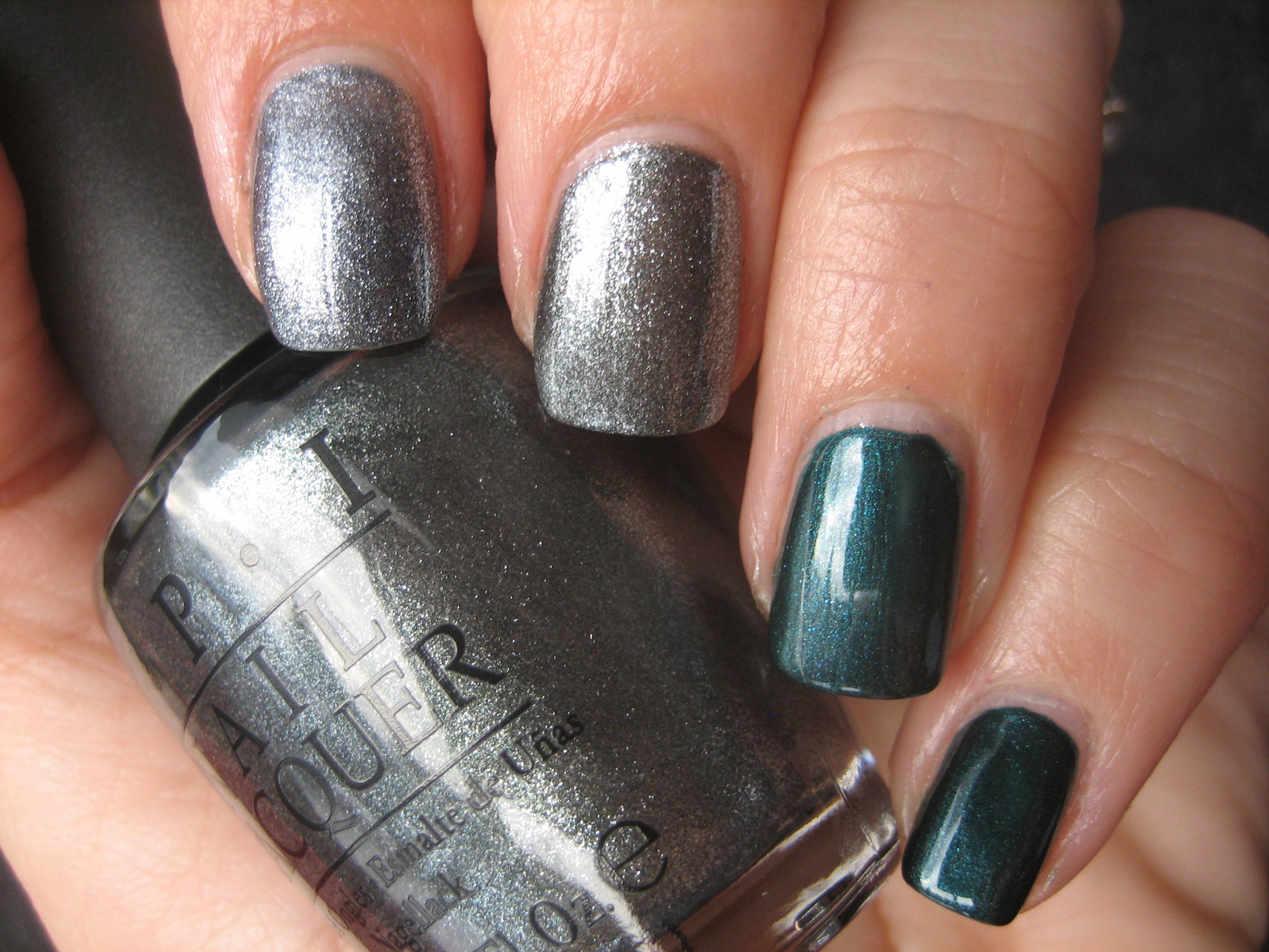
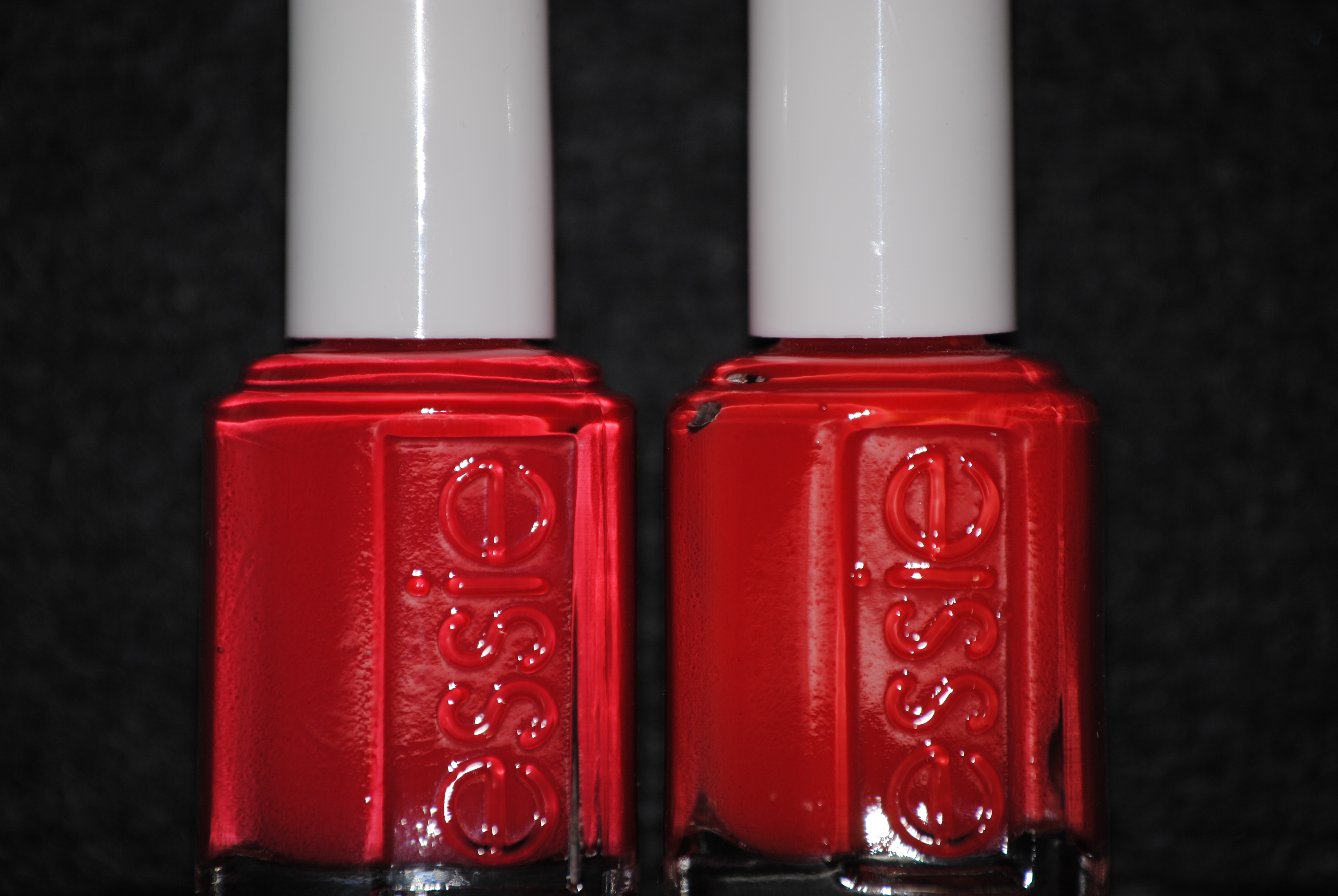
With Essie’s last 2 collections (Fall & Winter respectively), there were a lot of you out there that wondered if Essie wasn’t simply tweaking past shades into new collections. I wondered as well. So….with that in mind, I made a few comparisons ( here, here and here !). Today I may have found another close match between 2 more: Silken Cord (Winter 2010) and Lollipop (released Winter 2009).
While the bottle shade shows them to be very close, there’s still enough tonal discrepancies between them; they also applied completely differently as well. All pictures are: pinkie & middle fingers: Lollipop, ring & index fingers: Silken Cord over base coat.
Lollipop has a jelly-like finish but applies more like a creme. It is of thinner consistency than Silken Cord, but it becomes fairly opaque by the 2nd coat. The first coat shows their base tone to be quite similar, but note how much more opaque Silken Cord is even with this 1st layer.

1st coat, natural light
The second coat brings out the differences between the two; whereas Silken Cord has that bright maraschino cherry pop to it, Lollipop seems to veer just a touch more to the orangey red (you can still see the nail line slightly).

2nd coat, natural light
By the 3rd coat and if you’re in deeper or indoor lighting, you can tell that Lollipop has somewhat more translucency (trust me!), while Silken Cord displays both a creamier vibrancy and depth (nail line is just faintly visible on the nails with Lollipop).

3rd coat, natural light
Final thoughts: if you had purchased Lollipop in winter 2009, then you may wish to pass on Silken Cord, as they are almost identical, however……my advice is — don’t !. In my opinion, Silken Cord is one of the most remarkable reds I have ever come across, and I’m not even known for being red’s biggest fan….that’s how much it stands out to me. From the formula, to the application, to the high gloss finish, to how flattering it is to wear, there is absolutely nothing that I don’t love about this shade. As I stated in an earlier post, Silken Cord is also one of those colours that will translate exceptionally well as a Spring/Summer shade…..a true multi-tasker indeed! So………can you tell which is which?!

*Silken Cord is pictured on the left!
CHANEL Riva & Comparisons

Today I have a few comparisons to ‘Riva’ to show you using CHANEL’s ‘Nouvelle Vague’, Seophora by OPI’s ‘Havana Dreams’ and OPI’s ‘What’s With The Cattitude’.
Before I obtained Riva, I assumed it would be similar to Nouvelle Vague, but the colour difference is quite obvious: Riva is definitely baby blue while Nouvelle Vague is a washed out turquoise. The formula was not even close either, with Riva being thin and needing at least 4 coats to build to full opacity with a jelly-like finish, while Nouvelle Vague is significantly thicker, achieves opacity with 2 coats and has denser and finer shimmer throughout.

in natural light

in sunlight
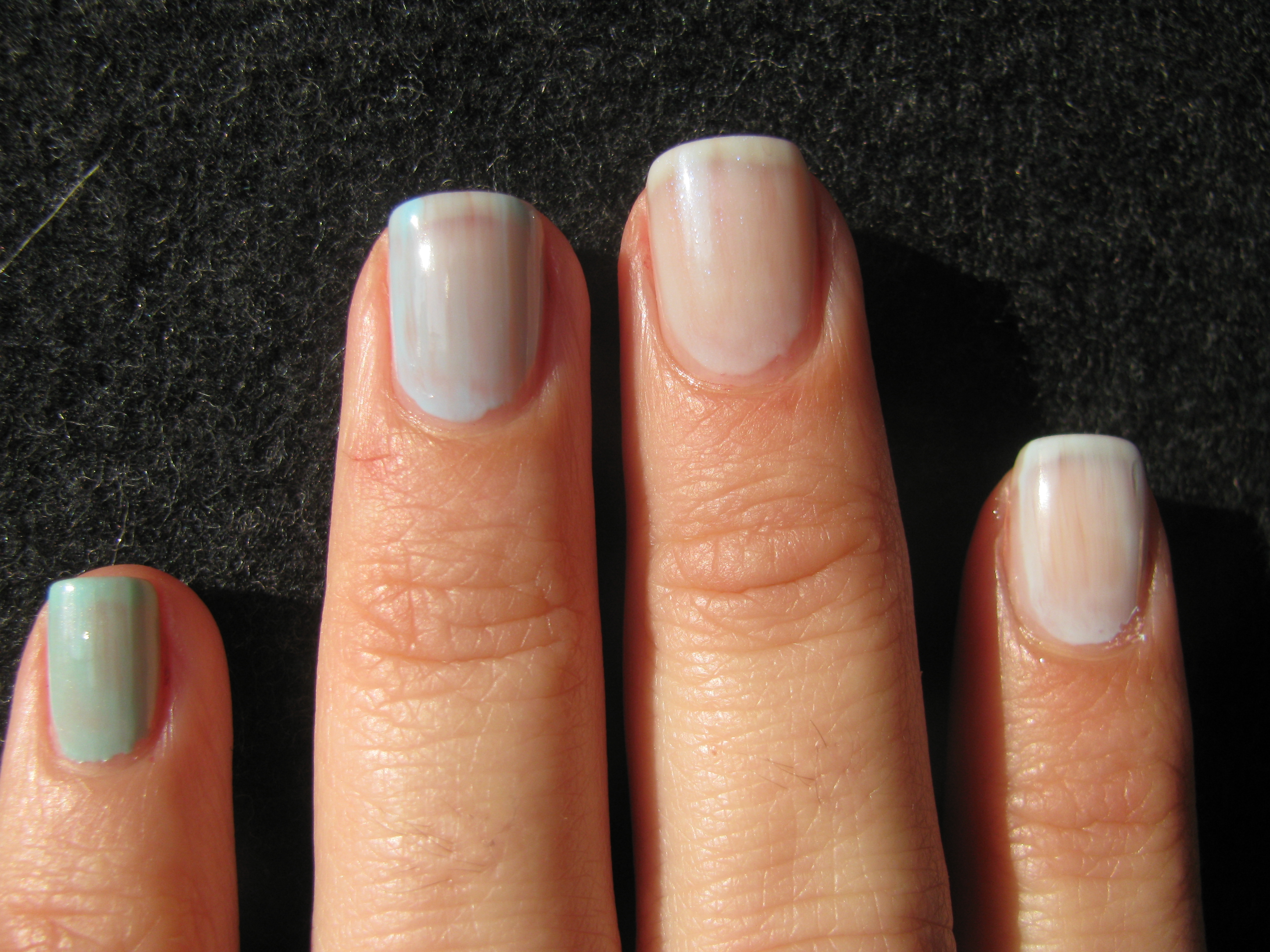
While I already reviewed Riva against Havana Dreams in more detail here, that was before I actually had my own bottle of Riva, therefore I wished to show how both shades looked on my nails as well as pitted against each other, and I also threw in OPI’s What’s With The Cattitude seeing as how it was the only other pale blue I had in my collection (this was one of the minis of a 4-piece set from OPI’s Shrek Collection). In all pictures starting from pinkie, ring, middle and index fingers the shades are: Nouvelle Vague, What’s With The Cattitude, Riva and Havana Dreams, all with base coat. (*Please excuse the nasty cut on my ring finger…I seriously need to start wearing gloves when I clean & water my yucca tree!*)
The first coat shows the same streaking pattern between Havana Dreams and What’s With The Cattitude, while Riva & Nouvelle Vague do apply smoother and the shimmer in the latter two is clearly visible in the sun. What’s With The Cattitude was also the thickest of the 4 and somewhat chalkier as well.
in sunlight, 1st coat
With the application of the second coat, Nouvelle Vague & What’s With The Cattitude seem basically opaque while Riva & Havana Dreams are not only the closest in tone but the sheerest and you can even see a slight bald patch with Havana Dreams. Any streaks, however, disappeared with this layer. This coat also highlights how much greener Nouvelle Vague, is while the more Robin’s Egg Blue of What’s With The Cattitude is nowhere near Riva’s rinsed pale blue.
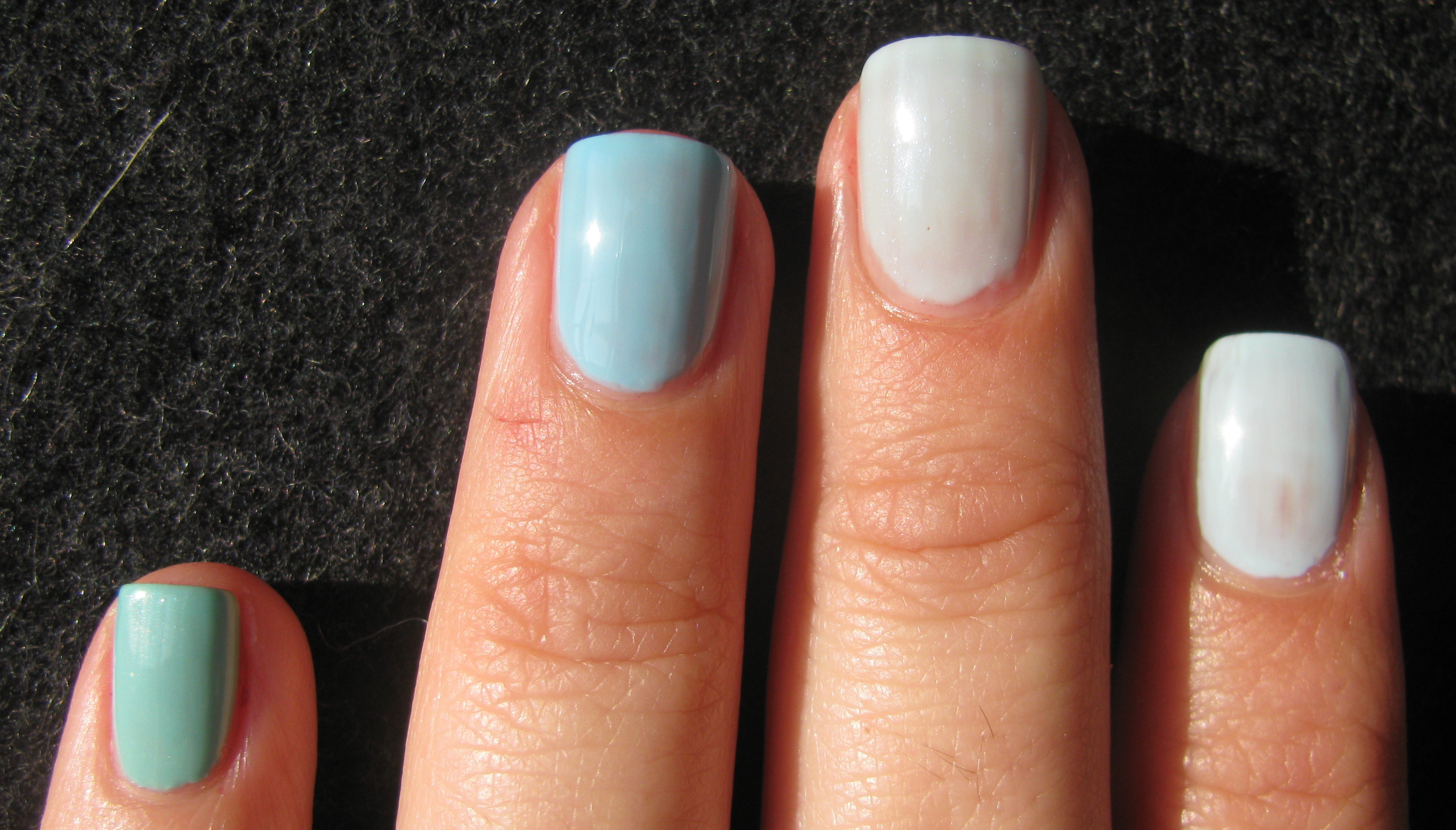
in sunlight, 2nd coat
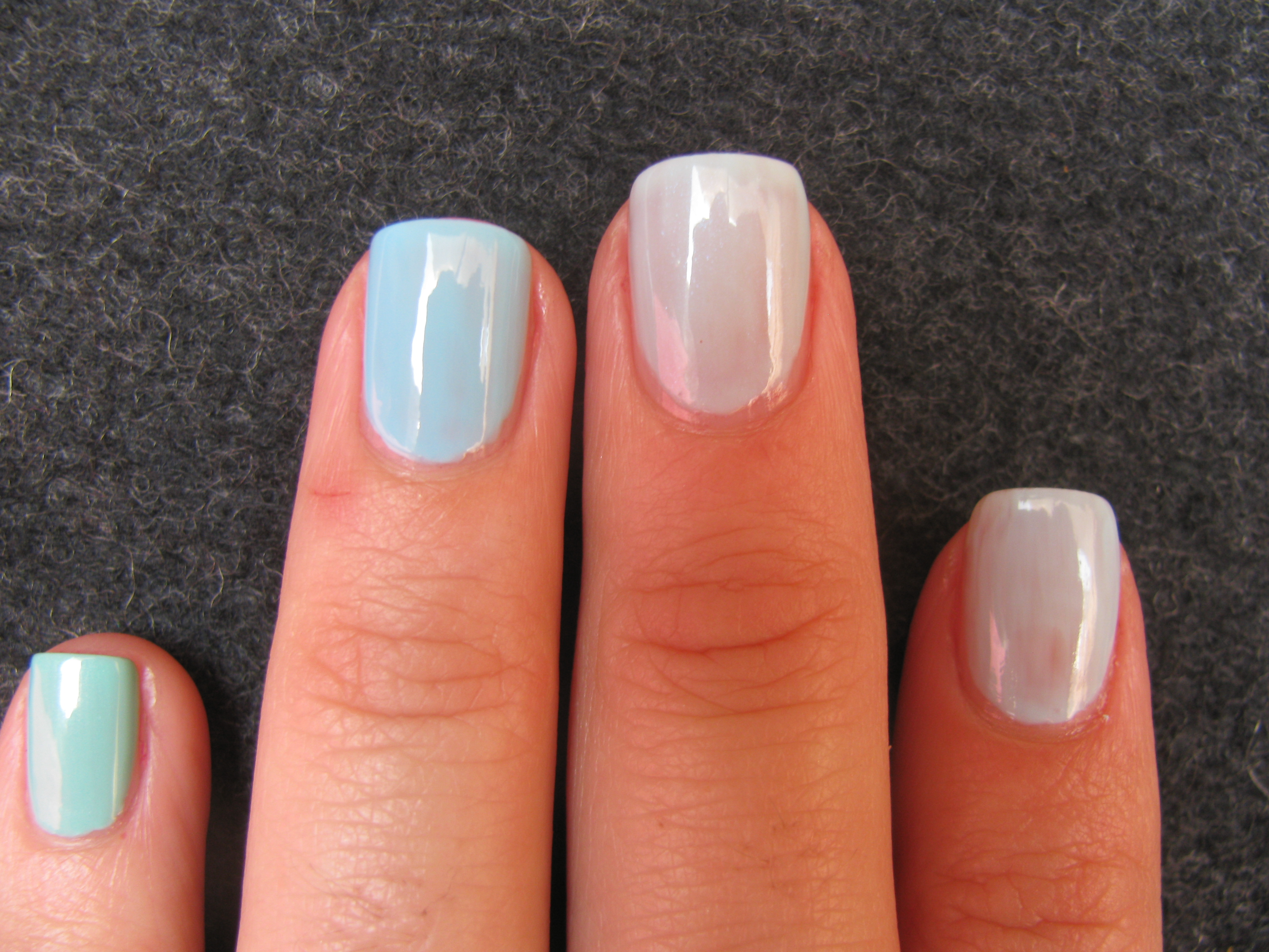
natural light, 2nd coat
With the third coat, both Nouvelle Vague & What’s With The Cattitude achieved 100% opacity and while the sunlight pictures show Riva to be pretty opaque as well, you can clearly see that it’s still somewhat sheer in natural light. Havana Dreams maintained a small bald patch, but that’s due more to my application than the polish itself (oops!).
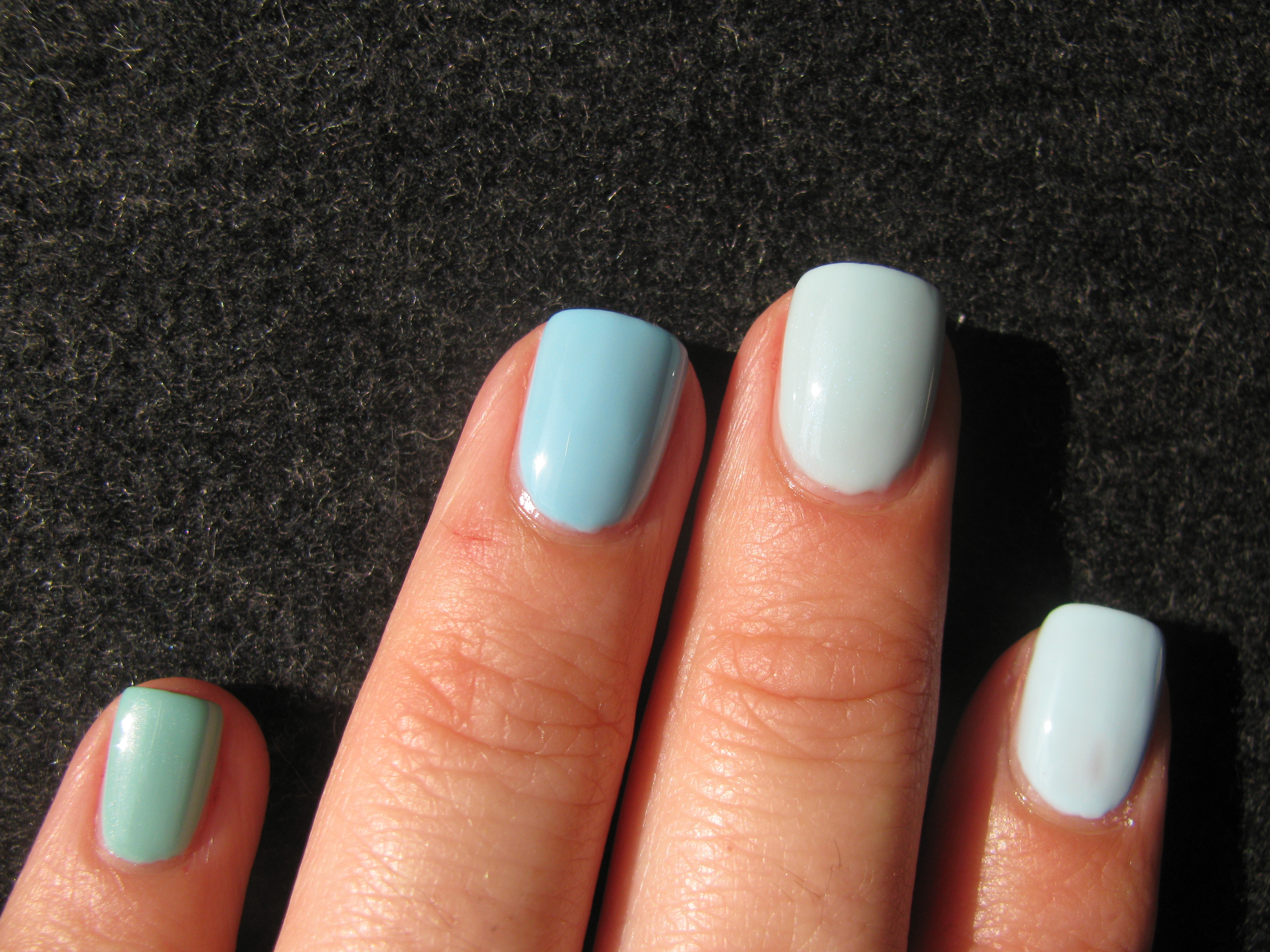
in sunlight, 3rd coat
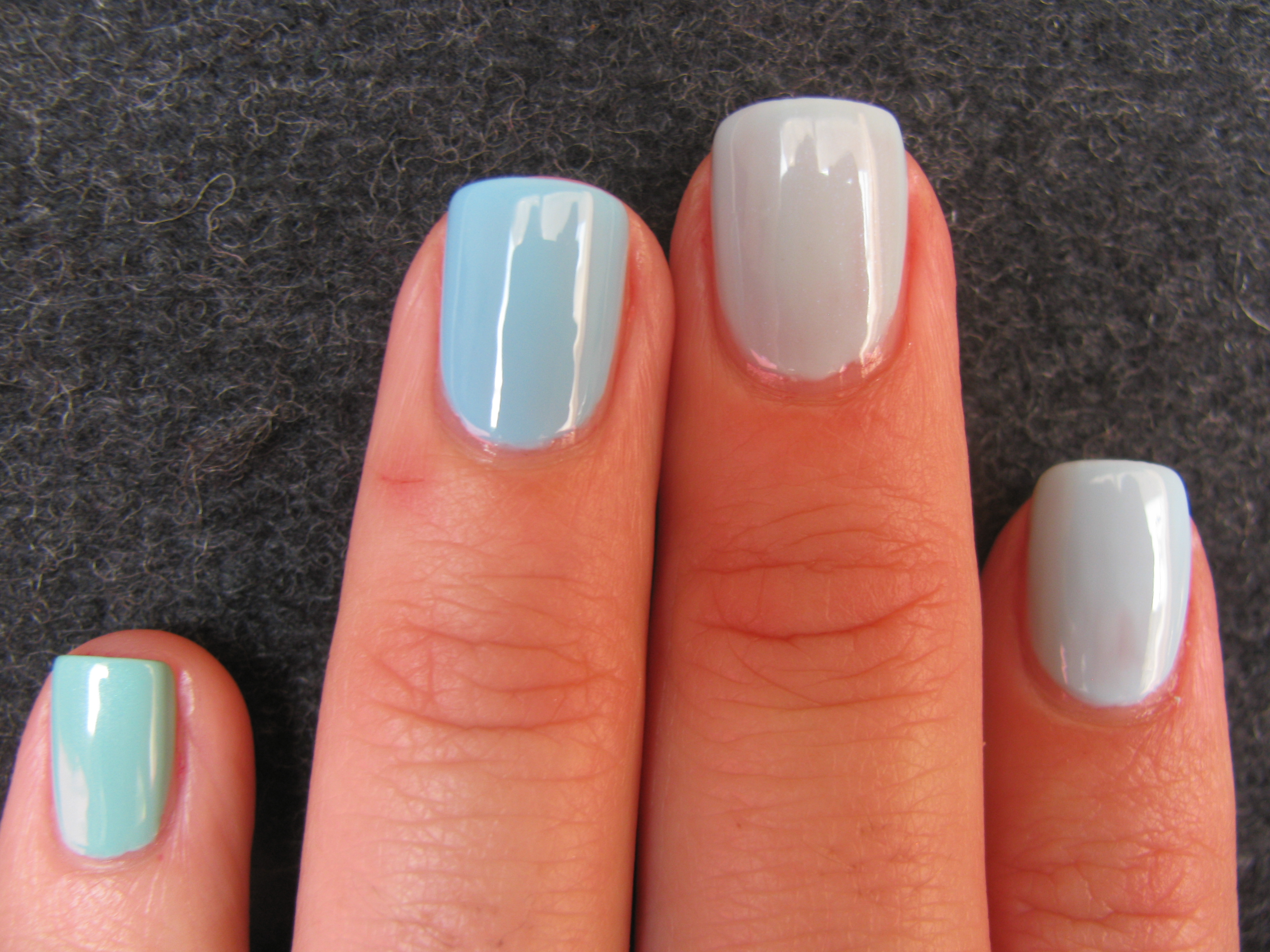
in natural light, 3rd coat
In this last picture, I gave an extra coat to Riva, bringing its total to 4 coats and finally fully opaque, and I also added Sèche Vite top coat to all for some added shine.
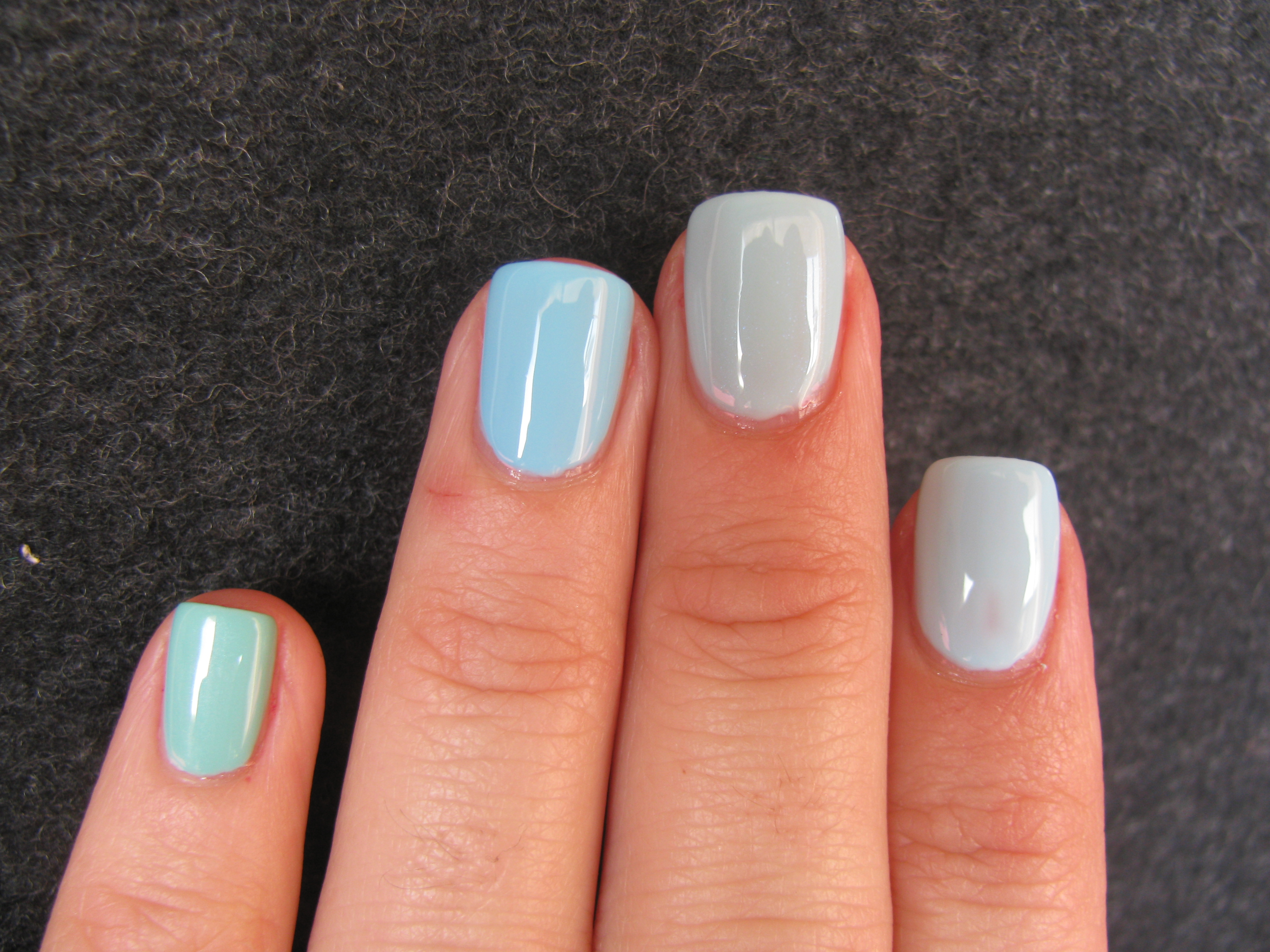
Final thoughts: Nouvelle Vague could not be considered anything other than a ‘Tiffany Box Blue’ as I like to call it, or a rather washed out turquoise, leaving it out of the running for a match. What’s With The Cattitude is much brighter and more of a sky blue shade, although a nice light blue alternative if you have it and cannot find either of the remaining two (or don’t wish to empty your wallet trying to purchase them). As I stated in my previous post comparing Riva & Havana Dreams, I can now truthfully say that while they are extremely close (more like sisters than twins), Riva is still unique in it’s slightly more washed out appearance and the shimmer, while not always visible, does add a little something extra.