Filed In: Nail Polish Comparisons
China Glaze – Sea Spray (swatches, review & comparison)
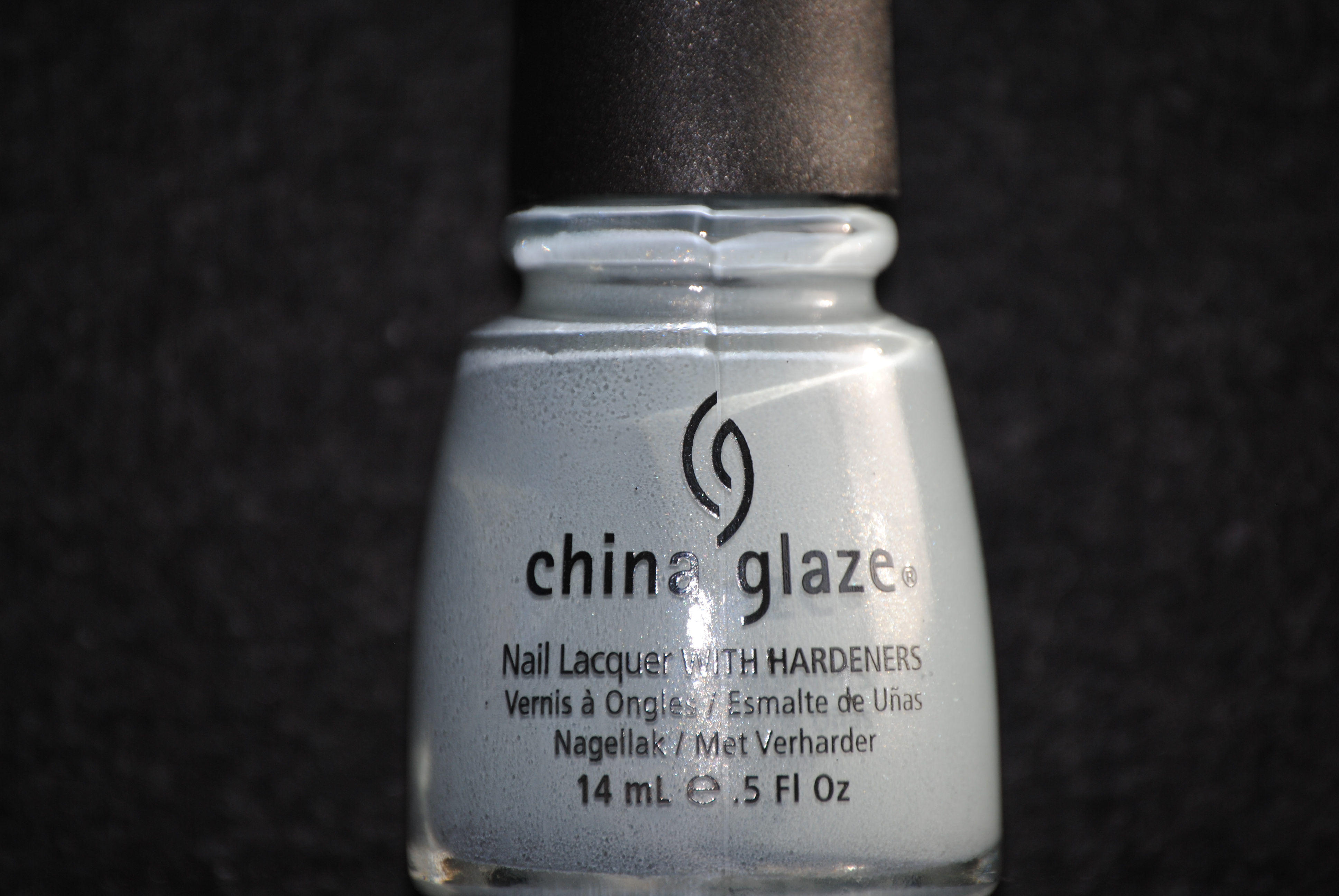
When I recently reviewed China Glaze’s ‘Anchors Away’ collection (part 1, part 2 & part 3), the only shade that I left out was ‘Sea Spray’…I was saving the best for last! This lacquer is an understated pale blue/grey hue with subtle silver shimmer running through it. What I love about this type of shade is that while it has a pastel-like look to it, it’s also edgy and modern without ever coming across as too girly. All swatches of ‘Sea Spray’ are with Sèche Natural base coat, two coats of lacquer, no top coat.

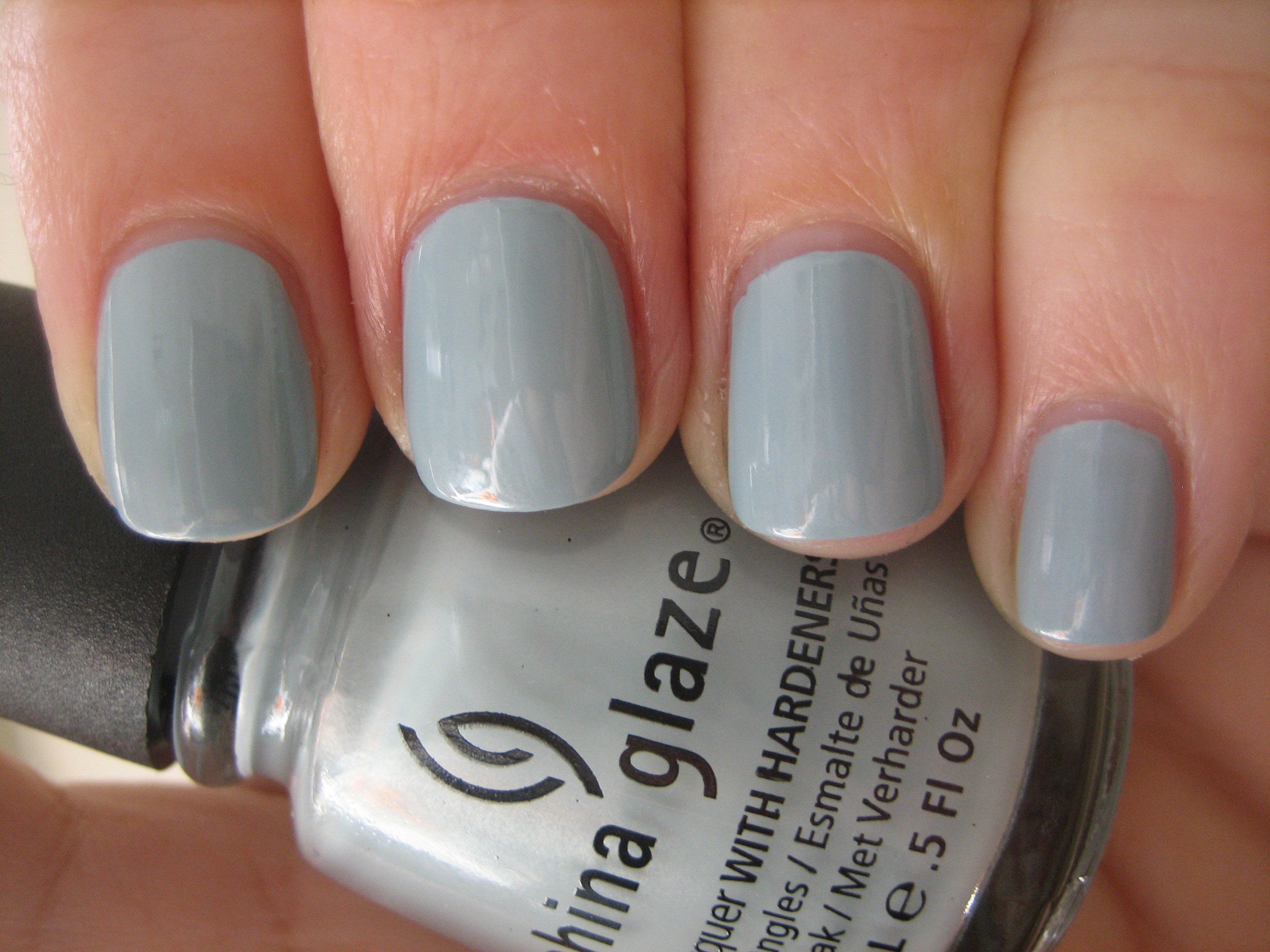
The dusty look of this polish is what attracts me; the delicate silver shimmer swimming in its depths, while not readily apparent in the bottle, rises to the surface once applied, giving your nails an almost reflecting pool look. The grey undertones can make this colour pull a little cooler, but this type of muted sky blue is versatile enough to be worn by basically all skin tones. The formula was richly pigmented, requiring only two coats for full opacity and even though it was a touch thick, it still applied very easily and was as self-levelling as the rest of this collection. Dry time was also quick, with a lovely shine to the finish. Did I say how much I LOVE this colour?!
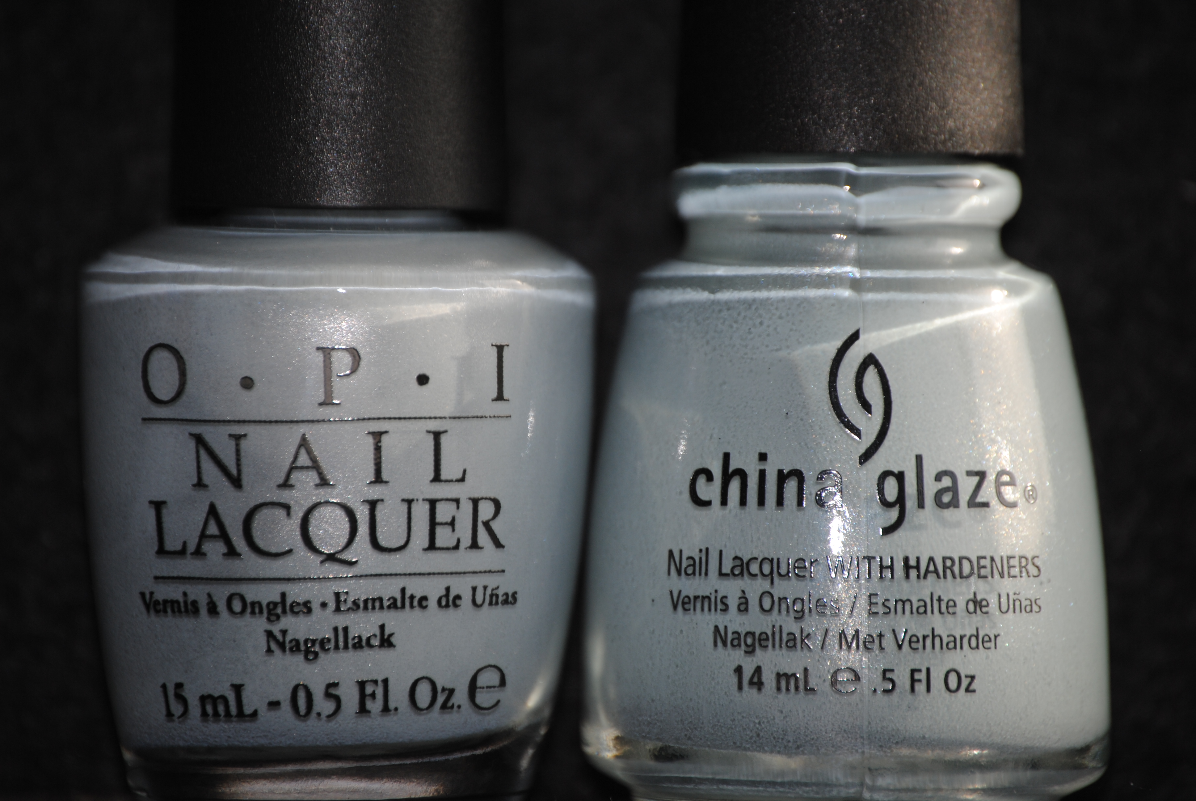
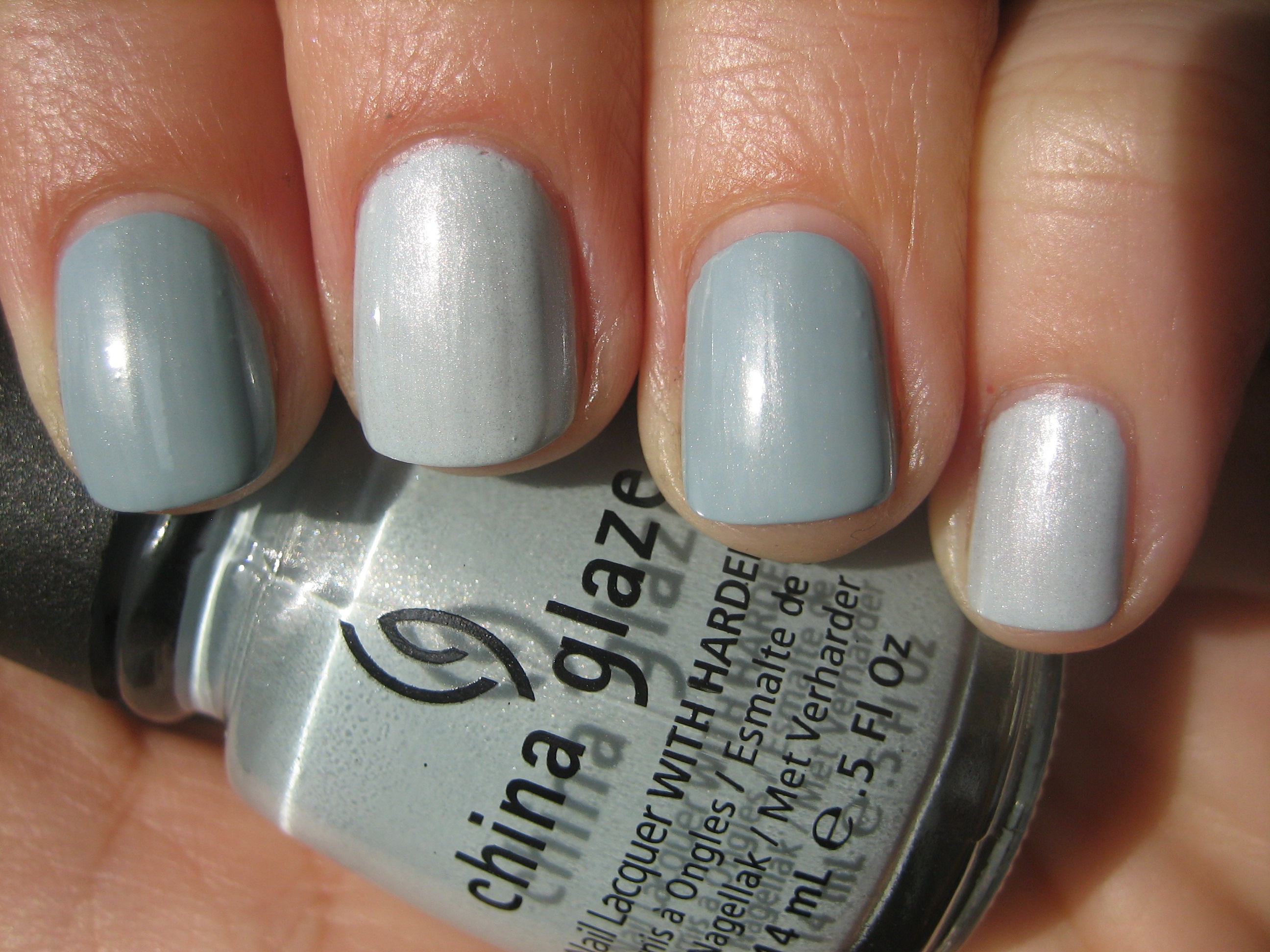
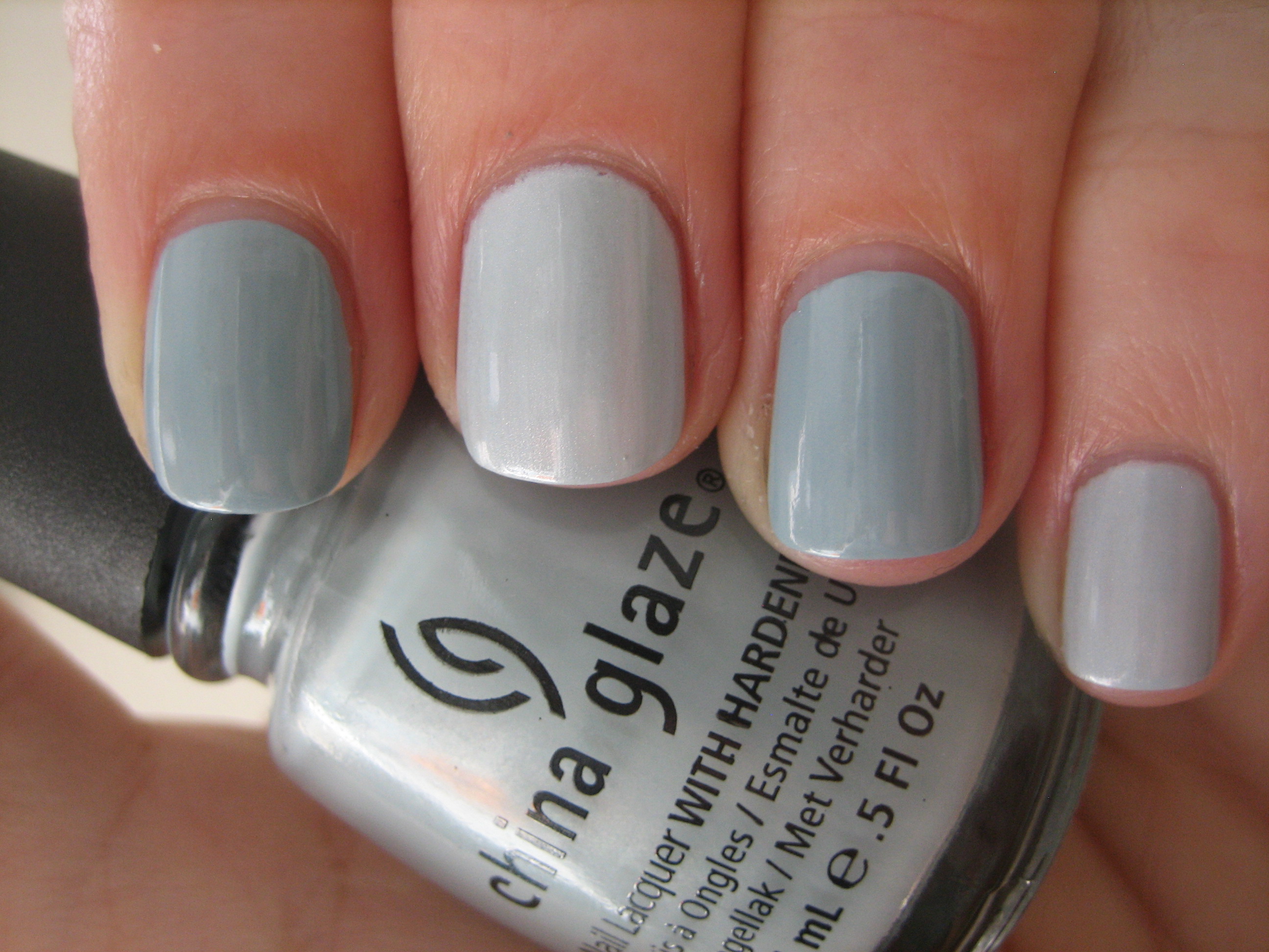
Of course, the first thing I thought of when I first laid eyes on ‘Sea Spray’, was this was a twin to OPI’s ‘I Vant To Be A-Lone Star’ (IVTBALS) from their recently launched Texas Collection, and while there are several similarities, they are most definitely not the same. For starters, IVTBALS is much more sheer, needing three coats to reach the same opacity, and its shimmer is definitely denser, giving it a more silvered appearance. The other big difference is that while they are both in the same tonal family, ‘Sea Spray’ looks so much bluer when they are side by side, whether seen in sunlight (top photo) or indirect light (bottom photo). Swatches are: index and ring fingers – ‘Sea Spray’, middle and pinkie fingers – IVTBALS, no top coat.
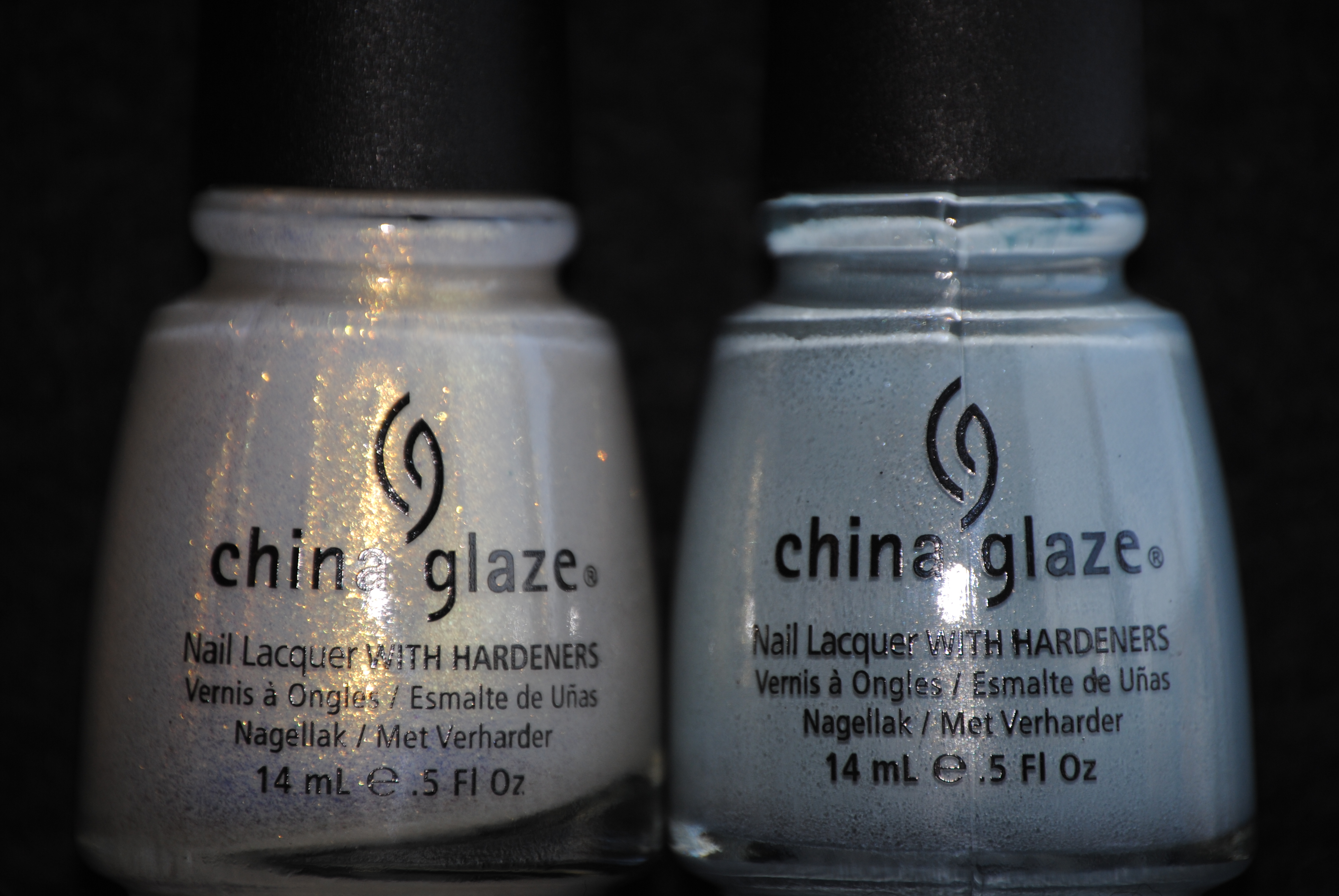
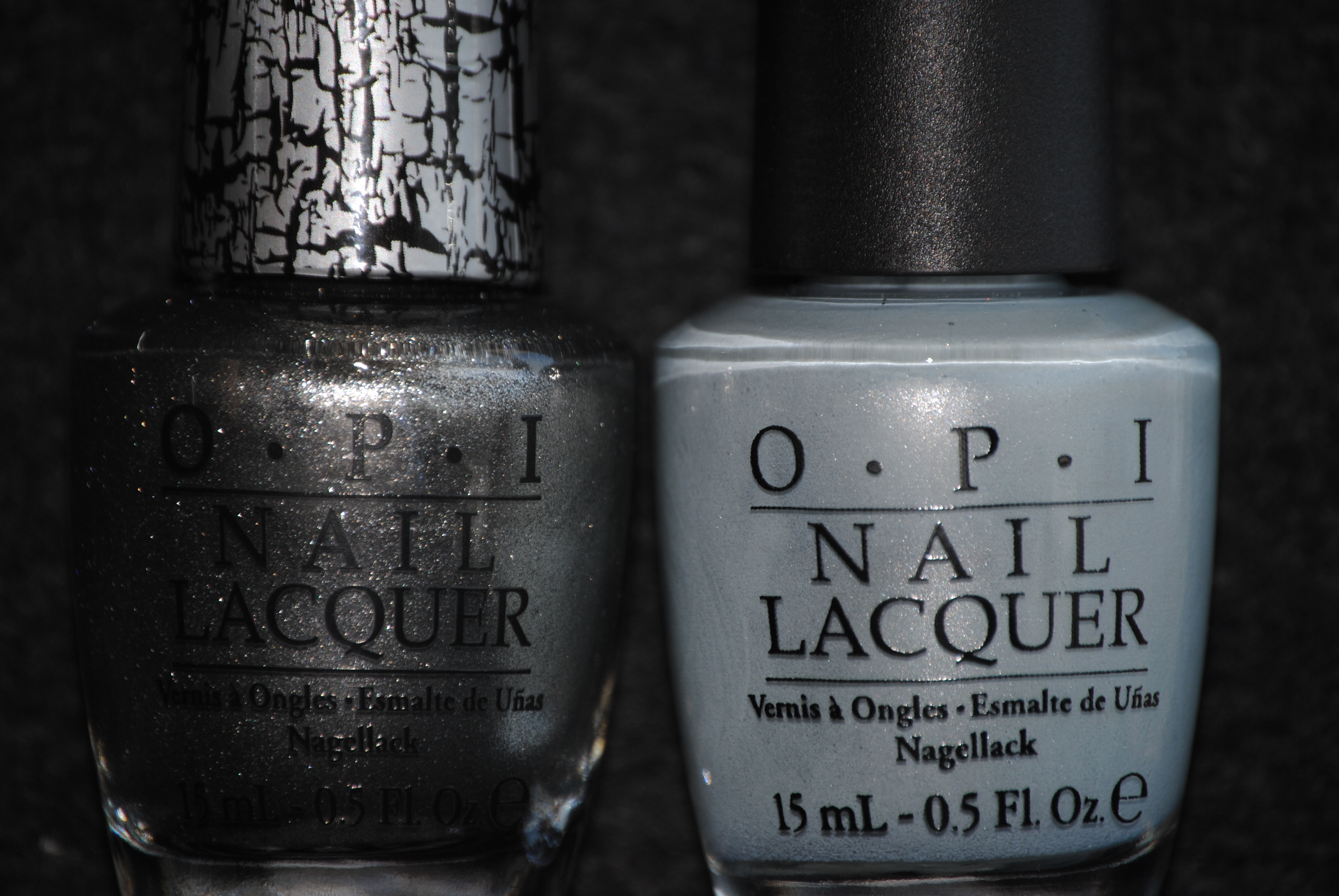
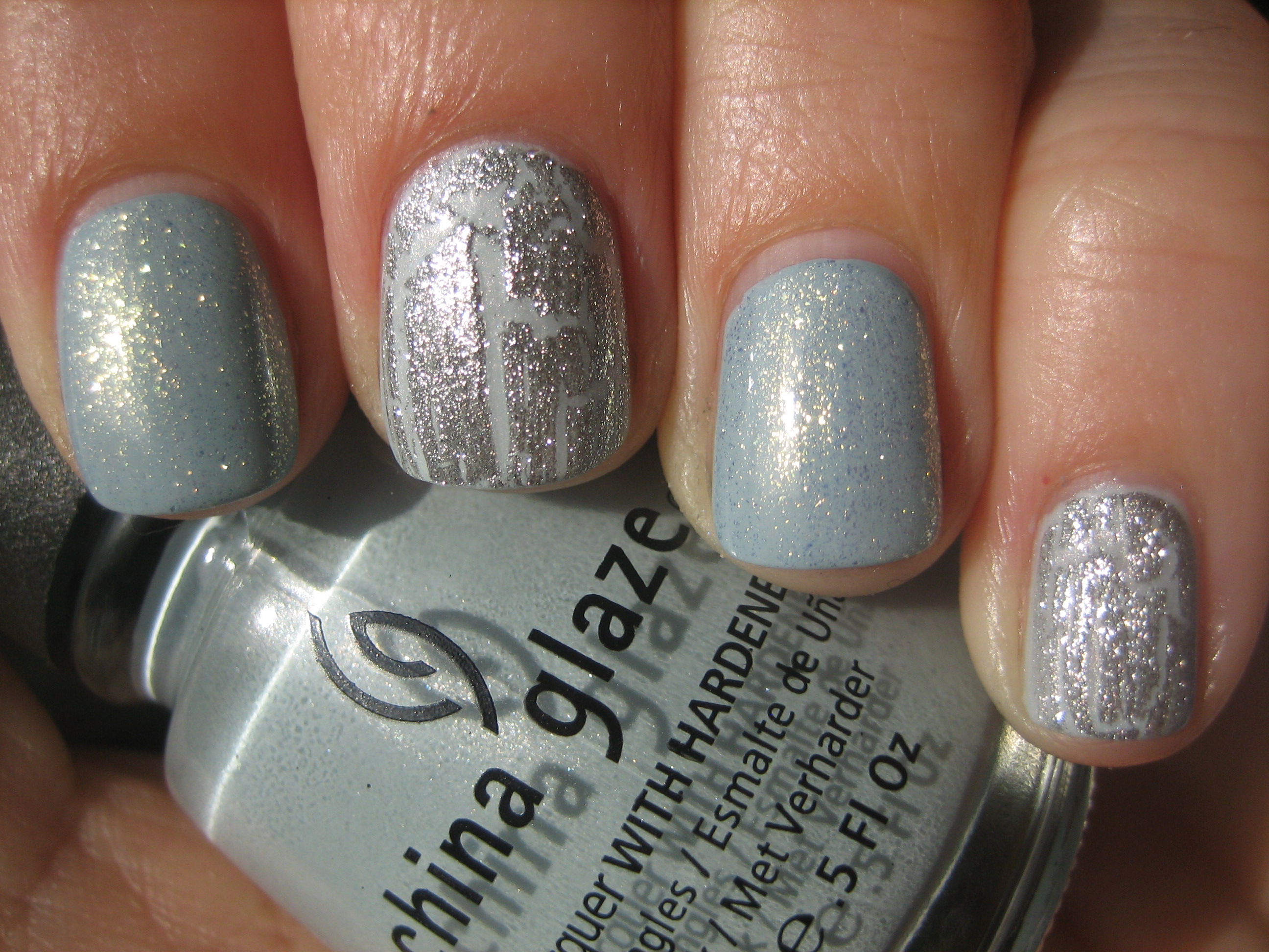
Just for fun, I wanted to see if there was anything I could layer over bot ‘Sea Spray’ and IVTBALS that could add even more visual interest, while not detracting from their delicate and spring-like prettiness. For ‘Sea Spray’ (index & ring fingers), I chose to layer one coat of ‘White Cap’ on top (from the same collection) and even though I wondered if the silver shimmer of ‘Sea Spray’ would clash with the golden shimmer of ‘White Cap’, I actually ended up loving the mix, which gave not only a new depth to the colour, but an unexpected other-worldy radiance to it. Going in another direction, but still in keeping with the same ethereal theme, I layered one coat of OPI’s upcoming ‘Silver Shatter’ over ‘I Vant To Be A-Lone Star’ (middle & pinkie fingers), and was captivated by the lacy effect; looked like crystalline icicles had formed on my nails! Both lovely and so completely different from one another….mesmerizing, no?!
Final thoughts: For me, ‘Sea Spray’ is the hands down winner of the entire Anchors Away collection, although if I were to be completely honest, I also loved every other shade…it’s just that I am partial to these understated grey/blue lacquers. Apart from the formula which was superb, I believe that this is a colour you will not get tired of seeing and will work equally well as a pedicure polish; just picture it against tanned skin! Even though it’s a Spring hue, the grey in its base keeps it from being to overtly pastel and will help it transition easily to Fall, or beyond.

*Disclaimer: product samples were provided by the company/PR for my unbiased consideration


a-england: Merlin, Avalon & Perceval (review/swatches)
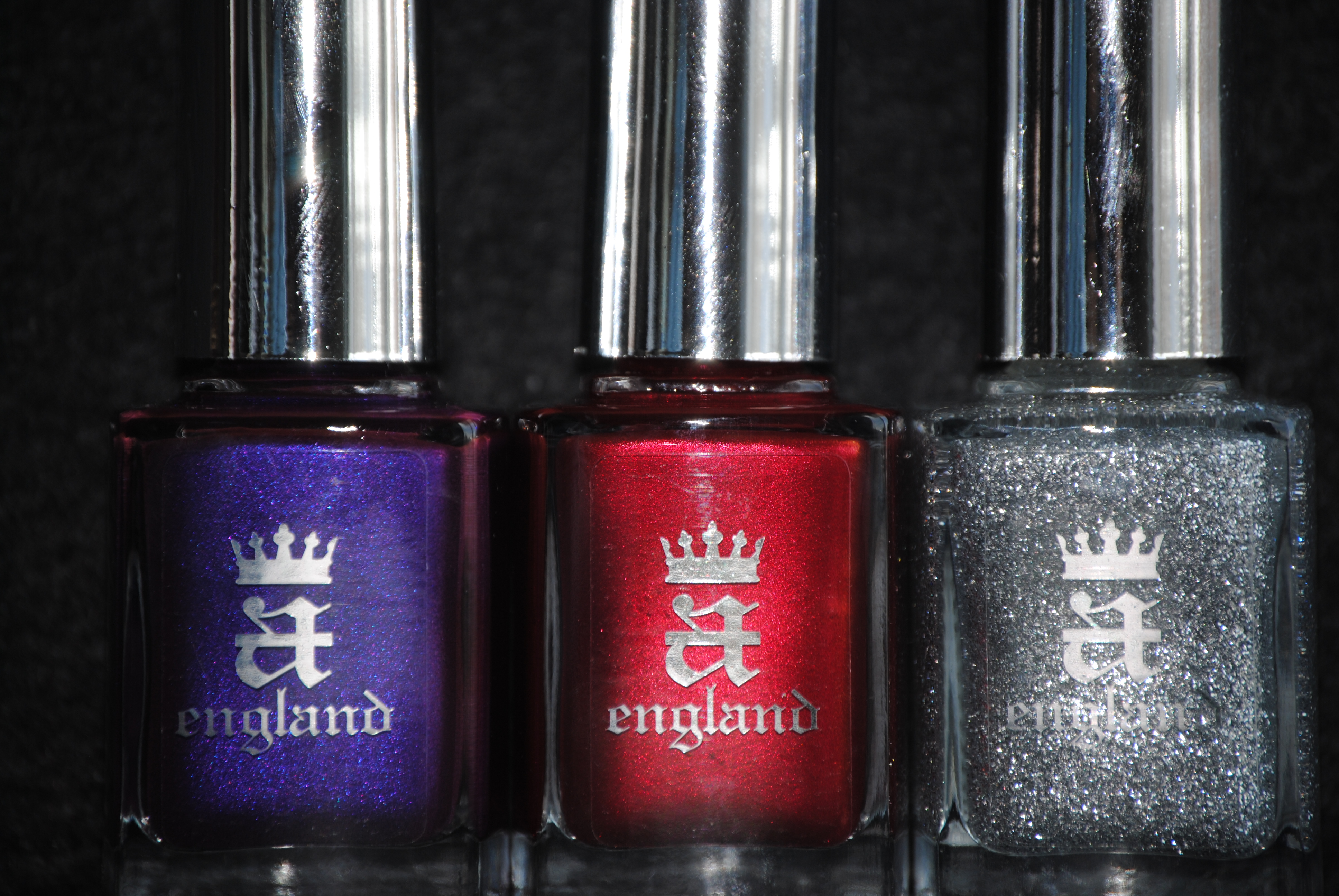
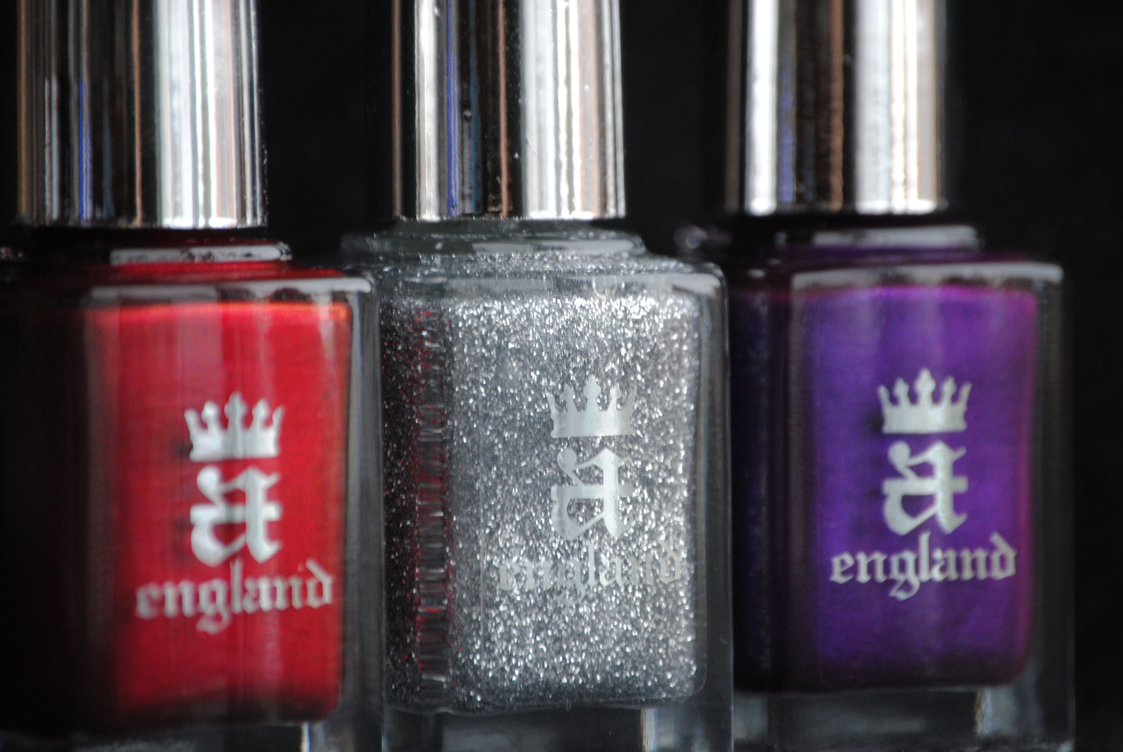
This past January, a new star in the world of nail lacquer, appeared on the horizon: a england. With my first review of these beauties, it was instant LOVE. The jewel-like hues, the incredibly smooth formula, the wonderfully flexible brush plus the high shine finish convinced me that this was a line of polishes of sublime perfection. The brain child of the highly talented Adina Bodana, these are polishes that are meant to “crown your hands and feet“. How appropriate then that her first collection should revolve around that most regal of legends, King Arthur. The three shades I bring you today are Merlin – a stunning silver sparkler, Avalon – deep royal purple and Perceval – intense shimmery garnet. All swatches are with Sèche Natural base coat and two coats of lacquer (except where noted in the comparisons), no top coat.
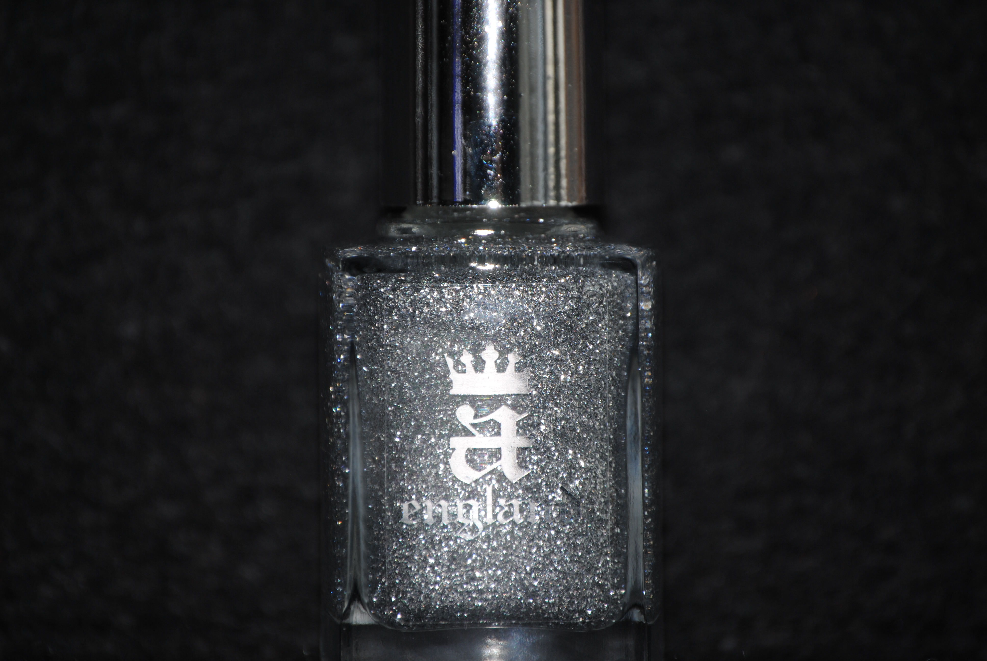
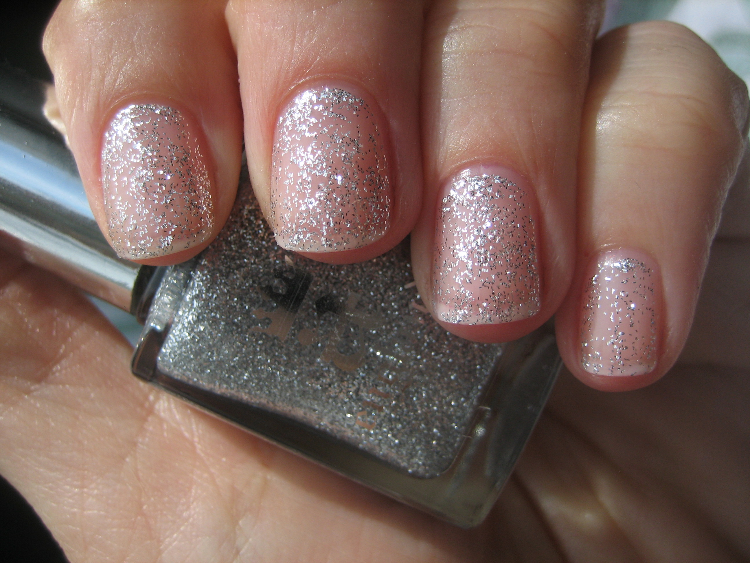
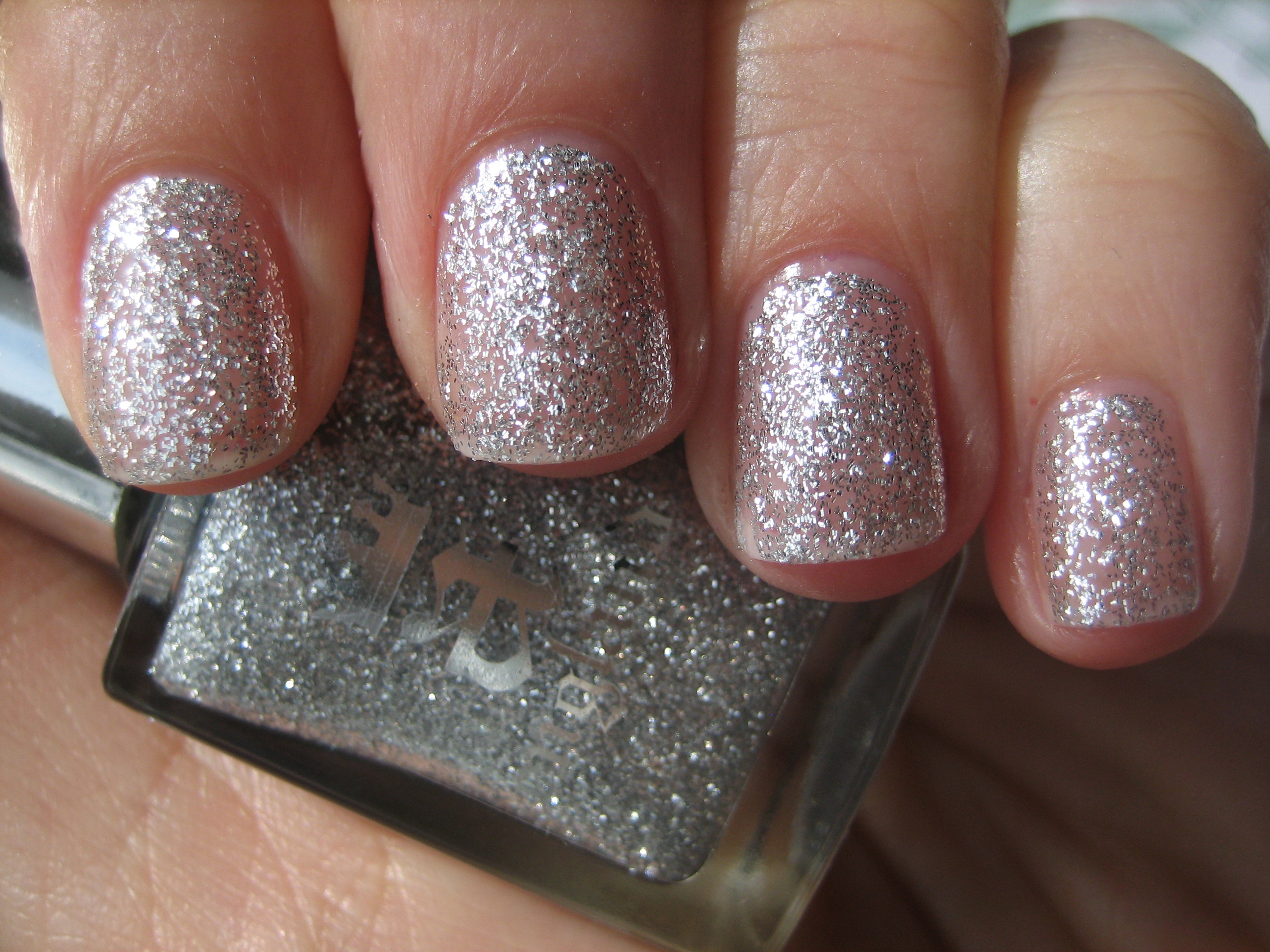
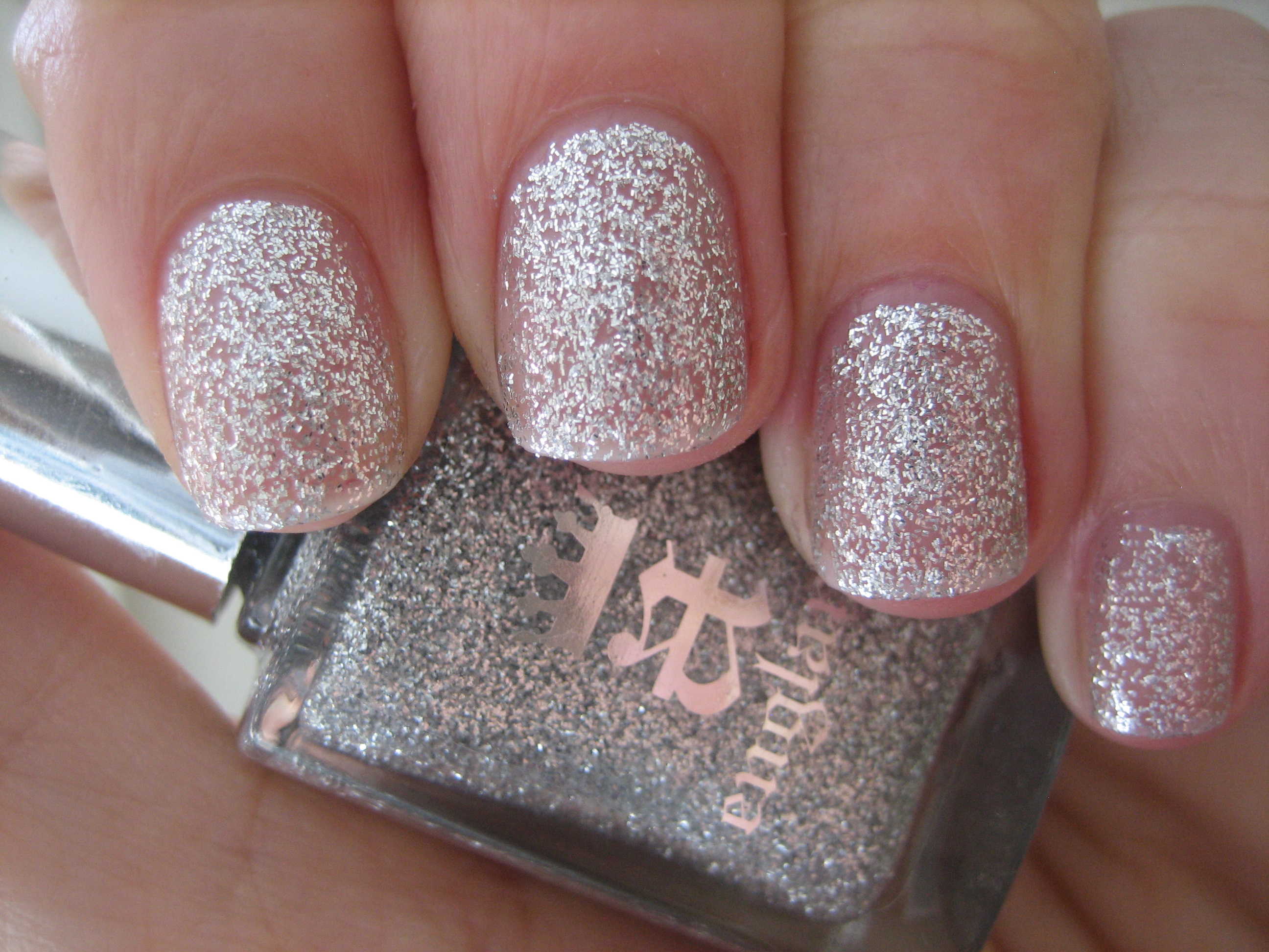
‘Merlin’ is described as a “spectacular scintillating silver” and is exactly that. Filled with varying sizes of both square & oblong pieces of highly reflective silver glitter, this is a semi-sheer polish that builds to good opacity by the second coat. Easy to apply and well flowing, this is excellent as a stand alone shade, or brilliant when layered as a top coat. Top swatch photo: 1 coat, middle photo: 2 coats (both taken in sunlight), bottom photo: indirect light (click to see detail of the glitter pieces). Representative of Merlin’s incandescent magical powers, this lacquer simply glows on your fingertips.
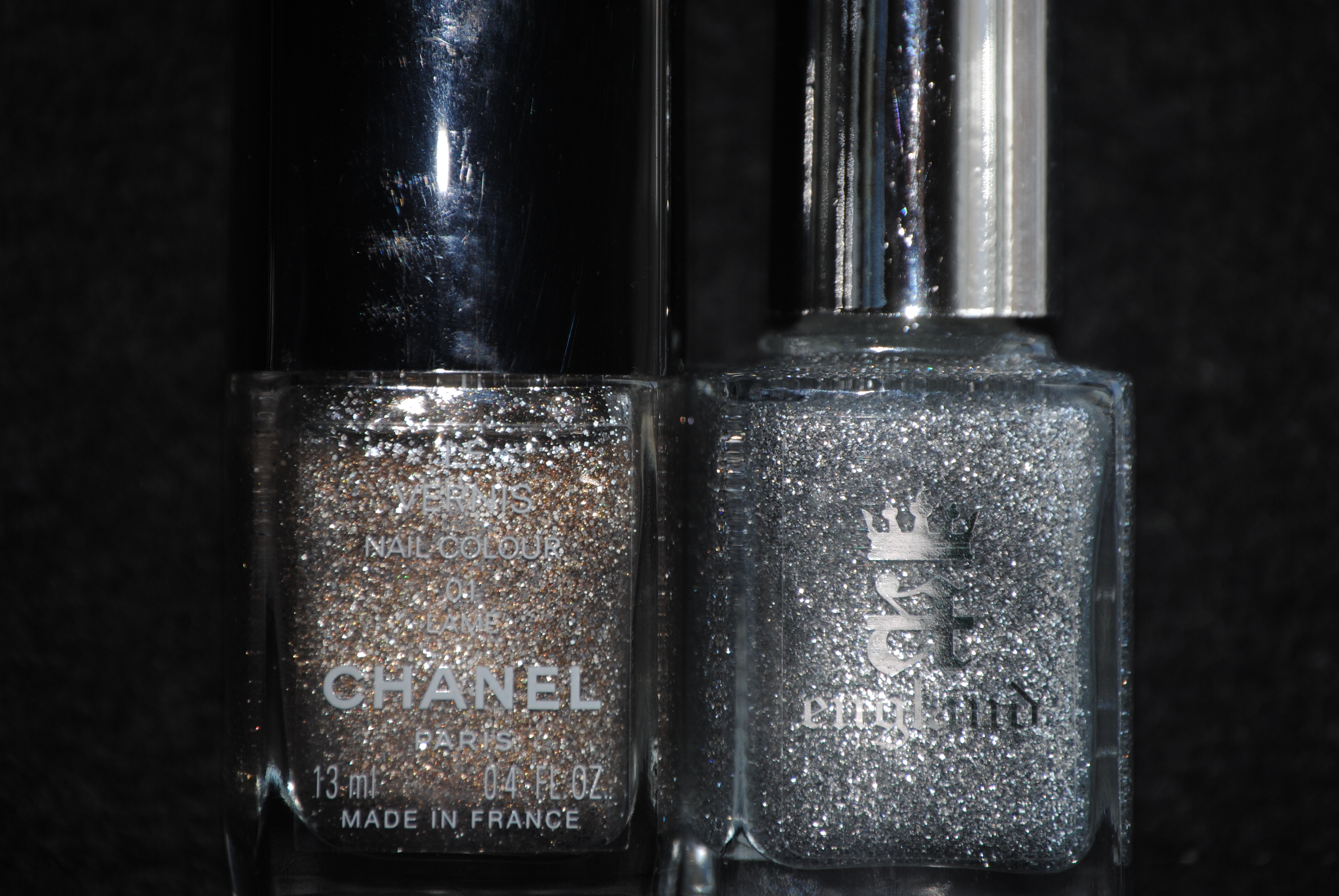
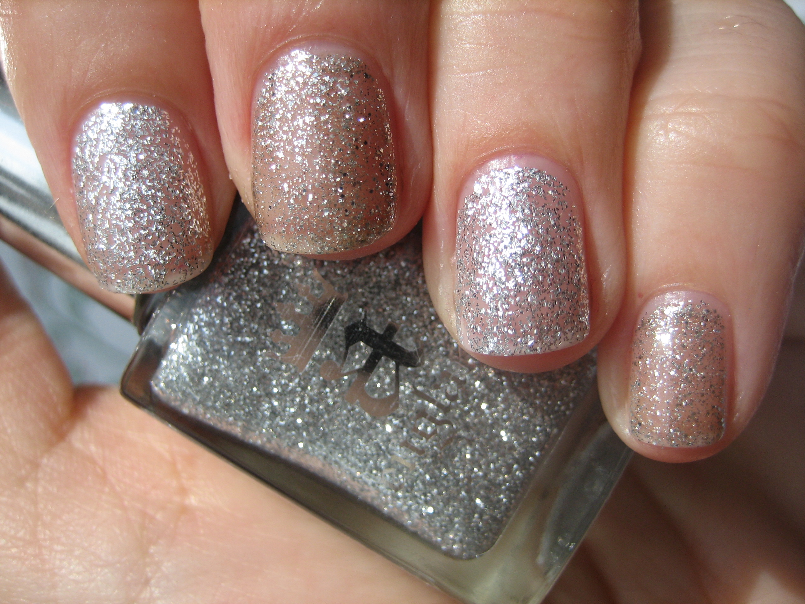
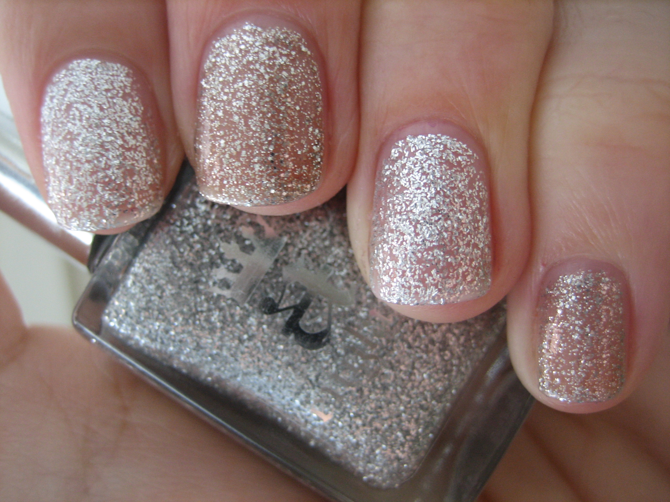
Looking through my stash, I came across CHANEL’s ‘Lamé’ which was the closest in hue and texture, although where ‘Merlin’ is a white-silver, ‘Lamé’ comes across as slightly more golden-tinged. The glitter pieces in ‘Lamé’ are also of only one size, which changes the density of the layering, and the other main difference is that ‘Lamé’ needed three coats to reach the same opacity level of ‘Merlin’, at two coats. Swatch photos above were taken in full sun (top) and indirect light (bottom).
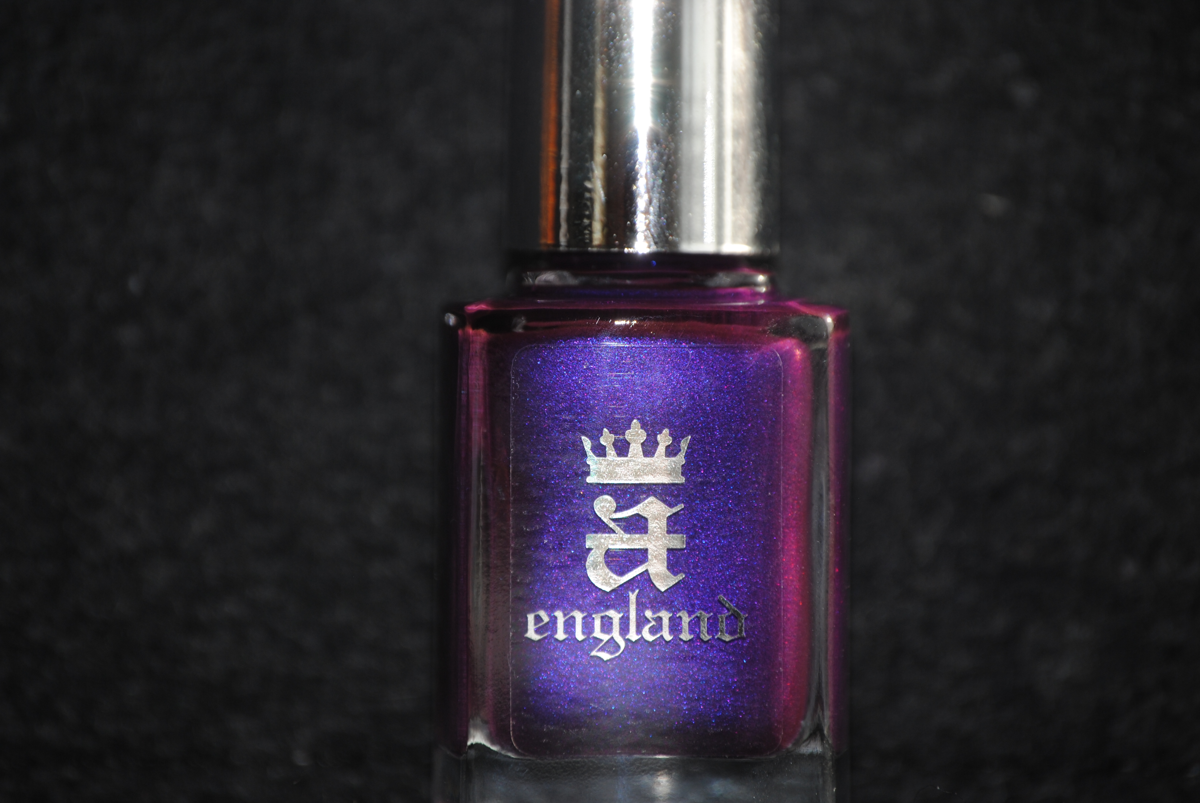
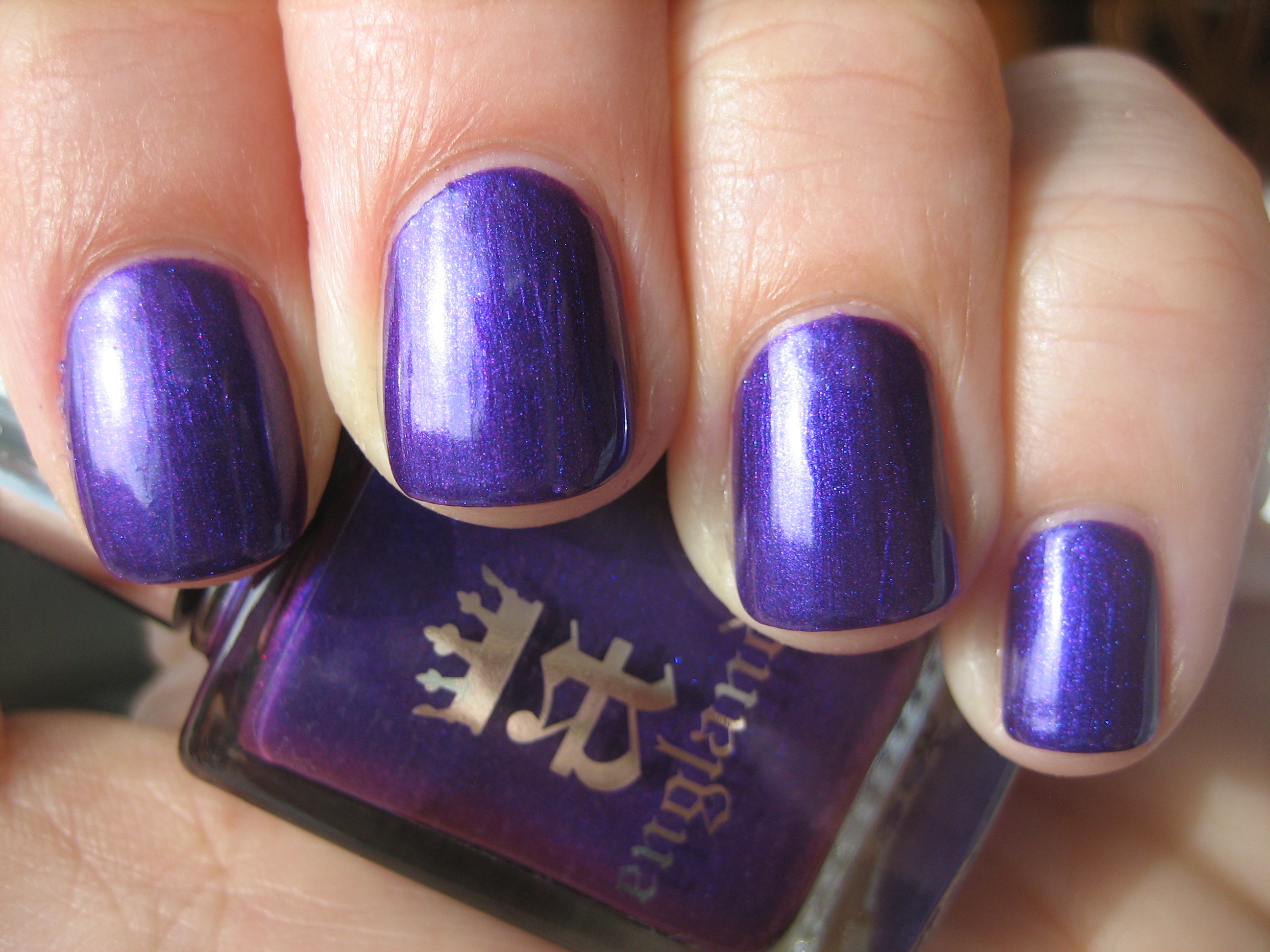
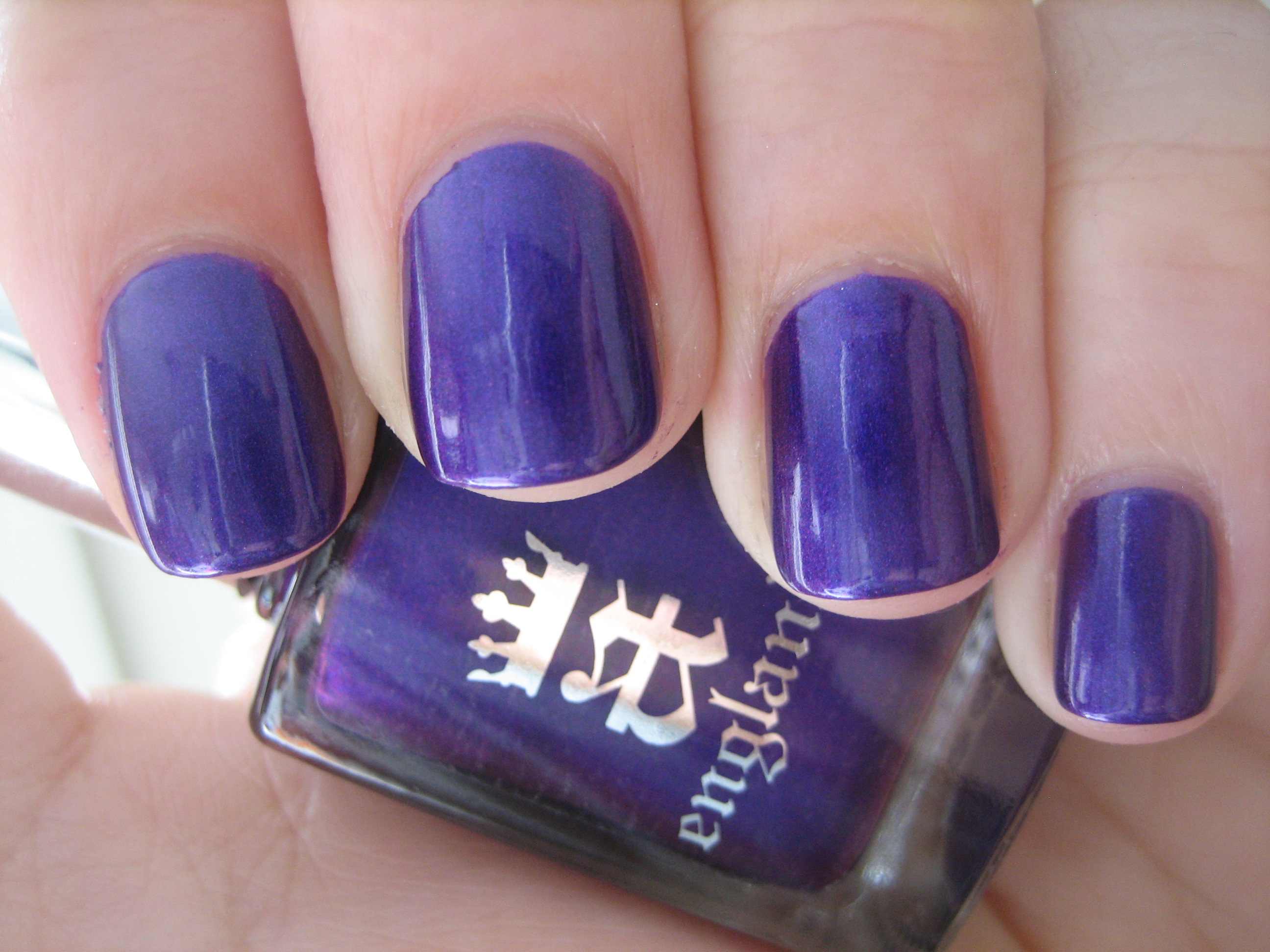
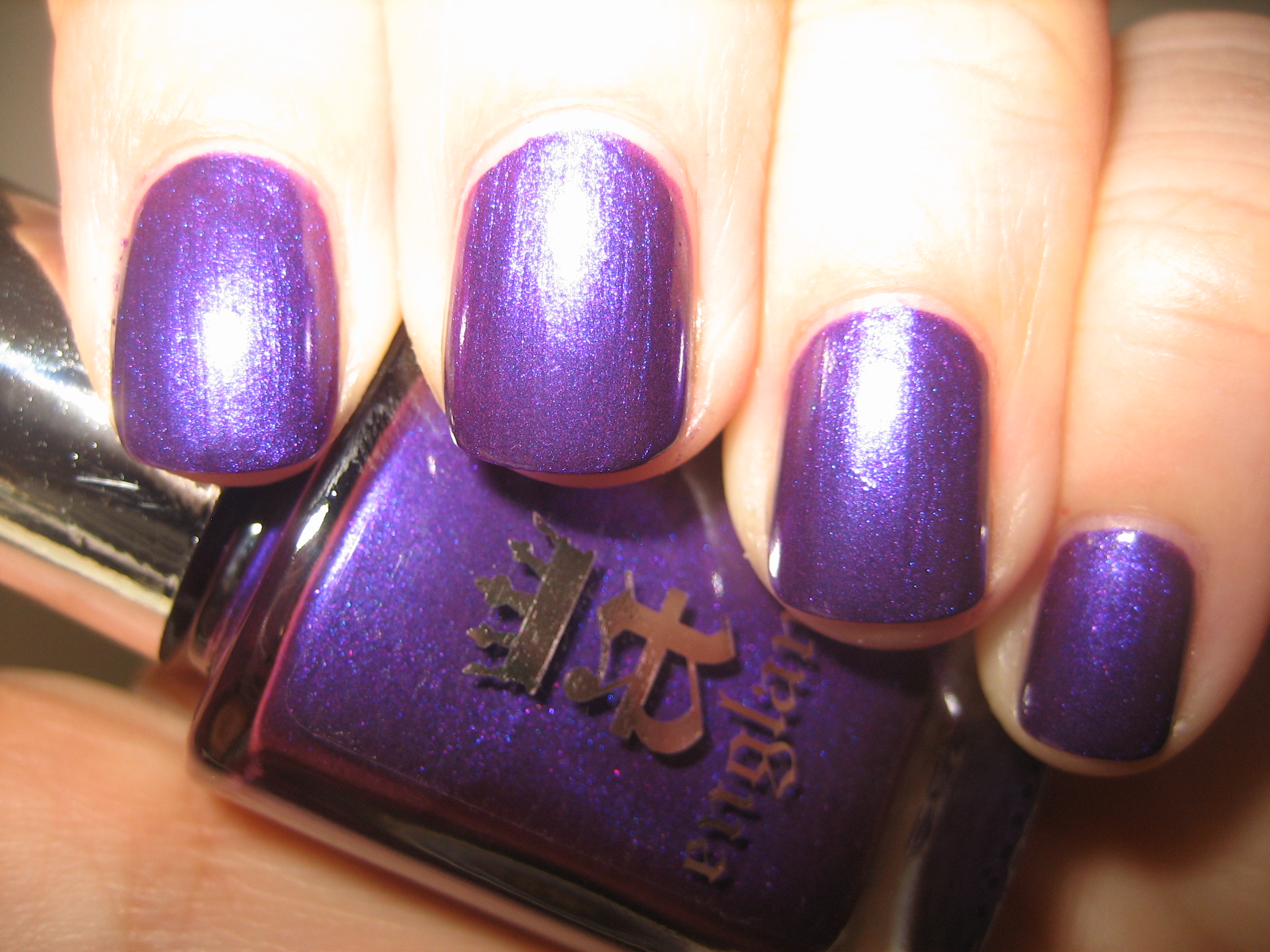
My photos of ‘Avalon’ cannot truly do this shade justice; this is the most regal and intense purple I have yet to come across, and what makes it even more unique is the minute pink and blue shimmer in its depths. So densely saturated in colour, it was practically a one coater, although the swatches here are with two coats. The top and middle swatch photos show it to pull more bluer than it actually is, while the last photo (taken with flash) gives a better indication of its true violet undertones. Application was flawless with the loveliest glassy finish. ‘Avalon’, the royal and sacred island, home to Vivian, The Lady of the Lake…and some say the final resting place of King Arthur himself. This shade is truly breathtaking!
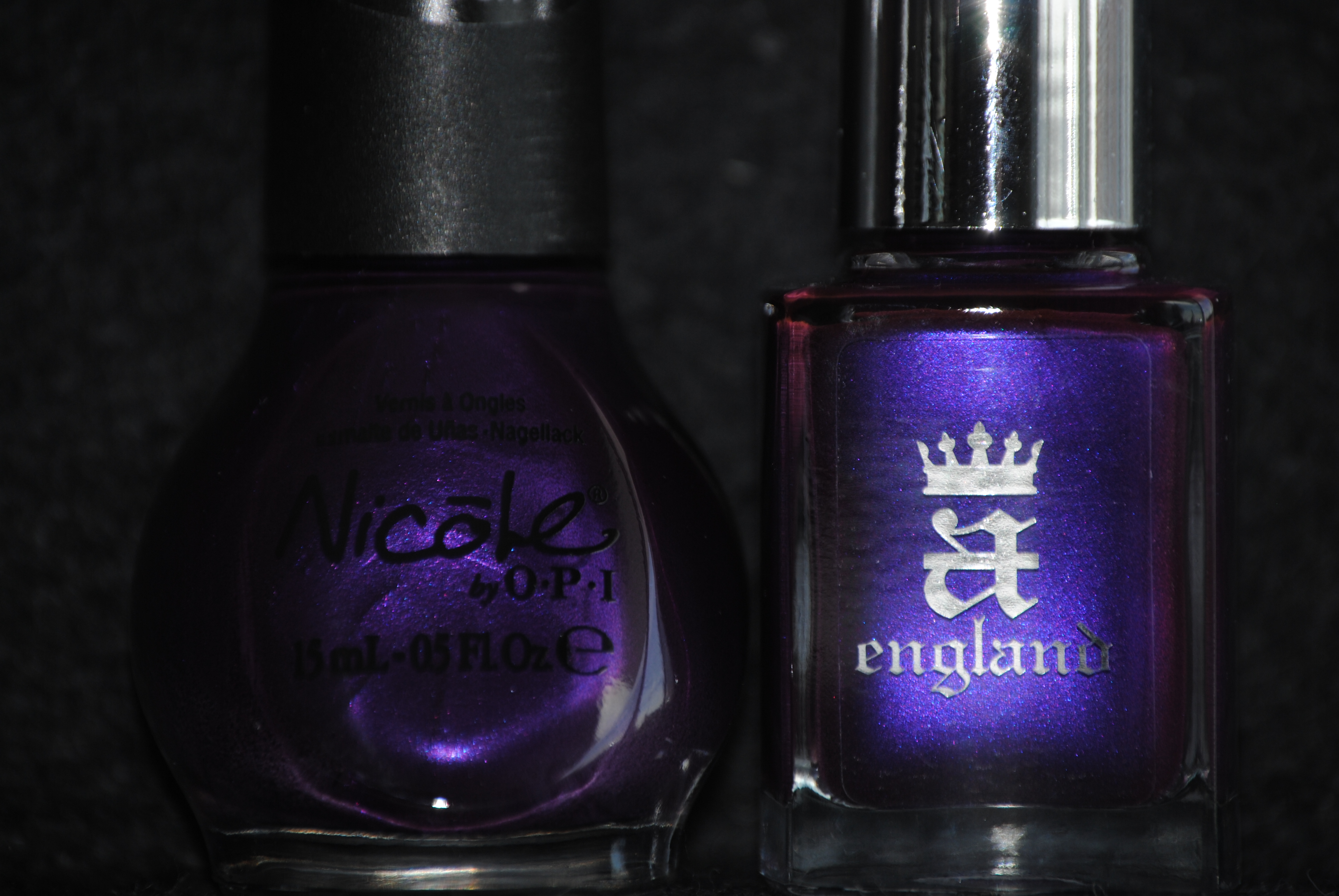
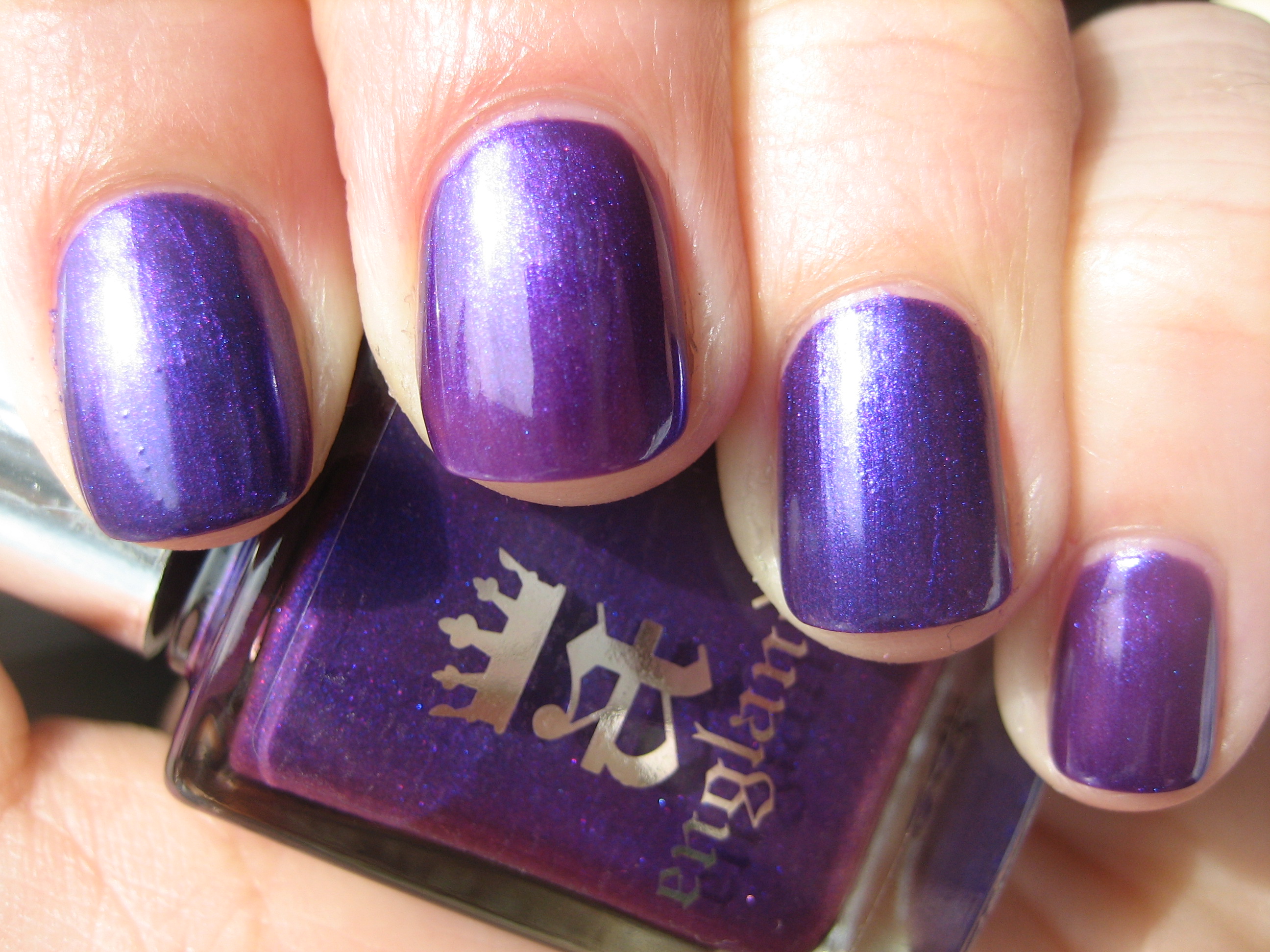
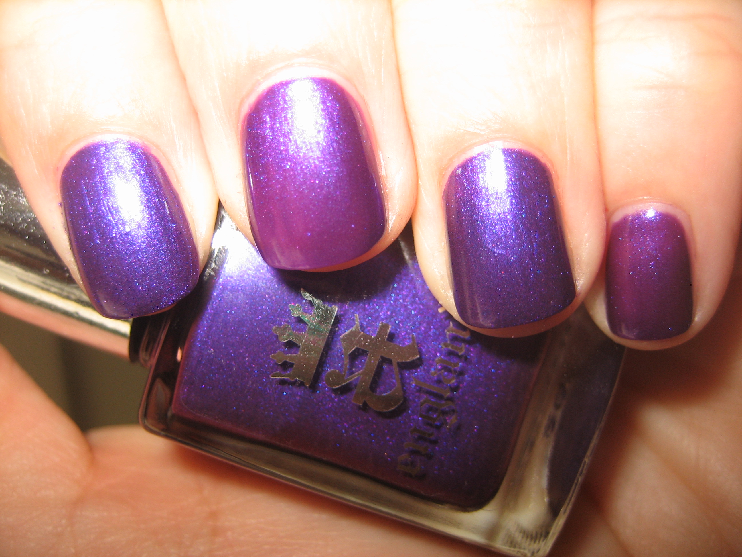
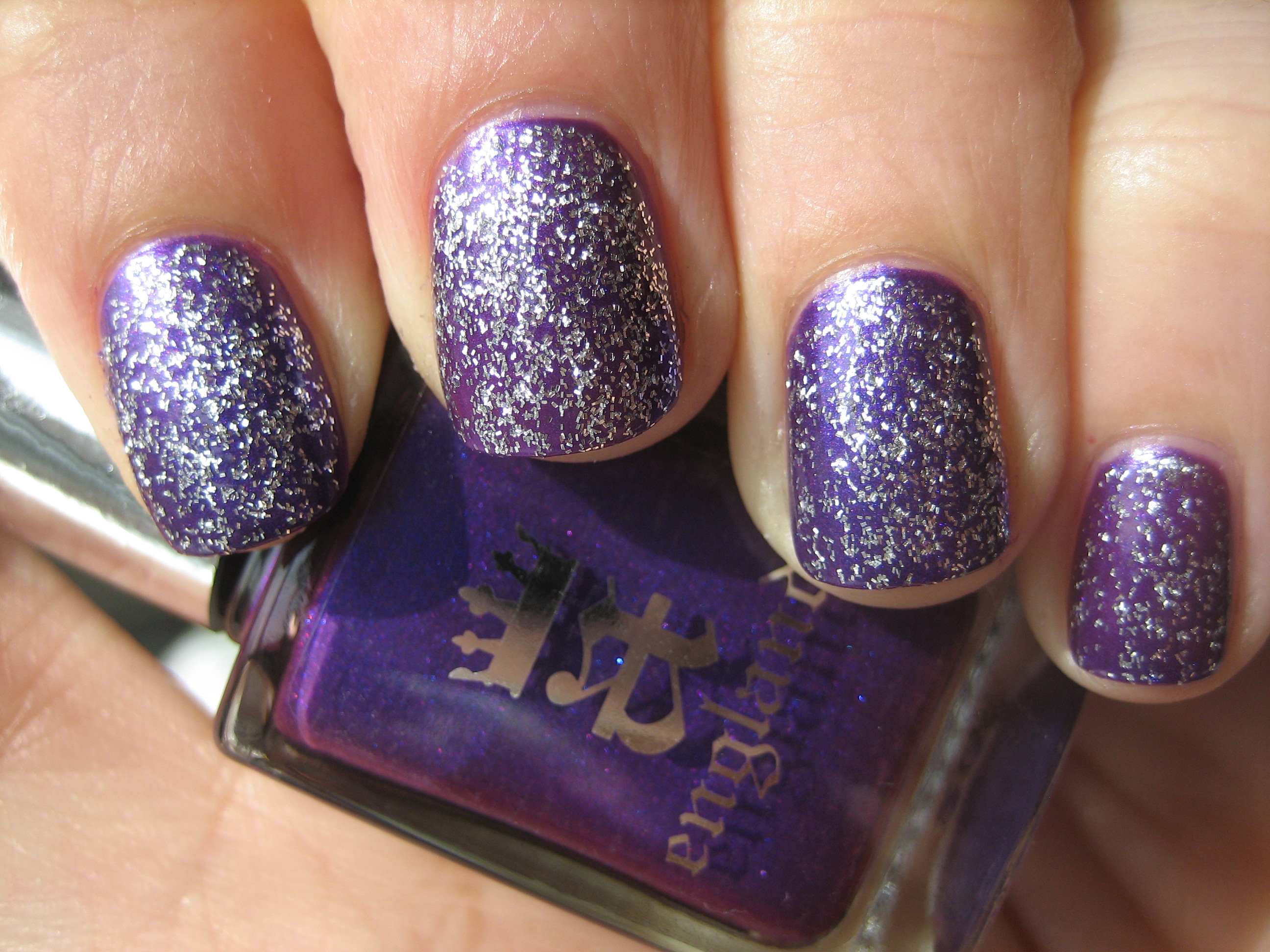
Of course, when I looked for a match, I found only one that came somewhat close: Nicole by OPI’s ‘Prized Possession Purple’ from the One Less Lonely Girl collection. While both shades bear similar blue & pink micro shimmer, ‘Prized Possession Purple’ is definitely a lighter hue and much more sheer, needing three coats to come close to the opacity of ‘Avalon’s’ two coats (top photo taken in sunlight, bottom photo with flash). To make things interesting, I then layered one coat of ‘Merlin’ on top and was captivated by the pattern, which looks almost like stars glimmering in a twilight sky. Swatch photos above are: index & ring fingers – ‘Avalon’, ring & pinkie fingers: ‘Prized Possession Purple’.
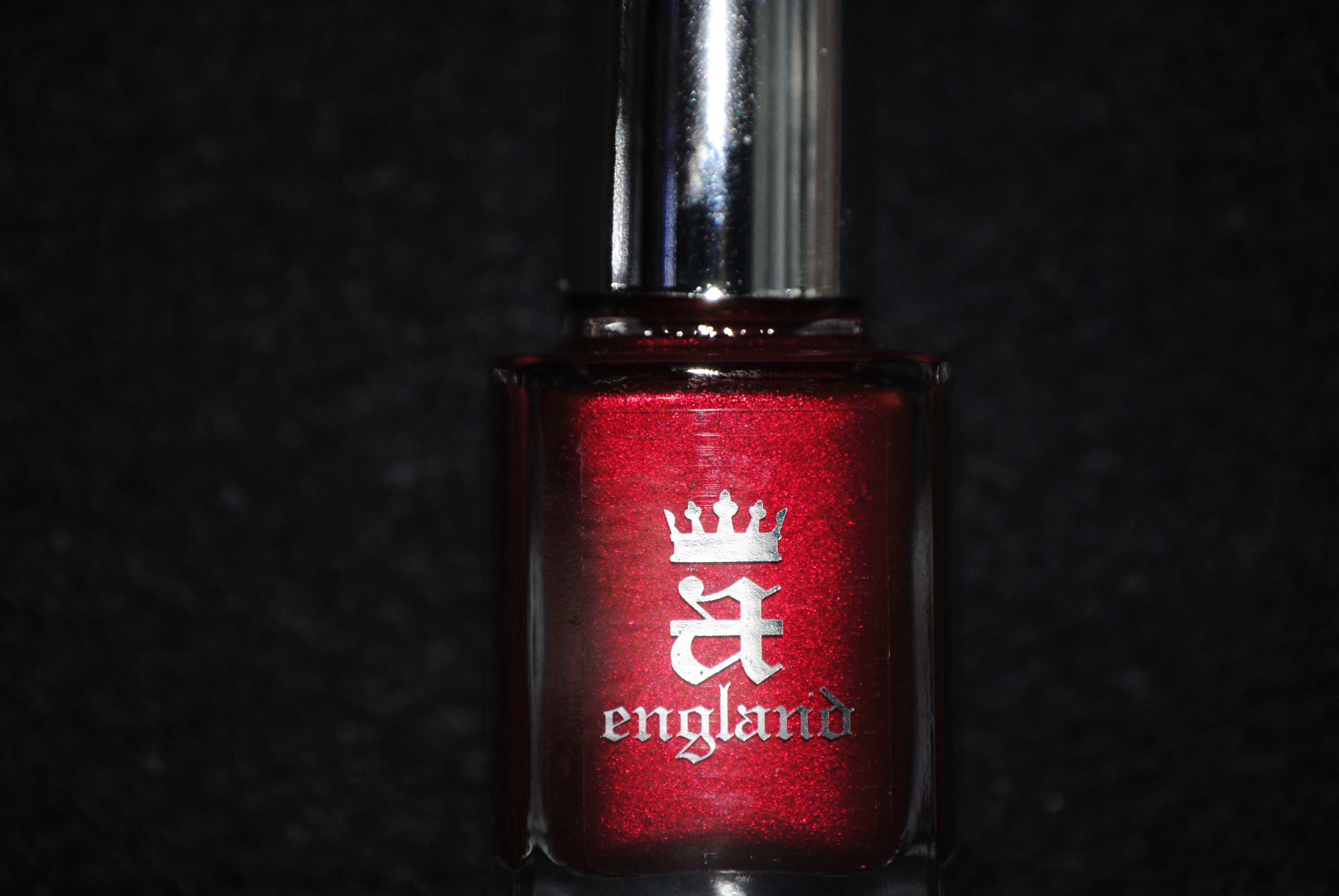
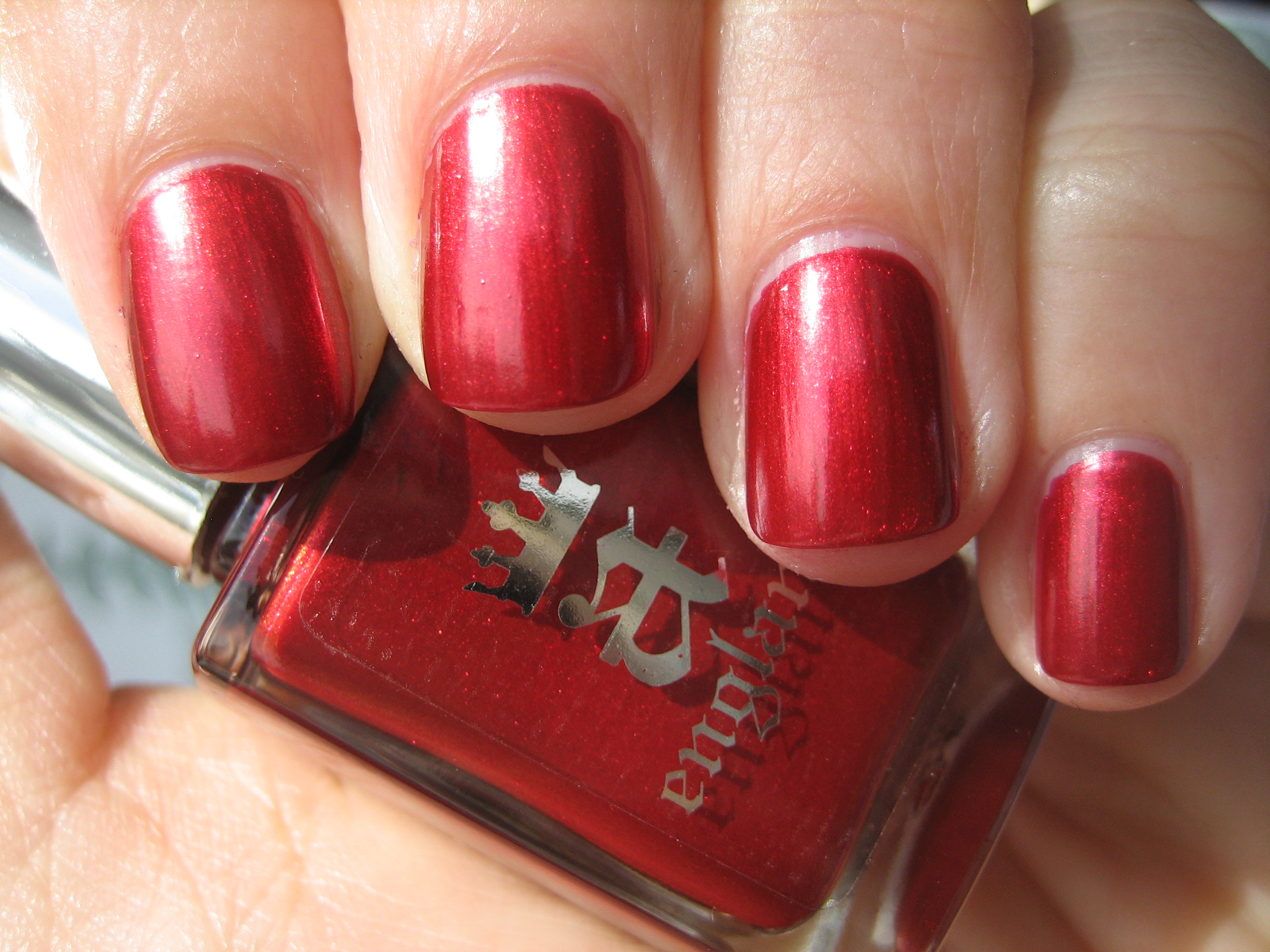
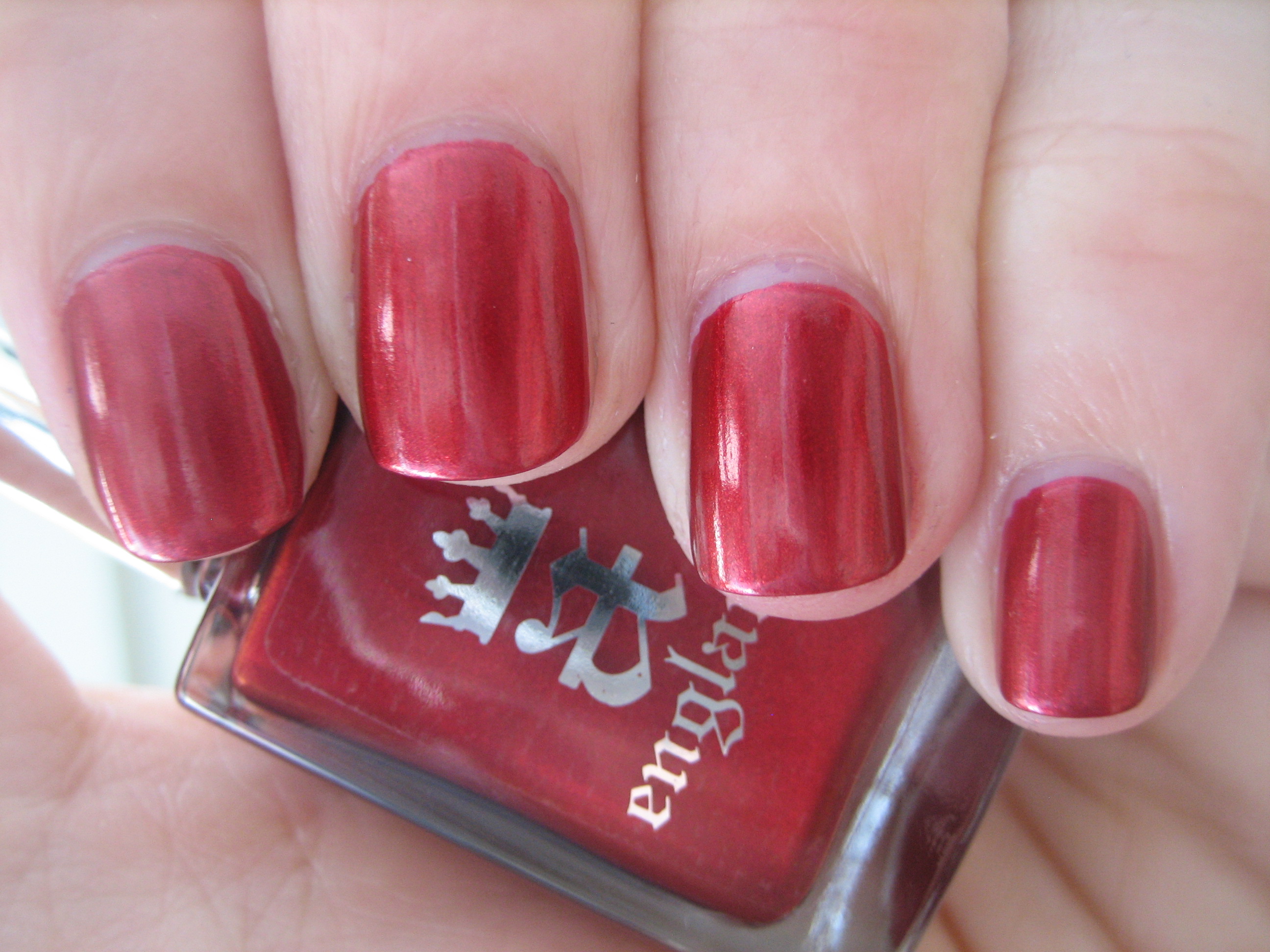
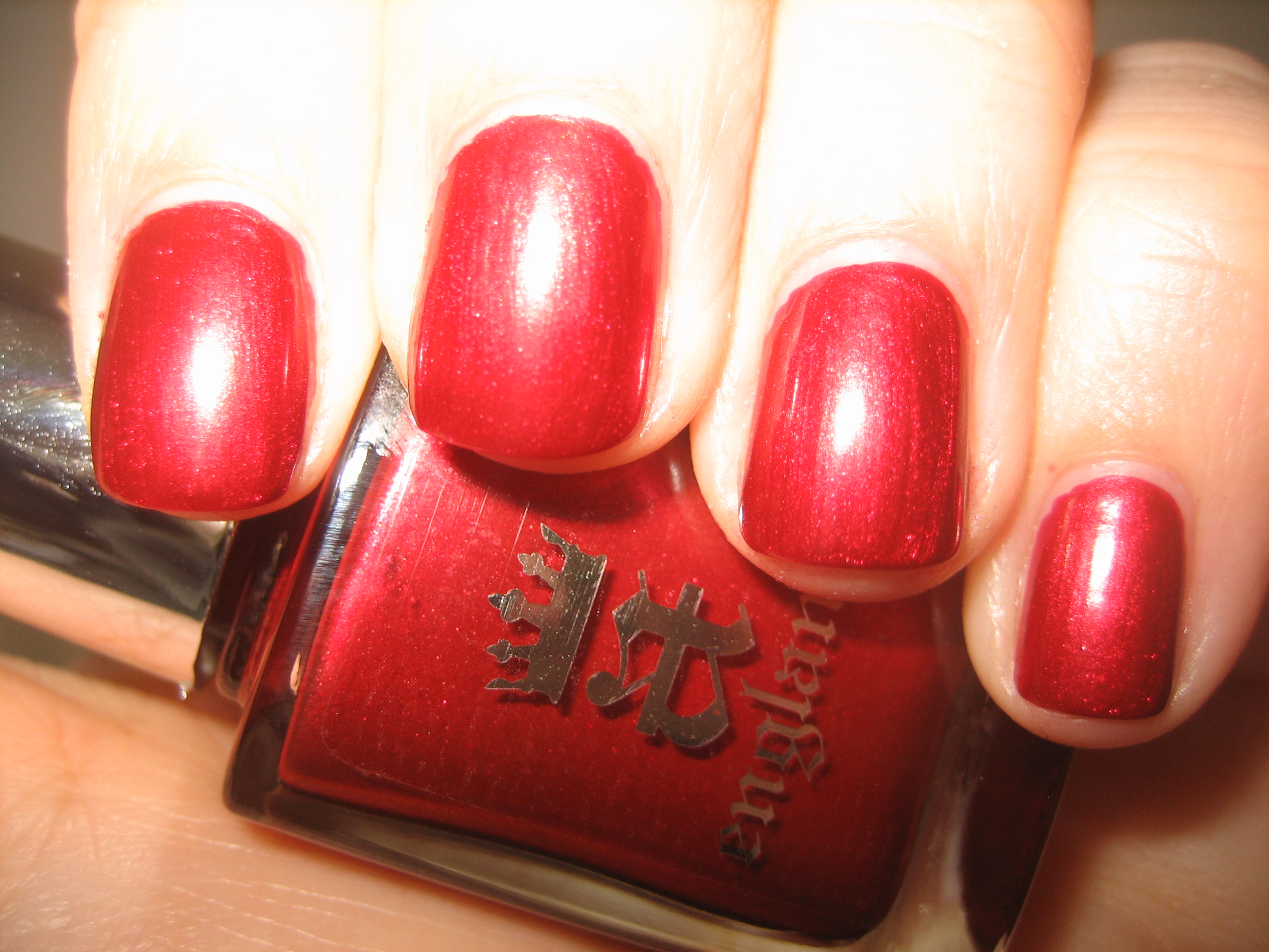
‘Perceval’ has an indescribable raw beauty; this is a deep almost ruby shade, with incredibly fine golden shimmer seeming to simmer in its depths. I fell for this ‘lit-from-within’ shade from the moment I saw it, and having such an incredible formula to work with, made it that much sweeter. Note how when seen in sunlight (top photo) as compared to indirect light (middle photo) the colour shifts from fiery to slightly cooler, while flash (bottom photo) brings out all the internal glimmer. This is an intense, jewel shade and will compliment all skin tones…I dare you to try and stop looking at it when you wear it! It is so fitting that ‘Perceval’ is a red, being the colour representative of loyalty and undying love, as was this virtuous knight who swore his allegiance to King Arthur, and legend has it that he was among those knights who found the Holy Grail to help heal his dying king. A true swoon-worthy shade…love!
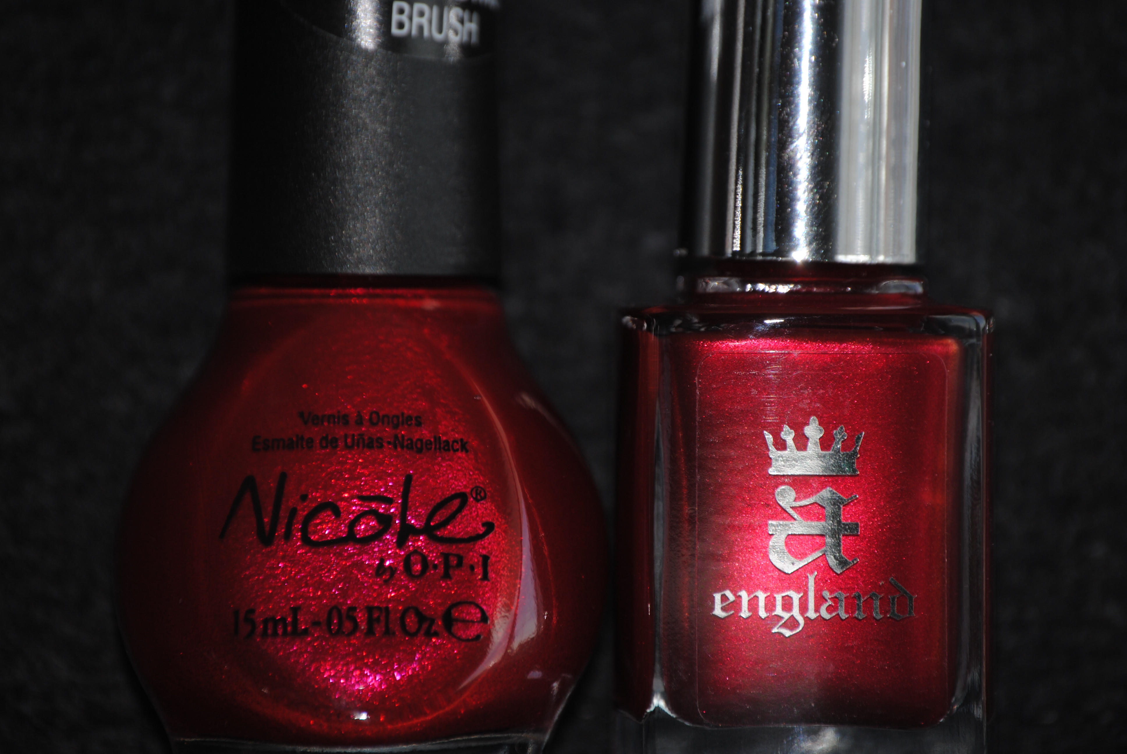
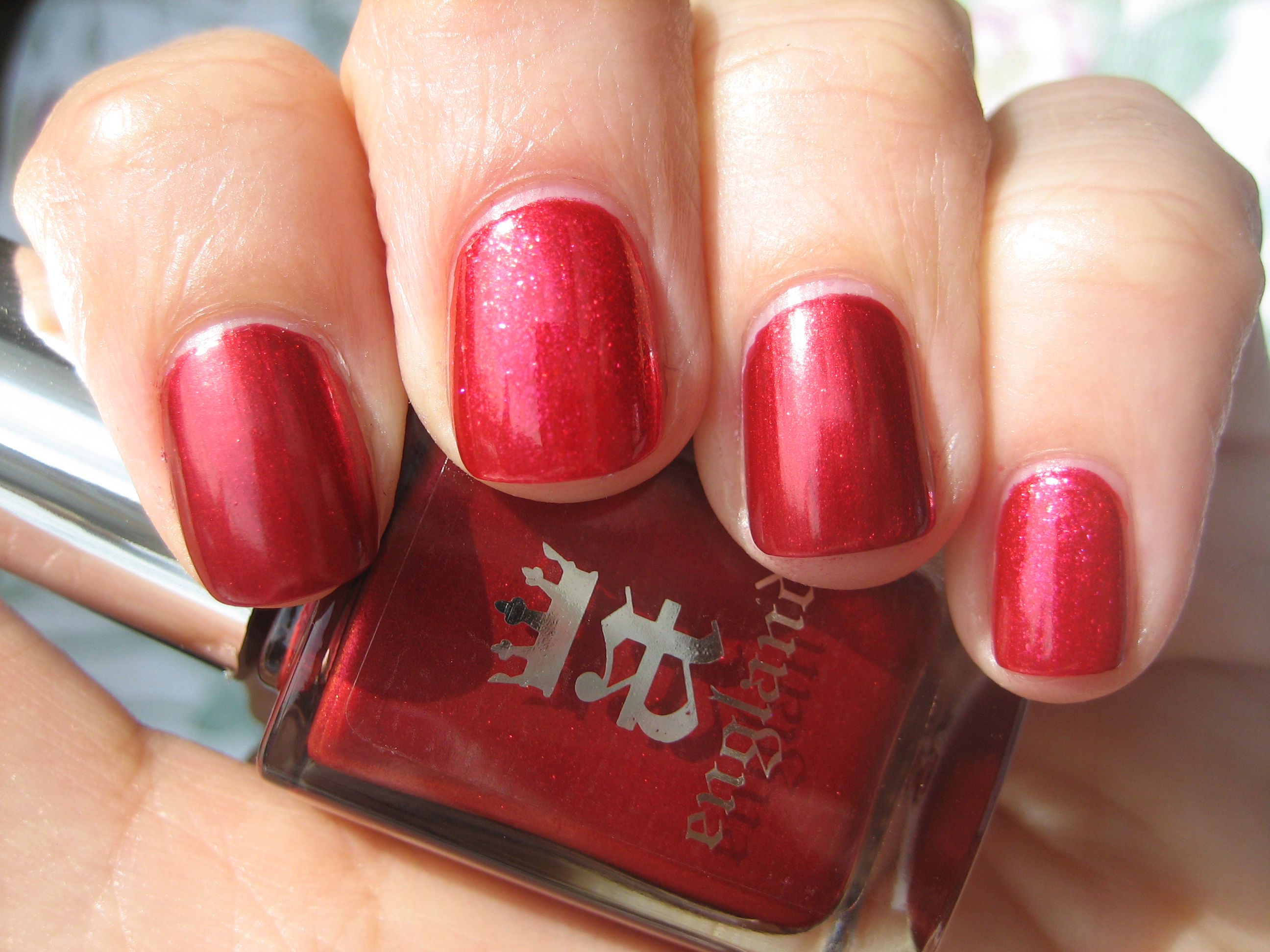
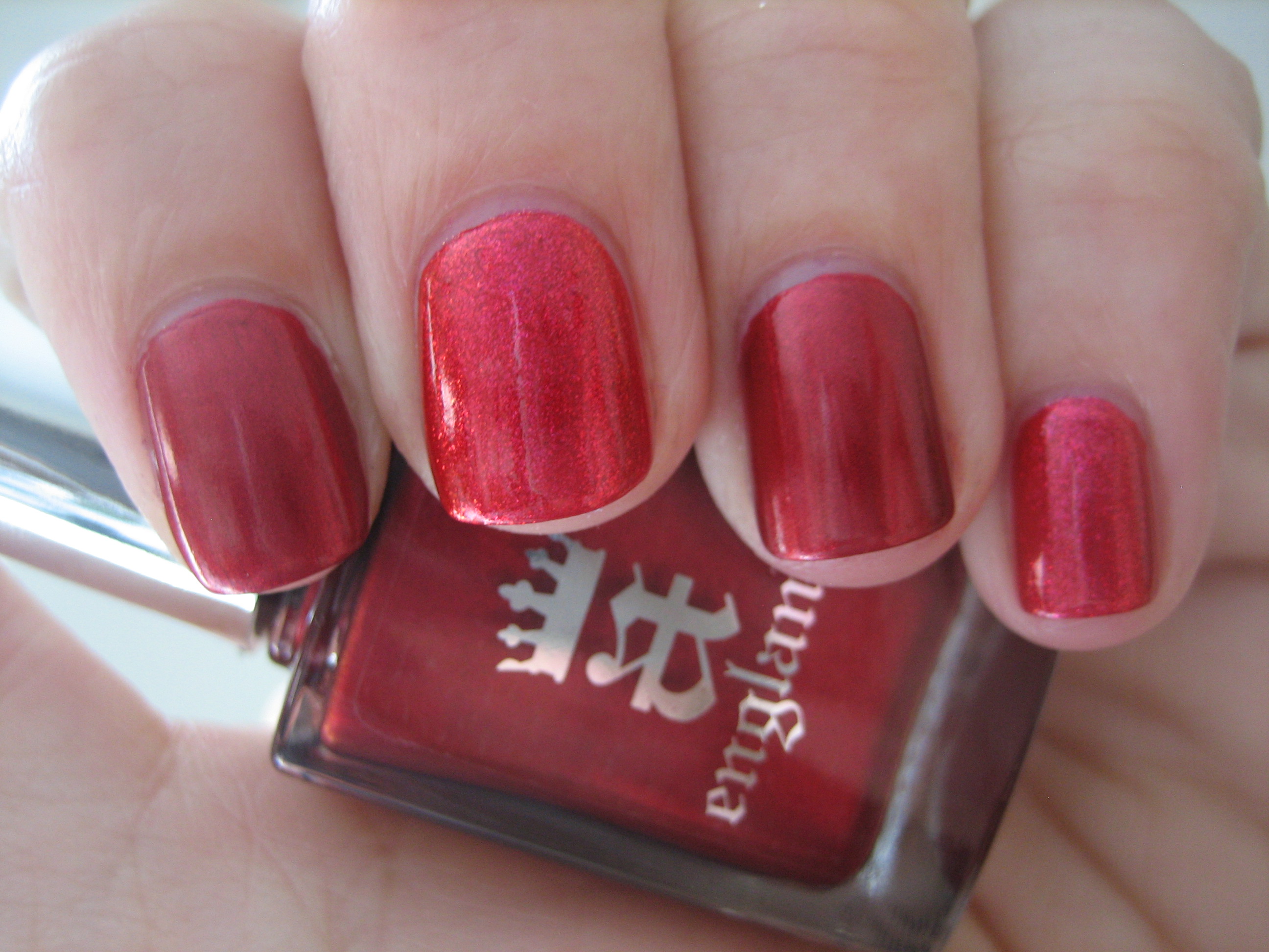
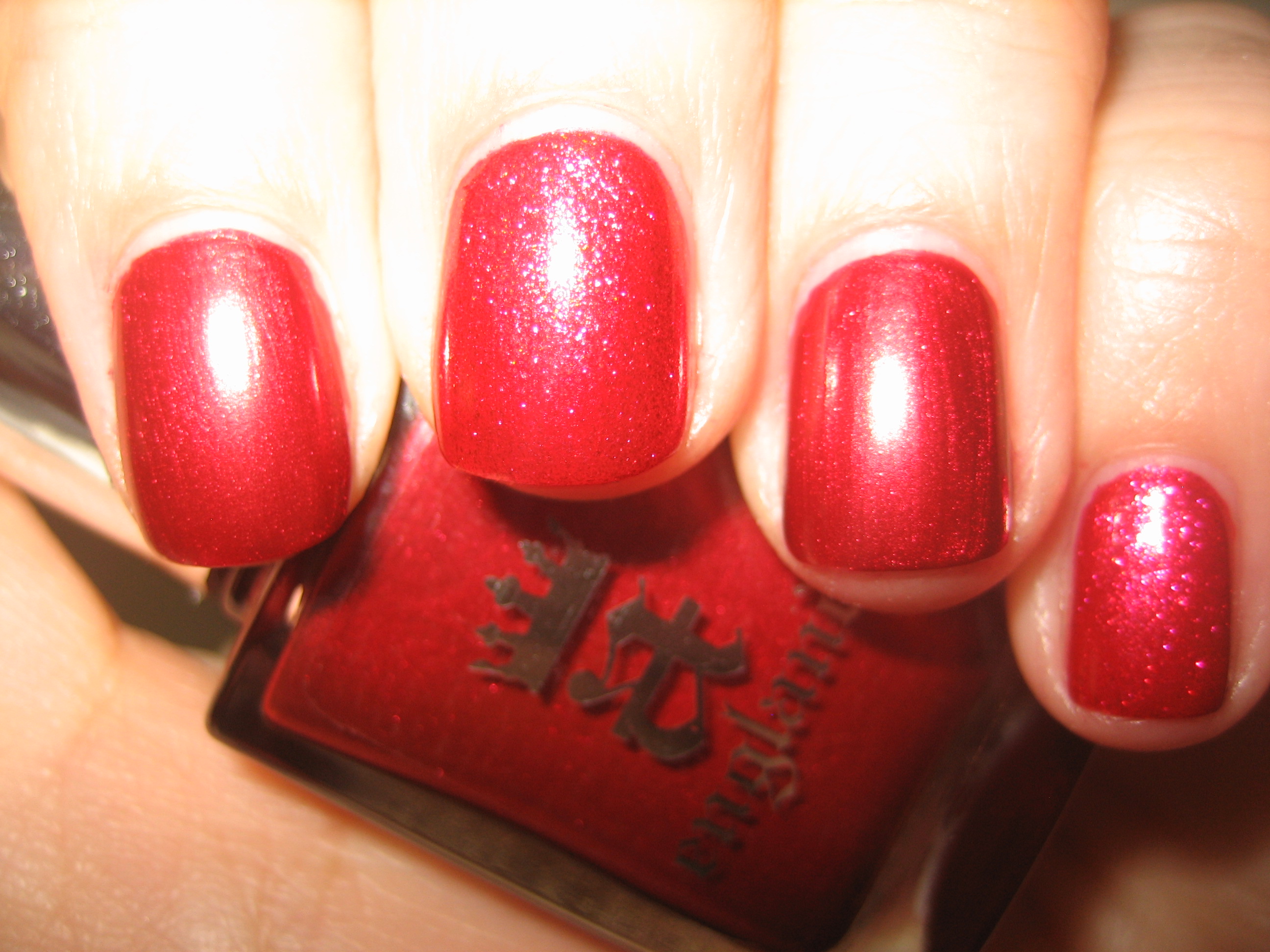
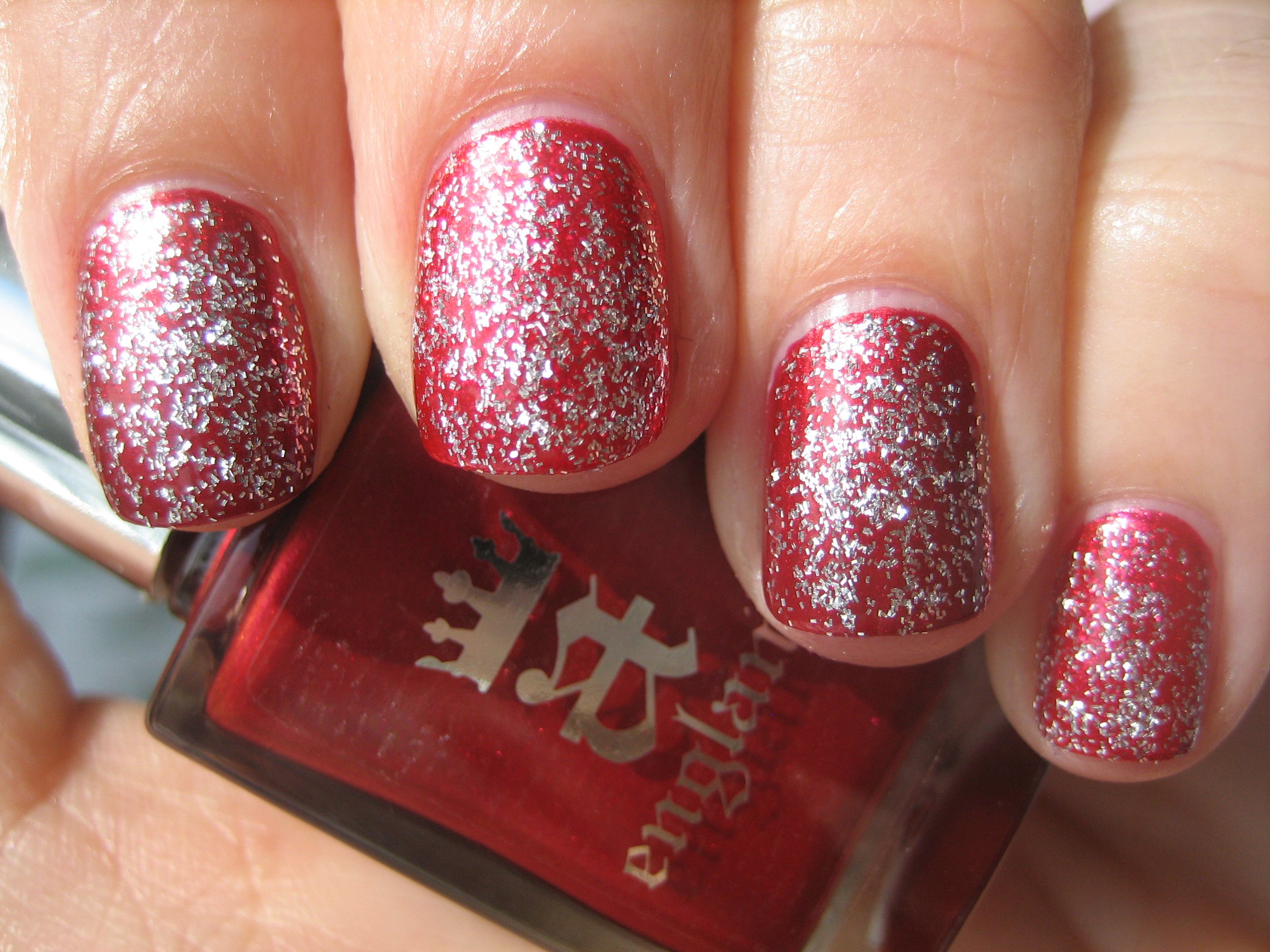
In my stash of numerous red shades, once again the closest I came to a match was with Nicole by OPI’s ‘OMB!’ from the One Less Lonely Girl collection, but there are still significant differences. First of all, ‘OMB!’ is much more sheer, requiring three coats to reach the opacity of ‘Perceval’s’ two coats, and the former’s base shade is several tones lighter and more pink tinged. ‘Perceval’s’ base is somewhat more saturated as well, making the shimmer particles of ‘OMB!’ seem slightly sparser. Even with a coat of ‘Merlin’ layered on top, you can still see the deep ruby hue of ‘Perceval’ peeking through. Swatches photos above are: index & ring fingers – ‘Percival’, middle & pinkie fingers – ‘OMB!’.
Final thoughts: From the six shades I have reviewed and swatched to date of this incredible new line, I cannot help but be so impressed across the board, from the richness of the colours, the almost self-levelling formula, the excellent brush and the high gloss shine. They are colours we may have seen before, but somehow Adina manages to infuse each and every shade with that little extra magical touch, taking them from the ordinary to the sublime. Worthy of their regal and historical heritage, these are shades suited for royalty….or for anyone who always dreamed of being a princess, at the very least! This line of exquisite lacquers can be purchased through their website and they also offer international shipping…you really have no reason not to try them now! If you’ve been wanting to try these polishes out, here’s another incentive: from now until April 16th, and when you join a-england on their Facebook page, receive 20% off your entire order by typing in the promo code available.

*Disclaimer: product samples provided by the company/PR for my unbiased consideration
OPI Texas Collection – Big Hair…Big Nails (swatches & review)

To round up my review on OPI’s Texas Collection (part 1 reviewed here, part 2 reviewed here and part 3 reviewed here), today I bring you ‘Big Hair…Big Nails’, a creamy coral which comes in their new sorbet finish. This collection has proven to be a surprising sleeper; originally, most people didn’t seem to be enthusiastic about either the shades or the textures, but once it was released and we all got the chance to try these lacquers out for ourselves, it was pure love! The sorbets, or jellies in particular, have garnered much attention, as much for their ease of application and as well for their glorious glossiness. All swatches are with Sèche natural base coat and three coats of lacquer, no top coat.


‘Big Hair…Big Nails’ (big name too!!) is vibrant without being neon, jelly and creamy at the same time, and just so ridiculously shiny, it almost hurts the eyes! This is a true coral shade with tangerine leanings, and will work with practically every skin tone without ever coming across as overwhelming. Note how in full sun (top photo), the colour just seems to pop and seems to be almost melon based, while seen in the shade (bottom photo) it can look rather orange.
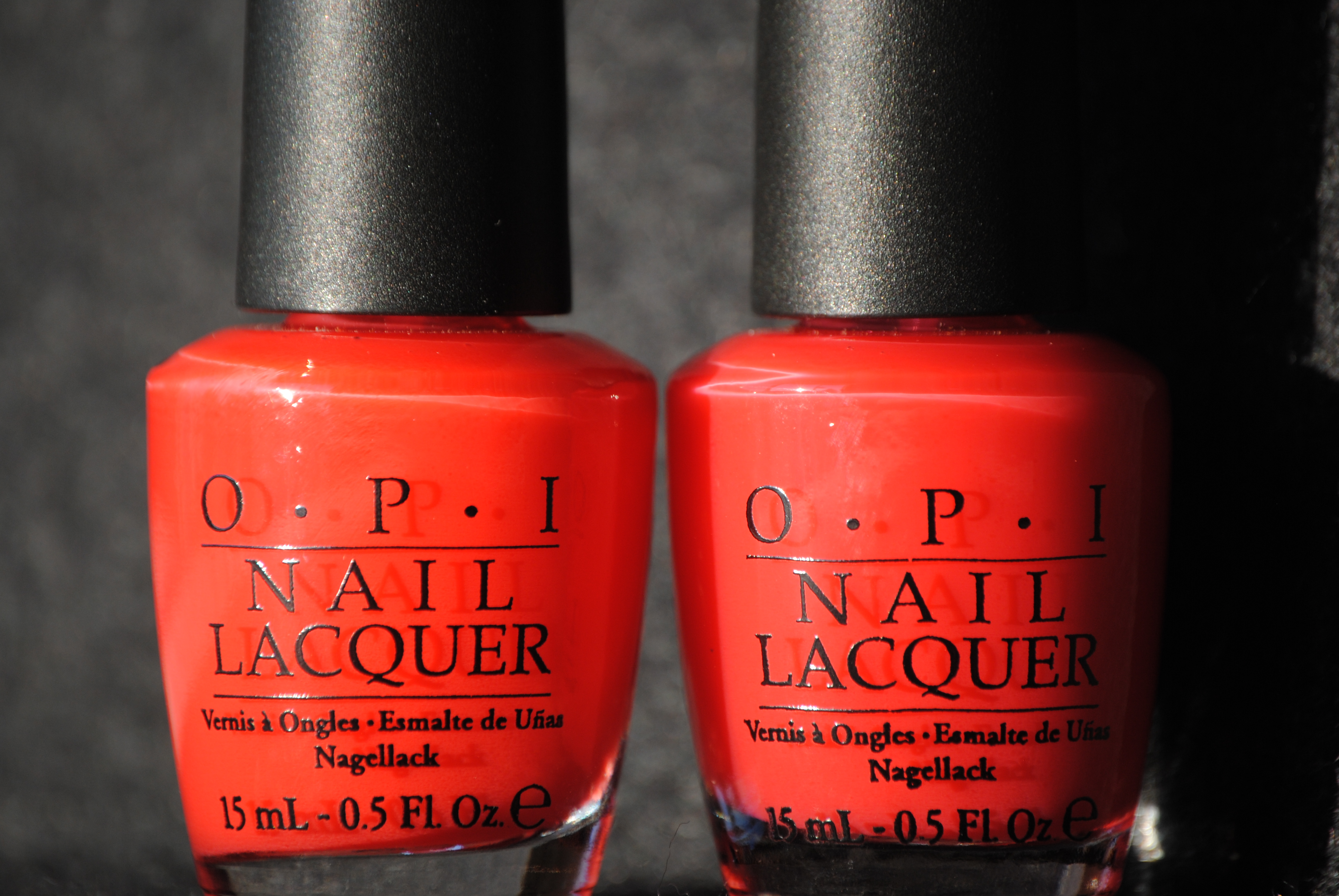

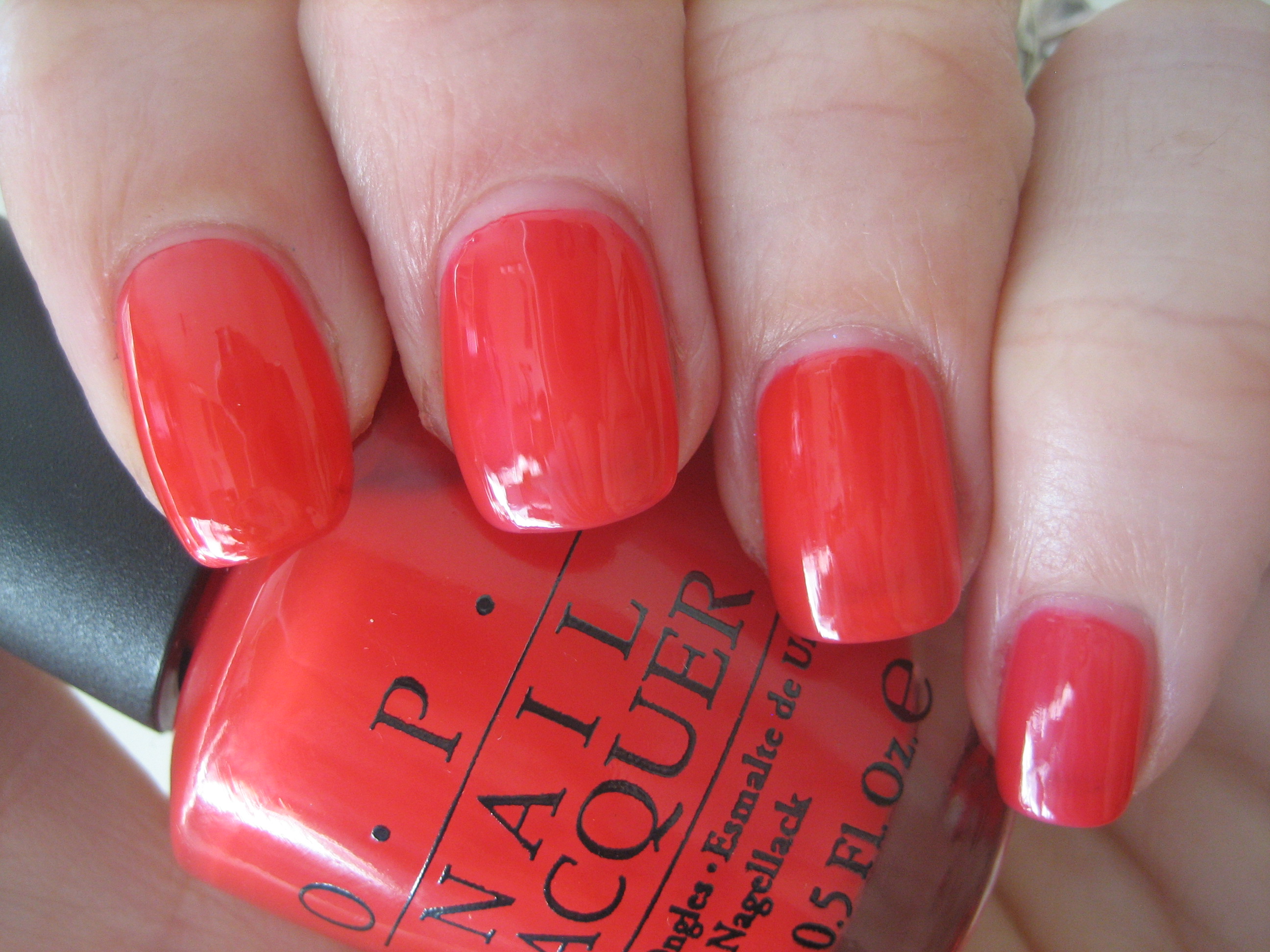
Of course, when I first saw ‘Big Hair…Big Nails’, I was convinced it was an exact duplicate for ‘Guy Meets Gal-Veston’ of the same collection. Seen side by side, you would be hard pressed to know which bottle was which, am I right? However, there are some very slight differences. First of all, the formula on ‘Guy Meets Gal-Veston’ is somewhat thinner and more sheer. The other difference is that where ‘Big Hair…Big Nails’ is most definitely coral through and through with a hint of peach, ‘Guy Meets Gal-Veston’ has more of a pink tinge to it, which can really only be discerned under certain lighting. The finish is the same, as is the high shine and quick dry time.
Final thoughts: Having reviewed this collection in its entirety, I must say that while I was not prepared to go gaga over the sorbets, I find that I am so attracted to the lusciousness of the hues, the juicy look they all have as well as that crazy shine. Do you need both ‘Big Hair…Big Nails’ and ‘Guy Meets Gal-Veston’? Probably not, as the differences are negligible, but you should know that one polish is definitely more translucent (and pinker) than the other. All in all, you should try them on against your own skin tone to determine which shade suits you better. Did you figure out which polish is which yet?!

*’Big Hair…Big Nails’ is on the left, ‘Guy Meets Gal-Veston’ on the right! Told you they looked like twins!
*Disclaimer: product samples were provided by the company/PR for my unbiased consideration
Glitter In The Air & Naked & Fashion – layering combos
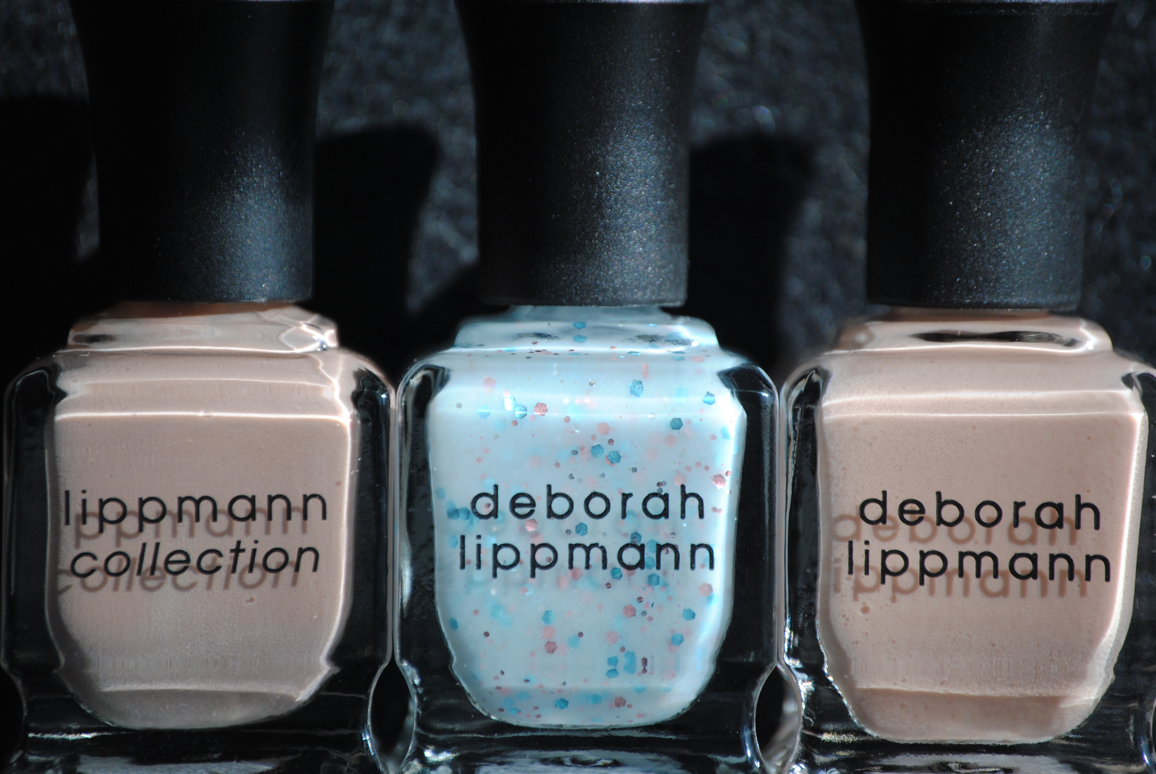
The Badgley Mishka Spring 2011 show was where Deborah Lippmann first gave us a tantalizing glimpse into one of her upcoming shades, ‘Glitter In The Air’ (reviewed here). All we knew at the time, was that it was described as a “sky blue confetti” and that she had layered it over the cult and celebrity favourite polish from her line, ‘Fashion’ – an opaque nude shade. That let us know that ‘Glitter In The Air’ was sheer enough to be layered, and that it had a fresh, Spring vibe to it. When it was announced that she would also be releasing another nude shade, ‘Naked‘ (reviewed here) along with ‘Glitter In The Air’, my first thought was that ‘Fashion’ was being removed from her lineup, but I’m happy to say that I thought wrong. Since I had the two nude shades, I decided to try my own layering experiment: ‘Glitter In The Air’ over ‘Naked’ over ‘Fashion’! Swatch is with Deborah Lippmann Rehydrating Base Coat, three coats each of ‘Naked’ (index & ring fingers) and ‘Fashion’ (middle & pinkie fingers), and two coats of ‘Glitter In The Air’, no top coat.
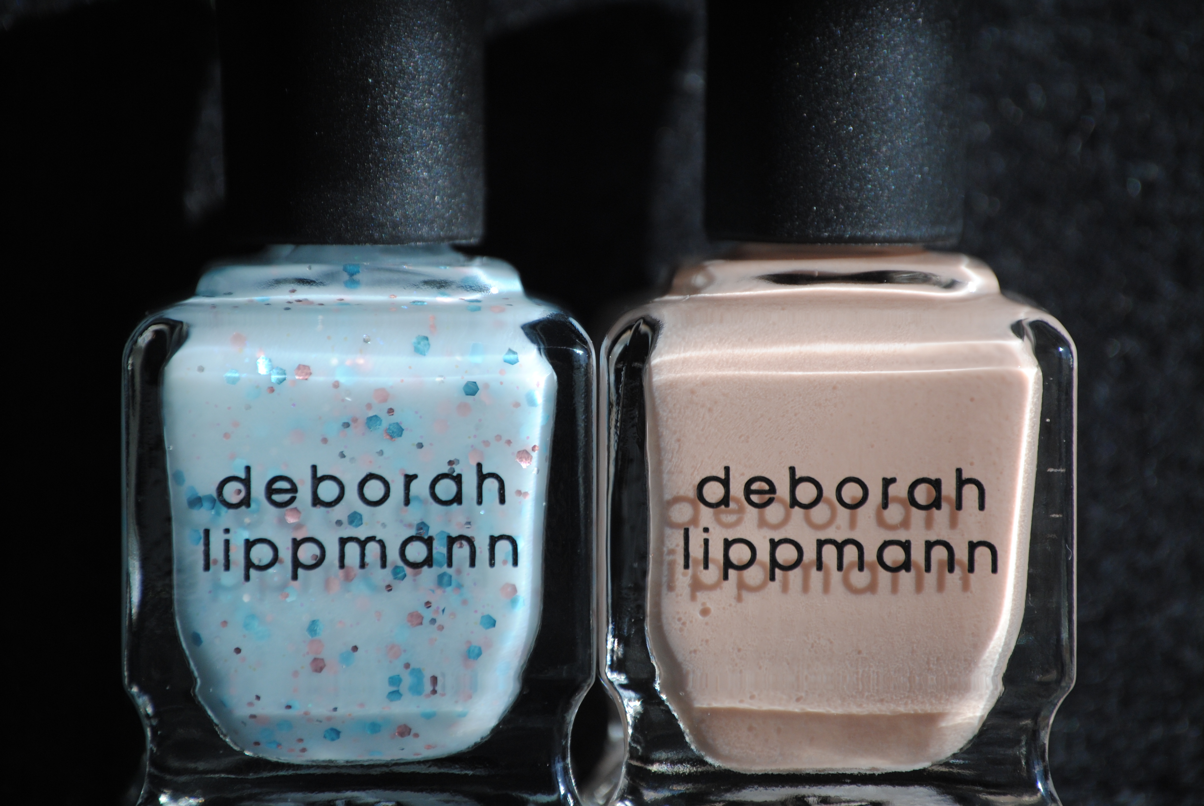
‘Glitter In The Air’ and ‘Naked’, sure to be the two stars of Deborah Lippmann’s Spring releases, and absolutely incredible shades to work with. A superb formula, excellent user-friendly brush, quick drying and intensely glossy. Pure love!
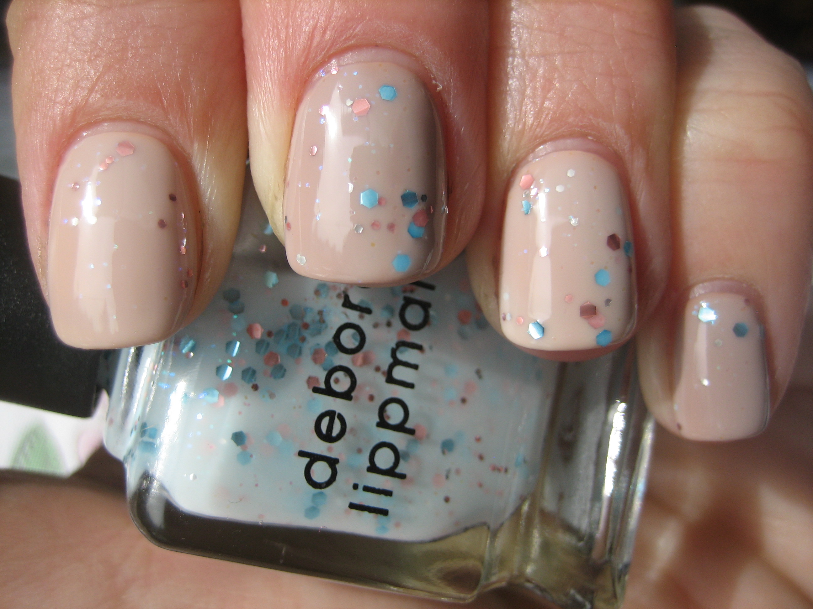
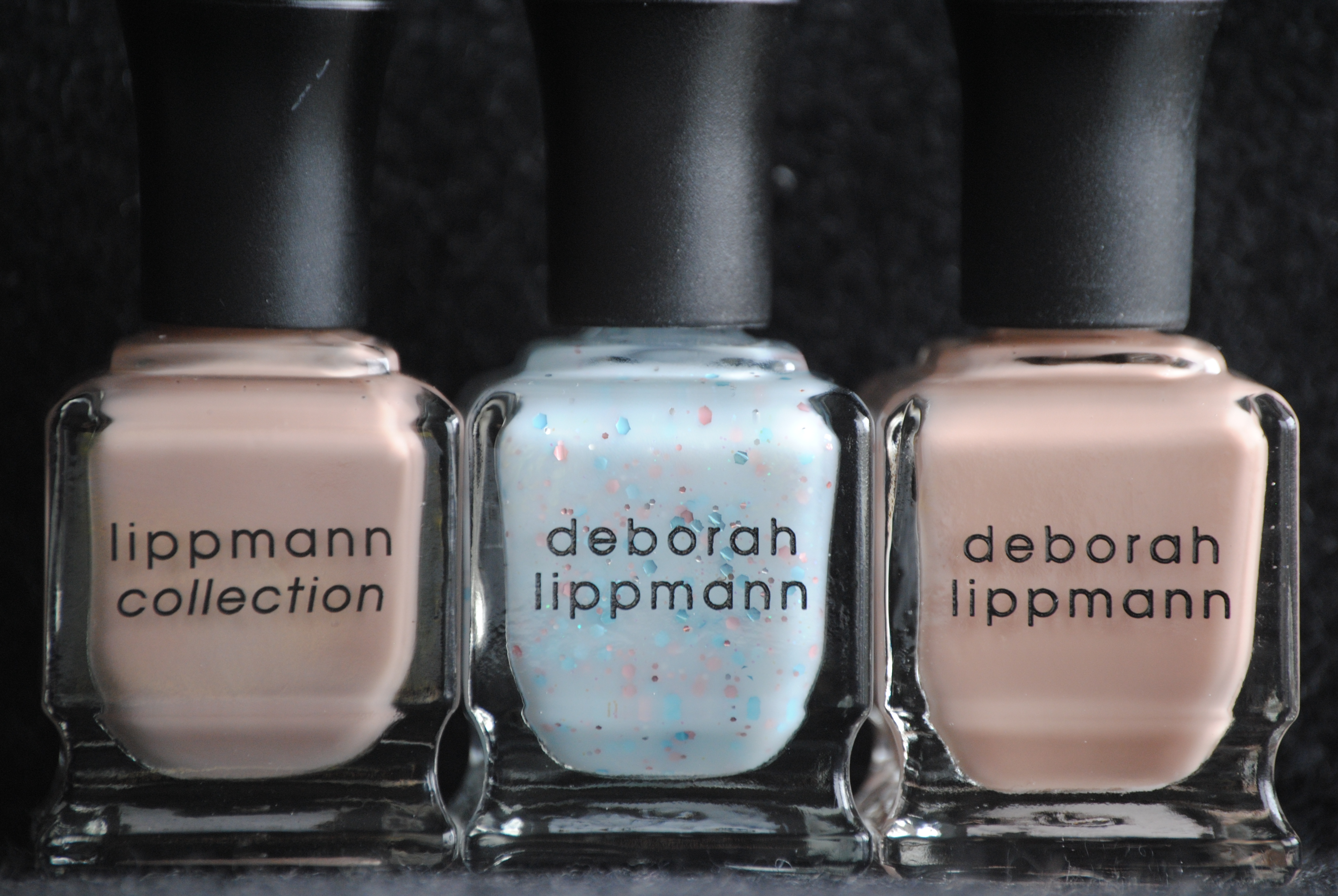
Seen next to each other like this, one would be very hard pressed to tell which finger had which base shade painted on. The layers of ‘Glitter In The Air’ on top seems to almost neutralize any differences between the two nude shades, rendering them almost identical to each other. However, if you click to enlarge the photo, you can see that the middle & pinkie fingers which sport ‘Fashion’, are just slightly more tan, compared to the other two fingers done in ‘Naked’ and which seem a touch lighter. You might have noticed that one of the nude polishes bears a variation of the Lippmann name; that’s because my bottle of ‘Fashion’ which I’ve had for some time now, is from when her line was called ‘Lippmann Collection’ whereas it is now known as ‘Deborah Lippmann’.
Final thoughts: While I am totally in love with the unique freshness of ‘Glitter In The Air’ on its own, I also could not help but appreciate the depth it received when layered over either of these two nude lacquers. There is something about the combination of the milky & glittery pale blue over the nude that just seems to work so well, and to me, is a pure and simple statement of Spring. This is a look that will appeal to a varied age range and the hues themselves, will work equally well on a number of skin tones, from fair to dark, cool to warm. Swatching these shades, I can now see how beautifully they must have set off the clothes at the Badgley Mishka show!
Please enjoy this quick video clip of Deborah Lippmann backstage at the Badgley Mishka Spring 2011 show, where she first introduced us to ‘Glitter In The Air’.
*Disclaimer: product samples were provided by the company/PR for my unbiased consideration
*Video clip courtesy of youtube
Deborah Lippmann’s ‘Naked’ – swatches & review

Along with ‘Glitter In The Air’ (reviewed here), ‘Naked’ is another new polish launched by Deborah Lippmann for Spring 2011, and is totally on point with the clean, nude nail look that has been seen all over the fashion runways and celebrity red carpets (see my review on the Golden Globes here for more). During Spring 2011 fashion week, this particular polish was also chosen as the shade models wore at four influential shows. While maintaining a natural appearance, it still has just enough hint of creamy beige to it, to give your nails that ‘you, but only better’ look, without ever looking washed out or boring. All swatches are with Deborah Lippmann’s Rehydrating Base Coat and three coats of Lacquer, no top coat.

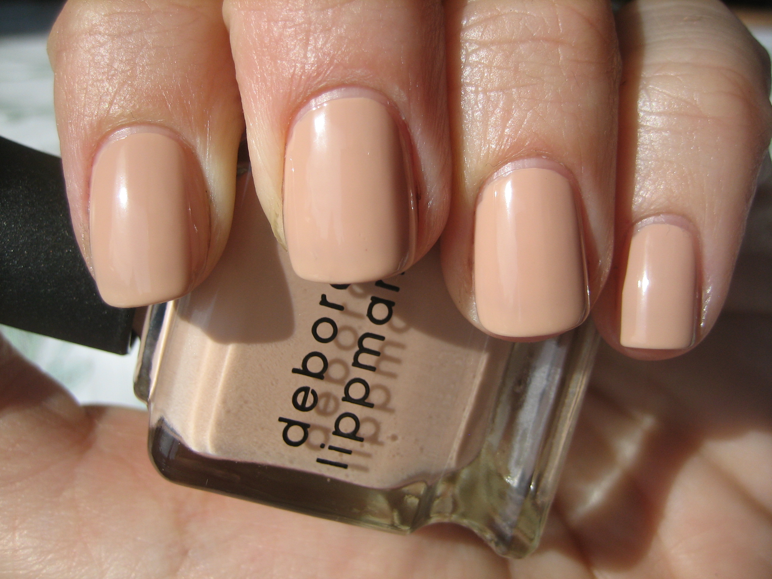

The interesting thing about this polish, is how cool it can appear in the shade (bottom photo) and yet switch over to a brighter warmth in the sun (top photo). This is one of the most wearable nude shades I have come across and just seemed perfect with my skin tone, without giving me that dreaded ‘mannequin hands’ look. The formula is wonderful; thin enough without being runny, yet thick enough to deposit a smooth layer, with a brush that is wide enough to cover the nail yet can easily get to edges with precision. There doesn’t seem to be any yellowish tinge to this beige-y nude polish, but rather more of a peachy/caramel base which imbues this with a beautiful creaminess. Absolutely no brush strokes whatsoever, dries relatively fast and finishes with a super glossy shine….might just be your best ‘naked’ look!
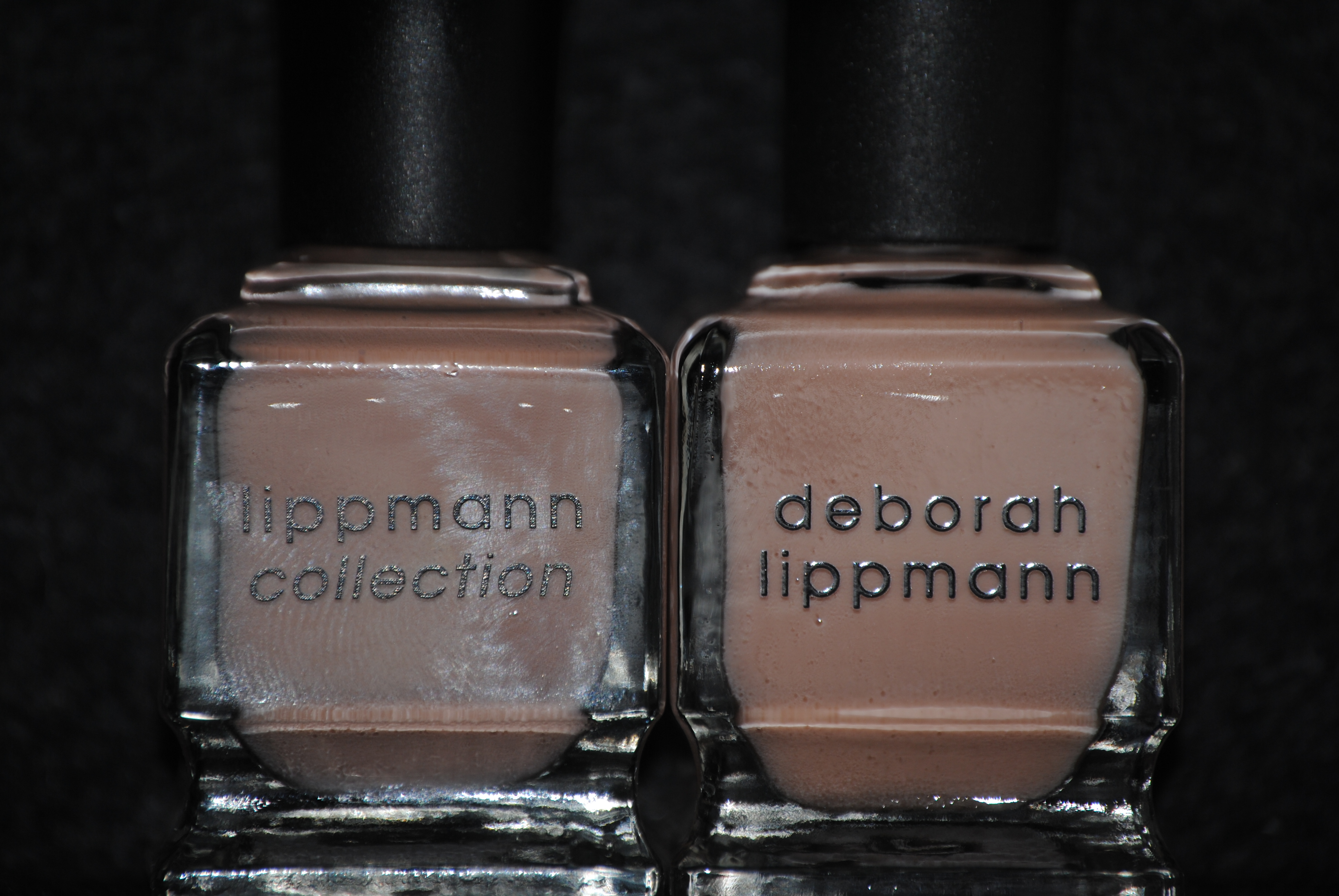
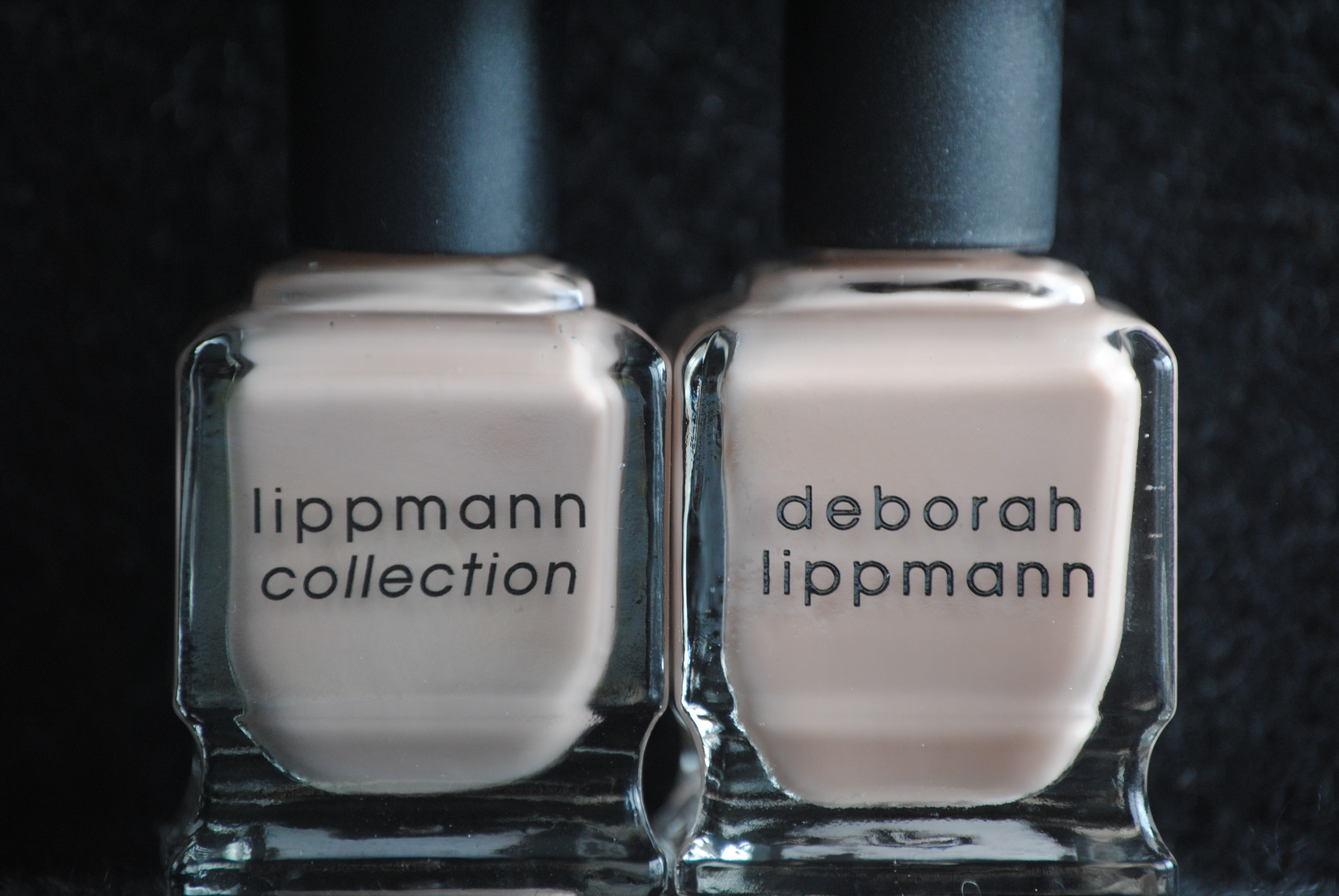

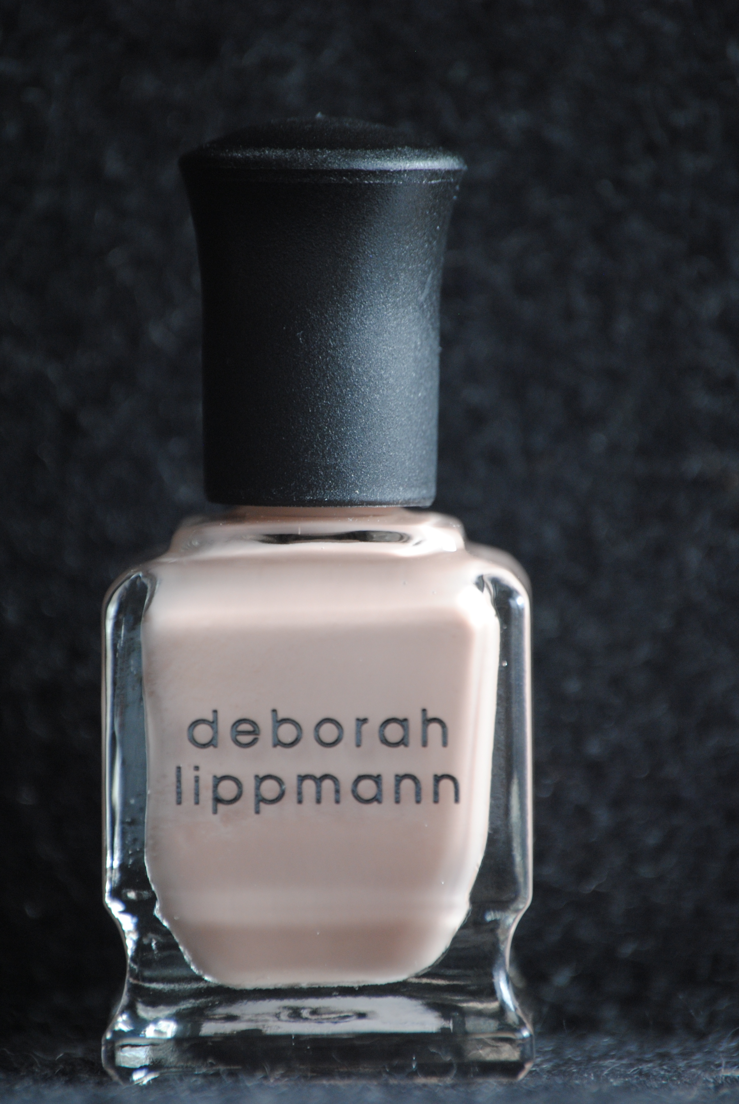
I initially thought that ‘Naked’ might be ‘Fashion’, but updated (perhaps with a new formula? A new name?) based on early promotional photos, and so I just had to put them side by side to compare. Whether viewed in natural light (bottom photo) or taken with flash (top photo), they really do seem to be identical. Even swatched on the nail, the differences in colour between the two is almost negligible, but still….there are differences. For starters, where ‘Naked’ has a touch more peach to it, ‘Fashion’ seems to be more tan, giving it a slightly darker tone. The other difference I noticed is that the formula in ‘Fashion’ was slightly thicker, but that could be because I’ve owned my bottle for some time now and it could have thickened naturally. Other than that, they are as close as fraternal twins, each lovely in its own right.
Final thoughts: If its a clean, work-friendly shade you’re looking for, with a superb formula and beautiful finish, then get ‘Naked’…seriously! This shade, however, can easily look edgy as well: I envision it paired with a much darker makeup and wardrobe look, to add an unexpected neutral counterbalance. While I’m not sure it would be as flattering as a pedicure shade, I can totally see myself wearing this polish as a sleek and sophisticated manicure. Even though the two shades, ‘Naked’ & ‘Fashion’ are so close in hue and might be redundant for some to own both, I still saw enough of a tonal difference to warrant having both…but then again, I am addicted to Deborah Lippmann lacquers! Stay tuned for the next instalment of my Spring 2011 Lippmann series.
Deborah Lippmann polishes can be purchased at several high end department stores and on her website.
*Disclaimer: product sample provided by the company/PR for my unbiased consideration