Filed In: Nail Polish Comparisons
Reader Request: Dark Grey Comparisons (swatches & review)

Across the horizon, deeply ominous clouds are massing, but you might call this the “Perfect Storm” instead! Fall 2011 has seen the release of a plethora of deep, near-black grey lacquers, with most of the major players in the industry launching their own version of this shade. Being naturally curious, I needed to know what, if any, set them apart and so combing through my stash, I chose these four to compare: China Glaze’s ‘Concrete Catwalk’ – Fall 2011 Metro Collection (reviewed here), Deborah Lippmann’s ‘Stormy Weather’ – Fall 2011 (reviewed here), NARS’ ‘Galion’ – Fall 2011 (reviewed here), and OPI’s ‘Suzi Skis In The Pyrenees’ – Fall 2009 Collection de España.
In order to better understand the differences (and similarities) between them, the following swatches show these shades with one coat of lacquer, no top coat (top photos), followed by two coats of lacquer and top coat (bottom photos). Further breakdowns are listed in a easy point format. Please note that all swatches were done with Seche Base Ridge Filling Top Coat, as well Revlon’s Quick Dry Top Coat for the second set.
- Index finger: China Glaze ‘Concrete Catwalk’
- Middle finger: Deborah Lippmann ‘Stormy Weather’
- Ring finger: NARS ‘Galion’
- Pinkie finger: OPI ‘Suzi Skis In The Pyrenees’
- The most similar formula ie: consistency & application – ‘Concrete Catwalk’ and ‘Stormy Weather’
- Most opaque formula: ‘Galion’
- Thinnest/sheerest formula: ‘Suzi Skis In The Pyrenees’
- Closest in colour: ‘Concrete Catwalk’ and ‘Stormy Weather’
- Glossiest finish: ‘Stormy Weather’
- Lightest in tone: ‘Stormy Weather’
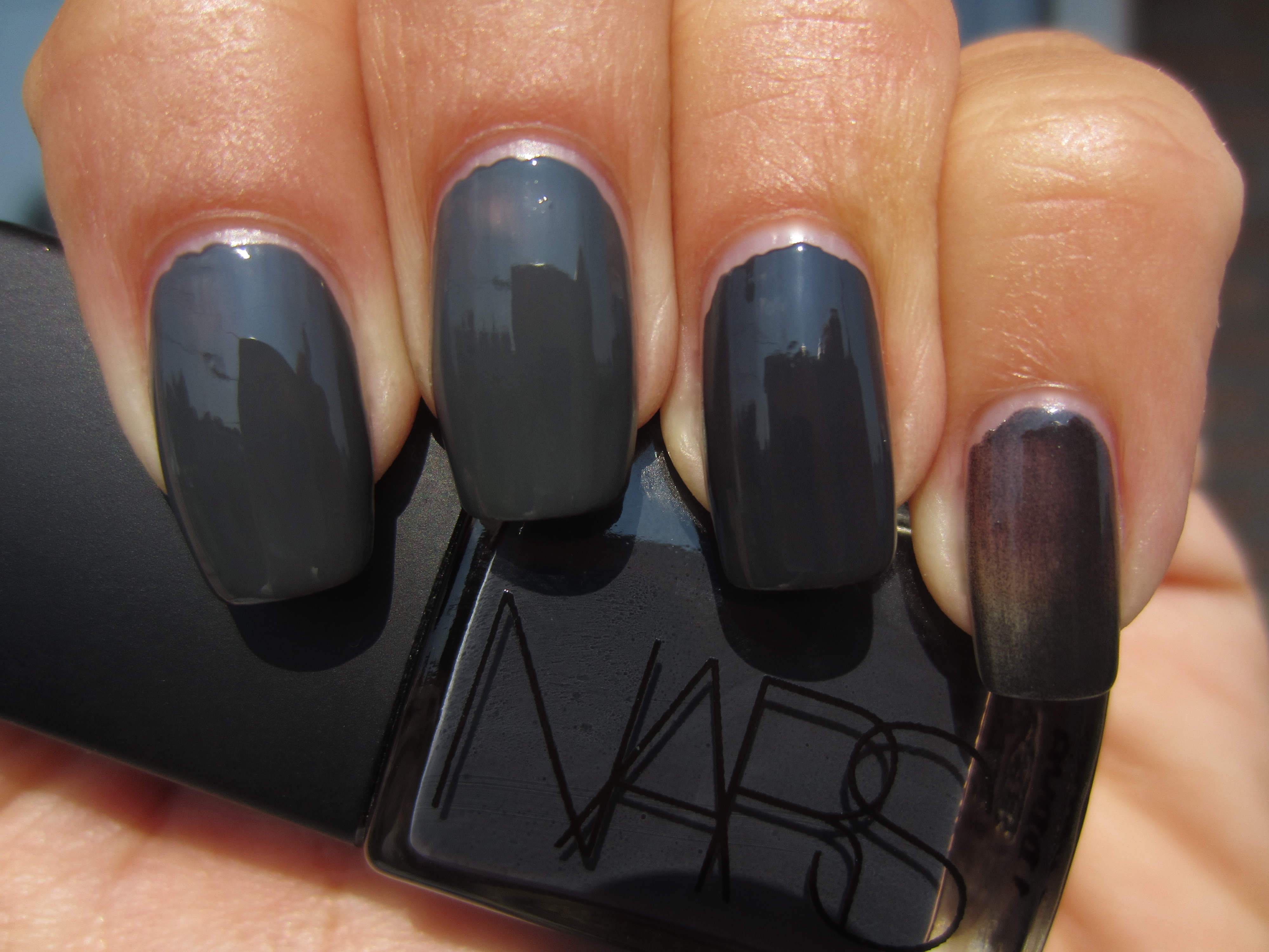
Sunlight, one coat of lacquer – no top coat.

Sunlight, two coats of lacquer and top coat.
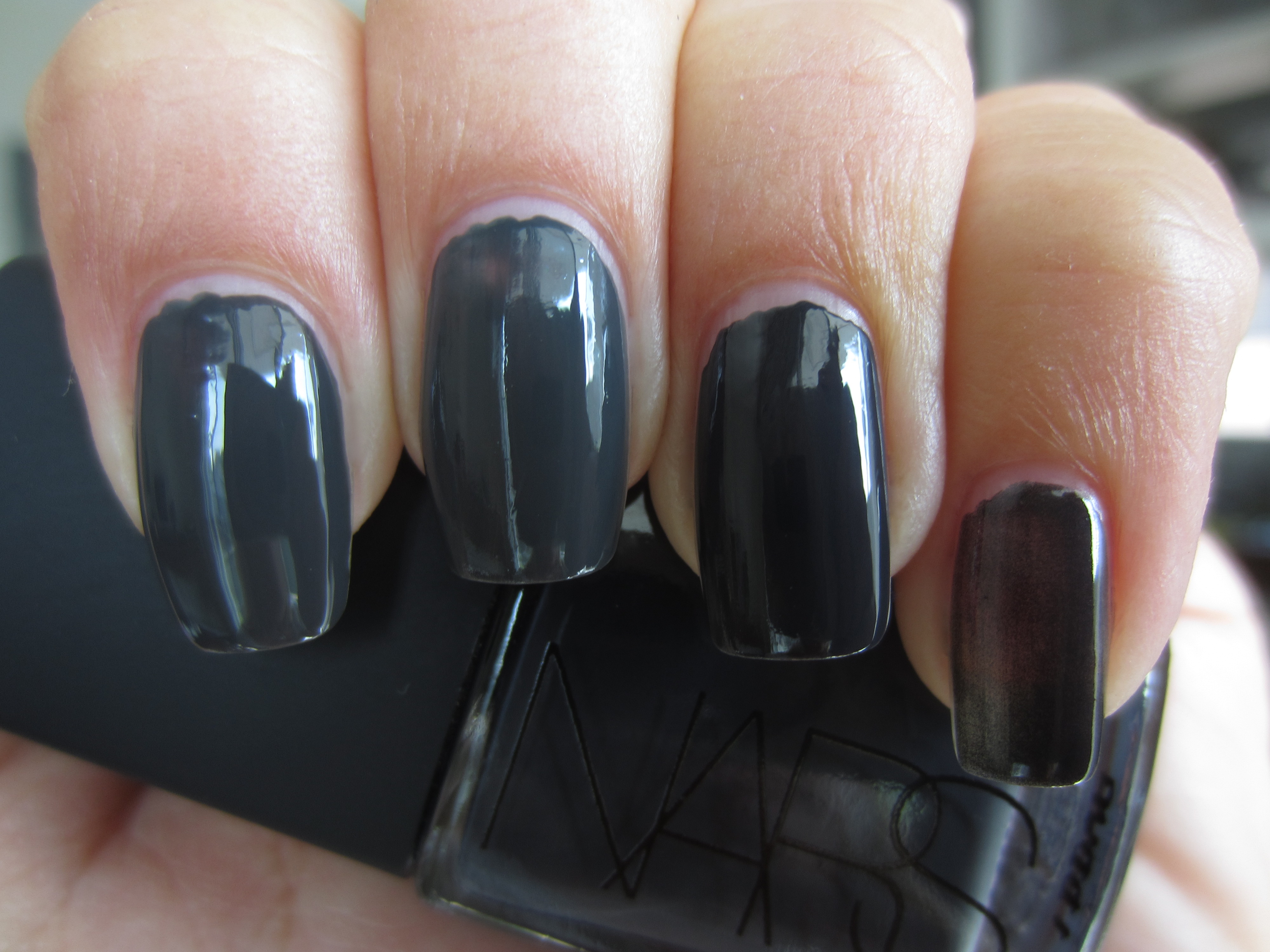
Indirect light, one coat of lacquer, no top coat.
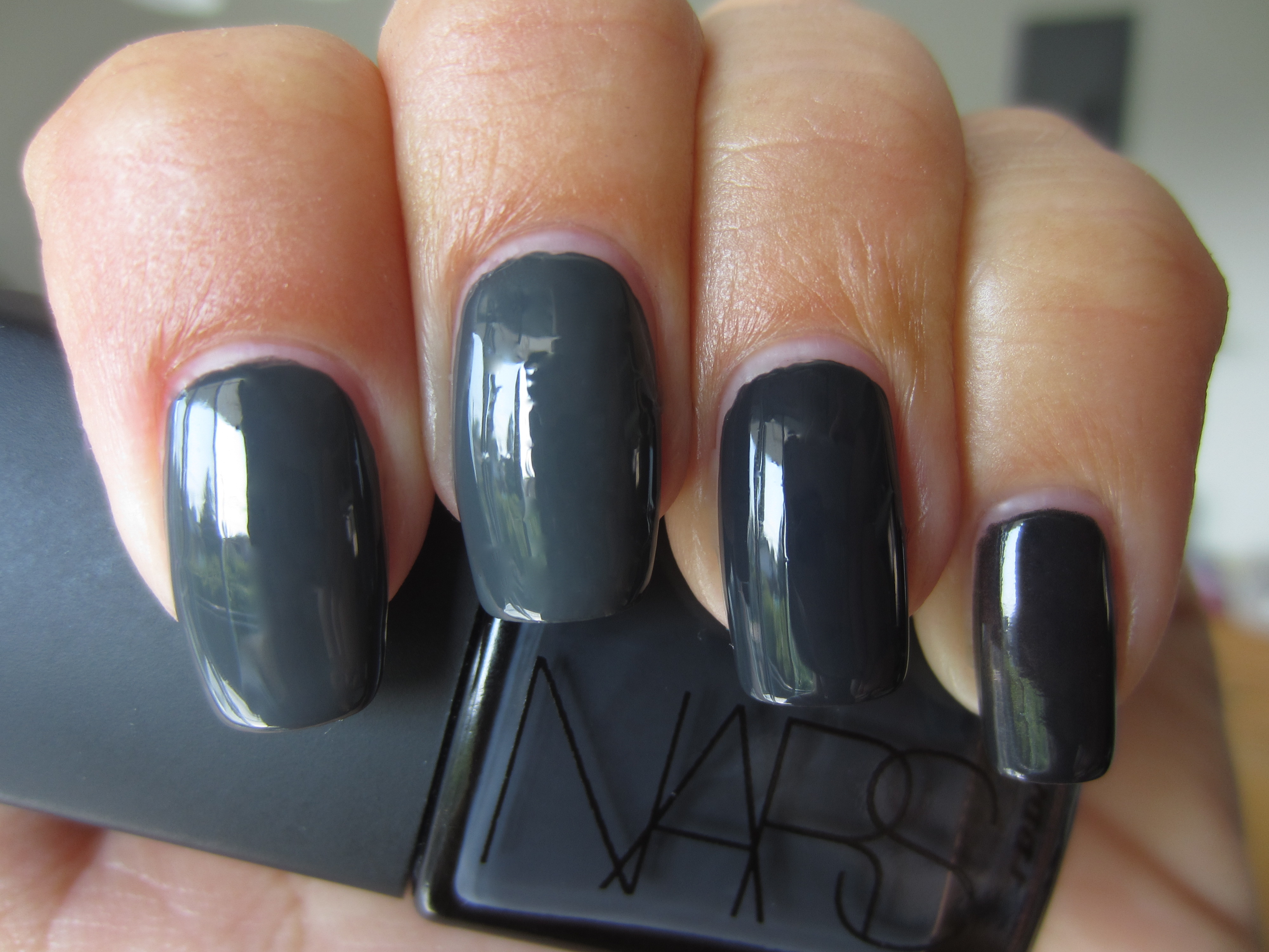
Indirect light, two coats of lacquer and top coat.
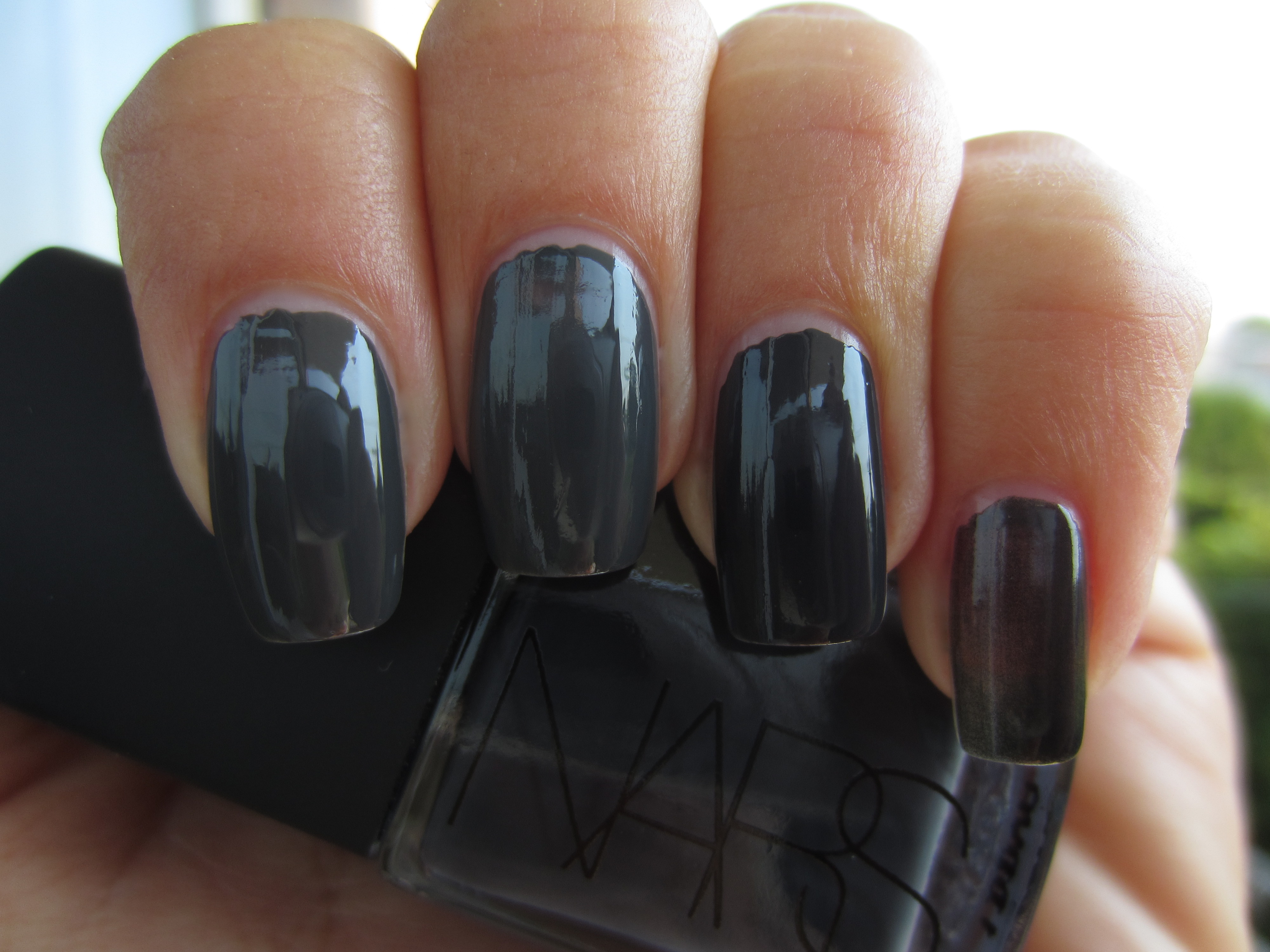
Shaded light, one coat of lacquer, no top coat.
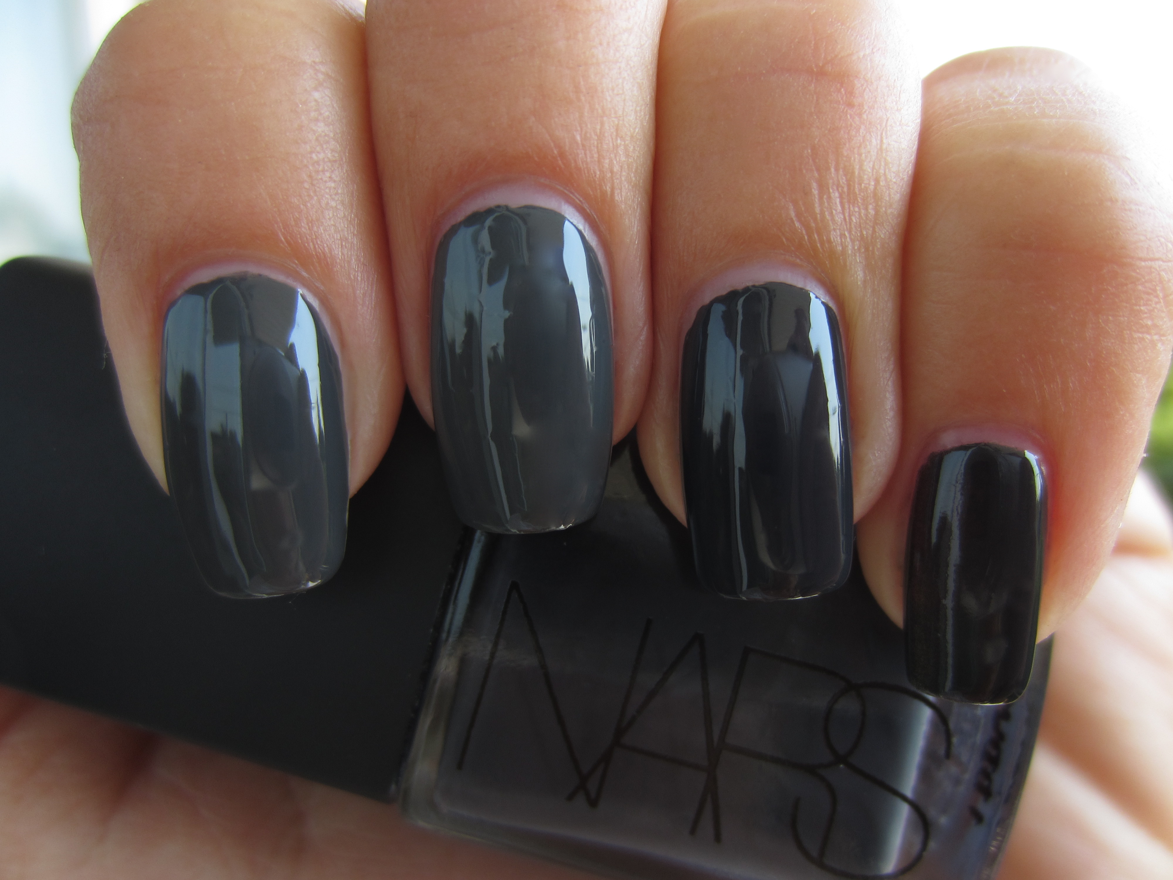
Shaded light, two coats of lacquer and top coat.
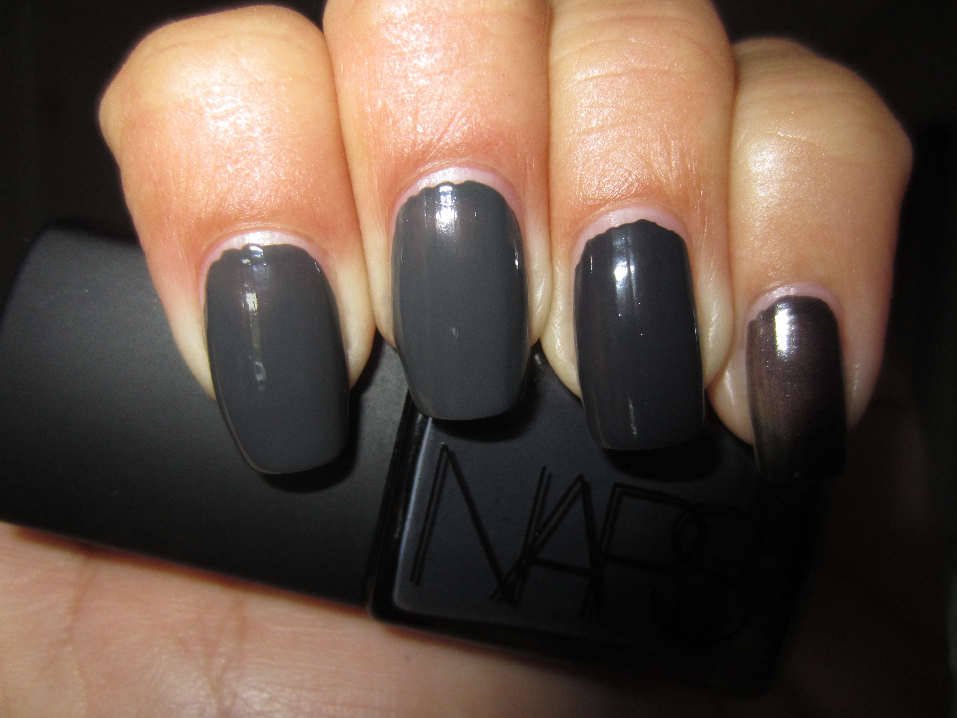
With flash, one coat of lacquer, no top coat.
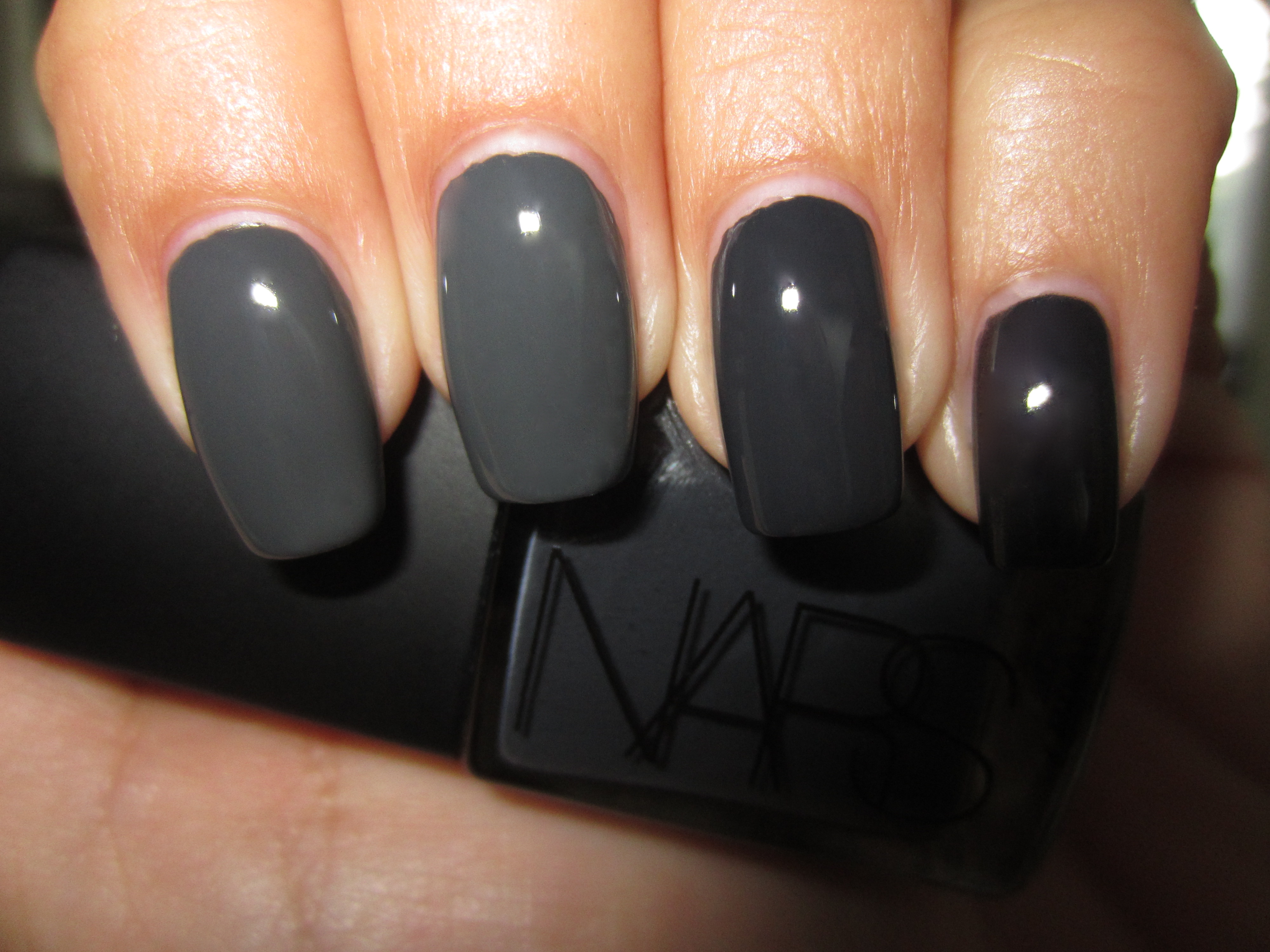
With flash, two coats of lacquer and top coat.
Final thoughts: Before actually viewing all four shades together, I was convinced that they would be duplicates. Once I had gathered the bottles, however, I immediately saw several differences, but of course, the application that would be the final determinator. When OPI released ‘Suzi Skis In The Pyrenees’ back in the Fall of 2009, I was drawn to this shade, even though I wasn’t sure if I would wind up wearing it. Fast forward two years later, and it seems that dark grey is the “couleur de choix” on everyone’s list, from regular folks all the way to fashion designers. What I did not expect when I applied the four shades, was that the OPI would turn out to be so much sheerer than the rest, requiring a third coat if I wanted to achieve the same opacity as the rest (I stuck with two coats though, to keep things equal). The other interesting feature that I noted was that although ‘Concrete Catwalk’ was the closest to ‘Galion’ in terms of depth of tone, it actually shared a similar blueish base with ‘Stormy Weather’ versus ‘Galion’ and ‘Suzi Skis In The Pyrenees’ more greener base. I had a difficult time choosing which was the glossiest, and to be honest, ‘Stormy Weather’ only won by a hair, with ‘Concrete Catwalk’ breathing hungrily down its neck.

I thought I had covered all the brooding greys lurking in my stash, until a reader inquired how Essie’s ‘Power Clutch’ (Fall 2011 Collection, reviewed here), and so back to the drawing board I went to swatch them all again, minus the OPI this time. I should also mention that I was also asked if ‘Stormy Weather’ was a close duplicate for Dior’s ‘Gris Montaigne’, but as I had totally forgotten to include that one as well. Sigh.
This second edition includes the following four lacquers:
- Index finger: Essie ‘Power Clutch’
- Middle finger: China Glaze ‘Concrete Catwalk’
- Ring finger: Deborah Lippmann ‘Stormy Weather’
- Pinkie finger: NARS ‘Galion’
As with the first group reviewed, I have broken down in point format what their various differences and/or similarities are. Wanting to add a new slant to these shades and being somewhat fascinated by the modern and chic vibe given off by a satin finish, I chose CHANEL’s recently released ‘Mat Velvet Top Coat’ (review forthcoming) to layer on top. Please note that all the following swatches were done using Deborah Lippmann’s Rehydrating Base Coat.
- The most similar formula, ie: consistency & application: ‘Concrete Catwalk’ and ‘Stormy Weather’
- Most opaque formula and darkest in tone: ‘Galion’
- Thinnest formula and lightest in tone: ‘Power Clutch’
- Thickest formula: ‘Concrete Catwalk’
- Closest in colour: ‘Concrete Catwalk’ and ‘Stormy Weather’
- Bushiest brush: ‘Concrete Catwalk’
- Glossiest finish: ‘Stormy Weather’
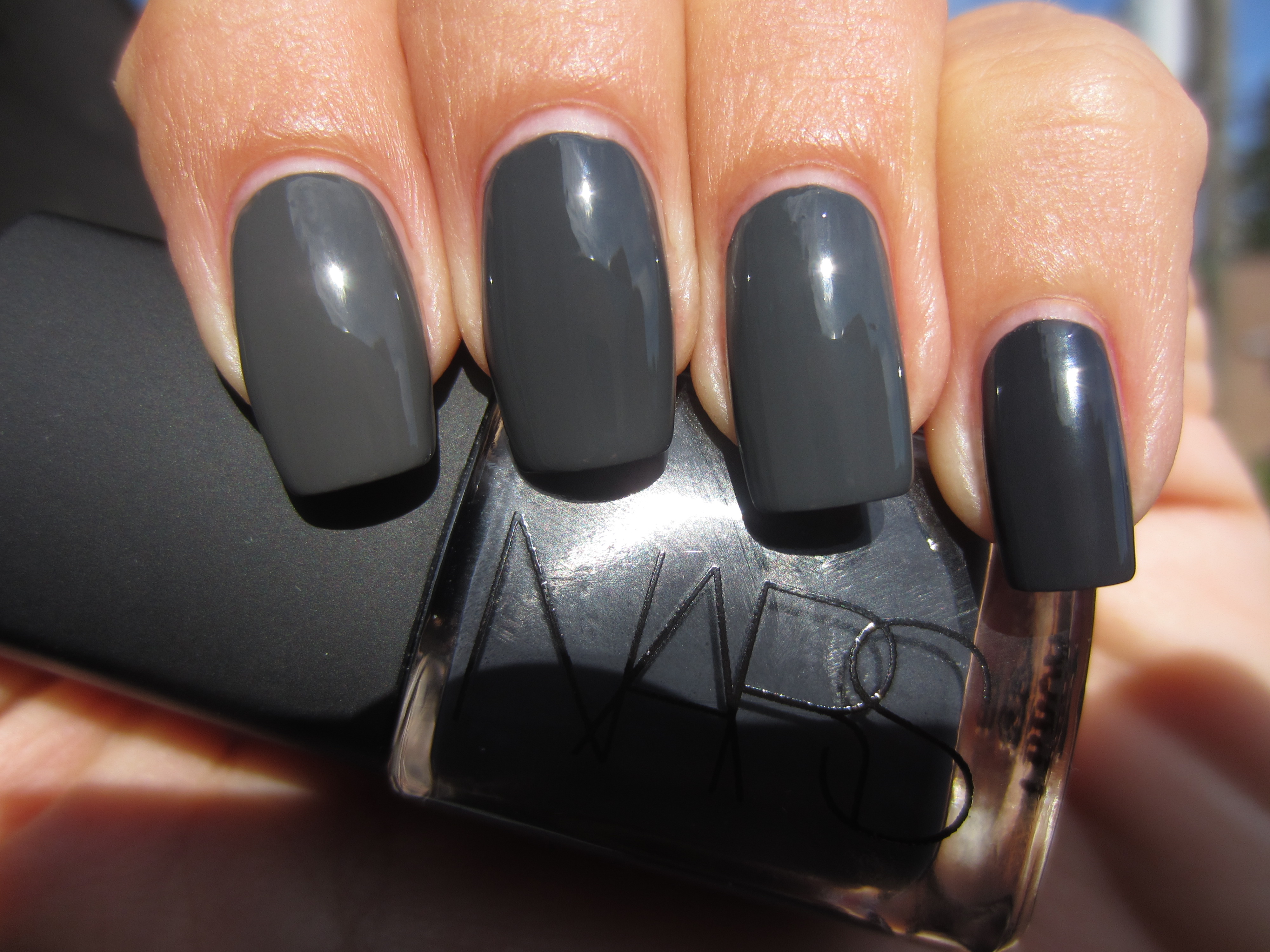
Sunlight, two coats of lacquer, no top coat.
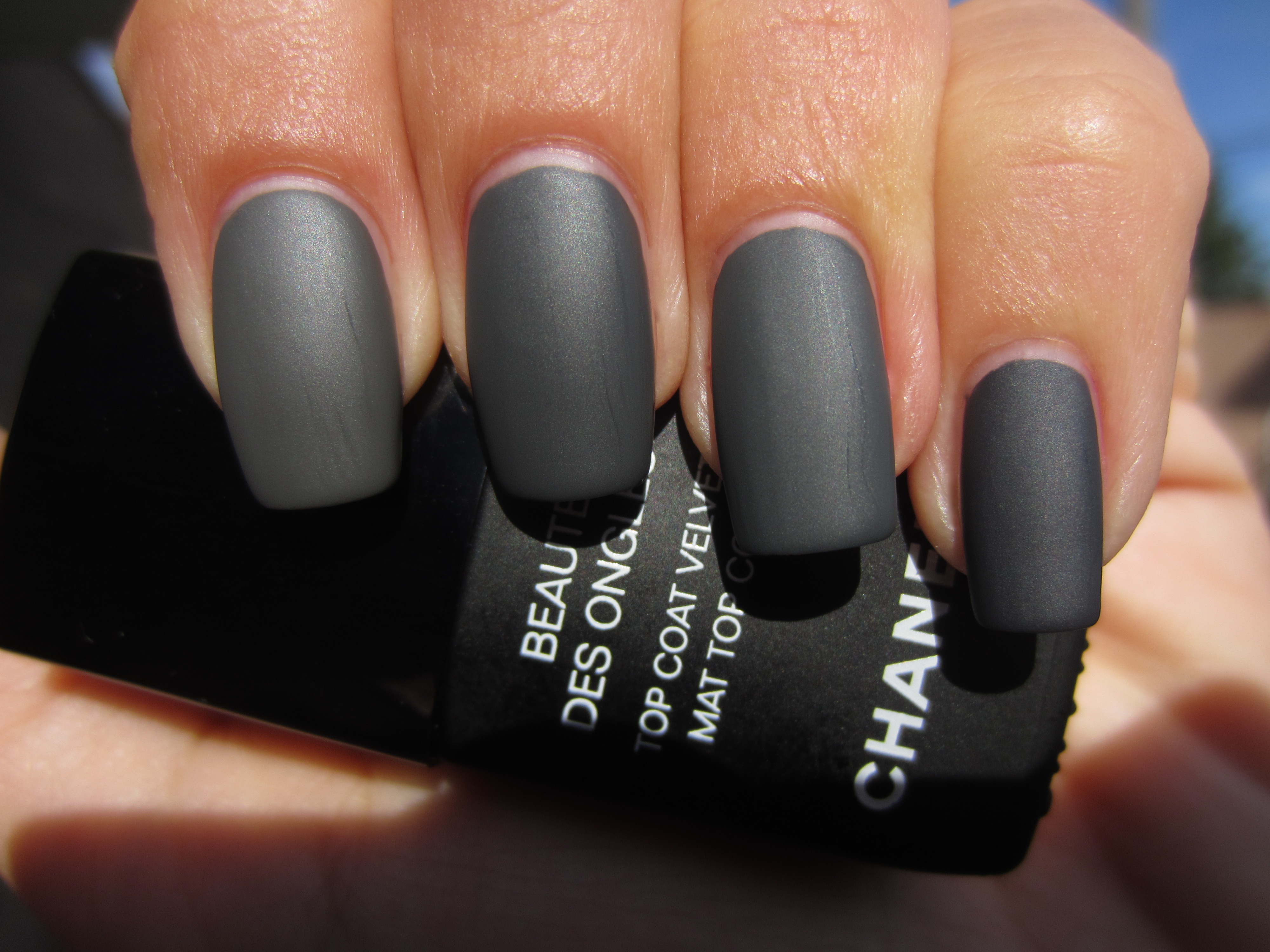
Sunlight, two coats of lacquer and Mat Velvet Top Coat.
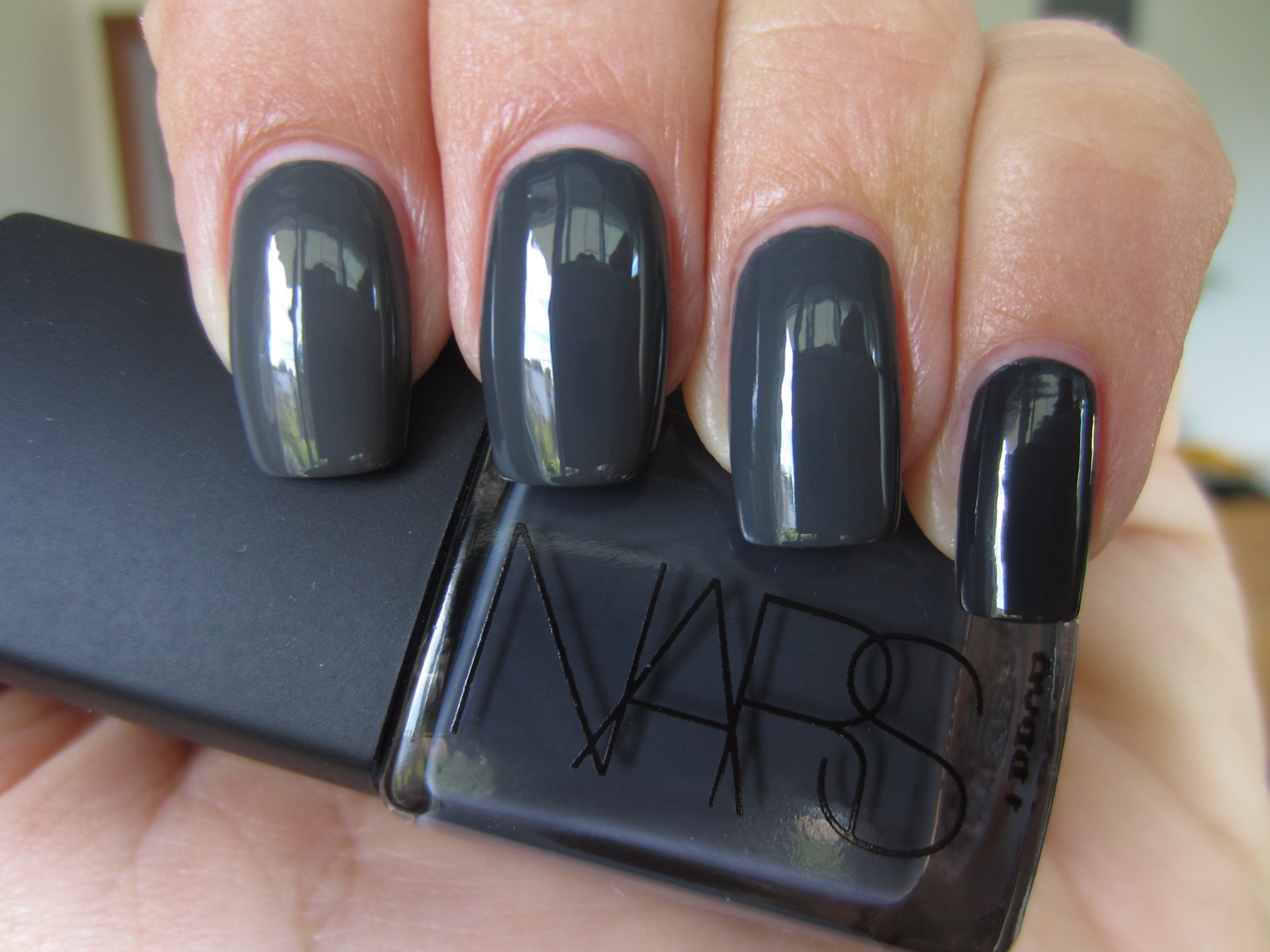
Indirect light, two coats of lacquer, no top coat.
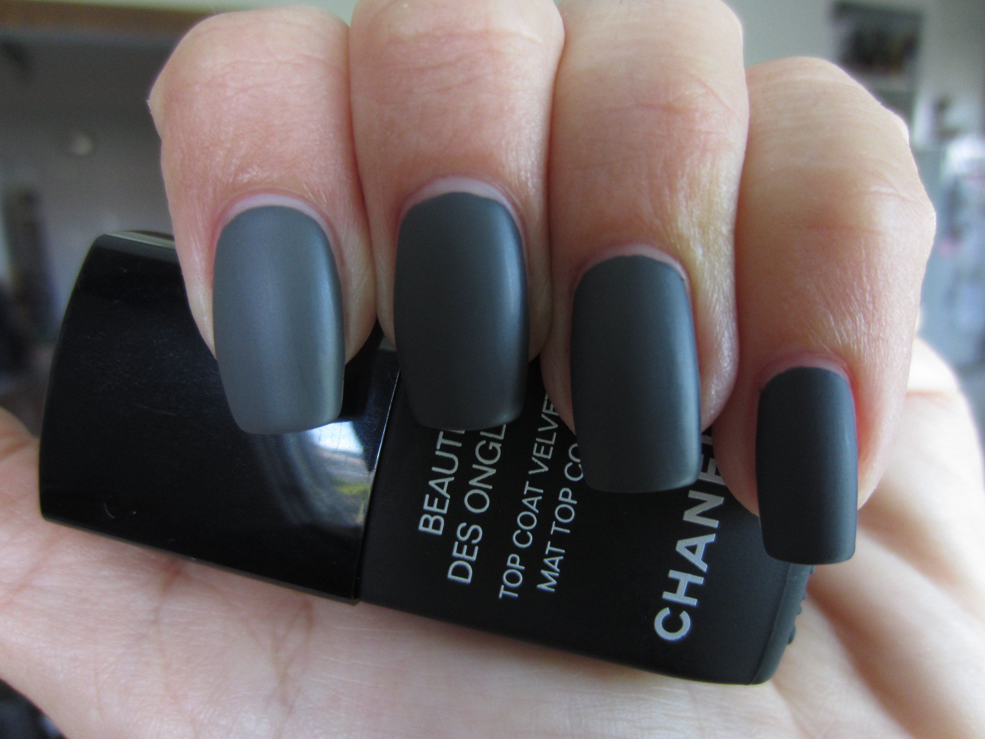
Indirect light, two coats of lacquer and Mat Velvet Top Coat.
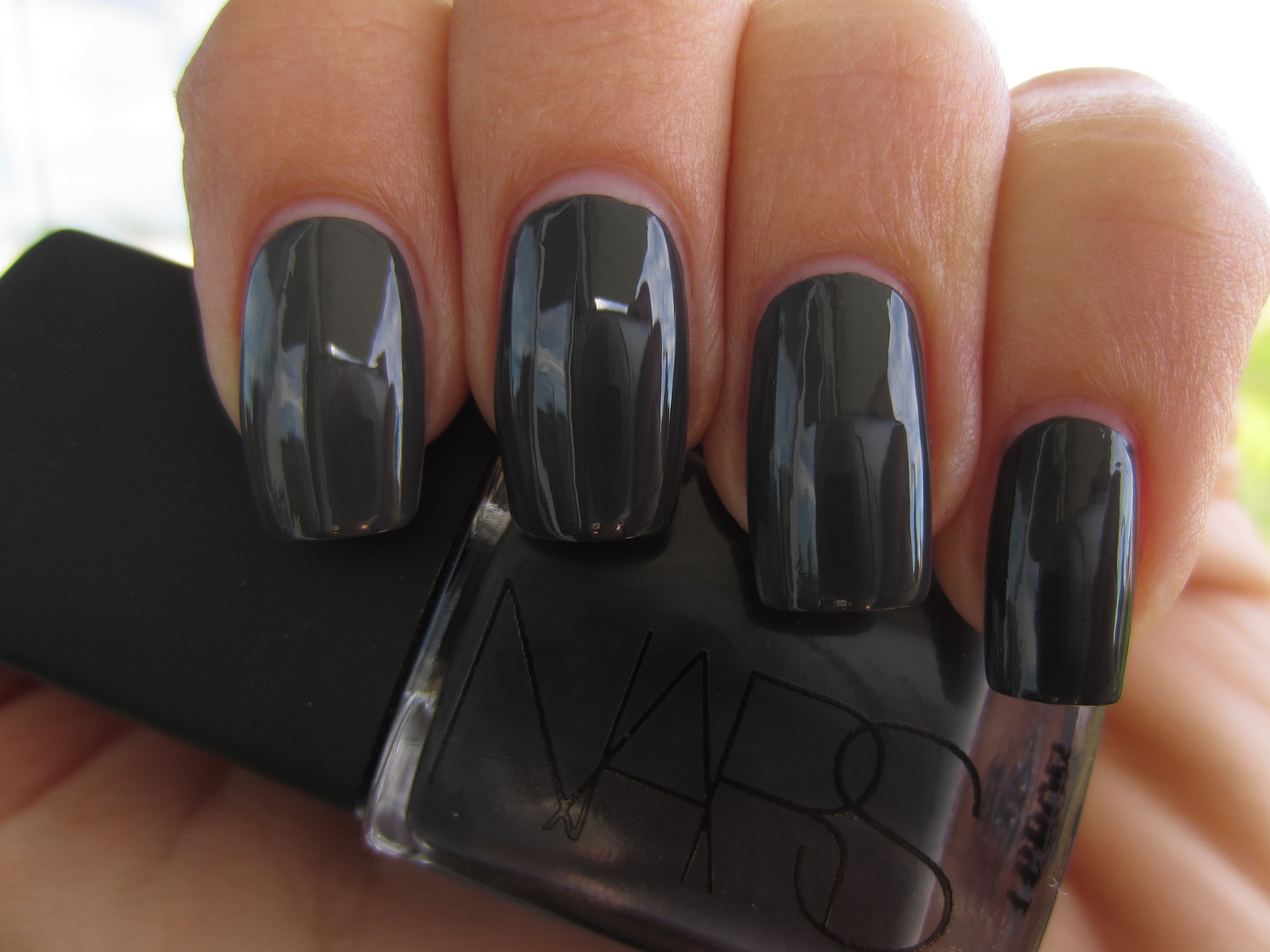
Shaded light, two coats of lacquer, no top coat.

Shaded light, two coats of lacquer and Mat Velvet Top Coat.
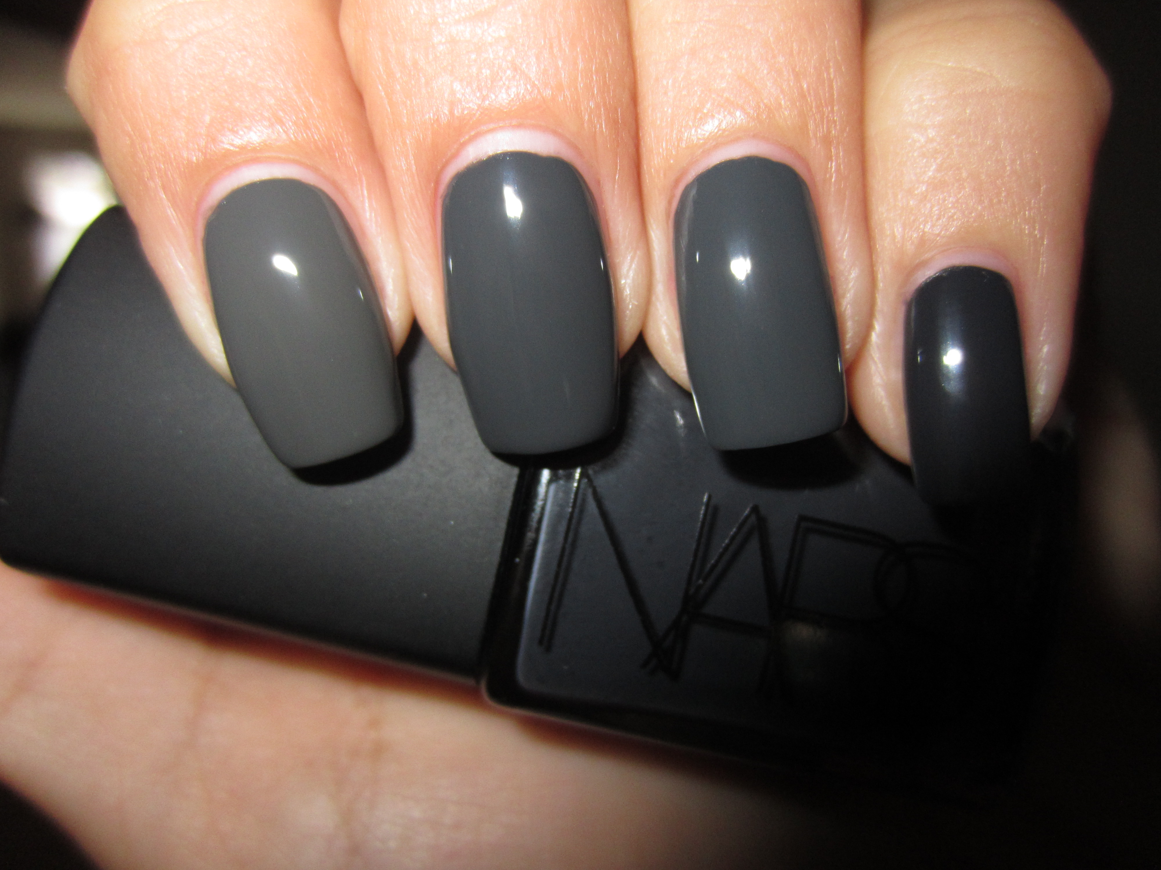
With flash, two coats of lacquer, no top coat.

With flash, two coats of lacquer and Mat Velvet Top Coat.
Final thoughts: Grey, in all its tonal qualities, from soft dove all the way to a smudge of charcoal, bears a very sophisticated aura. Not quite as disturbing as gothic black, which, while immensely interesting to sport on your nails, is not necessarily the most wearable shade, nor as washed out as the lightest grey hue in the spectrum, these versions of dark grey are all immensely pleasing to the eye, and give your nails a very unique, urban, and elegant sophistication. This time around, I observed that in most of the swatches, ‘Concrete Catwalk’ once more looked most similar to ‘Stormy Weather’ with ‘Galion’ frequently completing the triad. I did not expect ‘Power Clutch’ to be as light, but next to the others, it seemed almost like their shadowy version. It should be noted that ‘Galion’ could also very well be a one-coater if applied thickly, but I prefer the evenness and control that two coats gives. The other notable fact, is that once you take all these lacquers into shaded light, you would be hard pressed to tell them apart, but the natural gloss they all share, is outstanding. What it all boils down to is a) your preference, b) availability, as some (like ‘Galion’) are limited edition and thus will be pulled from the roster once the season ends and c) cost, with China Glaze being the least expensive, followed by Essie at a mid range price, and lastly Deborah Lippmann and NARS as the two most expensive.
Mysterious, seductive, alluring….deep dark grey shades like all of the above, are an enigma, and I for one, just love keeping them guessing…..
Disclaimer: some products were provided by the company/PR for my unbiased consideration


Reader Request: Essie’s ‘Da Bush’ vs. OPI’s ‘Stranger Tides’ (swatches & review)

Something tells me that the military trend will continue to beat strongly all through the summer and well into the fall. It seems like every brand is releasing their own version of khaki, from very pale and muted to deeply vibrant hues and personally, I couldn’t be happier as I absolutely adore these shades! With Essie’s recently launched Resort Collection (reviewed here), ‘Da Bush’ – a pale and creamy celadon green hue, looked like a dead ringer to OPI’s recently released ‘Stranger Tides’ (reviewed here) – another pale and creamy celadon green hue, from their Ahoy, Me Hearties Collection. Apparently, I’m not the only who thought so, hence this reader request! All swatches are with Sèche Natural base coat, lacquer and Essie Good to Go top coat. Please note that for all swatches, index and ring fingers: Essie ‘Da Bush’, middle and pinkie fingers: OPI ‘Stranger Tides’.


So you can get the most accurate picture of how these two shades compare, I’m showing it to you by layer. With the first coat of each, you see the differences clearly, versus the final result. ‘Da Bush’ seems to be just a hint more yellow leaning as opposed to ‘Stranger Tides’ that looks like it might have a touch more green in its base. I also noted that the OPI was definitely more sheer and of course, the other big difference is the brush itself, with the Essie being so much smaller than the wide OPI brush.


Upon application of the second coat, ‘Da Bush’ has reached full opacity while ‘Stranger Tides’ still looked somewhat streaky, requiring a third coat to be as opaque as the Essie. Other than that, the shades look almost identical at this level.
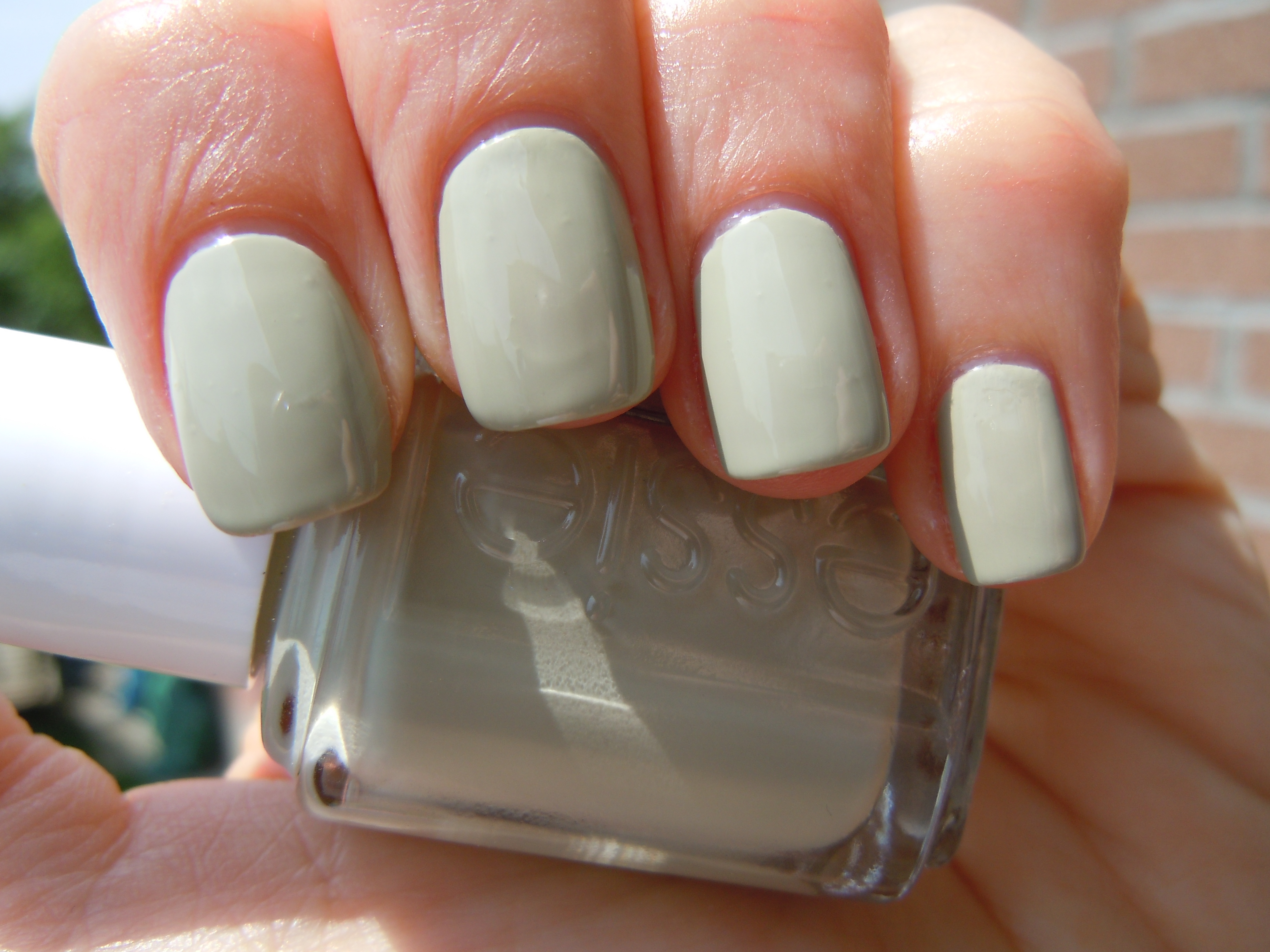
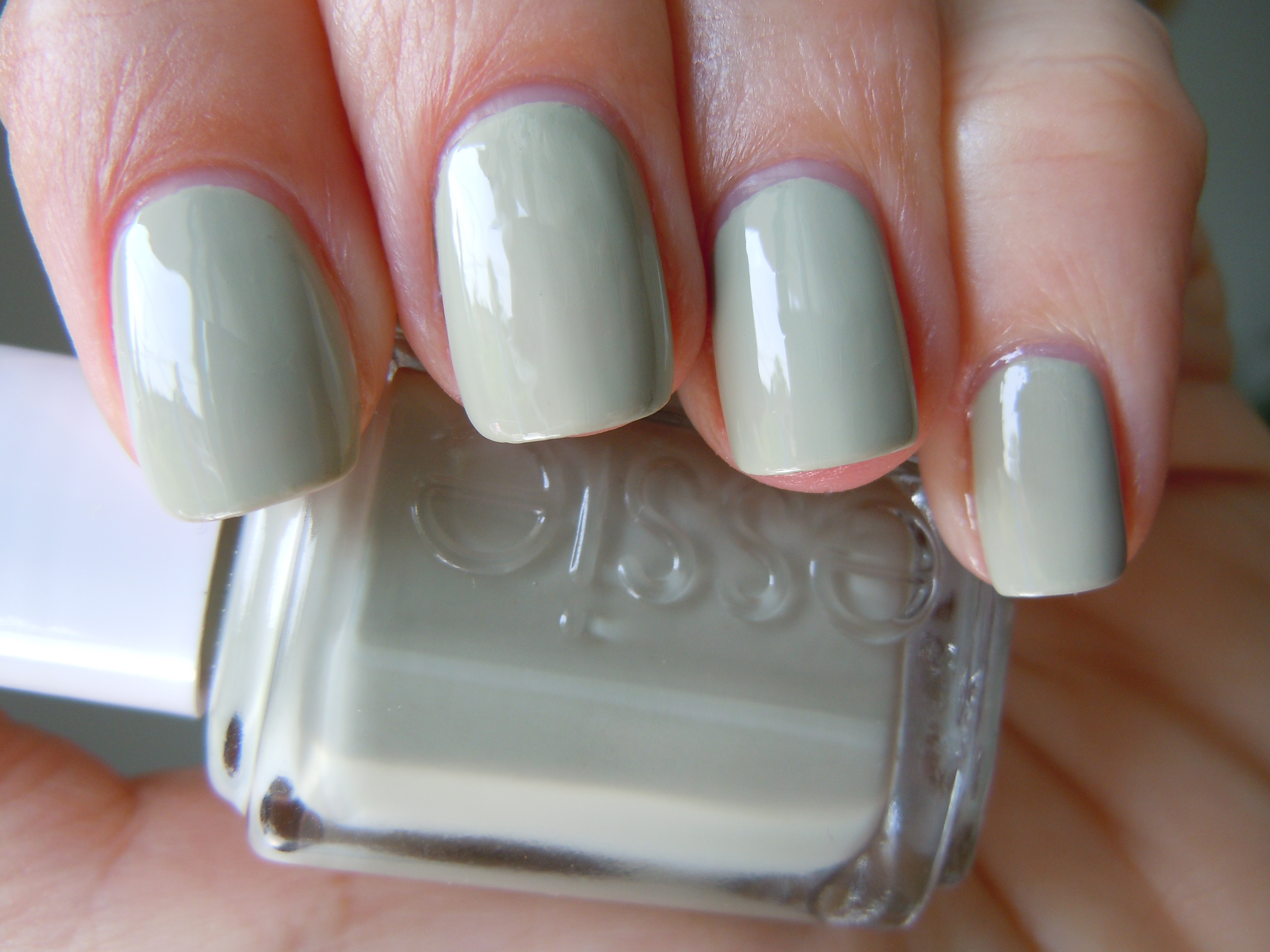
Leaving ‘Da Bush’ with two coats, I applied a third and final coat to ‘Stranger Tides’ to give them an equal depth of colour. At this point, you would be hard pressed to see any differences, especially when viewed in full sun (top photo). In shaded light (bottom photo), you can definitely see that while they are extremely close, ‘Da Bush’ is at least a tone deeper, even though it has one coat less than ‘Stranger Tides’.
Final thoughts: If you missed out on the OPI, here’s your chance to make it up with the Essie…and vice versa! That’s how close these shades really are! However, I noted that while ‘Da Bush’ required less coats for full opacity, the formula was definitely thicker than ‘Stranger Tides’ which may create some bubbling if you rush the application. The OPI also seemed to be slightly glossier at the finish, but when a top coat is applied anyway, it becomes a moot point. Do you need both? No….that may be redundant. It comes down to availability, brand preference and which style of brush you prefer. I usually snatch up these shades whenever I see them, primarily because I can’t resist anything ‘military’ inspired! My thanks to “A Happy Peach” for putting this request in!

*Disclaimer: product samples were provided by the company/PR for my unbiased consideration
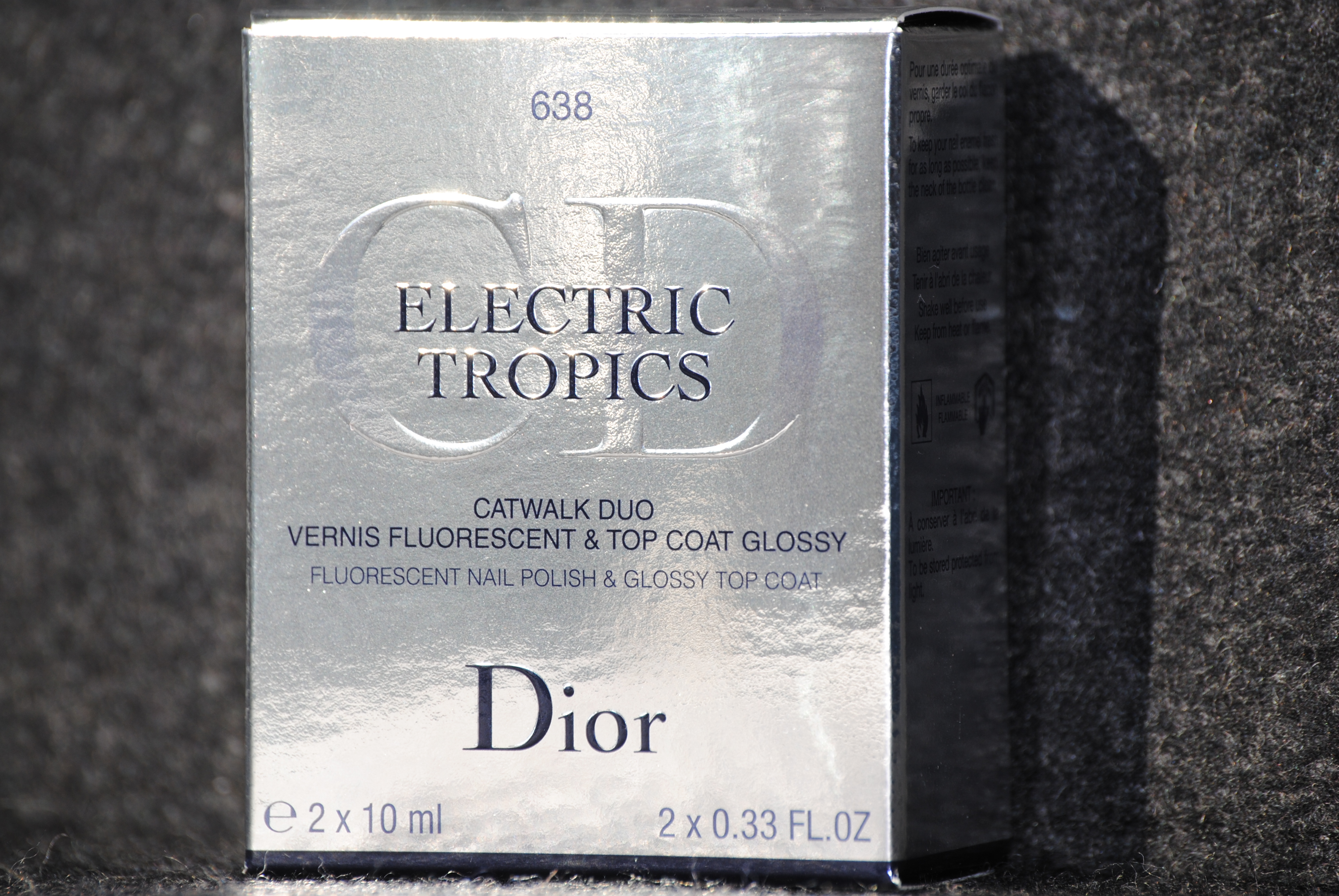
Dior – Electric Tropics Catwalk Duo #638 Aloha (swatches, review & comparison)
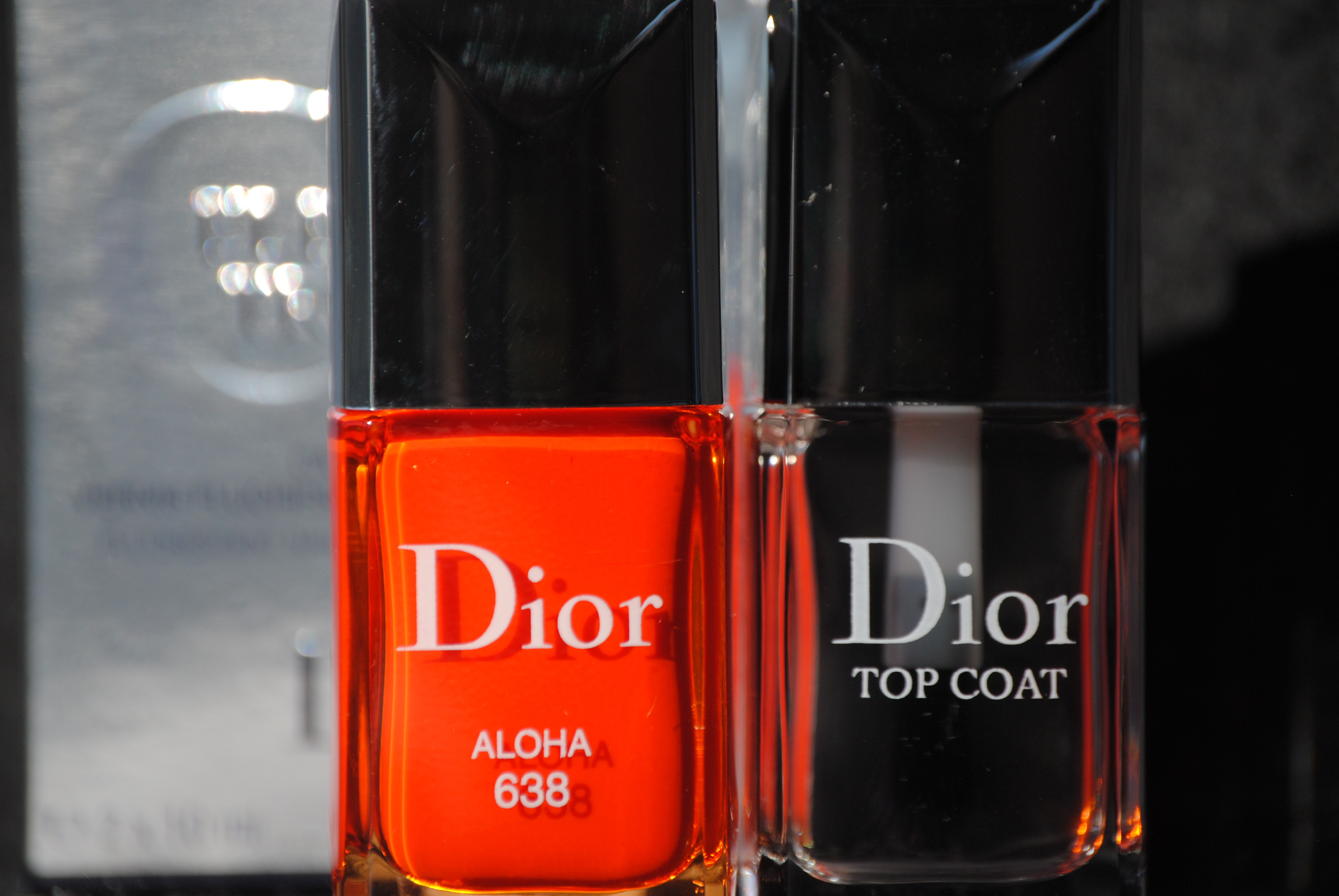
Hot on the successful heels of their recently released (but brooding) ‘Rock Your Nails’ Collection, Dior sends us in another (and brighter) direction with their latest launch for Summer 2011: ‘Electric Tropics’. Available in only two shades as well as sold with an accompanying top coat, the one that caught (and held!) my eye was #638 Aloha. I passed on the other duo (#558 Paradise Pink) as I heard it has a satiny finish which I tend to avoid, as well as the fact that I don’t usually wear hot pinks…but if it performs half as amazing as Aloha has, then I may come to regret that decision! All swatches are with Sèche Clear Base Coat, two coats of lacquer and Dior Top Coat.


Dior describes ‘Aloha’ as a “fluorescent nail polish” which initially put me off, but I soon realized that the appellation is a bit of a misnomer. While it might be exceptionally vivid, it certainly is not fluorescent by any stretch of the imagination — thank God, as I didn’t particularly wish to sport glow-in-the-dark nails! ‘Aloha’ is a rather brilliant tangerine hue, and the fact that it comes in a plump jelly-like formula, only adds to its lusciousness. As with other Dior formulas, this did not disappoint at all; I was surprised to note that there was enough saturation of colour even with the first coat, although I applied two for swatching purposes. Exceptionally shiny on its own, the addition of the accompanying top coat adds a superior glossy shine and maintains a hard to describe mirror-like look.
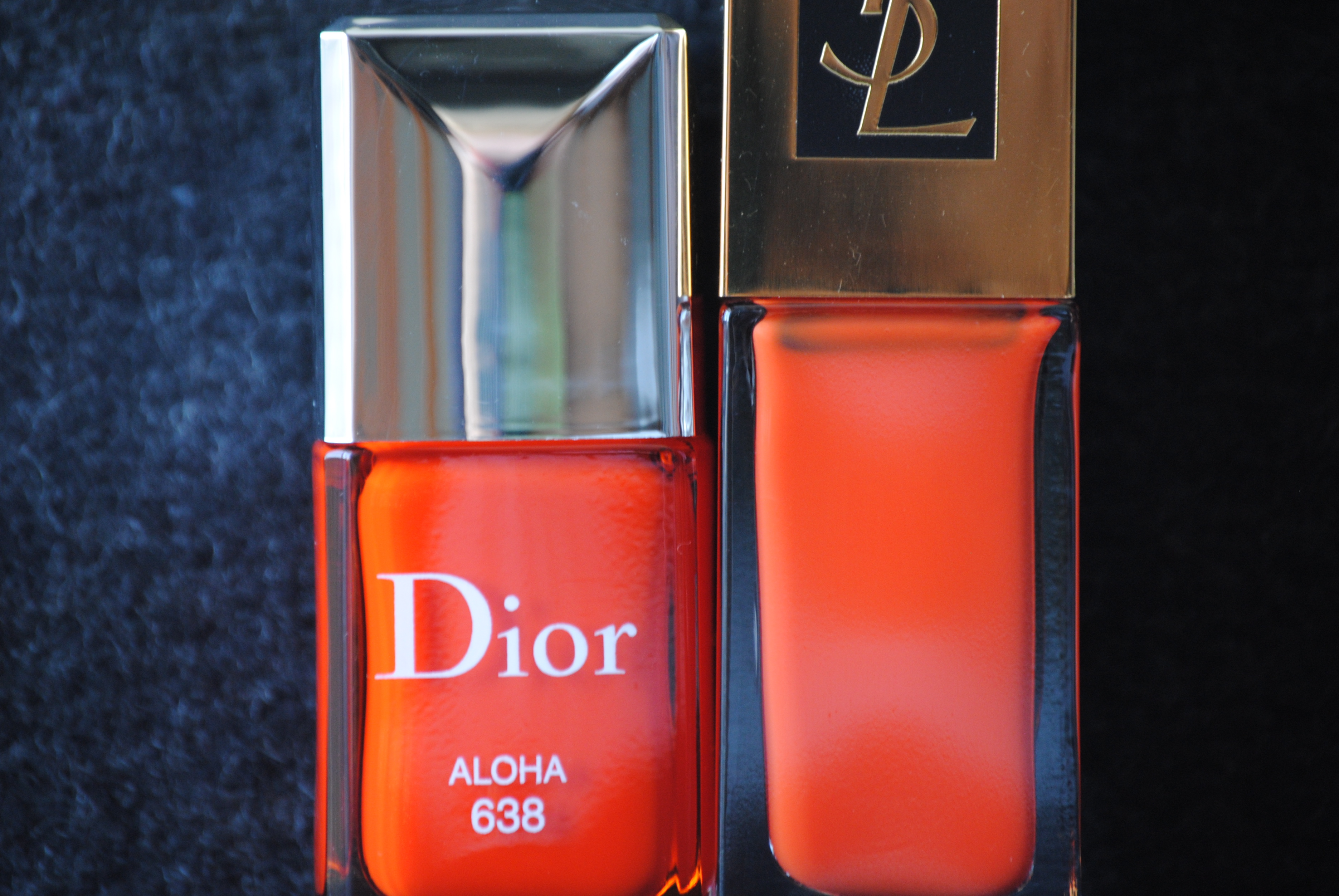


Going through my stash, I quickly realized that the only polish I had that came close, was YSL’s ‘Ultra Orange’ (from their Summer 2010 collection). Looking at them side by side, you an see that ‘Aloha’ still bears a slightly deeper hue, but once applied, the differences were negligible. Slightly more sheer on application, ‘Ultra Orange’ still has a similar jelly feel to it and to make it a fair comparison, I applied two coats of lacquer as well as the Dior top coat over it. Note how in full sun (top photo), you can just barely see ‘Aloha’s’ deeper tone, while shaded light (bottom photo) tends to even the differences out. Index & ring: ‘Aloha’, middle & pinkie: ‘Ultra Orange’
Final thoughts: I have yet to be disappointed with any of the Dior polishes I have tried to date and even though the company switched from a thin, flexible brush to a larger domed paddle shape (which takes a little getting used to), I find it quite easy to manipulate just the same. The formula is sublime and even though you’re paying more for this set (CAD $29.00 vs. CAD $24.00 for a single polish), I still find that it’s worth it for the inclusion of this awesome top coat, which is the closest contender I have come across to date for my usual favourite, Sèche Vite. As this is a limited edition set, snatch it up while you can, before it fades off into the Hawaiian sunset…aloha!
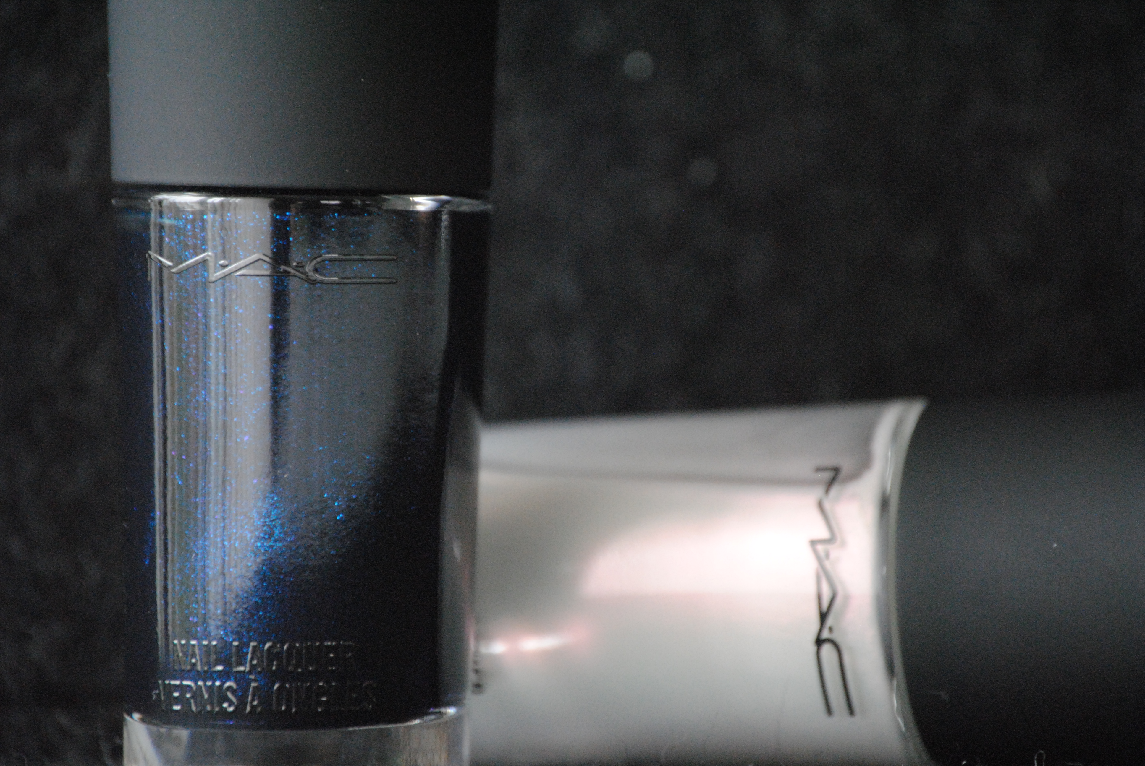
MAC – ‘Biker Blue’ and ‘Frayed To Order’ (swatches, review & comparison)
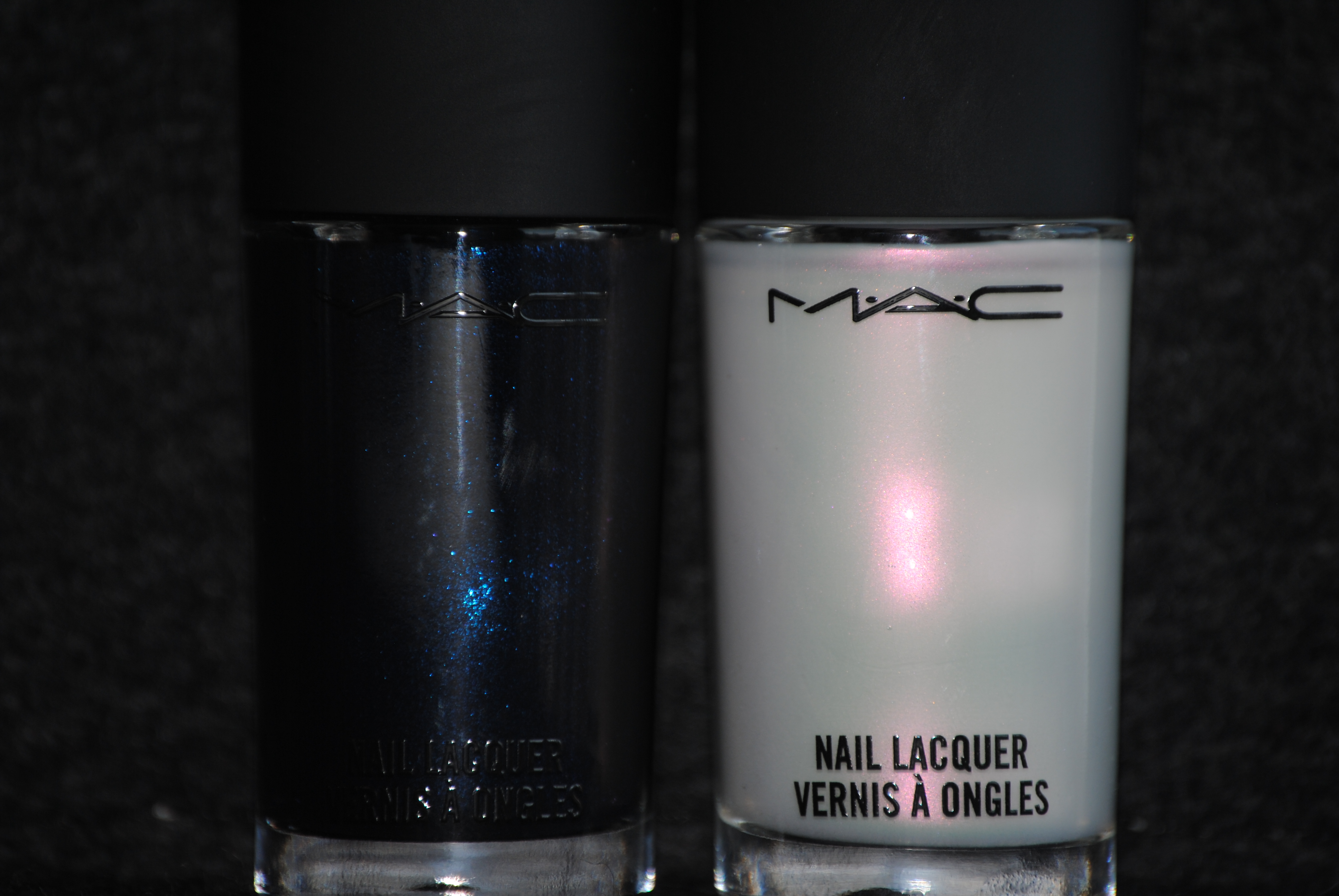
This past Spring when MAC released their Jeanius Collection, the two items I thought were of most interest were the lacquers, ‘Frayed to Order’ – a soft white matte, and ‘Biker Blue’ – a deep shimmering blue. What I find interesting is the juxtaposition of the dark, vampy polish to the delicate & airy light one, and that contrast is what appealed to me the most. All swatches are with Sèche Natural base coat; in order to enhance the finished effect of the lacquers, no top coat was applied.


‘Biker Blue’ is deep mysterious pool of darkness; this is a blackened navy base with the finest peacock blue shimmer throughout. I love how sunlight brings out its inner fire (top photo), making for a truly mesmerizing blue, while flash (bottom photo) gives you the full effect of the shimmer particles. Application was a breeze and two coats gave perfect opacity and coverage.


The only polish in my stash that comes close to ‘Biker Blue’, is none other than Illamasqua’s iconic ‘ Phallic’. The swatch photos above are index & ring fingers – ‘Biker Blue’, middle & pinkie fingers – ‘Phallic’, and while it’s fairly obvious that the two are quite close, you can still see that ‘Phallic’ has a brighter blue base and even finer shimmer compared to ‘Biker Blue’s’ indigo/denim leanings and slightly chunkier shimmer.
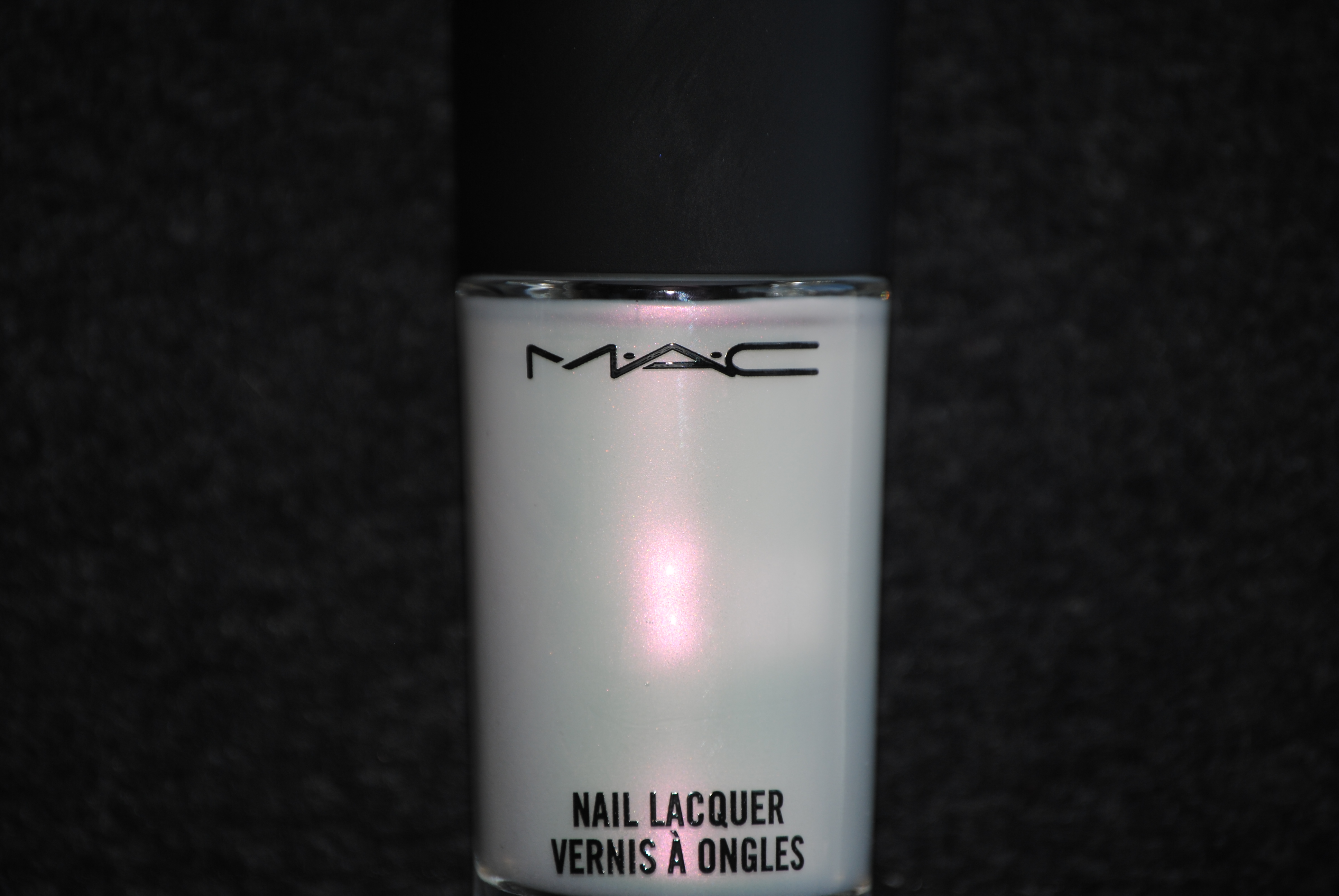


What I really loved about ‘Frayed To Order’, is how cloudy and diffused it appears. This is a soft, matte white shade with an opalescent look to it which can flash either pink or green at times. What’s interesting to note is how by adding that duo chrome finish and then making it a soft matte, it becomes an extremely wearable white shade. Application was a little tricky, mainly because of how quickly it dries (as do all mattes) forcing you to work quickly to avoid streaks, dragging and bald spots but with three thin coats like I did here, it left a perfectly even smooth finish.
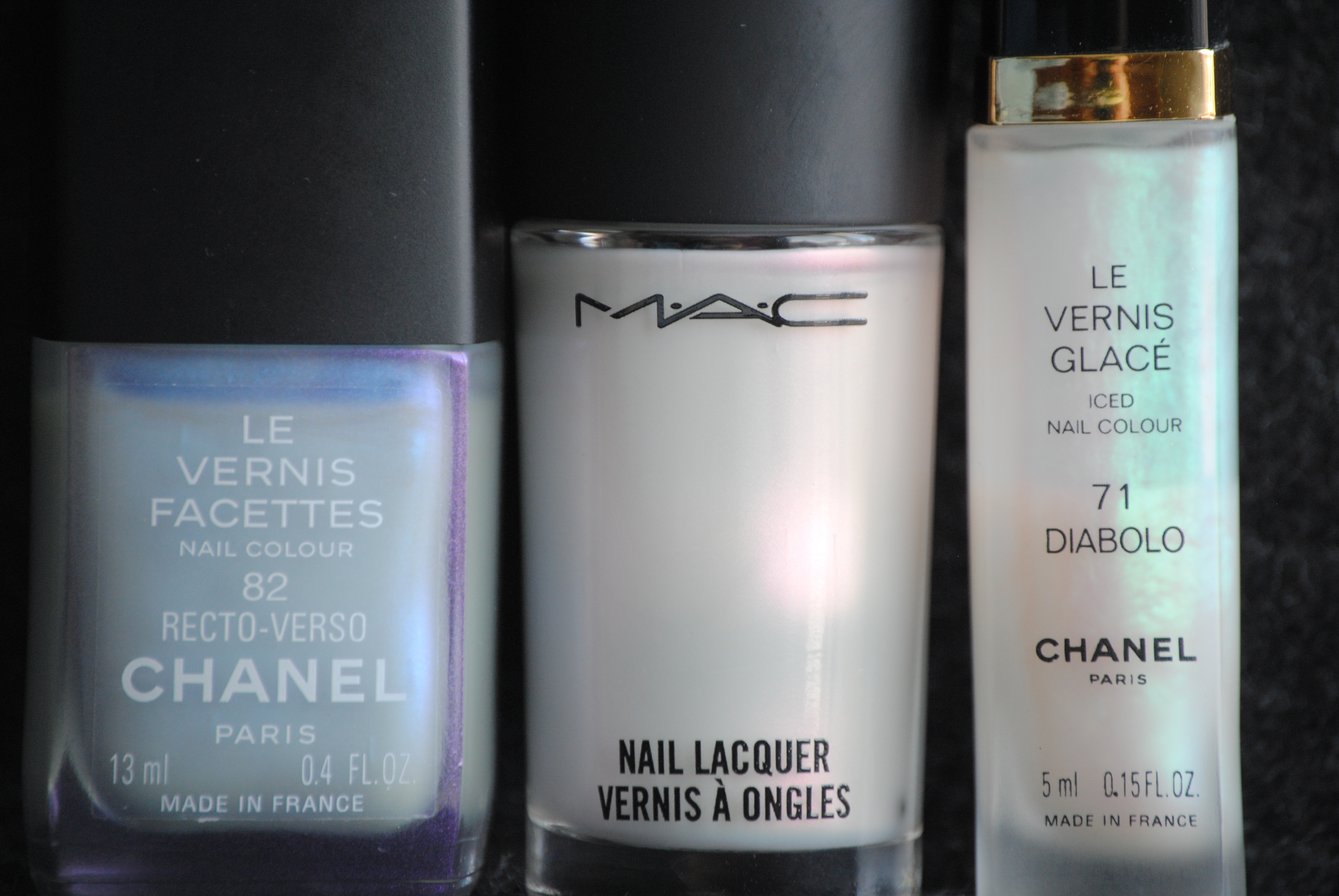


Digging through my stash, I came across a CHANEL polish dating back to Spring of 2000, Le Vernis Facettes in ‘Recto-Verso’ – another opalescent white shade that dried to a dull satin finish that I would have sworn was so similar to ‘Frayed To Order’…until I noticed that the CHANEL’s flash was violet & blue, and that the finish was completely different. The other candidate I found is yet another older CHANEL (not sure when it dates, but approx. 1998-2000), Le Vernis Glacé in ‘Diabolo’ which once again has that opal fire to it…but this one flashes green, is quite sheer, and the finish is a far cry from anything resembling matte. As you can see from the swatches above (index – ‘Recto-Verso’, midd;e & pinkie – ‘Frayed To Order’, ring – ‘Diabolo’), while all three have that same milky white base, the varying hues of the colour flashes do nothing to highlight any similarities but instead showcase how different they all are. I’m fairly certain that even by adding a matte top coat, they still won’t come close to each other. Please note that I applied three thin coats of lacquer for these swatches.
Final thoughts: For the vampy polish lovers out there, ‘Biker Blue’ is a beautiful and chic option, primarily due to the shimmer in its depths, and also because it never comes off as “just another dark shade” but maintains its blue integrity. ‘Frayed To Order’ as you can see from my comparisons, is truly unique in that this is a white shade like it’s never been done before: soft, fiery and matte all at the same time. I thought the formulas were easy to work with, and application relatively streak free, with the added bonus of a lovely shiny finish on ‘Biker Blue’. Ask to go through your nearest MAC counter’s makeup drawers, and you possibly could still score either one of these shades!
LAQA & Co. – Blurple (swatches, review & comparison)
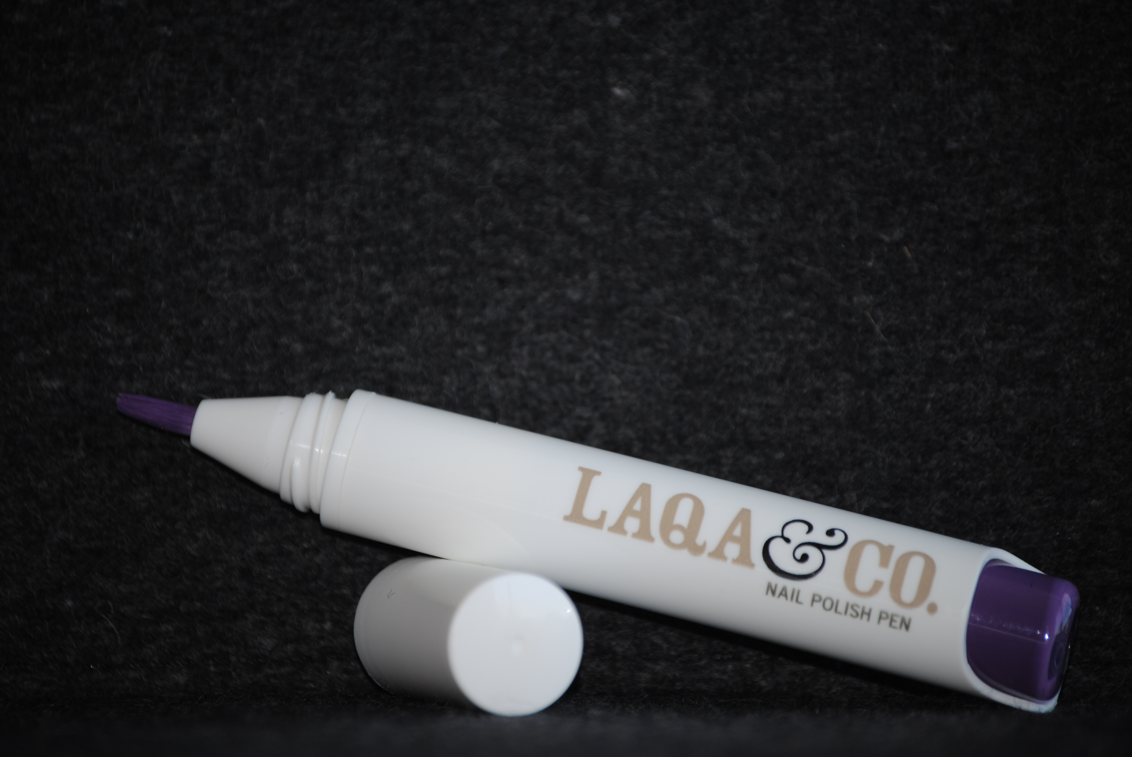
My first experience with a nail polish pen, was when I reviewed LAQA & Co.’s ‘WTF’ (here), so I had a fairly good idea of what to expect. What I was unprepared for, was how saturated in colour ‘Blurple’ would turn out to be…a pleasant surprise! True to the instructions that accompany each pen, within 8 clicks the polish flows easily to the tip and you’re set to start painting. What makes a nail polish pen unique amongst all the other lacquers out there, is its portability and ease of use. ‘Blurple’, as the name implies, is a cross between a deep purple and a rich blue and the following swatches are with Sèche Natural base coat and two coats of polish, no top coat.
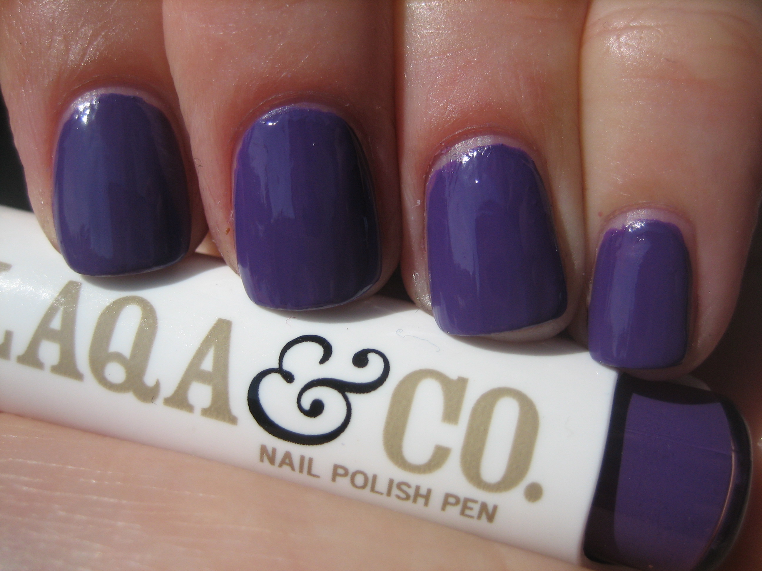
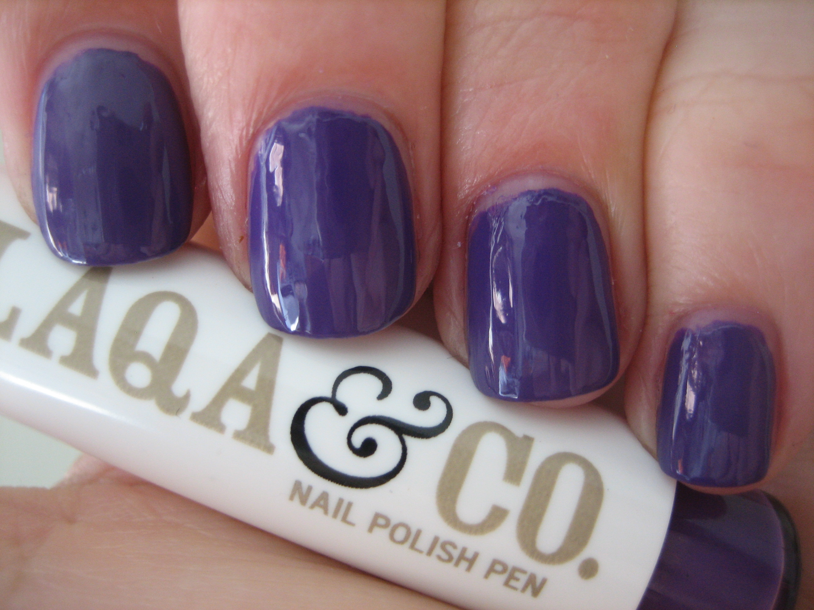
Initially, knowing how much polish to bring to the tip of the pen takes a bit of practice and some skill, but once you get the rhythm going, it becomes a breeze. ‘Blurple’ is an intensely deep indigo shade, becoming fully opaque with the second coat and what I found so impressive, was the awesome glossy finish; you basically don’t need a topcoat, at least not for any extra shine. Whether seen in full sun (top photo) or indirect light (bottom photo), I love how the colour itself doesn’t change all that much and remains true to its purple leanings. Dry time was fairly quick as well, and my only suggestion would be to have a napkin handy to wipe off any excess polish that might come to the tip of the pen or to dab your pen against, in case you push too much of the colour out the tip.
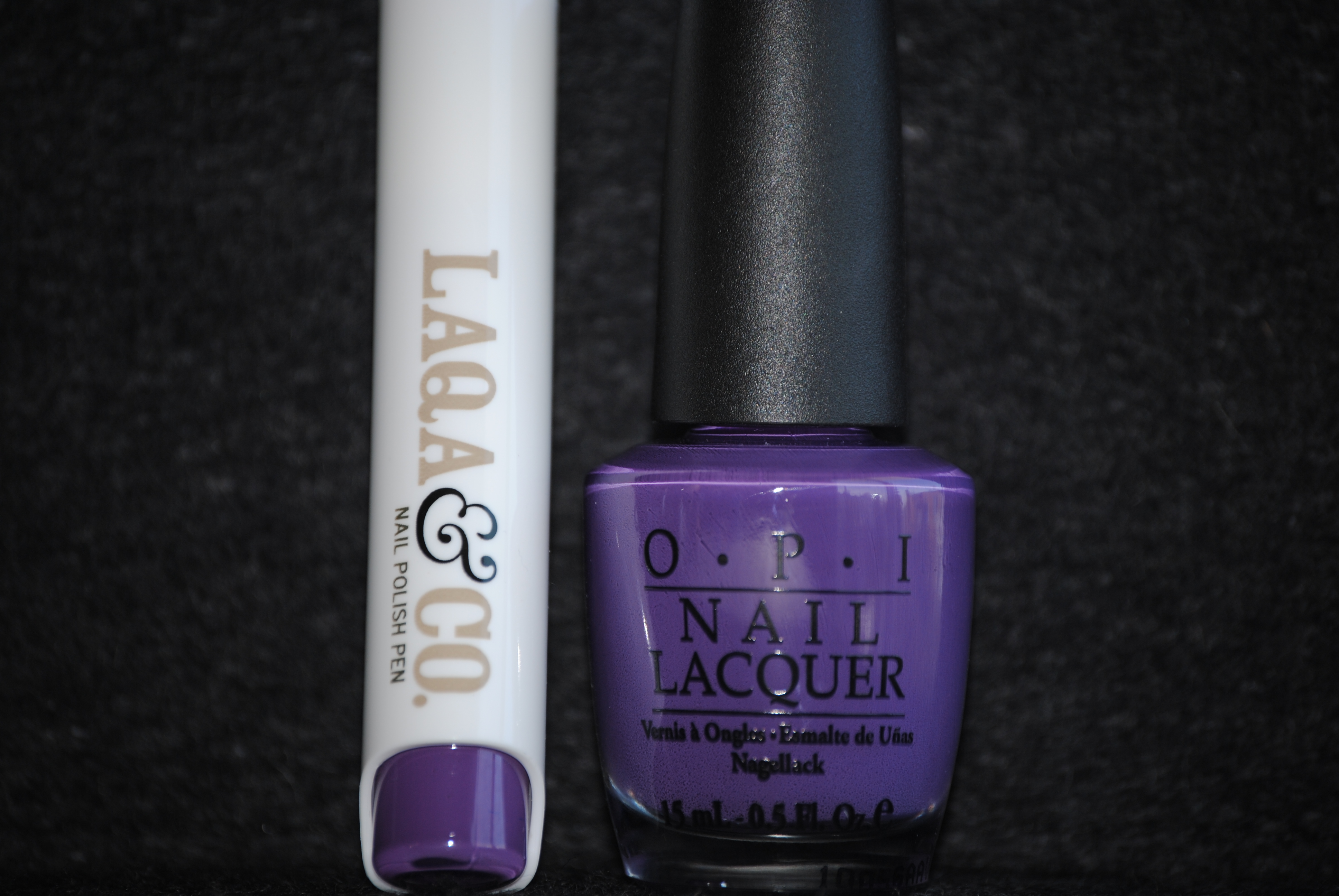
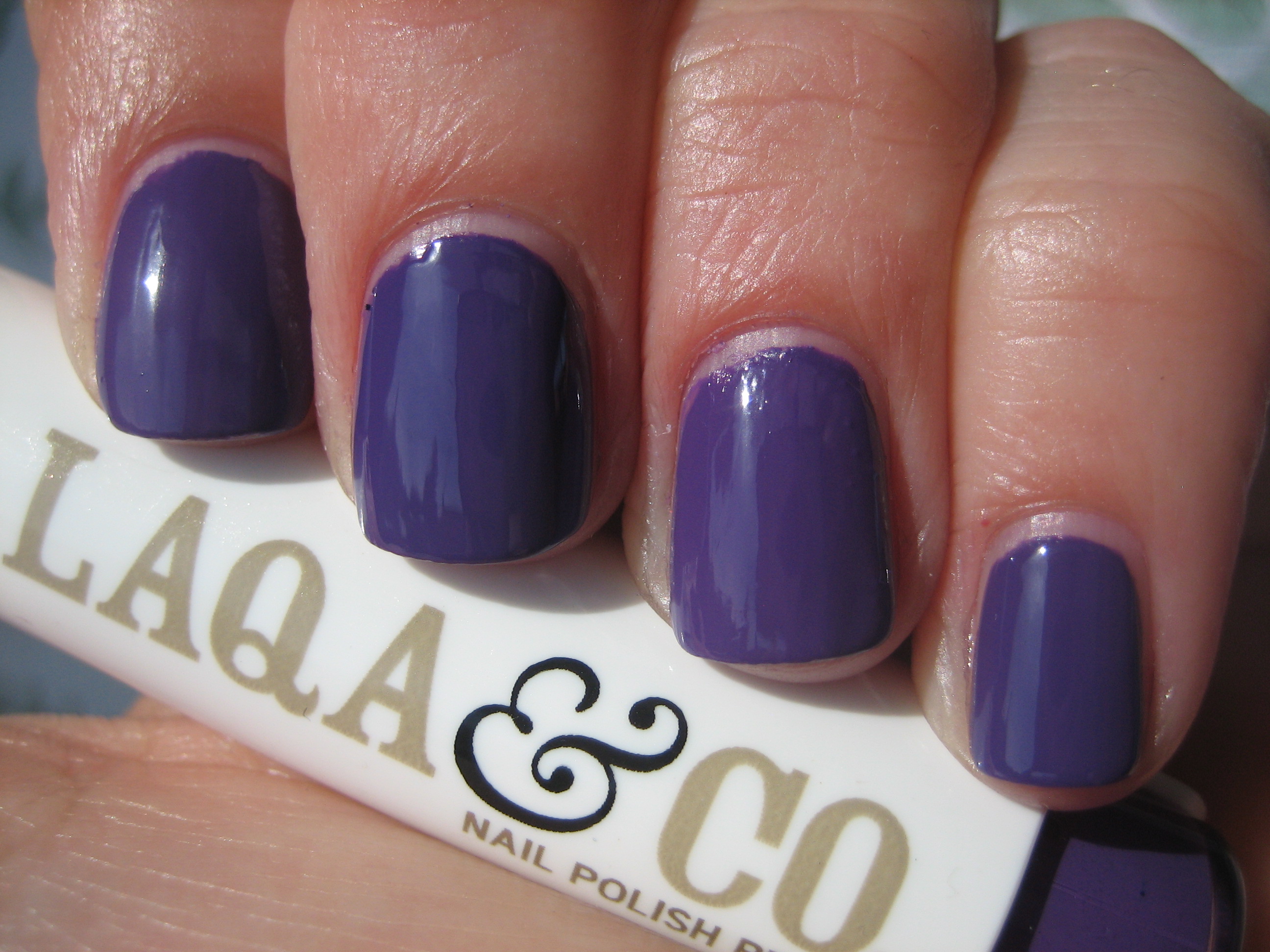
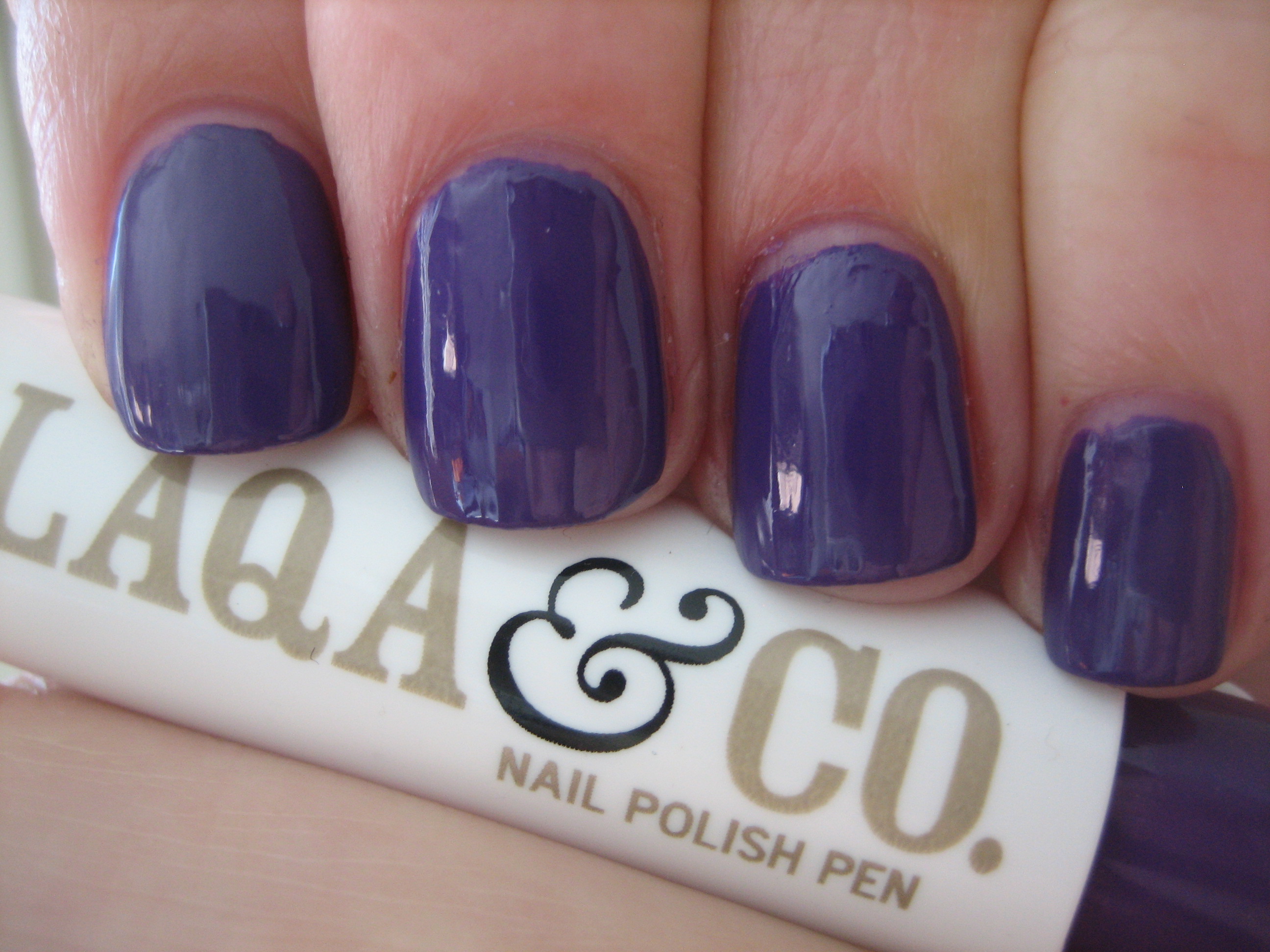
Going through my stash of lacquers, the best match I found was with OPI’s ‘Funkey Dunkey’ from the Shrek Collection. Both polishes needed only two coats to be fully opaque, and the differences themselves were rather minute; the formula on ‘Funkey Dunkey’ seemed to be somewhat thinner, and its base hue was perhaps a tone darker than that of ‘Blurple’ (as you can tell from the top photo taken in full sun), but other than that, they were indeed close enough to be twins.
Final thoughts: Having tried only two of the eight available shades, I have to confess that I prefer ‘Blurple’ to ‘WTF’, mainly because I fell in love with ‘Blurple’s’ colour…..like spilled ink! Apart from the 8 coloured nail polish pens available, the company also offers a top coat (again, in pen form) as well as nail polish remover pads. What’s interesting to note is the totally unique packaging that each item comes in; each polish pen box has been individually designed by an up-and-coming artist, and part of the proceeds of every pen/product sold, goes towards helping to support their endeavours…isn’t that wonderful? Please feel free to browse through LAQA & Co.’s website to purchase or for more information.

*Disclaimer: product samples were provided by the company/PR for my unbiased consideration