
Filed In: nail polish
Essie | Spring 2015 Collection

Oh, Essie – you had me at Spring, and then these shades come into my life and just like that, it’s amore. The new Spring 2015 Collection from Essie (launching in March), draws inspiration from an abundantly flowering garden, filled with a profusion of colour to reawaken our senses – all of which have probably been in hibernation from this miserably cold Winter. This jolt of colour is so welcome right now, and ∗almost∗ makes the cold weather bearable. At least this collection makes Spring seem that much closer.
It must be said, that Essie listens to their fans/devotees/groupies/addicts (take your pick. Pick, get it? Couldn’t resist including a garden/flower references. Shamelessly cheesy, but cute, no?) and continues to improve the formula. All six crème shades of this collection (not one drop of shimmer in sight) are a total joy to work with, applying in an effortless and self-levelling way, with several that don’t even need more than 1 coat for full opacity. All the swatches below are with 2 coats of lacquer each, as well as added top coat.


Perennial Chic | Described as “tawny tulip”, I say it’s more of a dollskin pink (or even Band-Aid pink), a neutral hue that is nowhere near what I consider tawny. The formula is semi-sheer and there’s a touch of patchiness seen with application of the first coat – normal for this type of shade – although Perennial Chic definitely becomes fully opaque with a second layer. This is a warmer leaning nude (I detect hints of peach in the base) and a colour that should be fairly easy for most skin tones to pull off, although I’m personally on the fence with the way it looks on me.

Picked Perfect | Described as “antique almond peony”, the antique almond part is about right, although I’m not feeling peony – more milk chocolate latte, instead. The formula here is thicker than that of Perennial Chic, but that works in its favour as it stays exactly where placed without any migration into surrounding skin. Picked Perfect applies in an über-creamy way and can almost be opaque at 1 coat if you load up your brush just right – totally surprising & so welcome. An absolutely perfect nude.

Blossom Dandy | Essie sure has the baby blue/mint category down pat, and Blossom Dandy is poised to be one of the biggest hits of this collection. This shade is incredibly difficult to properly capture in pictures; described as “mint crème hydrangea”, I say it’s closer to baby aqua that leans more blue than green, but again, that depends on the light and angle you’re coming from. I found the formula to be excellent and had no patchy issues to deal with whatsoever (unlike Essie’s Mint Candy Apple which always seems to apply rather chalky on me). All I know, is that I’m bsolutely loving Blossom Dandy and its mix of cool and warm tones should make it a winner for all skin tones across the board.

Petal Pushers | Lord, I do love me a good grey and Petal Pushers is pushing ALL my buttons. The formula here has a jelly-esque feel; slightly springy, ridiculously glossy, and leaving that plush look behind. Described as a “smoky stone rose” (how utterly romantic – I love the imagery of that description), I detect hints of blue and some mauve-y purple in the base, which lend this colour depth and keep it from appearing flat and one-dimensional. Perfection, I tell you.

Flowerista | Described as a “passionate plum dahlia”, I would have to agree – except I’d also add magenta in there as well. The formula is beyond amazing and can literally be a one coat wonder (especially if you load your brush up right), with a perfect flow, density and coverage – as well as a high-gloss shine at the finish (you don’t even need top coat, it’s THAT shiny). Once again, capturing all the colour nuances here proved difficult, as Flowerista can appear more purplish at some angles/lighting, or more pink-tinted at others. Either way, it’s gorgeous. Best part? Non-staining upon removal.

Garden Variety | Let’s just take a collective moment to absorb the gorgeousness of this colour, shall we? Sigh. Described as an “exotic teal blue orchid”, Garden Variety is all that — and more. An intense turquoise hue in a hybrid crème-jelly formula, there is a perfect density, opacity, and flow seen upon application, while the glossy finish is nothing less than spectacular. I detect more blue tints in the base, although there are small hints of green that peek through at certain angles (and yes, you would not believe how hard it was to accurately capture the colour in photos here as well – my camera just would.not.cooperate), all of which make this shade universally wearable by all skin tones. While relatively non-staining upon removal (relative to something so pigment-saturated in this colour group), I would not recommend skipping base coat just the same. Love, love, love this shade. Love.
A floral-inspired collection for Spring – how original, right? And yet, somehow Essie has managed to take this ubiquitous theme, shake it up, and then inject some new life into it. It doesn’t hurt that each and every formula of each and every shade is just perfect and make application fun, instead of a chore. With the exception of Perennial Chic (although I am oddly attracted to it, even if I’m not that thrilled with how it looks on me. So weird, that), I adore them all, with a 3-way tie between Blossom Dandy, Petal Pushers, and Garden Variety vying for top spot while both Flowerista and Picked Perfect are not that far behind. Final verdict: this entire collection is 100% win and well worth investing in.

Press samples provided for my unbiased consideration


Guerlain | 400 Coque d’Or & 901 L’Oiseau de Feu Gold Top Coat

Guerlain’s Christmas 2014 Collection included two new limited edition nail products, 400 Coque d’Or Colour Lacquer and 901 L’Oiseau de Feu Gold Top Coat (CAN $27.00 each). Gold may be a ubiquitous and almost mandatory colour for the holidays, but it also translates well into other seasons. Then again, you don’t really need a reason to bring a little bling to your nails, am I right?

Guerlain | 400 Coque d’Or & 901 L’Oiseau de Feu Gold Top Coat

Guerlain | 400 Coque d’Or & 901 L’Oiseau de Feu Gold Top Coat

Guerlain | 400 Coque d’Or & 901 L’Oiseau de Feu Gold Top Coat (outer caps removed)

Guerlain | L’Oiseau de Feu Gold Top Coat brush

400 Coque d’Or | Metallic polishes can be quite fussy to work with, but Coque d’Or is nothing short of spectacular. This is a cool-leaning pale gold shimmery hue (although there does seem to be enough to a darker golden tint in the base to make it wearable against warmer skin tones as well) in a formula that displays a perfect flow & density i.e.: stays exactly where placed without migrating. Self-levelling, ultra glossy, and utterly brilliant in every light, Coque d’Or almost seems to gain in shine as it dries/sets, with hardly any noticeable brush strokes. Absolute golden luxury. Coats applied: 2, no top coat
I need to take a second and talk about the brush (shown in closeup detail above): tapered, slightly rounded and with excellent density, it splays so perfectly along the nail that you really only need to apply the lightest pressure when placed on the nail – the brush seems to almost do all the work on its own.

Guerlain | 400 Coque d’Or

901 L’Oiseau de Feu Gold Top Coat | Made of irregularly shaped shards of golden flakes suspended in a [thick-ish] clear base, which helps in keeping the glitter pieces from sinking, while preventing too many from building up on the brush. Here’s where things get a little tricky, however; the shards are on the large side – which in itself is not an issue – but some may need to be nudged into place along the nail, while others have a tendency to not want to cooperate by staying flat (and may need a rather thick top coat to keep them down). Meant to be layered over another polish, I was surprised to find that I actually like the tone-on-tone effect when worn over Coque d’Or, and even though L’Oiseau de Feu may be somewhat finicky to work with, I can’t deny how insanely brilliant the gold shards are – highly reflective.
The swatches show 1 coat of L’Oiseau de Feu over 2 coats of Coque d’Or. What I love? How the shards provide a studded effect to the look, giving a rough and harder edge to the daintier gold which in turn makes this a more modern way to wear a metallic. What I don’t love? How some of the shards refuse to lay flat and catch on hair, clothing, etc. and as a result, can be easily ripped off – and take some of the underlying polish with them. Sigh.

Guerlain | 901 L’Oiseau de Feu Gold Top Coat (over 400 Coque d’Or)
Both of these lacquers were my first foray with Guerlain (surprising, right? I can’t figure out why I don’t own more) and while I absolutely adore Coque d’Or as one of the most amazing gold foil/metallic polishes I’ve ever worn, L’Oiseau de Feu definitely fell short in the performance department. Yes, the shards give a unique look and are seriously some of the most brilliant I’ve seen with regards to these types of top coats, but just know going in that you’ll need to put in a bit more of an effort. The final look of the two together is killer, however (dammit).
Still available at Guerlain counters (in Canada – The Bay, Sephora) although the Spring 2015 Collection has already started trickling onto counters. Find more info on the brand at www.guerlain.com

Press samples provided for my unbiased consideration
OPI | Fifty Shades of Grey Collection

OPI has just recently launched their limited edition Fifty Shades of Grey Collection (CAN $11.50/each) in collaboration with the movie of the same name that comes out in theatres this Valentine’s Day. While the book that inspired the movie (that also spawned a billion other Fifty Shades-related marketable items) left me unmoved (check out my original ‘Fifty Shades of Grey’ post here for a much better read in this genre), I happen to have a major weakness for the colour grey, so for that reason alone I would have fallen for this collection anyway.
And while not exactly all 50 shades (thank God, or I’d probably still be swatching), the five greys shown here are all luscious & gorgeous representatives of this somewhat ephemeral colour, all grounded by that one sensual red note for even more visceral appeal.

OPI | Fifty Shades of Grey Collection

OPI | Fifty Shades of Grey Collection

Cement the Deal | With its blueish undertones in the base hue, Cement the Deal can appear either concrete grey or more of a softer dove grey hue. The formula is simply superb: a hybrid crème/jelly that applies in a self-levelling way, finishes ultra-glossy, and displays an excellent opacity. Coats applied: 2, plus top coat

Embrace the Gray | With a formula that is basically identical to the one above, the main difference here is that Embrace the Gray falls a few degrees darker in tone, making this more of a sealskin grey. Coats applied: 2, plus top coat

Dark Side of the Mood | At first glance, this appears as just another blackish hue, but it is well named, for it has a slightly moody nature. Dark Side of the Mood is a deeply smoked charcoal colour with tiny, sparse silver flecks throughout that make occasional appearances. The formula is jelly-like in texture and semi sheer at the first coat, but becomes completely opaque with the second layer. There’s a subtle moiré pattern you can see at some angles – total LOVE. Coats applied: 2, plus top coat

My Silk Tie | An utterly brilliant white-based silver foil/metallic hue. Not as quick drying as other metallic shades (which works in the formula’s favour), you do need a steady hand in application to minimize any visible brush strokes – although they do seem to level out on their own to some degree. My Silk Tie comes to a fully opaque gleaming finish at 2 coats
TIP: for the smoothest finish, start with base coat followed by your first coat of polish, then apply a layer of matte top coat, finishing with your second coat of polish. For a foil/metallic texture like this, top coat is optional, as it only adds protection and no extra shine factor (in fact, it may even dull the natural brilliance).

Shine for Me | Complex doesn’t even begin to cover this; Shine for Me is a semi-sheer pearlized base hue with navy coloured fine and ultra-fine hexagonal glitter bits. The formula is another surprise, with an excellent density that means it will stay exactly where placed (no pooling into cuticles or running along the sides of nails) and while 2 coats are more than sufficient to reach full opacity on shorter nails, longer lengths might need a third layer (or simply left at 2 coats for a different take altogether). Relatively smooth to the touch with a top coat, an extra plus is that no major effort is needed for removal either (at least, not compared to other glitter polishes). Coats applied: 3 (thin), plus top coat

OPI Fifty Shades of Grey Collection | Shine for Me (detail)

Romantically Involved | Let me begin by saying that OPI sure knows how to do red. With its balance of both blue and brown undertones in the base of this crème/jelly hybrid formula, Romantically Involved appears rather cool-leaning with the first coat, but then takes on a much warmer tone with the application of a second layer. Lush, seductive, and somewhat carnal (which is what OPI was definitely going for, I’m guessing), the best part is that this shade is 100% non-staining upon removal. And absolutely, ridiculously glossy. Coats applied: 2, plus top coat

Shine for Me & My Silk Tie nail art | A simple, yet effective nail art look (especially if you’re nail art-challenged like me): Start by applying 2 coats of My Silk Tie and letting that dry completely. Take Shine for Me and wipe of most of the excess off the brush, and starting at the cuticle end of the nails, apply in a downward motion, feathering & fading it out as you go (leave the nail edges free of any glitter). Repeat with slightly more at the top for added depth. Finish with top coat to seal everything in and smooth out any delineation marks.
Wouldn’t this look make for a spectacular ‘Ice Queen’ mani?
The book, Fifty Shades of Grey, may have had me reeling in laughter (true story: I ultimately committed the most blasphemous thing a book-lover can do; I actually ∗gasp∗ threw away all 3 books of this series), but OPI’s Fifty Shades of Grey Collection has me ooh-ing and ahh-ing in appreciation … redemption. An entire collection of grey lacquers may have turned out, well, rather boring – but the little twists & turns of this grouping is a winning combination, in my opinion. Go ahead: surrender to this collection. You know you want to.
Available for a limited time through fine salons and spas nation wide. Visit www.opi.com for more brand information

press samples provided for my unbiased consideration
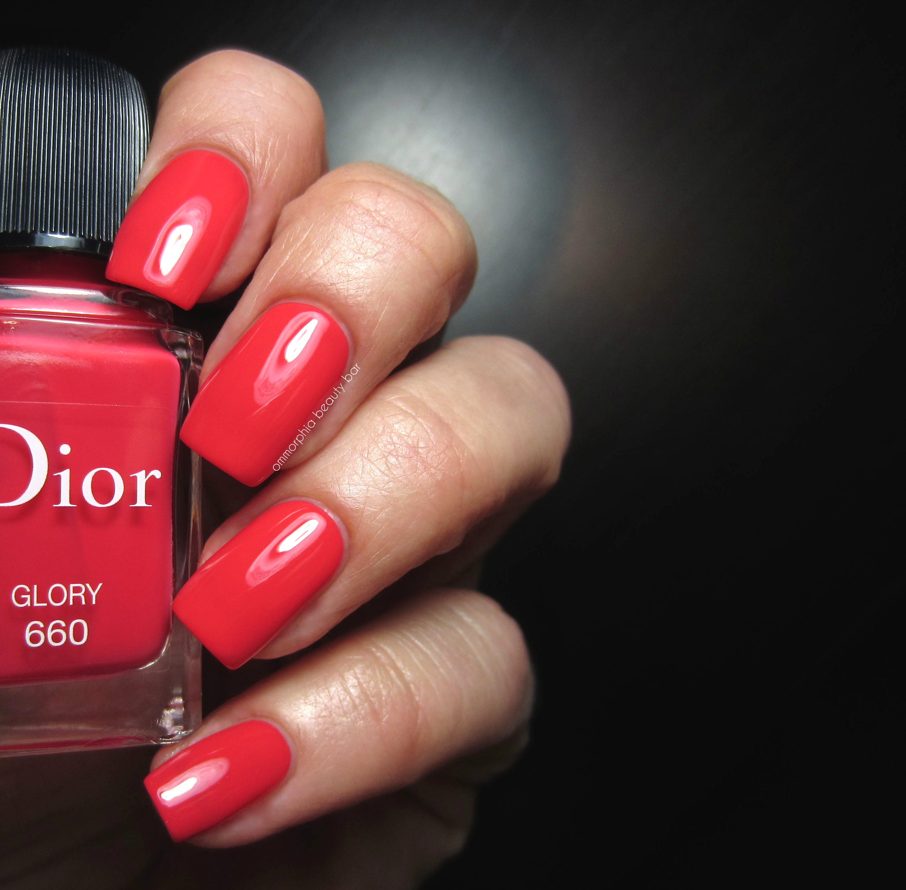
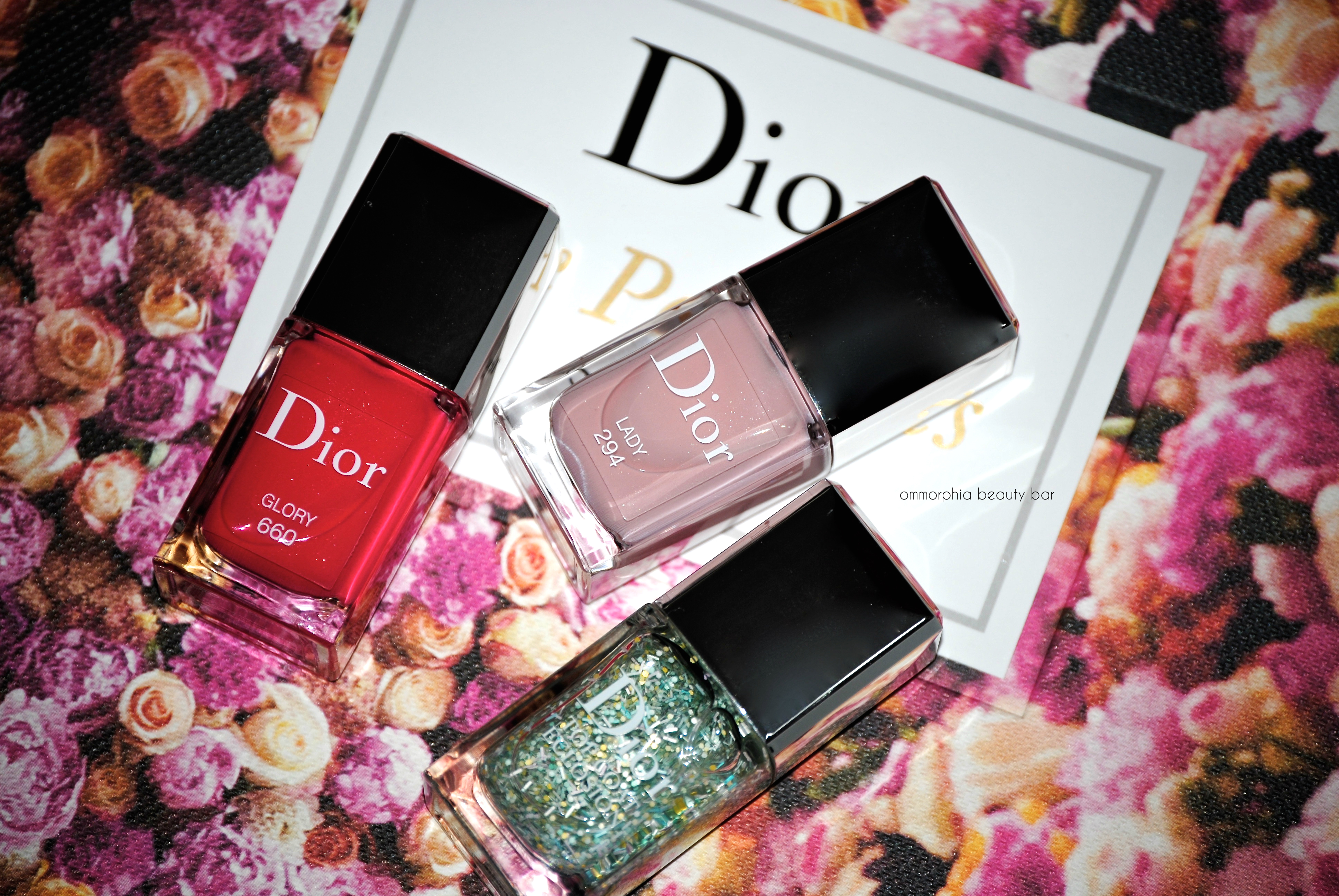
Dior Spring 2015 | #294 Lady, #660 Glory & Éclosion Blossoming Top Coat
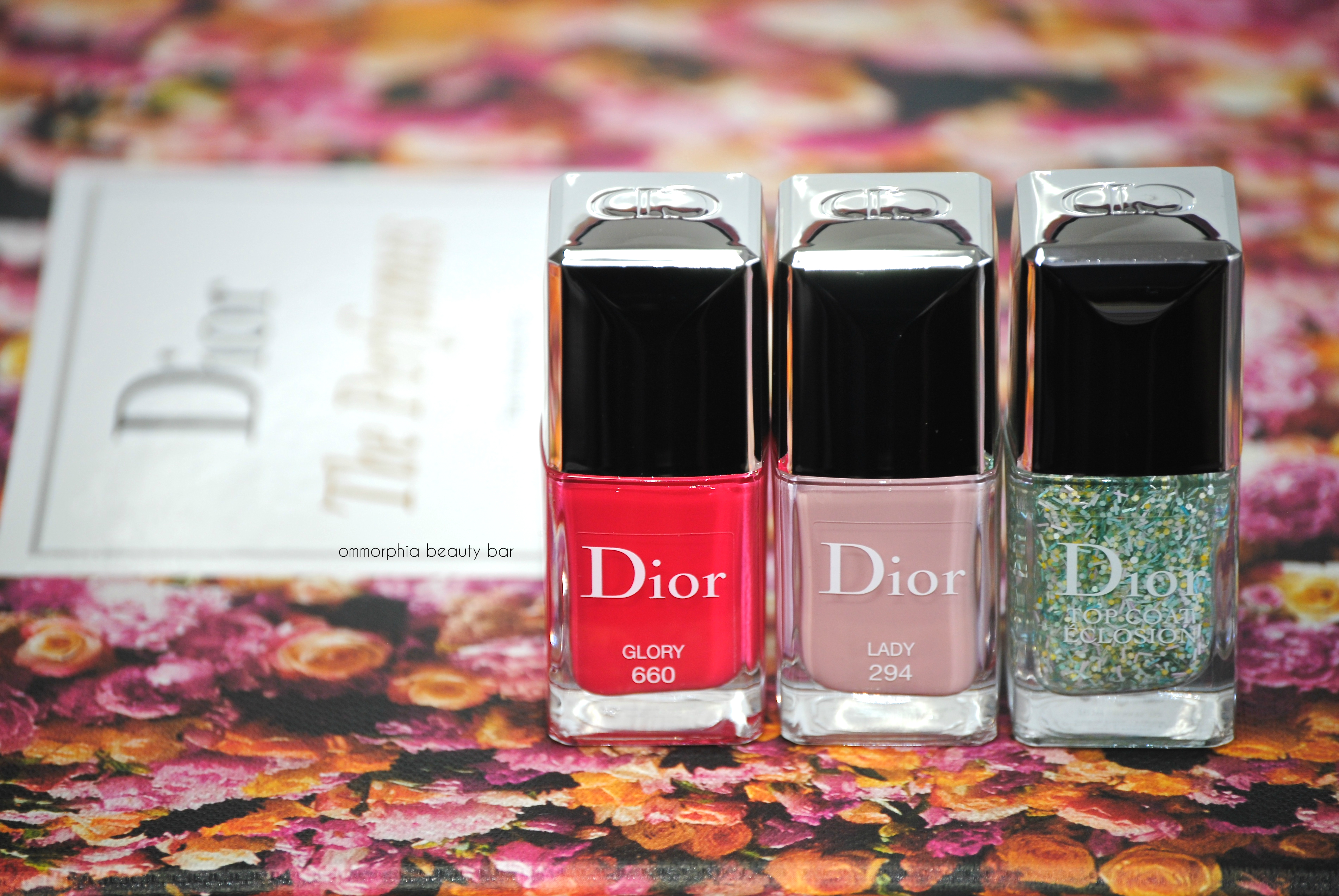
Despite the brutally cold weather we’ve been experiencing lately, a harbinger of the warmer weather ahead, comes in the form of Spring beauty offerings that have just begun trickling onto counters. The Dior Kingdom of Colours Collection Spring 2015 nail lacquers presents an encapsulated version of the collection’s main theme: neutral vs vivid, with a dash of whimsy thrown in via the new Éclosion Blossoming Top Coat.
The two colour shades of this collection are in Dior’s Gel Shine format which is incredibly glossy on its own and really makes adding a top coat superfluous, although I did apply one for my swatch photos here (although it’s totally not needed for a full mani/pedi. Seriously). The brush of Dior lacquers is one of my favourites of all brands – if not THE favourite – with its slightly chiselled and bevelled head of dense hairs, that splay perfectly when placed upon the nail, depositing the colour exactly where you want it to with a minimum amount of effort.
Note that both #294 Lady & #660 Glory bear Dior’s famous ‘secret shimmer’ in the base -incredibly fine particles that are relatively undetectable to the naked eye, but which are seen in direct sunlight or with flash – and definitely add a nice overall depth of tone to each hue.
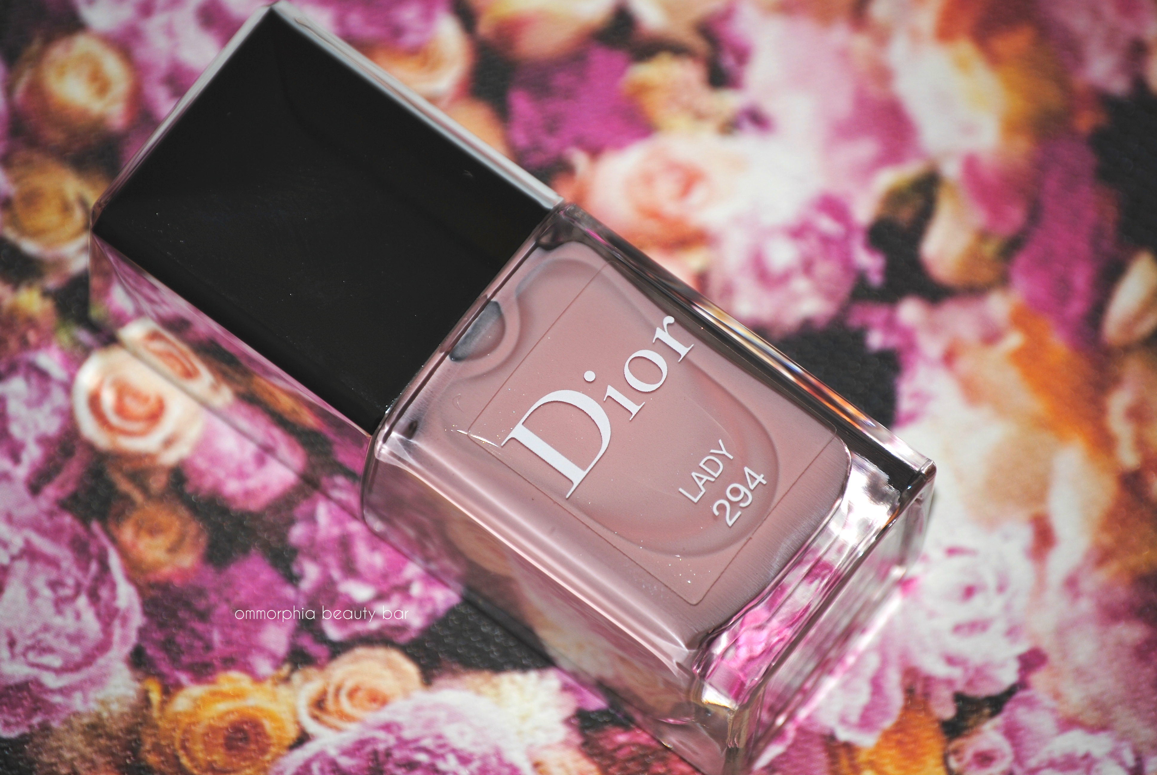
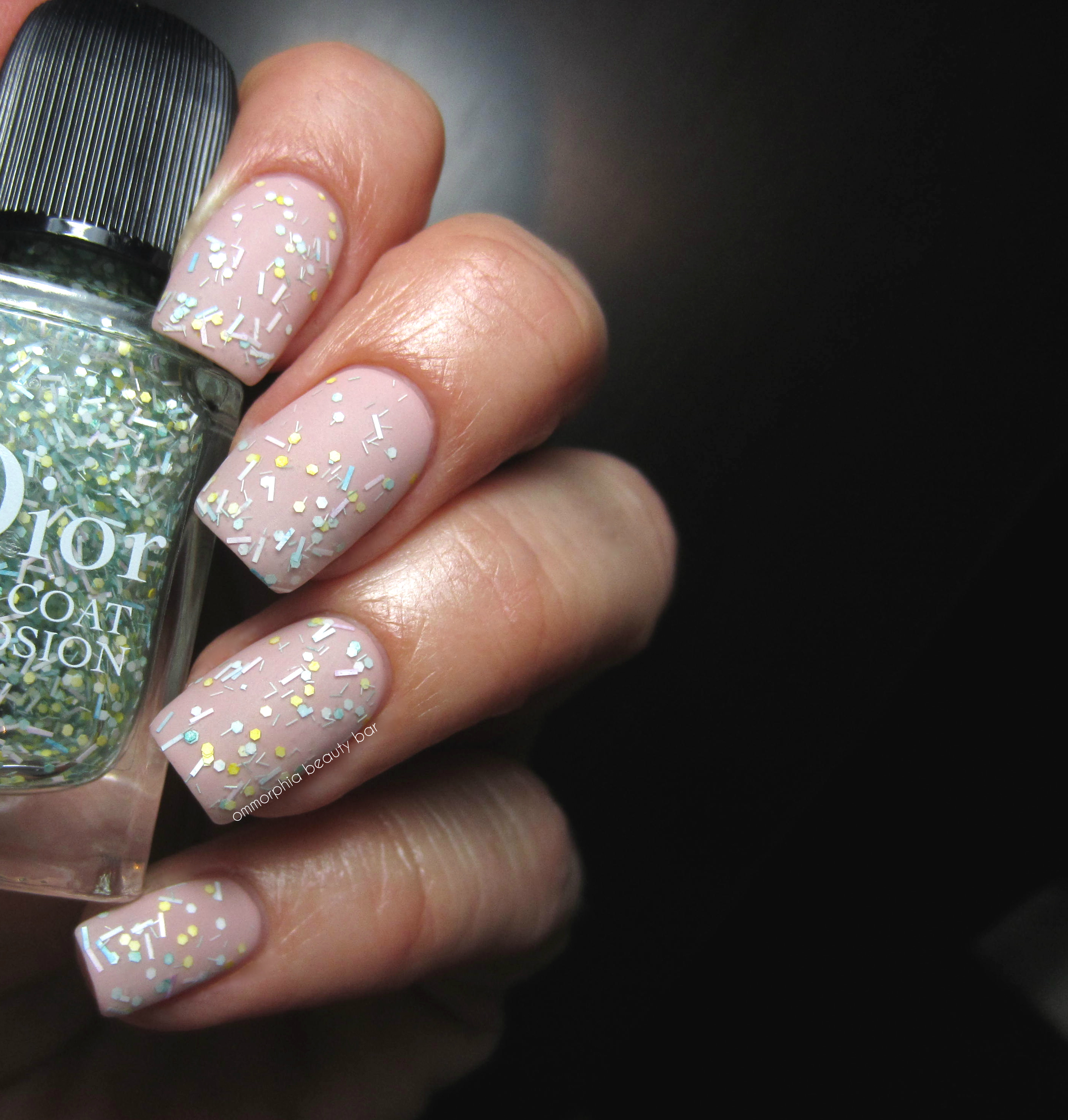
#294 Lady, limited edition (CAN $28.00) | A filtered nude/petal pink shade that has a softly muted appearance upon the nails, with just enough colour to keep it from coming off as flat or boring. Interestingly enough, nude shades are some of the hardest colours to wear, as the wrong undertone can violently clash with one’s skin tone, but Dior has managed to infuse the right amount of both cool & warm hues into #294 Lady, as to render it wearable by basically everyone. The formula here was another surprise, displaying an amazing pigmentation for a shade in this colour family – laying down easily and in a self-levelling way, with no patchiness in evidence, not even at the first coat. The resulting finish is nothing short of ridiculously glossy and spot-on perfect. Coats applied: 2, plus top coat
Option 2: Two coats of Éclosion Blossoming Top Coat were added over #294 Lady, in order to make all the confetti bits stands out
Option 3: Adding a matte top coat not only makes the pieces of Éclosion Blossoming Top Coat stand out, but gives a more urban feel to this look, adding a crisp edginess.

Dior Kingdom of Colour Spring 2015 | #294 Lady
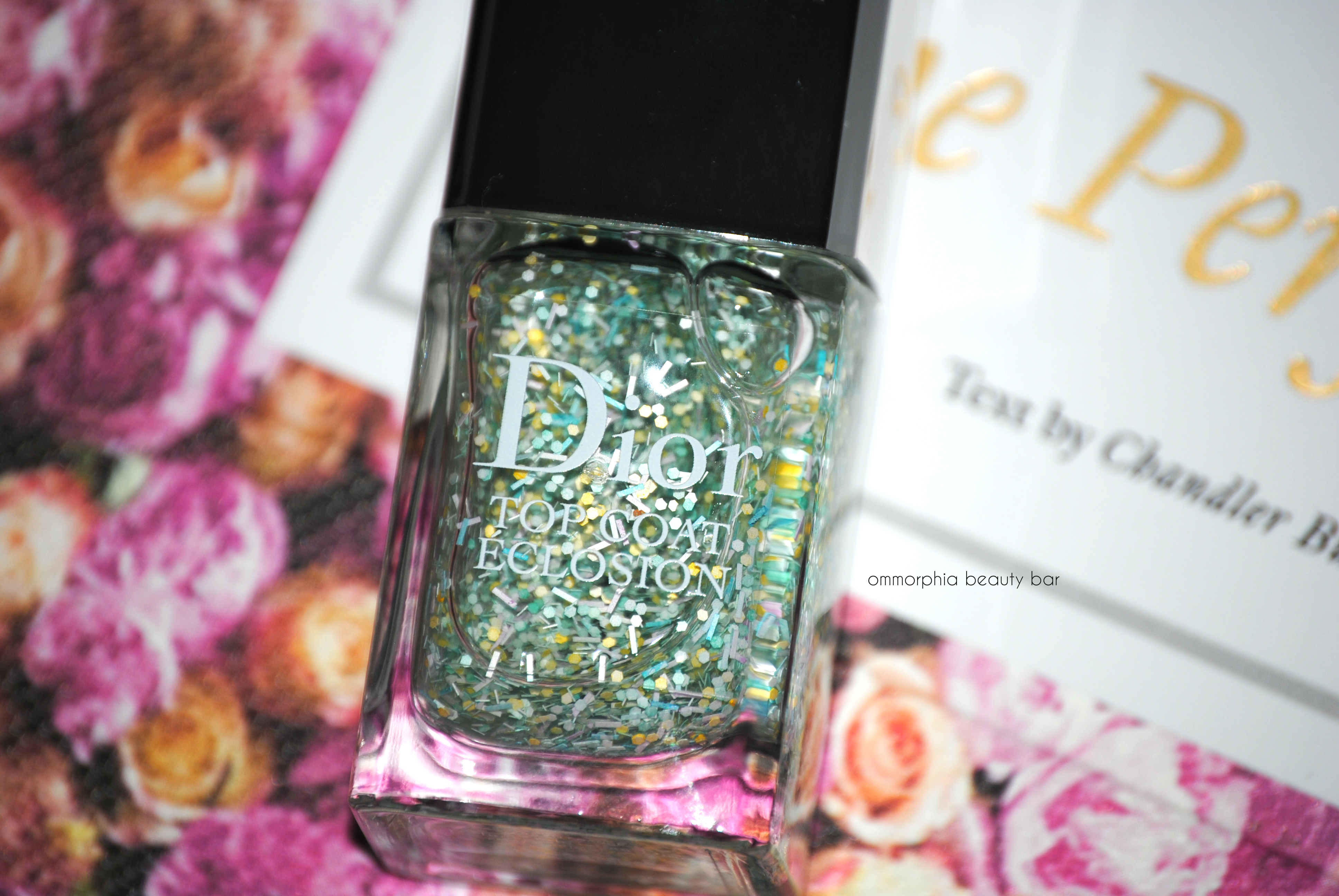
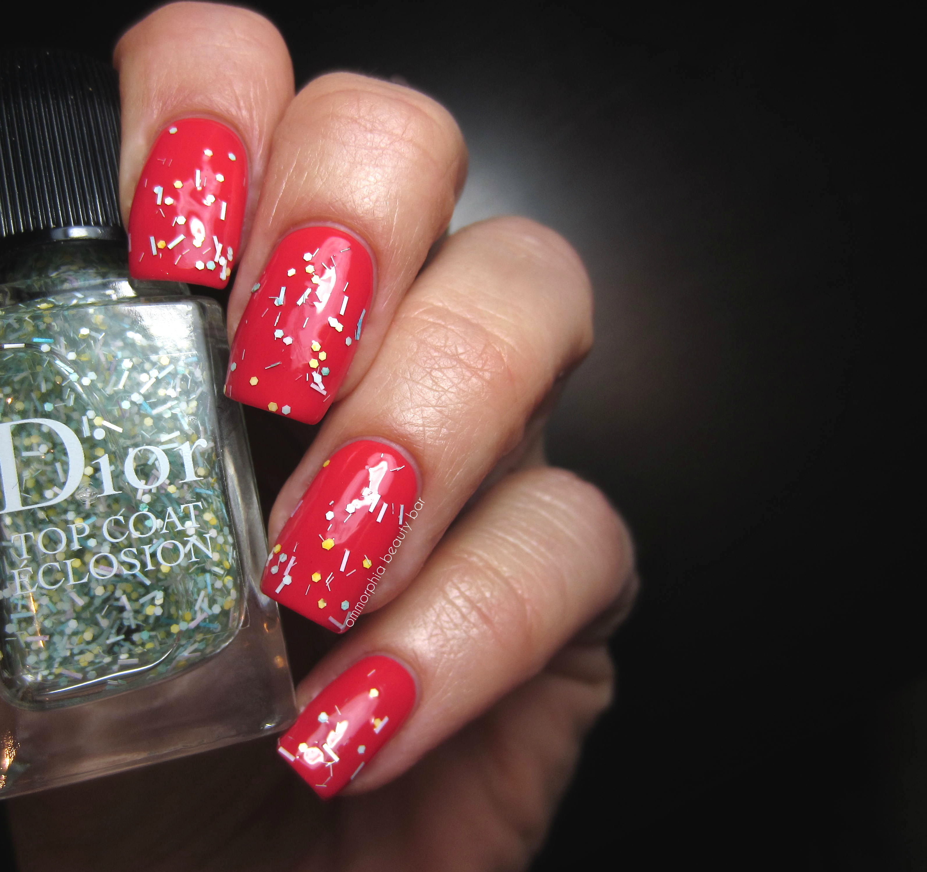
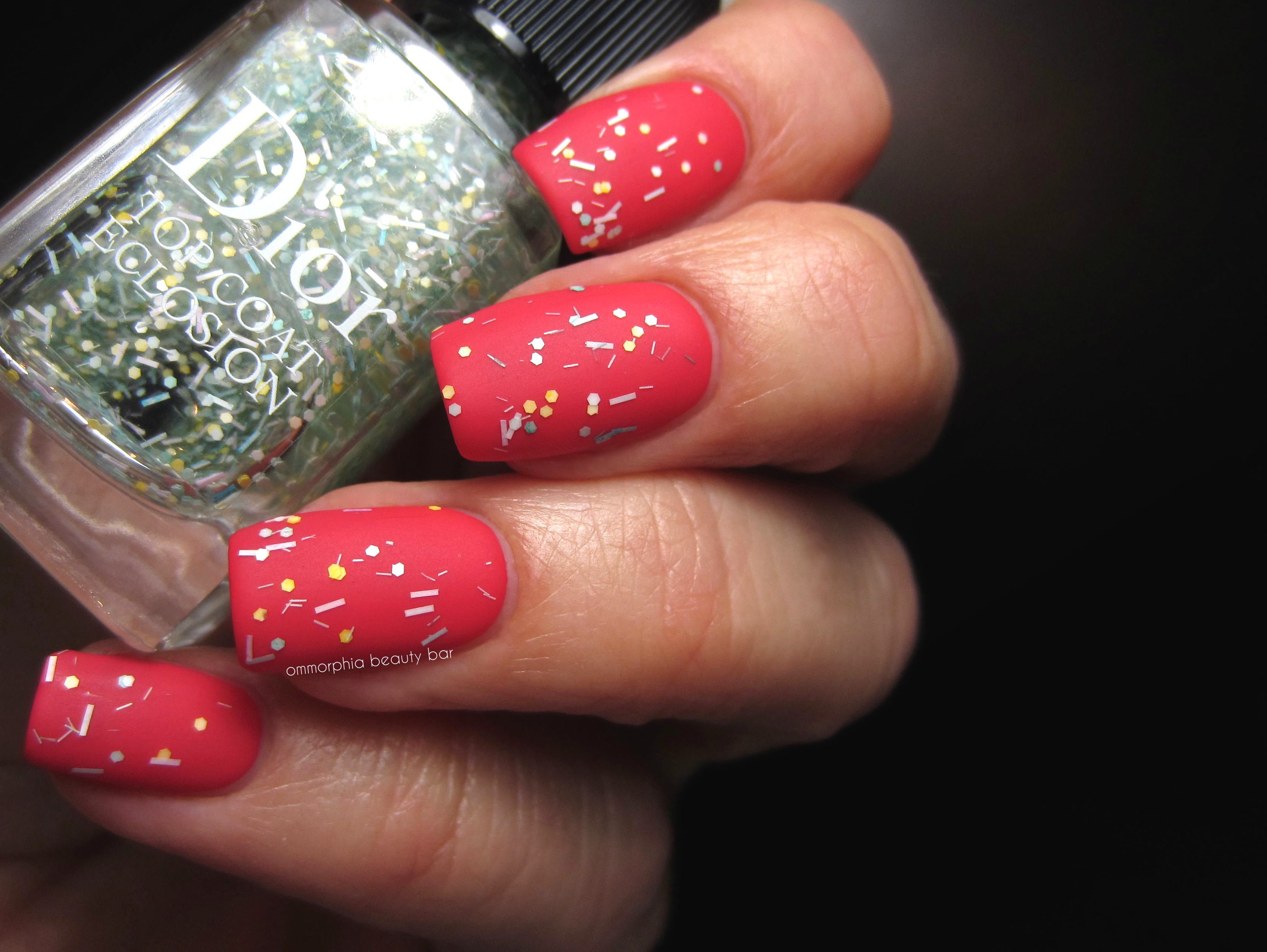
#001 Éclosion Blossoming Top Coat, limited edition (CAN $29.00) | This is a veritable confetti glitter party, albeit on the more subtle side due to the softer colour of all its pieces. Suspended in a clear base, Éclosion Blossoming Top Coat is composed of: white, lemon yellow, baby blue, blush pink and pale green glitter particles in bar as well as small hexagonal form. Each dip of the brush yields a fair amount of pieces per swipe, although some nudging into place of the bar glitter may be necessary along the nail free edges. I am not usually a fan of glitter, in particular the multi-variety type (yes, I am an unashamedly self-professed colour purist) and may even have done some eye-rolling when I first looked at this shade; however, once applied I was surprised to find that I ∗gasp∗ actually liked it. Adding a matte coat on top, may have even made me love it – and I’m not sure why – but there you go.
Note that the natural finish of Éclosion Blossoming Top Coat is very glossy on its own, but does have a bit of bumpiness due to the glitter pieces – easily remedied with a layer of a thickish top coat to smooth everything down.

Dior Kingdom of Colours Spring 2015 | #294 Lady & #001 Éclosion
Dior Kingdom of Colours Spring 2015 | #294 Lady & #001 Éclosion, matte
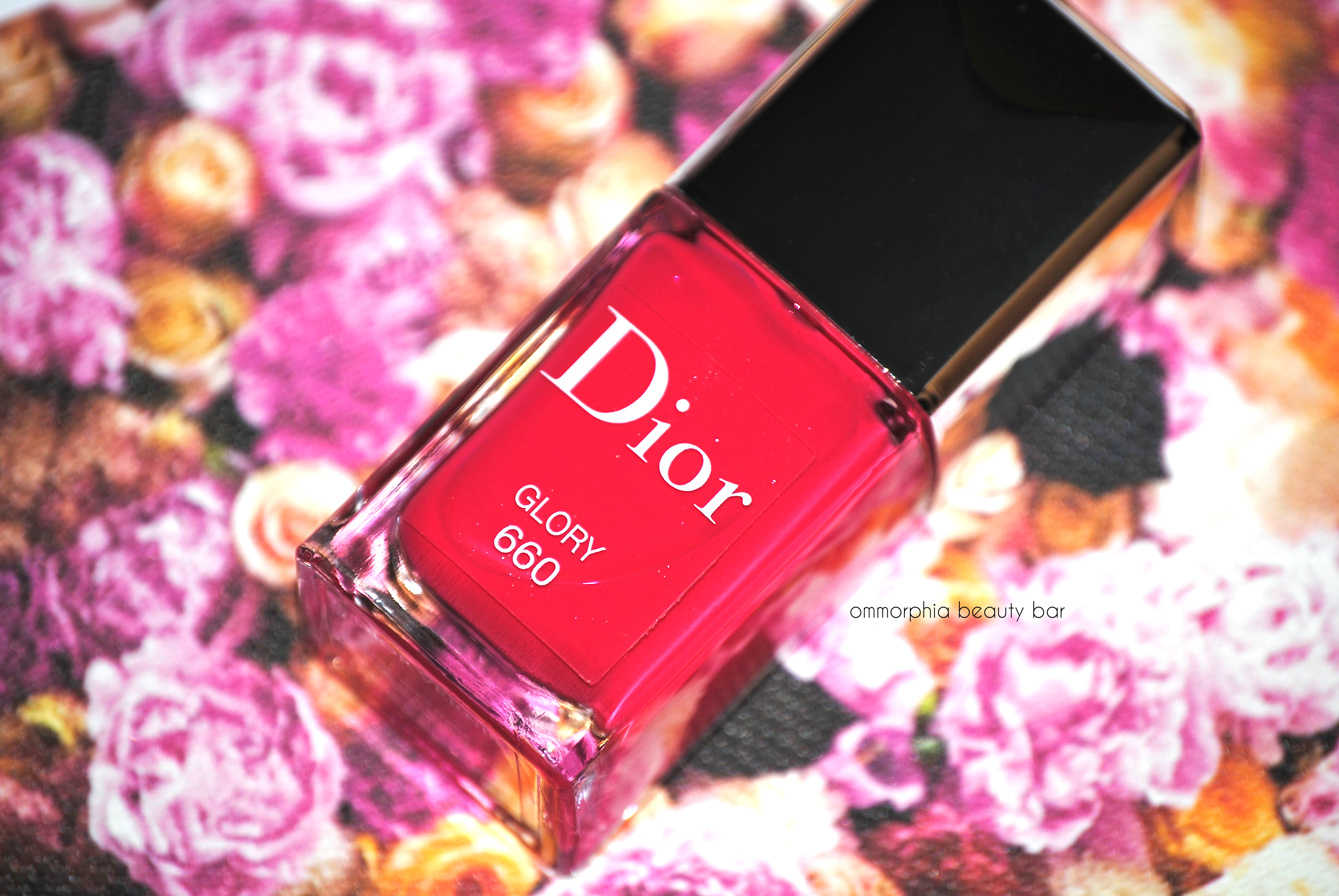
#660 Glory, limited edition (CAN $28.00) | A searingly vivid poppy/amaranth hue in a crème/jelly hybrid formula that defines perfection: self-levelling, a mirror-like glossy finish, and such intense colour saturation that you can easily get away with 1 coat for full coverage – especially on shorter nails. Depending on the angle, at times #660 Glory veers close to neon territory, but without quite going over, making it a bright yet sophisticated (read that as: modern) way to wear such a vivid colour. Bonus: non-staining upon removal. Coats applied: 2, plus top coat
Option 2: One Coat of Éclosion Blossoming Top Coat applied on top. Due to the colourful nature of #660 Glory, this is all you need for effect – any more would be overkill.
Option 3: Once again, adding a matte top coat emphasizes every bit of glitter and while interesting, I’m not as drawn to this combo as the previous one ∗shrugs∗ – definitely unique, though.
Dior Kingdom of Colours Spring 2015 | #660 Glory
Dior Kingdom of Colours Spring 2015 | #660 Glory & #001 Éclosion
Dior Kingdom of Colours Spring 2015 | #660 Glory & #001 Éclosion
Even though there are only three nail lacquers in the Kingdom of Colours Collection, there is still enough to appeal to basically everyone: #294 Lady for the neutral lovers, #660 Glory for fans of brighter colour, and Éclosion Blossoming Top Coat for glitter/nail art fiends. I personally love the look of #294 Lady on its own worn as a full mani and will definitely be sporting #660 Glory as a Spring/Summer pedi shade (heat…need some heat), with Éclosion Blossoming Top Coat making an occasional appearance just to keep things interesting (to repeat: I am a colour purist by nature). One last word: if you haven’t tried Dior polishes yet, you are seriously missing out on one of the best formulas & brush out there (still worth it, even with the $1.00 price hike per bottle – don’t think I didn’t notice, Dior).
Launching January 15th on all Dior counters nation-wide. Visit www.dior.com for more brand info.
Press samples provided for my unbiased consideration
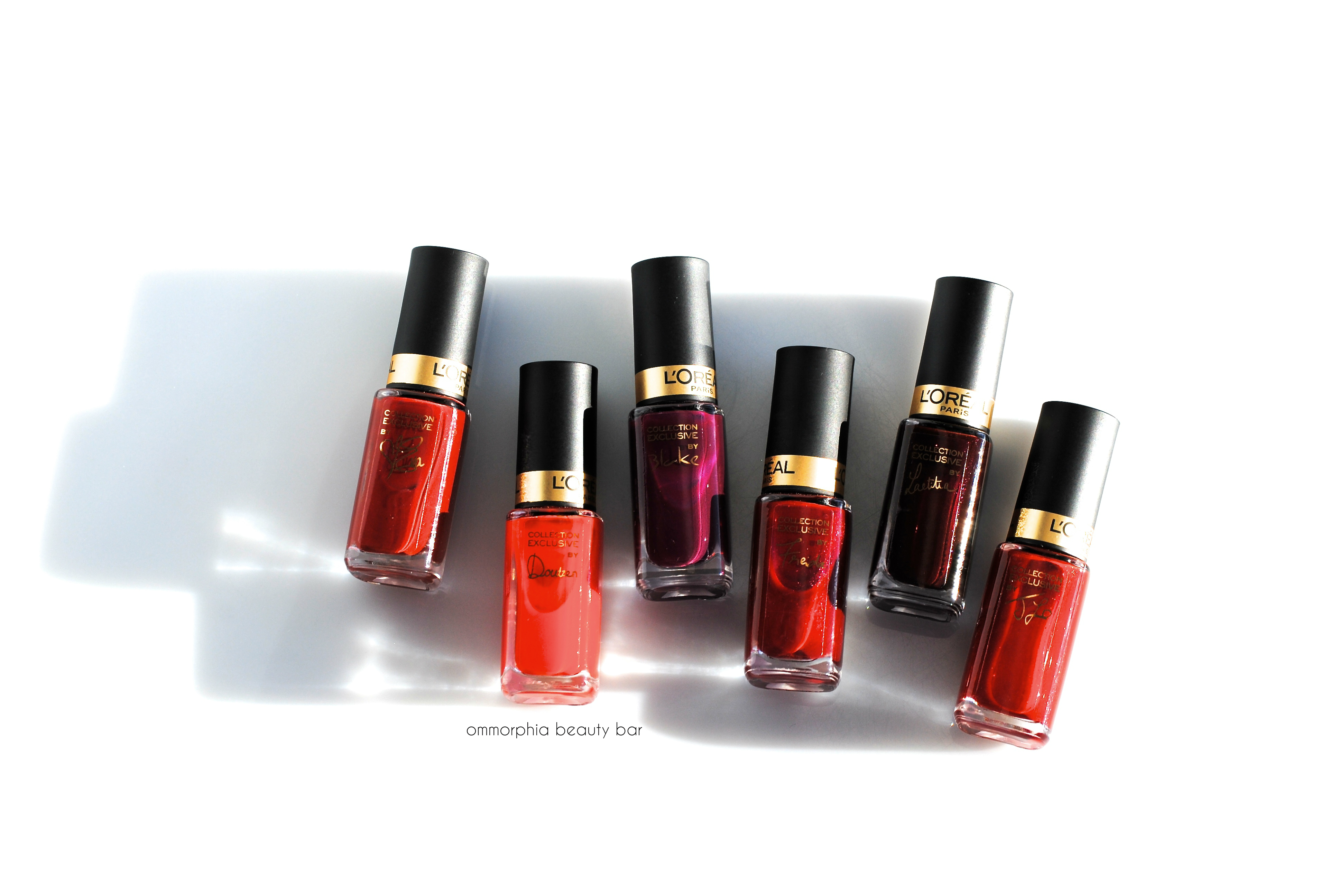
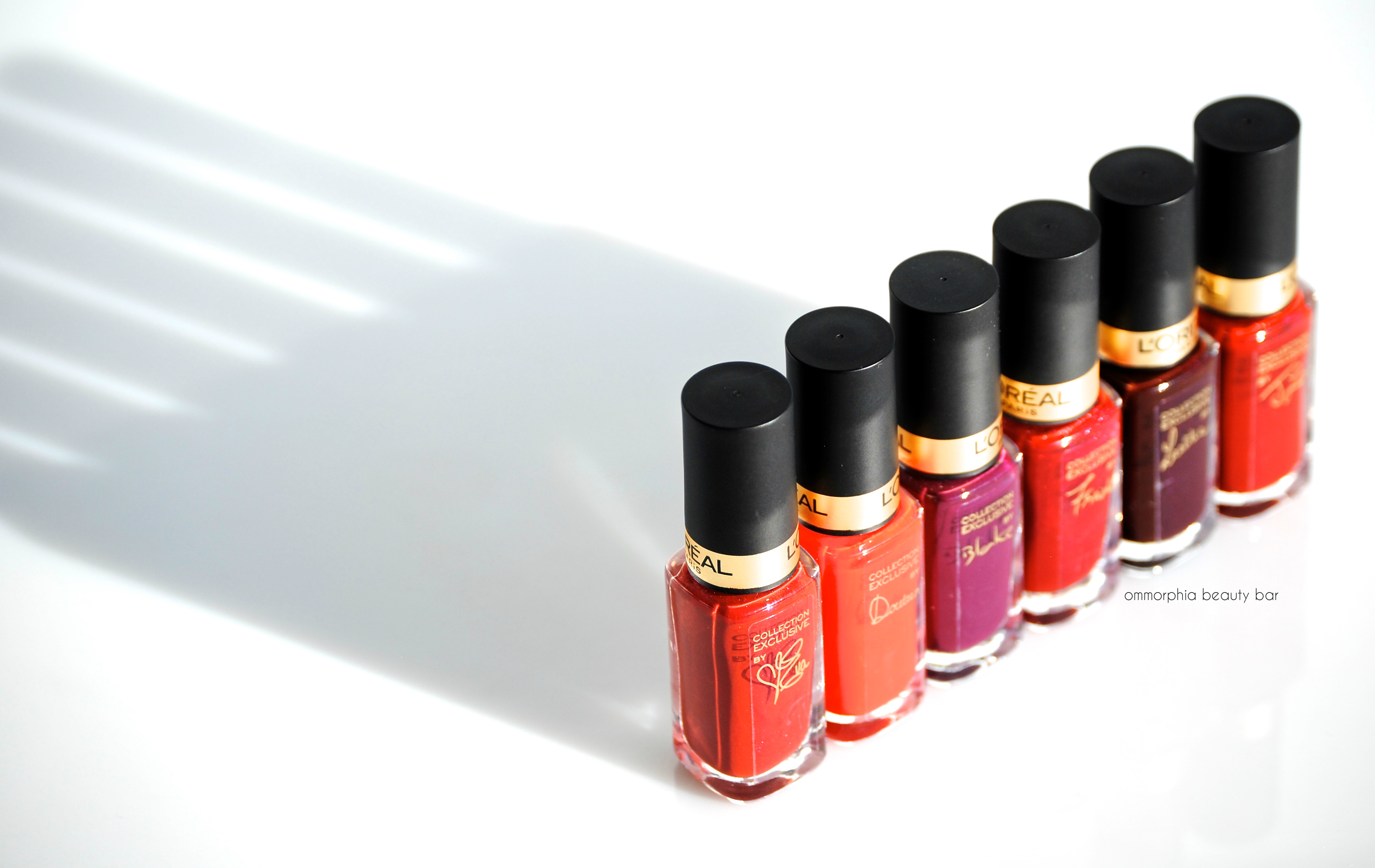
L’Oréal Paris | Collection Exclusive Pure Reds by Colour Riche

L’Oréal Paris has recently launched six new limited edition lipsticks and coordinating nail lacquers, the Collection Exclusive Pure Reds by Colour Riche. Varying in tone and finishes – from vibrant to sultry, creamy to shimmery, these nail polish shades (CAN $3.99) may be part of a capsule collection, but manage to represent the red spectrum rather well … and will in all likelihood sell out at the same hyper-speed as its predecessors, the Collection Privée Exclusive Nudes (see previews reviews here, here and here).
PS: a belated Merry Christmas to all!

L’Oréal Paris | Collection Exclusive Pure Reds
L’Oréal Paris | Collection Exclusive Pure Reds

Doutzen’s Pure Red | A tomato red crème hue in an amazing (albeit thinner-flowing than the rest swatched here) formula, bearing an excellent flow & density, applying in a self-levelling way, and leaving behind a high gloss finish. Bonus: non-staining upon removal. Coats applied: 2, plus top coat

JLo’s Pure Red | A rich ruby hue with an ultra fine magenta shimmer in yet another amazing formula: perfect saturation of colour, density and flow. The shimmer is not as visible to the naked eye when seen indoors/deeper light, but sunlight and/or direct light really makes it come alive – almost appearing as though it’s simmering at the surface level of the nails. Just gorgeous. At turns sexy, playful, vampy, and sophisticated, the best part is that it’s non-staining upon removal as well. Coats applied: 2, plus top coat

Eva’s Pure Red | A warm-leaning brick red hue bearing ultra fine magenta/fuchsia shimmer that may be subtle, but comes alive when seen in direct light/sunlight. Falling in a self-levelling way and finishing with a high gloss, the formula here feels thicker than the rest, but is still non-staining upon removal. Coats applied: 2, plus top coat

Freida’s Pure Red | A cool-leaning intense garnet hue (blue based) with and ultra fine magenta shimmer in the base that is not only the most visible of the six – regardless of the light you view it in – but that manages to leave behind the most unique moiré effect upon the nails (it’s actually quite mesmerizing). There’s a slight level of staining here, but that’s easily remedied by doubling up on your base coat first. Coats applied: 2, plus top coat
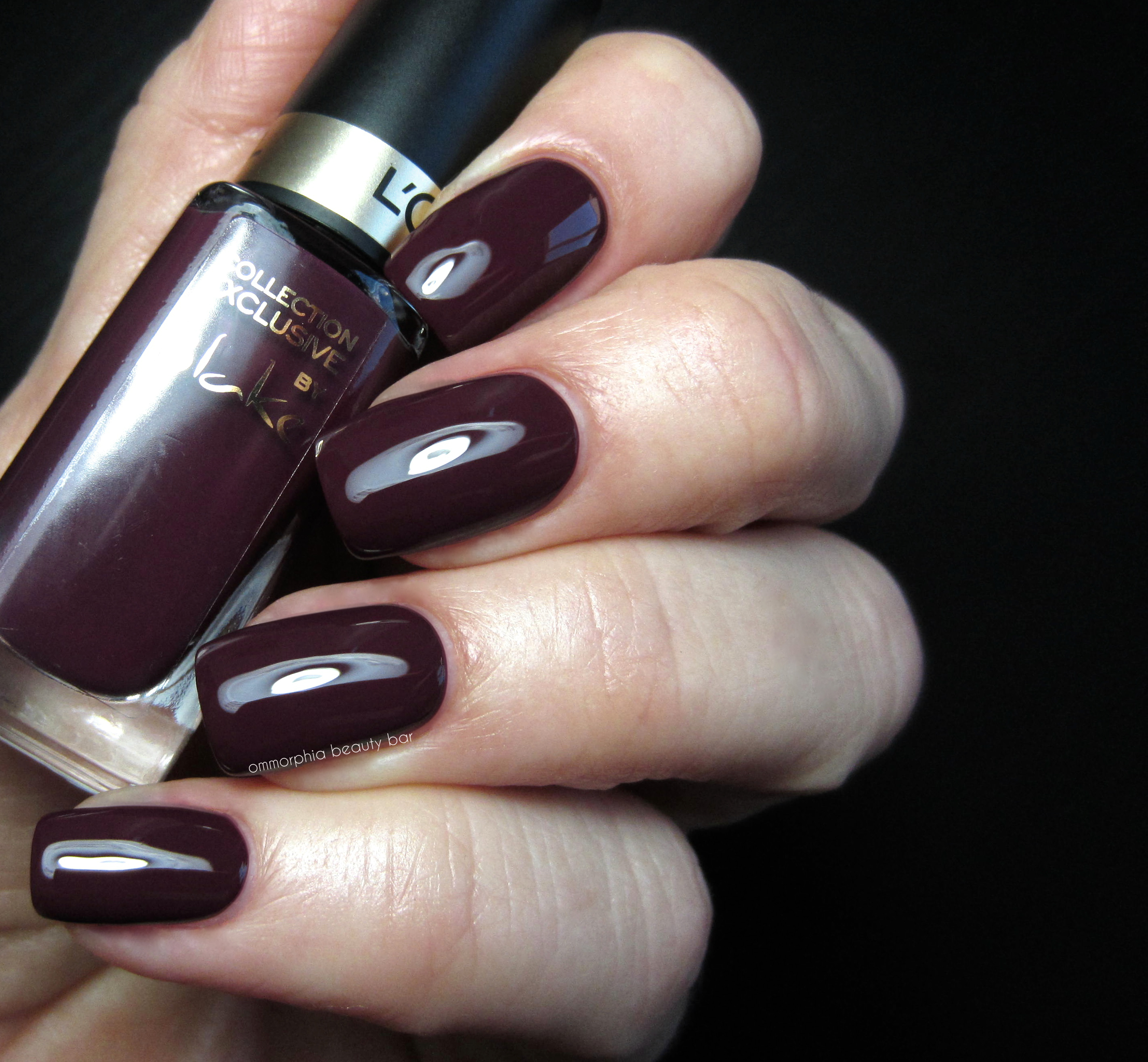
Blake’s Pure Red | (kind of a stretch calling this red, but I’ll let it go …) The only other crème hue of this collection, this is more of a deeply luxurious eggplant hue that defines perfection: full opacity with just one coat, excellent flow & density, self-levelling, über-glossy at the finish, and totally non-staining upon removal. As far as darker shades go, it doesn’t get better – or easier – than this. Coats applied: 2, plus top coat

Laetitia’s Pure Red | A stunning & vampy deep berry hue with ultra fine magenta/silver shimmer in the base, that will suit both cool and warm skin tones equally. I feel like I’m repeating myself, but once again the formula here is as stellar as the rest; this blackened red hue almost applies itself (not really, but it’s THAT easy) and has the advantage of being non-staining upon removal. Coats applied: 2, plus top coat
In my opinion, nothing makes a statement – and draws attention to – one’s nails, quite like red (apparently men are most attracted to red on a woman’s nails; just thought I’d throw that in. No particular reason why). I’ve been seeing the trend moving towards this timeless colour for some time now, and it appears every brand from every price point has gotten the same memo, if the plethora of reds being released is anything to judge by. What makes these Collection Exclusive Pure Reds stand out for me, starts with their wallet-friendly prices, their smaller size (seriously: who ever finishes a full-sized bottle anyway?), and the fact that even though there are only six colours to choose from, you can still find a red to suit your skin tone. Plus, they’re all damn sexy.
Available now for a limited time, find more information by visiting www.lorealparis.ca
Press samples provided for my unbiased consideration


