
Filed In: nail polish
Uniprix | Nail Polish Beauty Calendar
Press sample provided for my unbiased consideration

Tis the season … and for fans of beauty products, that usually means a plethora of gift sets flooding the market – and while some of these sets can be total duds, every once in a while something fun comes along: enter the Nail Polish Beauty Calendar from Québec drugstore retailer, Uniprix.
At (CAN) $39.99, this advent calendar holds 24-6ml bottles of nail polish in a range of colours – from bold & vibrant, edgy, neutral & sophisticated, as well as a variety of finishes (shimmer, crème, holographic, glitter). The best part (as well as hardest, at least for me) is opening up each daily door to find the treasure within – I’m so tempted to jump ahead and see what’s next!
Perfect for grown up beauty fans, as well as budding nailistas, the Beauty Calendar nail polishes are free from formaldehydes, parabens, Toluene, camphor, sulphates, synthetic pigments and fragrance, while the colours they come in transcend the seasons, turning this into the gift that keeps on giving, wouldn’t you agree?
Available now for the holidays (while supply lasts), find more information by visiting www.uniprix.com


Essie | Cashmere Matte 2015 Collection

A few weeks ago, a rather large box was delivered to me that contained a black vinyl quilted product case from Caboodles. But what was this? Opening it up, I was greeted with 6 new Essie shades – the Cashmere Matte 2015 Collection, accompanied by a gorgeous and insanely cozy-looking grey cashmere travel-sized blanket, matching satin-lined eye shade, as well as a grey cashmere pouch to store it all in & which turns the entire ensemble into a pillow (pretty neat, huh?). I almost didn’t know what to drool over first: the cashmere goodies, or the fab new shades?
I chose the shades, naturally. What stands the Cashmere Matte 2015 Collection apart, is the finish: satiny matte – never flat – and bearing a buttery-soft suede touch at the finish. Three of the shades hold a bluish micro-iridescence that you can clearly see (definitely not the type that sinks into the colour), one has the tiniest shimmery flecks that hold their own whether applied as is or glossed up with top coat, and the other 2 have the most unique pearlized gleam.
In order to make the final look as smooth as possible, I find it best to work with a ridge filling base coat first (I used Essie’s Fill The Gap Treatment) – this way, it creates a super-smooth surface for the polish and helps the matte finish look level. Any top coating was done using Essie’s Good To Go.
As a huge fan of matte anything (forget nail art; a matte finish is my gold standard when I want to jazz up my nails), the beauty of this collection is that you can avoid the extra step of applying a separate matte top coat, as this finish is built in. Couldn’t be easier.

Black vinyl quilted Caboodles case & oodles of grey cashmere

Like finding a pearl in an oyster: new Essies!

Essie | Cashmere Matte 2015 Collection

Wrap Me Up | I’ve said often enough that I love my darkling brooding shades, but for the past few years, anything white has been my Kryptonite. Taking this colour to a whole new level, Wrap Me Up is a soft white with pink/mauve/grey undertones (or what I see, depending on the angle) in a formula that leans a bit on the thick side and needs a touch of patience to get it right – but just.so.worth.it. I am absolutely obsessed with this shade. Coats applied: 3, as thin as you can get them for the most even finish.

All Eyes on Nudes | Creamy nude (coffee latte) with rose undertones to warm things up, in a thinner formula than Wrap Me Up – making it much easier to apply, but which may still require more than 2 coats for full opacity (especially on longer nails). The resulting finish is actually eerily close to my skin tone, turning All Eyes On Nudes into a Where’s Waldo? kind of colour on me, but I find that refreshing, actually – a very different look for me. Coats applied: 3, thin

Cozy In Cashmere | *I’m a little confused as to this shade’s true name; my bottle says ‘Comfy In Cashmere‘ but the press release calls it ‘Cozy in Cashmere‘, and since I like the word cozy, I’m going with that. Ok…how to describe this colour? Hands down the most unique mauve/taupe hue and filled with a blue micro-iridescence, which flashes a soft but definitely visible blue at all angles. The formula couldn’t be easier to work with either: self-levelling, excellent opacity and perfect flow. Coats applied: 2

Just Stitched | I’m generally not a fan of pink nail shades, but this is just too pretty to not like. A pale petal pink (and therefore more cool-leaning) hue, filled with blueish micro-iridescence that may not be as obvious as that seen in Cozy In Cashmere, but still present just the same – it just seems more of an overall pearlized finish here. Whatever – it’s really, really pretty. And easy to work with, in fact probably the easiest application of the six. And did I mention how pretty it is? Coats applied: 3, super thin

Coat Couture | A true show-stopper. Go ahead and take a moment to stare — I’ll wait. Coat Couture is a smokey purple with a strong blue micro-iridescent flash, in a formula that is in a word: superb. I seriously do not have enough superlatives for this shade, just a whole lotta love. Bonus: non-staining upon removal. Coats applied: 2
Something about Coat Couture begged me to add top coat, just to see what would happen. The results speak for themselves. And now I’m torn over which way I like it better.

Essie | Coat Couture (top coat added)

Spun in Luxe | Good GOD! Can there be a more intensely beautiful navy? This is a blackened navy filled with the tiniest brighter blue micro-shimmer bits that flash up at you from all angles, and as though they’re swimming just at the surface level. For real. Application is ridiculously easy – smoothly falling and in a free-flowing formula, levelling off perfectly at the finish. Bonus: non-staining upon removal (you heard me). Coats applied: 2
And glossed up – you know I absolutely had to. The night sky, am I right?

Essie | Spun in Luxe (top coat added)
It’s not often that an entire collection jumps up & grabs me like this, but Essie’s Cashmere Matte 2015 Collection does all that … and more. Inspired by the luxe yet totally wearable appearance of the softest cashmere, each shade makes an impact without needing to yell (I detest noisy polishes), and since you have the option of adding a top coat, it’s like you’re getting double the lacquers (sort of). For those who avoid wearing mattes because of their 1-dimensionality, you don’t need to worry here, as the finish is not a true matte, but more semi or satin matte, plus you get that micro-iridescence thrown in for even more visual appeal and BOOM. It’s on.

Kindly provided by Essie for my unbiased consideration
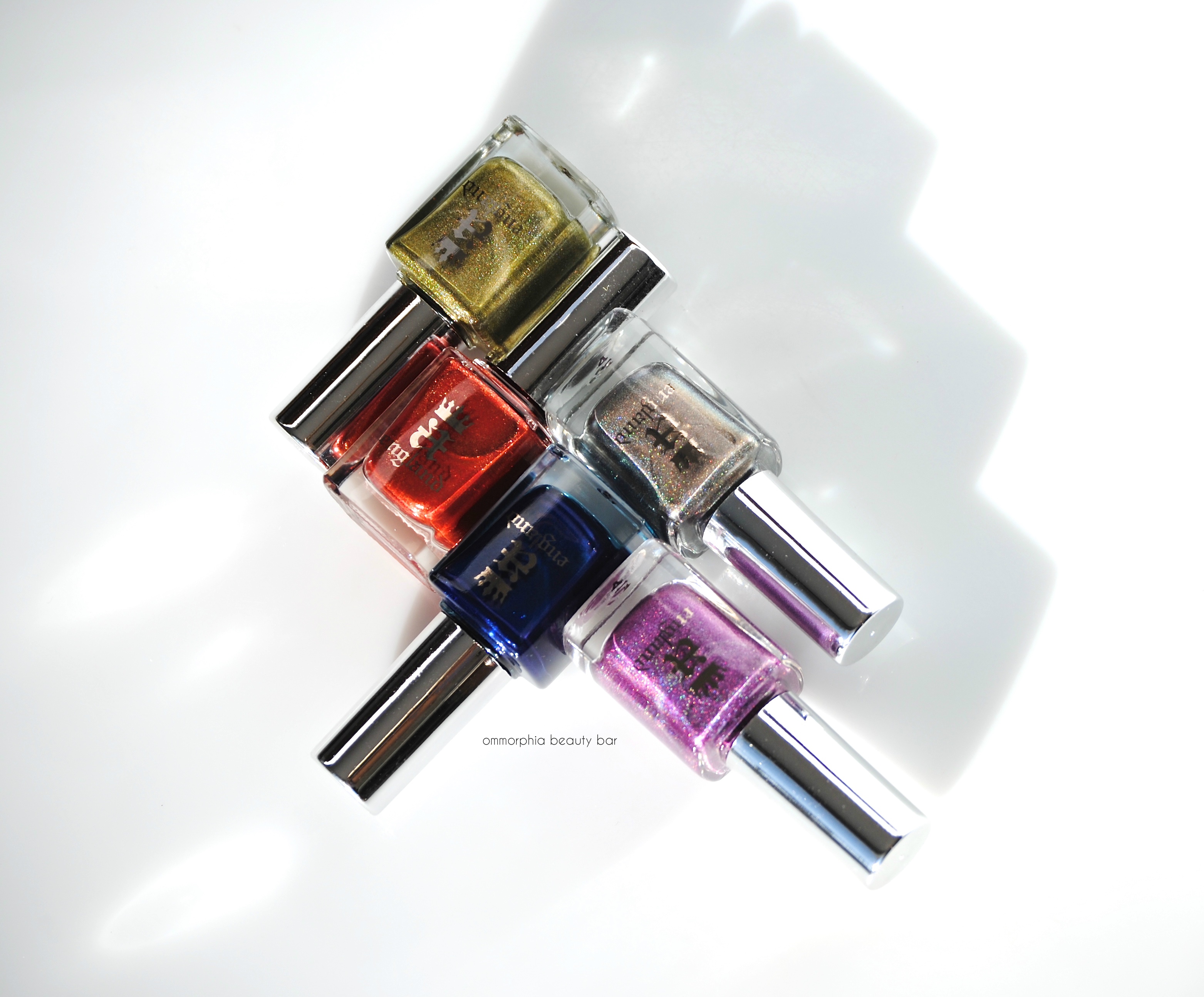
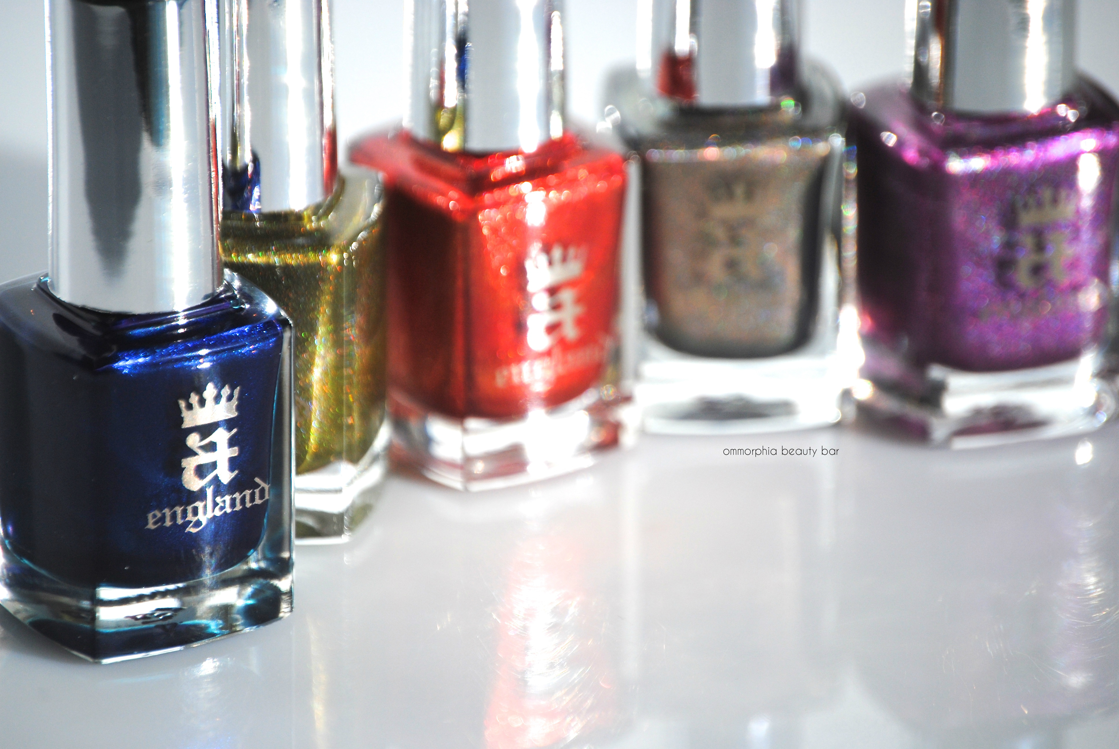
a-england | Elizabeth & Mary Collection
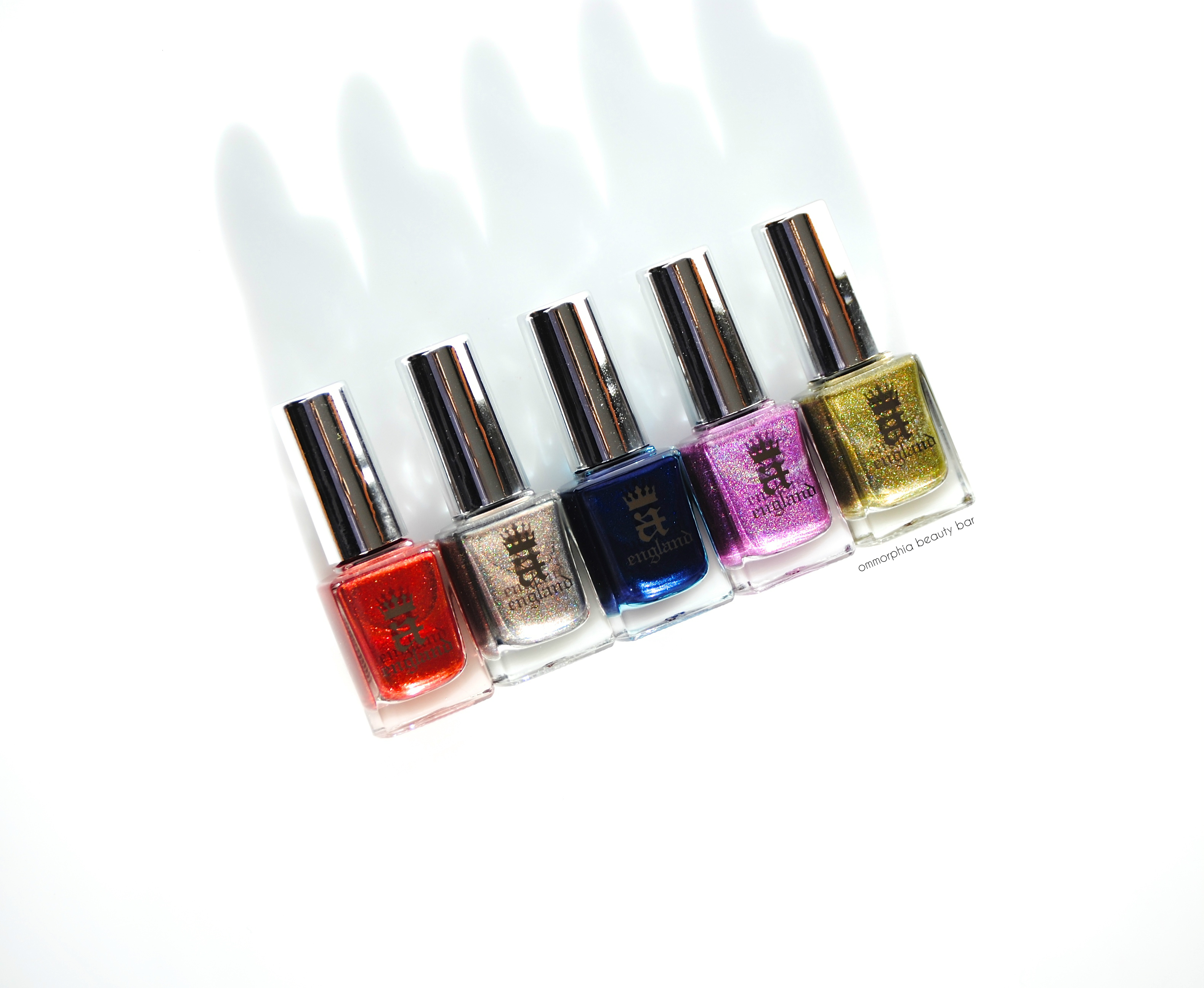
Rivalry, assassination plots, and the crown at stake … Elizabeth & Mary is the latest collection from a-england, which draws inspiration from two of Great Britain’s most well-known monarchs: Elizabeth I, also known as the ‘Virgin Queen‘ as well as ‘Gloriana‘, and her cousin Mary Stuart, also known as Mary, Queen of Scots.
There are five shades in this collection – three prismatic, one filled with fine reflective glitter, and one with a luminous shimmer – all in a-england’s solidly performing formula.
What I absolutely love about this brand (apart from having some of the most beautiful nail lacquer shades), is how founder Adina Bodana merges touches of history with each collection, which in turn manages to inject a more personal touch to her lacquers – they almost develop ‘personalities’, if that makes any sense.

a-england | Elizabeth & Mary Collection
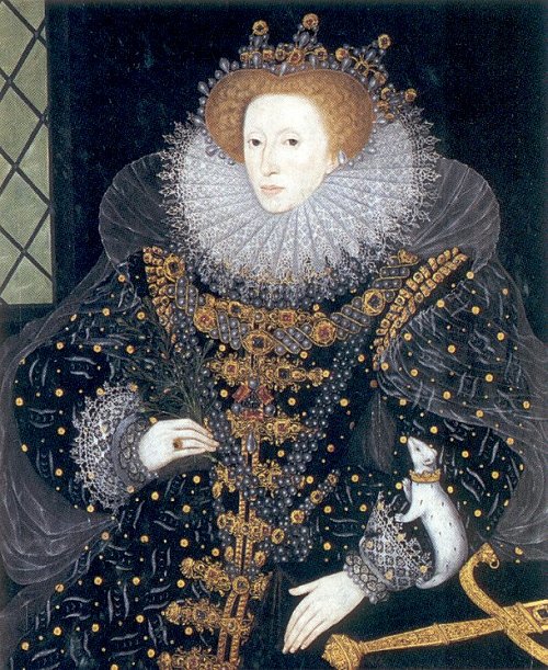
Queen Elizabeth I, The Ermine Portrait (1585), Nicholas Hilliard
Queen Elizabeth I (1533 – 1603), the last Tudor monarch (and some say the greatest that England has ever known), reigned for 45 years, a period which saw literature flourish throughout the land. Throughout her reign, Elizabeth I, never married and was finally succeeded by James VI of Scotland, son of Mary, Queen of Scots.
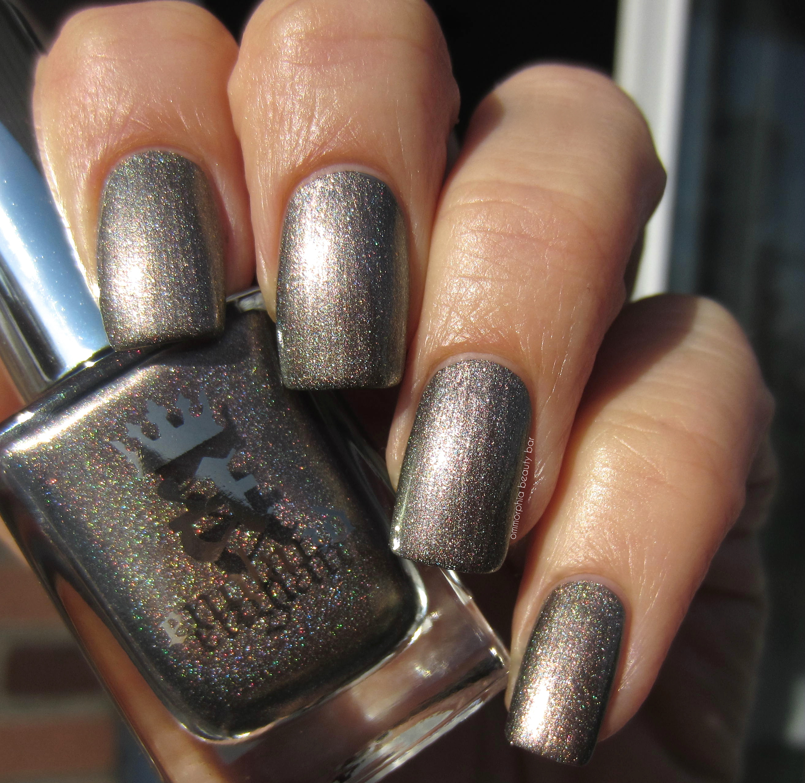
Virgin Queen | Pewter prismatic hue with a light pink undertone (more apparent in sunlight), making it more of a warm-leaning shade. Indoors, Virgin Queen can appear to have more of a grey/coppery-olive cast, with a more subtle holographic sheen. The formula here is a touch thick, but still easy to manipulate and appears basically opaque at one just coat. Coats applied: 2, plus top coat
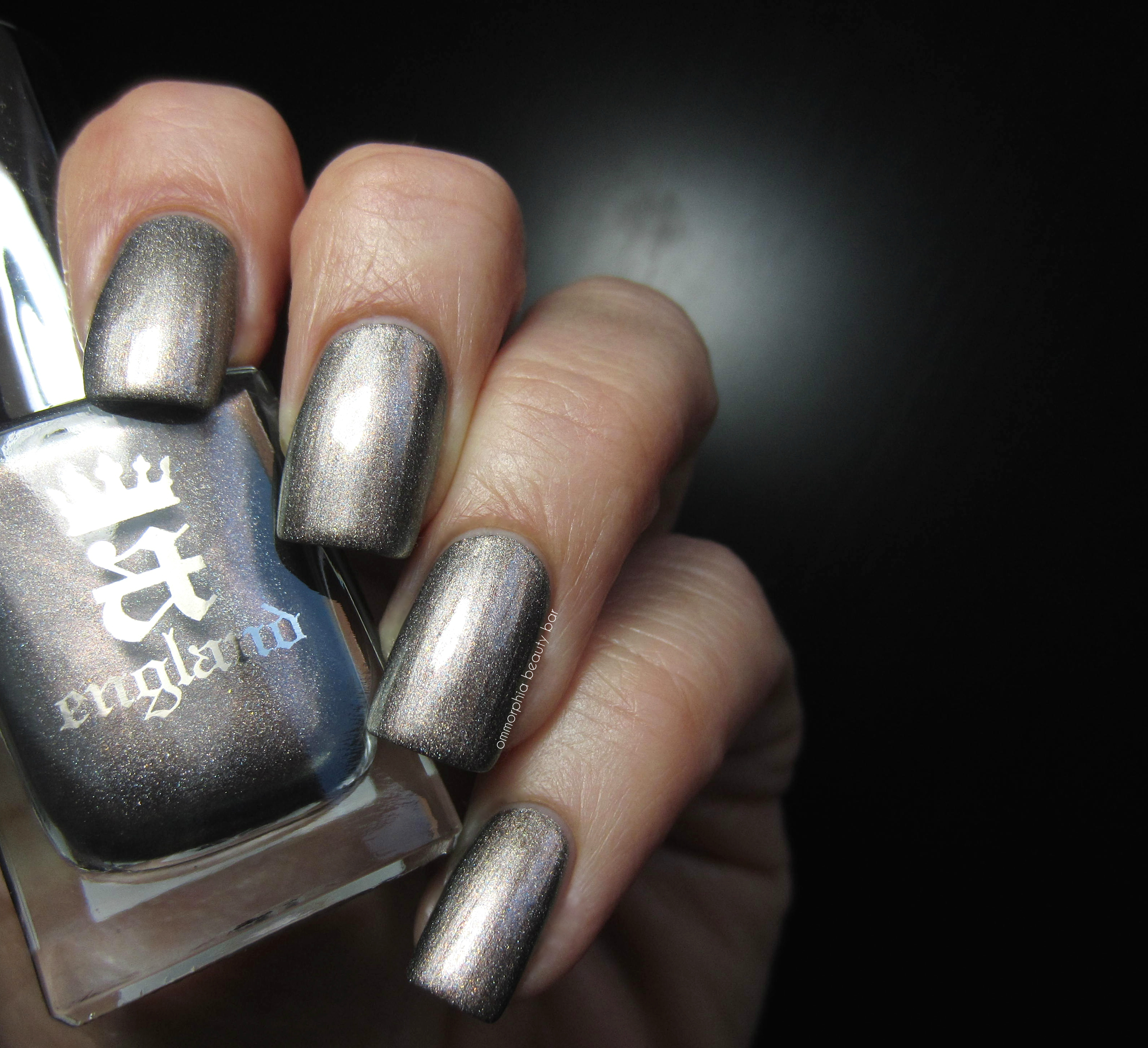
a-england | Virgin Queen
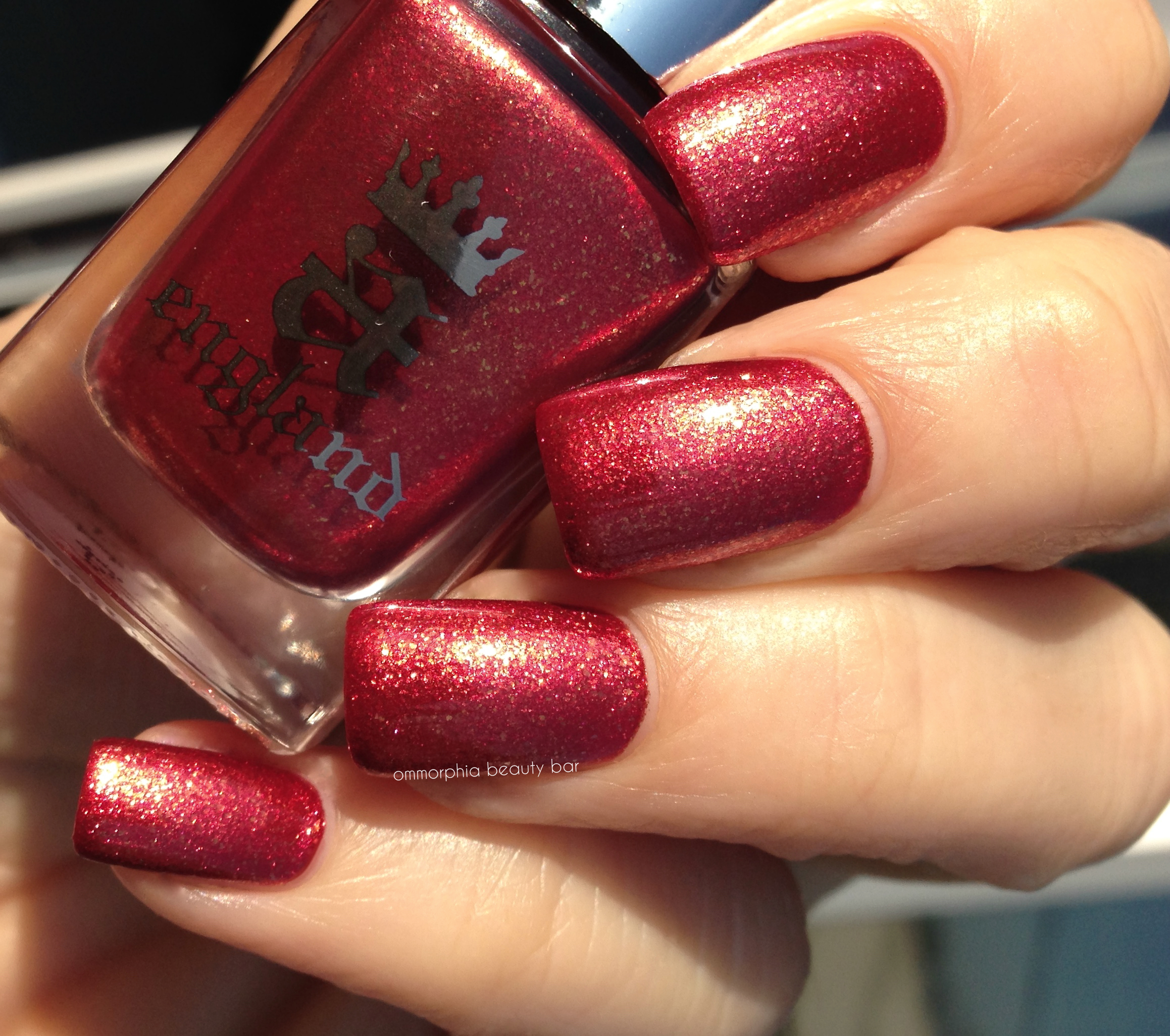
Gloriana | Chilli-pepper red hue filled with fine and ultra-fine gold sparkle. Self-levelling and almost a OCW (one coat wonder), Gloriana bears the same density to its formula as Virgin Queen, with a richly glowing tone and utterly brilliant at the finish. My photos make it appear a little rough, where in fact the surface does wind up smooth. Bonus: non-staining, although you may experience some glitter migration upon removal. Coats applied: 2, plus top coat
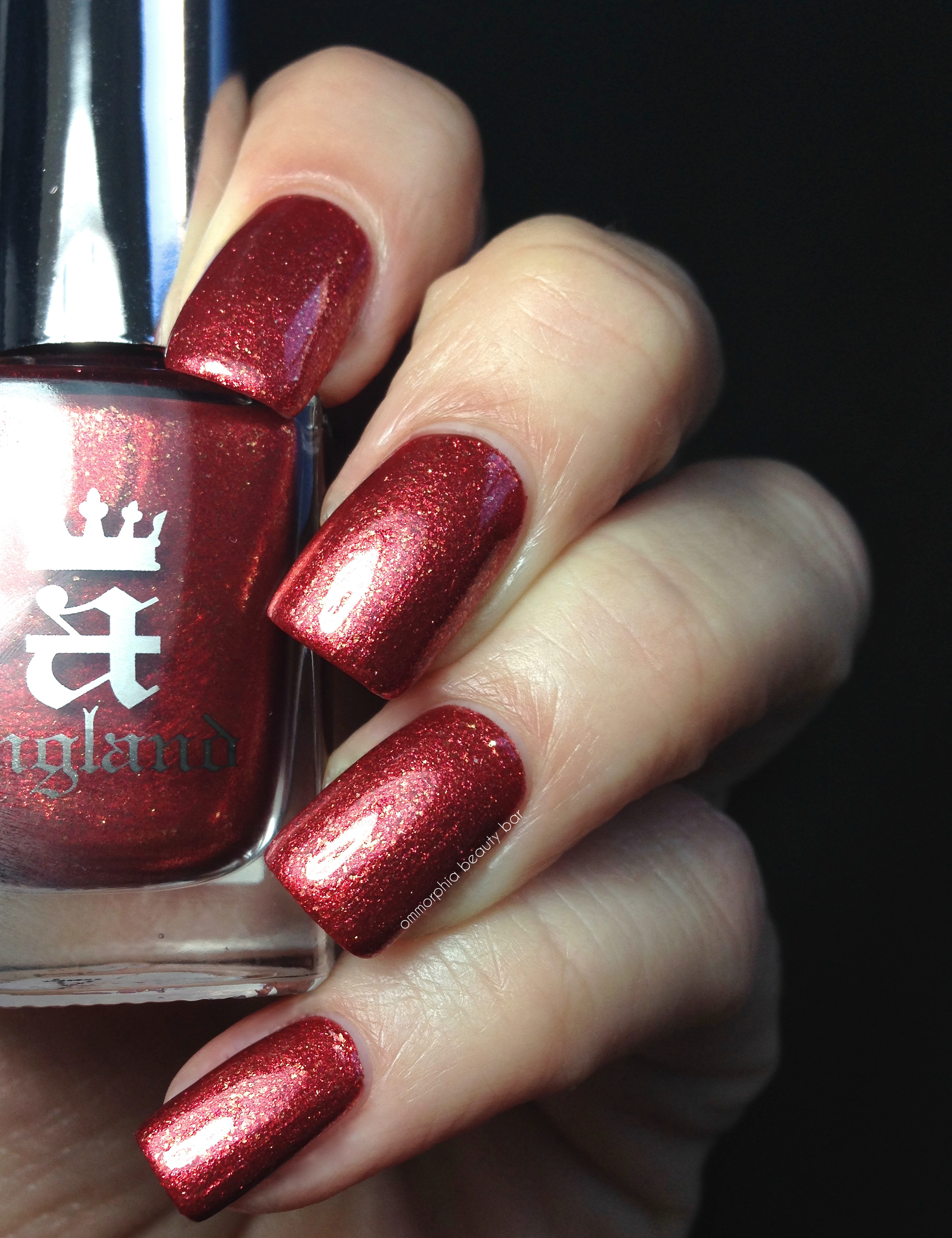
a-england | Gloriana
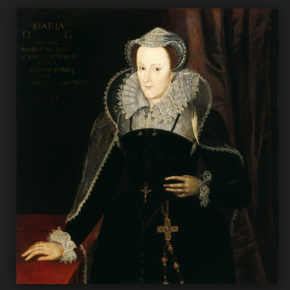
Mary, Queen of Scots, 1542 – 1587 Painted about 1610-1615, artist unknown (National Galleries of Scotland)
Mary Stuart, Queen of Scots (1542 – 1567) ascended the throne at merely 6 days old, when her father died. Seeking to restore Catholicism in England, she became a pawn in all the royal intrigue and power struggles that were taking place, and ultimately wound up imprisoned in England for 19 years, before finally being executed at Fotheringhay Castle in Northamptonshire, at the age of 44.
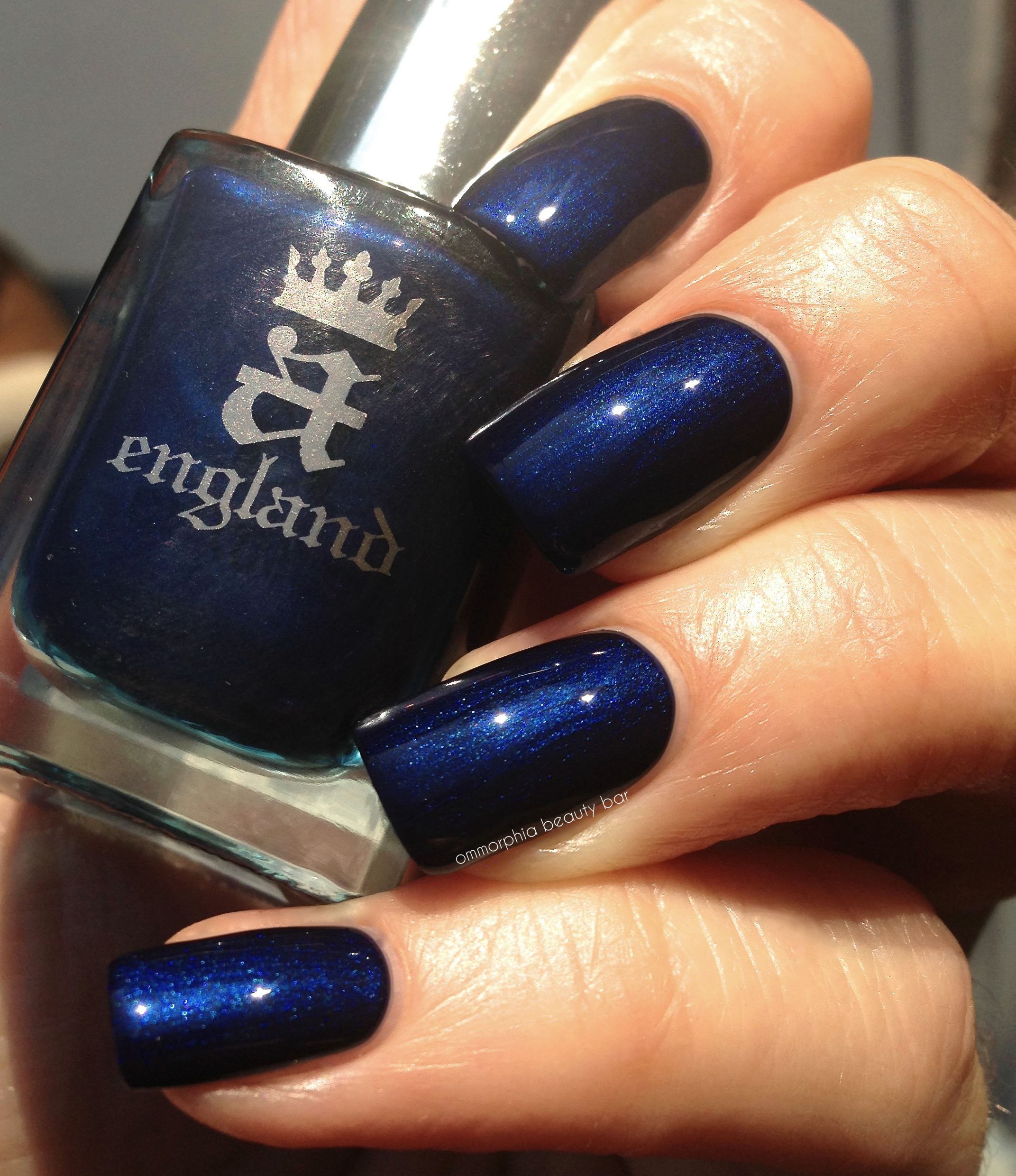
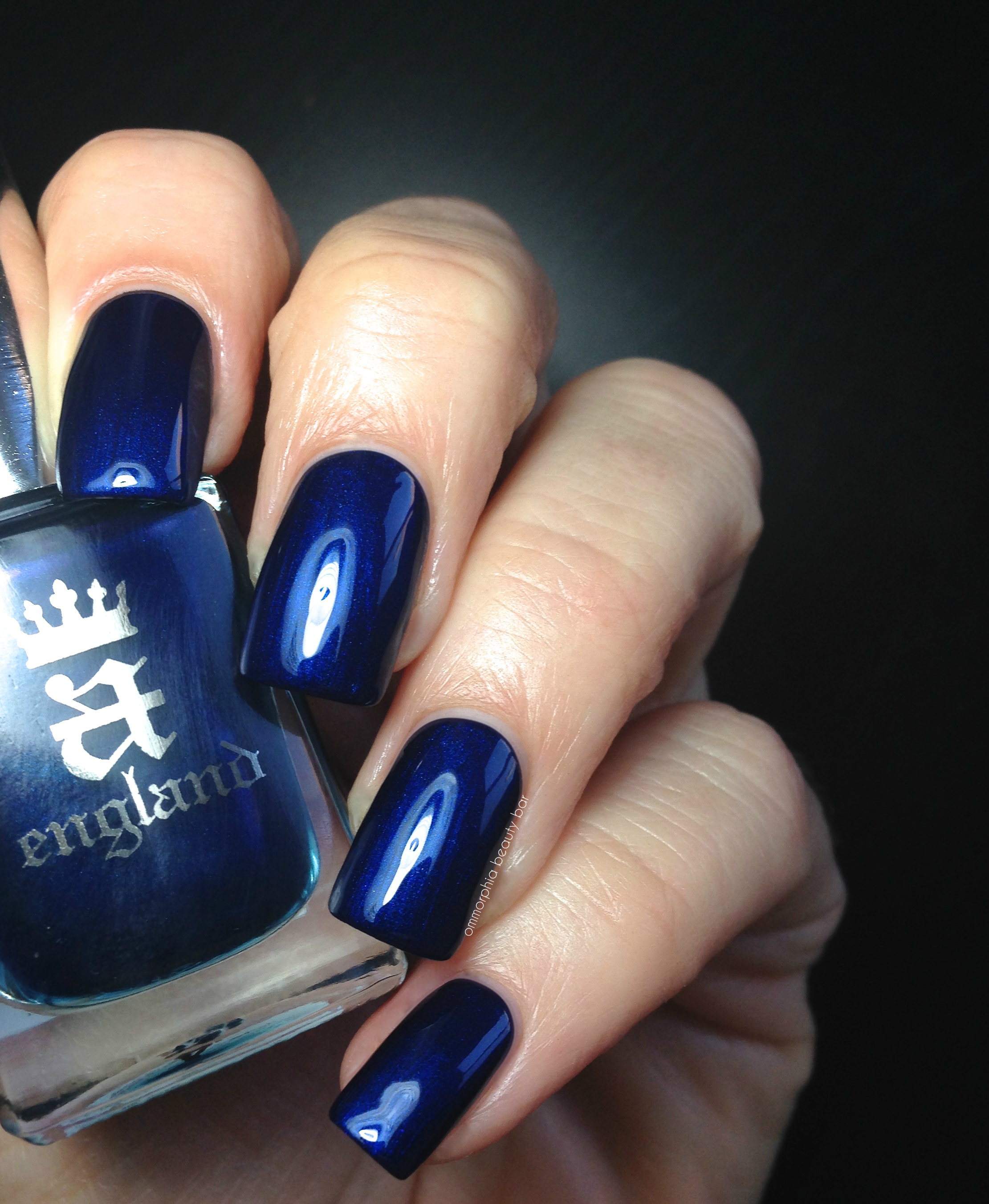
Queen of Scots | Beyond captivating, that’s for sure (no pun intended). An inky/deep royal blue shade in a category all its own: at once metallic, pearlized and satiny. I honestly don’t know how else to describe this finish. What you see here, is just one coat. ONE COAT. The shimmer in Queen of Scots is ultra-fine and the type that seems to just glow from along the centre of the nail beds, while the blue colour is deep & rich, yet manages to steer away from looking blackened. The formula is an odd mix of thick-ish density but yet still quite easy to apply, leaving no visible brush strokes behind. Relatively non-staining upon removal, provided you apply base coat first as a precaution. Coats applied: 1, plus top coat
I had a strong urge to mattify Queen of Scots, and my instincts proved correct: the resulting look is unlike anything I’ve seen before, while the finish feels like the most buttery suede – and just like that, I am obsessed with the way this looks.
a-england | Queen of Scots
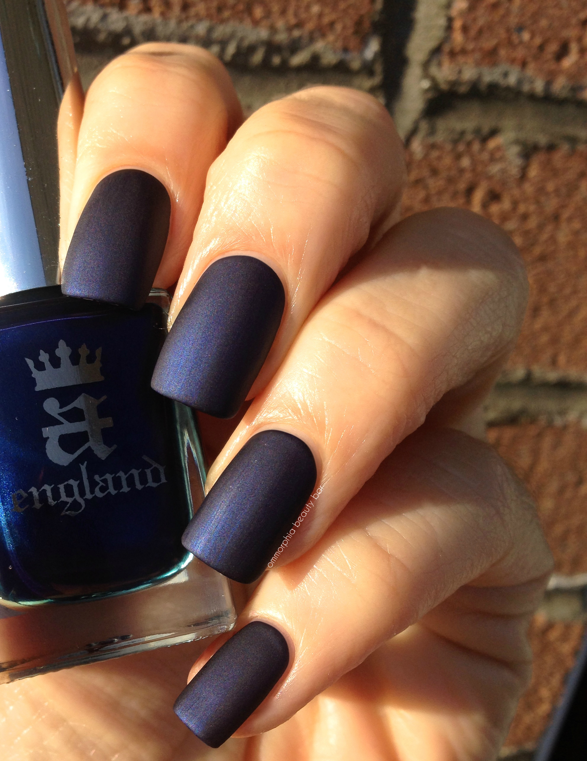
a-england | Queen of Scots, matte
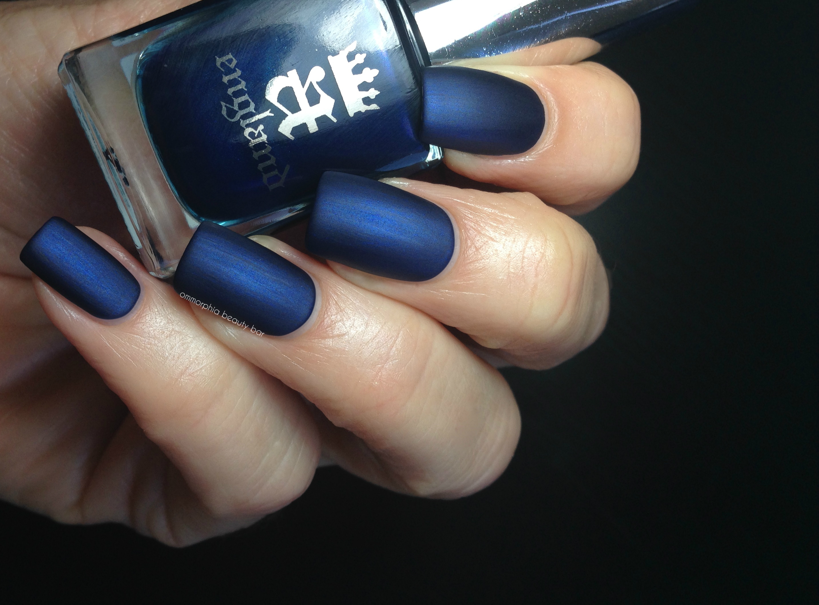
a-england | Queen of Scots, matte
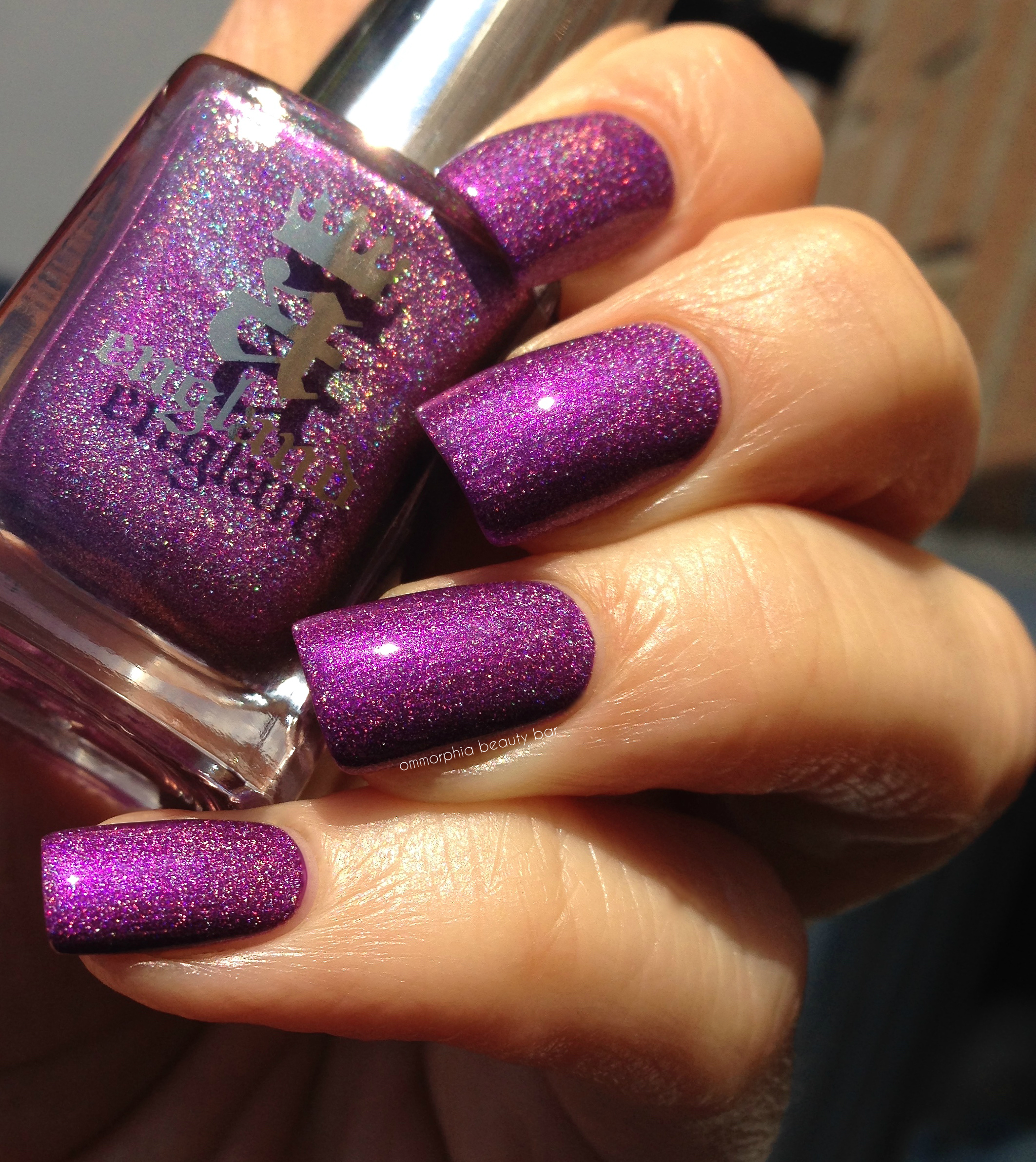
Crown of Thistles | A regal amethyst hue with a fairly evident prismatic tone (more of a strongly scattered holographic appearance, as opposed to linear). Interestingly enough, seen in sunlight, Crown of Thistles definitely appears warm-leaning, and yet under fluorescent lighting, it appears to veer decidedly cool. Quite the chameleon and one of the most sophisticated vivid purple shades I own (not a term I usually ascribe to this colour, but it sure fits here). Coats applied: 2, plus top coat
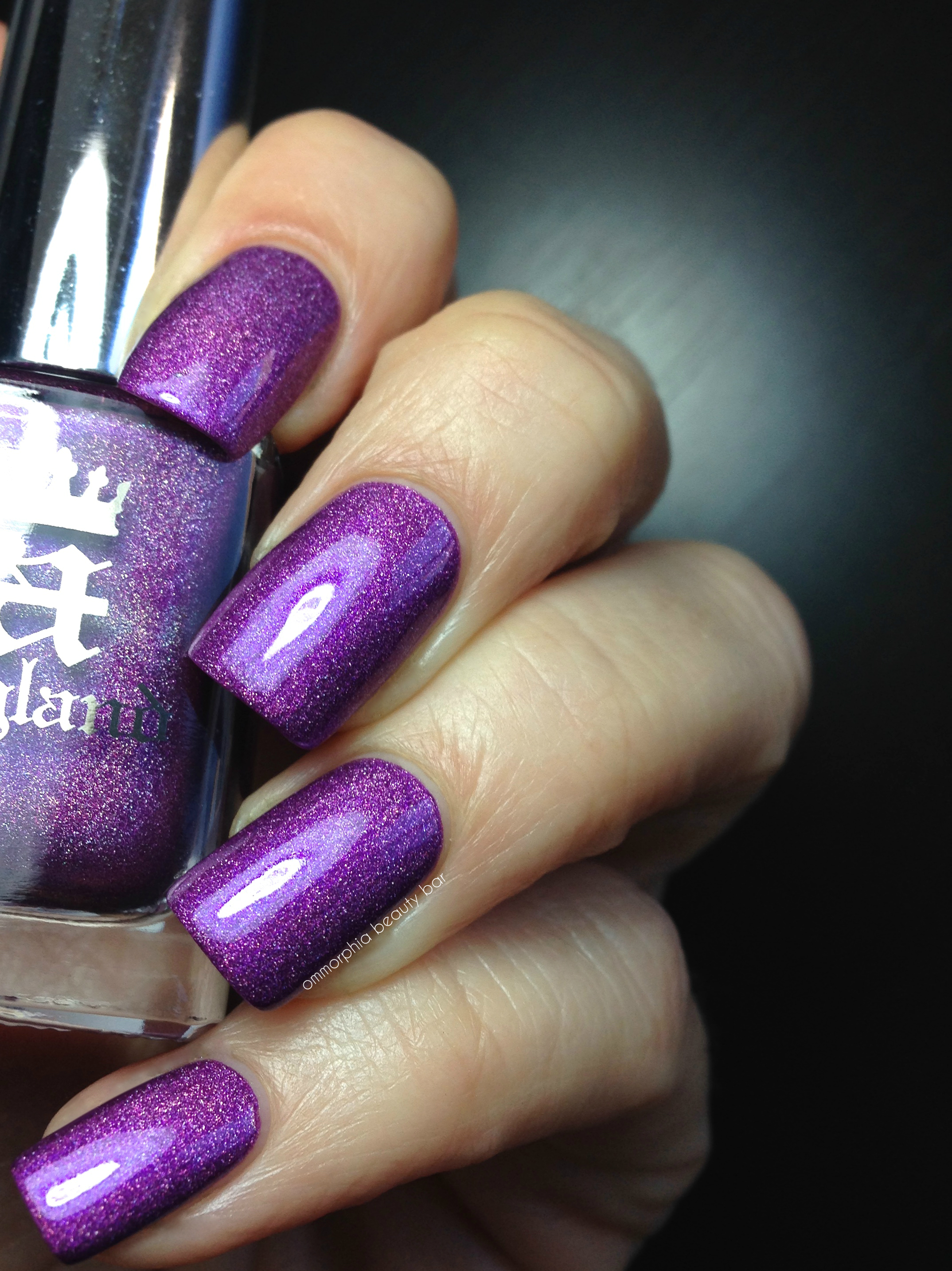
a-england | Crown of Thistles

The birthplace of Richard III and place of execution of Mary, Queen of Scots, Fotheringhay Castle was founded in 1100 AD by Simon de St, Liz (Senlis), Earl of Northampton and Huntingdon. Today, only the earthworks and the conical motte remain of the castle, its stones having been robbed and carted away by locals in order to build their own homes after Mary’s execution.
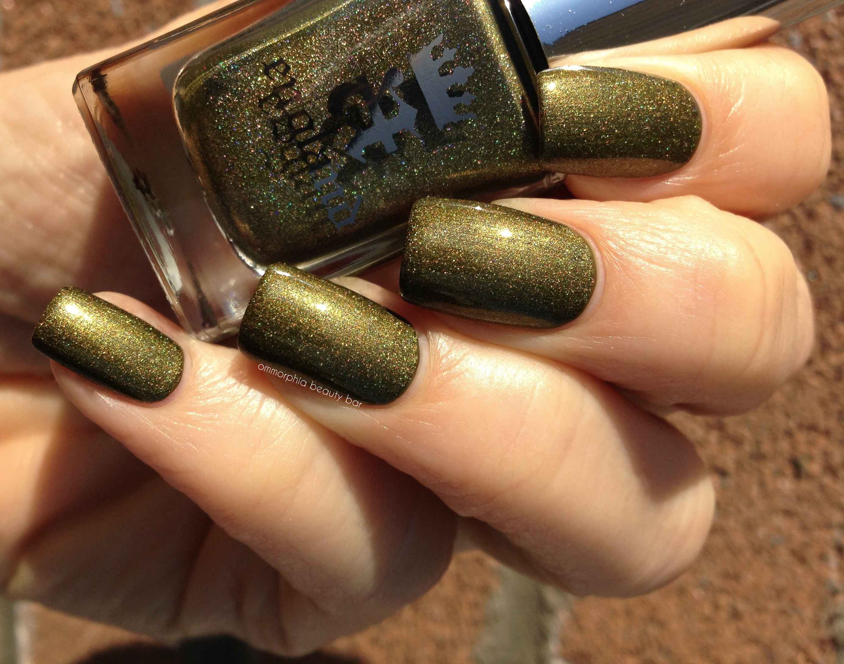
Fotheringhay Castle | Lustrous olive/mossy green with a strong prismatic shimmer, in a formula that was perhaps the thinnest applying of the five, but easy to work with just the same. I could easily have left it at one 1 coat for full opacity, but I personally prefer the look of Fotheringhay Castle with 2 coats – really brings out the holographic bits. Coats applied: 2, plus top coat
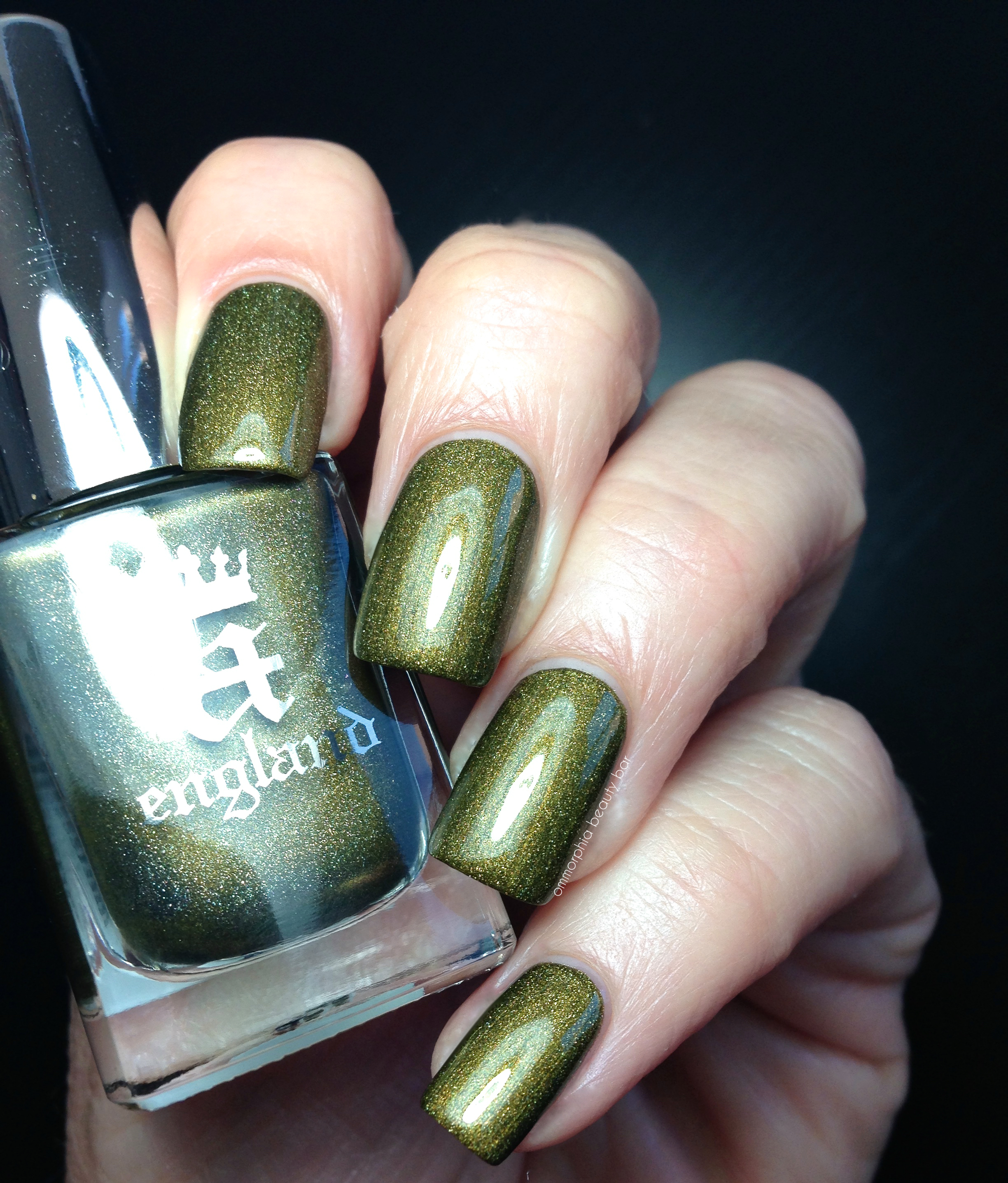
a-england | Fotheringhay Castle
I’ve made it no secret that I am a huge fan of a-england, but I also like to give credit where it’s due, and there is not one disappointment in any of these five Elizabeth & Mary shades. Unlike some other brands that can finish quite glossy, these lacquers have a more refined shine, and benefit from added top coat, turning them truly stellar – although Queen of Scots becomes an object of supreme beauty (for me, at any rate) once mattified.
Available now, find more information on a-england’s Elizabeth & Mary Collection (as well as the full range and worldwide stockists) by visiting a-england.com.co.uk
Click on the a-england tab (at right) to see swatches of all other a-england lacquers
Press samples provided for my unbiased consideration
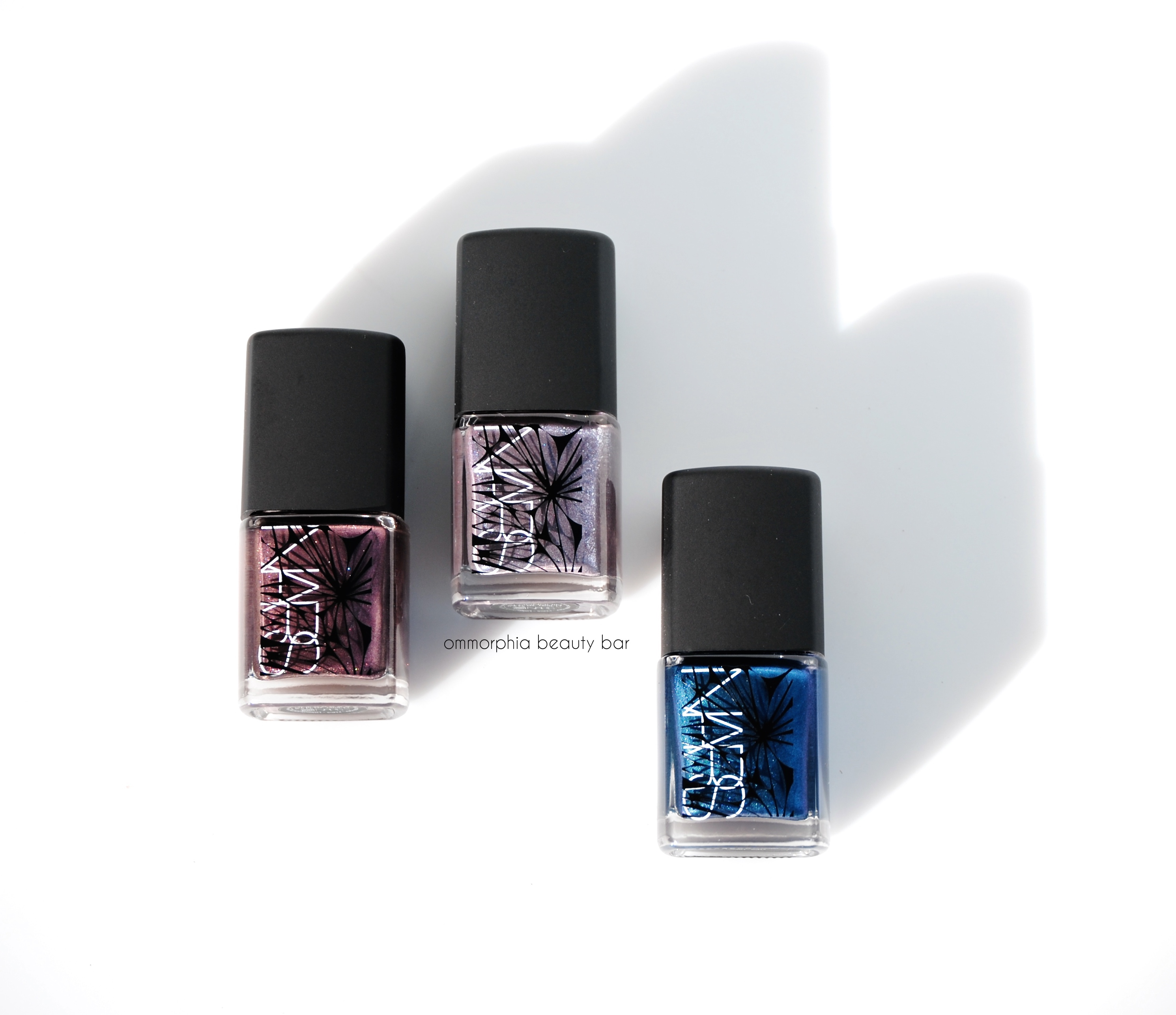
NARS Laced With Edge Holiday 2014 Collection | Sherwood, Algonquin & Berents Sea
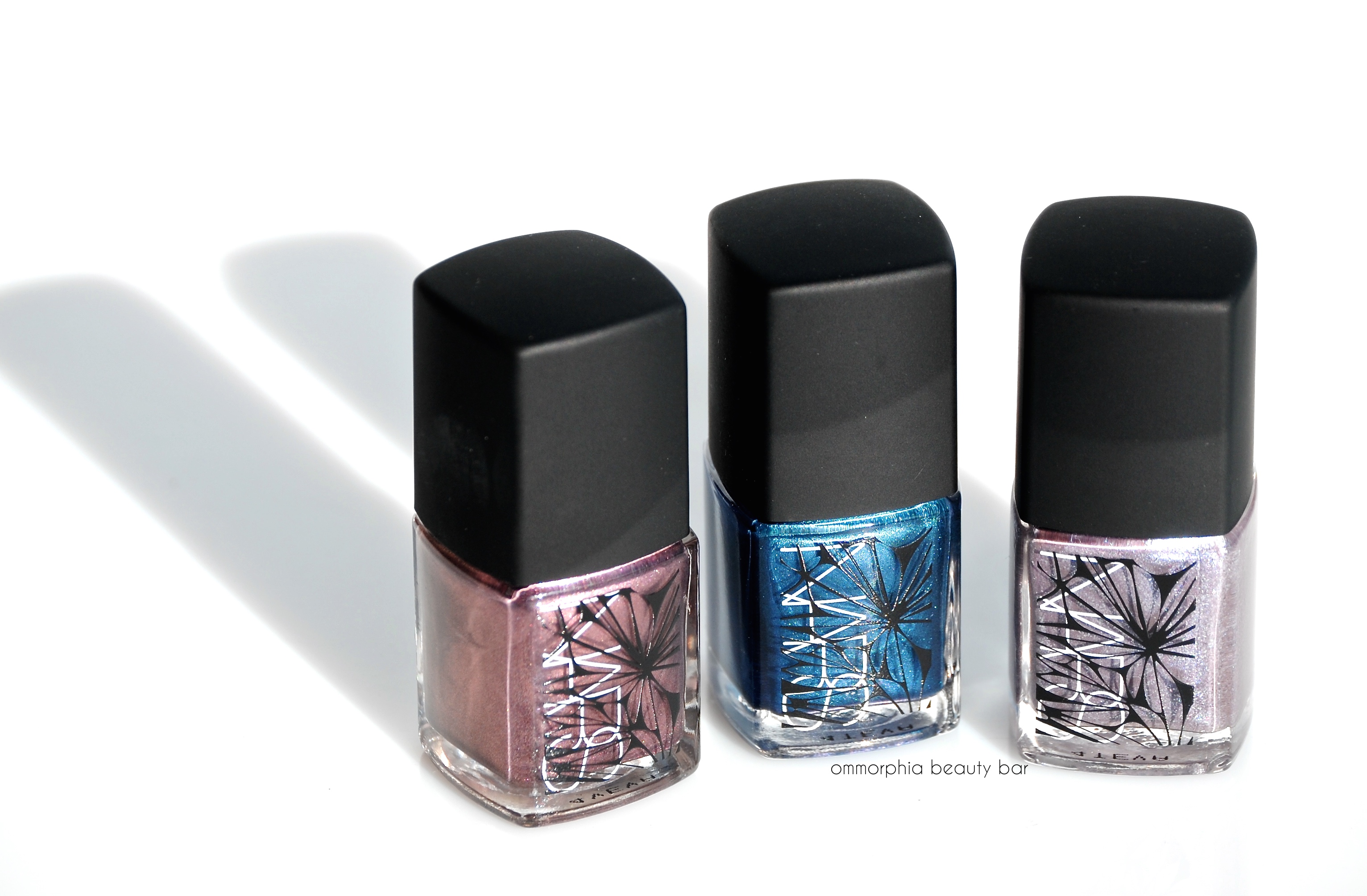
The three limited edition shades of the NARS Laced With Edge Holiday 2014 Color Collection, are all so surprisingly unique, as well as being standout shades from the brand. Each offers a different take on a metallic theme, with splashes of duo chrome and/or glass flecks for depth and visual interest – along with a stellar formula and colour palette – and come with complete with the Chris Kabatsi Nebula design on the bottles, reminiscent of intricate lace or in this case, snowflakes (which makes them even more perfect for holiday gift-giving, no?).
Note that all NARS nail lacquers come with removable outer caps on the bottles and a newly reformulated brush. I had experienced some issues with this new brush on some previously reviewed shades, but I’m happy to report that all three of this collection were a dream to work with, both in terms of colour and the brush.
Previous review on the Holiday 2014 Colour Collection Lip Glosses can be found here.
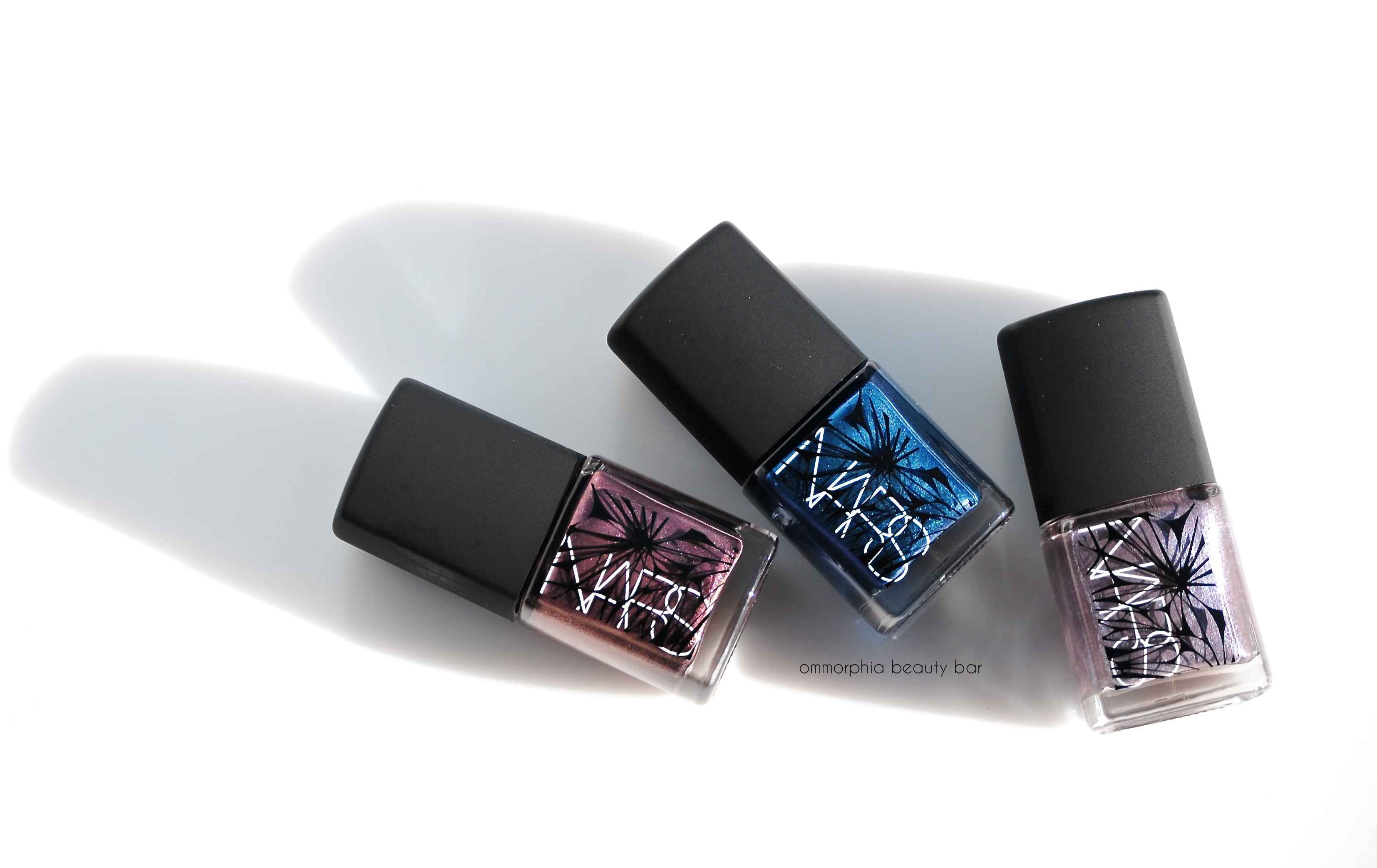
NARS Laced With Edge Holiday 2014 | Sherwood, Berents Sea, Algonquin
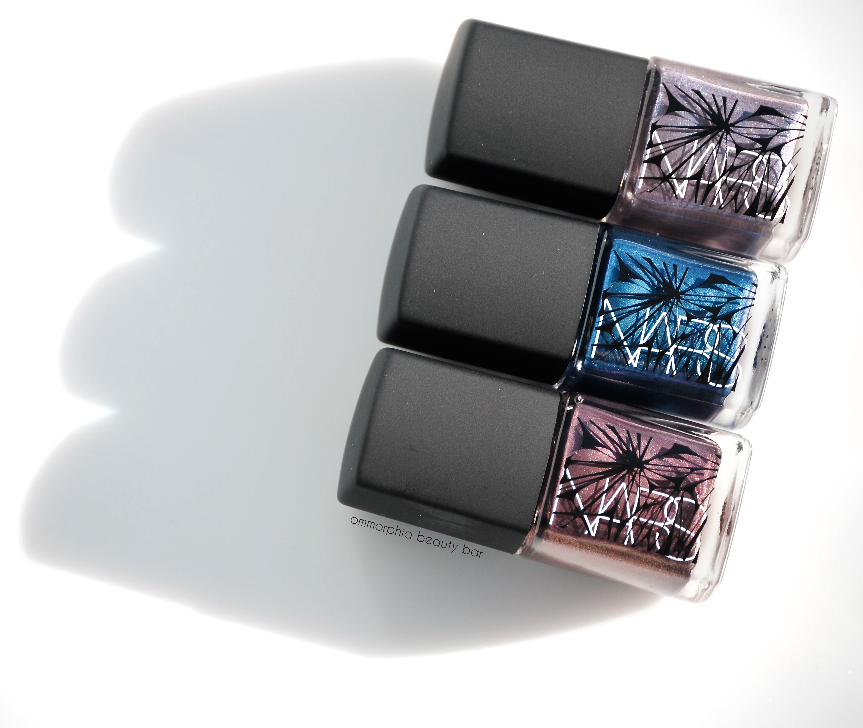
NARS Laced With Edge Holiday 2014 | Sherwood, Berents Sea, Algonquin
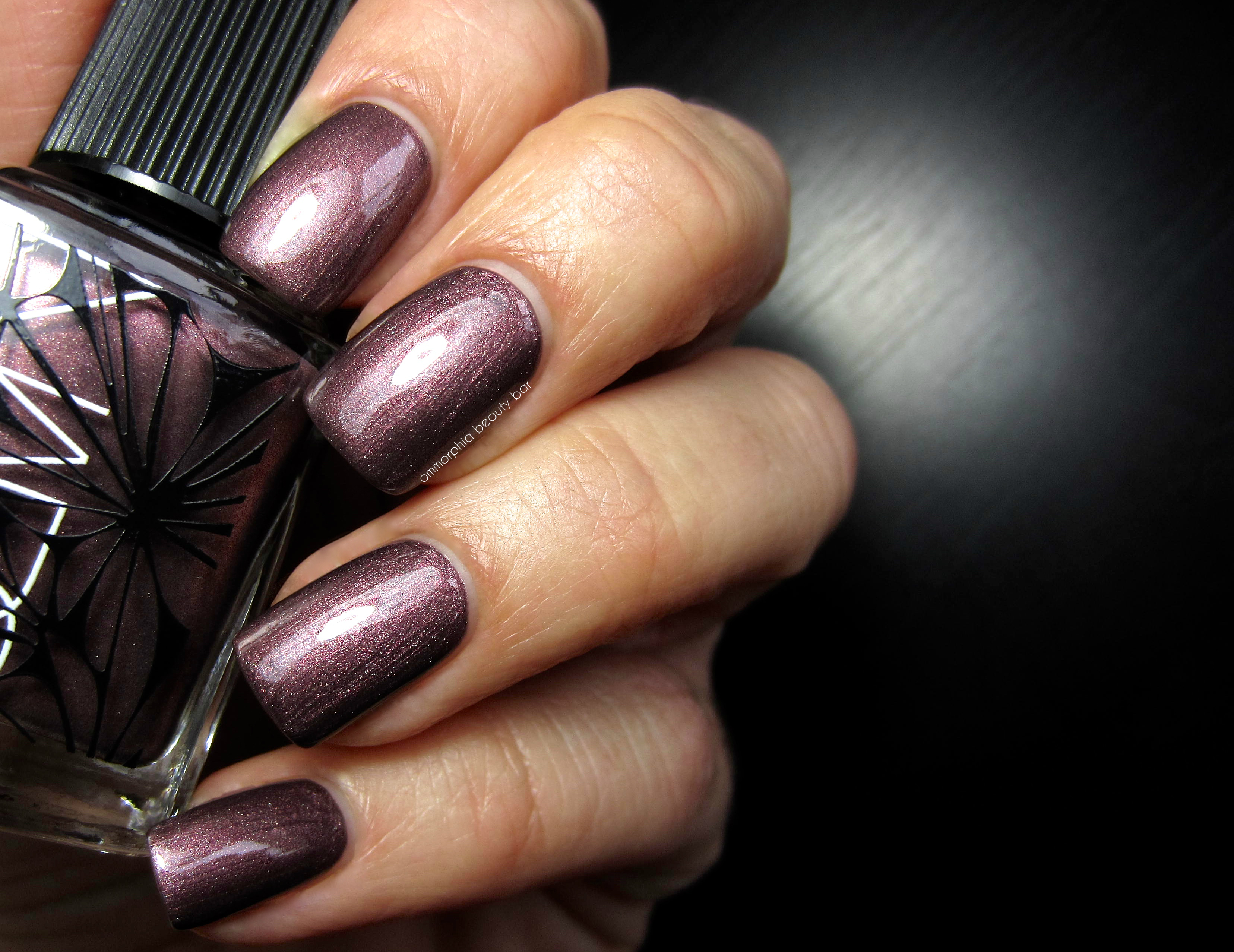
Sherwood, limited edition (CAN $23.00) | A mid-sheer greyed mauve/plum based colour with a complex ultra fine shimmer in bronze, silver and copper. The self-levelling formula has an excellent flow and applies brush stroke-free, with a glossy shine at the finish. There’s this unique dusty tone to Sherwood – an effect where the nail edges appear darker as though framing the centre portion. Love it! Coats applied: 2, plus top coat
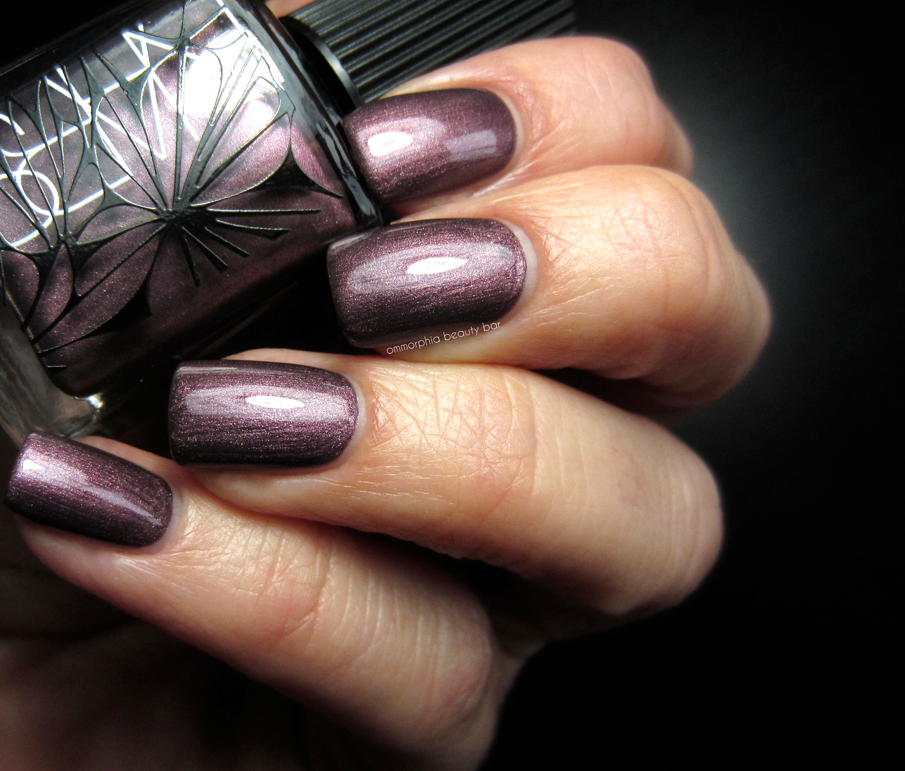
NARS Holiday 2014 | Sherwood, limited edition
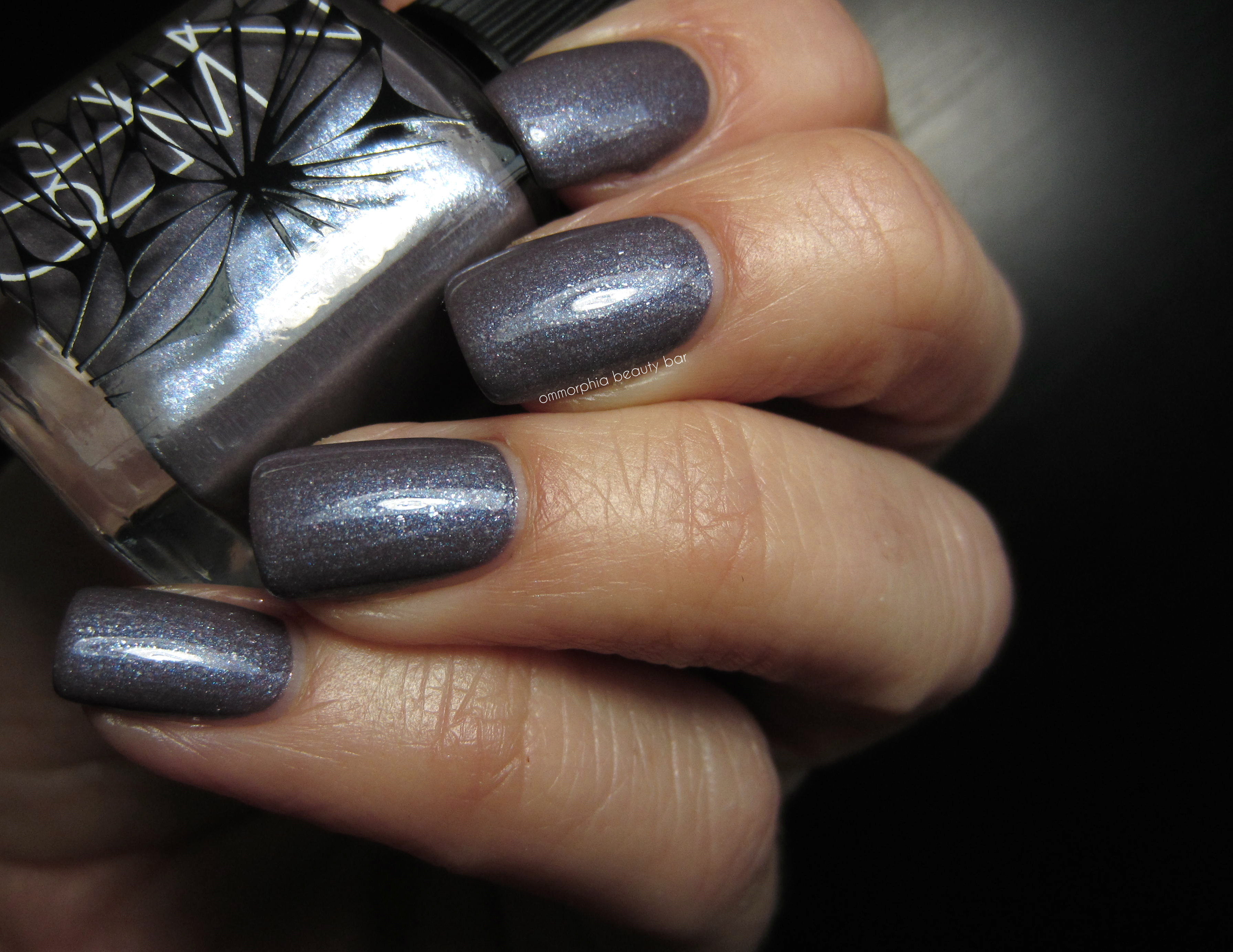
Algonquin, limited edition (CAN $23.00) | A dusky lavender with grey/mauve undertones filled with violet and prismatic ultra fine glass-flecked shimmer, in a crème/jelly hybrid formula. Smoothly applying and glossy at the finish, Algonquin is quite unique and mysterious looking, with these blue flashes that remind me of a blowtorch flame. Minimal shimmer spread upon removal. Coats applied: 2, plus top coat
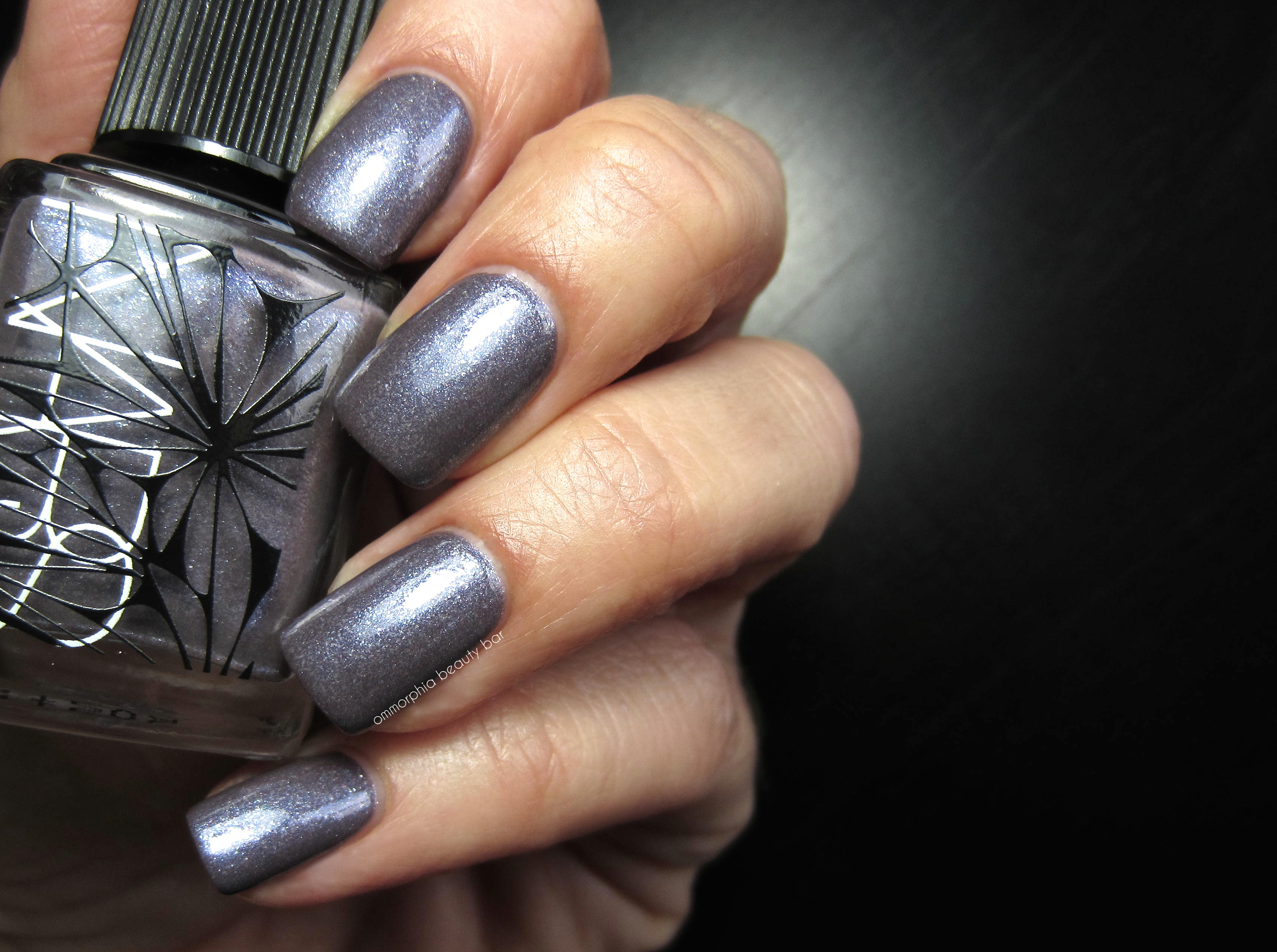
NARS Holiday 2014 | Algonquin, limited edition
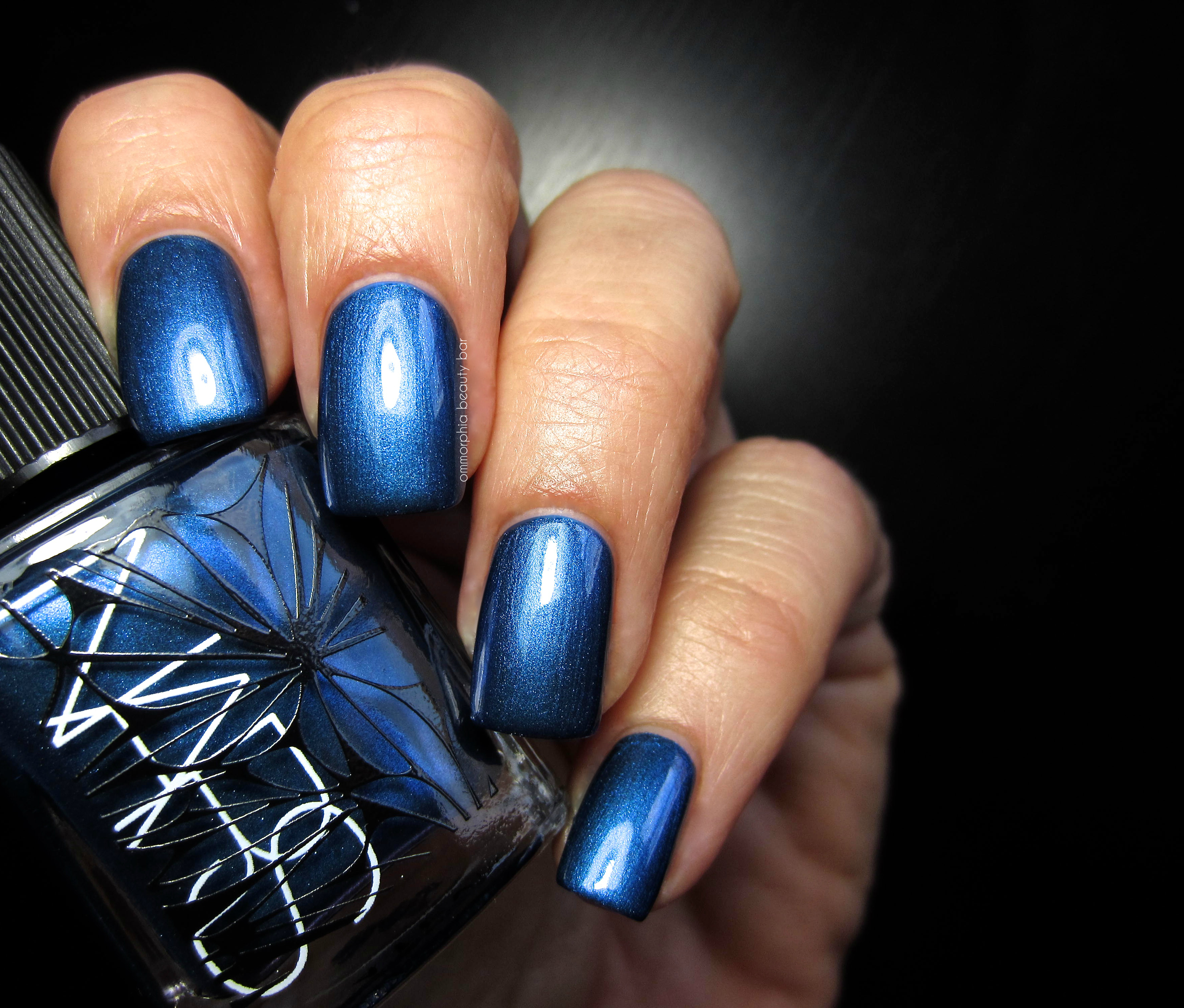
Berents Sea, limited edition (CAN $23.00) | Rich metallic royal blue shade with some violet flashes seen at certain angles. Excellent density and flow to the formula, but you do need a steady had with application to keep any visible brush strokes to a minimum (TIP: keep a light and even pressure on the brush to achieve an effortlessly smooth finish). Best part is that Berents Sea is non-staining upon removal. Coats applied: 2, plus top coat
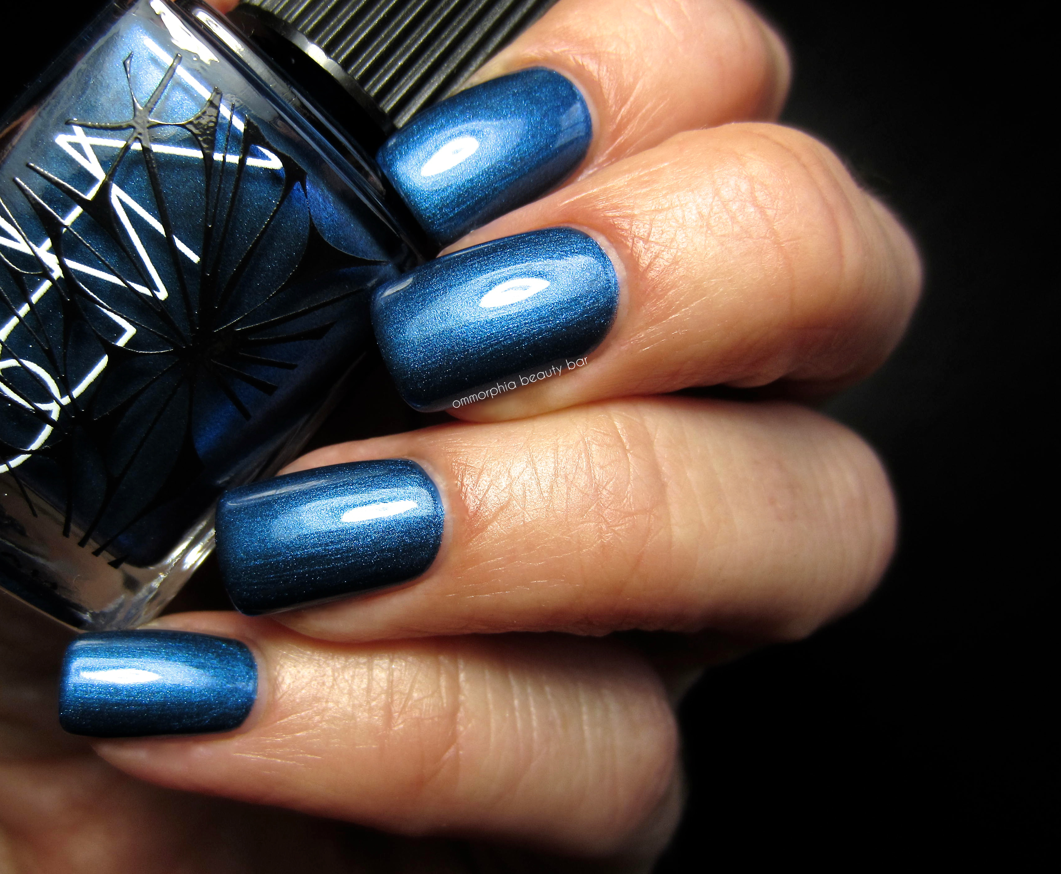
NARS Holiday 2014 | Berents Sea, limited edition
My initial impressions upon viewing these shades were mixed; I immediately fell in love with the packaging (details like that just push ALL my buttons), and apart from the sophisticated vibrancy of Berents Sea, I wasn’t sure what to make of the either Sherwood or Algonquin. The verdict? I absolutely LOVE each – not only are the colours and actual formulation of complex shimmers and/or glass flecks so well thought out, but the colours manage to be unique – not an easy task to accomplish when you consider the breadth and scope of a nail polish collection as large as mine. In summary: you need these.
Available at all NARS counters now but for a limited time – find more information via the website.
Press samples provided for my unbiased consideration
OPI Spring/Summer 2015 Hawaii Collection | A preview luncheon

Last Friday, I had the privilege of attending the launch of OPI’s Spring/Summer 2015 Hawaii Collection, held at Mildred’s Temple Kitchen, Toronto. This occasion marked the finale of a whirlwind 2 days of events that began with the Elizabeth Arden Spring/Summer 2015 launches, followed by the Nicole by OPI Spring/Summer 2015 launch.
Upon arriving, I was greeted with gorgeous island-themed displays featuring the collection – a welcoming sight indeed, considering how gloomy the weather was that day. After quickly reconnecting with several familiar faces and some who were only names to me up until that day, I headed to the manicure stations where I chose That’s Hula-rious! – a fresh mint hue – as my mani du jour, a shade that turned out to be overwhelmingly popular with several attendees, from what I later noticed.
The tempo really picked up once VP and Artistic Director of OPI, Suzi Weiss-Fischmann, arrived and after welcoming us all to the luncheon, we sat down for a delectable Hawaiian-themed meal (which unfortunately I barely did any justice to, as I was hit with the migraine to end all migraines — still not sure how I survived the flight back home a few hours later). Capping off the day, I was able to sit down once again (see my previous interview here) with Suzi for a quick interview and to get the scoop directly from her on what we can expect to see from OPI.
I hope you enjoy the preview photos and interview.
Thank you to my wonderful hosts for inviting me to be part of such an incredible event
♦
Welcome! Tell me about this latest collection
What was I going to do for Spring? I alluded to it when I spoke earlier and mentioned how women have arrived – we want to be more relaxed and comfortable, a common theme I also noticed from the Spring runway shows. Hawaii was the perfect inspiration; it’s an exotic locale and makes you feel wonderfully relaxed and alive at the same time – from the climate, the people, the food, the music and the colours.
As seen all over the various fashion shows, neutrals were once again dominating but with a twist; the new ‘midi’ look was shown where you leave the moon of the nail bare. Another way to wear neutrals is with a differently coloured free edge, or even applied as just one graphic line down the nail. The 70’s free-spirit vibe is represented by a mauve hue, a shade OPI hasn’t featured for quite some time, mint – very on trend and a perfect representation of Spring/Summer, the lavenders, purples, corals and pink – must have a pink, of course! Gold which I’ve also shown for the Holiday 2014 Collection, and metallics – which I’ll be showing more for Fall 2015. Rounding the collection out, are a lot of classics such as crèmes – which also happens to be the trend that I’m seeing coming up for future collections.
How do you go about selecting a country/city for a collection?
It usually begins with predictions/trend books from Milan and Paris, that look at the direction of colour in fashion, which in fact begins on the streets by observing people – a type of historical summary of colours and fashion, if you will. Then it’s up to the individual to translate this information to their own application, whether it’s in furniture, fashion, package design, colour cosmetics, or nail colour.
How does this process differ from celebrity collaborations?
To begin with, selecting a celebrity to collaborate with is not trend-driven, but more of my own personal choice. With Gwen Stefani, for example, she’s very much a part of the entire process and she personally chose the colours and finishes for the collection, even going as far as selecting individual glitter shapes from an assortment presented before her, for the creation of some shades.
The OPI shade names – how do you go about creating them?
First, I create the shades and then there are about 6 of us – from Nicole by OPI, Creative, Marketing, Purchasing, even Customer Service, basically the same team for many years now, that get together. We gather in a room with food representative of the country/city the collection is themed after, and then we brainstorm. The process can take an entire day and is very democratic; we all need to agree on the final name, but we also have fun with it.
I can just imagine the names that do NOT make the final cut!
That’s for off-camera! The blooper reel! We’ve have many good laughs over the years, believe me!
Can you briefly tell me about the creative process behind bringing forth a collection?
Taking the Hawaii Collection, for example, the entire process was very personal for me as it’s a place I’ve visited many times with my family. I was inspired by the ocean, the hula skirts, even the smells of the island that evoke images and which spark colour ideas in my mind. I also have to factor in which shades/colours the consumer will be attracted to as well as make sure it works in harmony with the current fashion styles. Don’t ask me to try to pin it down exactly; all I know, is that for 25 years this method has just worked for me.
This continued success and longevity just confirms that you’re doing something right!
[laughs] I hope so!
What territory, with regards to nail polish, has OPI not yet explored?
Definitely China, as I believe Chinese women are starting to explore and embrace beauty much more. With India, and while we previously released an Indian-themed collection, there’s a new middle class that is becoming more interested in – along with buying – beauty products as well. Another country is Brazil – latin women love and indulge in beauty products, and outside of North America and Europe, I feel that we need to venture out and include these women who have made beauty such a huge part of their everyday lives.
As a woman whose talent, drive and creativity is so highly admired in the industry, can you tell me what trend(s) you forecast next?
I continue to see textures; you’re going to see some new mattes from OPI for next year, as well as a continuation of this classic theme – such as crème hues. Shades such as mauve will be making a comeback and you’ll be seeing new shades in our Fall 2015 collection that have not been shown from OPI – or other brands – for a long time now. Nail colour continues to be important in women’s lives and it always amazes me how a bottle of nail polish can engineer a feeling of empowerment with women. Not everyone can afford a designer wardrobe, but a shade inspired from luxury fashion makes you feel a part of the entire experience.
Finally, do the rumours of a ’50 Shades of Grey’ collaboration have any truth to them?
Yes! The movie is being released on Valentine’s Day 2015, and the collection will include 6 shades – and not all grey, but a beautiful collection just the same! As with other collaborations, the author of the book was very hands on in the development and creation of these shades. This movie is not so much about sexuality, as it is about exploring our emotions and in the case of the collection, it also ties in with how colour affects our emotions as well.
I thank Suzi Weiss-Fischmann for taking the time to speak with me – it’s always such a pleasure!
♦
BEAUTY SCOOP! So, you heard it here first and directly from Suzi Weiss-Fischmann herself: get ready for a 6-bottle 50 Shades of Grey Collection collaboration (and not all grey!), new textures and mattes for next year, as well as retro shades making a comeback for Fall 2015.

fuel to start my day: Belgian waffles with fruit compote & lemon cream … and plenty of coffee

my look: Banana Republic cream vegan leather skirt, Denim & Supply bone oversized cowl-neck sweater, black over-the-knee socks, black Prada suede high-heeled boots and my beloved Theory moto jacket

the gorgeous Autumnal display in the lobby of The Thompson Hotel, Toronto

the venue: Mildred’s Temple Kitchen, Toronto

Introducing: the OPI Hawaii Collection


what’s an event without the ubiquitous candy bar?!


it’s not easy for me to sit back and have someone else to do my nails #controlfreak


the shade I chose: That’s Hula-rious! (the name, right?!)


Welcome speech given by Suzi Weiss-Fischmann


Pineapple-Hawaiian style slaw

Mahi-Mahi

Coconut Haupia

chillin’ with my friendly neighbourhood mani-geek, Karen

matching tips with Marta of ChitChatNails

ignore my frown face – I swear that I was really enjoying the conversation


Apparently our hosts all got Suzi’s memo and wore coordinating outfits!

My box/bottle of OPI’s Don’t Speak 18k Gold Top Coat personally autographed by Suzi


