Filed In: nail polish
Giorgio Armani – #705 Black Petrol Lacquer

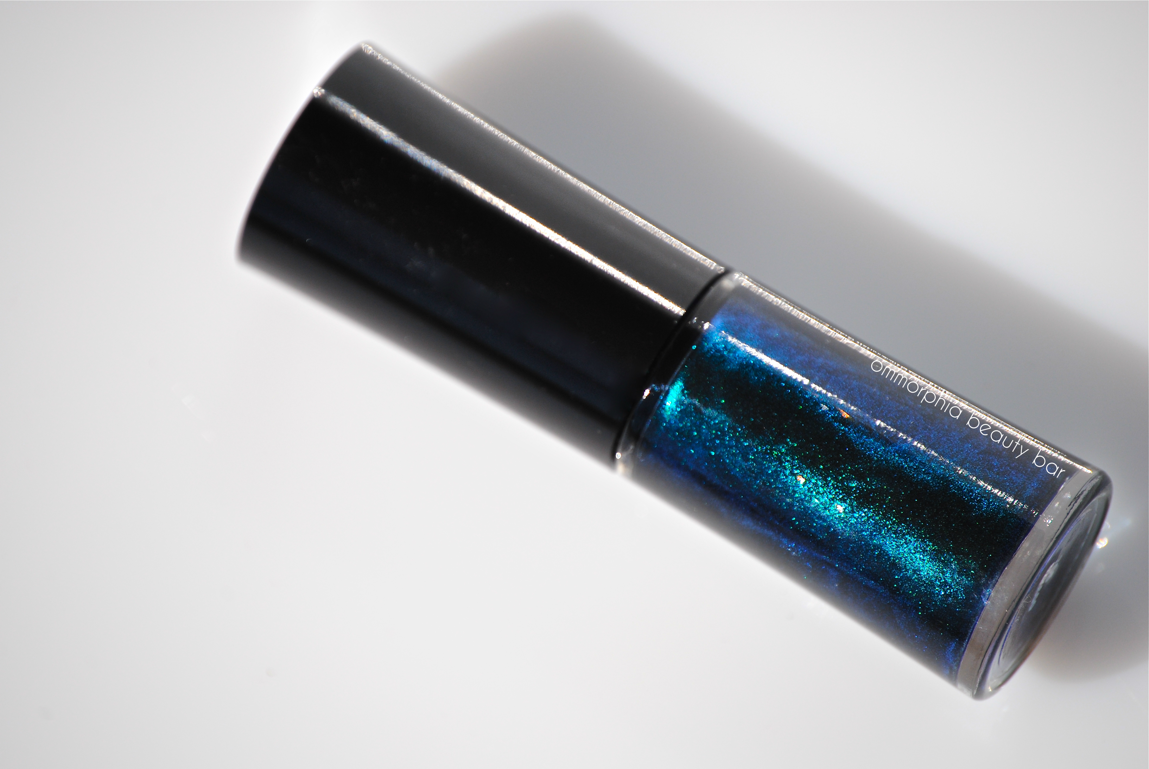
Upon spotting the new Giorgio Armani Nail Lacquers a few weeks ago, I think I may have stood rooted to the spot for a few moments, simply taking it all in. Then the dilemma: which shade to pick up first? After going back & forth between the 18 shades, I decided on #705 Petrol – as much for name, as the colour – an inky, swirling, mysterious & chameleon-like shade.
This new range of lacquers is reported to boast a new shiner & longer-lasting formula than conventional polish, with no need for either a base or a top coat, although I personally would not recommend skipping the base.

Giorgio Armani Nail Lacquer – #705 Black Petrol

Giorgio Armani Nail Lacquer – #705 Black Petrol

Giorgio Armani Nail Lacquer – #705 Black Petrol (ingredients list)
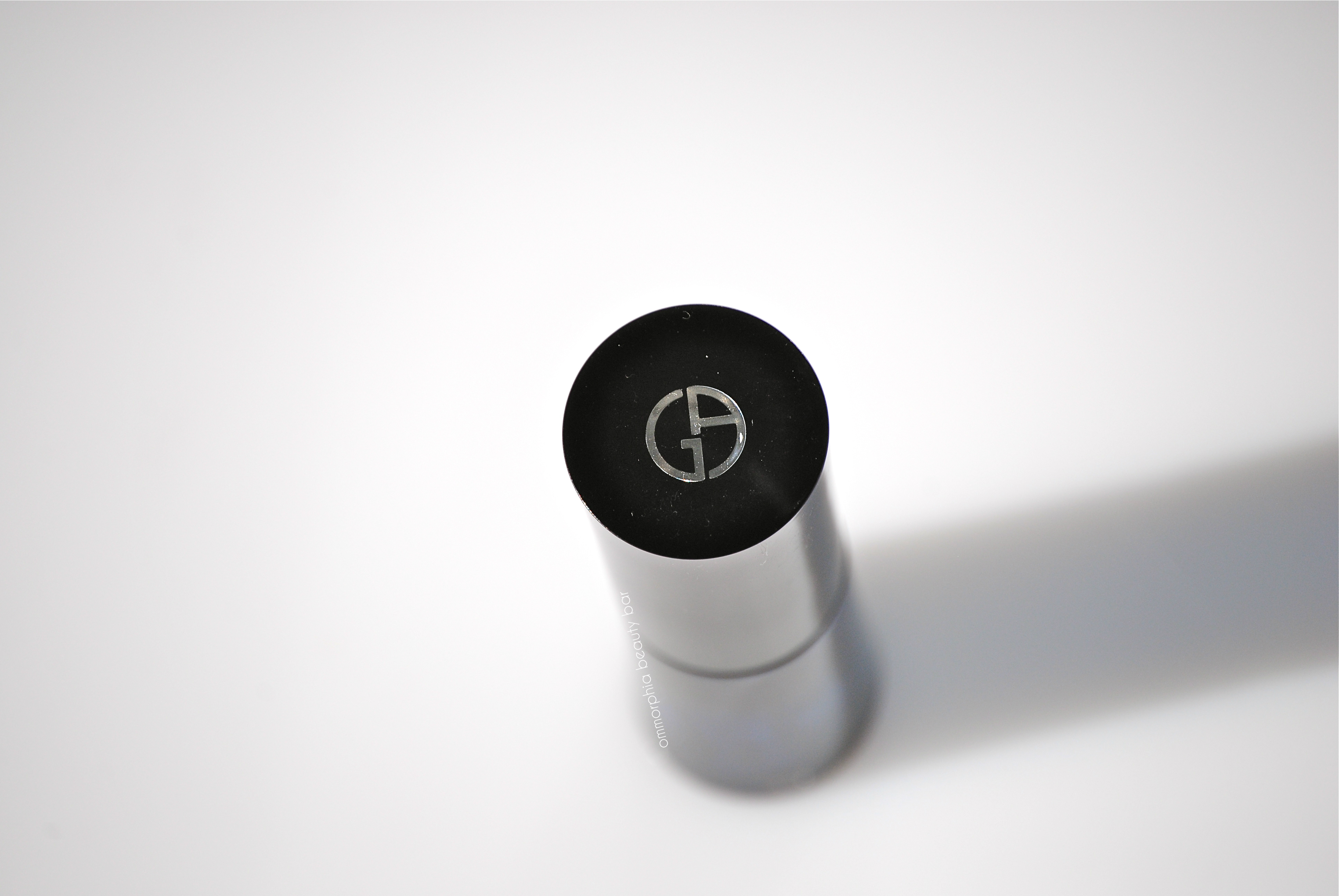
Giorgio Armani Nail Lacquer – #705 Black Petrol

Giorgio Armani Nail Lacquer – #705 Black Petrol

#705 Black Petrol (CAD $32.00/6 ml USD 20.00/ 0.2 fl.oz) – A blackened teal base bearing an ultra finely ground emerald and sapphire shimmer, in a formula with AMAZING viscosity & flow: this beauty stays exactly where placed, with no cuticle pooling, or dragging. The wide & flat paddle-style brush has an excellent density to the bristles, although my brush here did have a couple of wonky hairs (easily remedied by trimming, although at this price, I shouldn’t have to, right?) and I found the length of the wand very easy to use. Totally self-levelling and with a natural high-gloss shine at the finish, there’s almost an ombré effect seen in some lighting – with this shade looking darker around the edges of the nail, and a glowing center. BONUS: completely non-staining upon removal. Coats applied: 2, plus top coat

Giorgio Armani Nail Lacquer – #705 Black Petrol

Giorgio Armani Nail Lacquer – #705 Black Petrol

Giorgio Armani Nail Lacquer – #705 Black Petrol

Giorgio Armani Nail Lacquer – #705 Black Petrol (detail)

Giorgio Armani Nail Lacquer – #705 Black Petrol
Somehow, I’m not surprised at the exceptional quality of this lacquer; everything Mr. Armani touches, seems to be very carefully thought out, with no detail spared. The range, while not huge, does have the basics: nudes, paler pinks, reds, corals, wine, and a few unique colours, as well as varying finishes – from crème, pearly/opalescent, shimmer and even duo chrome. My biggest complaint? The Canadian price. I cannot even begin to comprehend how these polishes are $12.00 more here, and while I am impressed with the line, that alone is almost enough to keep me away. Except for the fact that I’ve already caved and picked up one more. But that’s it. I swear. Maybe…
I bought this item at Holt Renfrew, Montréal.


Illamasqua – Limited Edition Nail Varnish in Gothiqua, 3rd Blog-Aversary special

(source)
Three years ago today, I began this blog – little realizing at the time what that undertaking really meant, or what direction this adventure would take me. You might think that the best part of being a beauty blogger, would be the perks (product samples) and invites (press/media launches), and while those are definitely totally amazing, I feel that the best part is actually the connections I’ve made with like-minded souls from all over the world, and the opportunity to have a constant & ongoing discussion about this passion we all share: beauty products.
So, here’s to going where no other beauty blogger has gone before! (*shameless & cheesy Star Trek rip-off)
I raise a glass makeup brush to you all & send giant panda hugs your way – thanks for sticking it out with me! ♥
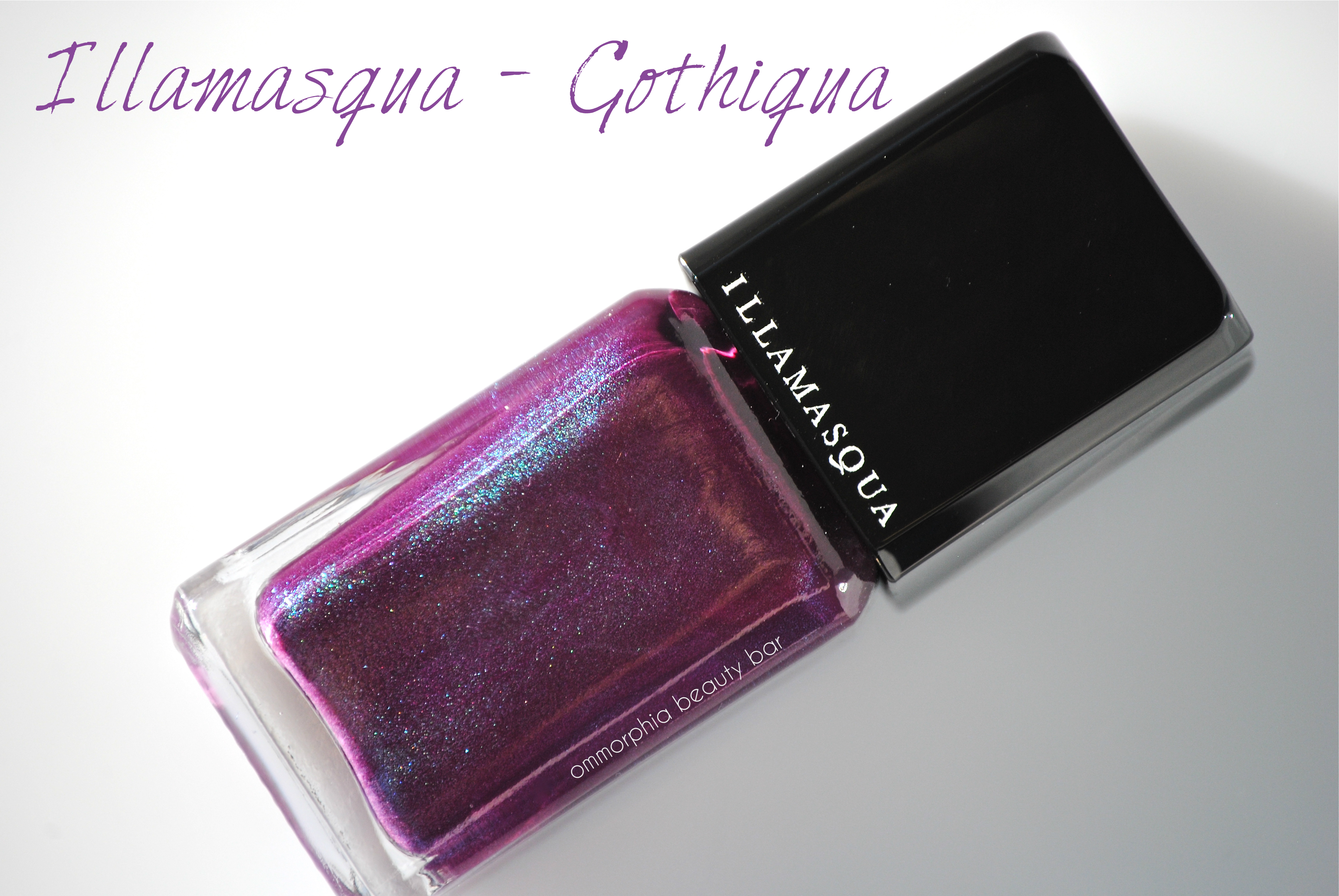
Everything happens for a reason – or at least, that’s a theory I’ve always subscribed to. Take for example, the polish featured in today’s post; I had sort of forgotten that Illamasqua products had finally become available at The Bay here in Canada, and last Saturday when I was at the Montréal downtown store for an exclusive interview with Rebecca Restrepo, Global Makeup Artist for Elizabeth Arden (full post coming soon!), I passed the newly opened Illamasqua boutique there, and stopped to take a quick look.
The varnish that I initially wanted from the new collection (Facet from Sacred Hour) was sold out, and as I turned to leave the store, the SA pointed out something even better: a limited edition colour – a shade made specifically for and exclusive to the brand’s launch at The Bay – AND part of the new Sacred Hour Collection, no less. I didn’t even blink — just forked over the cash and raced out of the store like a mad woman.
Moral of the story: never look a gift opportunity in the mouth (seriously weird expression) – had I not been invited to THAT particular store for THAT particular interview, I probably wouldn’t have even known this shade existed, let alone how unique it was — and absolutely perfect to celebrate my blog’s 3rd birthday with!
See? Everything happens for a reason …
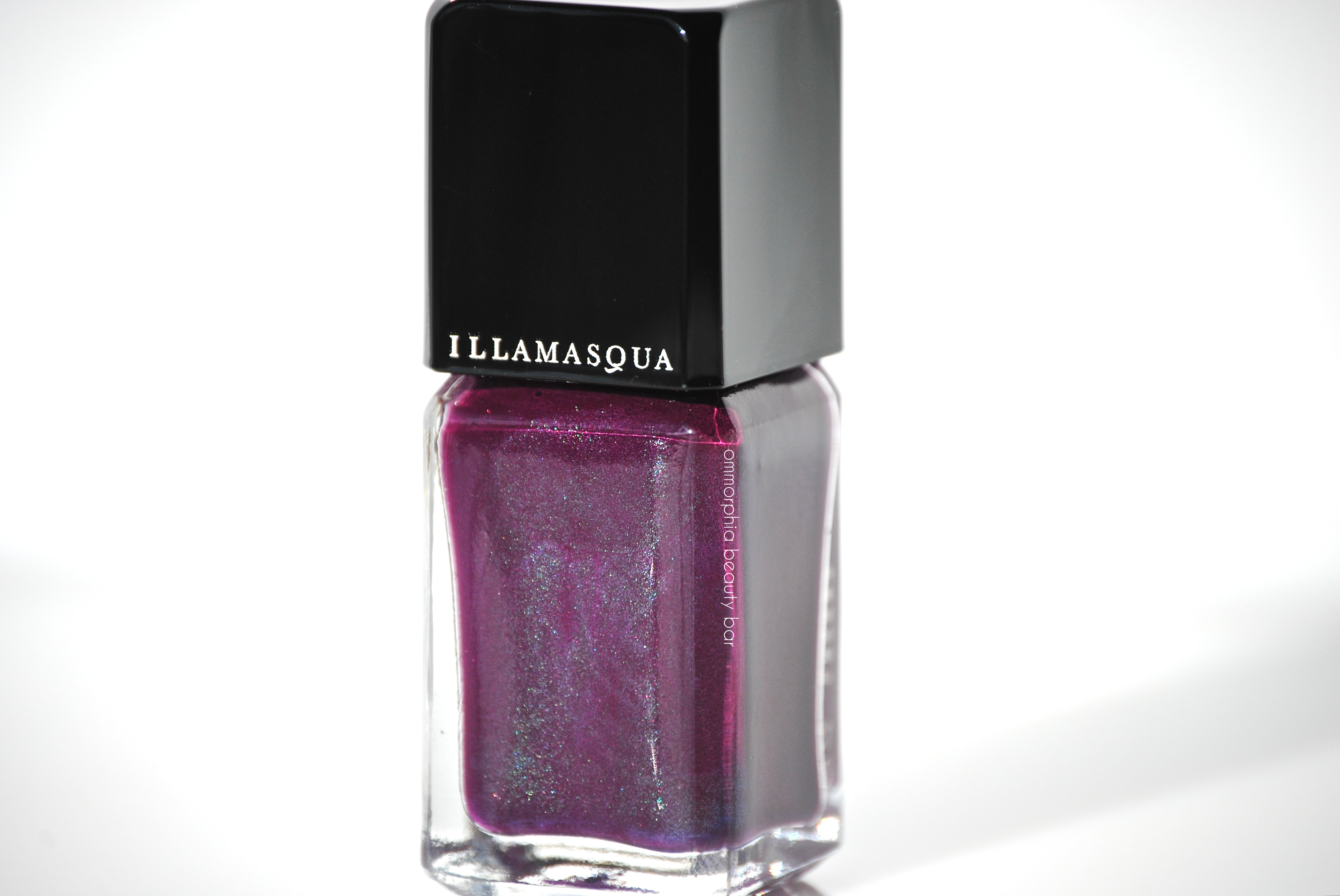
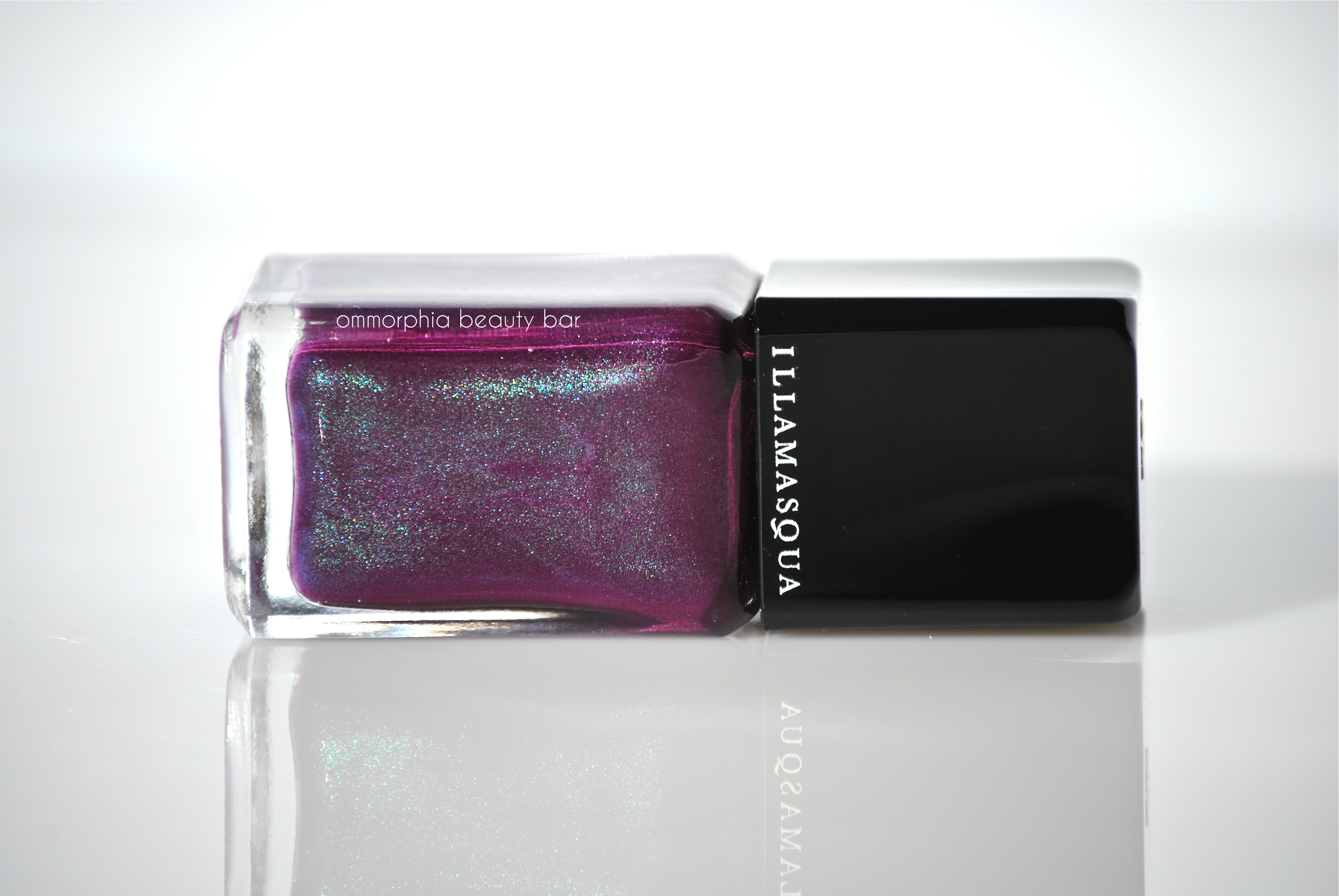
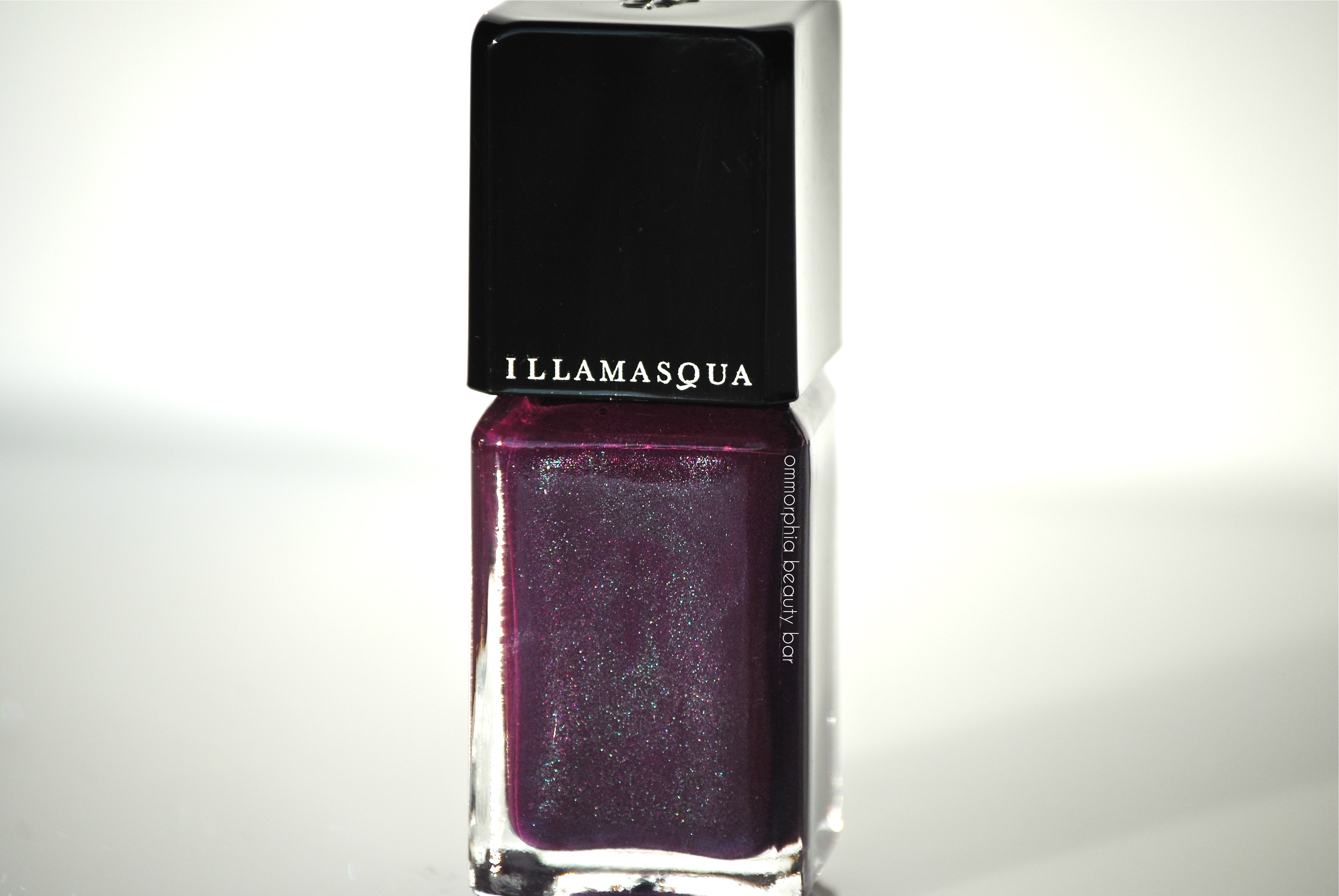
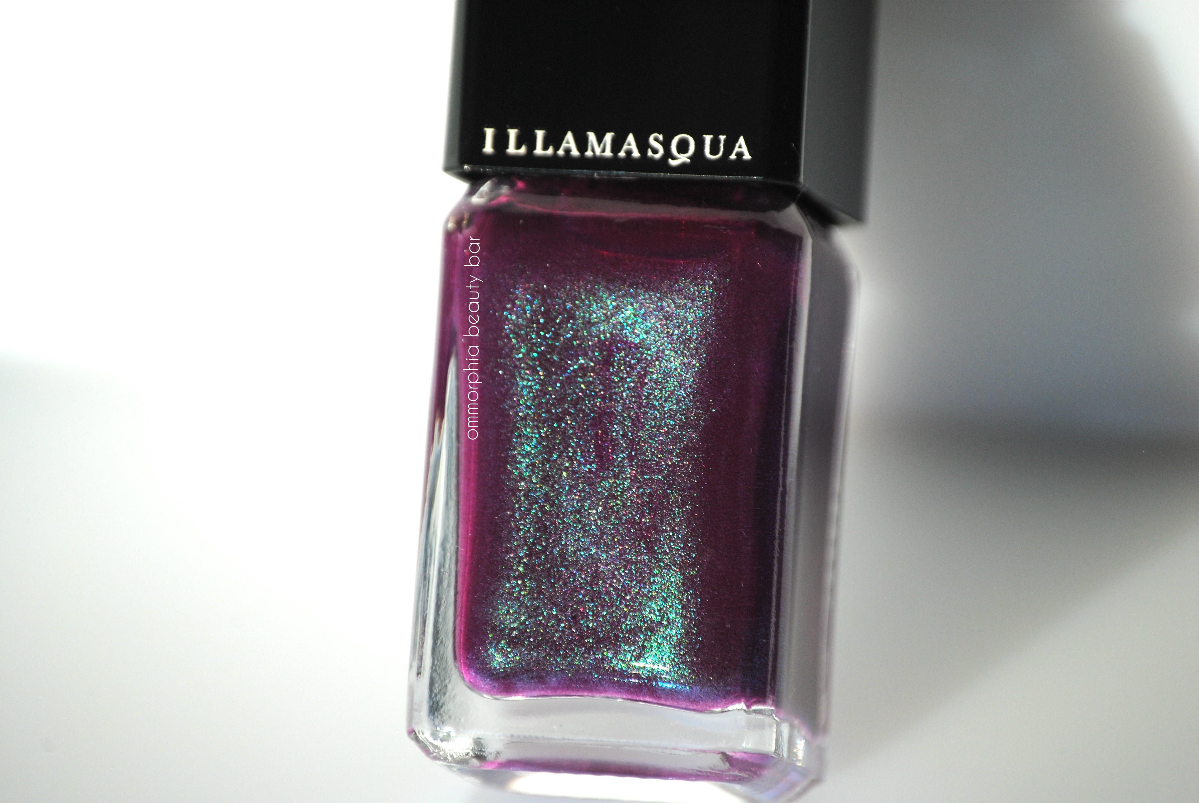
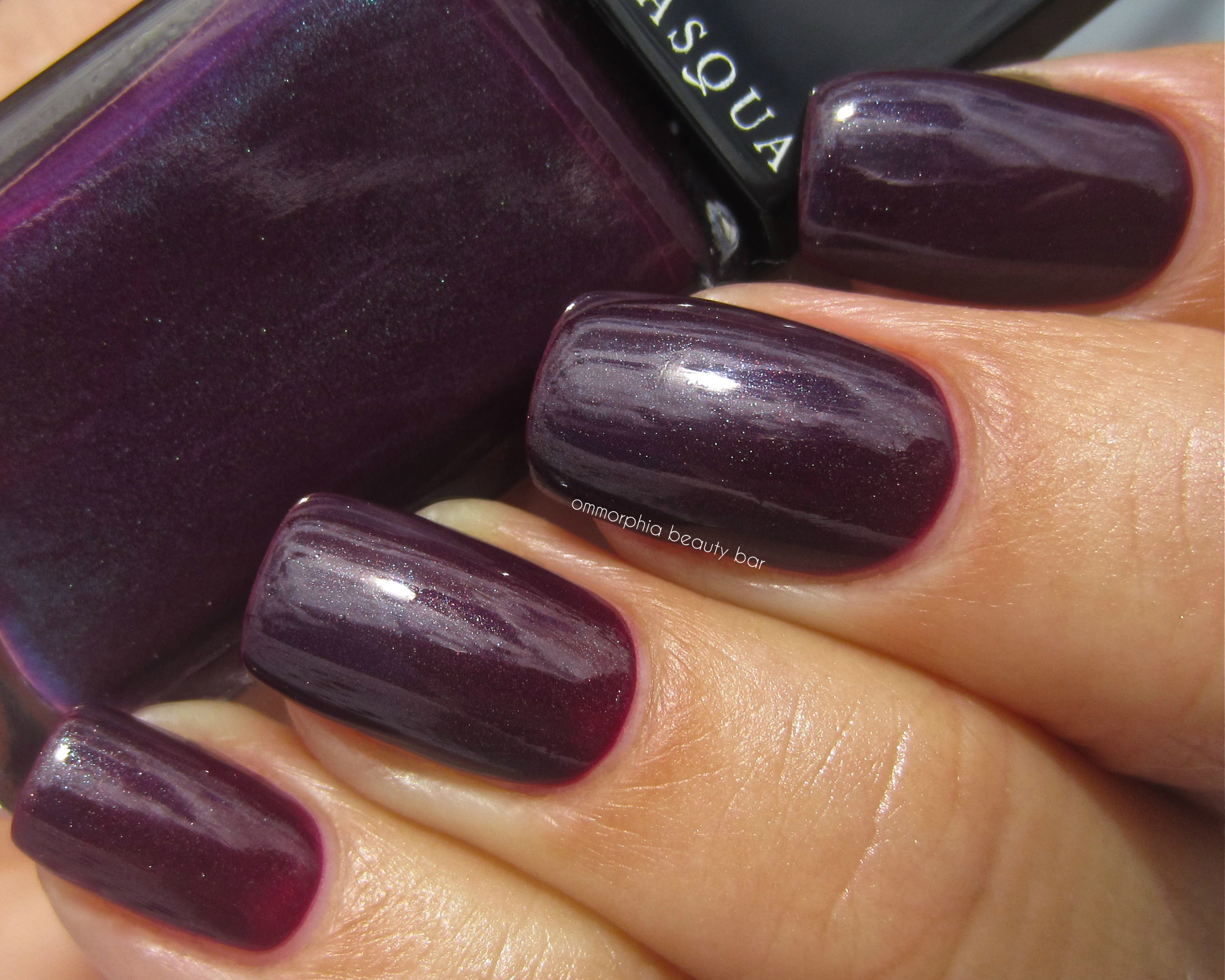
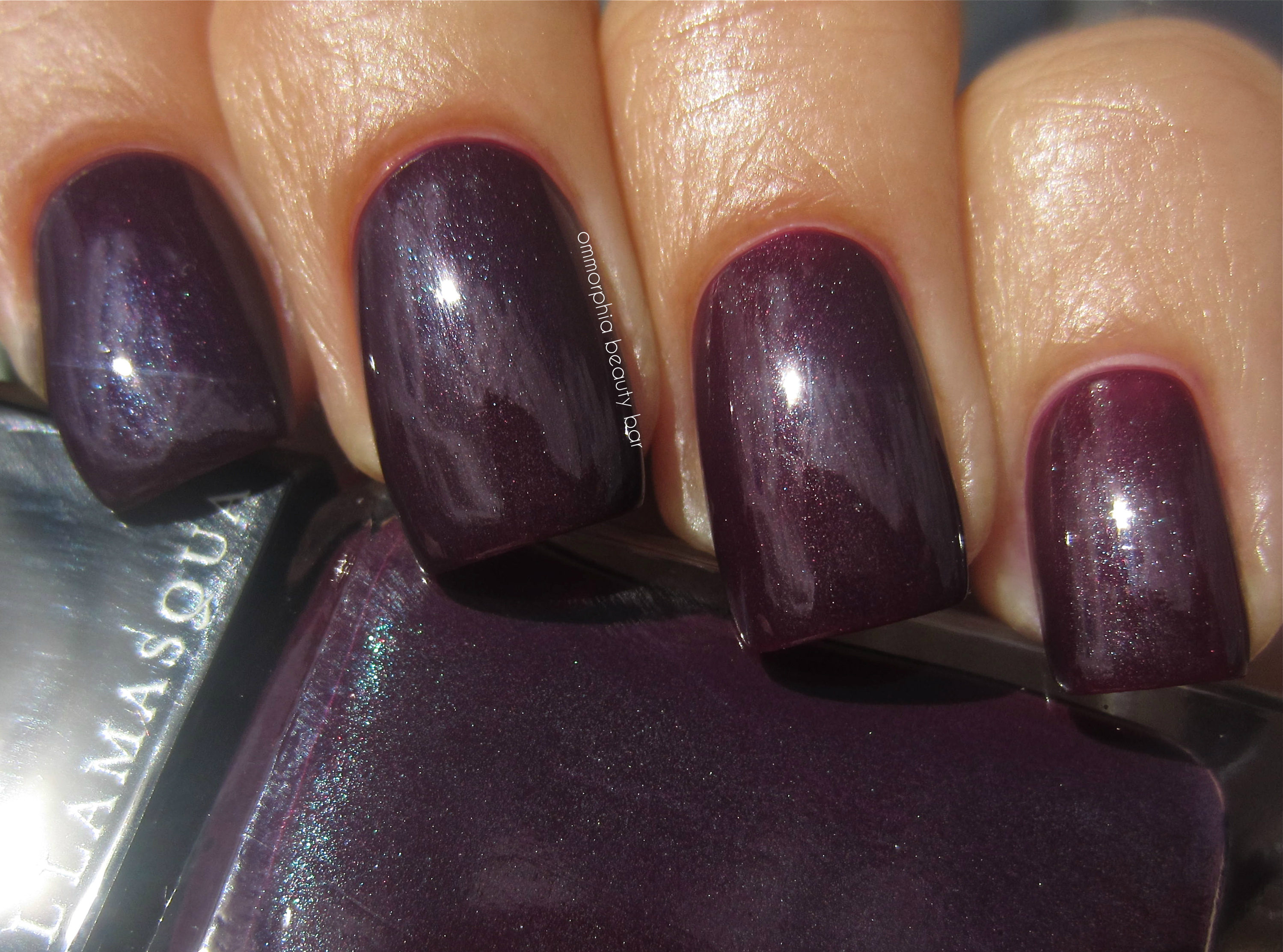
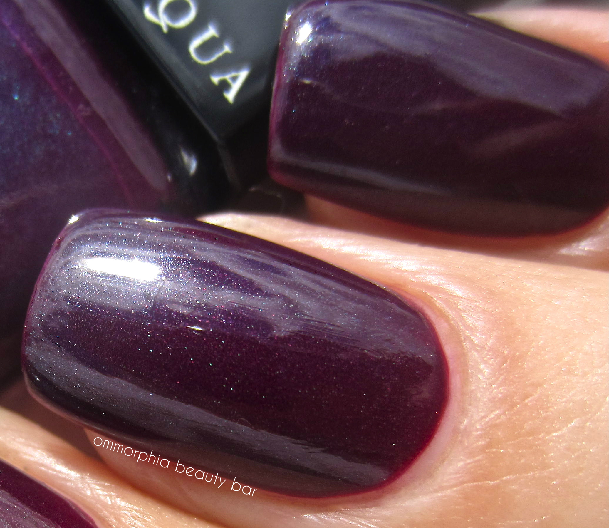
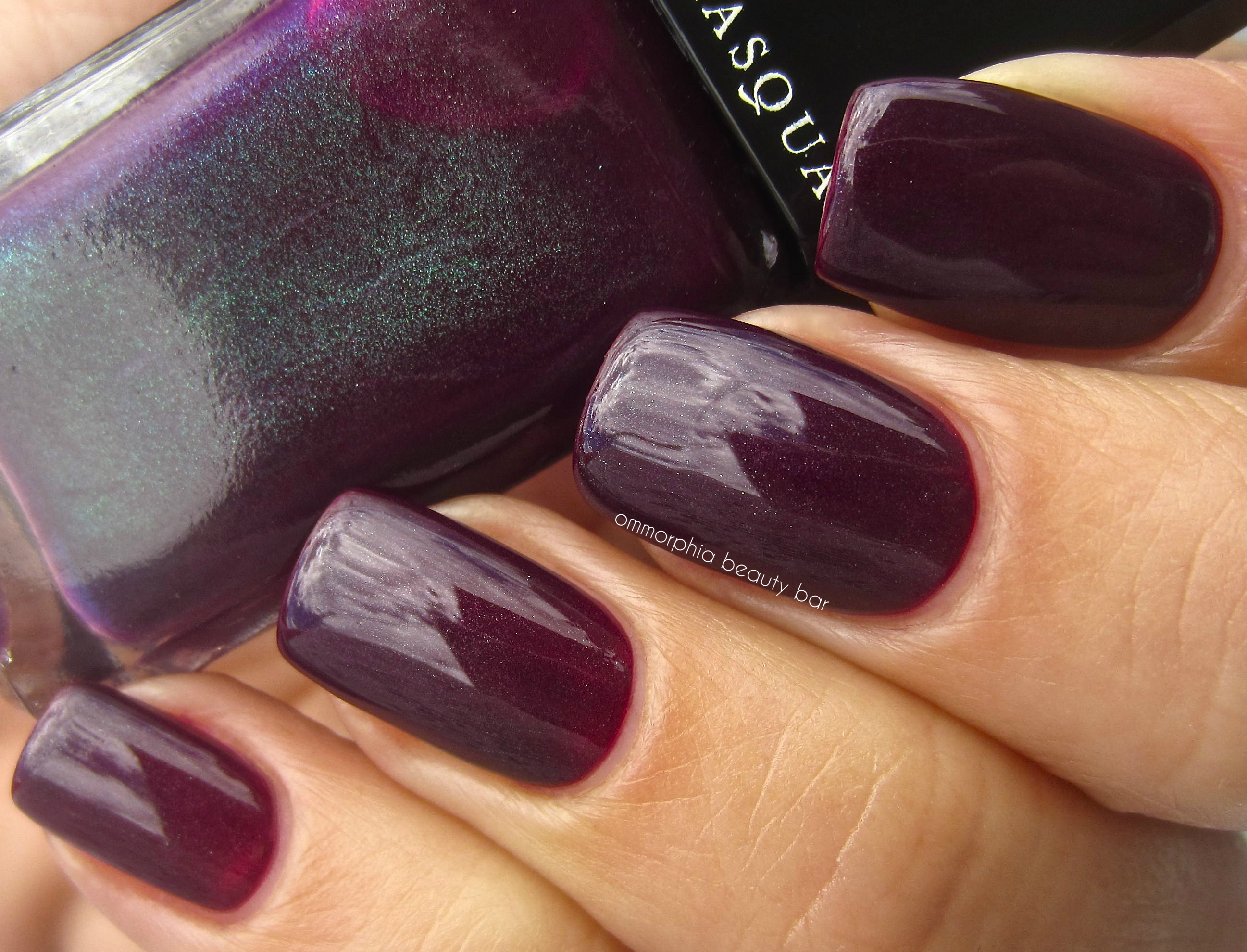
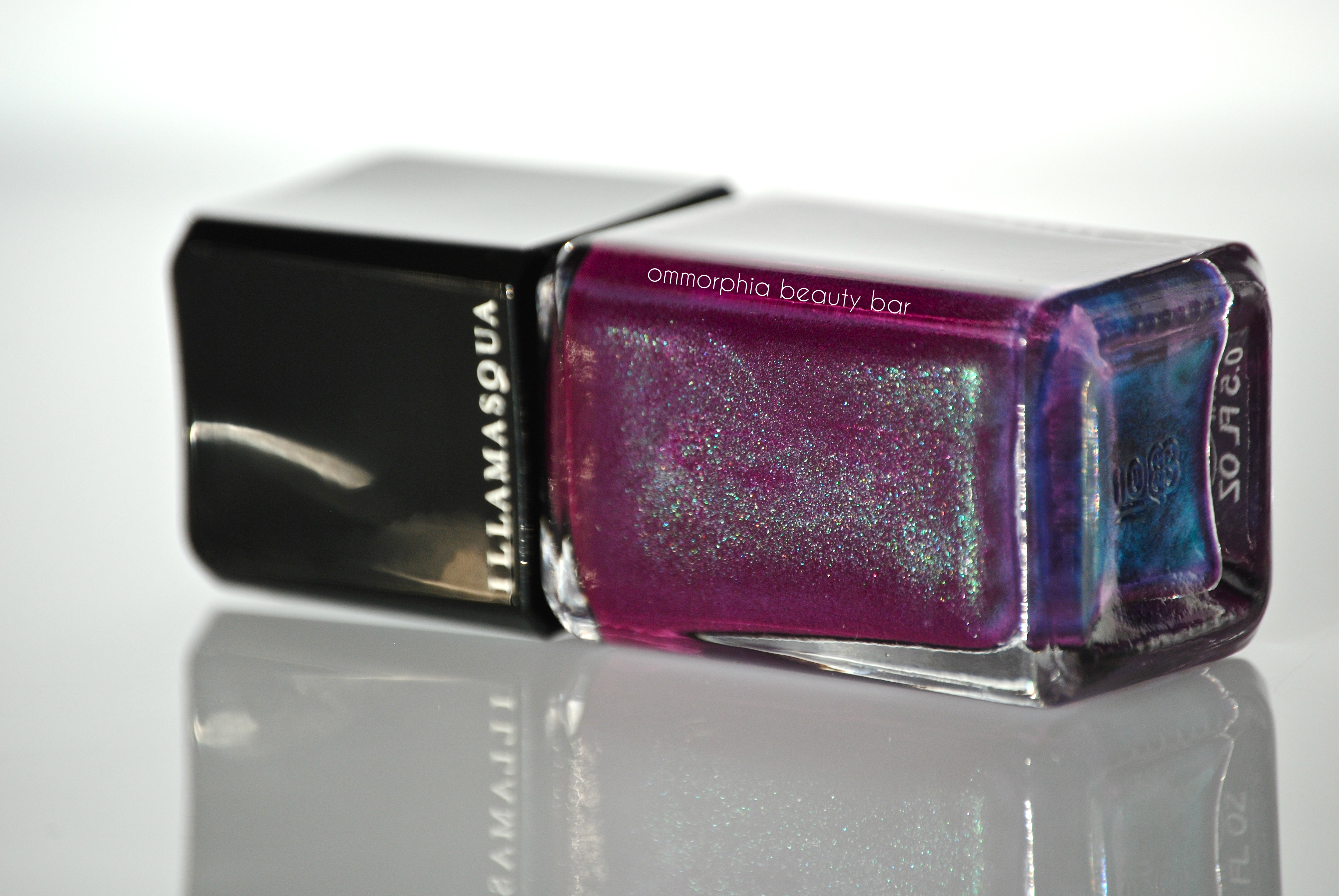
Gothiqua (CAD $17.00 15 ml/0.5 gl. oz) – a deep eggplant shade with a grape/purple base and blueish undertones in a medium opaque formula and filled with fairy dust. No, not really … but it might as well be; the inner shimmer flashes a luminous green, blue, silver, pink and some random red specks, but it is so finely ground that it only makes a sly appearance in direct sunlight or under bright light. Otherwise, it stays pretty much in the background, although it does lend this colour a beautiful depth of tone just the same.
True to Illamasqua form, the flow is ultra-creamy and self-levelling, making application ridiculously easy, while the finish at the end is nothing short of glass-like. As this beauty quite pigmented, I wouldn’t skip base coat – but I didn’t find it to be staining. Coats applied: 2, plus top coat
Illamasqua – Gothiqua
Illamasqua – Gothiqua
Illamasqua – Gothiqua
Illamasqua – Gothiqua
Illamasqua – Gothiqua
Illamasqua – Gothiqua
Illamasqua – Gothiqua
That this shade is drop-dead gorgeous, is undisputed, but the sad part is that it’s not only limited edition (boo) but available ONLY in Canada and ONLY at The Bay stores with an Illamasqua boutique (double boo). On the plus side AND for Canadians, this shade is available online through The Bay’s website – useful if you don’t have a flagship store nearby. Truthfully, as far as uniqueness factor goes, I’m fairly certain that I have a few bottles in my stash that could probably come close, but as I’m in the middle of re-organizing my personal collection, a comparison will have to wait. Still, it’s good to know that while those of you outside of Canada may not be able to get your hands on this baby, you just might already own something similar. That’s something positive, right?
generic Flomax
generic Abilify
generic Aciphex
generic Amitriptyline
Dior Vernis – Nuit 1947 #970

From the four new lacquer shades that have just been released with Dior’s recent revamp of their Rouge Dior lipstick range, ‘Nuit 1947’ is the one that caught my eye. I really have a thing for these dark & moody kind of hues – simply cannot resist them, in fact, and Nuit 1947 #970 does not disappoint.
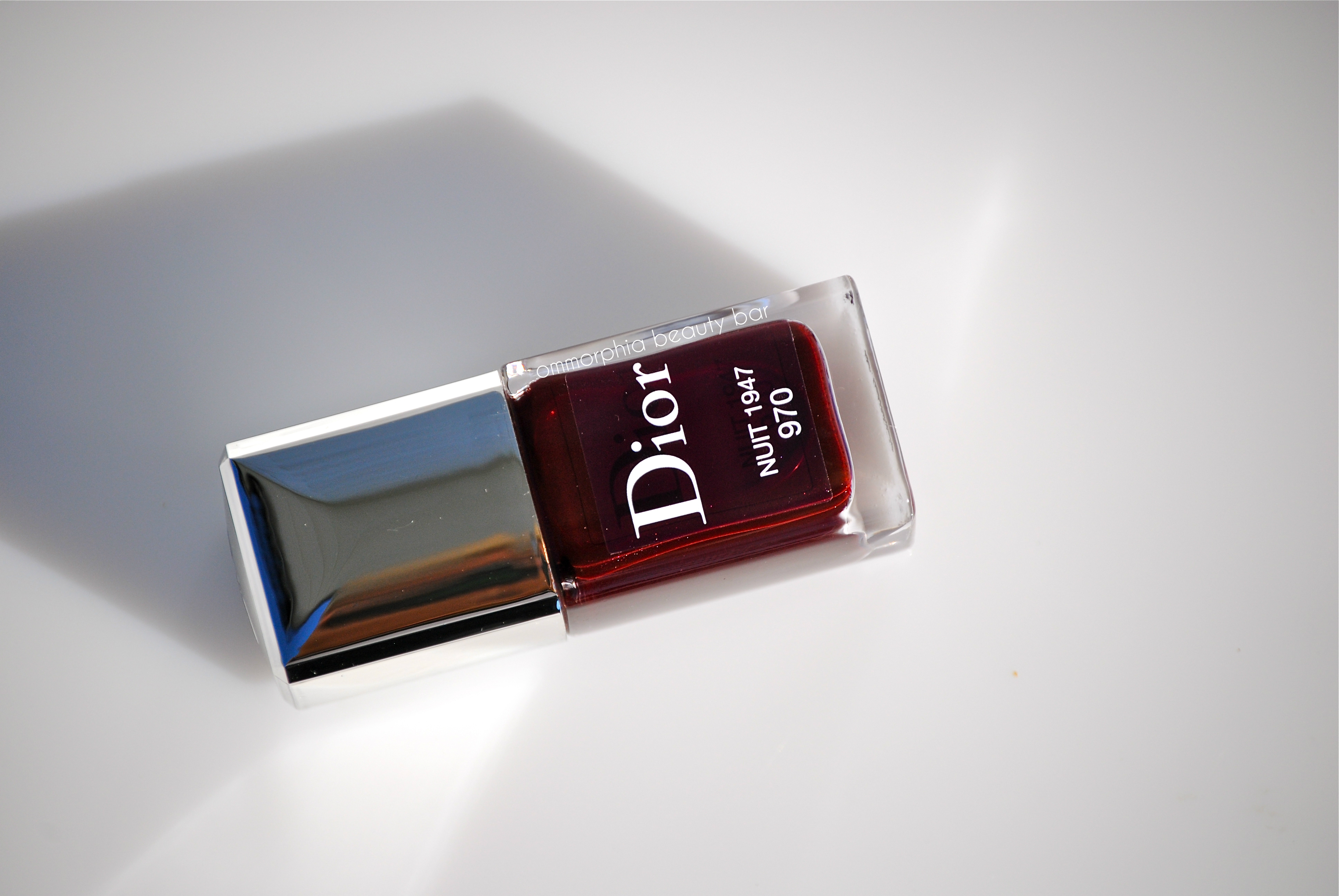
Nuit 1947 #970 (CAD $25.00) – a deep oxblood hue in a hybrid crème/jelly formula, with a touch of almost hidden shimmer, and grape/purple undertones; I had no idea the shimmer was even there, until I uploaded my photos. Due to a medium-sheer application, I found that 2 coats – which still gives pretty decent coverage – did not provide the same jewel-like richness that an added third coat did. Self-levelling, intense colour saturation, a glassy finish (almost doesn’t need top coat), and über-vampy, there was no staining left behind upon removal. Coats applied: 3 (thin), plus top coat
EDIT: You can find some comparison shades to Nuit 1947 #970 on Sabrina’s post (The Beauty Look Book) here

Dior – Nuit 1947 #970

Dior – Nuit 1947 #970

Dior – Nuit 1947 #970

Dior – Nuit 1947 #970

Dior – Nuit 1947 #970
This may not be a unique lacquer in terms of colour, but it stands out nonetheless – mainly due to its stellar formula and ridiculously easy application. If you have a passion for shades such as this (like I do), then you’ll definitely want to check it out; otherwise, shopping your own stash may possibly yield a few clones (CHANEL’s Rouge Noir comes to mind). Available now and spot-on trend for the season, this is definitely a shade that packs major sexiness … and who wouldn’t want that, am I right?!
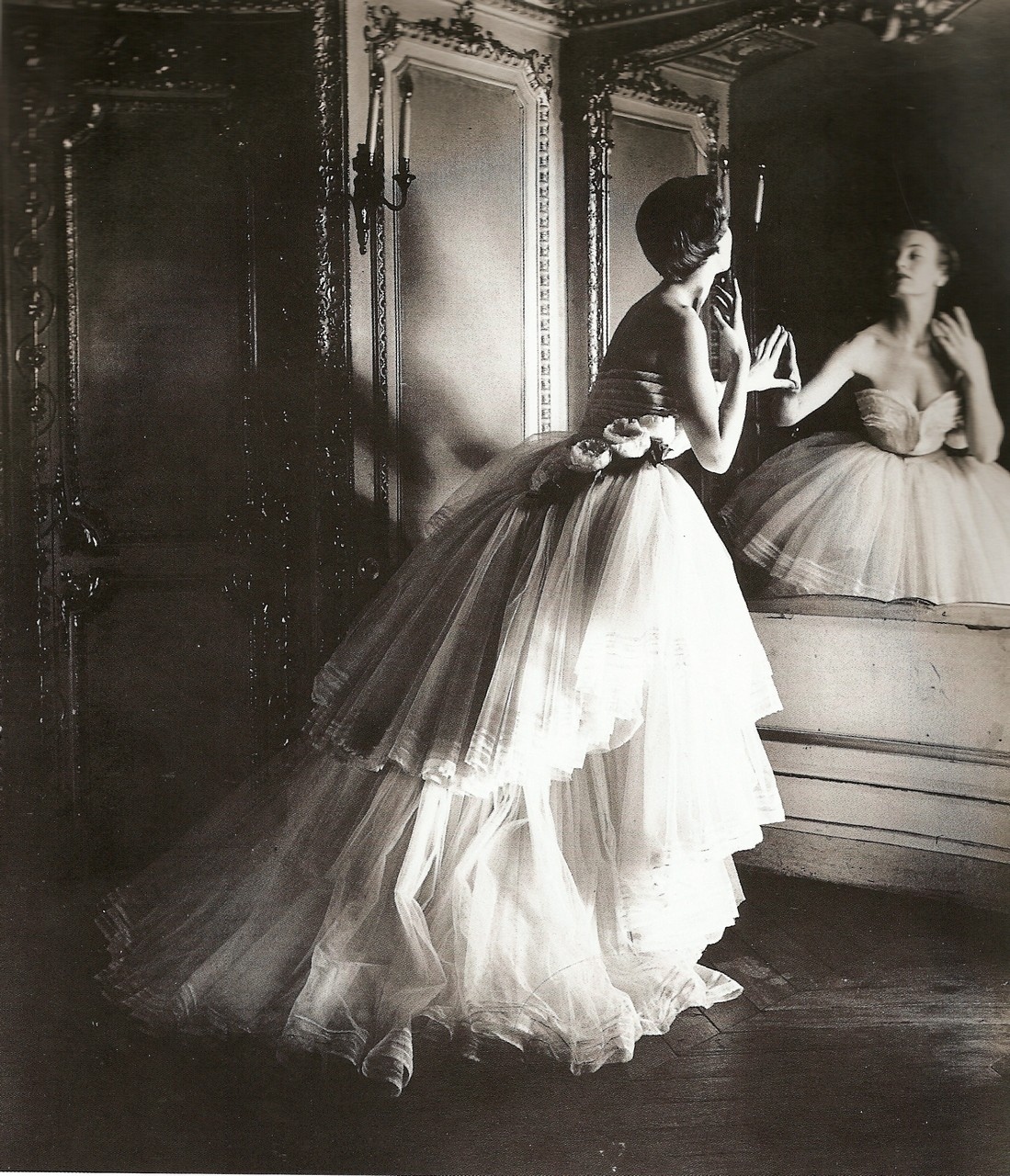
Vintage Dior gown from 1947 (source)
OPI – Pink of Hearts 2013 Limited Edition Set

For its 7th annual launch to promote breast cancer awareness, OPI has released the ‘Pink of Hearts 2013’ Limited Edition Set, consisting of ‘Pink-ing of You’ (a permanent shade) – a bubble gum pink solid hue, a limited edition matte pink multi-glitter hue, ‘More than a Glimmer’, along with10 decorative pink ribbon and 10 crystal decals, to jazz things up even more. Each bottle also offers a pink ribbon bottle wrap at the cap, in support of breast cancer awareness.
As October is Breast Cancer Awareness month, for 2013 OPI will donate $25,000 to Susan G. Komen and will also donate $5,000 to Rethink Breast Cancer in Canada – kudos to this brand, for doing their part to help end breast cancer.
For the following swatches, I went the whole hog; beginning with a base of ‘Pink-ing of You’, I then added one layer of ‘More than a Glimmer’ to all nails except the ring finger, leaving that one free to sport the pink ribbon as well as 3 crystals at the tip. Having very little experience with decals, placing these evenly was a bit of a challenge for me, but using a pair of tweezers (and holding my breath during the application), I was able to manage just fine.

OPI – Pink of Hearts 2013

Pink-ing of You – a mid sheer barbie pink hue with cool leaning blueish undertones in the base, in a crème-jelly hybrid formula – totally self-levelling and ultra-glossy at the finish. This uplifting pink shade is non-streaky upon application and while 2 coats should be more than enough on short nails, longer lengths may require a third layer. NOTE: this lacquer is part of OPI’s permanent range. Coats applied: 3 thin, no top coat

OPI – Pink-ing of You

OPI – Pink-ing of You

More than a Glimmer (Limited Edition) – a baby pink milky base hue filled with gold, silver, and pastel matte hexagonal glitter pieces in a variety of sizes – from tiny, all the way to large. The flow of this formula is superb and each brush stroke yields enough glitter for an even coverage; worn alone, 2 coats are more than dense enough, but this can also be easily layered over any other shade (as done in the swatches here) for more depth. Meant to be worn in its matte state (my personal favourite), you can always add a top coat for extra oomph. Coats applied: 1

OPI – More than a Glimmer over Pink-ing of You (with pink ribbon decal & crystals on ring finger), matte

OPI – More than a Glimmer over Pink-ing of You (with pink ribbon decal & crystals on ring finger), matte

OPI – More than a Glimmer over Pink-ing of You (detail), matte

OPI – More than a Glimmer over Pink-ing of You (top coat added)

OPI – More than a Glimmer over Pink-ing of You (top coat added)
There isn’t one of us who hasn’t been affected in some way by breast cancer, and continued research is the answer to eradicate this disease once and for all. This limited edition duo from OPI manages to meld beauty with a cause, but picking it up for the unique matte glitter ‘More than a Glimmer’ just sweetens the deal even more, in my opinion!
Available September & October 2013, the ‘Pink of Hearts 2013’ Limited Edition set will retail for CAD $19.95. Find more information via OPI’s website, twitter & facebook

*Disclosure: Product samples provided by the company/PR for my unbiased consideration
Essie – Winter 2013 Collection

As I write this post, it happens to be one of those scorching hot & crazy humid September days – definitely NOT the time to bring up Winter … unless it happens to come in the form of a new nail lacquer collection. This season, Essie’s Winter 2013 Collection takes inspiration from the luxurious and cozy fabrics seen on the runways, with little glamorous touches here and there to catch the light and liven things up. While not exactly shades one imagines when thinking of the colder weather, the six hues here, all exude a certain wearable factor, interwoven with a modern yet sophisticated vibe.
*EDIT: I have been informed that this collection should become available in store by early October 2013 – although I’m hoping for earlier!

Essie Winter 2013 Collection
Warm & Toasty Turtleneck – a blue tinged lavender crème hue with jelly-esque characteristics, in a self levelling and well pigmented formula that gives good coverage even by the first coat. There’s a cushiony-looking density to the overall look, and the final finish is ultra glossy. Coats applied: 2, plus top coat

Essie – Warm & Toasty Turtleneck

Essie – Warm & Toasty Turtleneck
Mind Your Mittens – a mid-sheer concrete grey hue with blue/green undertones, filled with ultra fine silver and prismatic ground shimmer – which is actually quite subtle, unless seen in direct sunlight. Looking more like a diffused sea foam shade and bearing an ultra-smooth finish, there’s a gorgeous uniqueness to this colour and while I searched through my Essies, I realized that I have nothing like it at all. Coats applied: 2, plus top coat

Essie – Mind Your Mittens

Essie – Mind Your Mittens
Sable Collar – Le Sigh….. Where do I start? I LOVE THIS SHADE (had to get that out of the way) – a totally unique mix of grey & raisin, and filled with a pale pink and burgundy ultra-fine shimmer throughout, but all as though seen through a dusty filter – hands down, the most original shade released this season by ANY brand. Ultra pigmented, self-levelling and with a nice shine (but not a natural high gloss) at the finish, this is a 100% must have. Coats applied: 2, plus top coat

Essie – Sable Collar

Essie – Sable Collar

Essie – Sable Collar
Shearling Darling – a rich and ultra saturated deep berry hue with wine/burgundy undertones in its base, in a hybrid crème/jelly formula. There’s an odd elasticity felt upon application – best to wait 2-3 minutes between coats, to avoid any dragging. Vampy, sexy, super glossy and 100% self-levelling, this is a universally flattering shade for all skin tones. Coats applied: 2, plus top coat

Essie – Shearling Darling

Essie – Shearling Darling
Parka Perfect – a somber dark teal hue that is paradoxically deep & bright at the same time, with definitive grey undertones in its base, all in a crème/jelly formula. With it’s über-glossy finish, smoothly laying application and excellent saturation fo colour, this is the perfect alternative to wearing black. Bonus: non-staining upon removal. Coats applied: 2, plus top coat

Essie – Parka Perfect

Essie – Parka Perfect
Toggle To The Top – a deep ruby base hue loaded with embedded magenta glitter in varying shapes & sizes, in a glowing jelly-esque formula. With its stunning and totally eye-catching colour, there is a glass fleck-like look to the glitter, seemingly floating at the nail surface and looking lit from within – GORGE! While there is a nice shine at the finish, this shade definitely needs between 1-2 layers of a dense top coat to smooth the surface and enhance the entire look. Coats applied: 2, plus top coat

Essie – Toggle To The Top

Essie – Toggle To The Top (macro detail)

Essie – Toggle To The Top
Oh yes, Essie…you have definitely done it again. Initially, I was fairly certain that the colours were not all that unique, but 2 things happened: A) when I began searching through my Essie collection for duplicates, I was stunned to find that I had matches for only 2 of the 6 shades and B) the superb application of each lacquer was yet another reason to love them all. My favourites are without a doubt ‘Sable Collar’, ‘Parka Perfect’ and ‘Shearling Darling’, and surprisingly, ‘Toggle To The Top’ – considering I’m not really the glitter type. That being said, I also want to try ‘Mind Your Mittens’ as a pedi shade next … just to switch things up a bit from darker tones on the toes!

Kindly provided by Essie for my unbiased consideration