Filed In: nail polish
OPI – Peace & Love & OPI with comparisons

Sometimes it seems like nail polish brands are on the same wavelength; with OPI’s San Francisco Fall 2013 release coming out at the same time as that of the Essie Fall 2013 launch, the shade that stood out from both collections was a gorgeous duo chrome. Naturally, I needed to know how close the two really were and that curiosity led me to hunt out a couple more similar shades. The following breakdown is how they compared:
All swatches are with base and top coats.
index finger: Deborah Lippmann ‘Wicked Game’ – the sheerest of the four, most apparent lilac tones, grey in the base quite subtle
middle finger: OPI ‘Peace & Love & OPI’ (reviewed here) – medium density formula, a couple of degrees brighter overall, the teal & mauve tones the most predominant of the four
ring finger: Essie ‘For The Twill Of It’ (reviewed here) – the thickest formula of the four (still an easy application, however), the closest in look & finish, the thinner brush of the Essie scores points for leaving behind fewer visible brush strokes
pinkie finger: OPI ‘Not Like The Movies’ (reviewed here) – mid-sheer formula with pronounced lilac undertones, the only one of the four bearing silver & gold micro glitters, the grey base is more apparent than the others

clockwise from top left: Deborah Lippmann ‘Wicked Game’, OPI ‘Peace & Love & OPI’, OPI ‘Not Like The Movies’, Essie ‘For The Twill Of It’

OPI San Francisco Collection – Peace & Love & OPI with comparisons

OPI San Francisco Collection – Peace & Love & OPI with comparisons

OPI San Francisco Collection – Peace & Love & OPI with comparisons

OPI San Francisco Collection – Peace & Love & OPI with comparisons
It’s quite obvious from the swatches above, that both OPI and Essie have achieved similar results with their respective duo (multi) chrome lacquers and while to my eye there are a few differences, they are minimal at best. Deborah Lippmann’s ‘Wicked Game’ has the honour of being the first out of the gate with this ethereal kind of shade, and I like the fact that it’s still available today (part of the permanent range). Do you need both the OPI and the Essie? I’d say probably not – your choice will be determined by either your brand favourite (OPI vs Essie), or brush preference (the thinner Essie vs the wider OPI). Then again, if you are a collector of this type of finish, you’ll want both. Or all. I’m just sayin’…

*Disclosure: Product samples provided by the company/PR for my unbiased consideration


L’Oréal Paris Collection Privée – Colour Riche Nailcolour

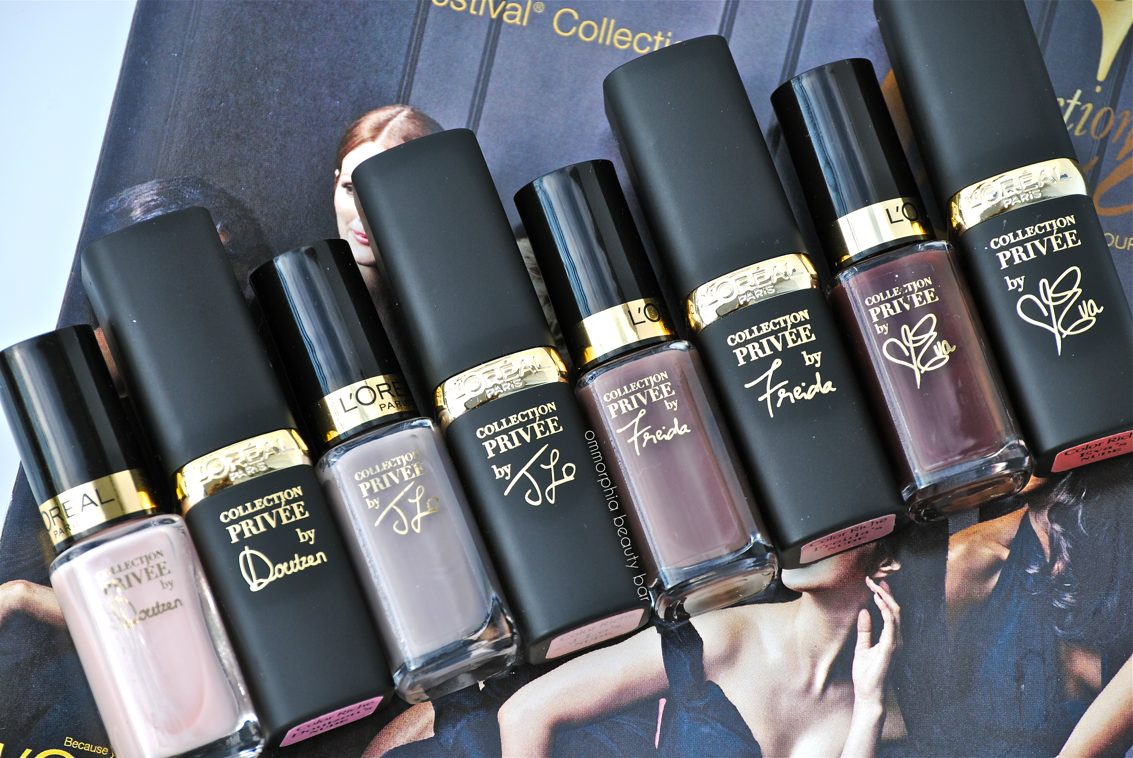
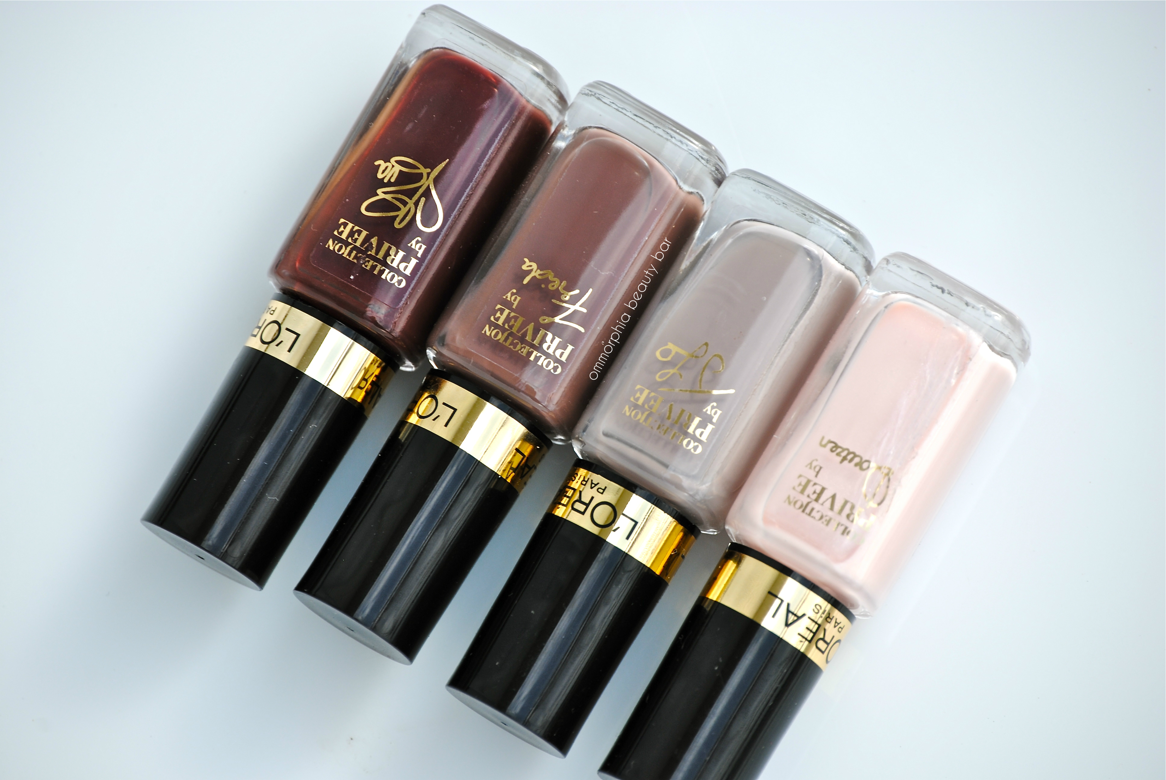
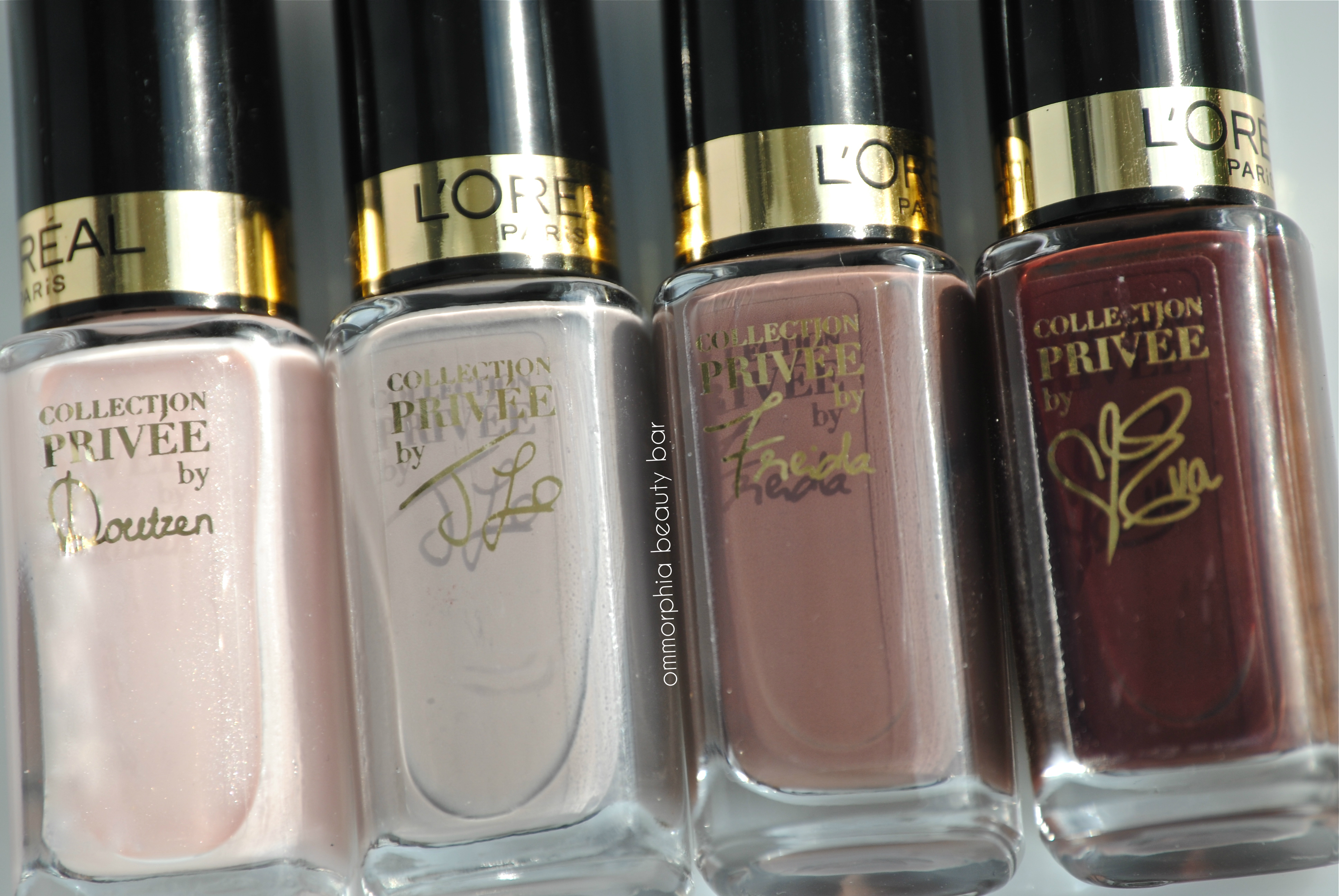
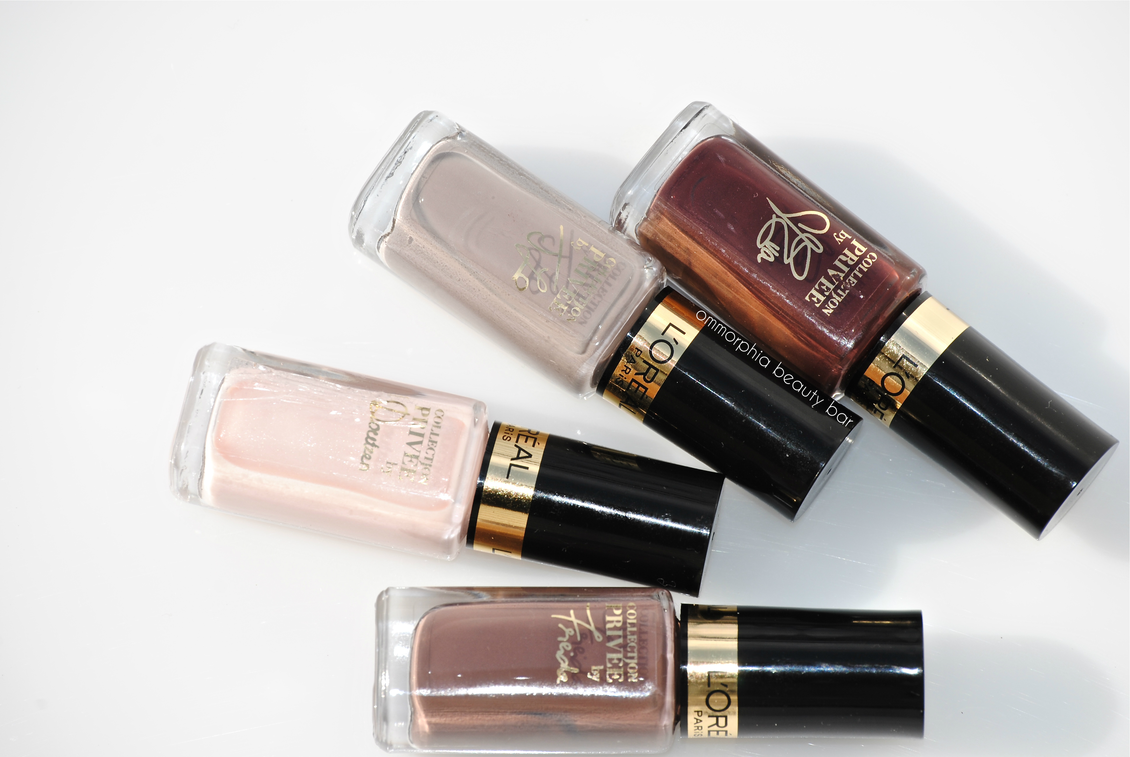
To celebrate the 2013 Toronto International Film Festival (TIFF), L’Oréal Paris (the official sponsor) has created a limited edition collection of luxurious nude lipsticks (reviewed here) with matching nail lacquers, four of which I’m showing you here today. While not exactly colours that one typically thinks of when hearing the word “nude”, these are all nevertheless neutral enough to not only be universally flattering on all skin tones, but also totally wearable for basically any situation.
Please note that the following swatches were all done when I had returned fresh from my holiday, therefore my skin tone is much darker than usual, and might alter your perception of the actual shade colours.
L’Oréal Paris – Collection Privée
L’Oréal Paris – Collection Privée
L’Oréal Paris – Collection Privée
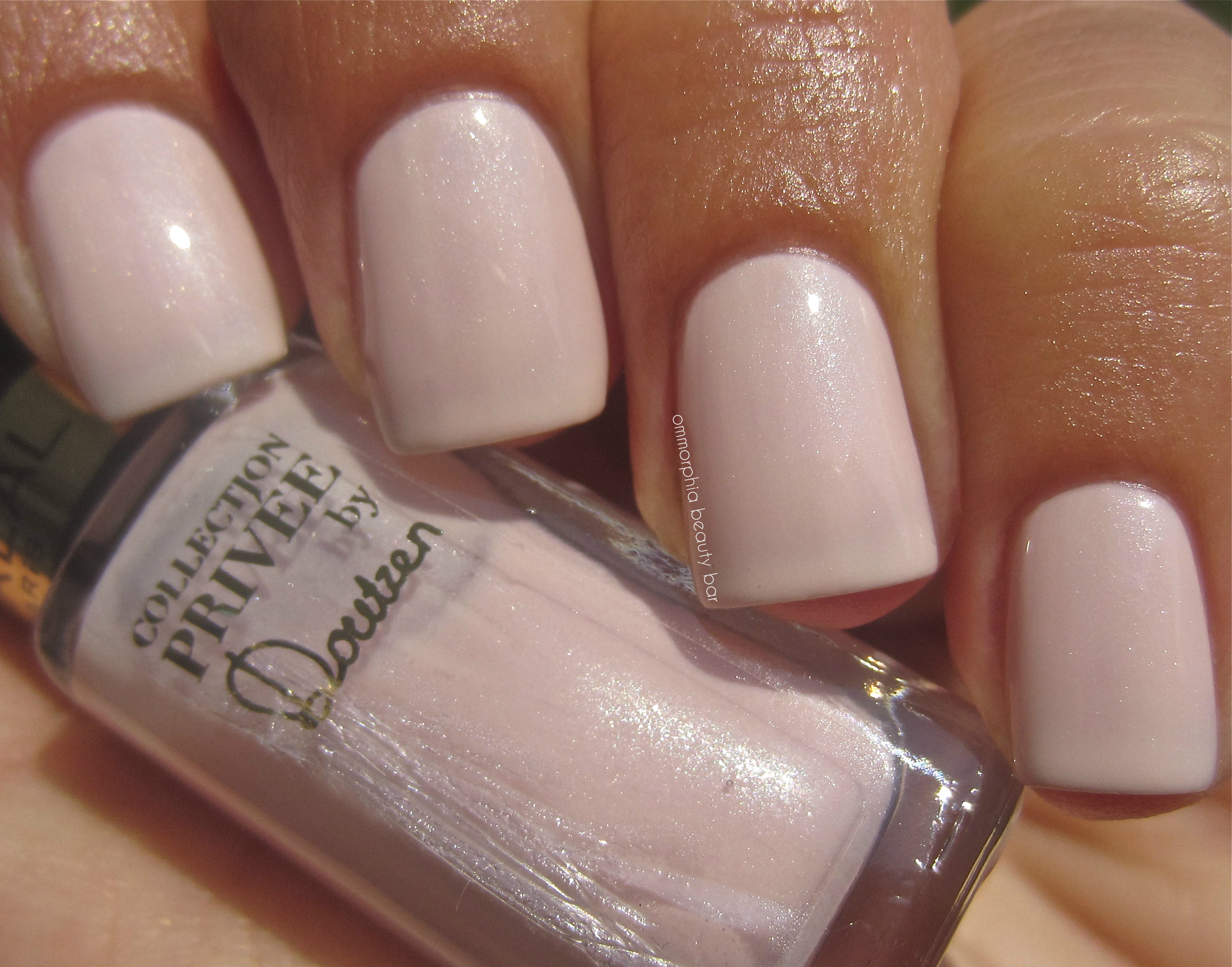
by Doutzen – a ballerina pink crème base filled with subtle ultra-fine silver & pearly shimmer, in a medium density formula that applied surprisingly non-streaky for a shade this pale. With its glossy finish, this is a cross between dainty and minimalistic chic-ness and while 2 heavier coats are enough for full opacity, longer nails may be better off with three thinner layers. Coats applied: 2, plus top coat

L’Oréal Paris Collection Privée – by Doutzen
L’Oréal Paris Collection Privée – by Doutzen
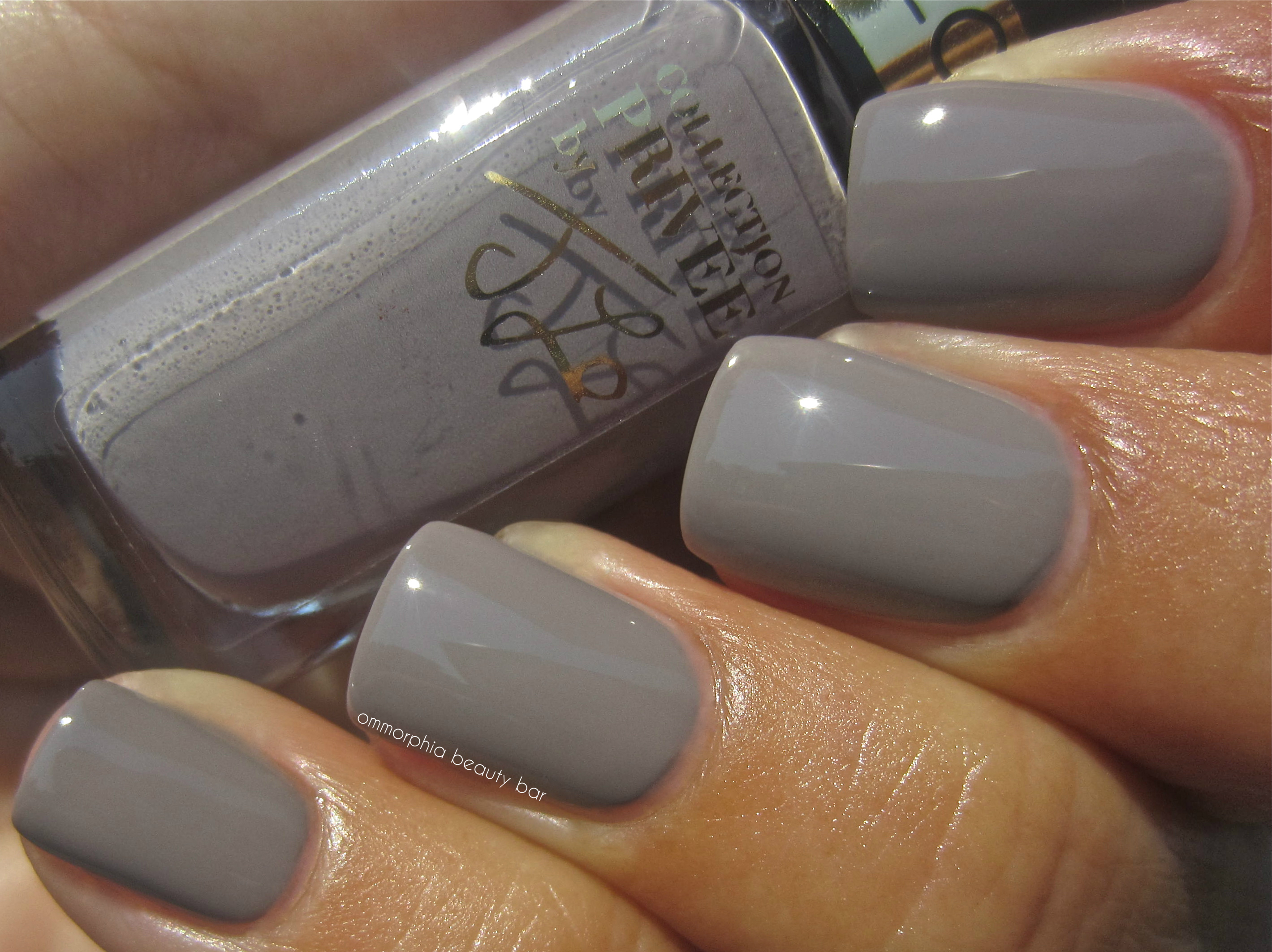
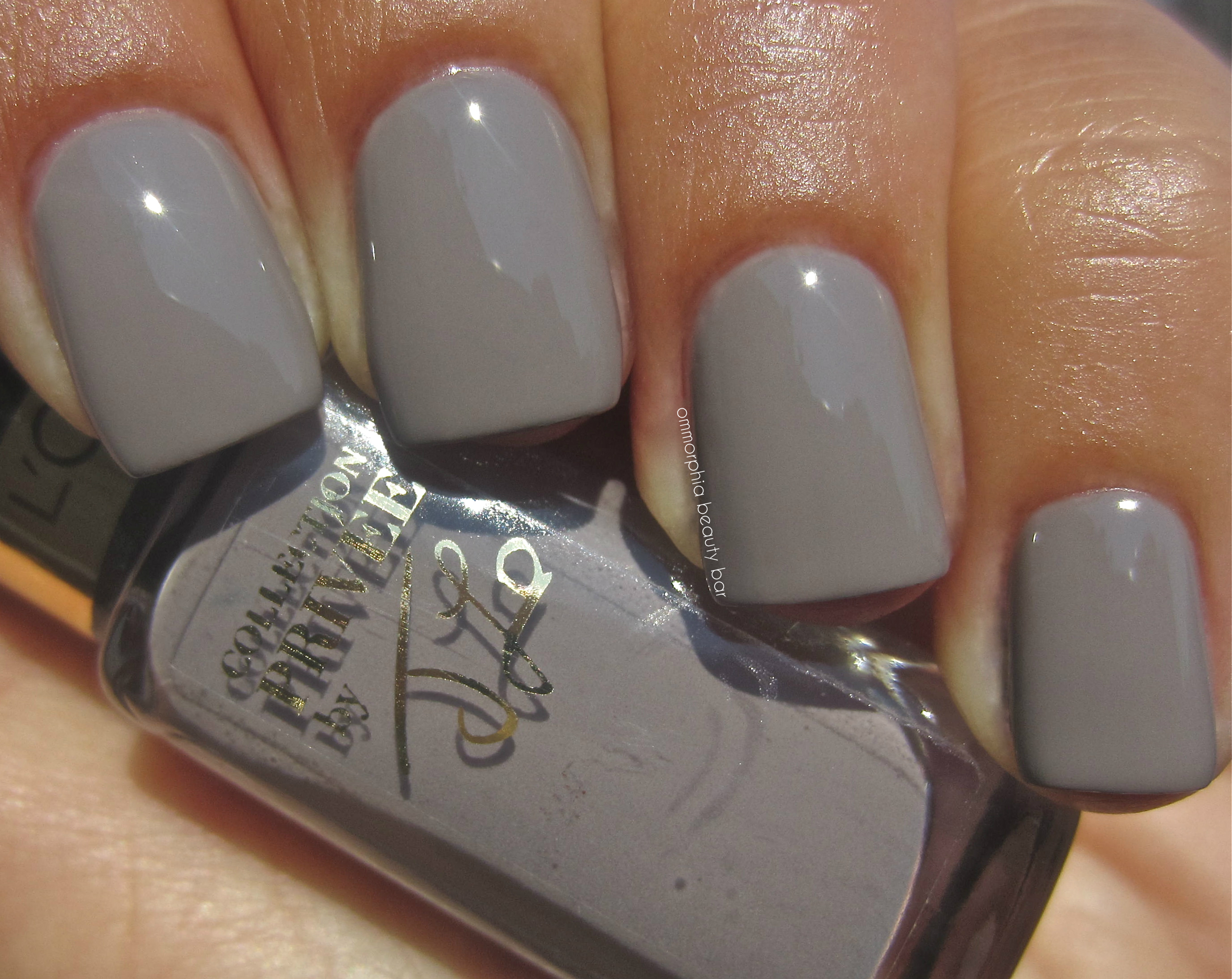
by J Lo – a warm leaning putty/greige hue with definitive mauve undertones in the base, bearing a perfect flow: an ultra-smooth and self-leveling application, ending in a high gloss natural shine. Coats applied: 2, plus top coat
L’Oréal Paris Collection Privée – by J Lo
L’Oréal Paris Collection Privée – by J Lo
by Freida – warm mink-brown hue with taupe/mauve hints in the base that adds a unique depth of tone and an almost blueish cast seen along the nail sides at certain angles, in a formula that was utter perfection: a creamy & self-levelling flow, excellent pigmentation and ultra glossy – almost a 1-coater, in fact. Coats applied: 2, plus top coat
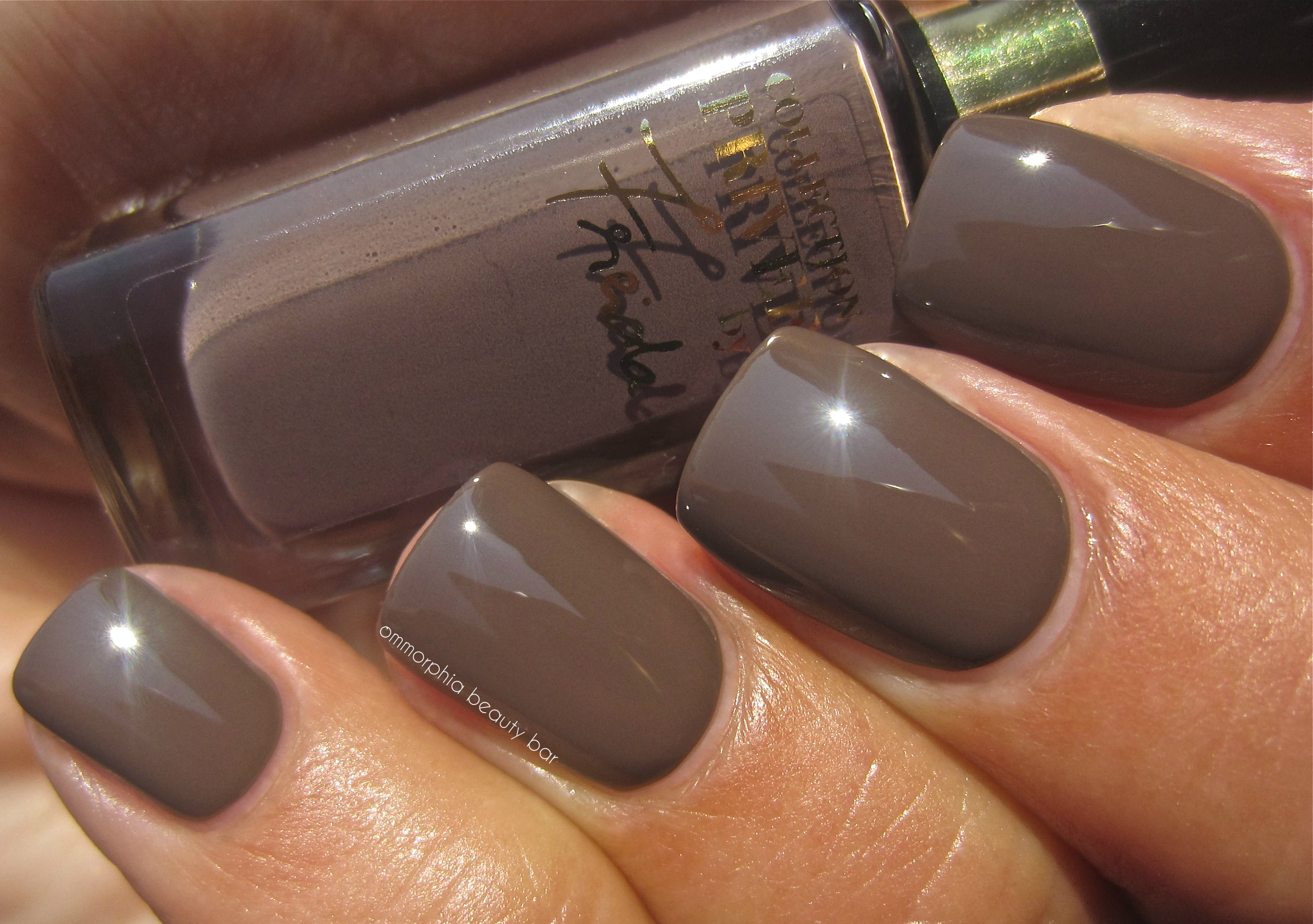
L’Oréal Paris Collection Privée – by Freida
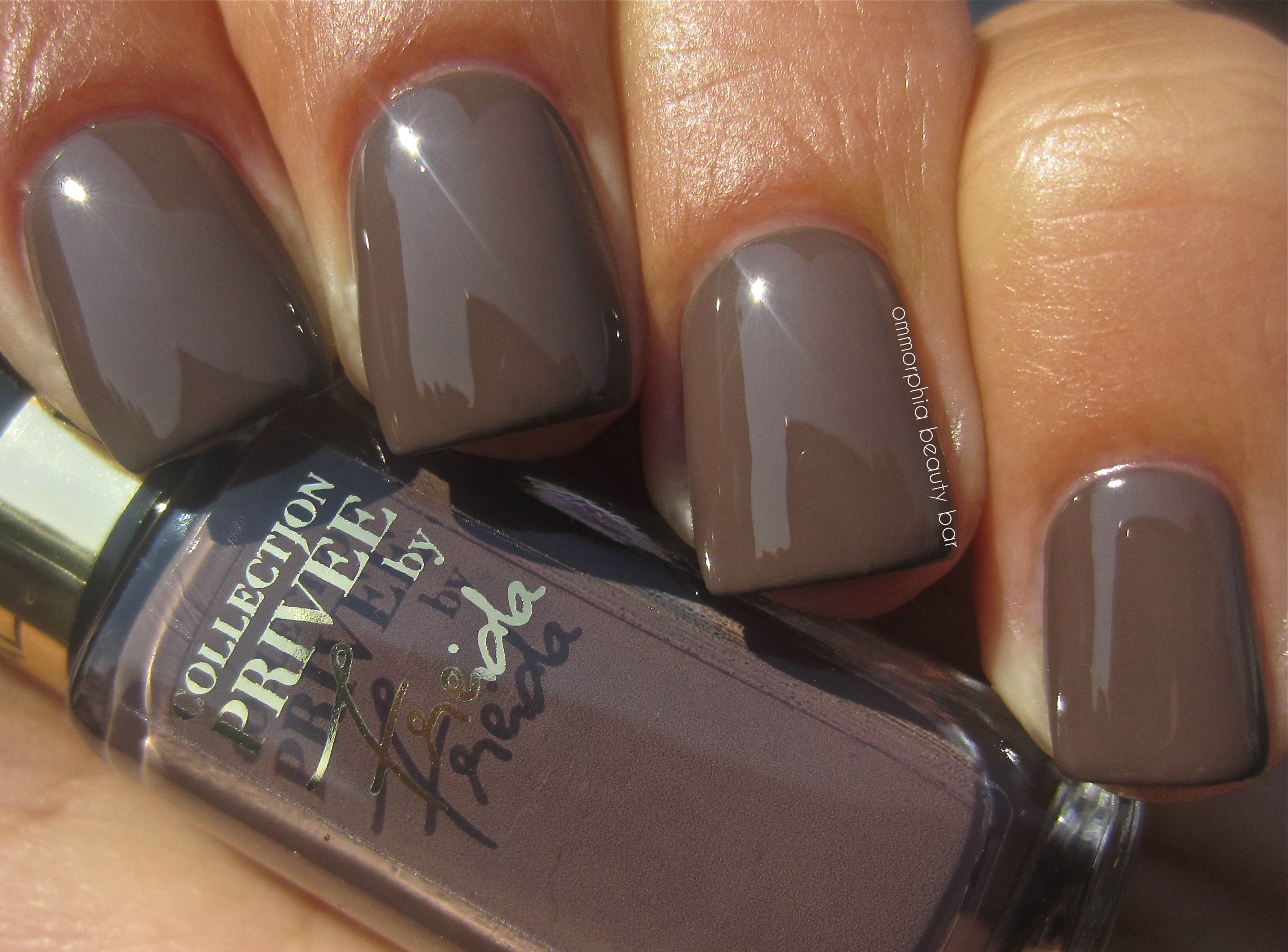
L’Oréal Paris Collection Privée – by Freida
by Eva – a deeply lush and vampy raisin/prune crème hue with burnt brown tints in the base for added warmth, in an ultra colour saturated formula that applies in a totally self-levelling way, and leaves a high-octane shine at the finish. Bonus: non-staining upon removal. Coats applied: 2, plus top coat
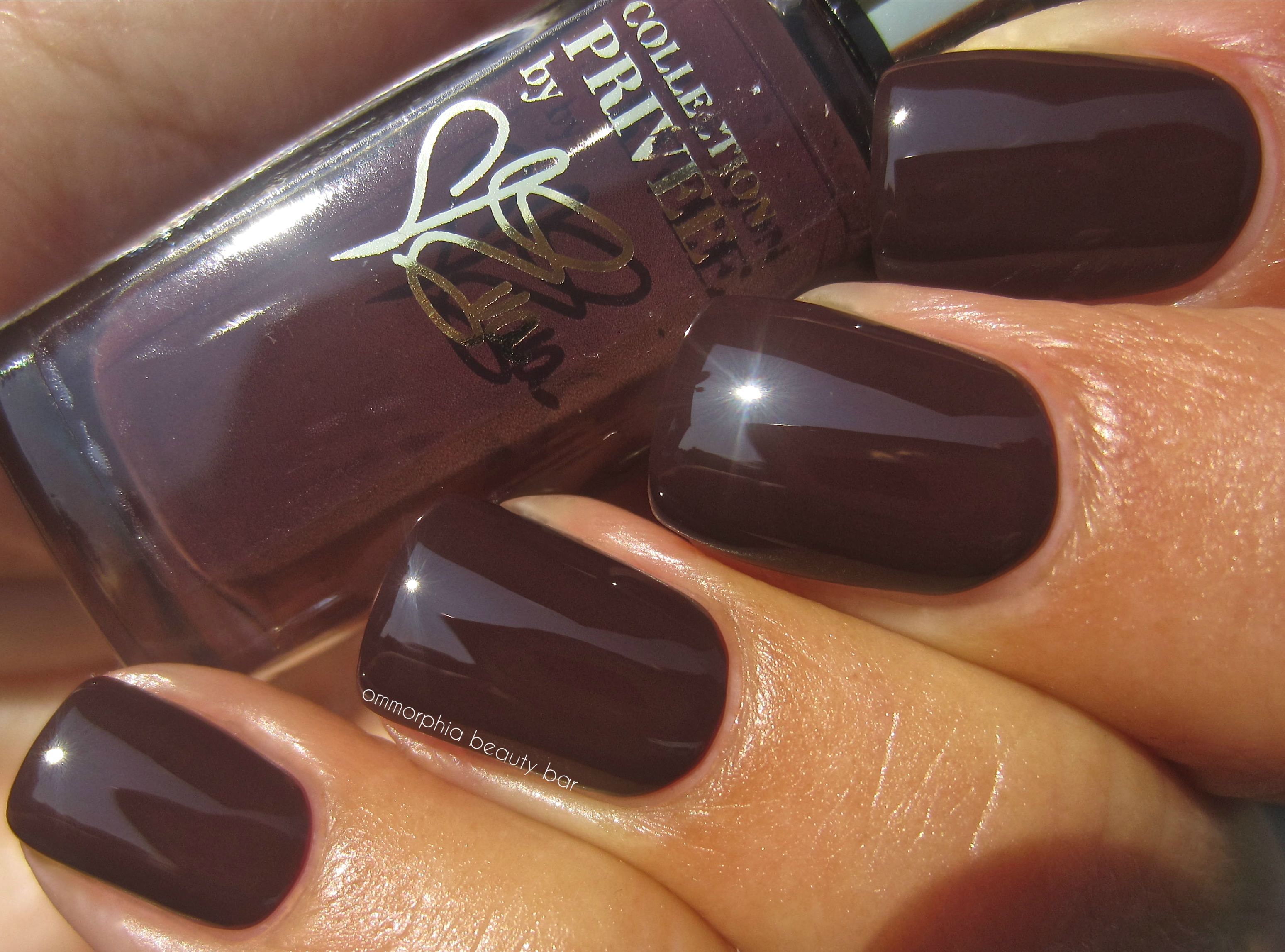
L’Oréal Paris Collection Privée – by Eva
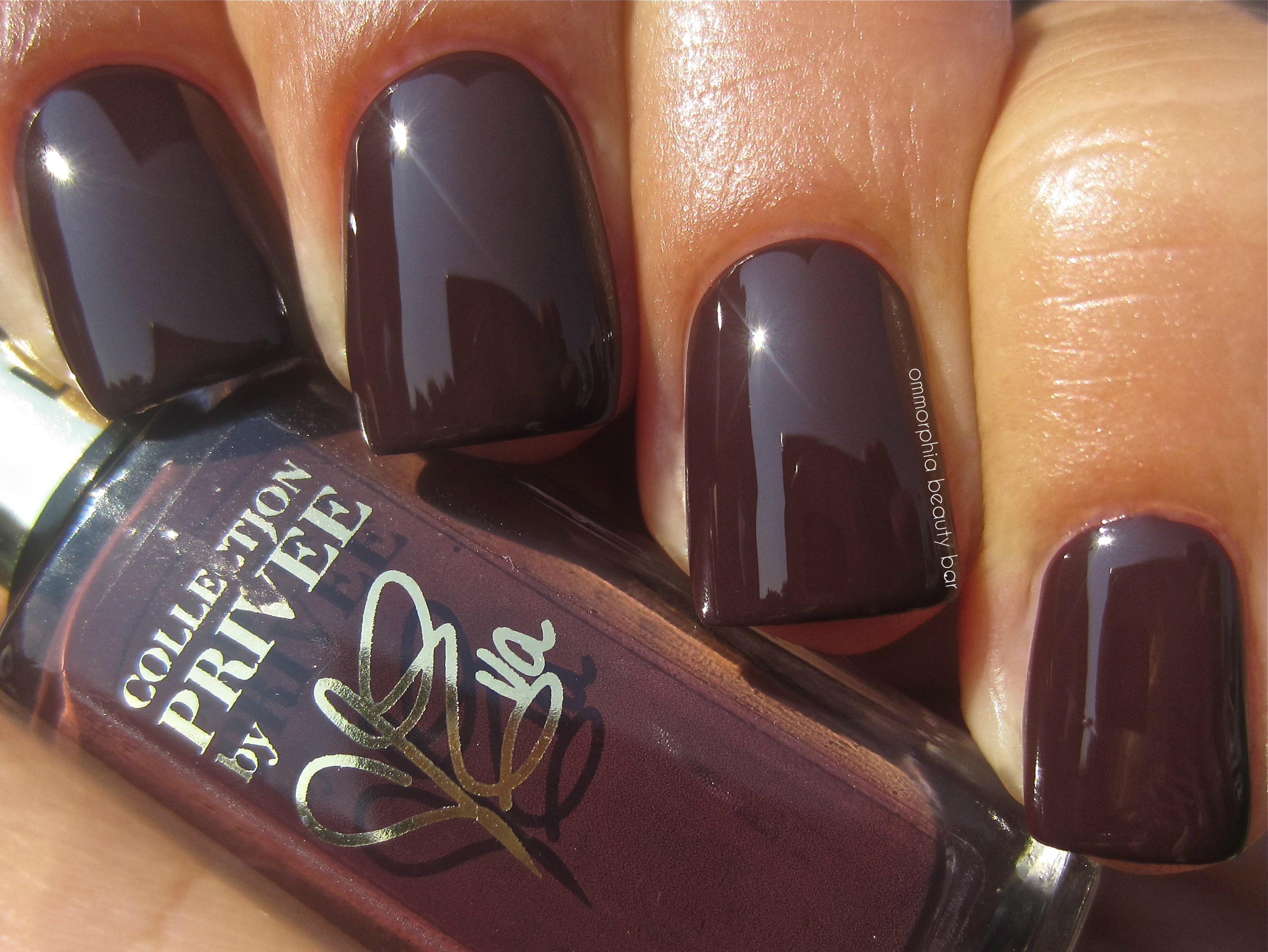
L’Oréal Paris Collection Privée – by Eva
The following ombré-style mani shows how cohesively these four colours look together, although I do prefer wearing them one shade at a time.
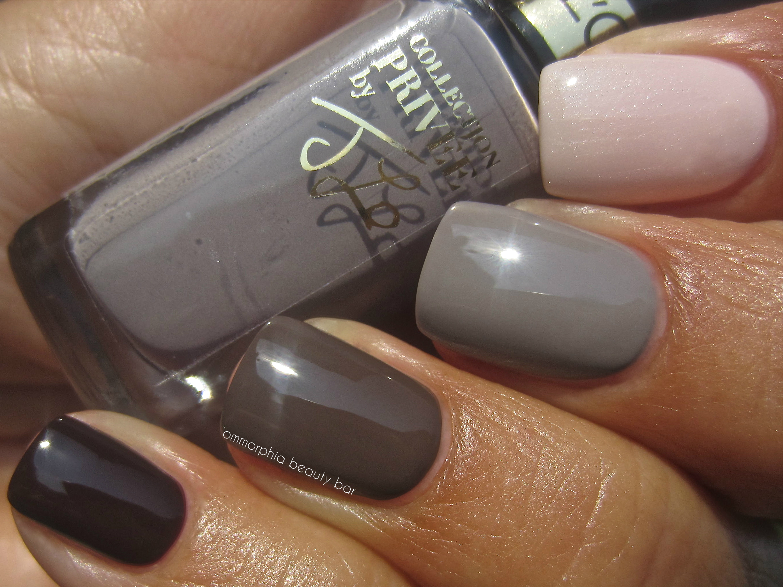
L’Oréal Paris – Collection Privée
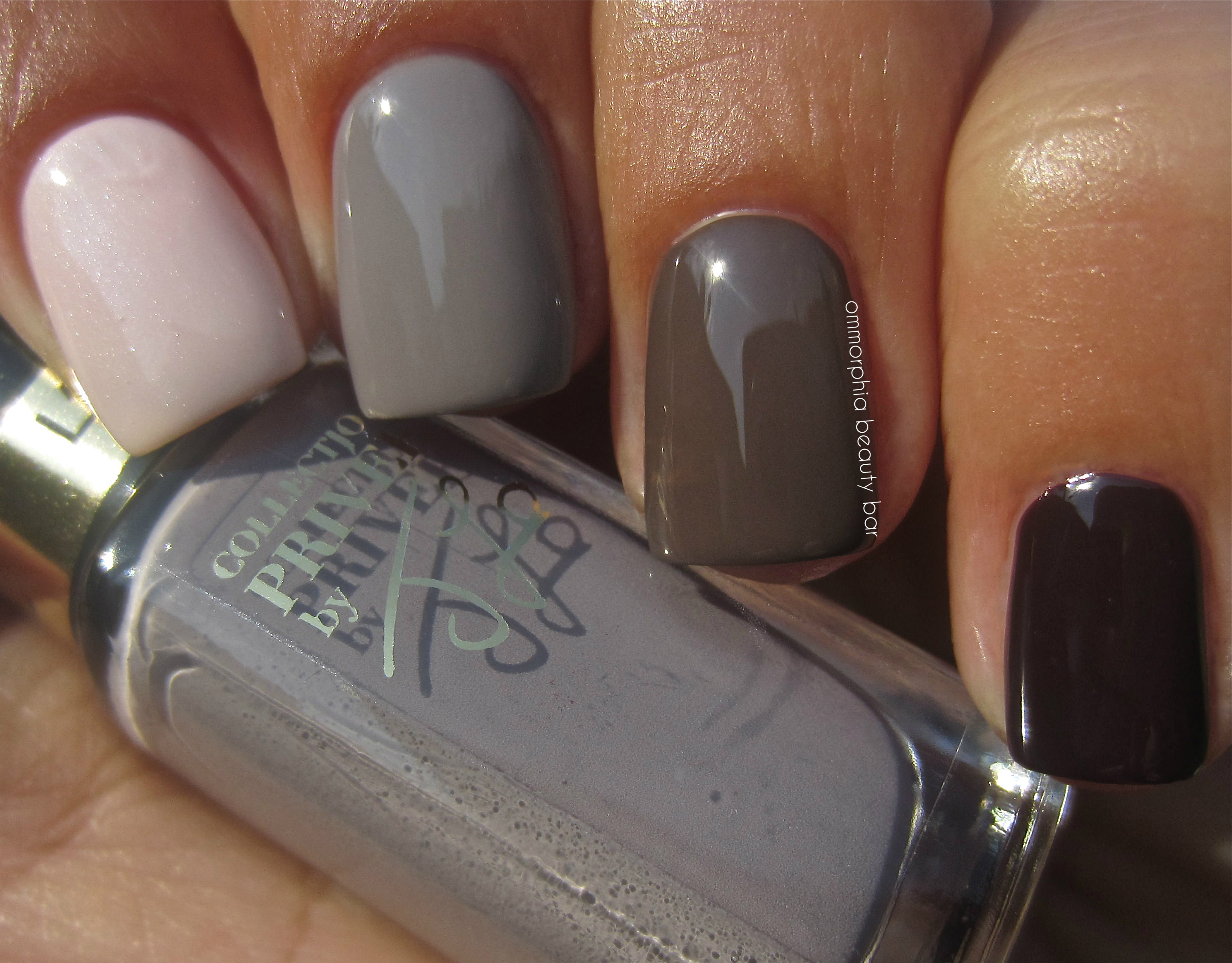
L’Oréal Paris – Collection Privée
These four shades were yet another surprise for me, having never tried any lacquers from L’Oréal Paris before, and even if the colours themselves wouldn’t have grabbed me (which they definitely do), the smaller size of the bottles (who ever really finishes their regular sized bottles of polish?) and the wallet-friendly price point, make them even more attractive.
Available as of September 2013, each shade will retail for approx. CAD $3.99 – find more information via the brand’s website, twitter or facebook.
*Disclosure: Product samples provided by the company/PR for my unbiased consideration
OPI San Francisco Collection Fall 2013 – part 1 (the warmth)

While Summer may be my favourite time of the year (living in a climate with brutal Winters will do that to a person), Fall collections are my absolute favourites – I love the intensity of deeper tones as well the complexities & layering possibilities, in fashion as well as cosmetics. Visiting San Francisco has been on my bucket list for as long as I can remember, so when I learned that for Fall 2013 OPI would be creating a collection inspired by this iconic city, I knew without a doubt, that it would be so totally up my alley. And yes, I was right.
I’ve decided to split up this 12-bottle collection into two distinct groups, as I see them: “the warmth” as represented by the 6 shades here, and “the coolness” in the post to follow. Enjoy!

The Golden Gate Bridge – one of San Francisco’s most iconic symbols (source)

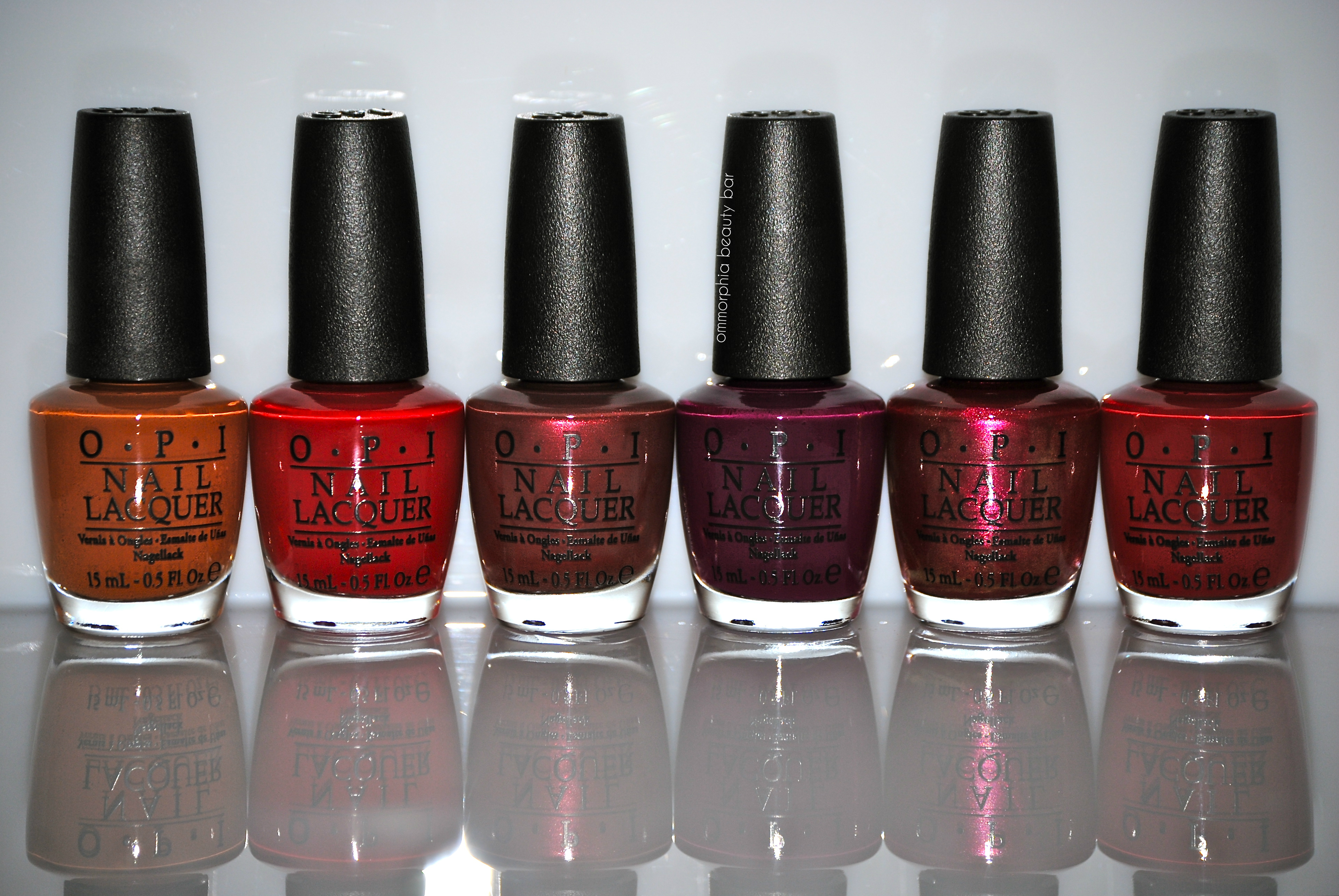
OPI The San Francisco Collection – part 1
A-piers To Be Tan – a warm umber/sienna crème hue with hints of mustard in the base, in a smoothly applying formula that lays down in a self-levelling way and with excellent pigmentation, leaving behind a true glossy shine. Coats applied: 2, plus top coat
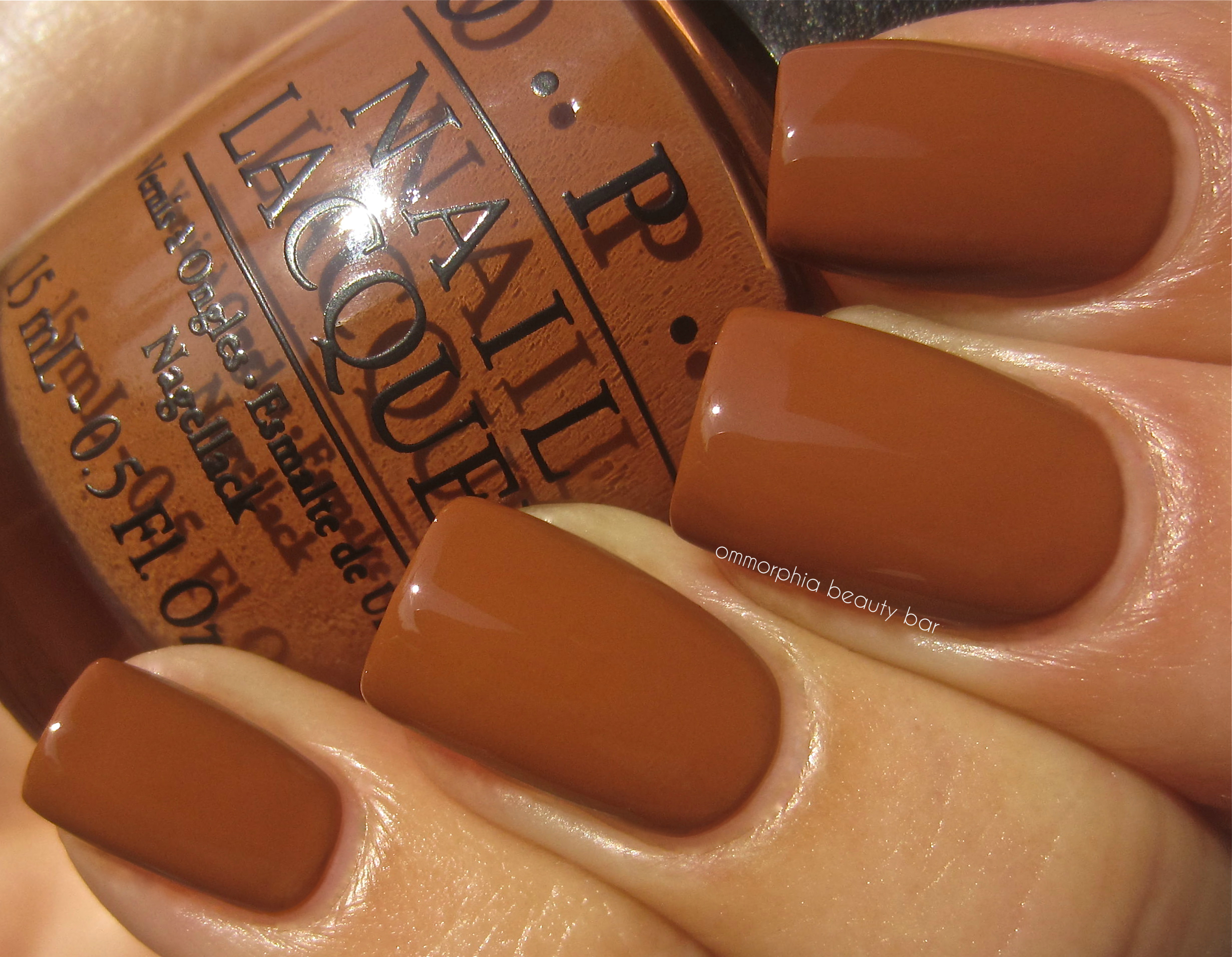
OPI San Francisco Collection – A-piers To Be Tan
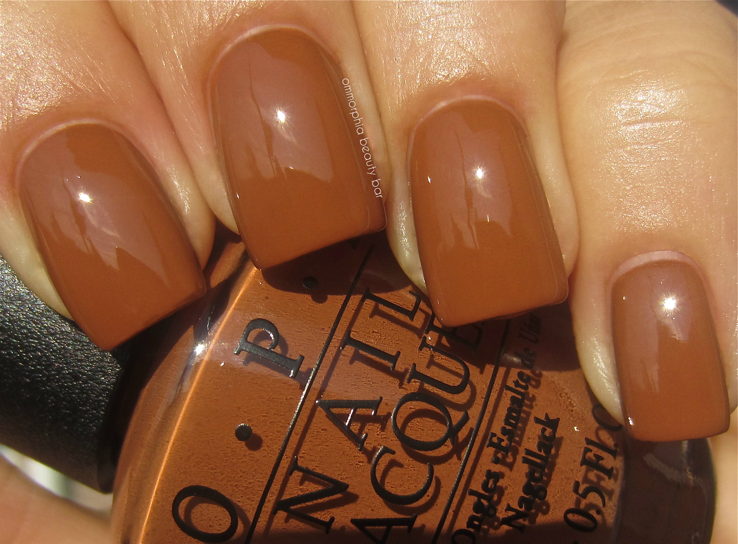
OPI San Francisco Collection – A-piers To Be Tan
I Knead Sour Dough – a raisin/plum hue filled with pearlized ultra-fine shimmer in varying pink tones, bearing an excellent flow and a glossy shine at the finish. The shimmer adds such an interesting overall depth, that the final look becomes uniquely multi-tonal. Coats applied: 2, plus top coat

OPI San Francisco Collection – I Knead Sour Dough

OPI San Francisco Collection – I Knead Sour Dough
Lost On Lombard – a blue-based rich berry red crème hue that appear paradoxically both cool & warm leaning. Bearing a superb flow (no pooling at the cuticle line or nail edges) and intense colour saturation, the finish is insanely glossy. Bonus: non-staining upon removal. Coats applied: 2, plus top coat

OPI San Francisco Collection – Lost On Lombard

OPI San Francisco Collection – Lost On Lombard
In The Cable Car-Pool Lane – a deep violet crème hue with bordeaux wine undertones, in a formula that bears a superior flow and application, laying down in a completely self-levelling way and ending in a mirror-like shine. Super colour-saturated and non-staining upon removal – a major plus! Coats applied: 2, plus top coat
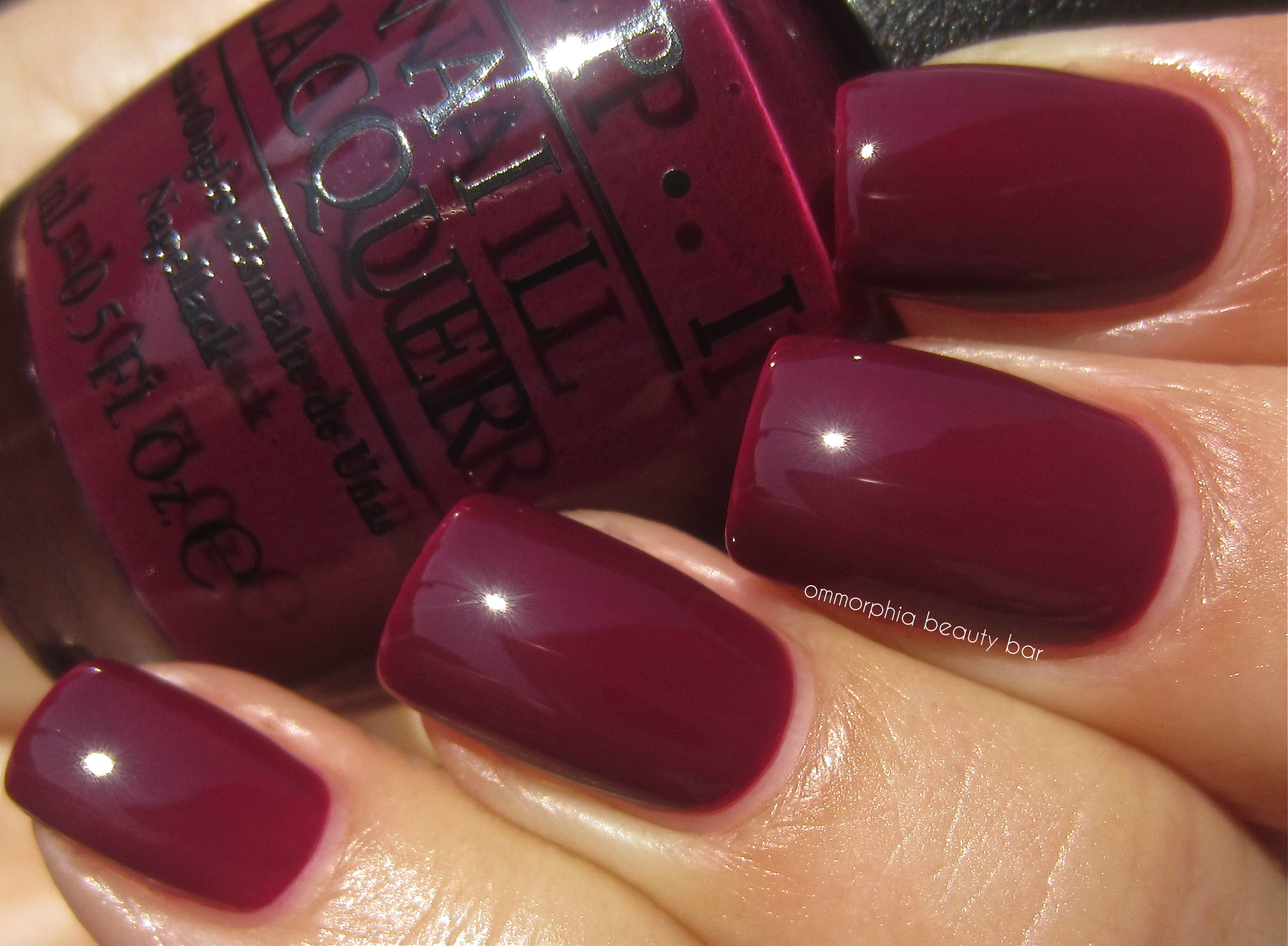
OPI San Francisco Collection – In The Cable Car-Pool Lane
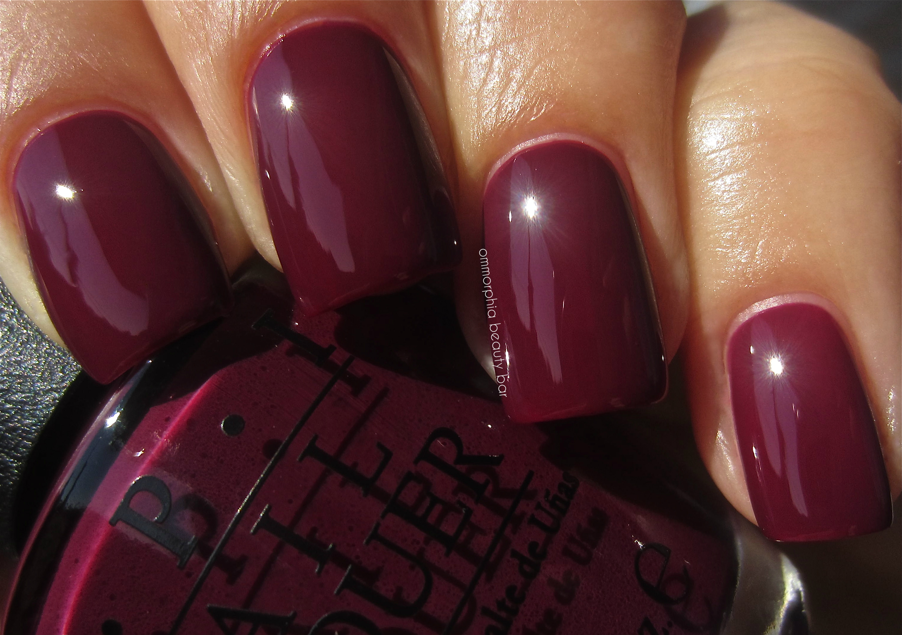
OPI San Francisco Collection – In The Cable Car-Pool Lane
First Date At The Golden Gate – a warm-leaning strawberry red crème hue in a jelly-esque formula that is not only super easy to apply, but bears a ridiculous gloss at the finish and is yet another non-staining shade – not sure how OPI has managed to do that, but I love it! Coats applied: 2, plus top coat
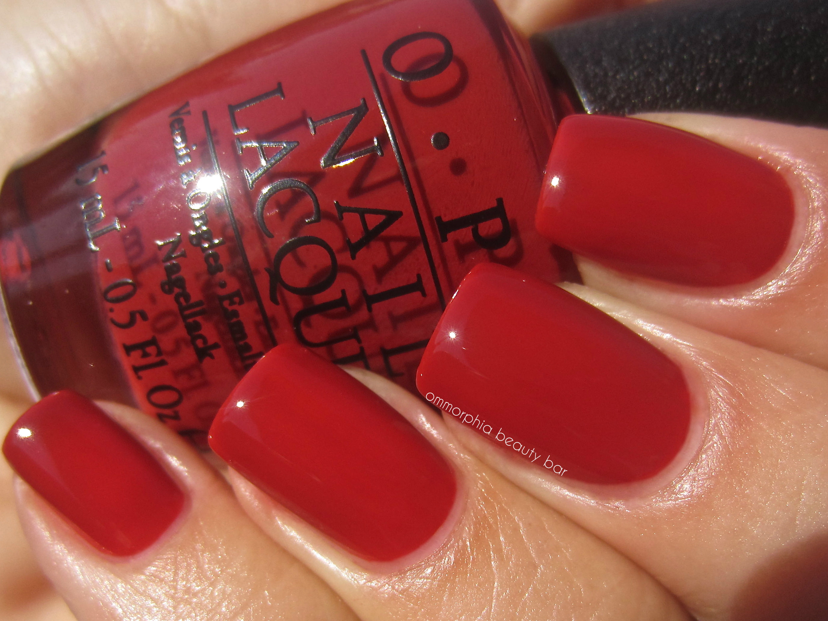
OPI San Francisco Collection – First Date At The Golden Gate

OPI San Francisco Collection – First Date At The Golden Gate
Embarca-Dare Ya! – a pale magenta/berry hue filled with gold, silver and pink finely ground glass-flecked shimmer that seems to simmer at the surface level of the nails – very, very pretty! Super easy to apply with no visible brush strokes & non-staining upon removal, there’s a beautiful natural gloss at the finish as well. Coats applied: 2, plus top coat

OPI San Francisco Collection – Embarca-Dare Ya!

OPI San Francisco Collection – Embarca-Dare Ya!
Last word: The lushness of these shades, as well as the incredible formula on EACH AND EVERY ONE (yes, that deserves capitals – shades of red that don’t stain? Hello!) makes them all winners, even if for the most part, they are not colours we haven’t already seen before – that being said, I must add that there does seem to be a slight new twist to each hue nonetheless. My personal favourites are hands-down ‘In The Cable Car-Pool Lane’ (yeah…a mouthful) and ‘Lost on Lombard’, but I was surprised by how much I liked ‘I Knead Sour Dough’ on my nails as well. Stay tuned for the cooler tones of the second half … to follow!
The OPI San Francisco Collection should have already started trickling into stores – you can follow via their website, twitter/facebook for all updates.
*Disclosure: Product samples provided by the company/PR for my unbiased consideration
generic celexa
generic cipro
generic cozaar
generic cymbalta
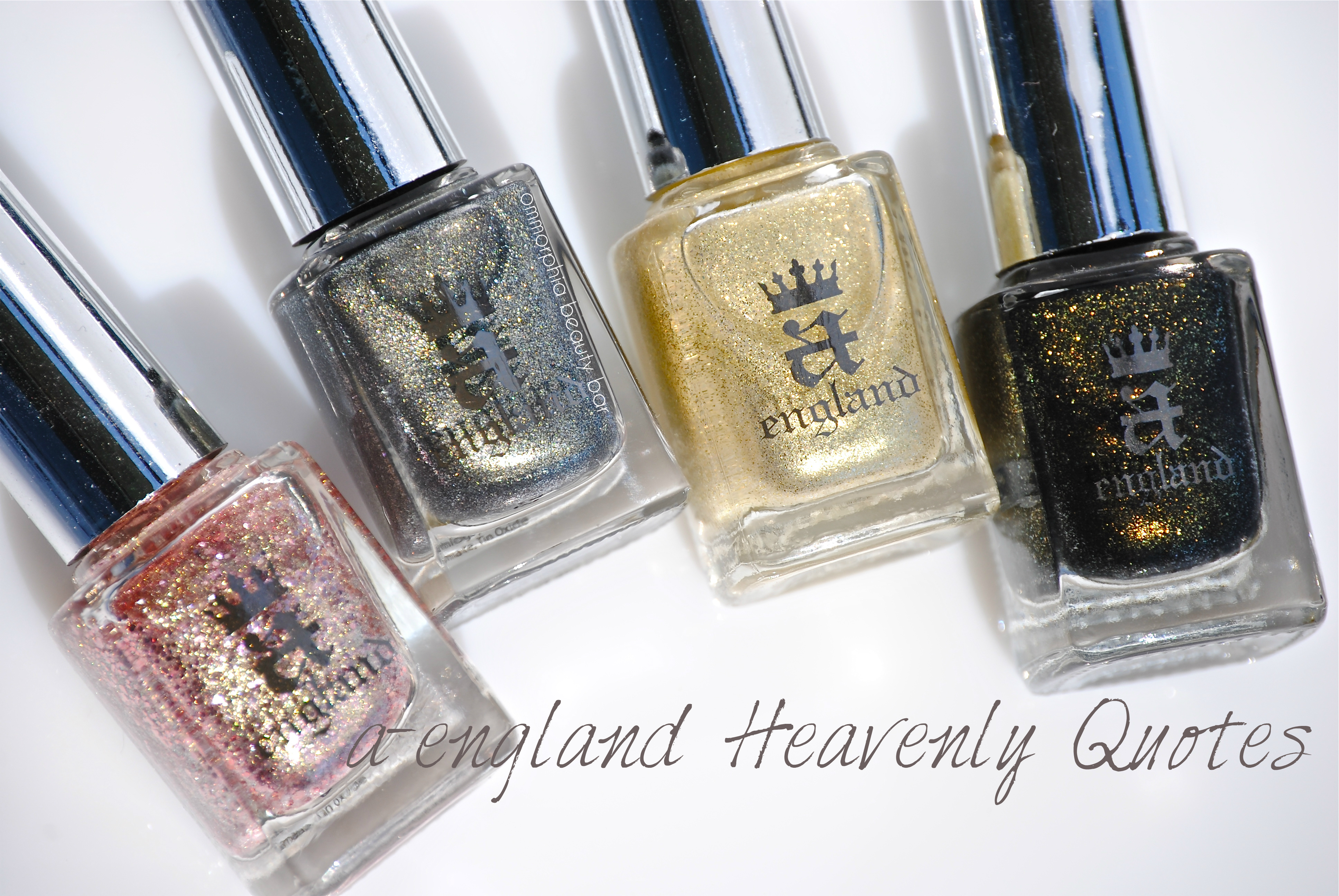
a-england ‘Love Is Enough’ – Heavenly Quotes Series

Today, I bring you the latest chapter in the ‘Heavenly Quotes’ Series from a-england (previous swatches of this series found here & here), ‘Love Is Enough’, a complex shade inspired by a poem of the same name written by William Morris – an English textile designer, artist, writer and libertarian socialist associated with the Pre-Raphaelite movement. Originally published in 1873 and dedicated to Morris’ wife Jane, this story while based on the intense power of love, also holds tragically dark undertones, all of which are perfectly captured in this bottle of lacquer – observe how the the deeply brooding base hue becomes almost transcendent, as its brilliant shimmer rises to the surface. Love is never one-dimensional, so why should a lacquer born of that sentiment, be any different?
LOVE is enough: though the World be a-waning,
And the woods have no voice but the voice of complaining,
Though the sky be too dark for dim eyes to discover
The gold-cups and daisies fair blooming thereunder,
Though the hills be held shadows, and the sea a dark wonder,
And this day draw a veil over all deeds pass’d over,
Yet their hands shall not tremble, their feet shall not falter;
The void shall not weary, the fear shall not alter
These lips and these eyes of the loved and the lover.
William Morris (excerpt)

Love Is Enough – a semi sheer greyed-out olive base hue filled with an intricate shimmer dance, consisting of copper, silver, gold & bronze glitter particles. Totally self-levelling and providing excellent coverage along the nail without either pooling to towards the cuticle line or shrinking from the nail tips, there appears to be an odd elasticity to the formula, although it still applies with ease just the same. Mysterious, moody, alluring, intriguing and totally captivating – just some of the adjectives that begin to describe this complex shade, the natural finish at the end, is nothing short of brilliant. Bonus: non-staining upon removal. Coats applied: 2, plus top coat

a-england ♦ Love Is Enough

a-england ♦ Love Is Enough

a-england ♦ Love Is Enough

a-england ♦ Love Is Enough
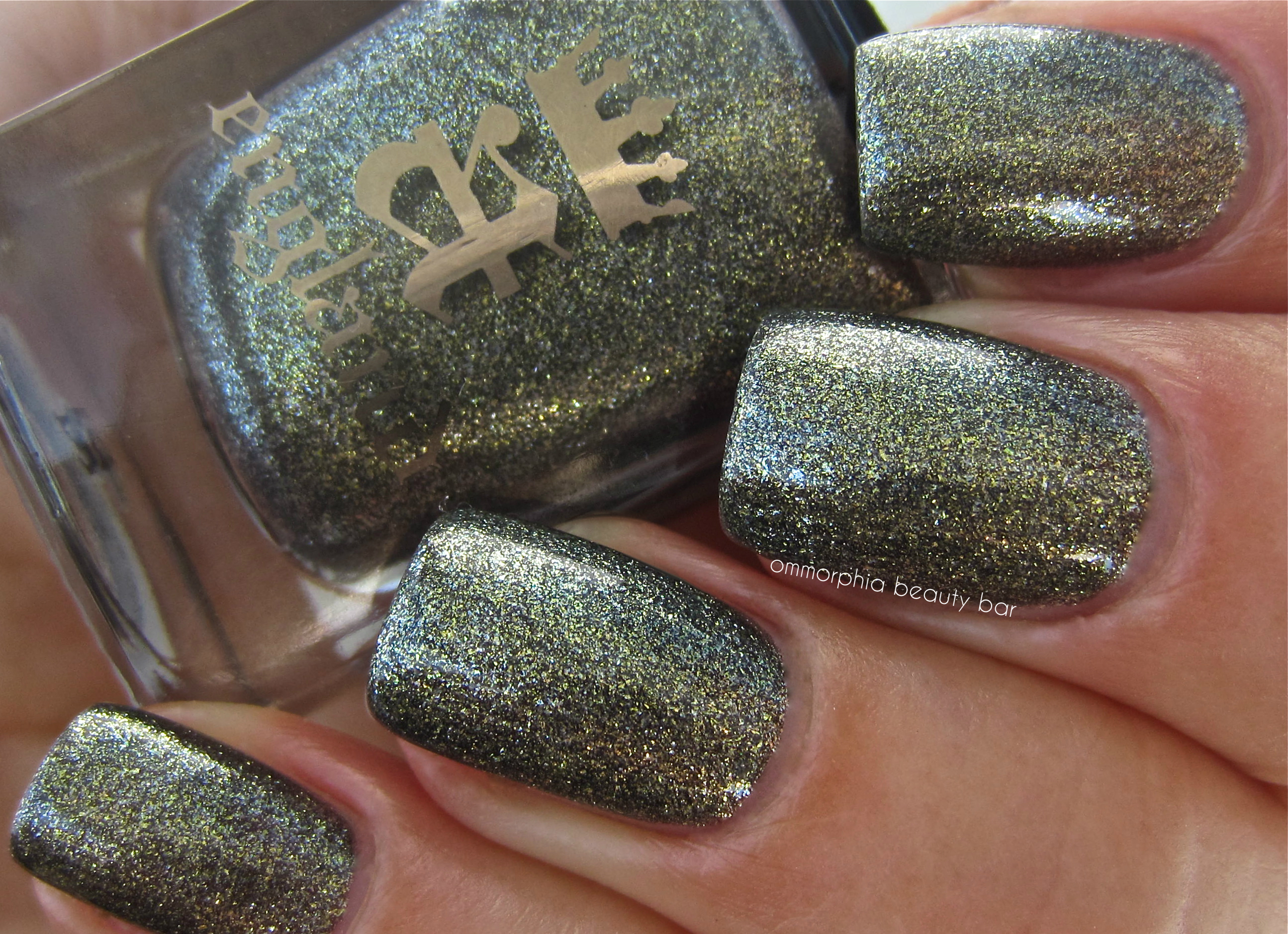
a-england ♦ Love Is Enough, indirect light

a-england ♦ Love Is Enough, with flash
Last word: A worthy addition to the ‘Heavenly Quotes’ Series, ‘Love Is Enough’ has enough drama going on with its multi-hued shimmer to satisfy a desire to stand out, yet the deeper undertones of the base colour adds a refining grounding element for an overall sexy & sophisticated gleam. Every angle of light seems to capture yet another facet to this unique shade, and I absolutely love how the entire look is both utterly romantic and totally edgy at the same time. Love may be enough, but my desire for complex lacquers will never be …
Available now, visit the a-england site for a complete list of products and stockists or follow via twitter/facebook for all updates.
*Disclosure: Product sample provided by the company/PR for my unbiased consideration
a-england Excalibur – Reborn

Born out of legend and forged by magic, the fable of King Arthur’s gleaming sword Excalibur, remains vividly alive to this very day. As part of a-england’s première nail lacquer collection, ‘The Mythicals’, the original version of this shade (reviewed here) came in a metallic steely hue – perfectly capturing the allure of that heroic blade. This updated version, however, takes that a step further by way of an infusion of gold pieces and a brilliant shimmer finish, which elevates this shade to true mythical proportions.
Excalibur – an aged silvery/pewter metallic and shimmery hue, with irregularly shaped golden pieces throughout for added depth & impact, imparting an air of regal patina. The formula was a mystery as well: while the first coat applies somewhat sheer, the second layer provides complete opacity, leaving behind a richly luxurious-looking finish. Self-levelling, no brush strokes in sight, and relatively quick-drying, this is a universally flattering shade for all skin tones, made so by balancing its icy silver tone with specks of gold. Coats applied: 2, plus ‘The Shield’ top coat from the same brand.

a-england ♦ Excalibur

a-england ♦ Excalibur

a-england ♦ Excalibur

a-england ♦ Excalibur

a-england ♦ Excalibur
a-england Excalibur, original version on index & pinkie fingers – silver metallic, blueish undertones, cool leaning
a-england Excalibur, new version on middle & ring fingers – silver foil shimmer, with irregularly shaped gold glitter flakes throughout, star shine

a-england ♦ Excalibur, old vs. new

a-england ♦ Excalibur, old vs. new
Last word: When Adina Bodana, creative mind and founder of a-england, debuted ‘The Mythicals’ nail lacquer collection, polish lovers everywhere were blown away – as much for the shades & incredible formula, as for the inspiration behind it all. It hasn’t taken long for this bijoux brand to reach cult status amongst varnish aficionados the world over, and with good reason: you can almost feel the passion that goes into each and every bottle. Since then, every subsequent collection has been consistently highly anticipated – so why change a good thing? The answer is simple: to make it better, and this revamped version of ‘Excalibur’ accomplishes all that … and more. A shade worthy of a legendary blade, this version is a triumph … and so incredibly brilliant that it should come with a warning. Or sunglasses.
For a full list of stockists and more information about a-england, visit the brand’s website and/or follow via twitter & facebook for all updates.

(source)
*Disclosure: Product sample provided by the company/PR for my unbiased consideraton