Filed In: nail polish
Cirque Colors – The Arcus Collection pt. 1

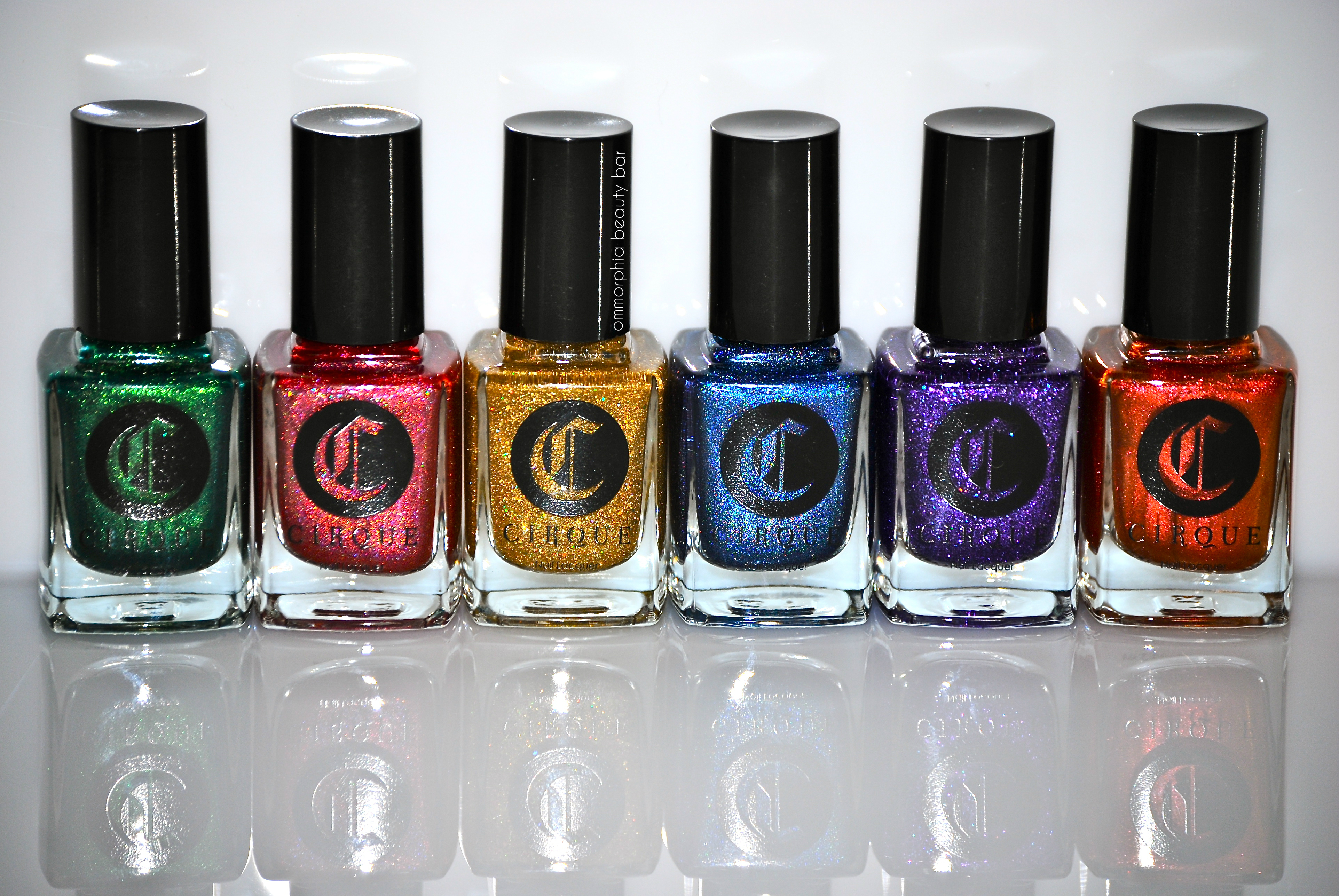
Having quickly risen to the ranks of one of my favourite boutique nail lacquer brands, Cirque Colors – the brainchild of Annie Pham, brings us her latest offering: ‘The Arcus Collection’. Consisting of 12 shades – 6 of them inspired by the primary colours found in a rainbow, the other 6 insanely brilliant “toppers” – these now come in the brand’s newly revamped packaging of the same square bottles, but with the logo silk-screened on top as opposed to the previous “sticker” version, with each housed in its own clearly-labelled box. The quality of Cirque Colors polishes is nothing short of superb, but it’s the original way that Annie combines colours and finishes that allows her beauties to stand out from the herd. To better appreciate this gorgeous collection, I’ve split it up into 2 parts … get ready to be spell-bound …

Cirque Colors Arcus Collection

Cirque Colors Arcus Collection
Sanguine – where to start describing this shade? A mid-sheer tangerine/pink duo chrome hue with a gorgeous bronze-y glow seen in some lights, in a formula with a good density, albeit on the thin side, which applies in a self-levelling way and winds down to a satiny finish. Can definitely be layered over a matching solid shade for more impact. Coats applied: 3 (thin), plus top coat
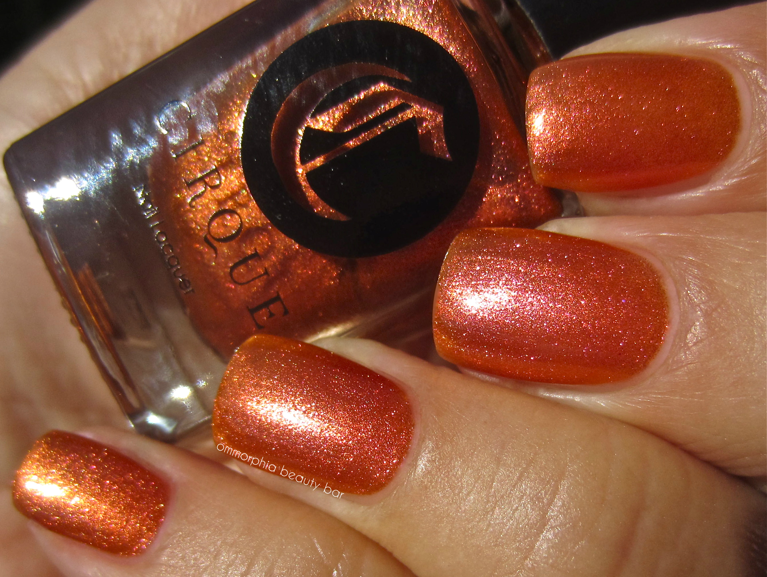
Cirque Colors Arcus Collection – Sanguine
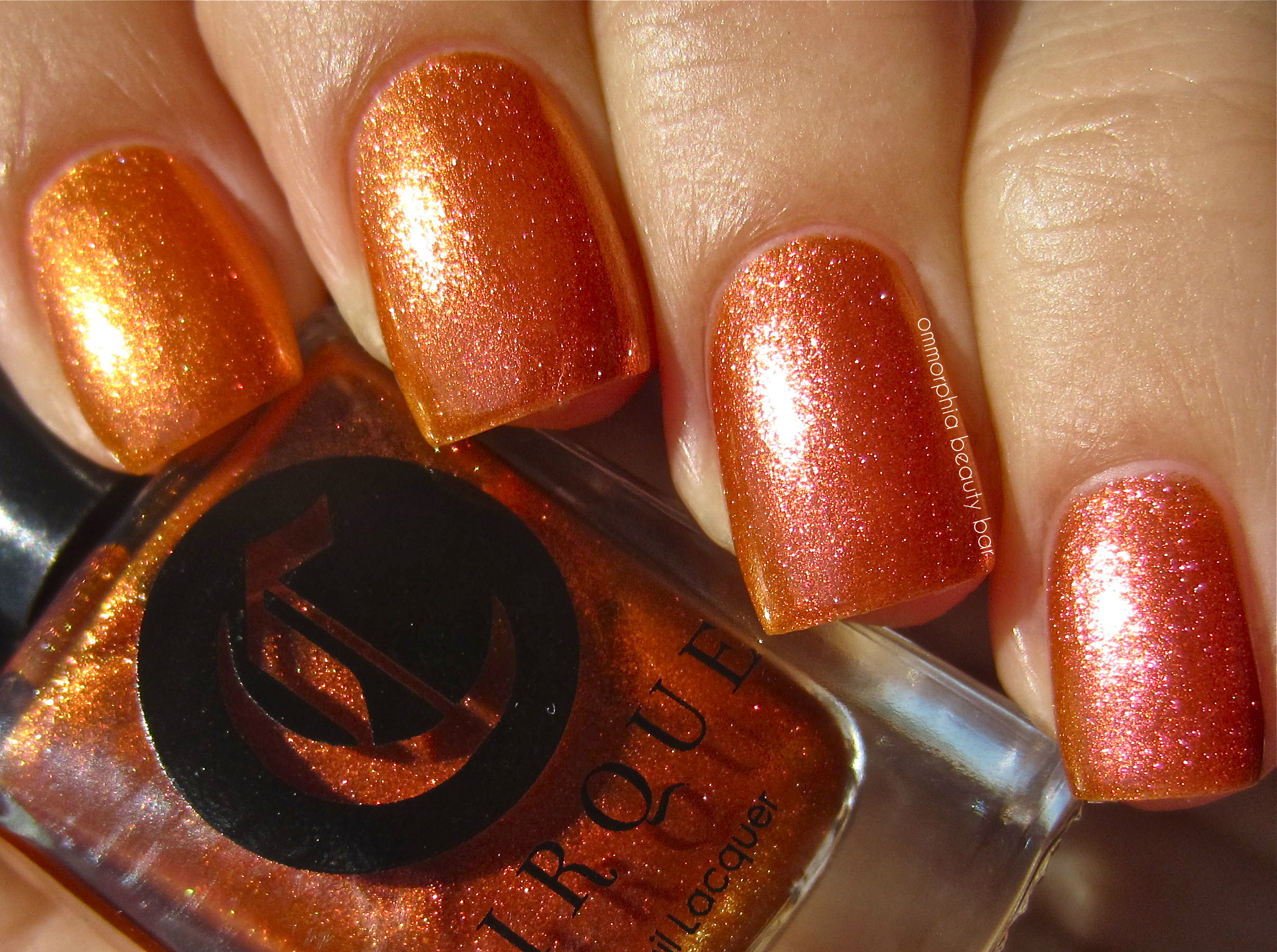
Cirque Colors Arcus Collection – Sanguine
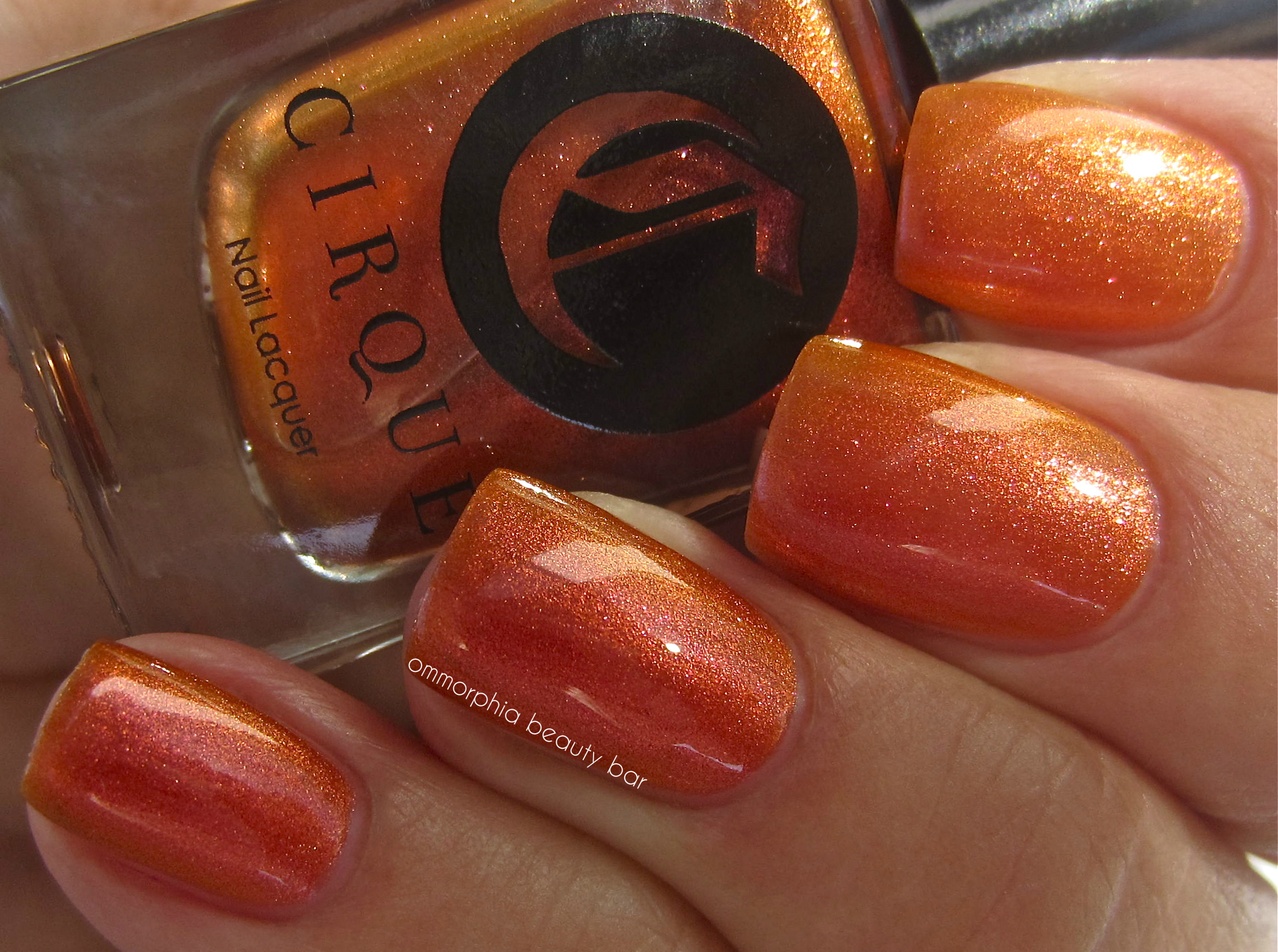
Cirque Colors Arcus Collection – Sanguine (indirect light)
Vesuvius – a molten hot raspberry hue with blueish undertones, displaying a scattered prismatic effect in a semi-sheer formula that bears an easy flow and excellent pigmentation – ending in a totally unusual and unique bright satin finish. The holographic effect is spectacular, especially in sunlight. Coats applied: 2, plus top coat

Cirque Colors Arcus Collection – Vesuvius
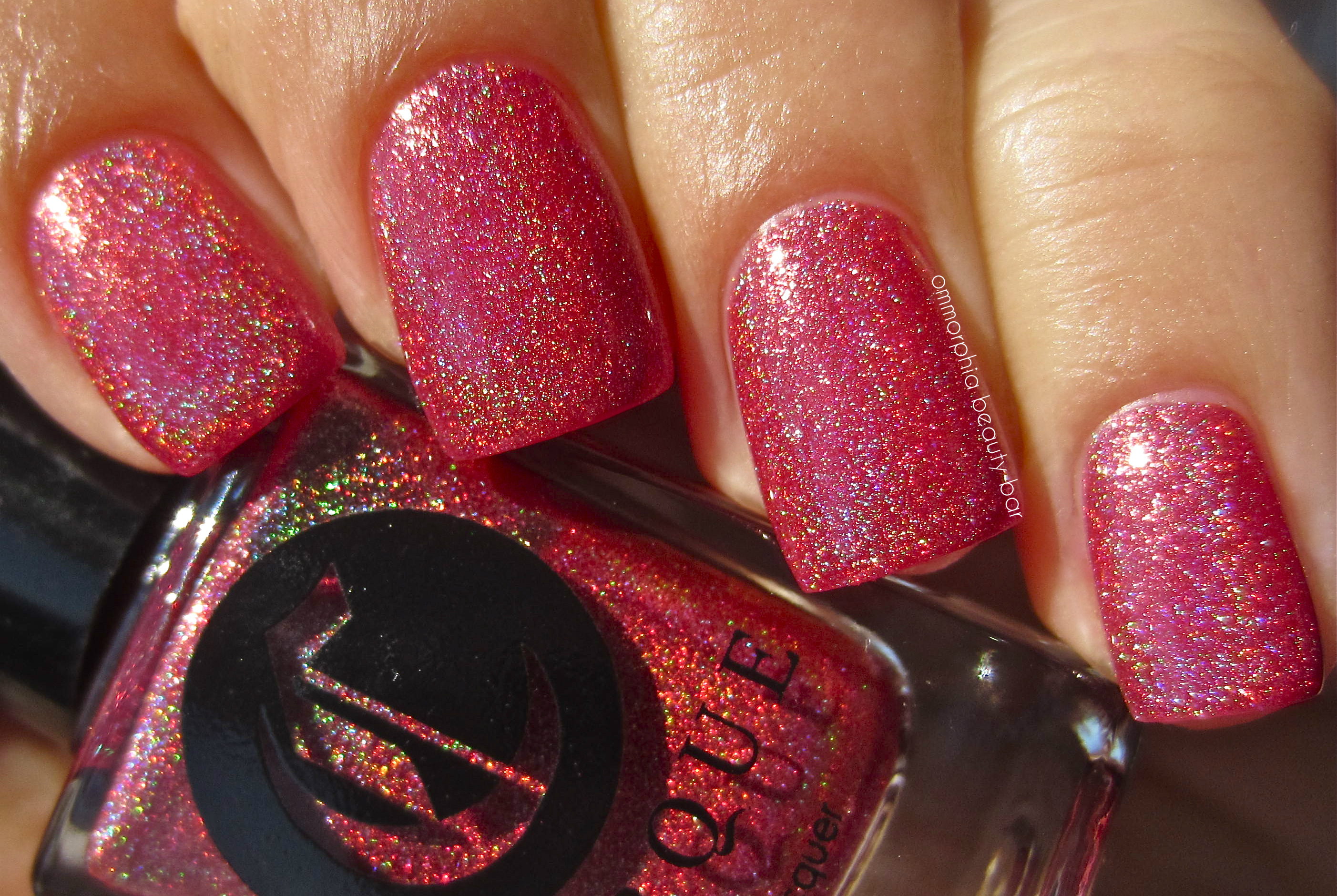
Cirque Colors Arcus Collection – Vesuvius
Bejewelled – a blueberry version of ‘Vesuvius’, this hue bears an interesting paradox: while the first coat may appear somewhat sheer upon application, it becomes 100% opaque by the second layer. Stellar, vivid, intense — these are just a few of the adjectives that only begin to describe this beauty. Another shade that comes to a satin, yet super bright finish, and completely non-staining upon removal. Coats applied: 2, plus top coat

Cirque Colors Arcus Collection – Bejewelled
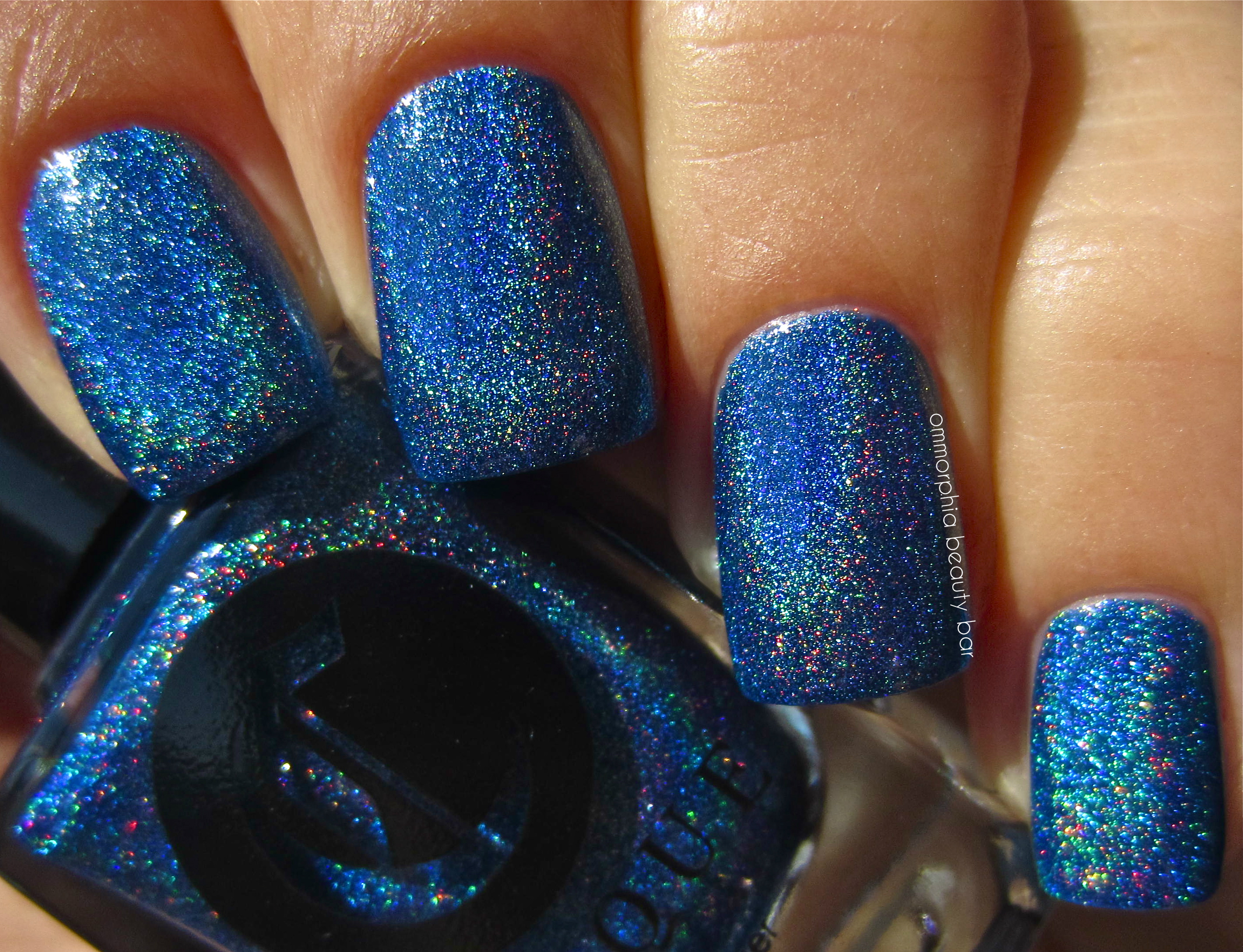
Cirque Colors Arcus Collection – Bejewelled
Erda – a luxurious emerald green hue with a jewel-like intensity and depth of tone, bearing golden olive undertones and a glass-flecked shimmer within. There was an odd “bounce-back” effect upon application of the first coat, which was quickly resolved by subsequent coats. This non-staining and self-levelling formula falls a bit on the thin side as well, making it ideal to be layered over a solid base colour. Bright satiny look at the finish. Coats applied: 3 (thin), plus top coat
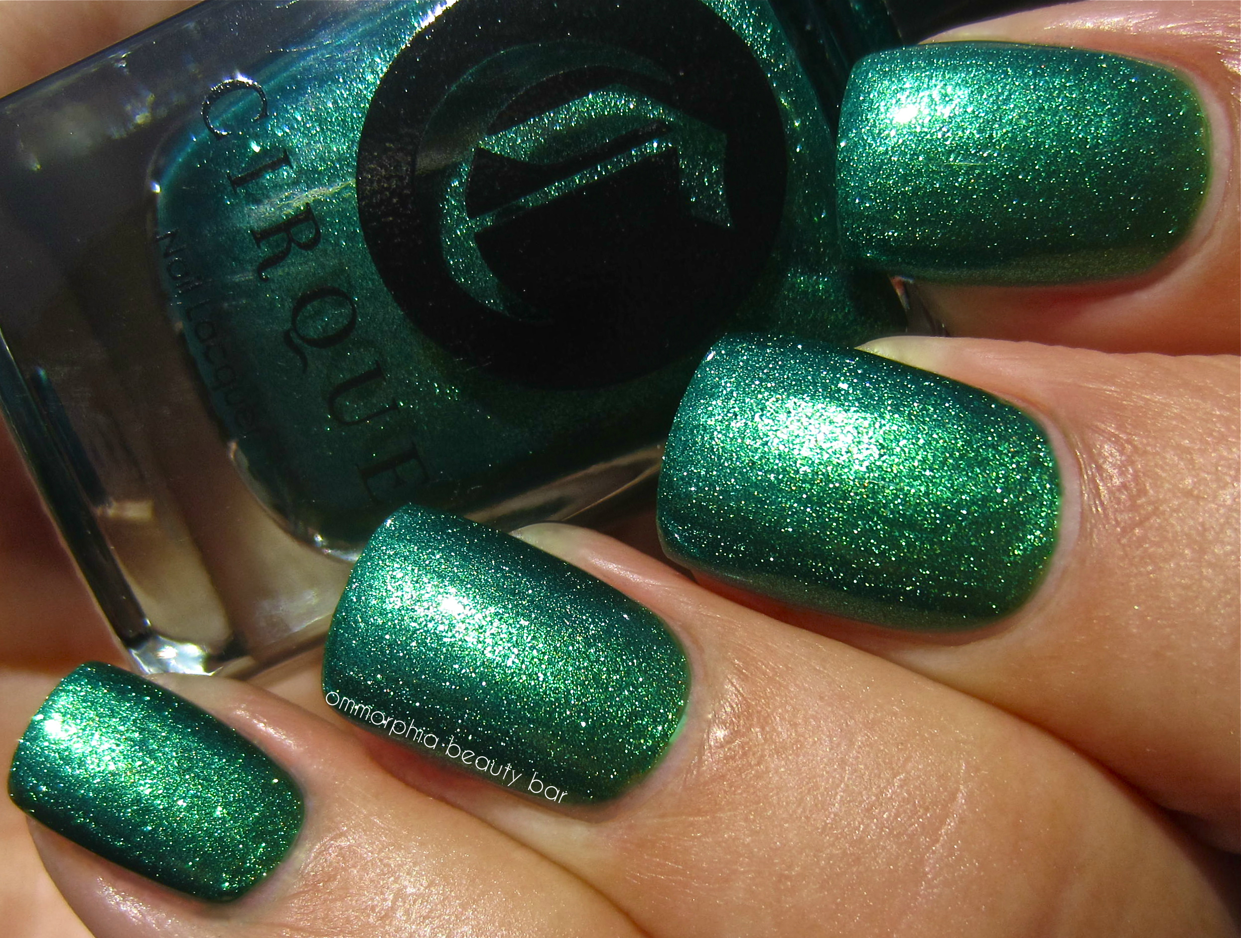
Cirque Colors Arcus Collection – Erda
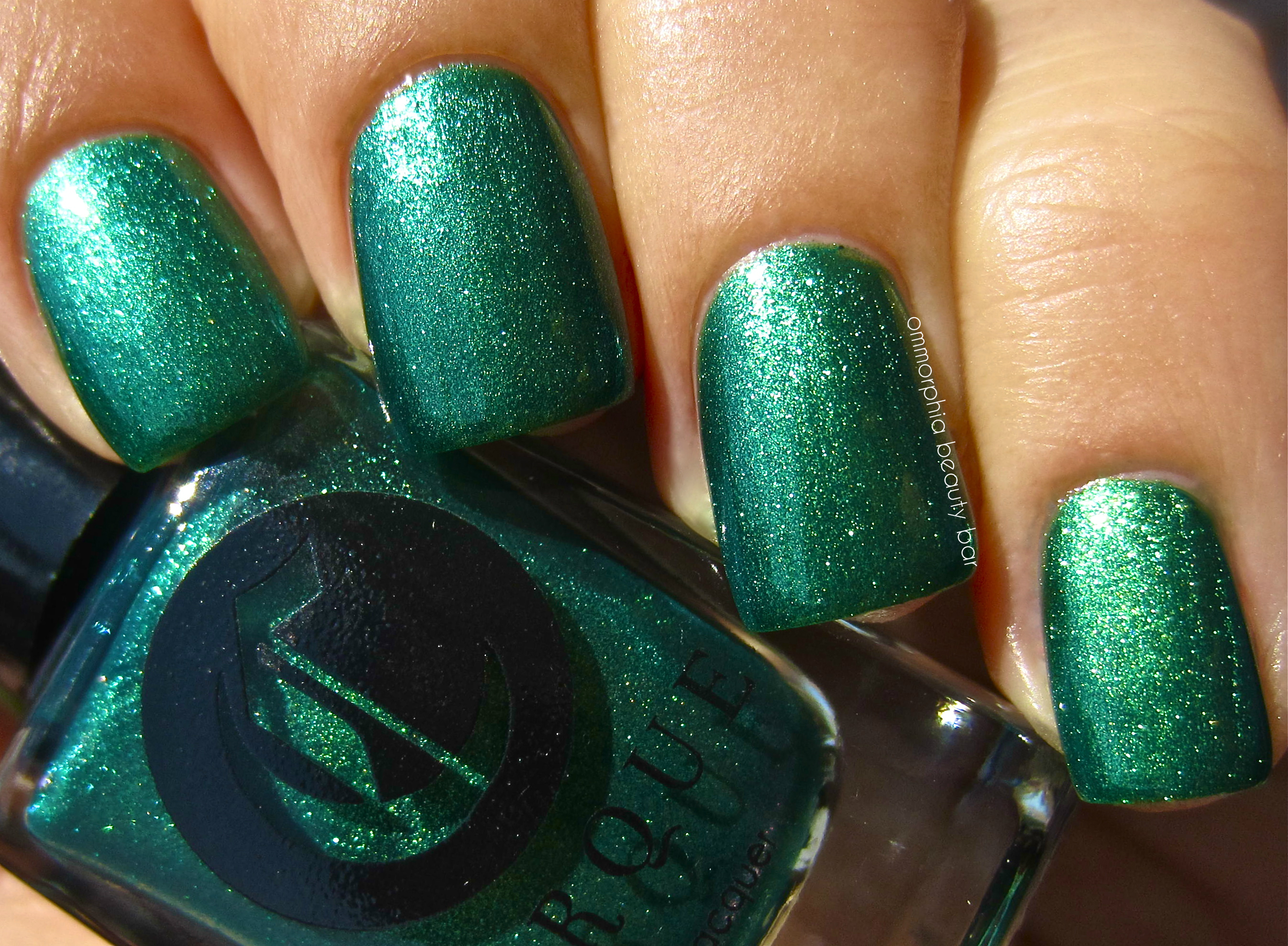
Cirque Colors Arcus Collection – Erda
Helios – appropriately named after the Greek Sun God, this is a clear base that is brimming with fine gold glitter and slightly larger hexagonal prismatic glitter pieces, falling in a self-levelling manner and with an utterly brilliant (and high luxe) look to its natural finish. With so much going on, I expected it to feel rather chunky, but adding top coat makes it relatively smooth to the touch. Coats applied: 3 (thin), plus top coat

Cirque Colors Arcus Collection – Helios

Cirque Colors Arcus Collection – Helios
Queen Majesty – a clear base loaded with purple/violet and blue fine glitter, with some of the pieces giving off a prismatic effect and an overall 3D appearance to the finished look. The epitome of majestic royalty in its über-brilliant tone & colour, this shade can easily be layered over a matching mono colour for more depth, or left as is – hypnotically beautiful! The semi-matte look at the finish, does nothing to distract from the intense sparkle. Coats applied: 3 (thin), plus top coat

Cirque Colors Arcus Collection – Queen Majesty
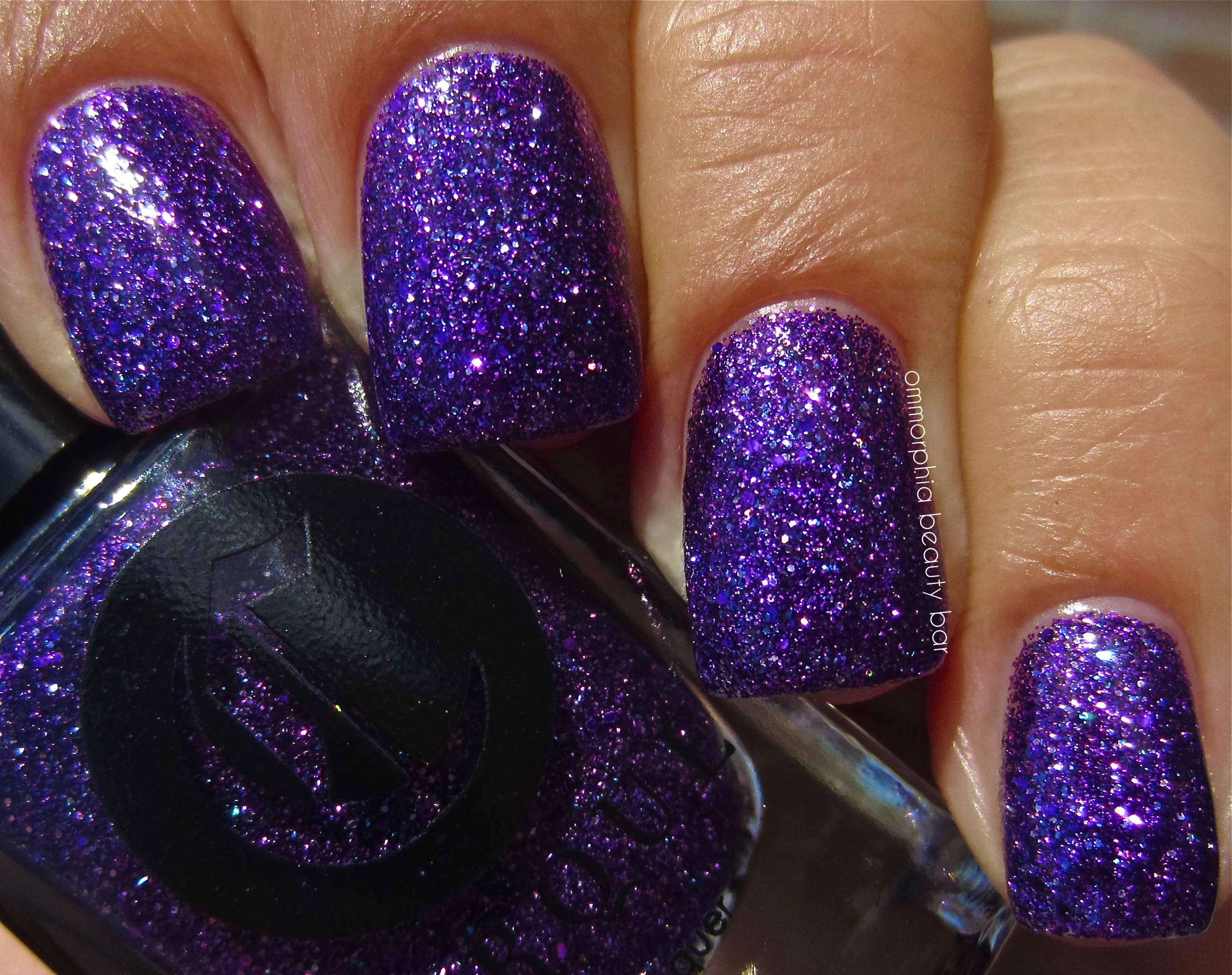
Cirque Colors Arcus Collection – Queen Majesty
Last word: I”m not one to usually wax poetic over either glittery shades or super-vivid colours, as my tastes usually run towards more brooding-type hues (unless it’s white polish, which I’m currently slavering over) but I think I must have stopped and stared at every.single.one of these babies for hours – mesmerizing, I tell you! I absolutely adore how no detail is overlooked – from the font used, to the packaging, to the literature and the story behind every collection, and you can just see that each hand-mixed bottle is made with pride and love. Then there’s the formula, the colours, the finishes … don’t get me going …
The Arcus Collection is available now through the Cirque Colors website, with a full list of stockists for your convenience. Feel free to follow the brand via twitter/facebook for all upcoming news
*Disclosure: Product samples provided by the company/PR for my unbiased consideration
generic Soma
generic Strattera
generic Trazodone
generic Ventolin


Butter London – The Colour Clash Collection, Fall 2013

For Fall 2013, Butter London has decided to take a very untraditional turn and create ‘The Colour Clash Collection’ – a set of 6 brightly vivid shades that might seem more suited for warm, rather than cooler temperatures … and will definitely stir up quite a bit of conversation. While I always personally look forward to the more sombre hues Fall collections have to offer (and as I’m currently on holiday – at the beach, mind you – and have absolutely ZERO desire to even think of anything cold-related), I can’t deny the appeal of these colours; to me, they feel like I’d be extending the Summer season. But that’s just me.
All swatches are with base and top coats.

Butter London – The Colour Clash Collection
Cotton Buds – a snowy white crème hue in an excellent formula – albeit a touch on the thick side, that may apply a bit patchy at the first coat if you don’t load up your brush properly, but which covers beautifully by the second. Self-levelling and with a nice gloss at the finish, this is an exceptionally easy white to pull off for all skin tones, staying just this side of looking neon, but never chalky or white-out-ish. On a personal note, I have been OBSESSED with white lacquer this season – this one is 100% LOVE for me. Coats applied: 2

Butter London – Cotton Buds

Butter London – Cotton Buds
Pimms – a warm-leaning egg-yolk yellow crème hue, in an easy-flowing formula with just the right density and saturation of colour to apply like a dream. The mix of custard & mustard (yellow polish rhyme!) undertones in the base, makes this shade flattering and suitable for all skin tones, unlike so many other yellow lacquers that can appear sallow or too juvenile. Self-levelling and glossy at the finish as well. Coats applied: 2

Butter London – Pimms

Butter London – Pimms
Wellies – a soft lime crème hue with definitive yellow undertones in its base, this shade bears an amazing formula that applies in a non-patchy and totally self-levelling manner, finishes up with a glossy shine and paradoxically remains vivid while steering clear of neon. Coats applied: 2

Butter London – Wellies

Butter London – Wellies
Silly Billy – a rich tangerine crème hue in a jelly-esque formula that applies in an ultra-smooth way, leaving a gorgeous gloss behind. I can’t add any more to this shade that the photos don’t already reveal – it’s so incredibly HAPPY looking! Bonus: non-staining upon removal. Coats applied: 2

Butter London – Silly Billy

Butter London – Silly Billy
Cake-Hole – a cool-leaning candy pink hue in a hybrid crème-jelly formula that bears an INSANE application: ultra-smooth and totally colour saturated. Super bright but never eye-searing, this shade is the only one of the 6 to come to a satin finish, but adding top coat really brings it out beautifully. Non-staining upon removal as well. Coats applied: 2

Butter London – Cake-Hole

Butter London – Cake-Hole
Giddy Kipper – a STUNNER. A colour-staurated indigo base hue filled with ultra-fine and almost iridescent shimmer in shades of blue, pink, and silver, in a formula that a cross between crème & jelly, bearing a superior flow, pigmentation, and shine. The only shimmer lacquer of the group, as well as the only concession to a “Fall” shade in this collection, blue-lovers will absolutely NEED to pick this one up. A welcome bonus: non-staining upon removal. Coats applied: 2

Butter London – Giddy Kipper

Butter London – Giddy Kipper
Last word: Confused by the shade choices? You’re not alone, and while my initial reaction was more along the lines of “what was Butter London thinking?”, I’ve come to appreciate the sly humour behind this collection. It doesn’t hurt either, that the formula is in true Butter London style: perfect. While I can’t say I’m much of a yellow or lime fan, I did like the way both ‘Pimms’ and ‘Wellies’ looked on me, but my hands-down favourites are ‘Cotton Buds’ (again, my white obsession), ‘Silly Billy’ (I also really like saying the name), and ‘Giddy Kipper’. As to ‘Cake-Hole’, I’ve been loving wearing this as a pedi shade — looks awesome on the beach!
Available now, The Colour Clash Collection retails for CAD $17.00 11 ml/USD $15.00 4 fl.oz – each, with a special promo of CAD $85.00 for the set (Canadian website only).
Find more information on all Butter London products via the website, twitter or facebook

*Disclosure: Product samples provided by the company/PR for my unbiased consideration
a-england Briarwood, Burne-Jones Dream

When I debuted the a-england Burne-Jones Dream collection (reviewed here), there was one lacquer yet to be shown – Briarwood, but I can honestly say that in this case, the best was definitely saved for last. Describing this shade is almost impossible, as it seems to pulsate with a life all its own – much like the fabled rose bushes that guarded Sleeping Beauty and the castle’s inhabitants. At once warm & cool, vibrant & muted, edgy & elegant, this vampy hue is like none other seen before by this brand … and completes the collection just so perfectly.

a-england ♦ Briarwood (Burne-Jones Dream)

a-england Briarwood – a burgundy port wine base colour, filled with ultra-fine prismatic particles that reflect every facet of light, in a formula that literally defines perfection: completely opaque at 1 coat, self-levelling, and with just the right density of flow that it applies exactly where placed, without any pooling or running. In full sunlight, the holographic flashes are truly hypnotic and depending on the angle, may appear either at the cuticle line, the nail tips, or along the sides. Shaded light brings out another deeper, more mysterious allure to this beauty, as well as adding a unique almost “clouded-over” effect to its overall tone. Shiny at the finish, top coat enhances every single nuance to the nth degree. Coats applied: 2 (although one is actually plenty) and all swatches are with a-england’s ‘The Knight’ base coat and ‘The Shield’ top coat (both previously reviewed here).

a-england ♦ Briarwood

a-england ♦ Briarwood

a-england ♦ Briarwood

a-england ♦ Briarwood

a-england ♦ Briarwood (in shaded light)

a-england ♦ Briarwood (with flash)

a-england ♦ Burne-Jones Dream

a-england ♦ Burne-Jones Dream
Last word: The five shades of a-england’s ‘Burne-Jones Dream’ collection are nothing short of spectacular, but ‘Briarwood’ is in a word: MAGICAL. Creating a unique colour in the world of nail lacquers is no easy feat, and yet somehow Adina Bodana – the brand’s creative genius & founder – has managed to do exactly that. The fact that ‘Briarwood’ also boasts a stellar formula and application, is just icing on the cake, in my opinion, and if you pick up nothing else from this collection (as IF), you absolutely NEED this shade. I’d run to order it, if I were you … fair warning!
Find more information on a-england via twitter & facebook – all products are available for purchase through the brand’s website, where you can also find a complete list of international stockists.

*Disclosure: Product samples provided by the company/PR for my unbiased consideration
Essie Fall 2013 – Comparisons

I’m not surprised that Essie’s Fall 2013 Collection has sparked quite a bit of interest amongst enthusiasts of the brand, and since many of you have wondered how close several of the new shades are to past hues, here’s a breakdown on a nail wheel for comparison. The swatches shown are all done with 2 coats of lacquer each (no base or top coats), but bear in mind that natural nails may alter the colour to a certain degree. I’ve left out ‘For The Twill Of It’ as well as ‘Cashmere Bathrobe’ from this post, as I don’t have anything like either shade in my personal collection of Essie polishes.
The reds:
- Limited Addiction – from the Fall 2010 Collection (reviewed here): a couple of degrees deeper in tone, but otherwise exceptionally close colour-wise (crème formula)
- Twin Sweater Set
- First Dance – from the Bridal 2011 Collection (reviewed here): several degrees lighter in tone, sheerer formula

the reds
The Purples:
- Sure Shot – from the Resort 2012 Collection (reviewed here): more pink based and filled with ultra-fine shimmer (as opposed to glass-flecked)
- The Lace Is On

the purples
The Greens:
- School Of Hard Rocks – from the Holiday 2011 Collection (reviewed here): similar formula, more teal/blue based
- Vested Interest

the greens
The Blues:
- Midnight Cami: more vivid shade of blue & filled with ultra-fine glass-flecked shimmer
- After School Boy Blazer
- No More Film – from the Resort 2012 Collection (reviewed here): similar formula but several degrees lighter, more cobalt/indigo leaning in tone
- Bobbing For Baubles – from the Holiday 2011 Collection (reviewed here): similar formula, more grey based and a few degrees darker in tone

the blues
Last word: Apart from the red shades, the other hues of this collection all seem to be rather unique – both in tone & texture/application, and hopefully this quick chart can help you narrow your choices down in preparation for this collection’s release this August. No matter which shade(s) you opt for, they’re all fabulous!

Kindly provided by Essie for my unbiased consideration
Essie – Fall 2013 Collection

Since I’ve only just begun getting myself into Summer mode, it feels almost like I’m cheating on the season by showing these shades, but that’s the world of fashion/beauty for you — always a few steps ahead of us mere mortals! For their Fall 2013 Collection, Essie takes us back to basics – but with a fresh & modern twist. According to Essie Weingarten herself, Founder and Global Creative Director of the brand:
“How do you convey all the richness of fashion’s dizzying array of textures in a polish? That’s what I always ask myself when creating a collection. For example, what does fluid cashmere knit look like in polish from? With textile innovation and the never-ending invention of style, we have seen so many exciting fashion mash-ups on the runways, so much layering, so much, well, fun with fabric. Case in point: Michelle Obama’s inaugural coat of silk twill, fashioned from fabric normally reserved for men’s neckties.
More and more, the unwritten rules of fashion are changing, caution hasn’t merely been thrown to the wind, it’s become a dirty word. And the mixing of colour and texture – like heavy flannels and silk chiffon – has become standard practice.
This season’s sensual allure comes from exactly that: a glorious mix of luxe, languid knits, warm woolens and elegant lace. It’s a look that’s incredibly sophisticated, and yet completely cozy. Bouclé knits and tartan plaids wrap the body in amply cut overcoats and delicious sweater dresses. Feminine frills add a touch of femme fatale flair to loosely tailored, boyish looks.
So, how do you bottle a cashmere bathrobe, exactly? That, my dears, is a trade secret.”
The six shades of this collection all offer something of interest – 2 types of shimmer, luxurious creamy finishes, intense saturation, and even colour-morphing properties, turning this grouping into a perfect reflection of today’s diverse trends.
Did I mention how absolutely STELLAR the formula is on each? Oh yeah ….

Essie – Fall 2013

Essie – Fall 2013
For The Twill Of It – a multi tonal grey/teal metallic base hue with pink iridescent flashes – that also colour shifts to purple in some lights, green in others – in a medium density flowing formula with amazing colour saturation. Self levelling and coming to a shiny finish, brush strokes are barely visible to the naked (although my high resolution photos may show otherwise), with a natural ombré effect seen along the nail tips at certain angles – GORGEOUS! This is a easily a triple chrome type of shade, and needs to be seen in person to be fully appreciated – the following shots are just a sampling of its many facets. Confession: every time I say the name of this shade, I think of Tweety Bird, lol! Coats applied: 2, plus top coat

Essie – For The Twill Of It

Essie – For The Twill Of It

Essie – For The Twill Of It

Essie – For The Twill Of It

Essie For The Twill Of It

Essie – For The Twill Of It

Essie – For The Twill Of It
Cashmere Bathrobe – a concrete grey base hue with marine blue undertones and filled with ultra fine silver shimmer bits in a jelly-esque formula, bearing an excellent pigmentation & flow and with a self-levelling application plus glossy shine at the finish. Definitely not deep enough to ever pass for black, I love how the shimmer is visible in all lighting. Cool leaning but can be easily worn by warmer skin tones as well, this shade is non-staining upon removal. Coats applied: 2, plus top coat

Essie – Cashmere Bathrobe

Essie – Cashmere Bathrobe

Essie – Cashmere Bathrobe
The Lace Is On – a vibrant magenta/fuchsia hue with purple undertones and some blueish tints seen under certain lights, filled with fuchsia glass-flecked ultra fine shimmer, all in a hybrid crème-jelly formula that applies like a dream. Cooler-leaning and ending with a fabulous shine at the finish, there is that “lit-from-within” glow emanating from this shade which I’m a total sucker for – absolutely spectacular! Coats applied: 2, plus top coat

Essie – The Lace Is On

Essie – The Lace Is On
Vested Interest – a sage green hue with definitive blue/grey undertones in a formula that applies like a crème but with the characteristics of a jelly: totally self-levelling and in an ultra-glossy manner. While understated in initial appearance, I found something so strangely compelling about this shade – reminds me of sharkskin for some reason, Bonus: no staining upon removal. Coats applied: 2, plus top coat

Essie – Vested Interest

Essie – Vested Interest
Twin Sweater Set – a blue-based true crimson red hue in a jelly-esque formula that is total perfection in its formula: self-levelling, ultra high gloss shine at the finish, easy flow and relatively non-staining upon removal — a bonus for a colour this intensely saturated. While cooler leaning, this shade can paradoxically be worn with ease by all skin tones along the spectrum. Coats applied: 2, plus top coat

Essie – Twin Sweater Set

Essie – Twin Sweater Set
After School Boy Blazer – (oy … the name!) a true navy hue in a formula that leans more jelly than crème, with superior colour pigmentation – this can bascially pass for a 1-coater if applied thickly enough. With a self-levelling application and insane mirror-like shine at the finish (which almost makes wearing a top coat superfluous – but don’t skip it just the same), there were absolutely no staining issues upon removal. While definitely deep in tone, there is enough colour in the base to prevent this shade from looking black in low lighting, with direct light really enhancing its rich glow. Coats applied: 2, plus top coat

Essie – After School Boy Blazer

Essie – After School Boy Blazer
Last word: I confess that when I first laid eyes on this collection, I gasped … like in the cartoons … for real. There is not one shade of the six that I am not 100% in love with and while there’s a part of me that enjoys wearing offbeat nail lacquer colours, there’s something to be said for mainstay hues – although there is nothing remotely commonplace with any of Essie’s Fall 2013 Collection lacquers. ‘For The Twill Of It’ delivers on all the promise seen in the bottle – in SPADES, and has all the makings of a mega-hit … so, be warned; get yours while you can.

Kindly provided by Essie for my unbiased consideration