
Filed In: nail polish
China Glaze – Hologlam Collection 2013 pt. 2
Disclosure: Press samples

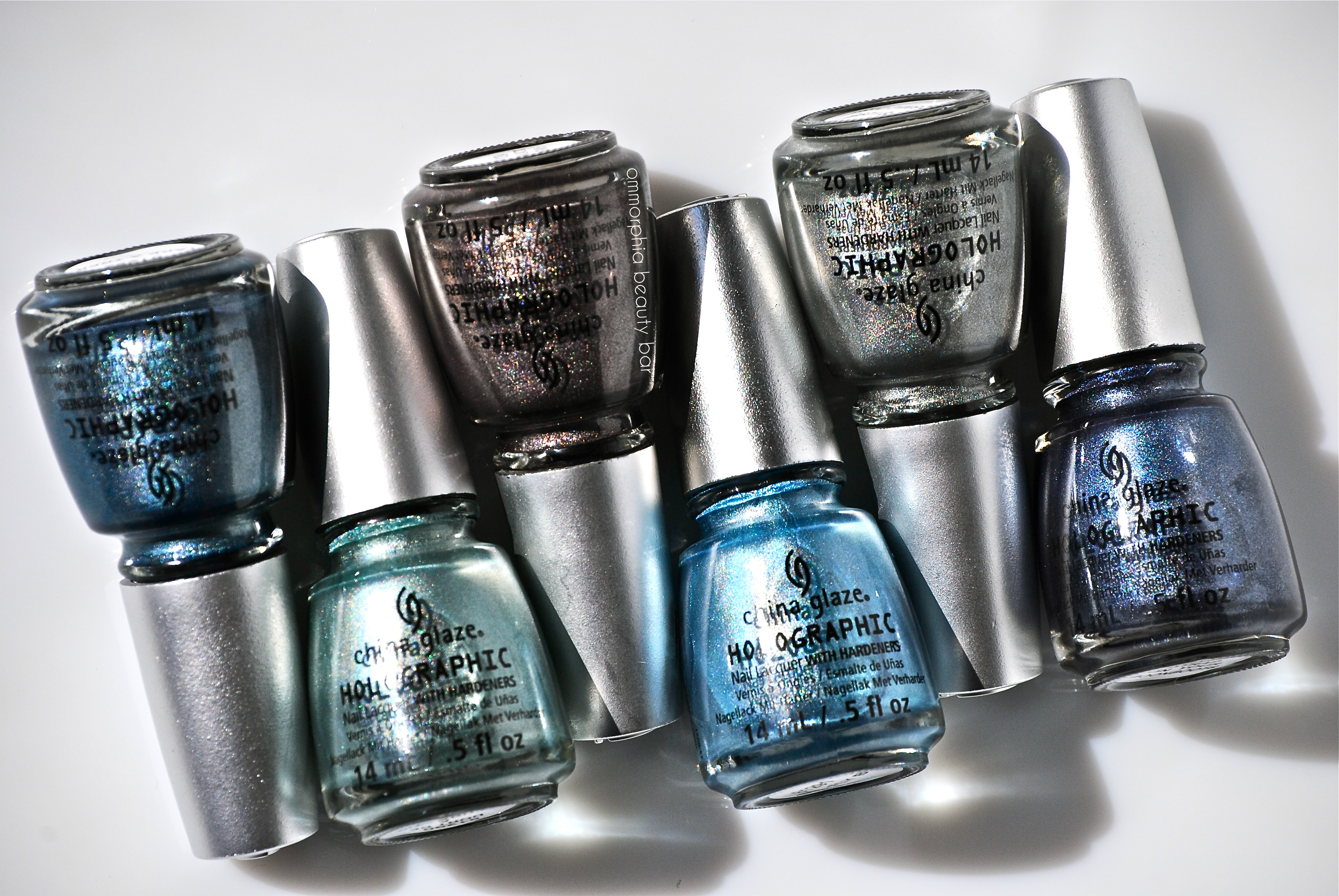
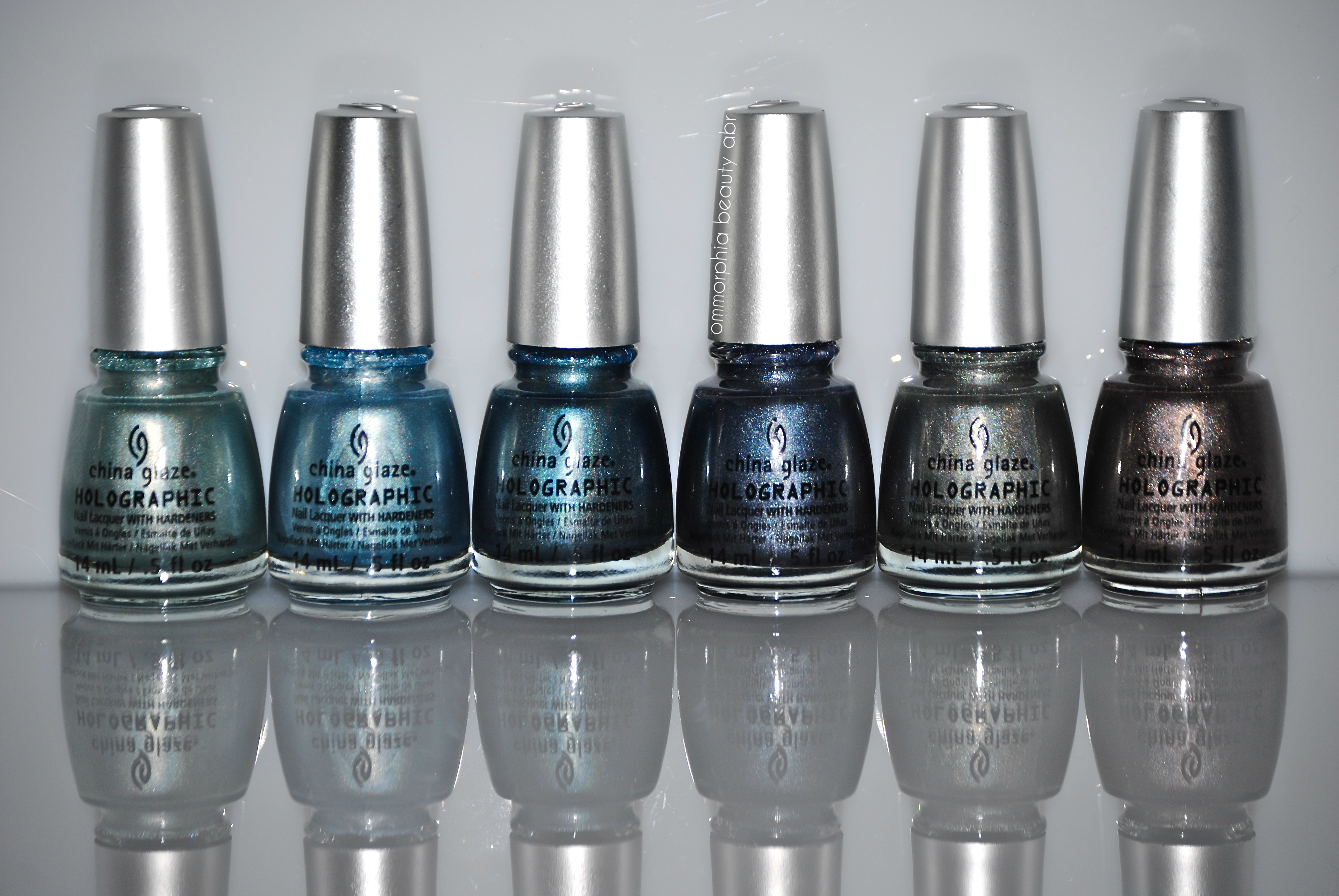
While the first half of the China Glaze Hologlam Collection (reviewed here) didn’t exactly strike gold with me (more to do with the colours offered, than any other reason), this bunch has my name all over it. The oceanically-inspired range of tones of the six shades shown here today, all work quite cohesively – whether worn individually or mixed & matched, and even their “holographic-ness” appears so much more vibrant and brilliant. As with the first grouping, these shades all have certain qualities in common:
- medium thick formula that bears an odd elasticity to it — almost a spring-back effect
- very fast drying
- non-staining with an easy removal
Application tips:
- ridge-filling base coat applied first will ensure a smoother surface to work on
- load enough polish on your brush to deposit a full coat per nail
- the “3-stroke” method works the best (ie: 1 swipe down the middle, then 1 swipe down either side of that)
- do not fuss with the first coat too much, in order to avoid potential bald spots
- wait a minimum of 2 minutes between coats, to eliminate any lumps from forming
- top coat optional; while I always apply a top coat for extra protection, I found that it dulled the effect on these lacquers
China Glaze – Hologlam Collection 2013 pt. 2

China Glaze – Hologlam Collection 2013 pt. 2
Don’t Be A Luna-Tic – an icy pale blue shade with undertones of seafoam in the base and rather cool leaning, with a mild but still visible linear prismatic effect. Coats applied: 3 thin, no top coat.

China Glaze – Don’t Be A Luna-Tic

China Glaze – Don’t Be A Luna-Tic
Sci-Fly By – a sky blue/azure shade and one of the sheerest in formula of this grouping, bearing a gentle and slightly more scattered prismatic effect. Coats applied: 3 thin, no top coat.

China Glaze – Sci-Fly By

China Glaze – Sci-Fly By
Take A Trek – a steel blue shade bearing an excellent saturation of colour (can almost be a 1-coater if applied thickly enough), smoothly flowing and giving off a diffused linear holographic effect. Coats applied: 2, no top coat.

China Glaze – Take A Trek

CHina Glaze – Take A Trek
Strap On Your Moonboots – a rich navy shade with strong purple undertones in the base in a formula that is stellar, both in flow and colour saturation. Much stronger and visible linear prismatic effect overall. Coats applied: 2, no top coat.

China Glaze – Strap On Your Moonboots

China Glaze – Strap on Your Moonboots
Cosmic Dust – a quasi-sheer platinum grey hue that is both warm & cool leaning, with a holographic effect that appears rather scattered in low lighting, but strongly linear in direct sunlight. Coats applied: 3 thin, no top coat.

China Glaze – Cosmic Dust

China Glaze – Cosmic Dust
Galactic Gray – a hybrid taupe/mauve hue bearing an amazing flow and colour pigmentation, with a strong linear prismatic effect seen in direct light that becomes slightly muted in lower lighting. Coats applied: 2, no top coat.

China Glaze – Galactic Gray

China Glaze – Galactic Gray
Last word: After a quick & cursory glance at this half of China Glaze’s Hologlam Collection, I wondered why there were so many similar hues; then I began swatching them and realized that I could not have been more wrong. Each shade offers something different and while inherently more of a “cool-themed” group, these are all colours that will work on a broad spectrum of skin tones and able to transcend all seasons as well. Care still needs to be taken with application, but the end result more than makes up for that. The best part? How beautifully each lacquer comes flaring to vivid life as soon as direct light hits it – you may want to have your sunglasses handy!
You can follow China Glaze via their website, twitter or facebook for all updates.
cheap Cytotec
cheap Diflucan
cheap Doxycycline
cheap Finasteride


China Glaze – Hologlam Collection 2013 pt. 1
Disclosure: Press samples
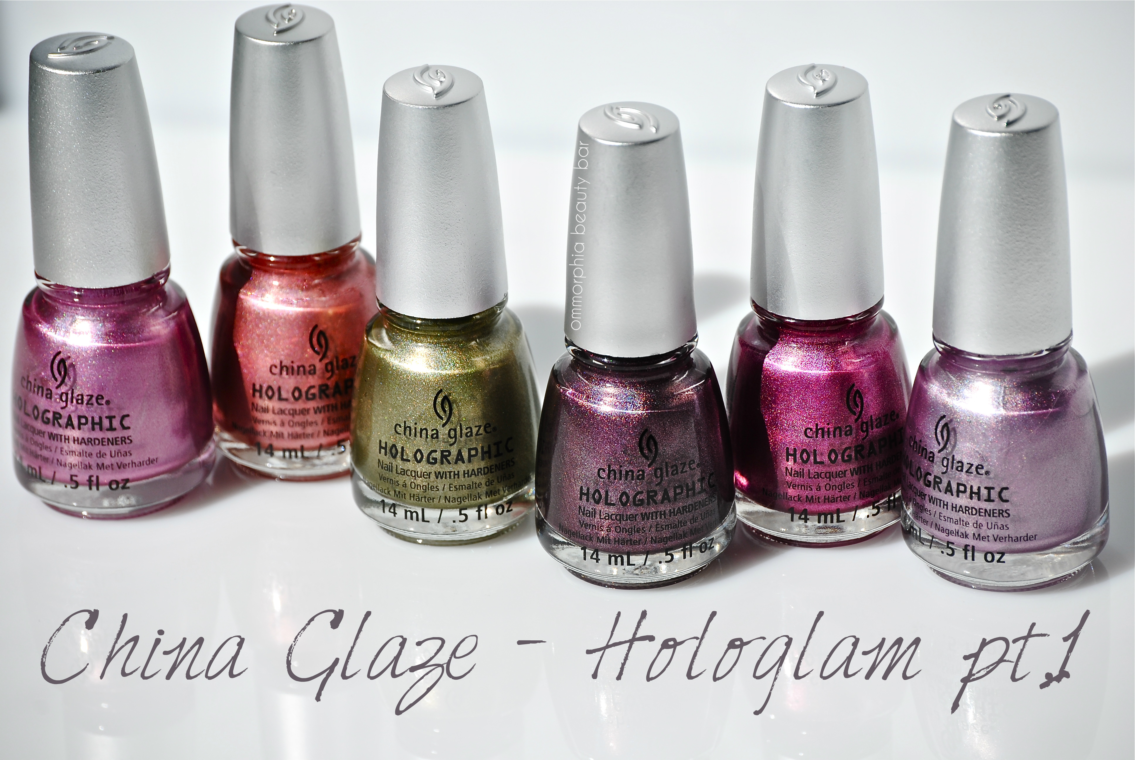
This Spring, China Glaze released a collection of 12 holographic-type lacquers, the ‘Hologlam Collection’, in a broad range of colours and with varying intensities in their prismatic finishes, but even if you’re a “colour purist” like I tend to be, there’s no denying the almost magnetic pull of these polishes. I’ve broken the collection down into 2 parts – the warmer group, as shown here today, with the cooler group to follow. While some of these shades tended to be more vibrant than others, they all shared the following characteristics:
- medium thick formula that bears an odd elasticity to it — almost a spring-back effect
- very fast drying
- non-staining with an easy removal
Application tips:
- ridge-filling base coat applied first will ensure a smoother surface to work on
- load enough polish on your brush to deposit a full coat per nail
- the “3-stroke” method works the best (ie: 1 swipe down the middle, then 1 swipe down either side of that)
- do not fuss with the first coat too much, in order to avoid potential bald spots
- wait a minimum of 2 minutes between coats, to eliminate any lumps from forming
- top coat optional; while I always apply a top coat for extra protection, I found that it dulled the effect on these lacquers

China Glaze – Hologlam Collection 2013 pt. 1
Get Outta My Space – lilac hue, both warm & cool leaning and with some grey undertones, gentle linear prismatic effect. Coats applied: 2, no top coat

China Glaze – Get Outta My Space

China Glaze – Get Outta My Space
Not In This Galaxy – warm rose hue with visible orange tints in the base, bearing a slightly scattered prismatic effect. Coats applied: 2, no top coat

China Glaze – Not In This Galaxy

China Glaze – Not In This Galaxy
Astro-Hot – pink/lavender hue that can lean both warm & cool, bearing a stronger linear prismatic effect. Coats applied: 2, no top coat

China Glaze – Astro-Hot

China Glaze – Astro-Hot
Infrared – magenta hue with hints of red in the base, strongly pigmented and bearing a scattered prismatic effect. Coats applied: 2, no top coat

China Glaze – Infrared

China Glaze – Infrared
OMG a UFO – olive green hue with gold reflects, bearing a more diffused linear prismatic effect. Coats applied: 2, no top coat

China Glaze – OMG a UFO

China Glaze – OMG a UFO
When Stars Collide – plum/burgundy base hue with the deepest pigmentation of the group, bearing a strong linear effect seen in sunlight. Coats applied: 2, no top coat

China Glaze – When Stars Collide

China Glaze – When Stars Collide
Last word: If you’re looking to add a little pizzazz to your nails, but don’t want the headaches (ie: removal issues) associated with glitter lacquer, then the prismatic finish of China Glaze’s Hologlam Collection may be just what you need. With the exception of ‘When Stars Collide’, I found the holographic effect to be more on the subdued side with this group, definitely making these shades more work-place friendly than party/clubbing — a definite plus in that respect. Once you’ve “nailed” down the proper application method, you’ll find the results pay off – and a great way to ease yourself into the world of polish holographics.
You can follow China Glaze via their website, twitter or facebook for all updates.

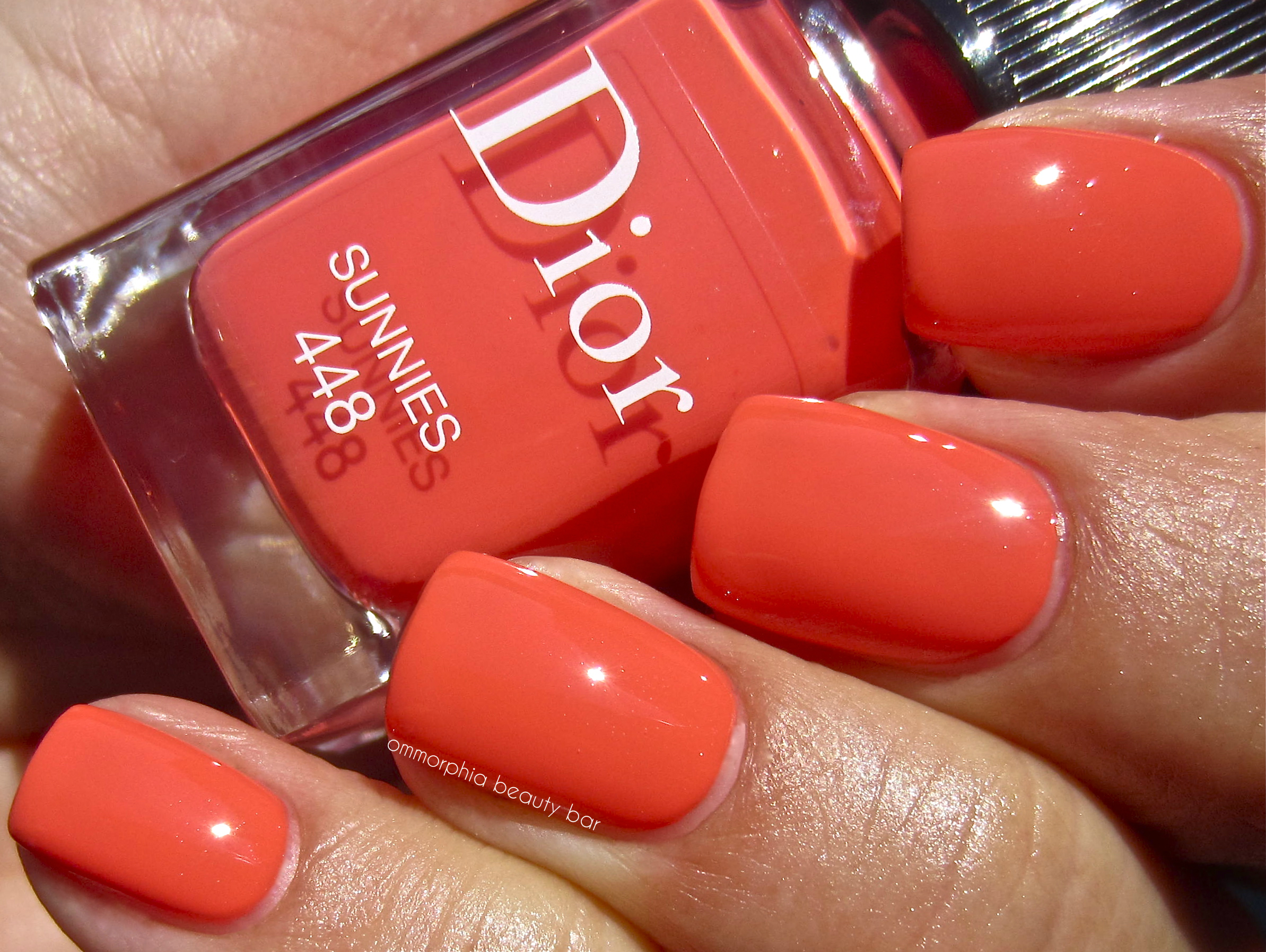
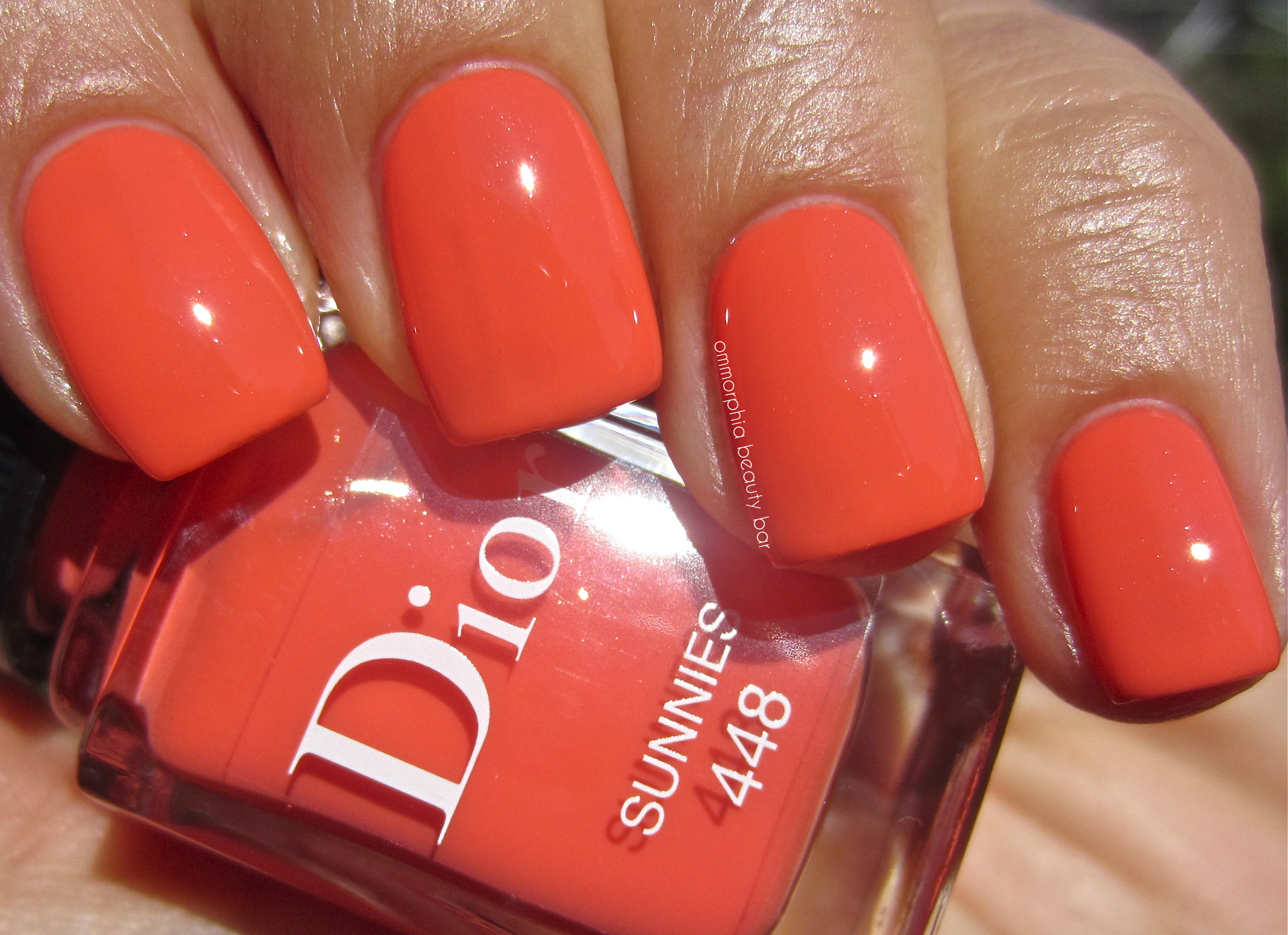
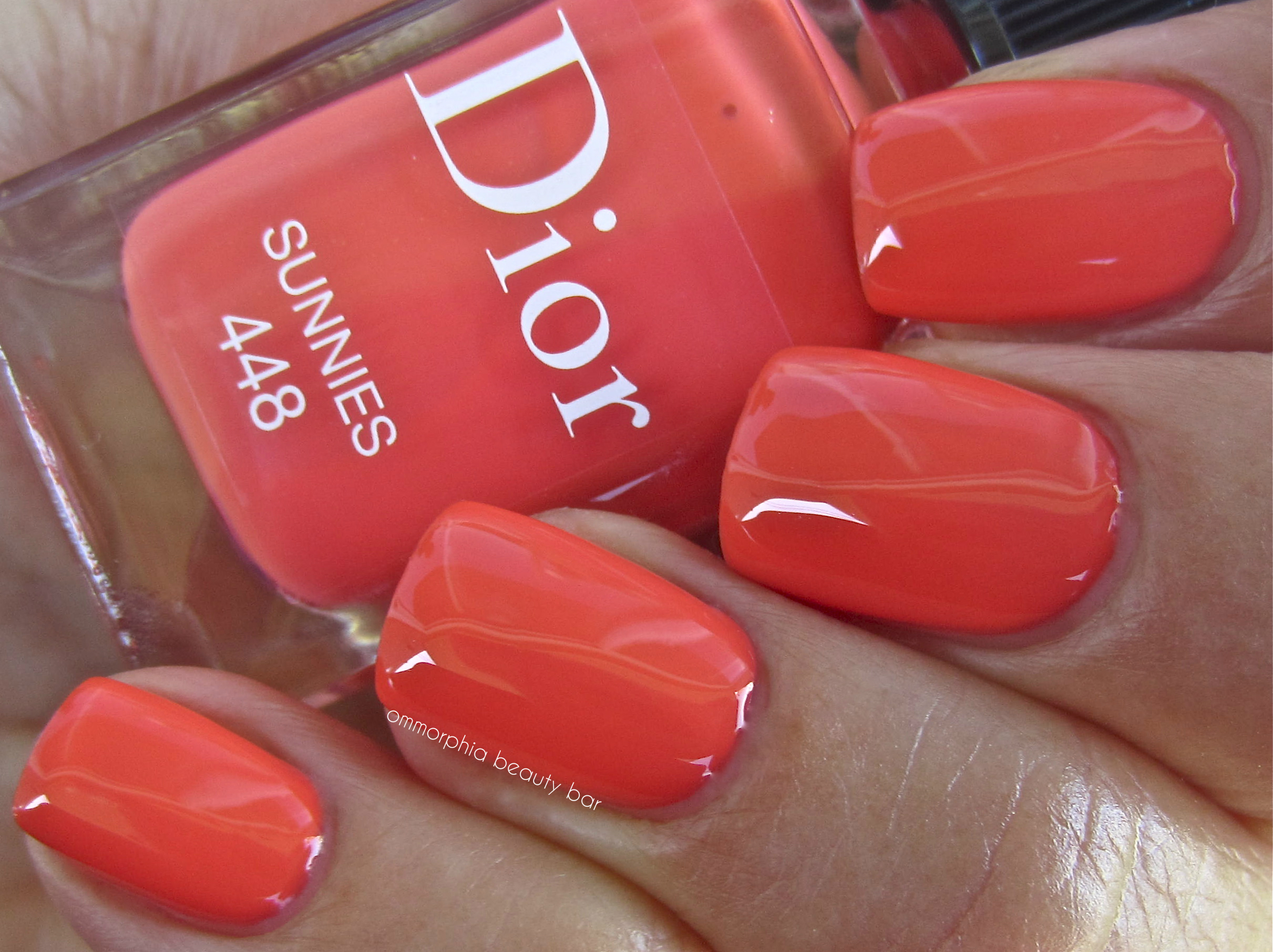
Dior Le Vernis #448 Sunnies – Summer Mix 2013 Collection (Limited Edition)

Passing by my local Dior counter the other day, I literally stopped in my tracks when I came upon the display for the Summer Mix 2013 Collection, which consists of 4 new vivid nail lacquer hues to match the 4 new crème blushes (which this particular beauty/makeup/blush fiend definitely needs to investigate further … stay tuned). Dior #448 Sunnies (don’t you just smile hearing that name?!) – is the shade I finally settled on, although hunting it down was no easy feat, as it was the only one of the 4 colours that was sold out at three of the counters I visited. The bottle I was finally able to snag, was the last one available and I clutched it protectively all the way home. It’s a nail polish addiction thing … those of you similarly afflicted, understand why …

Dior Summer Mix 2013 Collection
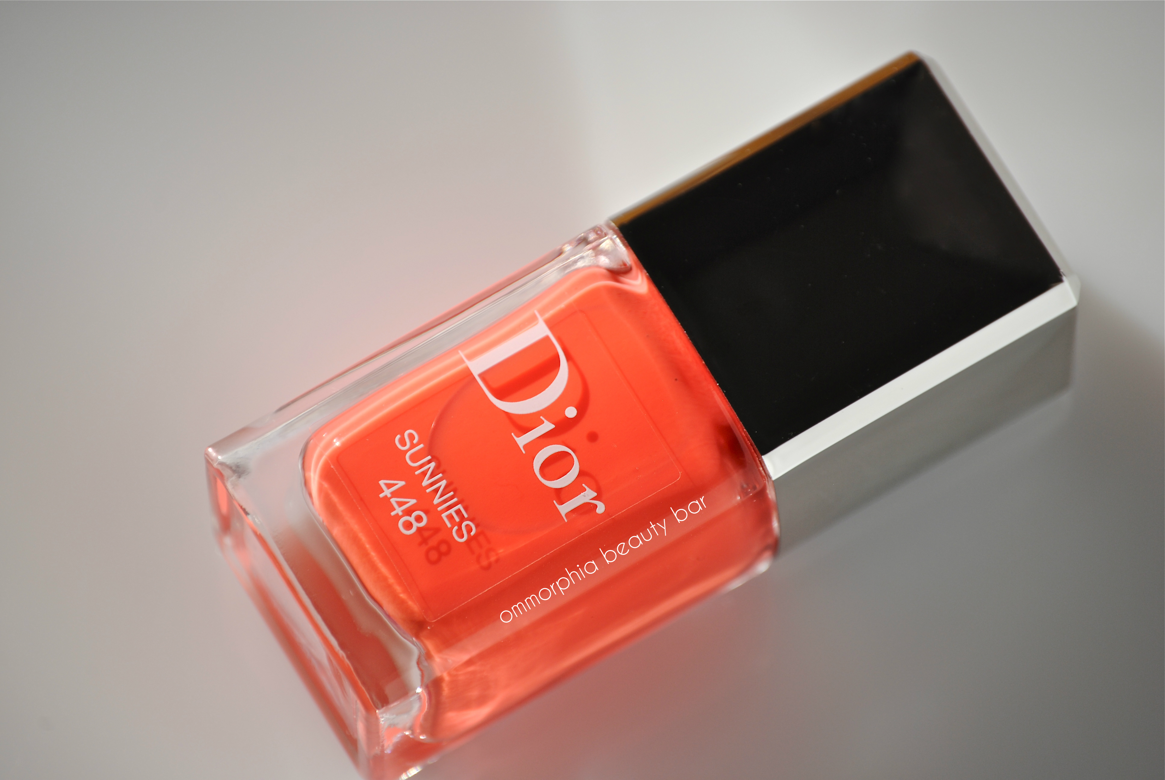
Dior #448 Sunnies (CAD $24.00 10 ml/0.33 fl.oz) – a lucious coral/cremesicle hue in a jelly-esque formula with an amazing saturation of colour and which applies in a ridiculously easy way, especially with Dior’s unique flat & wide brush with its tapered tip. Self-levelling and ending in an ultra glossy shine that makes top coat almost superfluous, this shade may be warm-leaning, but will enhance basically every skin tone across the spectrum. Interestingly enough, I didn’t notice the traces of hidden shimmer until I uploaded my photos, as this aspect is not visible to the naked eye. Coats applied: 2, plus top coat
Dior #448 Sunnies
Dior #448 Sunnies
Dior #448 Sunnies

Dior #448 Sunnies – the colourful spiral-bound notepad was gifted to me at the counter
Last word: This shade is absolutely GORGEOUS – both in colour and formula, and absolutely perfect for the summer weather that is finally upon us (well, supposed to be upon us … but I digress …) Vivid without being garish and in a softer, more wearable version of orange, #448 Sunnies is one of those shades that will have people notice and put a smile on your face – and totally worth the effort of tracking it down.
The Dior Summer Mix 2013 Collection is exclusive to The Bay (Canada) where I picked up my bottle.

a-england ‘Excalibur’ (revamped) & new Heavenly Quote: ‘Love Is Enough’
Disclosure: Press sample

William Morris ‘Love Is Enough’ (source)
If you follow me on my various social media platforms, then you may have seen the initial black & white preview of 2 new a-england shades; here they now are, in all their colourful splendour!
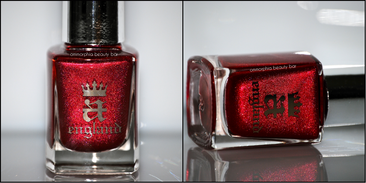
Having captured our hearts – as well as our imagination – with ‘The Mythicals’ introductory collection, founder Adina Bodina is constantly looking to create and improve upon her range; case in point, the revamped version of ‘Excalibur’ (see original swatch review here). This new incarnation takes the original steely hue and infuses it with multi-dimensional shimmer, creating a unique fusion of a wearable metallic.
In between the core collections, a-england has also introduced a running theme titled “Heavenly Quotes”, with new shades/chapters continuously included in this story. The latest addition, ‘Love Is Enough’ is a shade inspired by the artist, poet, textile designer and member of the Pre-Raphaelite Brotherhood, William Morris (1834 – 1896) – an intricate and almost moody deep olive hue, overlaid by a complex golden shimmer.
Please note that full nail swatches are coming soon. You can find more images and swatches of the entire range by clicking on the a-england tab on the right.

a-england ♦ Excalibur (revamped)

a-england ♦ Love Is Enough – Heavenly Quote
cheap Sildenafil
cheap Trazodone
cheap Zithromax
Last Word: As expected, these shades are done in true inimitable a-england style: with complete attention to detail, and in total perfection. I’ll have more details for you as soon as my post is up — stay tuned!
You can check out the a-england website for more information, or feel free to follow via twitter/facebook for the latest updates.

William Morris – Acanthus Leaf wallpaper c. 1875 (source)
a-england Burne-Jones Dream
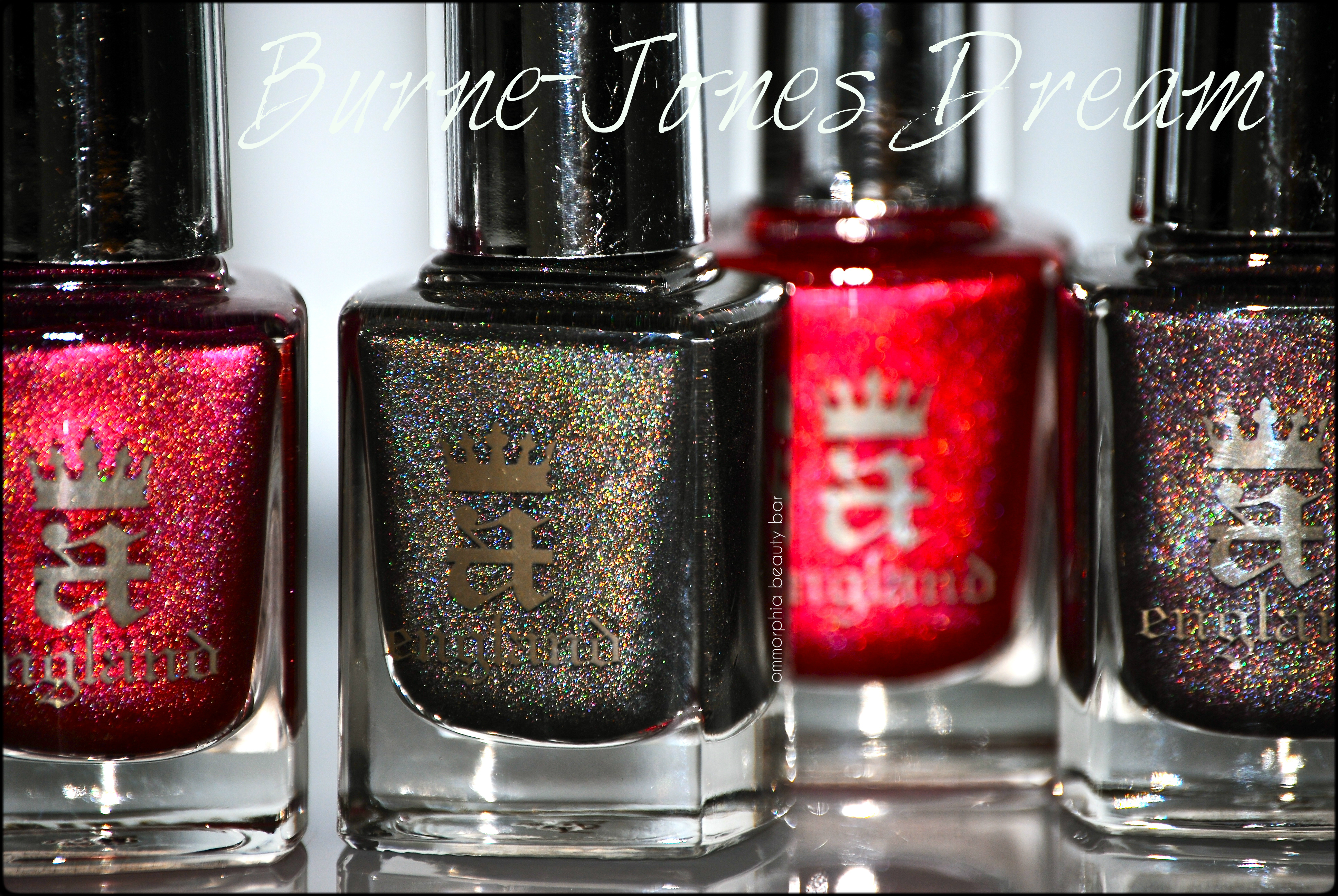
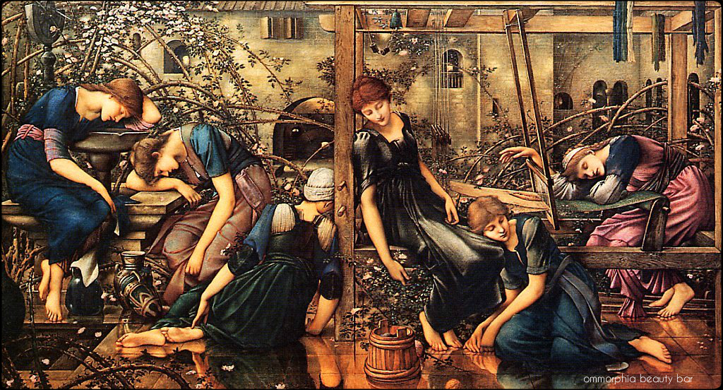
From the day a-england lacquers burst onto the nail polish landscape (and our beauty consciousness), each collection has been feverishly anticipated, and with good reason, as the ‘Burne-Jones Dream’ proves; merging complex and lusciously rich colours with her love of art, founder and creator Adina Bodana has once again brought us “wearable history” in the form of 5 decadent nail varnish shades, based on the story of the ‘Sleeping Beauty’, as interpreted by one of her favourite pre-Raphaelite artists.
The four paintings of The Briar Rose series created by Sir Edward Burne-Jones (1833-1898) which were 30 years in the making and finally completed in 1890, were inspired by the beloved fairy tale of the Sleeping Beauty, and focus on one pivotal scene in the story – where the prince battles the obstacles of the enchanted garden to finally gaze upon the face of the slumbering princess. His good friend William Morris created 4 verses of prose to be read in conjunction with each painting, thus taking the viewer seamlessly from one panel to the next and adding a new dimension to the entire experience. Deliberately omitting the final scene where the princess awakes, leaves us with a lingering sense of anticipation — but we can certainly fill in the blanks as intended.
*Please note that the 5th shade, Briarwood, is not shown – but is coming soon.

Edward Burne-Jones (1833 – 1898)
Burne-Jones in front of his Star of Bethlehem – 1890 (source)

a-england ♦ Burne-Jones Dream

a-england ♦ Burne-Jones Dream

The Briar Rose: The Prince Entering the Briar Wood, Edward Burne-Jones (1869), source
The fateful slumber floats and flows
About the tangle of the rose.
But lo the fated hand and heart
To rend the slumberous curse apart

Fated Prince “The tempered steel of a hero’s blade” – this shade is a quasi-sheer grey base with a dark olive undertone that mysteriously becomes completely opaque by the second coat. The tightly bound prismatic particles fall in a more scattered than linear pattern, and refract beautifully when light hits them. Superb flow and application to the formula, laying down completely self-levelling and coming to a natural shiny finish. Coats applied: 2, plus top coat

a-england ♦ Fated Prince

a-england ♦ Fated Prince

a-england ♦ Fated Prince

The Briar Rose: The Council Chamber, Edward Burne-Jones (1872-1892) source
The threat of war, the hope of peace
The Kingdom’s peril and increase.
Sleep on, and bide the latter day
When fate shall take her chains away

Sleeping Palace “An unnatural twilight has fallen upon the land” – this shade bears a prune base with hints of copper in the undertones, and filled with an abundance of prismatic particles that come vividly to life in direct light. The outstanding formula almost makes this a 1-coater, as it falls with perfect coverage from the start, but does wind up closer to a satin finish. Coats applied: 2, plus top coat
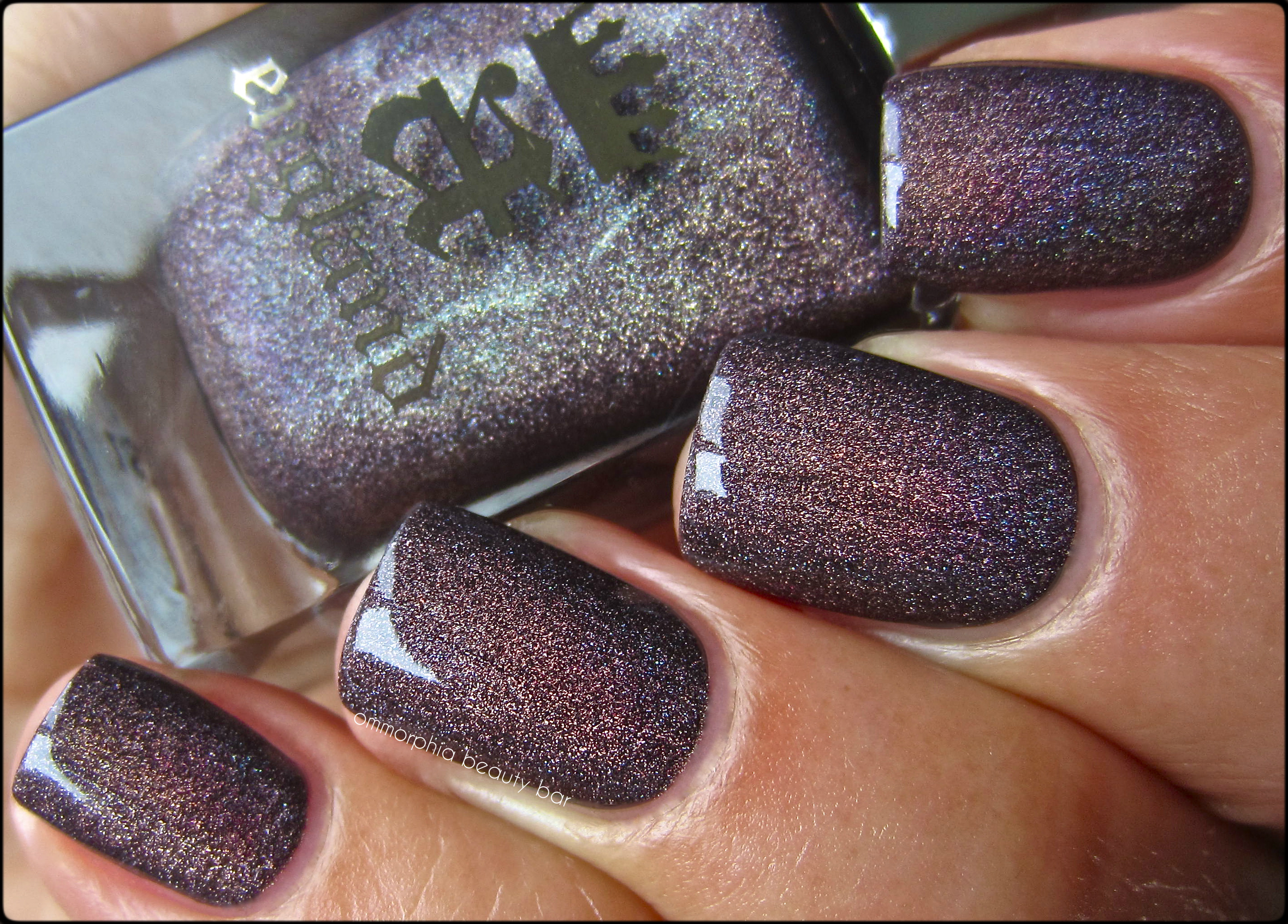
a-england ♦ Sleeping Palace

a-england ♦ Sleeping Palace
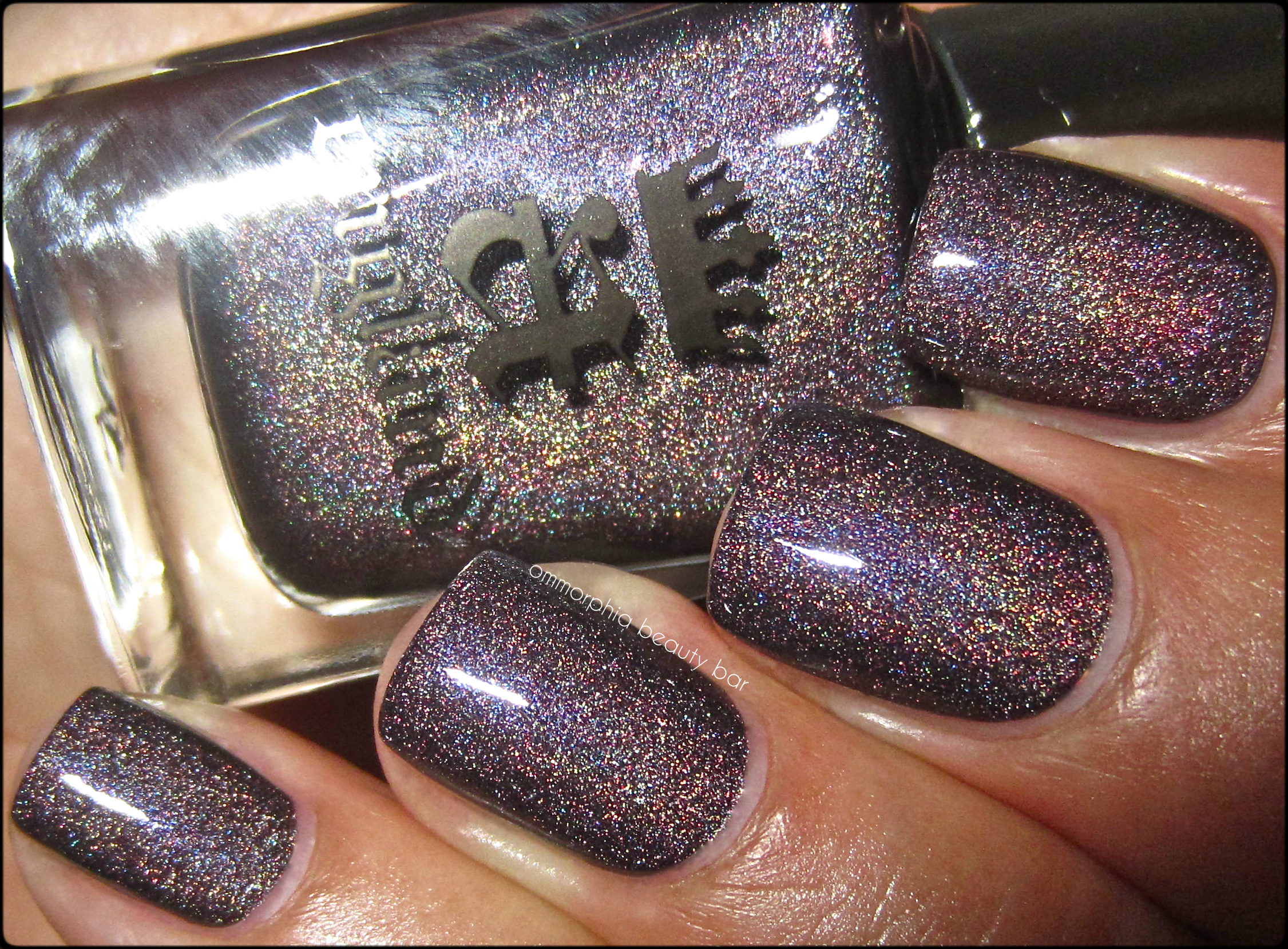
a-england ♦ Sleeping Palace
The Briar Rose: The Garden Court, Edward Burne-Jones (1890), source
The maiden pleasance of the land
Knoweth no stir of voice or hand,
No cup the sleeping waters fill,
The restless shuttle lieth still

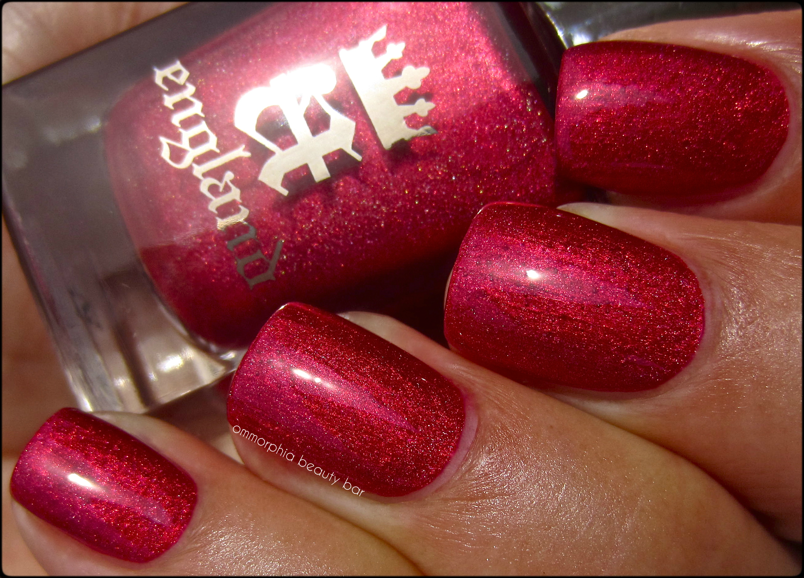
Briar Rose/Sleeping Beauty “Her lips a ruby glow of life while she lays lost in time” – a complex shade that is a true paradox; what appears as a rather milky and faded cranberry hue in dimmer lighting, comes to brilliant crimson life when full sun hits it, as well as casting out a subtle prismatic presence. Perfect flow, coverage and density to the formula, as well as a glossy natural finish. Coats applied: 2, plus top coat

a-england ♦ Briar Rose/Sleeping Beauty

a-england ♦ Briar Rose/Sleeping Beauty

a-england ♦ Briar Rose/Sleeping Beauty

The Briar Rose: The Rose Bower, Edward Burne-Jones (1893), source
Here lies the hoarded love the key
To all the treasure that shall be.
Come, fated hand, the gift to take
And smite the sleeping world awake
a-england – Rose Bower “Asleep in a bed of roses, her beauty still calls true” – a lustrous and true dark rose shade that holds an incredible luminosity albeit with the mildest prismatic effect of the four. The formula seemed the thickest of the group as well, but applies in a very easy manner and you barely need more than 1 coat for full coverage. Bonus: absolutely no staining left behind upon removal. Coats applied: 2, plus top coat
a-england ♦ Rose Bower

a-england ♦ Rose Bower

a-england ♦ Rose Bower

Sleeping Beauty by Edward Burne-Jones (1871), source
*This painting was created many years earlier by Sir Edward Burne-Jones, and not part of The Briar Rose series
Last word: Even were I not a fan of a-engand Lacquers (which we all know I totally am), I would still fall helplessly & madly in love with this new collection; apart from the stunningly gorgeous as well as season-transcending colours of each, the story of the Sleeping Beauty has always struck a chord in me from the time I was a little girl – the overt romanticism of the tale also holds ominous undertones and speaks to the duality of human nature. The shades themselves perfectly capture every moment of the fable, from their names to their colours, while the formula is in the a-england inimitable style: superb.
Briar Rose, Aurora, Sleeping Beauty … a rose by any other name definitely still smells as sweet, especially when interpreted by a-england, be it with this sublime collection of lacquers or Adina’s new Roses line of jewelry (reviewed here).
The collection is available now – check the a-england website for stockists, and feel free to follow via twitter/facebook for all updates
*Many thanks to Nikki and the amazing folks at Nail Polish Canada for their tireless help in getting this collection to me, despite all obstacles!
free viagra
cheap acipex
cheap amitriptyline

*Disclosure: Product samples provided for my unbiased consideration


