Filed In: nail polish
Essie – Winter 2012 Collection (swatches & review)

My initial thought when I first laid eyes on this collection, was that it seems to be quite an unconventional group of colours – especially for a “winter” theme. Then again, Essie has been taking things up a notch lately with their hues, so upon noticing the 2 sparkly shades included here, it occurred to me that each and every one of these hues seems somehow empowering – not to mention definitely intended to get your digits noticed

Essie’s Winter 2012 Collection is comprised of 4 crème hues, 1 jelly-like sparkler, and 1 finely compounded glitter. Broken down like that it may sound simple, but here’s the thing: the crème shades are ridiculously creamy and wearably vibrant, the jelly-ish shade has so many surprising levels to it, while crushed diamonds have nothing on the incredible brilliance of the glitter shade. All swatches are with Essie’s All In One Base Coat and No Chips Ahead Top Coat.

Snap Happy – a deeply saturated coral red hue, in a crème-jelly hybrid formula. The first coat looks more maraschino cherry-like albeit with amazing pigmentation, while the second coat deepens the colour (reminds of that boiled lobster red hue) and brings it almost towards neon territory. Self-levelling and with an ultra high-gloss finish, you may want to double up on the base coat as there may be some light staining. Coats applied: 2

in sunlight

shaded light

She’s Pampered – a deeply pink based red in the same crème-jelly format as above. and with a unique translucency to it, similar to that of sea glass. A more cool-toned red, this also applied in a self-levelling way and with a glass-like glossy shine at the finish. Base coat is a must here as well, in order to avoid any staining issues – which are light at best, and not bad as far as red hues go. Coats applied: 2

in sunlight

shaded light

Leading Lady – a deep berry/wine base colour, filled with red and fuchsia micro glitter. A slightly thick-leaning formula with an odd gelatinous-like texture, the first coat applied a touch patchy, with the glitter looking somewhat lumpy, although the 2nd coat made up for that by providing excellent coverage and applying in a surprisingly self-levelling way. There’s this gorgeous glass-flecked look to it, almost as though the glitter particles are suspended just at the surface level. The finish is semi-matte, so do not skip the top coat for an enhanced appearance as well as providing a smooth finish. Coats applied: 3 (for photo purposes only; 2 are actually more than enough)
PS: am I the only one who sees “raspberry jam” with this shade?!

in sunlight

macro

shaded light

with flash

Where’s my Chauffeur? – a beautiful robin’s egg blue crème shade AND a perfect clone of that iconic Tiffany blue colour, in a thinner formula than the others of this collection. The first coat seemed to apply slightly sheer and a touch streaky, but reached perfect opacity by the second coat. A truly stunning aqua hue, it also happens to be paradoxically vivid and muted at the same time – a really interesting effect. Totally self-levelling and insanely glossy at the finish, it is completely non-staining. Coats applied: 3 (very thin)

in sunlight

shaded light

Butler Please – an awe-inspiring vivid ultra-marine blue crème shade, in a medium thick formula that bears a unique texture; there almost seems to be an “elasticity” to the application with an unexpected spring-back effect, although this doesn’t affect the flow in any way. The first coat went on a touch streaky, but there was 100% opacity reached by the second coat – although I did notice a slight lumpiness which was resolved by a 3rd thinner layer. Bordering on, but not quite neon, this finishes semi-matte so make sure to apply top coat to truly appreciate every ounce of this beauty. BONUS: no staining, with a mess-free removal. Coats applied: 3 (thin)

in sunlight

shaded light

Beyond Cozy – a clear base hue absolutely brimming with antique silver incredibly fine glitter. I was surprised by how well it covered even at the first coat, but 2 coats provides a much denser opacity overall. There’s an “Old Hollywood” glamour vibe to this shade, like a screen siren’s lamé silver gown – but at other angles I see a more “oxidized tinsel” tone. Relatively quick-drying, the finish at the end was semi-shiny, although the glitter particles give off a brilliance of their own – a true paradox! For a perfectly smooth finish to the touch, either double up on, or apply a thicker top coat. Removal needs some elbow grease, but it seemed easier than some other glitters I’ve worn. Coats applied: 3 (thin)

in sunlight

in sunlight/alternate

macro

shaded light

with flash
Final thoughts: I’m getting tired of repeating myself, but once again Essie has hit it out of the park with this collection; from the excellent formulas, to the interesting mix of colours and finishes, there’s something here for all tastes. ‘Where’s my Chauffeur’ and ‘Butler Please’ are INSANE and should not be missed, especially if you’re a fan of blues, while ‘Leading Lady’ will have people giving your nails a double-and-triple take. As Essie herself so eloquently put it:
“… what better way to make a statement this winter, than with colour? After all, don’t we all deserve to be treated like royalty?”
… I couldn’t have said it better myself!

Kindly provided by Essie for my unbiased consideration


Dior – #751 ‘Marilyn’ Grand Bal Collection Holiday 2012 (swatches, comparison & review)

Dior’s Grand Bal Holiday 2012 Collection is sophisticated, visually beautiful, and full nostalgic old-world appeal. The packaging is some of the most luxe I’ve seen in a while, and the colours to be found in this collection are all eminently wearable and elegant. From the 4 nail varnishes offered, the only two that I felt were right for me, were #901 Diva (previously reviewed here) and this sexy red siren, #751 Marilyn. Then, there’s this adorable round bottle …
*All swatches are with base and top coats

Dior #751 Marilyn

beautiful packaging – inside & out

name clearly embossed on the unique gold box

#751 Marilyn – one of the truest red shades available, running neither too warm or cool-toned, but falling perfectly in between. With the unique round bottle shape and colour bringing to mind Snow White’s red apple, this vibrant hue was a pleasant surprise on many levels, starting with an absolutely STELLAR formula. Bearing an almost jelly-like quality in its slight translucency, it paradoxically manages to still give great coverage with the 1st coat, probably due to the excellent pigmentation. Almost a candy-apple red, I would say that ‘Marilyn’ might be a touch more blue-based, but still comes across as warm-leaning. Filled with exceptionally finely ground pink/magenta shimmer (only just visible to the naked eye), it also applies in a completely self-levelling manner and leaves behind an insanely glossy finish. BONUS: non-staining upon removal. Coats applied: 2

in sunlight

macro

shaded light

with flash

When I was recently on the search for a specific red colour, I came upon Dior’s #999 ‘Rouge Altesse/Red Royalty’ (review pending), and my first thought was that ‘Marilyn’ seemed to be a close match. I was both right and wrong; while the two seem to be in the same colour family, there are still differences between them, although in all honesty those differences are rather negligible at best. How they compared (note that 2 coats were applied):
index and ring fingers: #999 Red Royalty – a touch more orange based which makes it slightly warmer-toned, bearing a thicker running formula. Similar gloss and high level of pigmentation, but not as vibrant (a degree or 2 deeper in colour), with that well-known Dior “secret shimmer” – not readily apparent (unless seen in direct sunlight or with flash) for added depth. Non-staining as well.
NOTE: the brushes of all the lacquers in the holiday collection are not of the new chiselled paddle brush variety, but more like the older format, and with a significantly thinner and shorter wand – this does not affect application at all, however.
middle and pinkie fingers: #901 Marilyn

sampling of the two brushes

in sunlight

shaded light

with flash

#901 Diva & #751 Marilyn
Final thoughts: This colour is THE red shade I’ve been looking for, and finding it in a brand I trust and love, especially in a formula as amazing as this, makes this an excellent purchase in my opinion. Of course, I would have loved to have found this shade a week earlier when I wanted to wear it for my nephew’s wedding, but the collection hadn’t yet been released. Even though ‘Red Royalty’ is a near duplicate, I found the formula of ‘Marilyn’ easier to work with and I love how the shimmer manages to be present, but in an understated way. Then there’s the whole Marilyn Monroe association for me – a woman who happens to be one of my idols – how can I possibly resist this beauty after all that?
Retailing for CAD $26.00, I picked mine up at The Bay department store (Canada).

CHANEL – Le Vernis ‘Sky Line’ (swatches & review)

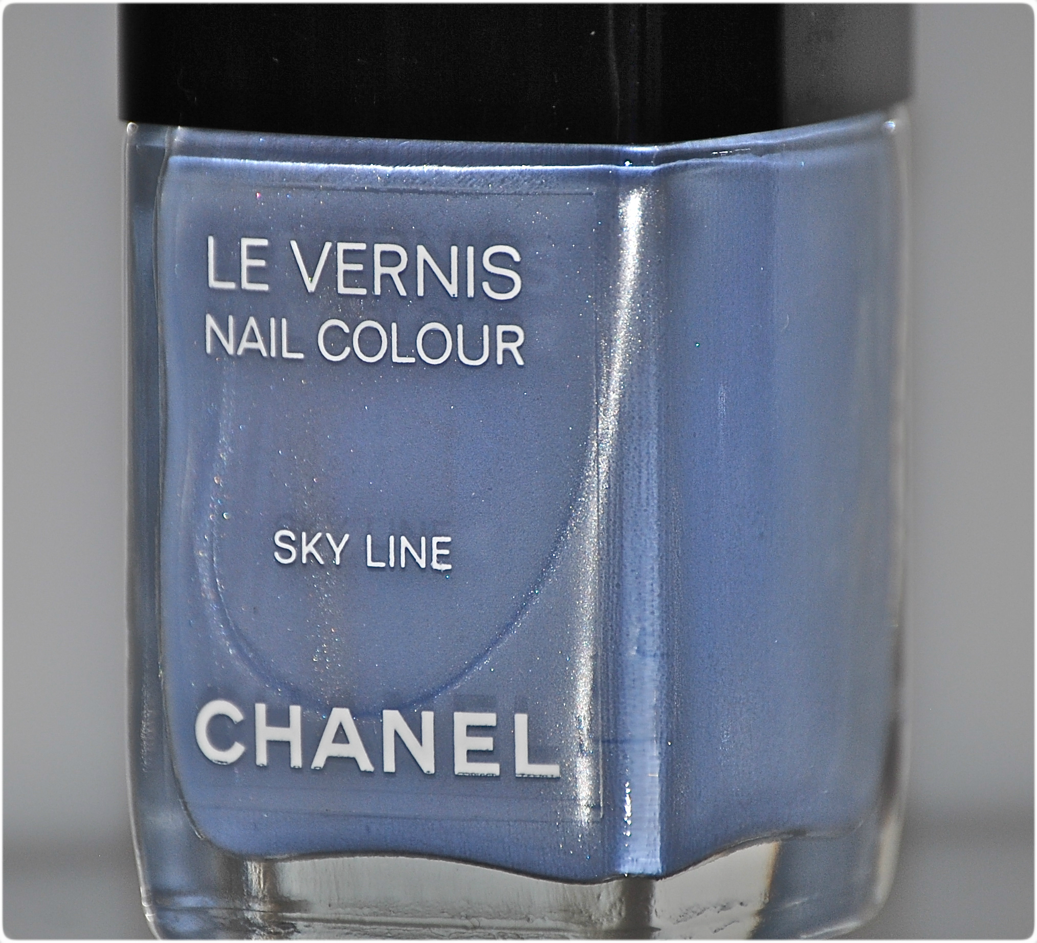
Early glimpses of CHANEL’s spring 2012 couture show, revealed the models wearing a light blue nail varnish; those quick peeks were all it took, and everyone began buzzing about ‘Sky Line’ – but it would prove to be almost unicorn-like in its elusiveness (especially for us Canadians). Then, when the first swatches started circulating, there was much said about its finicky formula. Did that stop me from wanting to add this beauty to my CHANEL collection of lacquers? Uh … not so much, obviously. How could I possibly pass up a shade as unique as this, and from a brand I adore?

Sky Line
buy generic cozaar online buynoprescriptionrxonline.com/generic-cozaar.html no prescription
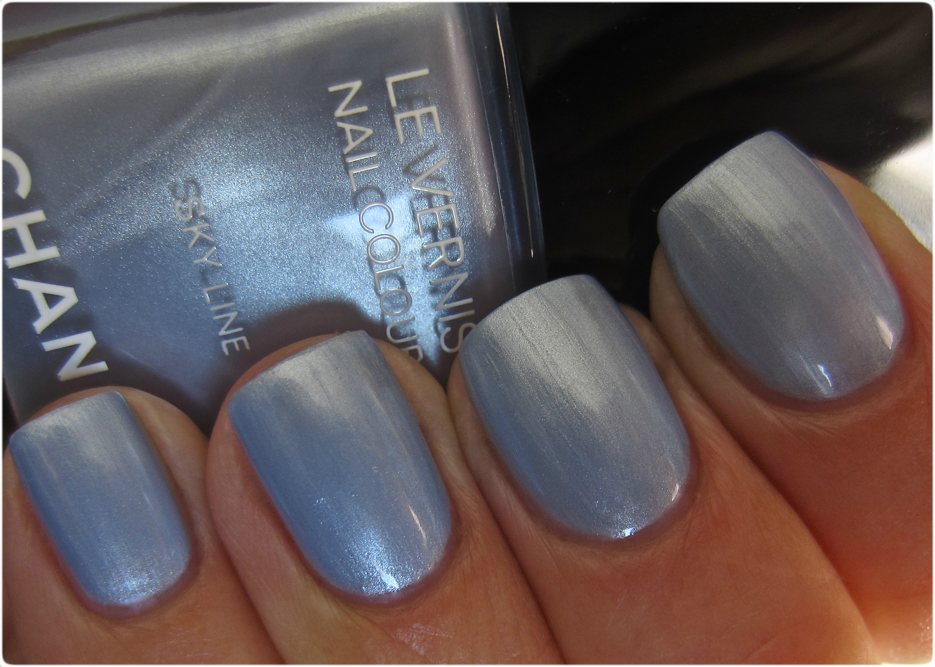
Sky Line – is full of surprises. An ethereal silvered cornflower-blue shade, there are pearly flashes that underly the entire look. The medium thick formula has an excellent flow, although the slightly frosty finish means you do need a steady hand in application to keep any visible brush strokes to a minimum. Dry time was unexpectedly quick, and while there is a lovely natural shine at the end, top coat not only enhances the colour, but helps to camouflage any imperfections. It should be stated that the camera really does emphasize the brush strokes in the following photos — all significantly less visible when seen with the naked eye. All swatches are with base and top coats. Coats applied: 2 – perfect coverage & opacity.
buy doxycycline online buynoprescriptionrxonline.net/doxycycline.html no prescription

in sunlight

in sunlight

with indirect lighting
in shaded light

in indirect shaded light
Final thoughts: Here’s the thing; I’ve talked often enough of my love for deep hues, especially crème shades, so I wondered if the only reasons I was drawn to this varnish was because a) it’s CHANEL and b) it’s a limited edition item. Well, I’d be lying if I said that those 2 reasons weren’t factors, but I surprised myself by how much I loved this shade — and the longer I wore it, the more I couldn’t stop looking at it. Something about this totally unique shade of blue, made me think “snow queen” with its icy overtones, and rummaging through my collection of varnishes yielded absolutely no look-a-likes, making me realize that I was right in not passing this up. Still, while neither a shade or a finish for everyone, there is no denying how original this colour is. Almost makes me look forward to winter. I said “almost”.
buy estrace online buynoprescriptionrxonline.net/estrace.html no prescription

*
NARS ‘Storm Bird’ Fall 2012 + fifty shades of grey … or, at least ten … (swatches, comparisons & review)

For fall 2012, NARS cosmetics has once again launched a collection full of an eclectic mix of colours, with a definitely modern autumnal vibe going on that ties everything together, as only François Nars can achieve. I’m always curious to what this creative artist will release as far as nail varnish is concerned, but ‘Storm Bird’ gave me pause; it wasn’t too long ago that the brand gave us another dark grey shade. Seems like grey is quite popular these days, which reminded me …
Ok – unless you’ve been in hibernation these past few months, you’ve surely heard of the frenzy caused by E.L. James’ trilogy of books, beginning with “fifty shades of grey” – a modern and titillatingly sexy story about a woman discovering the dark side to love. I was intrigued enough to buy the 1st book, but here’s where it goes sour for me; I was expecting some honest erotica (based on all the hype), and instead I feel that I got an updated Harlequin romance novel. Talk about a lunch-bag letdown … but the again, maybe it’s just me. After having read ‘The Sleeping Beauty Trilogy’ by A.N. Roquelaure (Anne Rice writing under a pseudonym) several years ago – a trio of sensually gritty books, everything else pales in comparison. But don’t take my word for it …
I digress – on to the lacquer!

‘Storm Bird’ is in a word, STUNNING. I was tempted to pass it over, thinking it was not different enough from NARS’ ‘Galion’ (previously reviewed here) to warrant investing in, but after swatching it quickly at the counter, I knew that I had nothing like it. A perfectly flowing & amazing formula, with excellent opacity and colour saturation, the 100% self-levelling finish gave way to a final shine that was literally glass-like; insane, I tell you! The colour of this luxurious crème varnish falls somewhere between concrete and dove, with definite blueish undertones in its base that seem to add a milky veil in certain lights, while at other times it can appear more dense – rather like gathering storm clouds, and just as impressive. The following swatches are all with Seche Clear Base Coat and Seche Vite Top Coat. Coats of lacquer applied: 2

in sunlight

shaded light

with flash

As the title of this post suggests, I was convinced I had easily at least 50 grey shades to compare ‘Storm Bird’ to, but after rummaging through my collection, I was surprised to find only 10 that met the criteria, discarding anything metallic, or with obvious shimmer and/or glitter. The only exception was for YSL’s ‘Stormy Grey’, both for the name and for the fact that the shimmer seen in the bottle paradoxically stays muted once applied – PLUS, it was the first brand to kick-start the whole modern grey trend. For the following comparisons, I’ve chosen to show them on a nail wheel (alone first, with my nail swatches second), in order to see all the hues together against ‘Storm Bird’ – which is the center shade at the top. All swatches are with base + top coats once more, and 2 coats of lacquer, with the exception of OPI’s ‘Suzi Skis in the Pyrenees’ that needed a 3rd to achieve a deeper opacity.
*By clicking to enlarge the nail wheel photos, you’ll get a better appreciation of all the shade variances
To the left of the ‘Storm Bird’ swatch, from top to bottom:
- NARS ‘Galion’ (reviewed here)
- OPI ‘Nein, Nein,Nein … Ok Fine!’ (reviewed here)
- Essie ‘Power Clutch’ – (reviewed here)
- YSL ‘Stormy Grey’
- MAC ‘On the Prowl’ (Hello Kitty Collection)
To the right of ‘Storm Bird’, from top to bottom:
- Deborah Lippmann ‘Stormy Weather’ (reviewed here)
- Gosh ‘Miss Grey’ (reviewed here)
- China Glaze ‘Concrete Catwalk (reviewed here)
- OPI ‘Suzi Skis in the Pyrenees’ (the Spain Collection)
- Dior ‘Gris Montaigne’ (reviewed here)
As is shown, clearly nothing is even remotely close to ‘Storm Bird’; the YSL has a similar blueish base, while the other hues fall anywhere between being much darker, too light, some slightly sheerer, others too green based. Yes … this beauty is definitely unique!

nail wheel, in sunlight

nail wheel, shaded light

nail wheel, with flash

Storm Bird nail swatch & comparisons, in sunlight

Storm Bird nail swatch & comparisons, shaded light

Storm Bird nail swatch & comparisons, with flash
Final thoughts: For a colour that is as unassuming as “grey”, it’s surprising how many degrees of it there are out there and how each one offers something different, from bold & vampy, all the way to subtle and ethereal. ‘Storm Bird’ falls somewhere in the middle, bearing enough intensity to stand out on its own, but still softened somewhat by its blueish undertones, to make this a work-friendly shade – which can easily make the transition for after hours. The formula alone is worth investing in; it almost applies itself WITH the added bonus of it being completely non-staining. Available at all NARS counters right now, this is the grey shade you want to be wearing. Seriously.

*Disclaimer: Some products provided by the company/PR for my unbiased consideration
Sephora + Pantone Universe – ‘Reflecting Pond’ Jewel Lacquer (swatches, comparisons & review)

I have a confession to make: I don’t really know all that much about Sephora’s 2nd collaboration with Pantone, and I only picked up one item from the previous collection (which I STILL haven’t reviewed), but as soon as my eyes landed on ‘Reflecting Pond’, I was captivated. Something about murky, aquatically-themed hues just get to me every single time. Probably has something to do with the fact that I’m a water sign … or it could be the storm-tossed allure of this lacquer …

Sephora + Pantone Universe ‘Reflecting Pond’

Sephora + Pantone Universe ‘Reflecting Pond’

the beautiful opalescent box

‘Reflecting Pond’ is a jewel, and just as luxurious colour-wise. Starting with the opalescent box it comes in – which is pretty enough in its own right, the densely pigmented, medium-thick formula makes application almost effortless. The charcoal infused teal of the base colour is filled to the brim with ultra fine brilliant teal shimmer “dust”, along with some deep blue, scattered green & lavender/pink specks throughout, which lend some elusive indigo flashes to this shade (seen clearer in direct sunlight) and a complex depth of tone. Indoors turns ‘Reflecting Pond’ into a murky & blackened teal, leaving behind an almost metallic after-image (really weird and cool effect, actually), but I love how the sides of the nail look like a frame for the gorgeous center teal colour. Brush stroke-free and self-levelling, the final finish is somewhat dull; addition of top coat is an absolute must, as it literally brings this beauty to life.
buy alphagan online myindianpharmacy.net/alphagan.html no prescription
The square bottle shape is a nice touch as well, made with heavy, sturdy glass and while the wand may seem a little long, I found the brush to be well formed, with just the right amount of length & flexibility to allow for a fuss-free application. Bonus: absolutely no staining upon removal. Coats applied: 2
Unique touch: on the back label of the box you’ll find a box with a colour swatch and a corresponding number, in case you want to paint your walls the same shade! According to Sephora:
What it is:
A thrilling collection of nail lacquers inspired by exotic gems, precious jewels, and vivid natural beauty.
What it does:
Fall under the spell of the Alchemy of Color Collection, an enchanting collaboration between Pantone Universe and Sephora that marries the hottest shades of the season with exclusive formulation and finish. The collection includes a kaleidoscope of colors and each of the multi-dimensional lacquers feature an innovative texture and futuristic finish, from metallic, to sparkle, iridescent, and never-seen-before metallic matte. The formulas are long-wearing, chip-resistant, and promise full-color payoff. Bring the brilliant hues to life as you mix and match to create your own magic.
What else you need to know:
This collection takes inspiration from Pantone’s View Colour Planner Autumn/ Winter 12-13 Book, predicting a radiant color breakthrough in fall 2012 and a leap into bright reds, energizing oranges, and sumptuous purples. Each formula is formaldehyde-free and dibutyl phthalate (DBP)-free.
buy amaryl online myindianpharmacy.net/amaryl.html no prescription
*All swatches are with Seche Clear Base Coat and Seche Vite Top Coat, but I did notice some shrinking away from the nail edges after this step – an obvious sign of incompatibility.

in sunlight

alternate angle
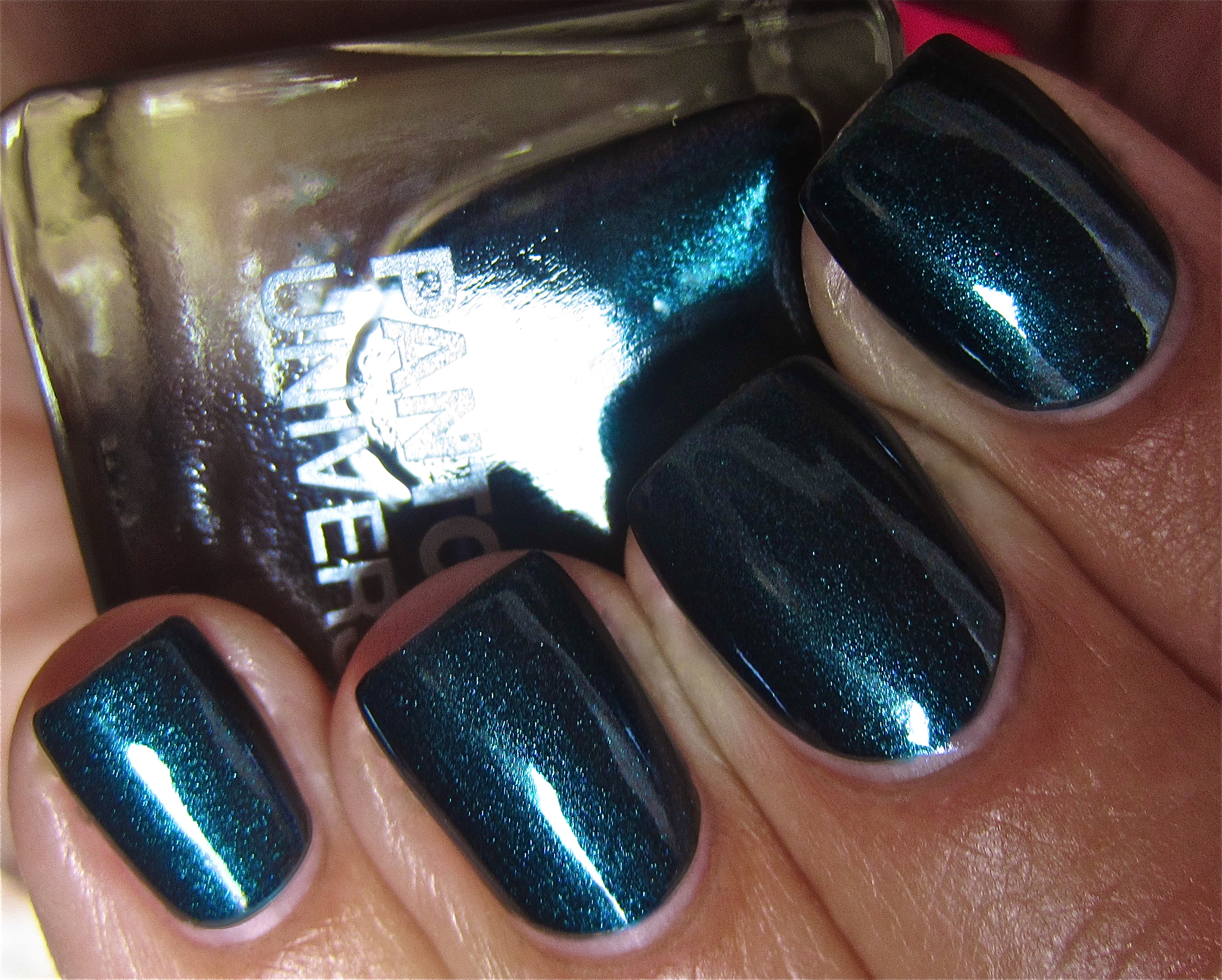
indoors

in shade

with flash

Going through my collection of polishes, I came across several that are in the same colour family as ‘Reflecting Pond’, but I narrowed things down to Deborah Lippmann’s ‘Don’t Tell Mama’ – for being the closest in base tone, and Nailtini’s ‘Stinger’ (previous reviewed here) – for having a similar duo coloured effect. All swatches are with 2 coats of lacquer, as well as base & top coats. How they compared:
- index finger: Deborah Lippmann ‘Don’t Tell Mama’ – the thinnest flowing formula, almost identical blackened teal base with a pine green ultra fine shimmer – no other colour flashes, the darkest in overall tone, very glossy natural finish
- middle & pinkie fingers: Sephora + Pantone Universe™ ‘Reflecting Pond’
- ring finger: Nailtini ‘Stinger’ – formula, flow & opacity similar to ‘Reflecting Pond’, underlying base shows more of a prune hue (1st coat), visible purple overtones (naked eye), much more prominent cobalt flash with shimmer leaning more towards emerald, superb glossy finish

in sunlight

alternate angle

indoors

in shade

with flash
Final thoughts: I am a total sucker for these types of shades; apart from its obvious brooding qualities, I love all the complexities of colour and tone that go into ‘Reflecting Pond’. The formula was unexpectedly thick, but very easy to work with nonetheless and even though you can almost get away with one coat, I highly recommend a second as it enhances the vivid colour of this beauty. I passed on the other 4 shades released – pretty hues, but nowhere near as eye-catching; I’m not sure at this point if they’re limited edition, but the collection is definitely a Sephora exclusive. The price seems to be quite fair as well, coming at CDN $11.00 for 11 ml/.37 fl oz, slightly more than an OPI but definitely less than a CHANEL. Definitely worth seeing with your own eyes – but be forewarned of its mesmerizing effect!
buy antabuse online myindianpharmacy.net/antabuse.html no prescription