

As I mentioned in my previous post on the ‘Waterlily’ & ‘Forget-Me-Not’ scented lacquers (here), I picked up 3 out of the 4 items from Dior’s Spring 2012 Garden Party Collection – here is the third item I was lusting over: the Couture Eyeshadow Palette in #441 Garden Pastels (the fourth item I’m presently coveting, but haven’t come across YET, is the new blush released with this collection … patience…). So many details about this palette called to me, starting from the simple yet dainty pairings of shades, to the jaw-dropping effect of the raised roses of this product – literally appearing like a breath of spring in one compact.

Of course, Dior’s iconic blue foil box with the embossed silver lettering … so simple, yet so chic.

The top of the box, with everything clearly stated – love it when brands do this!

I’m a huge fan of compacts being housed in an individual velour sleeve, great protection especially when travelling.

And finally … the compact!

A closeup view of ‘Garden Pastels’ – look at the exquisite detail! These five buttery-soft shades, while not intensely pigmented, nevertheless impart enough hue to be more than just a mere wash of colour. As representative of a springtime collection, I actually prefer a more delicate range like this, and what makes this palette stand out for me was the quality of the shades and the modern kick each colour gets by its lustrous shimmer. Bonus: absolutely no fallout experienced.
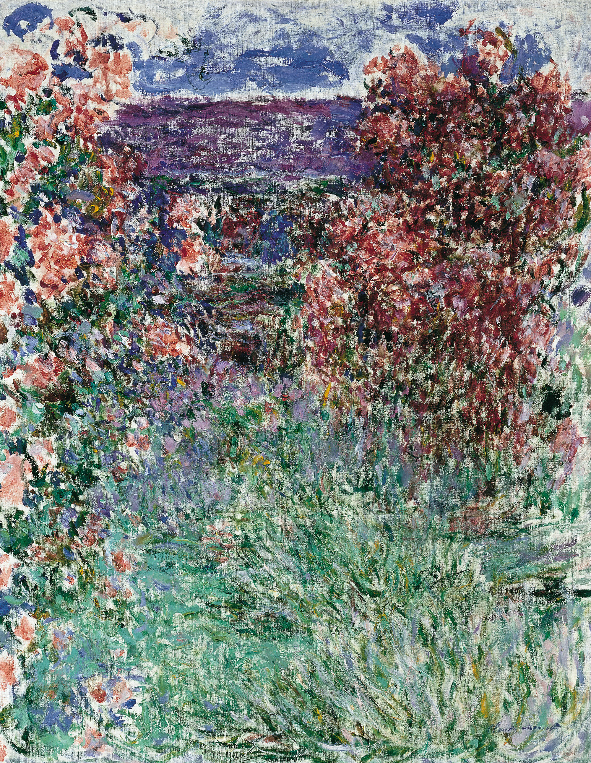
– The House Among the Roses by Claude Monet (1925)
The above painting by Claude Monet, apart from being by one of my favourite artists, so perfectly captures the very essence of this ‘Garden Pastels’ palette.

In clockwise order and beginning at the top left corner, this celery green shade bears an even shimmery finish that sometimes flashes with a slight bronze-y glow, applying exceptionally smoothly – I found it could be easily built up to a deeper intensity if desired.
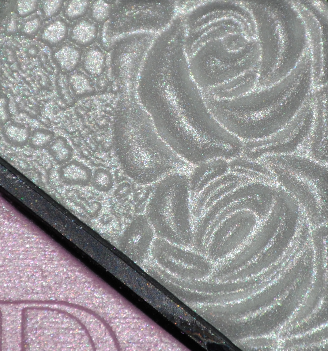
The top right shade, an icy winter white hue, had a touch more translucency than the others, making it an ideal shade to be used as a highlighter (inner eye corner), as well as on the brow bone.
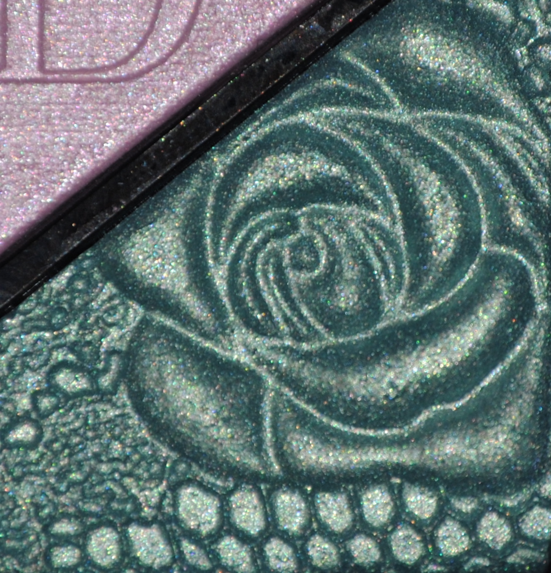
The bottom right shade is a delicate seafoam green, and for a colour that is usually intensely pigmented, I love how wearable this hue is – never overpowering but always complimenting every look.
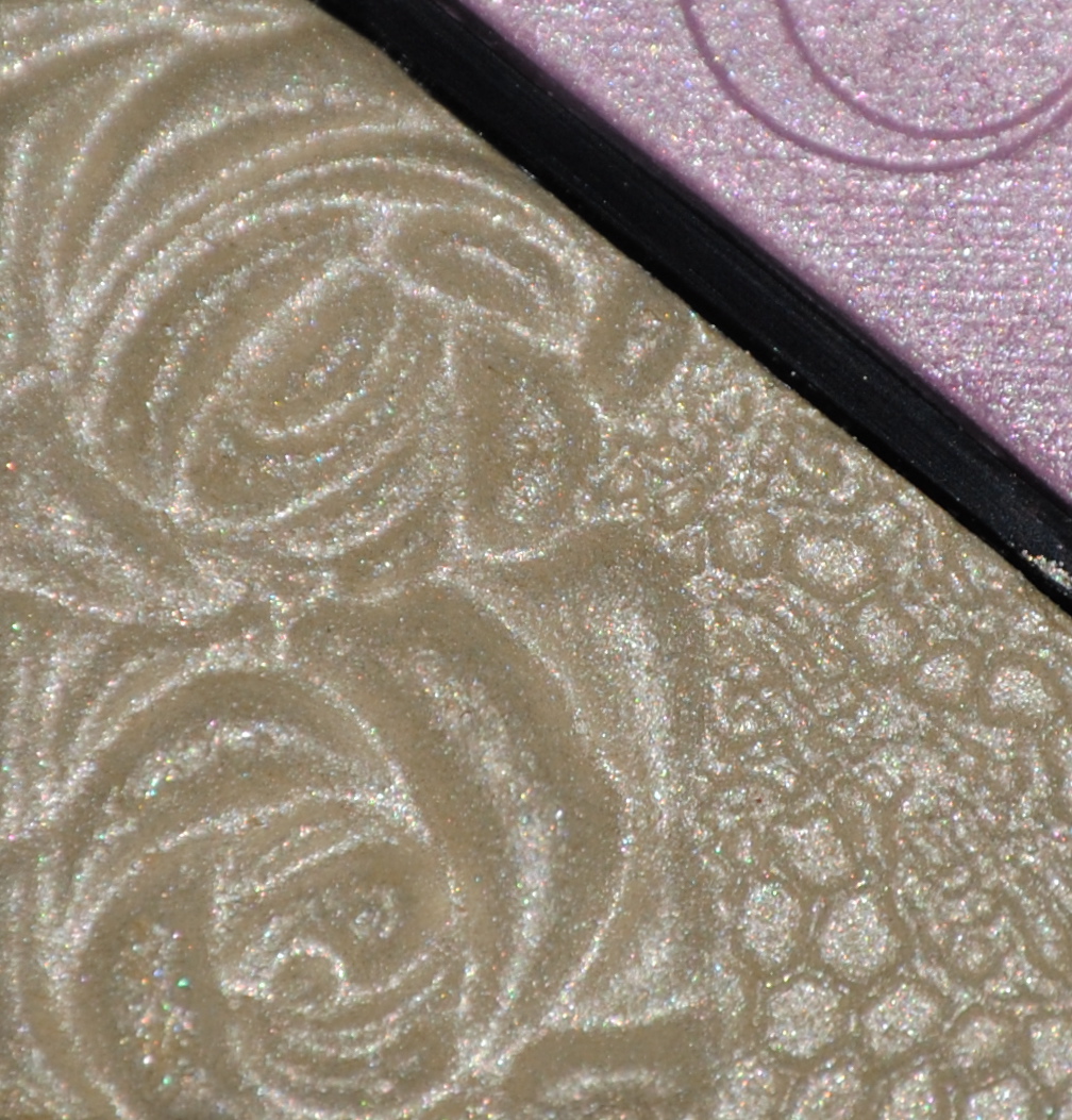
The bottom left shade is a softly shimmering ivory, neither leaning too warm or too cool, making it suitable for all skin tones. Again, this shade can also work well as a more subtle highlighter, especially when used in the inner eye corner.
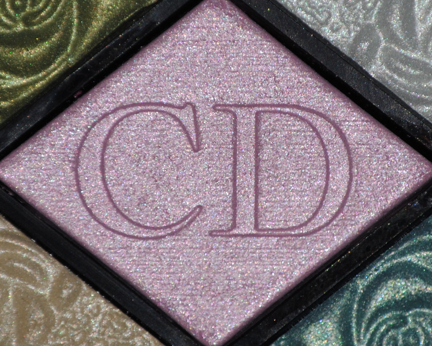
The center shade is a blue-leaning pink, but I found that it worked even with my light olive complexion. A perfect shade for the eye crease, an unexpected bonus was the stunning lavender shade it produced when layered over the paler green hue of this palette.
The following swatches are all on skin primed with Guerlain’s Linger de Peau Foundation in #03 Beige Naturel (not yet reviewed) and are shown from left to right in the same order as the above shade breakdown.
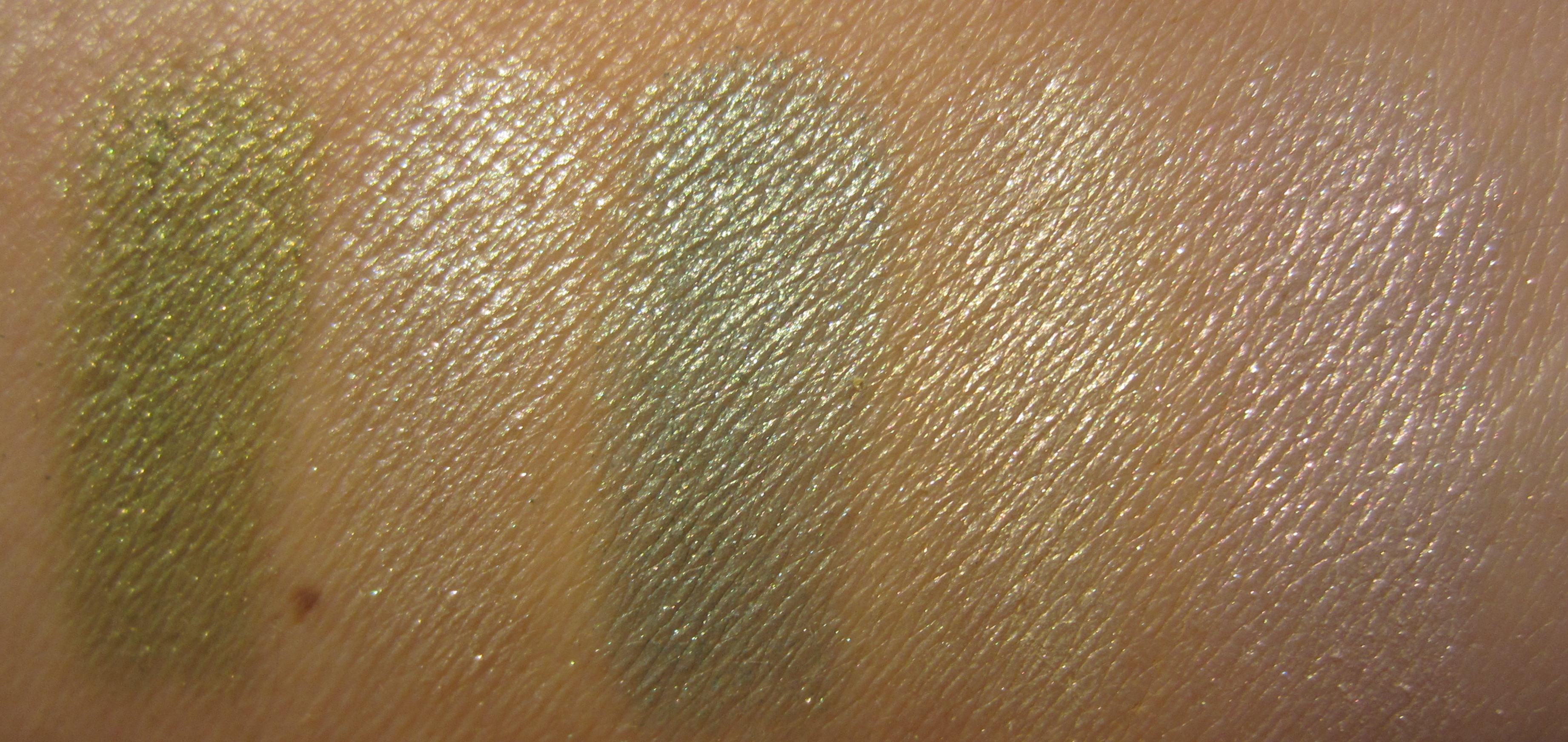
In natural light, the shades all appear warm, with the shimmer lending them an incandescent glow … much like a watercolour painting.
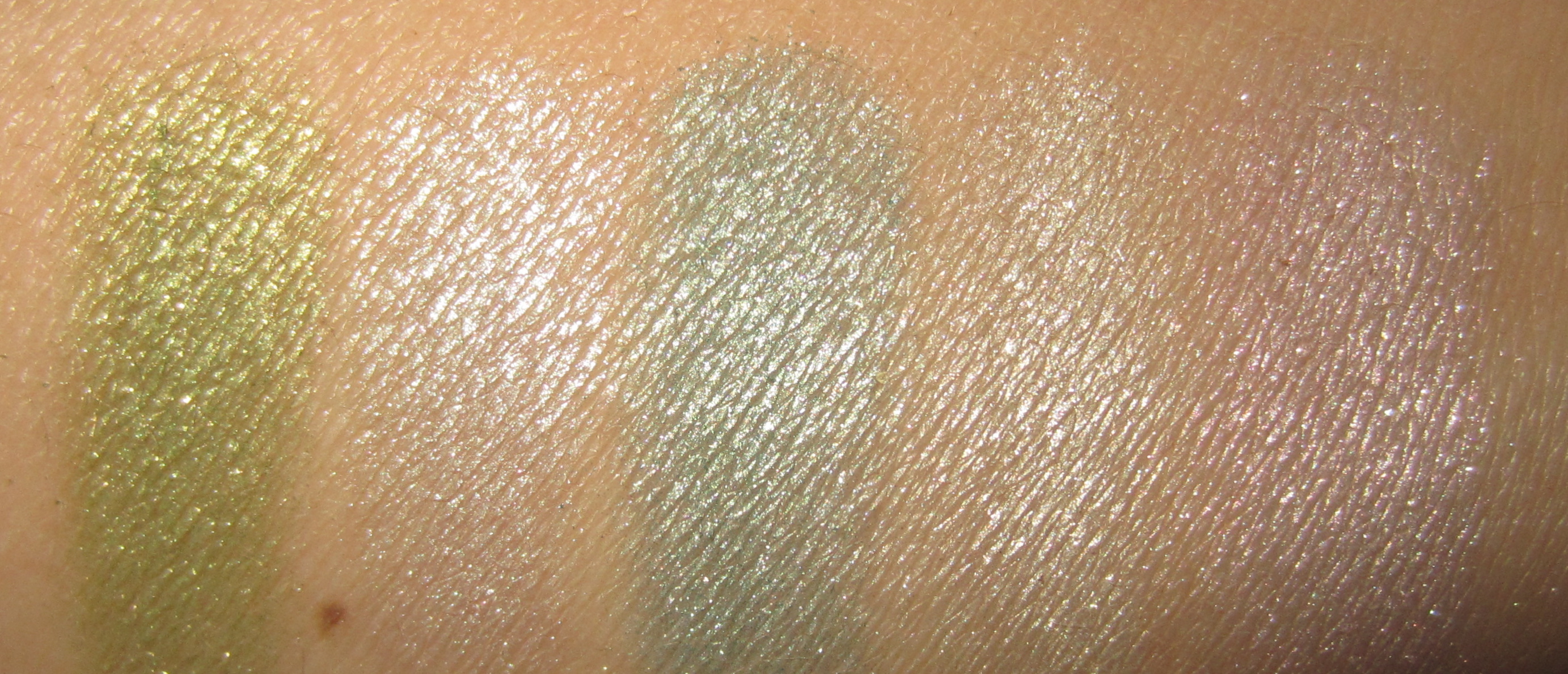
Flash emphasizes the shimmer and gives a clear indication of each shade’s true palette colour.
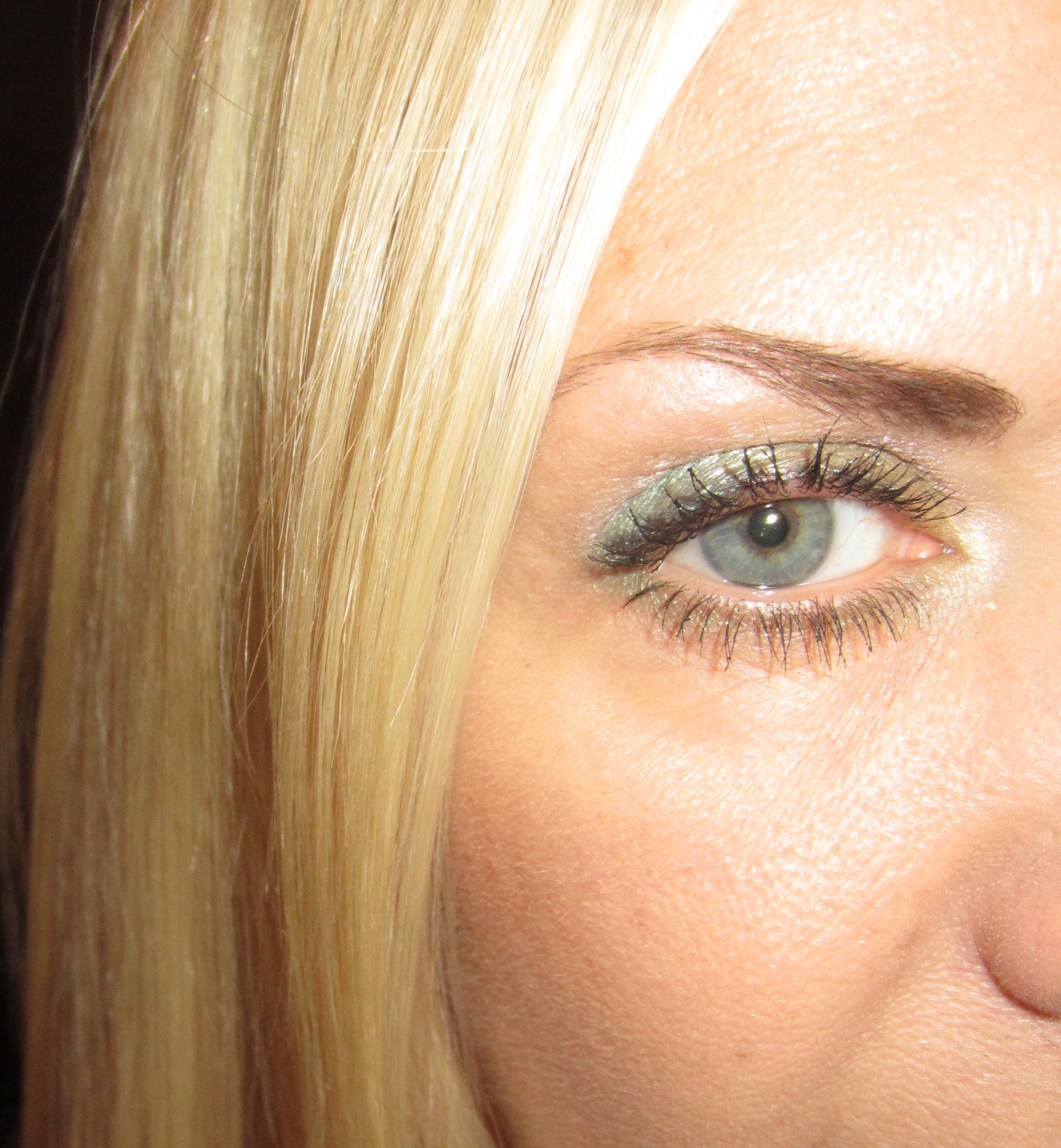
For the following photos, I primed my eyelids with NARS’ Smudge Proof Eyeshadow Base. For the sake of the swatches, I actually used all five shades for this look, although ordinarily I would probably play with at most three from any single palette. I applied the pale green all over the lid with the white on the brow bone as highlighter. The pale aqua was used to line the upper eyelid as well as on the outer third of the eye for more emphasis, while the rose shade was applied in the crease for a unique depth. The pale green was also used under the eye as liner, followed with a layer of the ivory – also used in the inner eye corner area. Giorgio Armani Eyes To Kill Lash Lengthening Mascara (not yet reviewed) was applied on lashes, CHANEL’s Espiègle Blush as well as Lumière Sculptée Highlighting Powder (previously reviewed here) on cheeks, as well as CHANEL’s Rose Merveille Natural Finish Pressed Powder to complete the look.
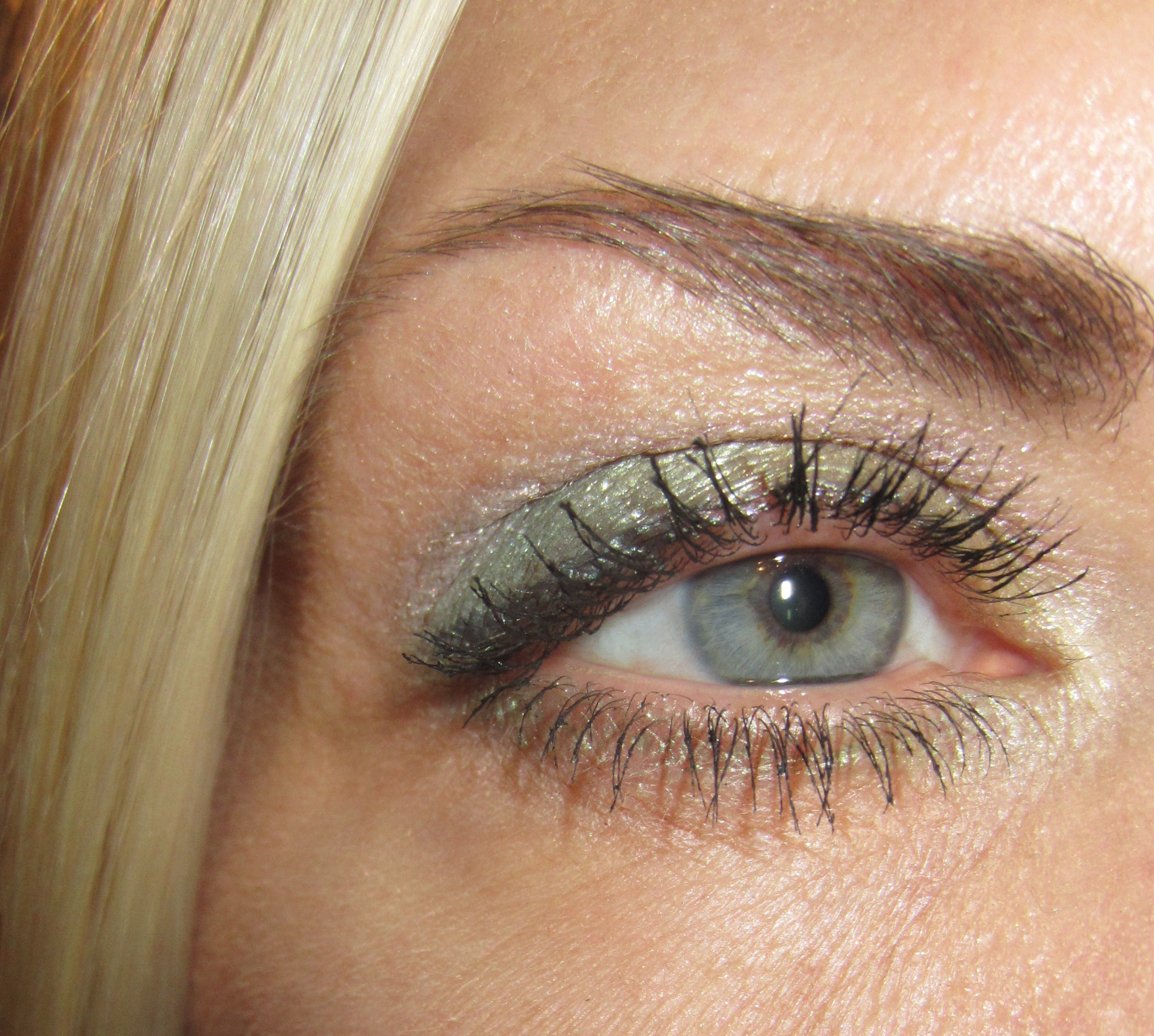
In the above look, you can just make out the pale lavender hue created by the rose shade in the crease.
In keeping with the ethereal nature of this palette, I opted for a delicate rose-like flush on the cheeks.
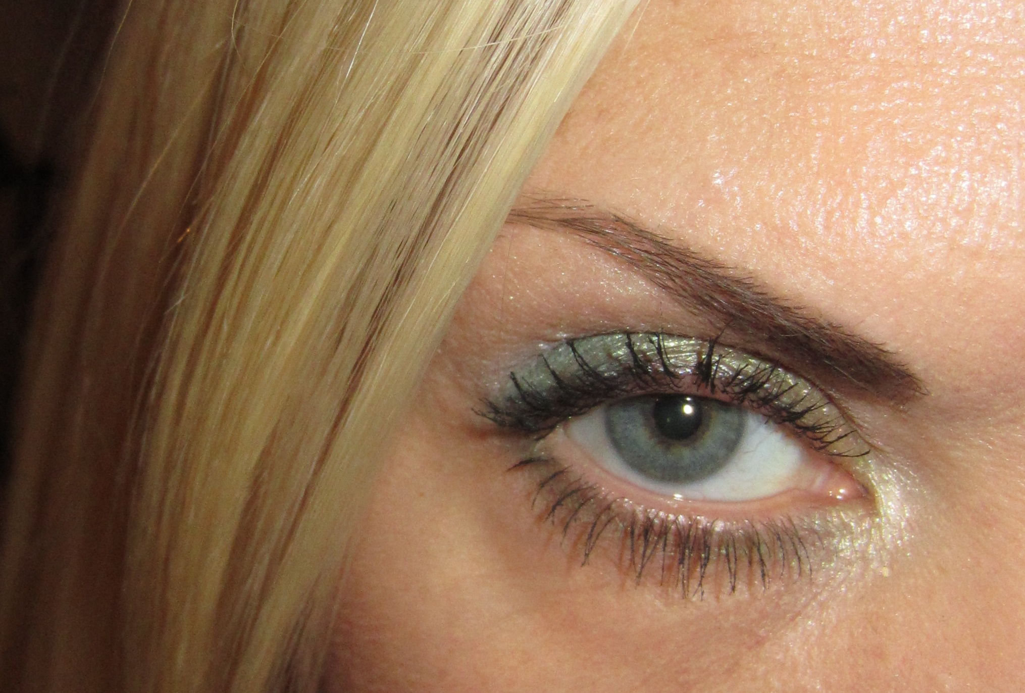
Even if the the green of the palette and my eye colour may seem a touch matchy-matchy, I still love the freshness of this shade.
Final thoughts: I fell in love with this palette from a promo photo, and seeing it live exceeded my expectations. Shimmery pastel hues are not always the easiest to wear, as they can sometimes appear dated, but what I love about this palette is how the finely milled powder of all five shades makes it so easy to layer them and thus create several new combinations, or applied singly as a sheer veil of colour for a more subtle look. A limited edition eyeshadow palette, ‘Garden Pastels’ would make a lovely addition for any beauty lover … or art collector!
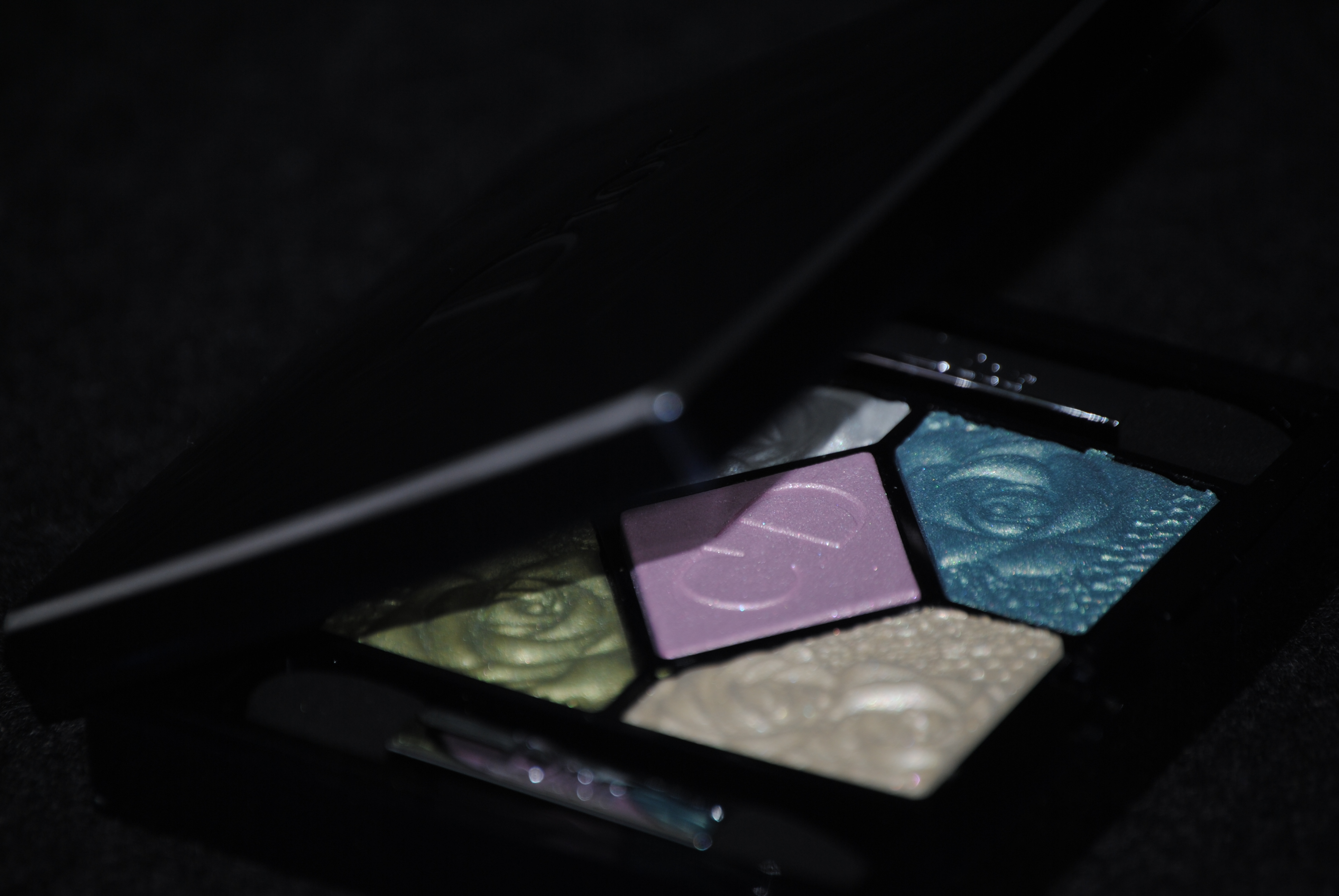
*Image credit



36 Responses to Dior #441 Garden Pastels – Couture Colour Eyeshadow Palette for Spring 2012 (swatches & review)