

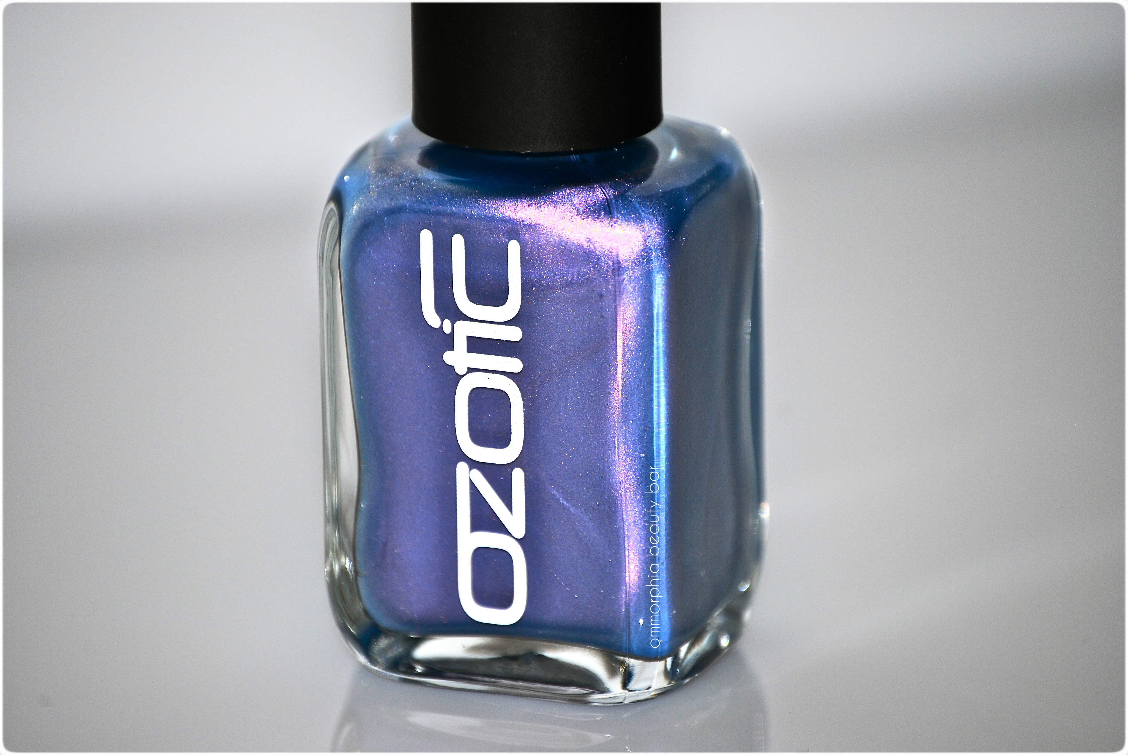
Ozotic by piCture pOlish may be a brand that is new to me, but I have long admired the line’s many unique shades & finishes – as initially seen from reviews by my fellow bloggers. If multi-tonal and/or duo chrome hues are your Achilles Heel, then you’re in luck, for something you will NOT find among the Ozotic range of lacquers, are your average mono-coloured or crème finishes.
All swatches are with base and top coats.
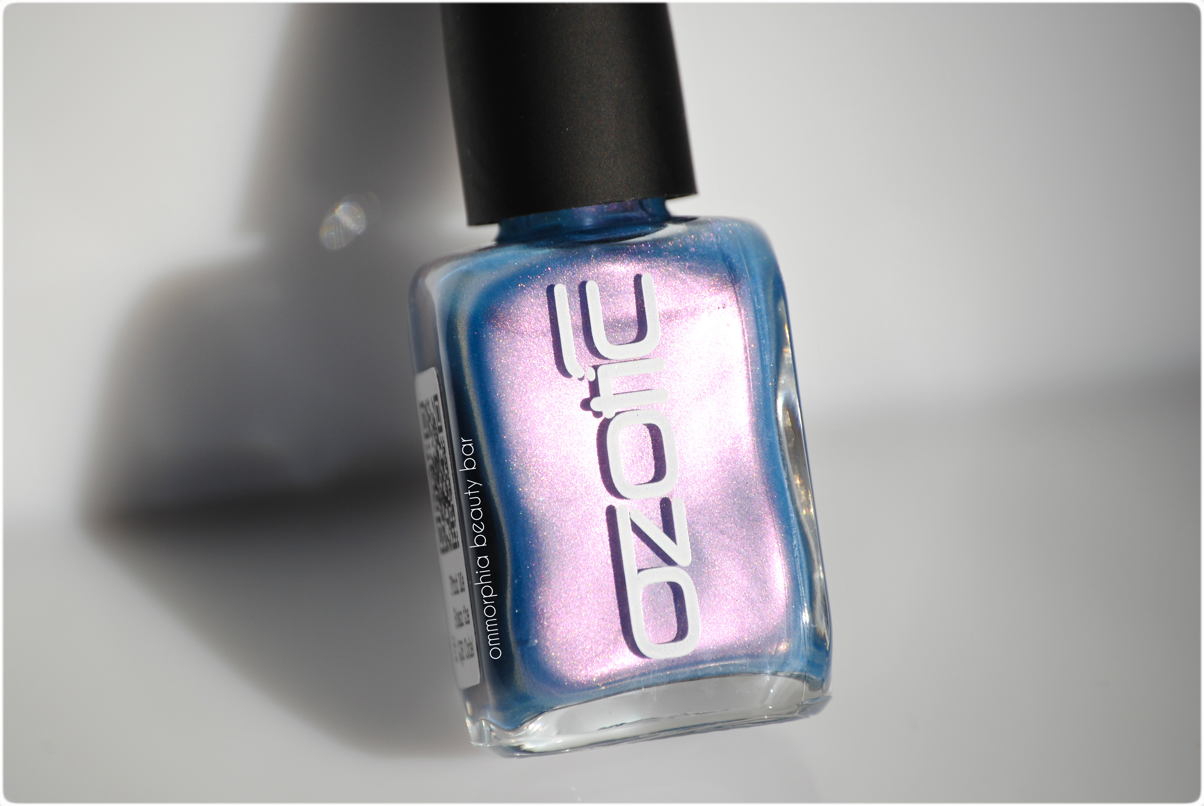
Ozotic #744 (in sunlight)

Ozotic #744 (CAD $14.50 11 ml) – a lavender base hue with an obvious pink/lilac duo chrome colour shift and random prismatic specks throughout. The medium-density formula is quite easy to work with, as the polish goes exactly where applied without any dragging or pooling – any would-be visible brush strokes are kept to a minimum. Its natural finish is quite shiny, although dry time seemed to take a little longer than average – be careful to not rush your coats. One thing that needs to mentioned, is that I found the brush wand to be a bit on the long side, which by itself wouldn’t necessarily be a bad thing, but the accompanying brush head is rather long and floppy as well, making for a tricky application. I suggest you load up your brush with polish, then try to apply as little pressure as possible when painting, for optimum effectiveness.
The versatility of this lacquer is something I appreciate as well; the first two swatches (figs. 1 & 2) are 2 coats of #744 over a ridge-filling base coat, whereas the last two swatches (figs. 3 & 4)are 1 coat of Ozotic #744 over the inky blue base of nails inc. ‘Belgrave Place’. In my opinion, when #744 is left on its own or layered over a light/white base, the colour shift is at its strongest and gives of an almost ethereal effect. Layered over a deep blue/dark base may take away from the duo chrome flash a bit, but the resulting colour is almost glowingly intense. Either way, it’s becomes something totally unique.
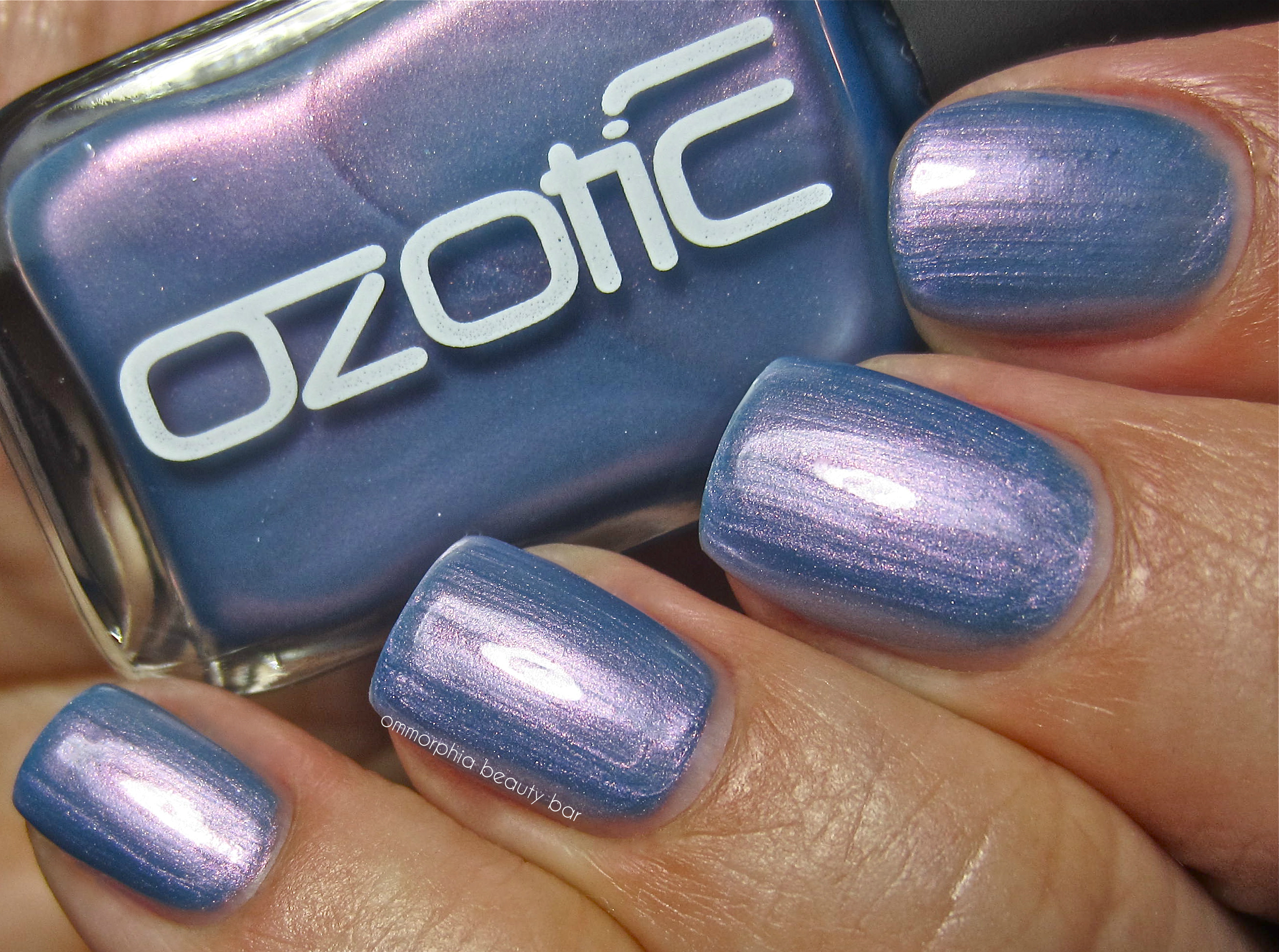
fig. 1 – Ozotic #744
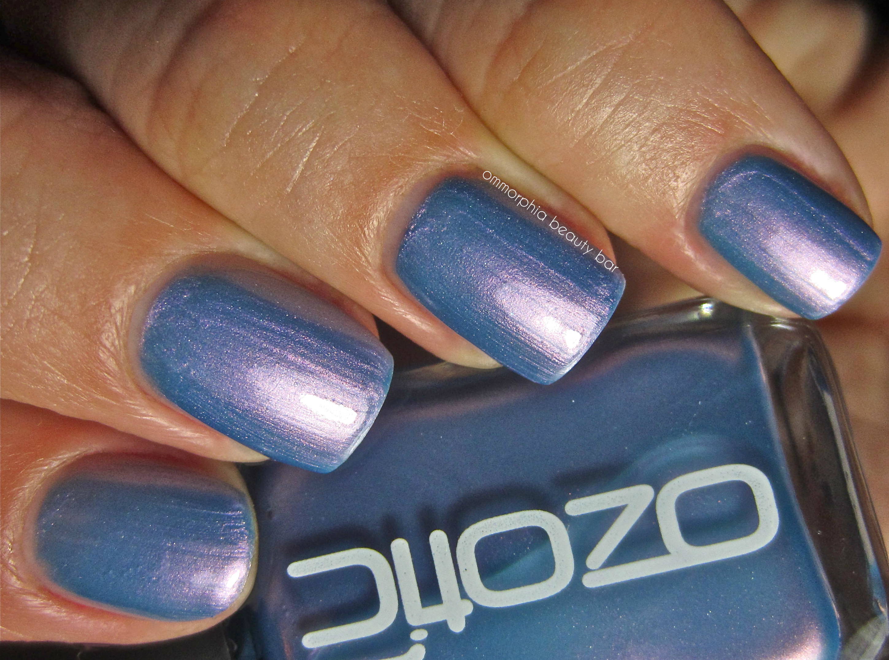
fig. 2 – Ozotic #744

fig. 3 – Ozotic #744 – layered over nails inc. Belgrave Place
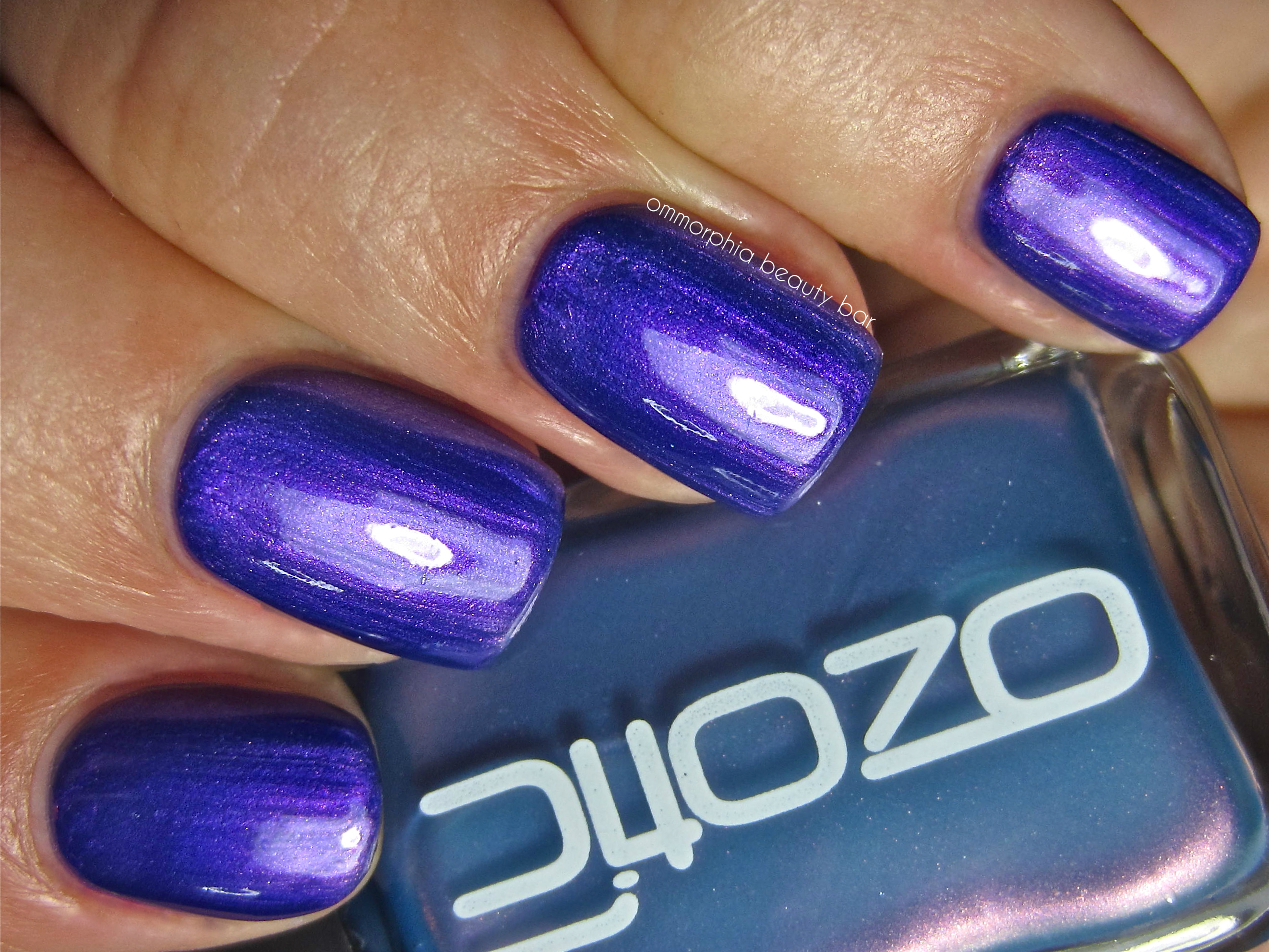
fig. 4 – Ozotic #744 – layered over nails inc. Belgrave Place
Last word: The last thing I expected to see, was the violet explosion of colour when #744 was applied over a darker base; even when worn on its own, I loved the melding of cornflower blue and flashes of dusky pink, while the fact that this pastel-looking shade proved completely opaque at 2 coats, was another nice and unexpected surprise. My only issue lies with the brush, something that definitely needs to be addressed and tweaked, as the present version can prove to be a little daunting in less experienced hands – not enough to be a deal-breaker, but definitely something to know in advance.
You can find the full range of piCture pOlish products through their website, or feel free to follow via twitter,facebook, Pinterest or Instagram
*Disclosure: Product sample provided by the company/PR for my unbiased consideration




16 Responses to Ozotic by piCture pOlish – #744