
Filed In: nail polish
CHANEL #583 Taboo (Limited Edition) & a comparison

CHANEL, long the master of covetable nail lacquers (amongst other products), has done it again with the release of their limited edition shade, #583 Taboo. Sure to stand tall amongst such cult faves such as Jade, Nouvelle Vague, and Ciel de Nuit, this nocturnal hue is almost hypnotic to look at; what at first appears as a shimmery vampy hue, bears a surprise with each brush stroke and true to CHANEL’s inimitable style, is destined to spawn many look-a-likes. I can guarantee that none will come close, however.

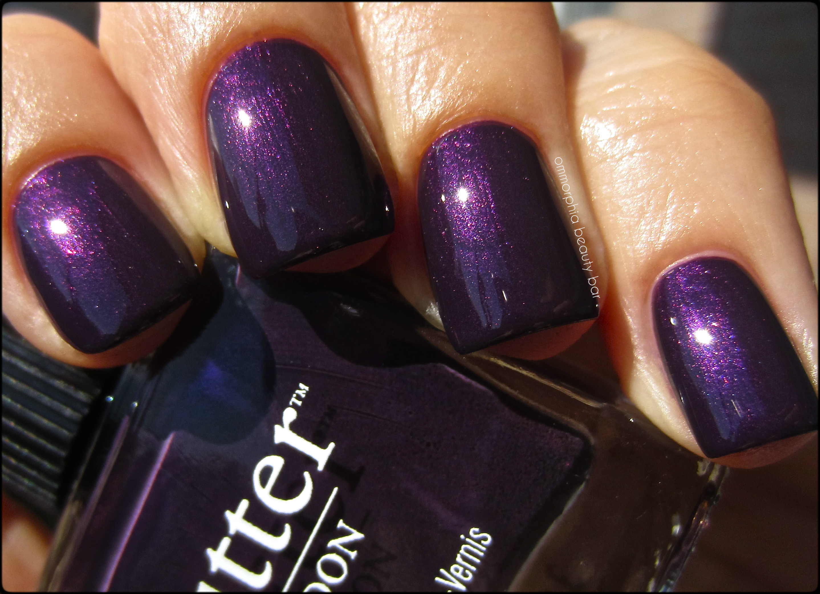
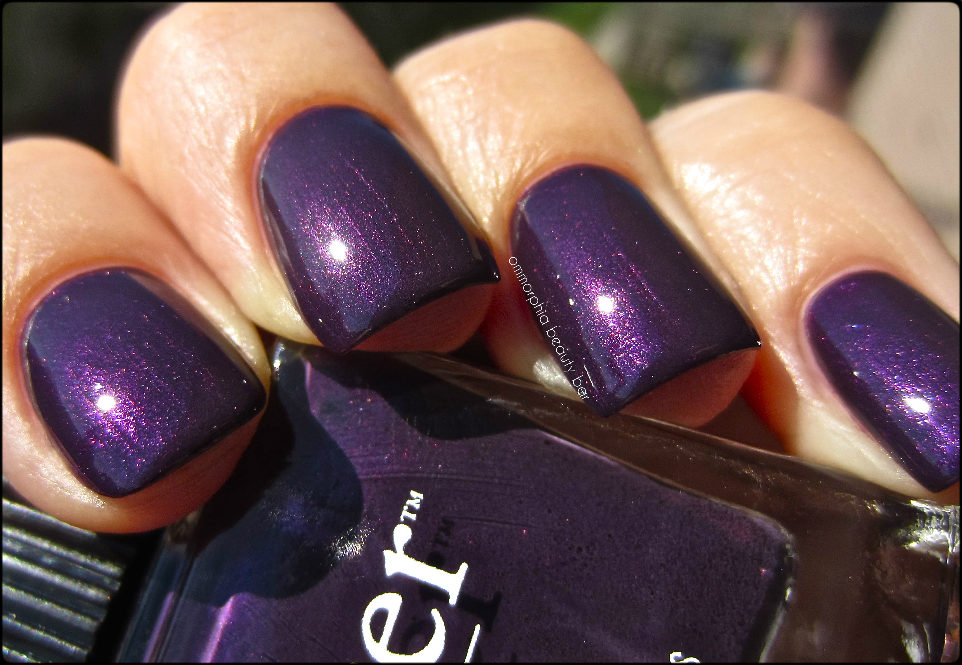
CHANEL #583 Taboo

CHANEL #583 Taboo

CHANEL #583 Taboo

CHANEL #583 Taboo (CAD $27.00) – a complex multi-chrome eggplant/wine base hue filled with ultra fine ribbons of purple and burgundy shimmer throughout and with mega colour shifting properties that throw out purple/indigo flashes, depending on the angle and lighting. The contents at the bottle’s neck appear rather inky in tone, belied by the application, which lays down more dark violet at the first coat. Pigmentation is STELLAR and the flow is simply phenomenal, while the final result is of that lit-from-withing glow which I absolutely adore – very much like a banked fire. Mysterious, sensual, provocative and intriguing — this shade is all that, and more, with the added bonus of absolutely no staining left behind upon removal. Coats applied: 2, plus top coat (although its rich colour saturation can easily make it pass for a 1-coater)

CHANEL #583 Taboo

CHANEL #583 Taboo

CHANEL #583 Taboo

CHANEL #583 Taboo

CHANEL #583 Taboo

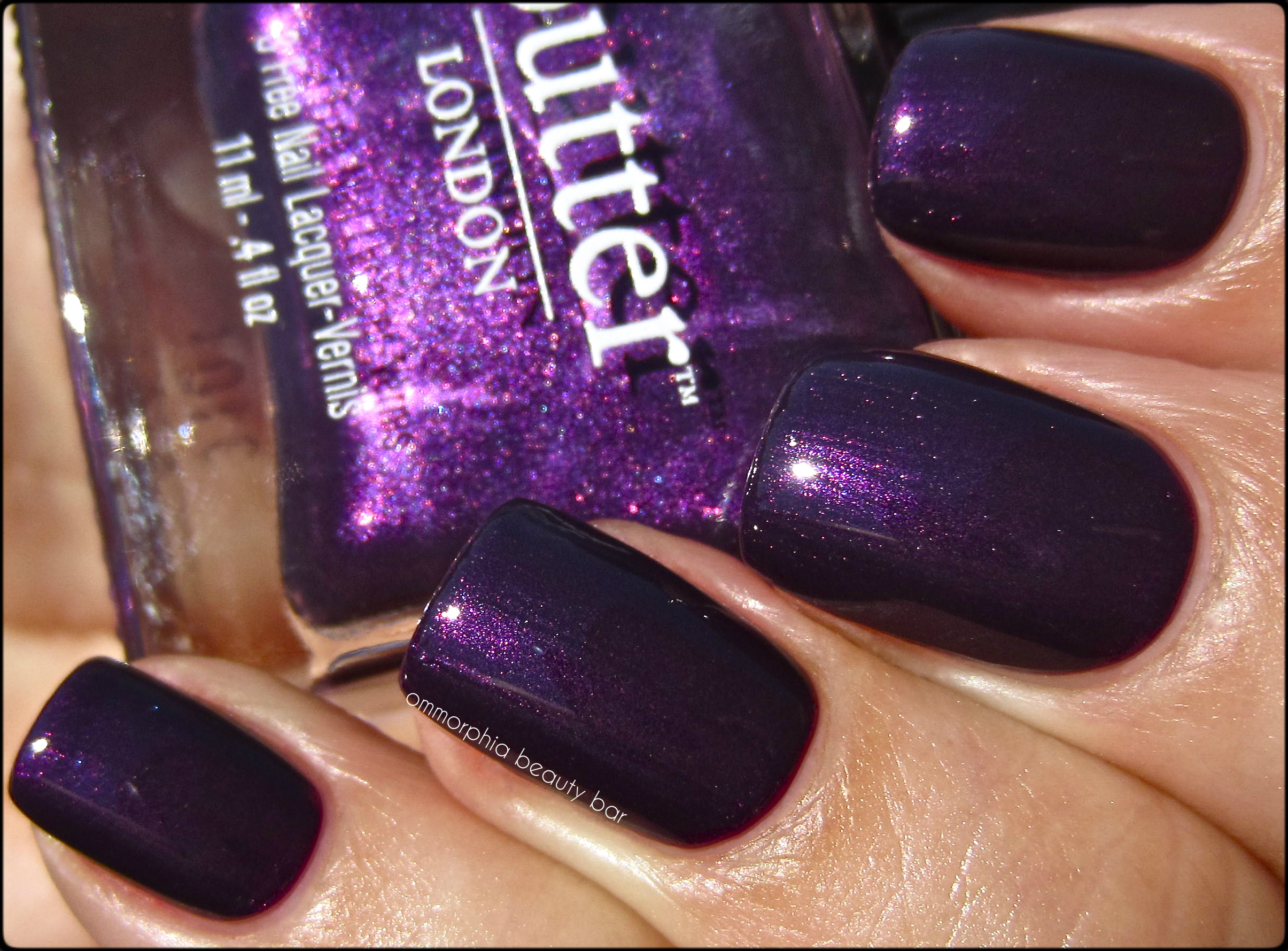
CHANEL #583 Taboo vs OPI German-icure by OPI – when I went looking for a comparison shade, the only one that came to mind was OPI’s German-icure by OPI (reviewed here) from the Germany Collection. A quick note: there have been many discrepancies as to the true name of this OPI shade, but my rep still insists that the one I have is rightly named, and not ‘Every Month is Oktoberfest’ as most people claim. Whatever. How the two compared:
- index & pinkie fingers – German-icure by OPI: less purple in base colour, burgundy tones more prominent with a finer shimmer throughout
- middle & ring fingers – #583 Taboo

CHANEL #583 Taboo vs OPI German-icure by OPI

CHANEL #583 Taboo vs OPI German-icure by OPI
cheap finasteride
cheap flomax
cheap fluoxetine
cheap lasix
Last word: I’ll make this easy: you NEED this shade. Unique and totally captivating, completely unlike anything else CHANEL has ever produced, this is one of those lacquers that will have you long regretting passing it up. The application is flawless and the range of colours found in this one bottle ensures that it will suit basically every skin tone and every season, at that. As stated from the start, it is a limited edition shade – don’t say you weren’t warned. Definitely back-up worthy.
Available now through all CHANEL counters.

*Disclosure: Product samples provided by the company/PR for my unbiased consideration


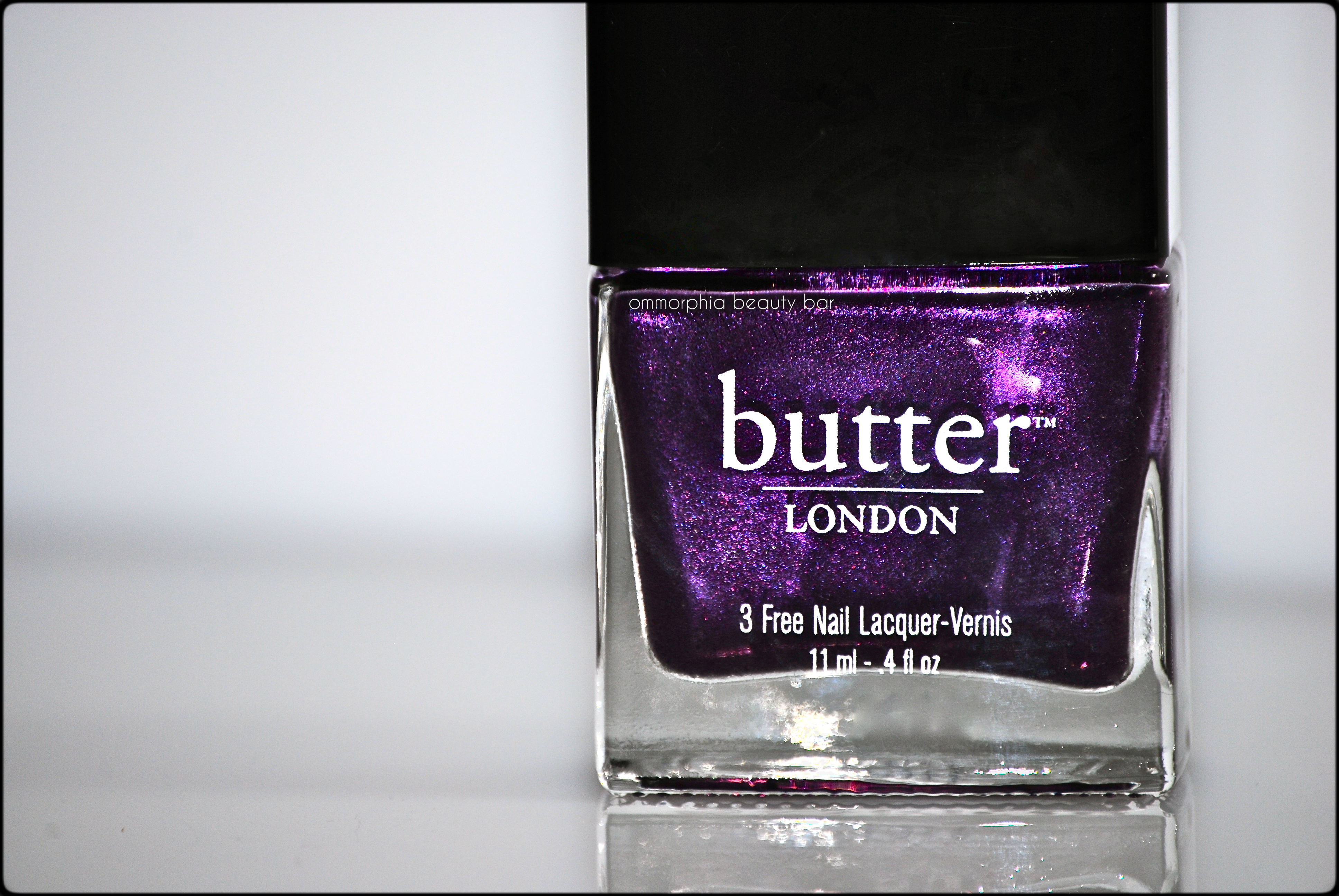
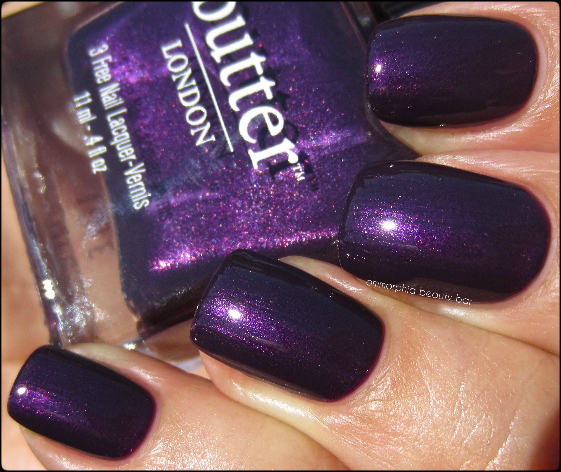
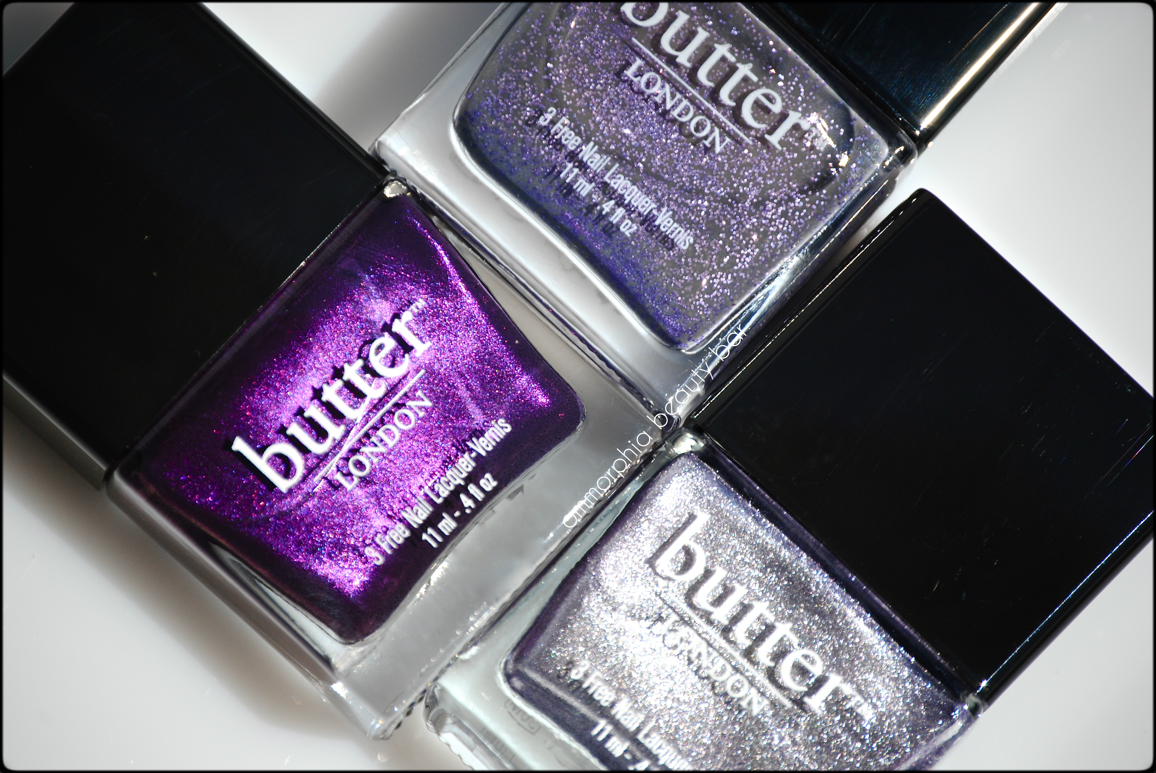
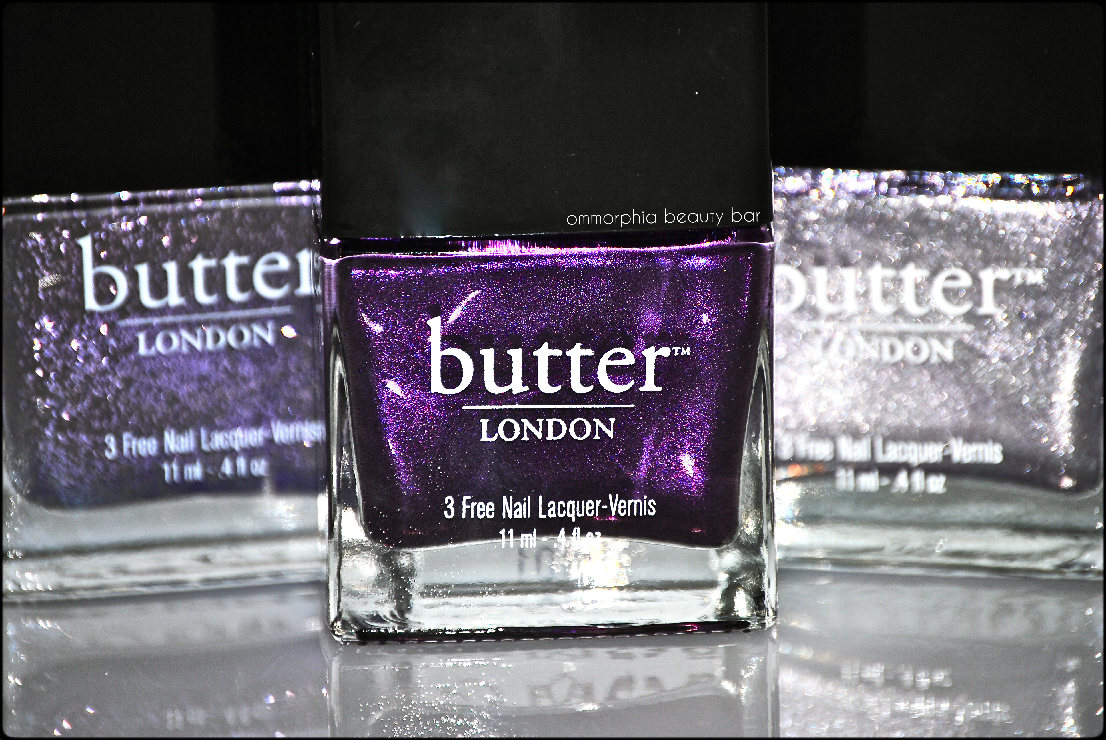
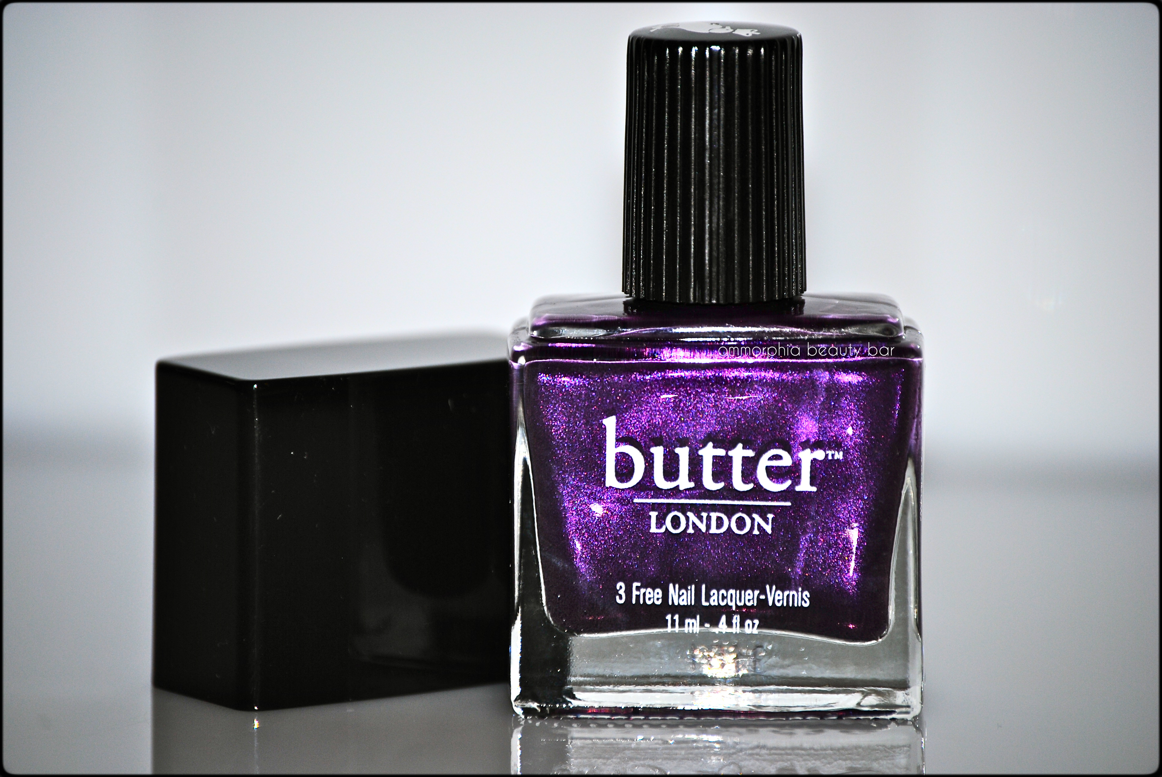
Butter London – Pitter Patter (Limited Edition)
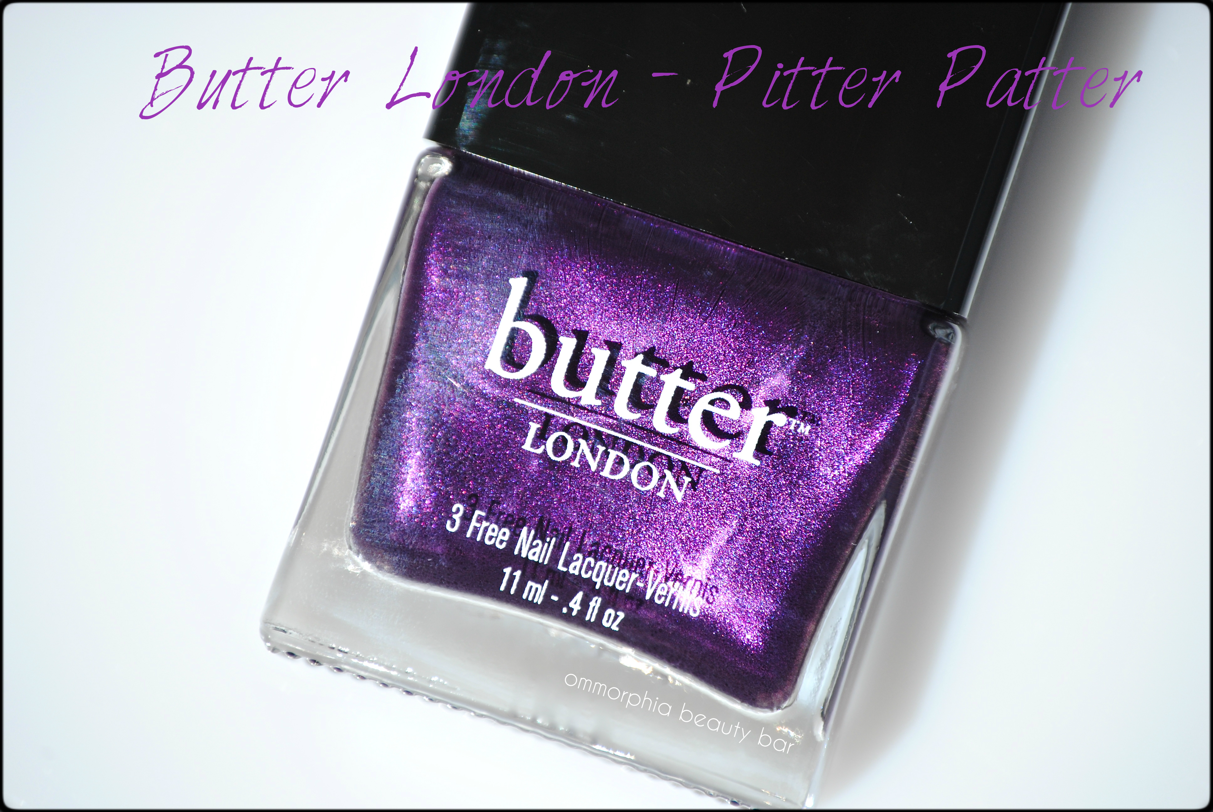
Purple, with its long and historic association as the colour of royalty, takes on an entirely new vibrance in the creative hands of Butter London. With many other purple hued lacquers in their large lineup, and in anticipation of Will & Kate’s upcoming bundle of joy, this cult-fave brand has managed to “give birth” (yes, I am totally going there…) to a shade that is at once intense, fun, oh-so-regal, and absolutely perfect for today’s über stylish royal baby. Now if said baby turns out to be a boy, I’m sure mommy won’t mind wearing this beauty until a girl comes along!
Butter London – Pitter Patter

Butter London – Pitter Patter (inner cap)
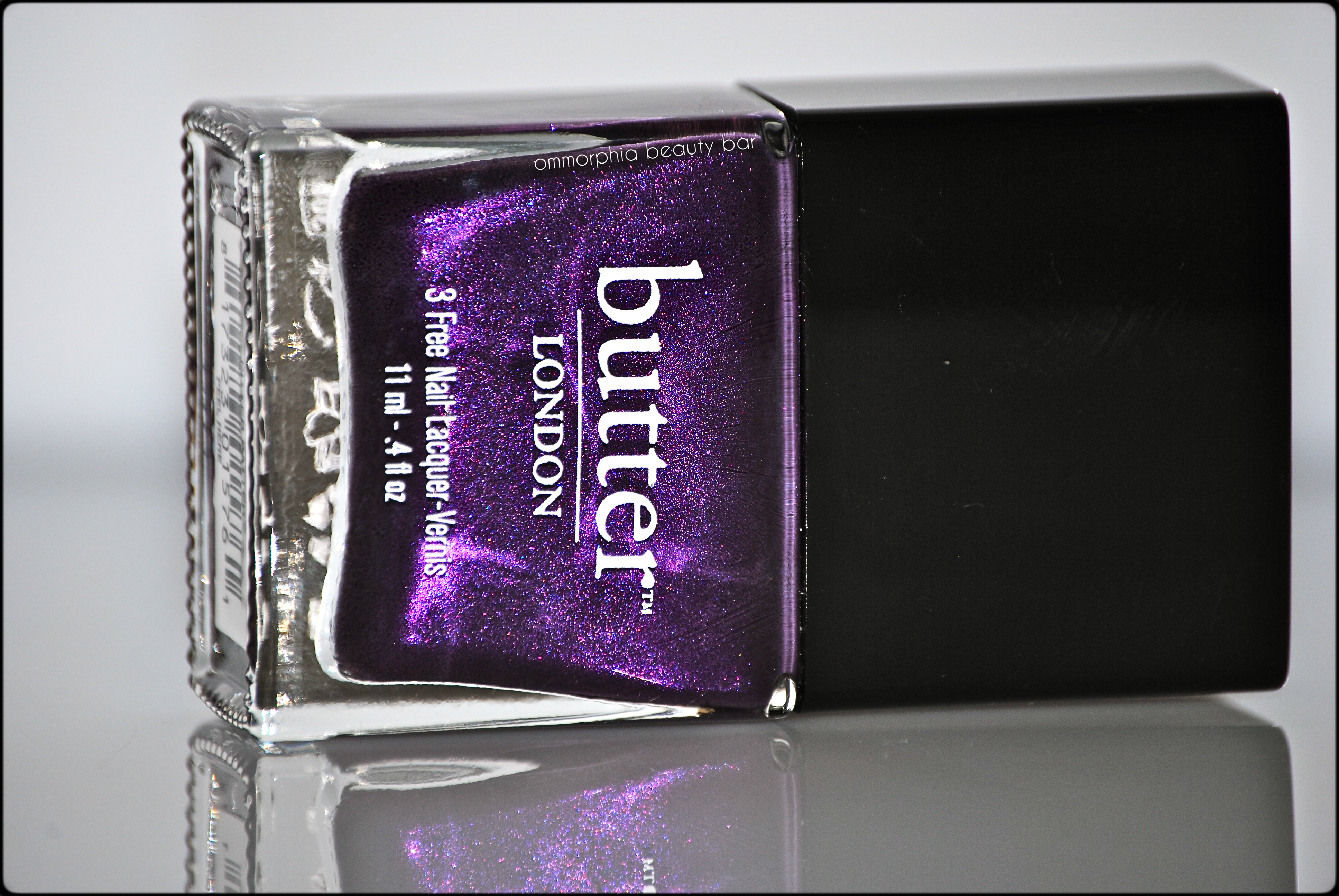
Pitter Patter (US $15.00 4 fl. oz/CAD $17.00 11 ml) – a deep and vivid purple hue filled with red and purple finely ground shimmer, in a formula that flows like a dream and bears a perfect density – neither too thick, nor too thin. With an excellent dry time and finishing in a natural high gloss shine, there is also the added bonus of this being a completely non-staining lacquer. Coats applied: 2, plus top coat
Butter London – Pitter Patter
Butter London – Pitter Patter
Butter London – Pitter Patter
Butter London – Pitter Patter
Butter London – Pitter Patter, No More Waity, Kaity (reviewed here) & Lillibet’s Jubilee (reviewed here)
Butter London – Pitter Patter: The Royals
Last word: Following in the popular footsteps of it’s “familial” predecessors ‘No More Waity, Kaitie’ (part of the permanent collection), a shade created for Kate Middleton’s engagement to Prince William, and ‘Lillibet’s Jubilee’ (a limited edition hue & no longer available), the shade created in honour of Queen Elizabeth’s coronation, ‘Pitter Patter’ stands poised to eclipse them all, as much for the story behind the polish, as the shade itself; rich, luxurious, spot-on trendy and a colour that is universally flattering. I couldn’t think of an easier of becoming a part of the royal family!
cheap prozac
cheap sildenafil
cheap tadalafil
Find out more about Butter London products via their website, twitter or facebook
*Disclosure: Product samples provided by company/PR for my unbiased consideration
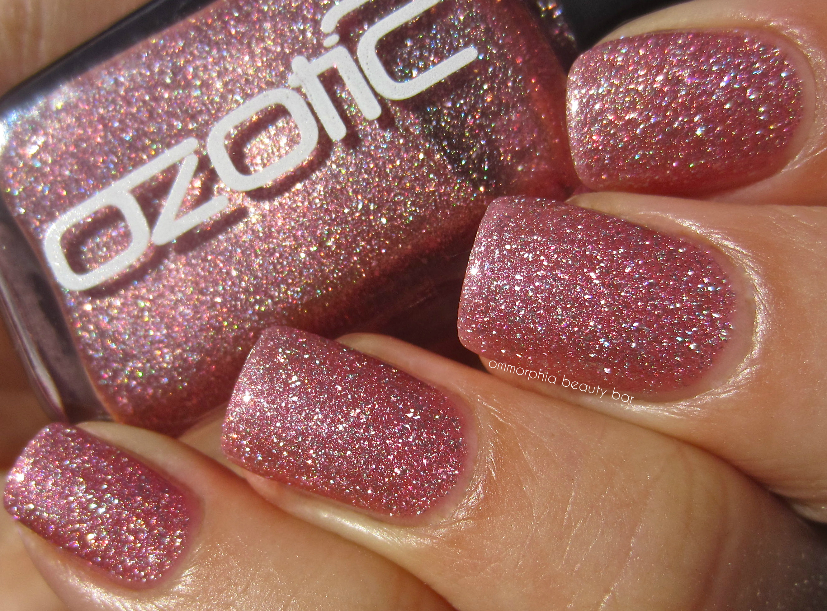
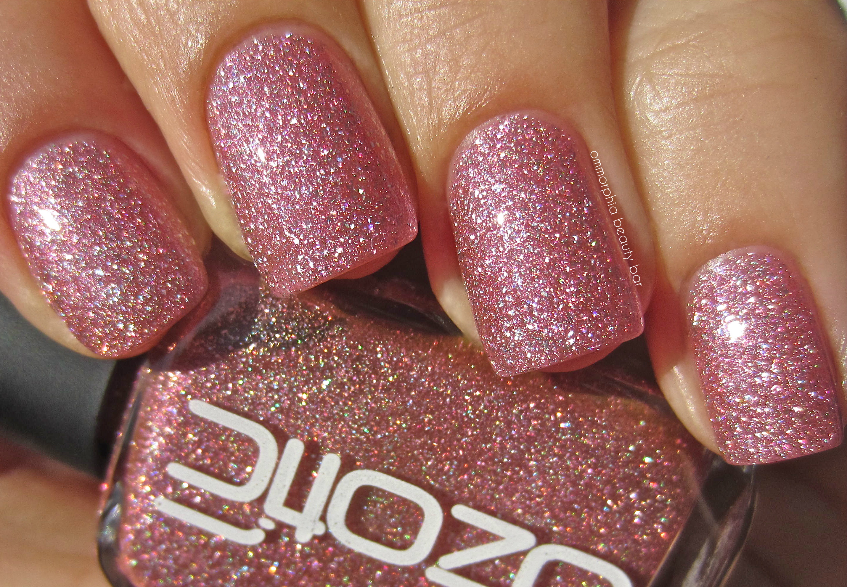
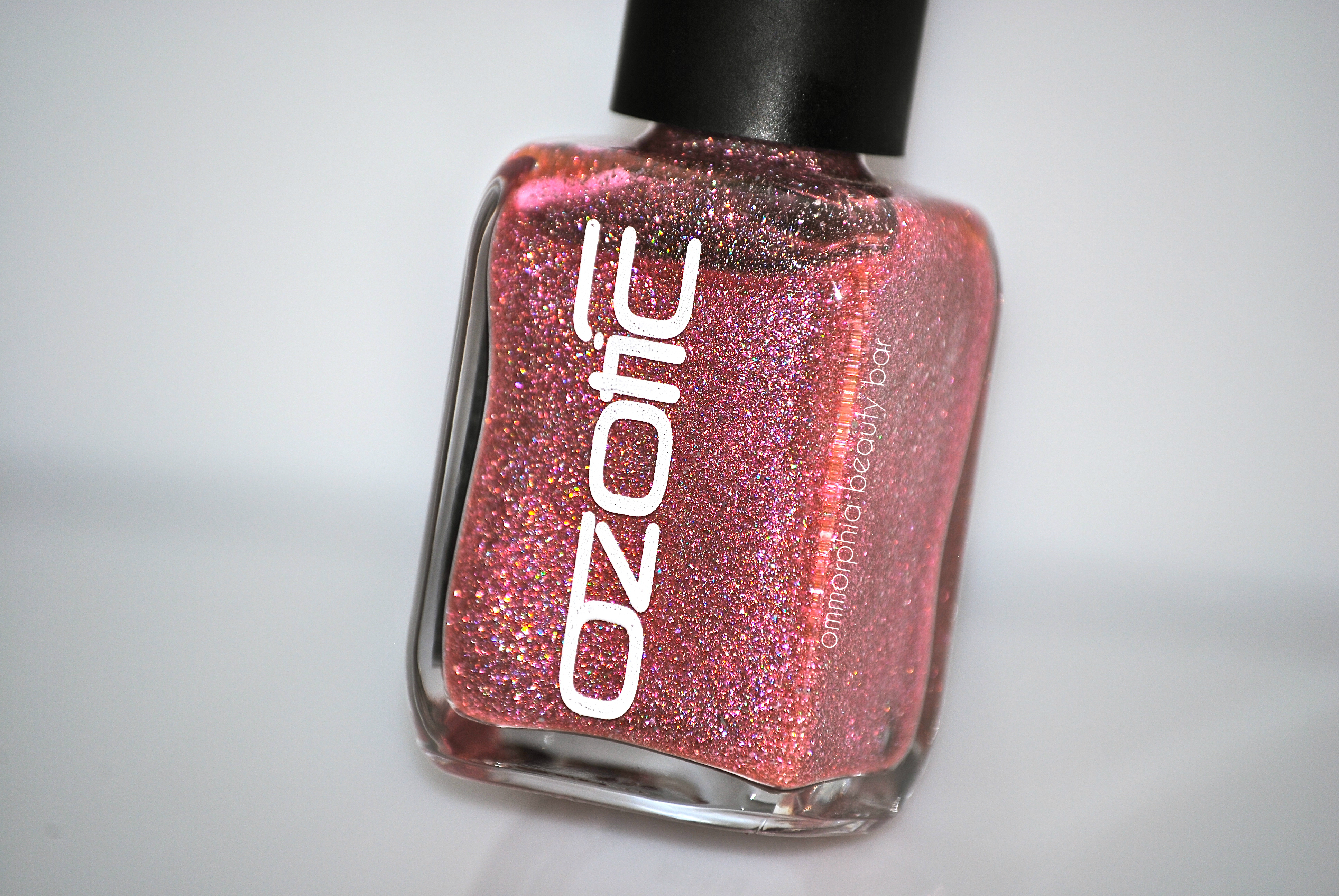
Ozotic by piCture pOlish – 601
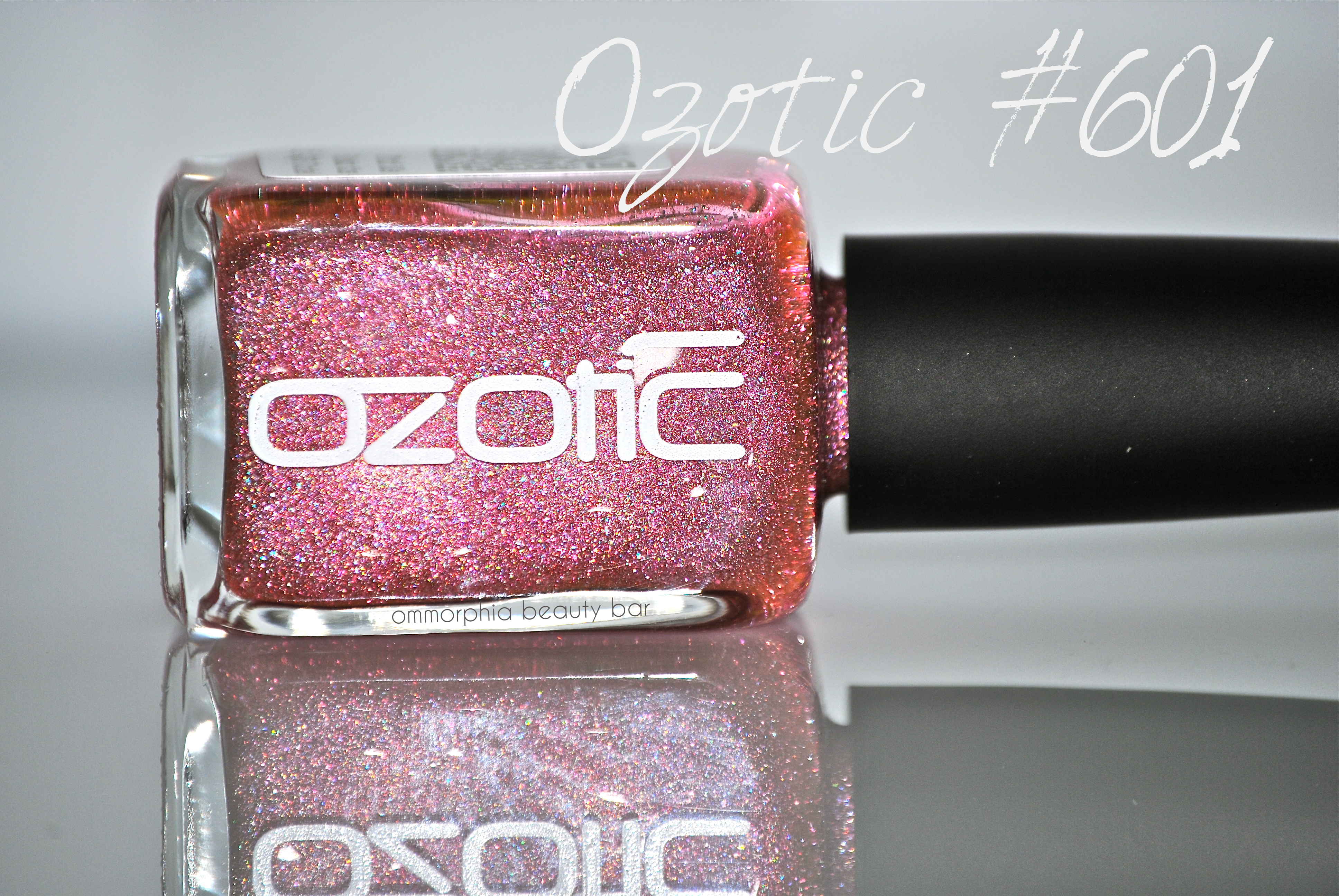
From all of the Ozotic by piCture pOlish shades I was sent to review, #601 has to definitely be the one that surprised me the most. Why? For starters, I am definitely not a “pink” person and so this shade didn’t really rock my world … until I applied it. Sometimes, it really does pay to step out of your colour comfort zone, and what better way to do that than with nail polish, right?
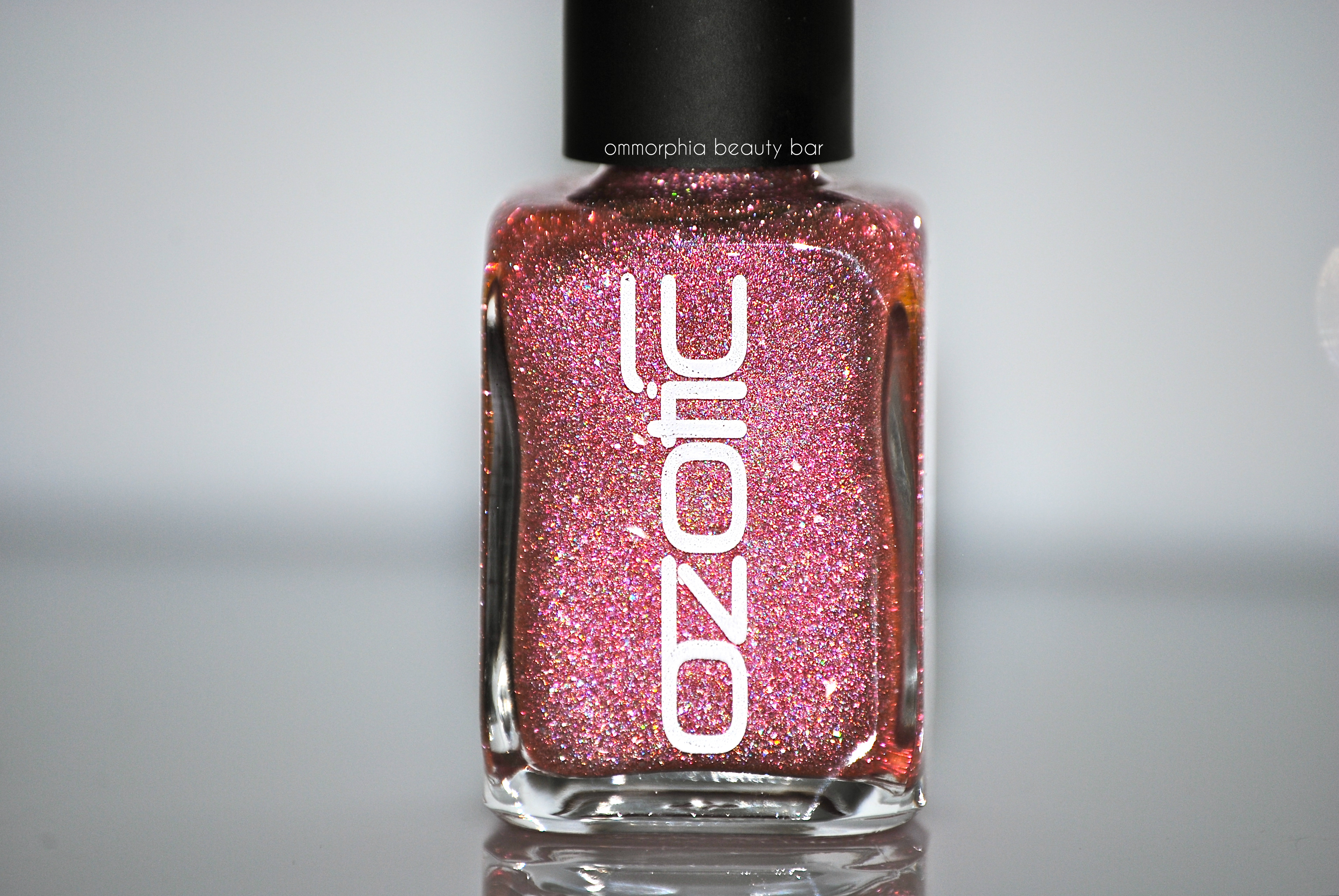
Ozotic by piCture pOlish #601 (CAD $14.50) – densely packed with finely ground pink and prismatic glitter, you’d be forgiven in not realizing that the base of this shade is actually clear. Worn alone, the look is one of dainty femininity, albeit the scattered holographic effect gives it a modern edge — layered over a dark solid hue, however, is the best way to bring out its multi-tonal refractions. Bearing an excellent formula that falls in a self-levelling and brush stroke-free manner, the finish is on the satin side and so benefits from the addition of top coat. Coats applied: 2, plus top coat (applied alone) and 1, plus top coat (layered over a black crème)
Ozotic by piCture pOlish – 601
Ozotic by piCture pOlish – 601
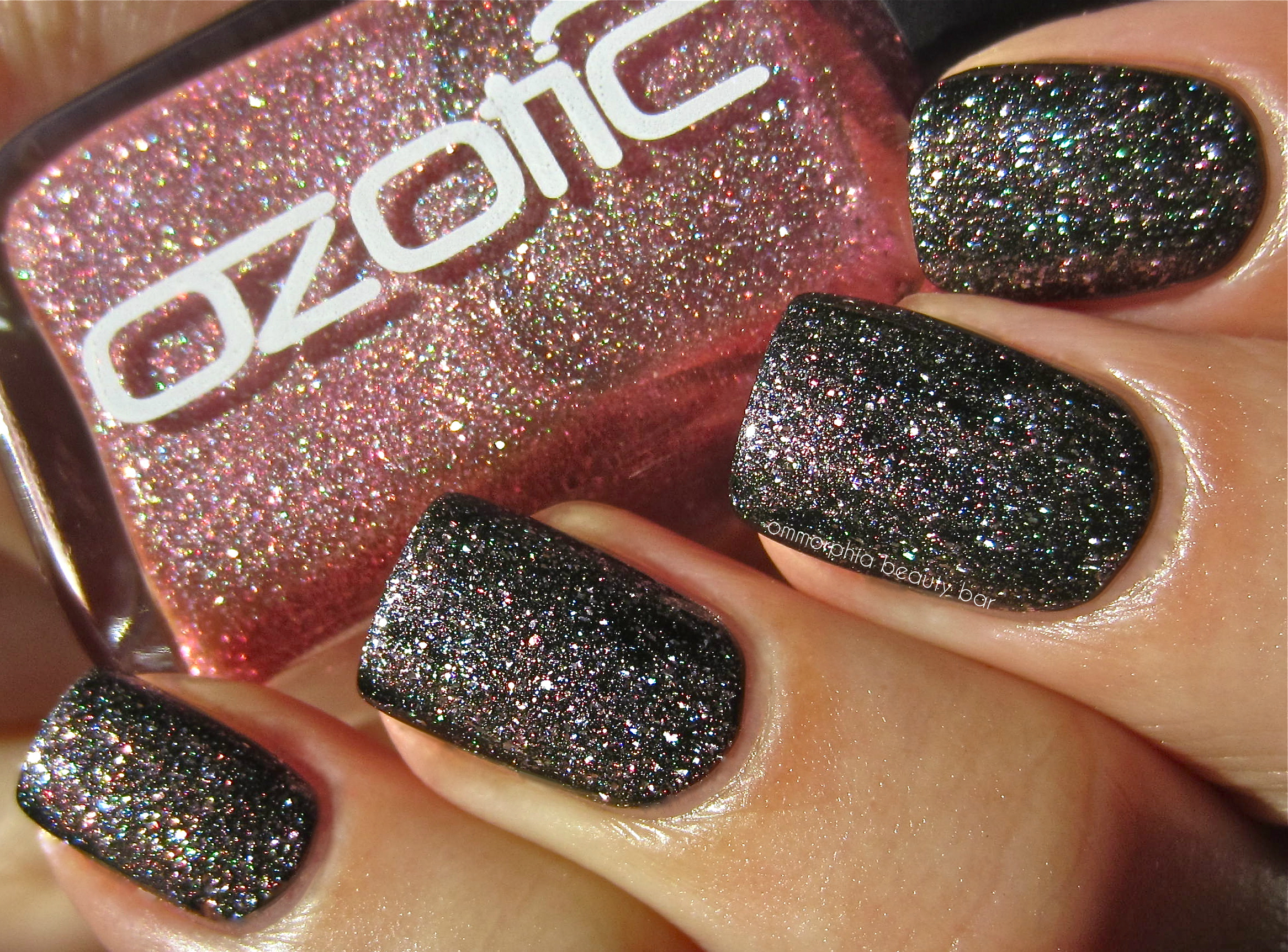
Ozotic by piCture pOlish – 601 (layered over a black crème)
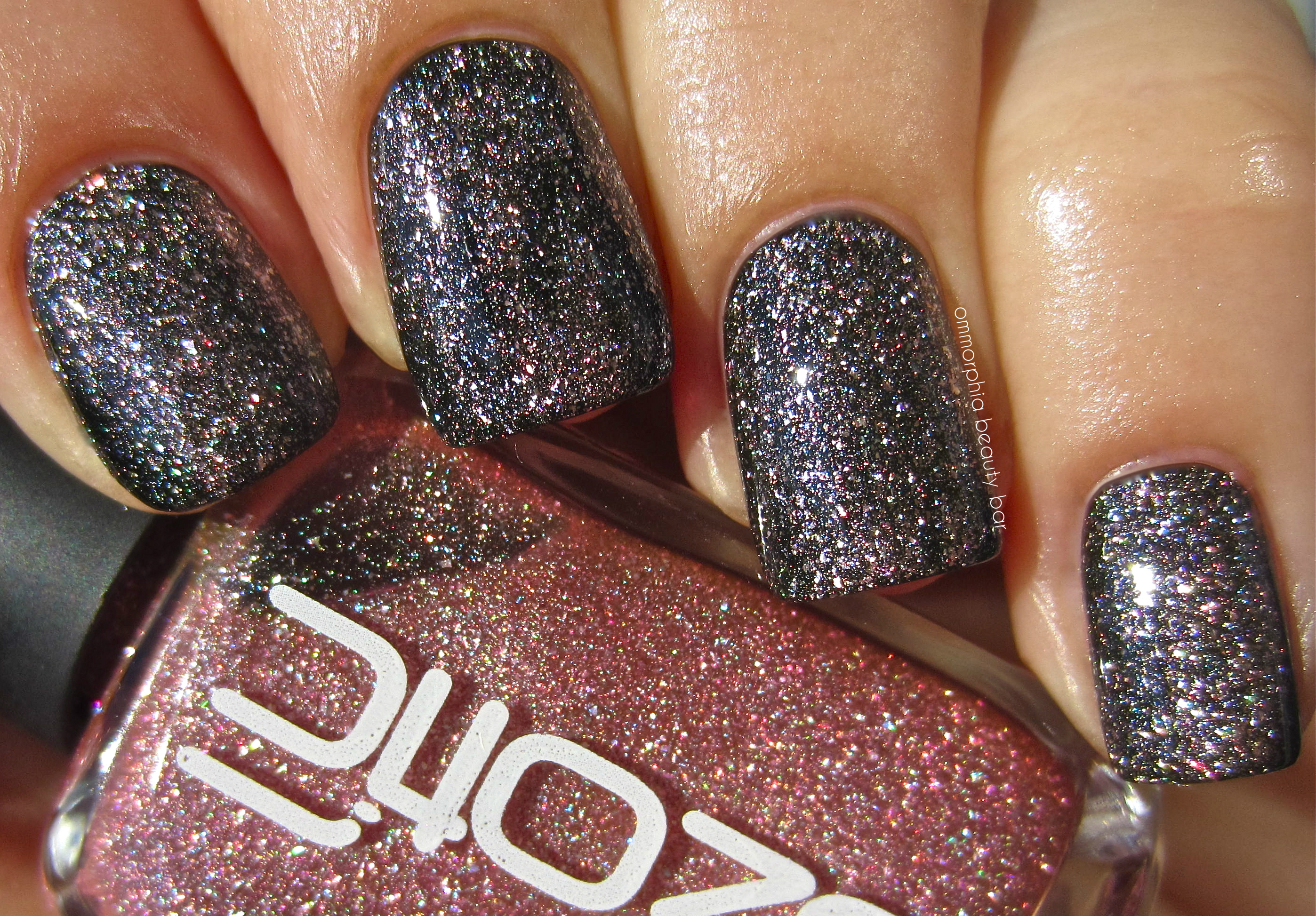
Ozotic by piCture pOlish – 601 (layered over a black crème)
cheap Cipro
cheap Clomid
cheap Cozaar
cheap Flagyl
Last word: If you’re a fan of pink as well as prismatic lacquers, then you need look no further than Ozotic by piCture pOlish #601 – it’s got all that and more, in one bottle. With a superb formula and all the layering possibilities available – or not, depending on your personal preferences, this is a shade that I never expected to like as much as I did and I can’t wait to try it over other colours as well. Bottom line: a total win.
More information can be found on the piCture pOlish/Ozotic website, or via twitter, facebook, Pinterest and Instagram
*Disclosure: Product sample provided by the company/PR for my unbiased consideration
New! a-england – First Look of Burne-Jones Dream
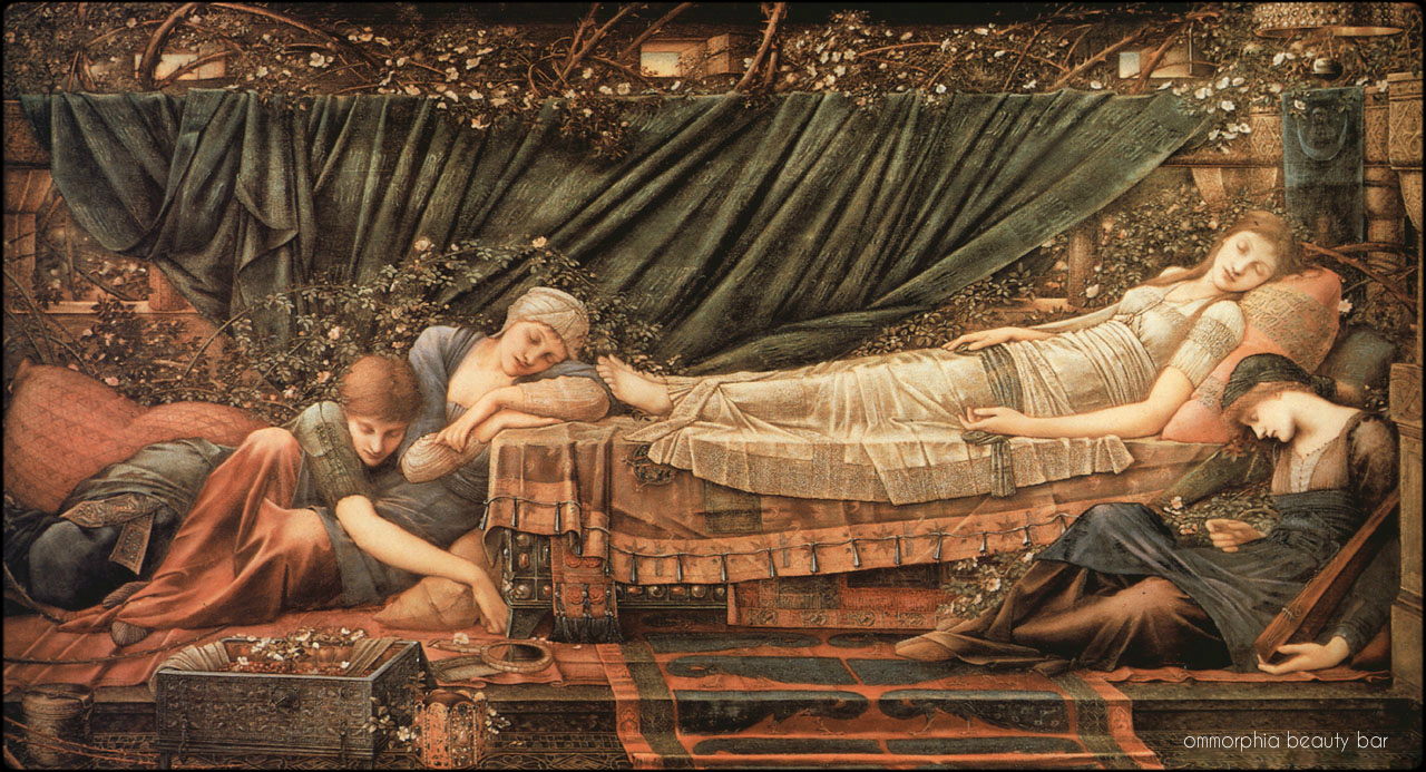
If you follow me on any of my social media feeds, you’ll have seen the first look I posted of a-england’s upcoming new collection ‘Byrne-Jones Dream’ – a series of 5 prismatic/holographic lacquers inspired by the Sleeping Beauty series of paintings created by the artist Edward Burne-Jones. Until I get proper swatches up, here’s a closer look at these lovelies.
Note: all shades swatches on a nail wheel, shown in natural light (left) and with flash (right). More detailed swatch photos to follow.
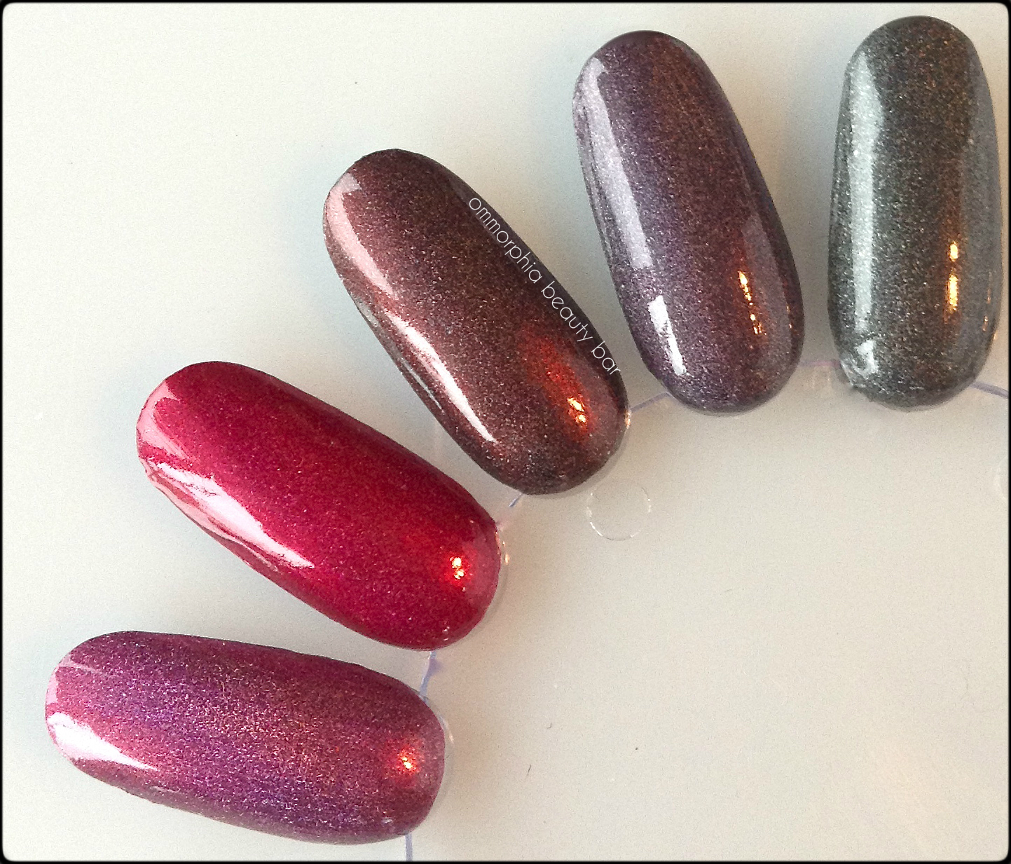
a-england Burne-Jones Dream (natural light)
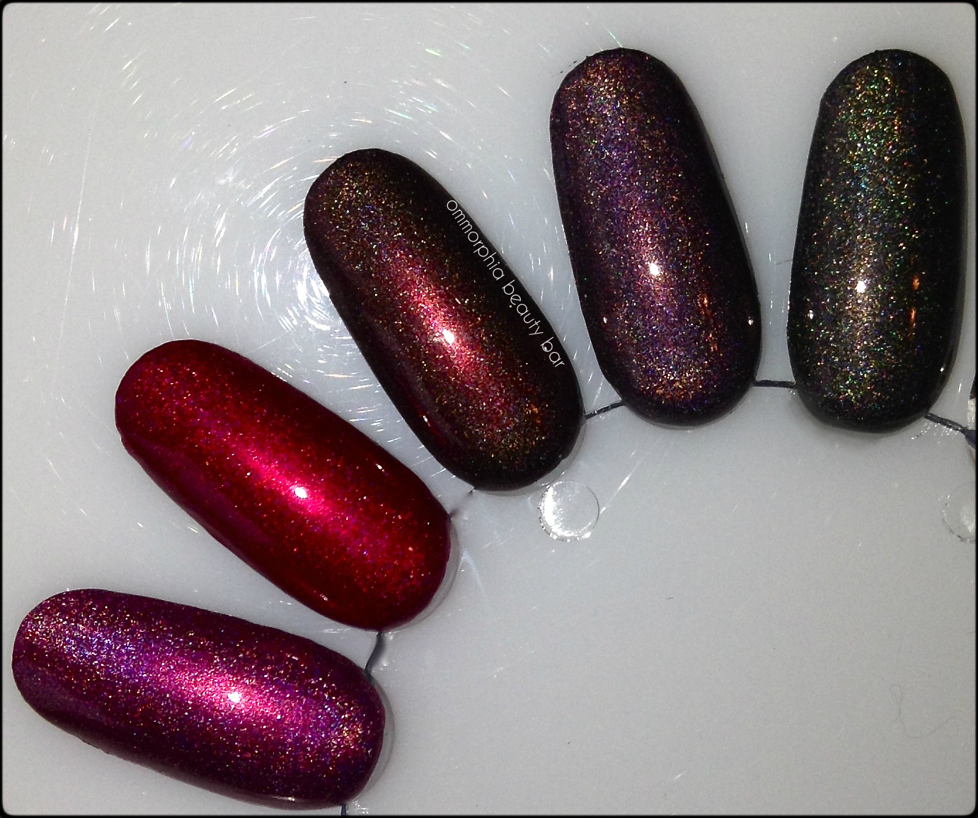
a-england Burne-Jones Dream (with flash)

a-engand Briar Rose (Sleeping Beauty)

a-england Rose Bower
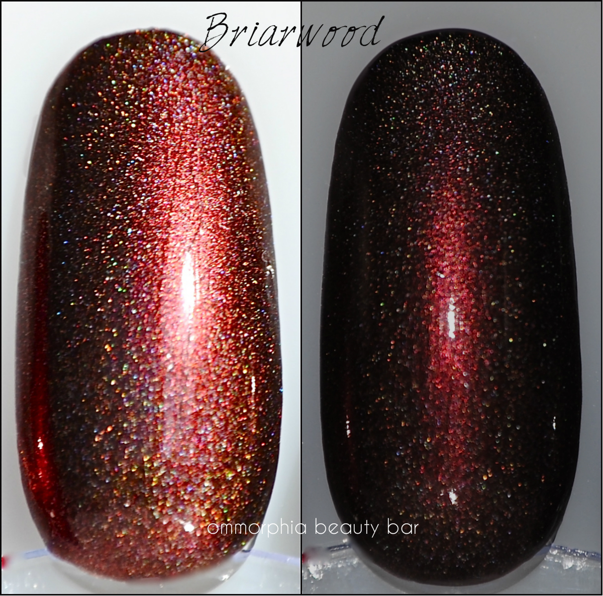
a-england Briarwood (*coming later)
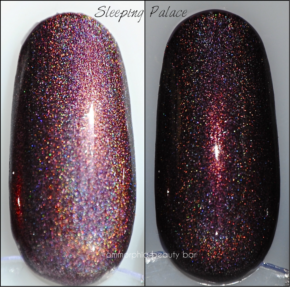
a-england Sleeping Palace
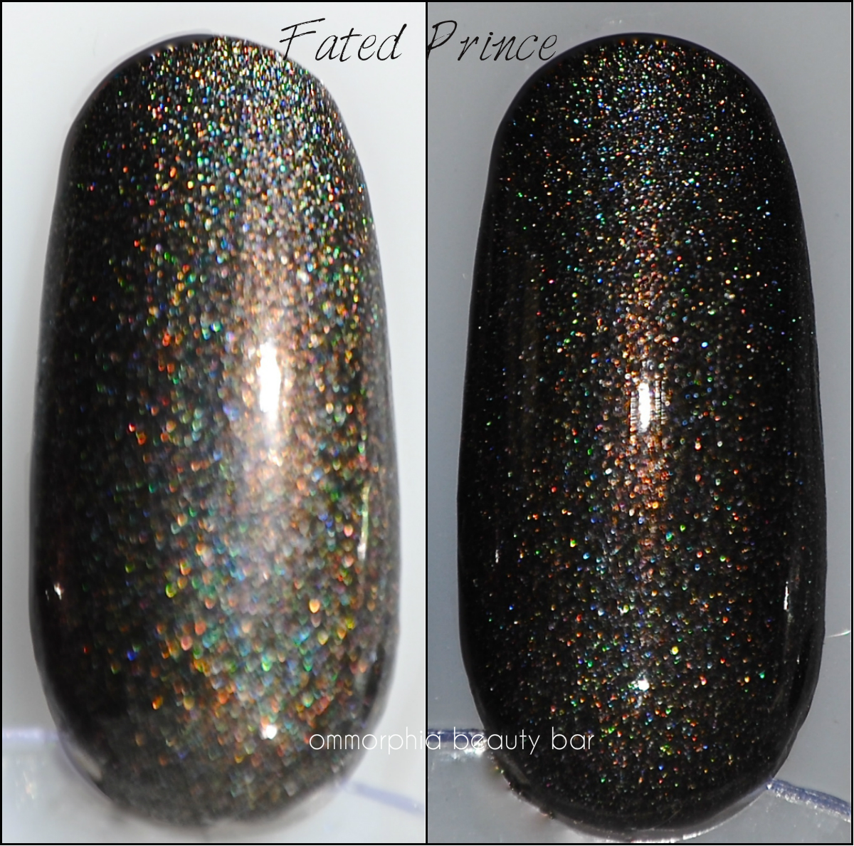
a-england Fated Prince
Last word: The nail wheel swatches shown here, while a good indicator, do NOT do these shades justice, believe me. Still, it gives everyone a pretty good visual of this upcoming collection – and if you’re familiar with the a-england brand, you already know about the stellar quality of the formula. Stay tuned for my own personal swatches, which will dive into each gorgeous shade in intimate depth.
*Disclosure: Product samples provided by the company/PR
essie – Summer 2013 Collection

When I first laid eyes (and hands!) on essie’s Summer 2013 Collection back in March, I was blown away by COLOUR! After a long & dreary Winter, I was so ready for the vivid happiness & warmth as embodied by these 6 shades, five of which hold a type of dancing shimmer within, while the last hue almost seems to jump out at me for attention. Make no mistake about it: you will definitely want to get your Summer on with these beauties …

essie – Summer 2013 Collection

essie – Summer 2013 Collection
Rock The Boat – a semi-sheer dusty cornflower blue shade with ultra fine silver & prismatic irregularly shaped glass-flecked shimmer that while subtle, is still quite visible in daylight. Bearing a hybrid jelly-crème formula, you do need to wait at least 1 1/2 minutes between coats to avoid any dragging or creating bald patches. Coats applied: 3 thin, plus top coat

essie – Rock The Boat

essie – Rock The Boat
Full Steam Ahead – a slightly cool-leaning lilac hue with dove grey undertones in its base, in the same formula and shimmer as ‘Rock The Boat’. Upon initial application, you could possibly see some clumpiness occuring if the polish is overworked, but that is completely resolved by any subsequent layers. Coats applied: 3 thin, plus top coat

essie – Full Steam Ahead

essie – Full Steam Ahead
The More The Merrier – an ultra vivid lime green hue that straddles a neon line, in a jelly-esque formula – – and the only shade without any shimmer of this collection. An absolutely unique colour that while vibrant, still manages to be quite wearable and finishes in a totally self-levelling and glossy shine. Coats applied: 3 ultra thin, plus top coat

essie – The More The Merrier

essie – The More The Merrier
Sunday Funday – a coral/pink hue with finely ground prismatic as well as irregularly shaped glass-flecked shimmer, in a jelly-esque formula that bears a higher colour saturation than the previous shades, making application very smooth & easy. Depending on your nail length, you could easily get away with 2 simple layers. Coats applied: 3 thin, plus top coat

essie – Sunday Funday

essie – Sunday Funday
The Girls Are Out – a rich magenta/fuchsia combination hue in a jelly-like formula and bearing the same finely ground prismatic and irregularly shaped glass flecked shimmer. Excellent colour pigmentation, application, and glassy shine at the finish – along with the ability to be worn by both cool & warmer skin tones equally. Coats applied: 2, plus top coat

essie – The Girls Are Out

essie – The Girls Are Out
Naughty Nautical – a spectacular turquoise/teal hue, slightly green-leaning and with the same prismatic and irregularly shaped glass flecked shimmer of the others in this collection. This hybrid crème-jelly formula made for the best flow and easiest application of the 6, with a stellar pigmentation and super glossy finish at the end. Coats applied: 2, plus top coat

essie – Naughty Nautical

essie – Naughty Nautical
Last word: From the 6 shades of this collection, ‘Rock The Boat’ and ‘Full Steam Ahead’, may seem similar to previous essie releases, although I must state that their shimmer does set them apart from earlier versions. Even ‘Sunday Funday’ and ‘The Girls Are Out’ may feel somewhat familiar, but in looking through my rather extensive essie stash, I realized that I own nothing like them. Of them all, I would have to say that ‘The More The Merrier’ stands out for its unusual and in-your-face tone, but for me, the winner of the bunch is ‘Naughty Nautical’, as much for the formula, its aquatically-themed colour, and the name. I’ll take anything naughty, thank you very much.

Kindly provided by Essie for my unbiased consideration


